Soft Florals That Set the Tone
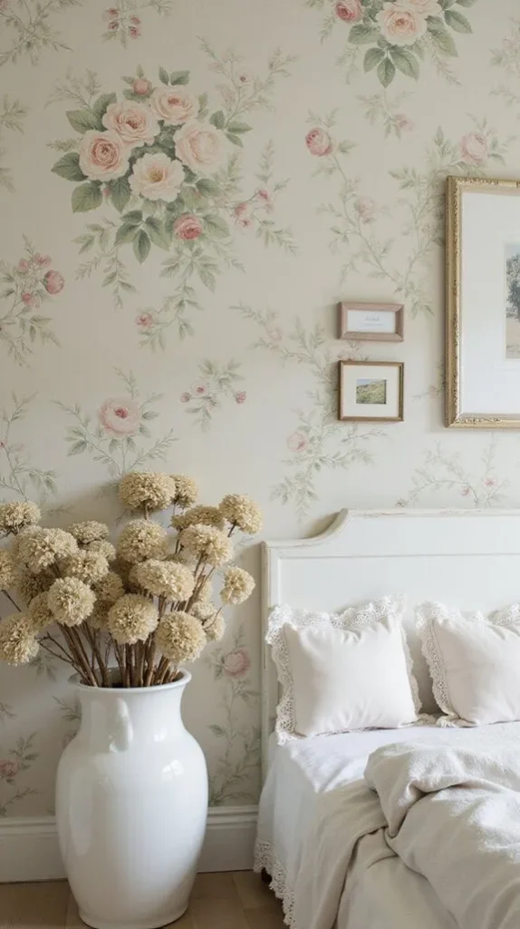
1. Faded Vintage Rose Wallpaper

This is the easiest way to get that classic shabby chic look right. The key is choosing roses that feel slightly washed out—not bold or high-contrast. You want them to look like they’ve been sitting in sunlight for years.
Use this in a bedroom with:
- White or cream furniture
- Linen bedding
- Light wood tones
It creates that soft, romantic feel without trying too hard.
2. Watercolor Peony Wallpaper
Peonies already feel elegant, but the watercolor effect softens everything even more. It almost blurs the edges, which makes the room feel calmer and more open.
This works especially well if:
- Your space feels small or tight
- You want something floral but not “busy”
Pair it with minimal decor so the walls can do the work.
3. Cream & Sage Botanical Wallpaper
This one leans a little more modern while still staying in the shabby chic lane. The sage green keeps things grounded, while the cream background keeps it light.
It’s a great “safe” choice if you:
- Don’t want overly feminine florals
- Want something that works long-term
Add plants nearby and it all ties together naturally.
4. English Garden Mixed Blooms
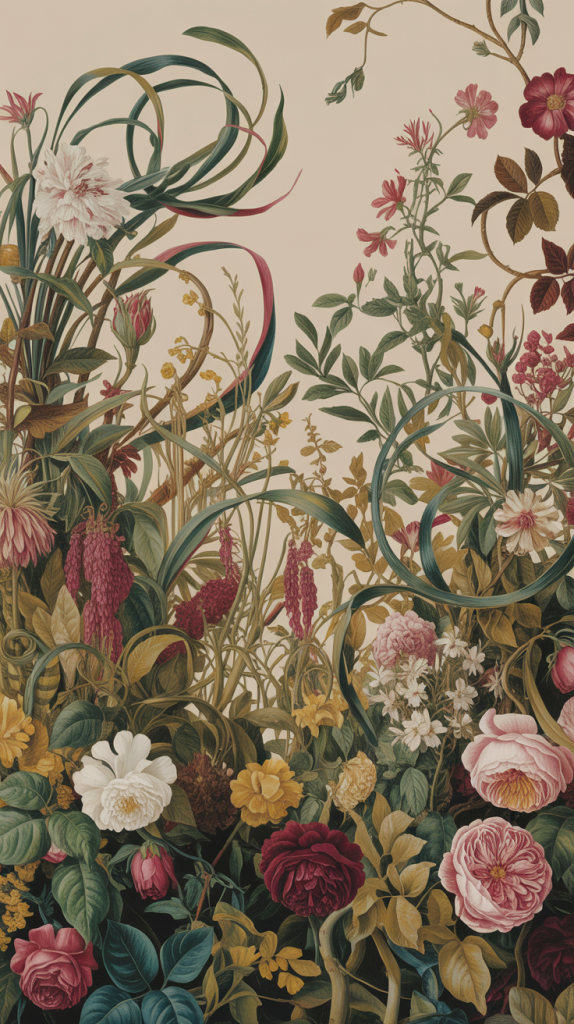
This is a fuller, layered look—multiple flowers, vines, and colors working together. It feels like a real garden instead of a single plant repeated over and over.
Best used on:
- One accent wall
- Dining rooms or sitting areas
Too much of this in a small room can feel heavy, so balance it with simple furniture.
Botanical & Nature-Inspired Styles
5. Pressed Botanical Print Wallpaper
This gives off a vintage collector vibe—like pages out of an old plant journal. Each flower or leaf feels intentional.
Use it when you want:
- A quieter, more refined look
- Something that feels intellectual, not decorative
Great for offices or reading spaces.
6. Lavender Field Wallpaper
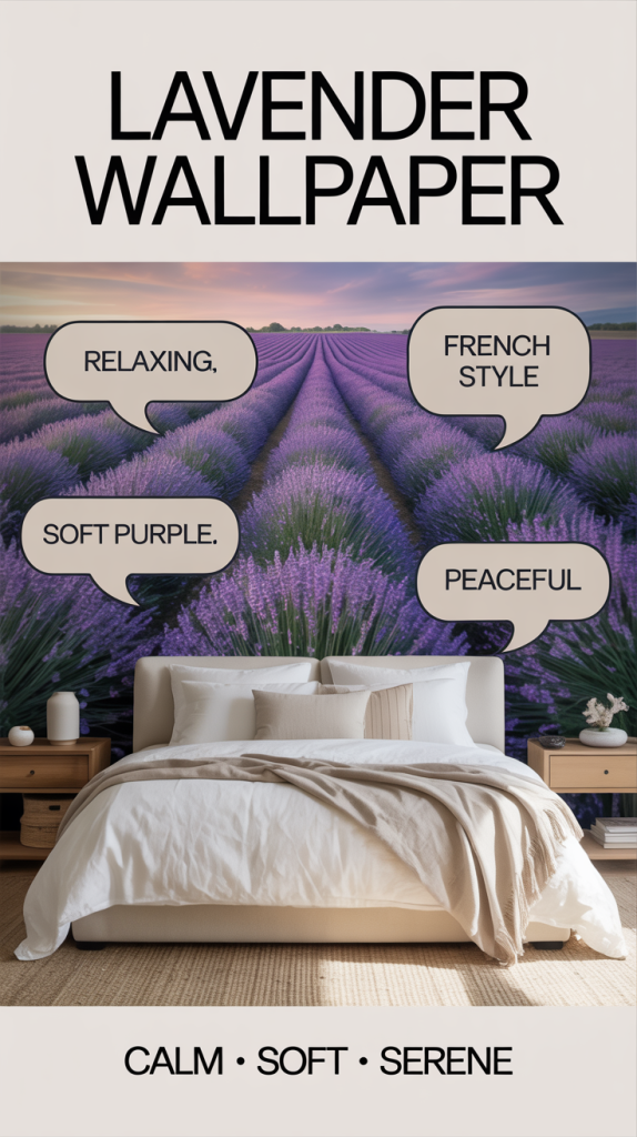
This one is more about the feeling than the pattern. Long rows of lavender create depth and calm.
It works best:
- Behind a bed
- In spaces meant for relaxing
Keep everything else simple—light fabrics, neutral tones, maybe a wood bench or stool.
7. Bird & Birdcage Motif Wallpaper
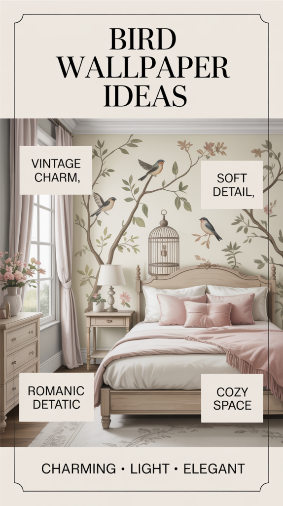
Adds a little story to the room. Birds, branches, and cages bring a soft, almost nostalgic feel.
Best approach:
- Use it as a feature wall
- Keep surrounding decor minimal
It’s subtle, but it gives the room personality.
Textured & Aged Finishes (Where It Gets Real)
8. Distressed Wood Panel Wallpaper
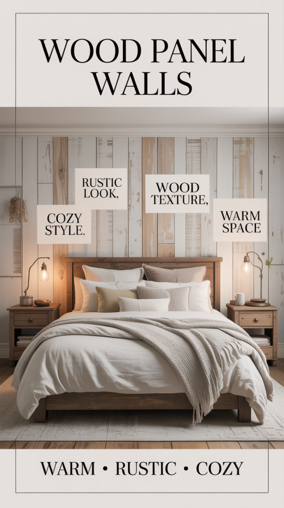
If you want warmth, this is it. It mimics reclaimed wood and instantly makes a room feel more grounded.
Use it in:
- Bedrooms
- Offices
- Even entryways
Lighter tones = airy cottage
Darker tones = cozy cabin
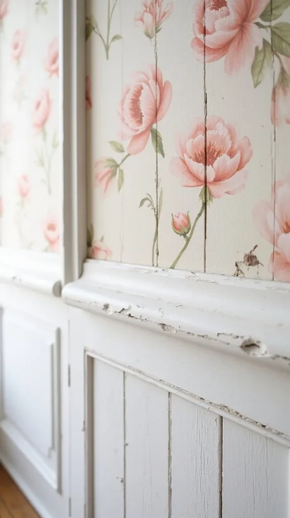
9. Peeling Paint Effect Wallpaper
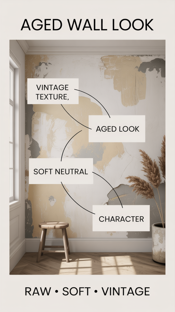
This gives you that imperfect, aged look—without actually damaging your walls.
It works well when:
- You want character without pattern
- You’re mixing modern and vintage
Think of it as a backdrop, not the main feature.
10. Whitewashed Brick Wallpaper
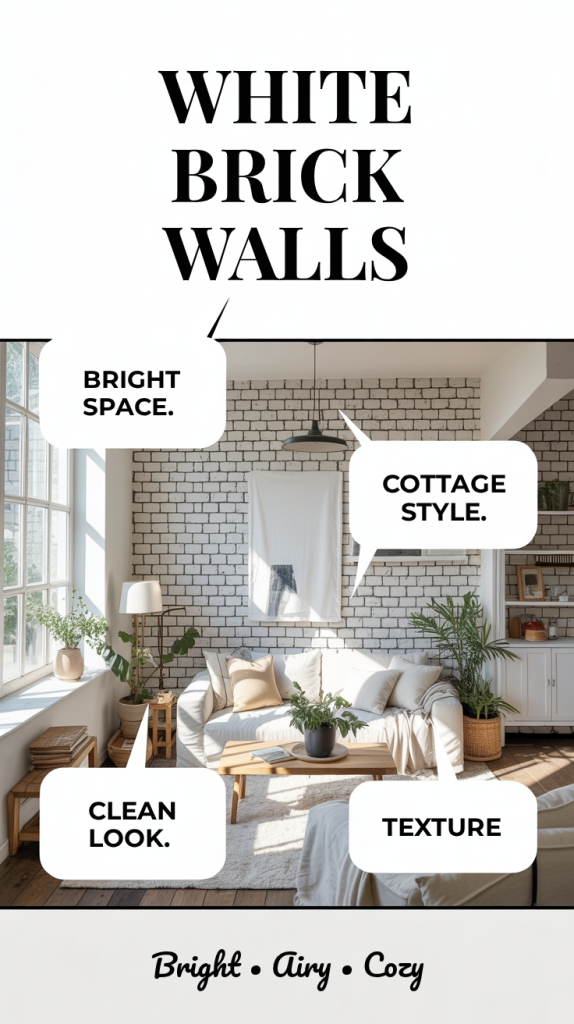
This one brightens a room while still adding texture. It’s a great alternative to real brick.
Perfect for:
- Living rooms
- Kitchens
- Open spaces
Add a big mirror or natural light and it really opens things up.
11. Crackled Paint (Pastels)
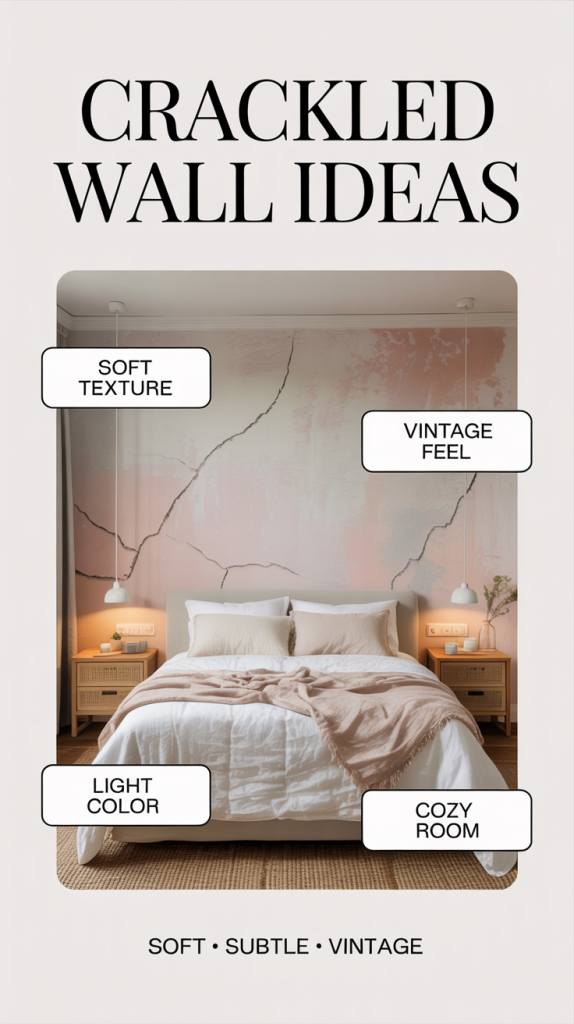
The crackle effect adds just enough detail without feeling busy. It’s subtle, but you notice it.
Best in:
- Small bedrooms
- Reading corners
Stick with soft colors like blush or mint to keep it cohesive.
12. Beadboard Wallpaper
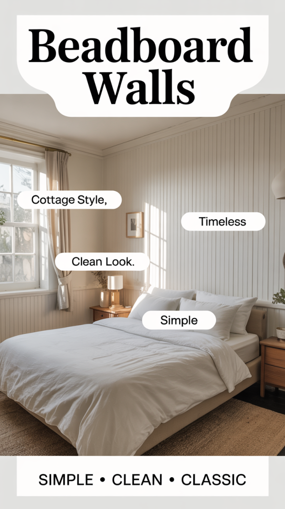
Clean, vertical lines that mimic real paneling. It’s simple but effective.
Use it when you want:
- A classic cottage feel
- Something that won’t go out of style
Works almost anywhere.
13. Linen-Texture Wallpaper
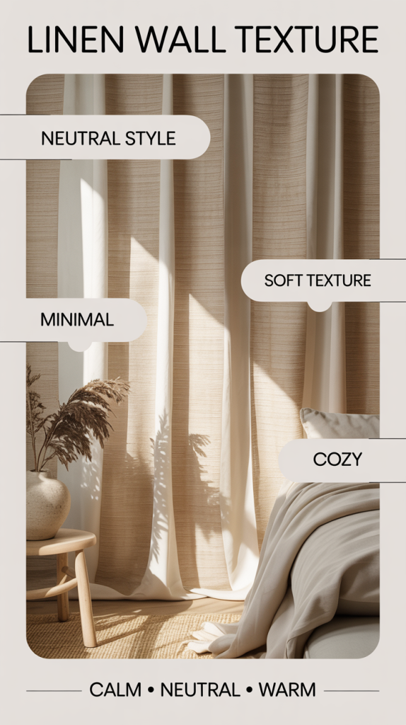
No pattern, just texture. This is your fallback if everything else feels like too much.
Great for:
- Layering with other textures
- Keeping things calm and neutral
It makes a room feel finished without drawing attention.
French-Inspired Looks
14. Soft Pink Damask
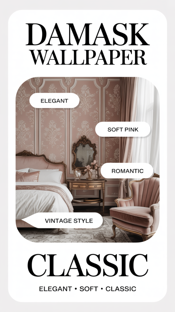
This is where shabby chic meets traditional elegance. The key is keeping the pink muted—not bright.
Best for:
- Bedrooms
- Accent walls behind beds
It adds depth without feeling formal.
15. French Script Wallpaper
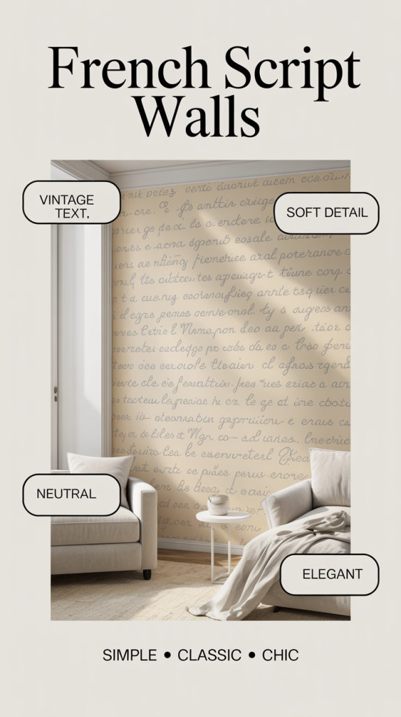
Looks like old handwritten letters layered across the wall.
Use it when you want:
- Subtle detail
- A slightly vintage, European feel
It works especially well in neutral color schemes.
16. Toile Wallpaper
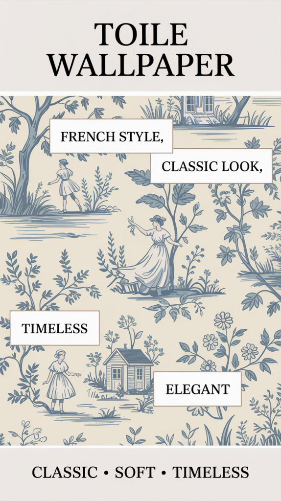
Classic countryside scenes repeated across the wall. It’s detailed but still calm.
Best approach:
- Use in larger rooms
- Or as a single feature wall
Pairs really well with traditional furniture.
17. Chandelier Pattern Wallpaper
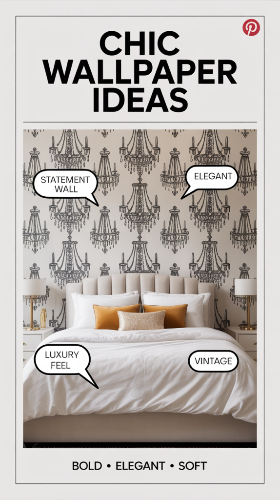
This is more of a statement. It draws attention immediately.
Use it:
- Behind a bed
- Behind a dining table
Keep everything else simple so it doesn’t compete.
Subtle Patterns & Finishing Touches
18. Lace Pattern Wallpaper
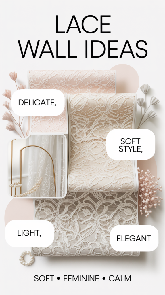
Soft, detailed, and very light visually. It reflects light nicely, which helps small rooms.
Best for:
- Bedrooms
- Dressing areas
Keep decor soft and layered.
19. Blue Gingham
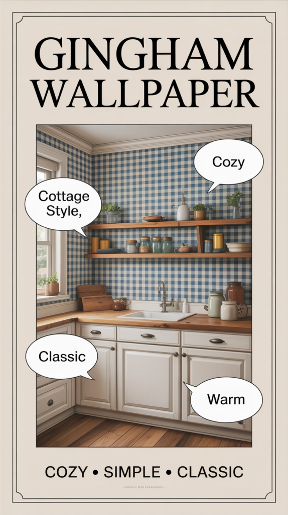
Feels casual and homey. Not overly styled—just comfortable.
Works well in:
- Kitchens
- Breakfast areas
Add wood accents and you’re done.
20. Faded Stripes
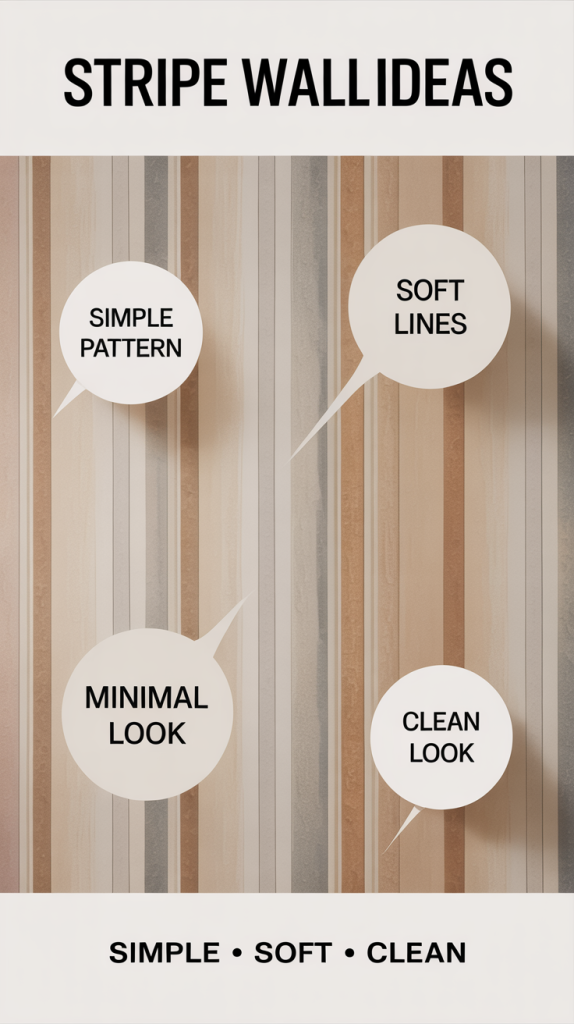
A subtle way to add pattern without going floral.
Use when:
- You want structure
- You don’t want visual clutter
Vertical stripes can also make ceilings feel taller.
21. Tarnished Mirror & Frame Patterns
This adds depth and a slightly dramatic feel, but still fits the vintage theme.
Best for:
- Smaller rooms
- Powder bathrooms
It reflects light visually, making the space feel bigger.
22. Pastel Patchwork (Quilt Look)
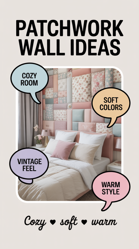
This one leans cozy. It feels layered and soft, almost like fabric on the walls.
Best used in:
- Bedrooms
- Guest rooms
Keep furniture simple so it doesn’t feel too busy.
Quick Reality Check (What Actually Works)
If you’re doing this in a real home—not just Pinterest:
- Pick one dominant style per room
- Use bold patterns on one wall max
- Balance everything with white, wood, and neutral textures
That’s how you keep it from looking cluttered.

Leave a Reply