Category: Uncategorized

  • 15 Vinyl Flooring Bedroom Ideas for Style, Comfort, and Durability

    Vinyl flooring has quickly become one of the most popular bedroom flooring choices for modern homes. It offers the perfect combination of style, comfort, affordability, and durability, making it ideal for homeowners who want beautiful floors without the high cost or maintenance of natural materials. Today’s vinyl flooring can realistically mimic hardwood, marble, stone, and even intricate tile patterns while remaining soft underfoot and easy to clean.

    Whether you’re creating a cozy farmhouse bedroom, a sleek minimalist retreat, or a luxurious modern space, vinyl flooring provides endless design opportunities. From light and airy finishes to dramatic dark wood tones, these ideas can help transform your bedroom into a relaxing and visually stunning sanctuary.

    1. Natural Hardwood-Look Vinyl

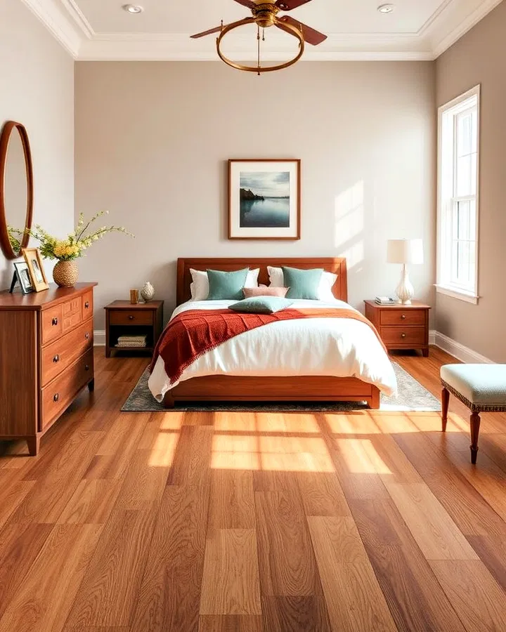
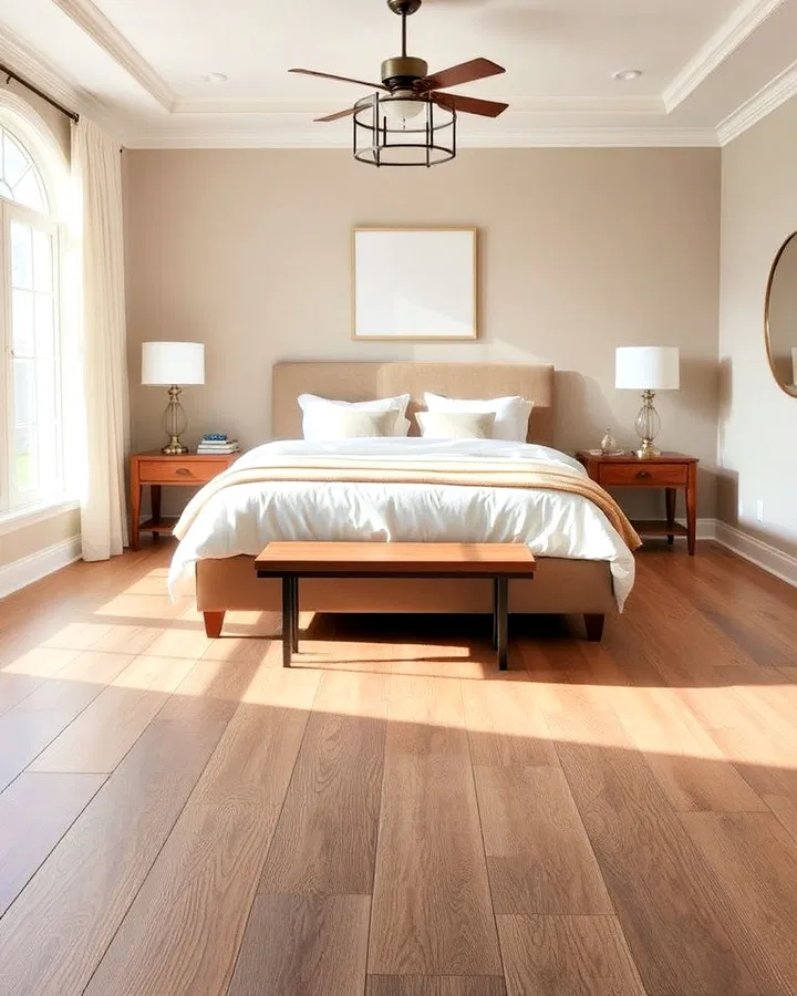
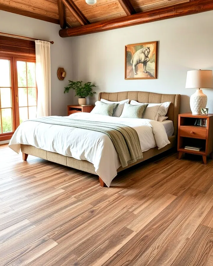
    Natural hardwood-look vinyl flooring remains one of the most timeless options for bedrooms because it combines warmth, elegance, and practicality. Advanced printing technology allows vinyl planks to closely replicate the grain, knots, and texture of real hardwood, giving your room an authentic appearance without the high maintenance requirements.

    Light oak finishes can make smaller bedrooms feel larger and brighter, while darker walnut or chestnut tones create a cozy and luxurious atmosphere. This flooring works beautifully in modern, traditional, Scandinavian, and rustic interiors alike. Since vinyl is resistant to scratches and moisture, it’s also an excellent long-term choice for busy households or pet owners.

    Pair hardwood-look vinyl with layered rugs, upholstered furniture, and soft lighting to create a welcoming and relaxing bedroom retreat.

    2. Soft Gray Vinyl Planks

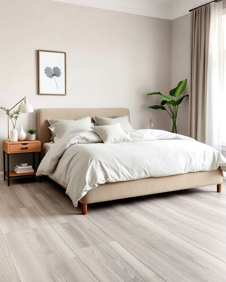
    Gray vinyl flooring offers a calm and sophisticated look that works with nearly every bedroom color palette. Soft gray planks provide a neutral foundation that allows furniture, bedding, and wall décor to stand out without overwhelming the space.

    In contemporary bedrooms, gray flooring creates a sleek and polished atmosphere, especially when paired with black accents, white walls, or minimalist furniture. For a softer and cozier feel, combine gray planks with warm textures like knitted throws, linen bedding, and natural wood furniture.

    One of the biggest advantages of gray vinyl is its versatility. Whether your bedroom style leans modern, industrial, coastal, or farmhouse-inspired, gray flooring can easily adapt while maintaining a clean and elegant appearance.

    3. Herringbone Vinyl Patterns

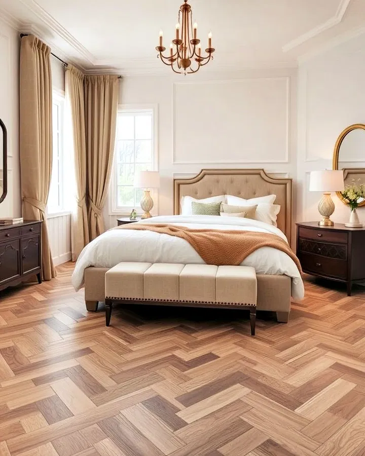
    Herringbone vinyl flooring instantly elevates the visual appeal of a bedroom by introducing movement and sophistication. The distinctive zigzag arrangement creates a luxurious, designer-inspired look that feels both classic and modern.

    This flooring pattern is especially effective in bedrooms that need extra visual depth or character. In smaller spaces, herringbone layouts can make the room appear more expansive by drawing the eye across the floor. Wood-look herringbone planks add warmth, while stone-inspired finishes create a more upscale and refined atmosphere.

    To keep the space balanced, pair herringbone floors with simple furniture and understated décor. The flooring itself becomes a statement feature that adds personality without requiring excessive decoration.

    4. Wide-Plank Vinyl Flooring

    Wide-plank vinyl flooring creates a clean and seamless appearance that makes bedrooms feel more spacious and uncluttered. Because there are fewer seams between planks, the flooring appears smoother and more continuous across the room.

    This style works particularly well in minimalist, modern, and Scandinavian-inspired interiors where simplicity and openness are key design elements. Wide planks in light wood tones create an airy atmosphere, while darker finishes offer warmth and richness.

    Beyond aesthetics, wide-plank vinyl is highly practical. It’s easy to maintain, comfortable underfoot, and durable enough to withstand daily wear while maintaining its polished appearance for years.

    5. Light-Colored Vinyl Flooring

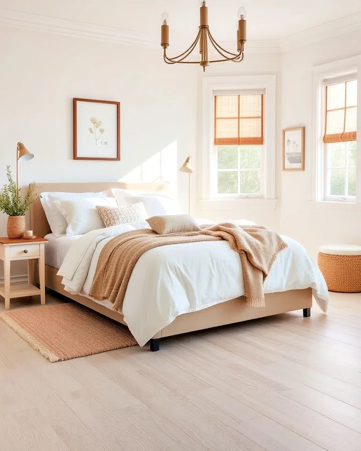
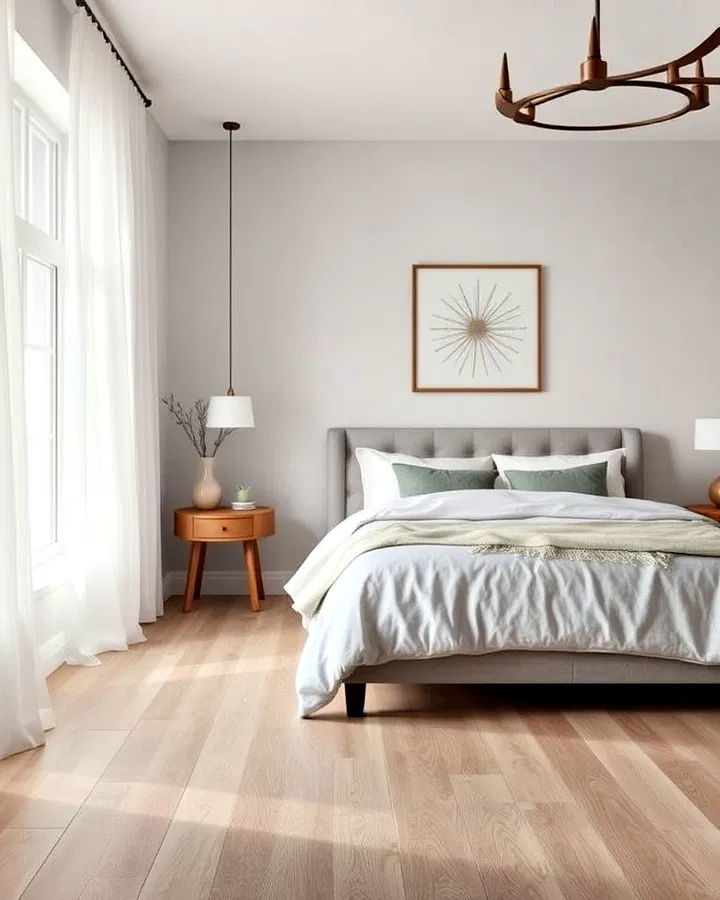
    Light-colored vinyl flooring is ideal for creating a bright, relaxing, and open bedroom environment. Shades such as white oak, pale ash, bleached pine, or soft beige help reflect natural light, making even compact bedrooms feel larger and more inviting.

    This flooring style pairs beautifully with neutral décor, soft pastel tones, and natural textures. It’s especially popular in coastal, bohemian, and Scandinavian interiors because it enhances the sense of calm and simplicity.

    Light vinyl floors also create an excellent backdrop for layering textures like woven rugs, linen curtains, and cozy bedding. The result is a bedroom that feels peaceful, fresh, and effortlessly stylish.

    6. Dark Wood-Look Vinyl

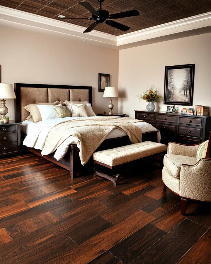
    Dark wood-look vinyl flooring adds drama, richness, and intimacy to a bedroom. Deep tones like espresso, mahogany, or dark walnut instantly create a luxurious and cozy atmosphere that feels elegant and timeless.

    This flooring works best when balanced with lighter walls, soft lighting, and neutral furnishings to prevent the room from feeling overly heavy. Metallic accents, velvet fabrics, and warm lighting can further enhance the upscale appearance.

    Dark vinyl flooring is also practical because it hides minor imperfections and everyday wear more effectively than lighter finishes, making it an attractive choice for high-traffic bedrooms.

    7. Patterned Vinyl Tiles

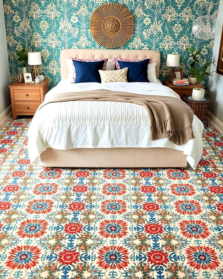
    Patterned vinyl tiles allow homeowners to introduce creativity and personality directly into the bedroom floor design. Whether you choose geometric motifs, floral prints, Moroccan-inspired patterns, or vintage-inspired tiles, patterned vinyl can become the focal point of the entire room.

    This flooring option works exceptionally well in eclectic, bohemian, or artistic interiors where bold design choices are encouraged. It can even reduce the need for large area rugs since the floor itself already adds visual interest.

    Despite their decorative appearance, patterned vinyl tiles remain highly durable, waterproof, and easy to maintain, making them as functional as they are stylish.

    8. Textured Vinyl Flooring

    Textured vinyl flooring adds dimension and realism by mimicking the tactile feel of natural wood or stone. Embossed surfaces create subtle grooves and grain patterns that enhance the authenticity of the flooring while making the bedroom feel warmer and more inviting.

    The added texture also improves slip resistance, which can be beneficial for households with children or elderly family members. Textured vinyl pairs beautifully with rustic, farmhouse, and contemporary bedroom styles because it adds depth without overpowering the décor.

    Layering textured flooring with plush rugs and soft textiles creates a comfortable and relaxing environment perfect for rest and relaxation.

    9. Marble-Look Vinyl Flooring

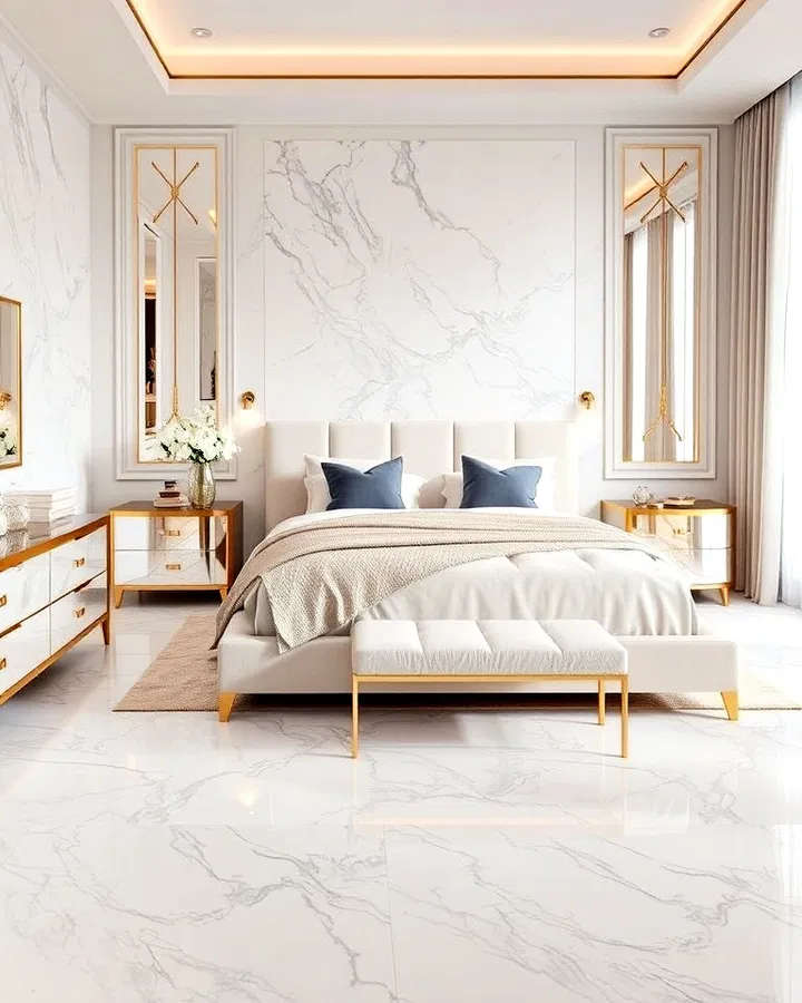
    Marble-look vinyl flooring offers the elegance of natural stone without the expensive installation and maintenance costs associated with real marble. The soft veining and polished appearance create a luxurious atmosphere that instantly elevates the bedroom.

    White marble-look vinyl can make a bedroom feel bright and glamorous, while darker marble finishes add sophistication and drama. Pair this flooring with gold accents, mirrored furniture, and soft neutral palettes for a truly upscale design.

    In addition to its beauty, marble-look vinyl is warmer and softer underfoot than actual stone, making it a more comfortable option for bedrooms.

    10. Eco-Friendly Vinyl Flooring

    Eco-friendly vinyl flooring is a great option for homeowners who want stylish interiors while prioritizing sustainability. Many modern vinyl flooring products are now made using recycled materials and low-VOC manufacturing processes that improve indoor air quality.

    These environmentally conscious options are available in a wide range of finishes, including realistic wood and stone looks, so you don’t have to compromise style for sustainability. Eco-friendly vinyl also tends to be highly durable, reducing the need for frequent replacements and minimizing long-term waste.

    Choosing sustainable flooring can help create a healthier and more environmentally responsible bedroom design.

    11. Beige Vinyl Flooring

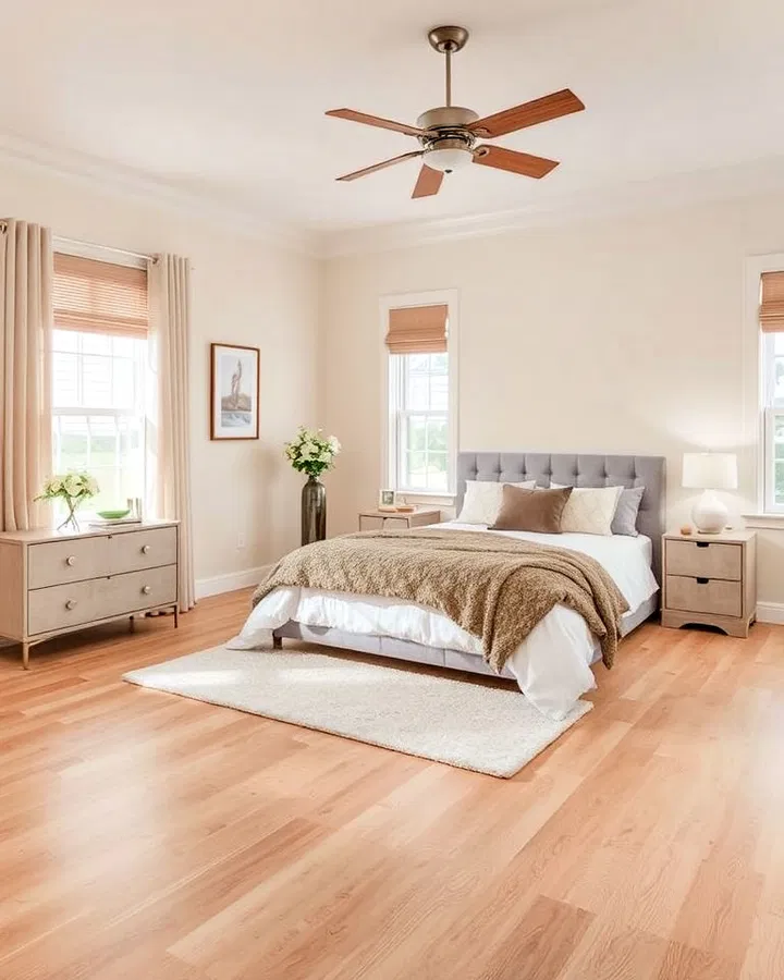
    Warm beige vinyl flooring creates a soft and welcoming foundation that works beautifully in nearly any bedroom style. Beige tones add warmth without overpowering the room, making the space feel cozy, balanced, and relaxing.

    This flooring complements both light and dark furniture, allowing for greater flexibility when decorating. It also pairs well with earthy color palettes, natural textures, and layered neutral tones.

    For homeowners who prefer timeless interiors over trendy designs, beige vinyl flooring offers lasting versatility and understated elegance.

    12. Checkerboard Vinyl Flooring

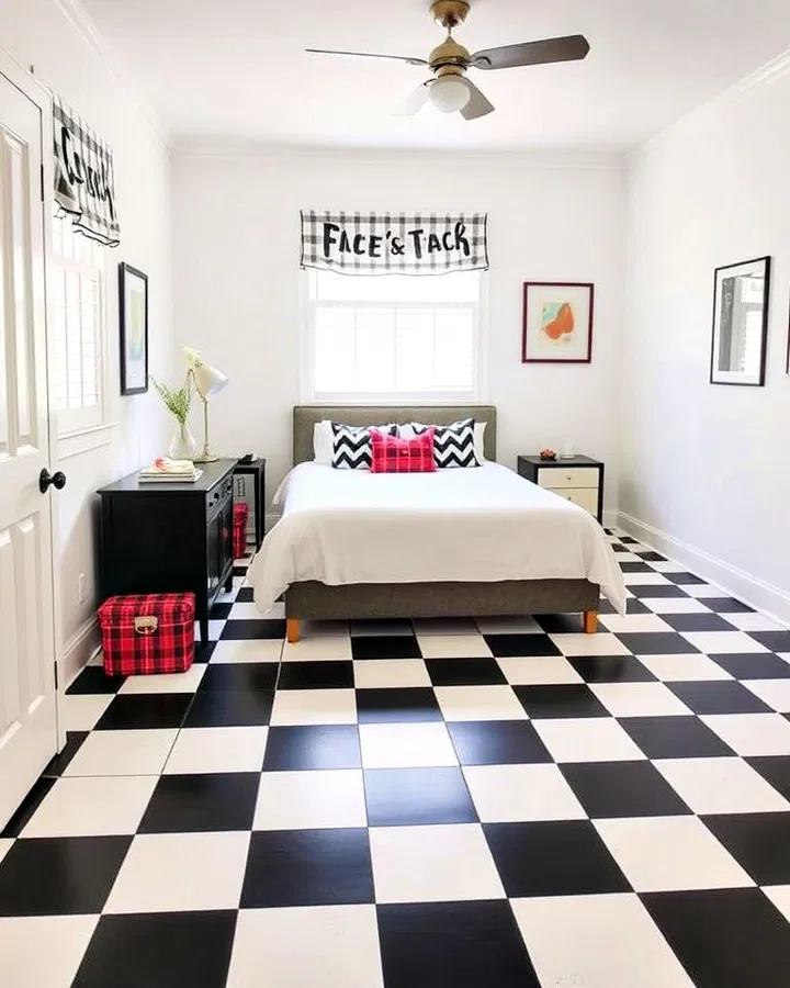
    Checkerboard vinyl flooring introduces bold contrast and vintage-inspired charm into the bedroom. Traditionally featuring black-and-white squares, this flooring style creates a dramatic visual effect that instantly captures attention.

    Modern interpretations may use softer colors like beige and white or gray and charcoal for a subtler appearance. Checkerboard flooring works particularly well in retro, eclectic, or artistic interiors where personality and creativity are emphasized.

    When styled thoughtfully, checkerboard floors can feel playful yet sophisticated, adding a unique design statement to the bedroom.

    13. Mixed-Tone Vinyl Planks

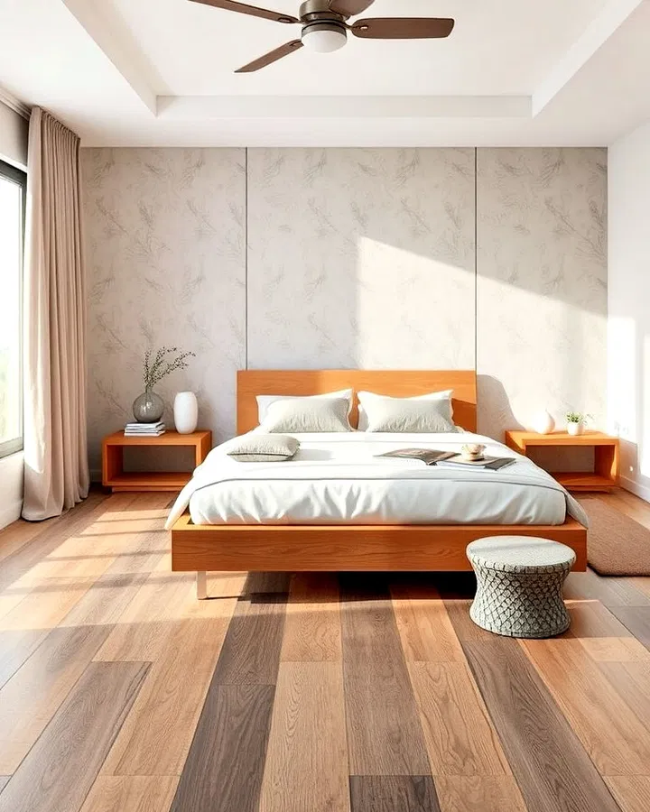
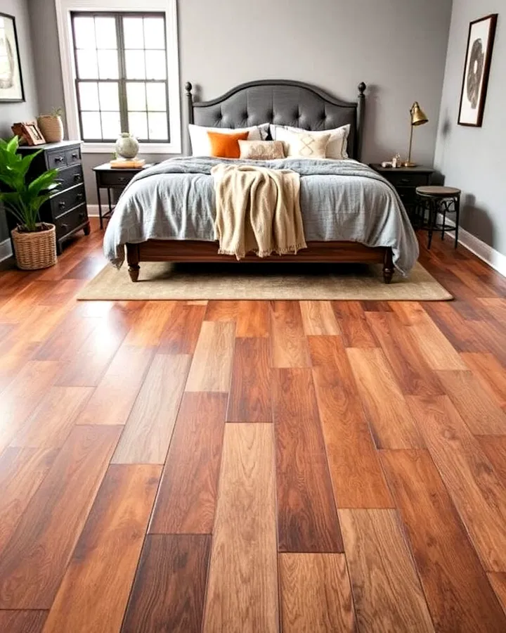
    Mixed-tone vinyl planks create a layered and dynamic appearance by combining multiple wood shades and textures within the same floor design. This variation adds natural depth and character while preventing the flooring from appearing too uniform.

    Mixed-tone flooring works beautifully in rustic, industrial, and transitional bedrooms because it feels organic and visually interesting. It also helps disguise dust, scratches, and daily wear more effectively than single-tone floors.

    Pair mixed-tone planks with textured bedding, vintage furniture, or metal accents to create a cozy and balanced bedroom aesthetic.

    14. Matte Finish Vinyl Flooring

    Matte finish vinyl flooring provides a soft, understated elegance that works particularly well in modern and minimalist bedrooms. Unlike glossy floors that reflect large amounts of light, matte finishes create a smooth and calming appearance.

    This subtle finish helps make the room feel more relaxed and sophisticated while reducing the visibility of smudges, footprints, and scratches. Matte vinyl pairs beautifully with neutral palettes, natural woods, and simple furnishings.

    Its quiet elegance makes it an excellent choice for homeowners who prefer a refined and contemporary bedroom design.

    15. Rustic Reclaimed Wood-Look Vinyl

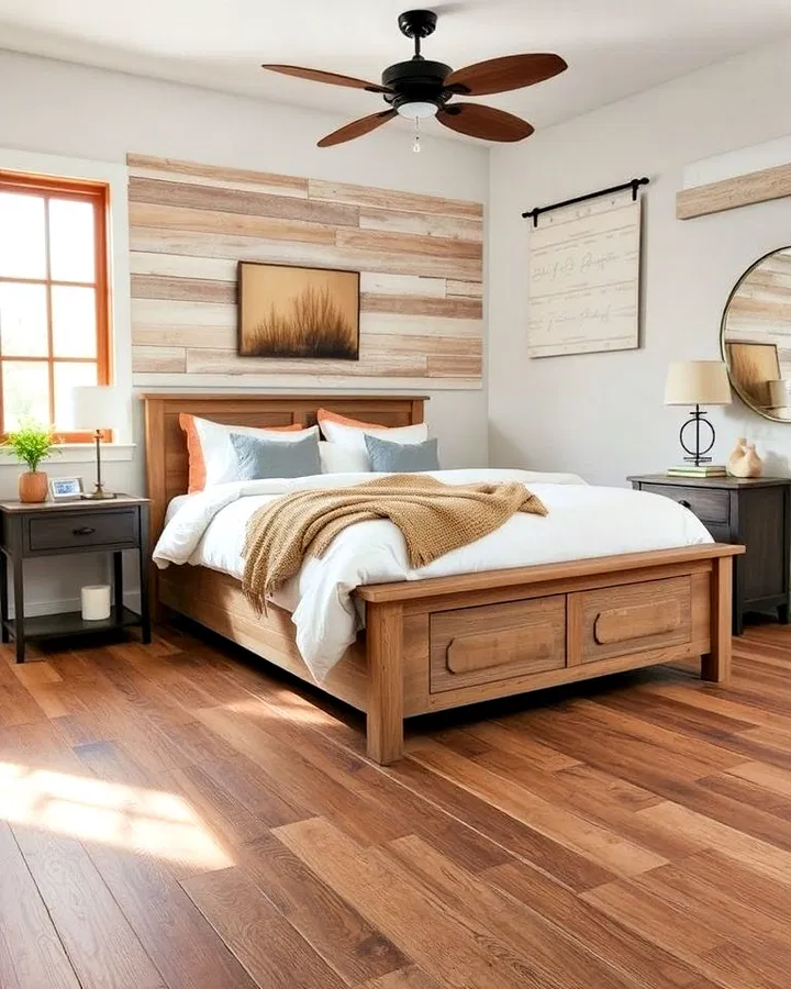
    Rustic reclaimed wood-look vinyl flooring captures the charm of aged timber with distressed textures, weathered finishes, and rich character details. It’s an ideal option for farmhouse, cottage, industrial, or cabin-inspired bedrooms.

    The worn appearance adds warmth and authenticity, creating a comfortable and inviting atmosphere. Pair reclaimed wood-look flooring with cozy blankets, vintage furniture, and earthy tones to enhance the rustic aesthetic.

    Unlike actual reclaimed wood, vinyl offers easy maintenance, moisture resistance, and long-lasting durability, making it a practical solution for everyday living.

    Conclusion

    Vinyl flooring offers endless opportunities to create a stylish, comfortable, and durable bedroom. Whether you prefer the warmth of wood-look planks, the sophistication of marble-inspired finishes, or the bold personality of patterned tiles, there’s a vinyl flooring style to match every design preference.

    Its affordability, low-maintenance nature, and wide range of finishes make vinyl one of the most practical flooring choices for modern bedrooms. By selecting the right texture, tone, and pattern, you can transform your bedroom into a relaxing retreat that feels both functional and beautifully designed.

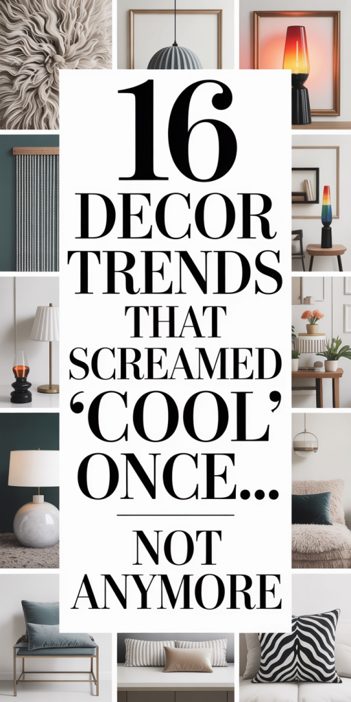
  • 16 Decor Trends That Screamed “Cool” Once… Not Anymore (And What To Do Instead)

    We love design, the mood shifts, the clever hacks, the way a single object can make a room feel new. But trends don’t stay fresh forever. Some looks that once signaled savvy style now read as tired, overexposed, or simply impractical. In this piece we’ll call out 16 decor trends that peaked years ago, explain why they fell from grace, and offer alternatives that feel current, livable, and smart. Whether you’re planning a full refresh or just thinking about swapping a throw pillow, our goal is to help you make choices that age well without sounding like a cautious bore.

    Why Design Trends Fade — Psychology, Overuse, And Context

    Trends are cultural shorthand: they tell other people we’re current, creative, or aspirational. But that shorthand can calcify. Psychologically, novelty triggers dopamine, we love new textures, patterns, and silhouettes, but once the novelty becomes ubiquitous, the signal flips. What once read as innovative becomes background noise. Overuse accelerates that flip: the more a trend is photographed, hashtagged, and mass-produced, the faster it loses its punch. Context matters too. A trend that makes sense in a small modern loft might look ridiculous when copied into a century-old farmhouse without adaptation. Practical issues also play a role: trends that trade durability or comfort for style often wear out emotionally (and literally) sooner. Finally, cultural cycles and changing values (sustainability, authenticity) shift what we find desirable. In short: trends fade because they were either overexposed, mismatched to the contexts people actually live in, or out of step with evolving cultural priorities. Understanding those forces helps us avoid repeating the same mistakes when choosing our next upgrade.

    Bold Patterns And Prints That Topped Out

    Big, loud patterns grabbed attention for a while, and for good reason. They can inject personality and energy into neutral rooms. But several pattern-heavy approaches reached a saturation point where they stopped feeling chic and started feeling gimmicky. The problem wasn’t the patterns per se: it was scale, placement, and the sheer visual noise when everything competed for attention. We’re now more interested in using pattern strategically: a single focal wall, a patterned rug that grounds furniture, or art that echoes motifs subtly. Texture and tone-on-tone patterning let us keep visual interest without exhausting the eye. Instead of trying to out-loud the neighbors, think about rhythm and restraint: give your room moments to breathe between pattern hits, and choose patterns that age because they’re rooted in craft and material rather than novelty.

    Over-The-Top Furniture Moments That Lost Their Edge

    Furniture can be the personality of a room, but when pieces become architectural gestures without regard for proportion or function, they stop being beautiful and start being theater. Overscaled, overly sculptural furniture was thrilling for social-media-friendly rooms, yet in everyday life we found many of those pieces impractical. They dominated small spaces, interfered with circulation, and often sacrificed comfort for Instagram angles. We’re rediscovering the virtue of furniture that balances form with utility: things that look purposeful, feel comfortable, and scale correctly to the room. Investment pieces should be timeless in silhouette and generous in workmanship rather than extreme in size or shape.

    Techy, Futuristic, And Novelty Fads That Dated Fast

    Design that leans too hard into the future can look instantly retro when that future doesn’t arrive. Chrome details, overly glossy finishes, holographic accents, and gimmicky novelty lighting were exciting for a spell, especially in show homes and staged photos. But many of these elements lacked longevity: finishes scratched, novelty materials yellowed, and the look aged out of taste quickly. We now favor tech and modernity when they’re integrated elegantly, hidden charging stations, discreet smart lighting, or minimalist AV solutions, instead of loud futuristic ornament. Embracing technology is sensible: trading lasting aesthetics for fleeting wow-factor is not.

    Open Shelving Overload, Floating TVs, And Invisible Tech

    Open shelving once felt like an antidote to cabinet clutter and too-much built-in storage. But when every wall became a display case, living spaces started to resemble curated shops rather than lived-in homes. Floating TVs and attempts at invisible tech promised a streamlined look, yet they often created awkward sightlines and sacrificed ergonomics for the sake of a clean photo. The current shift is toward intentional display: closed storage for messy needs, open shelves for objects we love and use daily, and TV placements that prioritize viewing comfort. Invisible tech should be subtle, not stealthy to the point of inconvenience. We want smart integration that respects how we live, not just how our rooms look on camera.

    Eco, Natural, And Rustic Looks That Became Predictable

    The turn toward natural materials and rustic finishes was a corrective to cold, manufactured interiors. Timber, stone, rattan, and linen brought human scale and warmth back into rooms. Problem is: when everyone copies the same wood-tone, hammered-metal, and ceramic-ware checklist, the result is predictable rather than authentic. We also noticed surface-level ‘eco’ decorating that prioritized look over lifecycle, thin veneer wood or short-lived woven accents passed off as sustainable. To make natural materials feel current, we focus on provenance and variation: mixed woods in complementary tones, locally made ceramics with imperfections, and textiles woven with intention. Patina and age become assets, not problems, but only when materials are real and cared for. That said, we should avoid nostalgia for its own sake. Rustic needs context: a crisp, modern sofa beside a reclaimed-wood table feels curated: the same table in a sea of distressed finishes feels staged and tired.

    Conclusion, How We Move Forward

    Trends will always cycle, but our job as thoughtful decorators is to choose what endures. We favor materials with substance, proportions that respect a room’s size, and accents that reflect our lives, not just our follower counts. When a trend starts shouting, it’s a good time to listen: ask whether a piece improves daily life, ages gracefully, and fits with the story you want your home to tell. If the answer is yes, keep it. If not, replace it with something quieter, better-made, and more honestly you.

  • 19 Decor Choices That Instantly Date Your Home (And How To Fix Them Fast)

    We’ve all walked into a room and felt it, something about the furnishings screams a moment in time, and not in a nostalgic way. Whether you bought a whole living room set in a rush, clung to a themed collection, or relied on gimmicky textiles, certain decor choices make a house look older than it should. In this guide we’ll call out 19 common mistakes that instantly date a home, explain why they age a space, and give practical, fast fixes you can carry out without a full renovation. Think of this as triage for your interiors: small changes, big impact.

    Oversized Furniture In Small Rooms That Swallows The Space

    One of the quickest ways to make a room feel dated, and cramped, is to fit it with oversized furniture that doesn’t suit its scale. A hulking sofa, extra-wide sectional, or enormous coffee table can make modern open designs look clumsy and make older homes feel like stage sets. We’ve seen this pattern: people buy the largest model that ‘looks comfy’ without considering sightlines, door swings, and traffic flow. The result is a room that feels stuck in time and visually heavy.

    Why it dates a space: Oversized pieces worked in eras when rooms were compartmentalized and scale trends favored massiveness. Today’s interiors trend toward proportion, negative space, and multifunctionality. Huge furniture also highlights awkwardness, limited walking space, blocked windows, and unbalanced sightlines, so the whole room reads as poorly planned rather than stylish.

    Fast fixes we recommend:

    • Edit first: Remove one large piece if possible. A single oversized item often causes the problem: store it or sell it and replace later.
    • Anchor with appropriately scaled pieces: Choose a sofa depth and length that allow 30–36 inches of clearance from coffee table to the seat and at least 18–24 inches between the sofa and wall where feasible.
    • Use low-profile alternatives: Replace a massive sectional with a modular sofa or a loveseat + armchair combo to open sightlines.
    • Visual tricks: Raise the room’s perceived scale with a lighter rug that extends under furniture, hang curtains closer to the ceiling, and pick furniture with exposed legs to create airy sightlines.

    We’ve found that even swapping one massive piece for a slimmer silhouette transforms both flow and perceived age of a room.

    Shiny Synthetic Fabrics And Gimmicky ‘Luxury’ Textiles

    People want luxe without the price, and that’s understandable. The problem comes when shiny synthetics, crinkly faux silks, high-gloss polyester satins, or novelty “velvets” that look plasticky, dominate a room. These fabrics often date interiors because they scream manufactured trends from particular decades (think 1980s glam or early 2000s faux-luxe) rather than timeless comfort.

    Why it dates a space: Synthetics reflect light oddly, show wear quickly, pill, and don’t drape the way natural fibers do. The result is a brittle, overly glossy aesthetic that reads as costume-y. When every pillow, drape, and upholstered chair matches in synthetic sheen, the room can look staged and cheaply “put-together.”

    How to update quickly:

    • Swap high-gloss textiles for textured, natural-feel fabrics like cotton-linen blends, matte velvet, or brushed wool. Even one or two well-placed swaps, throw pillows or a set of curtains, makes a difference.
    • Layer neutrals: Mix matte neutrals with one accent sheen to keep things modern without looking gaudy.
    • Keep durability in mind: If you need performance fabrics, choose modern technical weaves that mimic natural textures instead of shiny synthetics.

    We suggest testing fabric samples at home, hold them in different light and over a few days. It’s a small habit that prevents buying the wrong “luxury” textile that dates a space in months not years.

    Overly Matchy Furniture Sets That Look Staged

    There was a time when buying a coordinated living or bedroom set felt efficient and tasteful. Now, an entire room dressed in matching wood tone, identical upholstery, and replicated accent pieces often reads as showroom-floor or, worse, stuck-in-time. When everything matches exactly, rooms lose depth and the personal layering that makes interiors feel collected and current.

    Why it dates a room: Matching sets flatten a space’s visual interest and signal mass-produced, one-size-fits-all design solutions. The look can tie a room to the style era in which those sets peaked, often decades ago, because it ignores the mix-and-match sensibility that defines contemporary interiors.

    We can fix this fast by mixing textures and finishes. Start with a foundational piece, like your sofa, and introduce contrasting elements: a different wood tone for side tables, an unexpected metal in lighting, or a patterned rug. Keep a common thread (color, scale, or material) to maintain cohesion while breaking the “everything matches” trap.

    H3: Why Entire Matching Sets From Big-Box Stores Age A Room

    Big-box matching sets are engineered for mass appeal: uniform finishes, predictable proportions, and cost-effective construction. Initially they’re convenient and inexpensive. Over time, though, the uniformity betrays the era they were produced in because the proportions and finishes reflect manufacturing trends, not enduring design principles. To modernize, treat at least two pieces from the set as modular, reupholster, paint, or replace legs on a dresser: swap out hardware: or pair with thrifted or bespoke pieces to introduce character. Minor updates, new knobs, trimmed upholstery, or even just a coat of paint, reveal the potential underneath mass-produced uniformity without starting from scratch.

    Too Many Competing Trends At Once (Trend Overload)

    In our desire to keep up, it’s tempting to import several trending aesthetics simultaneously: an industrial light fixture here, a farmhouse shiplap wall there, and a midcentury chair in the corner. Individually, these items can be stylish. Together, without strategy, they become a mishmash that dates the room by pointing to a specific trend moment rather than a carefully curated personal style.

    Why trend overload feels dated: Trends are temporal: when you stack several, the room ends up like a collage of fashions from the same season instead of a layered, intentional space. That’s how interiors start to look like Pinterest snapshots, current for a minute, dated the next.

    Our approach to fix it fast is to establish a dominant language: choose one overarching style (the backbone) and use others as accents. For example, if midcentury modern is the backbone, commit to its proportions and finishes: use industrial touches sparingly as accents, think a metal lamp, not an entire wall of exposed pipe shelving. Prioritize cohesion: color palette and scale can unify disparate pieces quickly.

    When Industrial, Farmhouse, And Midcentury Collide — And How To Simplify

    When industrial, farmhouse, and midcentury collide without a unifying plan, the result is visual noise. We recommend these steps to simplify:

    • Pick one dominant aesthetic: Let it dictate scale and materials. If you choose midcentury, opt for tapered legs and streamlined silhouettes.
    • Use neutral color anchors: A consistent neutral palette (warm greys, soft whites, or muted greens) will let accents breathe.
    • Limit one contrasting material per room: e.g., wood + metal or wood + matte ceramic, too many materials fragment the look.
    • Edit ruthlessly: If a piece doesn’t serve the backbone, store it away for future use or move it to another room.

    Simplifying doesn’t mean stripping personality. It means making deliberate choices so that the room reads as designed, not patched together with last season’s trends.

    Themed Decor, Novelty Collections, And Gimmicks Left Out Year-Round

    We get it, collections and themed decor are fun. A bookshelf full of travel souvenirs, a wall of novelty plates, or a room themed after a hobby can feel personal. But when novelty collections dominate a space year-round, they trap the room in a moment and make it hard for the home to feel timeless.

    Why it dates a space: Themed decor tends to be literal and repetitive. It’s easy for novelty items to read as kitschy once the novelty fades. That conspicuousness signals a fixed era or interest, and unless that theme is genuinely central to the home’s identity (e.g., a dedicated hobby room), it becomes visual clutter.

    Smart, speedy solutions:

    • Rotate collections: Use a single shelf or a display cabinet for rotating items. Swap in new pieces seasonally to keep the room fresh.
    • Curate intentionally: Pair novelty items with neutral, textured backdrops and anchor pieces to avoid overwhelming the eye.
    • Edit for scale: Keep only a few standout pieces in the main living areas: move the rest to a dedicated display or storage.

    We recommend treating themed decor like a fun accessory, noticeable but controlled, so it enhances the home rather than dating it.

    Faded Wallpaper, Busy Borders, And Outdated Wall Treatments

    Wallpaper borders, overly busy floral prints, or faded patterned papers are some of the easiest ways a room announces its age. Even when well-maintained, certain prints and application styles, think wallpapers with small, repetitive florals or border strips, are associated with specific past decades.

    Why walls date a room: Walls are the room’s largest surface and set the backdrop for everything else. An outdated pattern dominates the visual field and tells a story about when that decor choice was fashionable. Fading and peeling make things worse by signaling neglect.

    Fast fixes we often recommend:

    • Remove borders: They’re usually the quickest way to modernize. A clean-painted wall often reads fresher than any replacement wallpaper.
    • Choose modern wall treatments: If you want pattern or texture, opt for a large-scale, contemporary print, grasscloth, or textured paint finishes in neutral tones.
    • Patch and repaint: Well-executed paint can reset the entire space. Select a neutral warm or cool tone depending on your home’s light and furnishings.
    • Accent instead of covering: Use removable wallpaper on a single accent wall or inside a bookshelf for interest without committing the whole room.

    These interventions are cost-effective and have immediate impact, fresh walls make everything else feel more current.

    Neglected Lighting: Harsh Overheads, Wrong Bulbs, And No Layering

    Lighting is the unsung factor that ages rooms. Harsh single overhead fluorescents, mismatched fixtures, and bulbs with the wrong color temperature can make a room feel clinical or stuck in a style era. Without layered lighting, ambient, task, and accent, spaces lack depth and vibrancy.

    Why lighting dates a home: Lighting technology and taste have evolved quickly. Old recessed fluorescents or yellowed ceiling fixtures are visual clues of an earlier period. Bulbs with incorrect color temperatures can make paint, fabrics, and skin tones look off, subtly signaling that something is ‘old’.

    How we fix lighting fast:

    • Replace bulbs first: Swap in warm (2700–3000K) LED bulbs for living areas and warm whites (3000–3500K) in kitchens or workspaces. LEDs are energy-efficient and immediately improve color rendering.
    • Add layers: Introduce floor lamps and table lamps to create pools of light. A lamp next to seating instantly feels cozier and more intentional.
    • Update one fixture at a time: Replace an outdated pendant or chandelier with a contemporary, scaled alternative. Even a modest fixture swap modernizes the space.
    • Use dimmers: Installing dimmers is an inexpensive upgrade that adds flexibility and sophistication.

    Good lighting is like good tailoring, it changes how everything fits and feels. We rarely need a full overhaul: targeted swaps do most of the work.

    Conclusion

    The decorating missteps that date a home aren’t permanent, they’re choices, and choices can be changed. We’ve shown how oversized furniture, shiny synthetics, matchy sets, trend overload, themed gimmicks, tired wall treatments, and neglected lighting each age a space and offered quick, practical fixes. Start small: replace a bulb, swap pillow covers, edit a collection, or repaint a wall. Those modest interventions compound. Before long, the dated elements fade into the background and the home feels refreshed, intentional, and timeless. If you want, we can walk through your room photos and suggest the three highest-impact changes to modernize your space quickly.

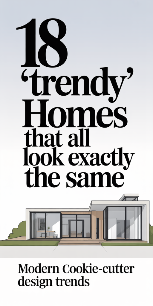
  • 18 “Trendy” Homes That All Look Exactly The Same — Why Every House Feels Like The Same Instagram Post In 2026

    We’ve all scrolled past that perfectly styled living room and felt a small pang of déjà vu: board-and-batten walls, bleached oak floors, a slubby linen sofa, and that arched doorway deliberately placed just off-center. In 2026, the urge to signal “taste” via interiors has been industrialized, trends spread faster, stores coordinate palettes, and photo-first design choices replicate across neighborhoods and feeds. This piece walks through why so many modern homes look interchangeable, breaks down the repeating design elements, lists the 18 trendy features that create that sameness, and, most importantly, shows how we can reclaim individuality without rejecting everything that works. If you’re tired of your home feeling like an Instagram template, read on: we’ll explain the mechanics and give practical fixes that actually fit real life.

    Why Trendy Homes End Up Looking Identical

    Trends aren’t inherently bad: they’re cultural shorthand that help us know what’s considered contemporary. But the pipeline from influencer to interior can compress nuance into a handful of repeatable choices. First, trends gain traction because they photograph well, certain colors, materials, and layouts produce high-contrast, easy-to-edit images. Editors, brands, and algorithms reward those images, amplifying them to millions.

    Second, supply chains have adapted to demand. Once a look proves popular, big-box retailers, lighting manufacturers, and millwork suppliers produce the same finishes at scale. That turns a curated aesthetic into a mass-produced kit: identical faucets, identical tile sizes, identical cabinet profiles. Third, professional designers and DIY decorators often rely on the same sources, trade-only showrooms, the same Instagram accounts, or popular design blogs, so the reference pool is narrow.

    Finally, risk aversion plays a role. Homeowners who want a safe resale profile or renters who want broadly appealing interiors pick familiar choices. The result: thousands of homes with subtle variations of the same seven or eight foundational decisions. When everyone selects from the same small palette of “safe” modern choices, houses begin to echo one another across the country and on our feeds.

    The Seven Core Design Elements That Repeat Across Trendy Homes

    Beneath all the curated photos there’s a surprisingly short list of decisions that determine whether a space looks ‘‘on trend.” We can trace most of the sameness to seven elements: color palette, flooring, cabinetry style, countertop material, lighting fixtures, open-plan layout, and built-in styling cues. Below we unpack the two most visually influential groups, surface choices and spatial layout, because they do the heavy lifting of creating that uniform aesthetic.

    The 18 Trendy Features Grouped By How They Produce Uniformity

    Here are the 18 features we see repeated most often, grouped by the mechanism that creates sameness: color/finish standardization, mass-produced components, photographic staging, and layout templates.

    Color and Finish Standardization

    1. Warm white or greige walls (low-contrast, photograph-friendly neutrals).
    2. Bleached or white oak plank floors with a matte finish.
    3. Matte, warm brass or black hardware in simplified profiles.
    4. Pale quartz or honed stone countertops with subtle veins.

    Mass-Produced Components

    1. Flat-panel or Shaker-style cabinetry in muted tones.
    2. Slim, cylindrical kitchen island pendant clusters (usually two or three).
    3. Slimline matte black faucets and fixtures as the ‘‘accent” metal.
    4. Repeating tile dimensions, subway-size in staggered or herringbone layouts.

    Photographic and Styling Choices

    1. Slubby linen or neutral upholstery with relaxed, low backs.
    2. Bouclé accent chairs or pillows to add ‘‘texture” without color risk.
    3. Minimalist shelving with carefully spaced vignettes (books, ceramics, plants).
    4. Indoor plants that are easy to source and photograph, ficus, fiddle-leaf fig, monstera.

    Layout and Architectural Templates

    1. Open-plan kitchen-living-dining with a central island.
    2. Arched or oversized interior doorways used as focal architectural gestures.
    3. Window treatments kept minimal, sheer linens or nothing, to maximize light.
    4. Built-in storage that’s painted to match the wall for a seamless look.

    Design-for-Resale Choices

    1. Neutral bathrooms with simple hex or penny tile outlines instead of bold patterns.
    2. Multipurpose nooks (office/guest fold-away beds) that read as flexible and marketable.

    Each element by itself is reasonable: together they form a visual language. When most houses rely on the same 18 tokens, the cumulative effect is extreme similarity. We’re not saying these choices are wrong, many improve comfort and marketability, but they do reduce individuality.

    How Social Media, Retail, And Mass Production Accelerate Copycat Design

    Social media acts as both radar and amplifier. Influencers and shelter magazines surface looks that get engagement, while algorithms amplify those posts to similar audiences. When an influencer demonstrates a combination of finishes and it performs well, dozens of accounts mimic the composition, whether consciously or through subconscious emulation. That visual repetition trains consumers to think certain combinations are the ‘‘right” modern look.

    Retailers see opportunity: if a look sells, producing coordinated collections of furniture, lighting, and accessories increases average order value. Big furniture brands now offer entire room bundles that show the same curated outfit, so customers buy the photo-ready version. Manufacturing efficiency further compresses variety: economies of scale favor a few finish choices and a handful of profiles.

    The result is a feedback loop. Trends go viral on social platforms, retailers package them, manufacturers standardize them, and more homes adopt them because they’re affordable and accessible. This loop shortens the time between niche adoption and mainstream ubiquity, what used to take decades now happens in months.

    Practical Ways To Make Your Home Distinct Without Rejecting Trends

    We don’t need to throw out everything fashionable to get a unique home. The trick is to treat trend elements as a foundation and layer personal choices on top. Start small: pick one or two trend items you like and commit to personalizing the rest. For instance, if we love pale oak floors and a neutral sofa, we can introduce contrast through art, window treatments, or custom pieces that aren’t mass-produced.

    Another approach is to prioritize pieces that age well: invest in one or two timeless items (a well-made dining table, a comfortable sofa) and rotate trendier accents. Doing so keeps the home feeling current without looking like a catalog. Finally, use lighting, scale, and placement to assert personality: the same pendant looks different in an industrial loft versus a bunkered coastal cottage based on context.

    Small High-Impact Changes That Instantly Personalize A Space

    Little moves can change perception dramatically. Swap the cabinet hardware for something handcrafted or locally made, metal finish and profile alter the perceived quality and intent of the kitchen. Install a statement rug with irregular patterns or saturated color under a neutral seating group: it grounds the space and resists homogenization.

    We also advise swapping one mass-produced art print for a locally made piece or a framed family photo in a gallery-style arrangement. Window treatments matter: layered curtains with a heavier textured panel behind a sheer add depth that looks intentional rather than staged. Finally, change plant choices to unusual varieties or curated dried arrangements, plants with sculptural shapes read as a deliberate choice, not a trending prop.

    These are high-impact, relatively low-cost swaps that transform a home from template to territory without compromising functionality.

    How To Mix Vintage, Local, Or Custom Pieces Into A Trendy Base

    Vintage and custom pieces introduce provenance, a story, that mass-produced items can’t replicate. Start by identifying focal points where a unique piece will have the most visual weight: the entry console, a dining table, or a living-room coffee table. We recommend blending a bespoke or vintage anchor with modular, trend-forward furniture so the room feels contemporary yet grounded.

    Sourcing advice: local flea markets, estate sales, and small workshops are goldmines for pieces with character. When introducing vintage, be mindful of scale and function. A vintage armoire may need rewiring or refinishing but can become unforgettable when paired with a neutral paneling backdrop. Custom work doesn’t have to be expensive, commissioning a simple bench or shelf in a local woodshop creates a one-of-a-kind silhouette that elevates the entire space.

    When mixing styles, keep a unifying thread, color, material, or texture, to maintain cohesion. If the home’s base is warm neutrals, choose vintage pieces with complementary tones or refinish them to match an accent color. The goal is harmony, not contrast for its own sake.

    What Homebuyers, Renters, And Designers Need To Know About Resale And Trends

    Trends and resale value are often perceived to be at odds, but they don’t have to be. Buyers want move-in-ready homes that feel contemporary, but that doesn’t mean every surface must be trend-forward. Neutral foundations, durable flooring, classic millwork, and well-lit spaces, are still the best long-term investments. Where we recommend caution is in highly personalized or niche finishes: bold wallpaper, bright tile patterns, or extreme color choices may limit appeal.

    For renters who can’t alter major finishes, styling choices are the safest lever. Removable wallpaper, washable rugs, and plug-in lighting allow for personality without permanent changes. Designers working for resale-minded clients should suggest reversible upgrades, paint, hardware swaps, and professionally installed but neutral flooring options.

    Eventually, markets differ. Urban millennials might prize industrial touches and bold color pops, while suburban families may prefer warm neutrals and durable surfaces. We advise matching the degree of trendiness to the expected holding period: the shorter the time you plan to own or rent, the more acceptable following popular trends becomes. If longevity is the goal, prioritize quality, flexibility, and a few unique touches that cost-effectively distinguish the home.

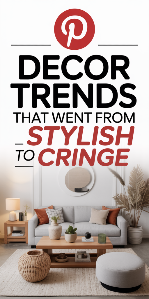
  • 13 Decor Trends That Went From Stylish To Cringe — What To Ditch (And Why) In 2026

    We’ve watched decor trends cycle through our feeds for years, and some styles that once felt fresh now read as dated, oversaturated, or simply impractical. In 2026 we’re more intentional: we want spaces that age well, feel personal, and actually work for our lives. This list of “13 Decor Trends That Went From Stylish To Cringe” isn’t about shaming past choices, many of these looks had strong moments, but about helping us decide what to ditch, what to update, and why. We’ll point to the visual signals that scream “trying too hard,” explain the practical downsides, and offer simple alternatives that deliver a similar vibe without the cringe. Think of this as a gentle declutter of style: keep what genuinely brings you joy, and let go of trends that now make your home look like a dated photo on a carousel.

    All-White Everything And Sterile Minimalism

    All-white interiors promised calm and a gallery-like clarity, and for a while, they delivered. But by 2026, “all-white everything” often reads as sterile, uninviting, and impractical for real households. White surfaces show wear, stains, and fingerprints faster: they require constant upkeep, and they flatten a room’s personality when textures and warmth are missing. The problem isn’t the color itself but the one-note execution. When every surface is white, lighting inconsistencies and small imperfections become glaring, and spaces feel more like a showroom than a home.

    What to ditch: the strict white-on-white rule and shiny pristine surfaces that demand daily caretaking. What to keep: the sense of lightness and calm. Swap in warmer neutrals, creamy ivories, soft taupes, or muted greiges, and introduce tactile materials like woven rugs, natural wood, and matte finishes to restore depth. We also recommend layering in a few curated pops of color through art, plants, or textiles to make the space feel lived-in. A nuanced neutral palette keeps the airy look without the clinical edge, and it’s far more forgiving of life’s little messes.

    Overstaged ‘Instagram’ Rooms And Forced Styling

    We all love a perfectly styled photo, but homes that exist primarily for the camera don’t age well in daily life. Overstaged “Instagram” rooms are built around symmetry, props, and picture-perfect corners that can’t stand up to real use. The telltale signs: identical books lined up by color, decorative objects placed where they’ll never be touched, and coffee tables arranged for snaps rather than living. These setups create anxiety for homeowners, they require maintenance and feel performative rather than functional.

    Instead of staging, aim for authenticity. Keep surfaces useful, not just pretty. Mix curated decor with items that have meaning, travel finds, family photos, or hand-thrown pottery. Let a side table hold a cup now and then: it’s okay if the cushions get indented. For photos, we suggest rotating one or two styled vignettes rather than committing the whole room to a social-media aesthetic. That approach makes your space easier to live in and oddly more stylish, because it signals confidence: you’re designing for life, not likes.

    Shiplap, Farmhouse Plaid, And Country-Style Overkill

    Thanks to the early 2010s farmhouse revival, shiplap and plaid saw a massive comeback. At first, they felt cozy: then they became shorthand for one specific design story. By 2026, excessive shiplap walls, faux barn doors, and every-surface plaid look like a costume rather than a curated aesthetic. The risk with overusing country motifs is that they flatten regional nuance into a single, overexposed cliché.

    If you still love farmhouse warmth, extract the best bits: reclaimed wood accents, simple beadboard, or a single shiplap feature wall placed thoughtfully. Replace predictable plaid with textured fabrics, linen, nubby wool, or subtle checks, that read more contemporary. Consider mixing in modern hardware and cleaner silhouettes so the overall feel remains grounded and fresh. We also encourage avoiding literal “farm” props (windmills, distressed milk cans) unless they’re authentic heirlooms. The goal is to keep the comfort and history of farmhouse style without turning your house into a themed exhibit.

    Open Shelving, Cluttered Countertops, And Decorative Dish Overload

    Open shelving promised effortless display and easy access. In reality, it often becomes a magnet for clutter, mismatched plates, decorative cups we never use, and kitchen counters staged with artisanal objects that collect grease. Open shelves work when curated, but many of us treated them like free advertising space, which led to visual chaos. In the kitchen, cluttered surfaces impede cooking and daily flow: in living areas, they gather dust and make cleaning harder.

    To salvage this, we recommend transitioning to a hybrid approach: keep lower cabinets concealed for function, and reserve a single, well-edited shelf for display. Store everyday dishes behind doors and use closed storage for less photogenic items. When styling open shelving, adopt a three-item rule: group items in odd numbers, limit color range, and vary heights for rhythm. Swap decorative-only dishes for a few beautiful, durable pieces you actually use. That way the shelves feel intentional and useful rather than a styled set-piece that’s impossible to maintain.

    Industrial Pipe Furniture, Raw Concrete, And Faux-Factory Chic

    Industrial chic gave us a refreshing contrast to polished interiors: exposed hardware, metal accents, and raw materials. But trends tip into cliché when the aesthetic becomes literal, pipe shelving that wobbles, faux-rusted finishes, and concrete-look everything. These elements can feel cold and heavy, especially when repeated across a whole home. Faux-factory chic often sacrifices comfort for attitude and can age poorly as finishes chip or look inauthentically distressed.

    Rather than lean on literal industrial props, pull in elements selectively. A reclaimed wood tabletop with simple steel legs reads modern and warm without feeling contrived. Choose real materials over faux finishes, solid wood, honed stone, or brushed metal age better and feel more expensive. If you love the industrial edge, balance it with softer textiles and warm metals to avoid an overly utilitarian vibe. We prefer pieces that nod to industrial roots but are built to last and feel comfortable in everyday life.

    Matchy-Matchy Gallery Walls And Overly Curated Photo Grids

    Gallery walls exploded as an accessible way to personalize spaces, but the “matchy-matchy” photo grids, identical frames, same-sized prints, perfect spacing, can read as staged and emotionless. They strip photographs and art of context and reduce storytelling to a decorative pattern. The problem intensifies when homeowners follow online templates exactly: these arrangements prioritize symmetry over narrative.

    We suggest treating gallery walls like conversations, not spreadsheets. Mix frame styles and sizes, intersperse art with found objects, and leave breathing room. Include a range of scales, one larger focal piece surrounded by a few smaller works feels intentional and dynamic. Don’t be afraid to hang pieces a little lower in living rooms for comfort sightlines, or to swap in new finds over time to keep the wall feeling lived-in. The most compelling galleries show personality and evolution, not perfect alignment.

    Oversized Statement Rugs, Layering Gone Wrong, And Busy Patterns

    Rugs used to anchor rooms: then oversized statement rugs became the headline act. When a rug competes with every other element, the space loses hierarchy and visual rest. Layering rugs can work, but over-layering or mixing too many bold patterns creates noise. Similarly, wild pattern mixes, wallpaper, upholstery, and drapery all vying for attention, leave the eye nowhere to rest. In practice, this leads to fatigue rather than interest.

    Our fix: prioritize one strong patterned element and keep the rest of the room grounded. If you love a big patterned rug, let furniture be more subdued and choose simpler window treatments. For layered rugs, pick compatible color families and vary textures rather than pattern intensity. When introducing patterns, make sure at least one element is a neutral or low-contrast field to balance the composition. That small restraint makes the room feel confident rather than conflicted.

    Trendy Materials That Aged Poorly — What To Replace First

    Materials trend and then tell a story about their era. In recent years, certain finishes and surfaces have shown their age quickly, peeling, staining, or just becoming visually overplayed. Replacing the worst offenders first improves both function and resale appeal. Here’s what we recommend swapping out early, with quick wins and longer-term investments detailed below.

    Terrazzo’s Tired Comeback

    Terrazzo made a high-profile comeback across countertops, floors, and accessories. The material itself is timeless, but the trend peaked in many sterile, high-contrast iterations that now feel ubiquitous. The issue isn’t terrazzo’s composition but its overuse in small-format applications and faux-printed versions that look cheap. In kitchens, low-quality terrazzo-effect surfaces can stain and chip: in bathrooms, busy speckled patterns sometimes read muddy in low light.

    If you have a courtroom-sized terrazzo slab, keep it, real terrazzo is durable and classic. But for mass-produced terrazzo-look laminates or tiny speckled tiles, consider replacing them with subtler stone, a honed quartz, or a solid surface that complements other materials. If you like terrazzo’s visual interest, use it as an accent, backsplashes, a fireplace surround, or a single tabletop, rather than a house-wide motif. That preserves the charm without making your home look dated by association.

    Velvet Everywhere And The Overused Luxe Texture

    Velvet was the texture of the moment, rich, tactile, and camera-ready. But when every sofa, pillow, and ottoman was covered in crushed velvet, the effect became predictable and, frankly, a little heavy. Velvet’s tendency to show wear (marks from pets, pressure from cushions, sheen variation) exposes itself quickly in active households. It’s a wonderful material in moderation, but the “velvet everything” phase now reads theatrical and high-maintenance.

    We recommend keeping velvet in smaller doses or opting for brushed cottons and performance velvets that hold up better. Consider velvet pillows, a statement chair, or a bench at the foot of the bed rather than cladding your main sofa in it. If you already own large velvet pieces and they’re in great condition, balance them with linen, leather, or matte-woven textiles to reduce the overtly luxe effect. Small swaps, like swapping a velvet cushion for a textured wool one, instantly modernize the look without losing comfort.

  • 16 Design Choices That Are Quietly Falling Off Hard — What To Stop Using In 2026

    Design trends don’t die overnight, they fade, then stumble, then become liabilities. As designers and product teams we need to be ruthless about what we keep. In 2026, certain design choices are no longer just dated: they actively harm conversion, accessibility, and brand credibility. In this text we’ll walk through 16 specific patterns, styles, and habits to stop using now. For each item we explain why it’s losing ground, what problems it causes, and practical alternatives you can adopt today. Think of this as a surgical checklist: remove the bad, keep what works, and free up space for smarter design decisions.

    Why These Design Choices Are Losing Ground Now

    Three forces are reshaping what we consider good design: user expectations, performance constraints, and regulation. First, users are savvier, they expect fast, clear, and respectful experiences. Anything that sacrifices clarity for novelty (weird layouts, cryptic microcopy) now costs us trust and time-on-task. Second, performance matters more than ever. Mobile-first browsing, stricter Core Web Vitals, and AI-driven content pipelines mean heavy visuals and complex scripts are liabilities. Third, accessibility and legal compliance are no longer optional: weak contrast, tiny touch targets, or inaccessible navigation can cause real harm, to users and to the business.

    We also see a cultural shift: audiences want authenticity and clarity. Overly stylized assets, ultra-generic hero photos, loud gradients, and faux-3D skeuomorphism, read as templated rather than crafted. While trends still matter, the winners in 2026 are design choices that scale: fast, usable, and inclusive. So when we say “stop using” a pattern in this guide, it’s because that pattern tends to break one of those three pillars. We’ll explain alternatives that retain aesthetic interest without trading away performance or accessibility.

    Layout Patterns To Retire: Fixed-Width Templates, Full-Width Carousels, And Dense Grid Walls

    Fixed-width templates were once a safe default: predictable gutters, centered content, neat columns. But as screen sizes diversify, foldables, ultra-wide monitors, and split-screen multitasking, rigid fixed-width layouts feel cramped on large displays and under-optimized on small ones. They also force awkward spacing decisions that can harm readability. Instead, we should embrace fluid layouts with responsive breakpoints and container queries so content adapts gracefully.

    Full-width carousels are another victim. They promise “visual drama” but deliver low interaction rates, accessibility problems, and poor mobile performance. Users often ignore carousels or get confused by auto-rotation: they’re frequently the heaviest elements on a page. We recommend replacing carousels with a meaningful hero (single message), progressive disclosure, or a simple, accessible carousel alternative with clear controls and paused autoplay.

    Finally, dense grid walls, pages that overwhelm users with dozens of equally emphasized cards, are falling out of favor. They create decision fatigue and bury hierarchy. We prefer curated lists, prioritized content tiers, and progressive reveal. A mix of larger hero cards plus smaller supporting cards drives action and guides the eye.

    In short: move from rigid, decorative layouts to adaptable, hierarchy-driven patterns that respect user intent and device constraints.

    Typography Moves To Ditch: Heavy All-Caps, Ultra-Condensed Sans, And Tiny Body Sizes

    Typography communicates tone and credibility instantly. Some once-popular typographic choices now undermine readability and accessibility. Heavy all-caps headlines can feel shouty and are harder to scan, especially for people with dyslexia or visual impairments. Reserve all-caps for short labels or decorative accents: for headlines use mixed case with strong weight and spacing.

    Ultra-condensed sans-serifs look modern on posters but collapse letterforms at small sizes and on lower-density screens. They reduce legibility, especially for long headlines and non-native readers. Choosing typefaces with generous open counters and moderate widths improves comprehension and reduces eye strain. Variable fonts give us the best of both worlds: we can use tighter styles for display and wider cuts for body text without loading multiple font families.

    Tiny body sizes (12px and below) remain a major mistake. On mobile, small text forces pinch-zooming and increases bounce. Accessibility guidance suggests 16px base for body copy on web: we often bump to 18px for long-form content and consider line-length and leading. Good typography uses scale systems, clear hierarchies and consistent rhythm, not novelty sizing.

    Practical swaps: adopt a readable base size, use responsive type scales, prefer typefaces designed for screen, and avoid condensed display fonts for primary content. That keeps copy accessible and the visual voice confident.

    Color And Visual Style Shifts: Overly Saturated Palettes, Heavy Gradients, And Excessive Neumorphism

    Color trends swing fast. A few years ago we embraced neon palettes and deep synthetic gradients: in 2026 those extremes often work against us. Overly saturated palettes can fatigue users, reduce perceived trustworthiness, and make accessibility (sufficient contrast) harder to achieve. We recommend refining palettes to purposeful primary colors with accessible contrast pairs and controlled accent tones.

    Heavy gradients used to signify modernity, now they can feel dated when they’re loud or inconsistent. Subtle, context-aware gradients or tonal shifts work better: use them to add depth where needed, not as an all-over texture. Similarly, excessive neumorphism, soft shadows and raised surfaces mimicking tangible UI, is falling out of favor because it compromises contrast and clarity. It looks pretty in mockups but often fails when implemented across devices and interferes with recognizability of controls.

    A growing alternative is restrained depth: clear elevation systems, intentional shadows, and tactile highlights that prioritize affordance and contrast. Also consider system-aware palettes (light/dark mode pairs) and color systems that adapt to branding while maintaining legibility. Finally, make accessibility checks part of palette design: use tools or automated checks to guarantee contrast, colorblind-safe combinations, and semantic token mapping.

    In short, less theatrical color and more purposeful systems will win in 2026.

    Imagery And Illustration That Feel Stale: Stocky Headshots, Generic Hero Photos, And Overused Vector Packs

    Generic imagery makes brands look interchangeable. Stocky headshots, smiling people posed against white backgrounds, were a go-to for a decade, but they now read as templated and insincere. Generic hero photos (people pointing at screens, celebratory hands) and overused vector packs create visual sameness across industries. Users notice: they may not name it, but they feel a lack of originality.

    We suggest three practical shifts. First, prioritize contextual imagery: real customers, behind-the-scenes candid shots, or product-in-context photos that tell specific stories. Second, avoid one-size-fits-all hero photos: choose single-image heroes with clear narrative intent or use animated micro-interactions for dynamism. Third, for illustrations, move away from ubiquitous vector packs toward bespoke art direction: modify stock vectors, commission spot illustrations, or adopt a limited system of shapes and colors that reinforce brand personality without copying the same library everyone else uses.

    Also consider performance: large, high-resolution images and unoptimized SVGs slow pages. Use responsive image techniques, modern formats (AVIF/WebP), and lazy-loading with meaningful placeholders. Finally, invest in alt text and descriptive captions to improve accessibility and SEO. Authentic imagery builds trust: generic imagery erodes it.

    Interaction And Navigation Habits To Rethink: Hidden Menus, Long Mega-Menus, And Endless Infinite Scroll

    Interaction patterns that trade discoverability for minimalism are under scrutiny. Hidden menus (hamburgers for desktop, tucked-away controls) look clean but reduce discoverability, especially for new or infrequent users. Navigation is a product feature: burying primary actions behind terse icons or hidden trays increases task time and frustrates people. We recommend making key actions explicit and using progressive disclosure for secondary items.

    Long mega-menus, huge dropdowns with dozens of links, were meant to surface options but often create choice paralysis. They can be overwhelming on touch devices and are difficult to make accessible. Instead, we prefer curated primary navigation with contextual in-page faceting or flyouts that reveal only closely related items.

    Infinite scroll is another fading pattern. For social feeds it still makes sense, but for product catalogs, articles, and search results it harms findability and discoverability. Users want to know their progress, land on distinct pages, and share precise URLs. Consider paginated or “Load more” patterns with meaningful states and clear anchors.

    Finally, micro-interactions should communicate state changes clearly and accessibly. Use motion sparingly and always provide controls to reduce motion for users who prefer it. Rethinking these interaction habits increases clarity and reduces cognitive load.

    Microcopy, Icons, And Accessibility Missteps: Cryptic CTAs, Decorative-Only Icons, And Small Touch Targets

    Microcopy is tiny but consequential. Cryptic CTAs like “Learn More” or vague button labels slow conversions because they don’t explain the outcome. We should write action-oriented microcopy: “Download spec (PDF)”, “Start 14-day trial, no card”, or “Compare plans”, language that sets expectations and reduces friction.

    Icons are useful but often misused as decoration. Decorative-only icons without text alternatives or labels create accessibility gaps: screen reader users miss meaning and sighted users may misinterpret icons if they’re nonstandard. Pair icons with concise labels, use standard glyphs for common actions, and ensure SVGs have appropriate aria-hidden or title attributes.

    Small touch targets remain a persistent problem. Buttons and interactive controls under 44–48px are hard to tap, especially for users with motor impairments. We should adopt minimum target sizes, generous spacing, and clear active states. Also, use focus-visible outlines for keyboard users and don’t remove them for aesthetics.

    Accessibility isn’t a checklist, it’s an experience mindset. Regular audits, inclusive testing with assistive tech, and writing descriptive alt text and labels are essential. Microcopy and iconography that prioritize clarity directly improve usability and conversions.

    Conclusion

    Trends change, but good design principles persist: clarity, performance, and respect for users. In 2026 we’ll see continued pruning of flashy but fragile choices, fixed-width layouts, heavy carousels, saturated palettes, and generic imagery, in favor of adaptable, accessible systems. As teams we should audit existing products against these 16 items, prioritize fixes that unblock accessibility and performance wins, and keep design systems lean and purpose-driven. Stopping the bad patterns isn’t about being conservative: it’s about freeing creative energy to solve real user problems. Let’s remove what’s failing, measure the impact, and make space for design that truly helps people.

  • 17 Living Room Mistakes That Make Your Home Look Cheap (And How To Fix Them)

    We walk into living rooms every day and instantly get a feel for whether a space was thoughtfully designed or thrown together. Often, it isn’t one glaring issue but a handful of small mistakes that, combined, make a room read as inexpensive. In this guide we’ll point out the 17 most common living room mistakes that make your home look cheap, and give practical, budget-savvy fixes you can carry out without a full remodel. We’ll cover furniture, textiles, lighting, layout, color, decor, and upkeep so you can prioritize the changes that will have the biggest impact. Read on and you’ll learn how to make even modest investments read luxurious.

    Furniture Mistakes: Wrong Scale, Cheap Materials, And Overcrowding (Mistakes 1–3)

    Mistake 1, Wrong scale: Furniture that’s too small or too large relative to the room kills cohesion. A too-small sofa on a large wall looks like an afterthought: an oversized sectional in a compact living room creates tension and blocks sightlines. Scale affects perceived value because proportion signals that a space was planned. Fix: Measure first. We recommend dividing the room into functional zones and choosing a sofa that fills about two-thirds of the main wall it sits against. Use painter’s tape to map out the footprint of big pieces before buying.

    Mistake 2, Cheap materials: Particleboard, low-density foam cushions, and glossy hollow-core finishes age poorly and photograph as low-end. Instead of chasing a brand name, focus on structural elements: solid hardwood frames (or metal for modern styles), eight-way hand-tied or sinuous springs, and higher-density foam wrapped in down or down-alternative for comfort and longevity. Fix: If new investment isn’t possible, reupholster a well-built frame or swap out cushions with higher-density inserts. Even replacing sofa legs with solid wood or metal can elevate the look.

    Mistake 3, Overcrowding: We often assume more furniture equals more comfort, but cluttered layouts feel chaotic and cheap. Too many small tables, mismatched chairs, and stacks of accessories make the room look like a hand-me-down collection rather than a curated space. Fix: Edit ruthlessly. Keep only pieces that serve a purpose or contribute to balance. Aim for negative space, areas where the eye can rest. Replace multiples of small items with one well-chosen statement piece (a console table, a single accent chair, or a sculptural floor lamp) to create a sense of intention.

    Textile And Rug Mistakes: Thin Fabrics, Wrong Rug Size, And Mismatched Textures (Mistakes 4–6)

    Mistake 4, Thin, flimsy fabrics: Lightweight polyester throws, cheap drapery panels, and thin cushion covers look shiny, dated, and fragile. They also wear quickly. Fix: Opt for mid-weight to heavyweight fabrics with texture, linen blends, cotton-linen, wool, and performance boucle. For curtains, choose fully lined panels with a substantial header and hang them high and wide to create height and drama.

    Mistake 5, Wrong rug size: A too-small rug is one of the quickest ways to make a room look cheap. Small rugs that float under a coffee table with all furniture sitting off the rug fragment the space. Fix: Choose a rug large enough that at least the front legs of the sofa and chairs sit on it: ideally, all major seating pieces should touch the rug. If you can’t fit a large rug, layer a smaller, higher-quality rug over a neutral jute or sisal to add texture and scale.

    Mistake 6, Mismatched textures: A room with everything slick or everything flat lacks depth. When all textiles are the same sheen or weight, think shiny velvet sofa with glossy leather poufs and polyester throws, the eye gets bored or senses cheapness. Fix: Build contrast by mixing textures: pair matte woven rugs with a soft nubby throw, smooth leather with raw wood, and crisp linen with boucle pillows. This layered approach feels intentional and gives a small space the richness usually reserved for higher budgets.

    Lighting Mistakes: Flat Overhead Light And Inconsistent Bulbs (Mistakes 7–8)

    Mistake 7, Relying on one flat overhead light: A single ceiling fixture produces flat, unflattering light and highlights every imperfection. Rooms that rely solely on overhead lighting appear utilitarian and cheap. Fix: Layer lighting in three zones, ambient, task, and accent. Combine a central fixture with floor lamps, table lamps, and directional spots for art or architectural features. Dimmers are transformational: they instantly make a space feel more sophisticated because you control mood.

    Mistake 8, Inconsistent bulbs and color temperatures: Mixing warm and cool bulbs creates a fractured look that reads as sloppy. Cheap bulbs also produce poor color rendering (low CRI), which dulls textiles and skin tones. Fix: Standardize color temperature across each zone, 2700K–3000K for living rooms, and choose bulbs with CRI 90+ where possible. We’ll often use slightly warmer bulbs for ambient fixtures and a neutral warm for task lighting to keep eyes comfortable. Swapping mismatched bulbs is inexpensive and has an outsized impact on perceived quality.

    Layout And Scale Mistakes: Poor Traffic Flow, Floating Furniture, And TV-First Arrangements (Mistakes 9–11)

    Mistake 9, Poor traffic flow: Blocking natural pathways with furniture turns a living room into an obstacle course. People subconsciously notice when they have to squeeze around pieces and that friction cheapens the experience. Fix: Create clear circulation paths, leave at least 30–36 inches for main walkways and 24 inches for secondary routes. Arrange seating to help conversation rather than forcing everyone to face a corner or the TV.

    Mistake 10, Floating furniture with no anchor: When sofas and chairs float in the middle of a room without visual anchors, the space can feel unfinished. Mistake is common in open-plan layouts where pieces are placed without regard for boundaries. Fix: Anchor seating with a properly sized rug (see Mistake 5) or with a console behind the sofa. Coffee tables and ottomans also help ground the arrangement: choose pieces with presence and balanced proportions.

    Mistake 11, TV-first arrangements: Designing the room solely around the TV often sacrifices scale, balance, and focal quality. A TV-dominant room usually means small seating choices, low-profile consoles, and little attention to symmetry. Fix: Treat the TV like one of several focal points. If it must be the center, incorporate built-ins or flanking shelving to integrate it into a composed vignette. Alternatively, arrange seating first for conversation and comfort, and make sure the TV is on a swivel mount or placed where it doesn’t dictate the entire layout.

    Color, Pattern, And Finish Mistakes: Too Many Competing Patterns, Wrong Paint Choices, And Distracting Finishes (Mistakes 12–14)

    Mistake 12, Too many competing patterns: Layering patterns can be sophisticated, but when everything fights for attention, the room feels chaotic and cheap. Mixing scale, rhythm, and color is an art. Fix: Limit yourself to a dominant pattern and one or two supporting patterns. Think in terms of scale: pair a large-scale pattern with a small-scale one and a neutral textured ground. Repeat a unifying color across patterns to harmonize the mix.

    Mistake 13, Wrong paint choices: High-gloss or chalky paint in the wrong place reveals flaws and looks inexpensive. Extremely bright or dated hues applied to large expanses without balancing elements can age a room quickly. Fix: Choose paints with the right sheen, matte or low-sheen (eggshell) on walls to hide imperfections: satin or semi-gloss for trim and high-touch surfaces. Use color to create depth: a slightly darker or saturated accent wall behind a sofa can make the room read as designed rather than accidental.

    Mistake 14, Distracting finishes and overly matchy metals: Everything shiny and identical (matching brass, chrome, and gold across knobs, lamps, and frames) can look like a catalog sample rather than a layered space. Conversely, random clashing finishes are also jarring. Fix: Pick two metal tones and carry them through the room for cohesion, one warm (antique brass) and one cool (matte black or brushed nickel) work well. Matte finishes and subtle patinas feel more expensive than high-shine alternatives.

    Decor And Accessory Mistakes: Overdecorating, Tiny Art, And Cheap-Looking Hardware (Mistakes 15–16)

    Mistake 15, Overdecorating with small pieces: A thousand tiny accessories never add up to sophistication. Over-accessorizing creates visual noise and makes the room look cluttered and low-budget. Fix: Curate with restraint. We aim for clusters of three to five objects arranged with varying heights and materials on a console or coffee table. Larger, fewer pieces make more impact: a sculptural vase, a stack of well-chosen books, or a single large basket instead of many small trinkets.

    Mistake 16, Tiny art and cheap-looking hardware: Art that’s too small for the wall reads like an afterthought: cheap frames, plastic-looking knobs, and flimsy curtain rods signal low quality even if everything else is decent. Fix: Scale art to the wall, large-scale pieces or well-composed galleries make walls feel intentional. For hardware, choose solid, tactile pieces in materials that age well. Upgrading knobs, pulls, and curtain rods is a relatively low-cost update that instantly elevates cabinets, doors, and windows. We often swap out plastic-looking pieces for mid-priced metal options and see rooms gain instant polish.

    Neglect And Upkeep Mistake: Failing To Maintain, Clean, Or Update (Mistake 17)

    Mistake 17, Failing to maintain, clean, or update: Even the best-designed room will read cheap if cushions are flattened, fabrics stained, or finishes scuffed. Small signs of neglect, sun-faded fabric, wobbling furniture, or outdated electronics, tell a story of carelessness that undermines any design effort. Fix: Establish seasonal maintenance routines. Rotate cushions to avoid uneven wear, have upholstery professionally cleaned when needed, touch up scuffed wood with markers or wax sticks matched to the finish, and replace broken or worn hardware promptly. Updating textiles (throws, pillows) and swapping a few accessories seasonally keeps the room feeling fresh without big expense. Regular maintenance is the highest-return investment for making a home look cared-for and, by extension, more expensive.

    Conclusion

    Making a living room look more expensive rarely requires a total overhaul. By addressing scale, materials, lighting, layout, color, accessories, and upkeep, we can lift the overall impression dramatically. Start with the high-impact, low-cost changes, right-sized rug, consistent lighting, upgraded bulbs, and edited accessories, then phase in bigger investments like reupholstery or quality textiles. Thoughtful editing, a few strategic swaps, and regular care will make your living room feel intentional, comfortable, and much more refined.

  • 20 Design Choices That Instantly Kill Any Room (And What To Do Instead)

    We’ve all walked into a room that felt off the moment we stepped through the door, claustrophobic, chaotic, or just lifeless. Often it isn’t the size or the budget but a handful of design choices that sabotage the space. In this guide we’ll identify 20 common mistakes that kill a room’s energy and offer practical alternatives you can apply today. Whether you’re staging to sell, refreshing a rental, or renovating, these fixes are straightforward, cost-effective, and rooted in how people actually move through and experience rooms. Read on, we’ll help you spot the problem and show you exactly what to do instead.

    Scale And Proportion Mistakes Furniture That’s Too Big Or Too Small

    Scale and proportion are the invisible rules that make a room feel intentional or accidental. When furniture is too large for a space, it swallows circulation and makes everything feel cramped. Conversely, pieces that are too small, tiny sofas, narrow rugs, petite tables, leave negative space that reads as underfurnished and awkward. We see this most often in living rooms where a massive sectional crowds a small apartment or a dainty sofa drowns in a large formal room.

    What to do instead: measure, measure, measure. Start with the room’s clearances, leave at least 18–24 inches between a coffee table and a sofa and 30–36 inches for primary traffic paths. Choose furniture that relates to the architecture: higher ceilings can handle taller-backed seating: low ceilings benefit from lower-profile pieces. Use rugs to define areas: a rug that’s too small breaks visual flow. When in doubt, scale up rather than down if the room allows: larger, simple shapes often feel more grounded than many tiny items. Finally, arrange seating to encourage conversation, group pieces so there’s an implied center. That single shift in proportion transforms awkward into intentional.

    Blocking Sight Lines And Traffic Flow With Poor Layouts

    Bad layouts kill a room faster than bad paint. We often prioritize symmetry or focal points and forget how people actually move through spaces. Placing furniture to block sight lines, like a tall bookcase in front of a window or a sofa perpendicular to the main path, creates visual and physical friction. Likewise, cluttered arrangements that force detours or pinch points make a room feel smaller and frustrating to use.

    What to do instead: map the movement. Stand at each door and imagine walking in, what should be visible and what should be hidden? Aim for clear sight lines to windows and focal points: position seating so people can enter a conversation without squeezing past. Use floating furniture (pulled away from walls) to create purposeful paths and zones. Keep a minimum of 30–36 inches for main walkways and 24–30 inches for secondary routes. If a piece blocks a natural path, consider rotating it, switching it to another wall, or replacing it with a slimmer alternative. Finally, embrace negative space, an uncluttered path signals an organized, breathable room.

    Single Overhead Light Or Harsh Lighting That Flattens Space

    Relying on one central ceiling fixture is a classic mistake that makes rooms look flat and uninviting. A single overhead light often casts harsh shadows, creates glare, and removes depth. It’s especially damaging in rooms with architectural details or layered surfaces: instead of accentuating features, the light washes everything out.

    What to do instead: build layers. We recommend a three-layer approach, ambient, task, and accent lighting, to add depth and flexibility. Ambient lighting provides general illumination: task lighting focuses on activities like reading or cooking: accent lighting highlights textures, art, or architectural features. Mix ceiling fixtures with floor lamps, table lamps, and wall-mounted lights to create pockets of light. Dimmer switches are inexpensive investments that let us tune the mood. Position fixtures to avoid glare on screens and mirrors, and use adjustable sources where possible to refine angles and emphasis. Thoughtful layering instantly makes a room look curated and comfortable.

    Wrong Bulb Temperature And Inconsistent Lighting Layers

    Bulb choice is the unsung design killer. We often pick bulbs for brightness alone and forget about color temperature. Mixing cool, bluish bulbs with warm, yellow ones creates a dissonant, patchy look that undermines cohesion. Too-cool light can feel clinical, while overly warm light muddies colors and flattens texture.

    What to do instead: get the color temperature right and be consistent. For living rooms and bedrooms aim for 2700K–3000K (warm white) to foster relaxation and flattering skin tones. Kitchens and work areas benefit from 3000K–3500K for clarity without harshness. Use consistent temperatures across fixtures within the same zone: if you want a warmer reading lamp, make sure surrounding lights harmonize. Pay attention to CRI (color rendering index): choose bulbs with CRI 90+ to reveal colors accurately. Finally, avoid extreme brightness, too many lumens at once flattens detail. Proper bulb choices complement your layered plan and make fabrics, finishes, and artwork sing.

    Color Decisions That Make A Room Feel Small Or Tired

    Color can expand a room or contract it. We’ve seen spaces painted in very dark hues that feel like closed boxes, or rooms with washed-out neutrals that lack personality and appear tired. Choosing color without considering light, scale, or how finishes reflect the hue often produces disappointing results: ceilings that read low, walls that look muddy, or rooms that feel emotionally cold.

    What to do instead: choose color with context. Test large swatches on multiple walls and observe them at different times of day. Use lighter, cooler shades on ceilings and trim to open vertical space and warmer, saturated tones on focal walls to add depth. Don’t be afraid of mid-tones, very pale or very dark can be limiting. If you want drama, balance a deep color with crisp white trim and well-lit accents. For small rooms, reflectivity matters: eggshell or satin finishes bounce more light than matte. Eventually, pick colors that harmonize with the room’s natural light and your furnishings, not just a trendy swatch.

    Overuse Of Trend Colors Or All-Over Neutral Mud

    Chasing trends or defaulting to indistinct neutrals are both ways to kill a room’s personality. Trend colors applied everywhere become dated quickly: we’ve seen entire homes painted in a single fashionable hue that looked stylish for one season and tired the next. On the other hand, layering the same beige or gray across walls, upholstery, and textiles creates a flat, indistinguishable space lacking contrast or warmth.

    What to do instead: use trends sparingly and layer neutrals with contrast. Treat trend colors as accents, on a single wall, in an upholstered chair, or through accessories, so they’re easy to swap. When using neutrals, introduce texture and tonal variation: a warm linen sofa, a cool wool rug, and metal or wood accents prevent the “mud” effect. Add at least one deliberate contrasting element, black window frames, brass hardware, or a saturated art piece, to give the eye a resting point. This strategy keeps the room current without sacrificing longevity.

    Pattern Overload Or Matching Everything Too Closely

    Patterns add personality, but too much pattern or overly coordinated patterns turns a room into visual noise. We often see mismatched scales, tiny repetitive prints next to large busy florals, or a fearful approach where everything is made to match exactly. Both extremes remove balance: one overwhelms, the other sterilizes.

    What to do instead: balance scale and rhythm. Combine patterns across three scales, small, medium, and large, to create harmony. For example: a large-scale geometric rug, medium-scale striped pillows, and a small floral lamp shade. Keep colors consistent across patterns to maintain cohesion, and use solids strategically to rest the eye. If a pattern dominates, tone it down with neutral textures or a single large-scale piece to anchor the room. We also recommend limiting pattern variety to three main motifs in a single room: simplicity often reads as sophistication.

    Ignoring Texture And Contrast For A Flat, Lifeless Look

    A room without texture feels inert. Flat paint, smooth surfaces, and uniform fabrics produce a showroom-like sterility that’s uncomfortable to inhabit. Texture creates tactile interest and visual depth, think nubby wovens, rough-hewn wood, soft velvet, and reflective metals. Contrast, light against dark, matte against gloss, guides the eye and brings out detail.

    What to do instead: layer materials and finishes. Pair rough textures with sleek surfaces: a reclaimed-wood coffee table next to a leather sofa, or a boucle throw on a velvet chair. Vary finishes, matte plaster walls, semi-gloss trim, and satin metal hardware, to catch light differently across surfaces. Introduce natural elements like stone, woven baskets, or live plants to add organic contrast. Aim for at least three distinct textures in a room so the space feels curated rather than staged. Texture invites touch and makes a room feel lived-in and welcoming.

    Cheap Finishes, Visible Hardware, And Poor Details

    The devil is in the details. Corners where paint peels, cabinet doors that don’t align, or visible, cheap-looking hardware instantly lower perceived quality. We’ve found that low-quality finishes read poorly even in otherwise thoughtful rooms, think laminate that blisters, off-center door handles, or countertops with seams in obvious places. These small failures erode trust in the overall design.

    What to do instead: invest where it counts and hide the rest. Spend on durable, visible surfaces, countertops, flooring, key furniture, and choose reliable hardware with a measured finish (matte black, aged brass, or brushed nickel are timeless). Ensure alignment and proportion: cabinet hardware should be consistent in size and placement. Conceal functional ugliness, use toe-kicks, built-in outlets, and integrated appliances where possible. If budget is tight, prioritize visible, tactile elements: a well-chosen knob or a clean paint job elevates everything else.

    Cluttered Styling, Too Many Small Pieces, And No Focal Point

    A room filled with small, indecisive objects becomes noisy. We often over-accessorize, dozens of small items on shelves and tables that compete for attention, so the room lacks a center and feels chaotic. Without a clear focal point, the eye wanders and the space loses narrative. Conversely, too few impactful items make the room forgettable.

    What to do instead: curate with intent. Start by selecting a single focal point, fireplace, large artwork, a statement light, or a bold piece of furniture. Edit accessories through negative space: choose fewer objects with scale and importance rather than many small trinkets. Group items in odd numbers and vary heights to create rhythm. Keep flat surfaces partly clear and rotate displays seasonally to avoid collection creep. If you’re unsure, photograph the room, images reveal clutter that we normalize in person. Thoughtful editing makes a room feel calm and purposeful rather than cluttered and confused.

  • 15 Decor Choices That Try To Look Expensive—And Why They Don’t (Plus What To Do Instead)

    We all want a home that reads polished and intentional without emptying our wallets. The problem: a lot of decor tries to look expensive but ends up shouting “budget buy” instead, sometimes loud enough to ruin an otherwise well-designed room. In this guide we’ll identify 15 common decor choices that aim for luxury but miss the mark, explain exactly why they fail, and give practical swaps and tweaks that actually elevate a space. Whether you’re staging, decorating on a tight budget, or simply tired of feeling like your pieces are pretending to be high-end, we’ll show how small changes in material choices, scale, placement, and finish transform the same items from tacky to tasteful. Read on for clear, confident guidance: spot the giveaways, fix them fast, and make your decor finally look the way you want it to, effortlessly refined, not contrived.

    Overly Shiny Metals, Gold-Plating, And Polished Chrome Overuse

    High-shine metals are seductive: they catch the eye and can imply polish. But relentless gloss or obvious gold-plating often reads cheap because the finish is masking subpar construction. Bright, mirror-like chrome or gold that peels or chips reveals its budget origins quickly. Also, mixing too many shiny metals, polished chrome faucets, bright brass knobs, and glossy light fixtures, creates a disjointed look that feels mass-produced.

    We prefer finishes that show a bit of subtlety. Brushed or satin metals conceal fingerprints and minor imperfections and feel more tailored. Warm, low-luster brass or oxidized metals have depth and age gracefully, which gives them a perceived value beyond the sticker price. When picking finishes, aim for consistency within sightlines: keep hardware and major fixtures in the same family, and reserve high-gloss pieces for small accents rather than whole rooms. Finally, think texture, pairing a satin brass lamp with a matte ceramic base and linen shade creates a layered, intentional look rather than a plastic-y shine.

    Velvet, Chenille, And Overstuffed Fabrics That Look Dated Or Cheap

    Soft, plush fabrics feel luxurious in principle, but certain treatments and silhouettes age poorly. Oversized tufted sofas with shiny velvet, or cheap chenille throws with visible pill, can instantly date a space. Overstuffing furniture to the point it loses shape is another common misstep, it reads like trend-driven fast furniture rather than enduring design. Fabric quality, scale, and context determine whether plush textiles upgrade a room or sink it.

    To keep soft fabrics looking high-end, we recommend several strategies. First, choose looser, matte velvets rather than glossy crushed velvet: the nap should be fine and consistent. Opt for tailored silhouettes with clean lines and modest tufting rather than exaggerated, low-quality padding. For throws and pillows, invest in natural fills (down or high-quality down alternatives) and covers in linen, wool, or brushed cotton. Finally, balance plush materials with firmer textures, think a linen bench, raw-wood coffee table, or metal-framed side table, so the room feels layered and intentional, not over-padded.

    Statement Pieces That Date Fast: Neon, Oversized Abstracts, And Trendy Sculptures

    Trend-forward statement pieces are tempting. They promise personality and immediacy. But their shelf life is often short. Neon signs, oversized abstract works in trendy palettes, and sculptural pieces tied to a micro-trend can anchor a room to a specific moment, and that moment may pass quickly. When a bold centerpiece feels temporally bound, the rest of the room can start to feel like it’s wearing last season’s outfit.

    We don’t mean to avoid boldness altogether: we just suggest strategic placement and flexibility. Treat highly trendy statement items as replaceable accents rather than permanent fixtures. Put them on a wall where they can be swapped easily, or stage them on a movable surface like a console or shelf. If you love neon or vivid abstracts, balance them with timeless elements, high-quality rugs, classic furniture silhouettes, and muted wall tones. That way, when the trend fades, the room still stands on solid, enduring bones.

    Cheap-Looking Lighting, Mirrors, And Decorative Accessories (Blown Glass, Plastic-Look Lamps)

    Lighting and mirrors are deceptively powerful, they can elevate or flatline an entire space. Lamps with clearly visible seams, blown glass that looks thin and overly glossy, or mirrors with fake antiquing patterns are all quick indicators of cheap production. Plastic-look components, obvious glued trims, and lightweight hardware that wobbles under touch are also giveaways. These items sit in sightlines and touch zones, so their perceived quality matters.

    When shopping, we focus on weight, joinery, and finish. A heavier lamp base often signals denser materials and better balance. Look for well-fitted seams, secure sockets, and high-quality fabric shades rather than flimsy paper. Mirrors should have flat, well-mounted glass and authentic backing or subtle, genuine patina if antique-looking. For decorative glass, prefer pieces with slight imperfections and depth, those qualities hint at handcrafting. Where budget limits us, prioritize good lighting and a single quality mirror: smaller accessories can be rotated or upgraded later.

    Conclusion

    Luxury in decor isn’t about price, it’s about choices. We’ve walked through common traps: faux materials, over-ornamentation, shiny finishes, dated textiles, fleeting statement pieces, and flimsy fixtures. The antidote is simple: prioritize authenticity of finish, control scale and balance, and choose pieces that layer well and age gracefully. Small upgrades, a satin metal finish, a matte stone look, a well-proportioned frame, or a weighted lamp, cost little compared with full replacements but punch well above their price.

    As we decorate, let’s think like curators. Keep the majority of elements calm and timeless, let the occasional trend be a replaceable accent, and invest where touch and sightlines matter most. Do that, and your decor will reliably read refined, not because it tries to look expensive, but because it’s thoughtfully composed.

  • 14 Home Trends That Need To Be Banned Immediately: Stop Making These Decorating Mistakes In 2026

    We’ve watched decorating trends come and go, but some fads keep resurfacing even after designers and homeowners agree they don’t work. In 2026, it’s time to call out the trends that cause more harm than good, the ones that look impressive in a glossy photo but fail in everyday life. This article lists 14 recurring choices that clutter our homes, complicate maintenance, or strip spaces of personality. We’re not here to police taste: we’re here to point out when a trend crosses the line from stylish to silly. Expect practical reasons, design consequences, and alternatives that actually improve how your home looks and functions.

    Why These ‘Trends’ Should Be Banned — What Designers And Homeowners Are Missing

    Trends often start with great intentions: novelty, problem-solving, or an aesthetic pivot. But several popular home trends ignore the realities of daily life. We’re not just nitpicking, we’re looking at recurring problems: wasted time on cleaning, poor ergonomics, reduced resale value, and emotional effects like stress or blandness. When a trend prioritizes looks over utility, it becomes performative. That’s a problem.

    Designers sometimes chase visual coherence at the expense of comfort. Homeowners follow glossy feeds and end up with spaces that photograph well but are unpleasant to live in. Here are common blind spots we’ve seen:

    • Underestimating maintenance: finishes and materials that show wear quickly or demand professional care.
    • Ignoring scale and proportion: oversized or undersized furniture that upends circulation and function.
    • Prioritizing novelty over longevity: tech or materials that become obsolete or break down fast.
    • Losing personality: trends that push uniformity so hard homes feel like hotel lobbies.

    We’ll examine 14 specific trends that keep resurfacing even though these pitfalls. For each, we’ll explain why it fails, who it hurts most, and offer alternatives that respect both form and function. Our aim is constructive: to help you make choices that elevate your home long-term, not just for the hour it’s photographed.

    Open Shelving Everywhere

    Open shelving showed up as a breath of fresh air, lightening kitchens and making living rooms feel airy. But the “everywhere” part is where things go wrong. The aesthetic promise of open shelves is visibility and display: the reality often becomes dust, clutter, and chaos.

    Open shelves expose everything. That’s great if you have curated dishware and the time to keep it pristine. Most households don’t. Our kitchens and bathrooms collect grease, steam, and fingerprints, and open shelving amplifies that maintenance burden. Daily-use items that are easy to tuck behind closed doors instead become styling problems. We find ourselves arranging and rearranging instead of cooking and living.

    Another issue is inconsistency of scale and storage needs. Open shelving invites a mix of objects, functional items next to decorative pieces, which looks eclectic until it doesn’t. In many homes it reads as incomplete or messy. And for smaller households with fewer display-worthy items, long runs of open shelves simply highlight emptiness.

    There’s also a hygiene angle. In bathrooms, open shelving near showers and sinks exposes linens and toiletries to humidity. In kitchens, airflow increases dust accumulation on ceramics and glass. For families with children or pets, fragile items are more likely to be knocked over when they’re literally at arm’s reach.

    Alternatives: combine open shelving with closed cabinetry, use open runs sparingly for curated displays, and keep everyday essentials behind doors. Consider glass-front cabinets for visibility without full exposure. If you love the look but not the upkeep, choose fewer open shelves at eye level and deep, closed storage below.

    Hygiene, Clutter And Practicality Problems With Open Shelves

    Let’s break down the main practical headaches. First: dust and grease. Open shelves accumulate grime on horizontal surfaces: glass and white ceramics show every speck. We’ve seen kitchens where homeowners spend more time cleaning display items than cooking. Second: visual clutter. Human brains prefer organized categories. Open shelves encourage a hodgepodge, and without strict curation that looks intentional, it reads as sloppy.

    Third: accessibility vs. safety. Items within reach are easier to grab, but also easier to break or contaminate. For households with small kids or pets, fragile décor or attractive pantry items become hazards. Finally: inventory fatigue. It’s easier to forget what you have when it’s not hidden but also not in labeled systems. Closed drawers and cabinets with organizers actually save time and reduce waste.

    If you insist on open shelves, commit: limit how much you display, choose materials that tolerate cleaning, and prioritize durability. Otherwise, we recommend closed storage as the practical baseline for most rooms.

    All-White Everything — The Sterile, Hard-To-Maintain Look

    All-white interiors are a classic for a reason: they feel bright, timeless, and versatile. But the “all” part, walls, cabinets, floors, upholstery, can sterilize a home. It creates a curated showroom vibe that’s difficult to live in and even harder to maintain.

    White surfaces show every mark. If you have kids, pets, or an active social life, white upholstery and rugs become an exercise in stress management. Even in low-traffic rooms, sunlight and everyday wear introduce subtle discoloration over time. The result is spaces that age poorly unless you’re prepared to replace or deep-clean frequently.

    Aesthetic problems arise too. An entirely white palette flattens depth and texture, making rooms feel bland unless you layer contrast through materials and accents. When homeowners try to ‘add’ interest, they often resort to trendy pops of color or patterns that clash with the intended calmness, producing visual tension instead of balance.

    There’s also environmental and economic waste. Maintaining pristine white often requires professional cleaning, special detergents, or replacing items sooner. That’s costly and unsustainable.

    What to do instead: embrace a light palette but mix warm neutrals, natural woods, and textured fabrics. Use white as a canvas rather than the sole design language. Add durable, washable fabrics in high-traffic areas and accept that lived-in patina can be beautiful.

    Matching Furniture Sets That Make Homes Look Like Showrooms

    Matching living-room sets, the couch, loveseat, armchair trilogy, have a tidy logic. But they often make homes look staged rather than personal. When every piece shares the exact same scale, finish, and fabric, rooms lose the layered look that signals history and thoughtfulness.

    There’s also a practical downside. Matching sets often come from big-box retailers and are designed for short-term appeal. They can wear uniformly, making a room feel dated all at once instead of developing character. And because every piece matches, there’s no opportunity to replace a worn item without upsetting the aesthetic harmony, nudging homeowners back into the same store for a full set replacement.

    Scale mismatch is another issue masked by sets. A living room needs a mix of heights, depths, and visual weights to feel balanced. Sets prioritize uniformity over contrast, so spaces can read flat. We’ve seen small rooms dominated by oversized matching sofas that crush circulation, and large rooms where tiny matching chairs float unanchored.

    Alternatives: mix and match intentionally. Start with one anchor piece you love, then layer complementary items in different textures, finishes, or eras. Thrifted or vintage finds can add warmth and uniqueness. If you prefer cohesive color, keep hues related but vary shapes and materials.

    Excessive Minimalism And The Decluttering Obsession

    Minimalism morphed from a useful lifestyle into a performative trend: living with as little as possible because of aesthetics or social media clout. We appreciate the clarity minimalism offers, but when it becomes an obsession, it strips homes of personality and can even harm well-being.

    Extreme decluttering often results in sterile interiors that feel more like offices than living spaces. There’s a difference between removing excess and erasing history. Sentimental objects, books, and crafted items tell stories. When everything is removed for the sake of a clean silhouette, homes lose those narrative layers.

    There’s also a cycle of purchase and purge. People buy minimal, photograph it, then swap items for the next image, which is wasteful and unsustainable. And for households with kids or multiple residents, rigid minimalism can be unrealistic and foster guilt when things inevitably get messy.

    In functional terms, minimalism sometimes eliminates necessary storage. We’ve seen kitchens with gorgeous countertops but nowhere to stash everyday appliances, leading to cluttered counters and frustration. The problem isn’t minimalism itself: it’s a version that ignores how people actually live.

    A better approach: intentional minimalism. Keep possessions that provide function, joy, or story. Use smart storage that conceals clutter without erasing personality. Let negative space exist, but not at the cost of comfort.

    Design Sterility And Mental Health Costs Of Over-Minimalism

    There’s growing evidence that our physical spaces affect mental health. Over-minimalized interiors can feel cold and anonymous, which may elevate feelings of isolation or stress for some people. Humans crave sensory input: texture, color, and small visual anchors that create a sense of safety.

    Design sterility can also make decision-making harder. When every surface is empty, the choice to personalize becomes anxiety-inducing rather than liberating. We’ve noticed clients who feel paralyzed, fearful of ‘ruining’ the minimalist aesthetic, and so they never make the space their own.

    Instead of erasing the past, we recommend curated accumulation: a few meaningful objects, layered textiles, and living elements like plants. These choices introduce warmth and decrease cognitive load by making a home feel familiar and supportive rather than like a photograph.

    Over-Engineered Smart Home Gimmicks That Add Complexity, Not Value

    Tech in the home promised convenience, and some smart solutions deliver, thermostats that learn patterns, lighting that adjusts with routines. But a wave of over-engineered gadgets has turned homes into ecosystems of novelty devices that complicate life rather than simplify it.

    We’re talking about single-purpose gadgets with short lifespans, obscure apps, and fragile integrations. Wi‑Fi light bulbs that blink when your router hiccups, voice-controlled faucets that misinterpret commands, or smart fridges that become obsolete after a software update: these are common frustrations. Every new device creates another app, another login, another firmware update.

    There’s also a privacy and security angle. Many low-cost smart devices lack robust update policies and are susceptible to breaches. We’ve seen poorly secured cameras and doorbells introduce real risk. And when vendors discontinue support or lock devices behind subscriptions, homeowners are left with partially functional or worthless hardware.

    Functionality vs. fuss: choose tech that solves a real, recurring problem rather than the latest shiny feature. Prioritize interoperability (open ecosystems), reliable manufacturers with update guarantees, and local control where possible. We’d rather have a simple programmable thermostat that works consistently than six novelty devices that fight for attention.

    When installing smart features, plan for longevity. Will this device be supported in five years? Can it be reset, repurposed, or integrated with other systems? If the answer is no, skip it.

    Conclusion

    Trends aren’t inherently bad, but when they repeat even though causing real-world problems, we should stop treating them as design commandments. Open shelving, all-white everything, matching sets, over-minimalism, and gadget overload are trends that too often prioritize image over life.

    Our advice: choose durability and delight over Instagram-ready aesthetics. Mix practical storage with curated displays, introduce warm textures, and pick tech that reduces friction. Homes should be comfortable, resilient, and reflective of the people who live in them. If a trend makes daily life harder, it doesn’t belong in our homes, no matter how pretty it looks in a photo.