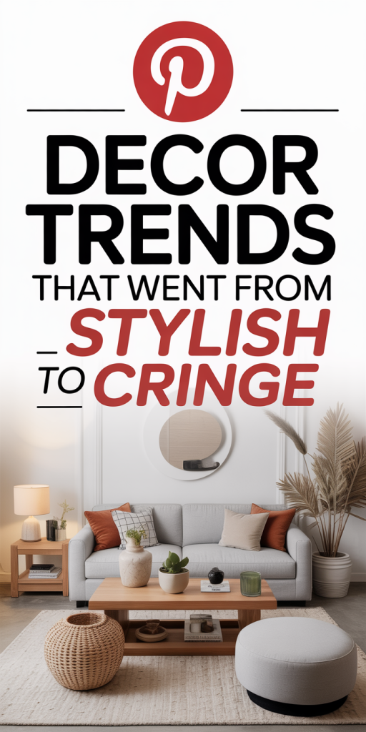
We’ve watched decor trends cycle through our feeds for years, and some styles that once felt fresh now read as dated, oversaturated, or simply impractical. In 2026 we’re more intentional: we want spaces that age well, feel personal, and actually work for our lives. This list of “13 Decor Trends That Went From Stylish To Cringe” isn’t about shaming past choices, many of these looks had strong moments, but about helping us decide what to ditch, what to update, and why. We’ll point to the visual signals that scream “trying too hard,” explain the practical downsides, and offer simple alternatives that deliver a similar vibe without the cringe. Think of this as a gentle declutter of style: keep what genuinely brings you joy, and let go of trends that now make your home look like a dated photo on a carousel.
All-White Everything And Sterile Minimalism
All-white interiors promised calm and a gallery-like clarity, and for a while, they delivered. But by 2026, “all-white everything” often reads as sterile, uninviting, and impractical for real households. White surfaces show wear, stains, and fingerprints faster: they require constant upkeep, and they flatten a room’s personality when textures and warmth are missing. The problem isn’t the color itself but the one-note execution. When every surface is white, lighting inconsistencies and small imperfections become glaring, and spaces feel more like a showroom than a home.
What to ditch: the strict white-on-white rule and shiny pristine surfaces that demand daily caretaking. What to keep: the sense of lightness and calm. Swap in warmer neutrals, creamy ivories, soft taupes, or muted greiges, and introduce tactile materials like woven rugs, natural wood, and matte finishes to restore depth. We also recommend layering in a few curated pops of color through art, plants, or textiles to make the space feel lived-in. A nuanced neutral palette keeps the airy look without the clinical edge, and it’s far more forgiving of life’s little messes.
Overstaged ‘Instagram’ Rooms And Forced Styling
We all love a perfectly styled photo, but homes that exist primarily for the camera don’t age well in daily life. Overstaged “Instagram” rooms are built around symmetry, props, and picture-perfect corners that can’t stand up to real use. The telltale signs: identical books lined up by color, decorative objects placed where they’ll never be touched, and coffee tables arranged for snaps rather than living. These setups create anxiety for homeowners, they require maintenance and feel performative rather than functional.
Instead of staging, aim for authenticity. Keep surfaces useful, not just pretty. Mix curated decor with items that have meaning, travel finds, family photos, or hand-thrown pottery. Let a side table hold a cup now and then: it’s okay if the cushions get indented. For photos, we suggest rotating one or two styled vignettes rather than committing the whole room to a social-media aesthetic. That approach makes your space easier to live in and oddly more stylish, because it signals confidence: you’re designing for life, not likes.
Shiplap, Farmhouse Plaid, And Country-Style Overkill
Thanks to the early 2010s farmhouse revival, shiplap and plaid saw a massive comeback. At first, they felt cozy: then they became shorthand for one specific design story. By 2026, excessive shiplap walls, faux barn doors, and every-surface plaid look like a costume rather than a curated aesthetic. The risk with overusing country motifs is that they flatten regional nuance into a single, overexposed cliché.
If you still love farmhouse warmth, extract the best bits: reclaimed wood accents, simple beadboard, or a single shiplap feature wall placed thoughtfully. Replace predictable plaid with textured fabrics, linen, nubby wool, or subtle checks, that read more contemporary. Consider mixing in modern hardware and cleaner silhouettes so the overall feel remains grounded and fresh. We also encourage avoiding literal “farm” props (windmills, distressed milk cans) unless they’re authentic heirlooms. The goal is to keep the comfort and history of farmhouse style without turning your house into a themed exhibit.
Open Shelving, Cluttered Countertops, And Decorative Dish Overload
Open shelving promised effortless display and easy access. In reality, it often becomes a magnet for clutter, mismatched plates, decorative cups we never use, and kitchen counters staged with artisanal objects that collect grease. Open shelves work when curated, but many of us treated them like free advertising space, which led to visual chaos. In the kitchen, cluttered surfaces impede cooking and daily flow: in living areas, they gather dust and make cleaning harder.
To salvage this, we recommend transitioning to a hybrid approach: keep lower cabinets concealed for function, and reserve a single, well-edited shelf for display. Store everyday dishes behind doors and use closed storage for less photogenic items. When styling open shelving, adopt a three-item rule: group items in odd numbers, limit color range, and vary heights for rhythm. Swap decorative-only dishes for a few beautiful, durable pieces you actually use. That way the shelves feel intentional and useful rather than a styled set-piece that’s impossible to maintain.
Industrial Pipe Furniture, Raw Concrete, And Faux-Factory Chic
Industrial chic gave us a refreshing contrast to polished interiors: exposed hardware, metal accents, and raw materials. But trends tip into cliché when the aesthetic becomes literal, pipe shelving that wobbles, faux-rusted finishes, and concrete-look everything. These elements can feel cold and heavy, especially when repeated across a whole home. Faux-factory chic often sacrifices comfort for attitude and can age poorly as finishes chip or look inauthentically distressed.
Rather than lean on literal industrial props, pull in elements selectively. A reclaimed wood tabletop with simple steel legs reads modern and warm without feeling contrived. Choose real materials over faux finishes, solid wood, honed stone, or brushed metal age better and feel more expensive. If you love the industrial edge, balance it with softer textiles and warm metals to avoid an overly utilitarian vibe. We prefer pieces that nod to industrial roots but are built to last and feel comfortable in everyday life.
Matchy-Matchy Gallery Walls And Overly Curated Photo Grids
Gallery walls exploded as an accessible way to personalize spaces, but the “matchy-matchy” photo grids, identical frames, same-sized prints, perfect spacing, can read as staged and emotionless. They strip photographs and art of context and reduce storytelling to a decorative pattern. The problem intensifies when homeowners follow online templates exactly: these arrangements prioritize symmetry over narrative.
We suggest treating gallery walls like conversations, not spreadsheets. Mix frame styles and sizes, intersperse art with found objects, and leave breathing room. Include a range of scales, one larger focal piece surrounded by a few smaller works feels intentional and dynamic. Don’t be afraid to hang pieces a little lower in living rooms for comfort sightlines, or to swap in new finds over time to keep the wall feeling lived-in. The most compelling galleries show personality and evolution, not perfect alignment.
Oversized Statement Rugs, Layering Gone Wrong, And Busy Patterns
Rugs used to anchor rooms: then oversized statement rugs became the headline act. When a rug competes with every other element, the space loses hierarchy and visual rest. Layering rugs can work, but over-layering or mixing too many bold patterns creates noise. Similarly, wild pattern mixes, wallpaper, upholstery, and drapery all vying for attention, leave the eye nowhere to rest. In practice, this leads to fatigue rather than interest.
Our fix: prioritize one strong patterned element and keep the rest of the room grounded. If you love a big patterned rug, let furniture be more subdued and choose simpler window treatments. For layered rugs, pick compatible color families and vary textures rather than pattern intensity. When introducing patterns, make sure at least one element is a neutral or low-contrast field to balance the composition. That small restraint makes the room feel confident rather than conflicted.
Trendy Materials That Aged Poorly — What To Replace First
Materials trend and then tell a story about their era. In recent years, certain finishes and surfaces have shown their age quickly, peeling, staining, or just becoming visually overplayed. Replacing the worst offenders first improves both function and resale appeal. Here’s what we recommend swapping out early, with quick wins and longer-term investments detailed below.
Terrazzo’s Tired Comeback
Terrazzo made a high-profile comeback across countertops, floors, and accessories. The material itself is timeless, but the trend peaked in many sterile, high-contrast iterations that now feel ubiquitous. The issue isn’t terrazzo’s composition but its overuse in small-format applications and faux-printed versions that look cheap. In kitchens, low-quality terrazzo-effect surfaces can stain and chip: in bathrooms, busy speckled patterns sometimes read muddy in low light.
If you have a courtroom-sized terrazzo slab, keep it, real terrazzo is durable and classic. But for mass-produced terrazzo-look laminates or tiny speckled tiles, consider replacing them with subtler stone, a honed quartz, or a solid surface that complements other materials. If you like terrazzo’s visual interest, use it as an accent, backsplashes, a fireplace surround, or a single tabletop, rather than a house-wide motif. That preserves the charm without making your home look dated by association.
Velvet Everywhere And The Overused Luxe Texture
Velvet was the texture of the moment, rich, tactile, and camera-ready. But when every sofa, pillow, and ottoman was covered in crushed velvet, the effect became predictable and, frankly, a little heavy. Velvet’s tendency to show wear (marks from pets, pressure from cushions, sheen variation) exposes itself quickly in active households. It’s a wonderful material in moderation, but the “velvet everything” phase now reads theatrical and high-maintenance.
We recommend keeping velvet in smaller doses or opting for brushed cottons and performance velvets that hold up better. Consider velvet pillows, a statement chair, or a bench at the foot of the bed rather than cladding your main sofa in it. If you already own large velvet pieces and they’re in great condition, balance them with linen, leather, or matte-woven textiles to reduce the overtly luxe effect. Small swaps, like swapping a velvet cushion for a textured wool one, instantly modernize the look without losing comfort.
Leave a Reply