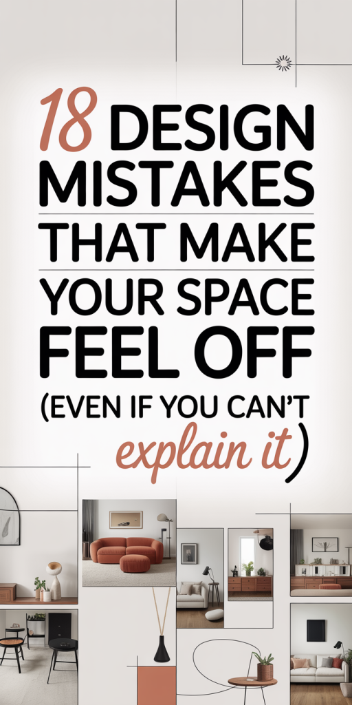
We’ve all walked into a room that felt oddly wrong, not ugly, not broken, just…off. You can’t point to a single element, but something about the proportions, light, or layout puts your brain on edge. That sensation usually comes from a handful of repeatable design mistakes. In this text we break down 18 subtle issues that sabotage a room’s comfort and cohesion, explain why your space reacts the way it does, and give straightforward fixes you can carry out this weekend. Our focus is practical: scale, sightlines, lighting, texture, and simple behavioral tweaks that make rooms feel composed instead of chaotic. Read on and we’ll walk you through the common traps and how to repair them so your home feels intentional, not just stylish.
Out-of-Scale Furniture And Poor Proportions
One of the fastest ways to make a room feel off is to use furniture that’s out of scale. A massive sectional in a modest living room overwhelms circulation: a tiny coffee table disappears in front of a deep sofa and leaves the design feeling unanchored. Human perception responds to proportion, when pieces are too large or too small relative to the room and one another, our brains detect imbalance.
How to diagnose it
- Measure first: note room length, width, ceiling height, and major openings. Compare those with the furniture footprint before buying.
- Visual distance: if you can’t place two people comfortably on a sofa without their knees touching, it’s probably too small. If a rug doesn’t at least tuck under the front legs of the seating, it’s too small.
Practical fixes
- Right-size the rug: aim for a rug that at least fits the front legs of all primary seating. In open-plan rooms go larger, 8×10 becomes 9×12 for the same furniture group in a bigger space.
- Scale in layers: pair larger pieces with smaller ones only when they share a common visual weight. For example, a large sofa balanced with a robust media console and a substantial floor lamp.
- Use negative space intentionally: don’t cram every inch. Letting breathing room around furniture clarifies proportion and makes pieces feel intentional.
Quick swaps to try this weekend
- Swap a low, delicate coffee table for something more substantial to anchor a deep sofa.
- Replace a tiny armchair with two slim but taller accent chairs to improve balance.
When we correct scale, rooms immediately read as composed. Proportion is a quiet rule, follow it and the room stops whispering “off.”
Awkward Traffic Flow And Misplaced Focal Points
Traffic flow and focal points are about choreography. If people keep cutting across a carefully arranged seating area, or if your eye repeatedly lands on a TV or closet instead of the fireplace or view, the room feels dysfunctional.
Why flow matters
Our spatial comfort depends on unobstructed routes and clear destinations. Interruptions, like a coffee table blocking a natural path, create tension. Similarly, competing focal points leave the eye unsettled because there’s no single place to rest.
How to improve flow and focal clarity
- Map movement paths: walk through the room and note the natural routes. Arrange seating and tables so paths remain clear and circulation is at least 30–36 inches wide where people pass.
- Define a single focal point: emphasize the most compelling element (fireplace, window, or art). If the TV is not the primary focus, disguise or flank it with shelving, artwork, or a painted surround to reduce its visual dominance.
- Use layout anchors: rugs, lighting, and furniture groups direct attention. Align the rug and sofa to the focal point to make the composition cohesive.
Design tweaks that help immediately
- Angling one chair slightly toward the main focal point can redirect sightlines without moving large items.
- Replace a console that interrupts traffic with a narrower alternative or move it to a wall where it helps define the entry rather than block it.
We find that when traffic becomes predictable and focal points are clear, rooms feel purposeful and calmer, which is exactly what a living space should be.
Flat, Unlayered Lighting That Kills Ambience
Lighting is a language: mood, depth, and function are all conveyed by light. Relying on a single overhead fixture creates flatness, hard shadows, and a clinical vibe. Conversely, layered lighting, ambient, task, and accent, creates depth and warmth.
Common lighting sins
- Only overhead light: makes faces look washed out and surfaces dull.
- Wrong bulb color temperature: too cool (5000K+) feels institutional: too warm (below 2700K) can muddy colors.
- No dimming: everything feels either too bright or too dark with no middle ground.
How we fix it
- Layer three types: ambient (soft overhead or multiple sources), task (reading lamps, under-cabinet in kitchens), and accent (art lights, uplights for plants). Each layer should be controllable.
- Match color temperature: keep most fixtures within one color family, usually 2700K–3000K for living spaces in 2026 homes for a warm, modern look that still renders color accurately.
- Add dimmers and zones: dimmers and smart switches let us tune mood for morning routines, movie nights, and entertaining.
Practical swaps
- Replace a single pendant with a cluster of pendants at varying heights over a dining table.
- Add a floor lamp behind a sofa and plug-in wall sconces beside bedside tables if rewiring isn’t an option.
When light is layered correctly, the room gains dimension and our brains interpret it as inviting and well-composed, an immediate psychological upgrade.
Wrong Color Choices And Poor Contrast
Color is powerful but tricky. The wrong hue or lack of contrast flattens a room or causes visual fatigue. Designers use color to guide attention and create depth: when we get it wrong, spaces feel murky or dissonant.
Where people slip up
- Using only one tone: monochrome rooms without contrast can read as washed out.
- Picking paint from small swatches: tiny samples don’t show the full effect across a wall under different light.
- Ignoring undertones: whites, grays, and beiges each have warm or cool undertones that shift with lighting.
How to choose color that works
- Test big: paint large sample swatches and observe at different times of day.
- Create three levels of contrast: background (walls), mid-tone (sofas, rugs), and accents (pillows, art). That hierarchy gives depth.
- Use color psychology sparingly: blues calm, greens soothe, and warm terracottas energize. But personal preference should guide primary choices.
Simple fixes to add contrast
- Introduce a darker accent wall or a bold piece of furniture to anchor a light room.
- Swap neutral pillows for richer tones and mixed textures to bring the palette to life without repainting.
We’ve found that even small injections of contrast (a navy pillow, a wood console) immediately readjust the eye and make the space feel deliberate rather than accidental.
Cluttered Layouts And Poor Use Of Negative Space
Clutter isn’t just about mess: it’s about too many competing visual elements. A room filled with objects of similar scale, color, and texture reads noisy. Negative space, the deliberate empty areas around objects, allows focal pieces to shine.
Understanding visual clutter
- Overlapping patterns and finishes create visual competition.
- Too many small items on surfaces reduces legibility and makes cleaning difficult.
- Open shelving that’s fully packed becomes a visual wall of clutter.
How to apply negative space
- Edit ruthlessly: keep surfaces to three-to-five meaningful objects maximum. Use trays to group smaller items so they read as one unit.
- Add breathing room: leave empty wall or shelf segments intentionally blank to create rhythm.
- Rotate collections: swap decorative items seasonally so displays remain fresh and minimal.
Organizational strategies
- Hidden storage: baskets, lidded bins, and furniture with drawers keep necessary items out of sight.
- Zoned storage: designate specific containers for chargers, mail, and kid’s toys to prevent drift.
When we reduce visual clutter and respect negative space, rooms feel larger, calmer, and more curated. That sense of calm is often what people mean when they say a space feels “right.”
Ignoring Sightlines, Visual Anchors, And Balance
Sightlines and anchors are subtle compositional tools that guide how we experience a room. If furniture blocks views or anchors are missing, the room feels disjointed. Balance, visual weight distributed across the space, keeps things grounded.
Common problems
- Blocking important views: a tall bookcase in front of a window or a sofa that interrupts the sightline between rooms.
- No anchor: seating that floats without a rug, art, or console to tie it to the space.
- Uneven visual weight: heavy items clustered on one side leave the other side feeling empty.
Fixes that create cohesion
- Reframe sightlines: angle furniture or swap tall items so windows and doorways remain visible. A low media console instead of a tall cabinet preserves the view.
- Add anchors: rugs, lighting, and artwork act as visual anchors. Always consider an anchor when you design a seating group.
- Balance asymmetrically: mirror visual weight rather than shapes. A tall plant can balance a stack of low bookshelves.
Micro-adjustments that help
- Move a rug slightly under the front legs of seating rather than centered in the room to better anchor a conversation area.
- Place a taller lamp opposite a bulky sofa to balance vertical mass.
We notice that once sightlines are respected and anchors added, rooms feel intentional. Balance isn’t symmetry: it’s a visual compromise that satisfies the eye.
Texture, Pattern, And Material Mismatches
Texture and pattern are where rooms gain personality. But conflicting scales, competing patterns, or materials that clash (like multiple metals without a common thread) throw off cohesion.
The issues we see often
- Too many patterns at one scale: large florals, big geometrics, and bold stripes all fighting for attention.
- Texture mismatch: pairing slippery leather, glossy acrylic, and lightweight linen without a unifying element creates a disjointed tactile story.
- Material chaos: mixed metals and finishes with no repetition feel accidental.
How to harmonize materials and patterns
- Limit pattern families: pick one dominant, one supporting, and one accent pattern. Vary scale, large, medium, small, for balance.
- Repeat a material three times: repeat wood, brass, or matte black three times across the room to create cohesion.
- Mix textures intentionally: balance soft textures (wool, velvet) with harder ones (wood, stone) to create tactile interest without visual conflict.
Quick swaps to harmonize
- Swap one patterned pillow for a textured solid to reduce competition.
- Introduce a unifying trim or color that repeats across textiles and surfaces to tie disparate materials together.
When we orchestrate texture and pattern with restraint, rooms feel rich rather than chaotic, more curated gallery than flea market.
Inconsistent Style, Finishes, Or Hardware
A mix-and-match approach can be charming, but inconsistency in style and finishes often produces a disjointed effect. Mismatched hardware, wildly different leg styles, or an inconsistent finish palette make the design look accidental rather than edited.
Where inconsistency creeps in
- Buying pieces over time without a guiding aesthetic or finish palette.
- Swapping out hardware in one area but not another, creating visual interruptions.
- Pairing modern, minimalist pieces with ornate traditional items with no common thread.
How we align style and finishes
- Choose a base finish palette: pick two primary finishes (for example, warm wood and matte black) and use them consistently for hardware and larger pieces.
- Edit with a rule: allow one contrasting accent style (a vintage piece in an otherwise modern room) but keep it purposeful.
- Standardize hardware: swapping kitchen and bathroom hardware to a consistent finish immediately reads as cohesive.
Practical projects to unify a room
- Refinish or sand-and-stain a thrifted table to more closely match other wood tones.
- Replace mismatched drawer pulls with a single style and finish throughout a cabinet run.
When finishes and styles relate to one another, the room reads as a single, intentional composition rather than a collage of choices.
Functional Blind Spots: Storage, Acoustics, And Usability
Sometimes rooms feel wrong for practical reasons: poor storage leads to perpetual clutter, bad acoustics make conversations tiring, and layouts that ignore daily routines create friction. These functional blind spots quietly degrade comfort.
Common functional flaws
- Insufficient storage: open surfaces covered in necessities (keys, mail, chargers) make the room look unfinished.
- Harsh acoustics: hard floors and bare walls bounce sound and make rooms feel echoey and unsettled.
- Poor ergonomics: seating too low for consoles, insufficient task lighting, or outlet placement that forces extension cords across walkways.
How to fix functional issues
- Add purposeful storage: built-ins, multi-functional furniture (beds with drawers, ottomans with lift tops), and attractive baskets reduce visible clutter.
- Improve acoustics: rugs, upholstered furniture, curtains, and acoustic panels absorb sound. Even a large bookshelf with mixed objects can soften reflections.
- Audit usability: evaluate daily routines and adjust. Move charging stations to a drawer, relocate a workspace near natural light, or add a few strategically placed outlets.
Small upgrades with big impact
- Add a bench with cubbies at the entry to contain shoes and bags.
- Hang heavy curtains to both frame windows and improve acoustics.
When we address these blind spots, spaces become not only prettier but more livable. Usability is the silent partner of good design, neglect it and the room will always feel out of step with how we actually live.
Conclusion
When a room feels “off” it’s rarely one problem, it’s a constellation of small mismatches: scale, light, sightlines, texture, and function. Our favorite approach is a quick audit: measure scale, map traffic, layer lighting, add contrast, and edit objects. Make one change at a time and observe: these incremental corrections compound quickly. With a few targeted tweaks, right-sized furniture, clearer focal points, layered light, thoughtful texture, and improved storage, your space will stop nagging at your brain and start supporting how you live. Let’s fix one thing this weekend, then the next: the momentum makes the room, and your home, finally feel right.
Leave a Reply