We’ve all felt the squeeze of small-square-foot living: a kitchen that crowds when two people cook, a living room that’s more obstacle course than relaxation zone, and closets that refuse to cooperate. But tiny apartment living doesn’t have to mean compromise. With a mix of ruthless editing, smarter furniture choices, visual techniques, layered lighting, and disappearing storage, we can make even the smallest floor plans feel open, breathable, and intentional. In this guide, updated for 2026 trends and materials, we share practical, low-effort hacks that create measurable gain in perceived space. These are tactics we’ve tested in real layouts, ranging from studio micro-units to narrow one-bedrooms. No renovation blueprints required: just sensible decisions, a little creativity, and a focus on consistency. Read on and pick the few changes that fit your budget and lifestyle: applied together, they add up to a home that feels much larger than its footprint.
Edit Ruthlessly: Declutter, Curate, And Keep Only What Matters
First things first: the single fastest way to make a tiny apartment feel huge is to reduce clutter. We edit ruthlessly by asking three simple questions for every item: Do we use it regularly? Does it bring us joy or serve a clear purpose? Is it replaceable? If the answer is no twice, it goes. That doesn’t mean a sterile place, it means curation. Keep a small number of artful, meaningful pieces rather than a scatter of half-loved objects.
Practical steps we use: set a 15-minute daily tidy window, do a quarterly purge of clothing and kitchenware, and apply the “one-in, one-out” rule for purchases. Use transparent bins and labeled containers inside drawers so surfaces stay clear without losing access. We also recommend consolidating like items: a single good set of knives beats three cheap sets shoved in different drawers.
For sentimental items, photograph them and store the images digitally. A single curated display, a shelf or gallery wall of favorites, reads as intentional design rather than clutter. Editing is maintenance, not a one-off event: done consistently, it immediately increases perceived floor space and reduces visual noise.
Choose Right-Scale, Multipurpose Furniture (And Where To Place It)
Furniture choice determines flow. In tiny apartments, scale and multipurpose design trump style statements. We prioritize pieces that do double (or triple) duty: seating that stores, tables that expand, and beds that hide when not in use. Avoid oversized sofas and bulky dressers, they eat sightlines and block circulation.
When shopping, measure twice and consider circulation paths: leave at least 24–30 inches for primary walkways and smaller clearance where necessary. Opt for furniture with slender legs and open bases: visible floor beneath pieces makes rooms feel airier. Choose mid-height storage rather than floor-to-ceiling in main living zones to prevent a boxed-in feeling. Lightweight materials (metal frames, low-profile upholstery) read less visually heavy.
We also recommend a staged approach: start with essential pieces (bed, seating, table) in scale, live with them for a month, and then layer in storage and accents. This prevents overfurnishing and helps you notice which multipurpose items actually get used. In tiny spaces, restraint plus intelligent selection equals more room to breathe.
Foldaway, Modular, And Convertible Pieces — Pros, Cons, And Best Uses
Foldaway and convertible furniture are the backbone of functional tiny-home living. Pros: they free floor area, adapt to changing activities, and often add built-in storage. Cons: some budget options sacrifice comfort or durability: mechanisms can fail if overloaded: and certain pieces add visual bulk when closed.
Best uses we’ve found:
- Wall beds (Murphy beds): excellent in studio apartments where sleeping needs to tuck away. Look for models with integrated shelving to avoid extra dressers.
- Drop-leaf and extendable tables: ideal for flexible dining and workspace needs. Keep a compact version permanently and expand only when guests arrive.
- Modular seating: configurable sofas allow us to reconfigure a lounge into a guest bed or sectional based on need. Choose pieces with removable covers for easy cleaning.
- Nesting tables and stools: provide occasional surfaces without permanent footprint.
Tips: test mechanisms in person if you can, choose quality hardware, and plan for maintenance access. Convertible pieces should feel like real furniture, comfortable and reliable, not novelty items. When they work, they dramatically increase usable square footage without renovations.
Anchor With Scale: How To Pick And Position Furniture To Maximize Perceived Space
Anchoring a room correctly shapes how we perceive its size. We pick one or two anchor pieces, typically the bed or sofa and a table, and build around them. Choose anchors that match the room’s proportions: a low-profile sofa for low ceilings, a slim platform bed for narrow bedrooms.
Placement rules that change everything:
- Float the sofa away from walls where possible. Pulling a seating piece a few inches from the wall creates depth and allows light to circulate behind it.
- Align furniture with long sightlines. Position the longest piece so that you can see across the room: this creates a visual corridor.
- Keep tall pieces (bookcases, wardrobes) to one side rather than scattered. A single vertical mass reads as intentional and balances the space.
- Angling a single piece slightly can sometimes increase perceived area by breaking predictable grids, but use this sparingly, too many angles feel chaotic.
We avoid blocking natural walk paths and ensure that sightlines to windows are clean. Thoughtful scale and placement make rooms feel organized and much larger than their square footage suggests.
Use Visual Tricks To Open Up The Room
Visual tricks manipulate perception without changing the layout. They’re inexpensive and high-impact. We use color, texture, and negative space to craft depth and lightness. Pale, warm neutrals on walls reflect more light and make ceilings feel higher. Alternatively, a single darker accent wall can create a perceived depth if used thoughtfully behind a bed or sofa.
Minimize busy, small-scale patterns. Tiny patterns tend to clutter a room visually: instead, choose larger-scale prints sparingly. Use rugs to define areas, but keep them appropriately sized: a rug that’s too small fragments the floor, making the room feel chopped up. Mirrored or glossy surfaces can amplify light but should be positioned to reflect pleasing scenes, not messy counters.
Consistent palettes and material repeats (wood tone banding, metal accents) create continuity and make separate zones feel connected. Finally, negative space is a design decision: leave breathing room around furniture and artwork so each element can register. That white space is as important as the objects, it’s how perception of spaciousness is built.
Lines, Patterns, And Negative Space: What To Use And What To Avoid
Lines guide our eyes: used well, they lengthen the room. Horizontal stripes on walls or long, low furniture emphasize width. Conversely, vertical lines draw the eye upward, useful for low ceilings. But avoid combining both in the same small area, that creates visual tension.
Patterns: prefer fewer, larger-scale patterns over lots of tiny motifs. A single bold patterned pillow or a larger geometric rug reads as curated rather than chaotic. Textural variety (woven baskets, a boucle chair) adds depth without competing for attention.
Negative space: intentionally leave areas uncluttered. For example, leave a gap around a bed or couch, and resist filling every wall with art. Empty space helps the brain interpret the room as larger. When placing art, align pieces at eye level and in odd-numbered groupings for a relaxed, expansive feel.
Avoid busy wallpaper in multiple small rooms and excessive wall-to-wall shelving in living spaces. The rule of thumb: if an element makes you feel visually crowded, remove or scale it back. Less frequently equals more spacious.
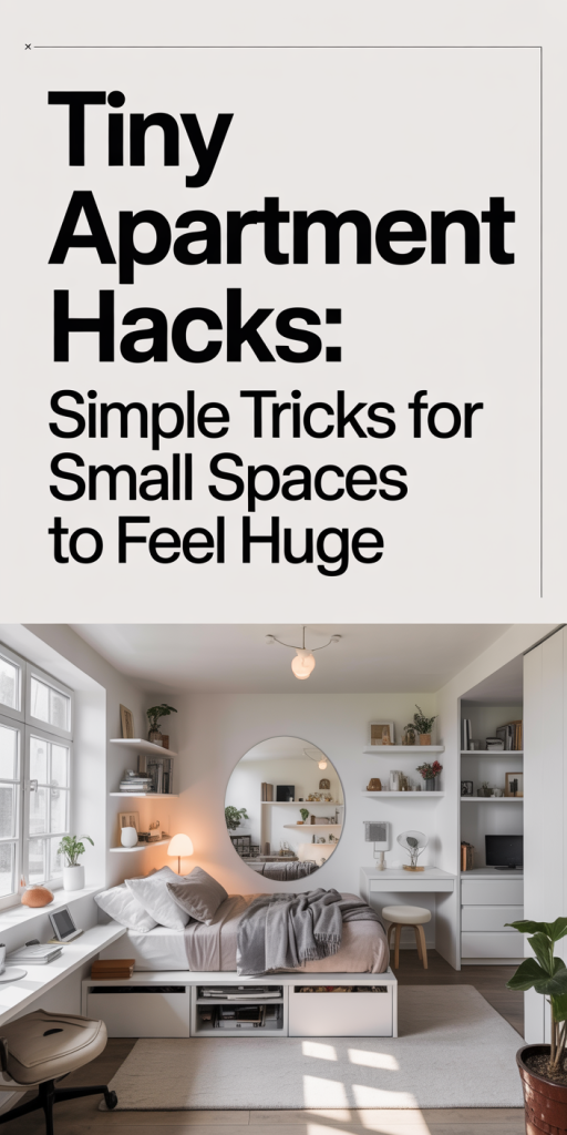
Optimize Lighting, Mirrors, And Window Treatments
Light transforms perception. Natural light is ideal, but we can amplify it with the right fixtures and window treatments. Start by maximizing window access: remove obstructive furniture from directly in front of windows and keep sill clutter minimal. Choose lightweight curtains or sheer panels that let daylight in while providing privacy.
Layered artificial lighting compensates where daylight is limited. Combine ambient (overhead), task (under-cabinet, reading lamps), and accent (picture lights, small uplights) to avoid a single flat illumination that shrinks rooms. Use warm white LEDs (2700–3000K) in living areas for a cozy yet open feel.
Mirrors are cheap spatial multipliers. A strategically placed mirror opposite a window effectively doubles incoming light and expands depth. Consider a full-length mirror along a narrow wall or mirrored closet doors when appropriate. Reflective surfaces, glossy tiles, metallic accents, also help, but balance them to avoid a clinical look.
Window treatments should hang high and wide: mount rods several inches above the frame and extend them beyond the jamb so curtains stack outside the opening when open, revealing the full window and maximizing light.
Layer Lighting And Mirror Placement To Multiply Light And Depth
Layered lighting is non-negotiable. We start with ambient overhead light, then add task lighting where we work or cook, and finish with accent lights to highlight art or architectural features. Dimmable circuits or smart bulbs give us control over mood and perceived space, brighter for activity, softer for evenings.
Placement tips:
- Task lights: under-cabinet strips in kitchens, swing-arm lamps by reading chairs, and directional track lights over work desks.
- Accent lights: small wall washers or picture lights to add depth and sculpt surfaces.
- Ambient options: flush-mounts or semi-flush fixtures that don’t hang low in tight ceiling heights.
For mirrors: place one opposite or adjacent to the primary window to capture and return daylight. In narrow rooms, a long horizontal mirror visually doubles width: in compact entryways, a tall, slim mirror stretches height. Avoid placing mirrors where they reflect cluttered views, they’ll just multiply the mess.
Combine lighting and reflective surfaces thoughtfully: light hitting a mirror should create pleasant highlights, not glare. Done right, this combo multiplies both light and perceived depth in small apartments.
Smart Storage That Disappears: Vertical, Hidden, And Dual-Purpose Solutions
In tiny apartments, storage that disappears is essential. We think vertically and inside the furniture. Vertical storage uses wall height without encroaching on floor space: floating shelves, tall narrow cabinets, and pegboards. Choose open shelving sparingly and pair it with boxes or baskets to hide visual clutter.
Hidden storage options: ottomans with cavities, beds with drawers, and sofas with under-seat compartments. These allow frequently used items to be kept handy but out of sight. Built-ins are ideal but not mandatory, freestanding pieces can be combined and finished to look integrated.
Dual-purpose solutions include kitchen islands on casters that function as prep space, dining table, and extra storage: entry benches that store shoes: and wall-mounted desks that fold away. Use clear labeling inside concealed storage so items remain accessible without opening every box.
We recommend a storage audit: map where items are used and place storage there. For example, keep seasonal items high and off-season clothing in vacuum bags under the bed. Invisible storage keeps surfaces clean and maintains the illusion of space while preserving functionality.
Creative Nooks: Under-Bed, Above-Doors, And Behind-Closet Storage Ideas
Creative nooks are where we reclaim lost inches. Under-bed storage remains one of the best untapped resources: shallow rolling bins for linens, shoe organizers, and slim luggage-style boxes for infrequently used items. For higher clearance beds, modular drawer units provide easy access and look tidy.
Above-door and high-shelf storage capture vertical real estate. Install a shelf above door frames for luggage, seasonal decor, or rarely used electronics. Use attractive baskets or labeled boxes to keep these high spots organized and visually consistent.
Behind-closet and door-back organizers multiply usable area. Slim hanging shoe pockets, hook systems, and narrow rail organizers store accessories and cleaning supplies. We also convert closet doors into micro command centers, slim shelves for mail, keys, and small electronics. In kitchens, magnetic strips on the inside of cabinet doors secure knives and tools without using counter space.
The takeaway: treat every surface as potential storage, but prioritize accessibility. If an out-of-the-way nook becomes a dumping ground, it’s defeating the purpose. Make these solutions visible and pleasant so we’ll use them consistently.
Conclusion: When combined, these tactics, ruthless editing, right-scale multipurpose furniture, visual tricks, layered lighting, and invisible storage, transform tiny apartments into calm, adaptable homes. We don’t need to increase square footage to live bigger: we need purposeful decisions that expand how we use the space. Start with one change this week, observe how it affects daily flow, and build from there. Small shifts add up quickly, and before long, your apartment will feel unexpectedly roomy and very much yours.
Leave a Reply