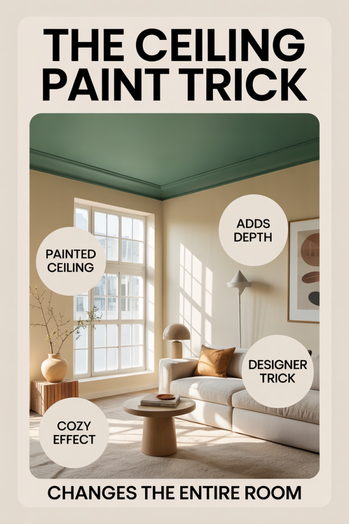
We often focus on walls, furniture, and flooring when updating a room, but the ceiling quietly governs how a space feels, its light, height, and emotional tone. The ceiling paint trick we’re about to walk through is simple: pick the right color and finish and you can make a low ceiling feel taller, brighten a dim room, or create a cozy, enveloping atmosphere without spending a fortune. In this text we’ll explain why ceiling color matters, how paint finish and hue change perception, practical painting techniques, design strategies for pairing ceiling color with walls and trim, and common mistakes to avoid. Whether you’re painting a studio apartment, a formal dining room, or a nursery, our guidance will help you make a thoughtful choice that transforms the entire room.
Why Ceiling Color Matters More Than You Think
Most people treat the ceiling as background, something to keep plain and forgettable. But the ceiling is a visual plane that interacts with light and color to shape perception. When we change ceiling color, we’re not just altering an overhead surface: we’re modifying how light bounces, where our eyes travel, and how the room’s proportions read. A pale, reflective ceiling throws light back into the room, making it feel airy. A darker ceiling absorbs light and visually pulls the plane downward, creating intimacy. That matters because mood and utility in a room are tightly linked to light and scale. Natural light behaves differently depending on ceiling tone and finish, and even artificial light fixtures reveal different personalities when set against a colored overhead. Beyond atmosphere, ceiling color can correct architectural quirks: we can visually raise soffits, soften harsh angles, or hide imperfections with a considered hue. In short, the ceiling is an opportunity, a kind of architectural punctuation mark that can shift a room’s story with one decisive stroke of paint.
Choose The Right Ceiling Paint Finish And Tone
Selecting the appropriate finish and tone for ceiling paint is as important as choosing the color itself. Ceilings traditionally get flat or matte finishes because they minimize glare and mask imperfections. We generally recommend an eggshell to flat sheen range for most ceilings: flat for hiding flaws in older homes, and a low-sheen eggshell or matte for modern spaces where durability and washability matter. The tone, warm, cool, neutral, will change how the room reads. Warm whites lean cream or ivory and add coziness: cool whites (with bluish or gray undertones) read crisp and airy. Undertones are sneaky: two paints labeled “white” can look dramatically different side by side, especially under different light sources. Test swatches on the ceiling itself and observe them at different times of day. If you’re leaning toward color rather than white, aim for a hue that’s slightly lighter and less saturated than the walls to avoid making the ceiling overpowering. Balance finish, tone, and the room’s lighting when making your choice, those three variables together determine the final effect.
How Ceiling Paint Affects Perceived Height And Light
Perception of height and light depends on contrast, value, and how our eyes draw boundaries. A high-contrast ceiling, dark against light walls, makes the ceiling feel lower because our eye stops at that darker band. Conversely, when the ceiling is noticeably lighter than the walls, it visually recedes, making the room feel taller. We can exploit this to solve design problems: in a room with a low ceiling but tall, heavy furnishings, a pale ceiling paired with slightly darker walls creates an airy balance. Light distribution is also heavily influenced by ceiling color. Light-colored, reflective ceilings return more of both natural and artificial light into the space, reducing the need for intense fixtures. Darker ceilings absorb light, which is ideal when you want to soften glare, create a cozy lounge vibe, or disguise ductwork and beams in industrial spaces. One subtle trick we like is painting the ceiling a fraction warmer or cooler than the walls to manipulate how light “warms” the room throughout the day. Small shifts in value, 20–30% difference in lightness, produce noticeable changes without feeling contrived.
Practical Techniques For Painting Ceilings
Knowing the theory is vital, but the execution makes the difference between a pro finish and a patchy ceiling. We always start by planning the sequence: prep, cut-in, roll, and touch-up. Choose a high-quality ceiling paint formulated for minimal splatter and good coverage. Use a roller with a short to medium nap (3/8″ to 1/2″) for smooth ceilings and a slightly thicker nap for textured ones. Begin with thorough surface prep, wash away grease, patch cracks, and prime stains. When cutting in, use a good-angle sash brush and create a perimeter band of about 2–3 inches. For rolling, attach an extension pole so you can maintain a consistent pressure and avoid stepping on ladders mid-roll. Overlap each pass slightly and maintain a wet edge to prevent lap marks. If you’re painting a darker color over white, multiple coats or a tinted primer will be required. For color-matched ceilings, get tint added to the primer to reduce the number of topcoats. Work in natural light or with good daylight-balanced bulbs so you can see true color and sheen while you paint.
Prepping, Tools, And Safety Tips
Proper prep shortens the project and improves the outcome. Start by removing or covering furniture, taping off trim, and protecting floors with a canvas drop cloth. Inspect for mold or moisture damage, if found, address the source before painting. Tools we recommend: an angled 2–2.5″ sash brush for crisp edges, a high-quality roller frame, extension pole, roller covers sized to your room, a paint tray with a grid, spackle for small repairs, and a respirator or mask rated for paint fumes. For safety, use a sturdy stepladder and have a helper when possible. If the ceiling is textured (popcorn or heavy stipple), consider whether you want to preserve the texture: painting can make texture more pronounced. For high ceilings, extendable poles and a stable, wide-base ladder are essential. Ventilation is crucial, open windows and use fans to move fumes outside. If you’re working around electrical fixtures, turn power off at the circuit and remove fixtures before painting. Finally, wear old clothes and eye protection: ceiling paint tends to splatter even though best efforts.
When To Use White Or Off-White
White and off-white ceilings are classic for a reason: they maximize perceived height and bounce light. We choose pure white (with neutral undertones) when the goal is maximum brightness, hallways, kitchens, and small bathrooms benefit most. Off-white variants, ivory, cream, or warm beige, are ideal in rooms where a slightly cozier feel is desired without losing light. Use warm off-white ceilings in living rooms and bedrooms that have warm wall colors or wood tones to harmonize the palette. In rooms with cool-toned walls or lots of natural light, a cool white (with faint blue or gray undertones) feels crisp and modern. Remember that what appears white on a paint card can shift dramatically under different lighting: always test a large swatch on the actual ceiling and view it at morning, midday, and evening light. For rental properties or open-concept homes, we often recommend a neutral white with minimal undertone so it pairs easily with varied wall colors and furnishings.
Using Color On The Ceiling To Add Depth
Painting the ceiling a color, not just white, can add sophistication and depth. A soft, muted color like pale blue or sage green can make a room feel larger by suggesting an extension of the sky or landscape. For dramatic effect, a deep navy or charcoal ceiling in a dining room or home theater creates an enveloping, luxurious feel. When using color, keep saturation moderate: highly saturated ceilings can feel oppressive if the walls aren’t balanced correctly. A popular technique is the ‘slightly lighter ceiling’ approach: pick a ceiling color that’s one to two shades lighter than the walls’ base color. That keeps harmony while creating dimensional layering. We also recommend considering adjacent rooms, if you have an open floor plan, use ceiling color to delineate zones without changing wall colors. Finally, metallic or pearlescent paints can subtly reflect light and add glamour when used sparingly, such as on coffered ceilings or architectural details.
Design Strategies: Matching Ceiling Color With Walls And Trim
Harmonizing ceiling color with walls and trim requires strategy. The traditional approach pairs a white or off-white ceiling with colored walls and matching trim, creating a clean delineation. But intentional continuity can also work, painting trim the same color as the ceiling can blur edges and make a room feel larger. We often suggest the following rules of thumb: if you want a room to feel taller, choose a ceiling several shades lighter than the walls: if you want a cozy, cocooned environment, pick a ceiling slightly darker. Consider undertones: if your walls have warm undertones, choose a ceiling with complementary warmth to avoid visual discord. For rooms with crown molding, painting the crown and ceiling the same color while contrasting the wall can be an elegant move that emphasizes architectural detail. In open plans, subtle continuity, like keeping ceiling color consistent across connected spaces, maintains flow while wall colors define each area. Finally, test how trim looks when painted in either ceiling or wall color: small changes in trim can dramatically shift the perceived balance.
Common Mistakes And How To Avoid Them
Even experienced DIYers make ceiling-paint mistakes, but most are avoidable. One frequent error is ignoring undertones: choosing a ‘white’ that clashes with wall tones can make colors look off. Avoid this by testing large swatches. Another mistake is using the wrong finish, high gloss on ceilings will highlight imperfections: stick to flat or low-sheen finishes. Poor prep causes flaking and uneven texture: take time to clean, patch, and prime. Lap marks happen when the paint edge dries before the next pass: maintain a wet edge and work in small sections. Skimping on primer when transitioning from dark to light will cost time, prime first. Overly saturated ceiling colors without balancing wall hues can feel heavy: if you want a dramatic ceiling, pair it with neutral or lighter walls. Finally, bad lighting choices during painting can mislead color perception. Use daylight-balanced bulbs while painting and review swatches at different times of day before committing. Taking these precautions saves time and delivers the polished result we all want.
Leave a Reply