Creating a beautiful and inspiring bedroom for your child doesn’t always require a complete makeover. Sometimes, a single accent wall can completely transform the look and feel of the space. Accent walls add color, personality, and visual interest while helping define different areas for sleeping, studying, playing, or relaxing. They can also reflect your child’s interests, hobbies, and imagination, making the room feel more personal and welcoming.
Whether your child dreams of exploring outer space, diving beneath the ocean, building with LEGO bricks, or curling up with their favorite books, there’s an accent wall idea that can bring those interests to life. These creative designs range from simple DIY projects to statement-making murals, offering inspiration for every style and budget.
1. Galaxy Adventure Wall
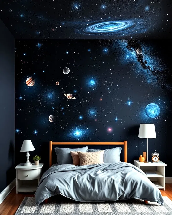
Bring the wonders of the universe into your child’s room with a stunning galaxy-themed accent wall. Deep shades of navy, midnight blue, and black create the perfect backdrop for stars, planets, constellations, and swirling nebula effects. Glow-in-the-dark paint or decals can make the stars shine after dark, turning bedtime into a magical experience. This design encourages curiosity about astronomy and science while creating a dramatic visual centerpiece. Pair the wall with space-themed bedding, rocket-shaped shelves, or astronaut decor to complete the celestial atmosphere.
2. Painted Arch Feature Wall
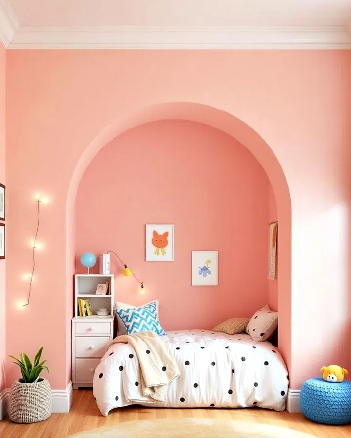
A painted arch is one of the simplest ways to create a designer-inspired accent wall without spending a fortune. By painting a large arch behind a bed, reading nook, or desk area, you instantly create a focal point that adds dimension and character. Soft pastel arches create a calm and playful feel, while bold colors make a modern statement. This versatile design works in nurseries, children’s rooms, and even teen bedrooms because it can easily evolve with changing tastes and styles.
3. Chalkboard Creativity Wall
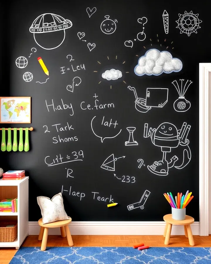
A chalkboard accent wall combines decoration and functionality in one creative feature. Kids can draw pictures, write messages, practice spelling words, solve math problems, or simply express their creativity whenever inspiration strikes. The wall becomes a constantly changing piece of art that grows with your child. Parents love this idea because it keeps creative activities contained to one designated space while encouraging learning and imagination. Colorful chalk organizers and magnetic accessories can make the wall even more interactive.
4. Animal Safari Mural
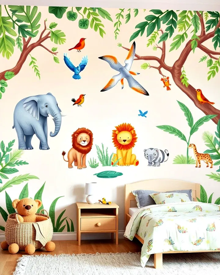
Turn an ordinary bedroom into an exciting wildlife adventure with an animal-themed mural. Large illustrations of elephants, giraffes, lions, monkeys, or woodland creatures instantly bring the room to life. Whether you choose hand-painted artwork, removable wallpaper, or oversized decals, animal murals create an immersive environment that sparks curiosity about nature. This design works especially well in nurseries and younger children’s rooms where imaginative play is a central part of daily life.
5. World Explorer Map Wall
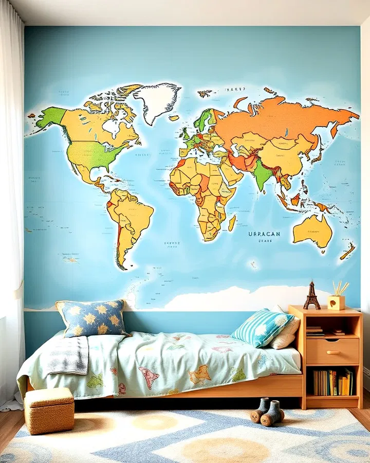
A world map accent wall is both educational and visually striking. Covering an entire wall with a colorful map encourages children to learn about geography, different cultures, and faraway destinations. Add push pins, stickers, or markers to track family vacations or dream destinations. This accent wall can inspire a love of travel and exploration while serving as a valuable learning tool. It also transitions beautifully into older children’s and teen rooms.
6. Pastel Rainbow Ombre Wall
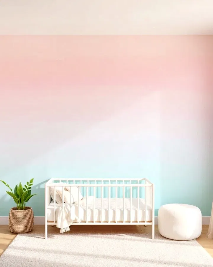
A rainbow ombre wall creates a soft, dreamy atmosphere that feels both playful and calming. Instead of bold rainbow stripes, the colors blend seamlessly into one another, creating a watercolor-like effect. Gentle shades of pink, lavender, blue, mint, and peach add warmth and charm without overwhelming the room. This style works especially well in nurseries, toddler rooms, and spaces designed to promote relaxation and comfort.
7. LEGO Building Wall
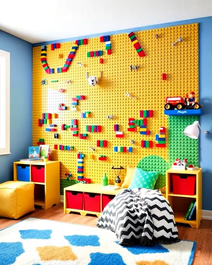
For children who love building and creating, a LEGO accent wall can become the ultimate play feature. Large LEGO baseplates mounted directly onto the wall allow kids to build vertically and display their favorite creations. The wall serves as both decoration and entertainment, helping keep toys organized while encouraging imaginative play. Adding storage bins nearby makes cleanup easier and creates a dedicated creative zone within the room.
8. Mountain Landscape Wall
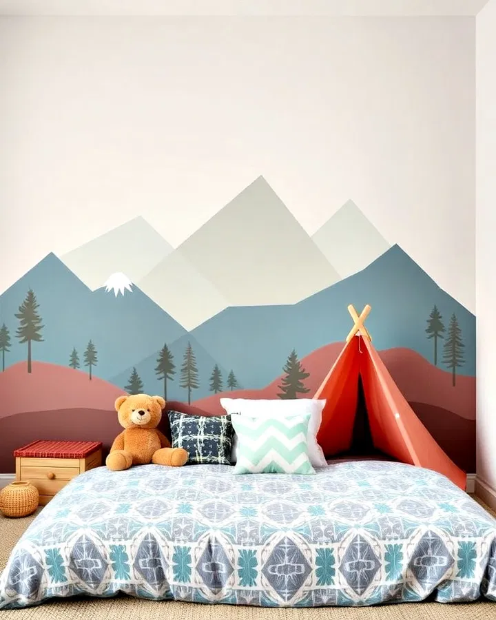
A mountain-inspired accent wall brings the beauty of the outdoors inside. Layered mountain silhouettes painted in varying shades create depth, movement, and a sense of adventure. Soft neutral tones create a calming effect, while brighter colors make the design more playful. This versatile style works well in nature-themed rooms and pairs beautifully with wooden furniture, camping-inspired decor, and cozy textiles.
9. Personalized Name Wall
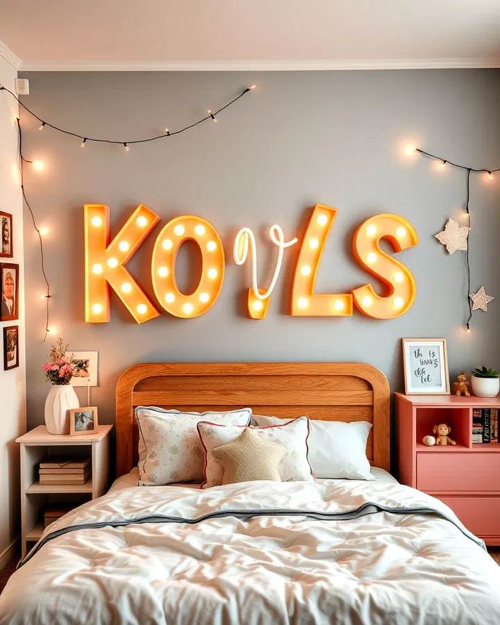
Nothing makes a room feel more special than featuring your child’s name as part of the design. Large painted lettering, wooden initials, custom neon signs, or decorative decals can become the focal point of the room. Surrounding the name with stars, flowers, animals, or favorite colors creates a personalized design that celebrates your child’s individuality. This timeless idea helps children feel connected to their space and gives the room a unique identity.
10. Bold Geometric Patterns
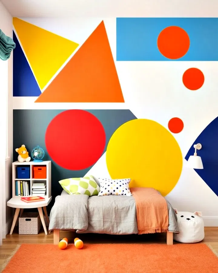
Geometric accent walls offer a fun and modern way to introduce color and shape into a child’s room. Triangles, diamonds, circles, and abstract patterns create visual energy while remaining stylish enough to grow with your child. Painter’s tape makes it easy to create clean lines and customized designs. Whether you choose bright contrasting colors or subtle neutral shades, geometric walls add movement and personality without feeling overly themed.
11. Fairy Light Feature Wall
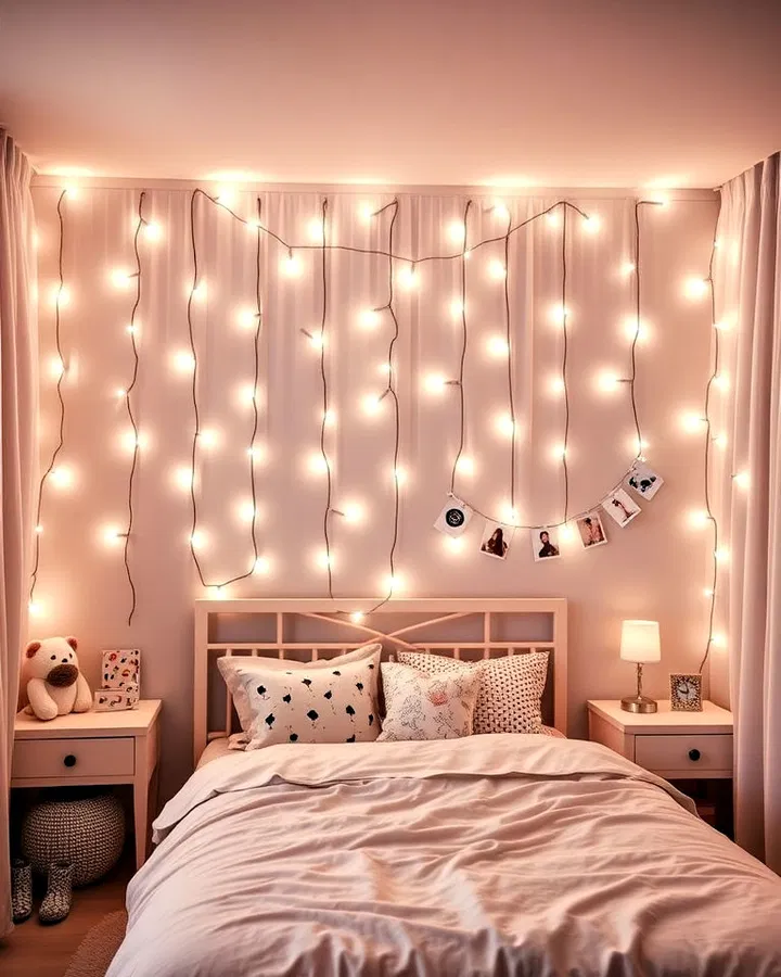
Fairy lights instantly add warmth and enchantment to a bedroom. String lights can be arranged in cascading patterns, woven behind sheer curtains, or displayed around photographs and artwork. The soft glow creates a cozy atmosphere that makes the room feel inviting and magical. This design is particularly popular with older children and preteens because it adds charm without requiring a major renovation.
12. Whimsical Wallpaper Wonderland
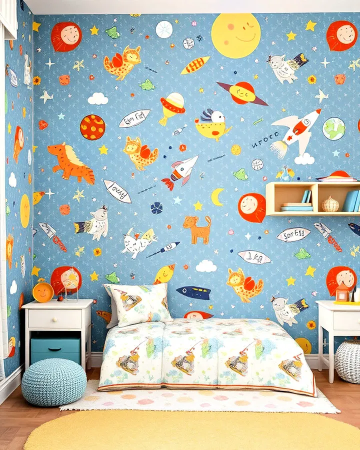
Wallpaper offers endless possibilities for creating a themed accent wall. From woodland animals and fairy tale castles to outer space adventures and tropical jungles, there is a design for every personality. Modern removable wallpaper makes installation easy and allows for future updates as interests change. A whimsical wallpaper wall instantly establishes a theme while adding color, texture, and character to the room.
13. Underwater Ocean Scene
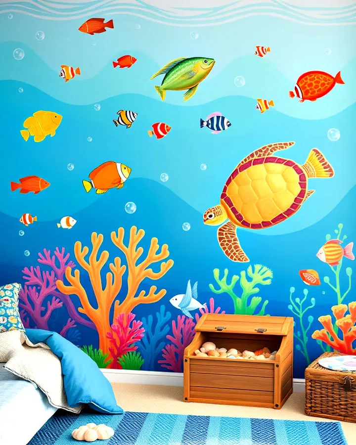
Dive beneath the waves with an underwater-themed accent wall that transforms the room into a colorful ocean paradise. Fish, sea turtles, coral reefs, dolphins, and underwater plants create an immersive environment full of imagination and discovery. Shades of blue mimic ocean depths while colorful sea creatures add excitement and visual interest. This theme is perfect for children fascinated by marine life and aquatic adventures.
14. Framed Art Display Gallery
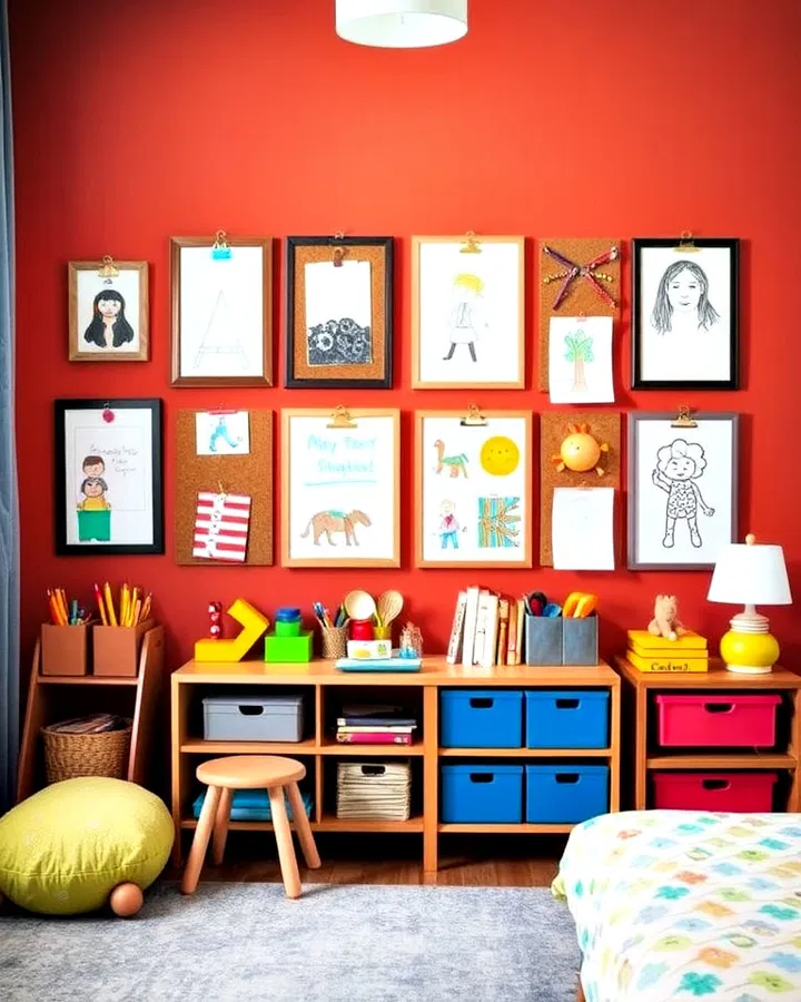
Showcasing your child’s artwork on a dedicated gallery wall celebrates creativity and makes them feel proud of their accomplishments. Use clipboards, frames, magnetic strips, or floating shelves to display drawings, paintings, and school projects. Since artwork can easily be swapped out, the wall continually evolves over time. This personal and meaningful accent wall turns cherished creations into part of the room’s decor.
15. Nature-Inspired Greenery Wall
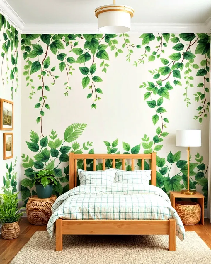
A greenery-inspired wall brings a refreshing sense of nature indoors. Leaf-patterned wallpaper, painted vines, botanical murals, or faux plant installations create a soothing environment filled with natural beauty. This style pairs well with wooden furniture, woven baskets, and earthy color palettes. The calming atmosphere helps create a peaceful retreat while introducing children to the beauty of the natural world.
16. Pegboard Organization Wall
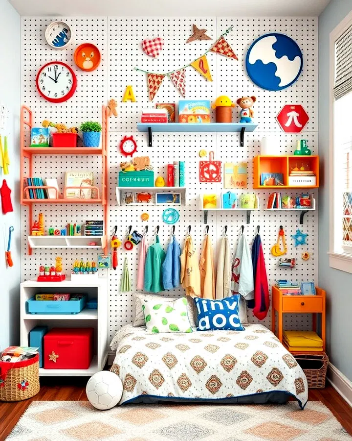
A pegboard accent wall combines style and practicality, making it ideal for busy kids’ rooms. Hooks, baskets, shelves, and organizers can be rearranged as needed to store toys, books, art supplies, and collectibles. Bright paint colors transform the pegboard into a decorative feature rather than just a storage solution. As children grow, the layout can be adjusted to suit changing interests and storage needs.
17. Striking Chevron Design
Chevron patterns bring movement and energy to a room through their distinctive zigzag shape. This eye-catching design works well with both vibrant and neutral color palettes, making it easy to customize. Chevron walls add depth and visual interest while maintaining a clean, modern look. The pattern can be bold enough to stand out while remaining versatile enough to suit various decorating styles.
18. Metallic Starburst Wall
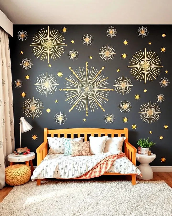
For children who love sparkle and shine, a metallic starburst wall offers a touch of glamour. Gold, silver, or copper stars scattered across the wall catch natural light and create a magical effect. This design works beautifully in celestial-themed rooms but is versatile enough to complement a variety of styles. The reflective accents add dimension and elegance while maintaining a playful atmosphere.
19. Book Lover’s Feature Wall
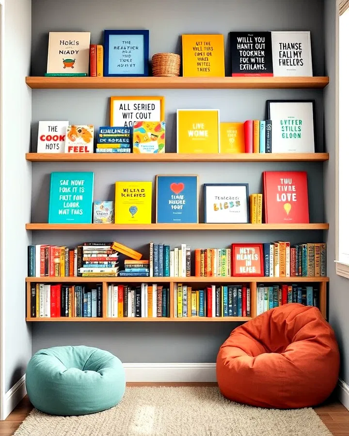
Encourage a lifelong love of reading with a book-themed accent wall. Floating shelves filled with colorful books become both functional storage and decorative artwork. Organize books by color, genre, or theme to create a visually appealing display. Pair the wall with a comfortable reading nook, bean bag chair, or soft lighting to create a cozy space where children can relax and enjoy their favorite stories.
20. Hand-Painted Abstract Art Wall
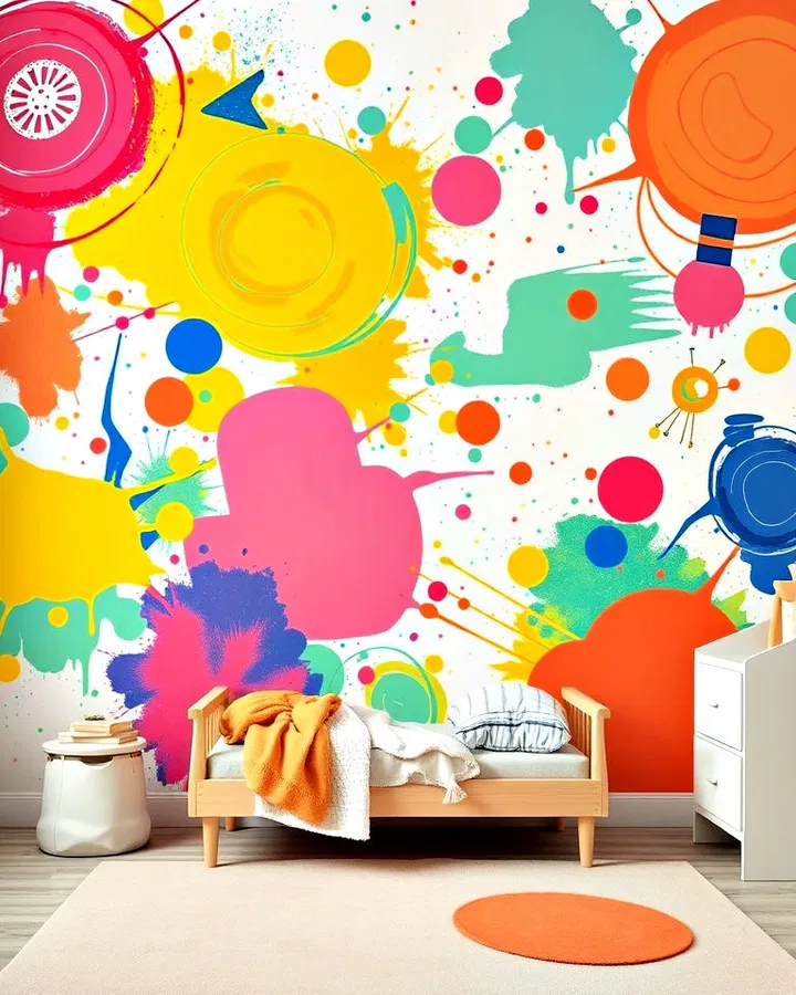
An abstract accent wall allows for complete creative freedom. Bold brushstrokes, splashes of color, geometric shapes, or flowing patterns can be customized to match your child’s personality and interests. This DIY-friendly option creates a one-of-a-kind design that feels artistic and energetic. Because there are no strict rules, parents can experiment with colors and techniques to create something truly unique.
21. Polka Dot Accent Wall
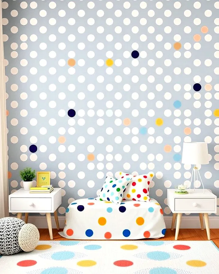
Polka dots are a timeless design choice that adds fun and playfulness to any room. Large dots create a bold statement, while smaller dots provide subtle texture and charm. Available in endless color combinations, polka dot walls work equally well in nurseries, playrooms, and older children’s bedrooms. Peel-and-stick decals make this one of the easiest accent wall projects to complete.
22. Wooden Slat Accent Wall
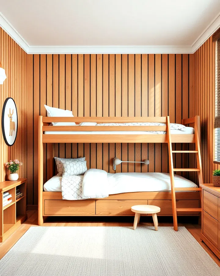
Wooden slat walls introduce warmth, texture, and architectural detail. Natural wood tones create a cozy atmosphere, while painted slats add a modern touch. The vertical lines draw the eye upward, making the room feel larger and more refined. This timeless design works beautifully behind beds, desks, or reading corners and can easily transition into a teen or adult space later on.
23. Glow-in-the-Dark Wall Features
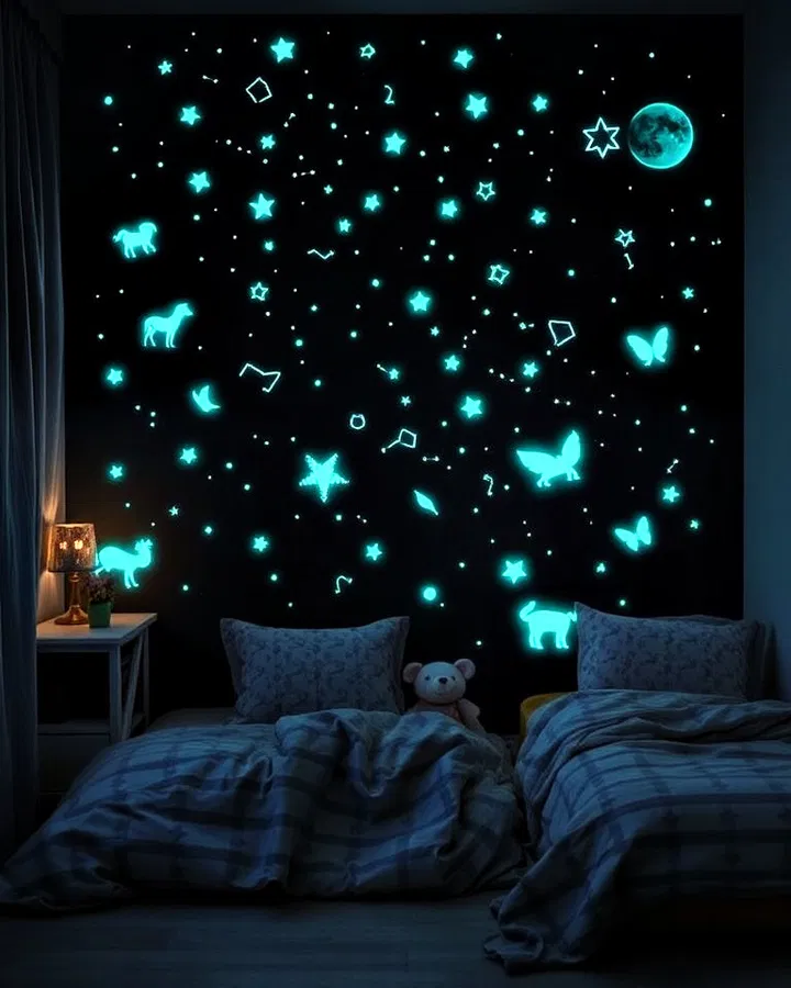
Glow-in-the-dark elements add an exciting surprise that transforms the room after sunset. Stars, constellations, animals, planets, or fantasy-inspired designs remain subtle during the day but illuminate beautifully at night. The gentle glow can also provide comfort for children who prefer a little light while sleeping. This idea combines practicality with imagination, creating a truly magical environment.
24. Superhero Headquarters Wall
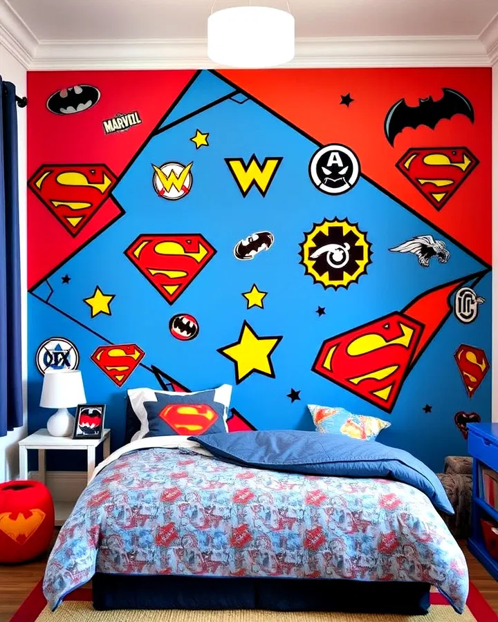
Let your child become the hero of their own story with a superhero-themed accent wall. Comic-inspired graphics, city skylines, character symbols, and bold colors bring excitement and adventure to the room. This design encourages imaginative play and celebrates favorite characters while creating a dynamic and energetic atmosphere. Coordinating bedding and accessories can further enhance the theme.
25. Classic Striped Statement Wall
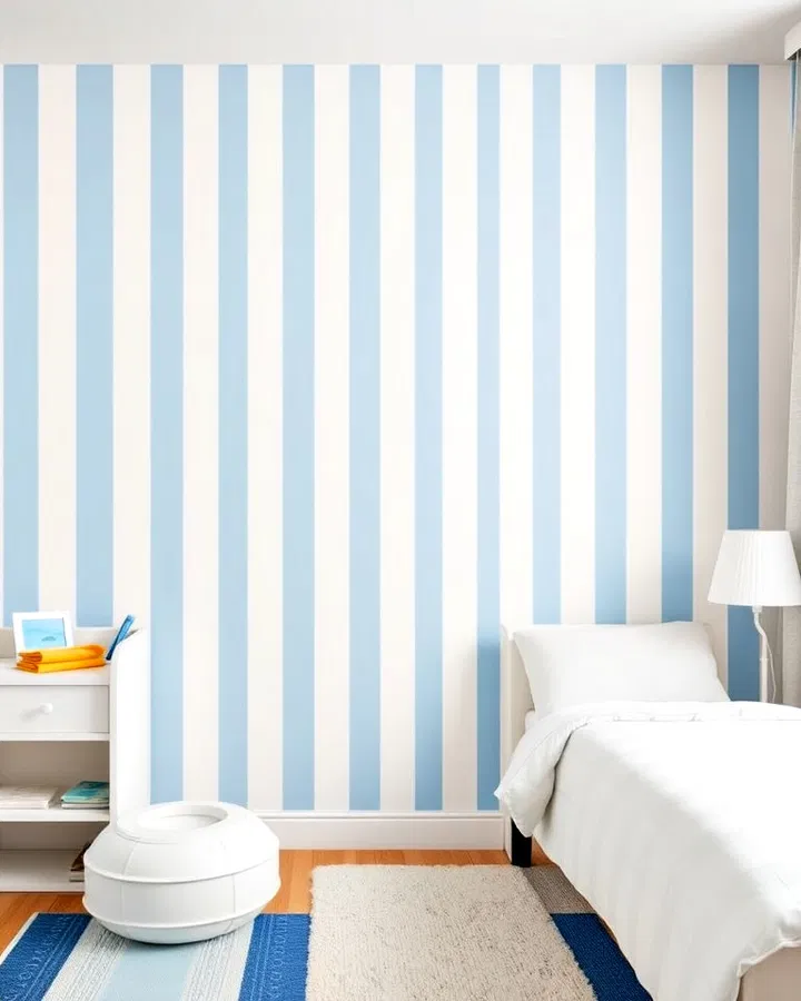
Striped walls remain one of the most versatile and enduring accent wall designs. Vertical stripes can make ceilings appear taller, while horizontal stripes create the illusion of a wider room. The pattern can be adapted to suit any age group by changing the colors and stripe widths. Whether you choose bright playful tones or sophisticated neutrals, stripes provide visual interest without overpowering the space.
Conclusion
A well-designed accent wall can completely redefine a child’s bedroom, transforming it into a space that inspires creativity, learning, comfort, and self-expression. From interactive chalkboard surfaces and educational world maps to whimsical murals and modern geometric patterns, these ideas prove that a single wall can make a huge impact. The best accent walls not only enhance the room’s appearance but also support your child’s interests, imagination, and growth. By choosing a design that reflects their personality and adapts to changing tastes, you can create a space they’ll enjoy and remember for years to come.