We often think finishing a room is all about paint color or furniture placement, but the secret most designers lean on is texture. Texture gives depth, tells a room’s story, and, done right, cements a space so it reads as intentional rather than incidental. In this 2026 guide we’ll show the simple texture mixing trick that consistently moves a room from “nice” to “finished.” We’ll explain why texture matters, unpack the core principle of balancing contrast with cohesion, and give concrete steps for choosing, layering, and correcting textures in living rooms, bedrooms, kitchens, and bathrooms. Follow along and you’ll have a repeatable method to make any space feel polished without overhauling your budget.
Why Texture Matters In Interior Design
Texture is one of those design elements people sense before they can name. It affects how light behaves, how we perceive scale, and how comfortable we feel in a space. When we think of texture, we shouldn’t limit ourselves to fabrics: texture includes wall finishes, floor materials, trim, metal sheens, weave types, and even the negative space created by shadows.
Why do we care so much? First, texture provides visual contrast without changing color. A matte plaster wall beside a glossy tile floor reads richer than two surfaces painted the same shade. Second, texture influences temperature perception: smooth, reflective surfaces tend to feel cooler, while nubby, tactile textiles make a place feel warm and lived-in. Third, texture anchors style. A room with layered textures reads intentional, think a mid-century sofa with a bouclé throw and a leather ottoman, because the variety signals thoughtfulness.
We also need to consider touch. Even if occupants rarely run their hands along the walls, implied touchability matters. Textural variety invites interaction and suggests comfort. In retail and hospitality design, this principle is used to slow people down, luxury boutiques layer textures to make shoppers linger. At home, layering textures helps us feel grounded and at ease.
Finally, texture helps with cohesion across different design pieces. A common mistake is matching colors closely but ignoring texture, leaving a room that feels flat. When we mix textures deliberately, color and pattern become more forgiving: a varied tactile palette makes diverse colors harmonize more easily. In short: texture matters because it delivers depth, comfort, and coherence, three pillars of a finished room.
The Texture Mixing Trick: Balance Contrast With Cohesion
At the heart of the texture mixing trick is a simple rule: balance contrast with cohesion. We want enough contrast to keep the eye moving, but enough cohesion so the room reads as a single, curated composition. Think of it like a musical arrangement, you need high notes and low notes, but they must share a key.
Contrast comes from differences in scale, sheen, and material. Pair a large-scale, coarse element like reclaimed wood beams with finer, softer elements like linen cushions. The juxtaposition creates interest. Cohesion comes from repeating at least one common thread across those contrasts: a color, a pattern motif, or a material family. For instance, a brass lamp, brass drawer pulls, and a brass-accented mirror create a unifying echo that ties disparate textures together.
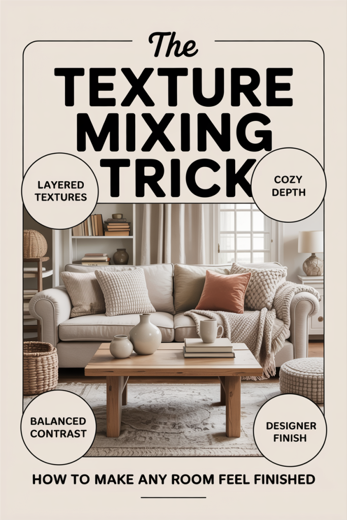
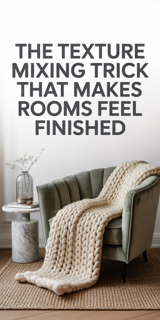
We recommend using a three-tier texture strategy: anchor, mid-layer, and accents. The anchor is the dominant texture, flooring, large upholstery, or a statement wall. The mid-layer adds comfort and scale, rugs, curtains, and medium-sized furniture. Accents are small, tactile details, throws, pillows, decorative objects, and hardware. If we maintain contrast across tiers (rough anchor, soft mid-layer, smooth accents) while repeating one cohesive element (color, finish, or pattern), the room will feel polished.
Another useful approach is the 60-30-10 idea adapted for texture: 60% anchor, 30% mid-layer, 10% accent. It’s not literal surface area but a visual weight guideline. We avoid overwhelming a room with too many dominant textures: instead, we let one texture lead while the others respond. That creates clarity.
Finally, lighting is part of the trick. Texture is revealed by light, directional lighting emphasizes weave and relief, while diffused light softens them. We’re careful to test textures in the room’s actual lighting conditions before committing. The result of balancing contrast and cohesion is a layered space that looks effortless because every piece seems to belong.
How To Choose Complementary Textures
Choosing textures starts with understanding the mood we want. Do we aim for cozy warmth, modern crispness, or an eclectic collected look? Our choices should reinforce that intention. From there, we evaluate four key characteristics: scale, sheen, temperature, and density.
Scale refers to the visual size of the texture’s pattern or surface variation. Large-scale textures, wide wood planks, oversized boucle, we’ll use sparingly as anchors: small-scale textures, fine linen, micro-knit, work well as accents. We avoid placing two large-scale textures next to each other unless one is muted: otherwise they compete.
Sheen defines how reflective a surface is. High-gloss finishes bounce light and read contemporary: matte finishes absorb light and read calm. Mixing sheen creates depth, pairing a matte plaster wall with a satin wood tabletop, for example. We aim for a contrast in sheen but tie them together through color or material family.
Temperature is more subtle but influential. Materials can read warm (wood, wool, terracotta) or cool (concrete, chrome, marble). We balance warm and cool textures for equilibrium. If a room skews warm, a cool metal or stone accessory can prevent it from feeling cloying.
Density concerns how visually heavy a texture appears. A dense weave or heavy stone feels substantial: open weaves and glass feel light. Layering densities prevents a room from becoming monotonous, a heavy sofa offset by an airy rattan chair can breathe life into the layout.
We find it helpful to create a quick texture inventory before shopping: list anchor, mid-layer, and accents, then note desired scale, sheen, temperature, and density for each. This checklist keeps purchases intentional. When in doubt, bring samples home, swatches, small material fragments, even a corner of fabric, and test them together in the space’s light. That physical comparison is worth more than any online photo.
Layering Order: Walls To Accessories
The order in which we layer textures matters because it sets visual hierarchy. We recommend working from the largest, least-changeable surfaces to the smallest details: walls → floors → major furniture → textiles → accessories. This order ensures foundational textures anchor the room and smaller textures refine the mood.
Walls: Start with walls because their finish defines background texture. Options include smooth paint, plaster, textured wallpaper, wood paneling, or exposed brick. A textured wall can become an anchor, but if you choose it, keep other anchors simpler. For example, a limewash or Venetian plaster wall pairs well with streamlined furniture.
Floors: Flooring is the second anchor. Natural hardwood, wide planks, or patterned tile set tone. If floors are visually rich, we often select a simpler wall finish and then use rugs for a contrasting mid-layer. Rugs are a powerful tool to introduce texture, they can be natural fiber, shaggy, flatweave, or kilim, each conveying a distinct character.
Major Furniture: Large upholstered pieces should complement but not overpower the anchor textures. A leather sofa introduces smoothness and sheen: a linen sofa offers a softer, breathable texture. Keep the furniture scale in mind: a large sectional in a heavy weave will dominate and limit other textural choices.
Textiles: Curtains, throws, and pillows are where we get playful. Curtains control the room’s vertical texture: heavier drapery feels formal, while lightweight sheers feel casual. Throws and pillows provide immediate, interchangeable texture updates, swap a chunky knit throw seasonally to shift warmth.
Accessories: Finally, add metal finishes, ceramics, glass, baskets, and art. Accessories should echo one or two textures found earlier to maintain cohesion. For example, woven baskets can repeat the rug’s natural fiber, while brass picture frames can reflect a lamp’s finish.
We always step back and edit. Too many textures without a repeated thread feel chaotic. We look for opportunities to repeat a shape, color, or material at least three times across the room, this repetition is the glue that makes layered textures read as intentional.
Practical Texture Combinations For Common Rooms
Living Room
The living room benefits from a mix of comforting textiles and durable surfaces. A reliable combination is: hardwood floors (anchor), a low-pile wool or flatweave rug (mid-layer), a linen or leather sofa (major furniture), a boucle chair or chunky knit throw (textiles), and brass or matte-black metal accents (accessories). We like pairing smooth leather with nubby boucle because the contrast feels both modern and tactile.
Bedroom
Bedrooms should feel restful, so we prioritize softness with strategic contrast. Start with a painted or plastered wall in a soft matte finish (anchor), hardwood or sisal flooring with a plush underfoot rug (mid-layer), and an upholstered bed, linen for cool climates, velvet for drama. Layer cotton or linen bedding over a wool blanket, and use a mix of pillow textures: sateen, dobby weave, and embroidery. Add wood bedside tables and a ceramic lamp to balance tactile variety.
Kitchen
Kitchens are high-function areas where texture must be both aesthetic and practical. Choose a durable tile or stone floor (anchor) and consider a subtle textured backsplash, subway tile with a hand-glazed finish, for example. Countertops can be honed stone for a matte look or polished for reflection. Bar stools in leather or rattan add a human scale to hard surfaces. Metallic hardware, brass, nickel, or blackened steel, introduces sheen without competing with primary textures.
Bathroom
Bathrooms read as spa-like when soft and reflective textures are in balance. Use large-format matte tiles on the floor (anchor) and a slightly reflective subway or glazed tile for the shower wall (mid-layer). Towels and bathmats in thick cotton or bamboo terry provide plushness. Introduce wood or stone shelving and a glass or mirrored accessory to keep the space feeling open.
Home Office
An effective home office combines professionalism with comfort. Start with a smooth painted wall or subtle wallpaper (anchor), a medium-pile rug for acoustic damping (mid-layer), a leather or upholstered desk chair (major furniture), linen window treatments to diffuse light, and a mix of metal and wooden desktop accessories. Textural balance helps with focus, a tactile desk surface and comfortable chair make long hours more sustainable.
Outdoor-Adjacent Spaces
Porches and sunrooms need weather-appropriate textures: slate or concrete floors, outdoor-grade wicker or teak furniture, quick-dry cushions, and woven rugs designed for moisture resistance. Mix in glazed ceramics and metal planters for contrast. Outdoor textures should be rugged but layered for comfort.
Common Mistakes And Quick Fixes
Mistake: Too Many Dominant Textures
Fix: Choose one dominant anchor and simplify surrounding elements. If your reclaimed wood wall and heavy-patterned tile both compete for attention, mute one, paint the wood a soft tone or swap the tile for a simpler floor. Remember the 60-30-10 visual-weight idea.
Mistake: Matching Color But Missing Texture
Fix: If everything is the same shade but still feels flat, introduce a contrasting sheen or weave. A matte wall with a glossy lamp or a velvet pillow next to a linen duvet creates depth without changing the palette.
Mistake: Overuse of Identical Materials
Fix: Repetition can be powerful, but too much of one material (e.g., all chrome finishes) can feel sterile. Break it up with organic textures, wood, woven fibers, or a single warm metal like brass to provide contrast.
Mistake: Ignoring Scale and Proportion
Fix: If a room feels visually out of balance, reassess scale. Large-scale textures need room to breathe. Swap a large-patterned rug for one with a subtler repeat, or add a few small-scale textures (throws, pillows) to offset a heavy sectional.
Mistake: Not Testing in Real Light
Fix: Always view samples in the room’s actual lighting, morning and evening. A plaster finish that looks warm under midday sun may read flat in the evening: add a reflective accent or a warmer lamp to correct for ambient shifts.
Quick Fixes We Use Regularly
- Swap pillows: Changing two or three pillow covers is the fastest way to shift a room’s texture story.
- Add a single woven basket: It introduces natural fiber and storage without commitment.
- Layer a runner or small rug over a larger rug: It adds immediate scale contrast and can define zones.
- Introduce one reflective object: A mirror, tray, or lamp can lift a flat composition.
These small edits let us correct texture missteps without a full redesign. We aim to edit ruthlessly: if an item doesn’t reinforce the room’s texture narrative, it goes.
Conclusion
Layering textures is a deceptively simple way to make rooms feel finished, and the best part is it’s repeatable. By balancing contrast with cohesion, working from walls to accessories, and applying the anchor/mid-layer/accents strategy, we can craft spaces that look curated yet lived-in. Start small: pick one room, identify your anchor texture, and introduce two contrasting textures with a shared thread. With practice, texture mixing becomes our go-to trick for polished, welcoming spaces that hold up over time.
Leave a Reply