We often get asked whether an all-white bathroom or a warm earth-toned design reads as more luxurious. The quick answer is: it depends. Luxury isn’t a single color or finish: it’s an orchestration of materials, light, scale, and detail. In this text we’ll walk through the design mechanics that create perceived value, compare the strengths and weaknesses of crisp white schemes versus richer, earthy palettes, and give practical guidance to help you choose based on budget, maintenance, and resale priorities. Along the way we’ll share hands-on strategies to make each approach feel intentionally high-end rather than merely trendy.
What Makes A Bathroom Feel Luxurious?
There’s a short list of repeatable factors that make any bathroom feel expensive, and they’re mostly about sensory cues and craftsmanship rather than color alone. When we evaluate a bathroom’s perceived quality, we look for coherence across three broad categories: materials and finishes, lighting and spatial proportion, and detail work.
Materials, Finish Quality, And Color Psychology
High-end bathrooms lean on honest materials with tactile presence. Natural stone, honed or polished porcelain, solid-surface countertops, brass or matte-black hardware, and high-density cabinetry read as premium because they age well and reveal craftsmanship. Finish quality matters: tight grout lines, consistent polish, and continuous veining in stone signal attention to specification and installation.
Color plays a psychological role. White communicates cleanliness, clarity, and quiet luxury when paired with substantial materials. Warm earth tones, think terracotta, ochre, deep taupe, olive, and warm greys, evoke comfort, heritage, and boutique hotel or spa vibes. Neither palette is inherently more luxurious: it’s how color integrates with materiality and texture. We look for palettes that support the materials rather than compete with them.
Lighting, Scale, And Detail Work
Lighting converts good finishes into gorgeous ones. Layered lighting, ambient overhead, task lighting at vanities, and accent or grazing lights on textured walls, creates depth and emphasizes chosen materials. Scale matters too: large-format tiles, generous countertops, and properly proportioned fixtures make a room feel spacious and intentional. Conversely, undersized fixtures or cramped layouts read cheap, regardless of finishes.
Detail work is the tie-breaker. Grout color choices, shadow gaps around cabinetry, integrated drains, concealed fasteners, harmonized trim, and consistent hardware finishes communicate craftsmanship. We always advise clients: spend on the small details that are highly visible, a well-detailed edge profile or a high-quality shower valve, and the room will read far more expensive than its nominal cost.
Bringing these elements together, premium-feeling materials, layered lighting, correct scale, and considered detailing, is what eventually determines whether a bathroom feels luxurious, not just whether it’s white or warm-toned.
Why All-White Bathrooms Read As High-End — When Done Right
An all-white bathroom can feel unequivocally luxe when executed with restraint and quality. White’s advantage is its ability to elevate contrast, highlight texture, and let form speak. But if we simply slap white tiles everywhere without thought, the space can quickly feel clinical.
Design Strategies For A High-End All-White Scheme
- Layer textures: Combine polished marble, honed stone, matte subway tiles, and satin cabinetry finishes to give white surfaces depth. A honed marble vanity top against matte tile walls creates a whisper of contrast that reads expensive.
- Use large-format materials: Fewer grout lines mean a cleaner, more continuous surface that reads as custom. Large slabs of porcelain or bookmatched marble introduce drama and reduce the “busy” look small tiles can create.
- Invest in quality fixtures: In an all-white setting, metal finishes and fittings become focal points. We recommend spending on a statement faucet, solid brass hardware, and a substantial mirror. These items anchor the room and provide the tactile cues of luxury.
- Control gloss and reflectivity: Too much high-gloss white becomes glaring. Pair glossy elements with satin or matte surfaces to balance reflectivity and prevent sterilization.
- Accent subtly: Use soft neutrals or natural woods sparingly, on a vanity face, floating shelf, or bench, to warm the space without shattering the all-white aesthetic.
- Pay attention to grout: Match or very slightly contrast grout color to tile for a refined look. Pixel-perfect, narrow grout lines feel bespoke.
Common Pitfalls And How To Avoid A Sterile Look
The biggest risk with white is sterility. We’ve seen hundreds of white bathrooms that look like hospital wings: the difference between hospital-clean and hotel-chic is richness of material and warmth of light. To avoid a sterile result:
- Avoid uniform gloss: Mix finishes so white reads layered. Use a matte tile on the floor and a semi-polished slab on the vanity.
- Don’t overuse bright, cool lighting: Cooler LEDs heighten clinical vibes. Opt for tunable or warm white (2700K–3000K) with layered sources to produce flattering skin tones and softer shadows.
- Introduce texture and pattern: A subtly patterned mosaic or a honed stone wall gives complexity without adding color. Texture sells tactile luxury.
- Include warmth through metals: Brass, bronze, or aged nickel introduce a lived-in richness that counters sterility.
When we design high-end all-white bathrooms, we treat white as the canvas for material richness rather than the design goal itself. That mindset keeps the result elevated rather than antiseptic.
Why Warm Earth Tones Can Look Richer — Context Matters
Warm earth tones can create instant perception of luxury because they echo natural materials and cultural craft traditions: plastered lime walls, handmade terracotta, warm wood, and patinated metals. These tones feel layered and soulful in ways white sometimes struggles to achieve. But wealth of result hinges on restraint and context.
Earthy palettes read expensive for several reasons:
- They mask wear: Slight staining or water marks are more forgiving on warm surfaces, which can make finishes appear older and hence more curated.
- They reference artisan craft: Natural pigments and textured plasters communicate a handcrafted quality that many perceive as bespoke and high-end.
- They produce a mood: Warm palettes convey comfort and timelessness, often associated with boutique hotels, restored country homes, or upscale spas.
Context is crucial. A warm-toned bathroom in a home with contemporary minimal architecture can feel unexpectedly sumptuous, but the same palette in a small, poorly lit bathroom can feel dull or dated. Proportion, light, and material choices determine whether earth tones look rich or simply dark.
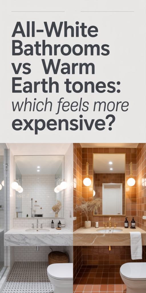
Design Strategies For A Luxurious Earth-Tone Bathroom
- Prioritize natural, tactile surfaces: Venetian plaster, tadelakt, honed travertine, and matte-glazed ceramic tiles give earth tones depth. We prefer finishes with subtle variation, it reads like craftsmanship rather than paint-by-number.
- Layer tonal variations: Use a dominant warm neutral (e.g., warm greige) with deeper accents (burnt umber or olive) and lighter highlights (creamy off-white) to create dimension. Avoid a single flat tone across every surface.
- Add refined metals: Aged brass, oil-rubbed bronze, or muted golds warm the palette and provide a luxe contrast to matte earth finishes.
- Use warming lighting: Slightly warmer color temperature (2700K–3000K) brings out deep hues and makes the space feel cozy and curated.
- Balance with negative space: Even a warm scheme needs quiet areas, a white sink basin or a lighter ceiling can prevent the room from feeling heavy.
- Consider patterned textiles: Natural-fiber towels, linen shower curtains, and woven bath mats add an artisanal layer that amplifies the perceived richness.
When we get these moves right, a warm, earthy bathroom can feel like a high-end retreat: inviting, layered, and precisely considered. But the margin for error is smaller than people assume, poorly chosen pigments or flat finishes can tip a room toward gloom rather than grandeur.
Cost, Maintenance, And Longevity: Practical Comparisons
When choosing between all-white and warm earth tones, we have to factor in real homeowner concerns: budget, maintenance, and how finishes age.
Cost
- Materials: Cost variance is driven more by material choice than color. Large-format porcelain slabs and bookmatched marble (often used in white schemes) can be expensive. Similarly, tadelakt or polished travertine for an earthy look can be costly. You can achieve either palette on a budget with quality-engineered porcelain or high-grade ceramic, but the perceived luxury remains linked to finish quality and installation.
- Labor: Specialized finishes (e.g., tadelakt plastering or precision stone bookmatching) require skilled labor, adding to cost. All-white schemes often demand equally meticulous work if you want narrow grout lines and seamless transitions.
Maintenance
- Cleaning: White surfaces show soap scum, hard-water spots, and grout discoloration more readily, which drives ongoing maintenance. That said, if grout is narrow and matched, and if you select vapor-resistant grout and sealed stone, upkeep is manageable.
- Stain tolerance: Warm earth tones conceal minor staining and patina better, which can be an advantage in family homes. Natural materials like unsealed lime plaster will require re-waxing or resealing over time.
Longevity and Aging
- White: Crisp white can feel timeless in minimalist settings, but if it lacks texture, it risks aging faster as trends shift. A well-detailed white bathroom with classic elements (freestanding tub, high-quality plumbing fixtures) retains value because buyers see the neutral canvas as adaptable.
- Earth tones: These can feel timeless if they reference traditional materials and restrained palettes, yet they’re slightly more subjective. A bold terracotta tile may feel dated in a decade, while a muted warm greige will likely age well.
Practical Recommendations
- For resale-focused projects: Neutral whites with high-quality finishes tend to appeal to a broader pool of buyers. We recommend an elegant white canvas with warm metal accents if resale is a priority.
- For personal, long-term enjoyment: If you’re designing for your own lifestyle and prefer mood and warmth, invest in durable earthy materials and professional finishes. You’ll likely appreciate the character they develop.
- Hybrid approach: Consider a largely white scheme with earth-tone accents (vanity faces, alcove walls, or textiles) or a predominantly warm palette punctuated with white fixtures to balance maintenance and longevity concerns.
Both palettes can deliver long life and good return on investment if materials are chosen wisely and installation is executed well. The smart move is to prioritize finishes and workmanship over strict adherence to color.
How To Choose For Your Home: Style, Resale, And Personal Use
Choosing between all-white and warm earth tones comes down to three practical filters: our home’s architecture and natural light, our lifestyle and maintenance tolerance, and whether resale is an important horizon.
Assess the architecture and light
- Bright, high-ceiling spaces: All-white schemes excel in rooms with ample natural light and generous proportions, white amplifies brightness and emphasizes scale. We often recommend white in modern, airy homes where the architecture itself is a selling point.
- Low-light or cozy footprints: Warm earth tones perform better in intimate or north-facing bathrooms. They make small spaces feel intentional and designed rather than cramped.
Match choice to lifestyle and maintenance
- Busy households with kids or active use: Earth tones and textured surfaces will hide wear better and reduce the stress of constant cleaning. Durable glazed tiles and sealed stone are practical here.
- Owners who want a spa-like, pristine aesthetic: A white scheme with matched grout and high-quality fixtures delivers a calm, hotel-like experience, provided you’re comfortable with slightly more upkeep.
Resale considerations
- Broader appeal: Neutral white is often the safer bet for resale because it’s a blank canvas for buyers. If we were renovating to flip or to maximize buyer interest, we’d select a restrained white with warm metal accents and quality finishes.
- Distinctive value: If our market leans toward design-forward buyers or if our property is a custom, high-end home, a tasteful warm palette can differentiate the listing and attract buyers seeking a curated look.
Practical decision steps we recommend
- Audit the natural light and room proportions: take photos at different times of day. This informs whether white will brighten or whether earth tones will add welcome warmth.
- Set a maintenance threshold: how often will we realistically clean and reseal surfaces? Be honest: maintenance appetite should shape material choices.
- Identify priority features: are we investing in long-term enjoyment (materials and finishes that age gracefully) or in resale (neutral, widely appealing choices)?
- Test full-scale samples: Tape up 4×8 sheets or install large tile mockups. Color and texture behave differently at scale and under bathroom lighting.
- Consider a hybrid: Use white on major surfaces and earth tones as accents (or vice versa). It often yields the best of both worlds, timeless resale appeal plus warm personality.
Final takeaways (100 words)
We’ve found that neither all-white nor warm earth tones are universally more “expensive”, perceived luxury comes from materiality, lighting, scale, and the precision of execution. White excels at clarity and timelessness: warm earth tones offer depth and a curated mood. For resale, a neutral white canvas with thoughtful warm accents is safest. For long-term personal enjoyment, embrace the palette that resonates with how you want to feel every morning. Whatever direction we choose, prioritizing quality finishes, layered lighting, and thoughtful detailing will ensure the bathroom reads as intentionally high-end rather than simply fashionable.
Leave a Reply