In today’s fast-paced world, our bedrooms should serve as tranquil sanctuaries—a place where simplicity and calm coexist to restore our energy and soothe our minds. Embracing minimalist bedroom design not only declutters your space but also creates an environment that fosters ultimate serenity. By focusing on clean lines, neutral palettes, and purposeful furnishings, you can transform your bedroom into a haven that promotes relaxation and clarity.
Minimalism is more than just an aesthetic; it’s a lifestyle choice that encourages intentional living and mindfulness. In this post, we’ll explore inspiring minimalist bedroom design ideas that balance functionality with beauty, helping you craft a space that feels both refreshing and deeply personal. Whether you’re starting from scratch or seeking subtle changes, these concepts will guide you toward a serene retreat where less truly is more.
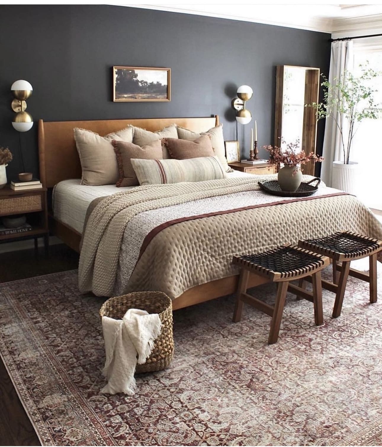
1. Illuminate with Stylish Wall-Mounted Lights
Wall-mounted sconces are an excellent choice for minimalist bedrooms, as they free up valuable floor space while adding soft, ambient lighting. By attaching lighting fixtures directly to the walls, you preserve the room’s open and uncluttered atmosphere. This approach ensures both functionality and a sleek, modern aesthetic.
Key Design Elements
- Choose sconces with adjustable arms to direct light where you need it most.
- Opt for dimmable fixtures to create customizable moods in your bedroom.
- Install sconces at eye level beside the bed for convenient reading light.
Pro Tip: Pro Tip: Select sconces with built-in USB ports to combine lighting with charging functionality, saving even more space.
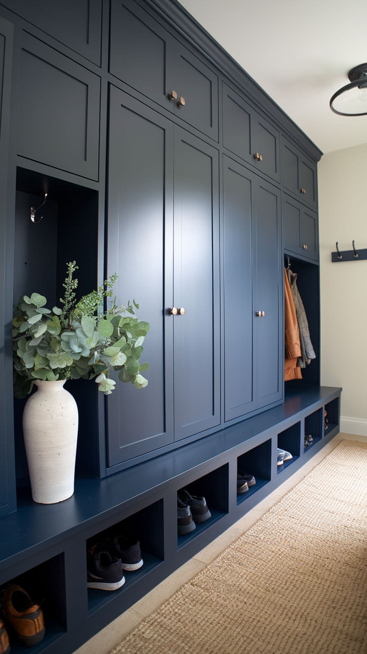
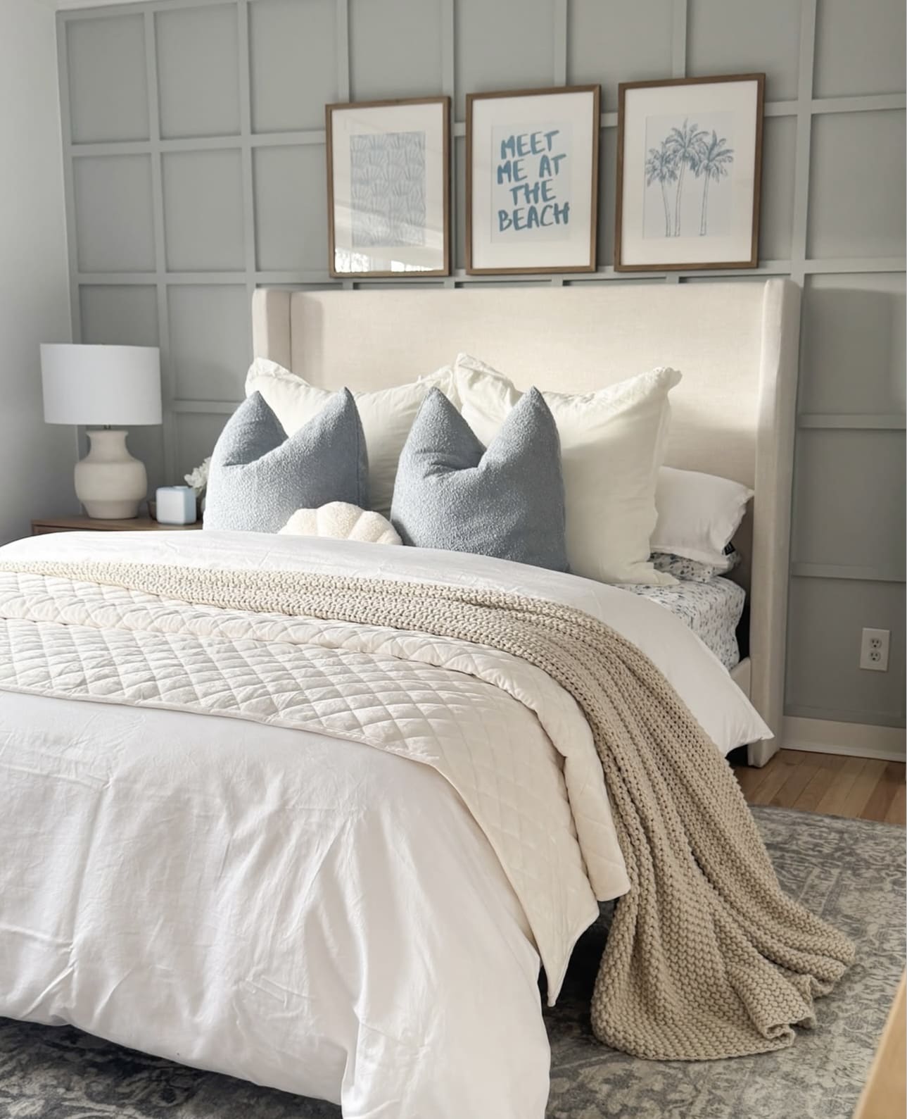
2. Embrace the Serenity of Blue Hues
Blue tones evoke a sense of peace and relaxation, making them the perfect palette for a restful bedroom environment. Gentle blues foster a soothing ambiance that helps melt away daily stress, setting the stage for better sleep and rejuvenation.
Key Design Elements
- Choose soft, muted blue shades for walls or bedding to create a calming backdrop.
- Incorporate blue accent pieces like throw pillows or curtains to add subtle tranquility.
- Pair blue with neutral colors such as white or beige to maintain a balanced and peaceful look.
Pro Tip: Pro Tip: Opt for matte or satin finishes in blue tones to enhance the room’s calming effect without overwhelming the senses.
3. Elevate Your Bedroom with a Textured Feature Wall
Add depth and character to your minimalist bedroom by incorporating a textured feature wall. Whether you choose reclaimed wood, embossed wallpaper, or a painted brick finish, this design element creates a striking visual centerpiece that enhances the overall ambiance of the space.
Key Design Elements
- Select materials that complement your room’s color palette for a cohesive look.
- Use subtle, natural textures to maintain a serene and uncluttered atmosphere.
- Balance the textured wall with simple furnishings to keep the focus on the accent.
Pro Tip: Pro Tip: Opt for a matte finish on textured surfaces to reduce glare and emphasize the material’s natural beauty.
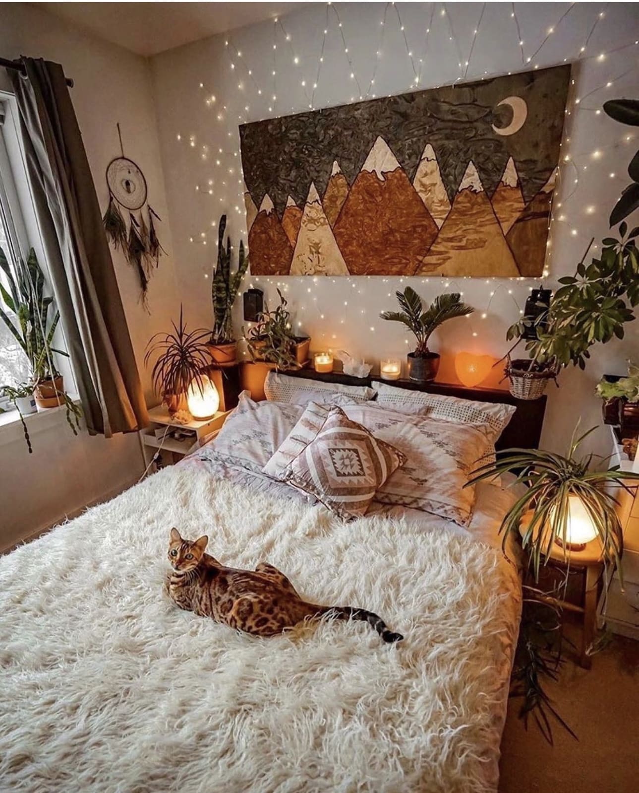
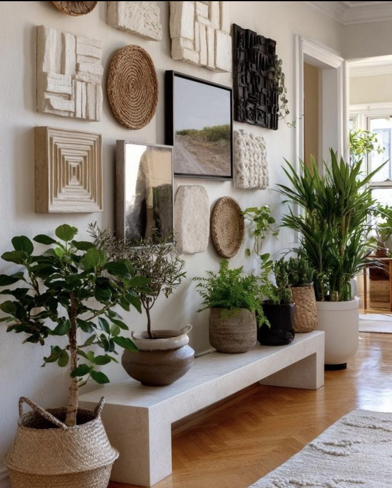
4. Bring Life Indoors with Lush Greenery
Incorporating indoor plants into your bedroom instantly infuses the space with vitality and serenity, creating a calming retreat. These natural elements not only enhance air quality but also foster a subtle connection to nature that softens the overall ambiance.
Key Design Elements
- Choose low-maintenance plants like snake plants or pothos for easy care.
- Place plants near windows to ensure they receive ample natural light.
- Use decorative pots that complement your bedroom’s color scheme to elevate style.
Pro Tip: Pro Tip: Rotate your plants regularly to ensure even growth and maintain their vibrant appearance.
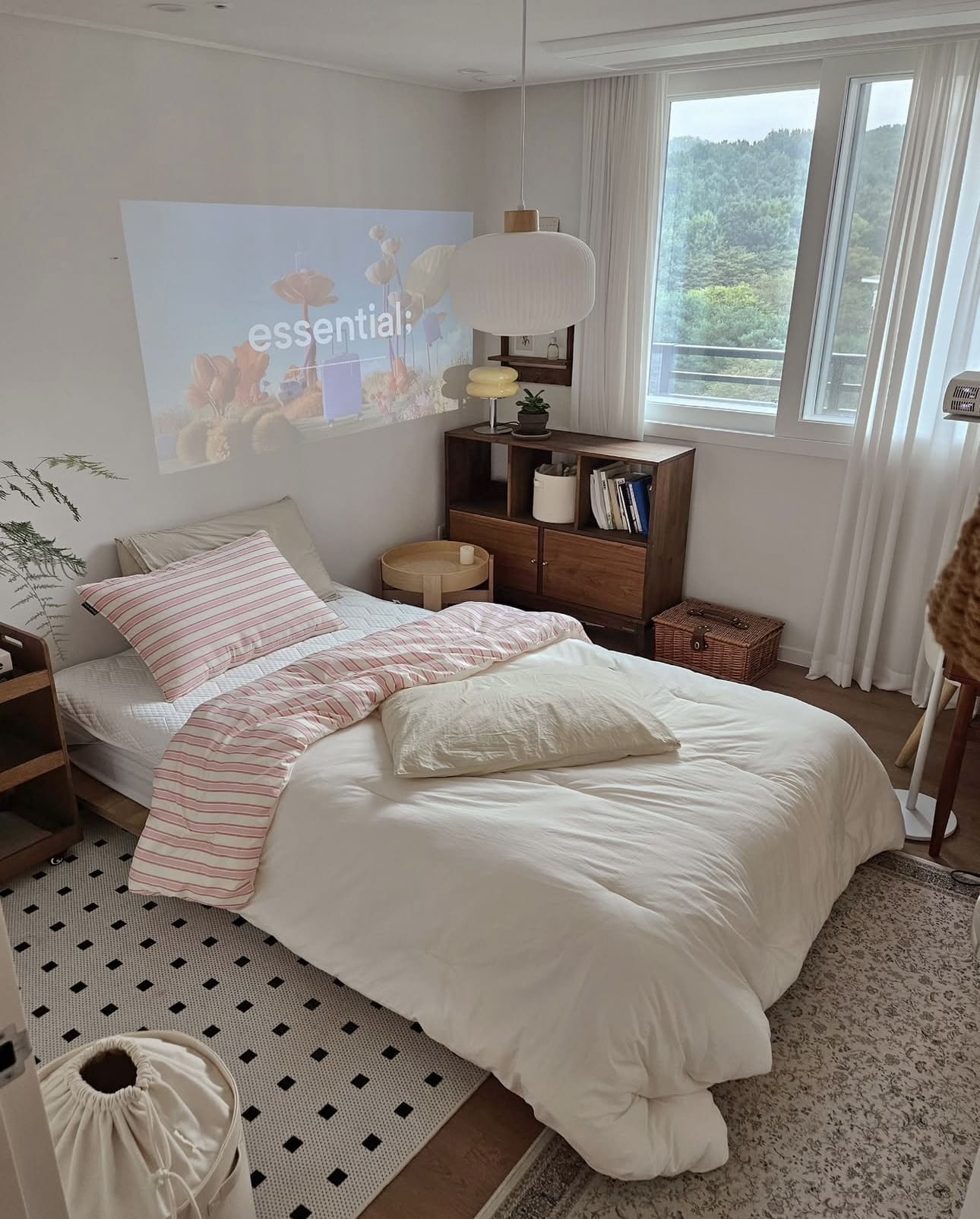
5. Embrace Light with Minimalist Window Treatments
Opting for simple window coverings allows ample natural light to fill your bedroom, fostering an open and serene environment. Lightweight sheer curtains gently filter sunlight, reducing harshness while casting a soothing, warm glow that enhances comfort and tranquility.
Key Design Elements
- Choose sheer or translucent fabrics to maintain privacy without sacrificing brightness.
- Avoid heavy drapes that block natural light and make the space feel smaller.
- Mount curtains close to the ceiling to create the illusion of taller windows and higher ceilings.
Pro Tip: Pro Tip: Layer sheer curtains with lightweight blinds to balance light control and privacy effortlessly.
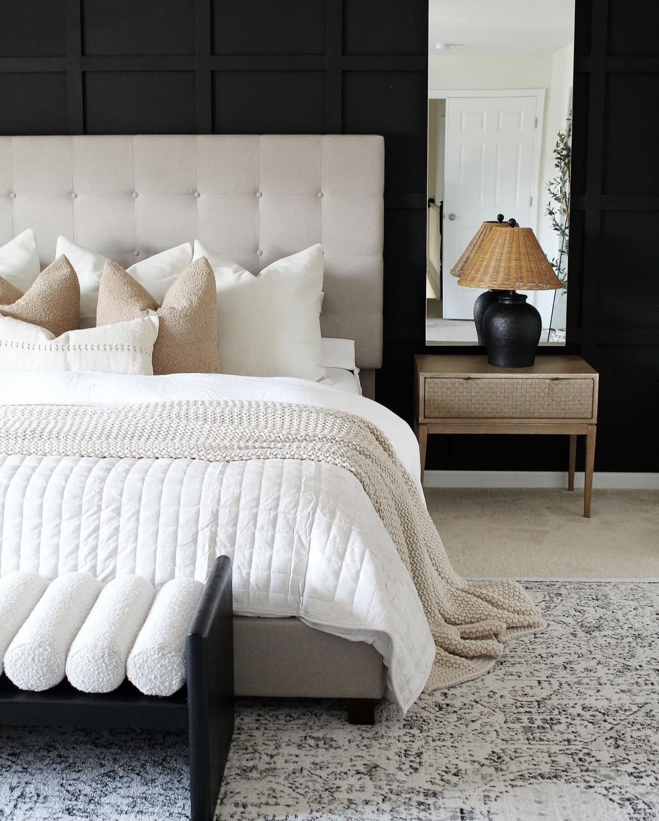
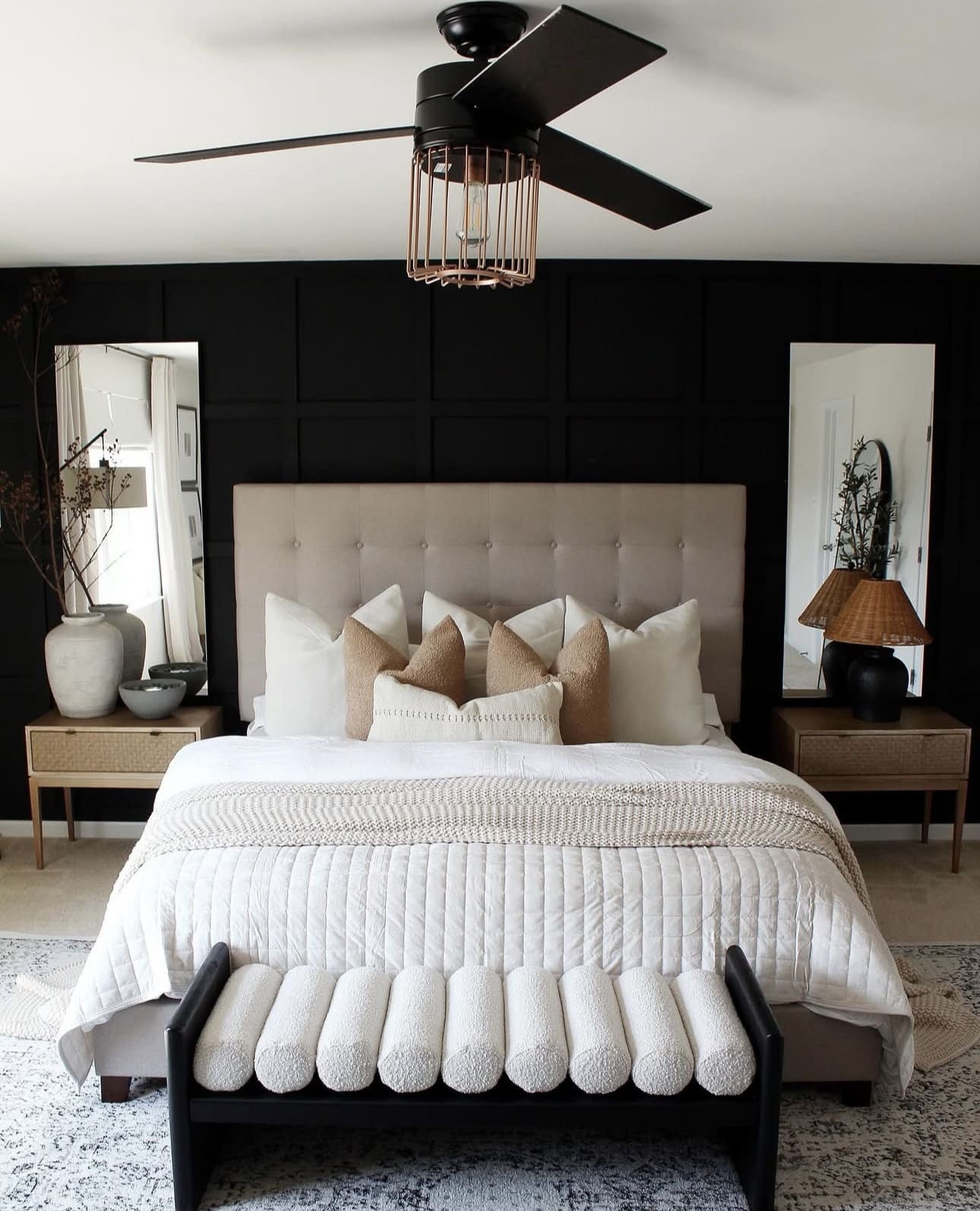
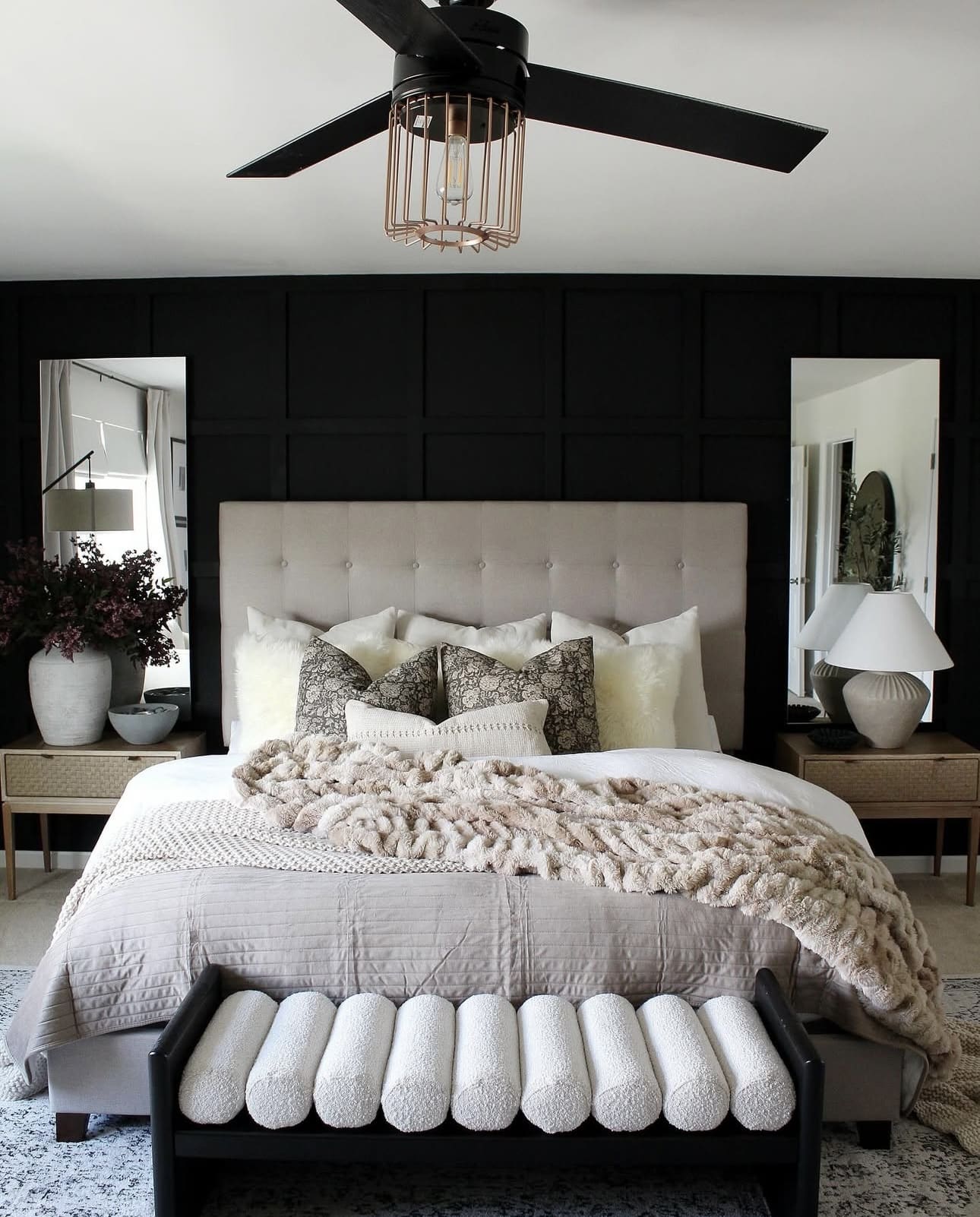
6. Elevate Your Space with a Statement Wall
Introducing a statement wall can transform a minimalist bedroom by adding depth and a captivating focal point. This design technique breaks up the simplicity with a burst of personality, making the room feel more dynamic and inviting. It’s a subtle way to infuse character without overwhelming the clean aesthetic.
Key Design Elements
- Choose a color or pattern that complements your existing palette to maintain harmony.
- Consider textured finishes like wallpaper or wood panels for added dimension.
- Use artwork or lighting strategically on the accent wall to enhance its impact.
Pro Tip: Pro Tip: Opt for matte finishes on the accent wall to avoid glare and keep the look sophisticated.
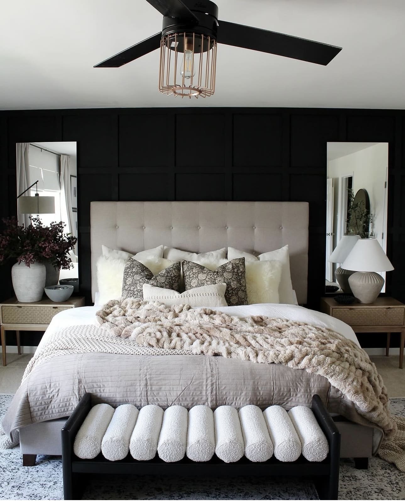
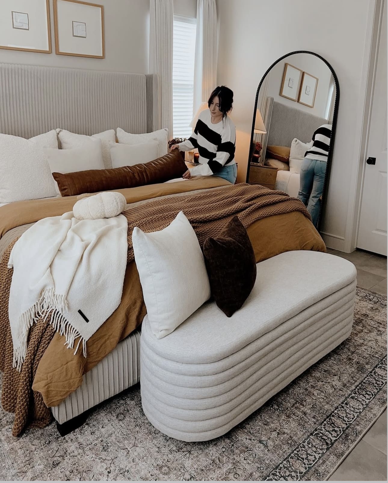
7. Elevate Comfort with Plush Fabrics
Incorporate plush fabrics to create a warm and inviting atmosphere in your bedroom. Choose premium bedding made from breathable natural materials like cotton or linen to enhance comfort and style. Complement the look with a soft area rug that grounds the space while adding subtle texture and charm.
Key Design Elements
- Select bedding crafted from organic cotton or linen for durability and breathability.
- Layer curtains with light, airy fabrics to soften natural light and add depth.
- Place a plush rug near the bed to provide a cushioned surface and enrich the room’s aesthetic.
Pro Tip: Pro Tip: Mixing different textile textures can add dimension and coziness without cluttering your design.
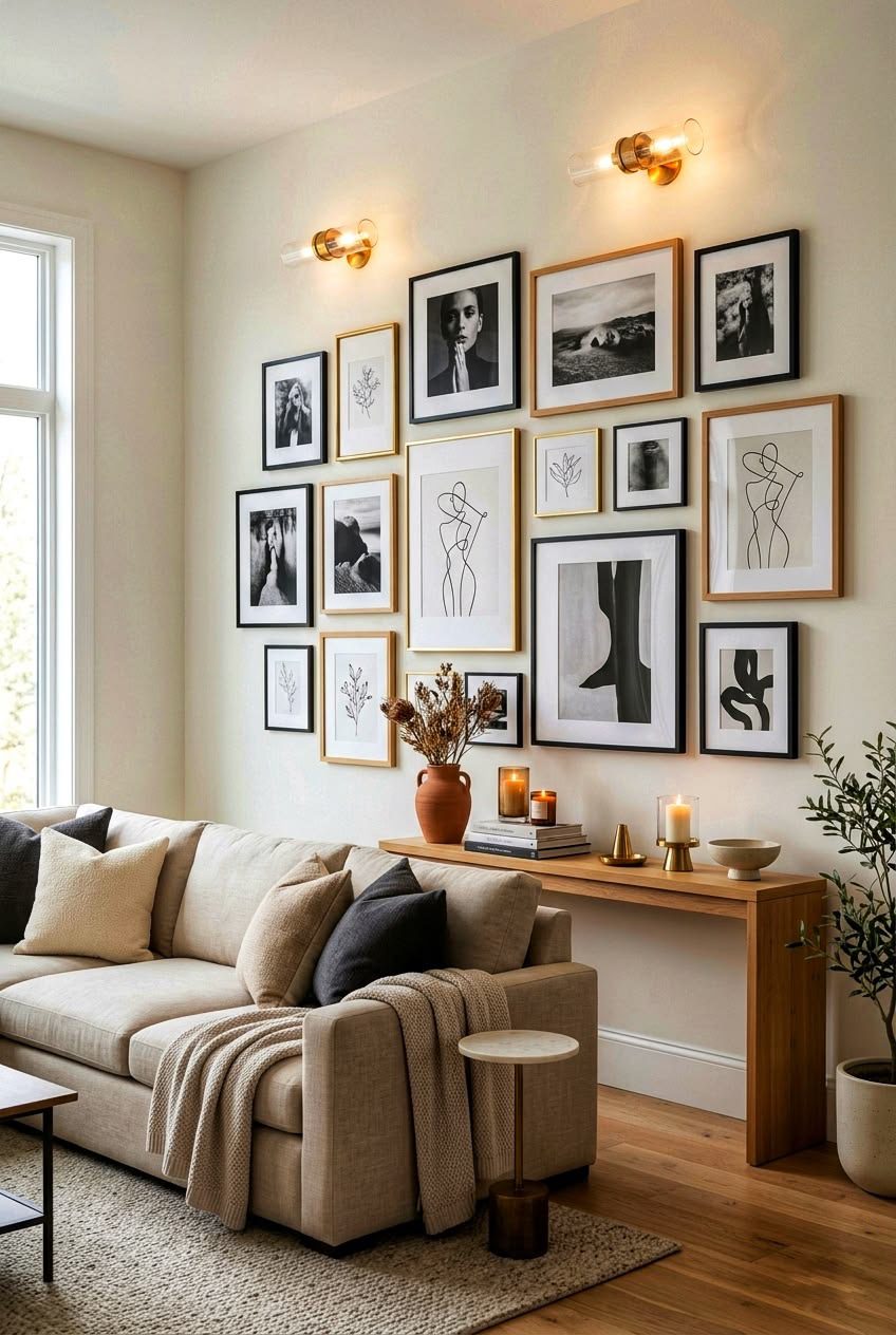
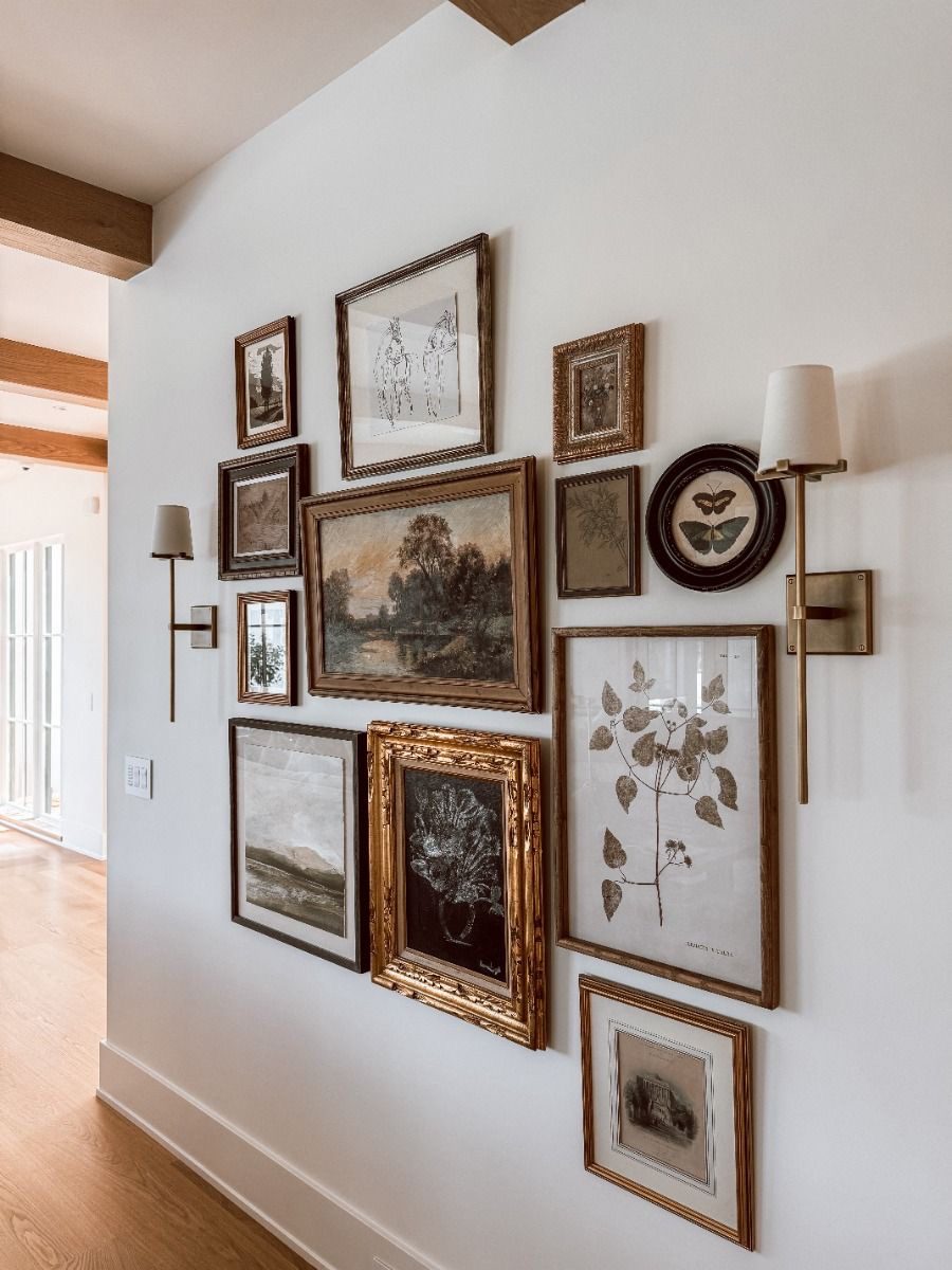
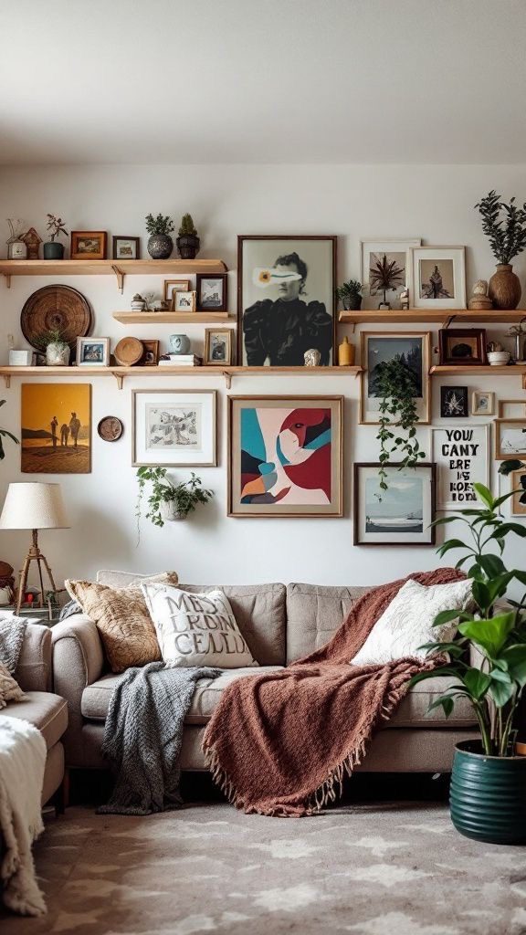
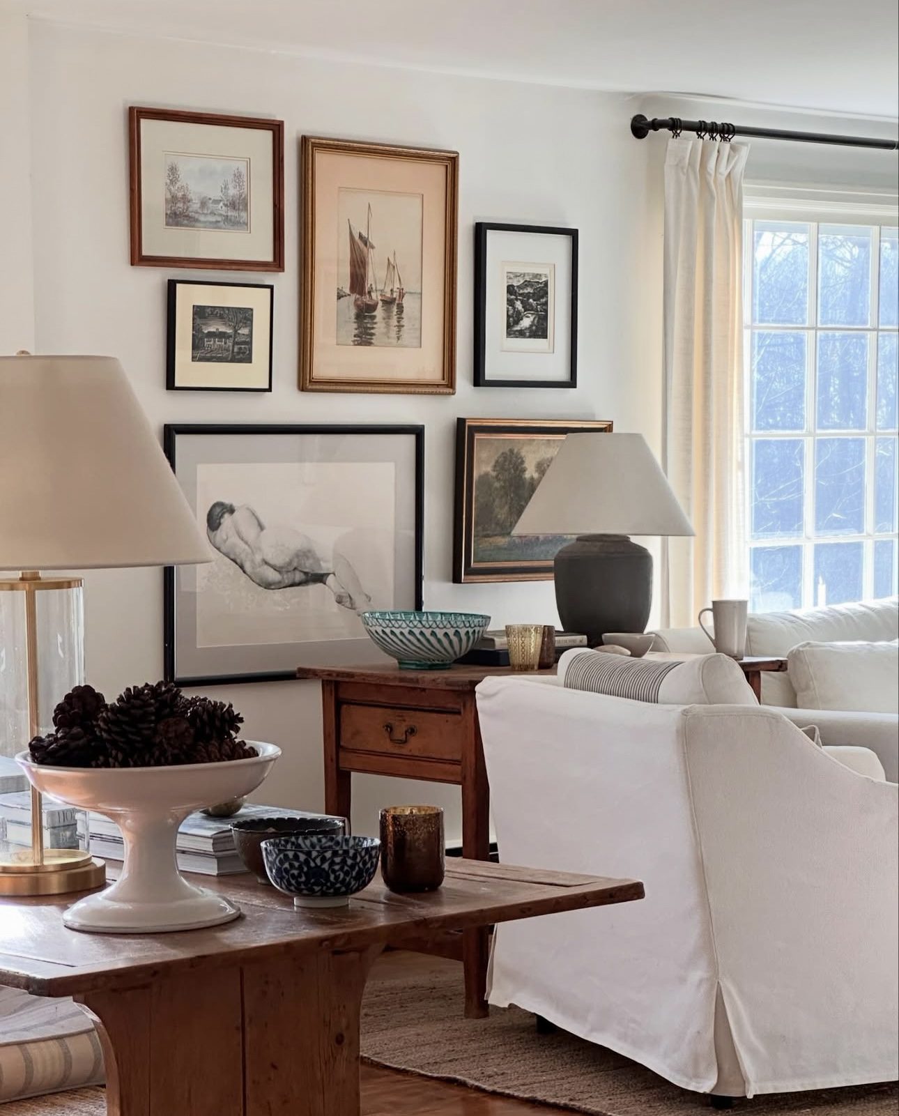
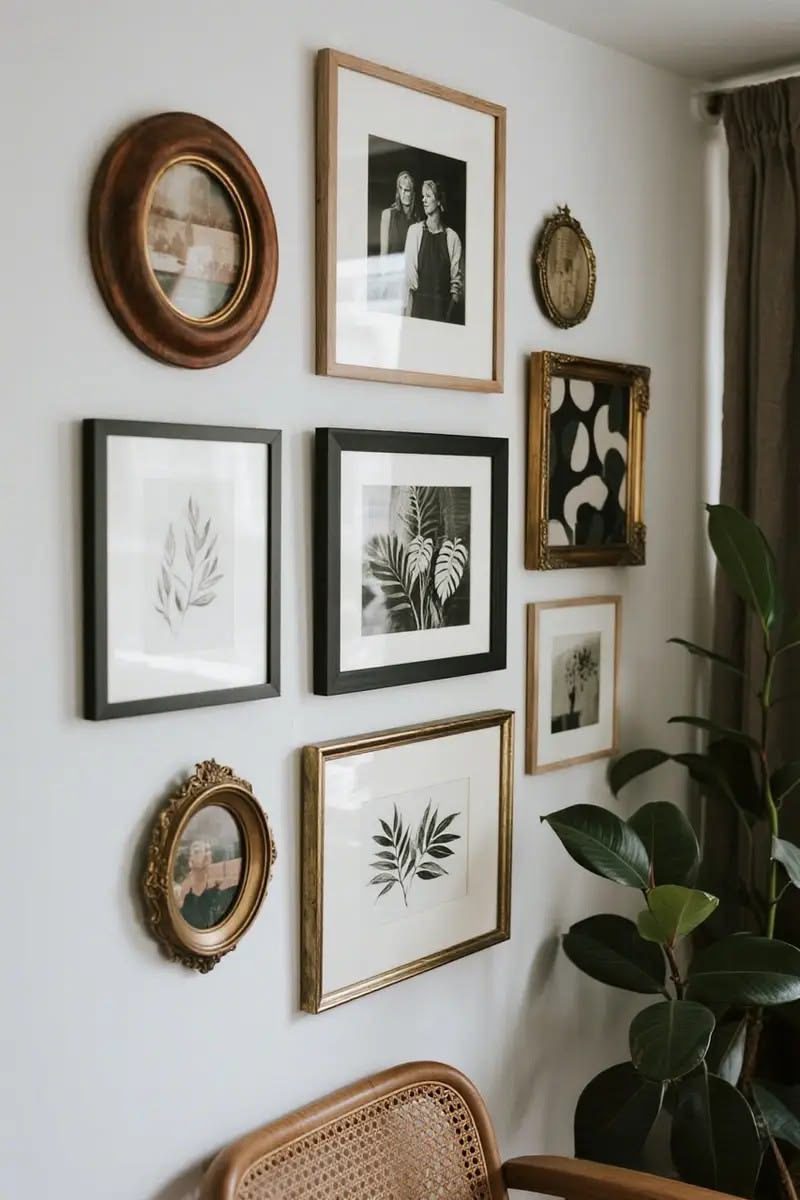
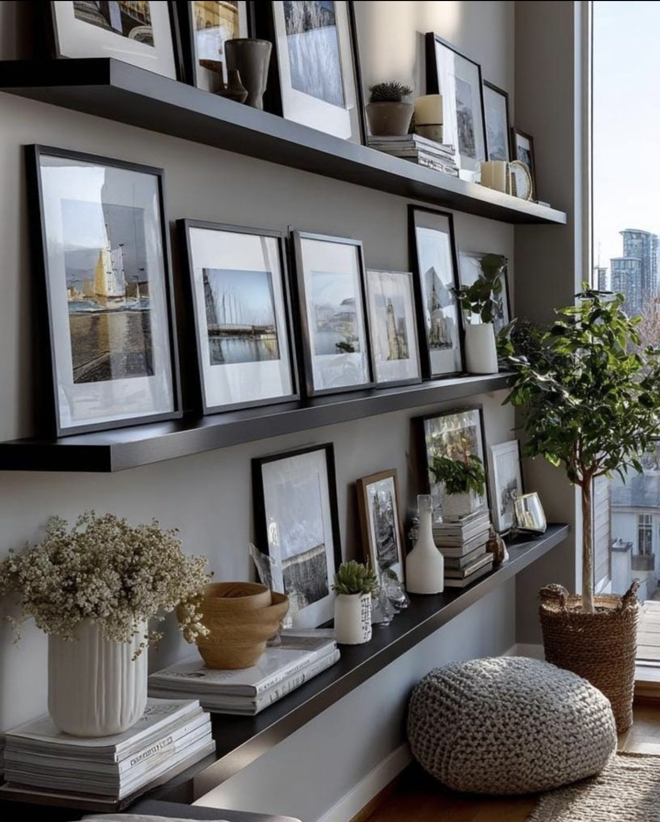
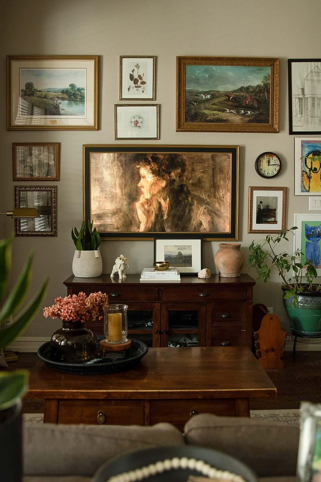
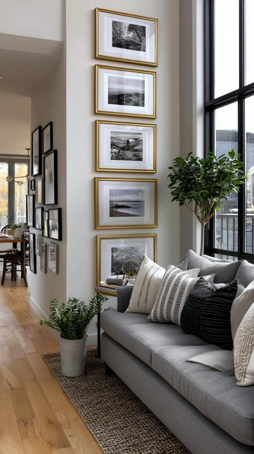
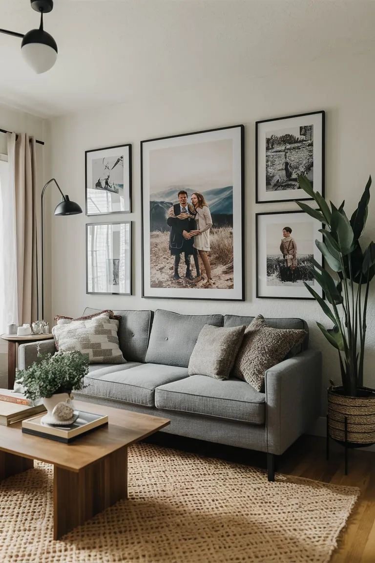
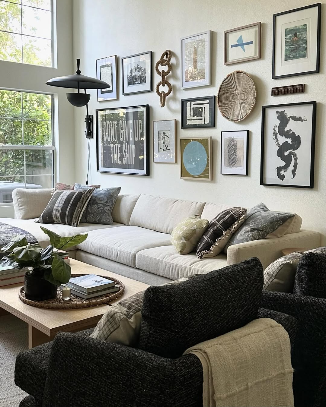
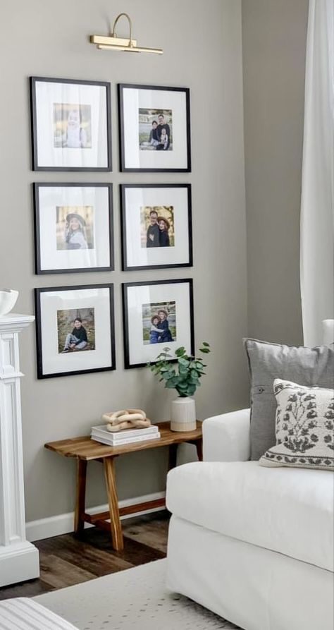
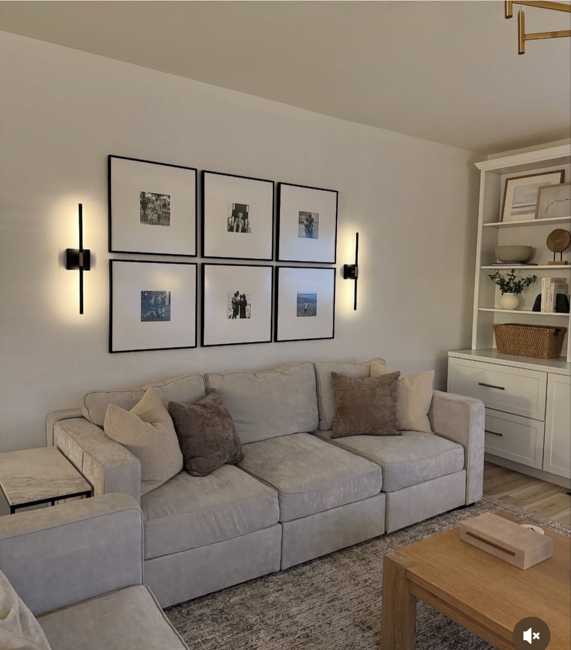
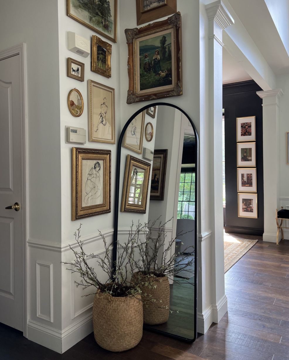
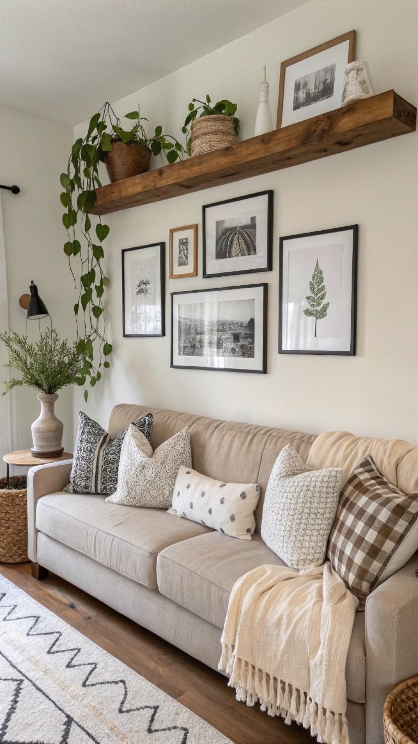
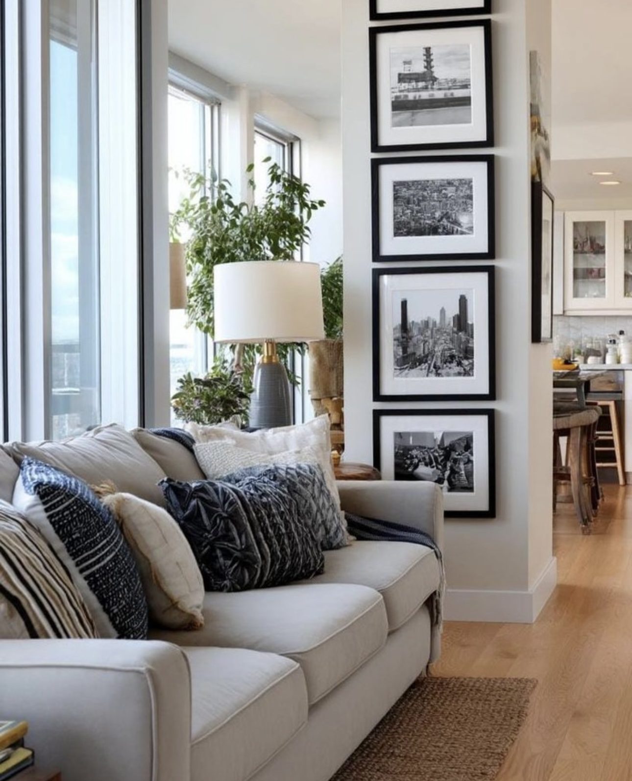
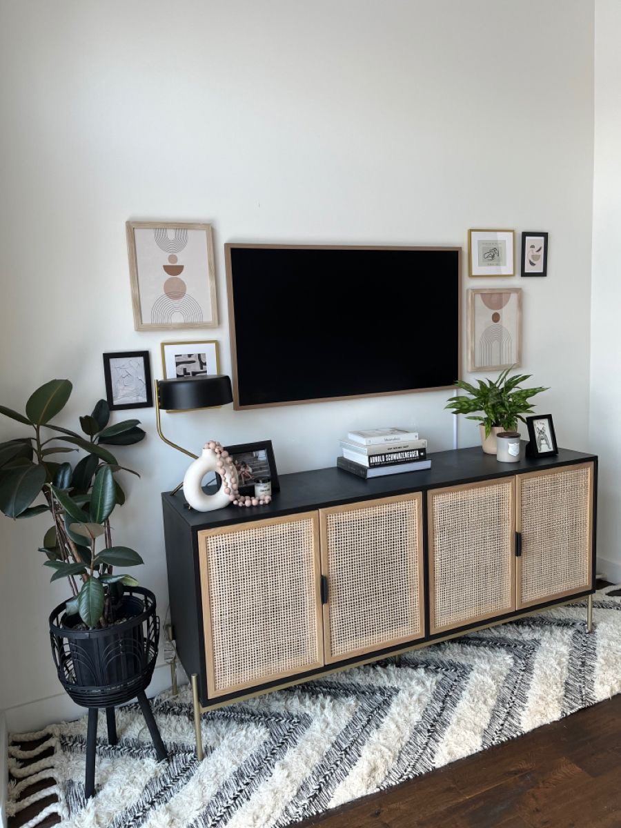
8. Elevate Your Space with Sleek Minimalist Art
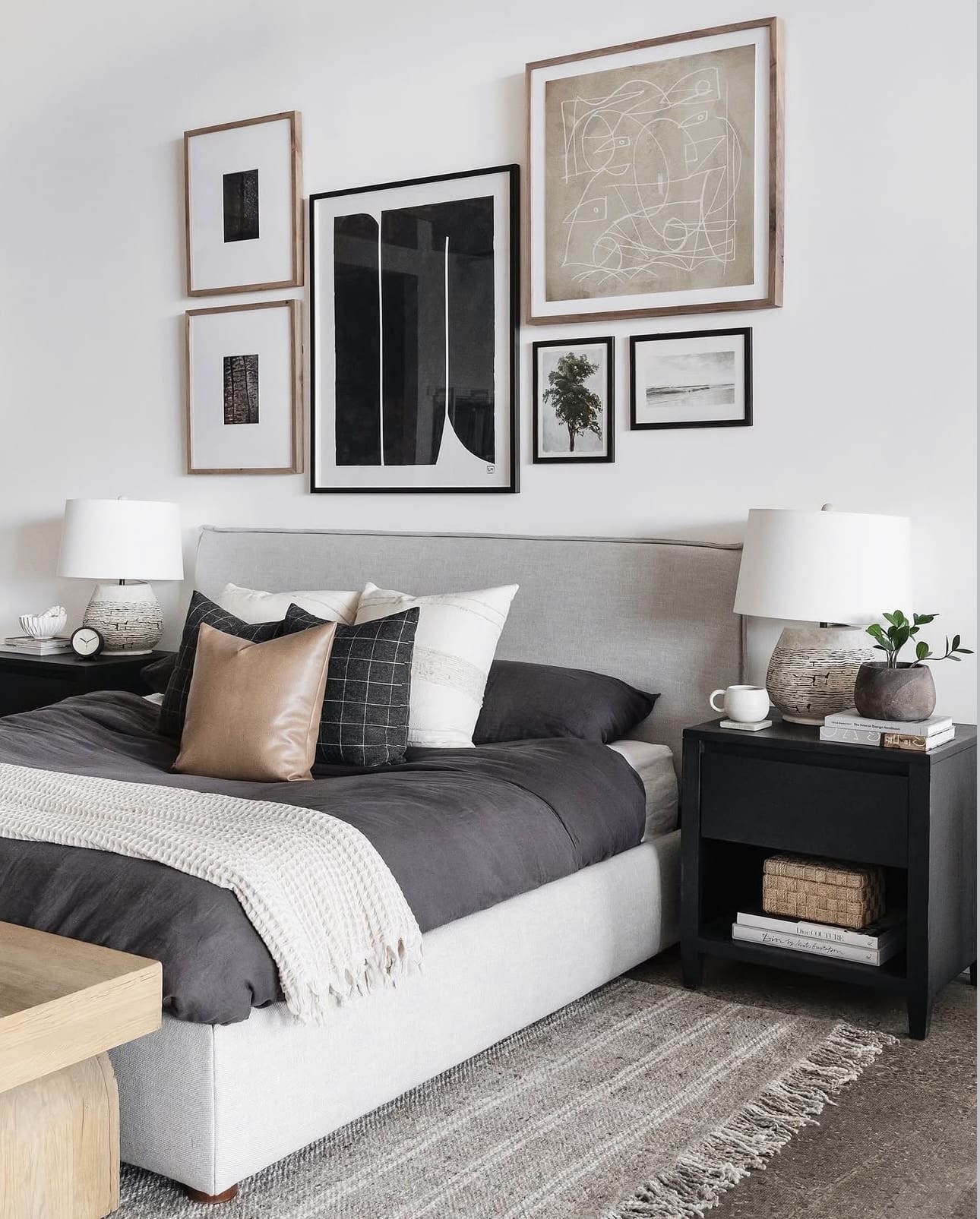
Bring subtle character to your bedroom by selecting artwork that embraces minimalist aesthetics. Focus on pieces featuring clean geometric forms, abstract motifs, or striking monochrome photography to enhance the room’s streamlined design. Creating a thoughtfully arranged gallery wall can introduce depth and intrigue without cluttering the space.
Key Design Elements
- Select art with a limited color palette to maintain a cohesive, calming atmosphere.
- Mix different sizes and frames for a dynamic yet balanced gallery wall.
- Use wall-mounted lighting or picture ledges to highlight your artwork thoughtfully.
Pro Tip: Pro Tip: Choose frames with slim profiles in neutral tones to keep the focus on the art while preserving a minimalist vibe.
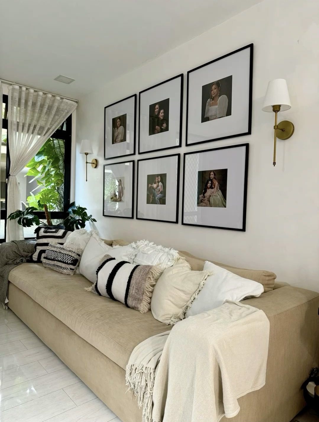
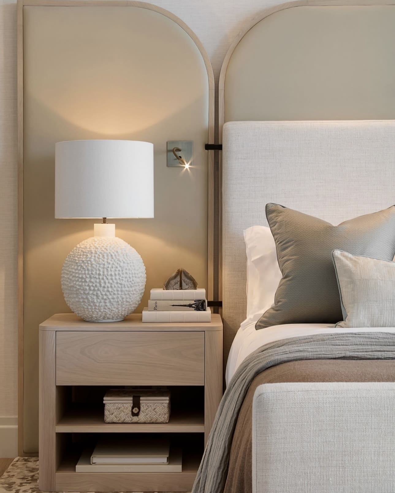
9. Harness the Power of Balanced Design
Creating balance in your bedroom layout fosters a peaceful atmosphere by offering visual harmony and a sense of order. In minimalist spaces, where every element counts, symmetrical arrangements enhance the feeling of calm and support restful sleep. This thoughtful design approach helps transform your bedroom into a soothing retreat.
Key Design Elements
- Place matching bedside tables and lamps on either side of the bed for a cohesive look.
- Align artwork or mirrors evenly above headboards to maintain visual balance.
- Choose pairs of decor items, like cushions or vases, to reinforce symmetry without clutter.
Pro Tip: Pro Tip: Use symmetry to anchor your space, then add subtle asymmetrical accents for dynamic interest.
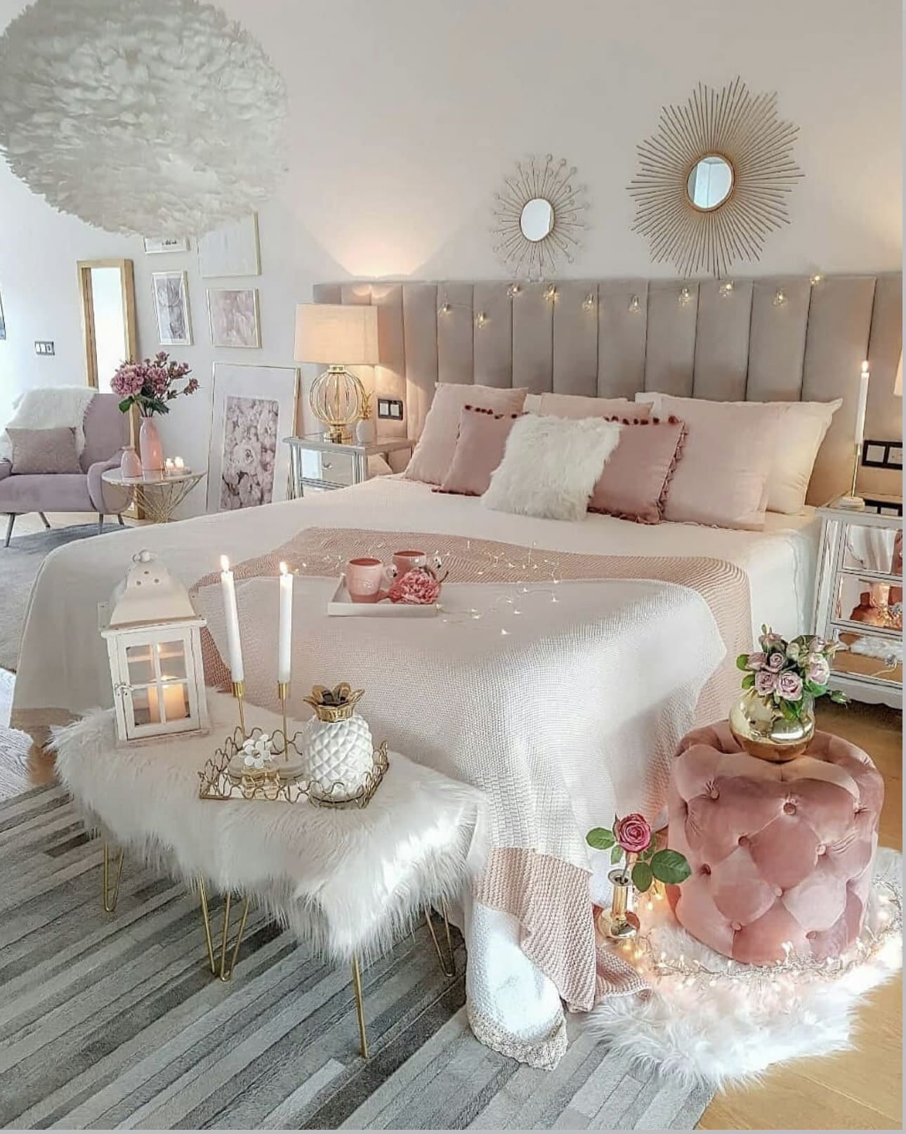
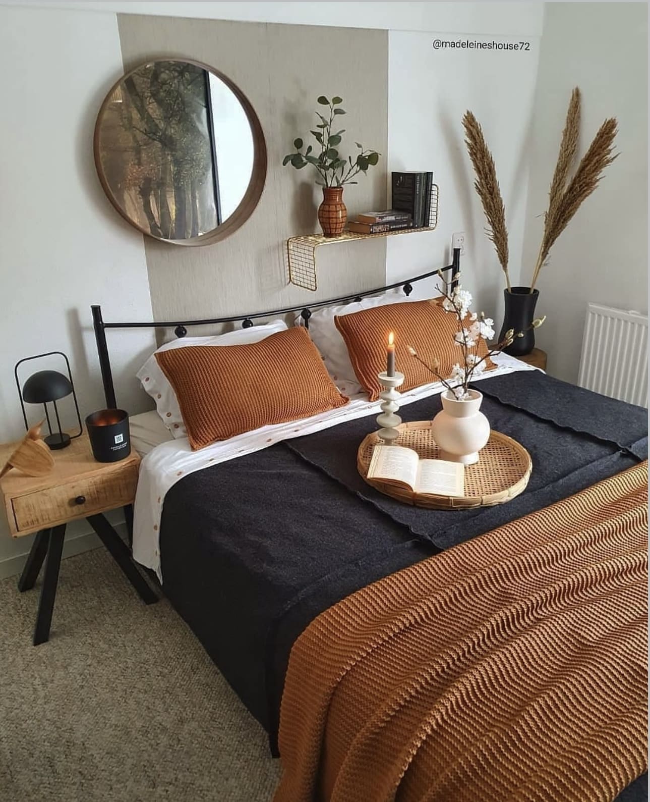
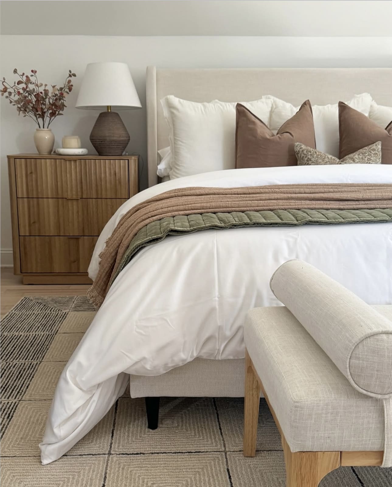
10. Soft Hues for Subtle Style
Incorporating soft color touches into a minimalist bedroom enhances the space with depth and interest while maintaining a calm and cohesive atmosphere. These gentle accents create a refined balance, ensuring the room feels inviting without overpowering its serene foundation.
Key Design Elements
- Choose muted tones like dusty rose, sage green, or soft blues to complement neutral walls.
- Integrate subtle color through accessories such as throw pillows, rugs, or artwork.
- Use layered textures in your chosen accent color to add dimension without intensity.
Pro Tip: Pro Tip: Opt for natural materials in your accent pieces to keep the look grounded and harmonious.
11. Embrace Simplicity with Thoughtful Accents
In minimalist bedroom design, restraint is key. Select a handful of impactful elements, like a bold piece of artwork or a unique lighting fixture, to infuse character while maintaining a clean, uncluttered space. Prioritize quality and meaningful pieces over an abundance of decor.
Key Design Elements
- Opt for one or two focal points that draw the eye immediately.
- Choose decor items that serve both aesthetic and functional purposes.
- Limit smaller decorative objects to avoid visual clutter and maintain serenity.
Pro Tip: Pro Tip: Invest in timeless pieces that elevate the room without overwhelming it.
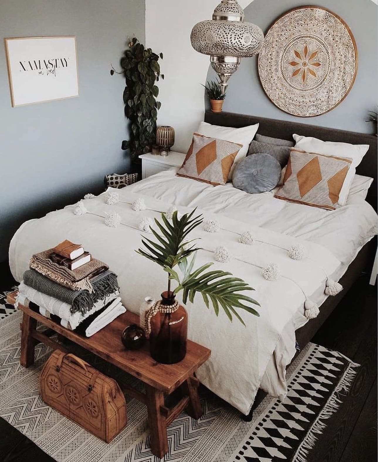
12. Bring the Calm of the Coast into Your Bedroom
Embrace the soothing essence of the sea by infusing your bedroom with coastal-inspired design elements. Utilizing a palette of crisp blues and whites, paired with organic textures and ocean-themed accents, creates a peaceful retreat that encourages relaxation and rejuvenation. This approach transforms your space into a serene sanctuary reminiscent of a tranquil seaside escape.
Key Design Elements
- Incorporate navy and white stripes through bedding or curtains to evoke classic nautical style.
- Use natural materials like driftwood, rattan, or jute to add texture and warmth.
- Decorate with subtle maritime motifs such as seashells, anchors, or nautical maps for authentic touches.
Pro Tip: Pro Tip: Balance bold nautical colors with soft neutrals to keep the space feeling airy and restful.
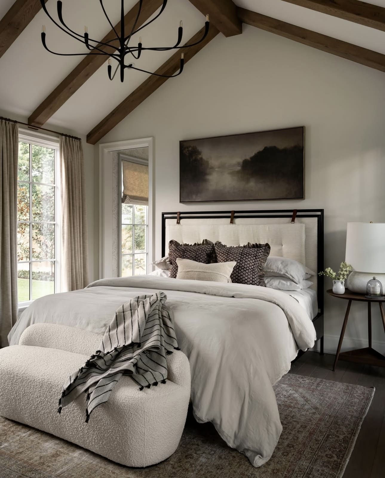
13. Embrace Earthy Elements for a Cozy Retreat
Infuse your bedroom with the calming essence of nature by integrating materials like wood, stone, and lush greenery. These natural components create a soothing atmosphere and add tactile interest, all while supporting a clean, minimalist aesthetic. Opt for hardy plants such as succulents or snake plants to effortlessly brighten your space without extra upkeep.
Key Design Elements
- Incorporate wooden furniture or accents to introduce warmth and organic texture.
- Use stone or ceramic decor pieces to add subtle depth and an earthy feel.
- Select low-maintenance plants that thrive indoors, like pothos or ZZ plants, to keep greenery vibrant year-round.
Pro Tip: Pro Tip: Combine different natural textures—like a wooden frame with a stone planter—to create a layered, inviting look.
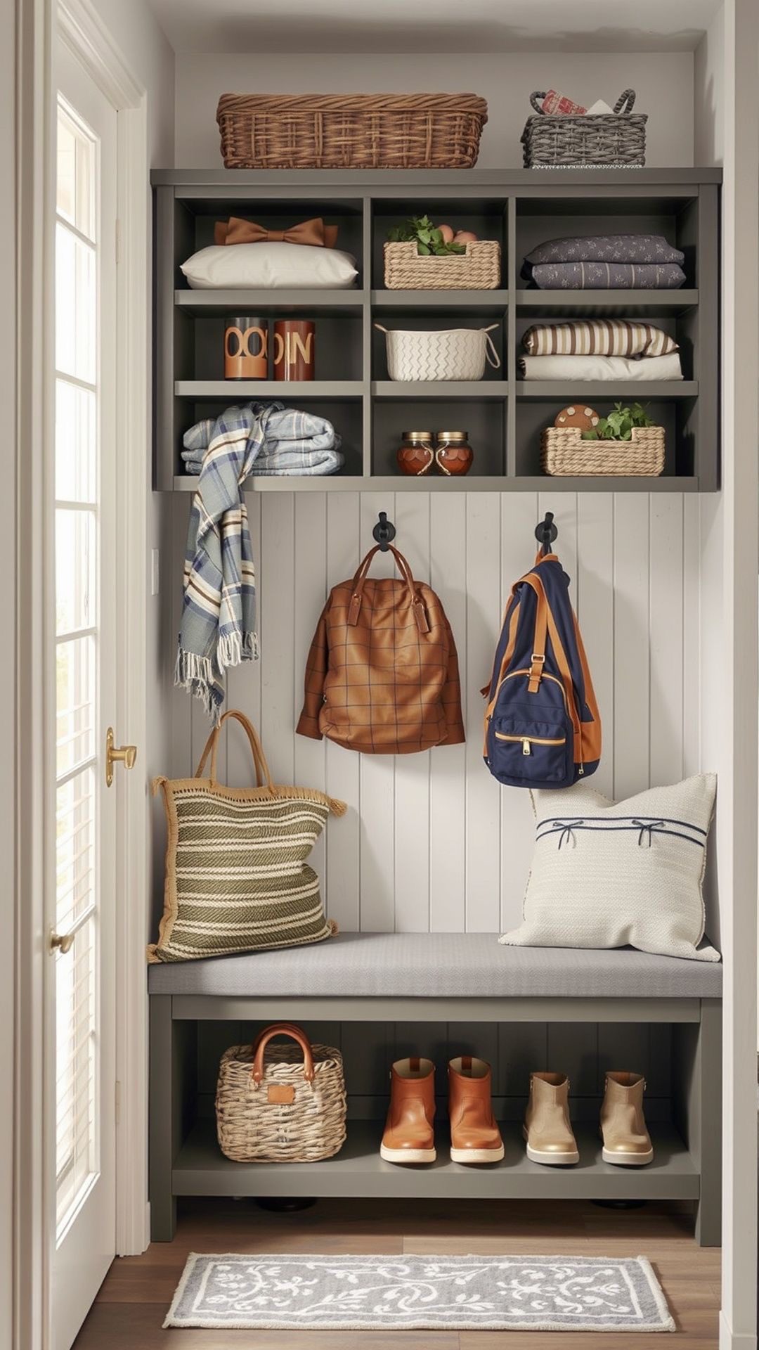
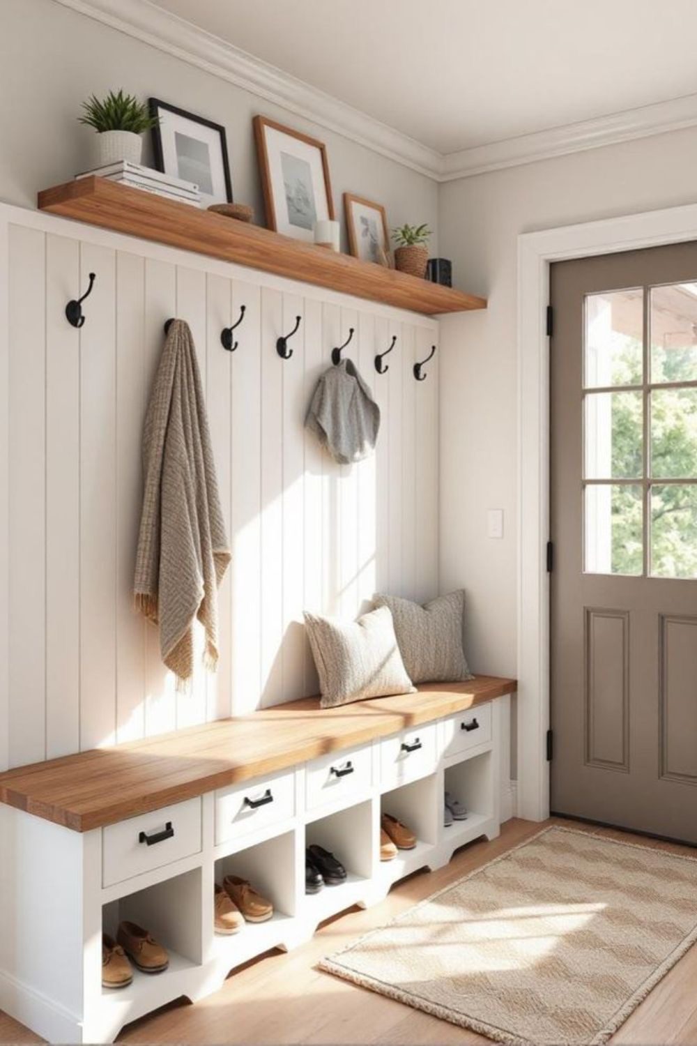
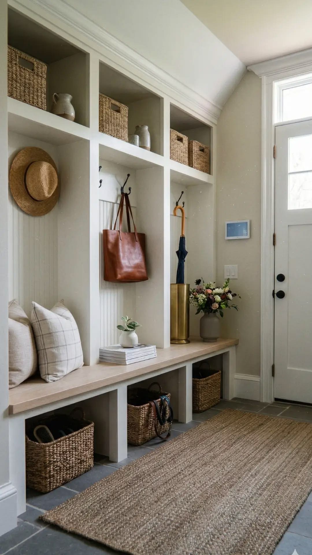
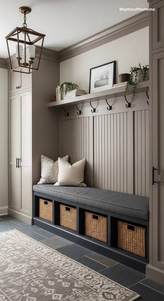
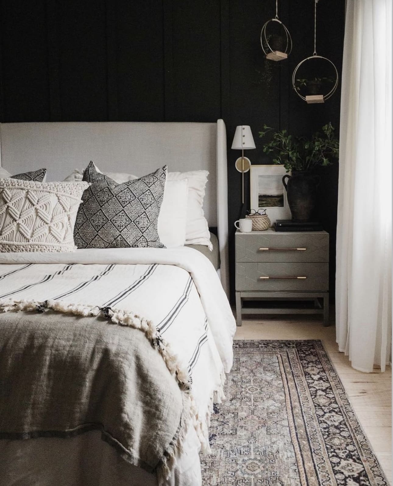
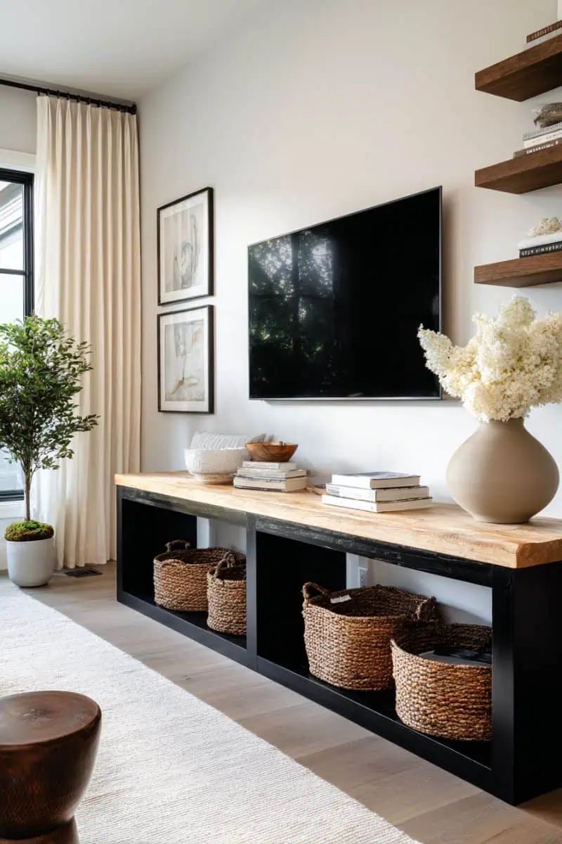
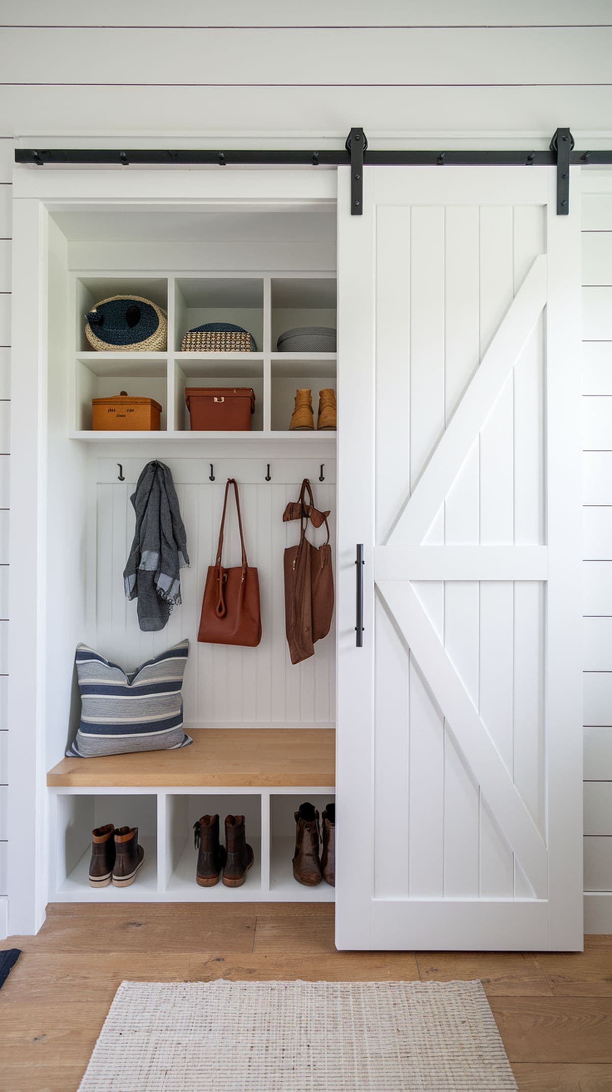
14. Smart Storage Strategies for a Clutter-Free Bedroom
Keep your bedroom tidy and inviting by integrating cleverly designed storage options that stay out of sight. Opt for sleek built-in closets or minimalist wardrobes that seamlessly merge with your décor. Don’t overlook the potential of under-bed drawers or stylish storage ottomans to efficiently utilize every inch of your space.
Key Design Elements
- Install floor-to-ceiling built-in closets with flush doors for a streamlined look.
- Choose wardrobes in neutral tones that complement your room to maintain a cohesive aesthetic.
- Incorporate multi-functional furniture like ottomans with hidden compartments for extra storage.
Pro Tip: Pro Tip: Use clear, labeled storage bins under the bed to easily identify items without disrupting the room’s flow.
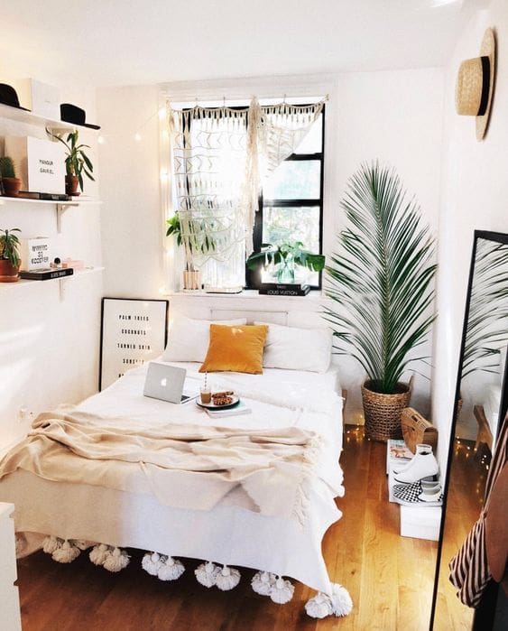
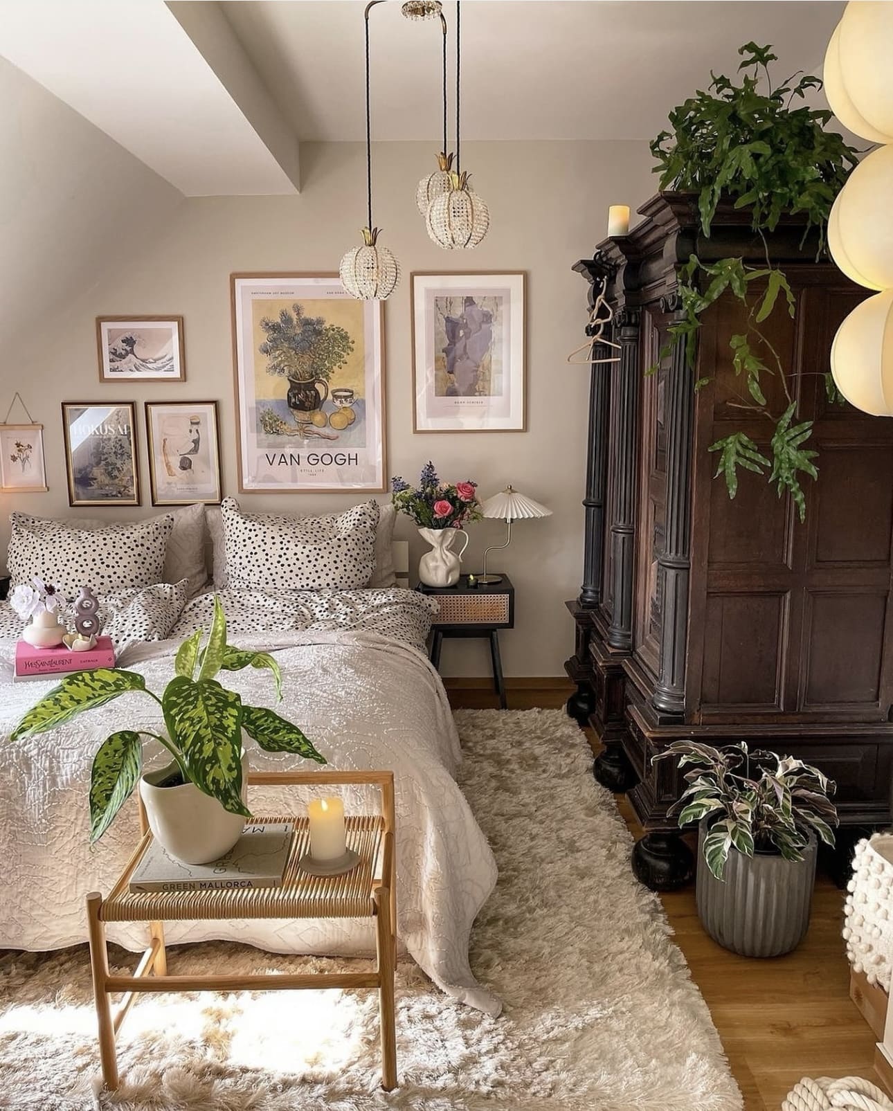
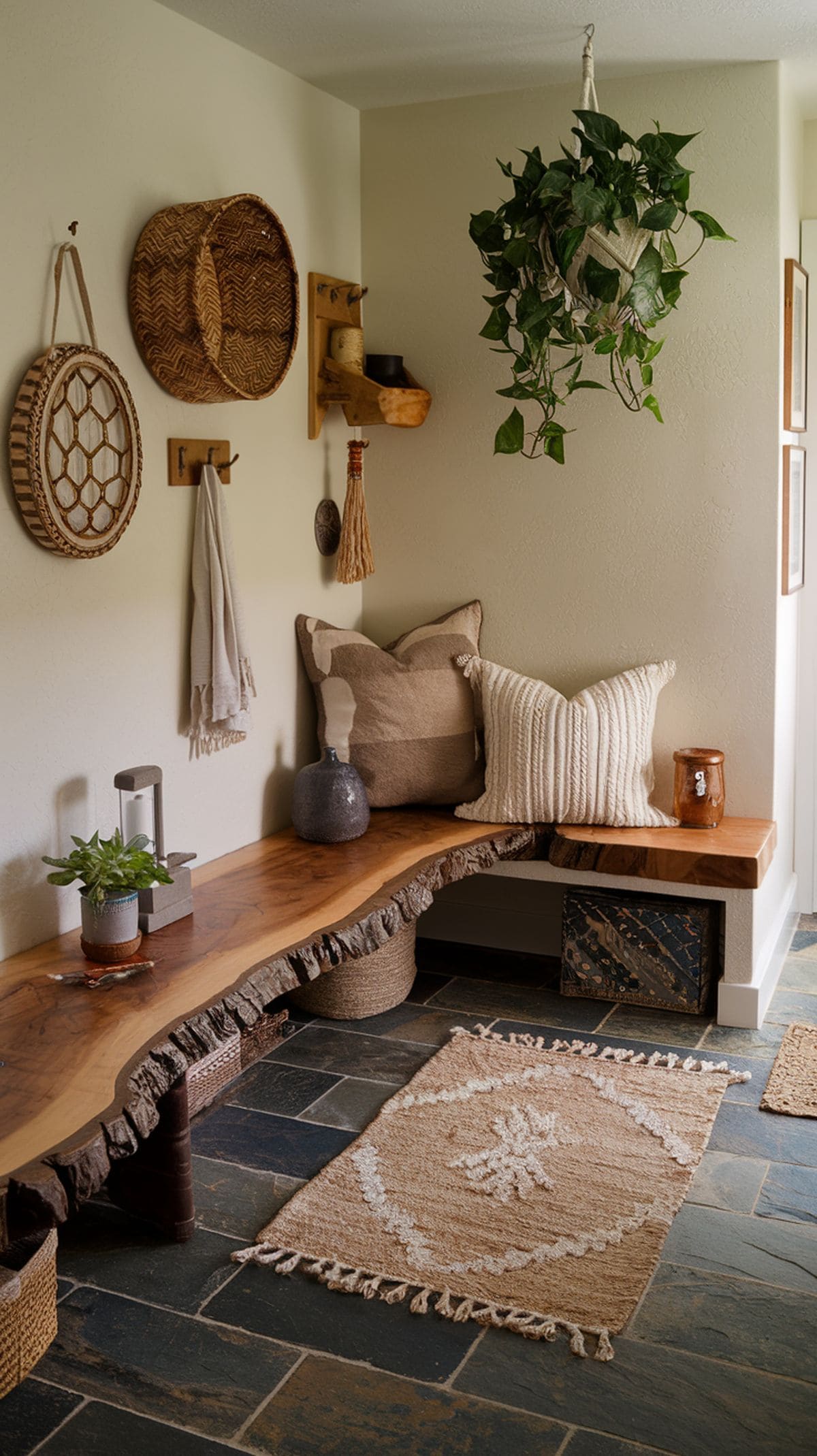
15. Create a Serene Boho-Minimalist Retreat
Start with a soft, neutral palette to establish a peaceful and simple foundation for your bedroom. Integrate natural materials, such as woven textiles and organic fibers, alongside earthy hues to bring warmth and texture to the space. This approach balances minimalism with bohemian charm, resulting in a cozy and inviting sanctuary.
Key Design Elements
- Choose light, muted tones like beige, cream, and soft greys for walls and larger furniture pieces.
- Incorporate handmade or artisanal woven items like rugs, throw pillows, and wall hangings to add tactile interest.
- Accentuate the room with plants and wooden elements to emphasize natural textures and maintain a grounded feel.
Pro Tip: Pro Tip: Layer subtle patterns and varied textures in similar tones to keep the look cohesive without overwhelming the senses.
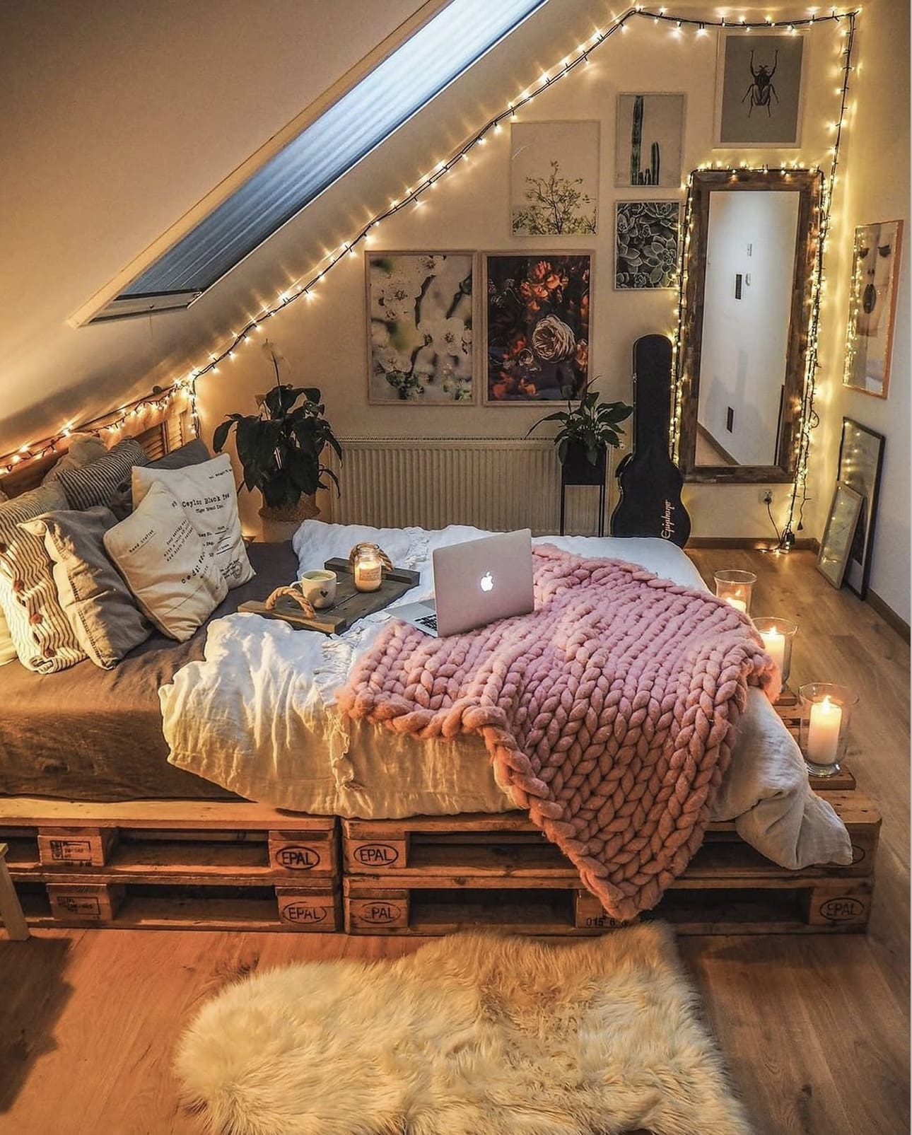
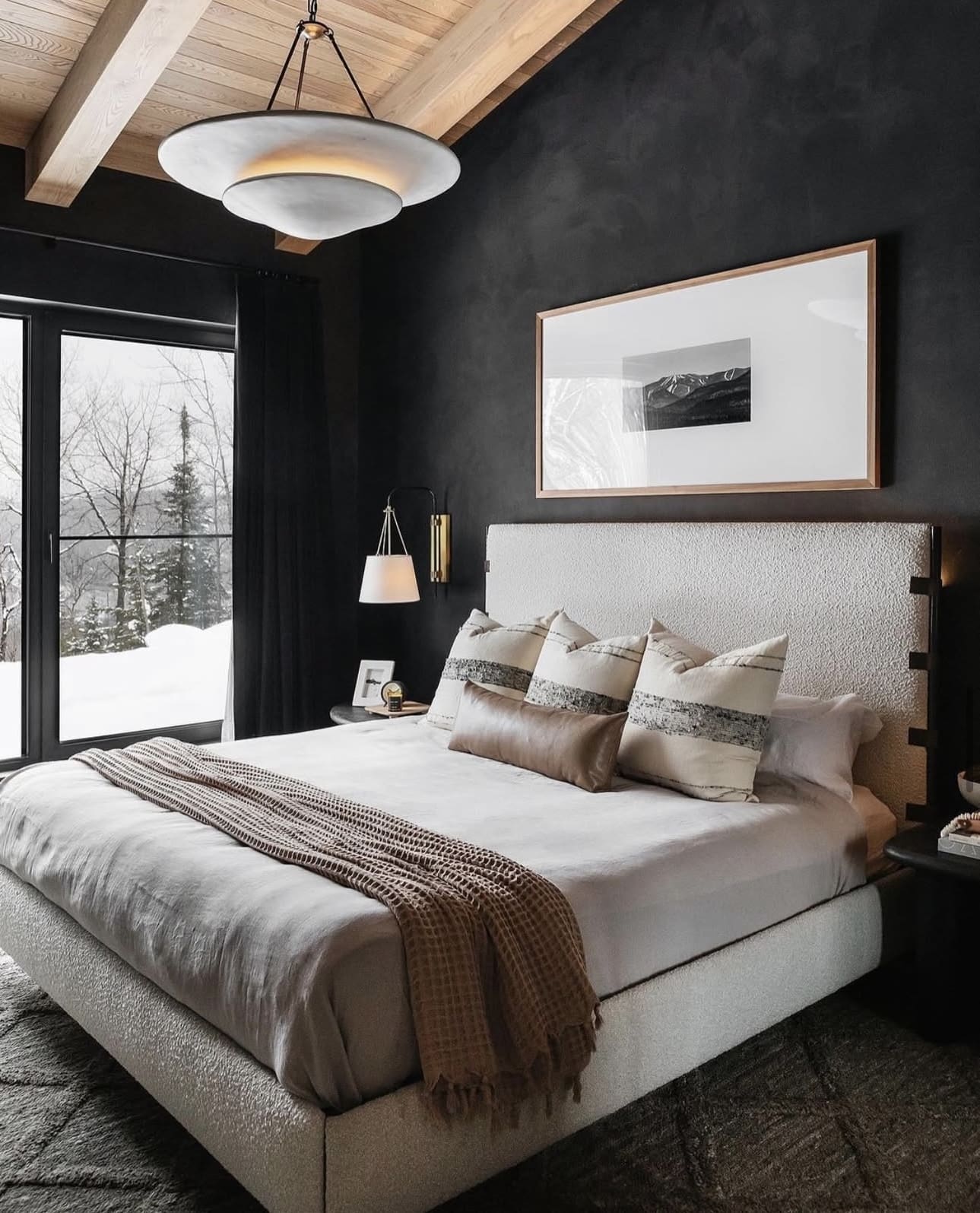
16. Embrace Gentle Lighting for a Relaxing Retreat
Transform your bedroom into a serene sanctuary by incorporating soft, ambient lighting. Choose fixtures like wall sconces, pendant lamps, or bedside table lamps fitted with warm-toned LED bulbs to cast a soothing glow. Installing dimmers allows you to effortlessly tailor the light intensity to match your mood and activities.
Key Design Elements
- Select warm white LED bulbs (2700K-3000K) to create a calming atmosphere.
- Mix different light sources at varying heights for depth and interest.
- Use dimmer switches to easily control brightness throughout the day.
Pro Tip: Pro Tip: Layer your lighting by combining ambient, task, and accent lights to achieve the perfect balance of function and comfort.
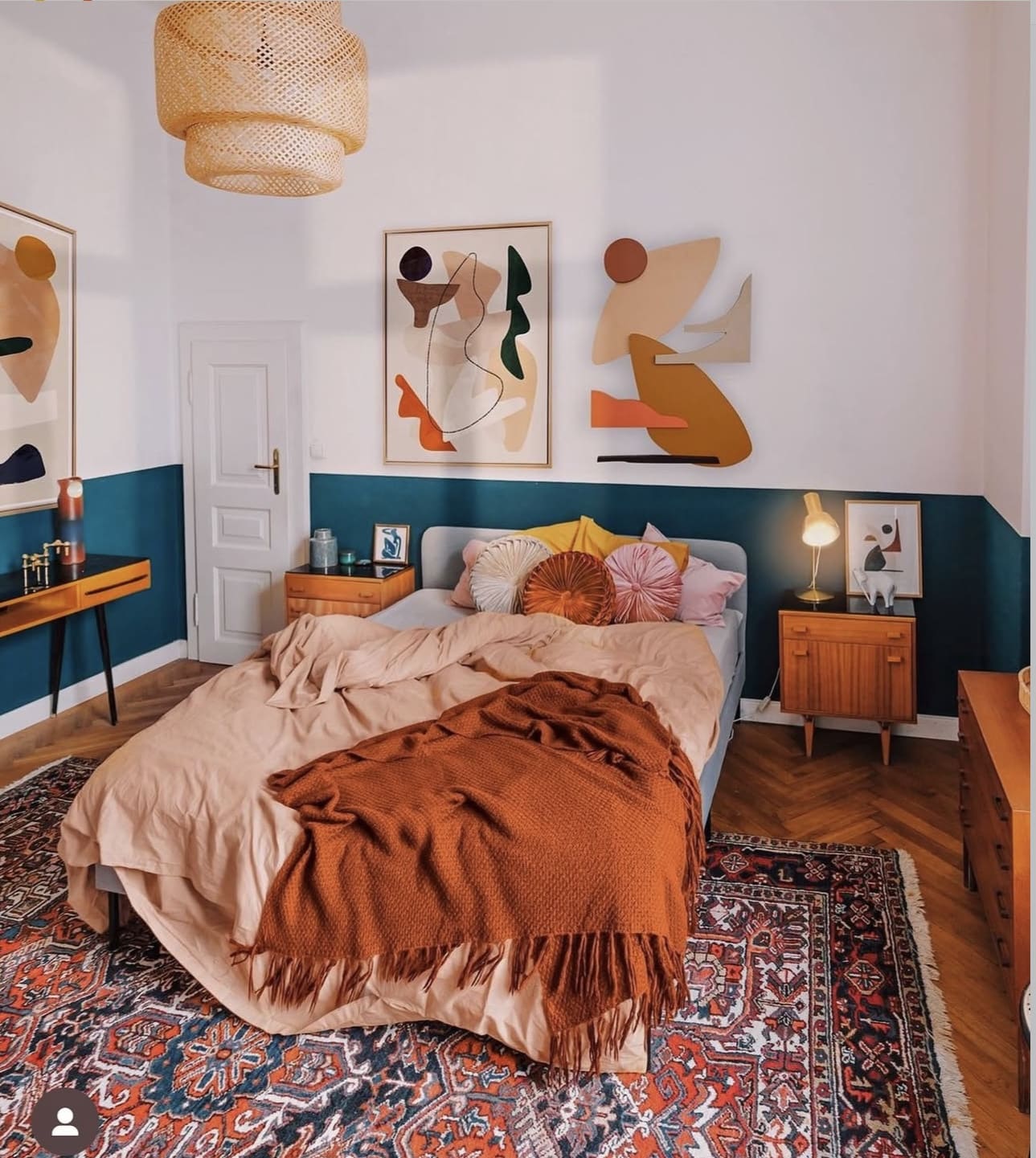
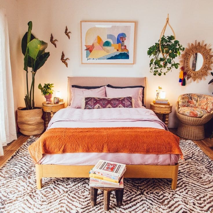
17. Inject Vibrancy with Bold Accents
Introducing a splash of color can instantly energize your bedroom and create a captivating visual anchor. In a space defined by clean lines and understated decor, vibrant hues add personality and warmth, preventing the room from feeling overly plain or sterile.
Key Design Elements
- Choose one statement piece, like a bright throw pillow or an accent chair, to introduce color without overwhelming the space.
- Incorporate colorful artwork or a patterned rug to subtly infuse personality while maintaining overall balance.
- Use accent lighting with colored bulbs or lampshades to enhance the mood and complement your chosen color palette.
Pro Tip: Pro Tip: Limit your bold colors to one or two shades to keep the look cohesive and visually appealing.
18. Embracing Nordic Serenity in Your Bedroom
Channel the essence of Nordic design by focusing on clean lines, practical layouts, and inviting warmth. Use natural elements like wood and linen alongside a muted, earthy color scheme to create a serene, minimalist retreat. This approach balances form and function while cultivating a cozy atmosphere.
Key Design Elements
- Choose light woods such as birch or pine for furniture to add natural texture.
- Layer soft, neutral-toned textiles like wool throws and cotton cushions to enhance comfort.
- Keep decor minimal and purposeful to maintain a clutter-free, calming space.
Pro Tip: Pro Tip: Incorporate plenty of natural light and add greenery to amplify the room’s fresh and airy vibe.
19. Embrace Light to Elevate Your Bedroom Ambiance
Harnessing the power of natural light transforms your bedroom into a welcoming and spacious retreat. Opt for window treatments that gently diffuse sunlight, enhancing brightness without compromising your privacy. This balance fosters a serene and uplifting atmosphere perfect for relaxation.
Key Design Elements
- Choose lightweight, translucent curtains to soften incoming light.
- Position mirrors opposite windows to reflect and amplify natural light.
- Keep window areas clutter-free to allow maximum light penetration.
Pro Tip: Pro Tip: Select curtains in light, neutral tones to brighten the space while maintaining a cozy feel.
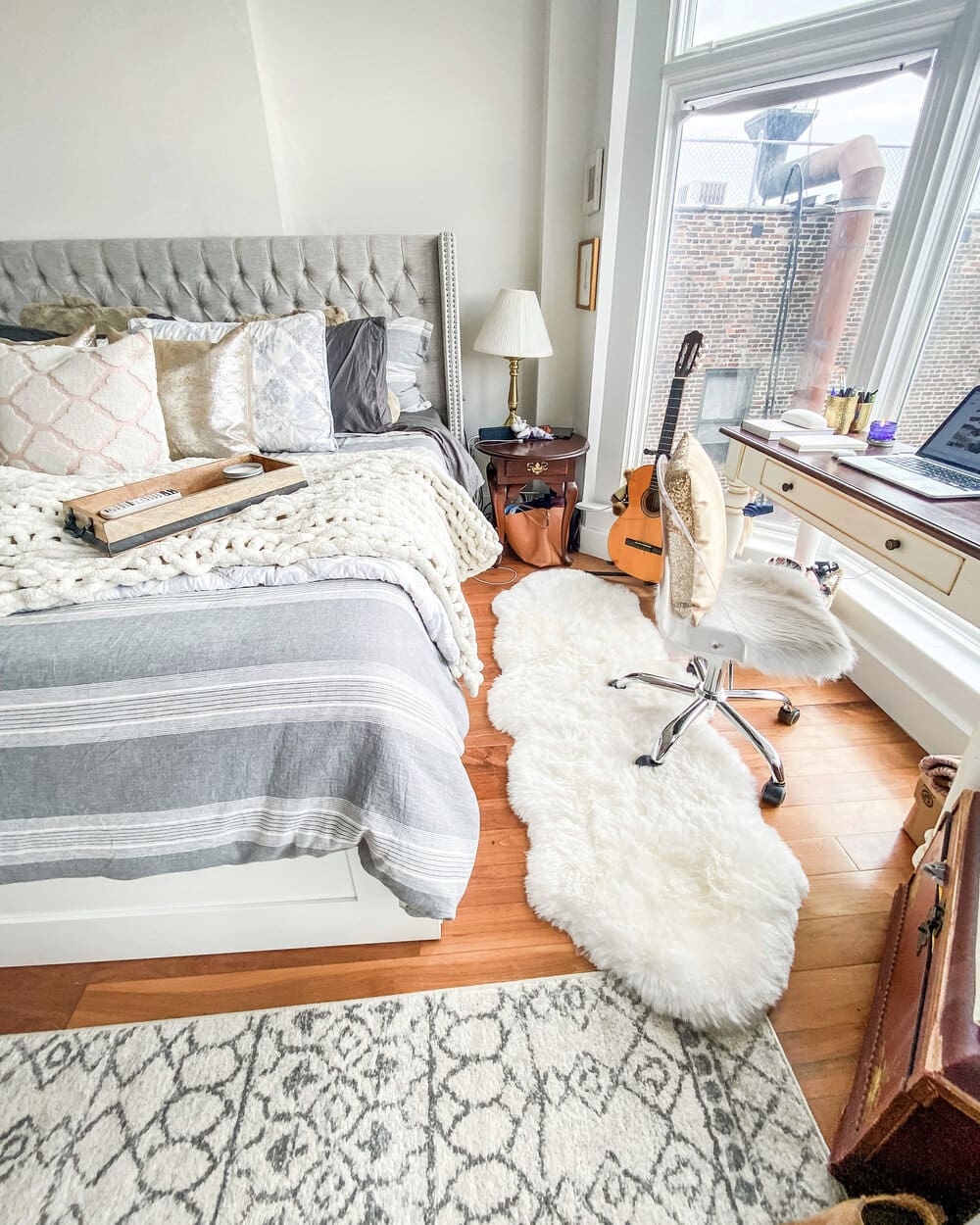
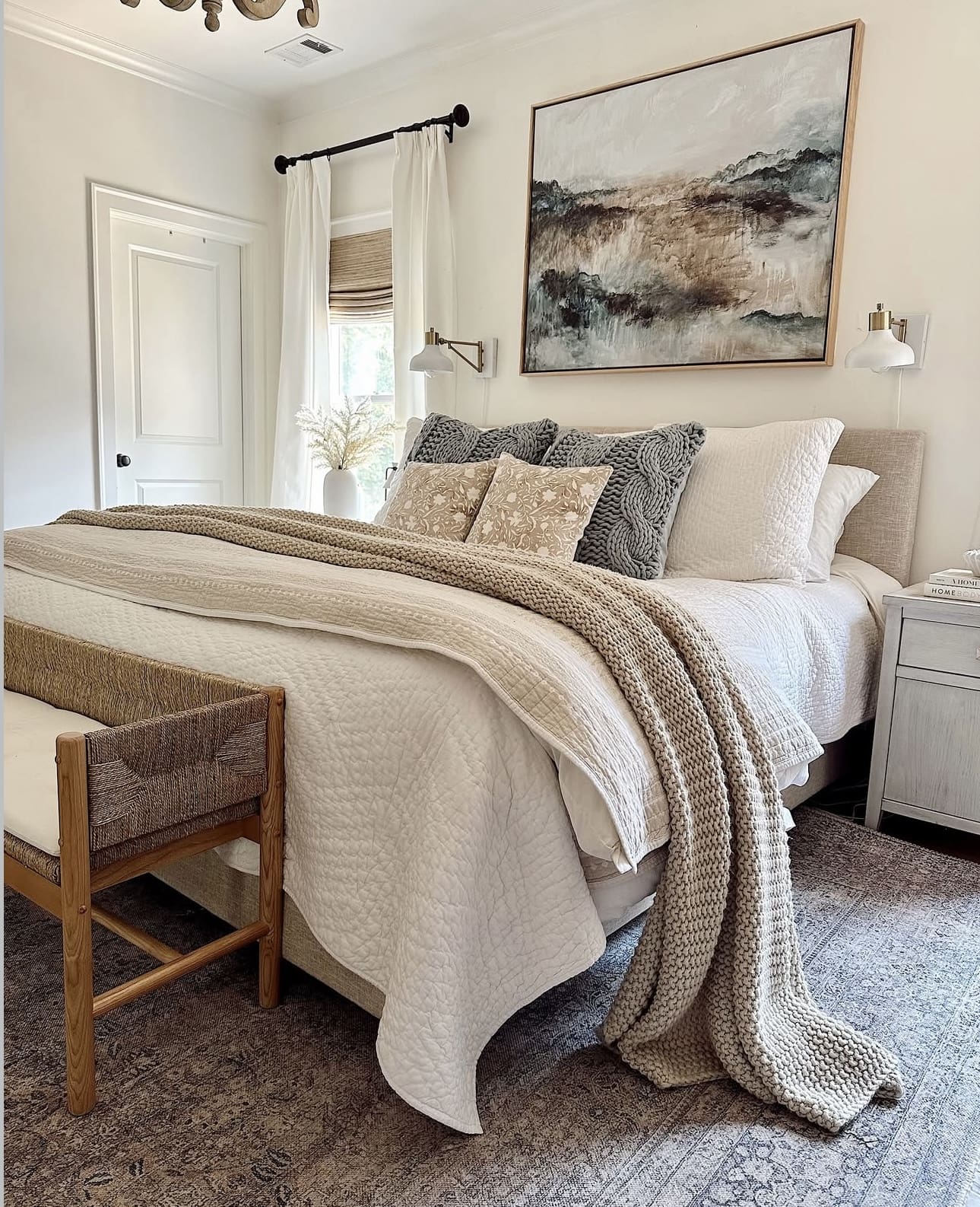
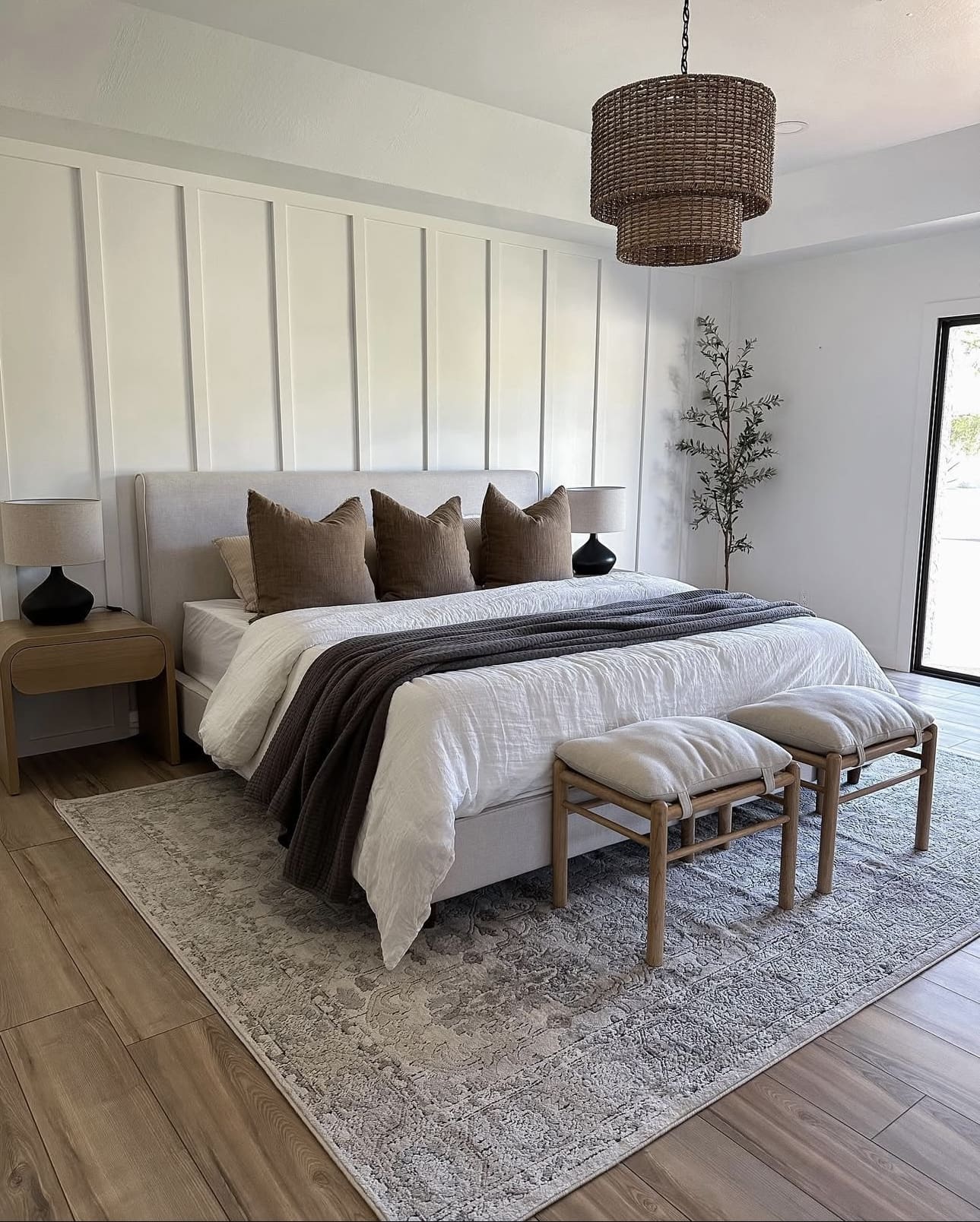
20. Add Warmth with a Plush Area Rug
Introducing a soft area rug can transform a minimalist bedroom by adding a layer of comfort and warmth beneath your feet. It creates an inviting atmosphere that balances the clean, neutral palette with tactile coziness. Starting your day on a plush rug enhances the overall sense of relaxation in your space.
Key Design Elements
- Choose a rug size that complements the bed and leaves enough space for walking around comfortably.
- Opt for natural fibers like wool or cotton for durability and a luxurious feel.
- Select subtle patterns or muted colors to maintain the room’s minimalist aesthetic while adding texture.
Pro Tip: Pro Tip: Layer a smaller, patterned rug atop a larger neutral one to introduce visual interest without overwhelming the space.
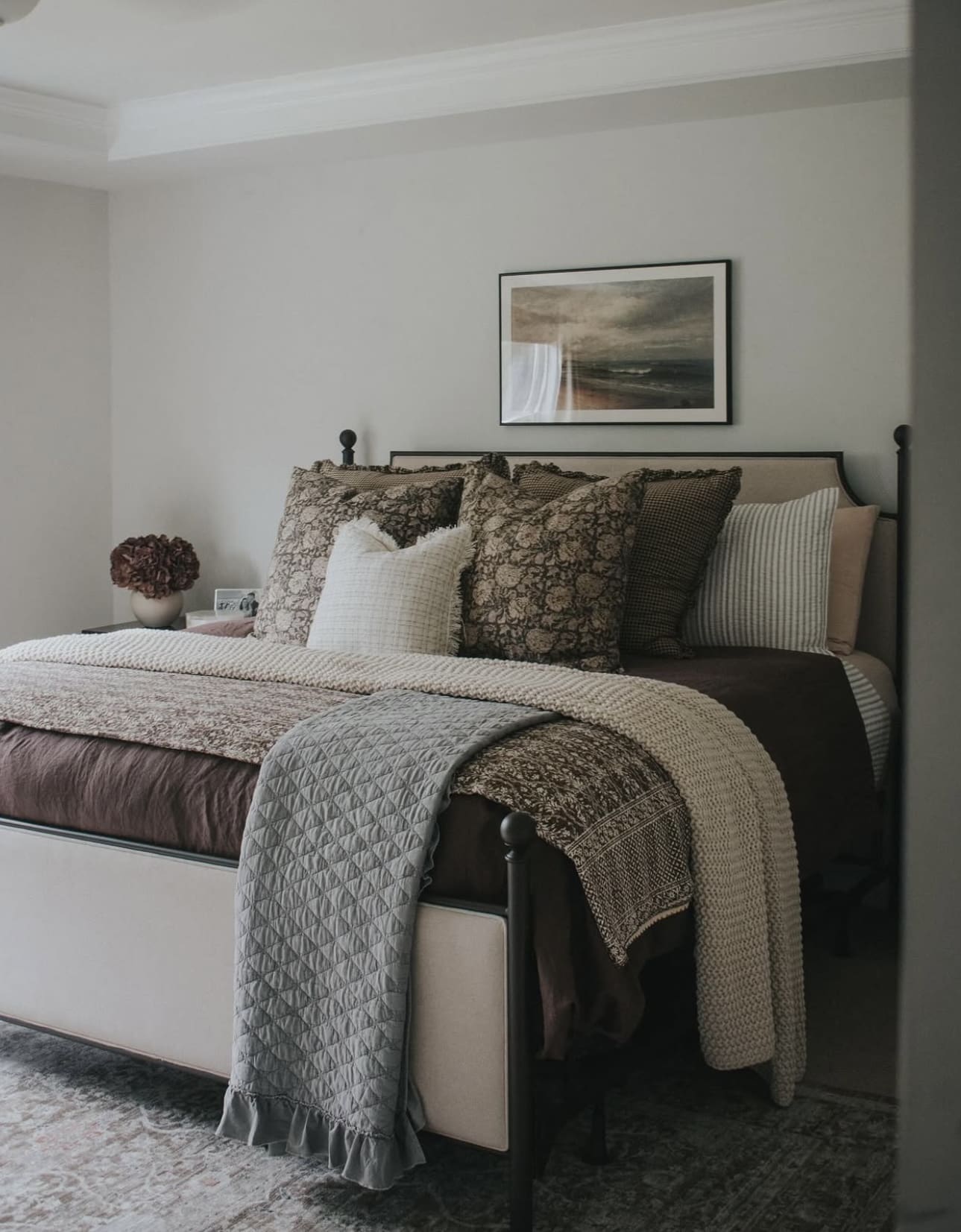
21. Elevate Your Space with Pattern and Texture Play
Introducing a blend of patterns and textures transforms your bedroom into a captivating retreat. Combining diverse fabrics, textured walls, and layered floor coverings not only adds depth but also infuses the room with unique character and warmth. This approach ensures your space feels inviting and visually stimulating.
Key Design Elements
- Layer different fabric patterns, such as florals with geometrics, to create harmony and interest.
- Incorporate textured elements like velvet cushions or woven throws to add tactile appeal.
- Use rugs of varying materials and patterns to define areas and enrich the floor space.
Pro Tip: Pro Tip: Balance bold patterns with neutral textures to maintain a cohesive and elegant look.
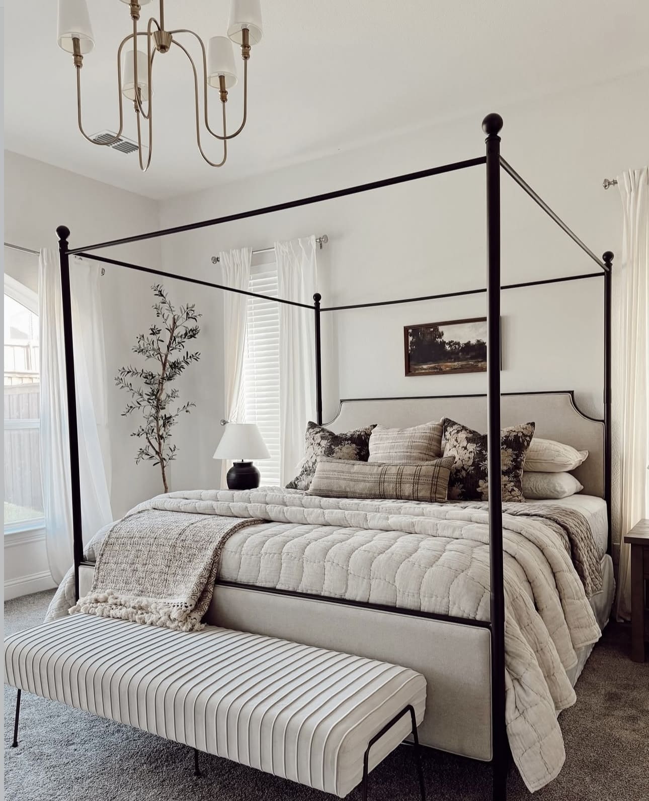
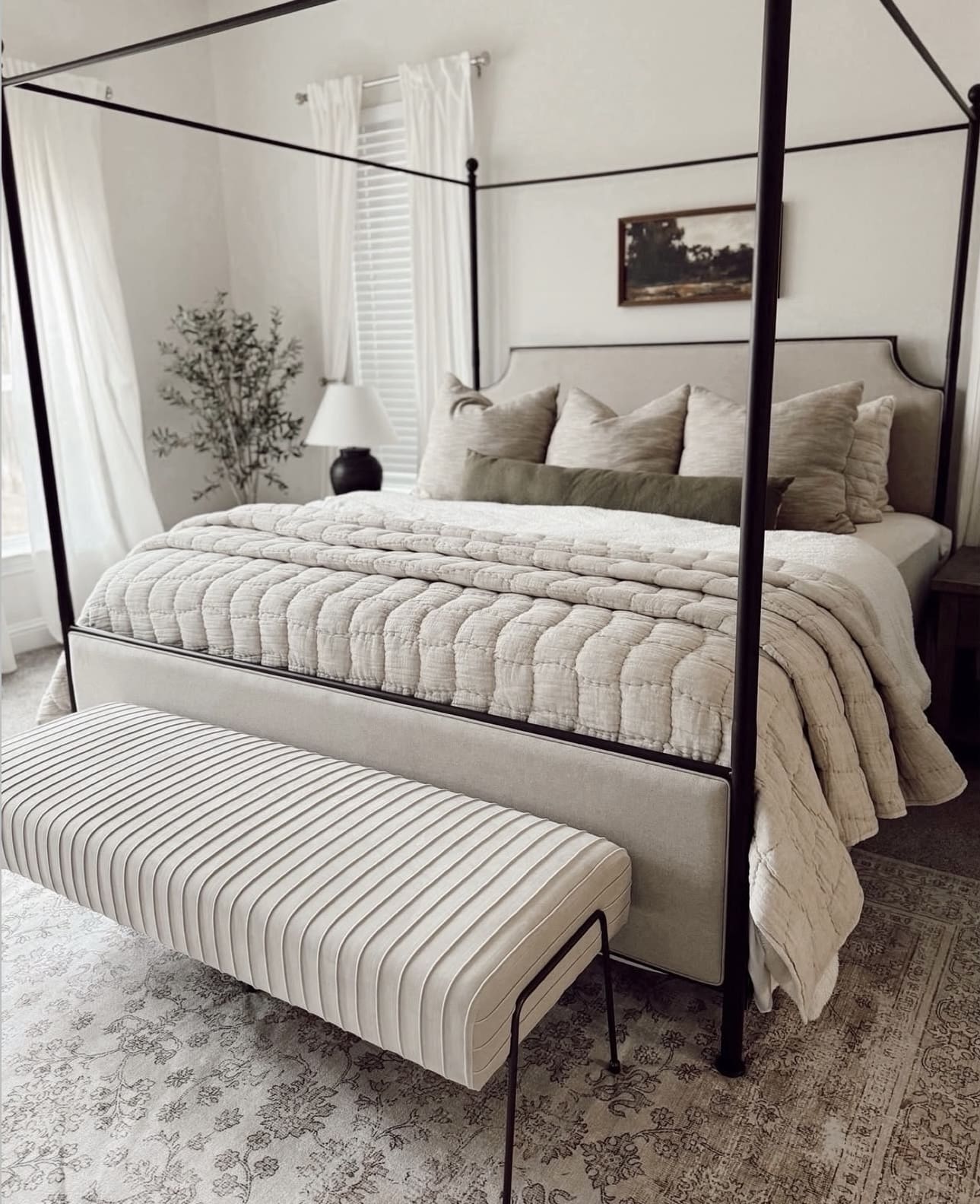
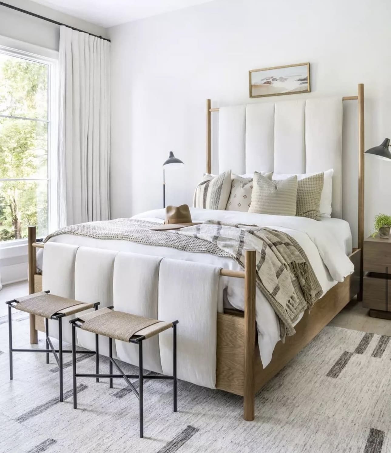
22. Embrace Sleek Simplicity with a Platform Bed
A platform bed offers a clean, low-profile foundation that embodies the essence of minimalist bedroom design. Its streamlined frame enhances the feeling of spaciousness while maintaining a modern, uncluttered aesthetic. For a subtle touch, add a simple upholstered headboard or skip it entirely to keep the focus on the bed’s elegant silhouette.
Key Design Elements
- Choose neutral tones or natural wood finishes to complement the minimalist vibe.
- Keep bedding crisp and simple to maintain the bed’s sleek appearance.
- Opt for under-bed storage solutions to maximize space without disrupting the clean lines.
Pro Tip: Pro Tip: Select a platform bed with built-in storage drawers to combine style and functionality seamlessly.
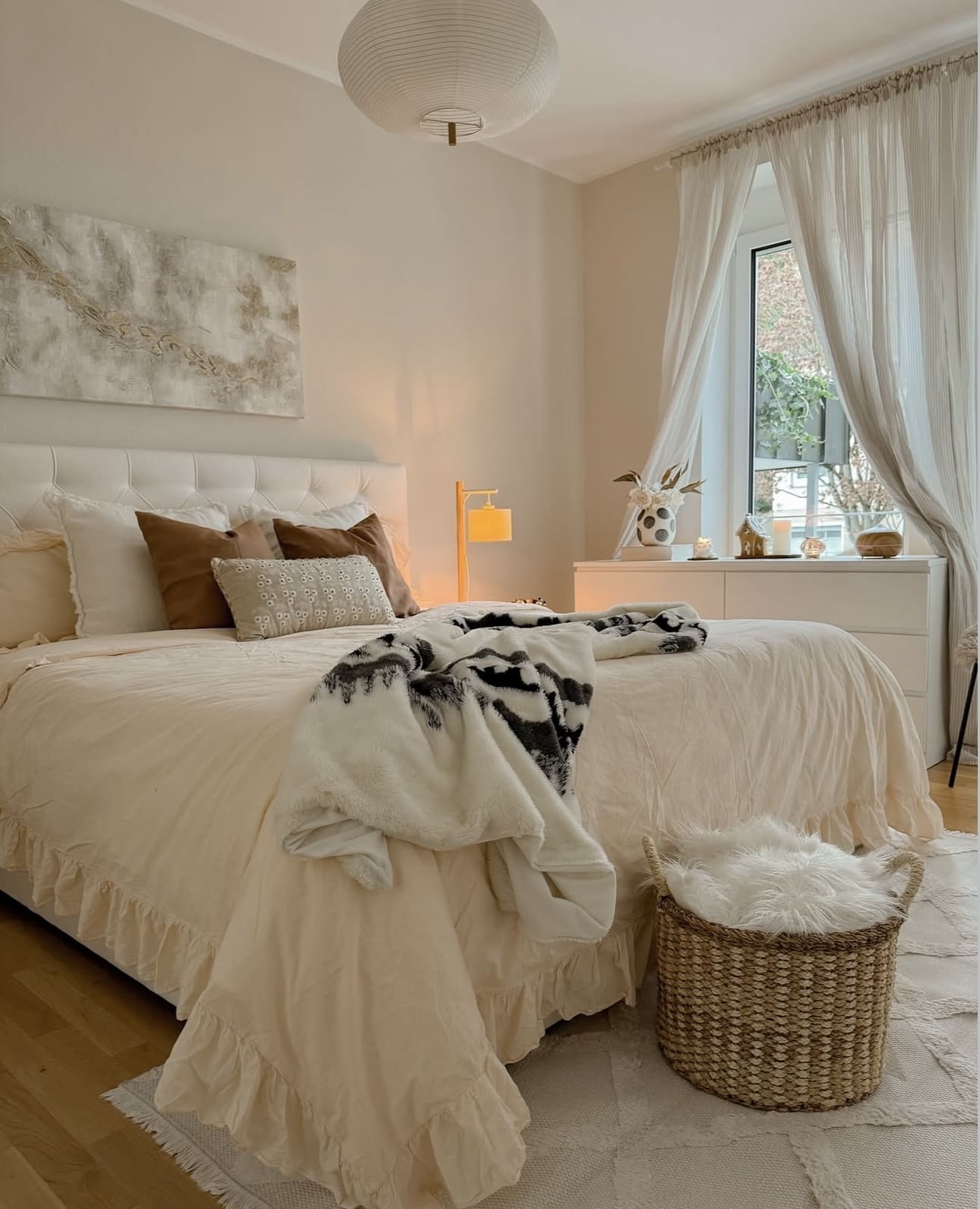
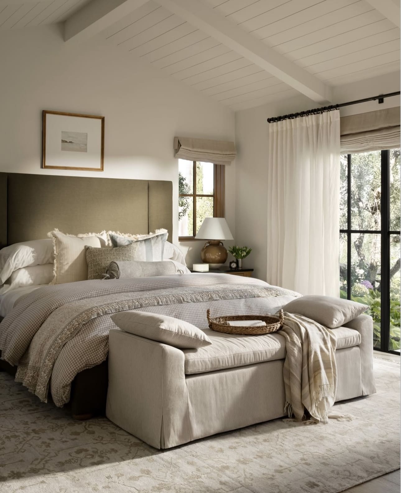
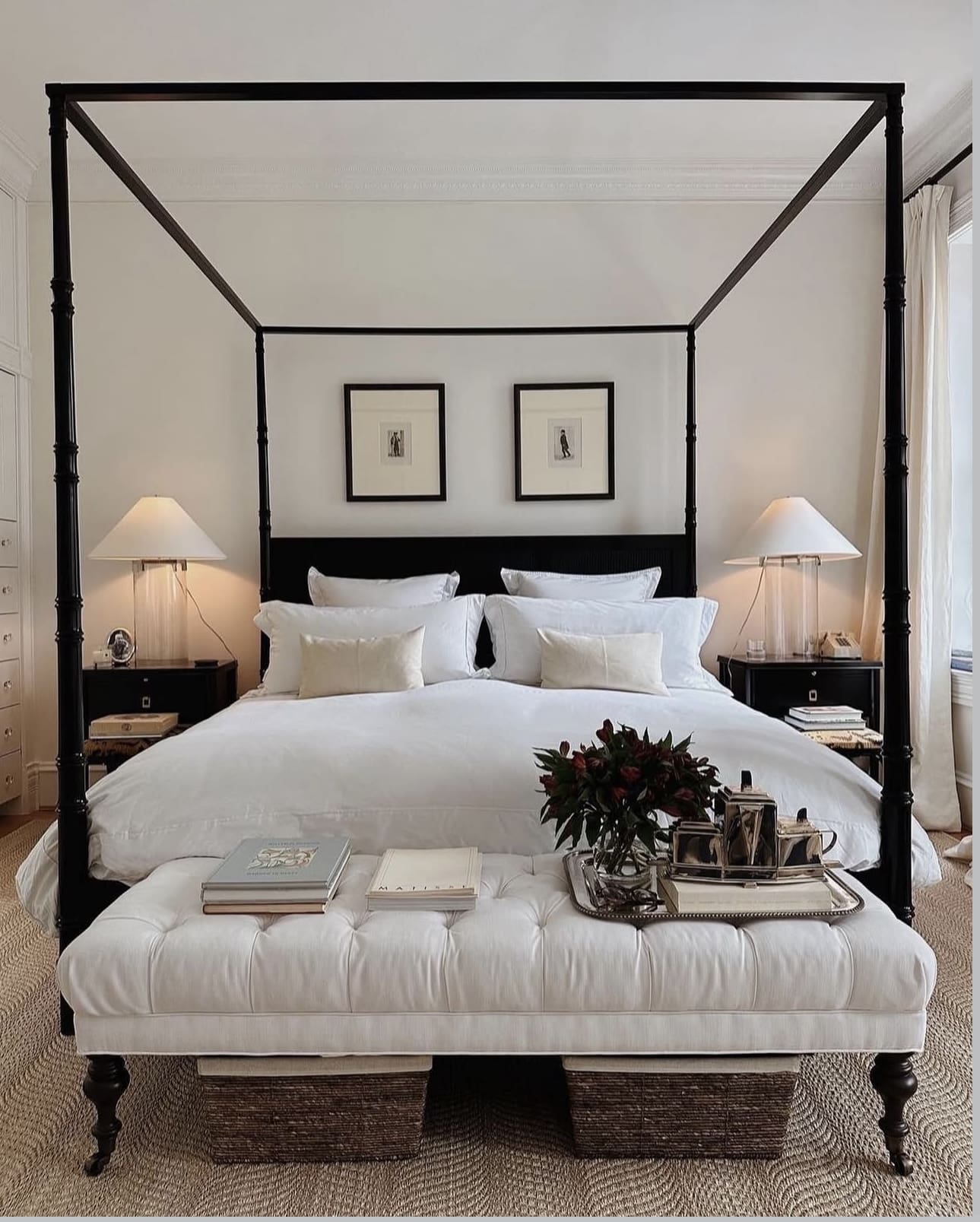
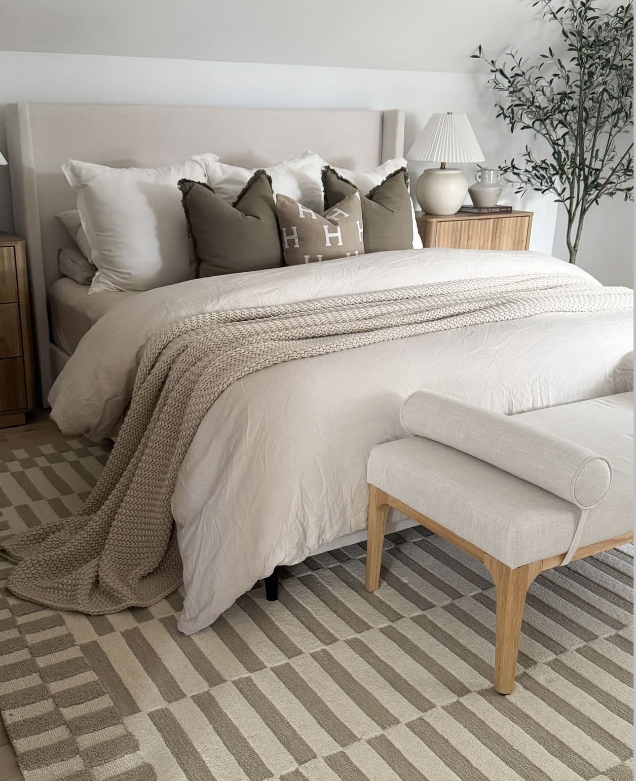
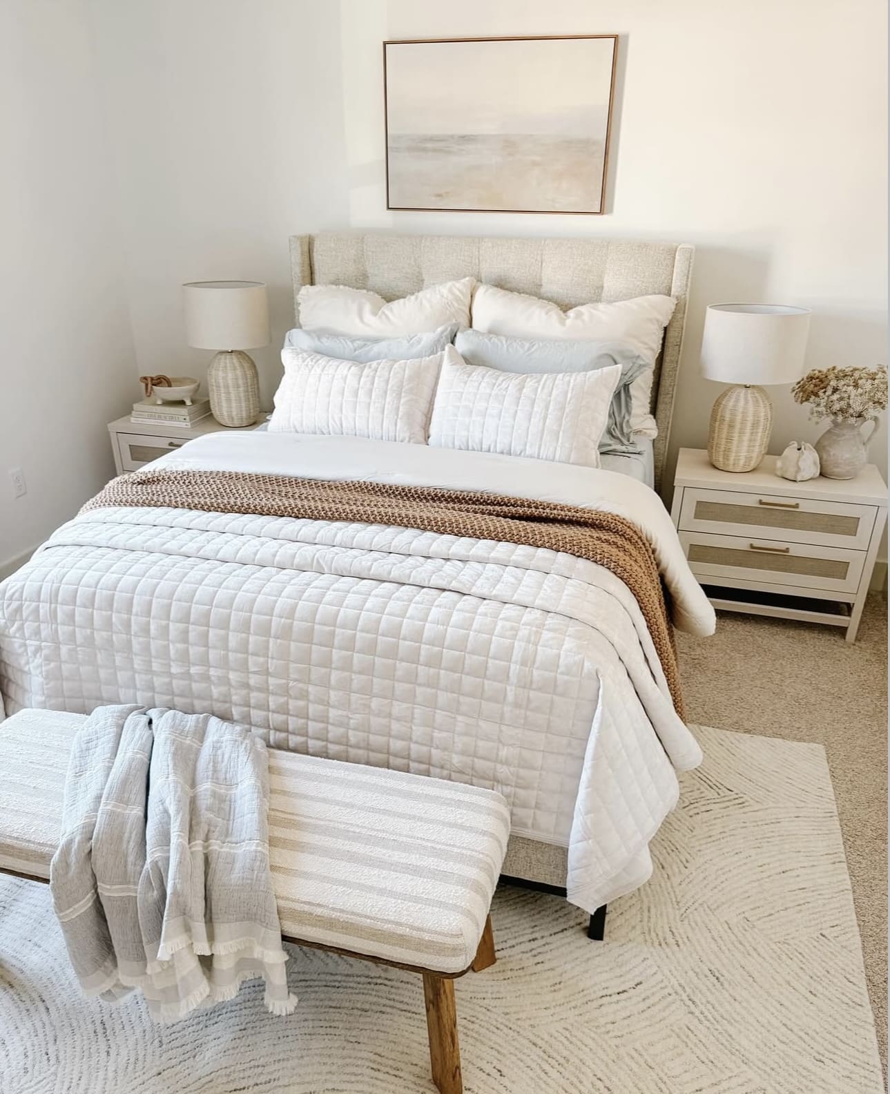
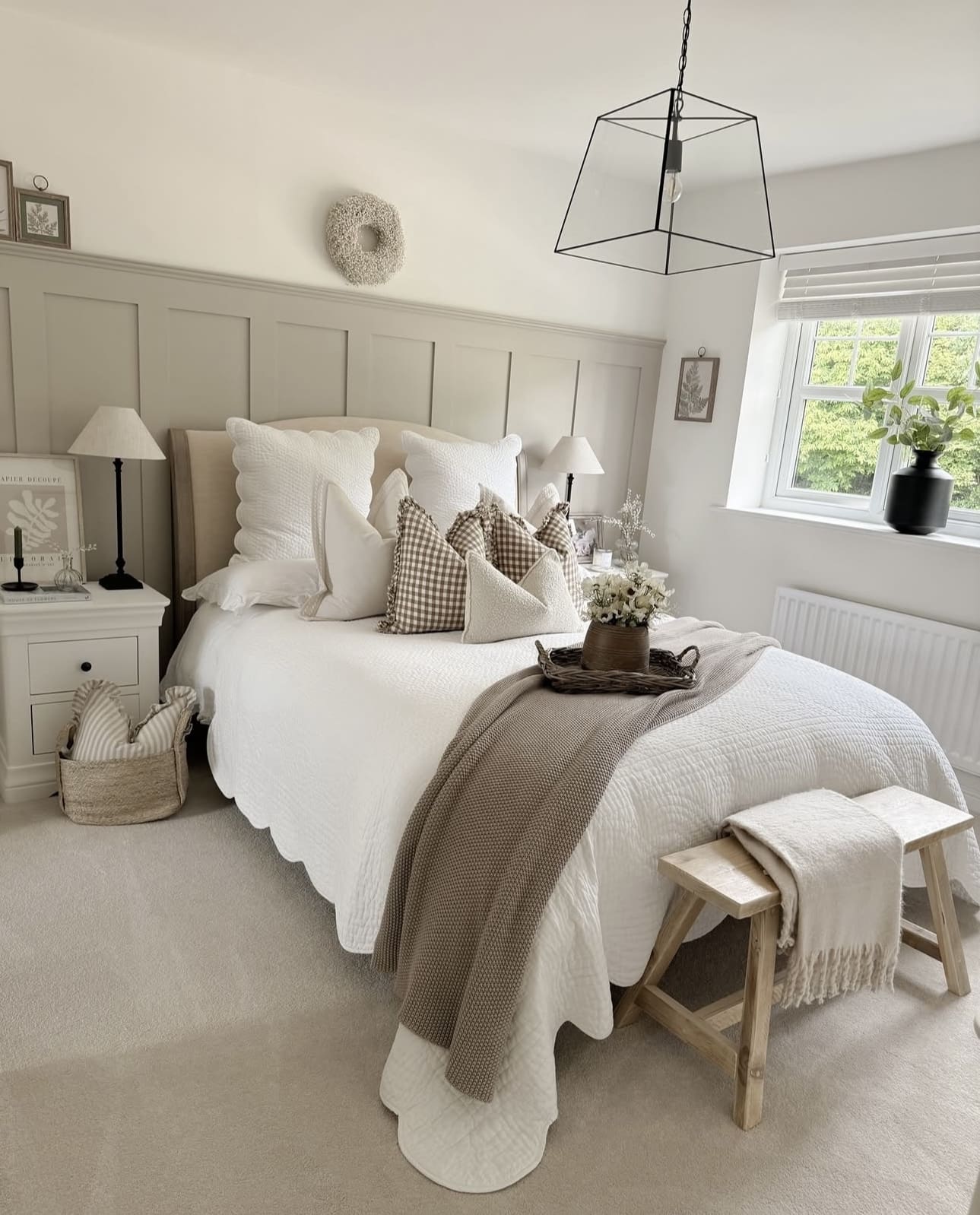
23. Embrace Simplicity with Sleek, Understated Bedding
Opt for bedding that feels calm and uncluttered by choosing crisp white sheets or soft, neutral duvets. Steer clear of bold patterns and excessive layering to preserve a serene, minimalist vibe. Instead, introduce subtle depth through tactile elements like a chunky knit throw or textured linen pillows.
Key Design Elements
- Select high-quality materials in solid, muted tones to create a timeless foundation.
- Limit the number of pillows and blankets to avoid visual overload.
- Incorporate texture through natural fibers to add warmth without compromising simplicity.
Pro Tip: Pro Tip: Choose bedding with subtle variations in weave or finish to add dimension without disrupting minimalism.
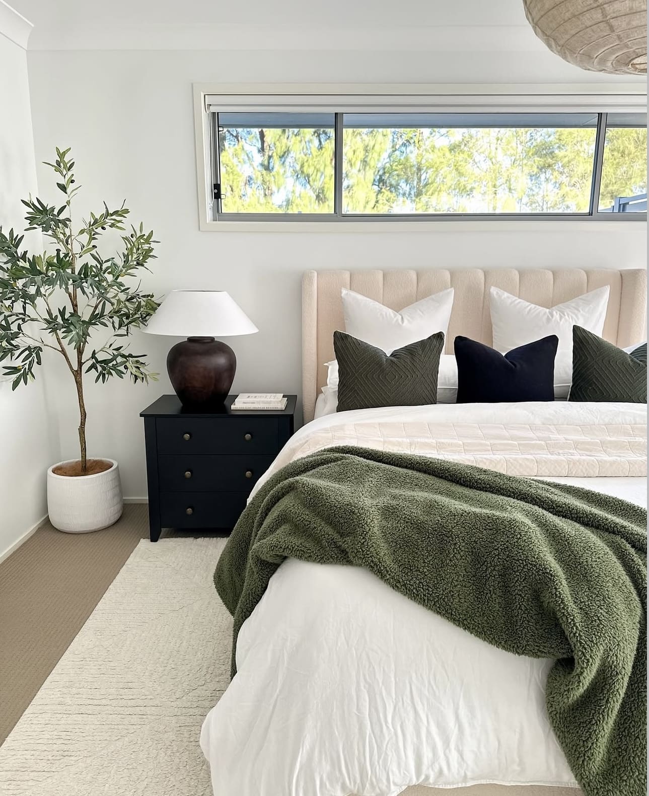
24. Refreshing Green Feature Wall
Incorporating a soft green feature wall introduces a serene and organic vibe to your bedroom, perfectly complementing neutral shades like white, beige, gray, or taupe. This subtle pop of color serves as a calming centerpiece that effortlessly grounds the space. It’s an excellent way to bring a touch of nature indoors without overwhelming the room.
Key Design Elements
- Choose a muted green tone to maintain a restful atmosphere.
- Pair the accent wall with natural textures such as wood or linen to enhance the organic feel.
- Use neutral furnishings and decor to balance the green and keep the look cohesive.
Pro Tip: Pro Tip: Test paint samples on your wall at different times of day to see how natural light affects the green’s appearance.
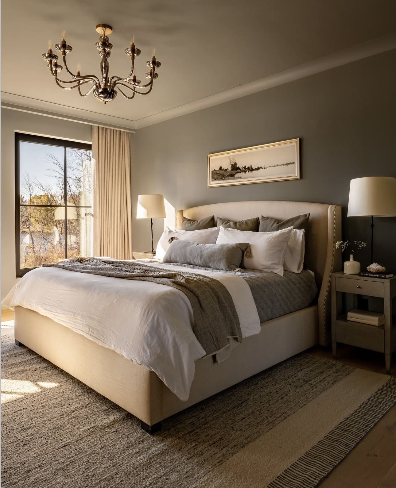
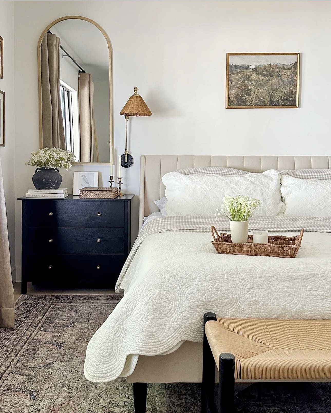
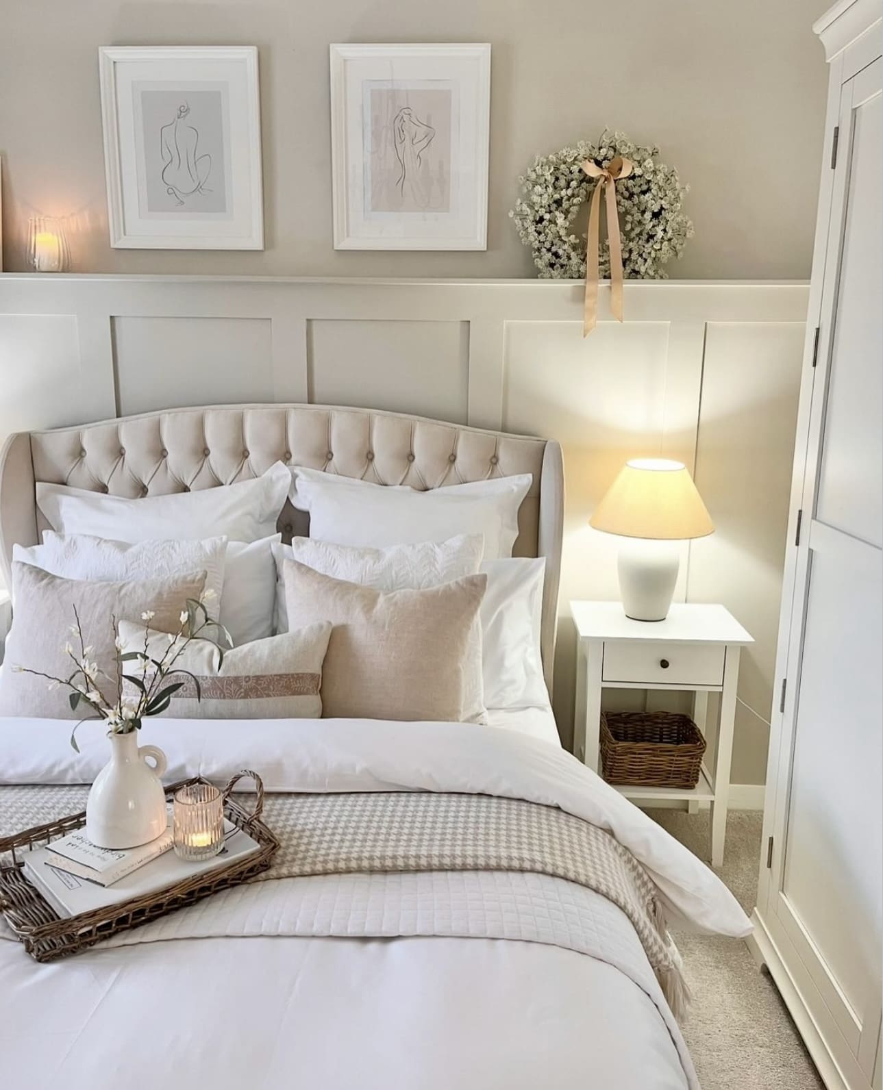
25. Create a Serene Base with Soft, Neutral Tones

Choosing a palette of soft neutrals like creamy whites, gentle grays, or warm beiges sets a peaceful and unified backdrop for your bedroom. These understated hues offer a timeless appeal and provide the perfect canvas to introduce vibrant accents or rich textures without overwhelming the space.
Key Design Elements
- Opt for matte or satin finishes to keep the look soothing and sophisticated.
- Layer different shades of neutrals to add depth without sacrificing calmness.
- Incorporate natural materials like wood or linen to complement the neutral palette.
Pro Tip: Pro Tip: Use neutral walls as a flexible backdrop, allowing you to easily update your bedroom’s look by swapping out accessories and textiles.
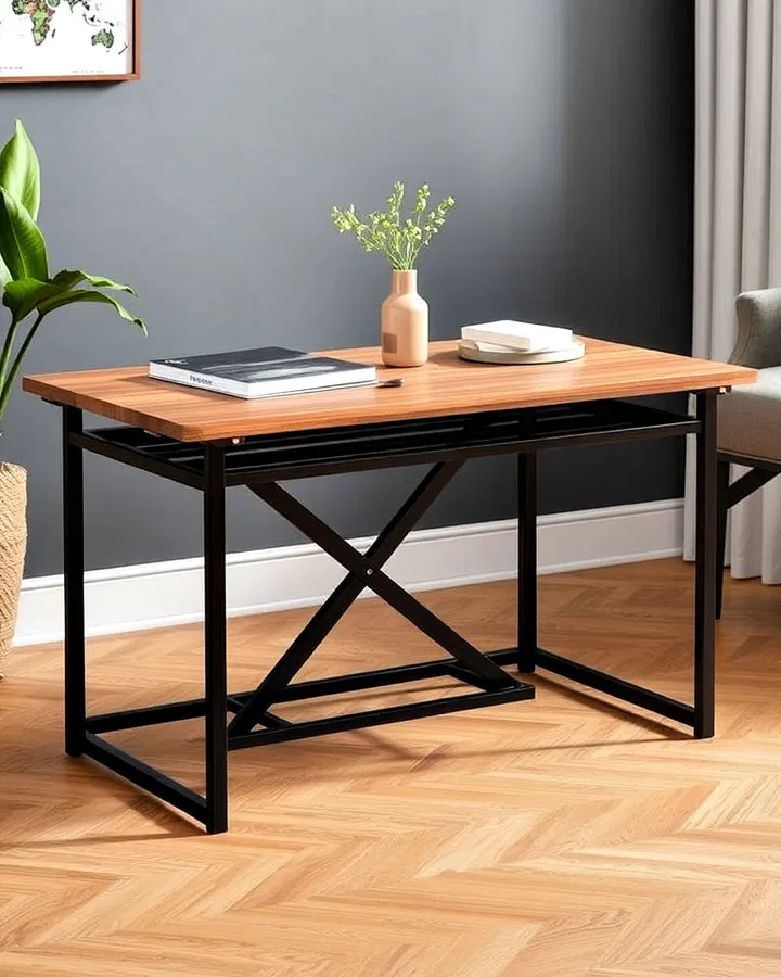
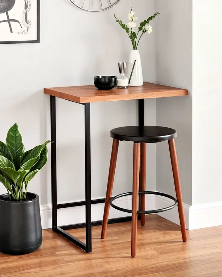
26. Embrace Minimalist Furniture for a Serene Bedroom
Select furniture that features sleek, uncomplicated designs to create a calm and inviting atmosphere. Prioritize natural materials such as wood or metal to add warmth and authenticity to your space. Limiting the number of pieces helps maintain an open and clutter-free environment, enhancing relaxation.
Key Design Elements
- Choose beds and dressers with straight edges and subtle detailing.
- Incorporate materials like oak, walnut, or brushed steel for a natural aesthetic.
- Avoid overcrowding by selecting only essential furniture that serves a purpose.
Pro Tip: Pro Tip: Opt for multifunctional furniture to maximize utility without sacrificing minimalism.
27. Elevate Your Space with Stylish Pendant Lighting
Incorporating pendant lights into your bedroom design introduces a sleek, contemporary vibe while drawing attention to key areas of the room. Opt for streamlined, minimalist styles that seamlessly blend with a clean and simple decor scheme to maintain a balanced and sophisticated atmosphere.
Key Design Elements
- Install pendant lights at varying heights to add depth and visual interest to the space.
- Choose dimmable fixtures to easily adjust the ambiance according to mood and time of day.
- Select finishes like matte black, brushed metal, or frosted glass to complement your bedroom’s color palette.
Pro Tip: Pro Tip: Position pendant lights on either side of the bed to free up nightstand space and create symmetrical balance.
Conclusion
Embracing minimalist bedroom design is more than just a style choice—it’s a powerful step towards creating a sanctuary that nurtures peace, clarity, and restful sleep. By thoughtfully decluttering, choosing calming colors, and prioritizing quality over quantity, you invite serenity into your personal space and, ultimately, your life. Now is the perfect time to transform your bedroom into a haven of simplicity and calm. Start small, trust your instincts, and watch how these minimalist ideas not only refresh your room but also restore your sense of balance and well-being. Your ultimate sanctuary awaits—take that first step today.