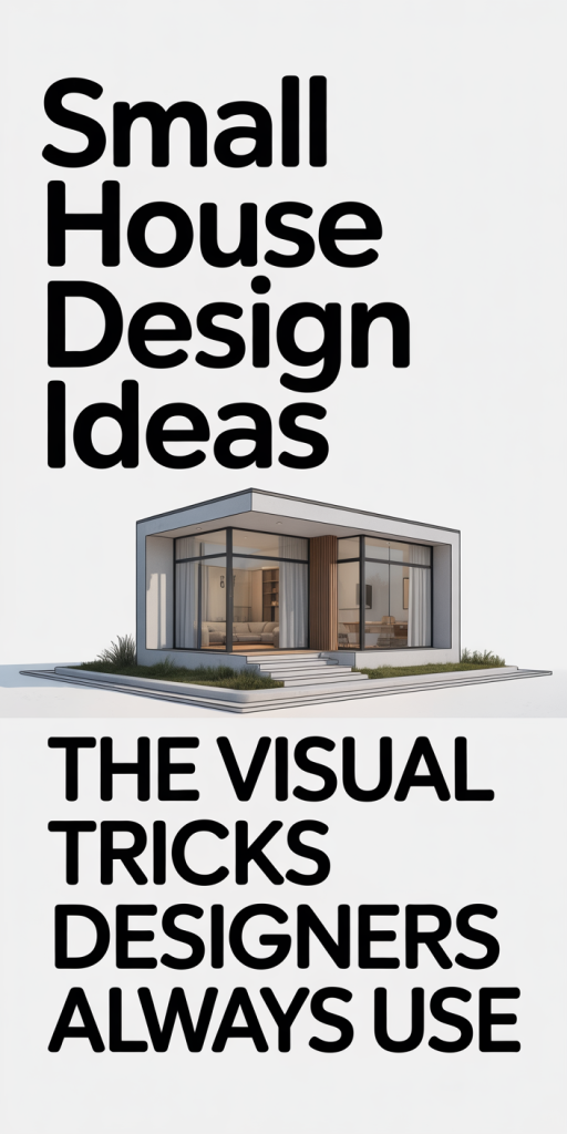
Living in a small house doesn’t mean sacrificing style or a sense of spaciousness. In our work designing and renovating compact homes, we’ve learned that clever visual tricks do more than decorate, they fundamentally change how a space feels. This article distills 12 proven designer techniques that make tiny rooms feel larger, brighter, and more intentional. We’ll explain why these approaches work, how to apply them without very costly, and the small decisions that yield the biggest perception gains. Whether you’re tackling a studio, a narrow rowhouse, or a tiny suburban cottage, these small house design ideas will help you get more room for living, and for living well.
Why Visual Tricks Matter In Small Homes
When square footage is limited, visual perception becomes the most valuable currency we have. People tend to evaluate a room by depth, light, continuity, and focal points, not by the exact number of square feet. That’s good news: designers can manipulate those cues. A single uninterrupted sightline, a high-contrast focal wall, or the strategic placement of light can shift your brain’s sense of scale.
We think of these techniques as optical investments. They don’t literally add area, but they reduce visual clutter, guide the eye, and create implied space. For example: a uniform floor material between kitchen and living area erases an artificial boundary: a mirror doubles perceived depth: layered lighting collapses shadowed nooks into the whole. These are inexpensive moves with outsized returns.
Beyond scale, visual tricks also increase comfort. A room that reads as airy and coherent makes daily routines feel less cramped. Over time, the psychology of space matters as much as the measurements, and that’s why small house design ideas that focus on perception are essential.
Light And Color To Visually Expand Space
We often start small-house projects with two straightforward questions: how can we increase perceived light, and how can color make surfaces recede rather than shout? Light and color are the foundation of many visual tricks because they alter depth cues and contrast relationships, the same visual signals the brain uses to judge size.
Bright, reflective surfaces combined with coordinated color flow push walls and ceilings further away in the mind’s eye. But it isn’t just about white paint or brighter bulbs: it’s about controlled contrast and continuity. When we layer natural and artificial light, use colors that create depth, and keep transitions smooth, tiny spaces breathe.
Below we break down practical, designer-level tactics for paint, accent walls, and lighting that make the biggest difference without a major renovation.
Paint, Accent Walls, And Color Flow
Paint is the easiest large-scale change we can make, and it’s surprisingly powerful. To visually expand a room, we favor low-contrast palettes with variations on the same hue. A continuous color from one room to the next creates a visual flow that removes perceived barriers. For open-plan small homes, painting the connected spaces in related tones makes the whole feel like one larger room.
Accent walls still have a role if used sparingly. Instead of a dark, saturated wall that closes space, choose a slightly warmer or cooler tint of the base color to create depth without interruption. Horizontal stripes are a classic trick for widening narrow rooms: vertical stripes can lift a low ceiling if you keep them subtle and soft-edged.
Don’t forget trim and ceiling strategy: painting the ceiling a shade lighter than walls raises the perceived height, while matching trim to the wall color reduces the number of visual edges the eye must process. Those fewer edges equal more perceived space.
Natural And Layered Lighting Strategies
Natural light is the most persuasive spatial enhancer. We prioritize maximizing daylight with unobstructed windows, slimline window treatments, and trimmed landscaping outside to allow deeper light penetration. Skylights or solar tubes are worth considering in dark corridors or central zones, they introduce a vertical source of light that tricks the eye into feeling more volume.
Indoors, layered lighting eliminates shadow pockets that make rooms feel boxed in. We use a three-tier approach: ambient (ceiling or recessed), task (pendants, under-cabinet lighting), and accent (wall sconces, picture lights). Dimmers are essential: they let us dial contrast down in the evening so the room reads softer and larger.
Finally, choose color temperature carefully. Warm light can cozy up a big room, but for small spaces, neutral-to-cool (2700–3500K) tends to feel cleaner and more open. Consistent temperature across fixtures prevents jarring shifts that break the visual flow.
Mirrors, Glass, And Reflective Surfaces
Reflective surfaces are an obvious, and enduring, trick for small houses. Mirrors duplicate views and light, effectively doubling perceived depth when placed opposite windows or long sightlines. We like full-height mirrors on closets or a gallery of smaller mirrors arranged to suggest a larger opening rather than a single heavy mirror that reads as decor.
Glass is also a visual equalizer. Interior glass doors, clear balustrades, and glass cabinet fronts maintain sightlines while still providing function. Frosted or textured glass preserves privacy but keeps light moving. In kitchens, glass-front upper cabinets reduce the visual mass of wall units and make the space feel airier.
Subtler reflective tactics include glossy backsplashes, high-sheen paint on trim, and metallic accents that catch light without becoming the focal point. The key is to use reflectivity to scatter light and soften edges, not to create small, glaring highlights that become distracting.
Smart Layouts, Zoning, And Sightlines
A smart layout is less about cramped efficiency and more about choreographing how the eye moves through space. We aim to create clear sightlines and purposeful zones so the brain reads the home as deliberately arranged, which feels inherently larger. Visual order beats a handful of square feet every time.
Open-plan living often benefits small houses, but we avoid removing every dividing element. Partial walls, low bookshelves, or a change in floor texture can delineate zones while preserving sightlines. We place the largest furniture parallel to the longest wall to maintain a flowy central path and keep circulation clutter-free.
Consider how doors and furniture align: a centered doorway framed by furniture creates a composed view: a zigzag of mismatched pieces fragments the eye. Stacking visual cues, repetition of materials, aligned vertical elements, and coordinated colors, helps knit separate areas into one coherent whole.
Layout Tips For Small Rooms
In small rooms, every inch of layout counts. We use a few layout rules repeatedly because they work: keep pathways at least 30 inches where possible, orient seating toward the room’s most generous anchor (a window, fireplace, or media wall), and leave a modest foreground zone in front of focal points so the eye can register depth.
Floating furniture, pushing pieces slightly away from walls, can paradoxically create the sense of more space by revealing baseboards and floor continuity. Multi-zone furniture like a sofa with a thin console behind or an open-backed bookshelf as a room divider provides function without visually chopping the room.
When arranging, we test different orientations by tape-marking furniture footprints on the floor. It’s a low-effort way to see which configuration preserves sightlines and clears circulation. Often the best layout feels obvious once you can walk through it.
Multifunctional Furniture, Storage, And Vertical Tricks
Furniture in a small house needs to earn its keep. Multifunctional pieces, sofa beds, extendable tables, nesting side tables, let us reduce visual noise and free up floor area when items aren’t in use. We encourage flexible furniture that adapts to different activities: a dining table that doubles as a workspace, or ottomans with hidden compartments that work as seating and storage.
Visual trickery also occurs vertically. Drawing the eye upward makes rooms feel taller, so tall, slim storage feels less heavy than wide, squat units. Open shelving arranged asymmetrically can create a sense of height while keeping things accessible. We prefer slender legs on sofas and tables to reveal the floor plane underneath, which keeps the room feeling open.
Modular furniture that can be reconfigured seasonally gives a small home longevity, and keeps layouts fresh without major expense.
Built-In, Hidden, And Vertical Storage Solutions
Built-ins are a small-house superpower because they convert awkward pockets into purposeful storage while blending with the architecture. Window seats with drawers, recessed shelving flanking a media niche, and under-stair cabinetry all remove standalone pieces that would otherwise crowd the floor.
Hidden storage, benches with lift tops, plinths that open, or hollow ottomans, reduces visible clutter: and since clutter is one of the biggest factors that shrinks a space visually, hidden solutions are high-impact. We like toe-kick drawers under kitchen cabinets and built-in wardrobes that reach the ceiling to use vertical volume.
When custom built-ins aren’t possible, we recommend high-reaching open shelving combined with matching storage boxes to keep a clean line. The goal is to present one continuous surface rather than a patchwork of items that break the eye’s path.
Conclusion
We’ve found that making a small house feel grand is mostly about focused decisions rather than bigger budgets. By controlling light, color, reflections, sightlines, and storage, we can alter perception dramatically. The twelve visual tricks above are flexible tools, mix and match them to suit your layout, lifestyle, and budget. Start with the moves that are easiest to carry out (paint, lighting, and decluttering) and then layer mirrored surfaces, built-ins, and multifunctional furniture as needed. With intention and a few designer tricks, tiny spaces stop feeling limiting and start feeling expansive, purposeful, and comfortable.
Leave a Reply