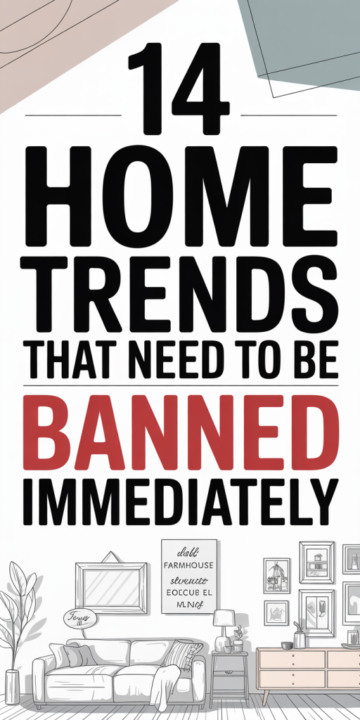
We’ve watched decorating trends come and go, but some fads keep resurfacing even after designers and homeowners agree they don’t work. In 2026, it’s time to call out the trends that cause more harm than good, the ones that look impressive in a glossy photo but fail in everyday life. This article lists 14 recurring choices that clutter our homes, complicate maintenance, or strip spaces of personality. We’re not here to police taste: we’re here to point out when a trend crosses the line from stylish to silly. Expect practical reasons, design consequences, and alternatives that actually improve how your home looks and functions.
Why These ‘Trends’ Should Be Banned — What Designers And Homeowners Are Missing
Trends often start with great intentions: novelty, problem-solving, or an aesthetic pivot. But several popular home trends ignore the realities of daily life. We’re not just nitpicking, we’re looking at recurring problems: wasted time on cleaning, poor ergonomics, reduced resale value, and emotional effects like stress or blandness. When a trend prioritizes looks over utility, it becomes performative. That’s a problem.
Designers sometimes chase visual coherence at the expense of comfort. Homeowners follow glossy feeds and end up with spaces that photograph well but are unpleasant to live in. Here are common blind spots we’ve seen:
- Underestimating maintenance: finishes and materials that show wear quickly or demand professional care.
- Ignoring scale and proportion: oversized or undersized furniture that upends circulation and function.
- Prioritizing novelty over longevity: tech or materials that become obsolete or break down fast.
- Losing personality: trends that push uniformity so hard homes feel like hotel lobbies.
We’ll examine 14 specific trends that keep resurfacing even though these pitfalls. For each, we’ll explain why it fails, who it hurts most, and offer alternatives that respect both form and function. Our aim is constructive: to help you make choices that elevate your home long-term, not just for the hour it’s photographed.
Open Shelving Everywhere
Open shelving showed up as a breath of fresh air, lightening kitchens and making living rooms feel airy. But the “everywhere” part is where things go wrong. The aesthetic promise of open shelves is visibility and display: the reality often becomes dust, clutter, and chaos.
Open shelves expose everything. That’s great if you have curated dishware and the time to keep it pristine. Most households don’t. Our kitchens and bathrooms collect grease, steam, and fingerprints, and open shelving amplifies that maintenance burden. Daily-use items that are easy to tuck behind closed doors instead become styling problems. We find ourselves arranging and rearranging instead of cooking and living.
Another issue is inconsistency of scale and storage needs. Open shelving invites a mix of objects, functional items next to decorative pieces, which looks eclectic until it doesn’t. In many homes it reads as incomplete or messy. And for smaller households with fewer display-worthy items, long runs of open shelves simply highlight emptiness.
There’s also a hygiene angle. In bathrooms, open shelving near showers and sinks exposes linens and toiletries to humidity. In kitchens, airflow increases dust accumulation on ceramics and glass. For families with children or pets, fragile items are more likely to be knocked over when they’re literally at arm’s reach.
Alternatives: combine open shelving with closed cabinetry, use open runs sparingly for curated displays, and keep everyday essentials behind doors. Consider glass-front cabinets for visibility without full exposure. If you love the look but not the upkeep, choose fewer open shelves at eye level and deep, closed storage below.
Hygiene, Clutter And Practicality Problems With Open Shelves
Let’s break down the main practical headaches. First: dust and grease. Open shelves accumulate grime on horizontal surfaces: glass and white ceramics show every speck. We’ve seen kitchens where homeowners spend more time cleaning display items than cooking. Second: visual clutter. Human brains prefer organized categories. Open shelves encourage a hodgepodge, and without strict curation that looks intentional, it reads as sloppy.
Third: accessibility vs. safety. Items within reach are easier to grab, but also easier to break or contaminate. For households with small kids or pets, fragile décor or attractive pantry items become hazards. Finally: inventory fatigue. It’s easier to forget what you have when it’s not hidden but also not in labeled systems. Closed drawers and cabinets with organizers actually save time and reduce waste.
If you insist on open shelves, commit: limit how much you display, choose materials that tolerate cleaning, and prioritize durability. Otherwise, we recommend closed storage as the practical baseline for most rooms.
All-White Everything — The Sterile, Hard-To-Maintain Look
All-white interiors are a classic for a reason: they feel bright, timeless, and versatile. But the “all” part, walls, cabinets, floors, upholstery, can sterilize a home. It creates a curated showroom vibe that’s difficult to live in and even harder to maintain.
White surfaces show every mark. If you have kids, pets, or an active social life, white upholstery and rugs become an exercise in stress management. Even in low-traffic rooms, sunlight and everyday wear introduce subtle discoloration over time. The result is spaces that age poorly unless you’re prepared to replace or deep-clean frequently.
Aesthetic problems arise too. An entirely white palette flattens depth and texture, making rooms feel bland unless you layer contrast through materials and accents. When homeowners try to ‘add’ interest, they often resort to trendy pops of color or patterns that clash with the intended calmness, producing visual tension instead of balance.
There’s also environmental and economic waste. Maintaining pristine white often requires professional cleaning, special detergents, or replacing items sooner. That’s costly and unsustainable.
What to do instead: embrace a light palette but mix warm neutrals, natural woods, and textured fabrics. Use white as a canvas rather than the sole design language. Add durable, washable fabrics in high-traffic areas and accept that lived-in patina can be beautiful.
Matching Furniture Sets That Make Homes Look Like Showrooms
Matching living-room sets, the couch, loveseat, armchair trilogy, have a tidy logic. But they often make homes look staged rather than personal. When every piece shares the exact same scale, finish, and fabric, rooms lose the layered look that signals history and thoughtfulness.
There’s also a practical downside. Matching sets often come from big-box retailers and are designed for short-term appeal. They can wear uniformly, making a room feel dated all at once instead of developing character. And because every piece matches, there’s no opportunity to replace a worn item without upsetting the aesthetic harmony, nudging homeowners back into the same store for a full set replacement.
Scale mismatch is another issue masked by sets. A living room needs a mix of heights, depths, and visual weights to feel balanced. Sets prioritize uniformity over contrast, so spaces can read flat. We’ve seen small rooms dominated by oversized matching sofas that crush circulation, and large rooms where tiny matching chairs float unanchored.
Alternatives: mix and match intentionally. Start with one anchor piece you love, then layer complementary items in different textures, finishes, or eras. Thrifted or vintage finds can add warmth and uniqueness. If you prefer cohesive color, keep hues related but vary shapes and materials.
Excessive Minimalism And The Decluttering Obsession
Minimalism morphed from a useful lifestyle into a performative trend: living with as little as possible because of aesthetics or social media clout. We appreciate the clarity minimalism offers, but when it becomes an obsession, it strips homes of personality and can even harm well-being.
Extreme decluttering often results in sterile interiors that feel more like offices than living spaces. There’s a difference between removing excess and erasing history. Sentimental objects, books, and crafted items tell stories. When everything is removed for the sake of a clean silhouette, homes lose those narrative layers.
There’s also a cycle of purchase and purge. People buy minimal, photograph it, then swap items for the next image, which is wasteful and unsustainable. And for households with kids or multiple residents, rigid minimalism can be unrealistic and foster guilt when things inevitably get messy.
In functional terms, minimalism sometimes eliminates necessary storage. We’ve seen kitchens with gorgeous countertops but nowhere to stash everyday appliances, leading to cluttered counters and frustration. The problem isn’t minimalism itself: it’s a version that ignores how people actually live.
A better approach: intentional minimalism. Keep possessions that provide function, joy, or story. Use smart storage that conceals clutter without erasing personality. Let negative space exist, but not at the cost of comfort.
Design Sterility And Mental Health Costs Of Over-Minimalism
There’s growing evidence that our physical spaces affect mental health. Over-minimalized interiors can feel cold and anonymous, which may elevate feelings of isolation or stress for some people. Humans crave sensory input: texture, color, and small visual anchors that create a sense of safety.
Design sterility can also make decision-making harder. When every surface is empty, the choice to personalize becomes anxiety-inducing rather than liberating. We’ve noticed clients who feel paralyzed, fearful of ‘ruining’ the minimalist aesthetic, and so they never make the space their own.
Instead of erasing the past, we recommend curated accumulation: a few meaningful objects, layered textiles, and living elements like plants. These choices introduce warmth and decrease cognitive load by making a home feel familiar and supportive rather than like a photograph.
Over-Engineered Smart Home Gimmicks That Add Complexity, Not Value
Tech in the home promised convenience, and some smart solutions deliver, thermostats that learn patterns, lighting that adjusts with routines. But a wave of over-engineered gadgets has turned homes into ecosystems of novelty devices that complicate life rather than simplify it.
We’re talking about single-purpose gadgets with short lifespans, obscure apps, and fragile integrations. Wi‑Fi light bulbs that blink when your router hiccups, voice-controlled faucets that misinterpret commands, or smart fridges that become obsolete after a software update: these are common frustrations. Every new device creates another app, another login, another firmware update.
There’s also a privacy and security angle. Many low-cost smart devices lack robust update policies and are susceptible to breaches. We’ve seen poorly secured cameras and doorbells introduce real risk. And when vendors discontinue support or lock devices behind subscriptions, homeowners are left with partially functional or worthless hardware.
Functionality vs. fuss: choose tech that solves a real, recurring problem rather than the latest shiny feature. Prioritize interoperability (open ecosystems), reliable manufacturers with update guarantees, and local control where possible. We’d rather have a simple programmable thermostat that works consistently than six novelty devices that fight for attention.
When installing smart features, plan for longevity. Will this device be supported in five years? Can it be reset, repurposed, or integrated with other systems? If the answer is no, skip it.
Conclusion
Trends aren’t inherently bad, but when they repeat even though causing real-world problems, we should stop treating them as design commandments. Open shelving, all-white everything, matching sets, over-minimalism, and gadget overload are trends that too often prioritize image over life.
Our advice: choose durability and delight over Instagram-ready aesthetics. Mix practical storage with curated displays, introduce warm textures, and pick tech that reduces friction. Homes should be comfortable, resilient, and reflective of the people who live in them. If a trend makes daily life harder, it doesn’t belong in our homes, no matter how pretty it looks in a photo.

Leave a Reply