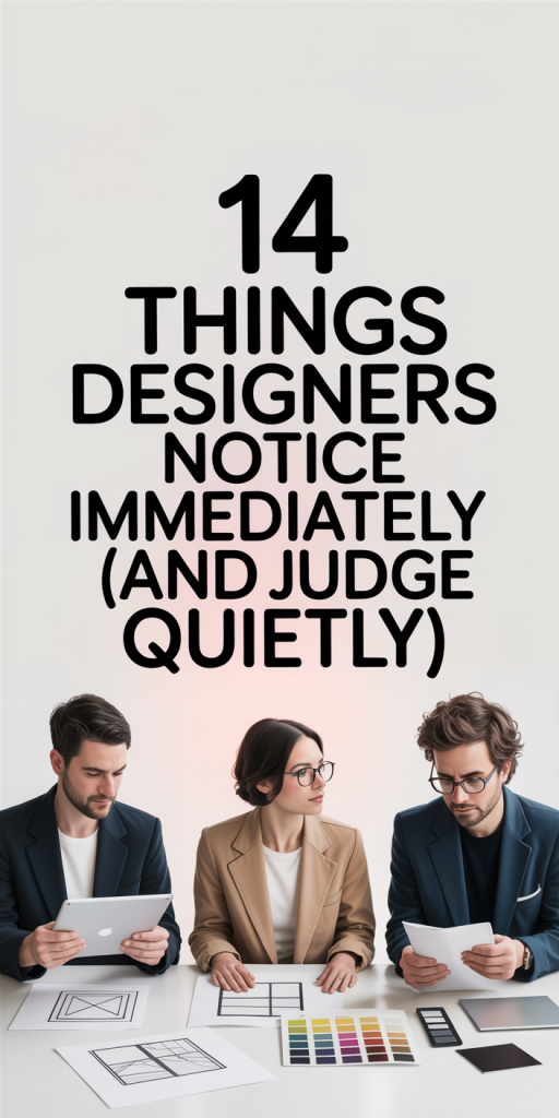
We all judge a book by its cover, designers just do it faster and more often. In 2026, with design trends shifting faster and accessibility expectations higher, certain visual and interaction mistakes stand out immediately to anyone who designs for a living. This article walks through the dozen-plus things designers notice in the first few seconds of viewing a website, app, or brand touchpoint, and explains why those details matter. Our goal isn’t to nitpick: it’s to help you recognize and fix common red flags so your product reads as intentional, trustworthy, and polished. Read on and you’ll learn what gives a design away, what signals professionalism, and practical fixes we use every day.
Layout And Visual Hierarchy: The First Instant Read
Layout is the shorthand we use to understand priorities. In the first three to five seconds, designers are decoding whether content is organized, where to look first, and whether the interface respects the user’s time. A strong visual hierarchy communicates purpose without words: a weak one creates friction.
We scan for whether primary and secondary elements are clearly separated, if the page has a deliberate rhythm, and whether white space is used as a tool rather than an afterthought. A cramped page tells us the team rushed wireframes or ignored responsive needs. Conversely, a grid-guided layout signals discipline and forethought.
Why it matters: users decide quickly whether to stay or leave. A coherent layout reduces cognitive load and increases conversions, engagement, and perceived credibility. Fixes are often simple, reweight typographic scale, increase spacing around the primary call-to-action, or tighten a grid, but their impact is immediate and measurable.
Typography, Color, And Brand Voice: What Signals Quality
Typography and color are the stretchiest parts of brand expression, they can make a simple layout feel premium or cheap. We judge whether type choices align with brand voice and whether color is used intentionally to signal function (links, CTAs, warnings). Poor typographic choices are one of the fastest giveaways that a design is amateur.
We listen with our eyes for tone: Is the typography playful, serious, or neutral? Does color palette feel cohesive or like someone picked shades from different decades? In 2026, designers are also looking for support across devices and locales, variable fonts, proper fallbacks, and sufficient color contrast for accessibility.
Why this matters: typography and color define perception before users read a single word. Invest in a coherent system and you reduce visual friction, strengthen brand recall, and create a consistent experience across touchpoints.
Imagery, Icons, And Microdetails That Give Away Laziness
Imagery is high-bandwidth communication, the wrong photo can undo careful copy and layout. We notice mismatched imagery immediately: low-resolution hero shots, inconsistent photo treatments, or stock images that scream generic stock. Icons are another giveaway: a mixed icon set with different stroke weights or perspectives tells us the asset library wasn’t curated.
Microdetails, like inconsistent border radii, shadows that don’t align with a single light source, or decorative elements that conflict with function, are the design sins that say “we didn’t finish.” These are the things users may not consciously name, but they feel them.
How we evaluate: quality first (resolution, crop, and subject relevance), then consistency (color treatment, filter, or illustration style), and finally function (does the image support the message or just fill space?). Replace lazy imagery with a small library of vetted photos or simple illustrations and you’ll lift perceived quality immediately.
Interaction, Usability, And Accessibility: The Silent Tests
Design is interactive by nature. We judge not just how things look but how they behave. Do buttons communicate affordance? Are interactive elements discoverable? Is the path to conversion frictionless? These are the silent tests that really determine whether a design works in the wild.
We often simulate tasks as new users and check common flows: sign-up, search, add-to-cart, or contact. Little annoyances like ambiguous labels, tiny tap targets, or modal traps break trust quickly. Accessibility is central: if keyboard navigation, focus states, and ARIA roles are missing, that’s a red flag that inclusiveness was an afterthought.
Practical mindset: design for the first interaction and the hundredth. Smooth onboarding, predictable interactions, and clear signposting improve retention and reduce support costs.
Conclusion
Designers notice more than aesthetics, we read intent. The details above are the fastest shortcuts we use to assess quality: layout rigour, typographic clarity, consistent imagery, and robust interaction patterns. When those elements align, a product feels trustworthy and usable: when they don’t, users leave and conversions drop.
If you take one thing away, let it be this: small, consistent systems beat one-off flourishes every time. Invest in grids, type scales, curated assets, and accessible interactions. The work is mostly discipline, not glamour, and it pays off in credibility, customer satisfaction, and fewer redesigns down the road. We’ve seen it repeatedly, fix the basics, and the rest falls into place.

Leave a Reply