We live in an era where square footage is a premium and every inch counts. Yet even perfectly sized apartments and cozy homes can feel suffocating, often because of a few correctable choices. In this guide we walk through the 15 most common small space mistakes that make rooms feel tighter than they are, and offer practical fixes you can carry out in 2026. We’ll focus on layout, furniture, storage, lighting, textiles, and finishing touches so you can stop guessing and start rearranging with confidence. Whether you rent, own, or stage to sell, these tactics are designed to stretch your space visually and functionally without a full renovation.
Why Small Spaces Still Feel Tight: Key Principles To Understand
Before we list the mistakes, let’s establish the principles that determine whether a room feels roomy or cramped. Understanding these will help us evaluate each problem and its solution more clearly.
Sightlines and scale: Our perception of space depends heavily on uninterrupted sightlines and proportional objects. A continuous view across a room makes it read as larger: visual interruptions or oversized pieces break that flow and shrink perceived volume.
Light and contrast: Bright, evenly distributed light expands space visually. High contrast, deep shadows, and dim corners compress it. Natural light is ideal, but layered artificial lighting can replicate the same effect.
Negative space and rhythm: Empty space isn’t wasted, it’s the stage for your belongings. Balanced spacing between items creates rhythm, which feels calm and open. Cramped spacing produces visual noise and claustrophobia.
Function-driven zones: Every area should have a clear purpose. When zones overlap chaotically, like a dining table doubling as a workout area, usage friction creates a sense of disorder that reads as smallness.
Psychological load: Clutter, too many patterns, and visual interruptions increase cognitive load: our brains interpret that overload as less physical space. Reducing stimuli often increases comfort more than adding square footage.
Keep these principles in mind as we go through specific mistakes: many fixes are about restoring sightlines, increasing light, clarifying function, and introducing deliberate negative space.
Layout And Flow: Poor Traffic Patterns, Blocking Sightlines, And Overfilled Zones (Mistakes 1–3)
Mistake 1, Ignoring natural traffic paths
One of the quickest ways to make a room feel cramped is to block the paths people naturally use to move through it. We’ve seen layouts where an armchair sits directly in front of a doorway, or a coffee table is centered on a path to the balcony. When we continuously detour around furniture, the space feels constricted and awkward.
Fix: Map the flow. Stand in each doorway and note where your feet tend to go. Rearrange so the primary paths are at least 2–3 feet wide and clear. Use rugs or subtle lighting to reinforce these routes.
Mistake 2, Placing tall or visually heavy pieces where they interrupt sightlines
Tall bookshelves, room dividers, or media units placed mid-room cut sightlines and make sections feel boxed in. Even well-designed pieces can act like walls if poorly placed.
Fix: Keep tall items against the perimeter or use open shelving with negative space. If you need a divider, choose transparent or low-profile options, glass, open slats, or a slim console that preserves horizontal sightlines.
Mistake 3, Overfilling zones with excess function
Trying to cram too many activities into one zone (work, sleep, dining, and storage) without clear separation creates visual chaos. Our eyes can’t parse multiple focal points at once, so the space reads as noisy and smaller than it is.
Fix: Define zones with subtle cues: a rug for the seating area, a pendant over the dining table, or a different paint or wallpaper accent. Use multipurpose furniture (folding tables, wall beds) strategically rather than stacking functions everywhere.
Furniture Scale And Placement: Choosing Pieces That Overwhelm The Room
Selecting the right furniture is less about style and more about scale and proportion. We often default to the pieces we love without testing whether they fit the room’s rhythm.
Too-Large Sofas And Bulky Arms
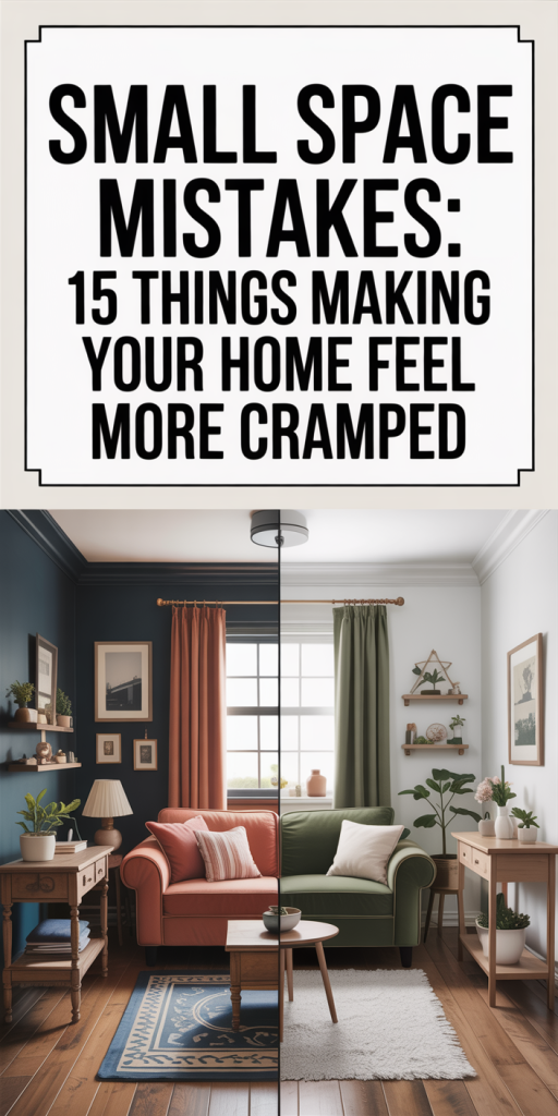
A common mistake is choosing a sofa that fills the room from wall to wall or has massive rolled arms. These shapes block light, create large solid masses, and prevent visual breathing room. Even if length-wise it technically fits, the visual weight can dominate.
Fix: Opt for streamlined silhouettes, slender arms, low profiles, and exposed legs. Sofa depths of 34–36 inches usually work best in smaller living rooms: lean toward armless or track-armed designs. If you love a deeper seat, consider pairing it with a narrow console behind to maintain proportionality.
Pushing All Furniture Against Walls Without Defining Zones
There’s an old rule that pushing furniture to the walls makes a room appear larger, but in many smaller spaces that strategy removes conversational areas and flattens depth. We lose the layered look that creates a sense of spatial richness.
Fix: Float furniture where possible. Pull seating slightly away from walls, 6–12 inches is often enough, to create a visual perimeter and allow airflow behind pieces. Use rugs to anchor groupings and create depth. If you must push a piece to the wall for traffic reasons, add a slim table or low shelving behind to create a deliberate boundary rather than an afterthought.
Storage And Clutter: Hidden Hoarding And Inefficient Solutions (Mistakes 7–8)
We tend to think that stuffing items into storage will solve clutter, but improperly planned storage creates its own visual problems.
Mistake 7, Using too many opaque storage surfaces
When every item is behind closed doors in bulky cabinets or chests, you get large, inscrutable blocks of furniture that feel heavy. Closed storage is essential for a tidy look, but overusing it without scale or rhythm leads to visual compression.
Fix: Mix open and closed storage. Use open shelves sparingly with curated displays and closed drawers for messy items. Choose low-profile, modular units instead of one massive armoire. A few strategic glass-fronted cabinets break up the mass while still hiding clutter.
Mistake 8, Letting everyday items spill into visible areas
Shoes, mail, charging cables, and kids’ toys are the real culprits that make a place feel lived-in, and small. Even a professionally designed living room collapses into cramped chaos if daily detritus collects on surfaces.
Fix: Create landing zones: a slim entry console with concealed drawer, a caddy or bench with shoe storage, and cord management near desks and media centers. Commit to a three-minute nightly reset: we do a quick sweep of surfaces, stow items, and the room immediately breathes easier.
Lighting And Color: Dim Rooms And Wrong Paint Choices That Shrink Space (Mistakes 9–10)
Color and light together form the emotional envelope of a room. Get them wrong and even generous square footage can feel oppressive.
Mistake 9, Relying on a single overhead light or poor bulb choices
A lone central fixture casts shadows in corners and flattens depth. Warm, low-lumen bulbs can also make surfaces look heavier. Inadequate task and accent lighting increase perceived density.
Fix: Layer lighting. Combine ambient (ceiling or recessed) with task (tables, reading lamps) and accent (wall washers, picture lights). Use bulbs with CRI 90+ where possible to render colors accurately: daylight-balanced LEDs (around 3000–4000K depending on the room) keep spaces bright without feeling clinical.
Mistake 10, Choosing extreme or wrong paint palettes
Very dark walls, heavy contrasts, or overly saturated colors can swallow light and make ceilings feel lower. Conversely, plain flat white with no variation can feel clinical and still fail to create depth.
Fix: Use light, warm neutrals to reflect light while adding subtle contrast with trim or an accent wall. Paint ceilings one to two shades lighter than walls to boost perceived height. Consider sheens: low-luster eggshell reflects a touch more light than flat paint while hiding imperfections better than gloss.
Patterns, Textiles, And Too-Many Accessories (Mistakes 11–12)
Textiles and patterns add character, but they can also create visual clutter when used without restraint.
Mistake 11, Overloading the room with competing patterns
When every surface, from curtains to pillows to rugs, fights for attention, the eye has nowhere to rest. That tension translates as cramped energy.
Fix: Choose one dominant pattern and two complementary supporting solids or textures. Use scale to balance: a large-scale rug, medium-scale pillows, and small-scale patterns on accessories. Neutral grounding pieces help your pattern choices sing instead of shout.
Mistake 12, Heavy, floor-length drapes and too many accessories
Bulky curtains pooled on the floor, layered window treatments, and shelves crowded with knickknacks reduce openness. We often think more is better for coziness, but excess soft goods and objects reduce perceived airiness.
Fix: Go for light, airy window treatments that allow maximum daylight, sheers, top-down shades, or blinds that recess into the window frame. Limit tabletop and shelf items: adopt a rotation strategy where you display a curated selection and store the rest. A few meaningful objects have more impact than a crowded shelf.
Doors, Window Treatments, And Visual Interruptions That Cut The Room In Half (Mistakes 13–14)
Architectural elements and treatments can either connect spaces or chop them into tiny islands.
Mistake 13, Using heavy doors or poor swing directions that interrupt furniture placement
Doors that swing into valuable floor space or block sightlines fragment the room. Sliding doors can help, but poorly chosen tracks or opaque panels can still create visual breaks.
Fix: Reconsider swing direction where possible. Replace swinging doors with pocket or sliding doors to maximize usable space. If replacement isn’t an option, use a narrow console or floating shelving to soften the visual impact of an inward-swinging door.
Mistake 14, Window treatments that visually ‘close’ a room
Treatments that are too dark, hung too low, or mounted inside the frame can shrink windows visually. Windows are portals, when they read small, the whole room feels smaller.
Fix: Mount curtains closer to the ceiling and extend them wider than the frame to make windows read larger. Choose lighter fabrics and consider reflective treatments, mirrors or light-colored blinds, to amplify daylight. Where privacy is needed, top-down shades offer control without fully obscuring the upper pane.
Decor Missteps: Overdecorating One Surface (Mistake 15)
We often concentrate our decorative energy on a single surface, an entry console, a mantel, or a coffee table, and end up with a cluttered focal point that anchors the room in the wrong way.
The problem: one hyper-decorated surface becomes a visual attractor that pulls attention and makes the surrounding negative space feel insufficient. It’s a bit like hanging a neon sign in a small shop window: attention collapses around it and the rest of the scene disappears.
Fix: Distribute visual weight. Instead of a densely packed console, try a single statement object (a sculptural vase or artwork), a small stack of books, and one or two lower-profile items. On a mantel, step back: choose three items max and stagger heights to create a calm composition. For coffee tables, keep the center low and clear, use a shallow tray for essentials and rotate decorative objects seasonally.
A final note and takeaway (conclusion)
Small space mistakes are rarely about taste: they’re about perception. If we restore flow, balance scale, declutter thoughtfully, and layer light and texture, our homes will feel bigger overnight. Start with one change, clear a sightline, add a lamp, or remove half the items on a shelf, and you’ll quickly see the compounding effect. With intentional edits rather than wholesale replacements, we can make even the coziest spaces feel open, functional, and intentional in 2026.

Leave a Reply