Living in a small home doesn’t mean giving up style, comfort, or the feeling of spaciousness. With the right approach to small space decorating we can transform tight footprints into airy, functional places that feel larger than their square footage. In this 2026 guide we’ll walk through the psychology behind perception of space, practical furniture and layout strategies, lighting and color techniques, flooring continuity, and storage solutions that reduce visual clutter. This isn’t about trends or gimmicks, it’s about rules that reliably change how a room reads to the eye and the mind. Read on and we’ll show you simple, repeatable tactics that make real difference whether you’re in a studio, a narrow townhouse, or a compact apartment.
The Psychology Of Space: What Makes A Room Feel Big Or Small
Perception drives everything when it comes to small space decorating. A room’s measured area is only one input: the cues our brains use, light, sightlines, scale, contrast, and familiarity, determine whether a place feels expansive or cramped. We can manipulate those cues to our advantage.
Some core psychological principles we rely on:
- Depth cues: Our brains interpret depth from overlapping objects, shadows, textures, and diminishing size. When those cues suggest continuity rather than interruption, a space reads as deeper.
- Contrast and framing: High-contrast edges and heavy frames break the visual field into smaller compartments. Soft transitions and low-contrast joins make surfaces flow, which makes rooms feel larger.
- Predictability vs. clutter: An orderly, predictable environment reduces cognitive load: clutter creates visual noise that closes in the space. Storage and simplicity free mental bandwidth and perceived space.
- Vertical attention: We often judge space by horizontal floor area, but height matters too. Drawing the eye upward, subtly, can change volume perception without altering footprint.
Understanding these drivers lets us make intentional choices: emphasize continuity, reduce harsh visual breaks, control focal points, and keep the eye moving through the room rather than stopping abruptly. In the sections that follow we’ll translate these concepts into concrete decorating rules that work together.
Scale, Proportion, And Furniture Choices
Size relationships are the foundation of small space decorating. Choose pieces that respect the room’s proportions and keep circulation comfortable. When furniture is too large or oddly scaled, it dominates the room and makes everything else feel small.
We follow three practical sub-rules for scale and proportion:
- Prioritize sightline-friendly silhouettes: Opt for low-profile sofas, open-legged chairs, and tables with slim bases rather than chunky pedestals. Furniture that reveals the floor under it keeps the visual plane continuous and unobstructed.
- Respect negative space: Allow breathing room around major pieces. Even six to twelve inches between a sofa and wall, or a clear walkway beside a bed, makes the room feel intentional rather than overcrowded.
- Create balanced groupings: When grouping seating or storage, aim for odd numbers and varied heights to produce rhythm without crowding. For example, a compact sofa, a slim side chair, and a narrow console create variety while keeping scale modest.
We should also avoid the temptation to match every piece to a single style or color. Subtle contrast in texture and finish adds depth without visual fragmentation, think a linen sofa, a walnut side table, and a glass-top coffee table. That variety reads as layered and spacious rather than boxed-in.
H3: Choosing Multi-Functional And Appropriately Scaled Furniture
Multi-function is essential in small homes. We recommend selecting pieces that pull double duty while staying proportional:
- Sofa beds and daybeds: Modern versions are sleeker and more refined than bulky mattress-on-a-frame options. Pick models with exposed legs to keep the floor visible.
- Nesting tables and collapsible desks: These give you surface area only when needed, preserving open space the rest of the time.
- Storage ottomans and benches: They provide seating, footrest, and hidden storage in one low-profile piece.
- Narrow-profile consoles: A console table can act as an entry catchall, a desk, or a media surface, choose one about 12–16 inches deep to avoid intruding into walkways.
When trying new configurations, we recommend using painter’s tape to mark furniture footprints on the floor. It’s a low-cost, low-commitment way to test scale and see whether a layout leaves adequate negative space and sightlines before buying or moving heavy items.
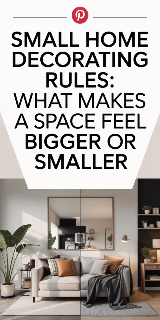
Layout, Flow, And Negative Space
Layout is where intention meets reality. A carefully considered plan optimizes function and circulation so that a small home feels effortless rather than squeezed.
Start by mapping primary pathways: how we enter the room, where we walk most frequently, and the natural gathering points. Then place the largest pieces to allow unobstructed flow. In studios or open-plan living rooms we often recommend “floating” furniture, pulling couches slightly away from walls, to create layered zones and continuous sightlines.
Negative space is deliberate emptiness. It’s not wasted: it’s breathing room that gives the eye options. We treat negative space as a design material: an area of floor left visible, a gap between wall art and shelves, or a clear edge along a windowsill. That visual rest prevents the room from feeling heavy.
Practical layout tips we use every time:
- Anchor seating with a rug, but keep the rug proportionate, too small makes the room fragmented: too big can overwhelm.
- Use scaled partitions like low bookcases or open shelving to define zones without closing them off.
- Prioritize primary functions: identify the top one or two activities for a room (sleeping and dressing, lounging and dining), then funnel layout decisions around those uses.
H3: Arranging For Sightlines And Clear Pathways
Sightlines, the unobstructed view from one point to another, make small spaces feel connected. We design arrangements that allow multiple sightlines, especially toward natural light sources or architectural features.
- Keep taller items away from key sightlines unless they provide a deliberate focal point.
- Angle furniture slightly rather than aligning everything perfectly parallel to walls. Subtle angles create an impression of spaciousness by breaking rigid geometry.
- Avoid blocking windows and doorways. Even a narrow passage left clear communicates openness.
A quick test: stand at the room’s primary entrance and look around. If your eye gets trapped on a bulky edge or a dark corner, that’s an area to rework, swap in a lower-profile piece, remove a visual blocker, or introduce a vertical element to redirect attention.
Light, Color, And Reflective Surfaces
Light is the single most powerful tool we have to enlarge perception of space. Natural daylight expands a room instantly, but well-designed artificial lighting and reflective surfaces amplify that effect.
Layer lighting: combine ambient, task, and accent sources so the room reads as luminous rather than spot-lit. Use flush or semi-flush ceiling fixtures in low-ceiling spaces to avoid chopping vertical sightlines. Wall sconces and floor lamps free up table surfaces while adding depth.
Color choices matter too. Lower-contrast palettes, tones that sit near each other on the value scale, create visual continuity. We favor light to mid-tones for walls and key upholstery, reserving brighter accents or darker shades for smaller elements like throw pillows, art frames, or a single accent piece.
Reflective surfaces are allies: mirrors, glossy finishes, and glass extend sightlines and bounce light. But placement matters: a mirror opposite a window doubles natural light: a mirror facing a busy, cluttered wall amplifies the clutter. Choose reflections that add depth or frame an attractive view.
H3: Using Color Schemes And Mirror Placement
Color strategy we recommend:
- Base layer: a neutral or soft-toned wall color that reflects light, off-whites, warm grays, or pale pastels.
- Mid layer: furniture and larger textiles in complementary mid-tones that provide warmth and avoid stark contrast.
- Accent layer: small, saturated pops of color in art, pillows, and accessories to draw the eye without breaking flow.
Mirror placement tips:
- Large vertical mirrors expand perceived height when placed between windows or beside doorways.
- Use narrow, full-length mirrors in entryways to open compact corridors.
- Group smaller mirrors intentionally: a composed gallery of reflective pieces can act like a single, larger reflective plane if arranged with consistent spacing and frames.
We avoid overusing high-gloss finishes: instead, we pick strategic reflective points (a mirror, a glass coffee table, polished metal lamp bases) to add light without turning the room into a glare zone.
Flooring, Rugs, And Visual Continuity
Flooring drives continuity across rooms. A consistent floor material or a coordinated color family makes a home read larger by reducing abrupt transitions that visually chop the plan.
When possible, we recommend installing the same flooring through adjacent rooms or using materials that share tone and grain. If full continuity isn’t an option, use rugs to tie spaces together. Choose rug sizes that allow front legs of seating to sit on them: small too-small rugs fragment the room and create the opposite effect.
Patterns on floors or rugs should be scaled to the room. Very busy or high-contrast patterns shrink the perception of space. Instead, we use large-scale, low-contrast patterns or solid tones that create a calm field. Natural fiber rugs, jute, sisal, or wool in neutral hues, work well to anchor furniture without overwhelming the visual field.
Transitions between rooms: use threshold strips, but avoid high color or texture contrast at doorways. A smooth visual handoff, a shared color accent or repeating material, maintains flow.
Practical flooring decisions for small homes:
- Matte finishes reduce glare and keep focus on the room’s form rather than reflective distraction.
- Light to medium tones generally enlarge perception, but a dark floor can work if balanced with lighter walls and plenty of vertical lighting.
- In studios, align planks or tiles so that their long dimension runs toward the main sightline (for example, into the room or toward windows) to visually lengthen the space.
Decluttering, Storage, And Visual Simplicity
Decluttering is non-negotiable in small space decorating. Even a few stray items create visual noise that contracts the space. We aim for curated surfaces and smart storage to keep daily life tidy and comfortable.
Start by auditing what’s essential for daily living. Donate or store things that aren’t used frequently. Then apply layered storage solutions:
- Concealed storage: cabinets with doors, ottomans with lids, and beds with drawers keep objects out of sight, preserving a calm visual plane.
- Vertical storage: tall, slim shelving and wall-mounted cabinets use unused vertical wall area without stealing floor space.
- Zone-based storage: assign a storage location per activity, entry, kitchen, living, sleep, so items don’t migrate and create clutter hotspots.
We also recommend designing storage to be part of the decor. Closed cabinetry can be painted the same color as the walls to disappear visually, while open shelves can display a restrained edit of objects to feel intentional rather than messy.
Small practical habits that matter:
- Daily five-minute tidy: spend a few minutes each evening returning items to their homes. It preserves visual simplicity with minimal effort.
- Use trays and small baskets to corral everyday items, keys, mail, remotes, so surfaces remain ordered.
- Keep countertops and tabletops mostly clear: use vertical corkboards or wall organizers for notes and lists instead of leaving paper piles.
Thoughtful storage frees up not just space but attention. A decluttered environment feels larger because our brains aren’t busy parsing every visible object.
Conclusion
Small space decorating is an exercise in intention: we control what the eye sees, how it moves, and what it remembers. By applying these rules, understanding perception, choosing appropriately scaled and multi-functional furniture, designing clear layouts with deliberate negative space, maximizing light and reflective surfaces, maintaining flooring continuity, and investing in smart storage, we can make compact homes feel open, calm, and generous.
Start with one change: rearrange a key seating area for better sightlines, swap a bulky piece for a slimmer alternative, or add a large mirror opposite a window. Small, purposeful moves add up quickly. With a clear plan and consistent application of these principles, even the smallest spaces can feel like thoughtfully designed, roomy places we’re proud to live in.
Leave a Reply