A small entryway doesn’t have to feel cramped or cheap. In 2026 we’re seeing a clear shift: thoughtful details, deliberate storage, and a few investment pieces give even the tiniest entrance an unmistakably luxe vibe. In this guide we’ll walk through 15 practical design moves, organized around function, scale, materials, lighting, and curated styling, that help small entryways read as expensive without requiring a full remodel. Whether you’re in a studio, a narrow foyer, or a condo hallway, these ideas are easy to adapt and prioritize, so you get maximum impact from minimal square footage. Let’s start by planning around how you actually use the space.
Plan Around Function First
When we approach a small entryway, function must come before aesthetics. If the basic circulation, storage, and drop zones aren’t resolved, even the prettiest finishes will look forced. Start by mapping how people use your entry: do you need a place to stash shoes, a landing spot for keys, a pet station, or a micro bench for putting on boots? Make a short list of the primary tasks and set them as non-negotiables.
We recommend sketching a 2D plan to scale, even a quick tape measure and paper diagram helps. Note door swing, sightlines from the living room, and any built-ins or niches. From there, prioritize solutions that serve multiple needs: a bench with hidden shoe storage, a shallow console that doubles as a mail catcher, or a wall hook rail that also displays art.
Think vertical first. In tiny entryways floor space is precious: we lean on walls for storage and staging. Floating shelves, vertically stacked baskets, and slim hooks let us keep the floor visually light while providing real utility. A narrow runner rug defines circulation without overwhelming the footprint, and a small rug pad keeps it from slipping.
Finally, plan lighting and power placement early, where you put a lamp or hardwire a sconce changes what furniture types will work. When function comes first, every decorative choice supports usefulness, and the result reads deliberate and expensive rather than cluttered.
Use Scale, Color, And Materials To Create Depth
Scale, color, and materials work together to make small entryways feel layered and expensive. We always consider the scale of furniture relative to the room: a bulky console will crush a tight entry, while a too-tiny side table will look underwhelming. Aim for pieces scaled to the width of the walkway, narrow, but with some presence: think 10–14 inches deep consoles or benches that match the door width proportionally.
Color can expand or contract a space. A monochromatic palette with one contrasting focal color creates cohesion and perceived depth. For example, painting the door in a deep, saturated hue while keeping walls in a warm off-white draws attention without shrinking the space. Dark lower walls or a painted wainscot anchor the space and make the upper area feel taller.
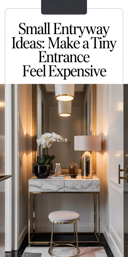
Materials signal quality. We favor natural textures, stone or terrazzo tile at the threshold, matte oak or walnut wood for furniture, and brushed brass or blackened steel hardware. Mixing one luxe material (marble-topped console, brass hook rail) with simpler supporting materials elevates the look without feeling overdone. A small glass vase, a leather tray for keys, or a felt-lined drawer adds tactile richness that suggests an expensive sensibility.
Add Statement Lighting And Mirrors For Illusion
Lighting and mirrors are essential for making small entryways feel expensive and larger than they are. We plan lighting in layers: ambient overhead illumination, task lighting for drop zones, and accent lighting to show off art or material details. A single striking fixture, a sculptural pendant or a low-profile chandelier, becomes a focal point and signals investment.
Consider scale: pendants should be proportionate to ceiling height and walkway width. In narrow entries we prefer linear flush or semi-flush fixtures, or a small cluster of bulbs on a slim track. For low ceilings, a shallow drum fixture in a luxe finish like aged brass instantly elevates the space without encroaching.
Mirrors double light and expand depth. A tall, narrow mirror opposite the door reflects arrival views and creates the illusion of depth. Round mirrors with a floating frame, or an oversized mirror with a thin metal edge, read expensive and keep the look airy. We often pair a mirror with an integrated shelf or slim console to create a purposeful vignette that’s both pretty and practical.
Invest In High-Quality Small Details
Small details are where an entryway truly reads as expensive. We encourage investing in a handful of quality touches rather than many cheap ones. Hardware is a quick confidence booster: upgrade door hardware, cabinet pulls, and hooks to cohesive finishes. A weighted doorstop, a solid brass key bowl, or a linen-lined drawer shows attention without shouting.
Textiles add softness and tactile richness. A handwoven runner or a runner with a subtle pattern can be expensive-looking: choose natural fibers like wool or cotton with a low, durable pile for entry durability. Leather or brass-accented trays for keys, a felt pad for sunglasses, or a bespoke doormat signal care.
Don’t forget scents and sound. A simple diffuser, a small candle in a matte ceramic vessel, or a compact Bluetooth speaker that plays soft music on arrival contributes to a sensory experience aligned with high-end spaces. These details compound: individually modest, together they shape the perception of quality and make a tiny entrance feel intentionally luxe.
Create A Cohesive, Curated Look
Cohesion is the final polish. We aim for a curated, edited look that feels lived-in rather than staged. Start by limiting your palette to two or three finishes (for example, warm wood, matte black, and aged brass) and repeat them in small doses so the eye reads consistency. Repeat textures, wood grain, woven fibers, matte metal, across the space to create a unified narrative.
Edit down objects. Instead of scattering many small items, select two to three meaningful pieces: a sculptural lamp, a framed print, and a bowl for keys. Rotating objects seasonally keeps the space fresh without adding clutter. When art is small-scale, place it low, at eye level when seated on the bench, to make the entry feel intentional and human-scaled.
We also think about the transition between entry and adjacent rooms. Match trim details or color accents to the next space so the entry reads like a natural extension of the home. Finally, incorporate one personal touch, a vintage mirror, a handmade ceramic vase, a family photo, to make the luxe look feel personal rather than catalog-like.
Conclusion
A tiny entryway can feel expensive when we prioritize function, choose proportionate furnishings, and layer materials and lighting thoughtfully. Small investments, quality hardware, a standout light, a well-chosen mirror, and restrained storage, deliver big returns in perceived value. By planning around how we use the space, editing carefully, and repeating a brief palette of finishes, we create tight, intentional entries that welcome and impress. Try one or two of these ideas first, then build on them as you go. The result will be a small entrance that feels unmistakably luxe.
Leave a Reply