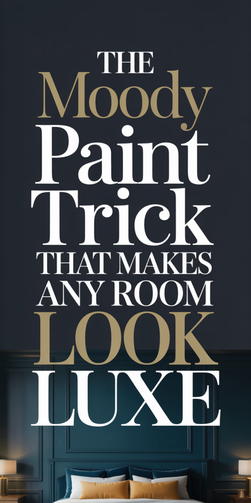
We’ve all seen rooms that look effortlessly expensive: deep, saturated walls, dramatic contrast, and an overall sense of intention that reads as luxe. The secret in many of those spaces is a specific moody paint technique that balances depth with clarity, not just slapping on a dark color, but manipulating undertone, finish, lighting, and trim to make the entire room sing. In 2026 that trick is more refined: designers are pairing jewel-toned neutrals, updated charcoal blends, and warmer black formulations with modern finishes and strategic lighting to create rooms that feel both cozy and elevated. In this guide we’ll explain exactly what the moody paint trick is, why it works, how to choose the right palette, which surfaces benefit most, step-by-step application tips, and how to style the finished space so the effect reads thoughtful rather than heavy.
What The Moody Paint Trick Is And Why It Works
The moody paint trick is a calculated approach to using saturated, low-value paint colors to create perceived luxury. It’s not simply choosing the darkest paint available: it’s about selecting hues with controlled undertones, matching them with finishes and trim treatments, and optimizing light so shadows and highlights sculpt the room. When done right, a moody room feels curated, intimate, and rich, even in modest square footage.
Why this works: our brains associate depth and restraint with cost and intention. Darker, nuanced walls reduce visual clutter and make furnishings and architectural details pop. A deep charcoal wall behind a gold mirror reads as deliberate and expensive: the same mirror on a pale, busy wallpaper might feel accidental or ordinary. The trick also plays on contrast: pairing moody walls with carefully chosen trim, metallic accents, and lighting creates a layered visual hierarchy that reads as high-end.
There’s a science to it. Color appearance changes with light temperature, surface sheen, and surrounding materials. A blue-black with a cool undertone can appear flat under warm incandescent light, while a slightly warmer black with brown undertones will feel richer and less like a void. In 2026 we’re seeing smarter pigment blends and formulations that retain chroma in low lighting, meaning moody colors can read luxe without swallowing a room whole.
We should also call out psychological effect: moody colors encourage focus and calm. They’re commonly used in dining rooms, studies, and master bedrooms because they promote relaxation and intimate conversation, emotional states associated with refined living. When we combine psychological resonance with the visual mechanics above, the result is a room that feels intentionally luxurious rather than merely dark.
Choosing The Right Moody Palette For Your Space
Selecting the right palette is the foundation of the moody paint trick. The best moody palettes balance chroma (color intensity), value (lightness/darkness), and undertone (the hidden color that shifts with light). Here’s how we approach palette selection in practice.
Start with function and mood: what do we want the room to feel like? For intimacy and warmth, we lean toward deep burgundy, warm black, or chocolate-toned paints. For modern drama, cooler navy-blacks, inky teals, and graphite grays work well. For a luxe-but-soft look, muted plum or moss green with low saturation reads elevated without feeling heavy.
Consider scale and natural light: small, north-facing rooms benefit from moody colors that have warmer undertones or slight reflectance. A pure blue-black in a north-facing room can feel cold and cave-like: a black with brown or red undertones will reflect subtle warmth. Conversely, sunlit rooms can take cooler moody colors, think indigo or slate, because daylight balances the shade.
Mixing neutrals with jewel tones: one of our favorite strategies is to anchor a room in a moody neutral (charcoal, deep taupe, or blackened gray) and add one or two jewel-toned accents, a sapphire cabinet, a malachite vase, or a ruby cushion. This creates contrast and prevents monotony while reinforcing a luxe palette.
Palette tools and palettes to try in 2026:
- Blackened Brown: a near-black with warm brown undertones, immersive and warm.
- Slate Indigo: deep blue with gray base, modern and calm.
- Forest Noir: muted deep green with a touch of gray, organic, luxe.
- Warm Charcoal: charcoal with subtle red or brown undertone, great for living spaces.
- Dusty Plum: deep plum, low chroma, feminine and sophisticated.
Undertones, Finishes, And Sample Testing
We can’t overstate how important sample testing is. Paint swatches in the store rarely tell the full story. Take 12″x12″ samples, paint them on foam core or large poster board, and view them at different times of day and under your room’s lamps. Observe for at least three days: morning daylight, afternoon brightness, and evening artificial lighting. Note how undertones emerge, a green undertone in a gray might appear only in twilight, which could be exactly the look you want or an unwelcome surprise.
Finish matters. Matte and low-sheen finishes absorb light and deepen color: they’re perfect for walls where we want a velvety, continuous field. Satin and eggshell reflect more light and can enhance depth while adding slight sheen that reads more formal. For trim and doors, we often suggest a higher sheen (semi-gloss or satin) to create crisp contrast and to stand up to wear. In 2026, hybrid finishes that mimic matte depth but are wash-resistant give us the best of both worlds, pick those if you expect wear or moisture exposure.
Finally, consider color families across connecting rooms. If your hallway flows into a living room, ensure the moody color reads cohesive when seen in sequence: test the most visible vantage points to avoid jarring transitions.
Best Rooms And Surfaces For The Trick
Not every surface benefits equally from moody paint. We prioritize rooms and surfaces where moodiness enhances function and looks intentional. Here are the prime candidates and why they work.
Dining Rooms
Dining rooms are a classic stage for moody paint. Deep walls make the table, lighting fixture, and tabletop objects the focal point. Moony colors create intimacy for dinner parties and highlight metallic accents and linens. A dark backdrop also makes artwork and mirrors read like editorial statements.
Bedrooms
Bedrooms benefit from the calming effects of deep colors. In master suites, a moody palette paired with layered lighting and soft textiles creates a cocooning effect that feels luxurious. We often recommend painting the entire room including the ceiling in an ultra-soft matte to reinforce the enveloping sensation.
Living Rooms and Libraries
For living rooms, choose moody colors when you want a dramatic, sophisticated entertaining space. Libraries and home offices, by contrast, gain a studious, archival vibe from dark walls, it feels like a grown-up sanctuary.
Bathrooms and Powder Rooms
Small bathrooms and powder rooms are excellent laboratories for moody paint. Because they’re contained and usually have a focal sink or vanity, a dramatic color reads like a design statement rather than an oppressive choice. Pair with lighter stone or metallic fixtures for contrast.
Built-Ins, Alcoves, and Accent Walls
Using moody paint on built-ins or alcoves is a smart, lower-commitment way to try the trick. Painted shelves in dark green or navy make books and objects pop. Accent walls behind headboards or sofas create depth without overwhelming the entire room.
Doors, Ceilings, and Trim
In 2026, designers increasingly paint ceilings and doors in moody hues to create cohesion. A painted ceiling in a slightly lighter shade than the walls can lift a room while still feeling luxurious. Painting interior doors and built-in cabinetry the same moody color extends the effect and creates a curated, enveloping look.
Surfaces to Avoid
We avoid heavy moody paint on cramped, windowless rooms unless balanced with strong artificial lighting and reflective accents. Also be cautious with large patterned textiles or busy wallpaper, pairing them with moody paint can create visual conflict unless carefully curated.
Overall, the best rooms for the moody paint trick are spaces where you want to slow the pace and make objects and finishes feel intentional. That’s where the trick reads luxe rather than just dark.
Step-By-Step: Prep, Paint, And Finishing Techniques
Executing the moody paint trick requires disciplined prep and thoughtful technique. We’ll walk through a reliable process that minimizes surprises and maximizes the high-end look.
- Prep the Space
- Clear and clean: Remove furniture or move it to the center and cover. Clean walls with a mild degreaser: grime shows up more on dark colors. Repair holes and sand rough spots.
- Prime: Use a high-quality primer, especially if covering a lighter color. For very deep hues, use a tinted primer matched closer to the final color to reduce the number of finish coats. A stain-blocking primer helps with water stains or tannin bleed-through on older walls.
- Choose Tools and Paint Quality
- Paint quality matters more than technique here. Upscale, richly pigmented paints provide better depth and hide: they also tend to level more smoothly. In 2026, many premium lines include pigments that retain chroma in low light, choose those if available.
- Rollers: Use a high-density microfibre roller for smooth coverage. For a velvet finish, a 1/4″ nap roller often gives the best result. Trim brushes should be high-quality synthetic or natural blends for crisp lines.
- Cut In Carefully
- Cut in around ceilings, corners, and trim with a steady hand. For best results, we like to use painter’s tape sparingly, only where a super-crisp edge is essential. Taping can sometimes lift matte finishes or create seams: a steady brush technique produces a cleaner, more natural edge.
- Apply Even Coats
- Moony colors often need two to three thin coats. Avoid heavy single coats, they dry unevenly and highlight imperfections. Allow proper drying time between coats, and watch for lap marks. Work in small sections and maintain a wet edge.
- Blend Sheen and Texture
- If you’re painting trim in a higher sheen, paint walls first and trim second. Use a light blocking coat between the two if you want perfectly crisp lines. For built-ins or cabinets painted in the same moody hue, consider spraying for a factory-smooth finish.
- Special Finishes and Techniques
- Soft Gradation (Ombre Accent): For a subtle luxe effect, create a soft gradation on an accent wall using the same pigment at varying values. This reads custom and high-end when done by a steady hand or professional.
- Glaze or Wax: In formal rooms, a very light glaze over a dark paint can add depth and movement. We only recommend this for textured walls or architectural spaces where the extra nuance will be appreciated.
- Final Inspection and Touch-Ups
- Live with the color for a few days and note spots that read uneven. Patch small inconsistencies with a touch-up brush rather than repainting large areas. Clean up edges and remove any tape slowly at a 45-degree angle to avoid peeling.
- Maintenance
- Dark walls show fingerprints more easily in high-traffic zones. Use washable or scrubbable paint in hallways and family rooms. Keep a small touch-up can for future nicks, matching sheen is the main challenge, so store leftover paint properly.
Follow these steps and the moody paint will look deliberate, flawless, and luxurious rather than rushed or heavy.
Lighting, Trim, And Styling To Elevate The Effect
A moody paint job is only as good as the context around it. Lighting, trim choices, and styling decisions make the difference between moody and majestic.
Lighting: Layered and Intentional
- Ambient + Accent + Task: Layered lighting is essential. Ambient light provides overall visibility, accent lights highlight artwork and architectural features, and task lighting serves functional areas. In a moody room, accent lights become dramatic players, picture a picture light over a painting or a directional sconce that throws soft pools of light across textured walls.
- Color Temperature: Choose warmer LEDs (2700–3000K) to keep deep walls feeling cozy. Cooler light (4000K+) can make moody blues and greens feel crisp, but may read clinical in intimate spaces. Use dimmers, they’re non-negotiable: dimming deep colors adds mood and reveals hidden undertones.
- Reflective Fixtures: Brass, polished nickel, or smoked glass fixtures create interesting reflections against deep walls: use them strategically to add sparkle without overpowering the color.
Trim and Millwork: Contrast With Purpose
- Match or Contrast: For a seamless, enveloping look, paint trim the same color as the walls but in a slightly glossier sheen. This creates depth without the hard lines of white trim. Conversely, crisp white trim against moody walls reads modern and graphic: choose the approach that aligns with your design language.
- Doors and Cabinetry: Painting doors and cabinetry in the same moody color extends the field and creates a built-in feel. For a layered look, paint trim and doors in a slightly lighter or warmer variant of the wall color.
Styling: Material Choices That Pop
- Metallics: Gold, brass, and champagne tones contrast beautifully with deep walls. Use them sparingly, a mirror frame, lamp base, or drawer pulls are enough to read luxe.
- Textiles: Layer tactile fabrics, velvet cushions, wool throws, and silk drapery. Textures read more important against a dark backdrop: even modest pieces will look richer.
- Art and Accessories: Seek high-contrast artwork or sculptural objects. A large-scale painting with lighter values or a marble sculpture will become an instant focal point. For shelves, arrange objects in small groupings to avoid visual clutter.
- Flooring: A lighter, neutral floor (wide-plank oak, pale stone) balances deep walls and prevents the room from feeling grounded too low. If you prefer dark floors, introduce area rugs with pattern and light tones to lift the palette.
Practical Touches
- Mirrors: Use mirrors to bounce light around and open sightlines. A large mirror opposite a window will amplify daylight and make moody walls feel less confining.
- Plants: Deep greens, both painted walls and living plants, complement each other. Plants add life and break the visual stillness of moody color.
When we combine considered lighting, purposeful trim choices, and curated styling, the moody paint trick transcends simple color and becomes a complete design composition that reads truly luxurious.
Common Mistakes To Avoid
The moody paint trick is high-reward but also easy to botch if we hurry or skip steps. Here are common mistakes we consistently see and how to avoid them.
- Skipping Samples and Relying on Swatches
Problem: A small paper swatch rarely captures how a color behaves under your light.
Solution: Paint multiple large samples on poster board and observe at different times and with your room’s lighting. Take photos and live with them for a few days.
- Ignoring Undertones
Problem: Choosing a color based purely on name (“charcoal”) without testing can reveal surprising undertones that clash with furnishings.
Solution: Look for colors in person and compare against your dominant finishes (floor, upholstery, cabinetry). If your wood has red undertones, choose a wall color with complementary warmth.
- Using Wrong Sheen
Problem: Flat or velvet finishes can look beautiful but are harder to clean and may scuff in high-traffic areas.
Solution: Use washable matte or low-sheen technology in busy rooms, and reserve true flat sheens for low-traffic zones like adult bedrooms or formal dining rooms.
- Over-Contrasting Trim Without Intention
Problem: Bright white trim against a deep wall can sometimes read too stark or dated if not thoughtfully executed.
Solution: Decide whether you want the crisp modern contrast or an enveloping tonal look. If the former, choose a warm white that relates to your flooring and furnishings.
- Poor Lighting Planning
Problem: Dark paint plus inadequate lighting turns a room into an uninviting cave.
Solution: Plan layered lighting before painting. Consider the function of each zone and install dimmers so you can adjust mood easily.
- Painting Everything the Same Dark Color Without Texture
Problem: A uniformly dark room with no texture or contrast can feel flat and heavy.
Solution: Mix materials, matte walls, glossy trim, metallic accents, textiles, to create dimensionality. Use an accent furniture piece or rug to break the field.
- Underestimating Maintenance
Problem: Dark walls show dust and fingerprints more readily, especially near light switches, doorways, and handrails.
Solution: Use scrubbable paint and keep a touch-up kit handy. For high-traffic zones, choose a finish that balances depth with durability.
By recognizing and sidestepping these mistakes, we make the moody paint trick feel intentional and lasting rather than experimental or regrettable.
Conclusion
The moody paint trick is a deceptively simple way to make any room feel luxe, but it relies on decisions at every step. We’ve walked through why moodiness works, how to pick the right palette, where to apply it, and the technical and styling moves that elevate the result. When we take time to test samples, plan lighting, choose appropriate finishes, and style with contrast and texture, deep colors don’t close a room down: they lift everything inside it. In 2026 the most successful moody rooms are those that marry pigment technology with thoughtful layering, and the payoff is a space that feels considered, intimate, and unmistakably upscale.
Leave a Reply