First impressions of a home happen in seconds, often before a guest has even taken off their shoes. We’ve learned that the secret to a welcoming, polished entryway isn’t an expensive renovation or a pile of décor. It’s one deliberate styling decision that anchors everything else and communicates intent, order, and personality the moment someone steps across the threshold. In this text we’ll explain that trick, why it works from a design and psychological perspective, and how to apply it step-by-step. Along the way we’ll cover complementary elements like lighting, rugs, mirrors, and storage, highlight common mistakes (and quick fixes), and give budget-friendly before-and-after ideas you can carry out this weekend. If you want guests, or potential buyers, to feel instantly at ease and impressed, read on.
The Entryway Styling Trick That Changes First Impressions: What It Is And Why It Works
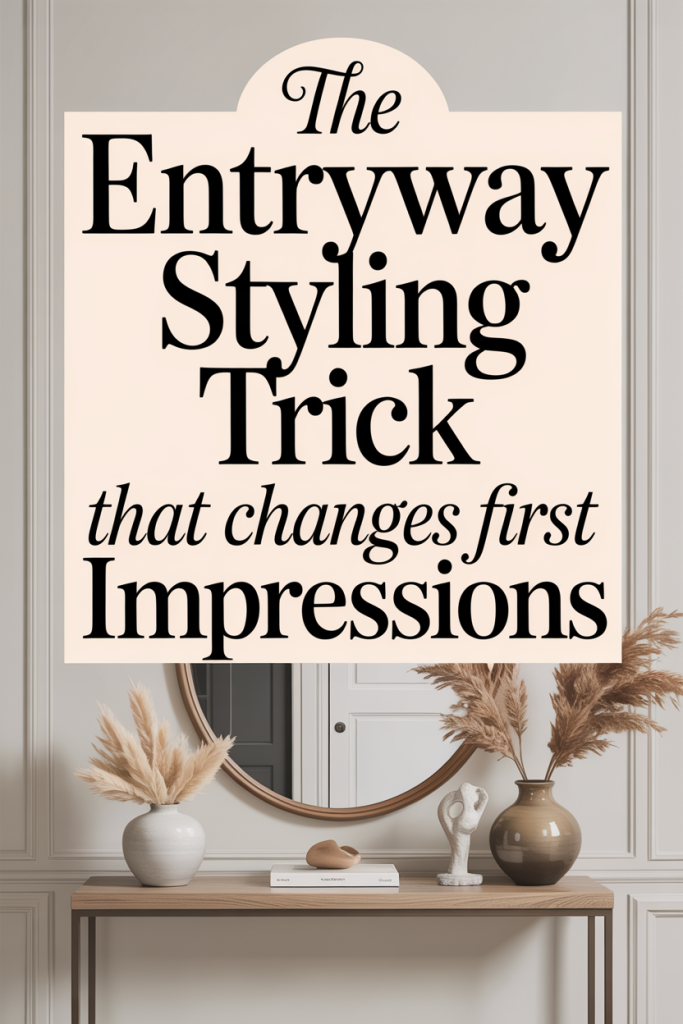
The trick is simple and repeatable: choose a single, well-proportioned anchor piece for the entryway and design everything else around its scale, color, and function. By “anchor” we mean a purposeful object that immediately communicates the room’s role, usually a console table, narrow bench, or statement piece of furniture, rather than a cluttered collection of mismatched items. When we start with an anchor, we create a clear focal point, define circulation, and give the eye something intentional to land on.
Why does this work? First, human perception favors clear hierarchy. When the brain encounters a defined focal point, it interprets the space as curated and cared for. Second, an anchor solves proportional confusion. Entryways are often transitional, small, and awkwardly shaped: without an anchor, homeowners pile functional items, keys, mail, shoes, on top of each other, creating visual noise. An appropriately sized anchor organizes those functions, turning chaos into composed utility. Third, anchors let us control flow. By placing a bench or console in the right spot, we subtly guide how people enter, take off coats, or set down bags, improving both experience and photos (key if you’re selling).
Beyond psychology and function, the anchor gives us a design rule to follow: match the anchor’s scale to the entry dimensions, echo a dominant color in two other elements, and repeat a material to create cohesion. That triad, scale, color, material, keeps styling decisions coherent. Over years of testing and staging homes, we’ve seen this single decision transform cramped, forgettable entryways into spaces that feel spacious, composed, and instantly inviting.
How To Apply The Trick — Step-By-Step
We break the application into a short, repeatable workflow so you can adopt the anchor approach in under an hour, then refine over days. Follow these steps in order: measure, select, position, style, and test. Each step narrows choices and prevents the common temptation to over-accessorize.
- Measure: Start with the obvious but overlooked step. Use a tape measure to note the width of the entry wall, depth from door swing to opposite wall, and ceiling height. These numbers dictate the anchor’s maximum dimensions. For example, a console should generally be no more than two-thirds the width of the wall and about 12–16 inches deep in narrow hallways. Benches need to leave 30–36 inches of traffic space in front.
- Select: Choose an anchor that fits the proportions and aligns with your home’s style. If the entry is narrow, pick something slim, an open-leg console, a narrow bench, or a floating shelf. For wider foyers, a wider console or a small settee can read as inviting. Material matters: wood introduces warmth, metal reads contemporary, and stone or marble feels luxe. We recommend an anchor with at least one surface for staging and one functional element (drawer, shelf, or storage) to keep clutter off sight.
- Position: Center the anchor on the primary wall, not awkwardly off to one side. If the door swings into that wall, leave clearance so it won’t hit handles or clothing. Use painter’s tape on the floor to visualize traffic flow before committing. Height matters: console tabletop should be roughly hip to waist height for most people (about 30–36 inches), while bench height should match comfortable seating (16–20 inches).
- Style: Layer accessories thoughtfully, start with a foundation group (lamp or sconce + mirror + small tray), then add one or two personal items (a plant, sculptural object, or a stack of two books). Keep to a simple palette: introduce one accent color and repeat it in two other places (a rug accent, a framed print, or a throw). Resist the urge to place every small object you own on the anchor: negative space increases perceived value.
- Test: Walk through the entry both yourself and with a partner carrying items, opening doors, and seating to ensure comfort. Photograph the entry in natural light and in evening light, you’ll often notice balance issues in photos that aren’t obvious in person. Adjust until the anchor feels like it belongs rather than dominates.
Choosing And Positioning Your Anchor
Choosing the right anchor starts with the entry’s size and how you use it. If your entry is mostly a pass-through, prioritize depth and clearance: a slim console or floating shelf will do the job. If the entry is a drop zone where we take off shoes and bags, choose a bench with storage or a console that incorporates hooks or drawers.
Think materials in terms of the story you want the home to tell. Warm wood signals comfort and tradition: dark metal or matte-black frames read modern: natural rattan suggests casual coastal: marble or lacquer reads formal and elegant. We aim to make the anchor feel intentional: if the rest of the home is mid-century modern, a chunky farmhouse bench will clash and confuse visitors.
Positioning is largely a matter of visual balance. Center the anchor on the main sightline, the wall opposite the front door or the longest visible surface when the door is open. If placing the anchor to one side is necessary (for example around a staircase or coat closet), balance it with a tall plant or artwork on the opposite side so the entry reads composed from multiple angles.
Keep circulation in mind: the anchor should define, not block, the path. We like to keep 30–36 inches of clear space in front of seating and 28–36 inches for primary walking paths. For entries that double as mudrooms, consider a narrower depth but with built-in hooks and a shoe shelf below the bench. Finally, if you’re in a rental or can’t make permanent changes, a lightweight console or bench that’s easy to move still provides the necessary anchor effect without commitment.
Layering Accessories And Maintaining Flow
Once the anchor is placed, accessories are the tools that make the entry feel curated rather than staged. We recommend layering in three planes: vertical (art, mirror, wall lamp), surface (tray, lamp, books, decorative objects), and lower level (basket, shoe tray, storage bench). This creates visual rhythm and prevents everything from sitting at the same height, which flattens the composition.
Start with a single large vertical element above the anchor, typically a mirror or artwork, to extend the focal point upward and reflect light. Mirrors are particularly powerful in small entries because they double perceived space and improve lighting for last-minute checks. Next, add a functional lamp or sconce to provide warmth in the evening: layered lighting makes an entry feel purposeful and cozy.
On the surface, divide the tabletop into two zones: functional and decorative. The functional zone (closest to the door) contains a small tray for keys, a shallow bowl for pocket change, and a slim catch-all for sunglasses. The decorative zone can hold a single plant, a stack of two books, or a sculptural object. Keep groupings odd-numbered for visual interest, and vary heights to create a small vignette.
Below the anchor, introduce practical storage that complements the look: woven baskets, a low shelf with baskets, or hidden drawers. Baskets are forgiving, they hide last-minute clutter while adding texture. Maintain flow by keeping the main walking area clear and using storage as the “drop zone” for daily items. Finally, revisit the setup at night. We often discover items that interrupt flow, a protruding bag strap, a basket that spills into the path, and correcting these small issues preserves the entry’s functionality and aesthetic.
Styling Elements To Complement The Trick (Lighting, Rug, Mirror, Storage)
Complementary styling elements turn the anchor from a single object into a cohesive entry experience. Lighting, rug, mirror, and storage are the high-impact items we recommend prioritizing after the anchor.
Lighting: Layered lighting is essential. If you have good overhead light, add a table lamp on one side of the console or wall sconces flanking a mirror. We prefer warm LED bulbs around 2700K–3000K for entries: they render skin tones and finishes pleasantly and make the space feel inviting. If possible, install a dimmer so the entry’s mood adjusts from morning bustle to evening calm.
Rug: A rug anchors the floor plane and defines the entry footprint. Choose a rug that fits the door swing and leaves at least 4–6 inches of floor border on either side for balance. In narrow entries, a runner is the obvious choice. For foyer squares, pick a rug proportional to the wall with the anchor. We favor low-pile, durable materials with a pattern that hides traffic stains, indoor-outdoor flatweaves or wool blends are pragmatic and pretty.
Mirror: Mirrors do double duty: they expand the perceived space and serve a last-second check before leaving. The mirror’s scale should match the anchor, a mirror that’s too small reads tacked-on: one that’s too large overwhelms. Consider vertical mirrors for low ceilings (they draw the eye up) and horizontal mirrors for wide consoles (they emphasize the tabletop). Frames should echo the anchor’s material for cohesion.
Storage: The anchor reduces visible clutter, but good storage completes the system. Think multifunctional: benches with hidden compartments, consoles with drawers, or open shelves with attractive baskets. For everyday convenience, keep an out-of-sight catch-all for mail and a dedicated spot for umbrellas and shoes. If you have kids or pets, include wash-and-wear bins for leashes and reusable grocery bags. We like labeled baskets for family members, it’s a small behavioral nudge that keeps drop zones orderly.
Common Mistakes And Easy Fixes
Even with the right idea, it’s easy to undermine an entry’s potential with a few common missteps. We see the same issues over and over, and they’re all fixable quickly.
Mistake 1: Wrong scale anchor. People often pick furniture that’s too large or too small. Fix: refer to your measurements and choose an anchor that’s roughly two-thirds of the wall width. Use painter’s tape to mock up the footprint before buying.
Mistake 2: Visual clutter. Stuffing the tabletop with every small item creates noise. Fix: adopt a “one functional tray + one decorative object” rule. Everything else goes into drawer or basket storage.
Mistake 3: Poor lighting. Harsh overhead light or no light at all kills ambiance. Fix: add a table lamp or wall sconce and swap to warm bulbs. A motion-sensor LED puck can be a cheap, temporary fix.
Mistake 4: Ignoring circulation. Anchors that block the path frustrate users. Fix: ensure 30–36 inches of clear walkway: if your entry is tight, choose a shallower piece or wall-mounted shelf.
Mistake 5: Mismatched styles without cohesion. A high-gloss console next to a rustic farmhouse door can feel disjointed. Fix: create cohesion by repeating one material (wood, metal, or rattan) in at least two places: anchor, mirror frame, rug accents, or storage baskets.
Mistake 6: Neglecting maintenance. Even the best-styled entry looks bad when shoes and mail pile up. Fix: institute a five-minute nightly tidy: file mail, empty the key tray, and place shoes in baskets. Low-effort rituals keep the space working long-term.
Most fixes are behavioral rather than expensive. We find we can transform an entry by swapping one piece for proper scale, removing three items, and adding a tray and a lamp, usually under an hour and a modest budget.
Quick Budget-Friendly Before-And-After Ideas
You don’t need a big budget to get a dramatic before-and-after. Here are quick, inexpensive interventions that deliver high perceived value.
- Swap or add a mirror (Budget: $30–$150). A well-placed mirror instantly enlarges the space. Look for sales at home stores or buy secondhand and refinish the frame for a custom look.
- Add a runner or small rug (Budget: $20–$200). A patterned flatweave hides wear and visually anchors the anchor. Measure first so the runner doesn’t look like an afterthought.
- Create a DIY console with a shelf and hairpin legs (Budget: $50–$150). A simple pine board and metal legs can replace a cluttered table and give a more intentional focal point.
- Use baskets for hidden storage (Budget: $20–$80). Woven baskets under a console or bench hide shoes and gear while adding texture.
- Install a hook strip or rail (Budget: $15–$60). Replace a clutter of mismatched hooks with a single rail for a cleaner look and uniform hang height.
- Swap bulbs and add a lamp (Budget: $10–$80). Warm LED bulbs and an affordable table lamp change mood immediately.
- Curate a simple tabletop vignette (Budget: $0–$50). Use a tray you already own, add a houseplant clipping from another room, and place a stack of two books. The goal is cohesion, not accumulation.
Before-and-after routine: remove everything, clean the surface, place the anchor, add vertical element (mirror/art), place functional tray, add one decorative object, and add storage beneath. Often a single weekend and under $200 will turn a messy, forgettable entry into an inviting threshold that looks staged by a pro. We’ve applied these quick fixes in rentals, newly purchased homes, and listings with consistent success.
Conclusion
The entryway styling trick, selecting a single well-proportioned anchor and designing everything around it, gives us a reliable framework to upgrade first impressions without major expense or upheaval. It addresses perception, proportion, and function all at once, and it’s flexible enough for any home style or budget. Start by measuring, pick an anchor that suits your flow, layer lighting and storage, and enforce a simple nightly tidy ritual. In short order your entry will stop being a catch-all and become a confident, welcoming introduction to the rest of the house, which is precisely the first impression we want guests and buyers to remember.
Leave a Reply