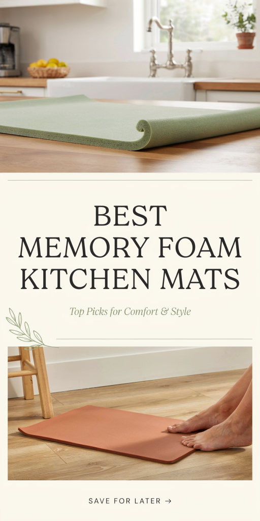
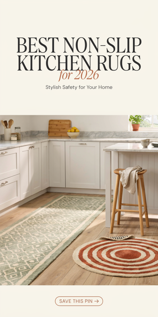
Kitchens are bustling areas in any home, but they can also be a hotspot for slips and falls, especially near sinks, stoves, and prep zones where water and grease often spill. Choosing the right non-slip kitchen rug helps you stay safe while adding comfort and style to your space. Thanks to improved materials and grip technologies in 2026, today’s kitchen rugs combine durability, ease of cleaning, and effective slip resistance on a variety of floor types. Whether you want a cushioned anti-fatigue mat or a vibrant, washable runner, these top-rated options fit different needs and aesthetics.
Let’s dive into the best non-slip kitchen rugs currently available, followed by tips on how to pick the perfect one for your home.
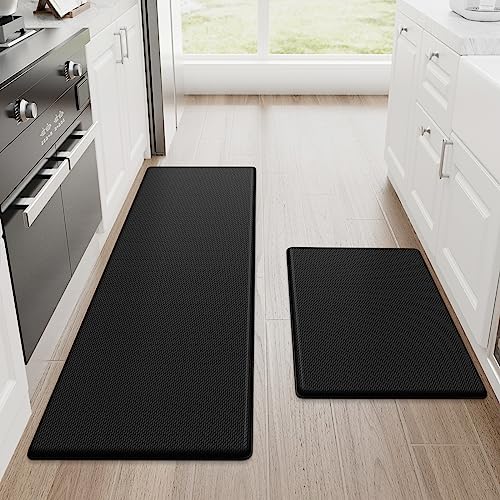
HEBE Boho Kitchen Rug Sets – Best Value 3-Piece Set
The HEBE Boho Kitchen Rugs come as a three-piece set designed to cover multiple kitchen zones like sinks, stoves, and islands. Made from a blend of polyester and polypropylene, these thin yet durable mats offer a minimalist thickness of 0.15 inches but provide reliable anti-slip backing that grips tile, wood, or laminate floors safely. Their boho-inspired patterns add an artistic flair to kitchen floors without sacrificing functionality.
| Feature | Details |
|---|---|
| Size/Dimensions | 3-piece set: 20″x32″, 20″x48″, 20″x59″ |
| Material | Polyester/Polypropylene |
| Thickness | 0.15 inches |
| Machine Washable | Yes |
| Backing Type | Non-slip rubber backing |
| Customer Rating | Not specified |
StepRite Anti-Fatigue Kitchen Mats (2-Pack) – Best Overall Comfort
StepRite delivers premium comfort with its two-piece anti-fatigue kitchen mats that are perfect for standing long hours while cooking or cleaning. These mats are crafted with phthalate-free and latex-free materials ensuring safety and durability. At 0.4 inches thick, they strike a good balance of cushioning without bulkiness. Their textured rubber backing firmly holds the mats in place on smooth kitchen floors to prevent slips.
| Feature | Details |
|---|---|
| Size/Dimensions | 2-piece set: 17.3″x30″, 17.3″x47″ |
| Material | Premium phthalate-free, latex-free materials |
| Thickness | 0.4 inches |
| Machine Washable | Wipe-clean (not machine washable) |
| Backing Type | Non-slip rubber backing |
| Customer Rating | 4.4 out of 5 stars |
Kitchen Mat Set of 2 Non-Slip Washable Rugs – Most Absorbent
For kitchens prone to water or grease spills, this two-piece set of non-slip, washable mats stands out due to its quick absorption ability. Made from 100% polyester chenille, these mats trap moisture effectively while their waterproof rubber backing prevents seepage and slipping. Both pieces are easy to clean in a washing machine or by hand, making them a practical choice for busy households.
| Feature | Details |
|---|---|
| Size/Dimensions | 2-piece set: 17.3″x30″, 17.3″x47″ |
| Material | 100% Polyester Chenille |
| Thickness | 0.2-0.3 inches |
| Machine Washable | Yes |
| Backing Type | Waterproof rubber backing |
| Customer Rating | Not specified |
StepRite Kitchen Rug Non-Slip Machine-Washable (Grey) – Premium Comfort
This single-piece kitchen rug by StepRite combines soft chenille fabric with a cushioned base that’s ideal for standing comfort. Its machine-washable design makes upkeep simple, and the anti-slip backing helps keep it securely in place on tile or wood floors. At a practical 32″x20″, it fits perfectly in front of sinks or cooking stations.
| Feature | Details |
|---|---|
| Size/Dimensions | 32″ x 20″ |
| Material | Chenille Fabric |
| Thickness | Cushioned (exact thickness not specified) |
| Machine Washable | Yes |
| Backing Type | Non-slip backing |
| Customer Rating | Not specified |
KitchenClouds Anti-Fatigue Waterproof Mat – Maximum Cushioning
If cushioning is your top priority, this 0.5-inch-thick PVC foam kitchen mat offers superior anti-fatigue support ideal for long periods of standing. The waterproof and non-slip backing keeps the mat in place and protects floors against spills. It fits smaller areas well with dimensions of 17.3″x28″, providing cozy comfort in tight kitchen spots.
| Feature | Details |
|---|---|
| Size/Dimensions | 17.3″ x 28″ |
| Material | PVC Foam |
| Thickness | 0.5 inches |
| Machine Washable | Wipe-clean recommended |
| Backing Type | Waterproof non-slip backing |
| Customer Rating | Not specified |
COSY HOMEER Kitchen Rug Mats – Most Popular Set
COSY HOMEER’s two-piece kitchen rug set is celebrated for its soft cushioning and long-lasting wear. Made from durable 100% polypropylene, these rugs resist stains, fading, and daily compression. At 0.4 inches thick, they provide excellent comfort while the polypropylene backing ensures a secure grip on a range of floor types. With thousands of positive reviews, these mats combine practical performance with hassle-free machine washing.
| Feature | Details |
|---|---|
| Size/Dimensions | 2-piece set: 30″ x 20″, 48″ x 20″ |
| Material | 100% Polypropylene |
| Thickness | 0.4 inches |
| Machine Washable | Yes |
| Backing Type | Polypropylene backing |
| Customer Rating | 4.3 out of 5 stars (18,914 reviews) |
eqivei Kitchen Rugs Non-Skid Washable Set – Best Waterproof Option
Designed with chenille polyester fabric and a fully waterproof rubber backing, this two-piece kitchen rug set excels in moisture control and floor protection. Their absorbent texture quickly traps water and grease splashes, while the rubber base prevents them from sliding on tile, marble, or hardwood surfaces. Easily cleaned by washing machine or hose rinse, these durable rugs can handle the high traffic of busy kitchens.
| Feature | Details |
|---|---|
| Size/Dimensions | 2-piece set: 17.3″ x 29″, 17.3″ x 47″ |
| Material | Polyester Chenille |
| Thickness | 0.3 inches |
| Machine Washable | Yes |
| Backing Type | Waterproof rubber backing |
| Customer Rating | Not specified |
Brown Kitchen Rugs Non-Slip Washable Mats – Longest Lasting Choice
These brown kitchen mats highlight a resilient textile surface designed to withstand pet scratches and daily spills alike. Their thick, tightly woven polyester/linen blend offers durability without compromising softness. Available in multiple sizes to fit various kitchen zones, each rug features a sturdy rubber backing to minimize slippage and cushion your feet during preparation or cleanup.
| Feature | Details |
|---|---|
| Size/Dimensions | Sizes: 17″x30″, 17″x47″, 17″x59″ |
| Material | Imitation Linen Surface |
| Thickness | Thick (exact not specified) |
| Machine Washable | Yes |
| Backing Type | Rubber non-slip backing |
| Customer Rating | Not specified |
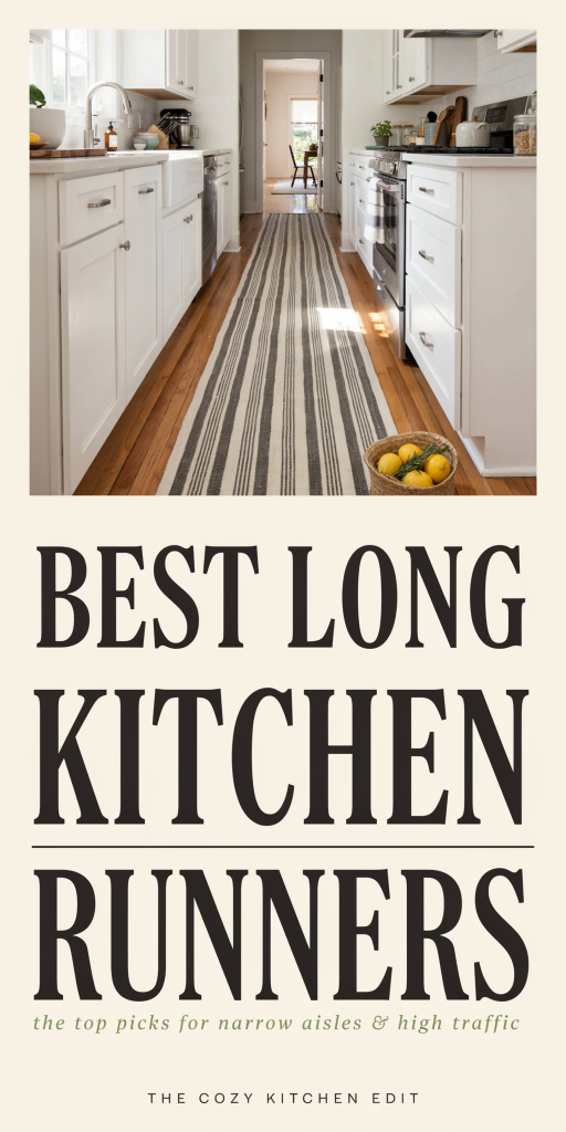
Lahome Modern Rainbow Jute Rug (2×6 Runner) – Most Stylish Option
Add a lively splash of color to your kitchen floor with the Lahome Modern Rainbow Jute Rug. Despite its name, it’s actually made from durable polyester, featuring a bold double rainbow design with graphic shapes that brighten up any space. Its non-slip TPE rubber backing secures the runner safely, while its large 24″ x 72″ size covers hallways or front of sink areas stylishly. This machine-washable runner is easy to maintain and compliments modern or eclectic kitchens.
| Feature | Details |
|---|---|
| Size/Dimensions | 24″ x 72″ |
| Material | Polyester (not actual jute) |
| Thickness | Low pile (exact thickness not stated) |
| Machine Washable | Yes (cold water, gentle cycle) |
| Backing Type | Rubber TPE backing |
| Customer Rating | 4.3 out of 5 stars (1,743 reviews) |
HY HAO YUN LAI 2×6 Washable Hallway Runner – Editor’s Choice
This lightweight polyester runner combines a vintage beige design with practical features like a low profile thickness (0.14 inches) and a sturdy non-slip rubber backing. Perfect for kitchens, entryways, or hallways, it won’t interfere with doors or cause tripping. Machine washable for easy upkeep, this runner offers timeless style and dependable safety in one package.
| Feature | Details |
|---|---|
| Size/Dimensions | 24″ x 72″ |
| Material | Polyester |
| Thickness | 0.14 inches |
| Machine Washable | Yes |
| Backing Type | Rubber non-slip backing |
| Customer Rating | Not specified |
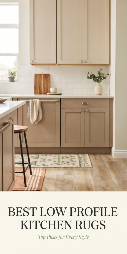
What to Consider When Choosing a Non-Slip Kitchen Rug
Choosing the right kitchen rug can boost both your comfort and safety. Here are key factors to keep in mind:
1. Material Durability and Care
Look for materials like polyester, polypropylene, or PVC foam that withstand frequent use, resist stains, and are easy to clean. Machine washable rugs offer great convenience.
2. Non-Slip Backing Type
A solid rubber, TPR (Thermoplastic Rubber), or textured diamond backing will adhere well to tile, hardwood, or linoleum floors, preventing dangerous slips.
3. Thickness and Comfort
Thicker mats (0.4–0.5 inches) provide cushioning to reduce foot fatigue when standing long. Thinner rugs (under 0.2 inches) work well where doors need clearance.
4. Size and Placement
Measure your kitchen zone to decide between runners for longer stretches or smaller mats for sink and stove areas.
5. Style and Design
Match your rug to your kitchen décor—whether you prefer bold patterns, neutral tones, or boho chic designs, there’s an option to suit your aesthetic.
6. Ease of Maintenance
Choose rugs that clean easily—many are machine washable, while some anti-fatigue mats require spot cleaning or hand wash.
Conclusion
A thoughtfully selected non-slip kitchen rug enhances your space by improving safety, comfort, and style simultaneously. The best rugs blend strong anti-slip technology with durable, easy-to-maintain materials that handle kitchen messes well. Whether you prefer cushioned anti-fatigue mats like StepRite or attractive machine-washable rugs like COSY HOMEER and Lahome’s colorful runner, these top options offer something for every kitchen environment in 2026. With the right choice, your kitchen floor becomes a safer and more inviting place to cook, clean, and create lasting memories.