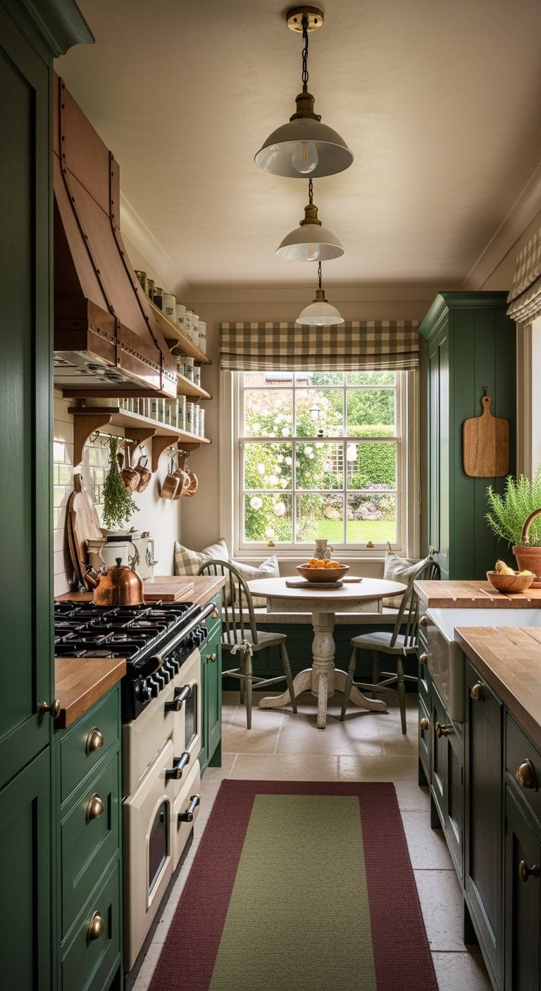
A beautifully styled Fourth of July table sets the stage for great food, meaningful conversations, and festive memories. Whether you’re hosting a backyard barbecue, a family picnic, or an elegant evening gathering, the right tablescape can instantly elevate the celebration. The best part? You don’t need expensive décor or professional styling skills to create a stunning patriotic setup.
From rustic farmhouse charm and coastal-inspired accents to sparkling fireworks-themed décor and edible centerpieces, these creative ideas will help you design a table that feels festive, welcoming, and uniquely your own.
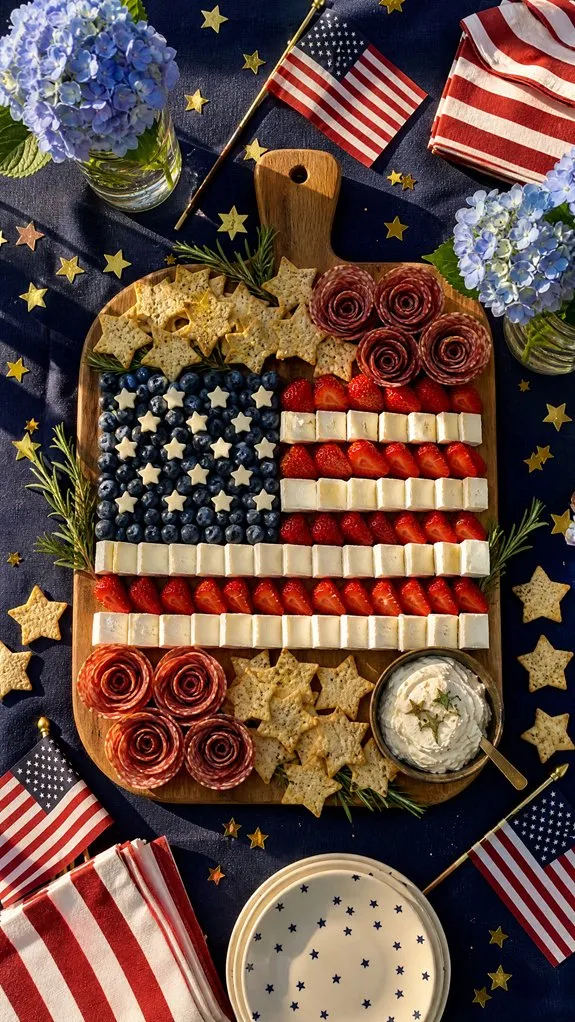
1. Create a Stunning Patriotic Charcuterie Board Centerpiece
Why settle for a traditional centerpiece when you can create one guests can actually enjoy? A patriotic charcuterie board serves as both décor and appetizer, making it one of the most practical additions to your holiday table.
Arrange white cheddar, red pepper gouda, blueberries, strawberries, and star-shaped crackers across a large wooden board. Use cookie cutters to shape cheeses and meats into stars, then scatter fresh berries throughout for a vibrant red, white, and blue display.
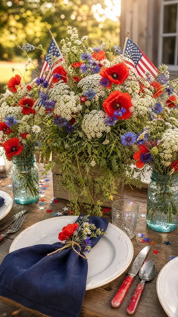
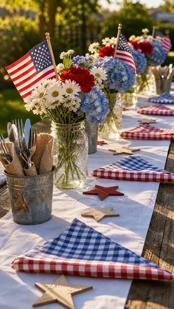
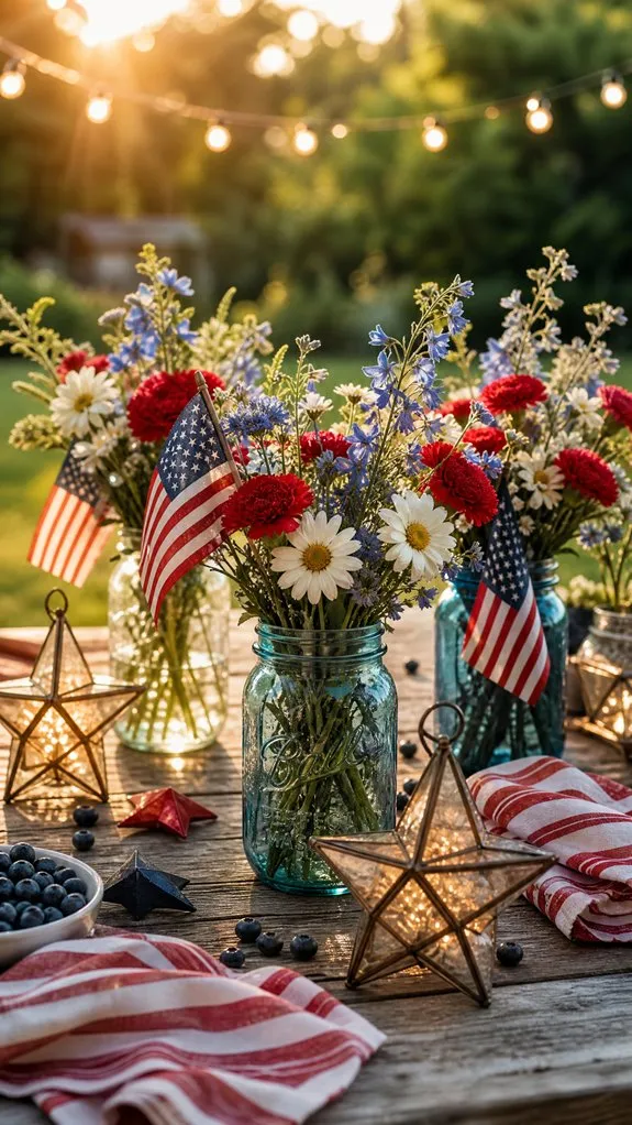
2. Design a Wildflower Centerpiece With a Patriotic Twist
Bring natural beauty to your table with an arrangement inspired by summer meadows. Wildflowers create a relaxed and welcoming atmosphere while still embracing patriotic colors.
Combine red zinnias, white daisies, and blue cornflowers in mason jars or galvanized buckets. Layer greenery garlands along the center of the table and tuck small American flags between blooms for a subtle festive touch.
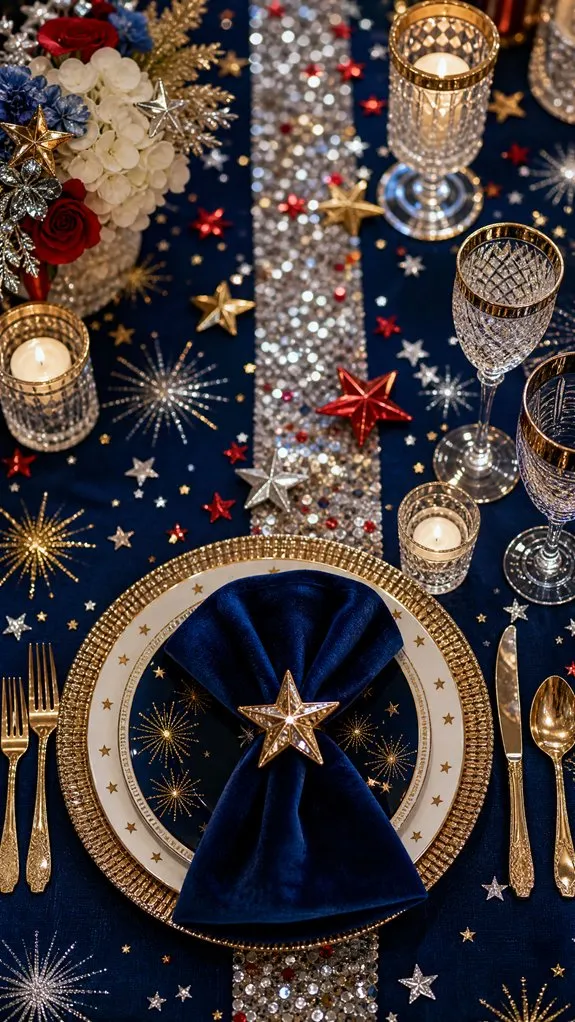
3. Add Fireworks-Inspired Metallic and Glitter Accents
Capture the excitement of Independence Day fireworks without lighting a single fuse. Metallic accents add glamour and reflect candlelight beautifully during evening gatherings.
Scatter gold and silver confetti across the table, incorporate glitter-detailed napkins, and use mirrored charger plates beneath dinnerware. Metallic candleholders help create sparkle while maintaining a sophisticated appearance.
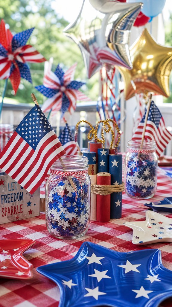
4. Set Up a Kid-Friendly Fourth of July Table
Make younger guests feel included with a table designed specifically for fun and creativity.
Choose colorful plates featuring stars and stripes, provide themed activity sheets, and include glow sticks or glowware for nighttime excitement. Simple craft stations with patriotic stickers and stamps can keep children entertained while adults enjoy the celebration.
5. Master the Art of Layering Linens
Professional-looking tablescapes often start with thoughtful layering. Mixing linens creates depth and visual interest without requiring expensive decorations.
Begin with a crisp white tablecloth, add navy or red placemats, and finish with folded cloth napkins featuring contrasting trim. Mixing fabrics such as cotton, linen, and woven textures adds richness to the overall design.
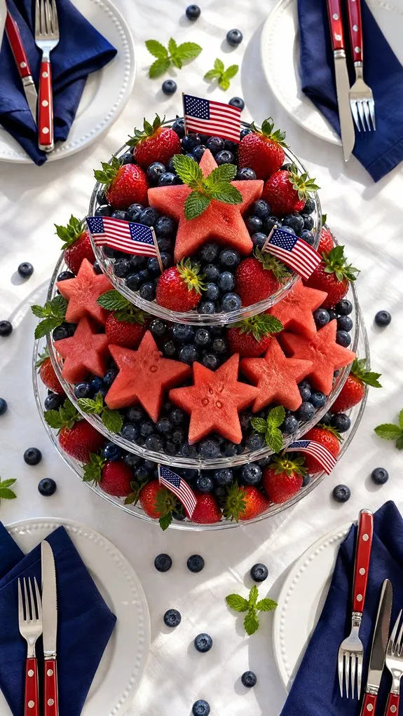
6. Build an Edible Red, White, and Blue Fruit Centerpiece
Fresh fruit provides color, texture, and a healthy treat all at once.
Arrange rows of strawberries, bananas, and blueberries to mimic the American flag, or create a large fruit display in a decorative tray. Not only does it look impressive, but guests can snack on it throughout the event.
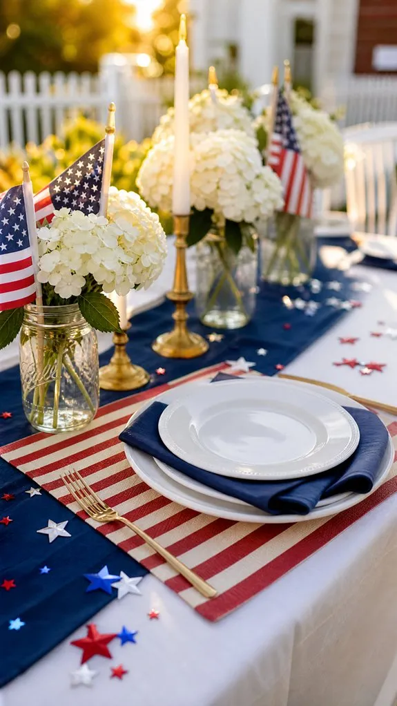
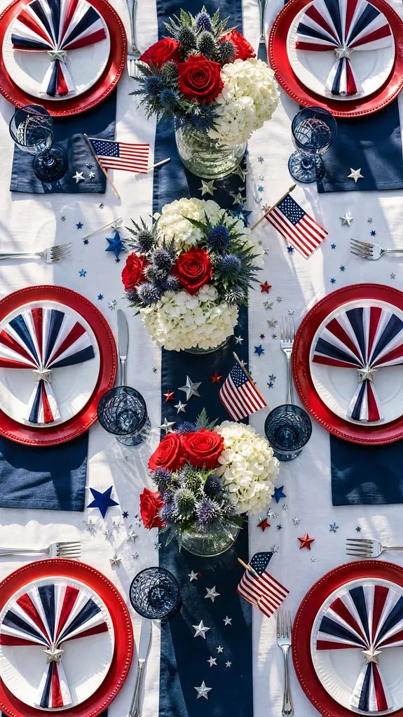
7. Use Flag-Themed Place Settings for a Cohesive Look
Small details often make the biggest impact. Patriotic place settings help tie the entire table together.
Place miniature flags beside each plate, wrap silverware with striped ribbon, or use themed place cards featuring stars and patriotic motifs. These simple additions instantly reinforce the holiday theme.
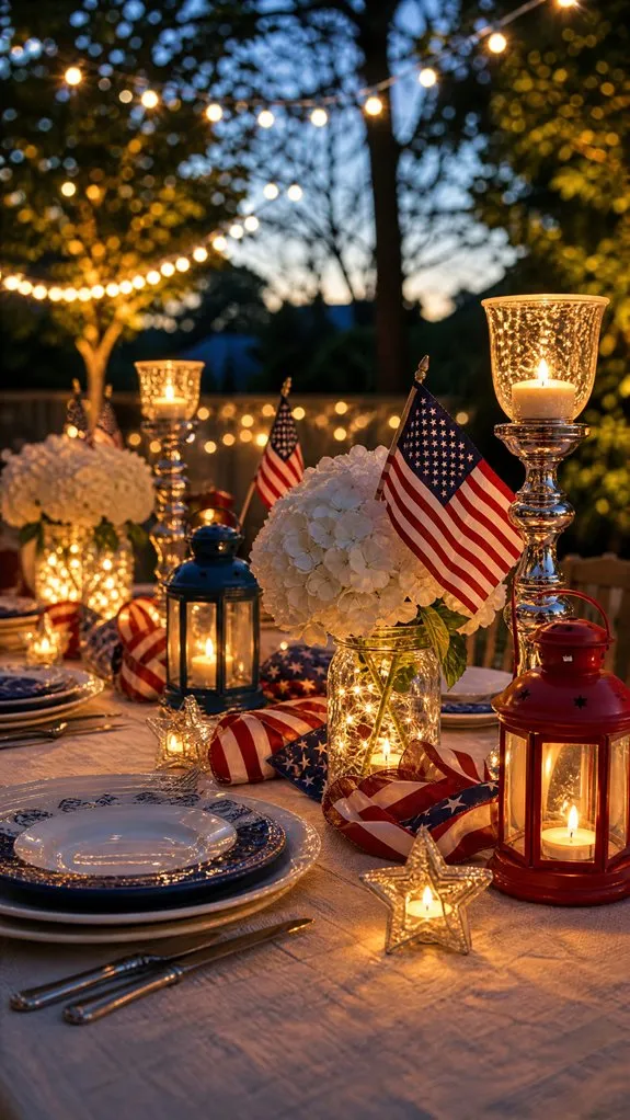
8. Illuminate Your Table With Lanterns and Fairy Lights
As daylight fades, lighting becomes one of the most important elements of your tablescape.
Combine solar lanterns, fairy lights, and candle clusters to create a warm and inviting glow. Varying heights add dimension, while soft lighting encourages guests to linger long after dinner ends.
9. Style an Outdoor Picnic Table for Large Gatherings
Hosting a crowd requires a balance between practicality and style.
Use long folding tables covered with patriotic runners, arrange buffet-style food stations, and incorporate disposable tableware in coordinating colors. This approach keeps setup simple while still looking festive and organized.
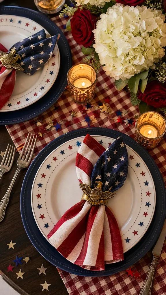
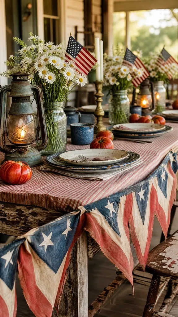
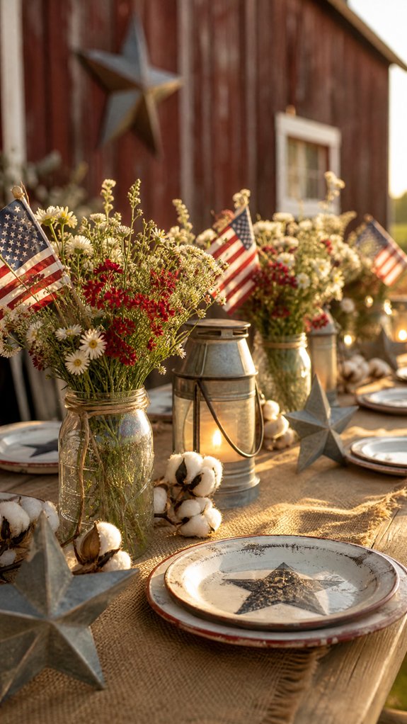
10. Embrace Vintage Americana Charm
Nothing says patriotic celebration quite like vintage Americana décor.
Mix antique-inspired bunting, weathered wood accents, and heirloom silverware for a nostalgic look. Mismatched pieces add character and create the feeling of a collection built over generations.
11. Craft a Budget-Friendly Patriotic Candle Centerpiece
You don’t need a large budget to make a big visual impact.
Gather inexpensive candleholders, arrange red, white, and blue candles at varying heights, and place them down the center of the table. The layered arrangement creates warmth, elegance, and a festive atmosphere.
12. Style a Stars-and-Stripes Runner Without Overwhelming the Table
Bold patterns can make a statement, but balance is key.
Pair a stars-and-stripes runner with solid-colored dinnerware and neutral accents. Adding natural textures like woven placemats or linen napkins helps soften the design while allowing the runner to remain the focal point.
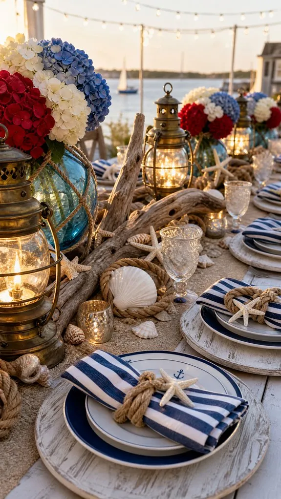
13. Create a Coastal-Inspired Patriotic Tablescape
If you’re celebrating near the beach or simply love coastal décor, combine patriotic colors with nautical elements.
Incorporate rope-wrapped vases, anchor motifs, driftwood accents, and sandy neutral tones alongside classic red, white, and blue. The result feels fresh, relaxed, and perfect for summer entertaining.
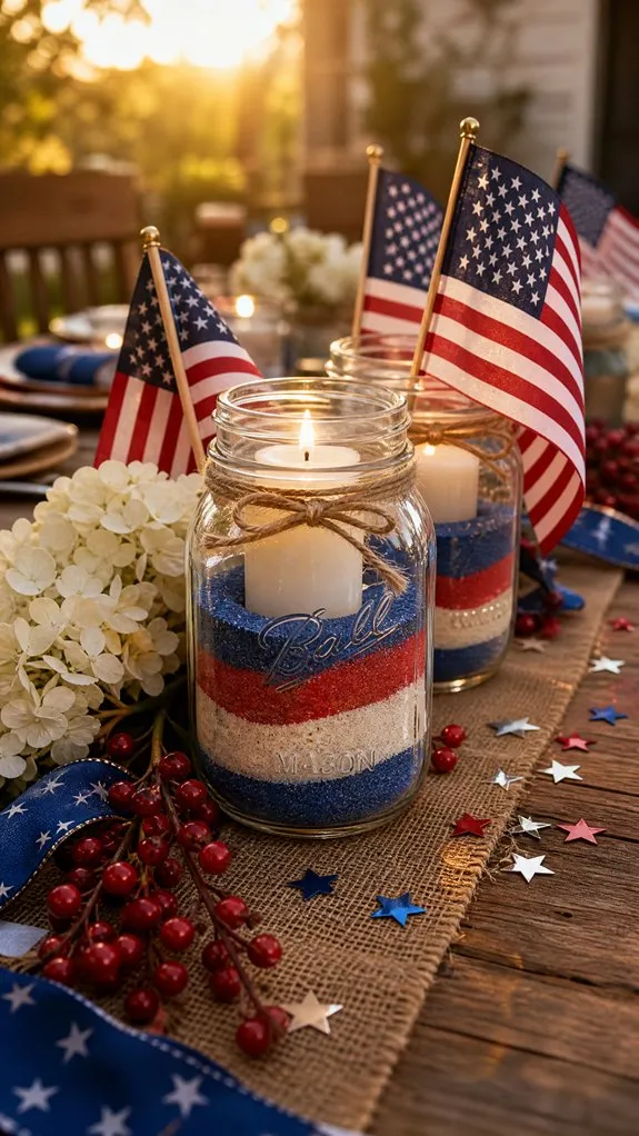
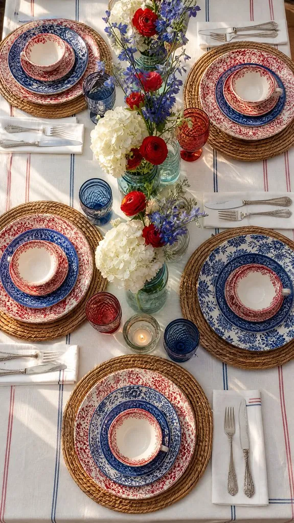
14. Arrange Mason Jar Centerpieces for Casual Backyard Charm
Mason jars remain a favorite for a reason—they’re affordable, versatile, and effortlessly charming.
Fill jars with red carnations, white daisies, and blue hydrangeas. Wrap twine around each jar and scatter them throughout the table in varying heights for a relaxed farmhouse-inspired look.
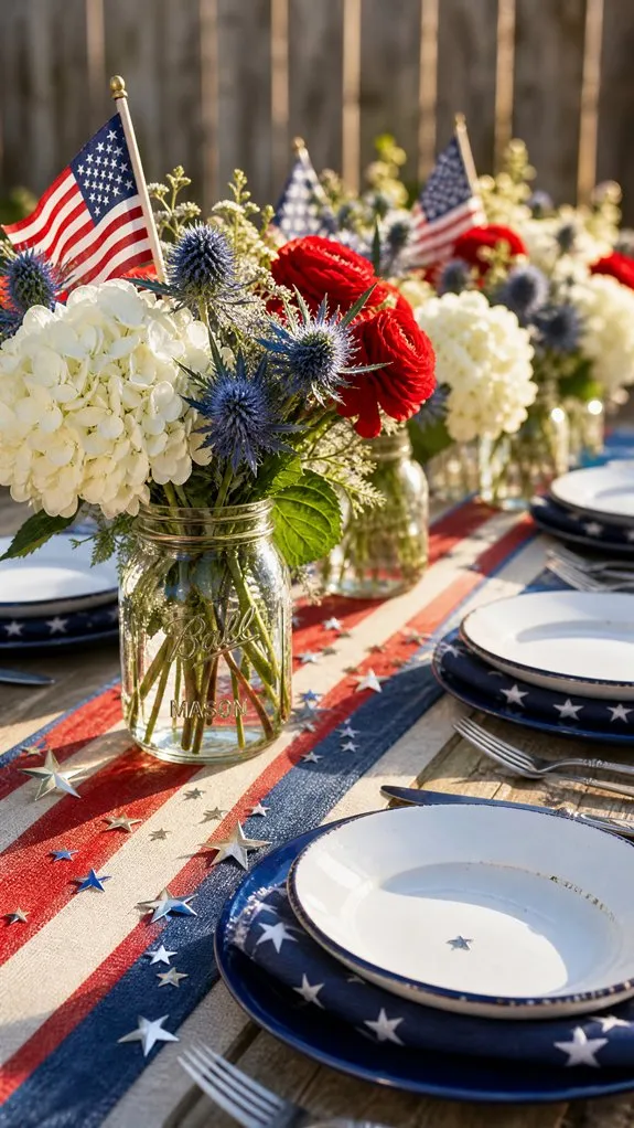
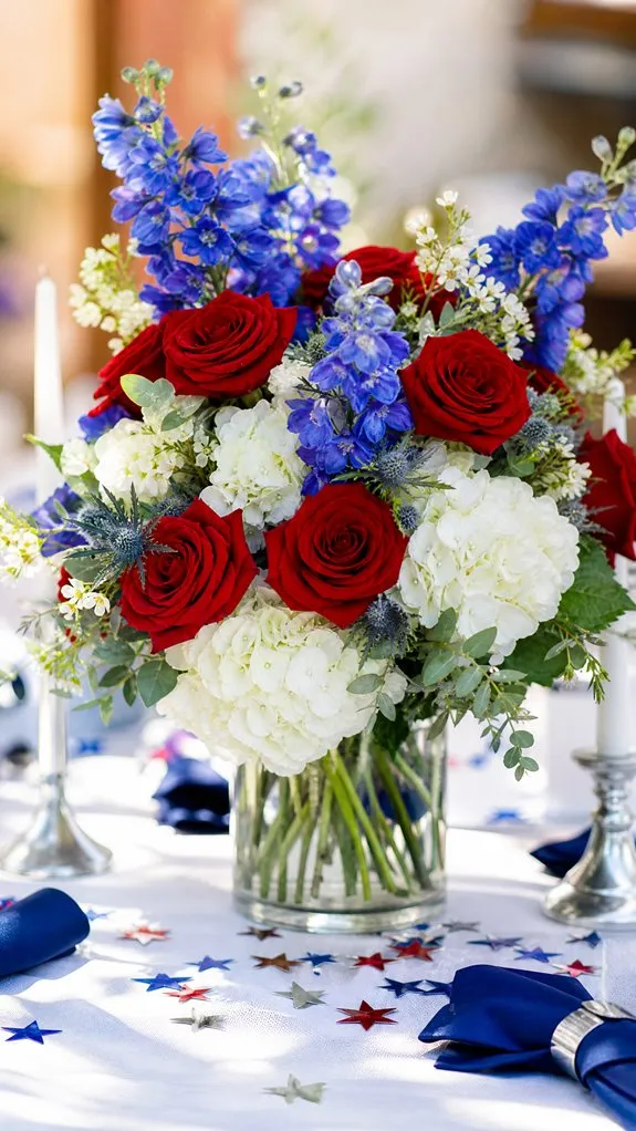
15. Build a Show-Stopping Floral Centerpiece
For a more formal celebration, a dramatic floral arrangement instantly elevates the table.
Combine red roses, white hydrangeas, and blue delphiniums in a large vase. Add greenery and decorative accents for additional texture. This classic arrangement serves as an elegant focal point for any patriotic gathering.
16. Design a Rustic Farmhouse Patriotic Table on a Budget
Rustic décor and patriotic themes pair beautifully together.
Layer burlap runners over wooden tables, use reclaimed wood slices as chargers, and decorate with mason jars filled with wildflowers. The combination feels warm, inviting, and authentically American.
17. Mix and Match Red, White, and Blue China Like a Pro
Mixing dinnerware can create visual interest, but it requires restraint.
Pair patterned pieces with solid-colored dishes and stick to consistent shades of navy, bright white, and true red. This creates variety while maintaining a cohesive and polished appearance.
18. Stick With the Timeless Red, White, and Blue Classic
Sometimes the most effective design is also the simplest.
Layer white linens with red and blue accents, incorporate patriotic centerpieces, and use star-themed chargers beneath dinner plates. This timeless combination never goes out of style and works beautifully for gatherings of any size.
Conclusion
Creating a memorable Fourth of July tablescape isn’t about spending the most money—it’s about combining colors, textures, and personal touches that make guests feel welcome. Whether you choose a rustic farmhouse setup, an elegant floral display, a coastal-inspired arrangement, or a festive charcuterie centerpiece, each of these ideas can help transform your table into the centerpiece of the celebration.
Mix and match elements from several styles, add your own creative flair, and most importantly, create a space where family and friends can gather, laugh, and celebrate together. With these 18 patriotic tablescape ideas, your Independence Day gathering is sure to be as memorable as the fireworks lighting up the sky.
When someone walks through your front door, the first impression starts with your entry table. It’s a small area, but it holds big potential to welcome guests with style and personality. You only have a limited space to create an inviting, eye-catching vignette, so every piece you choose has to pull its weight.
Think of your entry table as an opportunity to set the mood for the rest of your home. With a few thoughtful tips, you can transform this often-neglected spot from a chaotic drop zone into a curated showcase that sparks curiosity and leaves a lasting impression. It’s all about striking the perfect balance between function and flair.
1. Liven Up Your Entry Table with Vibrant Blooms and Greenery
Incorporating **live plants and flowers** into your entryway instantly adds a cozy, inviting atmosphere that other decor simply can’t match. Your entry table becomes a natural centerpiece, greeting you and your guests with fresh, organic charm every time you step inside.
You’ll find endless ways to style your greenery — try placing fresh-cut blooms in elegant ceramic vases for a timeless look, or opt for tall vessels filled with dried grasses for a sleek, maintenance-free vibe that remains beautiful over time. To heighten the sensory appeal, add aromatic sprigs like eucalyptus or lilac, filling your space with subtle, welcoming scents that delight visitors upon arrival.
Experiment with contrasting textures by mixing shiny, broad leaves with soft, airy ferns, or combine bold monstera stems alongside delicate baby’s breath to create a layered, visually captivating display. This thoughtful combination will instantly elevate the aesthetic of your entryway and make a memorable first impression.
Pro Tip: Use oversized planters to ground your entry table setup and showcase standout plants that create an impactful statement.
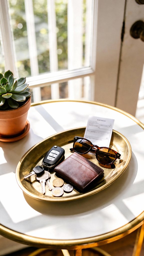
2. Stylish Trays and Catchalls to Declutter Your Entryway Table
Incorporating a thoughtfully selected tray on your entryway table instantly brings harmony to the space by gathering everyday essentials into a neat, intentional arrangement. This simple addition transforms a chaotic surface into an organized and visually appealing vignette that’s both practical and stylish.
You’ll find that a sleek metal catchall serves as an ideal spot to rest your rings and watches, while a handcrafted woven tray introduces warmth and texture, balancing out the harder materials around your entry area. These elements work together to keep your daily necessities within easy reach and beautifully displayed.
Key Design Elements
Keys assigned a consistent place, ending the frustration of misplaced items
Sunglasses safely stored to prevent scratches and damage
Coins collected neatly instead of being scattered randomly
Mail arranged in an orderly fashion until you have time to sort it
Daily vitamins or medications positioned for quick and easy access
Pro Tip: Opt for upscale storage baskets to elegantly conceal shoes, pet gear, and seasonal items while preserving your curated decor style.
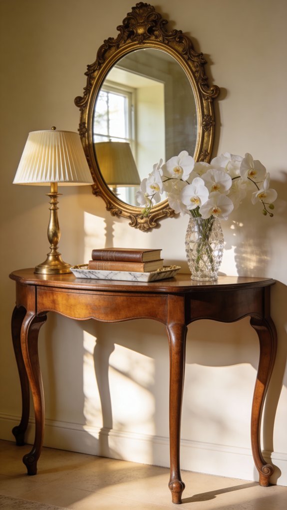
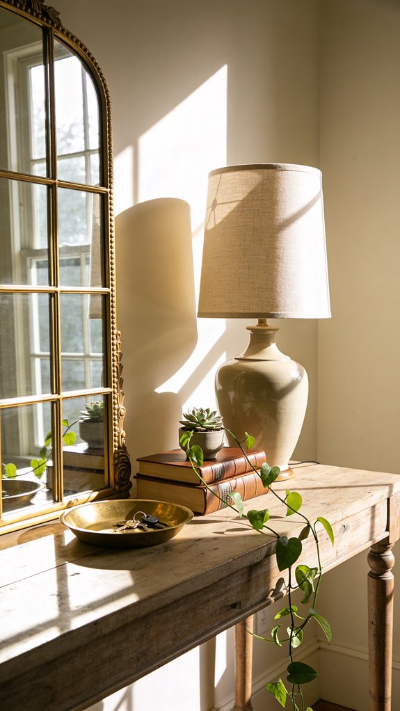
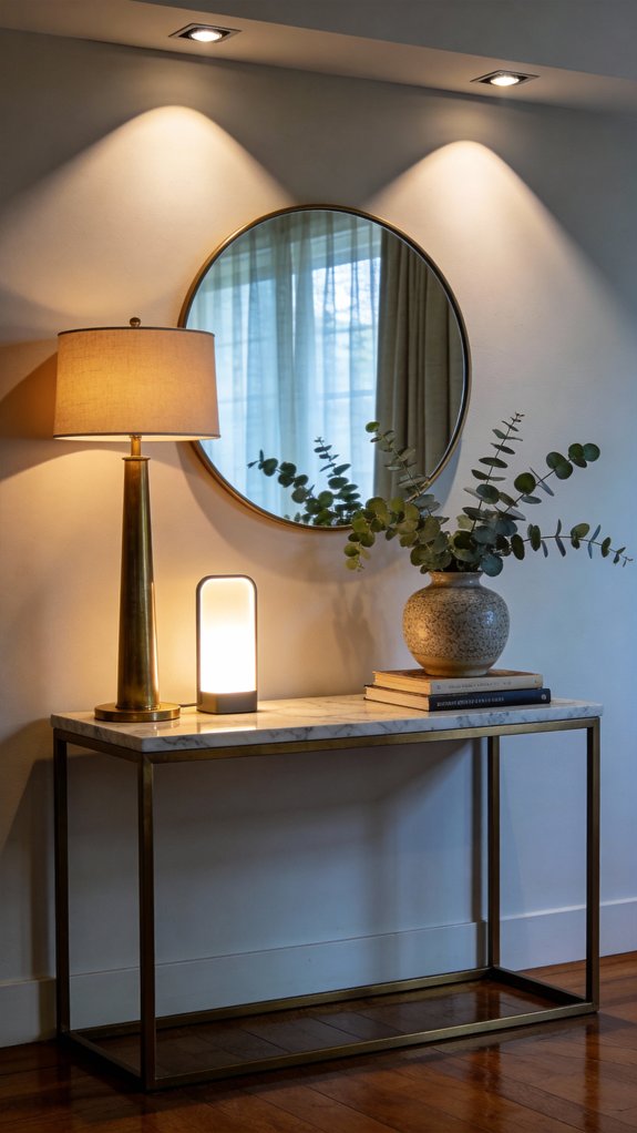
3. How to Use Mirrors on Your Entry Table to Instantly Elevate Your Space
Mirrors have a unique talent for enhancing your entry table by creating a sense of spaciousness and bouncing natural light throughout the area. They’re one of the most impactful additions you can make to your entryway décor, turning an ordinary surface into a stunning visual statement.
Positioning tall mirrors directly behind your entry table adds height and draws the eye upward, making your ceilings feel more expansive. Opt for frames in rich finishes like gold, bronze, or weathered silver to infuse a touch of timeless sophistication, immediately upgrading the look of your entire entry.
For a relaxed yet chic vibe, try leaning a large mirror against the wall, or for a polished look, mount it securely to establish balance and harmony. The reflective surface will double the presence of your carefully selected accessories, highlighting every detail and creating a layered, stylish effect.
Pro Tip: Choosing a large mirror for your wall can dramatically open up your entryway, adding depth and a welcoming atmosphere that makes even smaller spaces feel grand.
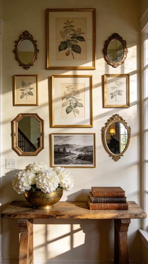
4. Creative Gallery Displays Above Your Entry Console
Elevating your entry table with a curated display of framed artwork, mirrors, and decorative accents instantly adds height and visual intrigue to your space. This vertical focus not only enhances the functionality of your console but also turns it into a captivating focal point that sets the tone for your entire entryway.
You can achieve a polished, harmonious look by arranging identical frames symmetrically around a central mirror, creating a sense of balance and timeless sophistication. On the other hand, embracing an eclectic mix of frame sizes, textures, and art styles introduces lively energy and a collected-over-time charm that feels personal and inviting.
To make the hanging process easier, begin by laying out your pieces on the floor until you find an arrangement that feels just right. Once satisfied, measure and mark your wall accordingly—this method helps you avoid unnecessary holes and gives you the confidence to create a gallery that reflects your unique style.
Pro Tip: Incorporating framed abstract prints can infuse your gallery with refined pops of color and modern flair, elevating the overall look without overpowering your entryway’s warm welcome.
5. Elevate Your Entryway with Streamlined Table Styling
Embracing minimalist decor for your entry table might feel intimidating at first, but you’ll quickly realize that a thoughtfully curated selection of items can create a more powerful and inviting impression than a cluttered display ever could.
By focusing on **neutral tones**, sleek silhouettes, and minimal hardware, you’ll craft an entryway vignette that exudes sophistication and deliberate design. This balance of simplicity and style sets the perfect tone for your home’s entrance, making visitors feel welcomed and impressed from the moment they step inside.
Key Design Elements
A standout vase filled with fresh greenery to bring natural life
One unique sculptural piece that captures your personal style
A streamlined mirror featuring crisp, understated framing
Soft illumination from a minimalist lamp with clean design
A small, natural-material dish to neatly hold everyday essentials
Pro Tip: Choosing fewer, meaningful items helps you avoid visual overload while highlighting your favorite pieces, resulting in an entryway that feels calm, intentional, and warmly inviting.
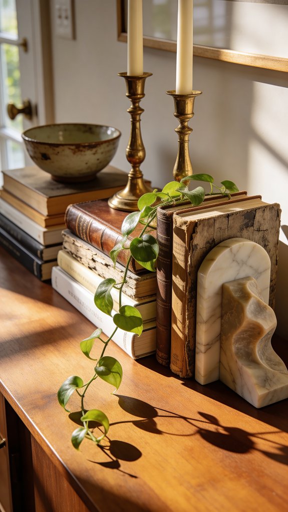
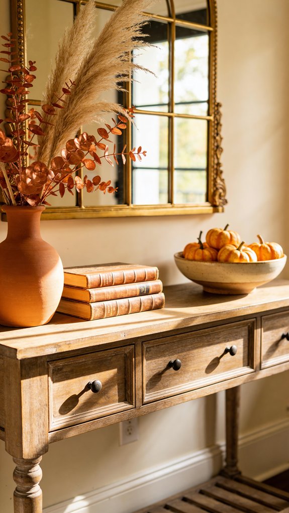
6. Thoughtful Stacks of Books and Treasures for a Personal Touch
To add a warm, inviting feel to your entry table, consider layering **books and meaningful objects** with deliberate care. While tall vases offer eye-catching height, a curated stack of your favorite books paired with unique items adds a rich, lived-in texture that reflects your personality and tastes.
Begin by selecting hardcover books of various sizes, arranging them from largest at the base to smaller ones on top to establish a stable foundation. Intermingle decorative accents such as small sculptures, vintage boxes, or natural elements like crystals or shells to introduce tactile diversity and spark curiosity.
The secret lies in choosing pieces that harmonize through a shared **color scheme or theme**, ensuring the display feels unified but never staged. Limit your stacks to three to five carefully chosen items, focusing on quality and meaning to avoid clutter and maintain visual interest.
Pro Tip: Opt for a sturdy wooden console table that not only showcases your decor but also offers hidden storage to keep your space neat and provide a solid surface for layering accessories.
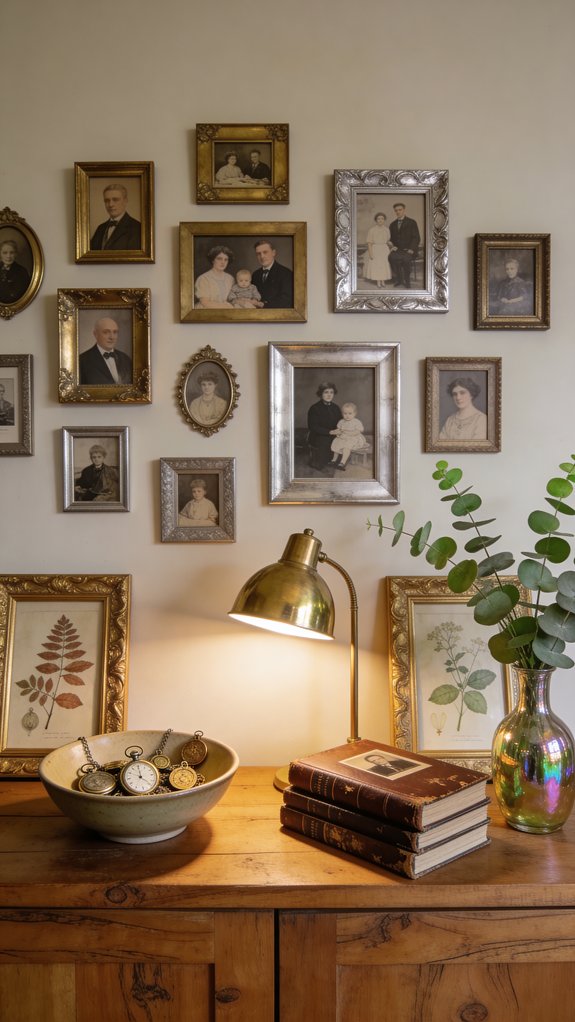
7. Create a Welcoming Entry with Personal Photos and Treasured Keepsakes
Your entryway table is the perfect spot to showcase the heart of your home by featuring **family photos** and treasured keepsakes that invite warmth and spark conversation the moment guests arrive.
Select frames with timeless finishes—think brushed brass, aged wood, or sleek silver—to display a blend of vintage portraits and recent snapshots. This creates a beautiful visual story that bridges your family’s past with today’s moments.
Enhance this personal gallery by layering in meaningful souvenirs from your travels, antique market discoveries, or beloved collections like miniature ceramics, classic books, or pressed flowers. Play with varying heights by stacking books or using small stands, and keep everything harmonized with a consistent color scheme or overall style. This way, each item shines individually while contributing to a cohesive narrative of your family’s journey.
Pro Tip: Deliberately mix frame materials like brass, wood, and silver to achieve an effortlessly collected look that feels authentic and well-curated.
8. Fresh Seasonal Swaps to Revitalize Your Entry Table
Your entry table is the perfect spot to reflect the changing seasons and breathe new life into your home’s first impression. By swapping out decor elements throughout the year, you’ll keep your space feeling fresh, purposeful, and in tune with nature’s evolving palette. In spring, think bright bulbs nestled in charming ceramic pots that signal growth and new beginnings, while fall invites cozy vibes with warm copper accents and clusters of dried wheat.
When winter arrives, add a touch of refined sparkle with frosted pinecones and the shimmering glow of mercury glass pieces. As summer heats up, swap in lively floral arrangements featuring bold blooms arranged loosely to capture that carefree, sunny spirit. These seasonal updates allow you to effortlessly refresh your entryway and set the tone for each part of the year.
Seashells and light, airy textiles bring the relaxed energy of summer to your space
Decorate with rustic pumpkins and warm amber candleholders to honor autumn’s bounty
Incorporate evergreen branches and shiny metallic ornaments for a winter wonderland feel
Mixing layered textures throughout the year adds depth and keeps your display visually engaging
Pro Tip: Try placing a propane fire table near your entryway to add cozy warmth and stylish charm that welcomes guests on chilly evenings.
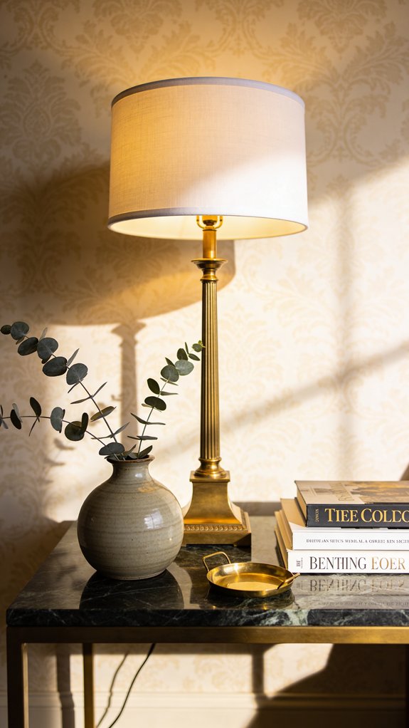
9. Elevate Your Entryway with Chic Table Lamps for Mood and Practicality
The right lighting can turn your entryway into a radiant and welcoming space, with your reflective surfaces glowing beautifully under a well-chosen table lamp. A thoughtfully selected lamp not only provides essential illumination but also acts as a captivating centerpiece that grounds your entry table’s overall aesthetic.
Opt for lamps featuring matte-finished bases that bring subtle texture and depth without overpowering the shine of your mirrors. This approach helps you achieve a harmonious visual balance that feels deliberate and refined. Explore options like organic ceramic shapes in warm, natural hues, modern metallic lamps with clean geometric lines, or sophisticated glass designs that gently scatter light and add sparkle to your foyer.
Incorporate bulbs with adjustable brightness so you can easily set the perfect mood—from a bright, cheerful morning welcome to a cozy, soft glow in the evening. This versatility ensures your entryway remains inviting and well-lit no matter the time or occasion.
Pro Tip: A standout table lamp transforms your entry table from simply functional to a stylish centerpiece that defines your home’s first impression.
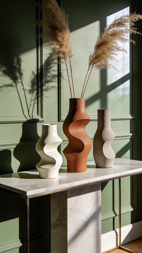
10. Artistic Vases and Sculptural Vessels to Transform Your Entryway
You’ll instantly upgrade your entry table from simple utility to stunning showcase with **sculptural vases** that act as art pieces in their own right. These vessels turn ordinary floral arrangements into dynamic displays that captivate guests the moment they enter your home.
Opt for handblown glass forms in warm amber tones or soft frosted whites that play with natural light, adding subtle motion and depth to your décor. Their organic curves bring life and sophistication, effortlessly enhancing the atmosphere around your doorway.
Ceramic vessels featuring bold geometric designs, tactile textures, and earthy finishes introduce a handcrafted vibe that balances contemporary flair with timeless appeal. Whether you adorn them with fresh flowers or let them stand solo, grouping a variety of heights and contrasting textures creates a visually compelling arrangement that elevates your space, making your entry feel welcoming, airy, and thoughtfully styled.
Pro Tip: Choosing handblown glass vases guarantees slight variations in shape and color, ensuring each piece is a unique artisan treasure that adds personality to your entry display.
11. Mastering the Art of Trio Styling for Your Entry Table
To craft a captivating entry table display, you’ll want to lean into the timeless principle of styling items in groups of three. This approach taps into the visual appeal of odd numbers, which naturally create a more engaging and balanced look compared to even-numbered arrangements.
By using three pieces of varying heights and sizes—such as a tall vase, a pair of medium-sized candlesticks, and a small decorative bowl—you introduce a sense of movement and interest. This asymmetrical setup guides the eye fluidly across your display, avoiding the static feel that symmetrical groupings can sometimes bring.
Our brains tend to respond better to these uneven groupings, perceiving them as more dynamic and authentic. This means your entryway will feel thoughtfully styled and welcoming, rather than overly staged or predictable.
Pro Tip: Add dimension and natural flair by incorporating plant stands of different heights, keeping your trio arrangement fresh and full of life.
12. Mastering Height Variation for a Captivating Entry Table Display
To make your entryway truly inviting, start by layering different heights to add visual interest and depth to your table decor. While grouping items in threes gives you a solid base, introducing a mix of tall, medium, and low pieces will elevate your vignette from simple to striking the moment guests arrive.
Begin by placing taller items like framed art or a sculptural mirror toward the back of your table. Then, position medium-height accents such as stylish vases or table lamps in the center. Finish by adding shorter elements—think stacked books or decorative boxes—up front to create a seamless flow that guides the eye naturally across your arrangement. This thoughtful layering technique adds dimension and drama, turning your entry table into a memorable focal point.
For extra flair, try incorporating tiered stands to raise smaller objects and set candles at varying heights for a touch of warmth and sophistication. These subtle variations in elevation not only enrich the visual texture but also invite guests into a space that feels both elegant and welcoming.
Pro Tip: Consider using a premium TV stand to similarly showcase decor at different heights, offering another opportunity to build layered interest around your living area.
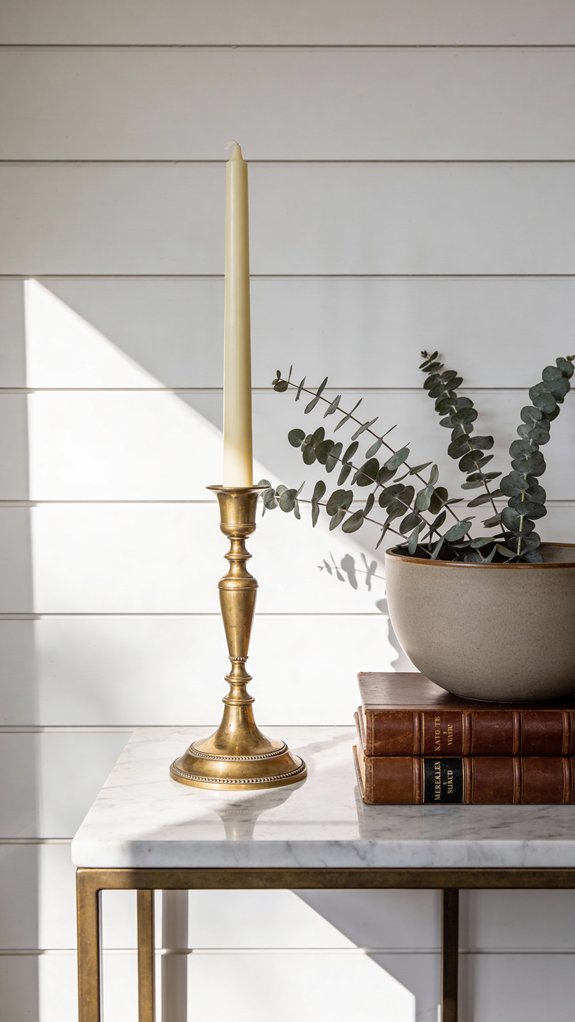
13. Mastering Layered Lighting to Enhance Your Entryway Display
Your entryway sets the tone for your entire home, and while your wall art or decor lays the groundwork, it’s the lighting that truly brings your display to life. Thoughtfully layered illumination adds depth and drama, emphasizing textures, casting playful shadows, and creating a warm, inviting atmosphere that welcomes guests from the moment they arrive.
To achieve this, you’ll want to blend a variety of light sources that complement each other seamlessly. By mixing ambient, task, and accent lights, you create an engaging visual narrative that makes your entry table a focal point rather than just an afterthought. This interplay of light will not only elevate the aesthetic but also enhance the mood, making your space feel thoughtfully curated and cozy.
Key Design Elements
Mount matching warm-toned sconces flanking your mirror to provide balanced, flattering light.
Arrange candles of different heights on your table to introduce a soft, romantic flicker.
Install a dimmer switch to easily customize brightness, adapting to both day and evening moods.
Choose a bold table lamp that doubles as a sculptural centerpiece for artistic impact.
Add subtle LED strip lighting underneath the table for a contemporary glow that adds unexpected flair.
Pro Tip: Mixing warm and cool lighting elements at varied heights cultivates a rich, layered effect, giving your entryway a polished, designer-quality feel.
Conclusion
You have all the tools to turn your entry table into a breathtaking centerpiece that instantly captures attention and sparks conversation. By blending artistic vases with meaningful keepsakes and thoughtfully varying the heights and textures, you’ll create a space that feels both stylish and deeply personal. This isn’t just about decorating—it’s about crafting a warm, unforgettable greeting that sets the tone for your entire home and leaves every visitor inspired the moment they step inside.
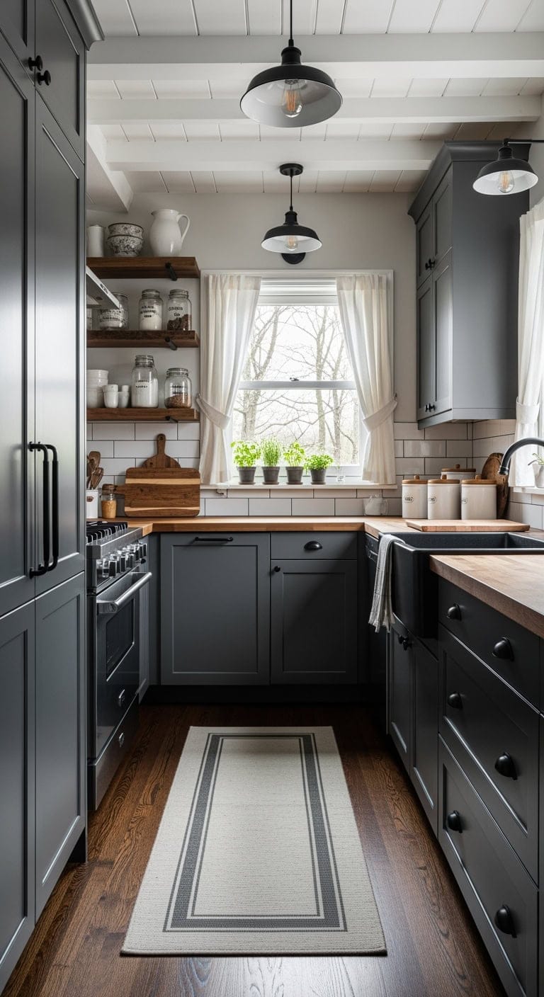
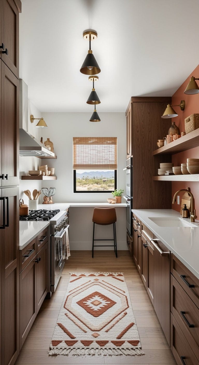
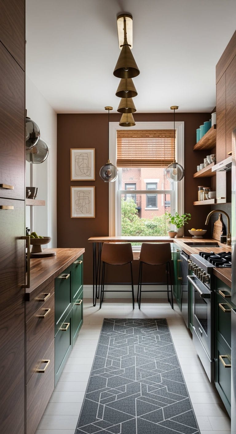
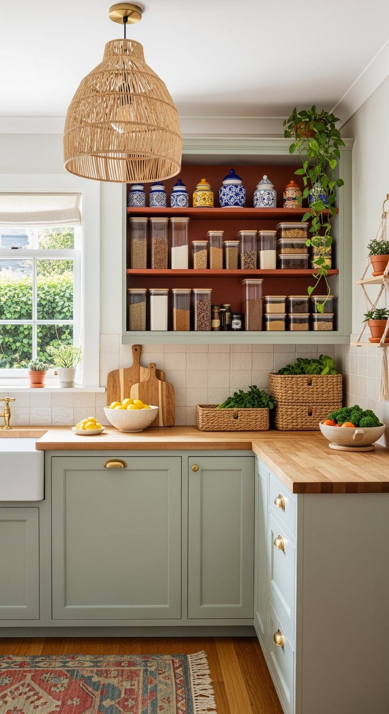
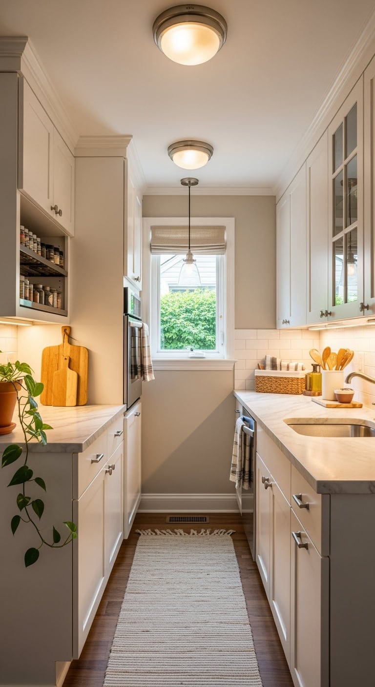
Contrary to traditional design advice, small kitchens no longer have to rely on bright, neutral tones to feel open and inviting. Innovative designers are boldly incorporating deep, rich hues to elevate these compact areas into stylish and refined culinary havens. By integrating shades like charcoal and midnight blue, they’re proving that darkness can add depth and character rather than shrink a space.
These moody color schemes bring a sense of luxury and purpose to kitchens that might otherwise feel cramped or bland. Rather than diminishing the size, the thoughtful use of darker finishes creates a striking, intimate atmosphere that feels both deliberate and elegant. Prepare to challenge your preconceptions about small kitchen design and discover how embracing bold colors can transform even the tiniest cooking quarters into sophisticated spaces.
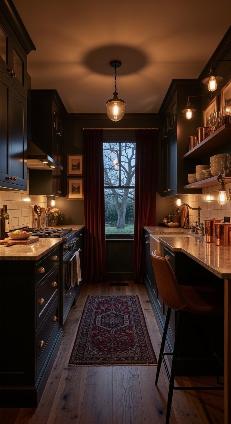
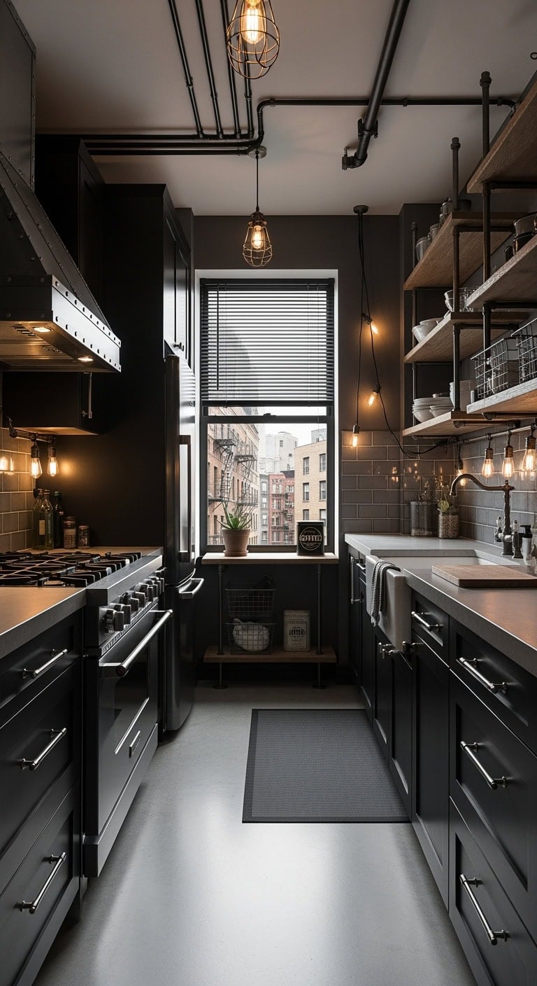
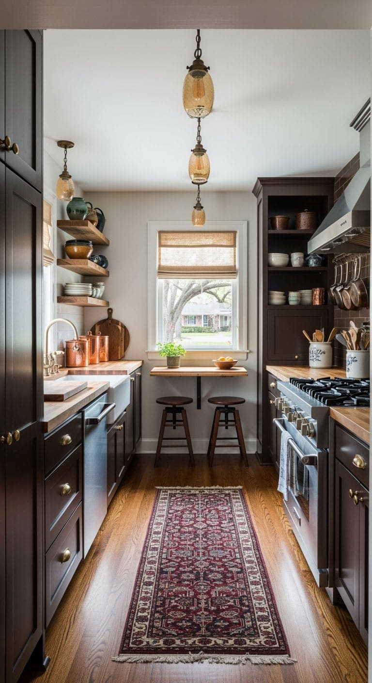
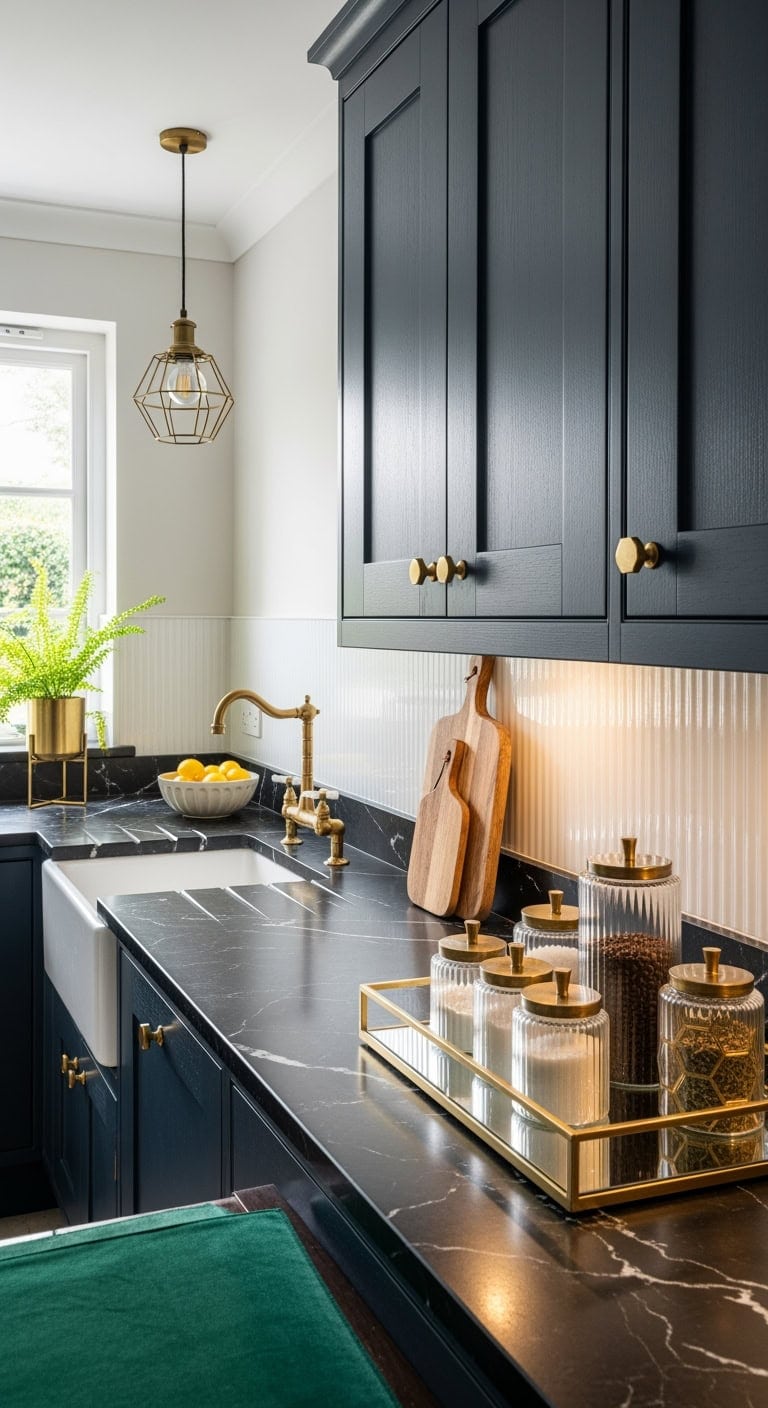
1. Sophisticated Charm: Elevating Compact Dark Kitchens with Luxurious Espresso Finishes and Warm Ambient Lighting
Embrace the allure of a refined, intimate kitchen space featuring deep espresso cabinetry that effortlessly conceals everyday wear. This style creates an inviting atmosphere reminiscent of an upscale wine lounge, where elegance seamlessly blends with practical design.
Key Design Elements
Deep espresso shaker cabinets accented with antique brass pulls
Round breakfast table crafted from rich dark walnut
Cognac-toned tufted leather stools for comfortable seating
Warm oil-rubbed bronze pendant lighting fixtures
Burgundy and navy Persian-inspired runner rug
Mini Edison bulb pendants with matte black metal details
Luxurious velvet café curtains in a deep wine shade
Copper storage jars topped with natural wood lids
Classic brass frames showcasing moody landscape art
Pro Tip: Refresh your cabinetry by painting lower cabinets in Benjamin Moore’s ‘Black Forest Green’ combined with Sherwin Williams’ ‘Caviar’ on an accent wall and lighten the ceiling using Benjamin Moore’s ‘Cloud White’ for balanced contrast.
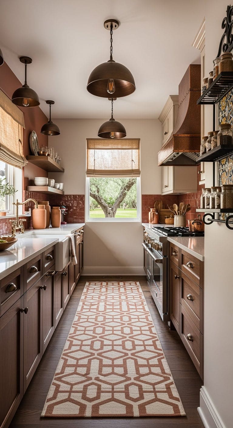
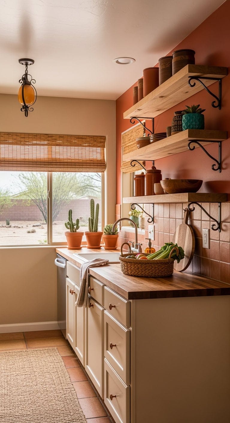
2. Warm Mediterranean Charm: Brightening Compact Kitchens with Earthy Bronze and Terra Cotta Accents
Imagine stepping into a kitchen inspired by sun-kissed Mediterranean villas, where rich bronze hardware gleams softly against terracotta tones that envelop the space in inviting warmth. This style effortlessly blends rustic Italian elegance with contemporary urban comfort, perfect for transforming narrow galley kitchens into cozy culinary retreats.
Key Design Elements
Rich walnut cabinetry accented with vintage bronze handles
Textured copper range hood or pendant lights with an aged bronze finish
Terracotta and cream patterned runner rug sized for narrow kitchens
Bronze dome-shaped pendant lighting with warm filament bulbs
Natural burlap Roman shades fitted with bronze curtain rods
Terra cotta jars with cork tops for stylish storage
Wrought iron spice rack with decorative ceramic tile inlays
Pro Tip: Refresh your kitchen cabinets by painting lower units in Benjamin Moore ‘Salamander’ and upper units in Sherwin Williams ‘Accessible Beige’, adding depth and warmth with a Benjamin Moore ‘Café Ole’ accent wall.
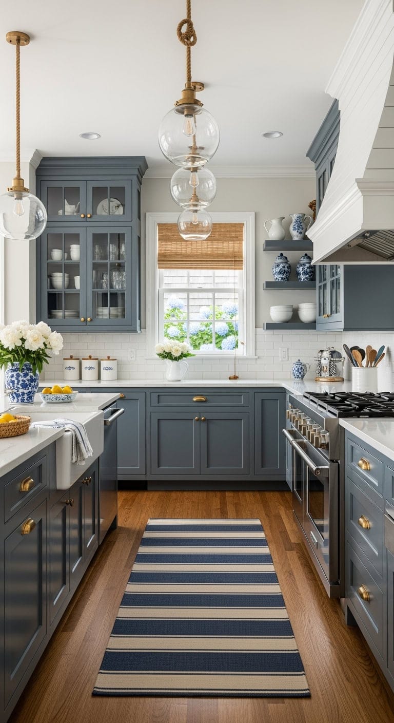
3. Elevated Coastal Charm: Enhancing Compact Dark Kitchens with Dusty Blue Cabinets and Warm Accents
Embodying a refined coastal elegance reminiscent of upscale beach homes, this kitchen style uses muted blue cabinetry to add richness and dimension, while organic materials introduce inviting warmth. The design strikes a perfect balance between polished sophistication and approachable comfort, ideal for compact layouts.
Key Design Elements
Dusty blue shaker cabinets accented with matte brass pulls
Marble countertop kitchen island featuring tapered legs
Woven rattan bar stools with soft ivory cushions
Beadboard-paneled range hood topped with decorative crown molding
Striped navy and cream runner rug sized approximately 2.5’x7′
Transparent glass pendant fixtures wrapped with natural rope accents
White bamboo roman shades or navy gingham cafe curtains for windows
White ceramic storage jars with wooden lids for countertop organization
Coastal-inspired artwork or ceramic pitchers displayed on open shelving
Pro Tip: For a harmonious palette, paint lower cabinets in Benjamin Moore ‘Nimbus Gray’, the island in Sherwin Williams ‘Pure White’, and walls in Benjamin Moore ‘White Heron’ to enhance light and contrast.
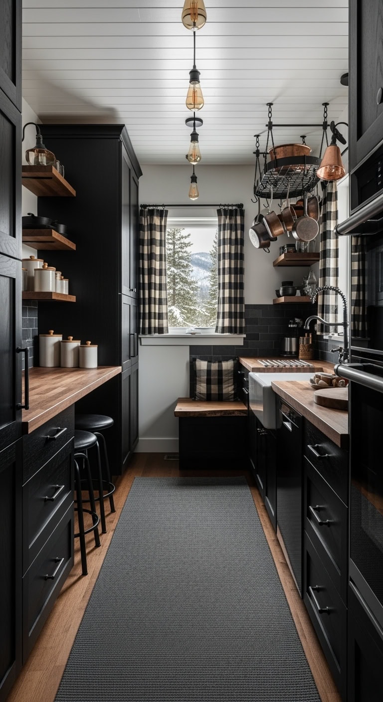
4. Rustic Alpine Retreat: Elevate Compact Kitchens with Deep Wood Finishes and Cozy Rustic Flair
Embrace the inviting charm of a mountain cabin right in your kitchen by blending rich, dark wood tones with intimate, alpine-inspired design elements. This style balances moody elegance with a warm, approachable atmosphere, perfect for compact spaces craving character and comfort.
Key Design Elements
Deep walnut-stained cabinetry paired with matte black pull handles
Live-edge reclaimed wood island or dining bench
Industrial-style leather bar chairs featuring black steel frames
Blackened wrought iron hanging pot racks or minimalist cage pendant lamps
Textured charcoal wool runner rug measuring approximately 2.5’ by 10’
Exposed filament bulb fixtures suspended with matte black cords
Classic buffalo plaid curtains in neutral blacks and creams
Neutral-toned stoneware jars with natural wood lids for countertop storage
Rustic wooden floating shelves adorned with vintage alpine-themed artwork
Pro Tip: For a rich, layered look, paint cabinetry using a deep matte black like Benjamin Moore’s ‘Black Beauty’ and complement with an accent wall in Sherwin Williams’ ‘Urbane Bronze’ to enhance warmth.
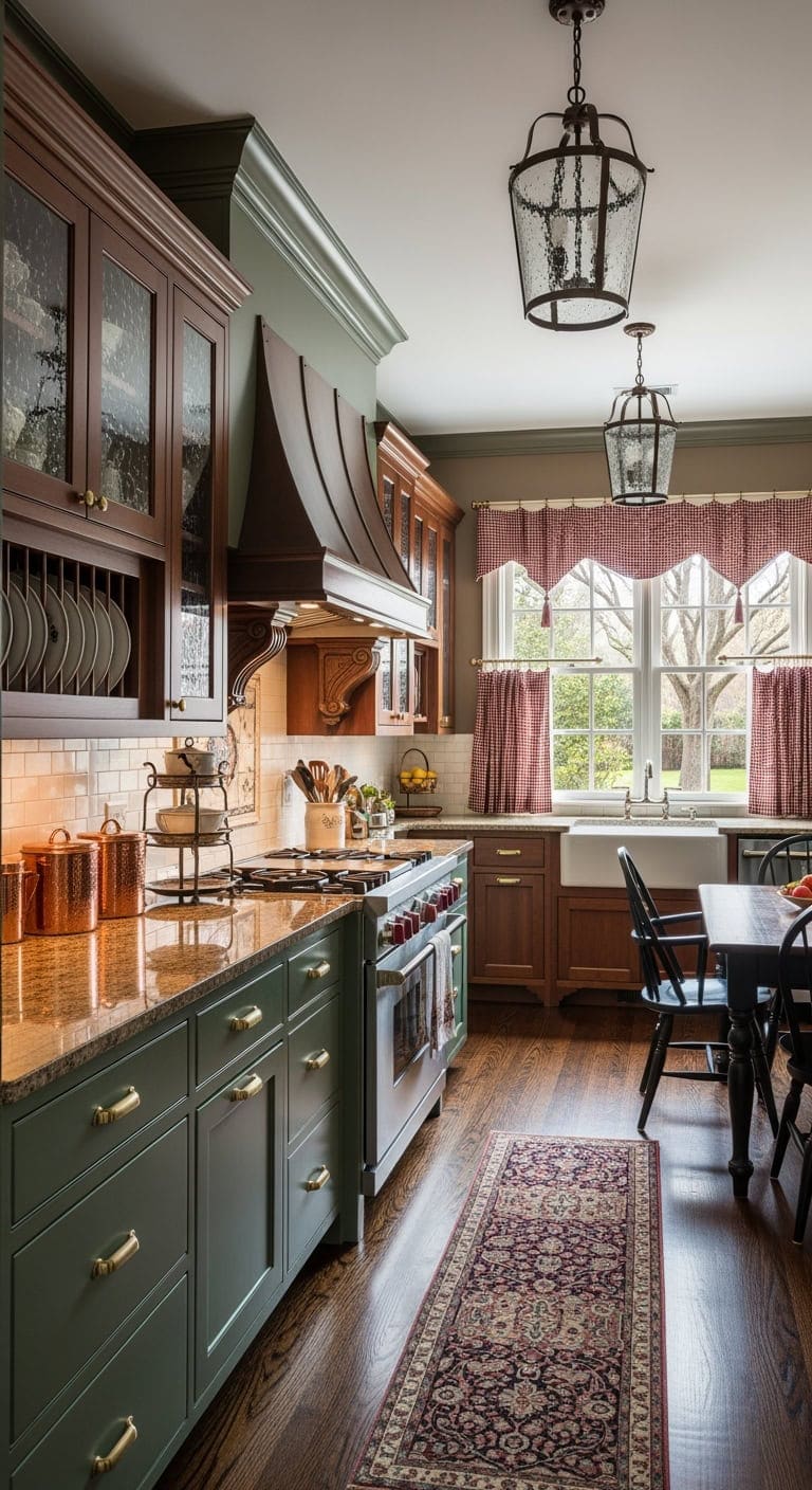
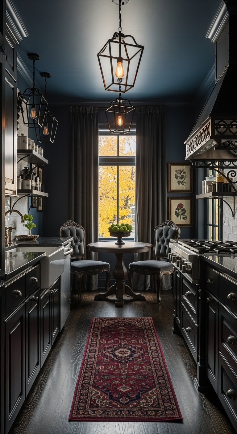
5. Classic Southern Charm: Infusing Cozy Elegance into Compact Dark Kitchens with Rich Wood Tones and Deep Crown Molding
Transform your small, shadowed kitchen into a refined gathering space where classic Southern warmth meets modern sophistication. By combining robust wood finishes and intricate molding details, this style strikes the perfect balance between traditional comfort and elegant charm.
Key Design Elements
Shaker-style cabinets finished in deep mahogany with vintage brass hardware
Solid walnut farmhouse table featuring traditional turned legs
Black Windsor dining chairs with natural wood seats for contrast
Oil-rubbed bronze range hood accented with ornate corbels
Burgundy and cream Persian-inspired runner (2.5’x10′) to add texture
Seeded glass lantern pendant fixtures for ambient lighting
Burgundy plaid or gingham café curtains to enhance warmth
Pro Tip: Refresh your cabinetry by painting lower cabinets in Benjamin Moore’s ‘Black Forest Green’ and crown molding in ‘Wrought Iron’ to deepen shadows, while softening surrounding walls with ‘Rustic Taupe’ for balanced warmth.
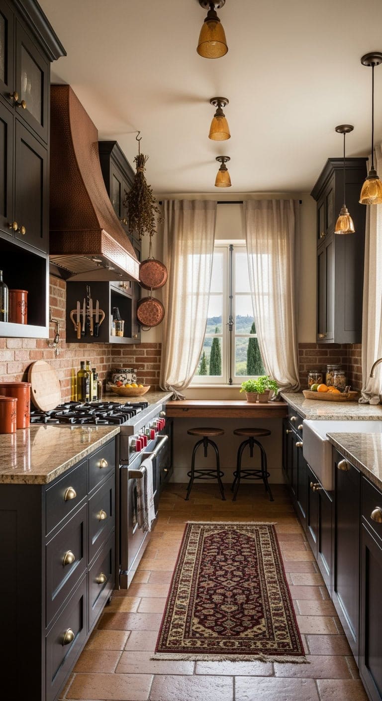
6. Mediterranean Charm: Elevating Compact Kitchens with Rich Espresso Tones and Timeless Old-World Details
Transform your small kitchen into a warm and inviting Mediterranean haven where deep espresso cabinetry sets a sophisticated yet cozy mood. Complemented by rustic accents and softly glowing lights, this style evokes the intimate charm of a beloved neighborhood trattoria.
Key Design Elements
Deep espresso shaker cabinets accented with vintage brass pulls
Solid walnut farmhouse-style dining table with a distressed finish
Wrought iron stools featuring plush linen upholstery
Ornate copper or aged bronze range hood with artisanal craftsmanship
Classic Persian runner rug showcasing rich burgundy and gold tones
Amber-hued mini pendant lighting for an inviting glow
Natural linen or burlap Roman shades with subtle stripe patterns
Handcrafted terracotta storage jars topped with cork lids
Rustic wooden shelving adorned with olive oil bottles and Mediterranean prints
Pro Tip: For authentic warmth, paint your lower cabinets in Benjamin Moore’s ‘Black Forest Green’ and create an accent wall using Sherwin Williams’ ‘Tuscany’ while keeping the ceiling crisp with Benjamin Moore’s ‘Linen White’.
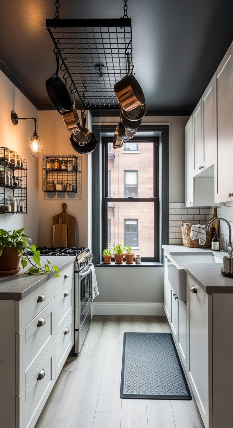
7. Urban Industrial Elegance: Elevating Compact Kitchens with Bold Metal Accents and Cozy Urban Vibes
Imagine the sleek charm of a city loft where raw metal meets warm, textured surfaces. This design approach redefines small kitchens by integrating rugged steel details and rich, dark tones to create an inviting yet edgy atmosphere perfect for contemporary urban living.
Key Design Elements
Flat-front black matte cabinetry paired with industrial-style iron handles
Dining table crafted from salvaged timber and black steel piping
Metal-framed stools with worn leather upholstery in deep charcoal
Steel range hood featuring riveted and brushed metal finishes
Dark slate gray washable kitchen runner (approximately 2.5’x7′)
Bronze cage pendant lighting fixtures with an antique finish
Matte black aluminum mini blinds or textured dark gray roller shades
Black wire mesh storage bins for open shelving or pantry organization
Pro Tip: For a cohesive look, paint all cabinetry with Benjamin Moore’s ‘Iron Mountain’ (2134-30) and use Sherwin Williams’ ‘Black Fox’ (SW 7020) on an accent wall to highlight industrial elements.
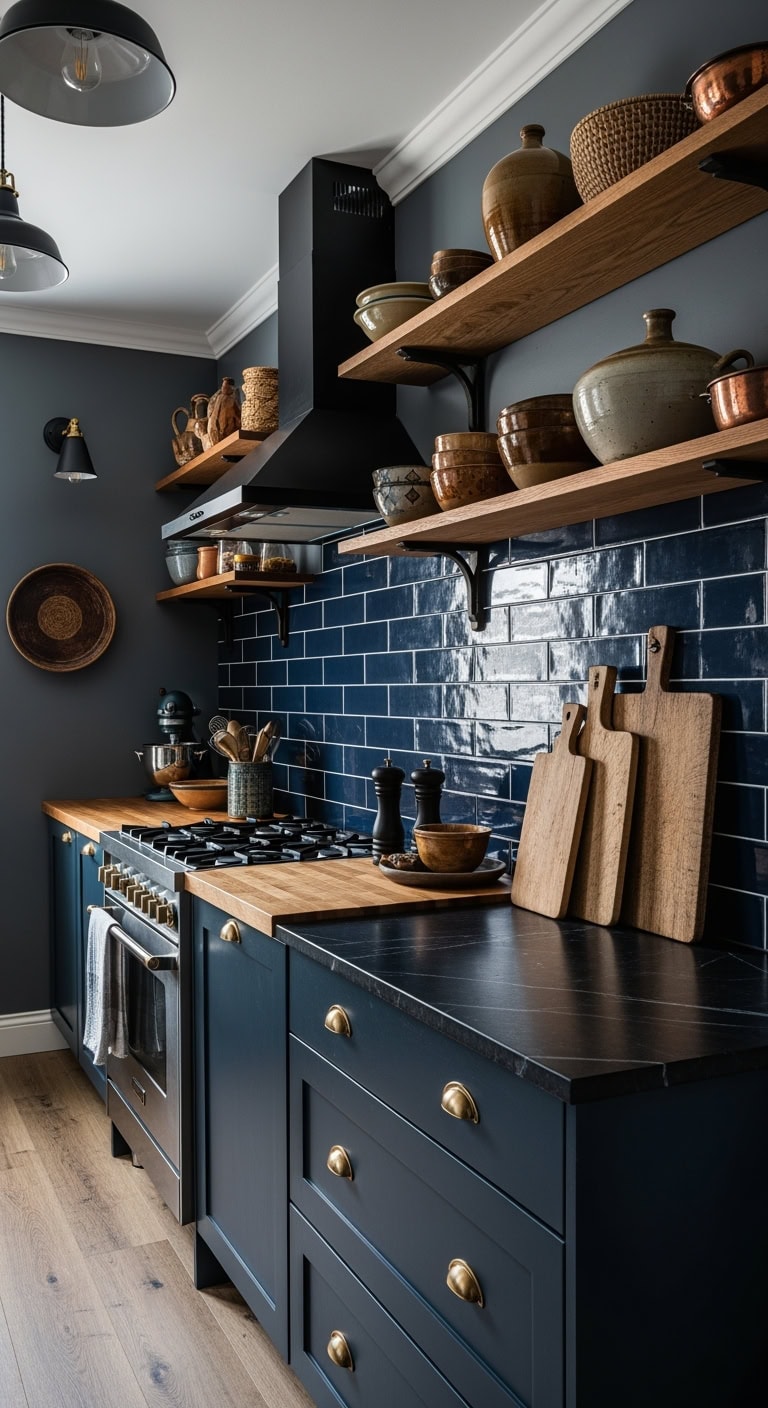
8. Moody Boho Charm: Transforming Compact Kitchens with Deep Blue Tiles and Rich Textural Layers
Inspired by the cozy allure of artisanal cafés, this kitchen design blends deep blue tiles with an eclectic mix of textures, creating an inviting space that sparks creativity. It channels a sophisticated bohemian spirit with a hint of scholarly mystique, perfect for intimate urban kitchens.
Key Design Elements
Deep navy shaker cabinetry accented with vintage brass pulls
Distressed reclaimed wood dining bench paired with industrial metal details
Woven rattan and matte black steel bar stools (set of 4)
Copper hammered range hood or a Moroccan-style pendant light
Oriental-inspired runner in rich navy and burnt orange hues (2.5’x10′)
Eclectic metal pendant lamps featuring tinted glass shades
Boho macramé curtains or intricately patterned Roman blinds
Curated gallery wall showcasing thrifted frames or open shelving with artisanal ceramics
Pro Tip: For a cohesive look, paint lower cabinets in Sherwin Williams ‘Naval’ and balance the ceiling with Benjamin Moore’s ‘Gentleman’s Gray’, adding an accent wall in Benjamin Moore ‘Hale Navy’ for depth and drama.
9. Gothic Elegance: Transforming Compact Kitchens with Dark Accents and Refined Ironwork
Embrace a strikingly moody vibe in your small kitchen by blending deep wood tones with intricate black iron details. This sophisticated look turns confined spaces into bold, inviting areas reminiscent of classic gothic charm infused with modern luxury.
Key Design Elements
Richly stained cabinetry in deep ebony with detailed wrought iron handles
Space-saving round pedestal dining table crafted from dark walnut wood
Black iron range hood showcasing elegant scrollwork and gothic motifs
Runner rug with Persian-inspired patterns in shades of deep crimson and maroon
Blackened metal pendant lanterns fitted with vintage-style Edison filament bulbs
Thick velvet cafe curtains in moody charcoal or forest green hues
Glass apothecary jars topped with matte black lids for stylish storage
Framed antique botanical illustrations in ornately designed black frames
Pro Tip: For a dramatic yet cohesive palette, paint cabinets with Benjamin Moore’s ‘Black Beauty’ (2128-10) and introduce a Sherwin Williams ‘Caviar’ (SW 6990) accent wall for depth and contrast.
10. Cozy English Retreat: Transforming Compact Dark Kitchens with Rich Forest Green Cabinets and Charming Dining Corners
Inspired by timeless English countryside charm, this kitchen style uses lush forest green cabinetry to infuse warmth and personality into small, dimly lit spaces. The design embraces intimate dining areas and vintage-inspired accents to create a snug, inviting environment perfect for everyday comfort and style.
Key Design Elements
Forest green shaker cabinets adorned with vintage brass handles
Distressed wood round pedestal table ideal for intimate breakfasts
Classic Windsor dining chairs finished in natural wood tones
Aged brass or copper range hood featuring ornamental straps
Handwoven wool runner in deep reds and greens (2’x6′)
Brass pendant lighting with frosted milk glass shades
Cream and green gingham cafe curtains for a quaint touch
Ceramic ironstone storage jars topped with wooden lids
Copper cookware and hanging dried herbs showcased on open shelves
Pro Tip: Refresh cabinetry with Benjamin Moore ‘Hunter Green’ (2041-10) paint and complement with Sherwin Williams ‘Urbane Bronze’ (SW 7048) on an accent wall to deepen the cozy atmosphere.
11. Timeless Elegance: Enhancing Compact Kitchens with Soft Gray Tones and Charming Vintage Details
Capture the essence of classic charm in your small kitchen by blending gentle gray hues with thoughtfully scaled, vintage-inspired millwork. This design evokes the comforting warmth of a cherished heritage space, creating an inviting atmosphere that pairs seamlessly with modern living.
Key Design Elements
Classic shaker cabinets painted in soft dove gray accented with antique brass cup handles
Compact round pedestal dining table in weathered slate finish
Traditional Windsor dining chairs in matte black with natural wood seats
Brass dome pendant lighting fixtures or retro-inspired schoolhouse lights
Striped runner rug in muted charcoal and cream tones, sized 2.5’x7′
Miniature glass pendant lamps featuring vintage-style Edison bulbs
Natural linen Roman shades in a creamy oatmeal color
Pewter-finished storage canisters adorned with classic detailing
Curated displays of framed vintage botanical artworks or collections of pewter plates
Pro Tip: Use a high-quality matte paint like Benjamin Moore’s ‘Kendall Charcoal’ for cabinetry and complement with Sherwin Williams’ ‘Peppercorn’ on an accent wall to add depth while preserving warmth.
12. Sleek Urban Elegance: Maximizing Compact Dark Kitchens with Polished Onyx Surfaces and Streamlined Furnishings
Embrace the allure of polished black countertops combined with minimalist cabinetry to transform small kitchens into sophisticated, boutique-style spaces. This approach exudes refined luxury while maintaining practicality in narrow layouts.
Key Design Elements
Glossy deep slate cabinetry featuring hidden finger pulls
Space-saving circular bistro table with matte black and natural wood accents
Set of 2-3 contemporary leather swivel stools with brushed steel frames
Slim black stainless steel range hood equipped with subtle LED lighting
Dark gray patterned runner rug measuring approximately 2’x6′
Modern black pendant fixtures with warm brass interiors
Charcoal blackout roller shades for optimal light control
Matte black stoneware jars and canisters for countertop organization
Monochrome abstract art prints to enhance wall aesthetics
Pro Tip: Use Benjamin Moore’s ‘Black Beauty’ on cabinets, Sherwin Williams’ ‘Iron Ore’ to create a dramatic feature wall, and balance with Benjamin Moore’s ‘Cloud White’ on the ceiling for crisp contrast.
13. Elegant Coastal Retreat: Transforming Compact Dim Kitchens with Stormy Blue Hues and Rustic Accents
Capture the essence of a serene seaside escape within your small kitchen by combining deep, moody blues with charmingly worn textures. This look balances the tranquility of ocean-inspired colors with the warmth of vintage weathered elements, perfect for narrow galley spaces with minimal daylight.
Key Design Elements
Distressed shaker-style cabinets painted in muted blue-gray tones, paired with matte silver pulls
Curved-edge dining table crafted from reclaimed driftwood
Navy upholstered rattan stools with woven cane backs
Brushed brass pendant lighting featuring maritime or dome-shaped designs
Striped natural fiber runner rug in soft cream and muted indigo (approx. 2.5’x7′)
Pendant lights with glass globes and rope-wrapped fixtures
Linen or sailcloth Roman shades in crisp white for filtered light
Clear glass canisters topped with cork lids for stylish storage
Floating shelves finished in weather-beaten wood displaying ceramics and dried sea flora
Pro Tip: For a layered coastal palette, paint lower cabinetry with Benjamin Moore’s ‘Nimbus Gray’ (2131-50), upper cabinets with Sherwin Williams’ ‘Sea Salt’ (SW 6204), and highlight an accent wall using Benjamin Moore’s ‘Hale Navy’ (HC-154) to add depth and contrast.
14. Refined Contrast: Elevating Cozy Dark Kitchens with Midnight Blue Islands and Rustic Wood Accents
This kitchen design balances rich, moody hues with natural textures, creating a sophisticated yet inviting space. The striking midnight blue island anchors the room, complemented by rugged wooden beams that evoke urban charm without overwhelming the senses.
Key Design Elements
Midnight blue shaker-style kitchen island featuring matte brass knobs
Deep walnut communal dining table with integrated bench seating
Counter-height stools crafted from leather and reclaimed wood (set of 3)
Matte black range hood framed by exposed rustic wood beam
Handwoven Persian-style runner rug blending navy and burnt orange hues (2.5’x10′)
Edison bulb pendant lighting with mixed metal finishes
Natural bamboo Roman shades or plush navy velvet café curtains
Clear glass canisters with brass fittings and wooden lids for countertop storage
Copper-framed botanical prints or minimalist open shelves with copper accents
Pro Tip: Use Benjamin Moore’s ‘Hale Navy’ for islands paired with ‘Kendall Charcoal’ on cabinets and a crisp ‘Chantilly Lace’ ceiling to create a layered yet fresh color palette.
15. Timeless Espresso Elegance: Maximizing Charm and Function in Compact Kitchens
This design blends the warmth of deep coffee hues with smart, space-saving features to evoke a refined yet inviting ambiance reminiscent of an upscale café. Rich wood tones paired with classic accents bring a touch of vintage sophistication to small kitchen spaces, making every inch count without sacrificing style.
Key Design Elements
Espresso-finished shaker-style cabinetry with aged brass pulls
Space-efficient butcher block breakfast bar
Windsor-inspired counter stools in rich walnut stain
Oil-rubbed bronze pendant lamps featuring vintage filament bulbs
Burgundy and cream Persian-style runner rug
Amber-hued glass schoolhouse pendant lighting
Textured burlap Roman blinds
Hammered copper storage jars topped with wooden lids
Floating reclaimed wood shelves adorned with antique ceramics
Pro Tip: For a cohesive look, paint all cabinetry with Benjamin Moore’s ‘Bittersweet Chocolate’ (2114-10) and highlight an accent wall using Sherwin Williams’ ‘Urbane Bronze’ (SW 7048), while keeping the ceiling bright with Benjamin Moore’s ‘Cloud White’ (OC-130).
16. Chic Rustic Charm: Maximizing Compact Dark Kitchens with Slate Cabinets and Matte Black Accents
This kitchen style blends inviting rustic elements with sleek modern touches, using slate-toned cabinets to add rich character to smaller spaces. Matte black hardware and thoughtfully chosen decor infuse warmth and sophistication, transforming a compact galley into a stylish culinary haven.
Key Design Elements
Slate-colored shaker cabinets paired with matte black hardware
Distressed wood dining nook table featuring sturdy metal legs
Black steel bar stools topped with natural wood seats (set of 3)
Industrial matte black range hood or exposed cage pendant lighting
Cream and slate patterned vintage-inspired kitchen runner (2.5’x7′)
Matte black hanging light fixtures with vintage filament bulbs
Natural linen Roman shades or crisp white cotton café curtains
White ceramic storage jars with wooden lids (set of 4)
Floating reclaimed wood shelves showcasing artisanal white pottery
Pro Tip: For a layered look, paint cabinets in a deep slate hue like Benjamin Moore’s ‘Wrought Iron’ (2124-10) and brighten the space with a soft white accent wall using Sherwin Williams’ ‘Alabaster’ (SW 7008).
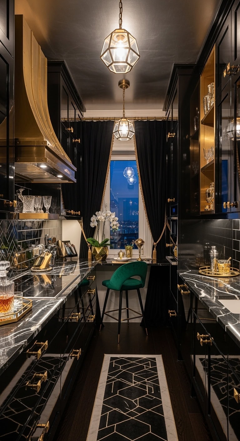
17. Luxurious Art Deco Chic: Transforming Compact Dark Kitchens with Reflective Ebony Finishes and Jewel-Toned Accents
Capture the essence of vintage cocktail lounge elegance with a rich, moody palette that maximizes every inch of your petite kitchen. This style embraces a jewel-box concept where glossy surfaces and carefully curated light-catching details create a lavish and intimate ambiance.
Key Design Elements
Sleek black lacquer cabinetry accented with matte gold or antique brass pulls
Black quartz or stained glass dining surface paired with a polished metal frame
Plush velvet counter stools in deep emerald or royal blue hues
Brass or gold-finished angular range hood or a sparkling crystal pendant centerpiece
Narrow geometric runner rug in black and metallic gold tones (approximately 2’x6′)
Vintage-inspired brass pendant lighting with intricate Art Deco patterns
Heavy black velvet drapes featuring subtle gold fringe or piping
Reflective black glass storage jars with gilded lids and trims
Pro Tip: Use a high-gloss ‘Onyx Black’ paint on cabinets combined with a soft metallic bronze accent wall to enhance light reflection and add depth in small kitchens.
18. Elevated Minimalism: Maximizing Compact Dark Kitchens with Slate-Toned Shaker Cabinets
Embodying the sleek sophistication of boutique cafe interiors, slate-hued shaker cabinetry offers a timeless, fingerprint-resistant solution for small kitchens. This refined palette enhances functionality while maintaining an inviting, streamlined atmosphere perfect for narrow galley spaces.
Cozy walnut-finished round breakfast table optimized for tight spaces
Set of two to three low-profile charcoal upholstered counter stools
Brushed nickel under-cabinet vent hood with minimalist design
Neutral-toned striped kitchen runner in shades of charcoal and ivory (2’x6′)
Matte black mini dome pendant lighting fixtures
Gray linen Roman window shades for subtle texture and light control
Matte-finished gray ceramic storage jars for countertop organization
Black steel floating shelves showcasing crisp white dishware
Pro Tip: Refresh cabinetry easily by applying Benjamin Moore’s ‘Kendall Charcoal’ HC-166 to all woodwork, pairing it with Sherwin Williams’ ‘Iron Ore’ SW-7069 on a single accent wall and finishing with a crisp Benjamin Moore ‘Cloud White’ OC-130 ceiling for added brightness.
19. Warm Minimalist Kitchens: Elevate Compact Spaces with Rich Earthy Browns and Sleek Design
Embrace the inviting warmth of deep brown hues paired with minimalist accents to transform small kitchens into stylish, intimate retreats. This design harmonizes natural desert-inspired tones with contemporary urban chic for a timeless, cozy atmosphere.
Key Design Elements
Shaker-style cabinets finished in rich walnut with matte black hardware
Natural oak pedestal breakfast table featuring a smooth round top
Cognac-toned leather stools with slender black metal legs
Matte black dome-shaped range hood or industrial-style cage pendant lighting
Terracotta and cream geometric pattern runner rug measuring approximately 2 by 6 feet
Cluster of brass and black mini pendant lights (three-piece set)
Natural bamboo Roman blinds or light, airy linen curtains
Stoneware storage jars in warm chocolate and sandy beige shades
Decorative woven wall baskets or copper-toned open shelving accents
Pro Tip: Refresh your lower cabinets with Benjamin Moore’s ‘Urbane Bronze’, highlight an accent wall using Sherwin Williams’ ‘Cavern Clay’, and brighten the ceiling with Benjamin Moore’s ‘Cloud White’ for a layered, natural color palette.
20. Elevating Compact Dark Kitchens with Walnut Elegance and Dynamic Geometry
Inspired by timeless mid-century flair, this kitchen style transforms small, dim spaces into inviting, sleek environments reminiscent of boutique hotel lounges. Rich walnut hues combined with geometric patterns create an illusion of spaciousness while adding a warm, refined character.
Key Design Elements
Walnut-finished cabinetry featuring a horizontal grain pattern and matte brass hardware
Rustic live-edge walnut dining table with minimalist metal hairpin legs
Caramel-toned leather counter stools framed in walnut
Linear arrangement of brass cone-shaped pendant lighting fixtures
Dark charcoal runner rug with bold geometric motifs (approximately 2.5’x7′)
Smoked glass globe pendant lights accented with walnut details
Natural bamboo roll-up shades for window treatments
Teak storage canisters topped with cork lids
Minimalist abstract line drawing prints showcased on walnut floating shelves
Pro Tip: Try painting lower cabinets in Benjamin Moore’s ‘Black Forest Green’ paired with a Sherwin Williams ‘Urbane Bronze’ accent wall and a crisp Benjamin Moore ‘Cloud White’ ceiling to add depth and brightness.
Conclusion
Embracing a small, dark kitchen is about celebrating intentional design and bold elegance rather than settling for less. These intimate spaces invite creativity, allowing every detail—from rich textures to thoughtfully chosen accents—to shine with purpose and personality. Rather than feeling confined, your compact kitchen becomes a sanctuary of style, warmth, and refined sophistication.
Let your kitchen defy expectations by turning darkness into an asset, where depth and contrast create a cozy yet captivating atmosphere. By weaving in natural materials and subtle metallic touches, you transform limited space into a powerful statement of taste and comfort. Small doesn’t mean simple; it means smart, stylish, and uniquely yours.
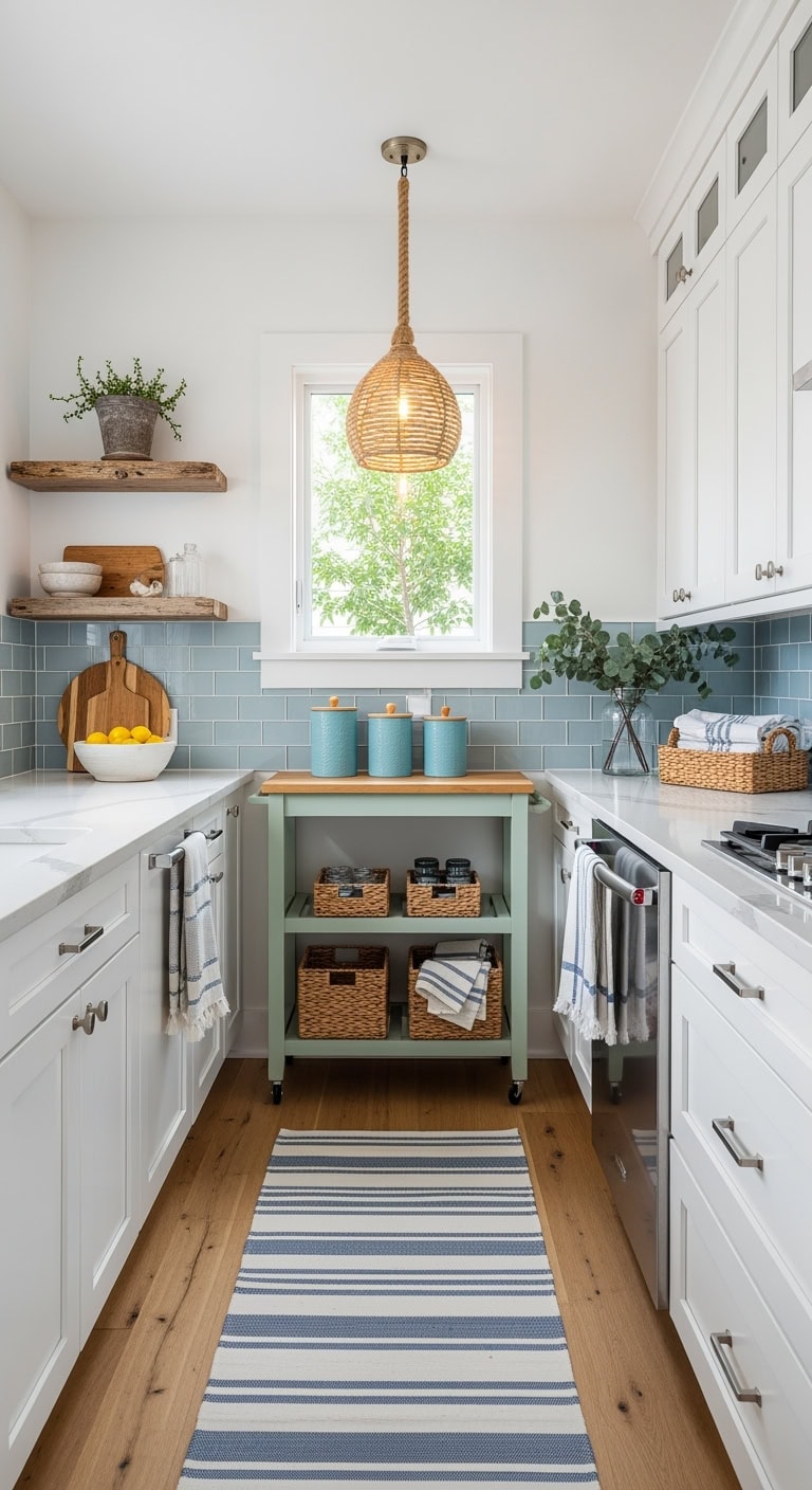
Transforming a small kitchen into a cozy, stylish haven doesn’t have to come with a hefty price tag. Whether you’re working with limited square footage or a tight budget, there’s something truly rewarding about breathing new life into the heart of your home without overspending. With a little creativity and thoughtful planning, even the most modest kitchen can be refreshed to feel brighter, more organized, and entirely your own. It’s all about making smart choices that maximize your space and charm, turning everyday cooking and gathering into a joyful experience.
Embracing a budget-friendly makeover means focusing on the potential your kitchen already holds rather than what it lacks. Small changes can have a big impact, and the process offers a wonderful opportunity to add personal touches that reflect your style and needs. This journey isn’t about perfection—it’s about progress and creating a space where comfort meets function. So, if you’ve been dreaming of a kitchen upgrade but worried about the cost, take heart. With patience and a bit of inspiration, your small kitchen can become a warm and inviting spot that feels fresh and new without breaking the bank.
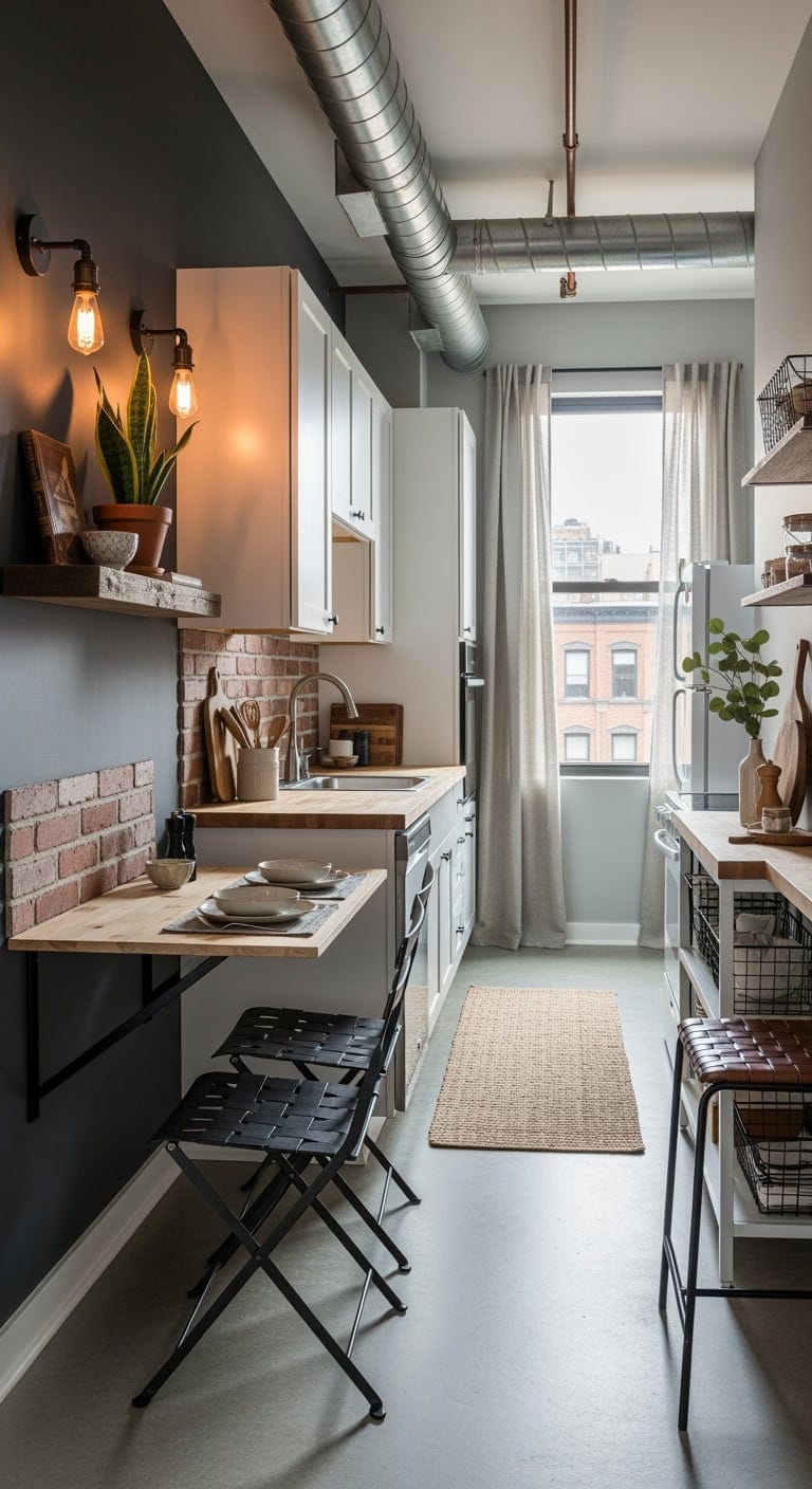
1. City Chic Solutions: Compact Wall-Mounted Tables to Refresh Your Dining Space Without Breaking the Bank
Transform that tight dining nook with a clever fold-away table that tucks neatly against the wall when not in use, freeing up valuable space. Marrying sturdy industrial charm with everyday function, it’s like pairing a sleek metal watch with your coziest sweater—effortlessly stylish and comfortable. These smart wall-mounted designs make even the trickiest corners invite you to sit down and enjoy a meal.
Key Design Elements
Compact wall-hinged fold-away dining table in reclaimed wood finish
Set of matte black steel folding chairs with urban industrial design
Floating distressed wood shelving unit with visible metal brackets
Sleek matte black drawer handles with minimalist geometric shapes
Vintage-inspired Edison bulb wall lamps with adjustable arms
Removable brick-patterned vinyl backsplash in warm red tones
Brown leather braided seat counter stools with black metal frames
Open black wire mesh storage bins for versatile kitchen organization
Pro Tip: For a chic industrial vibe in your kitchen, paint the wall behind your fold-down table in Benjamin Moore’s Wrought Iron (2124-10) to create a bold, loft-inspired backdrop. Then, highlight exposed pipes or ceiling beams with Sherwin-Williams’ Urbane Bronze (SW 7048) to add depth and a thoughtfully curated edge. This pairing brings warmth and character without overwhelming the space.
2. Charming Mini Plate Racks: Budget-Friendly Ways to Transform Unused Kitchen Walls
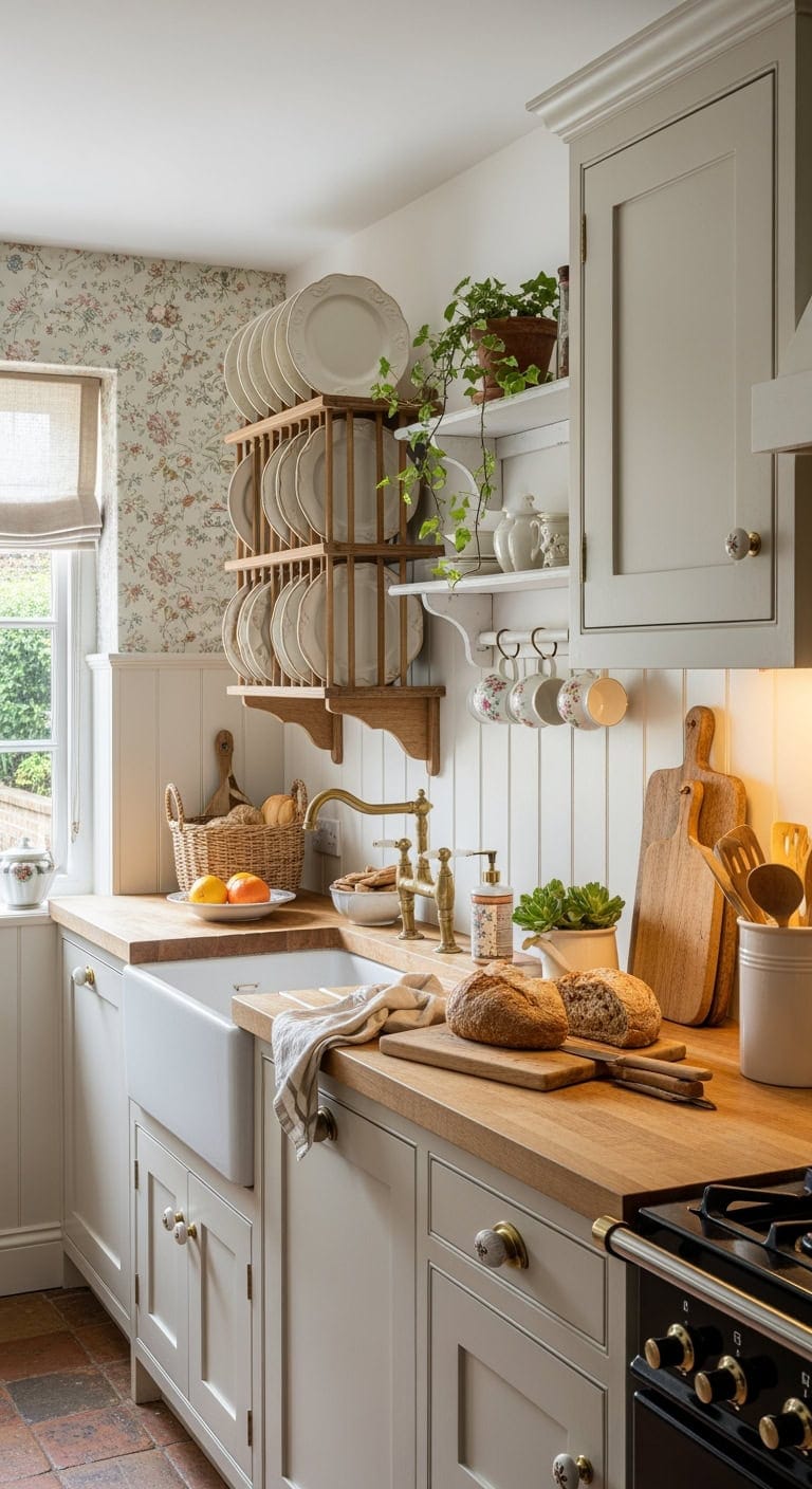
For years, that empty wall above your sink has quietly waited for a little love. Adding a small plate rack turns that overlooked spot into a charming display, giving your everyday dishes a chance to shine like treasured keepsakes. Embracing English country style, this simple touch brings warmth and personality to your kitchen without sacrificing function.
Key Design Elements
Handcrafted pine wall plate shelf with weathered finish
Soft ivory scalloped-edge stoneware dinner plates
Ornate antique brass wall brackets for plate display
Delicate pastel floral removable wallpaper panels
Brass-finished porcelain cup hooks for hanging mugs
Rustic whitewashed floating shelf with chipped paint effect
Natural linen café curtains with subtle texture
Classic ceramic cabinet knobs in vintage floral patterns
Pro Tip: For a charming, gallery-inspired look in your kitchen, try painting the wall behind your plate rack in Benjamin Moore’s crisp White Heron (OC-57) to make your dishes stand out beautifully. Pair it with Sherwin-Williams’ Creamy (SW 7012) on the window trims and moldings for a cozy, soft touch that evokes the warmth of an English cottage. This combination highlights your collection while adding inviting depth to the space.
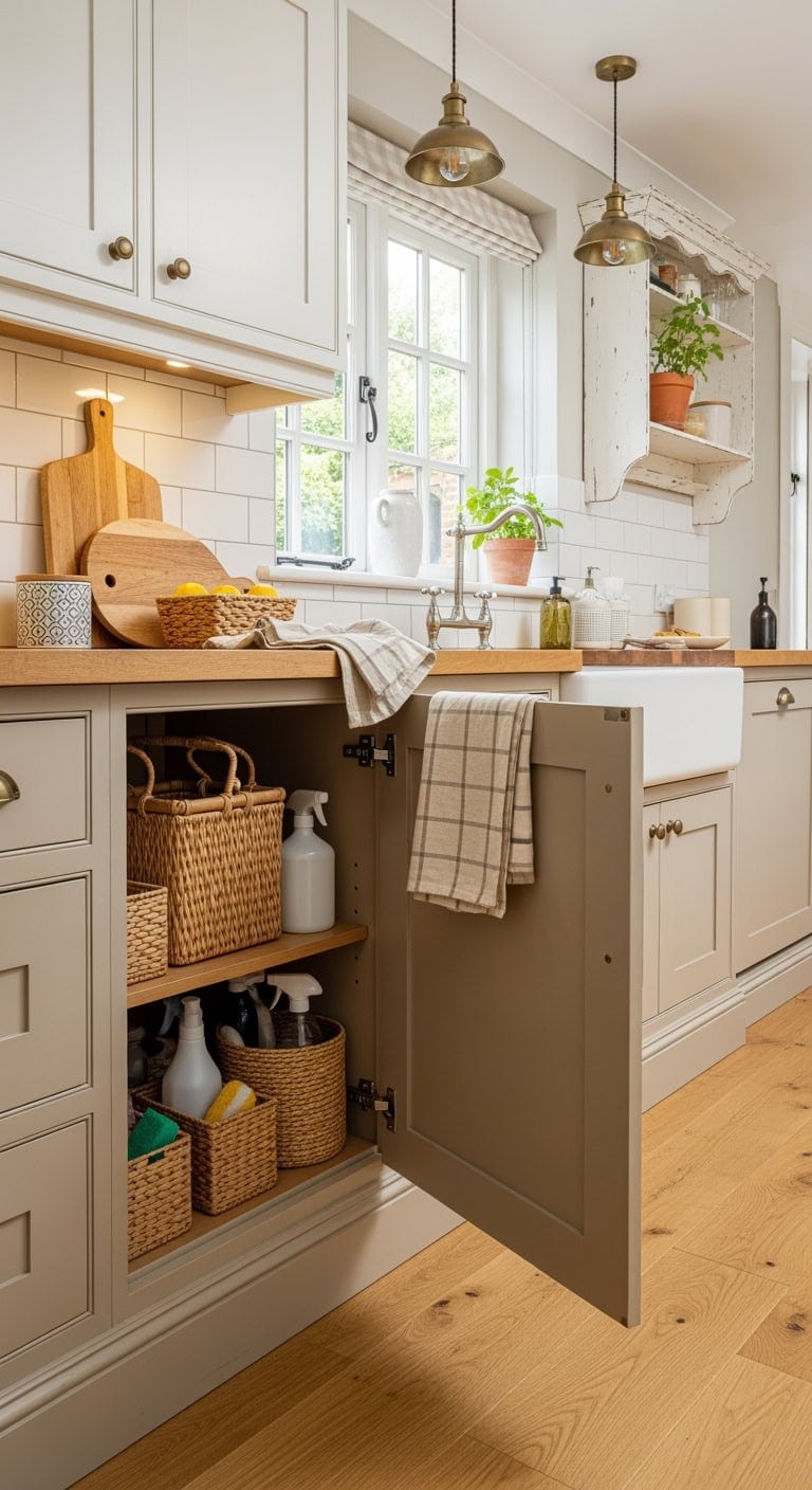
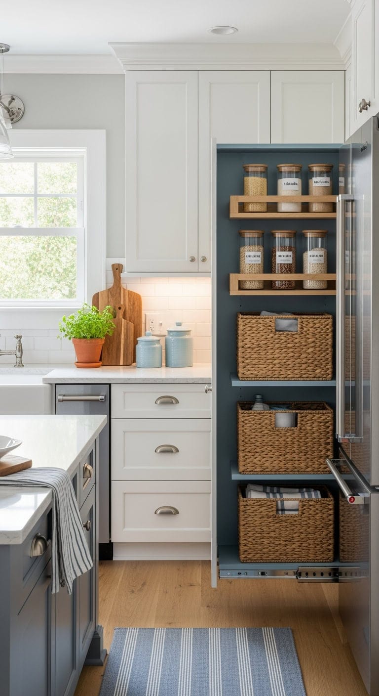
3. Charming Cottage Charm: Petite Under-Sink Baskets That Maximize Budget and Revive Hidden Corners
Your under-sink cabinet doesn’t have to be a cluttered catch-all for cleaning products and random containers. Embrace a cozy, cottage-inspired vibe by organizing with rustic woven baskets that bring a touch of French countryside charm. This clever storage solution not only tidies up the space but also adds a welcoming warmth every time you peek inside.
Key Design Elements
Natural woven wicker baskets designed for under-sink storage
Cream-colored metal sliding organizer for cabinets
Handwoven rattan tote for cleaning supplies
Antique-style ceramic drawer knobs in soft off-white
Soft cotton gingham fabric apron with ruffled edges
Aged brass cup pulls for kitchen drawers
Set of linen-blend kitchen towels with subtle texture
Rustic whitewashed wooden wall shelf with hooks
Pro Tip: For a cheerful and fresh under-sink space, try painting the inside of the cabinet in Benjamin Moore’s “Simply White” (OC-117) to instantly brighten the area and make your storage baskets stand out. Pair this with “Revere Pewter” (HC-172) on the lower cabinet doors for a soft, warm greige that’s perfect for a cozy cottage vibe and cleverly conceals daily wear.
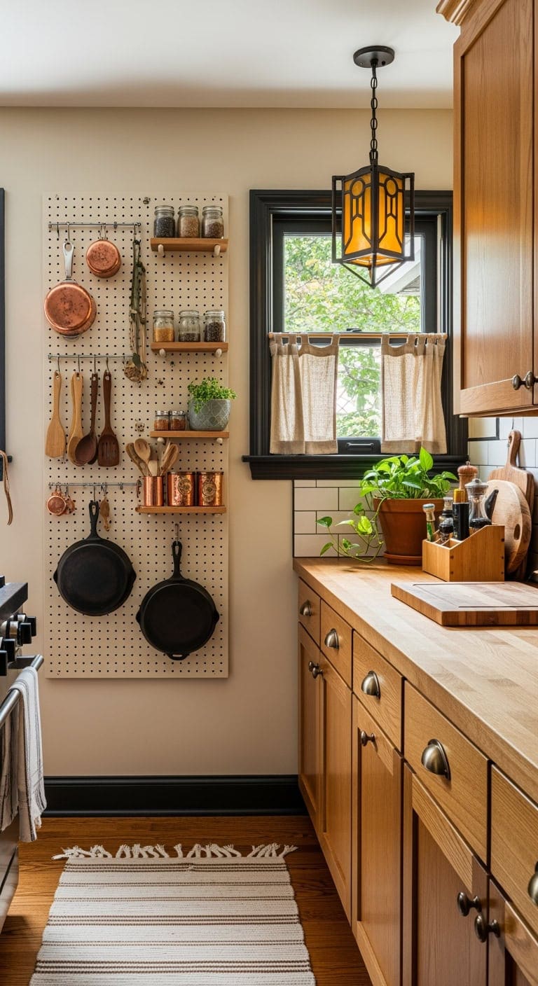
4. Charming Craftsman Pegboards: Affordable Wall Solutions to Refresh Your Kitchen Space
Transform that empty space beside your stove into a stylish command center with pegboard storage. Combining a touch of rustic workshop flair with everyday kitchen convenience, it keeps your utensils and tools neatly displayed and easy to grab. It’s the perfect blend of eye-catching design and smart organization, making meal prep smoother than ever.
Key Design Elements
Creamy white pegboard panel designed for kitchen wall storage
Assorted black metal peg hooks perfect for versatile utensil hanging
Solid oak pegboard shelf with a natural finish to showcase cookware
Dark bronze cabinet pulls featuring a rustic Craftsman-inspired design
Warm amber glass pendant lighting with handcrafted metal accents
Compact wooden butcher block organizer for countertop essentials
Neutral-toned woven cotton kitchen runner to soften hard surfaces
Light beige natural linen cafe curtains to add warmth and texture
Pro Tip: For a cozy, inviting kitchen workspace, try painting your pegboard in Benjamin Moore’s Classic Gray 1548 to create a soft, warm backdrop that makes your tools pop. Pair it with Sherwin Williams’ Balanced Beige SW 7037 on the walls to enhance natural wood accents and bring a subtle, arts-and-crafts charm to the room.
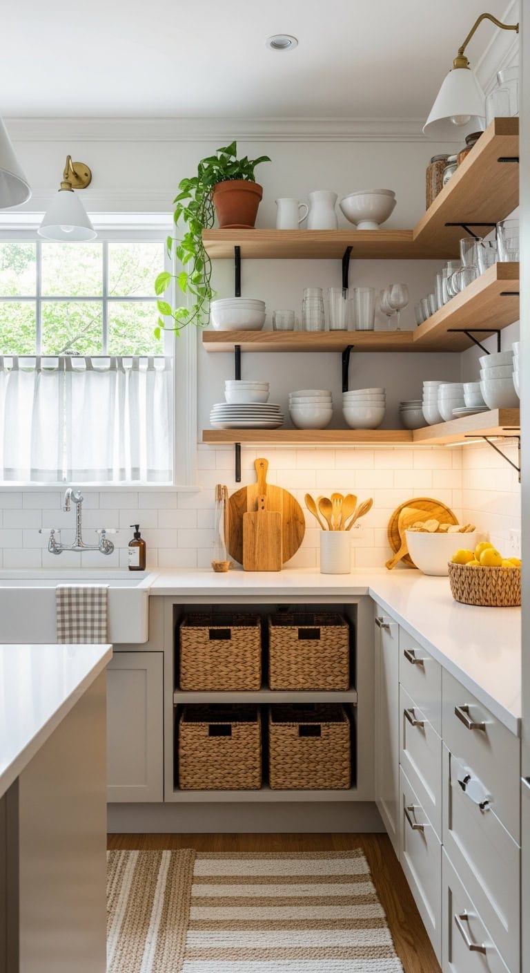
5. Breathe Life Into Tight Spaces with Budget-Friendly Scandinavian Open Shelves
Achieving that serene Nordic look in your kitchen doesn’t have to mean a costly makeover. By incorporating streamlined open shelves, you create a cozy, inviting space where every piece has a purpose and place. It’s all about thoughtfully curating your kitchen essentials to highlight simplicity and warmth without clutter.
Key Design Elements
Slim white floating shelves with clean lines
Light birch wood bracket supports for shelving
Matte white ceramic jars for countertop storage
Warm brushed brass knobs for cabinets
Soft striped linen tea towels in muted tones
Matte white pendant lighting with minimalist design
Natural wood cutting board used as a decorative accent
Neutral-toned woven kitchen rug with subtle texture
Pro Tip: For a clean, Scandinavian-inspired kitchen, start with Benjamin Moore’s Chantilly Lace (OC-65) on your main walls to achieve a bright, fresh white that feels airy and inviting. To add subtle warmth and avoid a too-sterile look, pair it with Pale Oak (OC-20) on adjoining walls or trim—this soft neutral brings just the right amount of coziness to the space.
6. Charming Parisian Flair: Affordable Mini Hooks That Bring Life and Charm to Bare Kitchen Walls
Empty kitchen walls are the perfect canvas for adding a touch of timeless character, and these brass hooks do just that without breaking the bank. They bring a hint of classic elegance, like treasures discovered at a quaint European market—minus the hefty shipping fees. It’s amazing how such simple, vintage-inspired accents can turn a standard kitchen into a space full of warmth and personality.
Key Design Elements
Aged brass hooks with intricate fleur-de-lis detailing
Rustic bronze wall hooks shaped like classic French keys
Chipped whitewashed wooden shelves with subtle distressing
Wrought iron wall-mounted plate rack with elegant scrollwork
Soft, natural linen cafe curtains in warm cream tones
Curved vintage-style brass kitchen faucet with patina finish
Handcrafted ceramic canisters adorned with pastel floral patterns
Pro Tip: For a timeless, Parisian-inspired kitchen, paint your walls in Benjamin Moore’s White Heron (OC-57) to achieve a soft, chalky backdrop that beautifully highlights brass fixtures. Add a touch of drama by using Hale Navy (HC-154) on an accent wall or inside open shelves, bringing in that rich, moody depth reminiscent of classic European interiors.
7. Worldly Charm: Compact Stackable Jars That Save Money and Transform Cluttered Kitchens
Say goodbye to messy spice drawers and hello to a stylish storage solution inspired by the vibrant markets of Marrakech and the clever compartmentalization of a Japanese bento. These stackable containers bring order and flair to your pantry, helping you keep everything neatly organized without breaking the bank. Transform your kitchen chaos into a colorful, easy-to-navigate system you’ll love to display.
Key Design Elements
Transparent modular food containers with airtight bamboo lids
Handcrafted ceramic spice jars featuring vibrant global motifs
Natural woven seagrass baskets for versatile pantry organization
Hammered brass drawer and cabinet pulls with artisanal charm
Boho-style rattan pendant lighting to brighten kitchen nooks
Washable kitchen runner inspired by traditional Kilim designs
Macrame wall shelf with hanging hooks perfect for herbs or utensils
Stackable mini glass jars with cork lids for easy countertop storage
Pro Tip: For a cozy, inviting pantry, try painting the interior in Benjamin Moore’s *Moroccan Spice* (2167-20)—its rich terracotta hue beautifully highlights your jars and containers. Pair it with Sherwin Williams’ *Salamander* (SW 6065) on any open shelving to introduce a bold, worldly contrast that adds depth and character to your kitchen storage.
8. Budget-Friendly Mediterranean Tile Makeover: Easy Peel-and-Stick Backsplash Upgrade for a Fresh, Vibrant Kitchen
Give your kitchen an effortless makeover without calling in a tile expert or spending hours on messy grout. These peel-and-stick tiles, inspired by Mediterranean charm, instantly infuse your space with vibrant, sun-kissed warmth—think coastal vibes at a fraction of the cost of a night out. Simply peel, apply, and enjoy the burst of geometric patterns and earthy terracotta hues that bring your backsplash to life.
Rustic olive wood floating shelves with warm finish
Decorative wrought iron olive oil bottle holder rack
Pro Tip: For a kitchen that highlights terracotta tiles, try painting your cabinets in Sherwin Williams’ SW 7012 ‘Creamy’—its soft warmth enhances the earthy tones without overpowering them. Pair this with walls in SW 7036 ‘Accessible Beige,’ a gentle sandy shade that effortlessly unifies a Mediterranean-inspired color scheme. This combination creates a cozy, inviting space with subtle, natural harmony.
9. Southwest Charm: Affordable Floating Shelves to Revive Your Kitchen Walls
Empty kitchen walls are a blank canvas just waiting to come alive, and sleek floating shelves offer an easy way to add charm without a full remodel. They’re like the perfect splash of spice in your cooking—subtle yet game-changing. Infuse those shelves with warm terracotta hues and organic textures to evoke cozy Southwest desert vibes that look as inviting as they feel.
Key Design Elements
Natural reclaimed wood floating shelves with a weathered finish
Handcrafted terracotta wall-mounted display ledge with rustic textures
Iron wall brackets featuring intricate southwestern motifs
Set of terracotta ceramic canisters with hand-painted desert patterns
Southwestern-style copper drawer and cabinet handles with hammered details
Earth-toned woven jute runner rug with subtle geometric accents
Light-filtering bamboo shades to bring warmth and natural light
Small turquoise ceramic planter perfect for succulents or cacti
Pro Tip: For a warm, inviting kitchen vibe, try painting the wall behind your shelves in Sherwin Williams’ Cavern Clay (SW 7701) to evoke a rich desert sunset feel. Pair this with Accessible Beige (SW 7036) on the surrounding walls to keep the space feeling light and airy, perfect for making smaller kitchens feel open and welcoming.
10. Effortless Elegance: Slim Fruit Baskets That Brighten Your Counter and Save You Money
Wire baskets filled with fresh lemons and avocados do more than organize—they bring a relaxed, sun-kissed charm to your kitchen. Imagine the effortless cool of a coastal market folded into your countertop, instantly transforming everyday clutter into a stylish, inviting vignette. This easy, affordable update adds personality and warmth without the hassle of a major makeover.
Key Design Elements
Slim tiered metal wire baskets for fruit and veggies
Rectangular woven seagrass basket for countertop storage
Bronze stackable fruit holder with multiple tiers
Narrow natural rattan organizer for kitchen essentials
Round brushed brass knobs for cabinetry refresh
White ceramic canisters with wooden lids for dry goods
Natural woven linen Roman shades for soft window light
Washable coastal striped runner to brighten the kitchen floor
Pro Tip: For a bright, airy kitchen vibe, try painting your cabinets in Benjamin Moore’s Simply White (OC-117)—it provides a crisp, clean canvas that really makes colorful fruits and veggies stand out. Pair this with Sherwin Williams’ Sea Salt (SW 6204) on the wall behind your basket display to introduce a soft, calming touch that brings a relaxed, coastal feel to your space.
11. Chic and Affordable: Sleek Glass Jars That Elevate Your Kitchen Without Breaking the Bank
Give your tired countertops a stylish upgrade without the hassle of a full remodel. These petite glass jars add a touch of vintage charm, blending sleek geometric shapes with everyday convenience. It’s like inviting a bit of classic Hollywood sparkle into your kitchen while keeping your essentials beautifully organized.
Key Design Elements
Set of small geometric glass canisters with frosted Art Deco patterns
Mini apothecary-style jars topped with antique brass lids
Ribbed glass storage jars with sleek metallic accents
Hexagonal gold-tone cabinet pulls with an Art Deco flair
Mirrored glass tray organizer for elegant countertop display
Vintage-inspired brass pendant lighting with geometric detailing
Black marble-effect adhesive film for countertop refresh
Plush emerald green velvet runner to add color and texture to your kitchen floor
Pro Tip: For a kitchen that feels both elegant and inviting, try painting your cabinets in Benjamin Moore’s Hale Navy—a deep, jewel-toned blue that adds instant sophistication. Pair it with Sherwin-Williams’ Alabaster on the walls, a soft creamy white that creates a warm canvas, allowing brass fixtures and geometric glass details to really pop.
12. Breezy Elegance: Affordable Slim Rolling Carts to Refresh Your Kitchen Instantly
This slender rolling cart is like the ultimate multitasker in your kitchen—small in size but mighty in function, effortlessly blending style with smart storage. Imagine a breezy seaside retreat where thoughtful design meets everyday efficiency, making even the busiest meal prep feel calm and inviting. It’s the perfect way to maximize space without sacrificing charm or comfort.
Key Design Elements
Slim white rolling kitchen trolley with open shelving
Set of woven natural fiber baskets for stylish storage
Ceramic canisters in varying shades of ocean blue
Sleek brushed nickel handles for cabinets and drawers
Soft seafoam blue subway tile backsplash
Pendant light fixture wrapped in nautical rope
Cotton kitchen runner featuring classic blue stripes
Distressed driftwood-inspired floating wall shelf
Pro Tip: For a subtle coastal vibe, paint your rolling cart in Sherwin Williams’ Sea Salt (SW 6204), which brings a soft, sage-infused freshness that pairs beautifully with white cabinets. To enhance open shelving without crowding the space, try Benjamin Moore’s Palladian Blue (HC-144) on the wall behind—it adds just the right touch of calming depth.
13. Chic Coastal Charm: Sleek Slide-Out Pantries That Maximize Space and Stretch Your Budget
Transform that often-overlooked space between your fridge and the wall into a smart storage haven with slim slide-out pantries. These sleek, space-saving organizers make the most of tight spots, keeping your kitchen essentials neatly within reach. Inspired by the easygoing charm of Hamptons style, they add a breezy, coastal vibe without breaking the budget.
Key Design Elements
6-inch slender pull-out pantry with soft-close mechanism
White slim-profile sliding pantry organizer with adjustable shelves
Corner lazy susan turntable designed for deep cabinet accessibility
Coastal-inspired brushed nickel cup pulls with a matte finish
Set of woven natural seagrass baskets for stylish storage
Peel-and-stick white beadboard backsplash panels for easy installation
Blue and white striped cotton kitchen runner with non-slip backing
Airtight glass canister collection with bamboo lids for dry goods
Pro Tip: For a bright, airy kitchen that echoes coastal charm, paint your cabinet exteriors in Benjamin Moore’s “Simply White” (OC-117) to instantly open up the space. Add a playful touch by painting the inside of pull-out drawers in “Palladian Blue” (HC-144) for a subtle pop of color that delights every time you reach inside. This combo brings a fresh, breezy vibe perfect for a relaxed seaside feel.
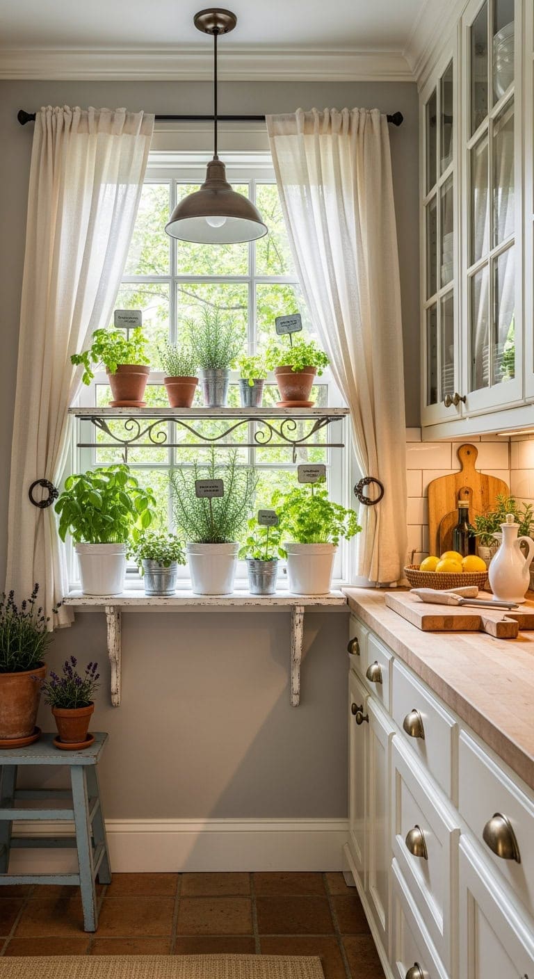
14. Charming French Herb Nooks: Revitalize Your Windowsills with Budget-Friendly Greenery
Transform your neglected windowsill into a vibrant herb sanctuary that brightens your kitchen and your meals. Imagine the cozy warmth of a countryside cottage, where fragrant basil and rosemary grow right at your fingertips—adding fresh flavor without the extra cost. It’s the perfect blend of rustic comfort and everyday convenience, bringing a touch of nature’s goodness indoors.
Key Design Elements
Set of white porcelain herb pots designed for sunny windowsills
Decorative black wrought iron brackets for mounting window boxes
Rustic metal plant tags with a weathered finish for labeling herbs
Brushed brass drawer pulls inspired by vintage French cabinetry
Soft cream-colored sheer curtains in light linen
Whitewashed distressed wooden floating shelves for displaying plants
Bronze pendant light fixture with a classic French countryside style
Durable terracotta-colored washable kitchen runner with a textured weave
Pro Tip: For a fresh, inviting kitchen vibe, paint your window frames in Benjamin Moore’s ‘Swiss Coffee’ to brighten the space and let your green herbs really stand out. Pair this with Sherwin Williams’ ‘Agreeable Gray’ on the walls—a gentle, warm neutral that instantly evokes the charm of a French countryside cottage. This combo brings both light and cozy elegance to your kitchen.
15. Budget-Friendly Compact Lights: Elevate Your Kitchen’s Glow with Simple, Stylish Neutrals
That bulky ceiling light may be dimming your cozy kitchen more than illuminating it, creating awkward shadows where you least want them. Choosing sleek, space-saving fixtures can transform your space—think of it as the subtle accessory that effortlessly elevates your whole look. With thoughtful lighting, even the smallest galley kitchen can feel open, airy, and inviting.
Key Design Elements
Brushed nickel low-profile flush mount ceiling fixture
Slim LED under-cabinet light strips with warm white glow
Clear glass mini pendant lights with vintage filament bulbs
Satin nickel slim bar pulls for cabinets and drawers
Peel-and-stick marble-effect countertop film for an elegant update
Soft, neutral-toned woven runner rug designed for kitchen durability
Magnetic stainless steel spice rack that clings to fridge or backsplash
Natural linen Roman shades offering subtle texture and soft light filtering
Pro Tip: For a kitchen that feels bright and spacious, try painting your ceiling in Benjamin Moore’s Chantilly Lace (OC-65) to reflect natural light and give your lighting fixtures a soft, glowing effect. Pair this with Sherwin-Williams’ Accessible Beige (SW 7036) on the walls for a warm, inviting backdrop that gently shifts with the daylight.
Transform the empty space above your kitchen island into a stylish storage solution that blends form and function. Hanging racks not only free up cabinet space but also add a sleek, urban vibe reminiscent of trendy city lofts—without the hefty price. This clever setup turns everyday cookware into eye-catching accents, giving your kitchen a thoughtfully designed, organized feel.
Key Design Elements
Sleek matte black overhead pot hanger designed for tight spaces
Rustic industrial pipe brackets perfect for open shelving
Set of vintage cast iron skillets with hanging hooks
Matte black drawer and cabinet handles with minimalist design
Warm Edison-style hanging pendant lights with an industrial vibe
Counter-height leather stools with metal frames for a rugged look
Durable black wire baskets for versatile kitchen storage
Pro Tip: For a striking kitchen look, paint the ceiling around your open shelving in Sherwin Williams’ Iron Ore (SW 7069) to highlight industrial hardware with rich, moody contrast. Pair this with Repose Gray (SW 7015) on the walls to bring a soft, balanced greige that complements cooler metal finishes beautifully. This combo creates depth while keeping the space inviting and modern.
Bring the cozy charm of a vintage French bakery into your kitchen by thoughtfully organizing your countertops to keep clutter out of sight while adding a touch of personality. Weathered white finishes and distressed details breathe new life into worn surfaces, creating inviting spots that feel like well-loved discoveries. Clever little caddies are perfect for snug spaces, ensuring your everyday essentials stay within easy reach without crowding your workspace.
Key Design Elements
Faded pastel wooden utensil holder with chipped paint finish
Peel-and-stick weathered stone countertop film
Creamy off-white porcelain spice jars with delicate floral decals
Aged brass drawer pulls with intricate vintage detailing
Mini whitewashed driftwood spice rack
Small crystal pendant light with a distressed metal frame
Handwoven cotton kitchen rug in muted floral patterns
Pro Tip: For a charming, aged look, start by painting your cabinets in Benjamin Moore’s Simply White (OC-117) and gently sand the edges to reveal a subtle, lived-in texture. Pair this with Sherwin Williams’ Repose Gray (SW 7015) on lower cabinets, sanding those edges lightly too, to achieve that timeless French country appeal with a soft, worn-in patina.
18. Charming Farmhouse Flair: Space-Savvy Corner Shelves That Refresh Your Kitchen Without Breaking the Bank
That neglected corner beside your coffee station is begging for a stylish upgrade. Modern farmhouse corner shelves bring charm and function together, creating a welcoming spot for your favorite kitchen essentials. They maximize vertical space beautifully, offering storage without making your kitchen feel boxed in.
Key Design Elements
Reclaimed wood corner floating shelves with natural grain finish
L-shaped matte black metal brackets for sturdy wall mounting
Rustic tiered wooden corner shelf with distressed paint
Peel-and-stick white beadboard backsplash panels for easy installation
Matte black wrought iron cup hooks for hanging kitchen essentials
Wire mesh wall organizer with farmhouse-inspired grid design
Antique bronze 4-inch cabinet pulls with vintage detailing
Natural woven jute kitchen runner with textured weave
Pro Tip: For a kitchen that highlights natural wood shelves beautifully, try painting the wall behind them in Benjamin Moore’s “Simply White” (OC-117) to create a crisp, clean backdrop that makes the wood grain stand out. Pair this with Sherwin-Williams’ “Agreeable Gray” (SW 7029) on the surrounding walls for a soft, warm neutral that ties together white trim and rustic textures seamlessly. This combination brings both warmth and contrast, giving your kitchen a cozy yet polished feel.
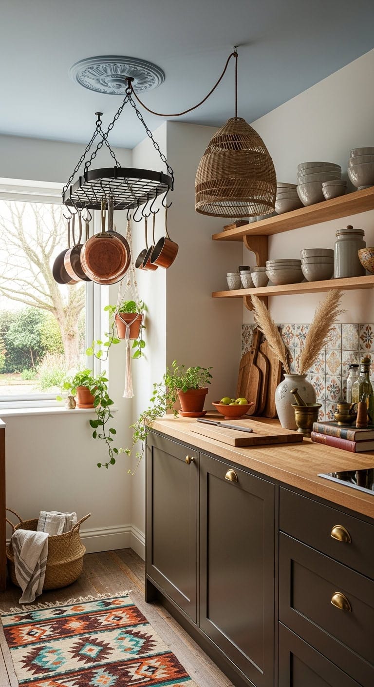
19. Charming Boho Vibes: Budget-Friendly Mini Hanging Pot Racks to Refresh Your Kitchen Ceiling
Give your ceiling a starring role with a petite hanging pot rack that adds instant bohemian flair—no major remodel required. It’s like accessorizing your kitchen with a chic pendant necklace, lifting the eye upward while creating extra room in your cabinets. Blending various metals and textures, this approach brings a curated, effortlessly collected vibe to your culinary space.
Key Design Elements
Petite wrought iron hanging rack with delicate scrollwork for pots
Set of vintage-style brass hooks designed for kitchenware display
Ornate antique bronze ceiling medallion to highlight hanging racks
Copper-bottomed cookware with a well-loved patina for rustic charm
Handcrafted macrame plant hanger perfect for fresh kitchen herbs
Woven rattan pendant light that casts warm, inviting glows
Brightly patterned kilim runner to add color and texture underfoot
Retro-inspired brass cabinet pulls to enhance cabinetry with character
Pro Tip: For a kitchen that feels thoughtfully styled, try painting the ceiling in Benjamin Moore’s soft yet striking Palladian Blue (HC-144) to add a surprising splash of color that highlights your hanging pot rack beautifully. Pair this with Sherwin-Williams’ Urbane Bronze (SW 7048) on your lower cabinets to anchor the space, creating a rich backdrop that enhances warm brass and copper accents.
Conclusion
Transforming a small kitchen doesn’t have to mean breaking the bank or undertaking a massive renovation. By choosing just one budget-friendly makeover idea—whether it’s refreshing your cabinet hardware, adding a splash of color with paint, or creatively reorganizing your space—you can breathe new life into your kitchen and make it feel more inviting and functional. Remember, even the smallest change can spark big inspiration, so pick an idea that excites you and start today. With a little time and creativity, your kitchen can become a cozy, beautiful spot that truly reflects your style without stretching your wallet.
When it comes to kitchen flooring, runners face the toughest challenges—constant foot traffic, inevitable spills, and the occasional dropped utensil. Finding a kitchen runner that combines durability, slip resistance, and easy maintenance is essential to keeping your cooking space both safe and beautiful. In this guide, we review some of the best washable kitchen runners available in 2026. These selections excel in quality, design, and functionality, helping you transform your kitchen walkway with confidence and style.
Washable Hallway Runner Rug with Non-Slip Backing
Best Overall Kitchen Runner
For a reliable all-around kitchen runner, the Restydon Washable Hallway Runner excels in performance and safety. Its microfiber fabric offers a soft, sleek surface with low pile height, while the robust TPR latex rubber backing ensures superb grip on a variety of flooring types. This 2′ x 8′ runner expertly handles heavy use—from carrying hot dishes to bustling foot traffic—without slipping or bunching. Plus, it can be regularly washed and dried to refresh its classic, vintage-inspired design.
Dark Washable Runners for Hallways with Non-Slip Backing
Most Stylish Choice
If you want to add a touch of bohemian flair to your kitchen, Hazo Haus offers a dark-toned polyester runner that balances aesthetics and practicality. Measuring 2’6” by 8 feet, it features a dense low pile that repels pet hair and reduces scratches on your floor. The rubber backing keeps it firmly in place, while reinforced edges prevent fraying. Its charming vintage boho pattern offers a unique visual appeal that complements many kitchen and hallway decors.
Cushioned Non-Slip Kitchen Floor Mat Set (2-Piece)
Most Cushioned Comfort
For those spending long hours cooking, the SUMLANS cushioned mat set offers exceptional support and protection. These two mats, sized 17.3” x 47” and 17.3” x 30”, feature a soft polyester surface and rubberized backing for slip resistance. Ideal for alleviating foot fatigue, they also absorb drops and spills effectively, making cleanup easier. Their stain-resistant braided low pile is perfect for busy kitchens, and machine washing keeps them fresh.
Feature
Specifications
Size
Set of 2 (17.3″ x 47″; 17.3″ x 30″)
Material
100% Polyester
Backing
Polyester rubberized backing
Pile Height
Low pile
Weight
4.29 pounds
Style
Modern, functional
Additional Info
Super absorbent, foot fatigue relief, stain resistant
The HY HAO YUN LAI vintage runner is a compact 2’ x 6’ option blending farmhouse charm with practical design. Its polyester fabric features a distressed look that ages beautifully without sacrificing durability. At just 0.14 inches pile height, it won’t obstruct door movement and provides comfortable standing support. The non-slip rubber backing ensures stability, and the rug’s machine-washable feature keeps it looking fresh after spills.
Kitchen Rugs Set – Non-Skid Washable Absorbent Floor Mats
Most Absorbent Runner Set
Ideal for areas around the sink or stove, eqivei’s two-piece rug set is designed to handle moisture and messes. Made from polyester and chenille, these mats soak up water, oil, and spills while the rubber backing prevents slips. Their cushioning effect reduces strain during food prep, and their modern aesthetic fits contemporary kitchens, entryways, and bathrooms alike. They’re machine washable, fade-resistant, and durable under heavy usage.
Washable Hallway Runner Rug for Kitchen & Entryway (Beige)
Best Vintage-Inspired Runner
This beige 2’ x 7’ polyester runner gives your kitchen or entryway a warm, farmhouse feel without sacrificing function. It features a PU leather backing that grips flooring securely without damaging surfaces. The 3.5mm low pile allows doors to swing open freely while providing a soft touch for standing. Washable by machine and air-dried, it’s a low-maintenance pick beloved by thousands of buyers for its blend of vintage style and reliable performance.
Buying Guide: How to Choose the Perfect Washable Kitchen Runner
Selecting the right kitchen runner involves balancing comfort, style, and practical considerations. Use these key factors to guide your choice:
1. Material & Weave
Look for durable synthetic fibers like polyester or microfiber blends that handle stains, resist fading, and dry quickly. Chenille blends offer extra softness and absorbency. Low-pile, tight weaves minimize dirt embedding and ease cleaning.
2. Backings for Safety
Slip resistance is critical in busy kitchens. Opt for runners with a full underside of TPR, rubber, or polyurethane backing to prevent slipping and sliding on tile, hardwood, or laminate floors.
3. Washability & Maintenance
Choose machine-washable runners with reinforced edges designed to hold their shape after repeated laundering. This ensures your runner stays fresh despite spills, stains, and heavy traffic.
4. Size & Fit
Most kitchens benefit from runners that are 2 to 2.6 feet wide and between 6 and 8 feet long, fitting standard walkway dimensions without obstructing doors or appliances.
5. Pile Height
Low pile runners (0.1–0.3 inches) allow easy clearance for doors and carts, reduce dirt accumulation, and offer better stability underfoot.
6. Style & Color
Select colors and patterns that complement your kitchen’s decor: vintage distressed looks for farmhouse styles, dark hues for modern elegance, or boho patterns to add visual interest.
Conclusion
Kitchen runners must combine durability, comfort, safety, and style to stand up to the demands of cooking spaces. The carefully chosen washable runners above represent the best of 2026—easy to clean, built to last, and designed to enhance your kitchen’s charm. Whether you need cushioned comfort, vintage allure, or modern moisture-absorbing mats, these options will protect your floors and brighten your home day after day.
When it comes to kitchen flooring, a well-chosen runner rug can combine beauty, comfort, and practical durability. Wool kitchen runners stand out as excellent options—they’re naturally resilient, easy to clean, and add a cozy touch to your cooking space. Wool’s natural fibers resist stains and hold up well against heavy foot traffic, meaning your runner can look fresh for years to come. Whether you’re after modern geometrics, traditional elegance, or farmhouse charm, a wool runner can elevate your kitchen while protecting your floors.
To guide you through the best choices this year, we’ve curated ten top wool kitchen runners that blend style with function. Below, you’ll find detailed looks at each product, plus a helpful buying guide to make your selection easier.
If sophistication and versatility are your priorities, the SAFAVIEH Micro-Loop Handmade Wool Runner is a top contender. This 2’3″ x 8′ rug features 100% premium wool with a subtle geometric micro-loop pattern that complements various kitchen aesthetics—from modern minimalism to boho chic. Its low 0.25-inch pile height is just right for high-traffic areas, offering firmness underfoot without sacrificing softness. Handmade craftsmanship ensures a durable, luxury feel backed by SAFAVIEH’s century-long reputation for quality.
SAFAVIEH Antiquity Traditional Wool Runner Rug (AT57C)
Most Traditional
Embodying the timeless beauty of 19th-century Persian artistry, the SAFAVIEH Antiquity Runner is perfect for those who love classic style. Crafted from 100% hand-spun wool pile with a luxurious 1-inch medium pile height, this 2’3″ x 10′ rug offers plush comfort and durability. Its olive-hued palette and intricate design add refined warmth to any kitchen. Though spot cleaning is suggested, this runner’s dense construction holds up well to daily wear, staying firmly in place thanks to its heft.
For fans of textured, natural fibers, the FRELISH DECOR Wool Jute Runner is an excellent choice. This handmade 2.5′ x 8′ rug combines 60% jute, 30% wool, and 10% cotton to offer a durable, flat-woven surface with a medium pile height. Its earthy striped design complements rustic, farmhouse, and coastal kitchens with ease. Expect some normal initial shedding as the natural fibers settle. Maintenance is simple—spot clean stains and vacuum gently without the beater brush to preserve its integrity.
Add a splash of artistic elegance in a compact footprint with the SAFAVIEH Blossom (BLM108B). Measuring 2’3″ x 6′, this hand-tufted wool runner brings classic English chintz and block print motifs into contemporary kitchens. Its 0.3-inch low pile facilitates easy clearance under doors while offering gentle cushioning. The large hand-woven loops provide tactile texture, and the latex backing helps keep the rug in place during busy kitchen moments.
Delivering refined floral style, the SAFAVIEH Blossom BLM402B combines hand-tufted craftsmanship with premium pure wool fibers. This 2’3″ x 6′ runner adds a subtle cushion with its 0.25-inch low pile, perfect for kitchens seeking durable sophistication. With a cotton canvas backing for added stability, the rug resists flattening and maintains design vibrance. Keep it away from direct sunlight to safeguard colors.
The LOKHOM Washable Runner is an everyday favorite for those needing low-maintenance durability without compromising softness. Crafted from soft polyester imitation cashmere, it offers a low-pile surface ideal for kitchens, laundry rooms, or entryways. The non-slip rubber backing enhances safety and stability, while machine-washable fabric ensures easy cleanup—just toss it in the washer after spills. Its beige-brown vintage floral design adds a gentle warmth to your space.
Buying Guide: Choosing the Ideal Wool Kitchen Runner
Selecting the perfect wool kitchen runner involves more than just picking a pretty design. Here are key factors to consider for both style and practical kitchen needs:
1. Material Quality
Look for 100% natural wool or high-quality wool blends. Pure wool provides softness, resilience, and natural stain resistance. Wool blends like jute-wool or cotton-wool can add texture and character but may require a bit more care.
2. Pile Height
Low (0.25″–0.5″) to medium (1″) pile heights work best in kitchens. Lower piles are easier to clean and handle foot traffic without matting, while medium piles add plushness but may trap crumbs.
3. Runner Size
Kitchen runners generally range from 2’ x 6’ to 2’ x 10’. Consider your space: narrow areas near sinks and counters suit shorter runners; longer runners cover entryways and extended floor zones.
4. Ease of Cleaning
Kitchens are prone to spills. Opt for runners that can be spot cleaned easily. Some synthetic blends are machine washable, making maintenance even simpler. Avoid overly delicate weaves for busy households.
5. Backing and Slip Resistance
Safety is crucial—check for latex or rubber-backed runners that stay put. Rugs without slip-resistant backing require an anti-slip pad underneath to prevent accidents.
6. Design and Color
Choose patterns and colors that complement your kitchen’s style. Darker tones or traditional patterns can camouflage stains, while lighter palettes brighten the space but may show wear more quickly.
Conclusion
A wool kitchen runner is an investment that pays off in comfort, style, and durability. From the refined geometric elegance of the SAFAVIEH Micro-Loop to the timeless charm of the Antiquity Persian design or the natural beauty of wool-jute blends, there’s a runner suited to every kitchen style and lifestyle. By focusing on material quality, pile height, size, and care requirements, you’ll find the perfect wool runner that welcomes you into your kitchen with both warmth and practicality for years to come.
Ready to upgrade your kitchen floor? Explore the options above and pick one that fits your home’s personality and everyday needs perfectly!
When you spend a lot of time cooking, cleaning, or prepping in your kitchen, comfort underfoot and floor protection become essential. Waterproof kitchen mats not only safeguard your floors from spills, stains, and moisture but also provide cushioning that eases fatigue during long periods of standing. In a bustling kitchen environment, these mats must be durable, slip-resistant, and simple to maintain.
This guide highlights ten top waterproof kitchen mats for 2026, focusing on quality, materials, size, and comfort to help you find the perfect fit for your cooking space.
For those looking for reliable performance and comfort, the StepRite Cushioned Anti-Fatigue Kitchen Mats offer an excellent combination of durability and ergonomic design. This two-piece set includes one small and one large mat, both featuring 0.4-inch thickness cushioning to reduce pressure on feet and joints during extended kitchen activities. Their waterproof, stain-resistant surface wipes clean effortlessly and grips firmly on hard floors, making them a popular best-seller in kitchen rugs.
KitchenClouds Anti-Fatigue Kitchen Mat (17.3″ x 28″, Black)
If counter space is limited or you prefer a compact mat, the KitchenClouds Anti-Fatigue Kitchen Mat is a great choice. Its 0.5-inch thick high-quality PVC foam offers superior cushioning that alleviates strain on feet, knees, and back. Thanks to a diamond-patterned non-slip backing and beveled edges, the mat stays stable and reduces tripping hazards. Measuring 28 by 17.3 inches, this lightweight mat is easy to move or reposition and simply wipes clean after spills.
For households looking to cover larger kitchen areas or multiple zones, this three-pack of waterproof mats from KitchenClouds delivers great value. Crafted with durable, premium PVC, these mats resist scratches, fading, and stains from food or liquids. They cushion your steps during lengthy chores and have non-slip backings that perform well on tile, hardwood, and laminate floors. The mats are easy to maintain—simply wipe with a damp cloth—and are recommended for use on dry and even surfaces for optimal safety.
SoftDuo’s 2-Pack Mats are designed with a focus on elevated comfort and posture support. Measuring a generous 17.3 by 47 inches, each mat offers almost half an inch of resilient cushioning made from premium PVC combined with thick foam. Their textured surface improves grip, while the waterproof, oil- and stain-resistant construction keeps maintenance minimal. The grey tone offers a modern aesthetic, and the mats can be used separately or together to fit various kitchen layouts.
Ideal for those who want a combination of comfortable support and waterproof protection, this KitchenClouds 2-pack provides two mats in differing sizes (17.3″ x 29″ and 17.3″ x 47″). Both mats feature anti-fatigue cushioning that reduces strain on feet and joints and sport water-resistant surfaces that clean up quickly using a damp cloth or vacuum. Their non-slip basements keep the mats firmly anchored on multiple flooring types such as wood, tile, or marble.
Buying Guide: How to Choose the Best Waterproof Kitchen Mat
Selecting the perfect kitchen mat involves more than just picking a pretty design. Keep these key factors in mind when shopping:
1. Material & Waterproofing
Look for mats made from PVC or specialized foam that do not absorb liquids. Fully waterproof surfaces repel spills and make cleaning as simple as wiping with a damp cloth, preventing stains and odors.
2. Comfort & Thickness
Choose a mat with adequate cushioning (typically between 0.4” to 0.5” thick) to reduce fatigue and ease pressure on knees and ankles. Memory foam or thick PVC foam are excellent options for long cooking sessions.
3. Size & Coverage
Measure your kitchen space carefully to find mats that fit well without creating tripping hazards. Consider multi-pack sets if you want to cover larger areas or specific zones, such as near the sink or stove.
4. Non-Slip Backing & Safety
Ensure the mat features a textured, non-slip bottom to keep it securely in place on tile, wood, or laminate floors. Beveled edges further reduce the risk of trips and falls.
5. Ease of Cleaning
Mats should be easy to clean daily with standard household items—avoid mats requiring machine washing as this can damage the cushioning material.
6. Durability & Warranty
Check reviews and warranties. Durable mats resist fading, tears, and compression long-term—even in high-traffic kitchens.
Conclusion
A well-chosen waterproof kitchen mat can transform your cooking experience by increasing comfort and protecting your floors. Whether you prefer a compact single mat for small spaces or a multi-piece set for comprehensive coverage, the options listed here offer excellent performance for 2026. Prioritize mats with reliable waterproof materials, sufficient cushioning, and secure grip to enjoy years of ease and support in your kitchen workspace.
Explore the selections above to find your ideal kitchen companion—because great cooking starts from the ground up.
Kitchens are often the heart of the home, bustling with activity and prone to spills, stains, and frequent foot traffic. Choosing the right kitchen runner can protect your floors while adding a splash of style—but when messes happen, the last thing you want is a rug that’s a headache to clean. Thankfully, washable kitchen runners combine convenience, durability, and aesthetics, making them ideal for busy homes. In this guide, we review 10 of the best washable kitchen runners available this year, so you can find the perfect runner that’s easy to clean, slip-resistant, and built to last.
HY HAO YUN LAI 2×6 Washable Vintage Runner Rug with Non-Slip Backing
Best Overall
The HY HAO YUN LAI vintage runner rug blends timeless farmhouse flair with practical features perfect for kitchen or hallway use. Crafted from polyester, it’s machine washable, resistant to stains, and built to endure repeated cold water washes without fading or losing shape. Its thin 0.14-inch rubber backing ensures it stays securely in place on hardwood or tile floors, while its low profile fits under doors with ease.
Specification
Details
Size
72″ L x 24″ W (2′ x 6′)
Pile Height
0.14 inches (low pile)
Material
Polyester
Backing
Rubber non-slip
Customer Rating
4.6 out of 5 stars (3,674 reviews)
Construction
Machine made, flat woven
Offers a lightweight yet durable option that combines easy cleaning with slip resistance and a cozy vintage aesthetic.
If you’re looking to outfit multiple spots in your kitchen or laundry area, the HEBE Boho 3-piece rug set is a smart pick. Each rug in the set comes in different sizes—20×32″, 20×48″, and 20×59″—providing flexible coverage options. Built from polyester (often cited as polypropylene), these rugs feature a low 0.15-inch pile and TPR + cotton backing that keeps them firmly planted and protects floors from scratches. Their machine-washable nature makes maintaining color vibrancy and fresh appeal hassle-free.
Specification
Details
Size
3-piece set (20″×32″, 20″×48″, 20″×59″)
Pile Height
0.15 inches (low pile)
Material
Polyester (also noted as polypropylene)
Backing
TPR rubber + cotton non-skid
Customer Rating
4.3 out of 5 stars (3,287 reviews)
Construction
Machine made
These rugs balance style and function with a lightweight design suitable for indoors or patios, making them versatile and attractive with boho flair.
Designed to withstand heavy use, this imitation linen kitchen runner delivers durability and comfort for busy kitchens or entryways. Its thick, encrypted woven surface resists wear from pets and heavy foot traffic, while a non-slip rubber backing firmly anchors it on various floor types. Measuring a compact 17″×30″ (also available in larger sizes), it’s a reliable sink mat or hallway runner option. Easy to clean by machine or vacuum, it combines anti-fatigue properties with a stylish natural look.
Specification
Details
Size
17″×30″ (also 17″×47″, 17″×59″)
Pile Height
Thick imitation linen (unspecified thickness)
Material
Imitation linen
Backing
Non-slip rubber
Customer Rating
Not provided
Construction
Thickened encrypted woven
A long-lasting, comfortable solution for those who want a kitchen runner that can endure everyday wear without sacrificing support.
The HEBE Hallway Runner Rug is a crowd favorite among budget-conscious shoppers looking for a premium-feeling rug. With over 4,400 positive reviews and an Amazon ranking at #8 among hallway runners, it features a medium pile height of 0.39 inches for enhanced cushioning during long kitchen chores. Made from machine-washable polyester, it resists fading and shrinking. The TPR + cotton backing prevents slips and protects your hardwood or tile floors.
Specification
Details
Size
72″ L x 24″ W (2’ x 6’)
Pile Height
0.39 inches (medium pile)
Material
Polyester
Backing
TPR + cotton non-skid
Customer Rating
4.6 out of 5 stars (4,423 reviews)
Construction
Machine made
Weighing only 3.65 pounds, this rug is easy to wash and quick to dry, making it an excellent choice for busy families.
SUMLANS Kitchen Mat Set of 2 Non-Slip Cushioned Mats
Best Cushioning
For those valuing comfort alongside practicality, the SUMLANS kitchen mat set offers two cushioned and durable mats that help reduce foot fatigue during long periods on your feet. This set includes a 17.3″×47″ runner and a 17.3″×30″ mat, both made from 100% polyester with rubberized backing ensuring a secure grip. Their super absorbent, stain-resistant fabric simplifies cleanup and protects floors from spills.
Specification
Details
Size
2-piece set: 17.3″×47″ & 17.3″×30″
Pile Height
0.2 inches (low pile)
Material
100% Polyester
Backing
Polyester rubberized backing
Customer Rating
Not provided
Construction
Machine made, braided
Thanks to braided weave construction, these mats retain their shape and are compatible with routine vacuuming or machine washing.
Ideal for larger kitchens or long entryways, this 2’x8’ runner from Lahome combines functionality with an elegant terracotta oriental pattern. Crafted from faux wool with a low-pile design, it prevents tripping hazards and resists dirt buildup. The machine-washable feature makes cleanups swift, while a TPE rubber backing offers superior slip resistance, even on polished floors.
Specification
Details
Size
2’ x 8’
Pile Height
Low pile, ultra-thin
Material
Faux wool
Backing
TPE rubber non-slip
Customer Rating
4.6 out of 5 stars (1,600+ reviews)
Construction
Machine made
Its large size and secure backing make it perfect for homes needing extended floor coverage without compromising ease of washing.
This 2-piece kitchen rug set provides a thick, chenille-textured surface designed to soak up spills and withstand heavy daily use. The rugs measure 17.3″×47″ and 17.3″×29″ respectively, both low-pile at around 0.3 inches thick. Polyester and chenille combine for a soft, plush feel underfoot, while a polyester backing ensures they stay grounded on various surfaces.
Specification
Details
Size
2-piece set: 17.3″×47″, 17.3″×29″
Pile Height
0.3 inches (low pile)
Material
Polyester, chenille
Backing
Polyester non-skid
Customer Rating
Not provided
Construction
Machine made
Perfect for absorbing kitchen spills while adding a cozy touch to your cooking space.
Rugcomf’s washable runner impresses with its buttery soft texture and reliable grip. The beige runner measures 2’x6’ with a 0.25-inch low pile that allows for easy doorway clearance while providing cushioning. Polyester fibers make it resistant to stains and wear, and the rubber backing keeps it firmly in place. The simple yet stylish design complements a variety of decor.
Specification
Details
Size
72″ L x 24″ W (2’ x 6’)
Pile Height
0.25 inches (low pile)
Material
Polyester
Backing
Rubber non-slip
Customer Rating
4.4 out of 5 stars (4,710 reviews)
Construction
Machine made
A strong blend of style, safety, and easy maintenance earns this runner our Editor’s Choice pick.
For wider hallways or kitchen spaces, this dark-colored washable runner (26″×96″) offers ample coverage and a sturdy low pile of 0.25 inches. Made from durable polyester, it resists stains and retains color after many washes. Its non-slip backing ensures safety on smooth surfaces, and the dark tone means fewer visible stains between washes.
Specification
Details
Size
26″ x 96″ (2’6” x 8’)
Pile Height
0.25 inches (low pile)
Material
Polyester
Backing
Rubber non-slip
Customer Rating
Not provided
Construction
Machine made
Perfect for those needing a wider runner that combines practicality with subtle elegance.
The Boho Kitchen Runner delivers a stylish chenille-style woven polyester rug featuring a low 0.1-inch pile that thickens to 0.25 inches at the edges. This slim profile fits easily under doors, while the non-slip backing keeps it firmly in place on tile or wood floors. Machine wash compatibility and quick-dry features make it a cost-effective solution for apartments or budget-minded shoppers.
Specification
Details
Size
71″ x 24″ (2’ x 6’)
Pile Height
0.1 inches (main), 0.25 inches edges
Material
Chenille-style woven polyester
Backing
Non-slip rubber
Customer Rating
Not provided
Construction
Machine made
A stylish, practical runner for affordable kitchen floor protection.
Buying Guide: How to Choose the Best Washable Kitchen Runner
When selecting a kitchen runner, there are several critical factors to consider to ensure you get maximum durability, comfort, and style alongside ease of cleaning.
1. Material
Look for runners made from durable, stain-resistant polyester or polypropylene blends. Faux wool and chenille options provide textured softness, but polyester is typically easier to clean and maintain. Avoid natural fibers like cotton or wool if you want simple machine washing.
2. Pile Height
For kitchen runners, low pile (under 0.5 inches) is ideal because it’s less prone to trapping crumbs, easier to vacuum, and won’t impede door clearance.
Keeping your kitchen floor looking fresh can be a challenge. From spills and splatters to dust and dirt, rugs in the kitchen face constant wear and tear. The good news? Washable kitchen rugs bring together practicality and style, making cleanup a breeze without sacrificing comfort or aesthetics. We’ve sifted through the top-rated options on the market, focusing on durability, ease of washing, anti-slip features, and design versatility. Whether you want cushioned mats for long cooking sessions or sleek runners that blend with your décor, this guide highlights ten of the best washable kitchen rugs to simplify your home routine.
HEBE Boho Kitchen Rug Sets (3-Piece)
Best Overall Kitchen Rug Set
The HEBE Boho Kitchen Rug Set delivers a thoughtfully sized trio designed to provide coverage exactly where you need it: sink, stove, and entryway. These polyester rugs are crafted with a low 0.15-inch pile to prevent interference with cabinets while offering a soft touch underfoot. The combination of thermoplastic rubber (TPR) and cotton on the backing ensures a firm grip on tile or hardwood floors, helping these rugs stay in place even during busy cooking times. With outstanding machine-washable durability and a chic bohemian design, they’re a functional and stylish kitchen upgrade.
2×6 Washable Hallway Runner Rug with Non-Slip Backing
Top Rated Narrow Runner Rug
Ideal for busy kitchens or hallways, the HY HAO YUN LAI 2×6 runner combines simplicity with practical features. This lightweight polyester rug has a low, 0.14-inch pile making it easy to clean and safe for walking. The sturdy rubber non-slip backing prevents movement on smooth surfaces, ensuring safety in high-traffic areas. Its neutral beige tones make it a versatile addition to different kitchen styles, and it’s compatible with robot vacuums, contributing to easy maintenance.
If you spend long hours standing in the kitchen, COSY HOMEER’s polypropylene mats offer a comfortable and supportive solution. Their 0.4-inch pile thickness provides excellent cushioning that resists compression, making them perfect for reducing fatigue as you cook or clean. These mats also boast a stain- and fade-resistant surface that withstands spills. The polypropylene backing keeps the rugs secure, and the entire set is machine washable for easy upkeep. Their widespread popularity is confirmed by nearly 19,000 positive reviews attesting to their comfort and durability.
For a runner that covers more ground, this 2×10-foot washable rug is a practical choice. It features a fade-resistant polyester weave with a thin 3.5-mm pile that easily fits under doors without causing dragging. The PU leather backing not only provides a solid grip on floors but also keeps the runner flat without curling edges. Its odor-free construction means it’s ready to use immediately after unboxing, and the neutral beige design pairs well with many décor themes.
This compact entryway rug is ideal for placing in tight kitchen corners or doorways. The low-profile 0.14-inch polyester surface resists stains while providing a cushioned, soft feel. Equipped with a TPR rubber backing, it prevents slipping on smooth surfaces. It’s also compatible with robot vacuums and recovers quickly from shipping folds simply by laying flat in your home.
Designed with absorbent polyester chenille, this two-piece black runner set excels at soaking up water, oil, and other kitchen messes. The low 0.3-inch pile offers comfortable support without creating tripping hazards. The rubber backing provides a waterproof barrier that protects floors and holds the rugs in place on slippery surfaces such as tile and marble. These rugs are machine washable and can also be rinsed outdoors with a hose for quick cleaning.
The Lahome Moroccan Trellis rug brings elegance and function to any kitchen corner or doorway. With a thin 4-mm profile and 100% polyester faux wool surface, this rug combines stain resistance with softness. Its TPE non-slip backing ensures it stays put, while its low height lets robot vacuums glide over without interruption. Durable enough for pet households, this rug is a chic way to add comfort while keeping cleaning effortless.
This two-piece set offers plush comfort with high-density 100% polyester mats combined with a rubberized backing for non-slip performance. Ideal for the kitchen zone where you stand the most, these mats cushion feet and joints efficiently, minimizing fatigue. Fully machine washable, they maintain shape and softness after repeated use. Their balanced thickness provides support without hindering cabinet doors or appliance access.
Offering a durable imitation linen look, these brown polyester runners come in multiple lengths to fit different kitchen layouts. Their non-slip rubber backing prevents slipping and sliding across tile or hardwood surfaces. Made with a focus on long-term use, they resist wear and keep their appearance after many washes. This makes them a fantastic investment for those seeking longevity without sacrificing style.
This three-piece grey set offers excellent coverage with generous sizes ideal for sinks, stoves, and entry points. Featuring premium polyester fabric and TPR rubber backing, these rugs combine softness with reliable floor grip to prevent slips. Their low-pile design enhances quick drying and keeps them from bunching or tripping. For those wanting an affordable complete kitchen rug solution, this set balances performance and price effortlessly.
What to Look For When Choosing a Washable Kitchen Rug
When shopping for a washable kitchen rug, consider these key factors to find one that suits your lifestyle and kitchen environment:
1. Material Quality and Durability
Look for rugs made from durable fibers such as polyester, polypropylene, or chenille that can withstand frequent washing without fading, shrinking, or shedding.
2. Backing and Slip Resistance
Anti-slip backing like TPR, rubber, or PU leather is crucial in kitchen areas to prevent accidents. Choose rugs with firm backing to keep them securely in place on tile or hardwood floors.
3. Pile Height and Thickness
Low to moderate pile heights (0.1–0.4 inches) are best for kitchens, as they dry quickly, reduce tripping hazards, and don’t interfere with cabinet doors or appliances.
4. Ease of Cleaning
Machine-washability is non-negotiable for kitchen rugs. Be sure the rug can withstand cold water washing and avoid high heat drying to maintain shape and color.
5. Comfort and Cushioning
If you spend a lot of time standing, look for rugs with anti-fatigue properties or thicker cushioned piles to reduce leg and back strain.
6. Size and Coverage
Measure your kitchen zones to select the right rug size—whether a small mat for an entryway or a larger runner for a busy prep area. Multi-piece sets offer coordinated coverage.
Final Thoughts
Investing in a washable kitchen rug can transform your cooking space from messy to manageable. With options ranging from stylish rugs to cushioned anti-fatigue mats, today’s washable kitchen rugs combine function and flair. Focus on durable materials, non-slip backing, and easy cleaning to find a rug that works
Vinyl floor mats are an underrated kitchen essential that can elevate both the comfort and cleanliness of your cooking space. By combining cushioned support with durable, waterproof surfaces, the best vinyl mats protect your floors, ease fatigue during long cooking sessions, and add a touch of style. In this guide, we review the top vinyl kitchen mats for 2026, highlighting their features, sizes, and benefits so you can find the perfect fit for your home.
If you spend hours standing at the stove or prep counters, the StepRite Cushioned Anti-Fatigue Mats offer excellent relief with a practical two-piece set. These mats, measuring 17.3″ x 30″ and 17.3″ x 47″ each, provide 0.4 inches of anti-fatigue cushioning that reduces pressure on feet, knees, and lower back. Made from premium, phthalate- and latex-free materials, they ensure safety and durability while featuring a non-slip backing that grips securely on tile, wood, and ceramic floors. Their waterproof surface is easy to clean, making them a reliable addition to any busy kitchen.
Offering similar specs to the top overall pick but focused on affordability, this khaki set from StepRite includes two mats sized 17.3″ x 30″ and 17.3″ x 47″, each with 0.4-inch thick cushioning. These mats feature a waterproof, stain-resistant surface that wipes clean quickly, plus a non-slip bottom to keep you safe while working. The neutral khaki color blends easily with many kitchen decors, and the mats are designed to last through years of kitchen activity.
KitchenClouds Anti-Fatigue Kitchen Mat 17.3″x28″ (Waterproof)
Most Compact
This compact mat is ideal for smaller kitchens or confined work areas. The KitchenClouds mat uses 0.5-inch thick soft PVC foam that cushions your feet and reduces fatigue during standing tasks. Its diamond pattern on the underside prevents slipping, and beveled edges minimize tripping hazards. Waterproof and easy to maintain, you can quickly wipe it clean or vacuum debris with minimal effort.
KitchenClouds Anti-Fatigue Kitchen Mat 17.3″x28″ (Grey)
Editor’s Choice
For those who want a stylish yet functional mat, this grey KitchenClouds model perfectly balances comfort and aesthetics. It boasts the same 0.5-inch thick cushioned PVC foam core for relieving foot and joint strain. The silicone-free material is eco-friendly, and the waterproof surface repels dust and spills. The non-slip diamond-patterned bottom ensures secure footing, while its neutral grey shade integrates smoothly with most kitchen palettes.
KMAT Kitchen Mat 2-Pack Anti-Fatigue Cushioned Rug
Most Popular
KMAT’s memory foam mats are designed to provide superior comfort for prolonged standing, with a two-piece set that covers various kitchen zones. Each mat offers 0.4 inches of thick cushioning combined with a waterproof, PVC-free surface. The non-slip underside keeps everything steady on your floor, whether tile or wood. These mats endure heavy use while remaining easy to clean with just a damp cloth or handheld vacuum.
For kitchens or dining areas needing expansive floor protection, this 4’x6’ vinyl mat stands up with a durable, high-quality PVC construction. It guards floors against stains, spills, and scratches caused by daily kitchen use or heavy appliances. The waterproof surface is resistant to oil and easy to clean, making it a practical choice when you want to cover larger areas without losing style or function.
SALLOUS Vinyl Floor Mat 6′x9′ Waterproof Grayish Blue
Premium Design
The SALLOUS vinyl mat offers a large surface for kitchen or dining areas, measuring 6′ x 9′ with a sleek grey-blue color tone. Its 4.0 mm (0.16 inch) thickness provides ample cushioning, while its waterproof vinyl material tackles spills with ease. Built for durability, this mat stands firm against wear and fading, ideal for high-traffic kitchens that demand both elegance and performance.
Bring a bohemian flair to your kitchen with these 2 cushioned anti-fatigue mats from Collive. Each mat measures 17″ x 30″ and 17″ x 47″ with 0.47 inches of padding made from soft foam to reduce fatigue. Their vibrant, stylish designs brighten your cooking space while providing practical comfort and a non-slip bottom for secure footing.
For an affordable yet reliable kitchen floor mat, this 4’x6’ waterproof PVC mat features a vintage print design that adds character while protecting your floors. At 3.0 mm thickness, it offers basic cushioning and a non-slip surface, perfect for those on a budget who want simple spill protection and comfort.
LuxStep Waterproof Anti-Fatigue Kitchen Mat 17.3″x28″
Top Rated
The LuxStep anti-fatigue mat focuses on comfort with a 0.5-inch thick cushioning made of high-quality PVC foam. Sized at 17.3″ x 28″, it works well in front of sinks, stoves, or standing desks, absorbing pressure and reducing foot fatigue. Waterproof and easy to clean, its simple design is ideal for any modern kitchen setup.
Buying Guide: Choosing the Best Vinyl Kitchen Mat for You
When shopping for a vinyl kitchen mat, consider these key factors to ensure you pick the perfect match for your space and lifestyle:
1. Cushioning Thickness & Comfort
The thickness of the mat’s foam or padding greatly influences comfort. Mats between 0.4 to 0.5 inches generally provide adequate relief for prolonged standing without feeling too soft or unstable.
2. Size & Coverage
Select mats that fit your kitchen layout. Small, compact mats work well for confined spaces, while larger mats or multi-piece sets offer coverage across cooking and prep zones.
3. Material Safety & Durability
Look for mats made with phthalate-free, latex-free, and PVC-free options if possible. High-quality PVC and memory foam materials are durable and safe for family environments.
4. Waterproof & Easy Cleaning
Kitchen mats encounter spills and messes daily. Waterproof surfaces that easily wipe clean with a damp cloth or vacuum simplify maintenance and protect your floors from moisture damage.
5. Non-Slip Backing
Safety is paramount. The mat’s backing should offer reliable traction on hard surfaces like tile, wood, and ceramic without slipping or sliding.
6. Style & Color
Your mat should complement your kitchen style. Whether you want neutral tones, vintage patterns, or boho designs, options abound to match your décor.
Conclusion
Investing in a high-quality vinyl floor mat transforms your kitchen experience by reducing fatigue and protecting your floors against damage and spills. Whether your priority is maximum comfort, large area coverage, or stylish appeal, our top picks for 2026 offer a range of sizes, materials, and designs to meet every home cook’s needs. Consider your kitchen layout and standing habits to select the ideal mat that will keep you comfortable and your kitchen beautiful for years to come.