Turning your small apartment bedroom into a cozy, stylish retreat might feel like a daunting task, especially when you’re working with a tight budget. But the good news is, creating a space that feels both inviting and personal doesn’t have to cost a fortune or require a complete overhaul. With a little creativity and thoughtful planning, you can transform even the smallest bedroom into a sanctuary where you look forward to unwinding at the end of each day. You don’t need to sacrifice comfort or style—you just need the right approach to make every inch count.
As you start this journey, remember that the magic is in the details. From choosing soft textiles that invite you to relax to arranging furniture that maximizes your space, every choice contributes to an atmosphere that’s uniquely yours. You’ll find that small changes—like adding warm lighting or incorporating meaningful decor—can significantly elevate the ambiance without breaking the bank. Embrace the process as an opportunity to reflect your personality and taste while making your bedroom a true haven, no matter the square footage or budget limitations.
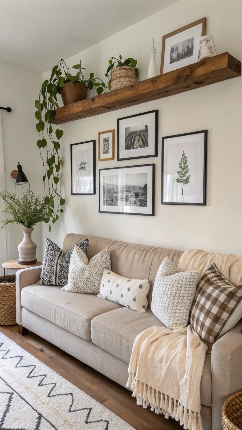
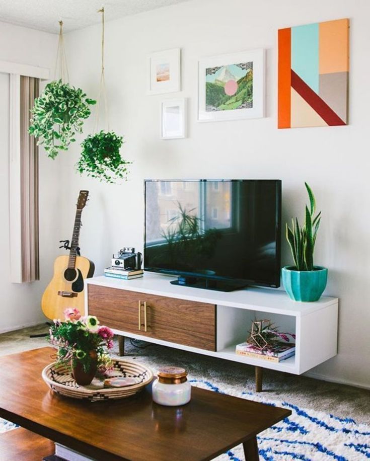
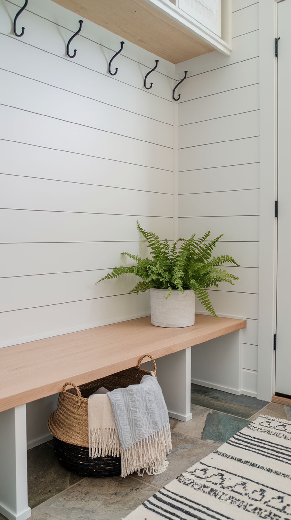
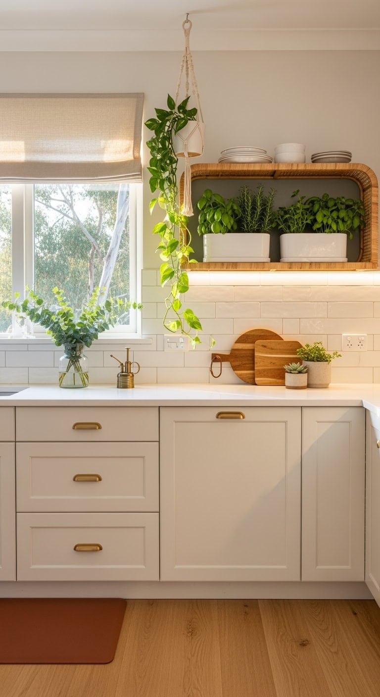
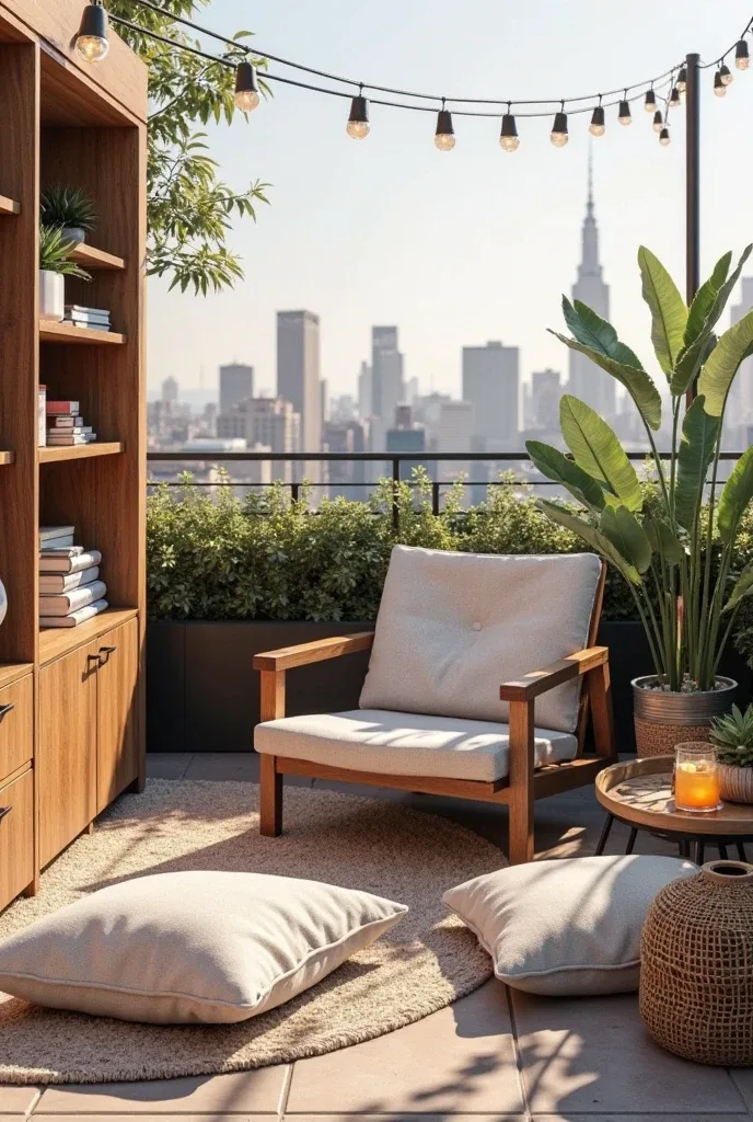
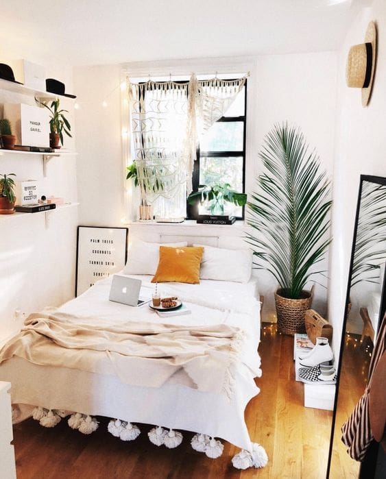
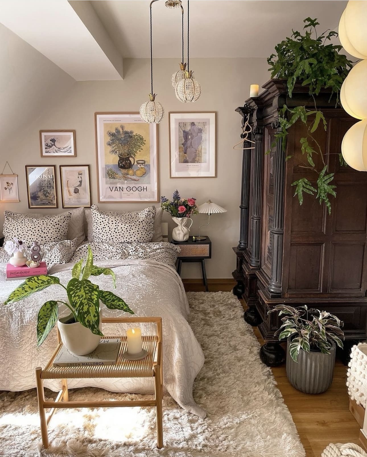
1. Embrace Nature with Indoor Plants
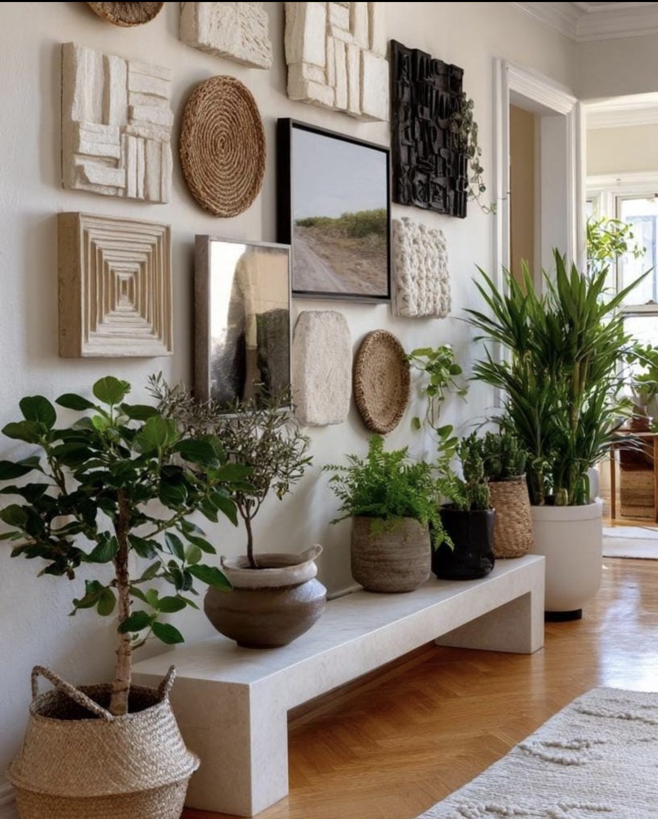
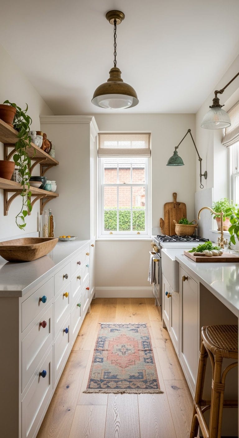
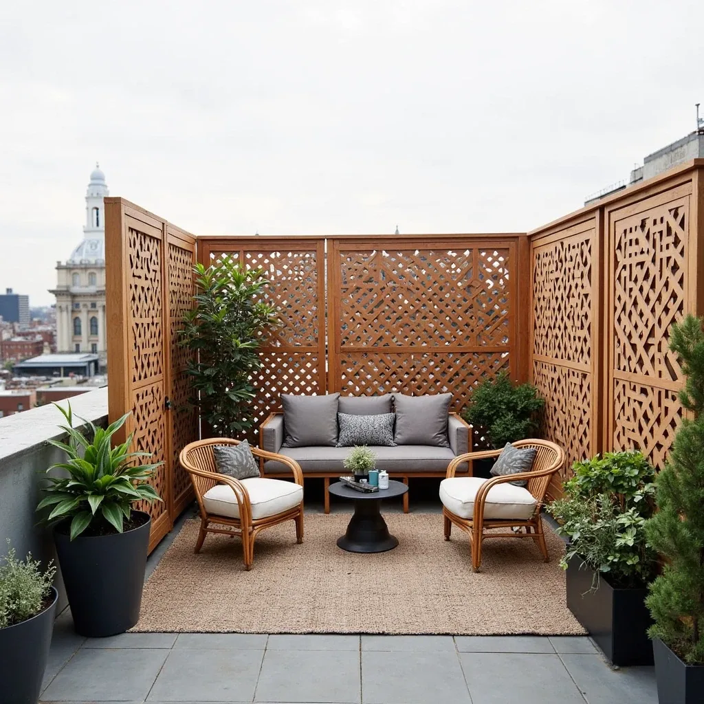
Incorporating plants into your bedroom decor not only enhances the aesthetic but also improves air quality, creating a serene and revitalizing environment. The presence of greenery fosters a sense of calm and connects you with nature, making your personal space feel more inviting.
Key Design Elements
- Choose low-maintenance plants like snake plants or pothos for easy care.
- Place plants near windows to ensure they receive adequate natural light.
- Use decorative pots that complement your bedroom’s color scheme for added style.
Pro Tip: Rotate your plants regularly to ensure even growth and maintain their vibrant appearance.
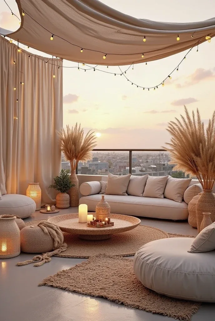
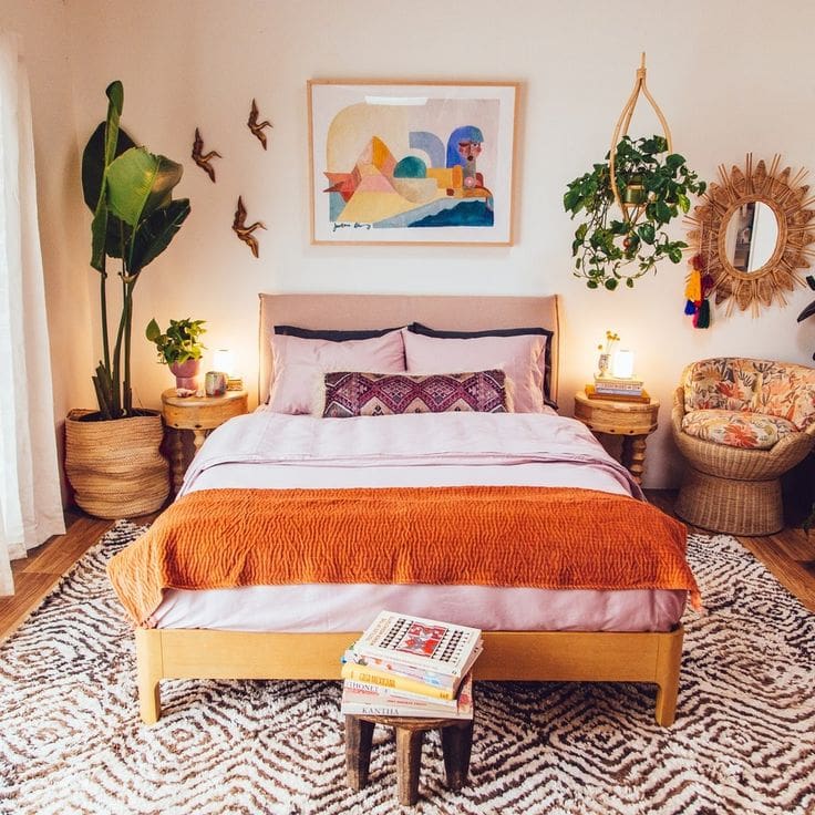
2. Embracing the Boho Vibe: Cozy, Colorful, and Carefree
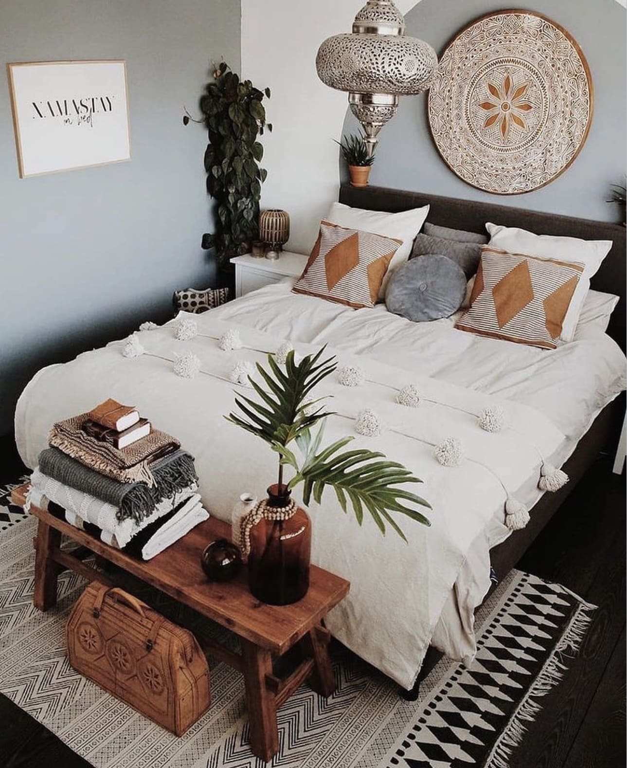
Infuse your bedroom with a laid-back charm by blending rich textures, vibrant patterns, and a mix of natural elements. Think layered rugs, plush cushions, and an abundance of greenery to create a sanctuary that feels both inviting and uniquely personal. This aesthetic is perfect for those who love a relaxed, eclectic atmosphere that sparks creativity and comfort.
Key Design Elements
- Incorporate a variety of fabrics like macramé wall hangings, woven throws, and patterned pillows to add depth and warmth.
- Place potted plants or hanging gardens throughout the space to bring a touch of nature indoors.
- Mix vintage finds with handmade crafts and travel-inspired pieces to build a collection that tells your story.
Pro Tip: Choose warm, earthy colors as a base and layer in pops of jewel tones to keep the room vibrant yet harmonious.
3. Creating a Snug and Productive Workspace
Transform a corner of your bedroom into a charming little nook dedicated to work or creative projects without compromising the room’s relaxing vibe. By choosing a compact desk and cozy seating, you can enjoy productivity in comfort. This setup balances functionality with warmth, making your space both inviting and efficient.
Key Design Elements
- Select a compact desk that fits neatly into a corner to maximize room space.
- Incorporate soft lighting, like a small lamp or string lights, to create a warm atmosphere.
- Add plush cushions or a cozy throw to your chair to combine comfort with style.
Pro Tip: Keep essential supplies organized in stylish containers to maintain a clutter-free and inviting workspace.
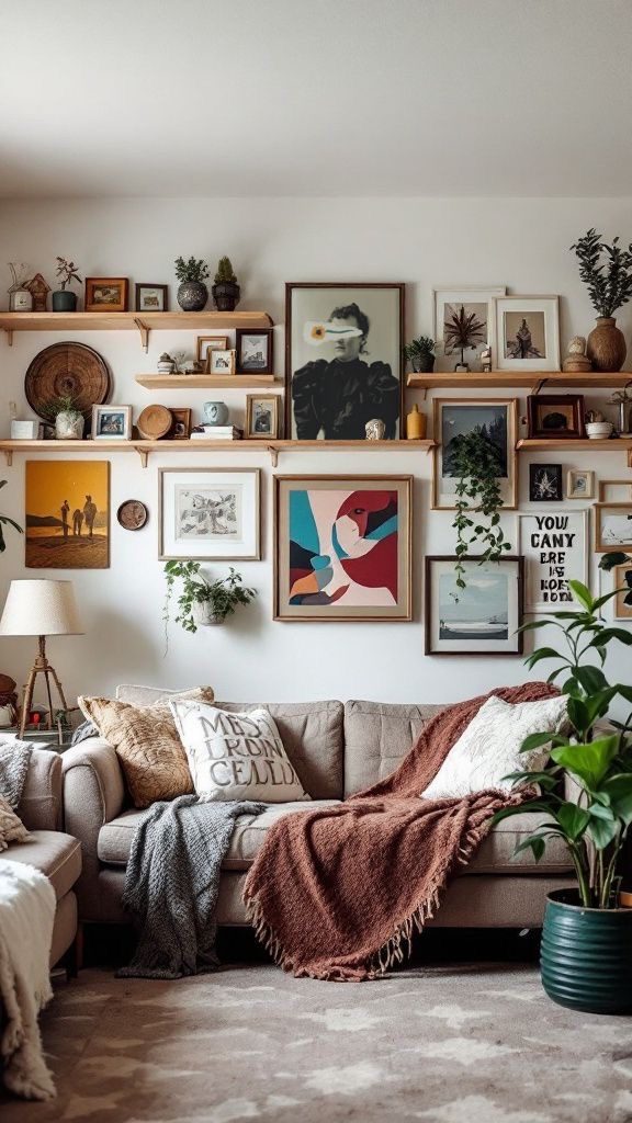
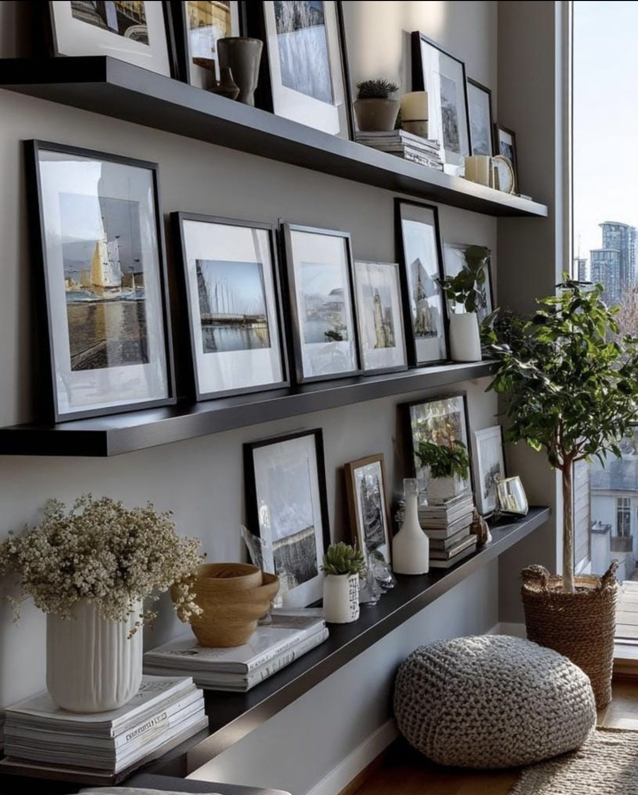
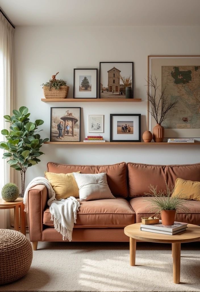
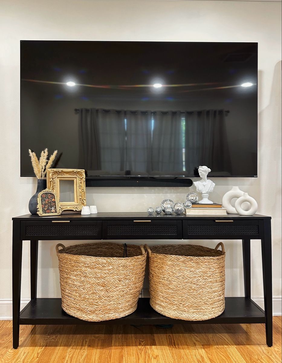
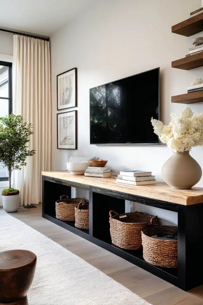
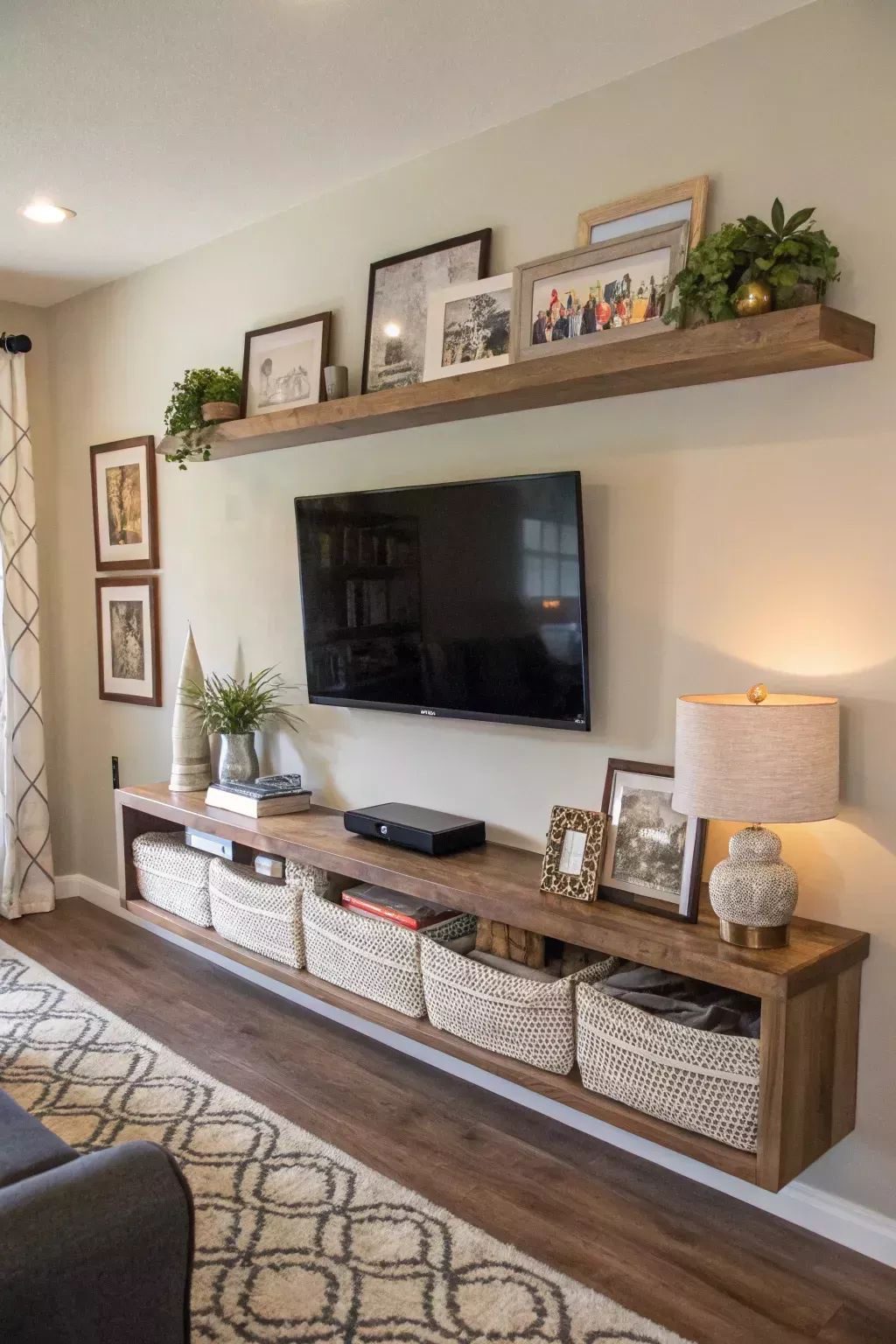
4. Showcase Your Style with Floating Shelves
Floating shelves are an elegant solution for adding storage and personality to your bedroom. They allow you to artfully present books, keepsakes, and decorative accents while keeping the space feeling open and airy. This approach maximizes wall space without overwhelming the room’s layout.
Key Design Elements
- Mix and match shelf sizes to create visual interest and accommodate different items.
- Incorporate plants or small lighting elements to add warmth and texture.
- Arrange items by color or theme to create a cohesive and curated look.
Pro Tip: Opt for sturdy brackets and secure wall anchors to safely display heavier objects on your floating shelves.
5. Embrace the Comfort of Rich Fabrics
Incorporating a variety of tactile fabrics into your bedroom instantly elevates the ambiance, creating a welcoming and inviting space. Think beyond just color—mixing materials like plush velvets, soft wools, and intricate weaves brings visual interest and a sense of warmth. These layers not only enhance comfort but also add a touch of sophistication to your decor.
Key Design Elements
- Layer a mix of cushions in different materials, such as silk, velvet, and linen, for a dynamic look.
- Drape a thick, knitted throw over your bed or chair to introduce a cozy, tactile element.
- Choose curtains or rugs with subtle textures or patterns to complement your bedding and furniture.
Pro Tip: Select fabrics in varying weights and weaves to create depth without overwhelming the room’s palette.
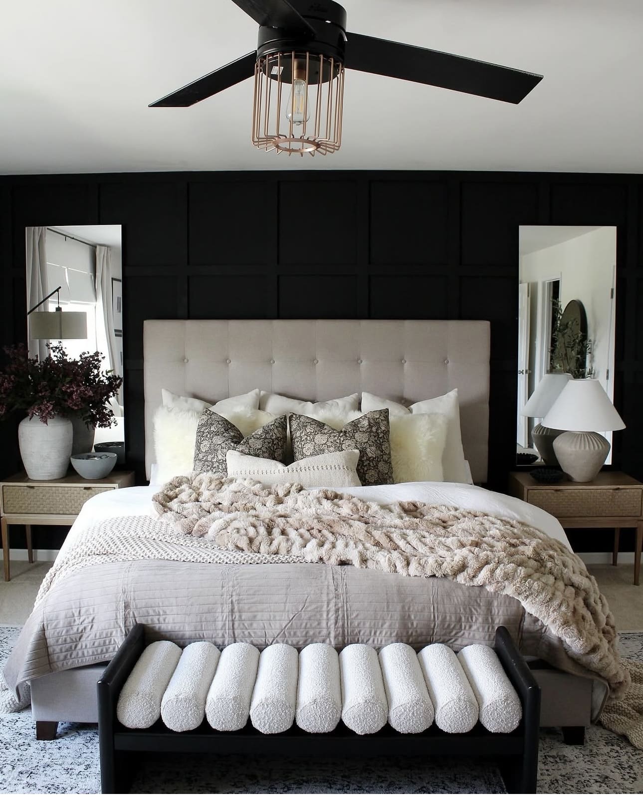
6. Elevate Your Space with a Striking Black Feature Wall
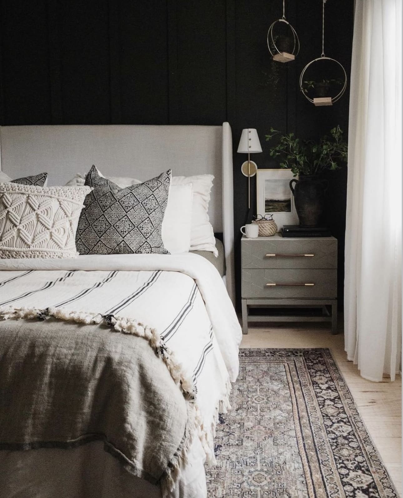
Introducing a black feature wall in your bedroom adds a touch of elegance and depth, transforming the room into a sophisticated retreat. This dark backdrop accentuates lighter furnishings and decor elements, creating a visually captivating contrast that feels both modern and timeless.
Key Design Elements
- Pair the black wall with metallic accents like gold or brass for a luxe vibe.
- Incorporate soft lighting fixtures to balance the darkness and add warmth.
- Choose minimalist artwork or mirrors to enhance the wall without overwhelming it.
Pro Tip: Use matte black paint to reduce glare and create a smooth, refined finish that complements a variety of textures.
7. Elevate Your Bedroom with Bold Abstract Expressions
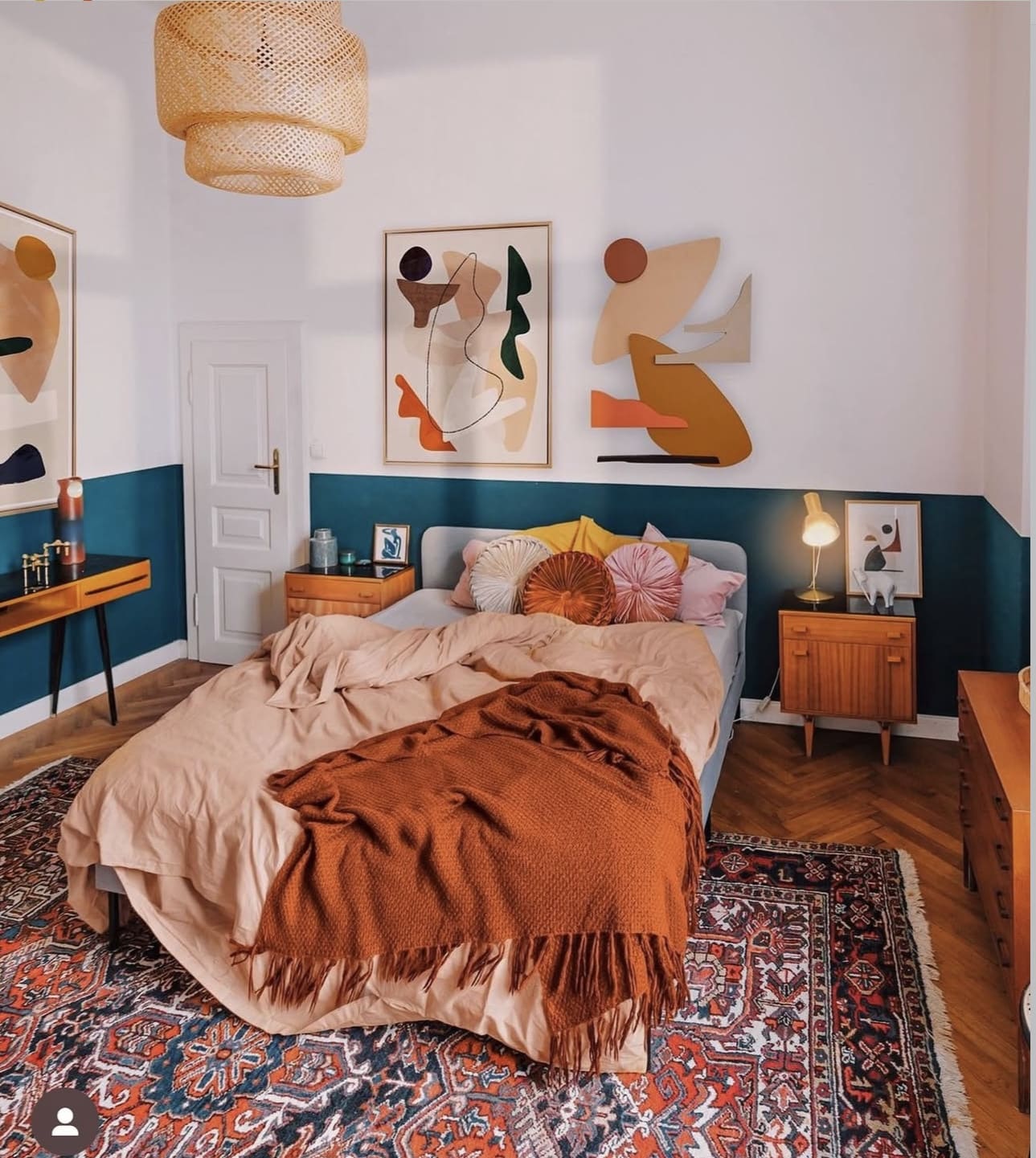
Incorporating abstract artwork into your bedroom design can transform the space into a vibrant, inspiring retreat. These pieces offer a unique way to showcase your individuality while sparking creativity and adding visual intrigue. Let your walls tell a story that complements your personal style.
Key Design Elements
- Choose colors in your abstract art that echo or contrast with your bedding and decor to create harmony or striking impact.
- Position a large abstract canvas above the headboard to serve as a captivating centerpiece.
- Mix different textures and mediums, such as painted canvases and sculptural art pieces, to add depth and interest.
Pro Tip: Opt for oversized abstract prints to instantly energize and modernize your bedroom’s atmosphere.
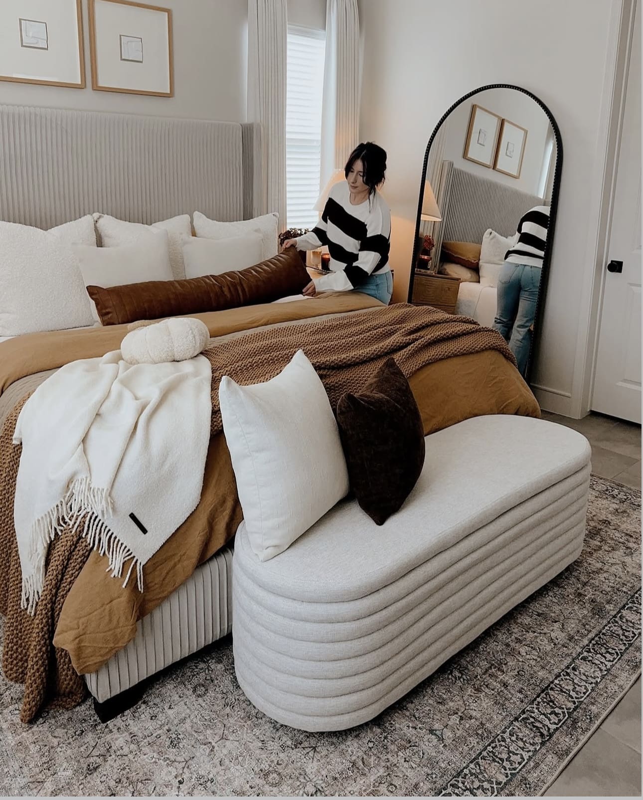
8. Elevate Your Bedroom with a Stylish Ottoman Bench
Placing an ottoman bench at the end of your bed not only enhances the room’s aesthetic but also serves as a versatile spot for sitting or storing essentials. This piece effortlessly combines comfort with practicality, helping to keep your bedroom tidy and inviting.
Key Design Elements
- Choose an ottoman with built-in storage to hide away blankets, pillows, or books.
- Match the bench’s fabric or color with your bedding to create a cohesive look.
- Use the bench as a convenient place to put on shoes or lay out clothes for the next day.
Pro Tip: Opt for an ottoman with a lift-top lid to maximize hidden storage without sacrificing style.
9. Elegant Drapes for a Cozy Ambiance
Light, flowing drapes effortlessly bring a sense of refinement while gently framing your windows. They help diffuse natural light, making the room feel warm and inviting without overpowering the space. This subtle softness transforms any bedroom into a serene retreat.
Key Design Elements
- Choose lightweight fabrics like linen or chiffon for a breezy, delicate effect.
- Opt for neutral or pastel shades to maintain a calming atmosphere.
- Layer curtains with blinds or shades for added privacy and texture.
Pro Tip: Install curtain rods slightly above the window frame to create the illusion of taller ceilings and more spacious windows.
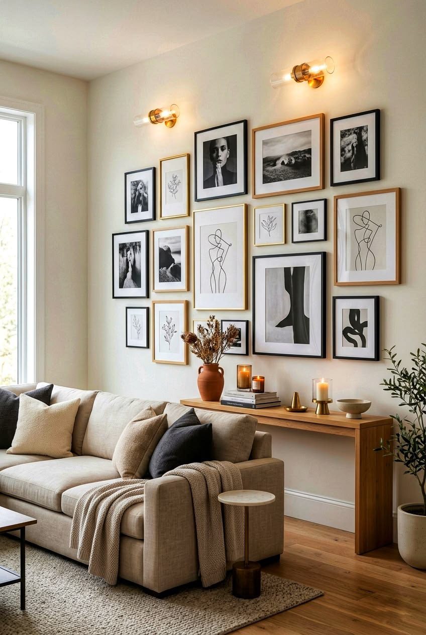
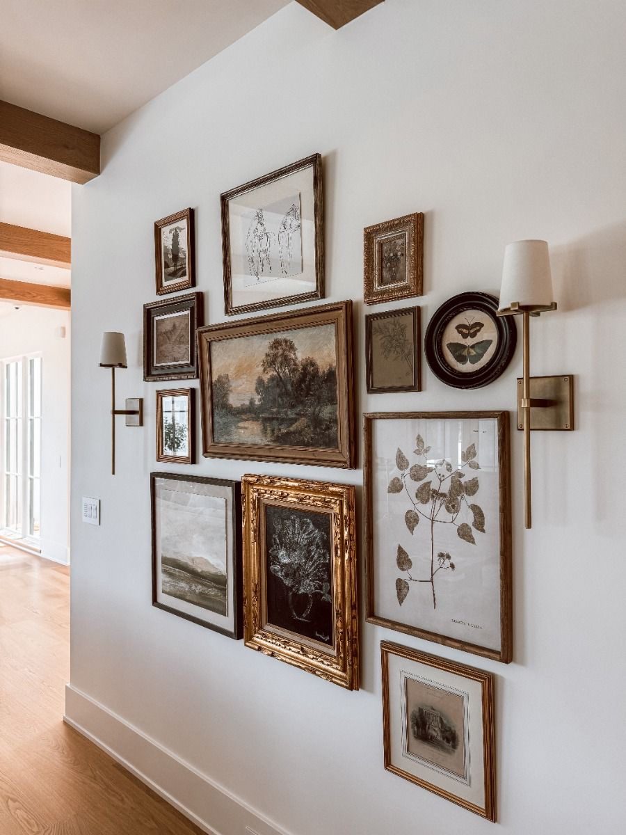
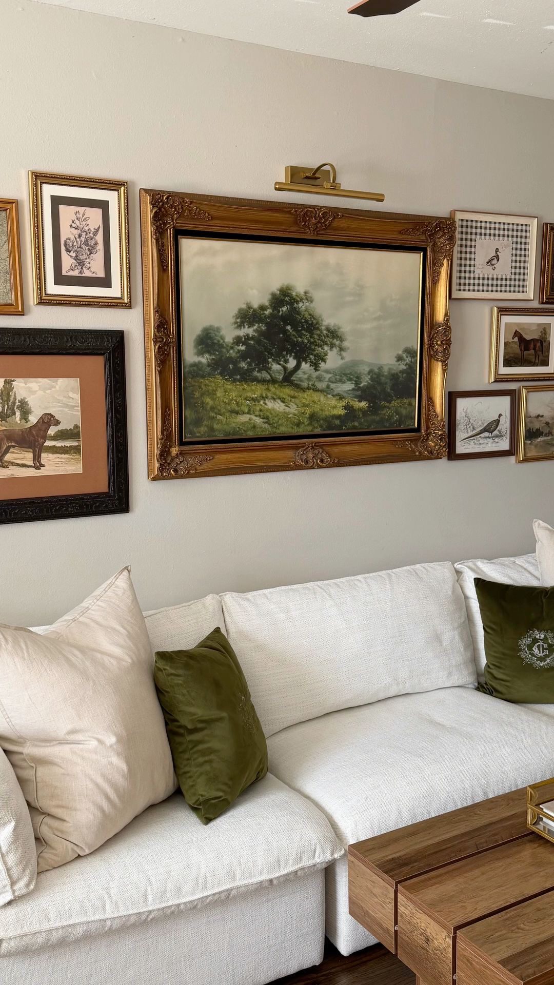
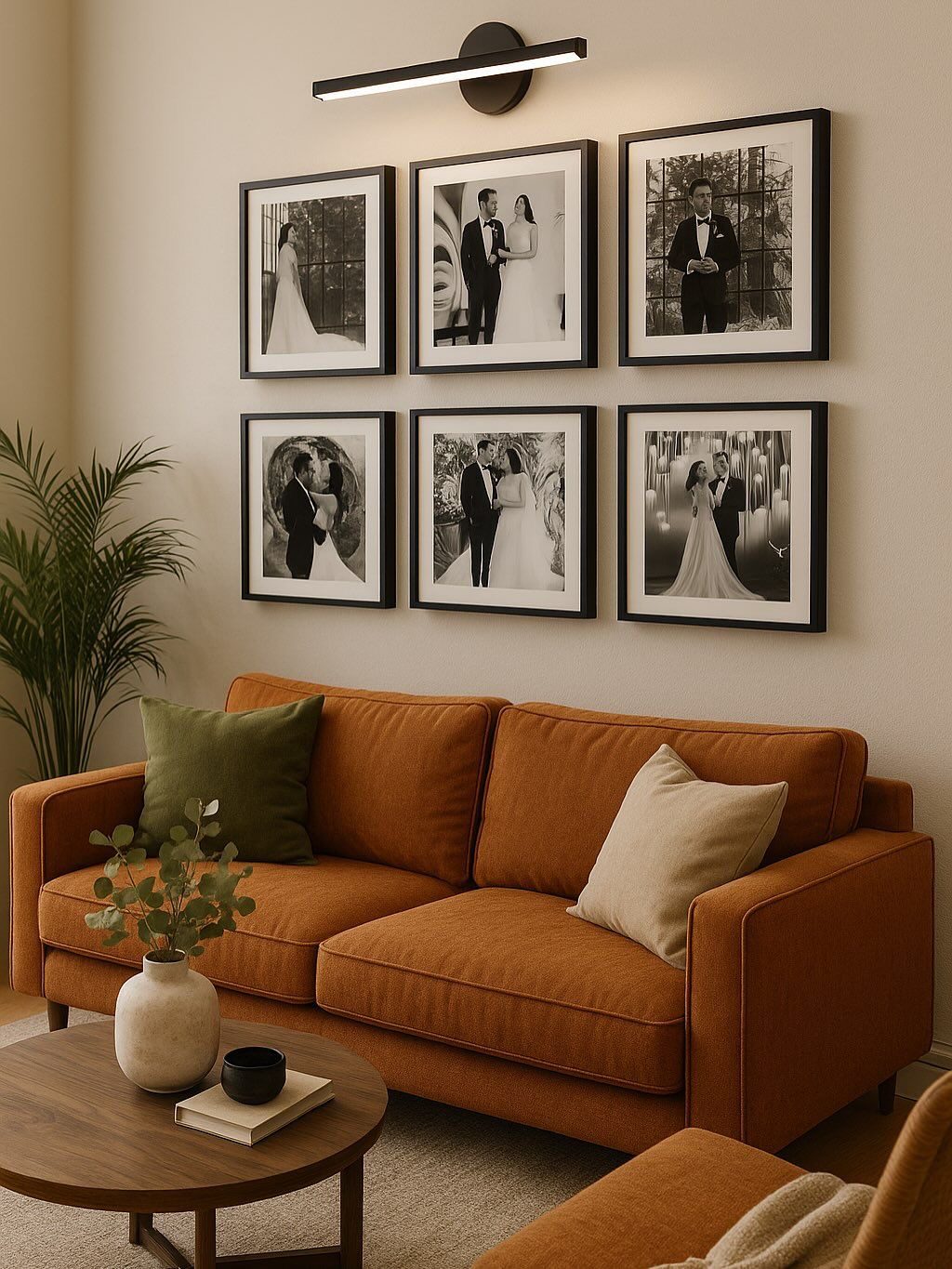
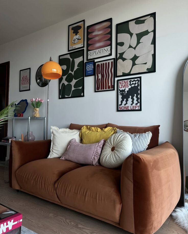
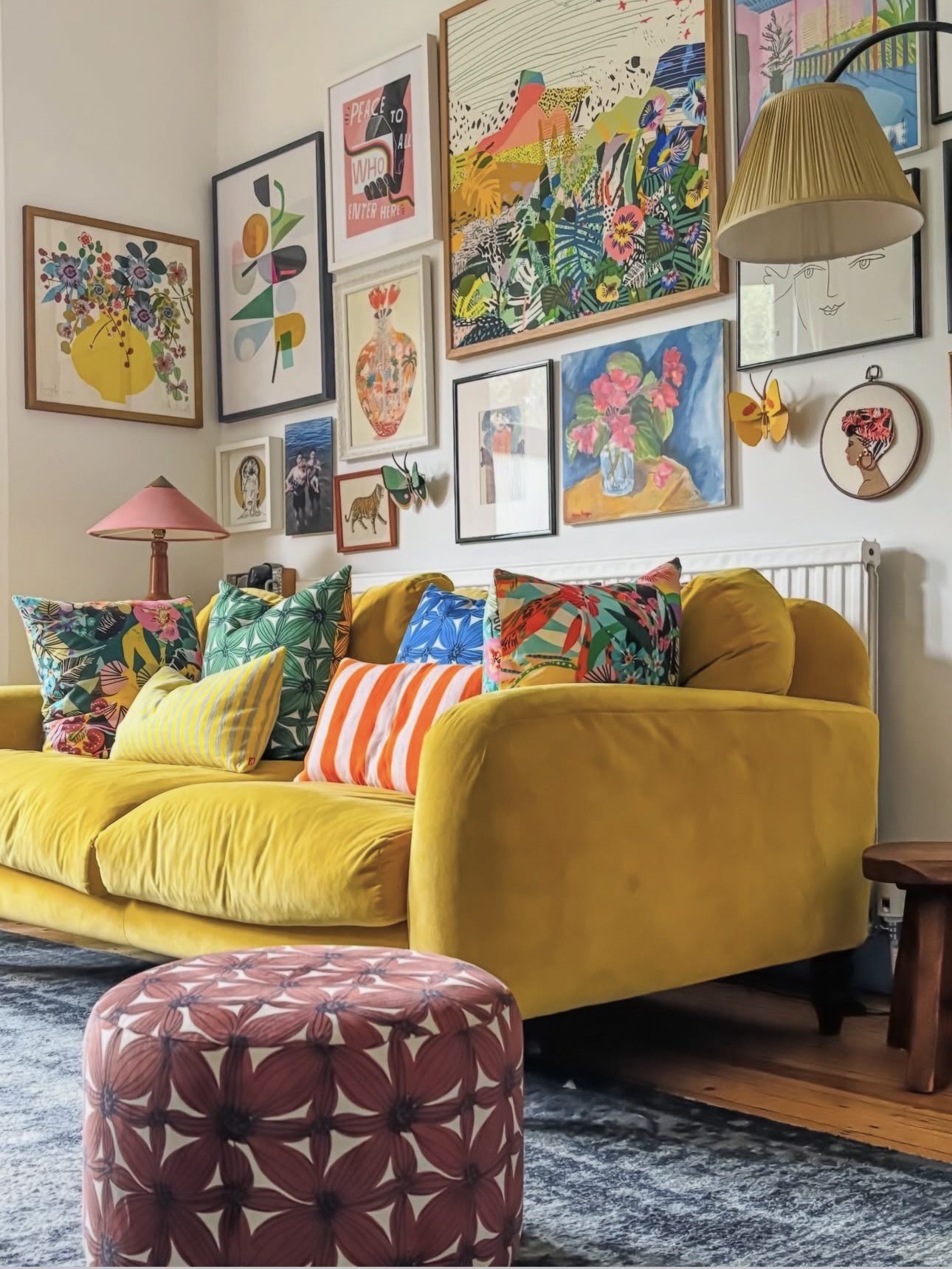
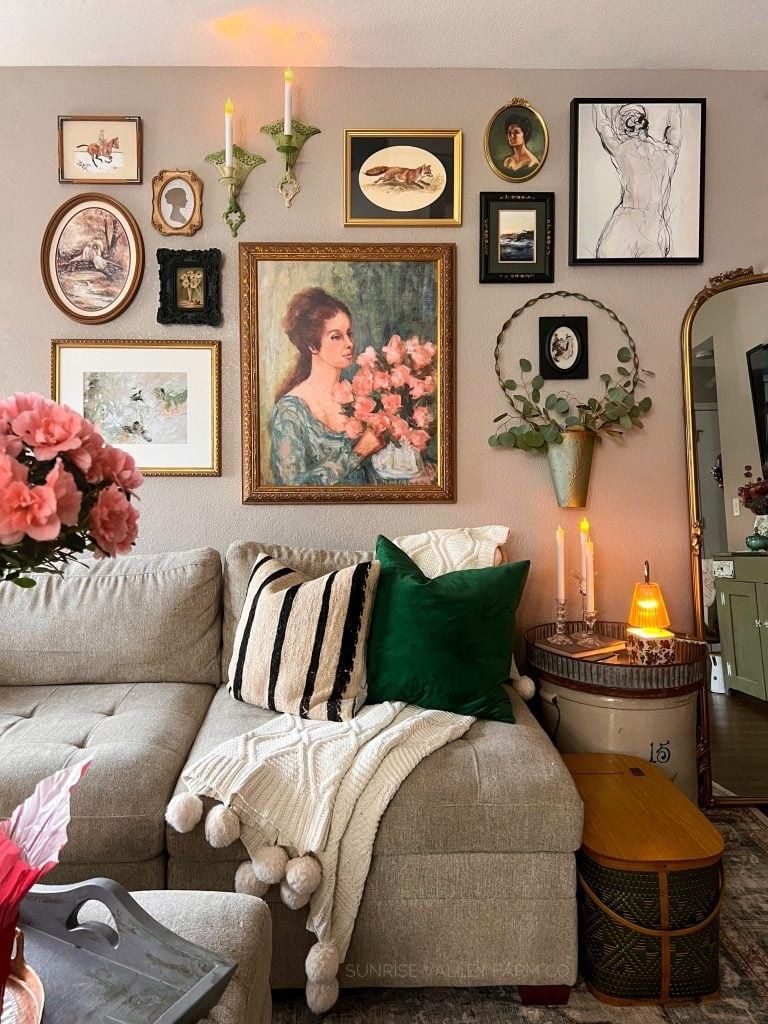
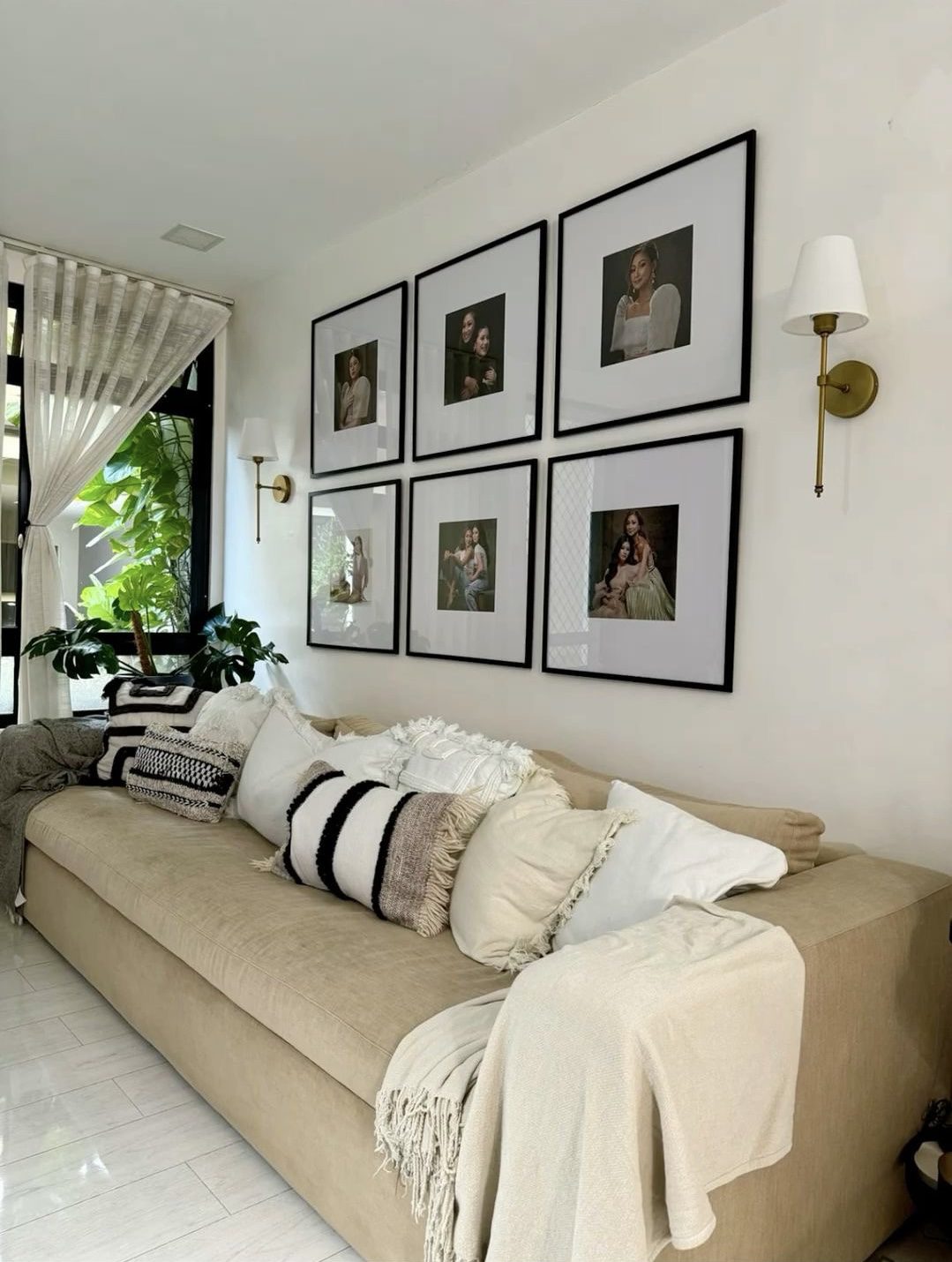
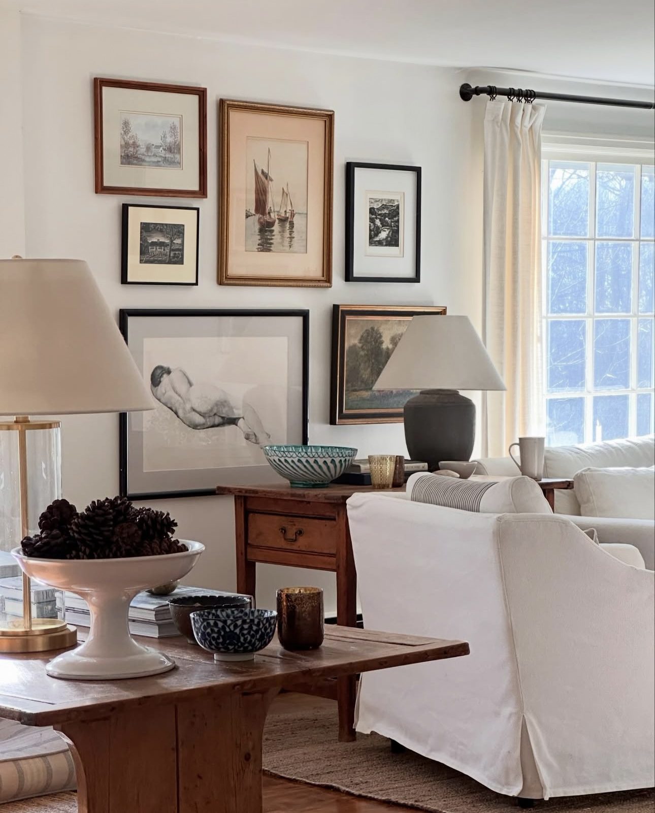
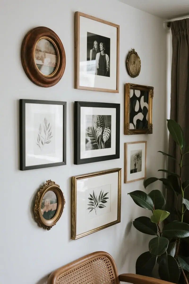
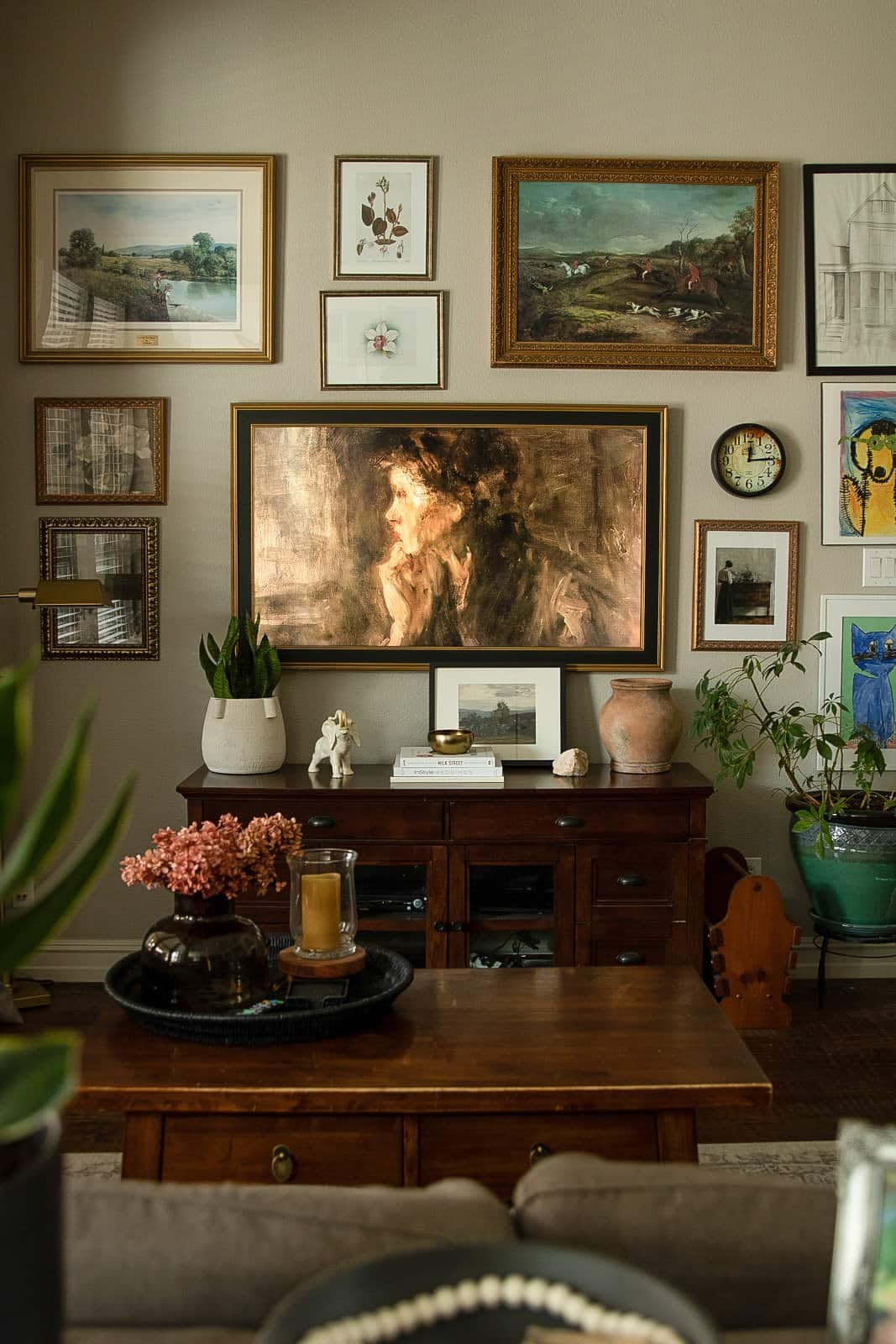
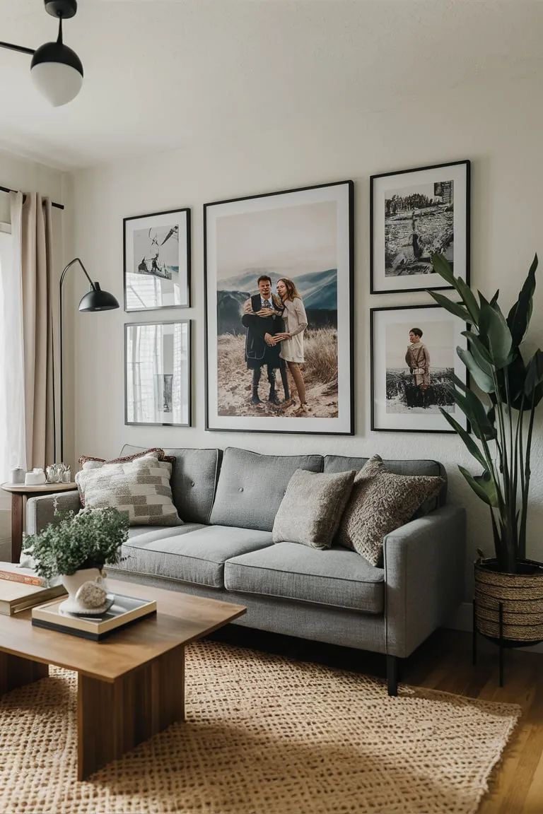
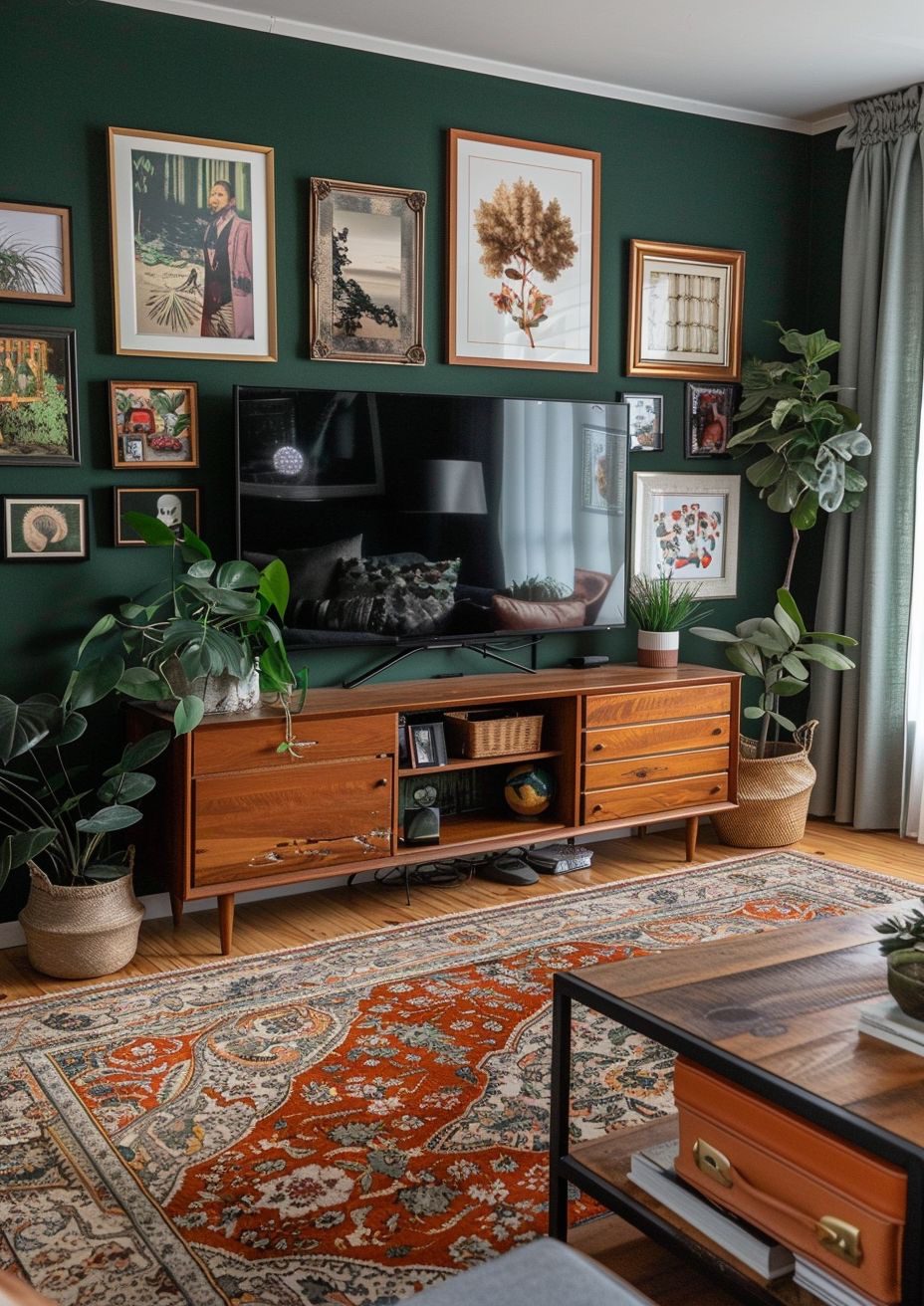
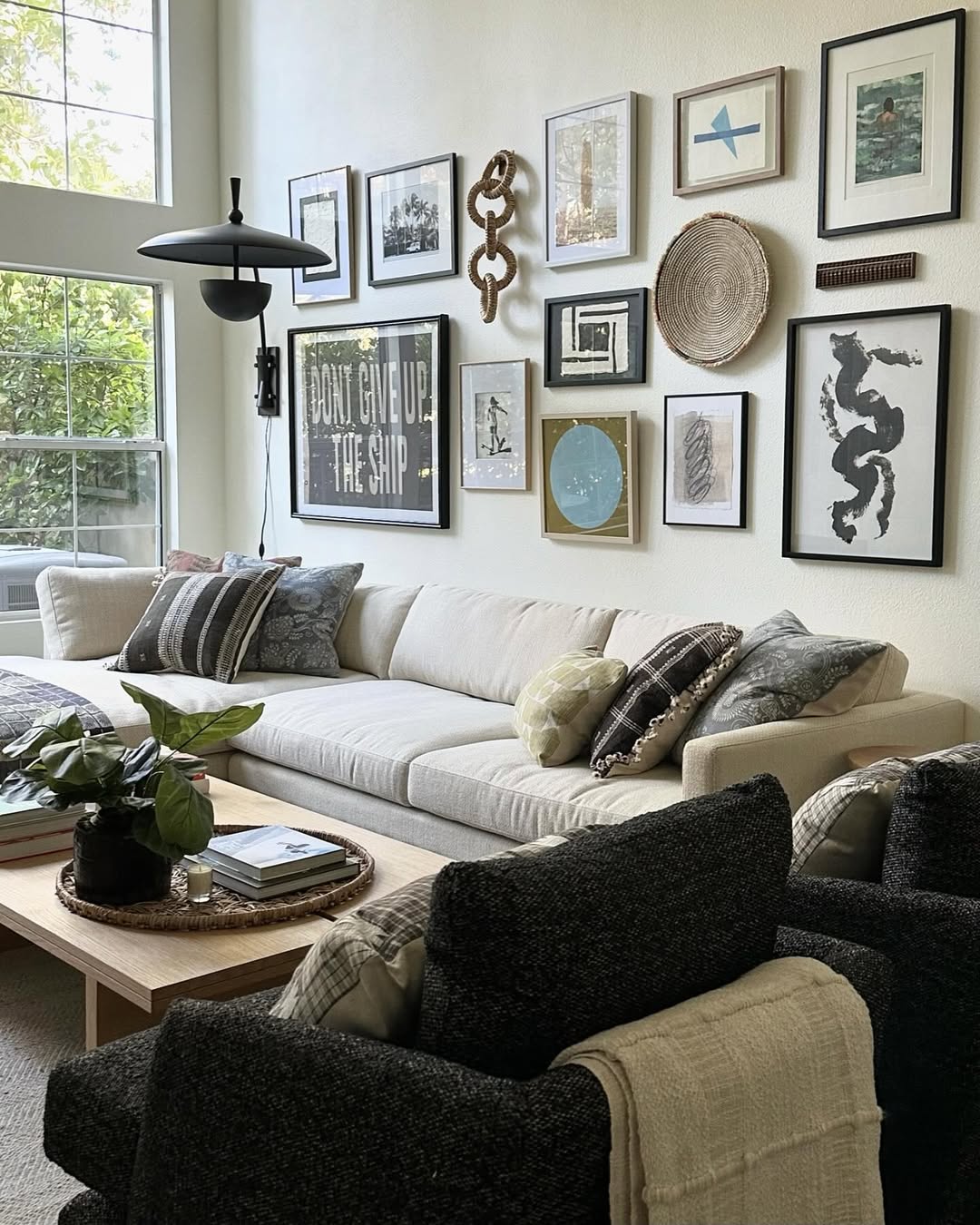
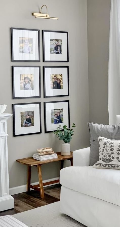
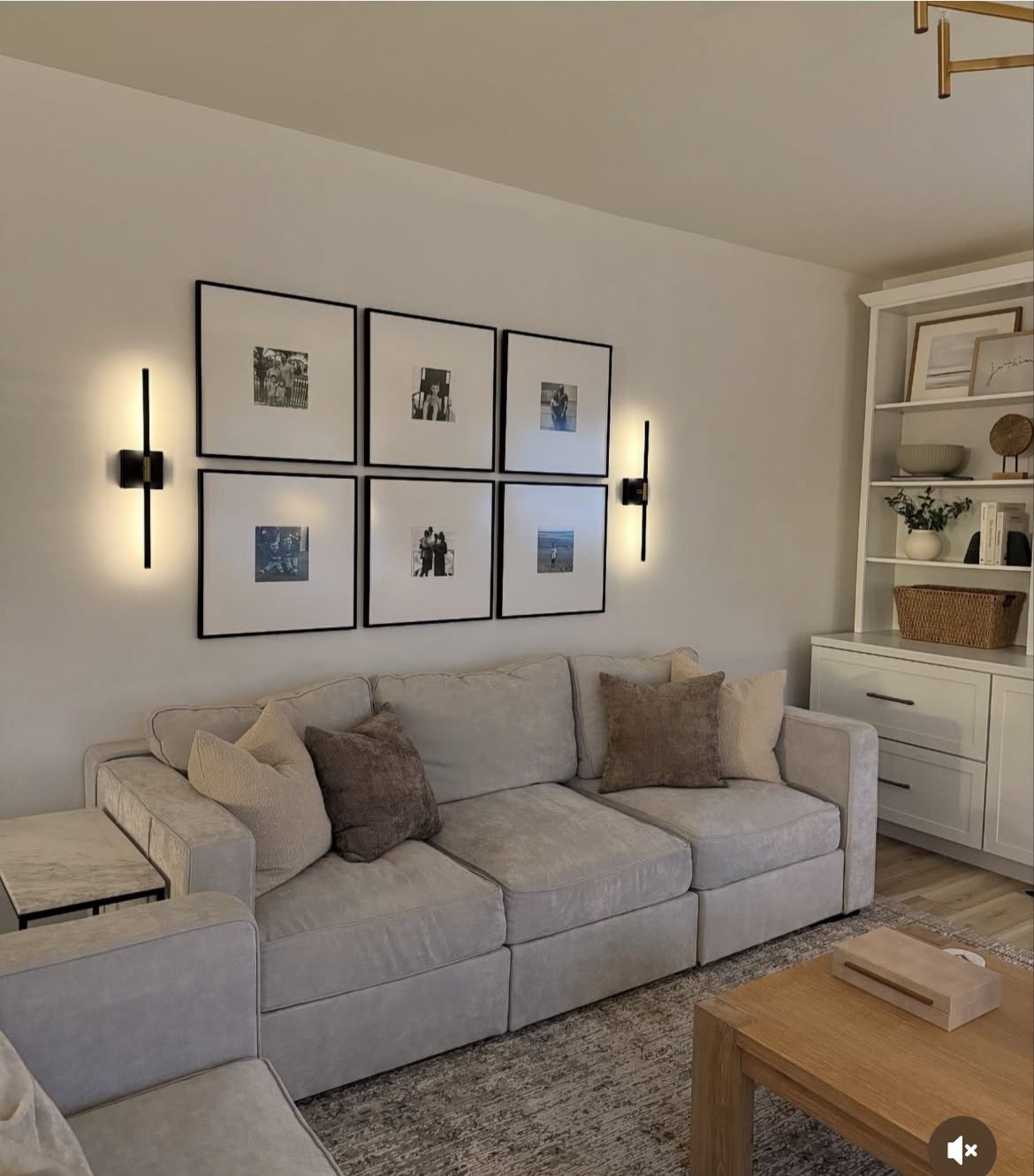
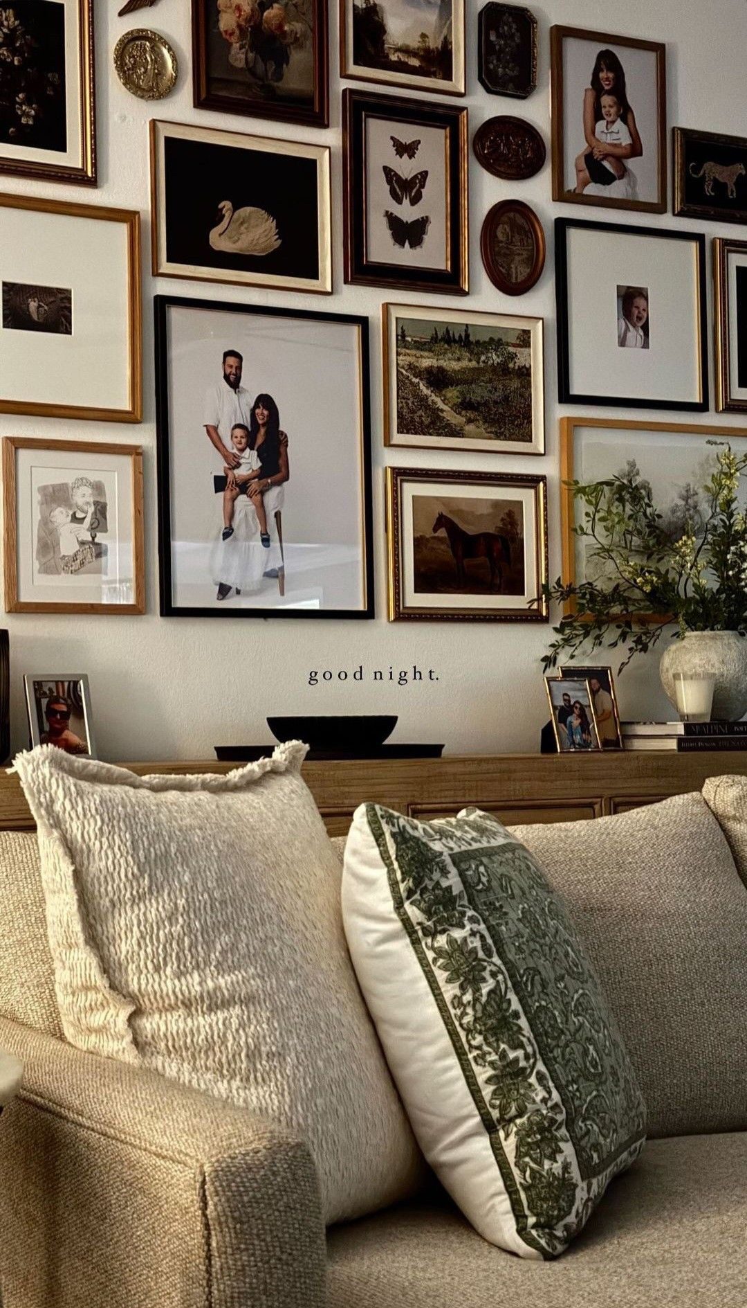
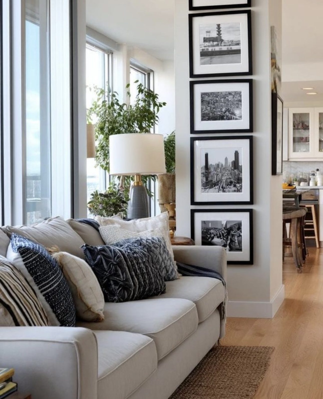
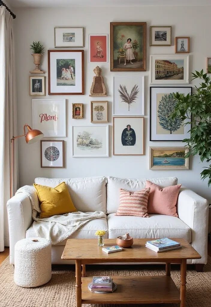
10. Create a One-of-a-Kind Art Display
Designing a wall filled with your favorite artworks, photographs, and meaningful quotes instantly adds character and warmth to your bedroom. This personalized display transforms a simple wall into a storytelling canvas that reflects your individuality and style. Mixing different sizes and frames can make the space feel dynamic and inviting.
Key Design Elements
- Select a cohesive color palette or theme to unify the pieces.
- Incorporate a mix of mediums such as prints, canvases, and framed photos.
- Use varied frame styles and sizes to add depth and interest.
Pro Tip: Lay out your gallery on the floor before hanging to find the perfect arrangement and balance.
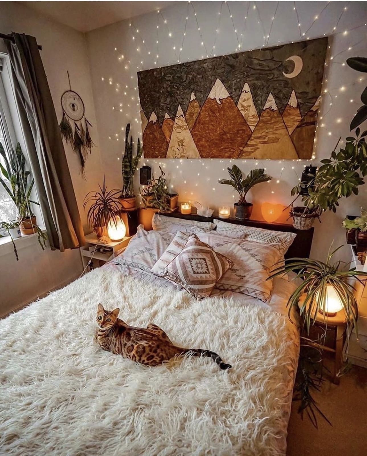
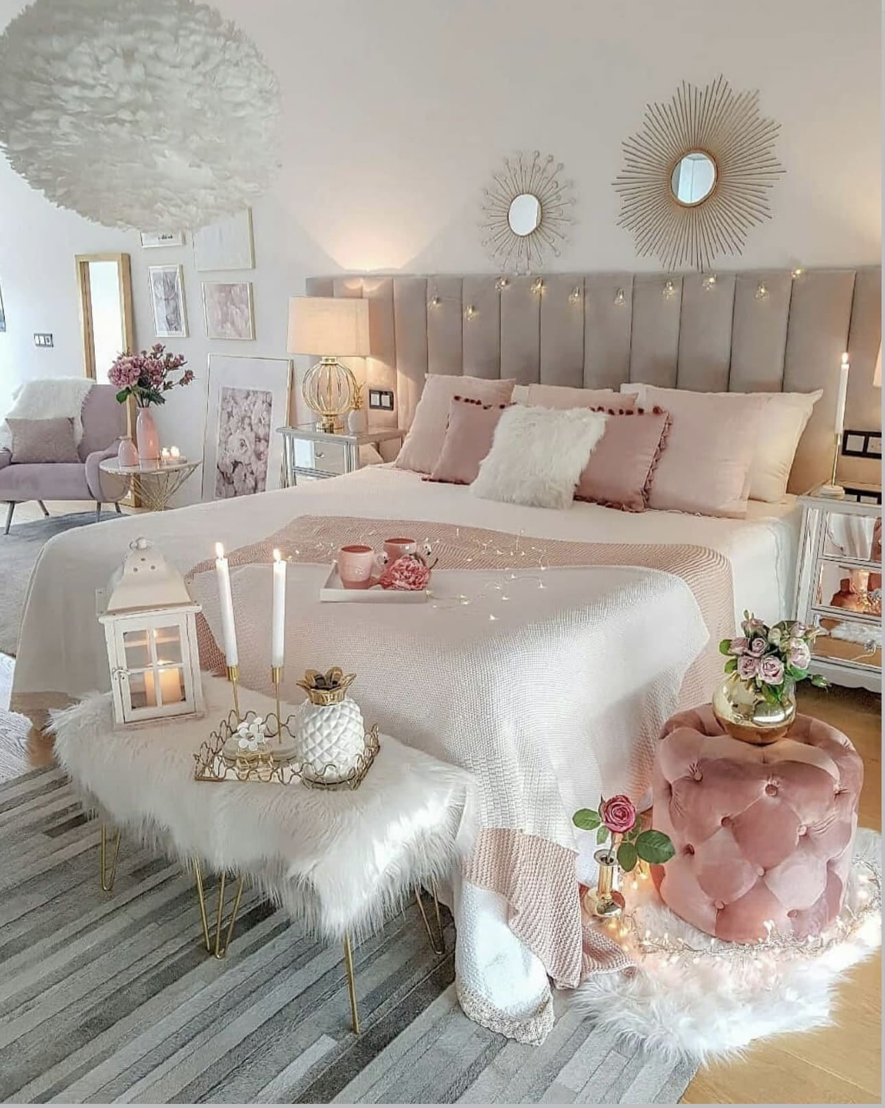
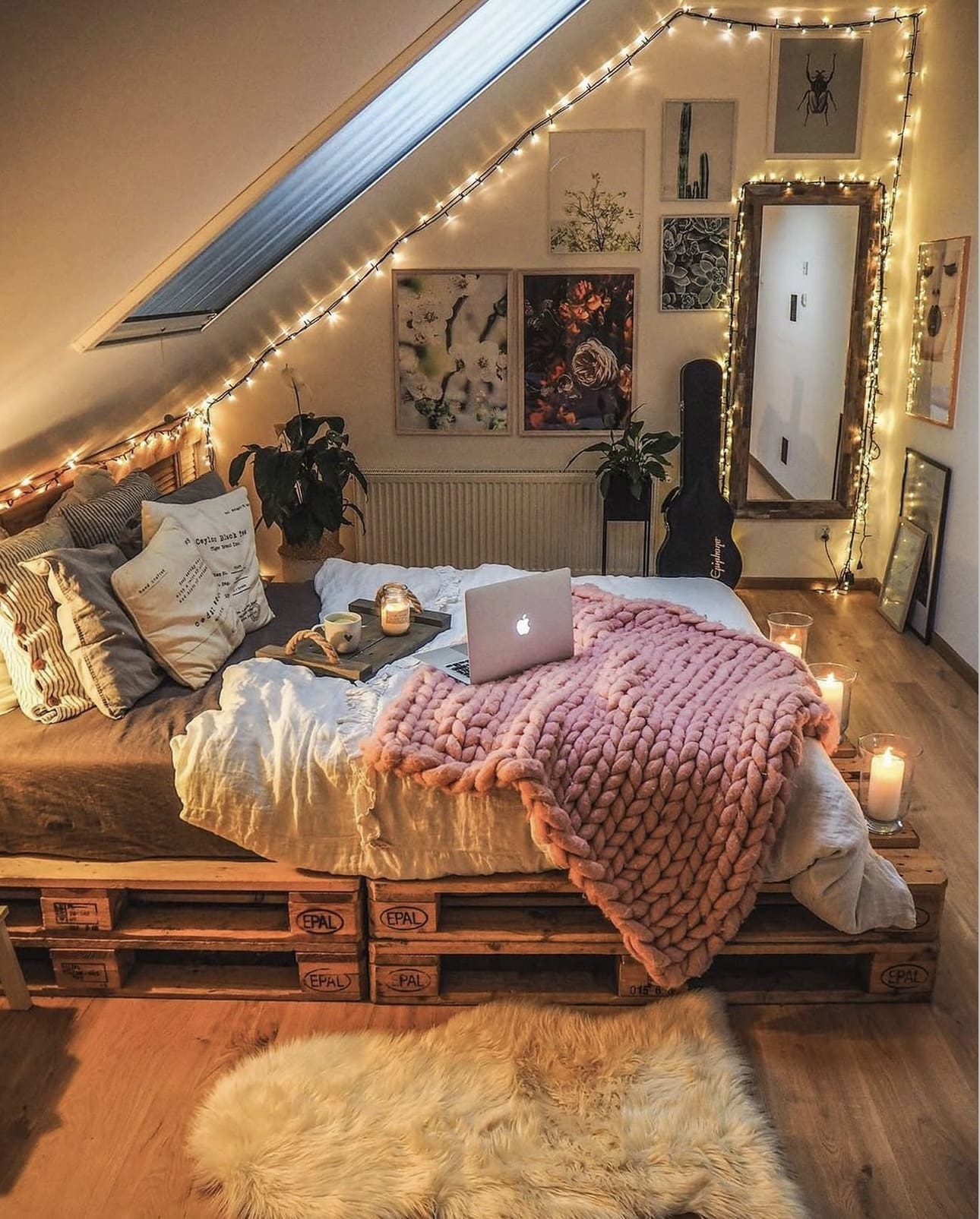
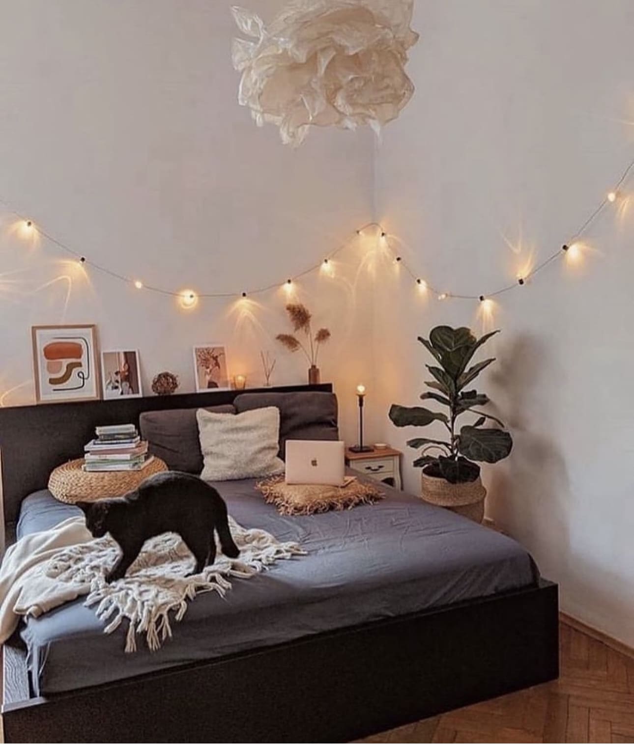
11. Enchant Your Space with Twinkling String Lights
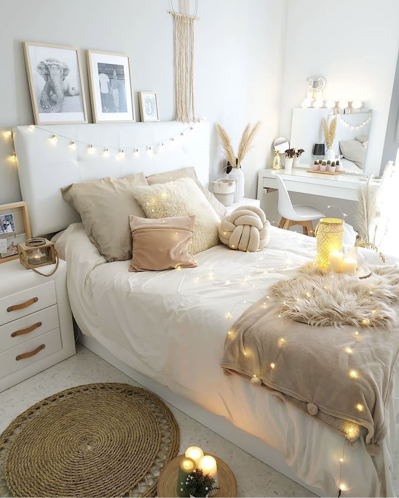
Incorporating string lights into your bedroom creates a gentle, inviting ambiance that instantly soothes the senses. Their delicate illumination is ideal for crafting a peaceful environment where you can relax and recharge after a busy day. These versatile lights also add a whimsical touch that complements any decor style.
Key Design Elements
- Drape string lights along the headboard or curtain rods to frame your bed with a cozy glow.
- Combine warm white bulbs with sheer fabrics to enhance the soft, dreamy effect in your space.
- Use battery-operated string lights for easy placement without worrying about outlets or cords.
Pro Tip: Opt for dimmable string lights so you can adjust the brightness to suit your mood and time of day.
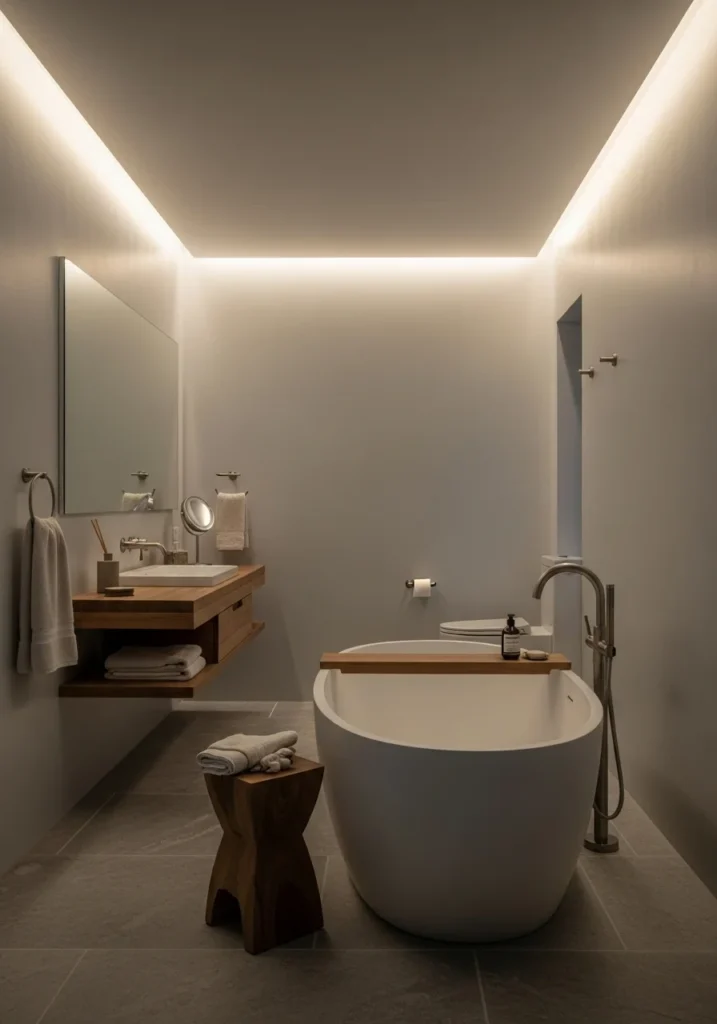
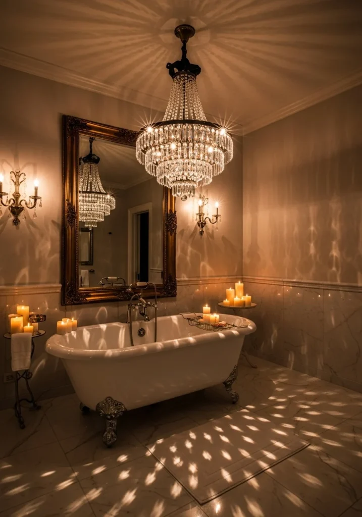
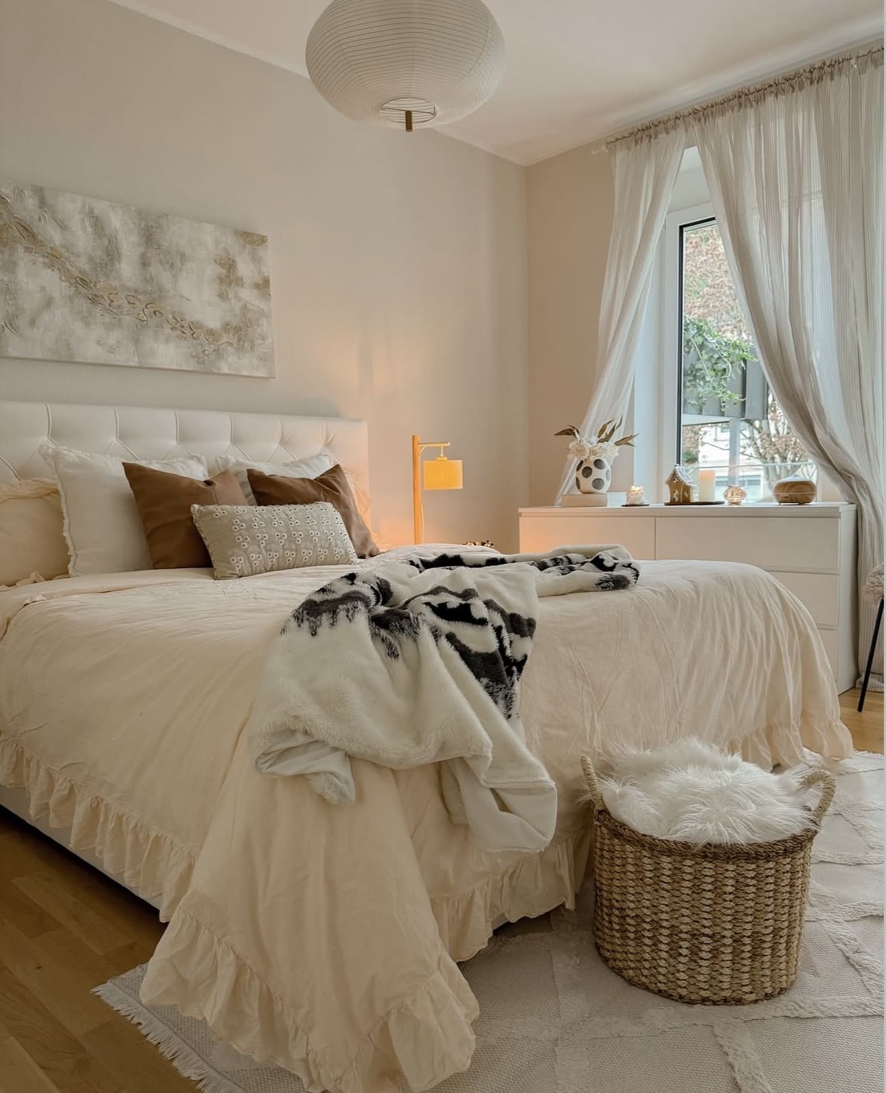
12. Embrace the Glow: Creating Cozy Ambiance with Gentle Lighting
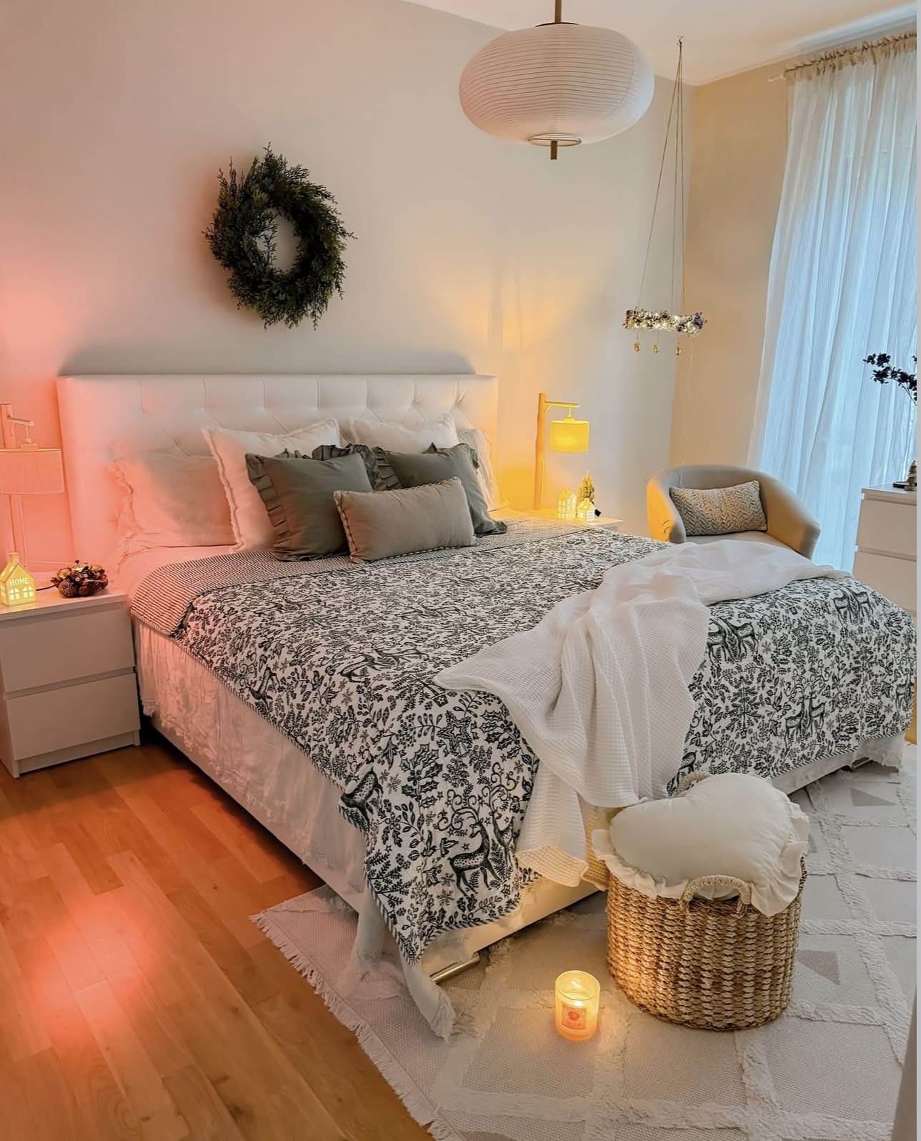
Incorporating gentle, warm lighting into your bedroom design transforms the space into a peaceful sanctuary perfect for unwinding. Utilizing fixtures like table lamps or subtle wall lights can soften the overall mood and invite comfort after a long day. This kind of illumination helps ease the mind and prepares you for rest.
Key Design Elements
- Choose lamps with warm-toned bulbs to cast a comforting hue throughout the room.
- Position lighting sources near your bed for easy access and a calming effect before sleep.
- Use dimmer switches to adjust brightness levels according to your mood and needs.
Pro Tip: Opt for LED bulbs with adjustable color temperatures to seamlessly transition from bright task lighting to soothing amber tones.
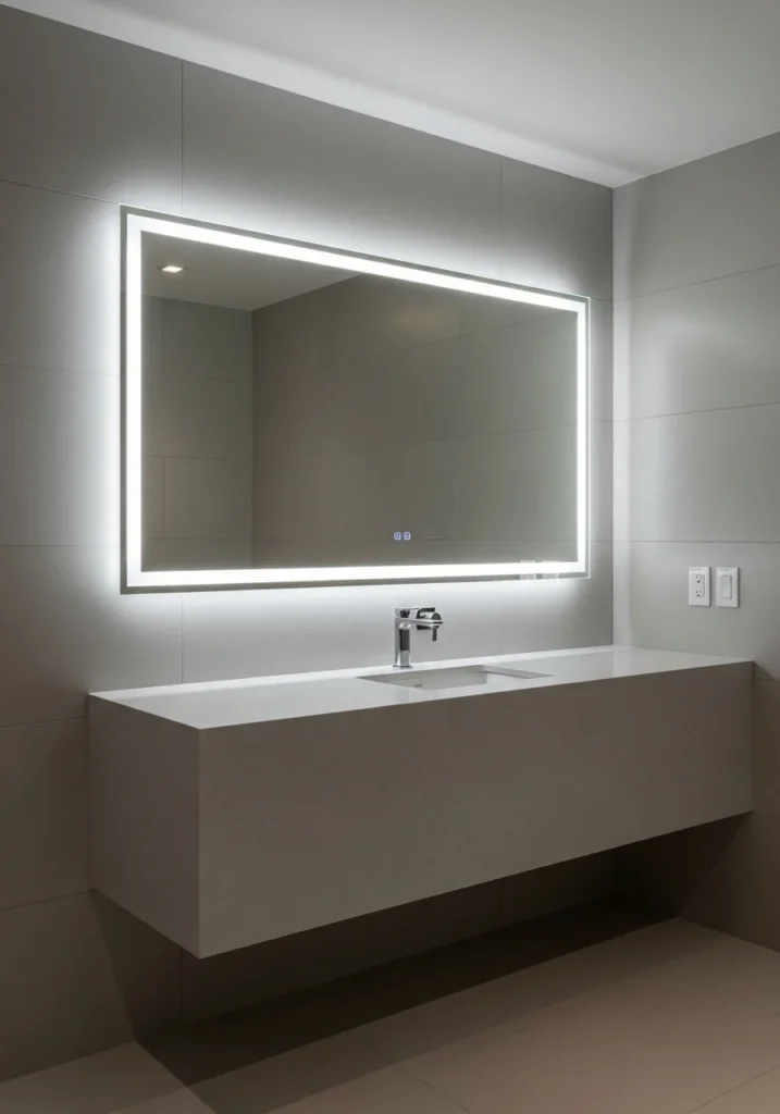
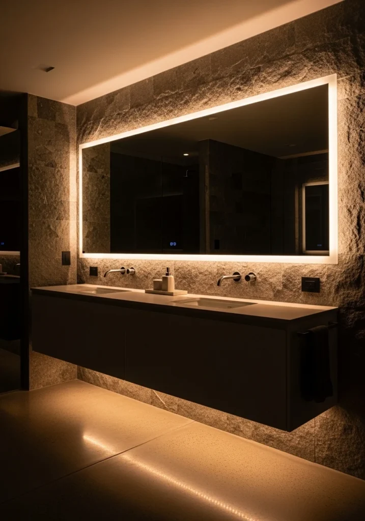
13. Enhancing Space with Strategic Mirror Placement

Incorporating mirrors into your bedroom design can dramatically enhance the feeling of spaciousness by bouncing light around the room. This clever trick works wonders in compact spaces, making them appear brighter and more open. Thoughtful mirror placement can transform even the coziest bedroom into a visually expansive retreat.
Key Design Elements
- Position mirrors opposite windows to maximize natural light reflection.
- Use large, full-length mirrors to add vertical depth and elongate walls.
- Consider mirrored closet doors or furniture to seamlessly blend functionality with style.
Pro Tip: Mount a round or oddly shaped mirror above your headboard to create a focal point that visually expands the room.
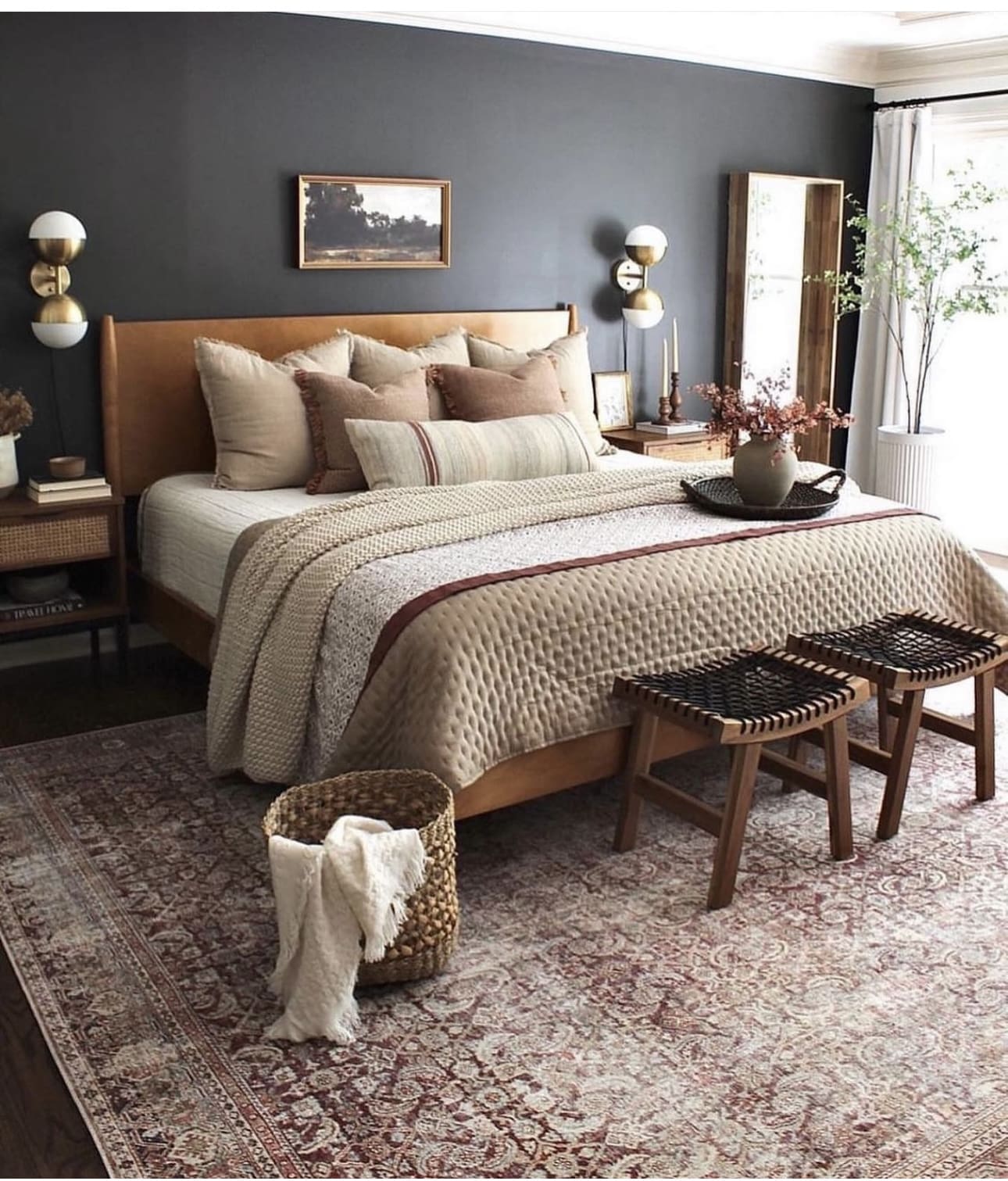
14. Creating Depth with Cozy Bedding Layers
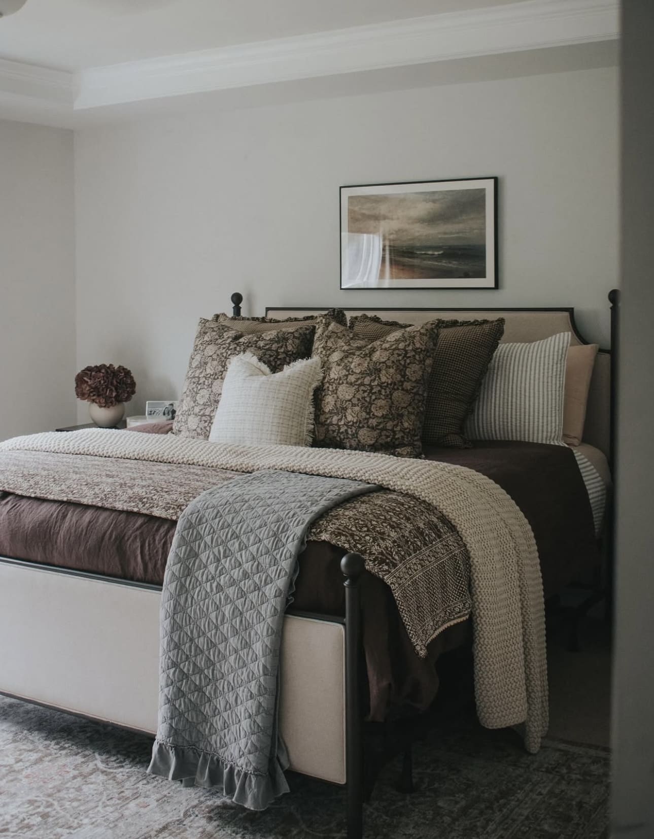
Build a welcoming and plush bed by artfully stacking different textures and fabrics. Mixing sheets, comforters, and accent throws not only adds visual interest but also invites relaxation and warmth. This approach transforms your bed into a stylish sanctuary that’s perfect for lounging or sleeping.
Key Design Elements
- Start with crisp, breathable sheets as your base layer for comfort and freshness.
- Add a thick duvet or quilt to bring warmth and a sense of luxury.
- Finish with a textured throw or blanket at the foot of the bed to introduce color and softness.
Pro Tip: Choose varying fabric weights and patterns within a cohesive color palette to create a layered look that’s both functional and aesthetically pleasing.
15. Cozy Up with a Soft Headboard
Incorporating a cushioned or tufted headboard transforms your bed into a relaxing nook, perfect for unwinding with a good book or your favorite show. This design not only adds a touch of luxury but also provides essential support when you’re sitting upright. It’s an easy way to boost both comfort and style in your bedroom.
Key Design Elements
- Choose plush fabrics like velvet or linen for an inviting texture.
- Consider a headboard with deep tufting to enhance softness and visual interest.
- Opt for neutral tones to complement various bedding styles and colors.
Pro Tip: Install a headboard that extends slightly beyond the width of your mattress for extra armrest space when sitting up.
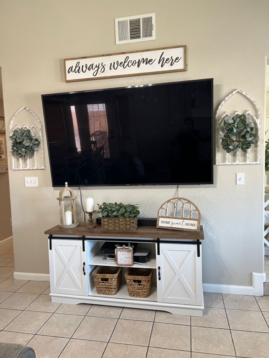
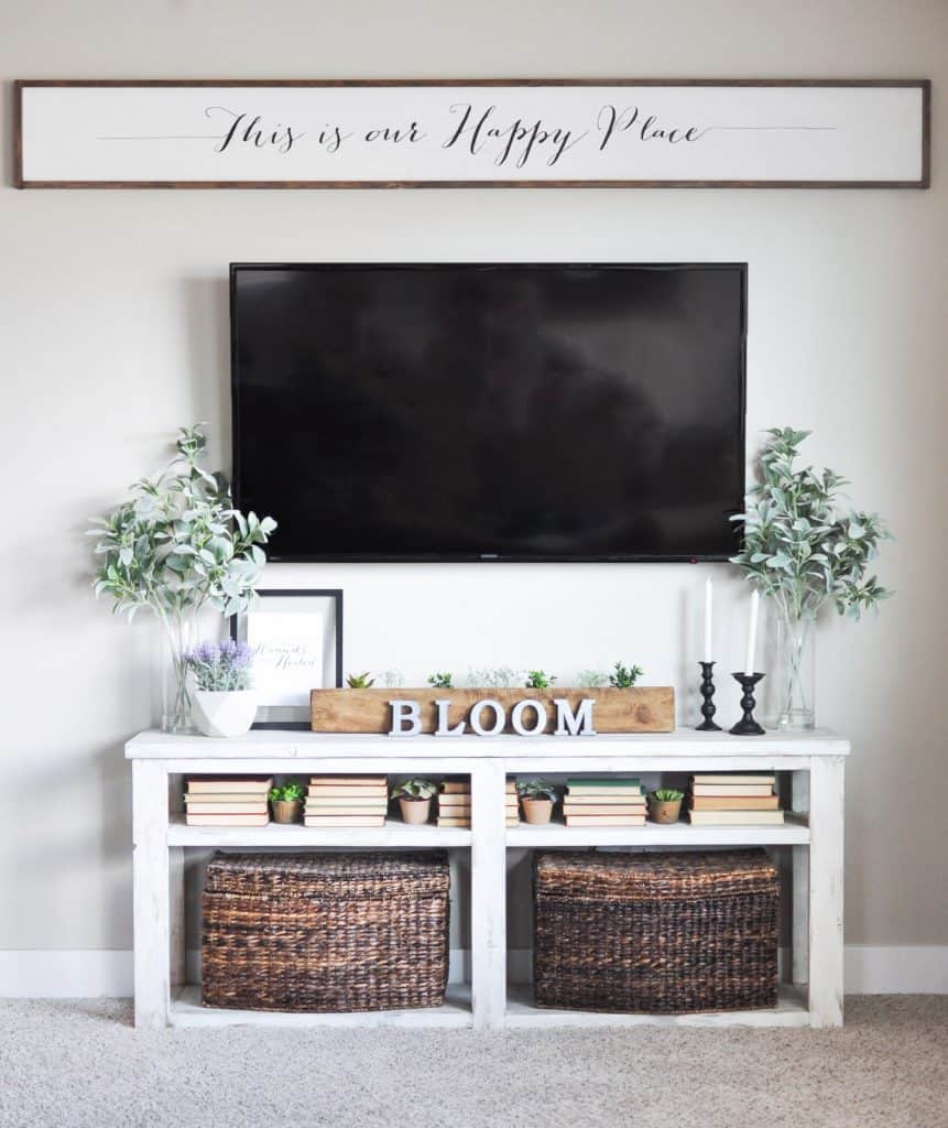
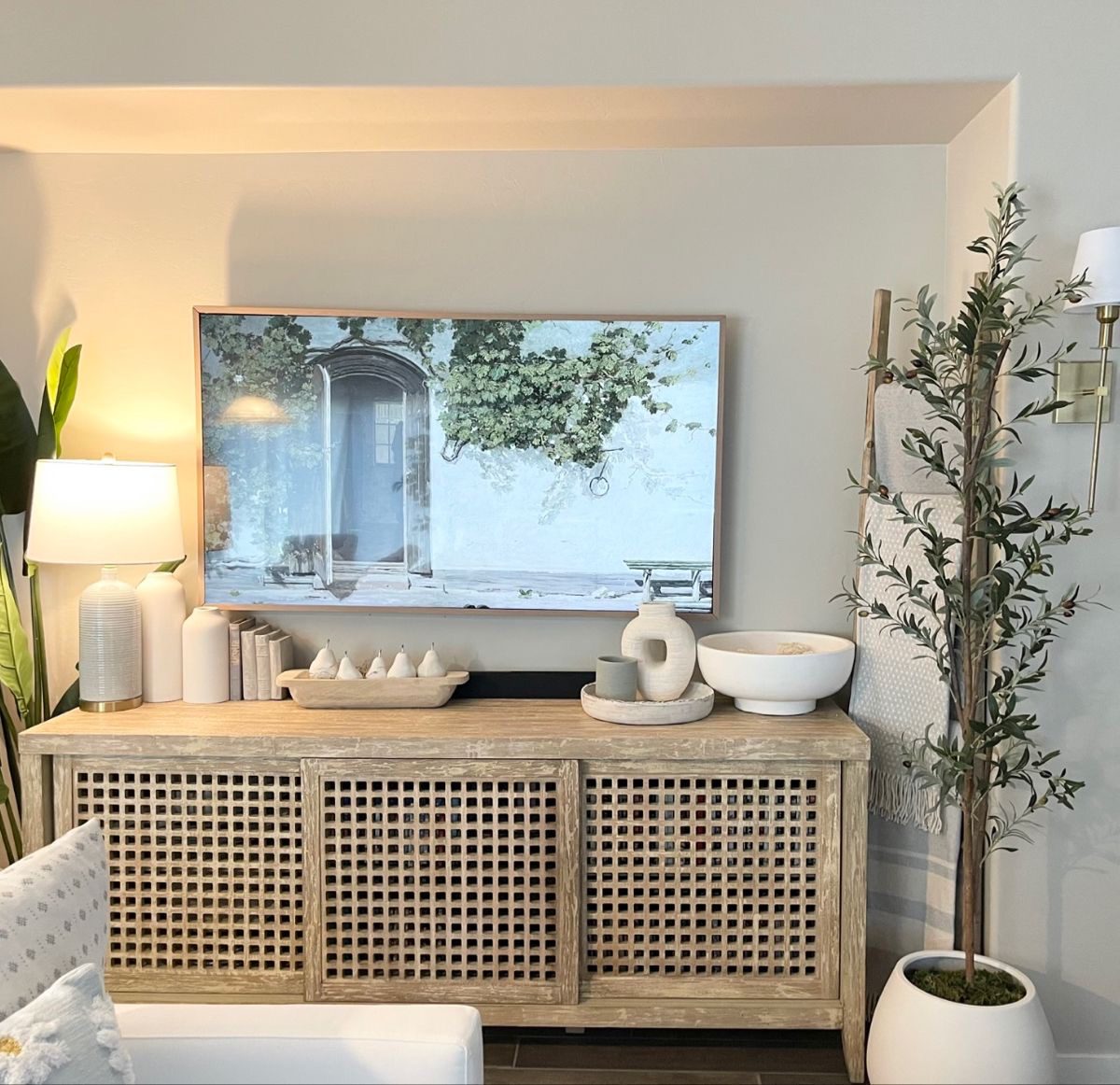
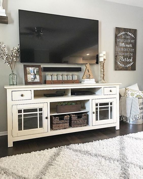
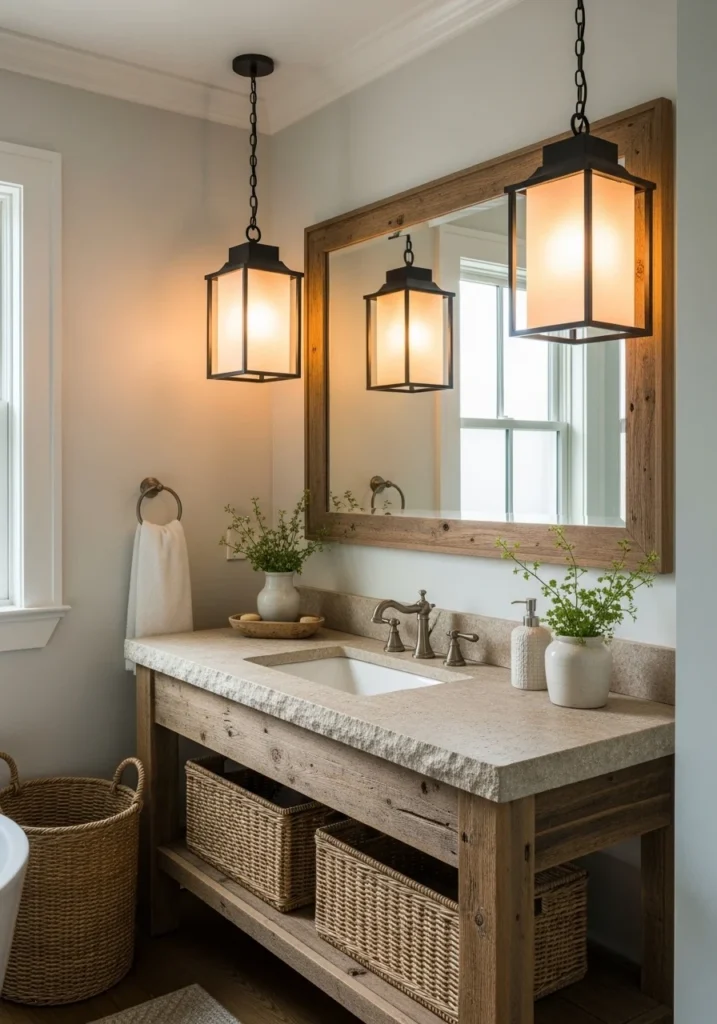
16. Embracing Earthy Textures for a Cozy Bedroom
Using natural elements like wood, rattan, and cotton can transform your bedroom into a serene retreat. These materials add a warm, inviting touch and create a soothing, grounded atmosphere. Their organic textures also bring depth and character to the room’s overall design.
Key Design Elements
- Incorporate wooden furniture pieces such as bed frames or nightstands for a timeless feel.
- Add rattan baskets or light fixtures to introduce a subtle bohemian flair.
- Choose cotton bedding or curtains to keep the space soft, breathable, and comfortable.
Pro Tip: Mix and match different natural textures to create visual interest without overwhelming the space.
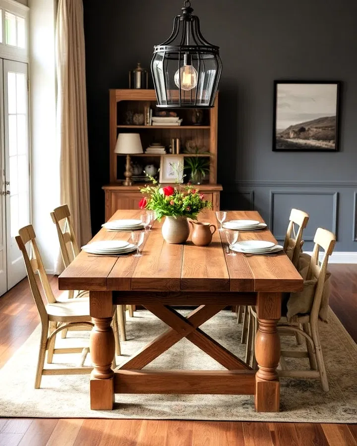
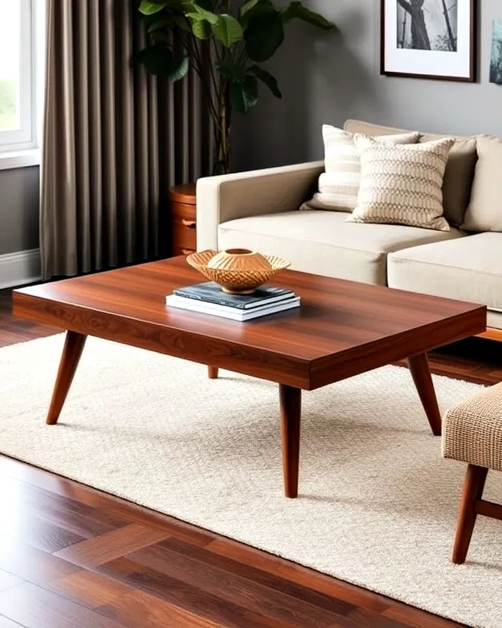
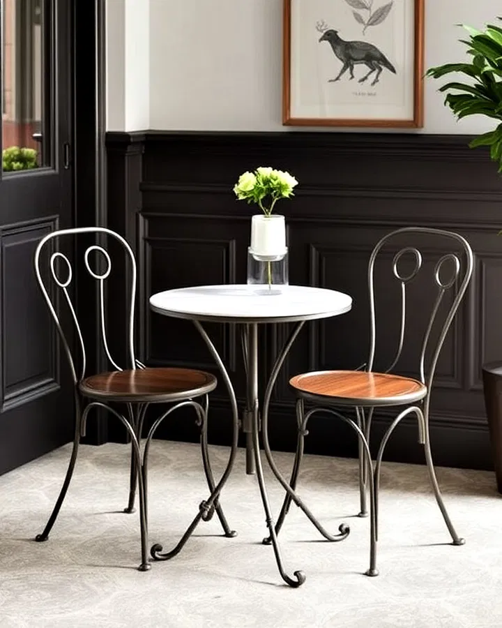
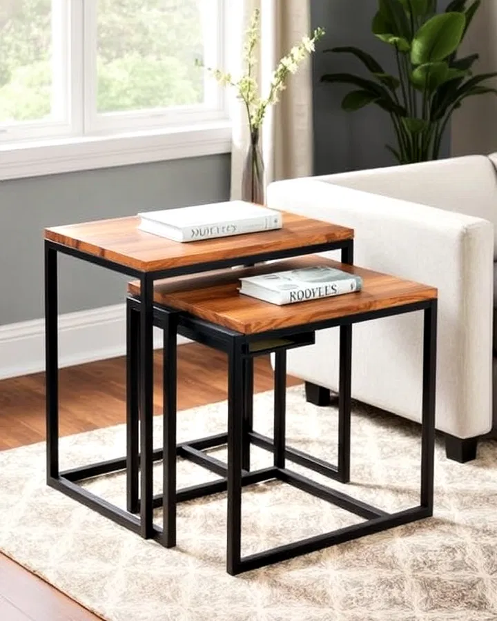
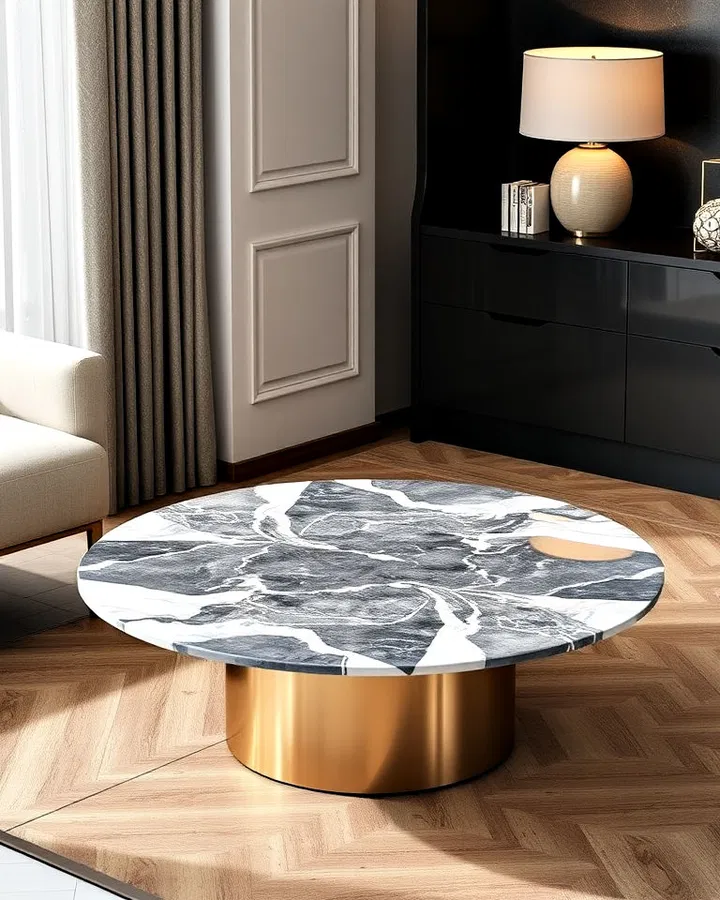
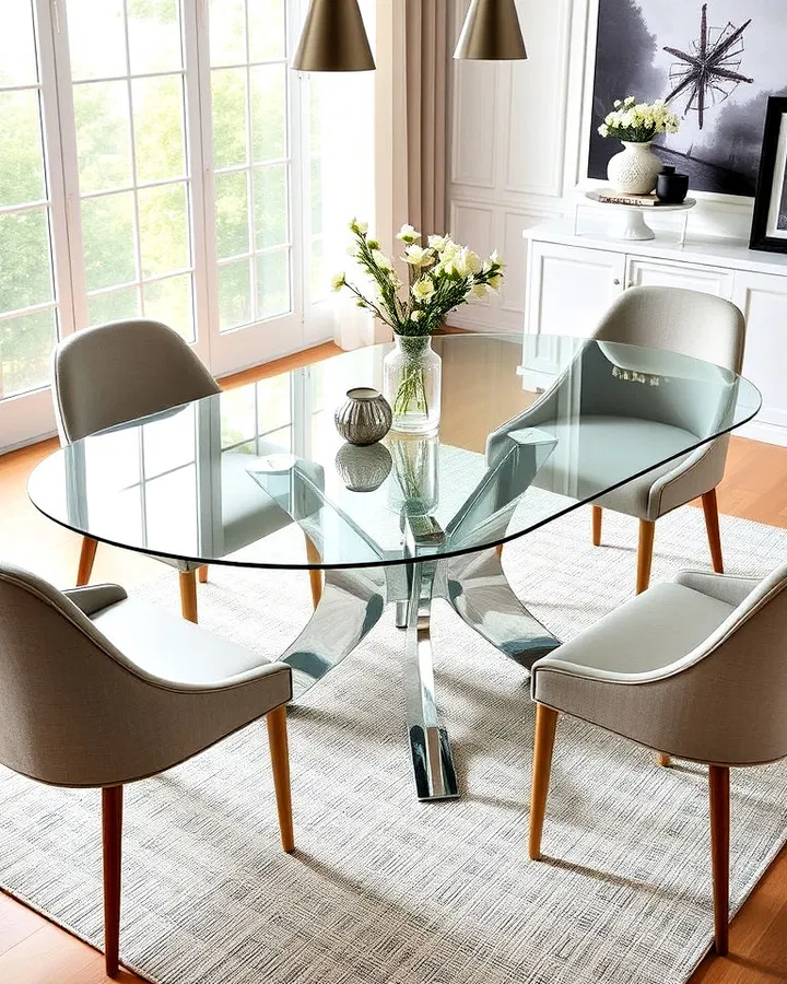
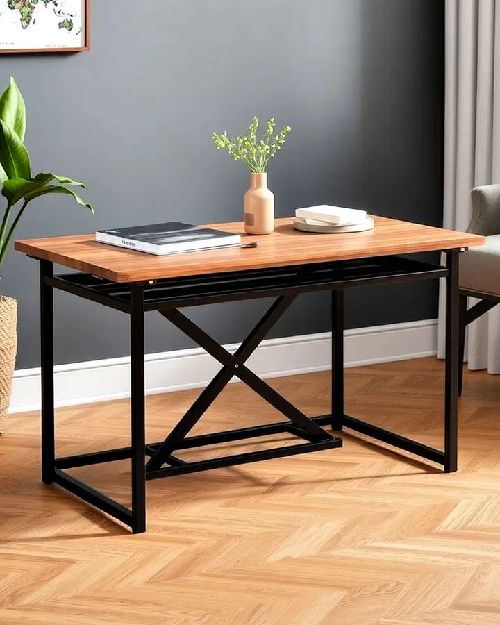
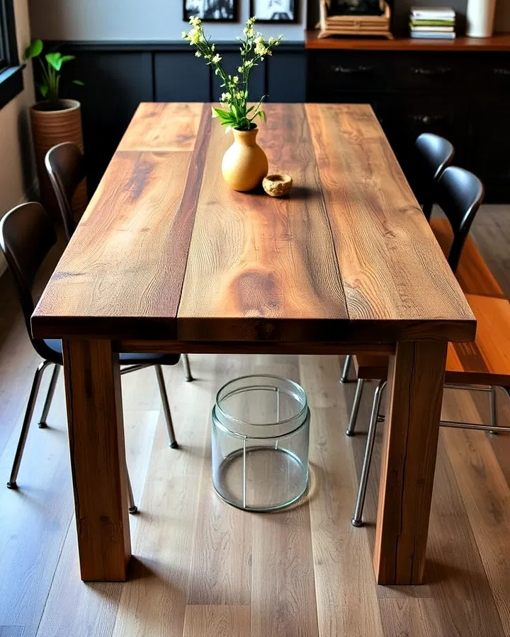
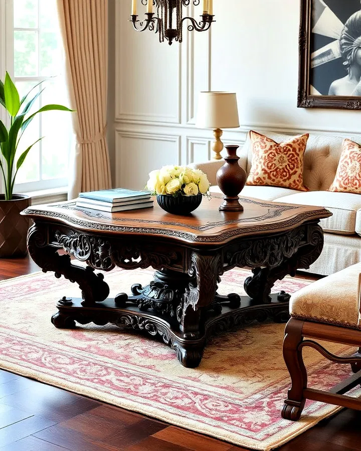
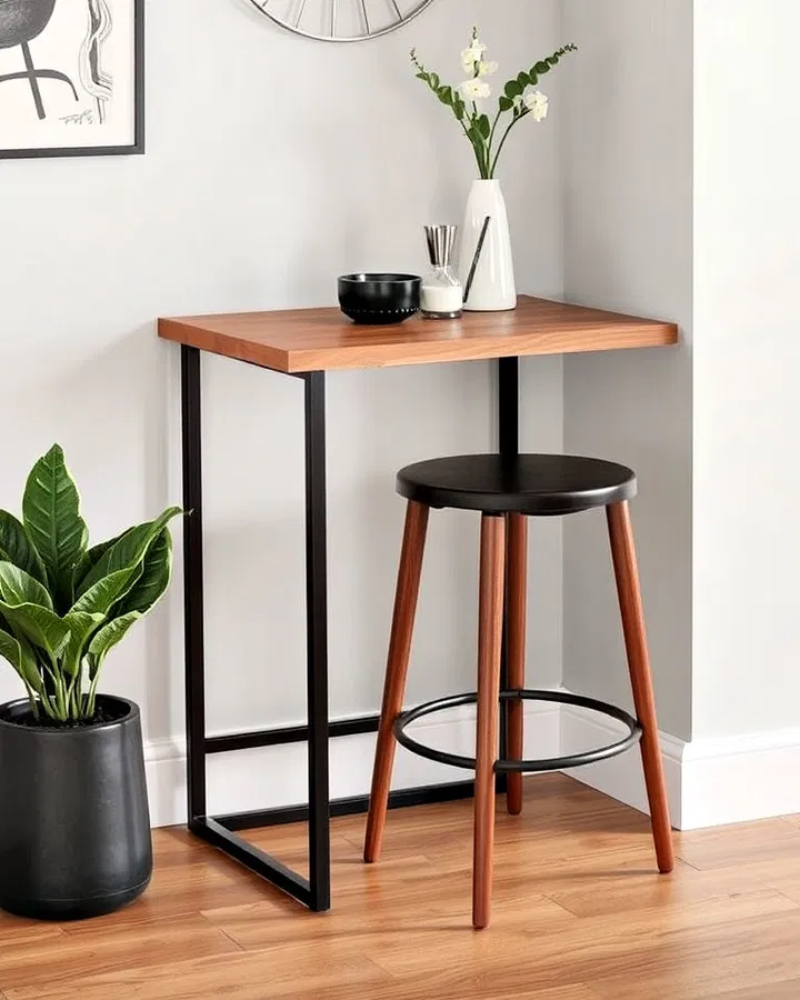
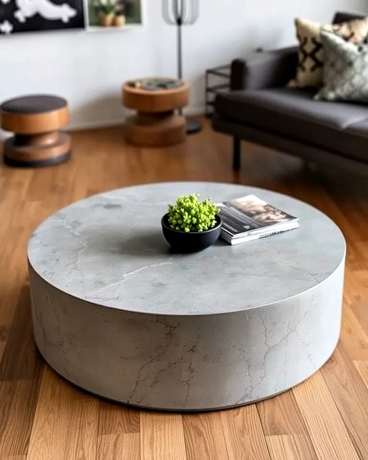
17. The Versatile Charm of a Compact Coffee Table
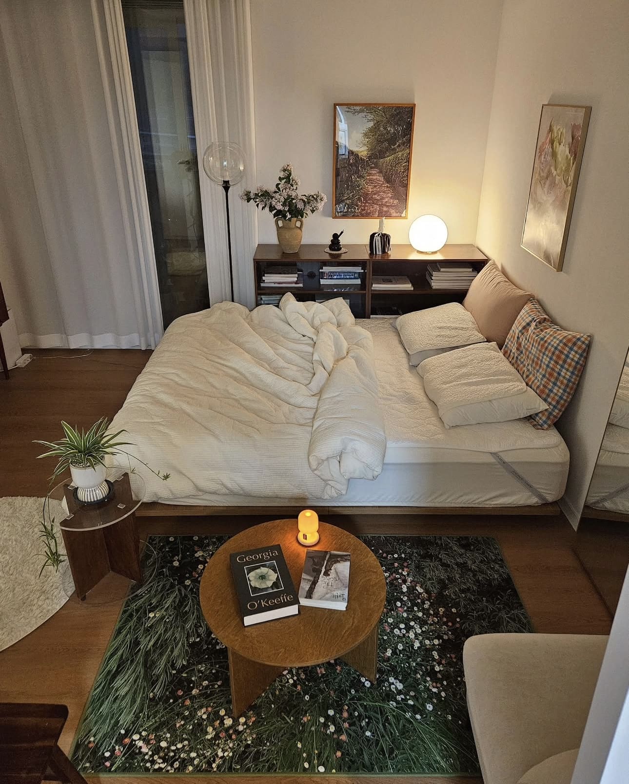
Incorporating a small coffee table into your bedroom design creates a multifunctional spot perfect for holding your favorite reads, cozy candles, or a quick snack. This simple addition transforms your space into a cozy sanctuary where everything you need is within arm’s reach, enhancing both comfort and style.
Key Design Elements
- Choose a table with built-in storage to keep remotes or magazines neatly tucked away.
- Opt for a surface material that complements your bedroom’s color palette and textures.
- Use trays or decorative bowls on the table to organize smaller items and add visual interest.
Pro Tip: Place your coffee table near a seating area or at the foot of your bed to maximize its accessibility and functionality.
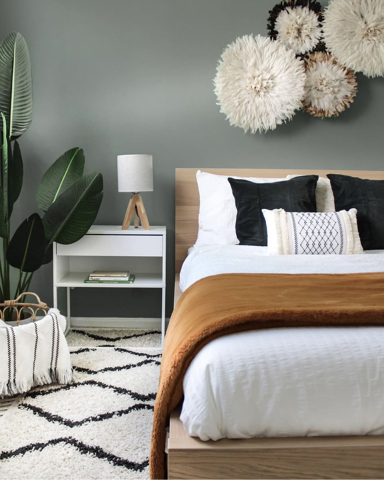
18. The Art of Piling on Plush Pillows
Transform your bedroom into a cozy retreat by layering an array of throw pillows in different sizes, shapes, and fabrics. This approach not only adds depth and visual interest but also invites you to sink into a space that feels both stylish and inviting. Mixing textures like velvet, linen, and knits can elevate the overall ambiance effortlessly.
Key Design Elements
- Combine bold patterns with solid colors to create a balanced yet dynamic look.
- Incorporate pillows with varying heights and thicknesses to enhance dimensionality.
- Choose a consistent color palette to maintain harmony amidst the variety.
Pro Tip: Rotate your throw pillows seasonally to refresh your bedroom’s vibe without a full makeover.
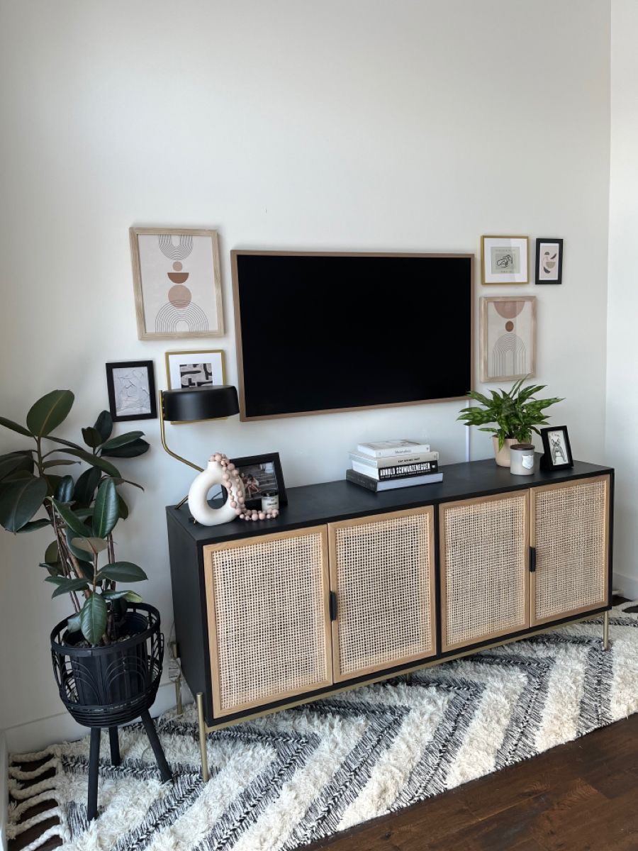
19. Embrace Earthy Charm with Rattan Accents
Incorporating rattan pieces into your bedroom instantly brings a warm, organic vibe that enriches the space with tactile intrigue. From woven light fixtures to intricately crafted baskets, these elements introduce a subtle natural texture that complements various decor styles. Their lightweight yet sturdy nature makes rattan both a functional and stylish addition.
Key Design Elements
- Choose rattan pendant lamps to cast soft, inviting shadows across the room.
- Use rattan baskets for stylish storage that keeps clutter at bay while enhancing decor.
- Incorporate rattan headboards or chairs to create a cozy, bohemian-inspired corner.
Pro Tip: Pair rattan decor with soft linens and greenery to amplify the tranquil, nature-inspired atmosphere.
20. Embrace Cozy Hues for a Relaxing Bedroom Atmosphere
Choosing warm tones for your bedroom walls creates a naturally inviting and soothing environment. These colors add depth and comfort, making the space feel like a personal retreat. Opting for gentle shades can transform your room into a cozy haven that encourages relaxation and rest.
Key Design Elements
- Select earthy colors like terracotta, soft peach, or muted gold for a grounded feel.
- Pair warm walls with neutral or complementary accents to maintain balance and avoid overwhelm.
- Use matte or eggshell finishes to enhance the softness of warm tones without harsh reflections.
Pro Tip: Test paint samples on your walls during different times of the day to observe how natural light interacts with warm hues before committing.
21. Adding Your Unique Flair
Make your bedroom truly yours by surrounding yourself with items that bring comfort and joy. Whether it’s a stack of your favorite novels, a treasured memento from a special trip, or a cozy robe hung within easy reach, these elements create a space that feels warm and lived-in. Personal touches transform a room from generic to genuinely inviting.
Key Design Elements
- Display a collection of books that inspire or relax you on a dedicated shelf or bedside table.
- Incorporate meaningful objects, like souvenirs or family heirlooms, where you can easily see them.
- Hang soft, inviting textiles such as robes or scarves on decorative hooks to add both function and charm.
Pro Tip: Rotate personal items seasonally to keep your space feeling fresh and reflective of different moods or memories.
22. Embrace Cozy Earth-Inspired Hues
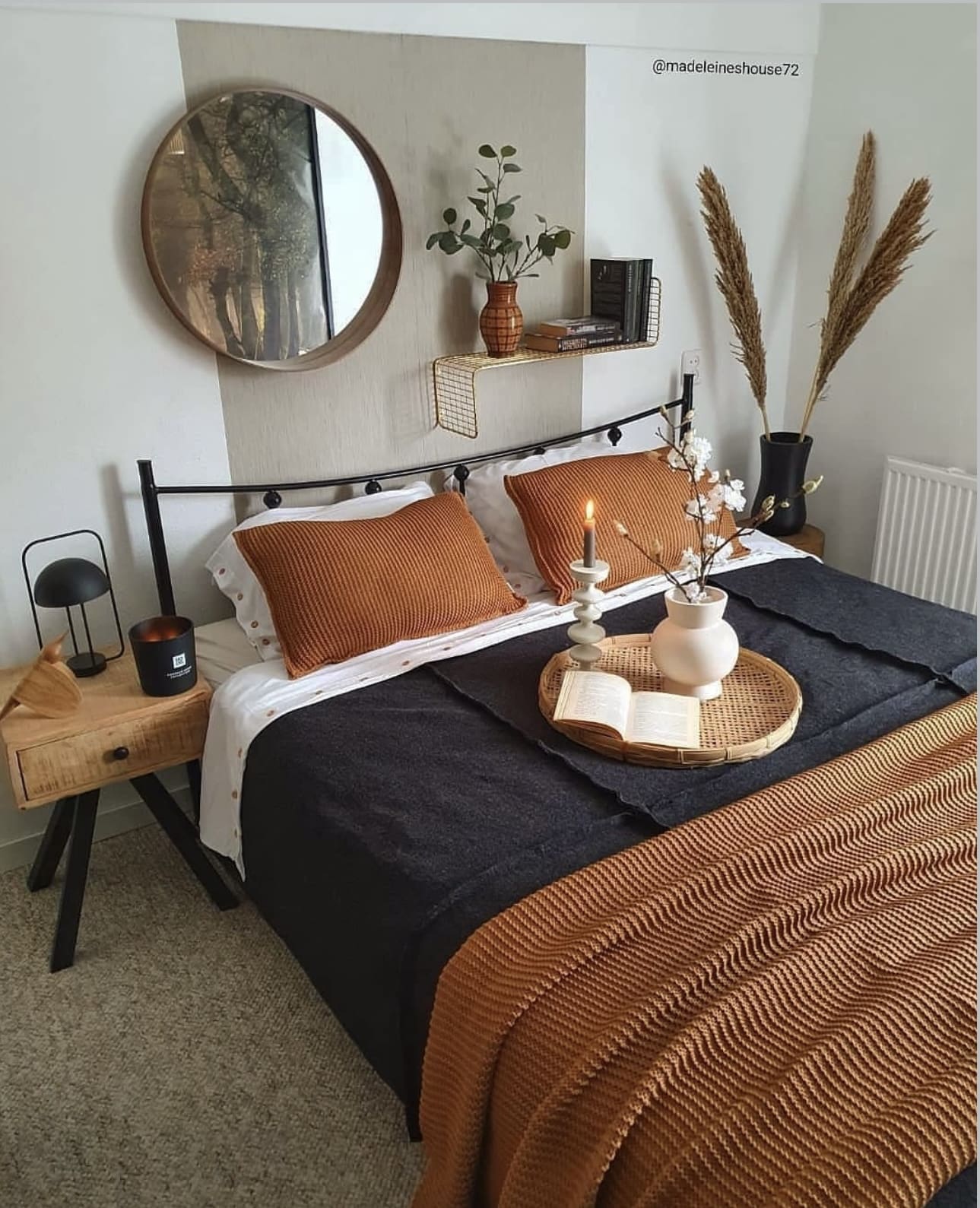
Incorporating warm earth tones such as rich terracotta, deep browns, soft beiges, and muted olives can transform your bedroom into a tranquil retreat. These natural shades promote a sense of comfort and stability, making your space feel both welcoming and serene. By grounding your decor with these colors, you create an inviting environment perfect for relaxation.
Key Design Elements
- Layer different textures in similar earthy shades to add depth and warmth without overwhelming the room.
- Use natural materials like wooden furniture and woven fabrics to complement the earth-inspired palette.
- Introduce greenery or plant elements to enhance the organic vibe and bring life to the space.
Pro Tip: Balance warmer hues with plenty of natural light to keep the room feeling bright and open rather than heavy.
23. Cozy Comfort: The Perfect Rug Beneath Your Bed
Laying a soft, inviting rug beneath your bed transforms the start of your day into a warm and comforting experience, especially when the floor feels chilly. It not only adds texture and style to your bedroom but also provides a gentle cushion for your feet as you rise. This simple addition can elevate both the look and feel of your personal space.
Key Design Elements
- Choose a rug with a thick pile for maximum softness and warmth underfoot.
- Opt for colors or patterns that complement your bedding and overall room decor.
- Ensure the rug extends beyond your bed frame for easy access when getting in and out.
Pro Tip: Select a rug made from natural fibers like wool for durability and a cozy feel that lasts through all seasons.
24. Creating a Serene Retreat with a Canopy Bed
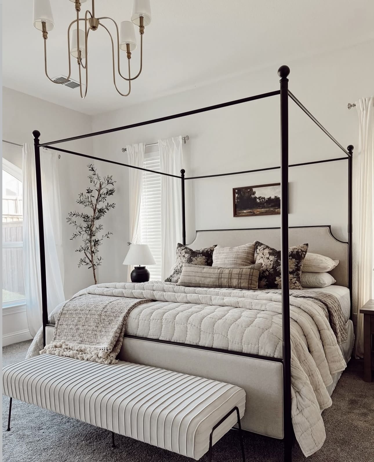
Elevate your bedroom ambiance by incorporating a canopy structure that envelops your bed, adding both charm and comfort. Whether you opt for sleek metal frames or soft, flowing fabrics, a canopy can turn your sleeping space into a tranquil oasis. This design invites relaxation while making a bold style statement.
Key Design Elements
- Choose lightweight, sheer curtains to maximize natural light while maintaining privacy.
- Consider adding fairy lights or lanterns around the canopy for a warm, inviting glow.
- Mix and match fabric textures and colors to complement your bedroom’s theme and add depth.
Pro Tip: Secure the canopy curtains with tiebacks to easily adjust light and airflow without sacrificing style.
Conclusion
Creating a cozy apartment bedroom is all about embracing warmth, comfort, and personal touches that make your space truly feel like a sanctuary. Whether it’s layering soft textiles, adding ambient lighting, or incorporating your favorite colors and decor, every small change can transform your bedroom into a restful retreat where you love to unwind. Don’t wait for the “perfect” moment to start—begin with one element that sparks joy and build from there. Your dream cozy bedroom is within reach, and the best part is making it uniquely yours. So gather your inspiration, trust your instincts, and let your creativity flow to craft a space that welcomes you home every day.