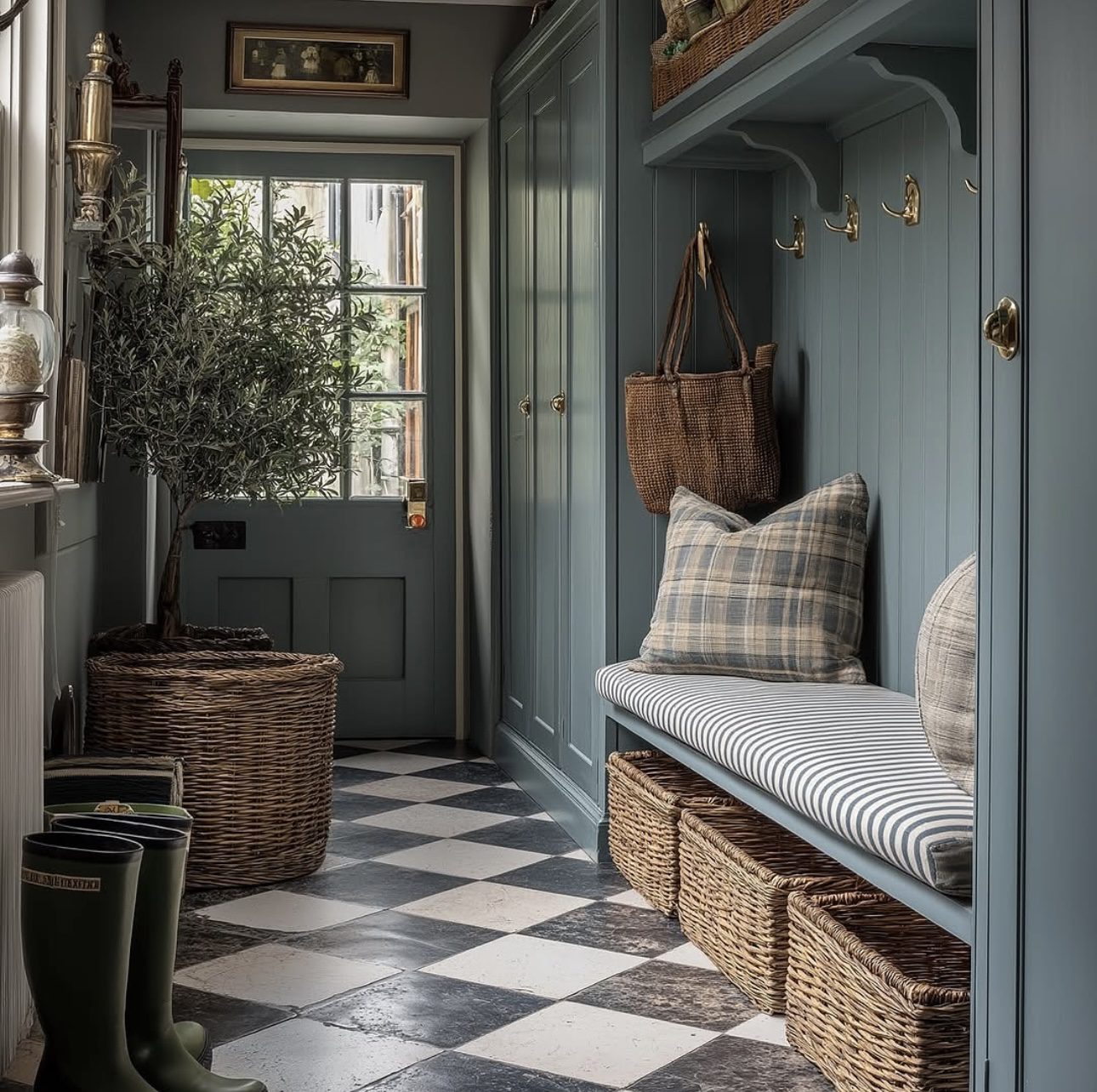
The edge of the lawn meets a patch of bare concrete. A lone folding chair appears come summer, only to vanish by fall. This isn’t a patio—it’s a placeholder, a space in waiting.
What separates a backyard that’s truly lived in from one that’s ignored isn’t how much space you have or how much money you spend. It’s about making a conscious choice: treating your outdoor area as an extension of your home, a purposeful space with thoughtful design, quality materials, and a clear use. Too often, yards underperform because no one has taken that step—to design with intent rather than default.
The following twenty ideas span every style, climate, and budget, but they all share one key trait: deliberate commitment. Each concept follows a focused design vision from start to finish. That purposeful execution is exactly what catches your eye when a garden truly captivates.
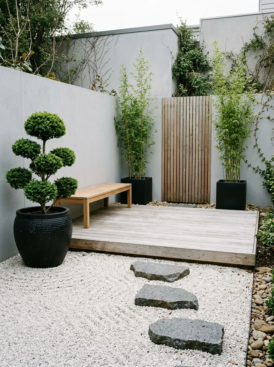
1. Serene Japanese-Inspired Gravel Garden Featuring a Sleek Deck Platform
Cover the entire garden space with a layer of white granite or quartz pea gravel, spreading it evenly to a depth of about eight to ten centimeters over a weed-blocking fabric. To keep the gravel neatly contained, install sleek black powder-coated metal edging along all perimeter lines, ensuring a clean and modern boundary.
Embed three large, irregularly shaped stepping stones made from dark basalt into the gravel. Each stone should be substantial—no less than sixty centimeters wide—and arranged to naturally guide visitors’ gaze and footsteps from the garden entrance toward the deck area.
Construct the deck from pale grey, silver-aged hardwood, positioning it slightly elevated above the gravel at one end of the garden. Behind the deck, add a vertical timber slat screen that serves both as a privacy barrier and a visually appealing backdrop, enhancing the sense of enclosure without closing off the space.
For planting, keep things minimalist yet striking. Place two black ceramic pots directly on the gravel—one containing a carefully cloud-pruned boxwood tree, the other housing a cluster of black bamboo. These select plants introduce texture and color contrast without overwhelming the understated design.
Finally, furnish the deck with a single simple teak bench, creating a quiet spot for relaxation. Avoid adding any other furniture pieces, allowing the clean lines and carefully curated elements of the patio to speak for themselves.
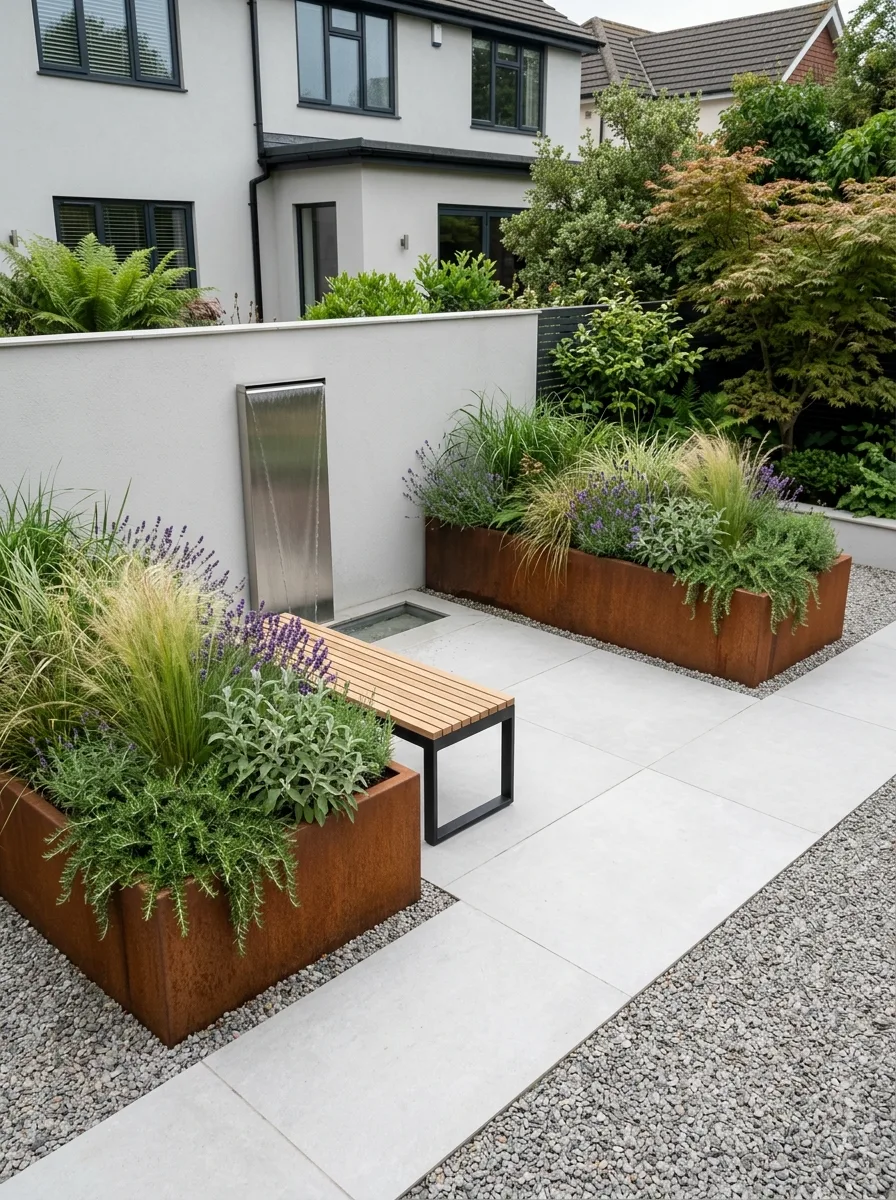
2. Modern Corten Steel and Gravel Oasis
Corten steel planters, known for their distinctive rust-colored patina, serve as the focal point of this patio design. The surrounding elements are carefully selected to either complement or provide a striking contrast to this warm, earthy hue. This approach creates a cohesive and visually engaging outdoor space that balances texture and tone.
For the flooring, opt for large-format paving slabs in a soft, pale gray shade—either concrete or porcelain works well. Arrange them in a crisp grid layout, and fill the gaps with gravel to introduce a subtle interplay of surfaces. This combination lends a modern, structured look while adding depth and interest through mixed materials.
To enhance the natural feel, acquire two to three sizeable rectangular corten planters, keeping their height uniform but varying their lengths for dynamic visual rhythm. Fill these containers with a blend of architectural and delicate plants—think tall, flowing feather grass and aromatic lavender at the forefront, wispy Stipa tenuissima to add gentle movement, and sage for a touch of color and fragrance.
Incorporate a sleek stainless steel water feature that sits flush against a rendered wall for a minimalist yet impactful statement. A single panel roughly one meter tall and thirty centimeters wide allows water to cascade smoothly down into a concealed trough below. This element not only adds a calming auditory dimension but also enhances the overall ambiance of the patio.
Finally, complete the space with a streamlined bench crafted from a black powder-coated steel frame paired with teak slats for the seating surface. The combination of corten steel, natural teak, and steel forms a thoughtful material palette that unifies the design, blending industrial strength with organic warmth.
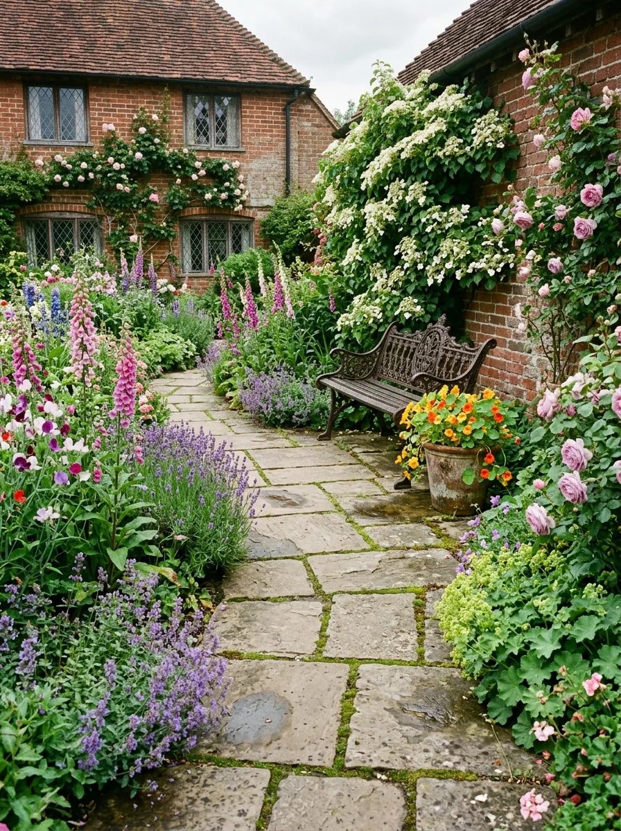
3. Charming English Garden Bench Patio Design
This patio area is designed to feel naturally formed rather than artificially constructed. Instead of rigid installation, it gradually comes together over time, creating an inviting, organic atmosphere.
Begin by choosing a sheltered spot along a south-facing wall, where warmth and protection encourage growth. Arrange irregular limestone or sandstone flagstones in a loose rectangular shape, spacing them generously to allow creeping thyme or sweet alyssum to fill the gaps with lush, fragrant greenery. Avoid sealing the joints; the plants need room to establish and spread, softening the hardscaping with living texture.
Set a single cast-iron bench—preferably an ornate Victorian style that’s allowed to age gracefully with a patina of rust—directly against the wall. In front, create a narrow, densely planted border brimming with classic cottage garden blooms. Think tall foxgloves, vibrant delphiniums, fragrant sweet william, silvery lavender, aromatic catmint, and rich salvia. These plants should be allowed to spill gently over the stone edges, blurring the boundary between garden and patio.
Echo the border planting by grouping terracotta pots of varying heights and sizes at either end of the bench, filled with the same cottage flowers to maintain continuity. Add personal touches—a watering can resting casually nearby, a gardening trowel hanging or placed on the wall. Above, train a climbing rose and cascading wisteria to climb the wall, adding vertical interest and seasonal color.
The goal is effortless charm: nothing here should appear deliberately placed or overly curated. Instead, this outdoor space should feel like it naturally evolved from the spot, a serene retreat shaped by time and nature rather than design.
4. Sweeping Paver Fire Pit Areas with Cozy Seating Spaces
This design concept outlines a cohesive plan for the entire backyard, emphasizing seamless flow rather than isolated elements. Starting from the house, the upper section features a spacious rectangular patio crafted from large concrete pavers in a soft, neutral tone. Opt for oversized pavers to create an understated yet elegant foundation. Furnish this area with a cream-colored weather-resistant sofa and two matching armchairs, all set on sleek, dark frames to provide a sophisticated contrast.
Leading away from this elevated seating space, a gently winding pathway constructed from darker pavers guides you through lush planting beds. These beds serve as a natural divider and introduce texture and color before reaching the lower patio zone. Here, you’ll find a generous circular platform paved with the same style of stone, centered around a round fire pit made from stone or cast iron. Surround this warm centerpiece with four Adirondack chairs or contemporary lounge seats to encourage gathering and relaxation.
The planting scheme connecting these zones is deliberately restrained and harmonious. Choose a uniform color palette—such as all blue-purple blooms or a mix of white and green foliage—to maintain visual continuity and avoid color clashes. Plants like ornamental grasses, lavender, and seasonal perennials anchor the beds with a consistent look that complements the hardscape.
Curves and circles are the foundation of the design language, repeated thoughtfully throughout the space. From the curved edges of the planting beds to the circular fire pit and the symmetrical seating arrangement, these soft shapes create a balanced, inviting atmosphere. This repetition not only unifies the different areas but also brings an organic softness to the structured lines of the pavers.
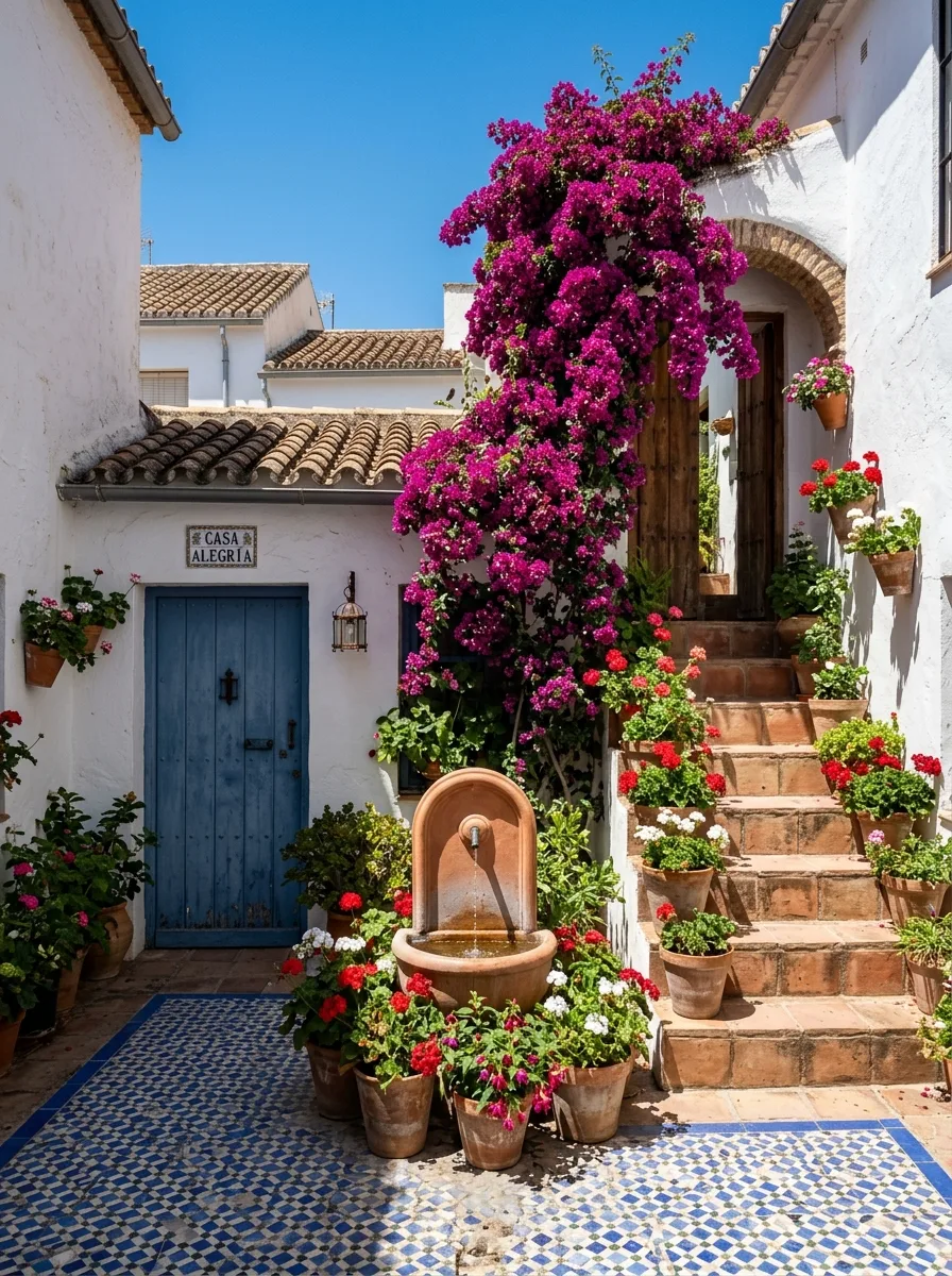
5. Sun-Kissed Bougainvillea Oasis Inspired by Andalusia
Start with a crisp, bright-white backdrop by applying smooth lime plaster to all the patio walls and finishing with pure white paint—avoid any creamy or off-white tones to keep the space vivid and fresh. For the flooring, choose classic blue-and-white encaustic tiles arranged in a striking geometric diamond pattern, creating an eye-catching foundation that complements the walls perfectly.
Let a mature bougainvillea take center stage as living architecture. Position one established plant in the corner where two white walls meet, guiding it to climb as high and as wide as the structure allows. This dramatic scale is essential; a small potted bougainvillea won’t capture the same bold presence. Instead, aim for a lush, sprawling vine that blankets several square meters, adding vibrant color and organic texture to the clean white surfaces.
At the base of each wall, gather terracotta pots filled with bright red geraniums, creating clusters rather than sparse placements. Use simple stone plinths to vary the height of the pots, generating layered interest and a sense of abundance. This collection of fiery blooms grounds the space and adds warmth and life against the crisp white backdrop.
Incorporate a wall-mounted terracotta fountain set within a Moorish-arched tile frame to introduce soothing water sounds and a touch of old-world charm. Opt for a minimalist design: a small spout feeding water into a half-basin that flows continuously, striking a perfect balance between decorative and serene.
Finally, finish the look with a single blue-painted door to anchor the space and complement the floor tiles, paired with an understated iron wall lantern for soft illumination. Resist the urge to overcrowd—this carefully curated combination speaks volumes with its simplicity and harmony.
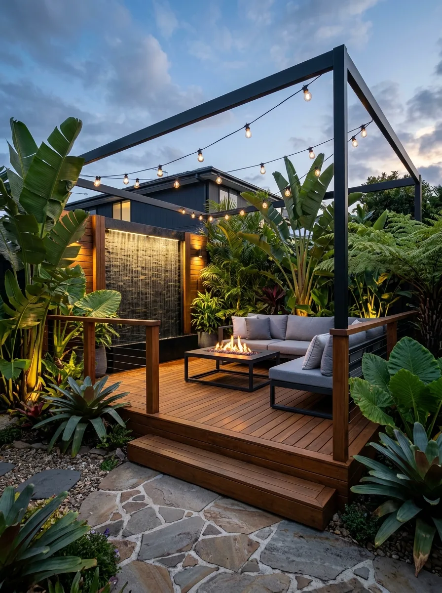
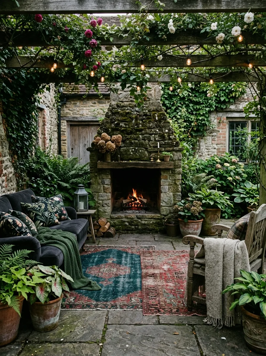
6. Opulent Tropical Evening Oasis
This patio is crafted to come alive under the cover of night, transforming your outdoor area into an enchanting evening retreat. Begin by constructing a raised hardwood deck with sharply defined edges that step down gracefully to a pathway of flagstone interspersed with smooth pebbles. Along the back wall, install a sleek wood-slat privacy screen that incorporates subtle warm LED strip lighting along its upper border, casting a soft, inviting glow.
Enhance the ambiance with a striking, full-height water curtain—a framed panel in stainless or steel that lets water cascade gently down its surface. Illuminate this feature both from above and below with warm LED lights, creating a mesmerizing play of light and water that serves as an elegant focal point. Place a modular outdoor sofa upholstered in warm grey fabric nearby, designed for low-profile seating that encourages relaxation. Anchor the space with a dark steel fire table at the center, and add a rattan hanging egg chair in one corner, suspended from a sturdy floor stand to provide a cozy nook.
Incorporate lush greenery to add texture and height; tall banana plants, bird of paradise, and areca palms form a natural overhead canopy, creating a tropical vibe. Closer to the ground, layer in vibrant bromeliads in rich pink and orange hues, orchids displayed in glossy ceramic pots, and imposing elephant ear alocasia to introduce dramatic, broad foliage. Illuminate the garden thoughtfully with warm LED spotlights positioned at ground level—amber tones highlight the palms, cool white lights accentuate the water feature, and the seating area is bathed in an overall warm glow.
This garden is a hidden gem by day, but as night falls, it transforms into an irresistible haven. When the clock strikes ten on a balmy evening, this glowing, intimate patio becomes the ultimate destination for unwinding and socializing, a space designed to captivate and comfort after sunset.
7. Lilac Haven with Circular Paver Design
Sometimes, the shape of your patio can create a stunning focal point all on its own. Consider installing a perfect circle of concrete or natural stone pavers at the heart of your garden. Frame this circle with a darker brick border laid in a soldier course pattern to add a striking contrast. Make sure the space is ample enough to comfortably fit a small dining set with four chairs, allowing plenty of room to move around.
Envelop this circular patio with a half-moon of lush lawn on one side and a sweeping arc of black mulch on the other. Within the mulch bed, place a solitary lilac tree as the standout feature, positioning it so its branches gently shade part of the paved area. Beneath the tree, plant a palette of low-growing shrubs and perennials in shades of white and soft lavender to complement the lilac’s blooms and keep the color scheme harmonious.
To create a gentle visual transition between the mulch and the patio, include a single stepping stone disk embedded in the mulch. This subtle detail guides the eye and adds texture without disrupting the overall flow. For now, leave the circular space unfurnished—the choice of furniture is a personal touch best left to the garden’s owner, allowing them to tailor the spot to their lifestyle and taste.
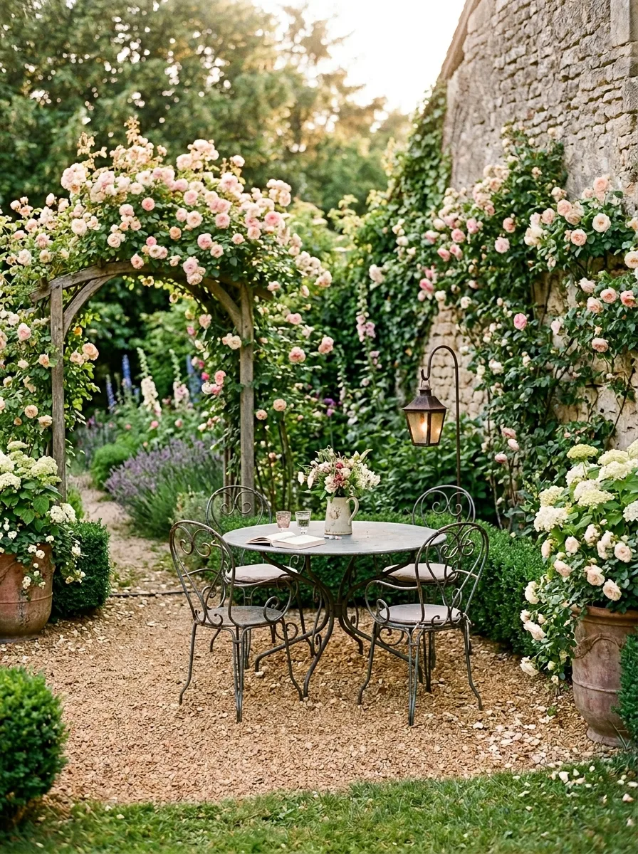
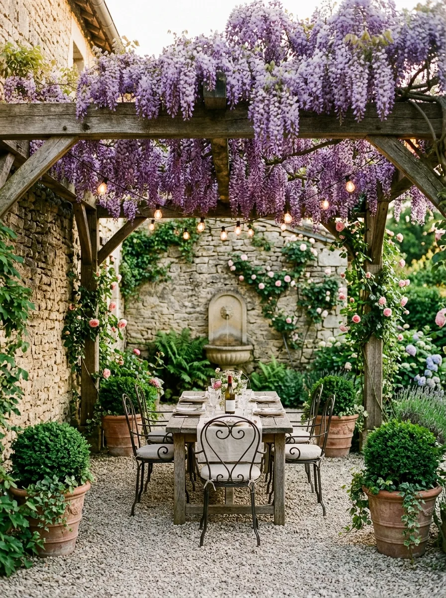
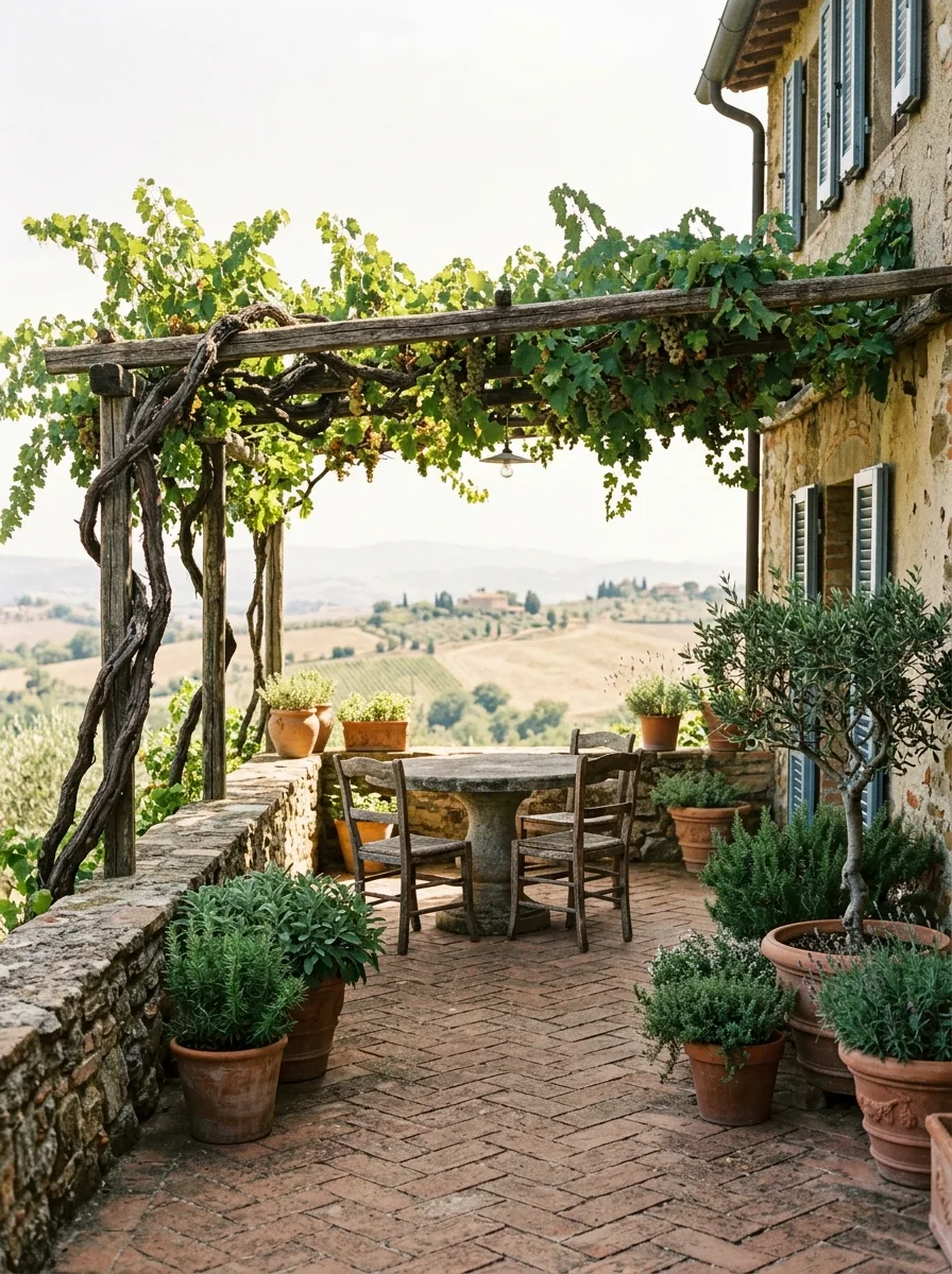
8. Stone Dining Area Under a Wisteria-Covered Pergola
Construct a sturdy pergola using rough-hewn oak posts and beams rather than typical treated softwood, which ages to a dull, flat grey that can appear cheap and uninspired. Oak, on the other hand, naturally weathers to a rich, silvery patina full of depth and character, giving your outdoor structure a timeless, elegant look that suggests heritage rather than wear.
At the base of each oak post, introduce Wisteria sinensis, training its main vines horizontally beneath the pergola beams with the help of discreet wire supports attached via vine eyes. Let the flower-laden spurs cascade downward freely, creating an enchanting draped effect once fully matured. Although it can take four to five years for the wisteria to fully envelop the pergola, the stunning display it eventually provides is well worth the patient wait.
For the flooring, lay down a smooth, pale gravel in soft champagne or oyster hues, ensuring it’s well-compacted and neatly edged to maintain a clean, polished appearance. Center a long wooden farmhouse table beneath the pergola, drape it with a loosely fitted linen tablecloth, and surround it with iron bistro chairs for a charming mix of rustic and refined seating—whether uniform or eclectic.
Elevate the evening ambiance by stringing delicate festoon lights along the pergola’s beams, casting a warm, inviting glow. At the far end of the space, position an intricately carved stone wall fountain to act as a captivating focal point and visual anchor.
To complete the look, flank the pergola entrance with terracotta pots filled with meticulously clipped boxwood spheres, adding structure and formality. In the adjoining garden beds, allow hydrangeas, lavender, and roses to flourish, their lush blooms spilling gracefully over the gravel borders to soften the hardscaping with vibrant texture and color.
9. Cozy Adirondack Seating Around a Gravel Fire Pit
This patio design stands out as the simplest and most accessible option in the entire collection, requiring virtually no advanced construction skills. Start by outlining a circle roughly four meters in diameter in your backyard. Dig down about ten centimeters, then lay down landscape fabric to prevent weed growth. Next, fill the area with white pea gravel, tamping it down firmly to create a stable, attractive surface.
At the center of this space, place a round fire pit made from dry-stacked natural stone, about sixty centimeters wide. You can either build this yourself or buy a ready-made option, depending on your preference. Surround the fire pit with four Adirondack chairs crafted from weathered teak or stained cedar, evenly spaced for comfort and conversation.
To add height and texture, position a large planter behind one of the chairs and plant a tall ornamental grass such as Miscanthus sinensis or Cortaderia. Along the perimeter, incorporate shade-loving plants like hostas and other broad-leaf varieties to soften the edges and introduce greenery. Scatter two or three sizable boulders irregularly throughout the gravel area to create natural focal points and add visual interest.
With these simple steps, your backyard transforms into a cozy, inviting retreat with minimal effort and expense. This straightforward patio requires no complex tools or skills—just thoughtful placement and quality materials to bring it all together.
10. Serene Water Garden Featuring Japanese Maple Trees
Think of the Japanese maple as the centerpiece of your patio landscape, with every other element designed to enhance and showcase its beauty.
Choose a mature Acer palmatum dissectum—the weeping variety known for its finely cut leaves—and situate it where it’s visible both from inside your home and from your main outdoor seating area. Let the tree grow naturally, only trimming away dead or crossing branches to maintain its graceful form without heavy pruning.
Create a tranquil base around the maple by layering white pea gravel alongside darker river stones, arranging them in clean, contrasting bands separated by concealed metal edging. Integrate large, flat stepping stones that invite you to wander through this serene ground cover. Nearby, place a sizable black glazed ceramic bowl filled with water lilies, adding a subtle water element that complements the tree without overpowering it.
Accentuate the space with low black iron lanterns positioned along the edges of pathways to provide gentle illumination. To frame the area and add privacy, install a bamboo screen fence that reinforces the garden’s peaceful, Zen-like ambiance.
For seating, keep it simple: a single bench or a pair of chairs placed in a secondary spot that naturally draws the eye toward the Japanese maple. The tree isn’t just a feature—it’s the focal point, the heart of your outdoor retreat.
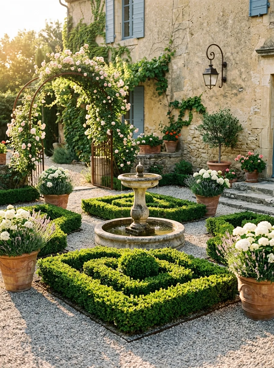
11. Charming Provençal Knot Garden Featuring a Stone Fountain
A formal parterre garden demands dedication and regular upkeep, but when executed with precision, it stands out as one of the most stunning patio landscaping options. Begin by spreading a layer of fine, light-colored gravel uniformly across the entire outdoor space. Within this gravel bed, construct a low boxwood hedge arranged in a classic knot garden pattern. The design features interlocking geometric shapes, each roughly one meter square, with the hedges carefully trimmed to maintain a consistent height of about thirty centimeters.
At the heart of this elegant layout, place a tiered fountain crafted from pale limestone or weathered concrete to bring an element of timeless charm. The fountain should be kept running continuously, providing a soothing water feature that anchors the garden visually and audibly. To frame the entrance, position a gracefully curved iron arch adorned with climbing roses in soft blush pink or apricot hues, adding a romantic flourish that contrasts beautifully with the precise hedging.
Enhance the corners of the garden with oversized terracotta urns in varying sizes, each planted with a mix of standard roses, fragrant lavender, and crisp white hydrangeas to introduce texture and color diversity. Along the wall of the house, mount wrought iron lanterns symmetrically on either side to offer subtle illumination and complement the garden’s formal aesthetic.
The defining characteristic of this style is the impeccable maintenance of the boxwood hedges, which should be clipped at least twice a year to preserve their sharp, clean lines. While the hedges require strict attention, the surrounding plantings can enjoy a more relaxed, natural look. It’s this deliberate interplay between the structured, manicured hedging and the freely cascading roses that creates the dynamic visual tension making the parterre garden so captivating.
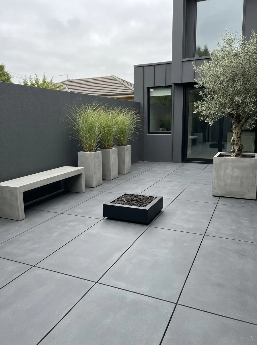
12. Sleek and Subtle Charcoal Patio Design
Imagine a sleek, minimalist courtyard defined by simplicity and intentional restraint. The ground is paved with expansive, dark charcoal porcelain tiles arranged in a seamless grid with narrow grout lines, creating an impeccably smooth, flat surface that feels both modern and timeless. This uniform base sets a calm, understated tone for the entire area.
Along the back wall, three identical tall concrete planters stand side by side, each showcasing a single tuft of feather grass (Stipa tenuissima). These light, wispy plants add a gentle, dynamic texture as their delicate blades sway effortlessly with every breeze, imparting subtle movement and softness to the space. On the adjacent side wall, a larger square planter holds a semi-mature olive tree, its silvery-green foliage providing a stately, natural focal point.
Positioned parallel to the trio of planters is a minimalist concrete bench, pared down to its essential form without a backrest, inviting quiet moments of reflection without distraction. At the heart of the courtyard, a compact, low-profile black fire bowl offers warmth and ambiance, its clean lines echoing the restrained aesthetic throughout.
No additional furniture or decorations clutter the area. The walls remain bare and unadorned, enhancing the sense of spaciousness and simplicity. The only source of illumination is a single recessed uplight installed in the ground beneath the olive tree, casting a subtle glow and accentuating the natural beauty of the foliage after dark. This space’s strength lies entirely in its deliberate absence of excess—proving that sometimes, less truly is more.
13. Lush Island-Inspired Fire Pit Patio Retreat
Create an elevated hardwood deck that rises a step above the surrounding terrain—this subtle elevation is key, as the deck itself acts as a focal point, while the surrounding landscape forms the backdrop. This distinction sets the stage for outdoor living, emphasizing the deck as the centerpiece.
Opt for robust hardwoods like ipe or comparable dense timber, using wide planks left to age gracefully to a natural silver-grey patina or enhanced with a warm-toned oil finish to maintain their rich hues. Above the deck, install a minimalist pergola crafted from powder-coated black steel, featuring only vertical posts and horizontal crossbeams—leave it open without additional infill panels. Drape warm white festoon lights loosely between the beams, creating gentle arcs of soft illumination that add ambiance without overpowering the space.
Position a low-profile, rectangular gas fire pit coffee table at the heart of a corner sectional sofa outfitted in durable grey outdoor fabric. Ensure the fire feature is centrally visible from every seat to foster a cozy and inviting atmosphere. Behind the deck, mount a striking water wall against the rear fence—a sleek stainless steel panel or a bamboo-accented cascade where water gently flows down the surface. Illuminate this feature from below with warm LED uplighting to enhance its tranquil presence as dusk falls.
Surround the base of the deck with lush, tropical foliage featuring broad-leafed plants such as banana palms, elephant ears, tree ferns, and bromeliads. Install ground-level lighting to cast an enchanting glow on these plants after dark, creating a vibrant, natural border that complements the deck’s clean lines while adding depth and texture to the landscape.
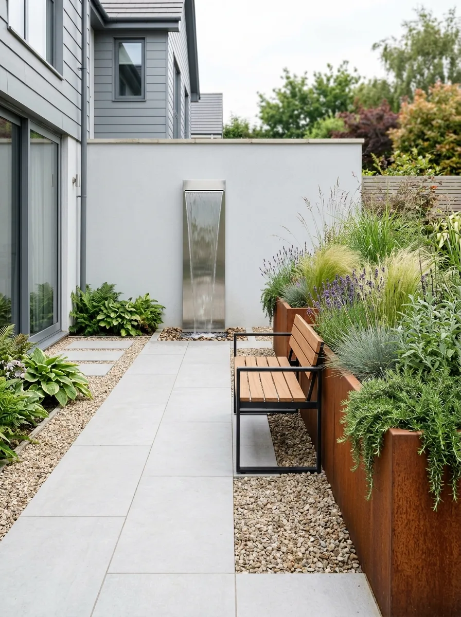
14. Contemporary Corten Steel and Sleek Blade Water Feature Garden
For a sleek, modern take on patio landscaping, consider using large-format, light-toned concrete slabs as your main flooring, creating a clean and spacious foundation. Surround the slabs with a fine gravel border in a similar hue, which not only contrasts subtly with the concrete but also delineates the space from adjacent walls, enhancing the overall minimalist aesthetic.
Within the gravel edging, place two or three rectangular planters crafted from corten steel, varying their sizes to add visual interest. Fill these containers exclusively with ornamental grasses and lavender, opting for a restrained planting scheme that avoids bright flowers or overly vibrant foliage, maintaining a calm and contemporary vibe throughout the space.
Feature a tall, narrow stainless steel water element mounted on the rendered wall—a slim vertical panel where water gently cascades from the top into a discreet trough below, producing a soothing, uninterrupted sound. Position a single LED uplight beneath the water feature to highlight its texture and movement after dusk, creating a serene focal point.
Complete the setup with a bench that combines a black powder-coated steel frame and teak slatted seating, oriented toward the water display to encourage relaxation and contemplation. This design demands minimal upkeep: ornamental grasses require a single trim in early spring, lavender benefits from a late summer pruning, corten steel planters need no maintenance, and the water feature operates continuously with little intervention, making it ideal for those seeking stylish yet fuss-free outdoor living.
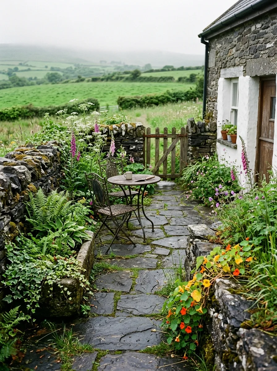
15. Cozy Irish Moorland Bistro Nook
Picture a cozy nook with just two chairs and a small table, where your morning coffee takes center stage and the natural surroundings complete the scene. For the foundation, lay down dark, irregular slate flagstones along the side of your home. Embrace their uneven shapes and let moss naturally fill the crevices, adding a touch of softness and age. Avoid using pressure washers on this paving to preserve its delicate, lived-in charm.
Choose a pair of vintage-style French iron bistro chairs—preferably the kind that have weathered countless seasons outdoors. Pair them with a round iron table whose paint shows wear and fading, lending a rustic, authentic feel to your patio setup. This furniture’s subtle imperfections tell a story and invite you to relax without fuss.
Surround this arrangement with plants that grow freely and organically. Let ferns and hostas spread naturally, while nasturtiums spill gracefully from a cracked stone urn. Encourage foxgloves to self-seed in the spaces between the stones, and allow a climbing rose to wander sideways instead of reaching skyward. This untamed planting style creates a charming, effortless garden sanctuary.
The only structured element is a dry-stone wall or an arrangement of large, irregular rocks forming a boundary. Complement this with a wooden gate that opens to the rest of the garden—slightly askew, dusted with moss at its base—perfectly blending formality with natural beauty. This subtle contrast adds character and invites exploration beyond the patio space.
Conclusion
A backyard that truly comes alive is one shaped by decisive choices. Every patio and garden setting thrives because it embraces a distinct style—whether it’s lush and romantic, sleek and minimal, structured and formal, or wild and free-spirited. Instead of trying to blend every idea, these spaces commit wholeheartedly to their unique vision. That commitment transforms a simple outdoor area into a purposeful retreat with a strong personality.
Don’t let the fear of losing options hold you back from defining your garden’s character. A landscape with clear intent invites you to live fully in the moments you spend there—be it savoring your morning coffee, gathering around an evening fire, hosting summer dinners, or enjoying a quiet Sunday with a book. Design your patio for the way you genuinely live outdoors, because that’s the space you’ll return to again and again, making it your true outdoor sanctuary.