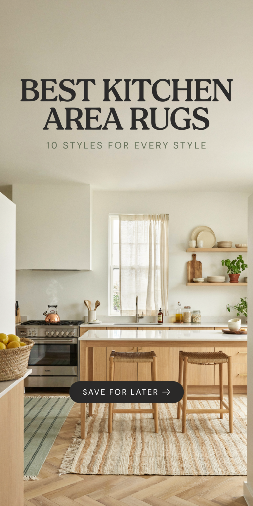
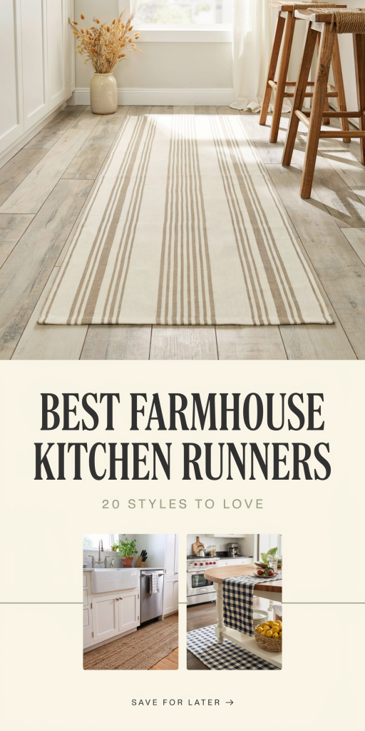
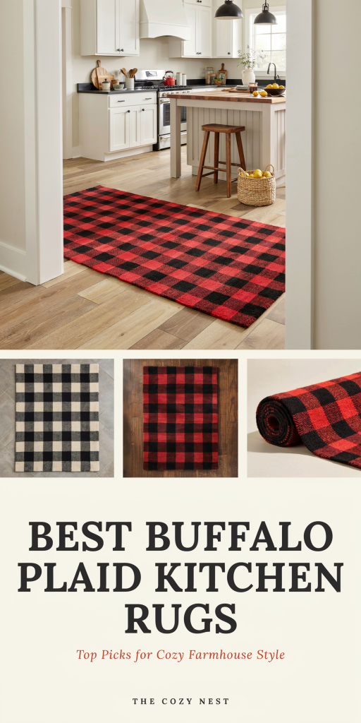
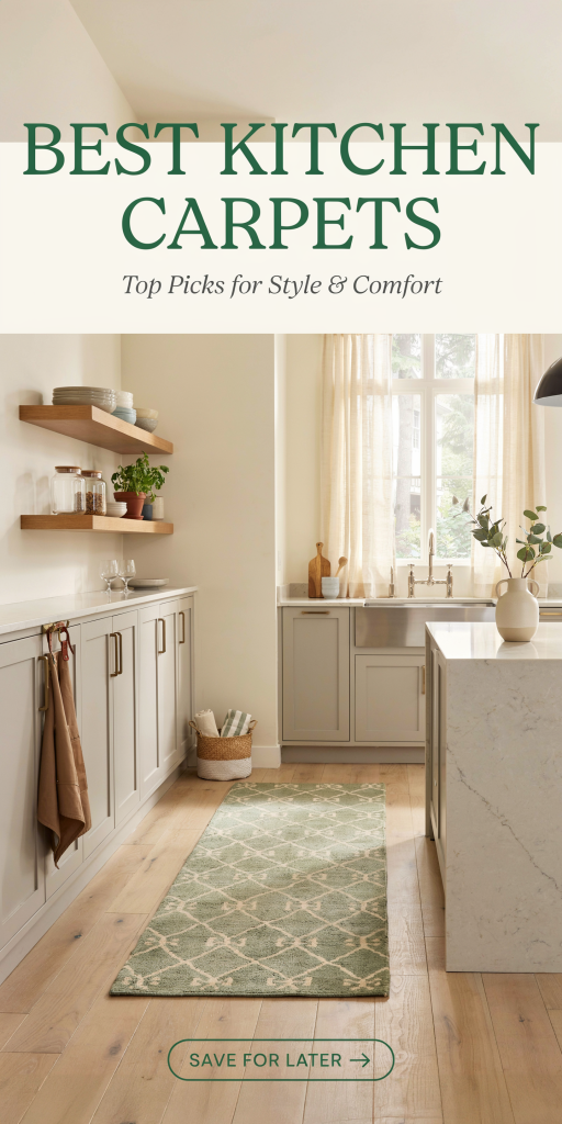
Finding the perfect kitchen rug can be a challenge—especially when you need something that can stand up to spills, heavy foot traffic, and constant cleaning without sacrificing style or comfort. In 2026, kitchen rugs have evolved, offering enhanced durability, safety features, and easy maintenance to keep your kitchen cozy and functional. Whether you’re standing by the stove for dinner prep or catching spills by the sink, the right rug transforms your kitchen experience.
Below, we explore some of the best kitchen rugs available this year, highlighting their key features, benefits, and specs to help you make an informed decision.
Gorilla Grip Original Durable Kitchen Rug
The Gorilla Grip Original rug stands out for its heavy-duty construction and excellent spill resistance, perfect for busy kitchens. Made with stain-resistant materials and a non-slip rubber backing, it keeps you safe during cooking messes while adding a splash of style.
| Feature | Details |
|---|---|
| Material | Microfiber suede top; rubber backing |
| Dimensions | 20 x 59 inches (Runner) |
| Pile Height | 0.4 inches |
| Cleaning | Machine washable |
| Non-Slip Backing | Rubber grip |
| Comfort Level | Medium cushioning |
Thanks to its dense microfiber surface, the Gorilla Grip rug repels liquids and resists stains without absorbing odors. Its rubber backing ensures firm grip on tile or hardwood floors, significantly reducing slip hazards.
iDesign Pebble Non-Slip Kitchen Mat
The iDesign Pebble mat combines comfort and safety with a low-profile, easy-to-clean design. Its dense foam padding offers excellent anti-fatigue support, making it ideal for those long cooking sessions, while the textured TPR backing locks the mat in place securely.
| Feature | Details |
|---|---|
| Material | Polyester top; TPR backing |
| Dimensions | 20 x 48 inches |
| Pile Height | 0.4 inches |
| Cleaning | Machine washable (cold water) |
| Non-Slip Backing | Textured TPR |
| Comfort Level | Soft, cushioned foam |
This flat-woven style rug is stain-resistant, resists flattening, and cleans easily with household detergents or a quick spin in the washer. Perfect for modern kitchens seeking a practical yet cozy floor accessory.
Unique Loom Sofia Vintage Kitchen Rug
The Unique Loom Sofia rug introduces a touch of classic elegance with its vintage pattern and robust polypropylene fabric. It is incredibly durable and maintains vivid colors despite frequent washing and heavy use, making it a stylish, long-term solution.
| Feature | Details |
|---|---|
| Material | Polypropylene |
| Dimensions | 20 x 59 inches |
| Pile Height | 0.3 inches |
| Cleaning | Machine washable |
| Non-Slip Backing | Rubber backing |
| Comfort Level | Moderate cushioning |
This rug’s low-pile construction reduces tripping hazards and cleans well with vacuum or mop, while its slip-resistant backing secures it firmly in place. An excellent choice for those desiring both sophistication and practicality.
NuLOOM Marty Textured Kitchen Rug
For those looking to add warmth and texture, the NuLOOM Marty rug blends soft polyester fibers with a functional design to prevent slipping while providing comfort underfoot. The rug’s cushioning eases fatigue without compromising safety.
| Feature | Details |
|---|---|
| Material | Polyester |
| Dimensions | 20 x 48 inches |
| Pile Height | 0.35 inches |
| Cleaning | Machine washable (gentle cycle) |
| Non-Slip Backing | Latex anti-slip |
| Comfort Level | Cushioned support |
Despite its generous cushioning, the Marty rug stays low-profile enough to prevent trips, making it suitable for narrow kitchen spaces. Its stain-resistant fibers simplify everyday cleaning duties.
Kifadow Memory Foam Kitchen Mat
The Kifadow Kitchen Mat includes a thick memory foam layer designed to reduce foot and back fatigue while working in the kitchen. Its durable polyester top is comfortable and easy to clean, paired with a solid PVC backing to prevent unwanted slips.
| Feature | Details |
|---|---|
| Material | Polyester top; PVC backing |
| Dimensions | 20 x 39 inches |
| Pile Height | 0.4 inches |
| Cleaning | Spot clean recommended |
| Non-Slip Backing | PVC non-slip base |
| Comfort Level | High (memory foam padding) |
Ideal for cooks who spend extended periods standing, this mat cushions joints and reduces fatigue. While it requires gentle cleaning methods to preserve memory foam integrity, the comfort payoff is significant.
Buying Guide: Choosing the Right Kitchen Rug for Your Home
Selecting a kitchen rug isn’t just about appearance—it’s about finding the perfect balance of safety, durability, and comfort for a high-use space. Here are some key factors to weigh before making your choice:
1. Material Durability and Stain Resistance
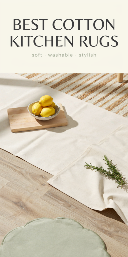
Your kitchen rug needs to withstand spills, dirt, and frequent washing. Durable synthetic fibers like polypropylene, polyester, and microfiber stand out for their stain-repelling qualities and color retention. Low-pile or flat-woven rugs offer better resistance against matting and wear.
2. Non-Slip Safety Backing
Safety is essential, especially in kitchens where water and oil can cause slips. Look for rugs with rubber, TPR, or PVC backing for reliable floor grip. Non-slip backing that holds up after washing and daily wear ensures your rug stays put and helps prevent accidents.
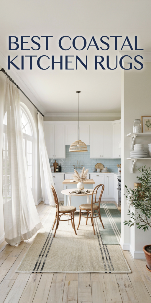
3. Size and Shape Compatibility
Consider your kitchen layout when choosing rug size. Narrow runners (around 20 inches wide) work well alongside sinks or counters, while rectangular mats fit under islands or workstations. Multi-piece sets can strategically cover multiple zones without overcrowding your floorspace.
4. Cleaning and Maintenance Needs
Busy kitchens benefit from rugs that are easy to wash, preferably machine washable with cold water and air dry recommendations. Avoid rugs requiring hand washing if you want hassle-free upkeep. Choose stain-resistant fibers and low-pile rugs that vacuum or wipe clean easily.
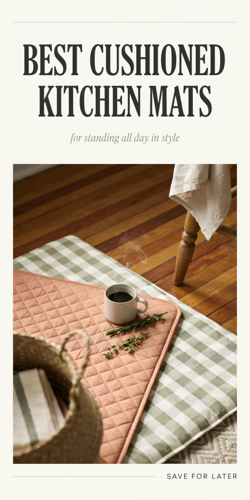
5. Comfort and Cushioning
If you spend lots of time standing while cooking, thicker rugs with memory foam or cushioned backings provide relief to your feet and joints. Aim for 0.3 to 0.4 inches thickness for a nice balance between comfort and spill safety without creating trip hazards.
6. Style and Aesthetic Fit
Beyond function, your kitchen rug should harmonize with your décor. Whether you prefer classic vintage designs, modern minimalist patterns, or soft subtle textures, the rug you choose can elevate your kitchen’s look while delivering practical benefits.
Conclusion
A quality kitchen rug creates a safer, comfier space to prepare meals and entertain. The best rugs combine durable, stain-resistant materials with cushioned support and dependable non-slip backing. Among top contenders in 2026, options like the Gorilla Grip Original, iDesign Pebble mat, and Unique Loom Sofia offer a fantastic mix of performance and style.
When selecting your ideal kitchen rug, think about your priorities—whether it’s fatigue relief, slip resistance, or ease of cleaning—and choose a rug formulated to meet those demands. Investing in a thoughtfully designed kitchen rug means less stress on your feet, fewer slips, and a kitchen that looks inviting for years to come.
Explore all the best kitchen rugs on Amazon to find your perfect fit today!