There’s something timeless and inviting about the marriage of blue and terracotta tones in a living room. These hues, rooted in nature, bring a harmonious balance between cool serenity and warm earthiness, creating a space that feels both tranquil and deeply welcoming. Whether you’re aiming for a modern, sophisticated look or a cozy, rustic retreat, the interplay of soft blues with rich terracotta accents can transform your living room into a sanctuary that reflects your personal style and invites relaxation. Embracing this color pairing allows you to craft an environment that’s visually captivating yet comforting—a perfect backdrop for everyday moments and special gatherings alike.
Incorporating blue and terracotta doesn’t just enhance aesthetics; it breathes new life into your living space by adding depth, texture, and a subtle vibrancy that invigorates the atmosphere. From plush cushions and elegant rugs to statement walls and curated décor pieces, there are countless ways to infuse these complementary tones to suit your taste and lifestyle. As you explore this dynamic duo, you’ll discover how to strike the ideal balance between boldness and subtlety, creating a living room that feels curated and effortlessly stylish. Now is the perfect time to rethink your décor and embrace a palette that celebrates warmth and calm in beautiful harmony.
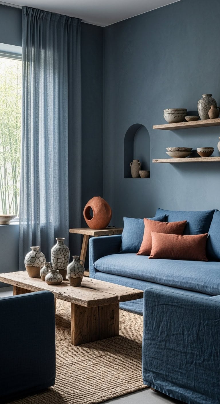
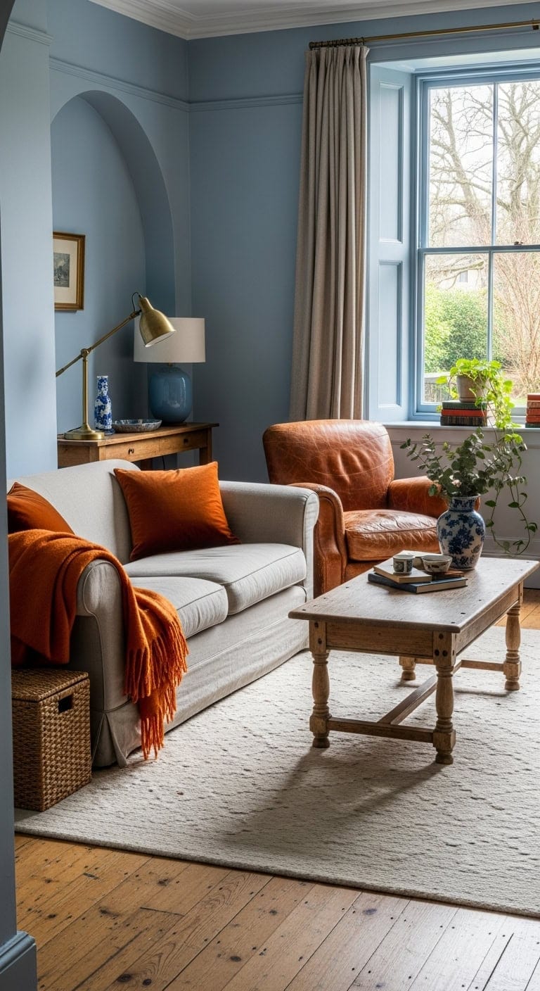
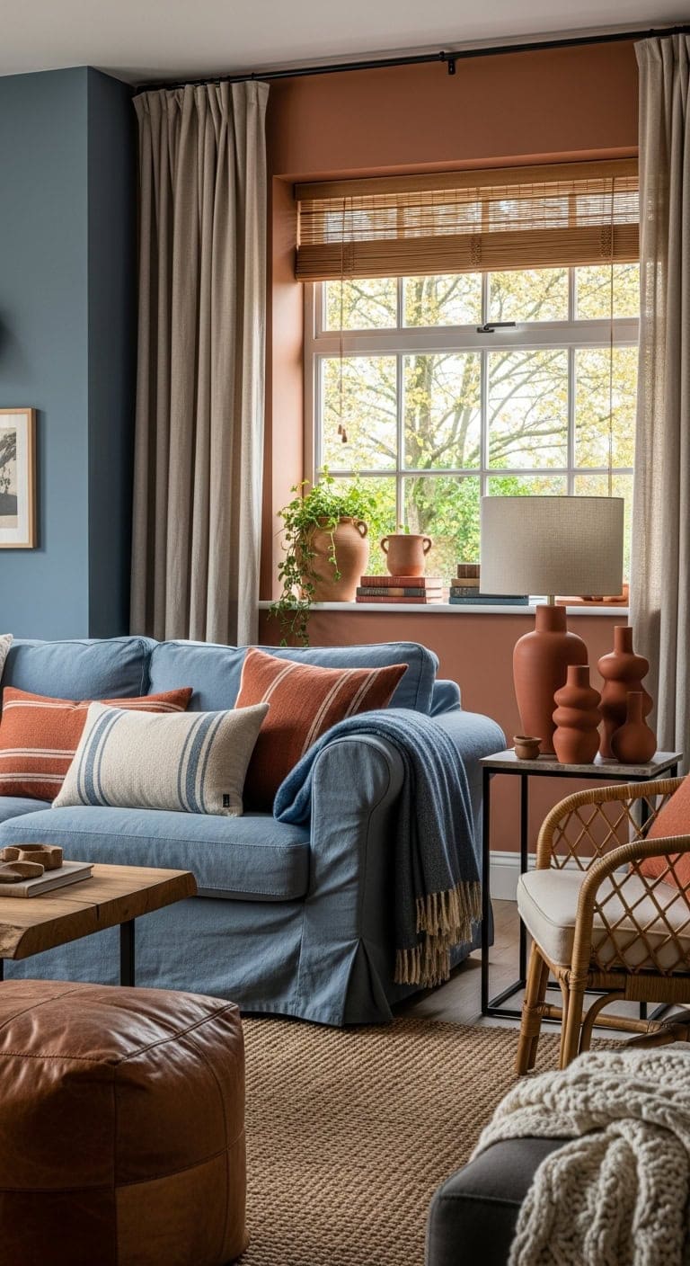
1. Cozy Farmhouse Charm with Blue and Earthen Tones
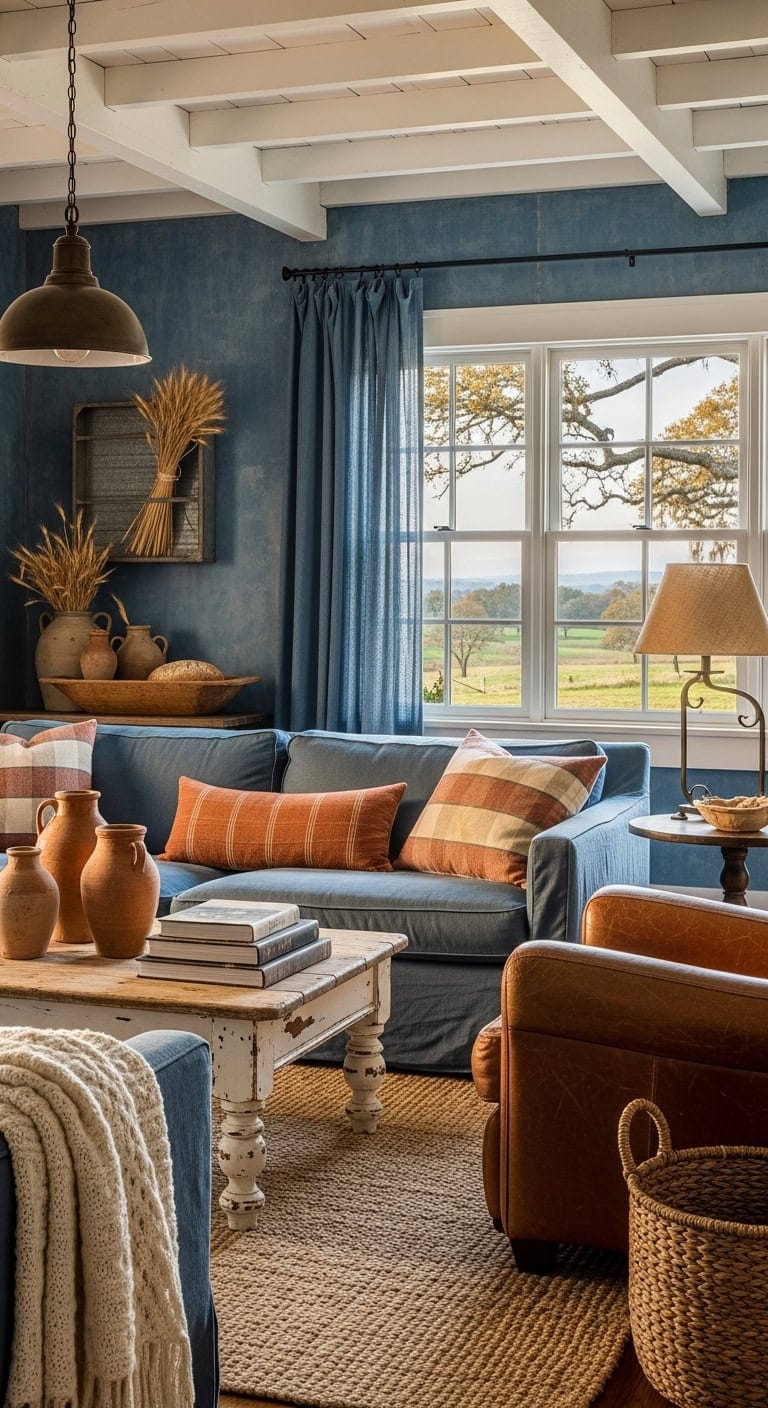
Soft denim-blue walls set a serene backdrop that perfectly complements the natural warmth of handmade clay decor. Linen drapes introduce gentle texture, contrasting beautifully with the rugged feel of terracotta accents and weathered wooden furnishings. This combination creates a space that feels both inviting and timeless, ideal for those who appreciate a lived-in, farmhouse aesthetic.
Key Design Elements
- Walls: Paint in ‘Denim’ (Sherwin-Williams SW 6523)
- Accent Wall or Built-ins: Paint in ‘Cavern Clay’ (Sherwin-Williams SW 7701)
Pro Tip: Ideal for spaces where comfort and casual elegance come together, such as family rooms or relaxed living areas.
2. Coastal Serenity with Earthy Warmth
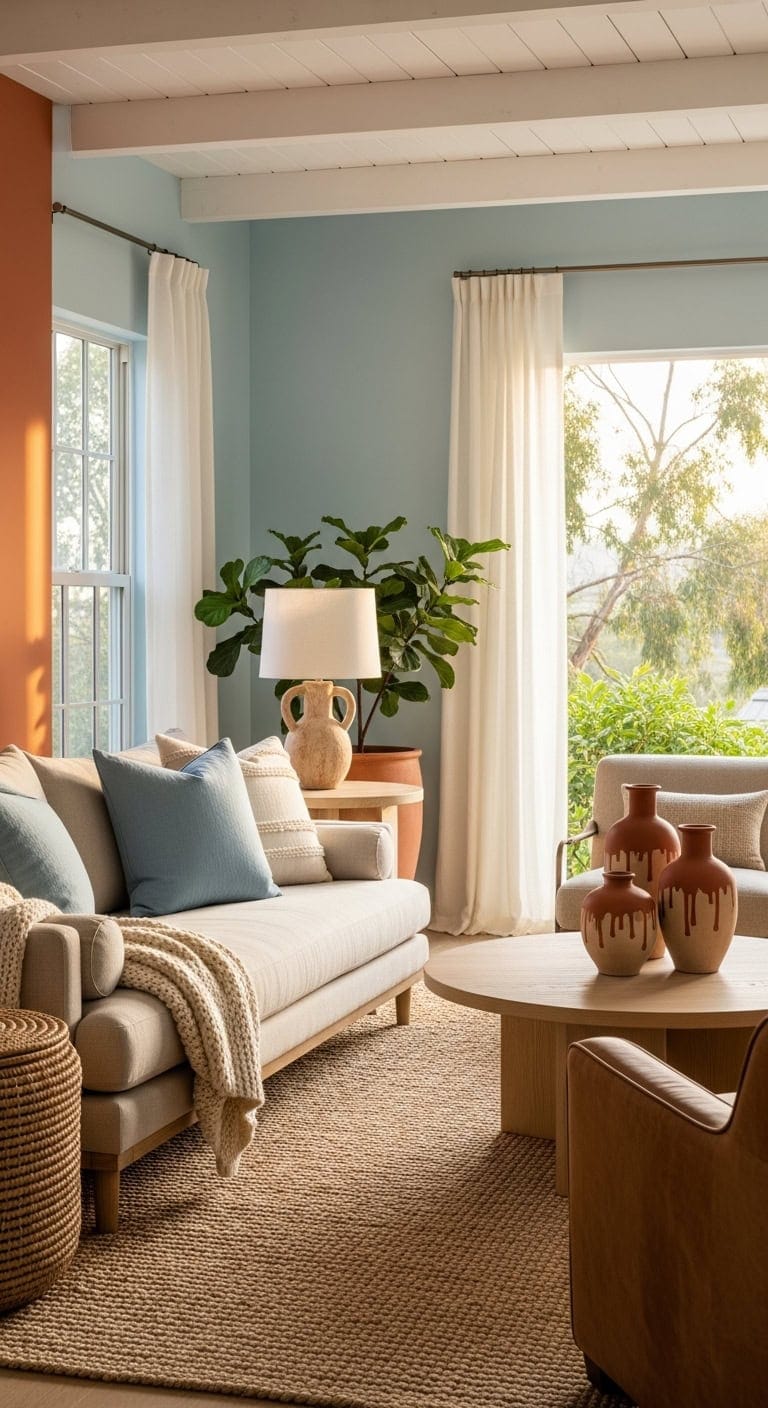
This color scheme evokes the tranquil beauty of a sunset by the sea, blending soft sky blues with rich terracotta hues. Textured linens and handcrafted clay accents add depth and a relaxed vibe, while woven natural fibers bring an organic touch to the room. Together, these elements create a space that feels inviting, balanced, and effortlessly stylish.
Key Design Elements
- Walls: Paint in ‘Upward’ (Sherwin-Williams SW 6239)
- Accent Wall or Built-ins: Paint in ‘Cavern Clay’ (Sherwin-Williams SW 7701)
Pro Tip: Ideal for enhancing light-filled living areas with mid-century or casual ranch-style architecture.
3. Serene Blue Fabrics and Earthy Clay Accents
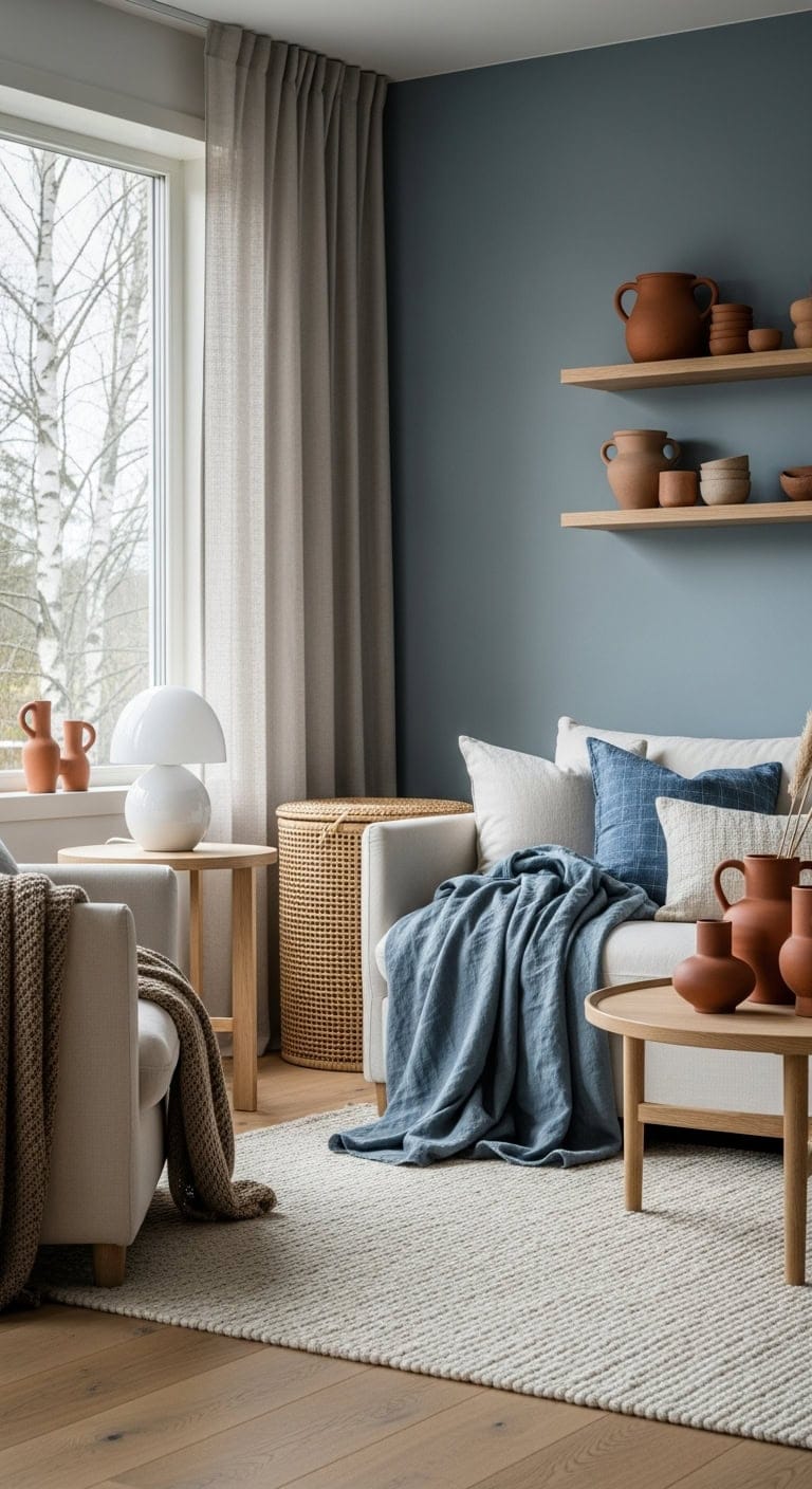
Gentle shades of muted blue linens softly enhance neutral seating, evoking a serene Scandinavian vibe. These calming blues beautifully contrast with rich terracotta ceramics placed thoughtfully throughout the room. Complemented by natural wood tones and textured woven elements, the space feels both warm and inviting.
Key Design Elements
- Accent Wall: Paint in ‘Windy Blue’ (Benjamin Moore 2067-60)
- Ceramic Display Shelf: Paint in ‘Cavern Clay’ (Sherwin-Williams SW 7701)
Pro Tip: Ideal for rooms seeking a cozy, minimalist look with a balanced color palette.
4. Seaside Elegance with Rustic Accents
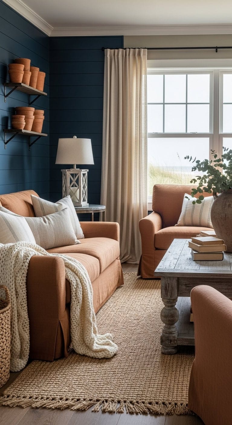
Deep navy shiplap walls create a striking yet serene ambiance reminiscent of coastal charm, while terracotta pots bring an earthy warmth that enhances the farmhouse feel. The interplay between the sleek, painted wood and the rugged texture of clay vessels offers a balanced, inviting atmosphere perfect for casual gatherings. This combination effortlessly blends sophistication with a touch of rustic personality.
Key Design Elements
- Shiplap Accent Wall: Paint in ‘Naval’ (Sherwin-Williams SW 6244)
- Terracotta Accent Pieces: Paint thrifted pots in ‘Cavern Clay’ (Sherwin-Williams SW 7701)
Pro Tip: Ideal for bright, open living areas where natural light highlights the contrast between cool and warm tones.
5. Serene Blues and Earthy Clay Accents
This living area blends soft, muted blues with rich clay hues to create a soothing, grounded atmosphere. The space highlights handcrafted ceramics and textured linens set against matte-finish plaster walls, offering an authentic, lived-in feel that polished designs often lack. The uneven surfaces and natural materials add a unique sense of calm and character.
Key Design Elements
- Walls: Paint in ‘Smoky Blue’ (Sherwin-Williams SW 7604)
- Accent niche or built-ins: Paint in ‘Cavern Clay’ (Sherwin-Williams SW 7701)
Pro Tip: Ideal for those who appreciate understated elegance with a focus on natural craftsmanship.
6. Cozy Contrast of Luxe Velvet and Warm Earthy Tiles
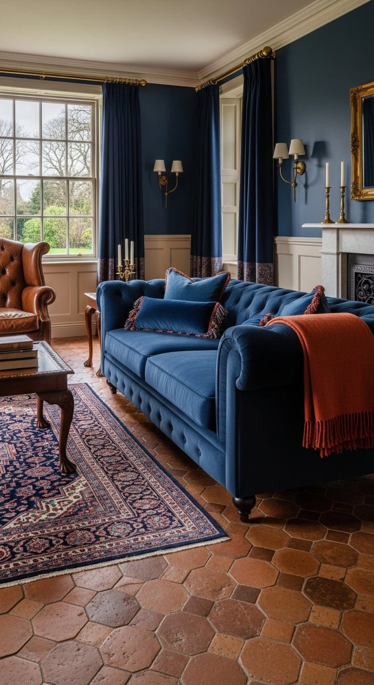
Soft velvet cushions create a rich, inviting texture that beautifully complements the rustic, natural feel of terracotta tile floors. This combination infuses a living room with timeless sophistication while maintaining a cozy, grounded atmosphere. The balance between plush fabric and earthy materials offers a harmonious blend of comfort and classic style.
Key Design Elements
- Accent Wall: Paint in ‘Naval’ (Sherwin-Williams SW 6244)
- Trim and Wainscoting: Paint in ‘Cavern Clay’ (Sherwin-Williams SW 7701)
Pro Tip: Ideal for living spaces featuring traditional architectural elements such as crown molding or detailed fireplace mantels.
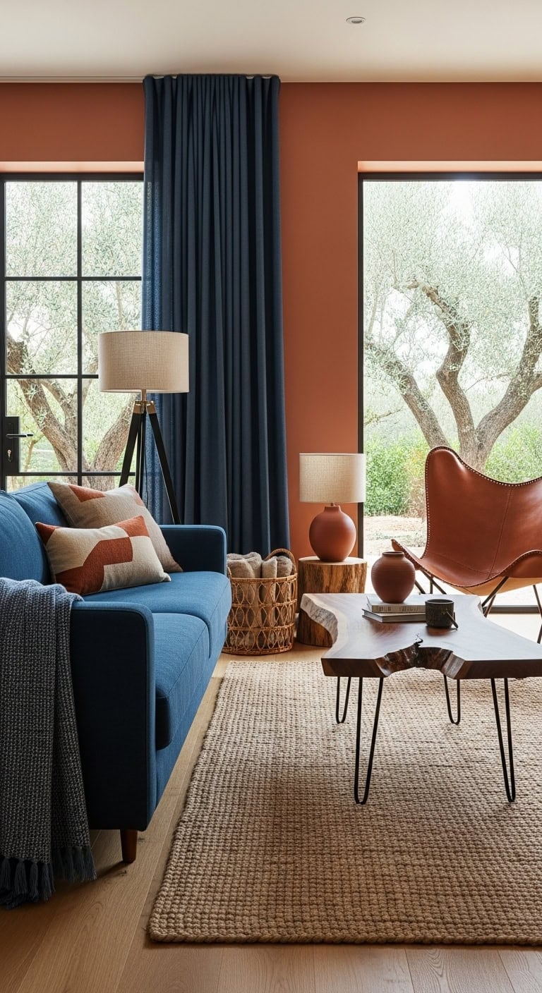
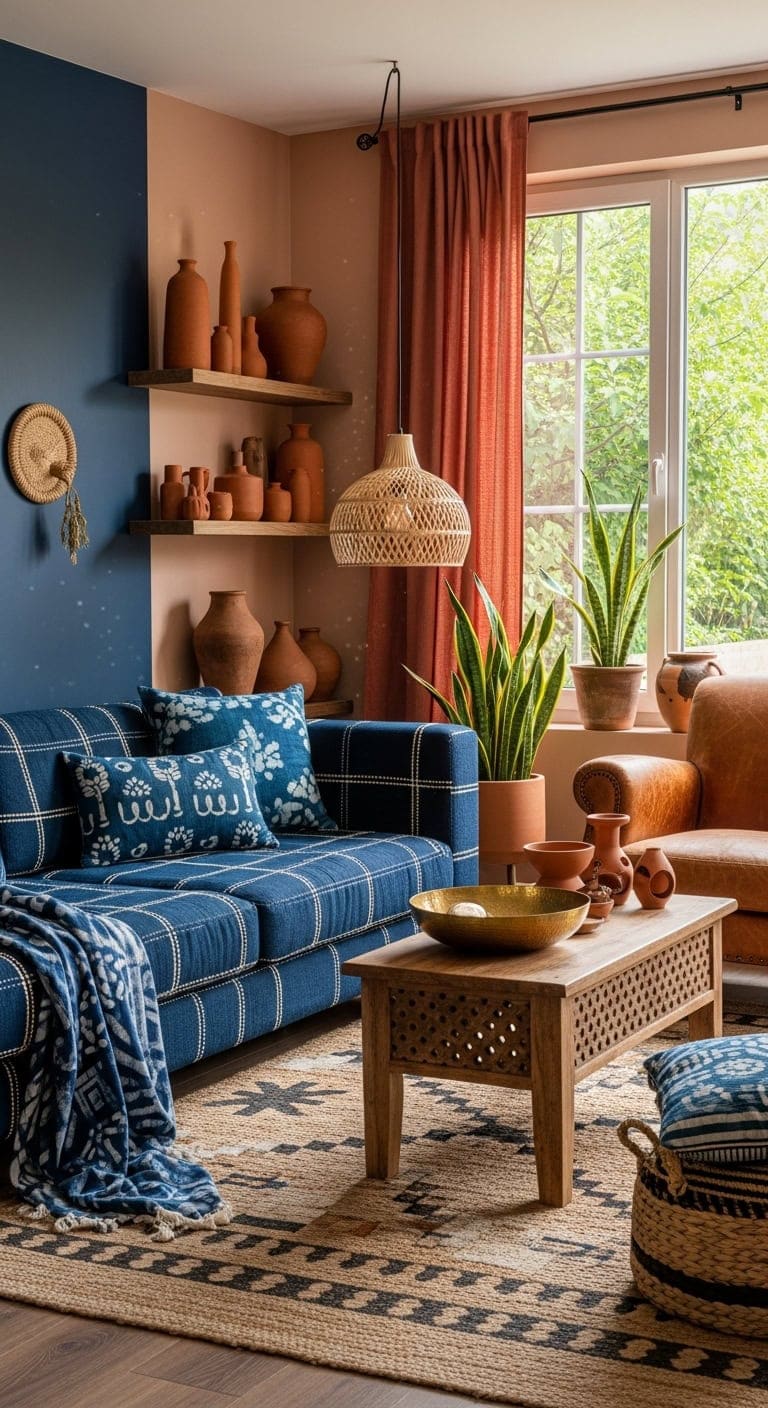
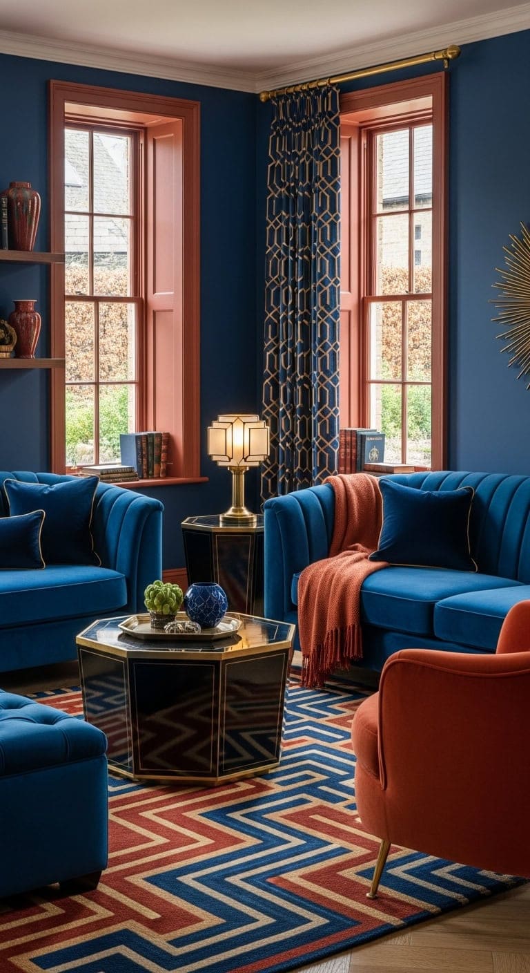
7. Rich Indigo Hues and Warm Terracotta Accents
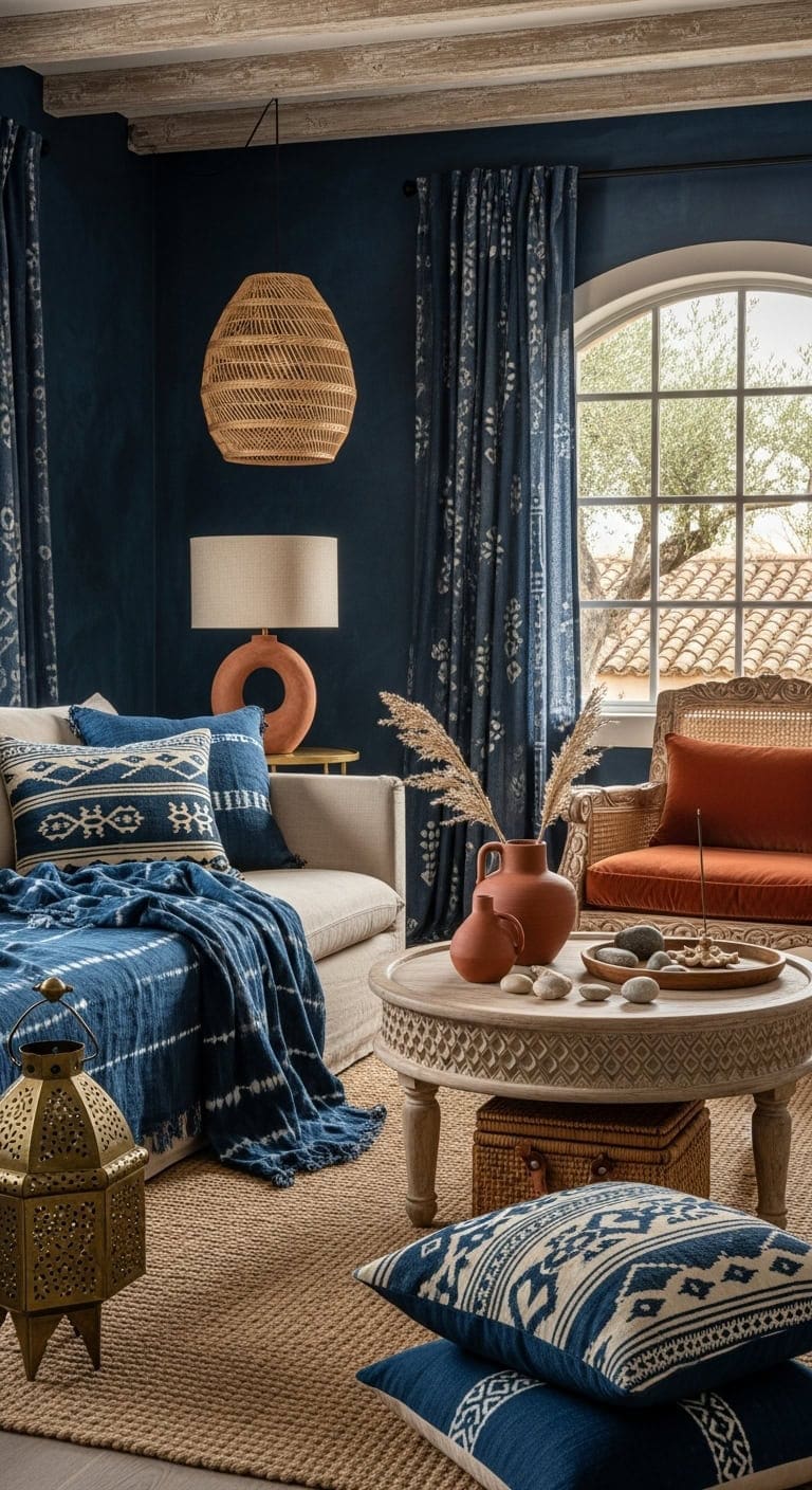
Combining saturated indigo shades with warm terracotta tones brings a curated yet cozy vibe to any living room. Soft linen furniture is enhanced with layered mudcloth textiles, while woven jute elements add an organic, tactile foundation. This pairing achieves a balanced space that feels both worldly and inviting.
Key Design Elements
- Accent Wall: Paint in ‘Indigo Batik’ (Sherwin-Williams SW 7602)
- Trim and Built-ins: Paint in ‘Burnt Terracotta’ (Benjamin Moore 2175-30)
Pro Tip: Ideal for open layouts seeking a harmonious blend of global-inspired patterns and earthy colors.
8. Elegant Blue Walls Complemented by Warm Terracotta Accents
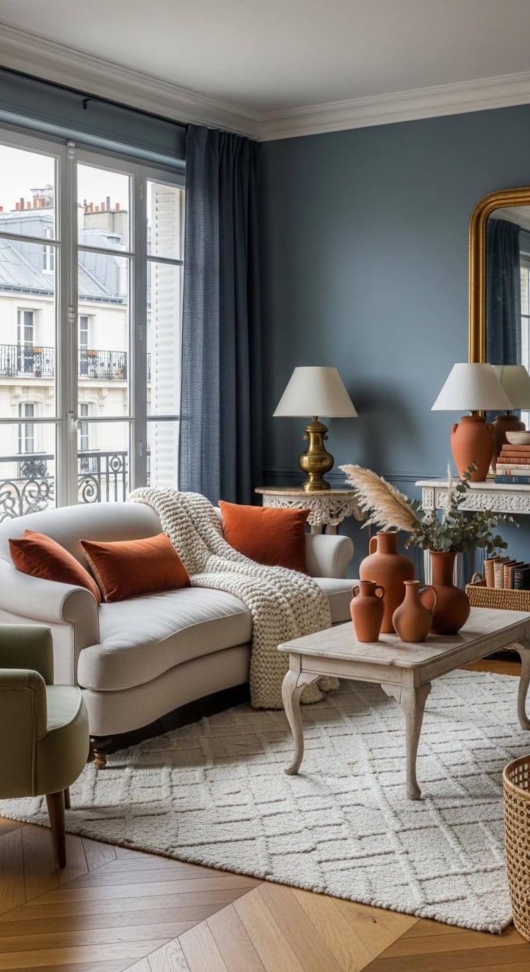
A gentle, muted blue on the walls sets a serene and chic atmosphere reminiscent of classic European interiors. This calming hue serves as the perfect canvas for rich terracotta pottery, whose earthy tones and smooth finishes beautifully contrast with textured fabrics and natural woven elements. The combination brings depth and warmth to the living space while maintaining a refined aesthetic.
Key Design Elements
- Walls: Paint in ‘Slate Blue’ (Benjamin Moore 1648)
- Accent Shelving or Built-ins: Paint in ‘Cavern Clay’ (Sherwin-Williams SW 7701)
Pro Tip: Ideal for rooms with limited natural light to add warmth without overpowering the space.
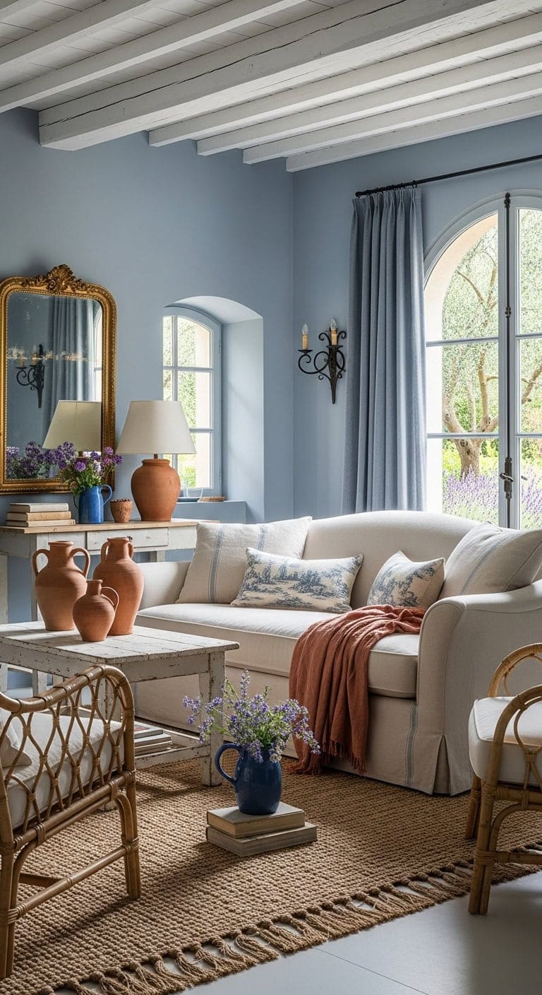
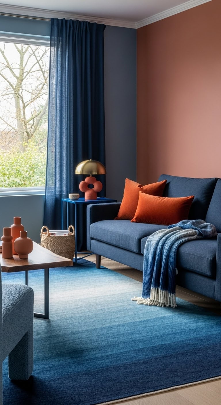
9. Serene Blue Walls Paired with Vibrant Tangerine Accents
A gentle, serene blue sets a peaceful tone for your living room, evoking a sense of timeless charm. Introducing plush burnt orange cushions adds an inviting burst of color that complements natural linen textures beautifully. The combination of soft textiles and earthy tones creates a balanced, effortlessly styled space.
Key Design Elements
- Walls: Paint in ‘Upward’ (Sherwin-Williams SW 6239) for a soothing powder blue
- Accent cushions or wall: Use ‘Cavern Clay’ (Sherwin-Williams SW 7701) to bring warmth and depth
Pro Tip: Ideal for creating a cozy yet refreshing atmosphere with classic and vibrant contrasts.
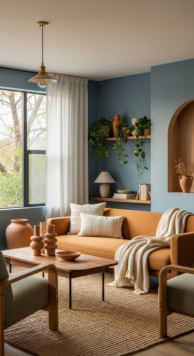
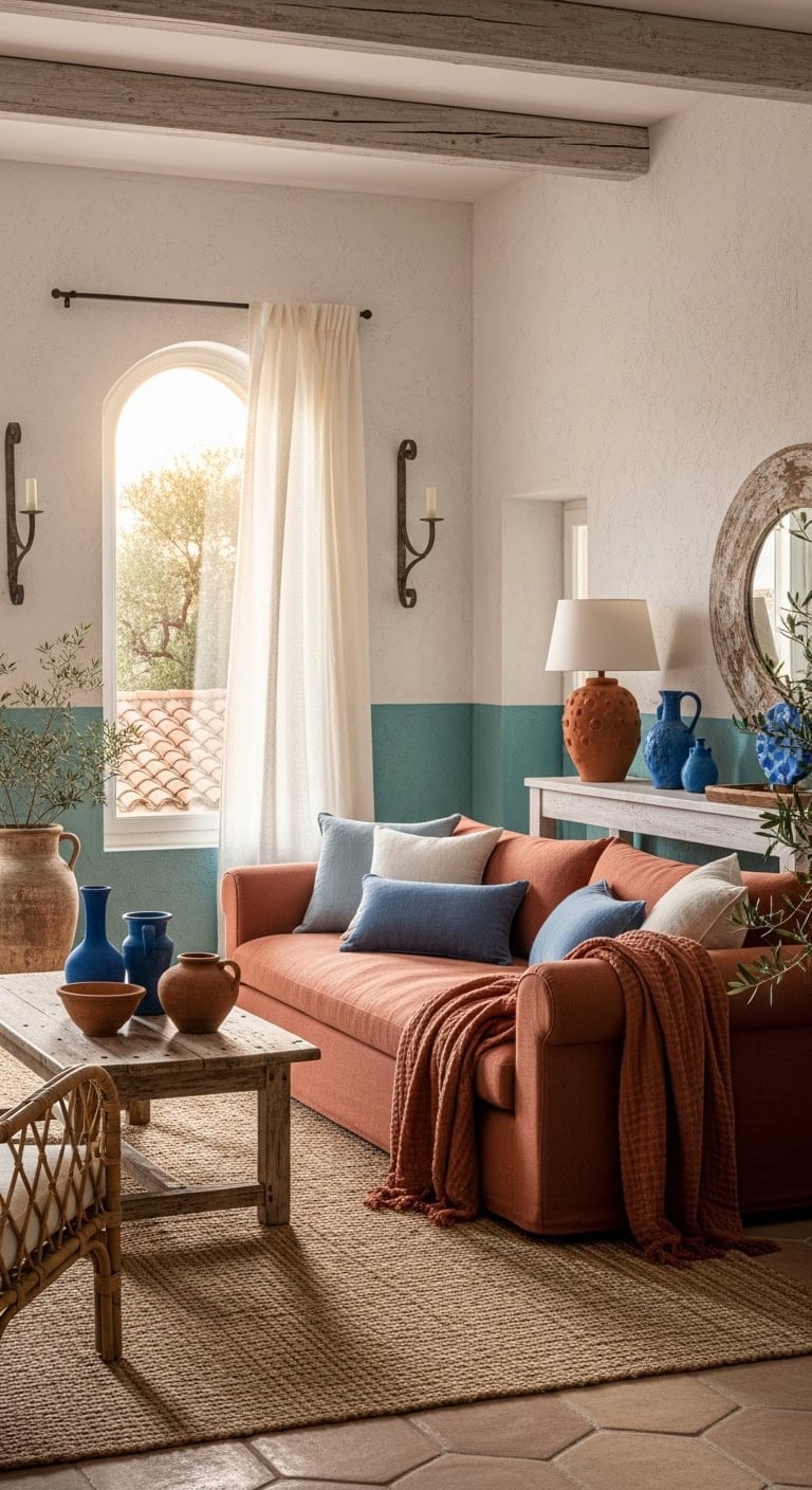
10. Earthy Blues and Warm Terracotta Harmony
Combining soothing shades of blue with rich terracotta tones brings a living room to life with a perfect balance of tranquility and warmth. The natural texture of clay pottery complements plush blue fabrics, while elements like woven jute rugs and reclaimed wood furniture introduce an inviting, organic feel. This blend evokes a space that is both comforting and refreshingly modern.
Key Design Elements
- Accent wall: Paint in ‘Cavern Clay’ (Sherwin-Williams SW 7701)
- Remaining walls: Paint in ‘Debonair’ (Sherwin-Williams SW 9139)
Pro Tip: Ideal for spaces that benefit from a grounded atmosphere without sacrificing a light, contemporary vibe.
11. Southwestern Charm with Turquoise and Earthy Terracotta
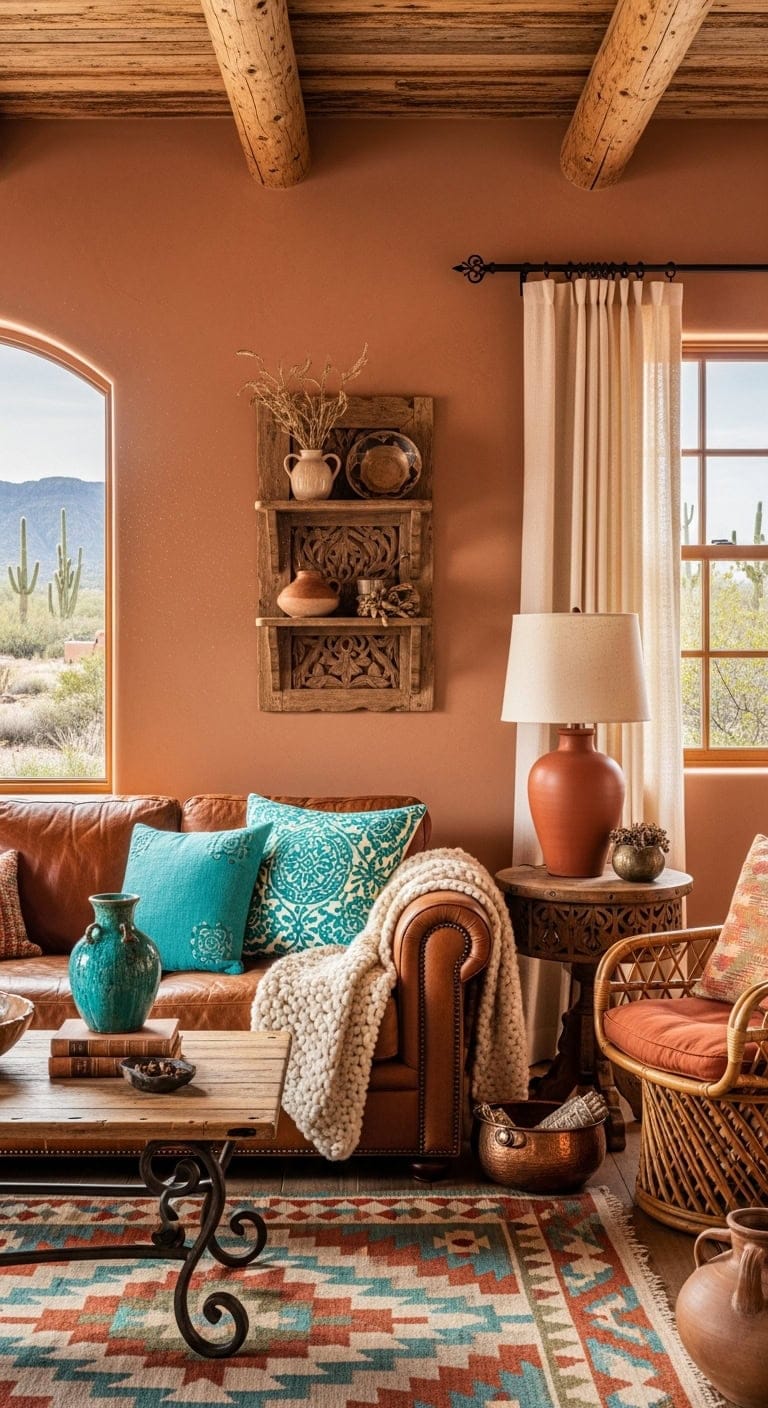
Infuse your living room with the warmth of sunbaked terracotta walls enhanced by lively turquoise highlights that evoke the essence of desert landscapes. This dynamic pairing offers a beautiful contrast, especially when combined with rustic wooden beams, intricate woven fabrics, and handcrafted pottery. The result is a cozy space that celebrates natural textures and vibrant color.
Key Design Elements
- Walls: Paint in ‘Cavern Clay’ (Sherwin-Williams SW 7701)
- Accent Wall or Built-ins: Paint in ‘Reflecting Pool’ (Sherwin-Williams SW 6486)
Pro Tip: Ideal for bright, open spaces where natural light can amplify these rich, southwestern tones.
12. Serene Blue Backdrop Enhanced by Warm Terracotta Accents
A soothing blue wall creates a tranquil canvas that highlights the inviting textures of terracotta pottery. The matte finish of the paint offers a sleek contrast to the rustic, earthy feel of the clay pieces, while soft natural fabrics introduce cozy layers to the streamlined design. This blend of cool tones and warm elements cultivates a balanced, contemporary living space.
Key Design Elements
- Walls: Paint in ‘Blueprint’ (Behr S510-5)
- Accent Niche or Built-ins: Paint in ‘Cavern Clay’ (Sherwin-Williams SW 7701)
Pro Tip: Ideal for minimalist spaces seeking a touch of organic warmth without clutter.
13. Earthy Elegance with Artisan Textiles and Clay Accents
Combining the rich texture of handwoven mudcloth with warm terracotta pottery adds layers of warmth and authenticity to your living room. This blend of tactile fabric and natural ceramic elements infuses the space with a sense of worldly artistry and handcrafted charm. Together, they create a grounded atmosphere that highlights cultural craftsmanship beyond typical mass-produced decor.
Key Design Elements
- Accent Wall: Paint in ‘Commodore’ (Benjamin Moore 2128-30)
- Remaining Walls: Paint in ‘Cavern Clay’ (Sherwin-Williams SW 7701)
Pro Tip: Ideal for eclectic spaces where your unique collection of global finds can take center stage.
14. Elegant Rustic Blues and Warm Earth Tones
Soft, textured linens complement the charm of exposed wooden beams, while woven rattan pieces introduce an organic feel throughout the room. This color scheme effortlessly captures the serene and inviting ambiance of a countryside retreat. Together, the hues create a balanced space that feels both cozy and refined.
Key Design Elements
- Walls: Paint in ‘Languid Blue’ (Sherwin-Williams SW 6226)
- Accent Wall or Built-ins: Paint in ‘Cavern Clay’ (Sherwin-Williams SW 7701)
Pro Tip: Ideal for bright, open living areas where you want to evoke a warm yet sophisticated atmosphere.
15. Coastal Colonial Charm with Warm Earthy Floors
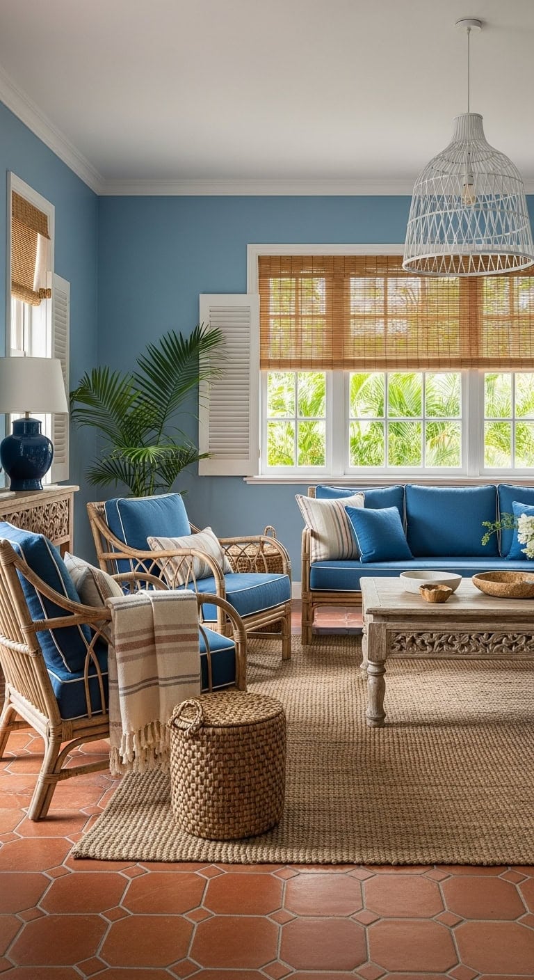
Imagine stepping onto rich terracotta tiles that bring a grounded warmth to your living space, perfectly complemented by soothing ocean-inspired blue accents. The textured clay flooring contrasts elegantly with airy white fabrics and rustic rattan furnishings, evoking a relaxed, coastal retreat atmosphere. This combination transforms your living room into a serene getaway filled with natural elements and timeless style.
Key Design Elements
- Accent Wall: Paint in ‘Santorini Blue’ (Benjamin Moore 1634)
- Trim and Moldings: Paint in ‘Cavern Clay’ (Sherwin-Williams SW 7701)
Pro Tip: Ideal for bright, sunlit rooms where you want to create a laid-back, vacation-like ambiance all year long.
16. Bold Blue Elements Against Exposed Brick Walls
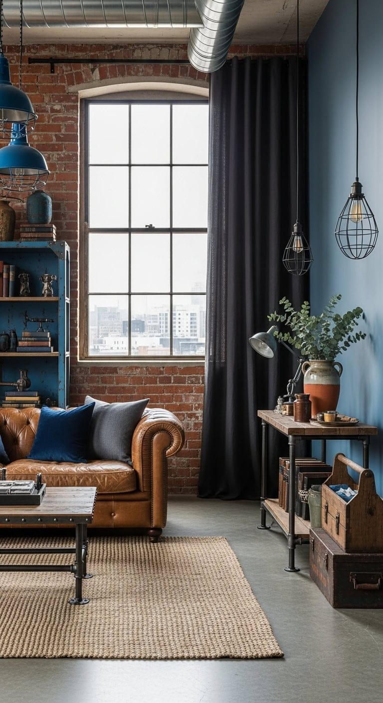
Combining vibrant blue metal accents with the rugged charm of exposed brick creates a striking contrast in your living space. The natural, weathered brick surface adds depth and warmth, while the smooth, bold blue pieces bring a contemporary flair. This pairing transforms the room into a dynamic setting with both texture and color.
Key Design Elements
- Accent Wall: Paint in ‘Blueprint’ (Behr S510-7)
- Trim and Built-ins: Paint in ‘Brick Dust’ (Sherwin-Williams SW 0032)
Pro Tip: Ideal for adding character to loft-style homes or spaces seeking a modern industrial vibe.
17. Layered Blues Enhanced by Warm Terracotta Touches
A spectrum of blues, stretching from rich navy to airy sky shades, brings dynamic flow to your living space through walls and fabrics. Introducing terracotta elements infuses a cozy, earthy vibe, balancing the cooler tones with textured warmth and natural, tactile materials. This combination fosters an inviting atmosphere that feels both fresh and grounded.
Key Design Elements
- Main Walls: Paint in ‘Endless Sea’ (Sherwin-Williams SW 9150)
- Accent Wall or Built-ins: Paint in ‘Cavern Clay’ (Sherwin-Williams SW 7701)
Pro Tip: Ideal for rooms with ample natural light, these hues add depth and comfort without overpowering the space.
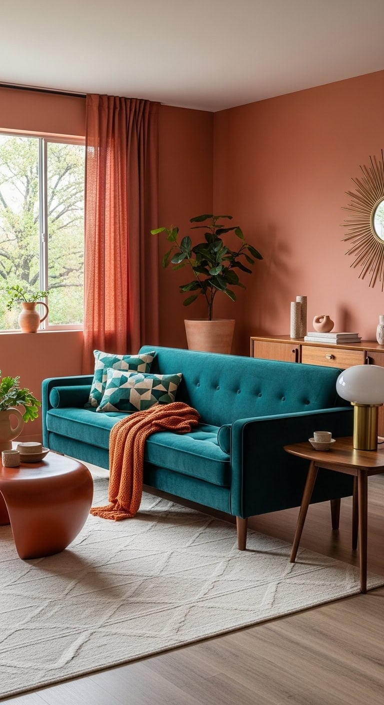
18. Moody Teal and Earthy Clay Harmony
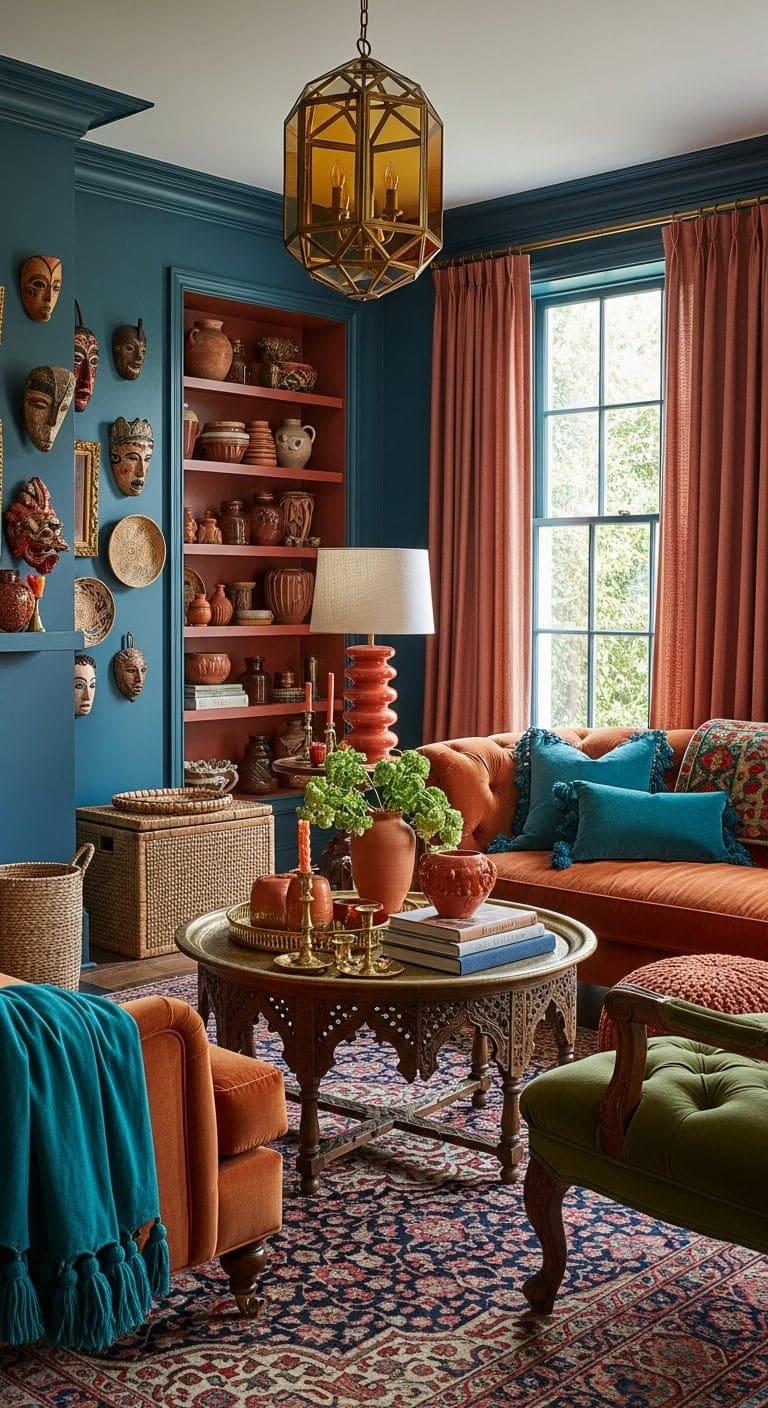
Rich teal walls set a dramatic and inviting tone, perfectly complemented by terracotta pottery and warm clay accents that bring a natural, grounded feel. The combination of plush velvet fabrics with textured woven elements creates depth, while brass details introduce a touch of elegant sophistication throughout the room. This mix of bold color and organic materials invites a cozy yet vibrant atmosphere.
Key Design Elements
- Accent wall: Paint in ‘Blue Nile’ (Sherwin-Williams SW 6776)
- Built-in shelving interior: Paint in ‘Cavern Clay’ (Sherwin-Williams SW 7701)
Pro Tip: Ideal for those who love blending worldly collectibles with rich, layered textures to tell a personal story.
19. Sun-Kissed Blues and Earthy Whites for a Coastal Retreat
Warm terracotta hues bring a grounded, natural feel to the room, perfectly balanced by refreshing Mediterranean blue highlights that pop against soft, whitewashed plaster walls. Textural elements like woven jute rugs, hand-crafted ceramics, and textured linen fabrics combine to evoke the relaxed charm of a sunlit European coastal villa. This blend creates a space that feels both inviting and effortlessly stylish.
Key Design Elements
- Walls: Paint in ‘Aegean Teal’ (Benjamin Moore 2136-40)
- Accent wall or fireplace surround: Paint in ‘Cavern Clay’ (Sherwin-Williams SW 7701)
Pro Tip: Ideal for rooms with plenty of sunlight to enhance the vibrant color contrast.
20. Timeless Elegance with Artisan Tile Accents
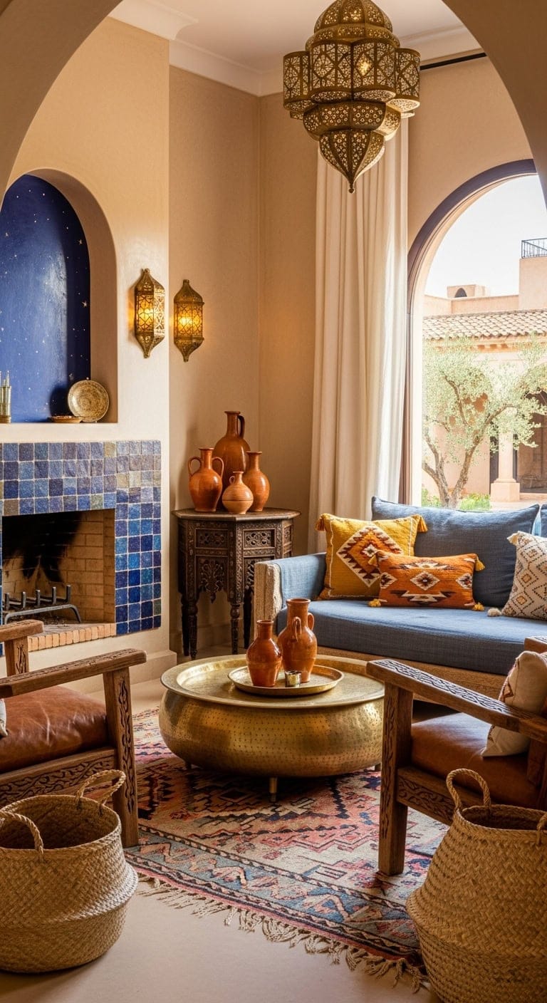
Incorporate the rich heritage of North African artistry into your living room by featuring hand-crafted tiles in deep blues and earthy terracotta shades. Their uneven glazed surfaces interact with natural light, adding dynamic texture and visual interest against sleek, plastered walls. This blend of color and craftsmanship creates a warm yet sophisticated ambiance.
Key Design Elements
- Accent wall or fireplace niche: Paint in ‘Starry Night Blue’ (Benjamin Moore 2067-20)
- Remaining walls: Paint in ‘Potters Clay’ (Sherwin-Williams SW 7551)
Pro Tip: Ideal for open spaces or rooms highlighting architectural details like fireplaces or built-in shelves.
21. Harmonizing Blue and Terracotta Hues in Your Living Space
Combining serene blue shades with rich terracotta accents brings a perfect equilibrium of cool and warm tones to your living room. Imagine a soft blue throw draped over your sofa paired with terracotta pottery to evoke the natural contrast between sky and earth. Layering in textured elements like woven rugs and cozy pillows helps weave these colors together seamlessly, creating a space that feels inviting and thoughtfully curated.
Key Design Elements
- Accent wall: Paint in ‘Smoky Blue’ (Sherwin-Williams SW 7604)
- Remaining walls: Paint in ‘Cavern Clay’ (Sherwin-Williams SW 7701)
Pro Tip: Ideal for open layouts seeking a cozy yet refreshing atmosphere that balances warmth with tranquility.
22. Retro Chic with Teal Sofas and Earthy Terracotta Accents
Deep teal velvet sofas provide a luxurious pop of color that harmonizes effortlessly with the warm, rustic tones of terracotta tables. The natural walnut elements introduce an inviting organic feel, while brass details reflect light and enhance the vintage mid-century ambiance. Together, these elements create a balanced and stylish living space.
Key Design Elements
- Accent Wall: Paint in ‘Oceanside’ (Sherwin-Williams SW 6496)
- Complementary Wall: Paint in ‘Cavern Clay’ (Sherwin-Williams SW 7701)
Pro Tip: Ideal for open layouts seeking a cozy yet sophisticated focal point for social gatherings.
23. Glamorous Geometry with Sapphire and Rust Accents
Incorporate striking geometric designs to elevate your living space, combining rich sapphire hues with warm rust tones for a sophisticated touch. Plush velvet furniture paired with gleaming brass details channels a luxurious 1920s vibe, while textured wool elements add depth and balance to the bold color scheme. This blend creates an inviting yet opulent atmosphere perfect for stylish entertaining.
Key Design Elements
- Accent Wall: Paint in ‘Commodore’ (Benjamin Moore 2149-30)
- Architectural Trim: Paint in ‘Roasted Sesame’ (Sherwin-Williams SW 9119)
Pro Tip: Ideal for creating a refined and welcoming space that encourages both conversation and comfort.
Conclusion
Embracing the captivating blend of blue and terracotta in your living room offers a unique opportunity to create a space that is both soothing and vibrant, grounded yet full of life. Whether you opt for soft blue walls paired with rich terracotta accents or vice versa, this dynamic palette invites warmth, depth, and personality into your home. Don’t be afraid to experiment with textures, patterns, and finishes to find the perfect balance that reflects your style. By thoughtfully incorporating these hues, you’ll transform your living room into a welcoming sanctuary that sparks joy and inspires comfort. Now is the perfect time to dive in, explore this timeless combination, and let your creativity bring your dream space to life.