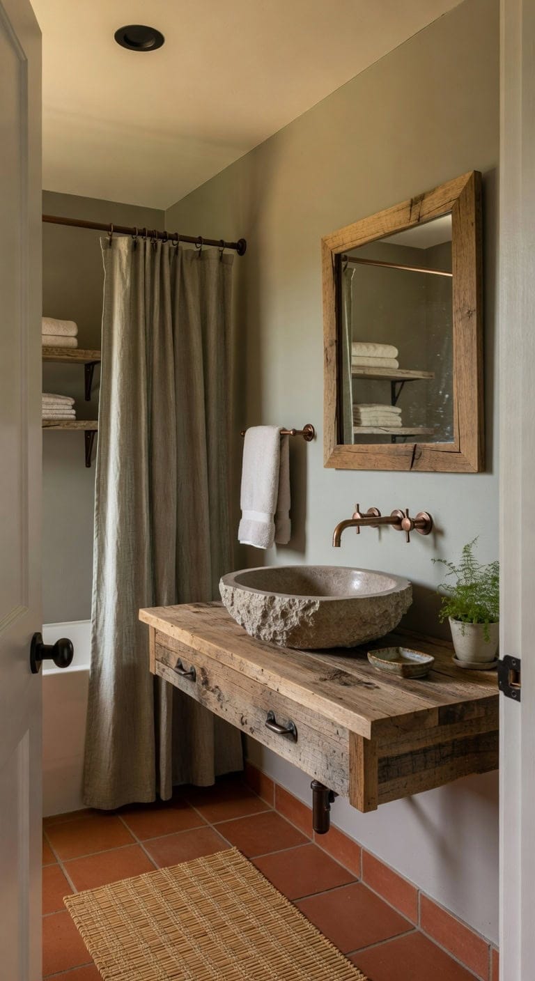
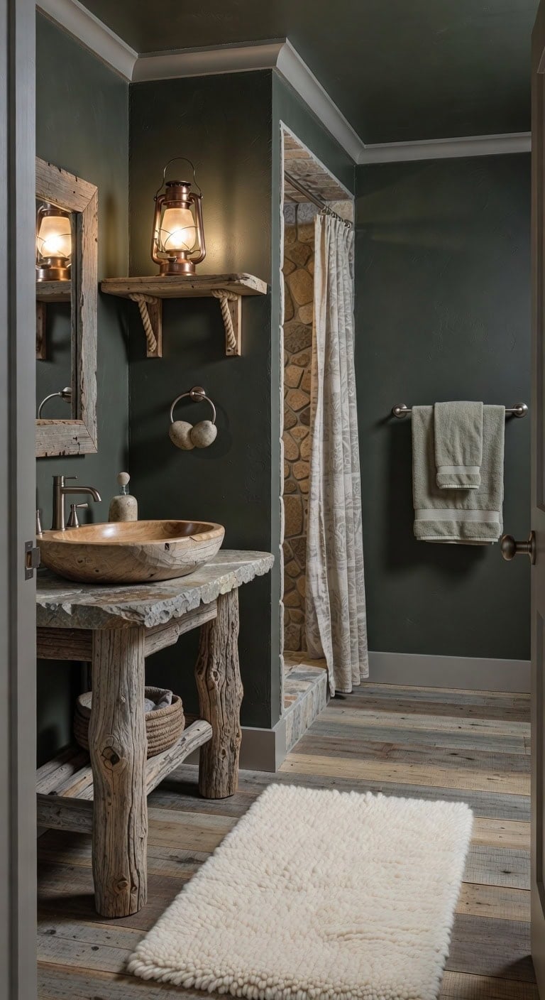
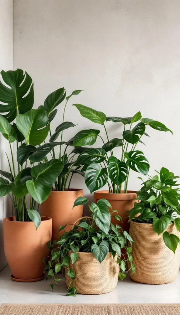
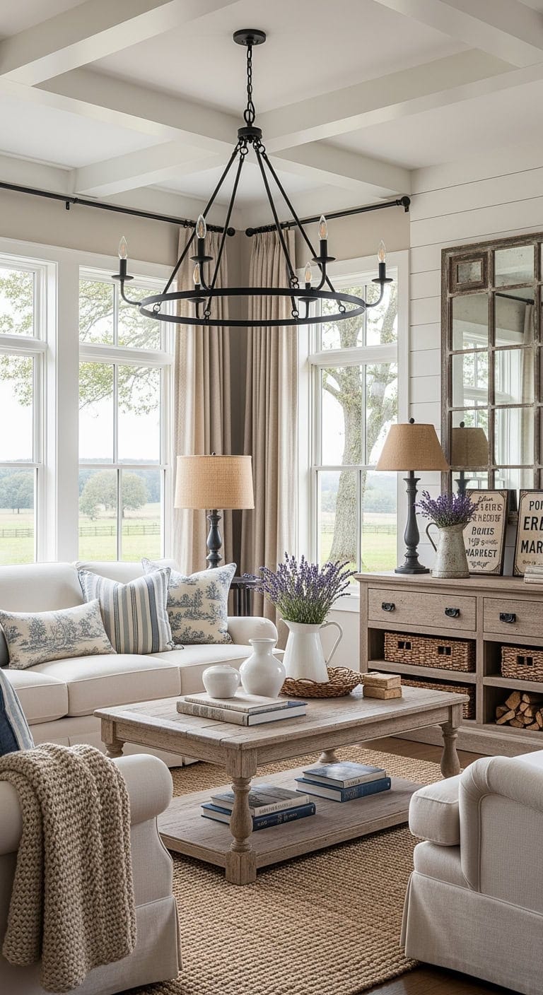
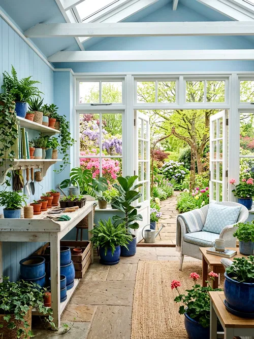
There’s something undeniably grounding about the natural allure of stone sinks—a perfect marriage of rugged texture and refined artistry that transforms any bathroom into a serene sanctuary. These sinks bring a warm, earthy presence that invites touch and admiration, turning a simple daily ritual into a sensory experience. Whether sculpted from smooth marble, veined granite, or organically shaped river stone, each piece carries a unique story etched by nature, making your bathroom feel less like a utilitarian space and more like a tranquil retreat.
Embracing stone sinks means welcoming an element that speaks to timeless elegance and durability while celebrating the imperfect beauty found only in natural materials. Their tactile surfaces and rich, organic hues create a striking contrast against sleek, modern fixtures or blend seamlessly with rustic, farmhouse styles. Beyond their visual appeal, stone sinks offer a tactile warmth and depth that ceramic or porcelain simply cannot replicate, making them an irresistible choice for those who crave both sophistication and authenticity in their home decor.
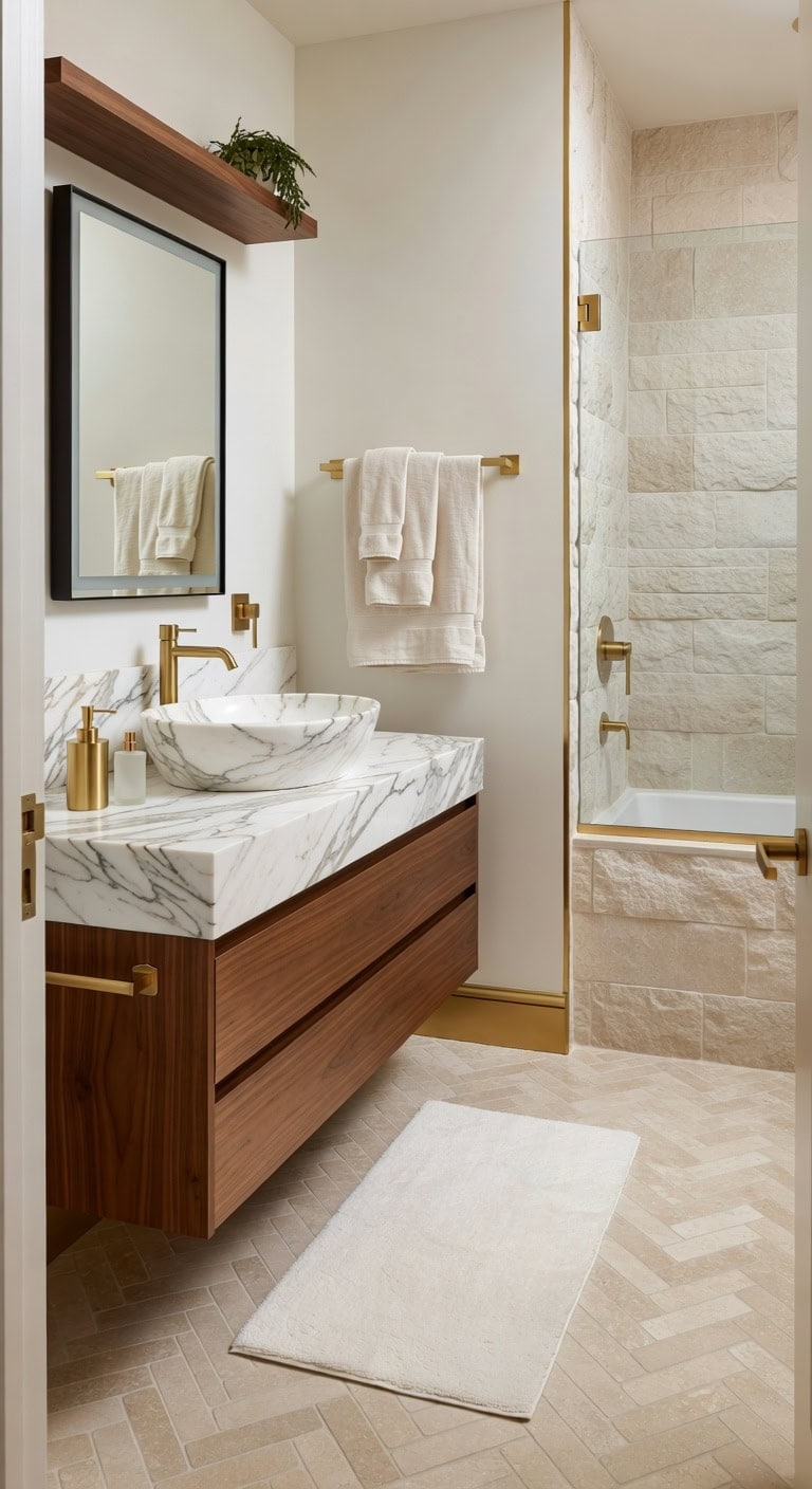
Experience a serene blend of nature and luxury with a pristine marble basin paired with radiant gold accessories. The silky soft bath rug invites indulgence, while a harmonious mix of smooth stone, gleaming metal, and cozy textiles creates a refined earthy atmosphere.
Key Design Elements
Pristine white marble countertop sink
Lustrous gold-finished soap dispenser
Velvety smooth bath rug
Matte gold-tone towel bar
Rough-hewn stone tiles for the shower walls
Pro Tip: Use Benjamin Moore’s White Pearl (2121-60) on the walls and Sherwin-Williams’ Champagne Gold (SW 6905) on the trims to accentuate the marble’s delicate veins.
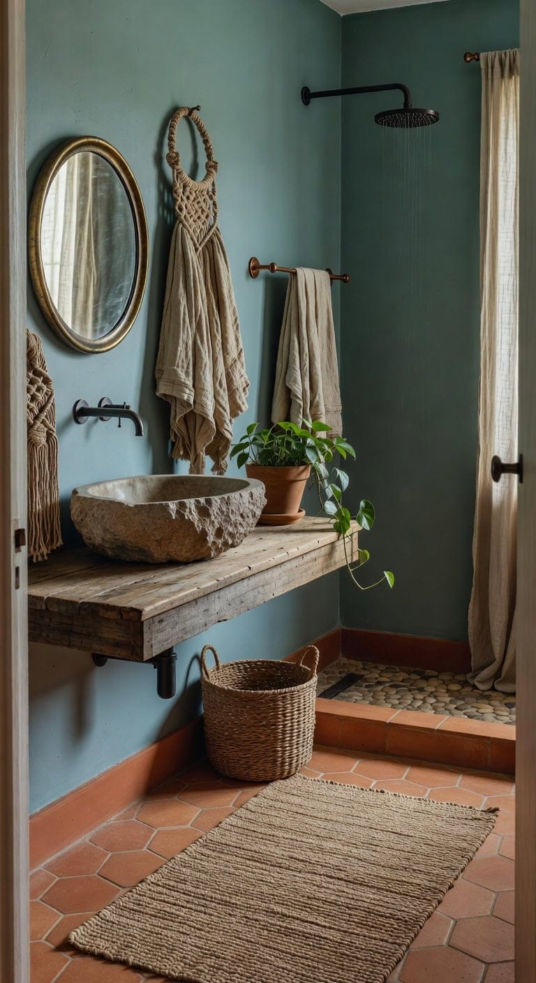
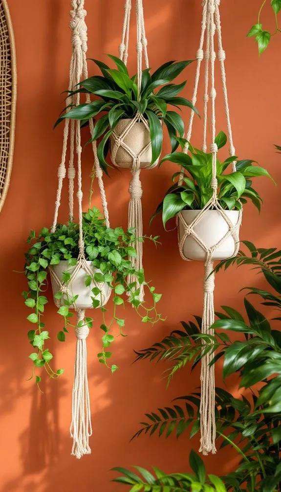
2. Organic Boho Charm with Clay Basin, Artisan Soap Dish, and Natural Fiber Rug
A rich clay sink pairs beautifully with a hand-decorated ceramic soap dish, while a plush natural fiber rug adds warmth and earthiness underfoot. The soft, sunbaked hues of terracotta harmonize with the tactile woven jute and smooth ceramics, evoking a laid-back, bohemian retreat.
Key Design Elements
Handcrafted jute bath rug
Clay-glazed ceramic basin
Artisan hand-painted ceramic soap holder
Boho-inspired macramé shower curtain
Brass towel rack mounted on the wall
Pro Tip: Create a calming oasis by painting your bathroom walls in Sherwin-Williams’ Terracotta Clay (SW 6035) and highlighting trim with Benjamin Moore’s Sage Green (HC-123).
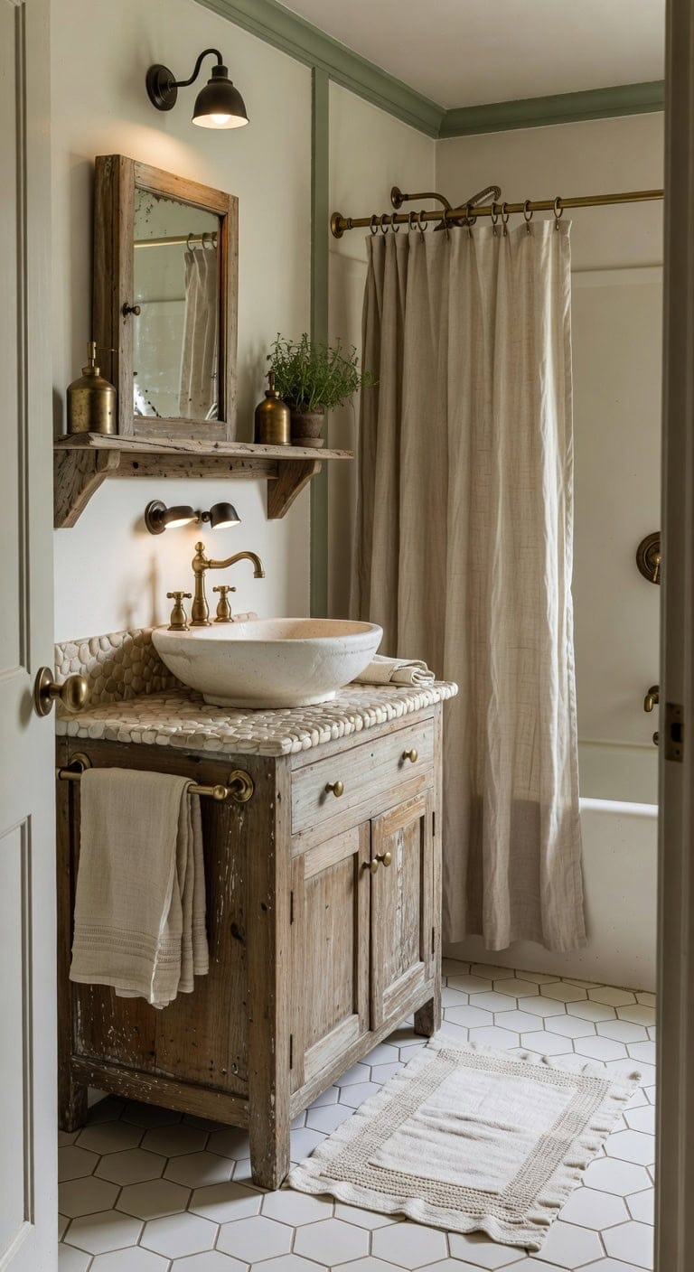
3. Rustic Charm Featuring a Weathered White Basin, Vintage Brass Fixtures, and Soft Linen Accents
Nestled beneath a gently faded cabinet, the weathered white basin pairs beautifully with vintage brass fixtures that shimmer softly alongside plush linen hand towels. The blend of creamy ivories and subtle sage tones harmonizes with the rugged character of reclaimed wood and the elegant finish of brushed brass, evoking a warm and inviting farmhouse atmosphere.
Key Design Elements
Natural woven linen shower drape
Floating shelf crafted from reclaimed barn wood
Brushed brass towel holder
Hand-sewn linen bath rug
Vintage brass soap dispenser
Pro Tip: For an enduring farmhouse vibe, paint your main wall Antique White by Benjamin Moore (978) and add crown molding in Sherwin-Williams Sage Green (SW 6205).
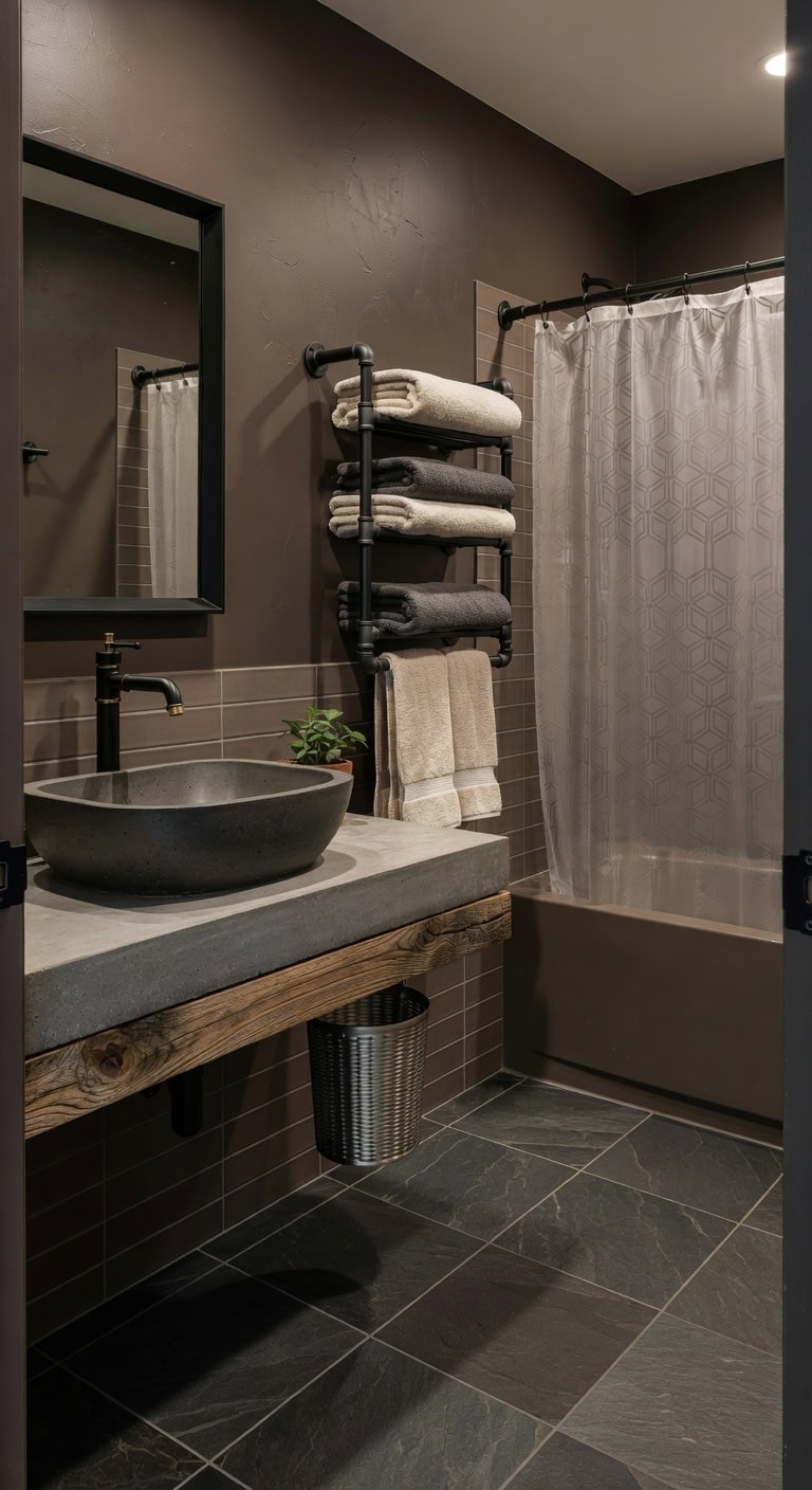
4. Industrial Chic with Stone Basin, Steel Mesh Accent, and Luxe Microfiber Linens
A sleek concrete basin in smoky gray complements rich, earthy-toned walls, while a steel mesh basket introduces a touch of industrial edge. Plush microfiber towels add softness and warmth, creating a harmonious blend of rugged materials and inviting textures that feel both urban and natural.
Key Design Elements
Smoky charcoal concrete washbasin
Steel mesh waste bin with brushed finish
Organic cotton microfiber bath linens
Matte black rectangular mirror with clean lines
Wall-mounted industrial pipe towel holder
Pro Tip: For an authentic loft aesthetic, paint the main bathroom wall Urban Earth by Sherwin-Williams (SW 7035) and the vanity cabinet in Benjamin Moore’s Concrete Gray (2120-20).
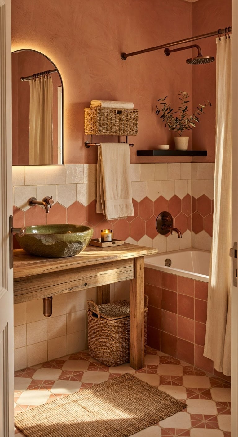
5. Sun-Drenched Mediterranean Charm with Terracotta Tiles, Olive-Scented Ambiance, and Rustic Woven Towel Holders
Embrace the warmth of the Mediterranean with radiant terracotta tile highlights paired with the subtle, herbaceous scent of an olive oil candle. Natural woven baskets bring a touch of rustic elegance, while the balance of soft linens and sleek ceramics crafts a welcoming and tranquil retreat.
Handcrafted ceramic sink basin glazed in olive green
Natural jute bath mat with a tactile weave
Wall-mounted towel rack in brushed copper finish
Soy wax candle infused with fresh olive oil fragrance
Pro Tip: For a Mediterranean-inspired glow, paint your main wall Terracotta Clay by Sherwin-Williams (SW 7574) and use Benjamin Moore’s Olive Grove (HC-123) for the trim.
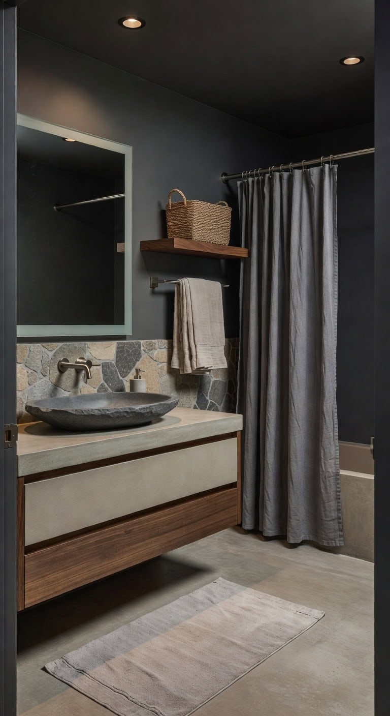
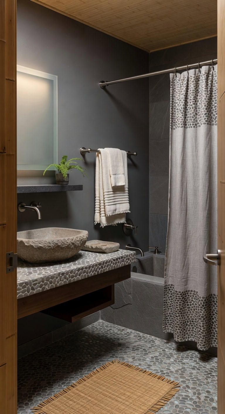
6. Natural Serenity: Slate Basin, Concrete Accents, and Linen Textures
This tranquil minimalist bathroom showcases the deep tones of a slate basin harmonizing with warm concrete details for a soothing, earthy ambiance. A streamlined concrete soap dispenser complements the gentle softness of a linen bath mat, while the matte finish of slate introduces a refined balance to the room’s organic materials.
Key Design Elements
Slate-toned linen shower curtain
Smooth concrete rectangular countertop
Matte nickel wall-mounted towel rack
Rough-hewn stone soap dispenser
Floating wooden open shelves
Pro Tip: Use Benjamin Moore’s Slate Gray (2127-30) for the main wall and Sherwin-Williams’ Concrete Beige (SW 7035) on the vanity panels to evoke a serene, spa-inspired minimalist atmosphere.
7. Earthy Bohemian Charm with Macramé Accents and Natural Textures
Soft teal macramé towel hangers complement the rustic charm of a distressed jute rug, while a rich terracotta clay pot brimming with greenery introduces a cozy, grounded feel. Light, airy linen curtains sway gently beside sleek brushed-nickel hardware, blending effortless boho comfort with subtle sophistication.
Key Design Elements
Artisan-crafted macramé shower curtain in calming teal
Floating vanity shelf made from upcycled reclaimed wood
Wall-mounted towel rail finished in brushed copper
Pro Tip: Use Sherwin-Williams’ Teal Tide (SW 7615) on walls paired with Benjamin Moore’s Terracotta Clay (2150-30) on crown molding to bring out the earthy boho tones.
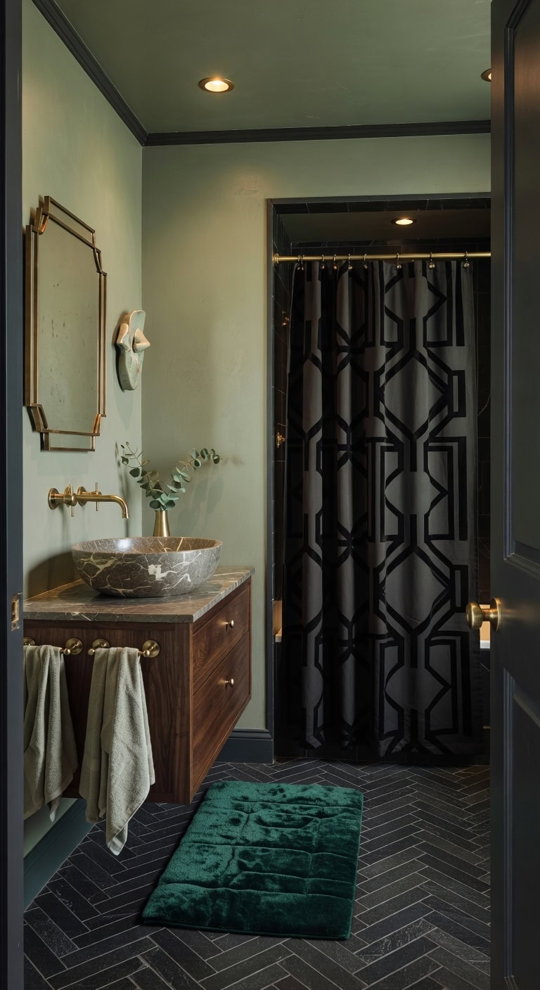
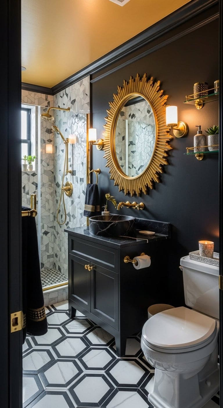
8. Sophisticated Earth Tones Meet Art Deco Elegance with Marble and Brass Accents
A sleek marble basin with delicate veining contrasts stunningly against the warm glow of brass towel hooks, while a rich velvet bath mat introduces an inviting layer of softness. The palette of subdued sage green and deep charcoal threads throughout, striking the perfect balance between comfort and refined style.
Key Design Elements
Black matte geometric-patterned shower curtain
Polished marble countertop vessel sink
Double brass towel rack mounted on the wall
Rectangular tufted velvet bath rug
Floating vanity shelf in dark walnut finish
Pro Tip: For a classic Art Deco ambiance, paint the bathroom walls in Benjamin Moore’s Sage Green (2135-30) and use Sherwin-Williams’ Charcoal Gray (SW 7075) on the crown molding and baseboards.
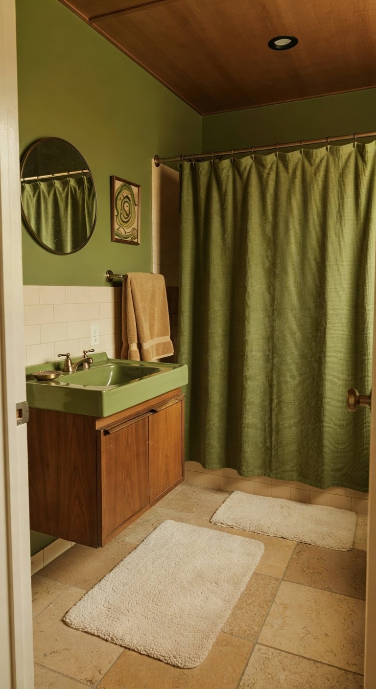
9. Retro Revival with Olive-Toned Sink, Classic Brass Soap Holder, and Cozy Fleece Rug
An olive-hued sink boldly contrasts rich walnut cabinetry, complemented by a timeless brass soap holder that evokes a vintage charm. Plush fleece rugs bring warmth to the stone floor, while the blend of matte ceramic tiles and satin brass accents enhances the inviting retro atmosphere.
Key Design Elements
Olive-green ceramic sink basin
Walnut floating vanity with countertop
Antique-style brass soap holder
Soft fleece bath mat rug
Textured waffle-weave olive-green shower curtain
Pro Tip: For an eye-catching retro statement, paint the bathroom walls in Sherwin-Williams SW 6429 Olive Green and the ceiling in Benjamin Moore HC-122 Warm Walnut.
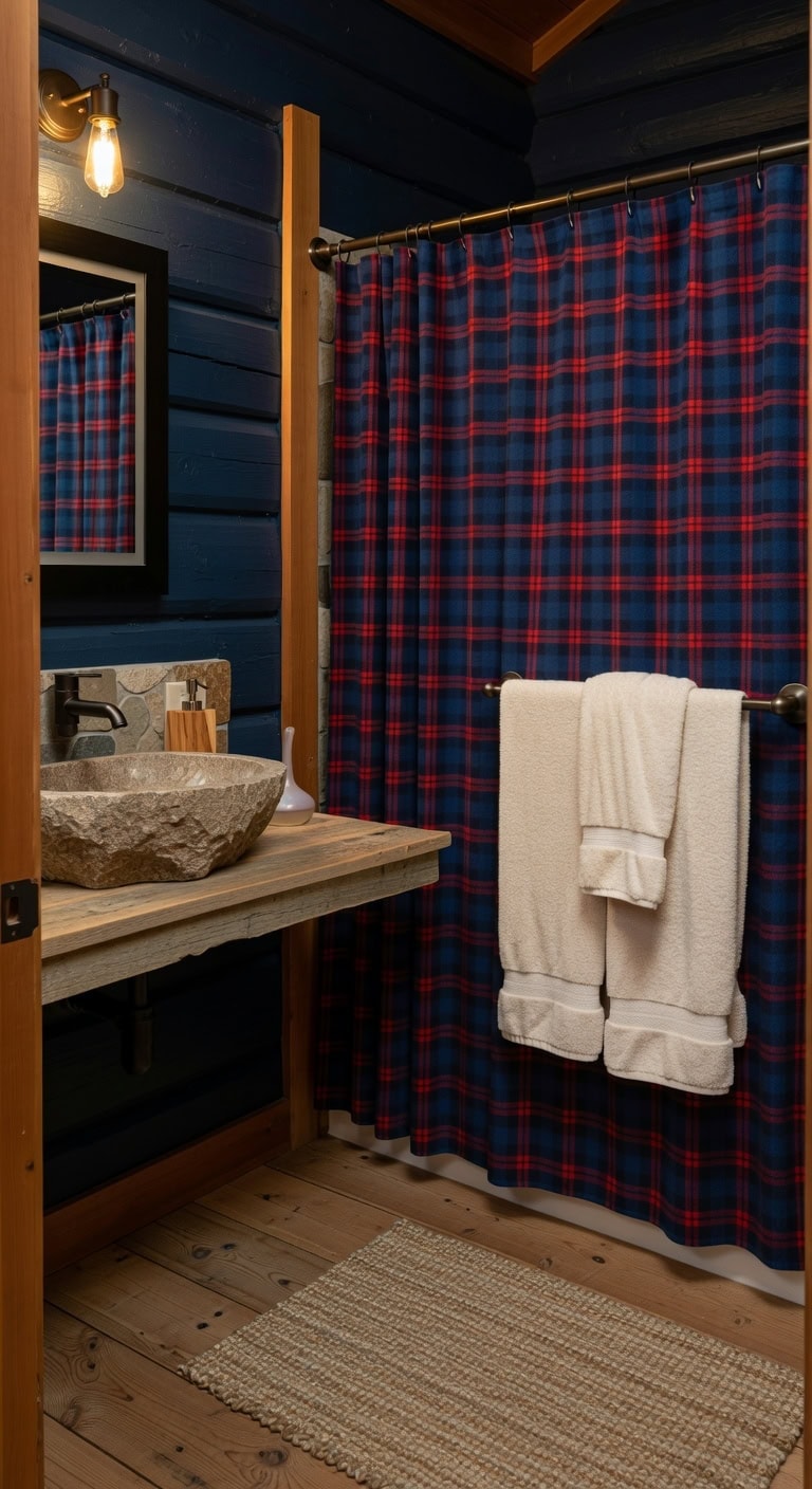
10. Rustic Retreat Featuring Plaid Shower Drapes, Cedar Accents, and Cozy Fleece Linens
Embrace the warmth of a rustic retreat with a plaid shower curtain in rich navy and cedar tones, complemented by a cedar wood soap dispenser and ultra-soft fleece towels. The combination of natural wood textures, plush fabrics, and classic patterning crafts a welcoming and layered bathroom ambiance.
Key Design Elements
Plaid shower curtain in navy and warm cedar hues
Soap dispenser crafted from natural cedar wood
Set of plush fleece bath towels
Floating vanity shelf made from reclaimed pine
Brushed bronze wall-mounted towel holder
Pro Tip: For an authentic cabin atmosphere, paint your main wall in Benjamin Moore’s Navy Depth (2122-10) and highlight crown molding with Sherwin-Williams’ Cedar Bark (SW 6189).
11. Natural Nordic Charm Featuring Light Oak Basin, Sleek Towel Rail, and Plush Cotton Rug
A light oak basin sets a grounded, natural tone, while plush cotton towels paired with a streamlined towel rail maintain an open, uncluttered feel. The warm hues of sandalwood beautifully contrast with the coolness of slate gray, evoking a cozy Scandinavian atmosphere that’s both tranquil and welcoming.
Key Design Elements
Geometric-patterned linen shower curtain
Matte nickel wall-mounted towel rail
Floating vanity shelf crafted from light oak
White rectangular ceramic soap dispenser
Soft gray cotton bath rug
Pro Tip: Use Benjamin Moore’s Sandy Oak (2135-30) on the main walls and Sherwin-Williams’ Cool Slate (SW 7079) for an accent wall to create a peaceful Nordic-inspired bathroom.
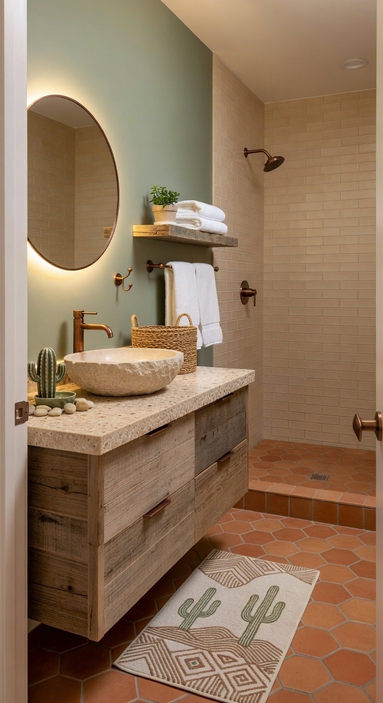
Transform your bathroom into a tranquil desert hideaway with gentle sage walls that complement a sandy pebble basin. The blend of smooth ceramic, quirky cactus-inspired soap holder, and a handwoven seagrass basket adds layers of texture and calm earthy charm.
Key Design Elements
Pebble countertop in warm sandy hues
Ceramic soap holder shaped like a cactus
Handwoven seagrass storage basket
Matte copper towel hook
Floating shelf crafted from reclaimed wood
Pro Tip: Use Sherwin-Williams’ Sage Green (SW 6184) on the walls paired with Benjamin Moore’s Sand Dune (2159-50) for the sink to evoke a grounded desert atmosphere.
13. Seaside Serenity with Driftwood Basin, Sea-Glass Accents, and Organic Hemp Towels
Inspired by the tranquil shore, a driftwood basin anchors this bathroom with its warm, natural texture, perfectly complemented by soft sea-glass details. Complemented by plush hemp towels, the space invites a soothing, tactile connection to nature. The gentle sand tones of the sink harmonize effortlessly with the delicate teal hues of the soap dispenser, crafting a peaceful coastal sanctuary.
Key Design Elements
Creamy white linen shower curtain with a subtle weave
Vanity countertop crafted from reclaimed driftwood
Frosted sea-glass inspired soap dispenser in soft teal
Set of bath towels woven from sustainable hemp fibers
Brushed nickel floating shelf with minimalist design
Pro Tip: For a fresh coastal vibe, paint your bathroom walls in Benjamin Moore’s Seaside Sand 2121-50 and add trim in Sherwin-Williams’ Ocean Teal SW 6245 for crisp contrast.
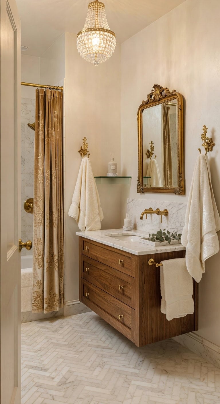
14. Elegant Rustic Charm with Marble Basin, Gilded Towel Hooks, and Luxe Velvet Linens
A sleek marble basin set against creamy ivory walls exudes understated elegance, while gilded towel hooks introduce a subtle shimmer. Soft velvet towels gracefully hang, adding warmth and indulgence that beautifully complement the cool marble surface, crafting a stylish and inviting sanctuary.
Key Design Elements
Velvet shower curtain with gold-thread embroidery
Marble countertop vanity with integrated sink
Double brass wall-mounted towel hooks
Ivory velvet bath towel collection
Crystal pendant chandelier lighting fixture
Pro Tip: Use Benjamin Moore’s Ivory Pearl (2135-44) on main walls and accentuate trim with Sherwin-Williams’ Gilded Gold (SW 6907) to highlight marble and metallic accents.
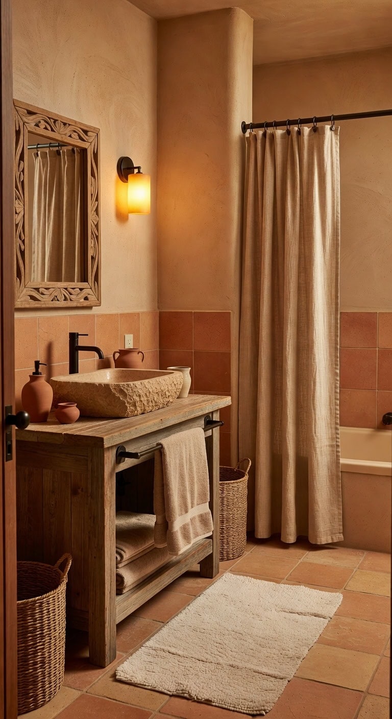
15. Desert Serenity: Sandstone Basin, Terracotta Accents, and Suede Comfort
Embrace the soothing warmth of desert-inspired hues with the natural ruggedness of sandstone and the rich, sunbaked charm of terracotta pottery. The inviting texture of a suede bath rug adds a cozy layer, turning your bathroom into a peaceful desert retreat that balances tactile elements with soft, muted colors.
Key Design Elements
Sand-colored handwoven linen shower curtain
Sleek rectangular vanity sink crafted from polished stone
Ivory suede looped bath mat for plush underfoot comfort
Towel rack in matte black with brushed metal detailing
Pro Tip: Use Sherwin-Williams’ Sandstone Beige (SW 7035) on the main wall and Benjamin Moore’s Terracotta Clay (2152-30) for the vanity backsplash to evoke the essence of a sun-soaked desert refuge.
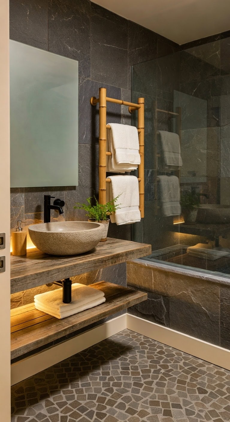
16. Serene Spa Ambiance with River Stone Countertop, Sculpted Soap Dish, and Bamboo Mat
A smooth river stone countertop in soft slate tones pairs beautifully with a delicately sculpted stone soap dish, while a bamboo bath mat introduces a cozy, organic feel underfoot. The interplay between the cool, solid stone and the warm, natural bamboo cultivates a tranquil Zen atmosphere reminiscent of a luxurious spa sanctuary.
Key Design Elements
Linen-textured river rock patterned shower curtain
Hand-sculpted river stone soap dish
Fringed bamboo woven bath mat
Matte black floating stone display shelf
Brushed nickel wall-mounted towel holder
Pro Tip: Use Slate Gray (Benjamin Moore 2120-30) for the main wall and Bamboo Beige (Sherwin-Williams SW 6109) on the ceiling to anchor the natural stone accents.
17. Earthy Serenity Featuring Stone Basin, Bamboo Towel Holder, and Eco-Friendly Cotton Linens
A rugged stone basin nestled against warm, natural tones creates the perfect sanctuary to relax and recharge. The rich charcoal hues of the basin complement the creamy softness of eco-friendly cotton towels, while bamboo elements introduce an organic touch that feels both calming and grounding.
Key Design Elements
Textured woven bamboo stone basin
Matte black metal towel holder with brushed finish
Handwoven ivory organic cotton towels
Floating vanity shelf crafted from reclaimed wood
Pebble-textured natural stone bath mat
Pro Tip: Use Slate Gray (Benjamin Moore 2135-30) on the main wall paired with Ivory Cream (Sherwin-Williams SW 7012) trim to evoke a peaceful, spa-inspired atmosphere.
18. Natural Elegance Featuring Stone Basin, Artisan Wooden Soap Holder, and Eco-Friendly Hemp Linens
The stone basin introduces a grounding, organic element that harmonizes effortlessly with the rich, amber hues of handcrafted wooden accessories. Plush hemp towels bring a cozy, tactile layer, while the gentle green undertones of the stone evoke a serene outdoor ambiance.
Key Design Elements
Woven stone-patterned shower curtain
Matte black faucet with river stone finish
Floating shelf crafted from reclaimed timber
Hand-finished brass soap holder with oil-rubbed patina
Set of soft linen and hemp blend towels
Pro Tip: For a calming, nature-inspired retreat, paint your bathroom walls in Sherwin-Williams Amber Glow (SW 6385) and use Benjamin Moore River Stone (HC-123) on the trim.
19. Organic Charm with Vintage Wood Vanity, Artisan Soap Holder, and Bamboo Rug
An artisanal vanity crafted from salvaged wood combined with a handmade ceramic soap holder and a textured bamboo rug infuses the bathroom with natural warmth and character. Soft sage-hued walls harmonize with rich terracotta floor tiles, highlighting the wood’s unique patterns and the bamboo’s gentle weave to create a serene, rustic sanctuary.
Key Design Elements
Sage linen shower curtain with subtle texture
Floating vanity made from reclaimed oak featuring a spacious drawer
Hand-thrown ceramic soap holder glazed with a flowing river pattern
Bath mat woven from eco-friendly bamboo fibers
Wall-mounted towel rack finished in brushed copper
Pro Tip: Choose a calming Sage Green (Benjamin Moore 2140-50) for the walls and a warm Terracotta hue (Sherwin-Williams SW 7645) on the floors to evoke a tranquil spa atmosphere.
20. Earthy Cabin Charm with Timber Basin, Rock Towel Holder, and Cozy Wool Rug
A sculpted timber basin pairs beautifully with a rugged stone towel holder, while a plush wool-blend rug invites warmth underfoot. Shades of mossy pine and soft stone gray reflect the natural elements of raw wood and textured rock, creating an inviting retreat inspired by mountain lodges. The combination of sturdy stone, smooth wood, and gentle wool evokes a comforting, rustic atmosphere.
Key Design Elements
Linen shower curtain featuring a subtle stone motif
Handcrafted walnut log sink basin
Smooth river rock towel holder with polished finish
Thick ivory wool-blend bath rug for added softness
Wall-mounted towel bar in brushed nickel
Pro Tip: For a true rustic cabin vibe, paint your bathroom walls in Sherwin-Williams Deep Pine Green (SW 6205) and accent the trim with Benjamin Moore Stone Gray (HC-170).
Final Thoughts
Incorporating a stone sink into your bathroom design is more than just a functional choice—it’s an invitation to bring the timeless beauty and organic charm of nature into your everyday routine. The unique textures and rich variations inherent in natural stone create a striking centerpiece that elevates any space, blending sophistication with rustic elegance in perfect harmony. By embracing these ideas, you not only enhance your bathroom’s aesthetic appeal but also introduce a sense of tranquility and durability that only genuine stone can offer. Let the enduring allure of natural stone inspire you to transform your bathroom into a serene retreat where craftsmanship and nature seamlessly coexist.
Neutral paint colors are getting a major refresh in 2026. While cool grays and stark whites once dominated interior design, today’s homeowners and designers are embracing warmer, earth-inspired hues that create comfort, depth, and personality. These modern neutrals feel more organic, drawing inspiration from nature, handcrafted materials, and timeless design principles.
Whether you’re updating a single room or planning a whole-home makeover, these trending paint colors provide the perfect foundation for creating inviting spaces that feel both stylish and enduring. From rich greens and cozy browns to soft yellows and sophisticated charcoals, these shades prove that neutral doesn’t have to mean boring.
1. Muted Rust: Desert-Inspired Warmth
Muted rust is one of the most welcoming paint trends of 2026. Inspired by desert landscapes, terracotta pottery, and sunbaked clay, this earthy shade brings warmth and character to any room while still functioning as a versatile neutral.
Unlike brighter orange tones, muted rust feels soft and sophisticated. It creates cozy, inviting environments that are ideal for living rooms, bedrooms, and dining spaces. The color pairs beautifully with natural wood furniture, woven baskets, linen fabrics, and vintage-inspired décor.
This shade is particularly effective in homes that want warmth without relying solely on traditional beige or brown. Its subtle richness makes spaces feel grounded, comfortable, and full of personality.
2. Sage Green: Nature’s Calming Neutral
Sage green continues to be a favorite among designers thanks to its soothing connection to nature. This soft green shade offers a refreshing alternative to white walls while maintaining the versatility homeowners expect from a neutral palette.
Sage green creates a peaceful atmosphere that works beautifully in bedrooms, bathrooms, kitchens, and family rooms. It reflects natural light softly and helps establish a relaxing environment that feels balanced and serene.
The color pairs effortlessly with rattan furniture, natural oak finishes, linen textiles, and stone accents. Together, these materials create spaces that feel organic, welcoming, and timeless.
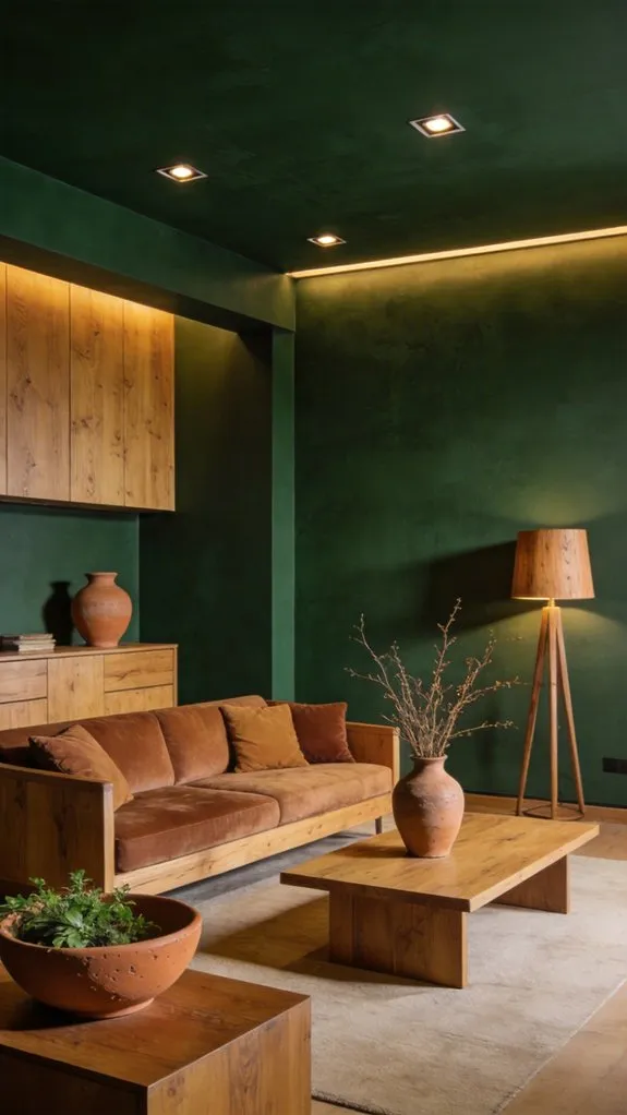
3. Earthy Dark Green: A Sophisticated Foundation
For those who prefer deeper, moodier colors, earthy dark green is emerging as one of the year’s most luxurious neutral options. Rich forest-inspired shades add depth and elegance while maintaining a strong connection to nature.
Dark green works exceptionally well in home offices, dining rooms, libraries, and feature walls. It creates dramatic impact without feeling overwhelming, especially when paired with warm wood tones, brass accents, and textured fabrics.
Despite its bold appearance, this saturated green functions surprisingly well as a neutral backdrop, allowing artwork, furniture, and decorative elements to stand out beautifully.
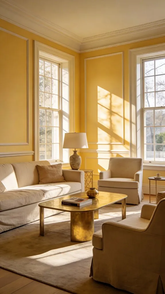
4. Uplifting Yellow: The Buttery Alternative to White
Soft buttery yellow is bringing optimism back into interior design. As homeowners move away from stark white walls, this cheerful shade offers brightness and warmth in equal measure.
Unlike vibrant yellows that can feel overwhelming, buttery yellow provides a gentle glow that enhances natural light and creates welcoming spaces. It works particularly well in kitchens, breakfast nooks, entryways, and living rooms where warmth and energy are desired.
When combined with white trim, natural wood finishes, and soft textiles, buttery yellow creates interiors that feel sunny, cheerful, and effortlessly timeless.
5. Charcoal: The Modern Grounding Neutral
Charcoal remains one of the most dependable paint colors for creating sophisticated interiors. This rich neutral adds depth and contrast while maintaining a clean, contemporary aesthetic.
Designers often use charcoal to anchor modern spaces, providing a strong foundation that allows lighter colors and textures to shine. It pairs beautifully with warm browns, creamy whites, muted greens, and soft peach accents.
Whether used on walls, cabinetry, or accent features, charcoal introduces elegance and visual balance while helping create layered, thoughtfully designed spaces.
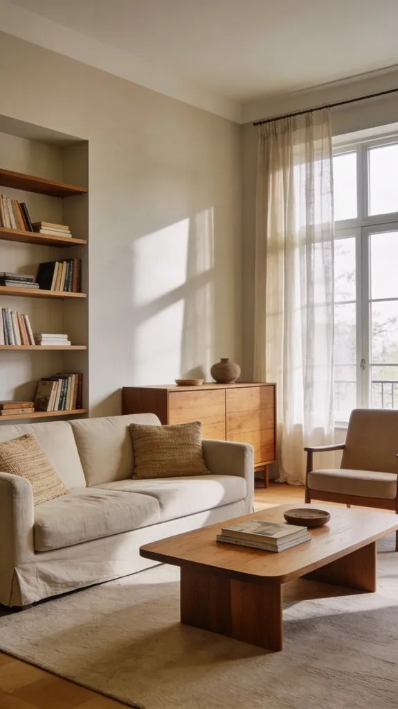
6. Soft Brown: The Warm Neutral Replacing Gray
Soft brown is rapidly replacing cool gray as the neutral of choice for modern homes. This warm and versatile shade offers comfort and character while remaining incredibly adaptable.
Unlike gray, which can sometimes feel cold or impersonal, soft brown creates inviting environments that instantly feel more welcoming. It complements wood furniture, brass fixtures, natural textiles, and organic décor elements.
The color works beautifully in living rooms, bedrooms, offices, and open-concept spaces where warmth and cohesion are priorities. It’s a timeless option that bridges traditional and contemporary design styles effortlessly.
7. Putty: The Perfect Beige-Taupe Blend
Putty has emerged as one of the most refined neutral shades for 2026. Sitting somewhere between beige and taupe, it provides subtle depth while maintaining a soft and understated appearance.
This adaptable color performs beautifully in various lighting conditions, making it a favorite among interior designers. Putty can be used across walls, ceilings, and trim to create a seamless, cocoon-like effect that feels elegant and sophisticated.
Its versatility allows it to pair naturally with stone, wood, marble, and metal finishes, creating a timeless foundation that works with nearly any decorating style.
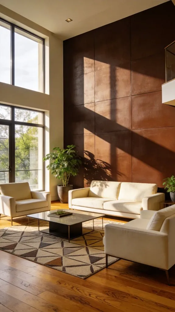
8. Chocolate Brown: The Return of Rich Sophistication
Chocolate brown is making a strong comeback as homeowners embrace richer, more layered interiors. This luxurious shade delivers warmth, depth, and a sense of timeless sophistication.
Modern chocolate brown feels far more refined than its past versions. It creates dramatic yet cozy spaces that work beautifully with leather furniture, wool textiles, brass hardware, and natural wood accents.
Whether used on walls, cabinetry, or architectural features, chocolate brown provides a grounding presence that elevates an entire room. Its rich tone creates contrast while maintaining the welcoming atmosphere that today’s homeowners desire.
Conclusion
The neutral paint trends of 2026 celebrate warmth, comfort, and a deeper connection to nature. Rather than relying on cold grays and stark whites, designers are embracing colors that feel inviting, grounded, and full of character. From the earthy warmth of muted rust and soft brown to the calming influence of sage and dark green, these shades offer endless possibilities for creating beautiful interiors.
By combining these modern neutrals with natural materials, layered textures, and thoughtful décor choices, you can create a home that feels both contemporary and timeless. No matter your style, these trending paint colors provide a versatile foundation for spaces that are designed to be lived in and loved for years to come.
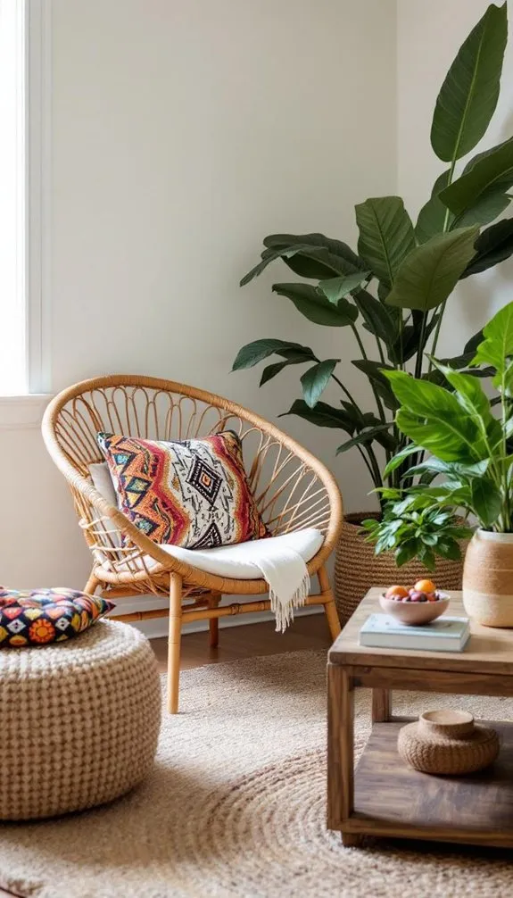
Afrohemian style is a beautiful fusion of African heritage and bohemian creativity. It combines rich cultural influences, handcrafted details, natural materials, and layered textures to create spaces that feel deeply personal and welcoming. Rather than following strict design rules, Afrohemian interiors celebrate storytelling through art, textiles, furniture, and meaningful collections.
Whether you’re refreshing a single room or transforming your entire home, these 22 Afrohemian decor ideas will help you create a space filled with warmth, character, and cultural depth.
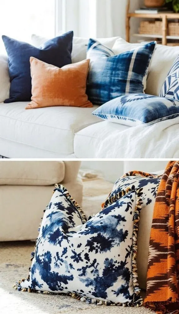
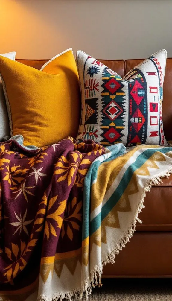
1. Layer Hand-Dyed Indigo Pillows for Rich Color
Hand-dyed indigo textiles bring depth and sophistication to Afrohemian interiors. Layer pillows featuring shibori, tie-dye, or dip-dyed techniques in varying shades of blue to create visual interest. Mixing patterns while staying within the same color family creates a cohesive yet dynamic look.
Balance the cool tones of indigo with warm ochre or terracotta accents to maintain the earthy warmth that defines Afrohemian design. These pillows instantly transform neutral seating into a striking focal point.
2. Hang African Woven Wall Tapestries for Texture and Story
Handwoven African tapestries add soul and authenticity to your walls. Beyond their decorative appeal, these textiles often carry cultural significance through symbols, patterns, and traditional weaving techniques.
Choose an oversized tapestry as a statement piece or create a gallery-style arrangement with multiple woven works. Pair them with natural materials such as wood, clay, and woven baskets to create a cohesive, curated display.
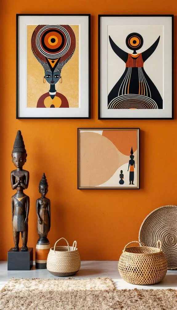
3. Frame African Art Prints or Vintage Travel Posters
Thoughtfully framed African artwork and vintage travel posters add personality and historical depth to your home. Warm wood frames or sleek black frames allow the artwork to shine while complementing Afrohemian aesthetics.
Mix contemporary African artists with vintage-inspired pieces to create a layered collection that reflects both heritage and modern creativity.
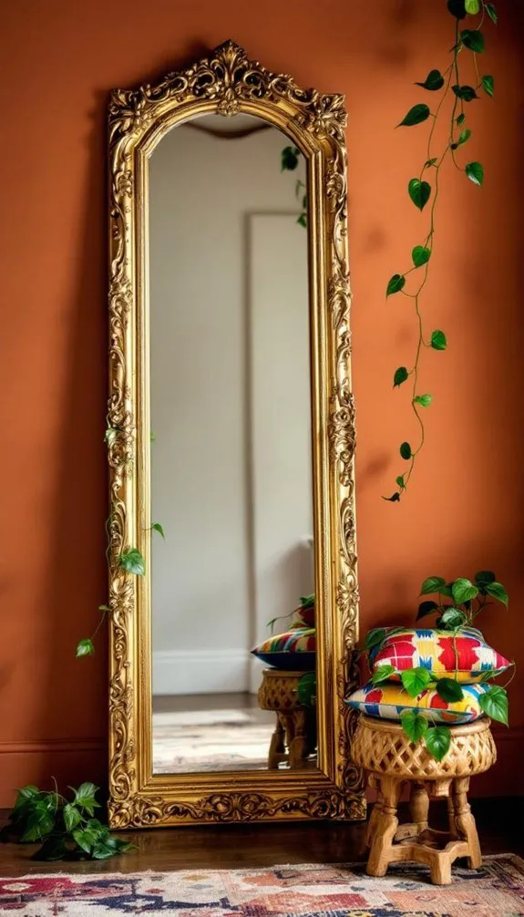
4. Lean Large Mirrors Against Walls to Expand Small Spaces
Oversized floor mirrors are both practical and stylish. Leaning a large mirror against a wall creates a relaxed, bohemian feel while helping smaller spaces appear larger and brighter.
Position mirrors opposite windows whenever possible to maximize natural light. Surround them with plants, baskets, and textured decor to enhance the layered Afrohemian aesthetic.
5. Display Handcrafted Pottery and Ceramic Vessels
Handcrafted ceramics add artisanal charm and celebrate craftsmanship. Look for pieces with visible textures, organic shapes, and earthy glazes that reflect natural materials and handmade traditions.
Group vessels in varying heights and sizes to create visually appealing displays on shelves, coffee tables, and consoles. Functional pieces such as pitchers and planters can also serve as beautiful decor.
6. Choose Earthy Terracotta, Ochre, and Burnt Sienna Tones
The foundation of Afrohemian style begins with a warm, earthy color palette. Terracotta, ochre, and burnt sienna evoke sun-baked landscapes and create a cozy atmosphere throughout the home.
Use terracotta on an accent wall, incorporate ochre through textiles, and add burnt sienna accents with ceramics or artwork. Together, these colors create a rich backdrop for layered textures and cultural decor.
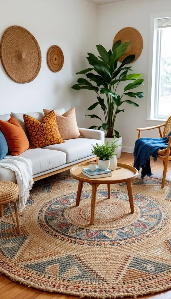
7. Anchor Your Space With a Statement Jute or Sisal Rug
Natural fiber rugs provide the grounding element every Afrohemian room needs. Jute and sisal rugs introduce texture while maintaining a neutral base that allows other design elements to shine.
Choose a generously sized rug that anchors your furniture arrangement. Layer smaller patterned rugs or mudcloth runners on top for additional visual interest and warmth.
8. Mix Rattan and Reclaimed Wood for Bohemian Warmth
Combining rattan and reclaimed wood creates a balanced mix of lightness and substance. The woven texture of rattan contrasts beautifully with the rich grain and character of reclaimed wood.
Pair a reclaimed wood coffee table with rattan chairs or storage pieces. This combination adds warmth, sustainability, and natural beauty to any Afrohemian space.
9. Layer Mudcloth and Kente Textiles for Bold Pattern Play
Mudcloth and Kente fabrics are iconic elements of Afrohemian design. Mudcloth provides a grounded, neutral base with geometric patterns, while Kente introduces vibrant colors and energetic motifs.
Use mudcloth pillows, throws, or upholstery and complement them with Kente wall hangings or accent pieces. This layered approach creates depth without overwhelming the room.
10. Drape Throws and Blankets in Natural Linen and Cotton
Soft, natural textiles make a room feel lived-in and inviting. Linen and cotton throws bring comfort while reinforcing the relaxed spirit of Afrohemian design.
Drape blankets casually across sofas, armchairs, or beds. Mix textures and weights to create a collected look that feels effortless and welcoming.
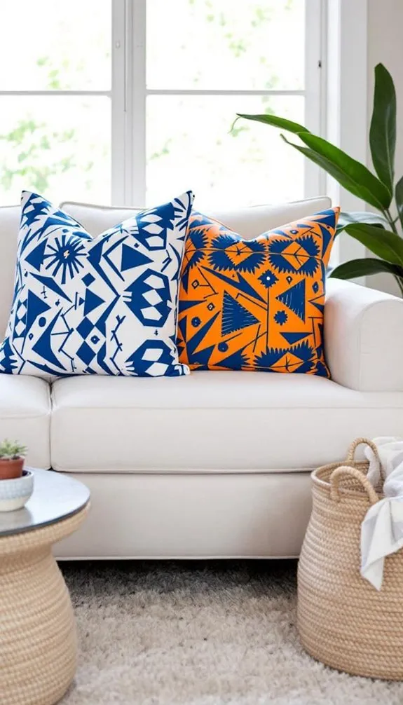
11. Pair Bold Tribal Prints With Neutral Solid Fabrics
Bold tribal patterns deserve room to breathe. Balance statement prints with solid fabrics in neutral tones such as cream, sand, taupe, or warm gray.
This contrast allows the patterns to remain the focal point while maintaining harmony throughout the space. Use tribal prints sparingly for maximum impact.
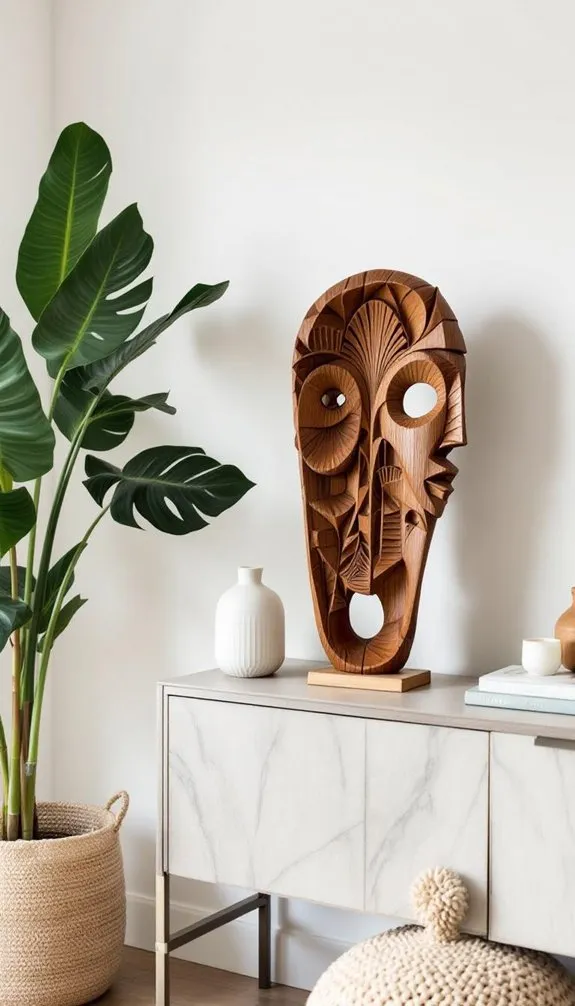
12. Use Carved Wood Sculptures as Focal Point Accents
Wood carvings introduce artistry, culture, and dimension. Whether displayed on shelves, consoles, or pedestals, these sculptural pieces add visual weight and storytelling power.
Choose meaningful pieces that resonate with your personal style and allow them to serve as conversation-starting focal points.
13. Add Brass and Copper for Warm Metallic Pops
Warm metals such as brass and copper complement Afrohemian color palettes beautifully. Their rich tones enhance earthy hues and add subtle elegance.
Incorporate metallic accents through trays, candlesticks, bowls, mirrors, or lighting fixtures. A little goes a long way in creating warmth and sophistication.
14. Build Low Seating Nooks With Oversized Floor Poufs
Create inviting gathering spaces with floor cushions and oversized poufs. Low seating encourages relaxation and conversation while embracing bohemian comfort.
Arrange poufs around a low table and layer rugs beneath to establish a cozy nook perfect for entertaining or quiet moments.
15. Stack Books and Personal Mementos on Low Shelving
Afrohemian design celebrates personal storytelling. Display books, travel souvenirs, family heirlooms, and meaningful keepsakes on open shelving.
Mix decorative objects with books to create layered vignettes that feel authentic rather than overly styled.
16. Use Wicker Baskets for Stylish, Functional Storage
Wicker baskets combine practicality with natural beauty. Use them to store blankets, pillows, magazines, toys, or everyday essentials while maintaining a cohesive aesthetic.
Different weaving styles and sizes add texture and visual variety throughout the room.
17. Group Potted Plants for Lush, Layered Greenery
Plants bring life and energy into Afrohemian spaces. Create layered arrangements using a mix of tall plants, bushy greenery, and trailing vines.
Cluster plants in odd numbers and use woven, terracotta, or ceramic planters to reinforce the natural, handcrafted feel.
18. Add Macramé Plant Hangers for Vertical Interest
Macramé plant hangers introduce handcrafted charm while utilizing vertical space. Hanging plants soften walls and create visual movement throughout the room.
Stagger several hangers at different heights for a dynamic display that draws the eye upward.
19. Install Woven Pendant Lights for Soft, Ambient Glow
Lighting plays a key role in creating atmosphere. Woven pendant lights made from rattan, jute, or seagrass diffuse light beautifully and enhance the room’s texture.
Choose warm-toned bulbs to emphasize earthy colors and create a cozy, welcoming ambiance.
20. Layer Ambient, Task, and Accent Lighting for Depth
A well-designed Afrohemian room incorporates multiple lighting sources. Combine overhead fixtures, reading lamps, and accent lights to create flexibility and visual depth.
Layered lighting highlights artwork, textiles, and decorative objects while making the space feel warm and inviting.
21. Display Beaded Artifacts and Woven Trays on Surfaces
Decorative trays and handcrafted beaded objects add detail and cultural richness to tabletops and shelves. Group items in odd numbers and vary heights for a balanced display.
These small touches help tell a story and reinforce the handcrafted nature of Afrohemian interiors.
22. Balance Vintage African Artifacts With Modern Bohemian Furniture
One of the most compelling aspects of Afrohemian design is its ability to blend old and new. Pair vintage artifacts with contemporary furniture to create contrast and visual interest.
Allow special pieces room to shine by avoiding clutter and embracing thoughtful curation. The result is a space that feels both timeless and deeply personal.
Conclusion
Afrohemian design is about much more than decorating—it’s about creating a home that reflects culture, creativity, and personal history. By combining natural materials, handcrafted elements, rich textiles, and meaningful collections, you can build a space that feels warm, soulful, and uniquely yours.
Start with a few of these ideas and layer them gradually. The beauty of Afrohemian style lies in its authenticity, allowing your home to evolve naturally while telling your own story through every carefully chosen detail.
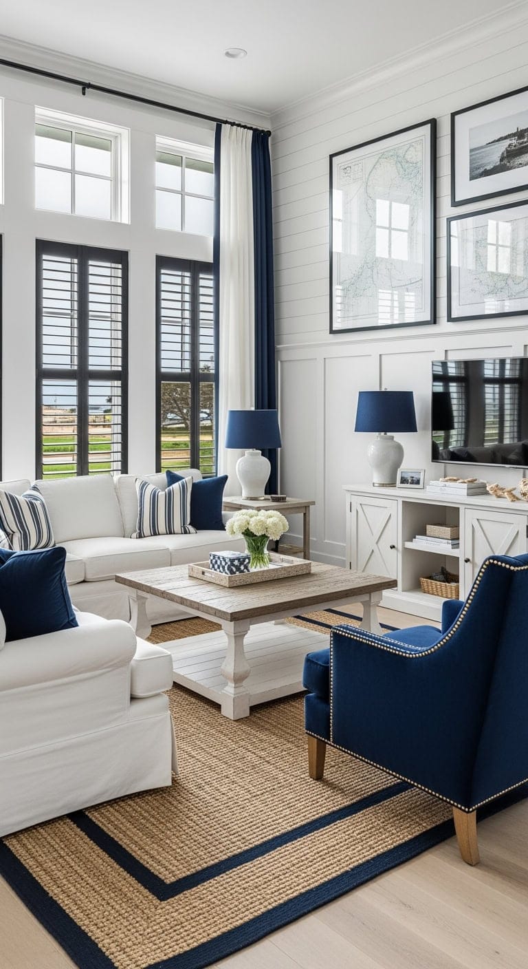
There’s something undeniably magnetic about a living room dressed in bold black—a space that feels both daring and deeply inviting at the same time. Black isn’t just a color; it’s a design statement that exudes confidence and sophistication, transforming your living room into a modern sanctuary where every detail pops with intention. When used thoughtfully, black becomes the perfect canvas to highlight texture, create striking contrasts, and bring a sense of drama without overwhelming the space. It’s the secret ingredient that can make natural wood, plush fabrics, and metallic accents sing in harmony, turning your living room into a stylish retreat that feels curated yet cozy.
In this article, we’re diving into the art of embracing black in modern living room design without fear or hesitation. Whether you’re dreaming of a sleek black accent wall, chic furniture pieces, or clever ways to balance darkness with light, you’ll find inspiring ideas and practical tips to help you craft a space that’s both visually stunning and warmly welcoming. Think of it as your personal guide to unlocking the power of black, revealing how this bold choice can elevate your living room into a modern masterpiece that reflects your unique style and invites guests to linger a little longer.
1. Mediterranean Vibes: Embracing Black Iron and Terra Cotta Warmth
Capture the essence of a sun-soaked Mediterranean escape right in your living room, where rustic charm meets refined elegance. Think cozy afternoons filled with rich terracotta hues and striking black iron accents that invite both relaxation and a touch of sophistication. It’s the perfect blend of old-world hacienda style and modern comfort for every day and night.
Key Design Elements
Soft cream sectional with classic rolled arms
Wrought iron coffee table paired with a glass or wood surface
Rich dark wood media console featuring iron hardware
Luxurious cognac leather accent chair
Terracotta-inspired patterned area rug in warm neutrals
Black iron table lamp with a soft fabric shade
Pro Tip: To achieve that authentic sun-baked stucco glow, try painting your walls with Benjamin Moore’s ‘Windham Cream’ (HC-6); it offers warmth without the unwanted yellow cast during evening hours.
2. Craftsman Charm: Black Built-In Bookcases Paired with Mission Furniture & Leather
Imagine stepping into a living room that feels like your favorite cozy nook, where rich leather and sturdy wood invite you to kick back and relax. This Craftsman-inspired design blends timeless black built-ins with mission-style furniture, creating a space that’s both sophisticated and welcoming. It’s the perfect balance of classic character and everyday comfort, making it ideal for lazy afternoons or lively gatherings.
Key Design Elements
Deep brown leather Chesterfield sofa with nailhead detailing
Solid oak mission-style coffee table with lower shelf
Tall black built-in bookcases for a striking focal point
Warm cognac leather club chair paired with a matching ottoman
Natural handwoven jute area rug grounding the space
Black iron table lamp featuring an amber glass shade
Pro Tip: For a striking backdrop that lets your books and decor shine, paint the wall behind your open shelving in a rich, matte black like Benjamin Moore’s ‘Wrought Iron.’ It instantly elevates the space and adds depth to your display.
Imagine sinking into a sumptuous black velvet sofa set against soft, cream textured wallpaper—this blend effortlessly merges timeless elegance with cozy modern vibes. It’s the kind of space that feels both inviting and chic, perfect for unwinding after a long day or impressing guests with understated sophistication. This design strikes a harmonious balance between plush comfort and refined style, creating an ambiance that’s as warm as it is stylish.
Key Design Elements
Black velvet tufted sofas with sleek gold legs
Oval white marble coffee table with black metal base
Cream boucle accent chair featuring black legs
Soft cream jute rug with subtle stripes
Brass arc floor lamp topped with a white shade
Cream linen curtains hung on matte black metal rods
Pro Tip: Use Benjamin Moore’s ‘White Dove’ OC-17 on trim and ceilings to subtly highlight black velvet furniture without overpowering the textured wallpaper backdrop.
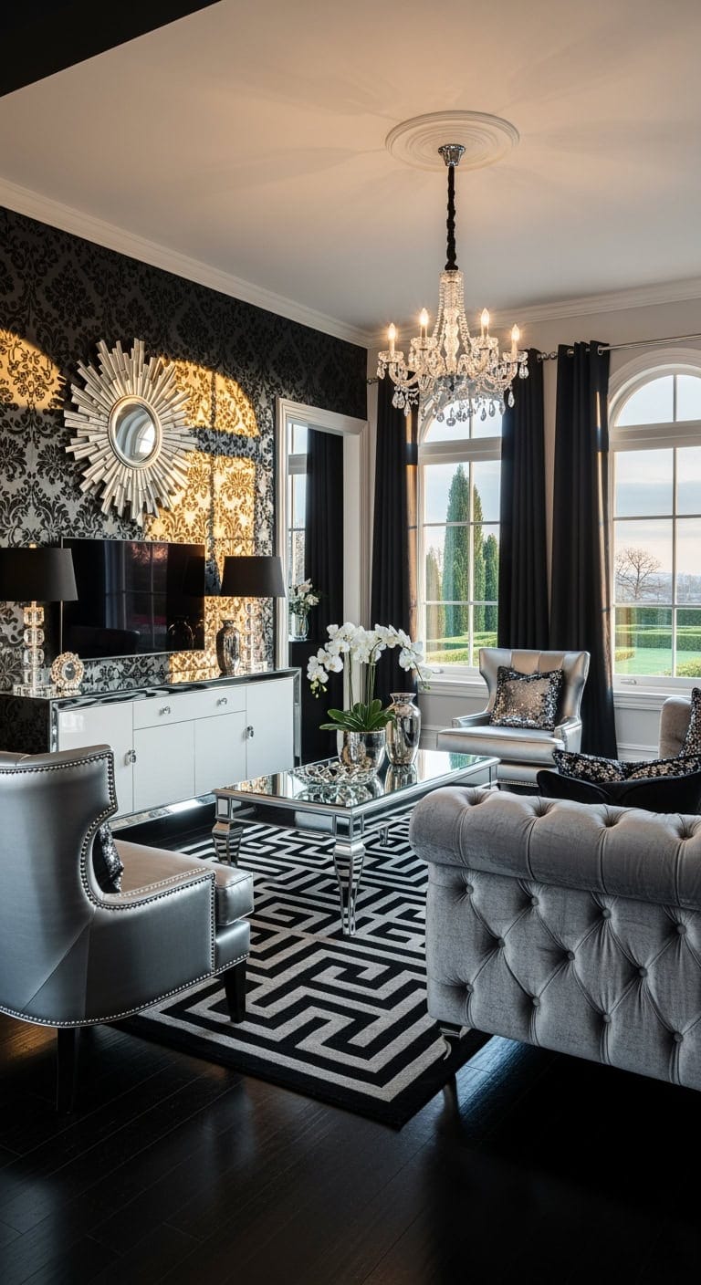
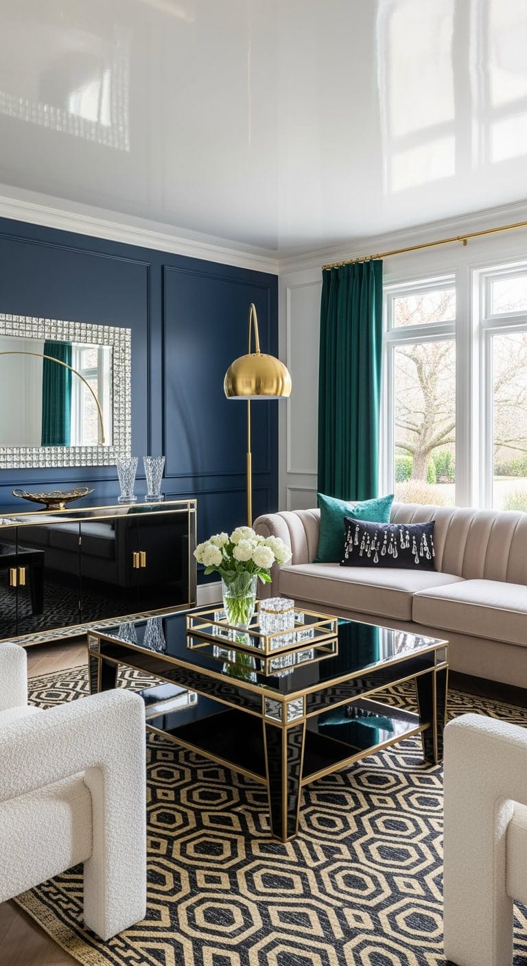
4. Chic Black and Silver: Elevate Your Living Room with Luxe Metallics and Velvet
Bring the timeless allure of old Hollywood right into your living space by blending deep black velvet with shimmering silver accents. This pairing creates an irresistible balance of bold sophistication and dazzling sparkle, turning your living room into a stylish retreat that feels both cozy and glamorous.
Black lacquer media console with polished silver hardware
Silver-framed accent chair complemented by plush black cushions
Graphic black and silver geometric area rug
Elegant crystal table lamp topped with a black lampshade
Pro Tip: Go beyond the walls—paint your ceiling a rich, velvety black like Benjamin Moore’s ‘Black Beauty’ to create a cozy, speakeasy atmosphere that makes silver details pop with radiant glow.
5. Mid-Century Modern Charm: Walnut Wood Meets Sleek Black Hairpin Legs and Brass Accents
Step into the timeless elegance of mid-century modern design, where rich walnut wood blends effortlessly with bold black hairpin legs and gleaming brass details. This style strikes the perfect balance between vintage flair and contemporary cool, creating a warm, inviting space that feels both sophisticated and welcoming. It’s the kind of look that naturally sparks conversation and makes your living room feel like a curated treasure trove.
Key Design Elements
Walnut wood sectional sofa with slender black hairpin legs
Round walnut coffee table supported by brass legs
Walnut media console featuring black metal hardware
Mustard yellow velvet accent chair with walnut legs
Geometric black and cream area rug for grounding the space
Brass table lamp topped with a matte black shade
Pro Tip: Paint your walls in a soft, warm neutral like Sherwin Williams’ ‘Accessible Beige’ (SW 7036) to make walnut tones pop beautifully without tipping into yellow, creating a cozy yet polished backdrop.
6. Striking Black Gallery Walls: Eclectic Art Meets Statement Furniture
Transform your living room into a captivating showcase by embracing a rich black accent wall that acts as the perfect canvas for your eclectic art collection. This daring backdrop not only highlights each piece with intentional flair but also invites you to blend diverse styles, periods, and textures seamlessly, creating a space that feels thoughtfully curated rather than cluttered.
Key Design Elements
Luxurious black velvet sofa with sleek brass legs
Elegant marble coffee table featuring a dark base
Sleek black media console anchoring the space
Soft cream boucle accent chair adding texture
Monochrome black and white abstract rug grounding the room
Eclectic mix of framed artwork in varying sizes and styles
Pro Tip: Opt for a deep, velvety black like Benjamin Moore’s ‘Black Beauty’ to instantly elevate your gallery wall; this rich tone makes every frame and art piece pop with a polished, museum-quality vibe.
Imagine stepping into your own stylish industrial retreat, where exposed black ductwork meets the cool edge of concrete floors and the warm flicker of Edison bulbs. This design effortlessly combines raw urban charm with cozy sophistication, making your living room the ultimate spot for laid-back evenings or lively gatherings.
Key Design Elements
Charcoal gray leather sectional with sleek metal legs
Reclaimed wood coffee table accented with iron piping
Metal mesh-door TV console for an industrial touch
Cognac leather accent chair framed in black metal
Textured natural jute area rug grounding the space
Black metal floor lamp featuring exposed Edison bulbs
Pro Tip: Paint the wall behind your TV with Benjamin Moore’s ‘Wrought Iron’ (2124-10) to deepen the loft ambiance and give your screen a striking backdrop for movie time.
8. Industrial Warmth: Black Steel Meets Reclaimed Wood Charm
Imagine the cozy vibe of a Brooklyn loft where rugged meets refined in the most inviting way. This style blends the stark strength of black steel with the natural beauty of reclaimed wood, creating a space that feels effortlessly cool yet warmly lived-in.
Key Design Elements
Charcoal gray sectional with sleek black metal frame
Reclaimed wood coffee table anchored by sturdy black steel legs
Open shelving media console crafted from industrial black steel
Tan leather accent chair with minimalist black metal base
Textured natural jute area rug for grounding warmth
Black metal floor lamp featuring vintage Edison bulbs
Pro Tip: Paint the wall behind your TV with Benjamin Moore’s ‘Wrought Iron’ (2124-10) to add depth and create a dramatic contrast that highlights your screen while enhancing the room’s loft-inspired vibe.
9. Zen-Inspired Living: Embrace Black Stone Walls with Bamboo and Natural Textures
Craving a serene escape right in your living room? This design effortlessly balances bold and soothing elements—the rich black stone wall brings depth and intrigue, while bamboo and natural fibers add a gentle, organic touch. It’s like wrapping your space in calm sophistication with just the right pop of drama.
Key Design Elements
Low-profile linen sectional in soft neutrals
Live edge wooden coffee table with sleek black metal legs
Floating media console crafted from light bamboo
Cream cushioned rattan accent chair
Natural jute rug featuring a subtle black border
Black metal arc floor lamp with a woven shade
Pro Tip: For that perfect statement wall, try Benjamin Moore’s ‘Black Beauty’ (2128-10) in a matte finish—it mimics the depth of stone while keeping the space warm and inviting.
10. Bohemian Luxe Living: Embracing Black Velvet with Moroccan Flair and Macrame Touches
If you’ve been dreaming of a space that feels effortlessly chic yet wildly eclectic, this Bohemian Luxe style is your new best friend. Imagine the rich depth of black velvet blending seamlessly with intricate Moroccan patterns and the tactile charm of macrame, creating a vibe that’s both soulful and sophisticated. It’s like curating a room that tells a story—layered, luxurious, and totally inviting.
Key Design Elements
Sumptuous black velvet sectional with sleek gold legs
Brass hammered coffee table doubling as a Moroccan tray
Dark wood media console featuring intricate carved accents
Lush jewel-toned velvet pouf ottoman for extra warmth
Soft cream-gray Moroccan trellis shag rug anchoring the space
Handcrafted black yarn macrame wall art adding texture
Pro Tip: Try painting an accent wall in Sherwin Williams ‘Cavern Clay’ (SW 7701) to introduce a warm, earthy backdrop that makes those jewel tones and black velvet pop beautifully.
11. French Country Charm: Embracing Black Iron and Linen in Rustic Elegance
Imagine the comforting blend of rustic farmhouse warmth and Parisian sophistication coming together in your living room. French Country style celebrates the beauty of natural textures and timeless details, creating a space that feels both lived-in and effortlessly chic—a perfect harmony of casual comfort and refined grace.
Key Design Elements
Linen-upholstered sofa with softly rolled arms
Distressed wood coffee table featuring turned legs
Weathered oak media console accented with iron hardware
Tufted accent chair clad in vintage-style linen
Jute area rug with a subtle patterned border
Black iron chandelier or table lamp with burlap linen shades
Pro Tip: To capture that authentic French cottage vibe, try using a limewash finish over Benjamin Moore’s ‘White Dove’ OC-17 for your walls—this technique adds a beautiful, timeworn plaster texture that instantly warms the room.
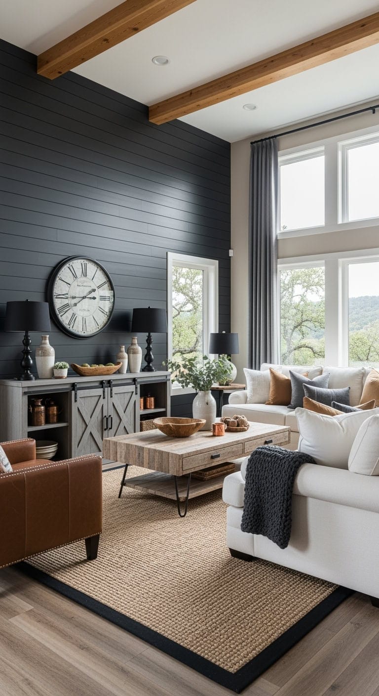
12. Modern Farmhouse Charm: Charcoal Shiplap Meets Cozy Wood Beams
Imagine the cozy appeal of farmhouse warmth mixed with a sleek, modern edge—where rustic textures meet urban sophistication. Charcoal shiplap walls bring a moody yet inviting backdrop, while natural wood beams add that timeless, earthy touch that makes your living room feel like a welcoming retreat.
Key Design Elements
Cream linen sectional with plush, rolled arms
Reclaimed wood coffee table with sturdy black iron legs
Weathered gray TV console featuring barn-style doors
Cognac leather accent chair detailed with nailhead trim
Natural jute rug bordered in charcoal for subtle contrast
Black metal table lamps topped with soft drum shades
Pro Tip: For a rich, enduring backdrop, try Benjamin Moore’s ‘Wrought Iron’ on your shiplap walls—its deep charcoal tone offers drama without overwhelming the space, striking a perfect balance between trendy and timeless.
13. Desert Modern Charm: Embracing Black Accents with Warm Terracotta and Succulent Touches
Bring the effortless cool of the Southwest into your living room with a blend of rich terracotta hues and sleek black furnishings. This style feels like wrapping yourself in a cozy, sun-kissed embrace, where modern sophistication meets desert-inspired warmth. It’s the perfect balance of earthy comfort and bold contrast that invites both relaxation and style.
Key Design Elements
Low-profile black leather sectional
Black metal and wood coffee table
Matte black media console with open shelving
Black metal cane accent chair
Southwestern patterned terracotta and cream area rug
Industrial-style black table lamp with exposed filament bulb
Pro Tip: To capture that authentic adobe vibe, paint your main wall with Benjamin Moore’s ‘Sedona Clay’ (2174-30); it adds warmth and character without feeling kitschy.
14. Timeless Traditional: Black Marble Fireplace Paired with Tufted Ottoman & Silk Drapes
Imagine your living room centered around a stunning black marble fireplace that serves as a bold yet elegant focal point, reminiscent of heirloom treasures passed down through generations. This design effortlessly blends cozy, inviting textures with refined, classic details to create a space that feels both warm and impeccably polished—a harmonious nod to vintage charm with a contemporary twist.
Key Design Elements
Deep navy velvet Chesterfield sofa
Mahogany coffee table with brass claw feet
Traditional wood media console with crown molding
Cream tufted ottoman in champagne fabric
Rich leather wingback accent chair
Burgundy and gold Persian-style area rug
Pro Tip: Paint the fireplace wall in Benjamin Moore’s ‘Hale Navy’ (HC-154) to establish a rich, sophisticated backdrop that grounds the room without overpowering it.
15. Hollywood Regency Vibes: Sleek Black Piano Coffee Tables with Glimmering Mirrored Accents
Imagine stepping into a space where vintage glamour meets modern sophistication, all wrapped up in the glossy shine of black piano finishes and sparkling crystal details. This Hollywood Regency style channels that timeless elegance straight from the silver screen, turning every corner of your living room into a shimmering statement. It’s the perfect way to infuse your home with a luxe, cinematic feel without going over the top.
Key Design Elements
Champagne velvet sofa with elegant channel tufting
Black lacquered coffee table featuring mirrored panels and crystal embellishments
Glossy black media console accented with bold gold hardware
Cream boucle accent chairs with soft, curved backs
Gold and black geometric Moroccan-inspired area rug
Gold arc floor lamp topped with a sleek black shade
Pro Tip: For a truly dramatic backdrop that makes gold details and mirrors pop, paint your main wall in Benjamin Moore’s ‘Hale Navy’ (HC-154)—it’s the perfect moody canvas for Hollywood Regency glamour.
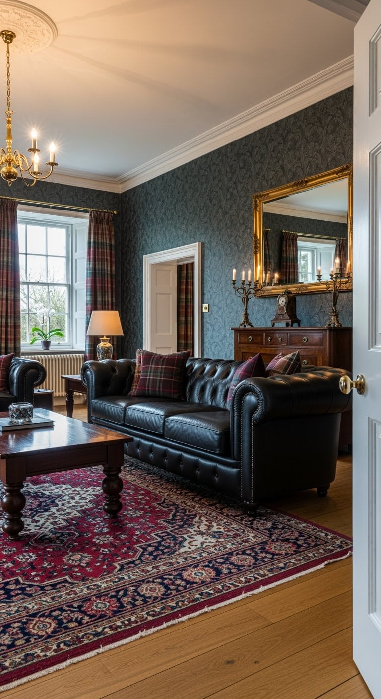
16. English Traditional Charm: Black Chesterfield Sofa Meets Tartan Accents
Imagine stepping into a cozy British manor where timeless elegance blends effortlessly with everyday comfort. This style channels the classic allure of an old-world library, softened by inviting textures and warm hues that make every moment feel like a refined escape. It’s the perfect backdrop for relaxed evenings, whether you’re curled up with a book or enjoying your favorite show.
Key Design Elements
Black leather Chesterfield sofa with signature button tufting
Rich mahogany coffee table featuring turned legs
Espresso-toned traditional media console
Plush burgundy velvet wingback chair
Deep red and navy Persian-inspired area rug
Classic Scottish tartan throw pillows
Pro Tip: Paint your fireplace wall in a deep navy like Benjamin Moore’s ‘Hale Navy’ (HC-154) to evoke that cozy, library-like atmosphere without making the space feel cramped.
17. Scandinavian Style Refresh: Bold Black Wall Meets Warm Oak and Textured Comfort
Imagine a living room where a striking black accent wall adds an elegant depth, instantly elevating the space with a touch of modern sophistication. Paired with warm, light oak floors, this design channels that effortlessly chic Scandinavian vibe we all adore on Instagram. It’s the perfect blend of cozy textures and sleek lines, making every moment feel both inviting and artfully curated.
Key Design Elements
Cream boucle sofa with light oak legs
Round oak coffee table with black metal base
Floating oak media console in matte black
Charcoal gray swivel accent chair
Natural jute rug featuring a black border
Black arc floor lamp with brass details
Pro Tip: Opt for Sherwin Williams ‘Tricorn Black’ (SW 6258) for your accent wall—its rich matte finish not only snaps beautifully in photos but also makes your oak floors glow with warmth.
18. Cottage Charm Reimagined: Black Window Trim Meets White Beadboard & Floral Accents
Imagine the timeless appeal of cottage style infused with a modern twist—black window trim adds a bold, grounding touch against crisp white beadboard, while soft floral cushions bring in a whisper of nostalgia. This design strikes the perfect balance between cozy and chic, evoking the warmth of a sunlit morning spent in a beloved family home.
Key Design Elements
White slipcovered sofa with relaxed rolled arms
Weathered white wood coffee table featuring open shelving
White beadboard media console accented with black iron hardware
Delicate floral-patterned accent chair in soft blues and pinks
Natural jute rug framed by a subtle cream border
Black metal table lamp topped with a breathable linen shade
Pro Tip: To nail that striking yet inviting contrast, paint your window trim and frames in Benjamin Moore’s ‘Wrought Iron’ (2124-10); it’s rich and dramatic without overpowering the room’s gentle vibe.
19. Art Deco Revival: Elevate Your Space with Black Lacquer and Gleaming Gold Geometrics
Step into a living room that channels the opulence of the Roaring Twenties with a modern twist — where bold black lacquer furniture meets stunning gold geometric accents. This design effortlessly balances show-stopping glamour and everyday coziness, creating a space that’s as inviting for lively gatherings as it is for quiet, relaxed moments. Think luxe details that catch the eye but don’t demand too much upkeep, making your home both chic and livable.
Key Design Elements
Sleek black lacquer sectional with plush velvet cushions
Gold geometric coffee table with a glass top
High-gloss black media console accented with gold hardware
Velvety emerald green accent chair featuring black legs
Black and gold geometric patterned area rug
Statement gold sunburst mirror as wall decor
Pro Tip: Paint your main accent wall in a deep, rich black like Benjamin Moore’s ‘Black Beauty’ (2128-10) to create a dramatic backdrop that makes every gold detail shimmer and pop.
20. Coastal Modern Charm: Black Window Frames Meet Breezy White Sofas and Earthy Rugs
Black window frames are the unexpected hero of coastal modern design, adding a bold edge that perfectly contrasts with crisp white slipcovered sofas. This style captures that effortlessly chic, seaside vibe—think relaxed luxury without the hefty price tag. It’s like bringing the serene elegance of a beachside retreat right into your living room.
Key Design Elements
Soft white slipcovered sectional with washable fabric
Distressed wood coffee table with sleek black metal legs
Whitewashed media console featuring matte black hardware
Natural woven accent chair framed in black
Jute area rug accented with a subtle black border
Black metal table lamp paired with a white drum shade
Pro Tip: Refresh your existing windows by painting the frames in a rich, deep black like Sherwin Williams’ ‘Tricorn Black’ to instantly elevate your space with striking architectural contrast.
21. Contemporary Minimalist Magic: Bold Black Walls Paired with White Molding and Gleaming Gold Touches
Imagine stepping into a living room that feels like a chic urban café wrapped in evening elegance. Deep black walls set a cozy, intimate tone, while crisp white crown molding adds a fresh, polished frame. Touches of gold bring in just the right amount of warmth and sparkle, creating a space that’s both modern and inviting.
Key Design Elements
Luxe cream velvet sofa with sleek gold legs
Striking black marble coffee table featuring a gold base
Black wood media console accented with gold hardware
Rich navy velvet accent chair framed in gold
Graphic black and white geometric rug grounding the space
Elegant gold arc floor lamp topped with a black shade
Pro Tip: Use Benjamin Moore’s ‘Black Beauty’ (2128-10) on your main wall for a rich, gallery-like backdrop that cleverly hides your TV and elevates the entire room’s vibe.
22. Industrial Chic Living: Embrace Exposed Brick, Black Metal, and Luxe Leather
Imagine stepping into a space where rugged urban charm meets cozy sophistication—exposed brick walls paired with smooth leather and sleek black metal accents create a living room that’s both bold and welcoming. This style thrives on the contrast between raw, textured surfaces and plush comfort, making every corner feel effortlessly cool yet invitingly warm.
Key Design Elements
Tufted charcoal leather sectional sofa
Black iron pipe coffee table with reclaimed wood top
Media console combining industrial metal and wood with mesh doors
Distressed leather accent chair framed in black metal
Vintage deep red and navy Persian rug
Adjustable black metal pharmacy floor lamp
Pro Tip: To make the exposed brick stand out beautifully, paint one adjacent wall with a rich charcoal like Sherwin Williams’ ‘Iron Ore’—this deep hue highlights the brick’s texture without overpowering the room.
23. Hamptons Charm: Crisp White Paneling Meets Bold Navy Accents
Imagine the serene elegance of a Nantucket getaway brought right into your living room—where crisp white paneling and chic navy touches come together effortlessly. This style blends timeless coastal vibes with a hint of modern farmhouse flair, creating a space that feels both fresh and inviting, perfect for relaxing or entertaining.
Key Design Elements
White slipcovered sofa with classic rolled arms
Weathered wood coffee table featuring a whitewashed base
White shiplap media console accented with black metal hardware
Navy blue velvet accent chair detailed with nailhead trim
Natural jute area rug bordered in navy
Decorative navy and white striped throw pillows
Pro Tip: For an instant style upgrade, paint your fireplace wall or TV backdrop in Benjamin Moore’s ‘Hale Navy’ HC-154—it’s the perfect deep hue to ground the room without making it feel heavy.
Conclusion
Embracing bold black in your modern living room is more than just a design choice—it’s an invitation to create a space that feels both timeless and strikingly unique. Whether your style leans toward sleek minimalism or eclectic charm, black provides a versatile foundation that effortlessly enhances any aesthetic. By incorporating rich textures, contrasting accents, and thoughtful lighting, you can transform your living room into a cozy yet sophisticated retreat that reflects your personality and creativity. Don’t hesitate to experiment with black as your canvas; it’s a powerful way to make your home feel both inviting and undeniably stylish.
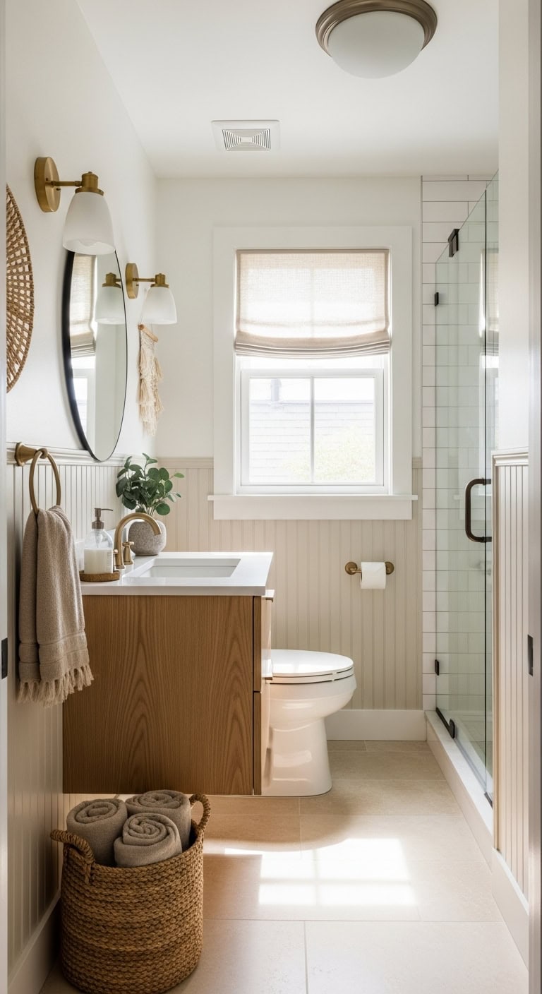
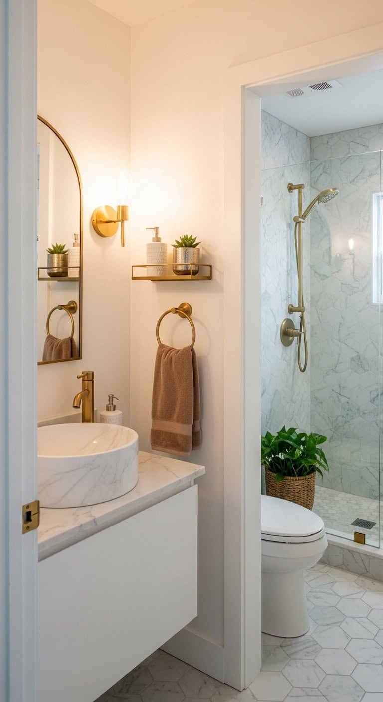
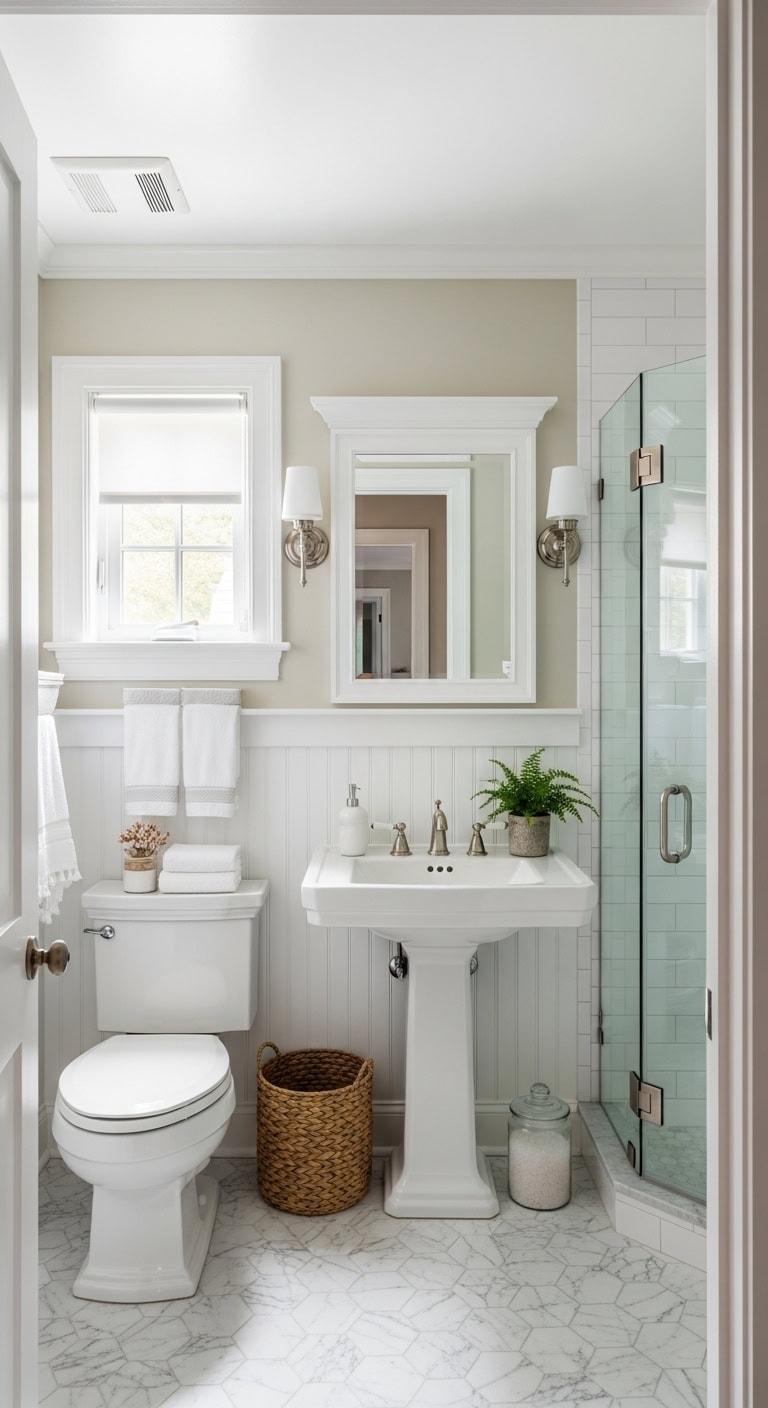
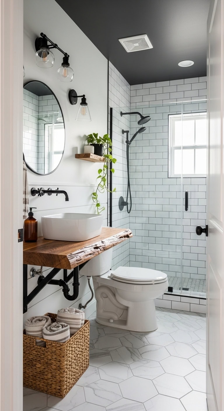
Designing a small bathroom can often feel like trying to fit a puzzle together with missing pieces. Limited space, awkward layouts, and the need for functionality can make creating a beautiful and practical bathroom seem like an uphill battle. But don’t be discouraged—small bathrooms hold incredible potential to become cozy, stylish sanctuaries that maximize every inch without sacrificing comfort or charm.
In this article, we’ll explore creative and inspiring design ideas tailored specifically for compact bathrooms. From clever storage solutions to space-enhancing layouts and eye-catching decor, you’ll discover practical tips that make the most of your square footage. Whether you’re working with a tiny powder room or a snug ensuite, these expert strategies will help you transform your small bathroom into a refreshing retreat that feels bigger than it is.
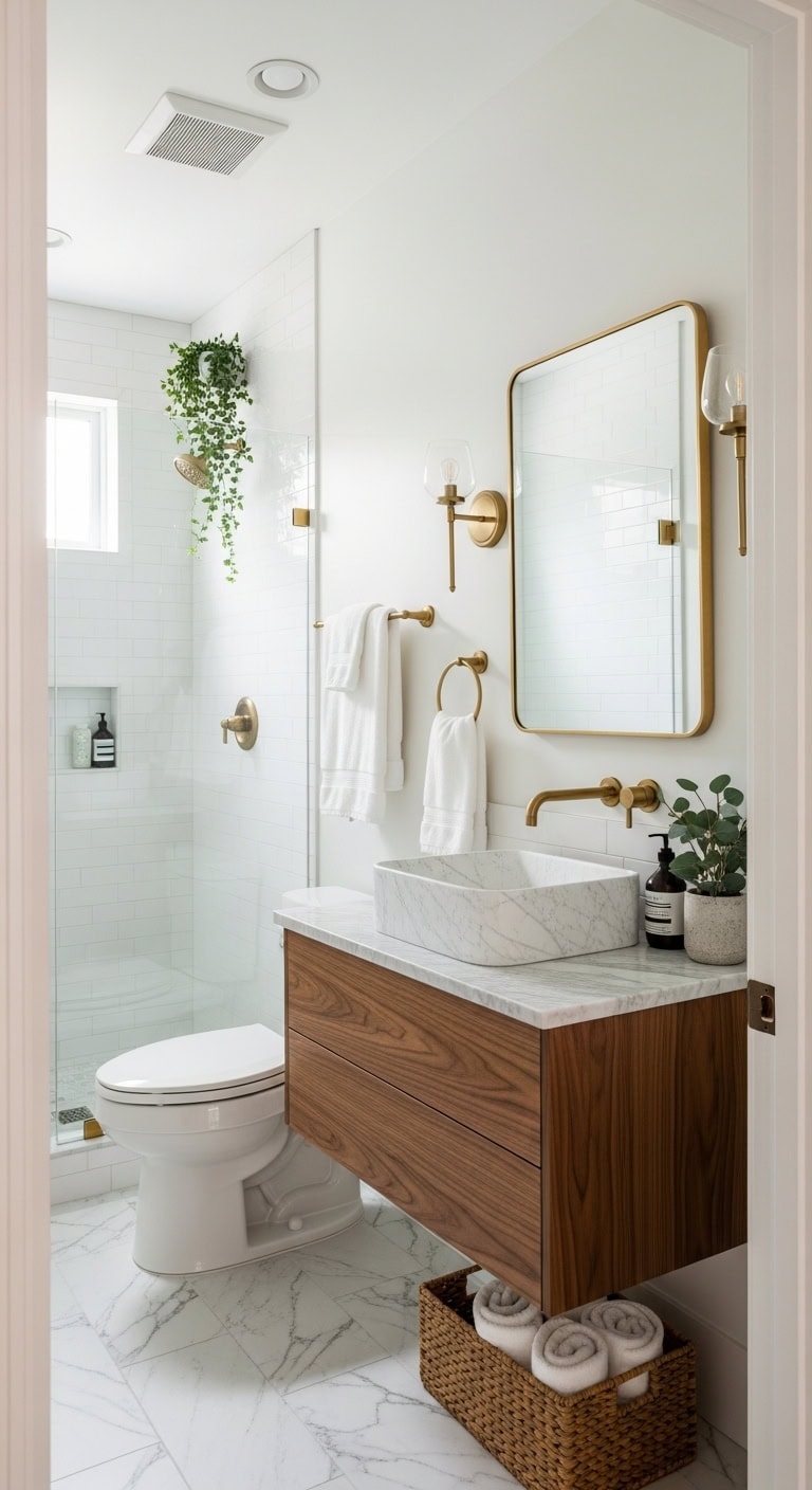
1. Urban Luxe: Redefine Small Spaces with Marble Elegance
Elevate your petite bathroom into a chic sanctuary where the crisp veins of marble harmonize effortlessly with the glow of warm metallic details. The blend of sleek stone surfaces, soft brass fixtures, and sumptuous cotton linens conjures the feeling of an upscale boutique hotel, right in your own home.
This refined urban luxe style demonstrates that even the coziest footprint can boast high-end sophistication. Marble countertops serve as the timeless centerpiece, while glossy and reflective elements help expand the visual space, making every square inch feel open and inviting.
Key Design Elements
Sleek white marble countertop with a vessel sink offers enduring natural beauty
Warm brushed brass widespread faucet infuses the sink area with subtle luxury
Floating walnut vanity introduces rich, textured wood tones beneath the stone
Frameless beveled rectangular mirror enhances light and adds a contemporary edge
Soft white Turkish cotton towels provide plush, hotel-inspired comfort
Marble-inspired ceramic floor tiles continue the elegant stone look underfoot
Gold-toned metal soap dispenser adds a touch of refined metallic sparkle
Pro Tip: Ideal for style-savvy city dwellers seeking spa-like sophistication in small bathrooms or powder rooms without major remodeling.
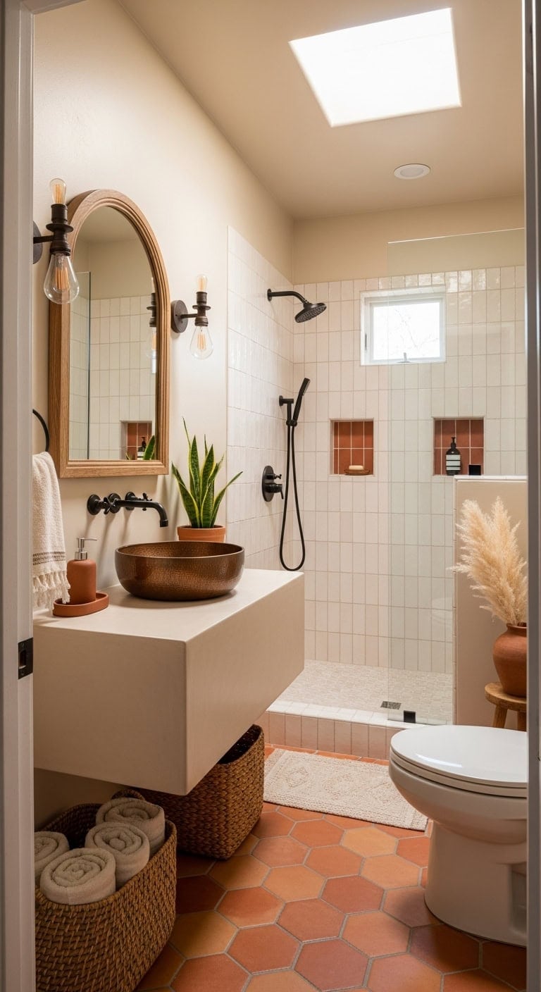
2. Bohemian Eclectic: Maximize Cozy Bathrooms with Stylish Open Shelving
Transform your small bathroom into a warm, inviting retreat by blending bohemian charm with smart, open storage solutions. Imagine rustic wooden shelves floating against rich terracotta-hued walls, where natural woven baskets nestle beside artisanal brass accents and soft, textured cotton towels. This eclectic design approach breathes life into limited space, turning it into a thoughtfully layered haven that feels more like a curated collection than cramped quarters.
With each element thoughtfully chosen—from tactile surfaces to handcrafted details—this style invites a sense of global wanderlust and relaxed sophistication. Open shelving not only provides functional storage but also highlights your treasured finds, helping your compact bathroom feel airy, personal, and full of character.
Key Design Elements
Set of rustic wooden floating shelves offers stylish, accessible storage and display room
Trio of woven rattan baskets introduces natural texture while organizing essentials neatly
Pair of hammered brass wall sconces casts a warm, handcrafted glow over the space
Sculptural white ceramic vessel sink creates an eye-catching centerpiece above the vanity
Antique brass widespread faucet complements the warm metallic tones with vintage flair
Terracotta peel-and-stick floor tiles lay down an earthy, sun-kissed base for the room
Macrame cotton shower curtain with fringe adds boho-inspired texture and subtle movement
Carved wooden soap dispenser set infuses artisanal craftsmanship to countertop styling
Pro Tip: Ideal for imaginative individuals living in charming older homes who want their small bathroom to evoke the feel of a thoughtfully gathered global getaway rather than a plain utilitarian space.
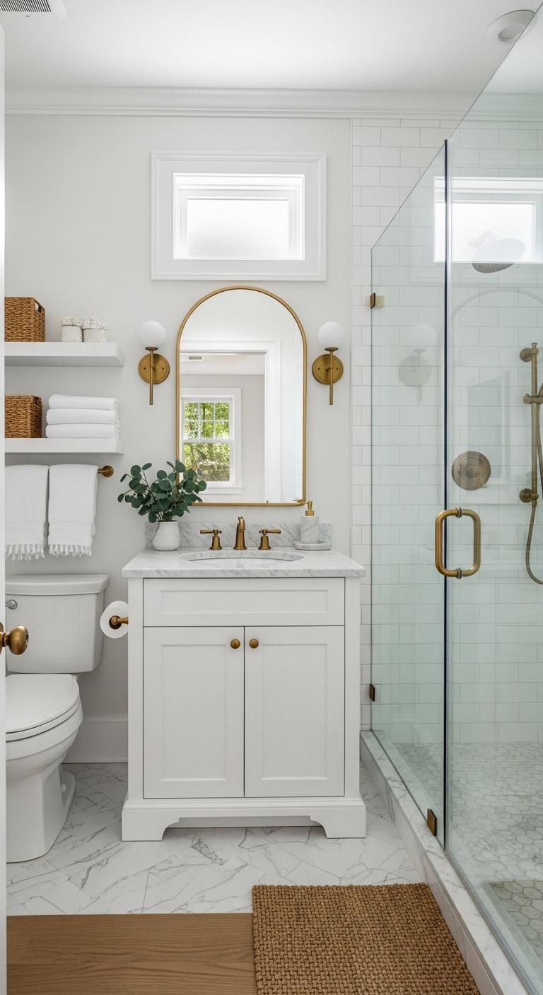
3. Transitional Classic: Elevate Small Bathrooms with Sleek Glass Shower Doors
Introducing a frameless glass shower enclosure instantly opens up a compact bathroom, transforming it into a light-filled sanctuary by removing bulky visual dividers that fragment limited space. The uninterrupted flow of smooth marble flooring, warm brushed brass accents, and pristine white subway tiles crafts an elegant, layered look that feels both airy and inviting without crowding the room.
This transitional design expertly balances traditional architectural details with streamlined modern elements, resulting in a timeless aesthetic that suits any small bathroom. The careful blend of classic and contemporary finishes brings depth and sophistication while maintaining a clean, uncluttered atmosphere.
Key Design Elements
Seamless frameless glass pivot door enhances openness and visually enlarges the bathroom
Classic white marble hexagonal floor tiles deliver enduring elegance beneath your feet
Warm brushed brass faucet with widespread design adds a rich metallic glow to the sink area
Sleek white floating vanity with integrated drawers offers ample storage without consuming floor space
Distinctive arched mirror framed in gold metal introduces architectural charm above the vanity
Twin brass wall sconces flank the mirror, providing symmetrical and flattering illumination
Sumptuous white Turkish cotton towels contribute a plush, spa-inspired touch
Coordinated marble soap dispensers unify the stone elements across the countertop
Pro Tip: Ideal for homeowners working with small full bathrooms who desire the feel of upscale hotel luxury and a more spacious ambiance without undergoing extensive remodeling.
4. California Casual: Enhance Compact Bathrooms with Bright, Natural Light Strategies
In tight bathroom spaces, the California casual vibe effortlessly shifts confined areas into spacious, sunlit sanctuaries by cleverly utilizing every available window and reflective element. This relaxed style blends crisp white walls with soft sandy beige tones, layered with textured accents like woven jute baskets, airy linen curtains, and sleek ceramic tiles to add dimension and warmth.
The overall effect evokes the breezy charm of a coastal retreat, turning even the smallest powder room into a light-filled haven. By combining natural materials and subtle color contrasts, the design invites a serene, open atmosphere that feels both inviting and effortlessly chic.
Key Design Elements
Floating vanity crafted from white oak introduces soft, sun-bleached wood warmth
Pro Tip: Ideal for homeowners dealing with windowless or dim bathrooms who want to simulate natural sunlight and open up their space through thoughtful color palettes and material textures.
5. Contemporary Glam: Elevate Petite Bathrooms with Luxe Metallic Touches
Turn your small bathroom into a dazzling sanctuary where metallic elements reflect light, creating a sense of spaciousness and glamour. The contemporary glam aesthetic blends smooth, modern surfaces with rich gold or brushed brass details set against clean, neutral backdrops—offering an elegant vibe that doesn’t overcrowd limited space.
Shiny metal fixtures shimmer alongside sleek marble finishes, while sumptuous velvet towels introduce a cozy contrast. This approach proves that even the tiniest bathrooms can shine with luxe, eye-catching accents that make a bold style statement.
Key Design Elements
Warm brushed gold widespread faucet provides a radiant focal point for the vanity
Arched bathroom mirror with a brass frame adds architectural interest and vintage flair above the sink
Floating shelf in gold metal offers stylish open storage while reflecting light beautifully
White marble vessel sink serves as a sculptural centerpiece exuding refined sophistication
Velvet-textured bath towels introduce plush comfort against cool, polished marble
Ceramic soap dispenser with delicate gold detailing harmonizes the metallic theme
Peel-and-stick marble hexagon tiles bring timeless stone charm to the floor with easy installation
Pro Tip: Ideal for design-savvy homeowners eager to upgrade a powder or guest bathroom into a chic, photo-ready space without undertaking a full remodel.
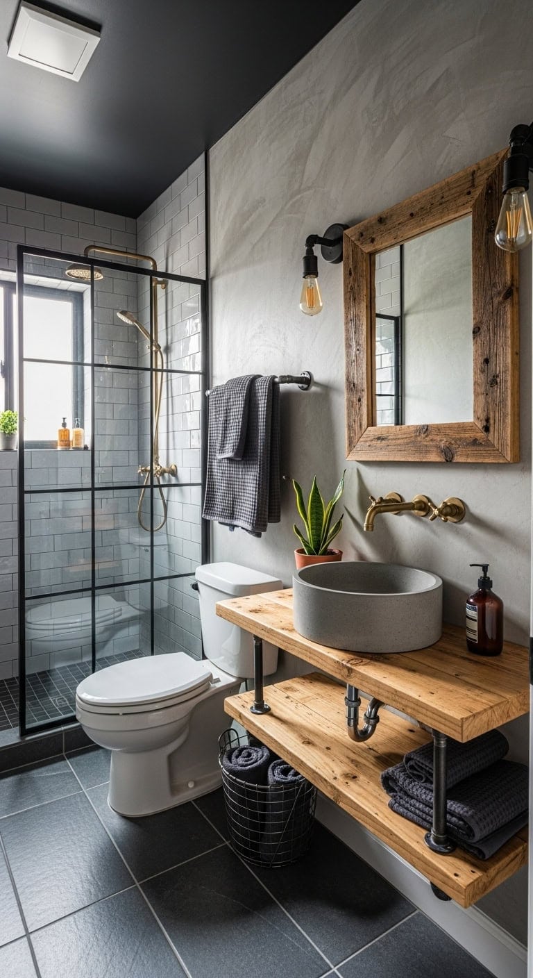
Give your small bathroom a striking makeover by embracing an industrial loft vibe where rugged elements meet polished design. Exposed pipe fixtures, far from being mere functional necessities, serve as captivating art pieces that define the space. The blend of raw concrete finishes and warmly patinated brass fittings creates a compelling contrast, while plush cotton towels introduce a cozy counterpoint to the cool metallic accents.
This gritty yet sophisticated style shows that limited square footage doesn’t mean sacrificing personality. By incorporating tactile materials and statement hardware, even the tiniest bathroom can become a dynamic urban retreat filled with character and charm.
Key Design Elements
Brass exposed pipe faucet mounted on the wall doubles as a striking sculptural element above the sink
Floating shelf crafted from reclaimed wood and industrial pipes offers rustic yet sleek storage
Black iron pipe towel rack combines functionality with a rugged industrial aesthetic
Round concrete vessel sink in soft gray delivers authentic texture and anchors the design
Black metal Edison bulb wall sconce provides warm, moody lighting with vintage flair
Reclaimed wood framed mirror introduces an inviting natural warmth to contrast metal and stone
Charcoal waffle-weave towels add a plush, tactile softness to balance the industrial surfaces
Wire mesh basket storage keeps essentials organized while reinforcing the loft-inspired look
Pro Tip: Ideal for city apartment residents and style-savvy homeowners eager to evoke genuine loft living vibes in their small bathroom without extensive remodeling.
7. New England Traditional: Elevate Compact Bathrooms with Timeless Beadboard Detailing
Step into a bathroom that evokes the cozy charm of a classic New England seaside retreat. Crisp white beadboard paneling introduces subtle vertical texture that visually lifts the ceiling, making even the tiniest powder room feel open and airy. This distinctive woodwork pairs beautifully with smooth ceramic tiles and gleaming polished nickel accents to create an inviting space brimming with authentic coastal character.
The blend of tactile materials—painted wood, refined metal finishes, and natural fibers—offers a harmonious contrast that feels both fresh and enduring. Whether you’re looking to refresh a half bath or maximize a small powder room, the traditional coastal aesthetic of beadboard walls delivers architectural interest and a bright, welcoming ambiance without the need for costly renovations.
Key Design Elements
White beadboard wainscoting introduces vertical patterns that visually expand room height
Classic porcelain pedestal sink maintains an open floor plan and airy feel
Polished nickel sconces with clear glass shades provide soft, timeless illumination
Beveled mirror framed in white wood adds refined architectural detail above the sink
White and gray marble hexagon tiles infuse the floor with elegant coastal flair
Natural woven seagrass basket offers stylish storage and organic texture beneath the sink
Luxurious white Turkish cotton towels bring crispness and plush comfort akin to boutique hotels
Coordinated ceramic soap dispenser with brushed nickel pump complements the hardware finish
Pro Tip: Ideal for homeowners with compact powder rooms or half baths seeking classic American coastal style and architectural charm without extensive remodeling.
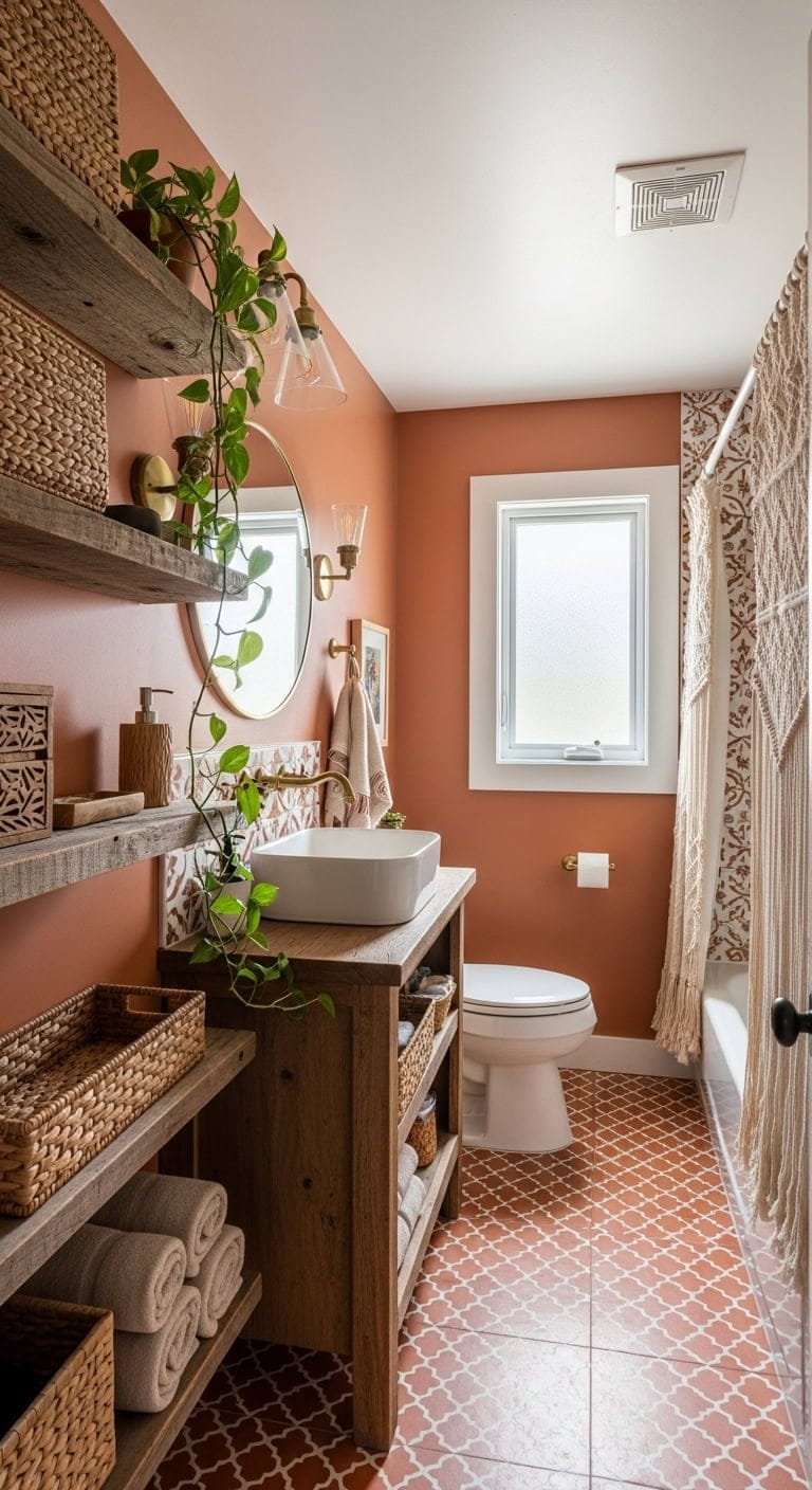
8. Southwestern Adobe: Cozy Small Bathrooms Infused with Terracotta Charm
Rich terracotta hues combined with handcrafted copper accents bring a sun-soaked Southwestern adobe vibe to even the smallest bathroom. Layering natural materials and warm, earthy tones, this style evokes the inviting spirit of a desert retreat, turning your compact space into a cozy, sun-warmed haven.
By pairing hexagonal terracotta floor tiles with soft beige floating vanities and rugged iron fixtures, the design captures an authentic adobe feeling that’s both grounded and welcoming. The result is a bathroom that envelops you in warmth and rustic elegance the moment you walk in, offering a peaceful escape inspired by Southwestern desert landscapes.
Key Design Elements
Hexagon terracotta floor tiles establish a genuine sun-baked adobe foundation
Desert-toned beige floating vanity adds warmth and anchors the space beautifully
Hand-forged hammered copper vessel sink serves as a standout artisanal centerpiece
Curved wooden mirror frame reflects the natural, flowing forms of adobe architecture
Pair of iron wall sconces with a weathered finish creates soft, ambient lighting reminiscent of candlelight
Seagrass woven baskets provide earthy texture and clever concealed storage
Soft cream Turkish cotton towels introduce a gentle contrast against rustic elements
Terracotta ceramic soap dispensers unify the warm color palette throughout the room
Pro Tip: Ideal for those who embrace natural Southwestern design and desire a snug, earth-toned powder room that feels like stepping into a tranquil desert casita.
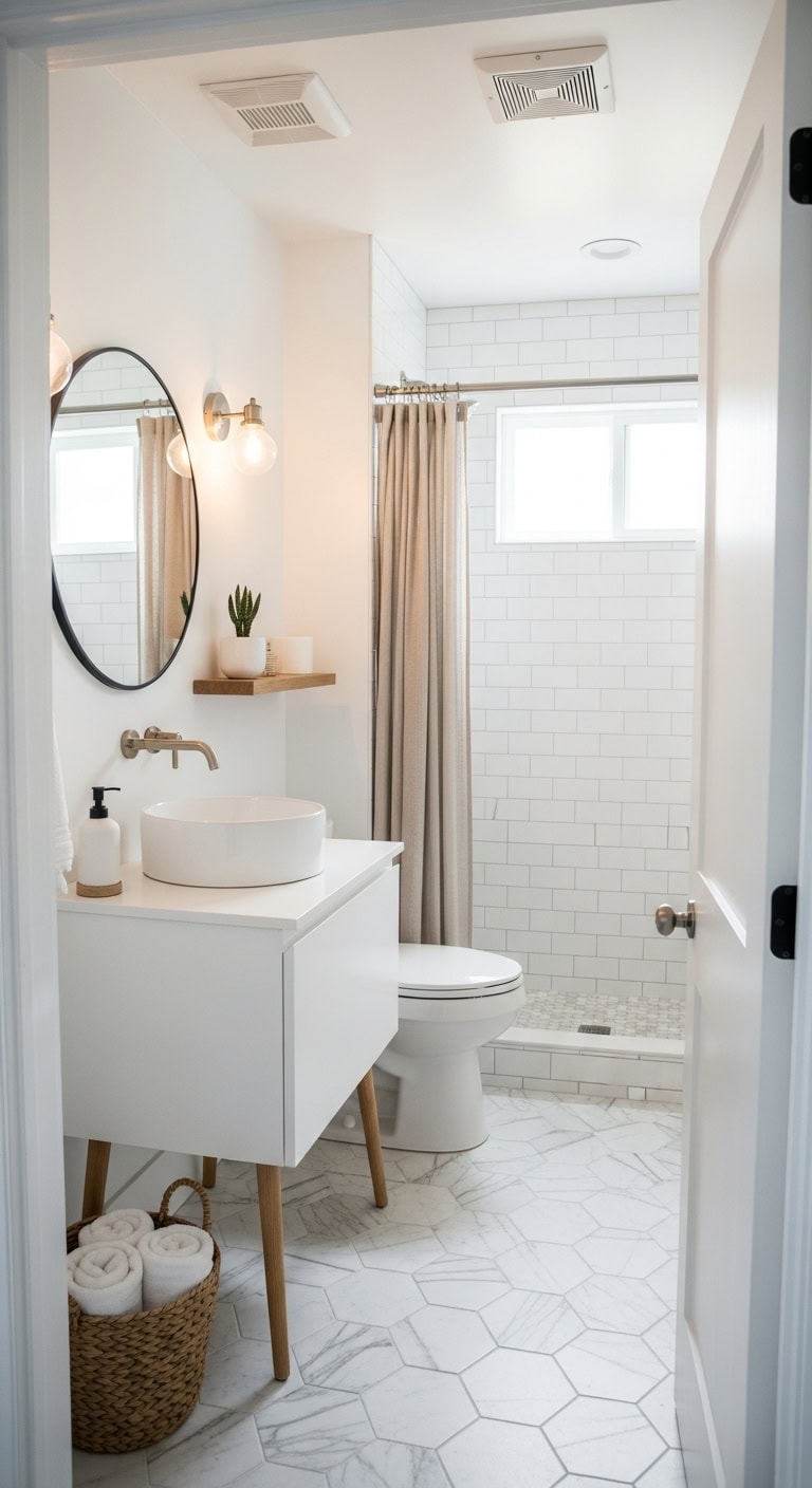
9. Scandinavian Minimalist: Elevate Compact Bathrooms with a Bright All-White Aesthetic
Step into the tranquility of a bathroom designed with a soothing all-white color scheme, where soft matte finishes blend effortlessly with warm natural wood tones. This Scandinavian-inspired style transforms even the smallest spaces into airy, peaceful sanctuaries that invite relaxation and clarity.
By balancing sleek, minimalist elements with subtle textures and gentle linen details, the design creates a harmonious environment that feels open and uncluttered. The thoughtful layering of light, clean surfaces and organic accents ensures your bathroom remains both stylish and inviting, capturing the essence of serene simplicity.
Key Design Elements
White floating vanity supported by wooden legs introduces a cozy contrast within the bright palette
Frameless round mirror with beveled edges enhances light flow while maintaining a minimalist vibe
Sculptural matte white ceramic vessel sink offers elegant simplicity atop the vanity
Brushed nickel wall sconces deliver refined, contemporary lighting with a minimalist edge
Hexagonal white marble floor tiles add gentle texture without overpowering the visual calm
Natural linen shower curtain hung with simple hooks brings warmth and softness to the space
Light oak floating shelf provides open storage infused with Scandinavian natural charm
White stoneware soap dispensers keep countertops neat, reinforcing the clean aesthetic
Pro Tip: Ideal for minimalist enthusiasts with limited bathroom space who desire a luminous, spacious feel that blends warmth with sleek, understated design.
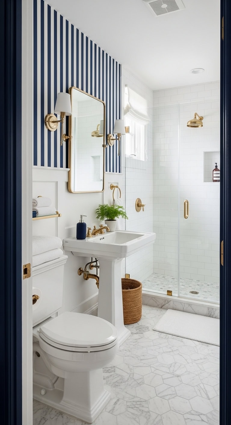
10. Preppy Classic: Elevate Compact Bathrooms with Striking Striped Wallpaper
Step into a petite bathroom that radiates the charm of a quaint New England seaside cottage. The iconic navy and white stripes instantly deliver that effortlessly chic, preppy vibe, evoking coastal elegance in a compact space. Paired with gleaming brass accents, the look becomes warm and inviting, perfectly complementing the fresh texture of crisp cotton towels and the smooth sophistication of marble finishes.
This thoughtfully curated blend of classic patterns and luxe materials turns even the smallest powder room into a refined sanctuary. The timeless style ensures your space remains perpetually polished, offering a nod to traditional East Coast design while maximizing visual impact in limited square footage.
Key Design Elements
Navy and white striped peel-and-stick wallpaper introduces instant coastal-preppy flair with minimal effort
Traditional white pedestal sink maintains an open, airy feeling by freeing up floor space
Rectangular mirror framed in brass delivers a warm metallic glow that contrasts beautifully with the stripes
Polished brass wall sconces enhance the classic navy-and-white scheme with elegant lighting
Carrara marble hexagonal tiles underfoot add a layer of enduring luxury and texture
Soft, white Turkish cotton towels evoke a crisp, upscale hotel ambiance
Brass widespread faucet ties together the warm metal accents throughout the room
Navy ceramic soap dispenser set perfectly echoes the color palette, unifying the countertop decor
Pro Tip: Ideal for homeowners who love traditional East Coast aesthetics and want their small powder room to exude timeless, polished character.
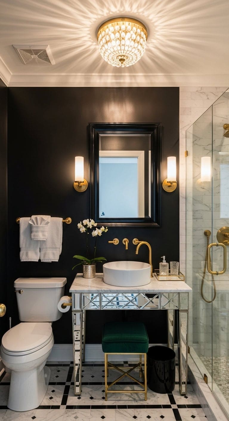
11. Hollywood Regency: Elevate Compact Bathrooms with Striking Statement Lighting
Transform a small powder room into a dazzling retreat by spotlighting bold, eye-catching lighting against rich, opulent finishes. Imagine gleaming brass sconces framing your mirror, casting a flattering glow that dances across polished lacquer surfaces and reflective accents. This combination instantly injects a dose of vintage Hollywood allure into a modest space.
Incorporate mirrored furnishings, sumptuous velvet details, and pristine marble to cultivate an ambiance brimming with old-Hollywood charm and dramatic flair. These elements work harmoniously to create a captivating setting that leaves visitors enchanted and inspired.
Key Design Elements
Shiny brass wall sconces positioned beside the mirror provide radiant, flattering illumination
A mirrored vanity console blends practical surface area with reflective sophistication
A crystal flush mount ceiling fixture offers a chandelier-inspired focal point overhead
Bathroom mirror bordered in black lacquer delivers a bold, theatrical accent
White Carrara marble vessel sink serves as a luxurious and timeless centerpiece
Velvet-covered vanity stool introduces plush, glamorous comfort beneath the counter
Gold-toned metallic towel bars add warmth and elegant hardware details
Monochrome geometric floor tiles establish a striking Art Deco-inspired foundation
Pro Tip: Ideal for confident decorators eager to infuse their powder room with unforgettable vintage glamour and unapologetic sophistication.
12. Art Deco Revival: Elevate Compact Bathrooms with Striking Geometric Flair
Infuse your small bathroom with the timeless elegance and bold charisma of the 1920s by embracing strong geometric designs that instantly captivate. Sleek black lacquered finishes set the stage for radiant gold metal accents, while the cool sophistication of marble countertops pairs beautifully with textured glass tiles to evoke the unmistakable drama of Art Deco style.
Reflective surfaces like mirrors and polished chrome fixtures bounce light throughout the space, turning even the tiniest powder room into a glamorous retreat reminiscent of a vintage speakeasy. This clever interplay of light, pattern, and luxe materials transforms compact quarters into a refined sanctuary bursting with old Hollywood charm.
Key Design Elements
Dramatic black and white hexagonal floor tiles establish a classic Art Deco geometric foundation
A gold sunburst mirror above the vanity injects a burst of vintage glamour and focal appeal
Polished brass wall sconces with an Art Deco flair provide warm, ambient lighting that enhances the room’s theatrical vibe
A striking black marble vessel sink commands attention as the centerpiece with its polished luxury
Elegant gold widespread faucet in brass unites the metallic accents seamlessly throughout the space
Glass floating shelves supported by gold brackets offer chic, open storage while maintaining visual lightness
Coordinated black and gold bath towels reinforce the sophisticated, contrasting color scheme
Geometric ceramic soap dispensers continue the motif, tying the design story together with subtle detail
Pro Tip: Perfect for design enthusiasts who adore vintage Hollywood glamour and want to transform a small powder room into a dazzling, sophisticated jewel box.
13. Cottage Core: Make the Most of Tiny Spaces with Corner Basin Solutions
Transform that overlooked corner in your petite bathroom into a delightful focal point by adopting a charming cottage core vibe with a compact corner basin. Soft, buttery cream walls provide the perfect backdrop for gentle sage green touches, while natural materials like woven wicker baskets and reclaimed wood shelving add rich layers of rustic warmth. Accents of delicate floral cotton fabrics soften the space, creating a serene, countryside-inspired sanctuary.
By incorporating these vintage-inspired elements, even the smallest powder rooms can feel inviting and beautifully curated. The combination of practical design and romantic, pastoral details elevates cramped corners into cozy, inviting retreats reminiscent of an English cottage in bloom.
Key Design Elements
Classic white ceramic pedestal sink designed to snugly fit into small bathroom corners, turning difficult spaces into charming features
Set of woven wicker baskets for stylish storage that adds earthy texture while keeping essentials neatly tucked away
Floating corner shelf crafted from distressed wood to cleverly utilize vertical space above the sink without overcrowding
Warm antique brass sconces mounted on the wall to cast a soft, welcoming glow characteristic of cottage interiors
Sage-green floral cotton shower curtain introduces a fresh, garden-inspired splash of color and pattern
Peel-and-stick marble hexagon tiles on the floor that bring a touch of understated elegance without a major renovation
Oval mirror framed in cream linen fabric offering a gentle, romantic focal point that complements the vintage theme
Vintage-style widespread faucet in brass completes the look with authentic, timeless cottage hardware details
Pro Tip: Ideal for homeowners dealing with tricky bathroom layouts or tight powder rooms who want to optimize every inch while embracing a dreamy, English cottage-inspired aesthetic.
14. Coastal Chic: Amplify Small Bathrooms with Grand-Scale Mirrors
An oversized mirror is one of the most effective tools to visually expand a compact bathroom, especially when combined with light, breezy coastal décor. Picture pristine white shiplap walls mirrored back to create a sense of endless space, while natural woven elements like baskets and rope details introduce inviting warmth and texture. The look is effortlessly fresh, evoking the relaxed vibe of a beachside haven.
To complete this serene coastal escape, layer in sandy beige linen towels alongside driftwood-inspired accents that bring an organic, weathered charm. This thoughtful blend of reflective surfaces and tactile materials transforms a tight footprint into an airy retreat, making the room feel significantly larger without any extensive remodeling.
Key Design Elements
Large frameless rectangular mirror dramatically enhances the room’s perceived size
White peel-and-stick shiplap wallpaper provides a crisp, coastal-inspired backdrop
Driftwood-finished wall sconces introduce natural warmth against bright white walls
Ceramic pedestal sink creates open floor space and contributes to a light, airy atmosphere
Brushed nickel widespread faucet adds subtle coastal elegance without overpowering the design
Beige linen towels capture the soft, neutral hues of sandy shores
Hexagonal marble mosaic flooring grounds the design with refined, understated luxury
Pro Tip: Ideal for homeowners with small bathrooms lacking natural light, such as windowless or north-facing spaces, who want to brighten and open up their space with a fresh, coastal-inspired aesthetic—no major renovations needed.
15. Mediterranean Warmth: Elevate Compact Bathrooms with Vibrant Patterned Tiles
Turn your small powder room into a radiant Mediterranean-inspired retreat where every detail evokes sunlit charm. Intricately patterned encaustic tiles in rich terracotta hues and creamy tones lay the perfect foundation, instantly adding character and warmth beneath your feet. Paired with the tactile appeal of rustic wood finishes, the space gains a natural, inviting balance that contrasts effortlessly with sleek, glossy ceramics.
Accents like woven rattan baskets introduce an earthy texture that softens the overall look while providing smart storage solutions. Meanwhile, brushed brass fixtures gleam with the golden glow reminiscent of Mediterranean afternoons, enhancing both functionality and style. Together, these elements create a cozy yet elegant powder room that feels light, airy, and full of old-world European allure without overwhelming the space.
Key Design Elements
Vibrant terracotta encaustic tiles serve as a captivating sunlit centerpiece for the floor
Smooth cream ceramic vessel sink offers a minimalist sculptural touch atop the vanity
Floating vanity in warm, distressed wood grounds the room with authentic Mediterranean vibes
Wall-mounted brushed brass faucet reflects sunlight with a subtle metallic shimmer
Arched bathroom mirror framed in brass complements the warm metallic accents throughout
Soft cream linen shower curtain balances the bold tile pattern with gentle texture
Terracotta-hued ceramic soap dispenser enhances the earthy, cohesive color palette
Pro Tip: Ideal for homeowners seeking to infuse a small guest bathroom or powder room with timeless European charm without the hassle of a major overhaul.
16. Mid-Century Modern: Elevate Compact Bathrooms with Striking Tile Designs
Step into a small bathroom that feels thoughtfully designed, where every element contributes to a cohesive style statement rather than feeling like an afterthought. Embracing mid-century modern aesthetics, these intimate spaces come alive through bold, graphic tile patterns that anchor the room, complemented by the rich texture of walnut wood vanities and the soft glow of brushed brass accents. This combination of sleek ceramic surfaces, natural wood warmth, and metallic shine adds layers of visual interest that make cozy layouts feel carefully curated and impactful.
The seamless fusion of these elements transforms limited square footage into an inviting retreat. From the eye-catching geometric floor tiles to the warm tones of wood and brass, each component works together to craft an environment that’s both functional and fashion-forward. Ideal for those wanting their powder rooms or half baths to make a memorable impression without sacrificing everyday usability.
Key Design Elements
Warm walnut floating vanity with integrated storage brings organic texture and clean lines
Bold geometric ceramic floor tiles create a captivating visual centerpiece beneath your feet
Brushed brass wall-mounted faucet introduces a touch of classic mid-century metallic refinement
Round wooden-framed mirror reflects the vanity’s natural warmth and softens the space
Sleek white ceramic soap dispenser set keeps the countertop tidy and stylish
Vibrant mustard yellow cotton towels add a cheerful mid-century pop of color
Teak floating shelf offers extra storage while enhancing the natural wood palette
Pro Tip: Ideal for design-conscious homeowners eager to inject bold, stylish elements into powder rooms or half bathrooms where impactful design can shine without overwhelming daily use.
17. Zen Spa: Elevate Compact Bathrooms with Bamboo Elements
Convert your small bathroom into a peaceful sanctuary where everyday rituals feel intentional and soothing. The natural warmth of bamboo accessories harmonizes effortlessly with gentle sage green hues, evoking a spa-like ambiance even within limited square footage. Combining woven textures and smooth stone accents, alongside the rich grains of organic wood, brings a comforting balance that complements crisp, white cotton linens.
This tranquil design proves that a sense of calm doesn’t require a large space. Instead, thoughtful materials and subtle natural colors work together to create a rejuvenating retreat perfect for mindful moments and relaxation, right at home.
Key Design Elements
Natural-finish bamboo accessory set adds a soothing, earthy vibe to your bathroom surfaces
Wall-mounted bamboo floating shelf offers stylish storage while maintaining an airy feel
Rectangular vanity mirror with a bamboo frame introduces organic texture above the basin
Round white ceramic vessel sink provides a sleek, sculptural centerpiece
Brushed nickel faucet mounted on the wall combines minimalist style with practical ease
River stone bath mat grounds the space with tactile, spa-inspired texture underfoot
Sage green waffle weave towels inject a serene, nature-inspired splash of color
Brass-finished frosted glass wall sconce diffuses gentle, relaxing light for a spa atmosphere
Pro Tip: Ideal for busy professionals craving a peaceful start to their day or anyone looking to infuse spa-like tranquility into a small guest or powder bathroom.
18. Traditional Elegance: Elevate Compact Bathrooms with Stylish Vertical Storage Solutions
Utilizing a tall storage cabinet is an ingenious way to reclaim unused vertical space in small bathrooms, turning it into a chic and practical feature. Imagine creamy white cabinetry adorned with sleek brushed nickel handles, set against soothing gray walls. The addition of marble details and the tactile charm of woven baskets introduces a cozy yet sophisticated atmosphere. This harmonious combination offers a peaceful, timeless ambiance that keeps your essentials neatly organized and easily accessible.
Classic design elements come together beautifully in this approach, creating a refined powder room or guest bathroom that feels both inviting and orderly. Incorporating luxurious touches like marble-patterned tiles and traditional fixtures enhances the overall sense of elegance without crowding the space, ensuring the room remains open and airy.
Rectangular beveled mirror framed for added architectural interest above the vanity
Set of woven seagrass baskets introduces natural texture while concealing clutter
Classic white ceramic pedestal sink preserves open floor space for a lighter feel
Soft gray cotton towels bring warmth and contrast to crisp white cabinetry
Polished nickel widespread faucet offers an elegant finishing touch to the hardware ensemble
Pro Tip: Ideal for homeowners who cherish timeless design and want to maximize vertical storage in small powder rooms or guest bathrooms without compromising on style.
19. Rustic Retreat: Enhance Compact Bathrooms with Built-In Medicine Cabinets
Transform your small bathroom into a cozy woodland haven by blending natural textures with clever storage solutions. A recessed medicine cabinet seamlessly integrates into the wall, offering a sleek spot to stash essentials without encroaching on limited space. Complementing this, rustic wooden shelves and woven baskets introduce a warm, lived-in feel reminiscent of a charming cabin nestled in the woods.
This design beautifully balances functionality and comfort, making the most of every inch while maintaining an inviting, timeless aesthetic. The combination of weathered wood elements and tactile accents creates a serene retreat, perfect for unwinding and enjoying a slice of mountain lodge charm right at home.
Key Design Elements
Built-in recessed medicine cabinet with a wooden frame saves space by sitting flush within the wall
Floating rustic wood shelf mounted above the toilet offers open storage and showcase opportunities
Set of woven seagrass baskets organizes towels and toiletries with a naturally earthy vibe
Vanity featuring a weathered oak vessel sink establishes a strong rustic centerpiece
Oil-rubbed bronze sconces provide soft, ambient lighting that evokes a cozy cabin atmosphere
Gray stone hexagon floor tiles add grounded, organic texture beneathfoot
Matte black widespread faucet delivers a modern contrast to the warm wood finishes
Pro Tip: Ideal for homeowners seeking to create a tranquil mountain lodge ambiance in a small bathroom, enhanced by smart, space-saving storage solutions.
20. Modern Farmhouse: Optimize Compact Bathrooms with Sleek Floating Vanities
In bathrooms where space is limited, installing a floating vanity is a clever way to open up your modern farmhouse retreat. The blend of distressed wood finishes paired with crisp white shiplap walls creates a welcoming, lived-in vibe, while matte black hardware injects a striking contrast that enhances the rustic charm without overwhelming the room. By elevating the vanity off the ground, you maintain clear sightlines to the floor, which visually expands even the tiniest powder room.
This design strategy not only maximizes functionality but also infuses the space with texture and warmth. Layered with carefully chosen accents like woven natural storage solutions and subtle lighting, the result is a small bathroom that feels airy and thoughtfully styled, perfectly balancing farmhouse coziness with modern efficiency.
Key Design Elements
Wall-mounted reclaimed wood vanity frees up floor space for a more open, airy feel
Matte black iron faucets mounted on the wall create eye-catching farmhouse contrast
Easy-to-install white shiplap peel-and-stick panels add authentic rustic charm without a full remodel
Circular black metal-framed mirror ties in seamlessly with the dark hardware elements
Matte black wall sconces flank the mirror, delivering focused, farmhouse-inspired lighting
Classic white marble hexagonal tiles provide a durable and elegant foundation
Soft cream linen-striped towels introduce gentle texture and warmth against the rugged farmhouse materials
Pro Tip: Ideal for homeowners with compact half-baths or narrow full bathrooms who crave farmhouse style while preserving valuable floor space for ease of movement and cleaning.
21. French Country: Embrace Cozy Elegance with Classic Pedestal Sinks
A French Country powder room thrives on its cozy charm, inviting you to celebrate its petite scale instead of masking it. Imagine a graceful white porcelain pedestal sink that anchors the space with timeless simplicity, while gentle lavender tones softly infuse the room with that signature Provençal warmth and romance. The blend of aged wood accents alongside smooth ceramic surfaces evokes the rustic yet refined spirit of the French countryside.
Add to this a touch of vintage allure with carefully selected details: delicate linen towels, weathered textures, and subtle lighting that together create a serene, inviting atmosphere. This is a space where old-world charm meets practical elegance, making your daily routine feel like a graceful escape to a quaint European village.
Key Design Elements
Vintage-inspired white porcelain pedestal sink maximizes floor area and exudes classic French allure
Lavender-toned wall sconces provide a soft, romantic ambiance reminiscent of Provençal homes
Antique-style carved wood mirror frame brings authentic rustic French character to the room
Traditional polished nickel widespread faucet complements the porcelain sink with timeless style
Cream linen hand towels embroidered with subtle French motifs enhance the room’s delicate elegance
Sophisticated marble soap dispenser and matching tray introduce understated luxury to the countertop
Smooth white ceramic toothbrush holder in a French provincial design completes the harmonious aesthetic
Pro Tip: Ideal for romantics with compact powder rooms seeking to infuse European cottage charm without sacrificing valuable floor space to bulky cabinetry.
22. English Garden: Infuse Small Bathrooms with Floral Charm and Light
Step into a petite bathroom that captures the essence of an English country garden, where delicate blooms and gentle hues invite tranquility and warmth. Floral wallpaper with soft, pastel tones instantly enlivens the space, while woven wicker accents and plush cotton textiles bring a touch of nature indoors, transforming everyday routines into serene moments of indulgence.
This idyllic design approach breathes life into compact powder rooms, enveloping them in a romantic, garden-inspired ambiance. Every detail, from the gracefully curved mirror to the inviting brass lighting, works together to create a cozy yet airy sanctuary reminiscent of a quaint countryside retreat.
Key Design Elements
Peel-and-stick wallpaper featuring pink floral motifs sets a refreshing English garden vibe instantly
White wicker storage basket offers charming rustic texture and discreet organization
Ivory ruffled cotton shower curtain introduces a gentle, feminine flow to the room
Classic white ceramic pedestal sink maintains an open, uncluttered floor space
Brass wall sconces with glass shades provide a soft, inviting glow akin to outdoor garden lighting
Wood-framed arched mirror adds a touch of romantic elegance above the vanity
Marble soap dispenser trio in white elevates countertop style with understated sophistication
Blush pink Turkish cotton towels complement the floral palette with plush comfort
Pro Tip: Ideal for romantics seeking to transform small bathrooms or powder rooms into cozy cottage garden escapes, especially in homes featuring traditional or shabby chic décor.
Conclusion
No matter the size of your bathroom, it holds the potential to become a beautiful, functional retreat that reflects your personal style. Whether you’re drawn to sleek modern minimalism, cozy rustic charm, or vibrant eclectic touches, there’s a design idea that can transform your small space into something truly special. Remember, even the smallest changes—like clever storage solutions, thoughtful lighting, or a fresh color palette—can make a big impact.
So don’t wait to create the bathroom you’ve always dreamed of. Choose the style that speaks to you, gather your inspiration, and take that first step toward a space that feels both inviting and uniquely yours. Your perfect small bathroom makeover is just around the corner, and with a little creativity and heart, you’ll turn everyday routines into moments of joy.
Brick floors offer a unique blend of durability, style, and timeless charm, making them an excellent choice for laundry rooms. Whether you prefer a rustic, contemporary, or industrial vibe, brick flooring can be tailored to suit your aesthetic while withstanding the daily demands of this busy space. With a variety of finishes, patterns, and accents, brick floors transform a simple laundry room into a warm and inviting environment.
1. Warm Up Your Laundry Space with Radiant Heated Brick Floors
Incorporating radiant heating beneath brick flooring elevates comfort in your laundry room, especially during chilly seasons. This blend of traditional brick aesthetics with modern heating technology creates a cozy atmosphere, making chores more enjoyable. The warmth radiated through the bricks enhances their natural texture, adding both functionality and a welcoming vibe.
Provides consistent warmth during colder months
Blends classic brick with modern convenience
Increases comfort during household tasks
Pro Tip: Pair your radiant heating system with a smart thermostat to efficiently manage temperature and minimize energy consumption.
2. Make a Bold Impact with Darkened Brick Flooring
Choosing blackened bricks for your laundry room floor creates a striking and sophisticated look. The deep tones add richness and contrast beautifully with lighter elements in the room, enhancing visual interest. This flooring style is perfect for industrial or modern interiors that embrace strong, dramatic design statements.
Dark color adds richness and sophistication
Creates contrast against light walls and fixtures
Ideal for industrial and contemporary spaces
Pro Tip: Balance the dark flooring by incorporating bright cabinetry and adequate lighting to keep the space feeling open and inviting.
3. Modernize with Matte Gray Brick Flooring
A matte gray finish on brick introduces a subtle, contemporary edge to your laundry room while maintaining the traditional brick’s texture and resilience. This muted shade works particularly well in minimalist or modern settings, seamlessly complementing neutral or pastel color schemes. It offers a perfect balance of style and practicality.
Offers a sleek, modern gray tone
Complements monochrome or soft color palettes
Preserves the classic brick texture
Pro Tip: Combine matte gray bricks with white walls and stainless steel appliances for a clean, streamlined look.
4. Infuse Character with Antique Reclaimed Bricks
Using reclaimed bricks in your laundry room floor adds rich history and distinctive charm to the space. These authentic, weathered bricks feature unique textures and color variations that tell a story, enhancing visual intrigue. Pairing them with vintage-inspired details and décor completes a nostalgic and inviting atmosphere.
Features unique, weathered textures
Each brick carries its own history
Perfectly complements vintage-style décor
Pro Tip: For genuine reclaimed bricks, explore demolition salvage yards to find eco-friendly, authentic materials.
5. Elevate Your Floor with Contrasting Border Designs
Adding a contrasting border around your brick floor frames the laundry room with a polished, refined look. Using different colors or textures for the border sets the main flooring apart, enhancing the room’s aesthetic appeal. This approach works beautifully in any size space, bringing sophistication and a tailored finish.
Defines and frames the floor area
Suitable for both small and large laundry rooms
Adds an elegant, sophisticated touch
Pro Tip: Select a border material and color that harmonizes with your main bricks to achieve a cohesive yet eye-catching design.
6. Achieve a Natural Look with Earth-Toned Grout
Using natural-colored grout with your brick flooring creates a smooth, organic appearance that highlights the brick’s beauty. This subtle grout choice works exceptionally well in rustic or farmhouse laundry rooms, where it complements wood accents and neutral hues. It enhances the floor’s cohesiveness without detracting from the bricks’ character.
Enhances the natural appeal of brick
Provides a unified and organic design
Complements rustic and farmhouse interiors
Pro Tip: Seal grout after installation to protect against stains and simplify cleaning in moisture-prone laundry areas.
7. Add Vibrancy with Multicolored Brick Mosaics
A lively multicolored brick floor featuring shades like red, gray, and beige can inject energy and personality into your laundry room. This mosaic style blends well with eclectic or transitional designs and cleverly camouflages dirt and stains, making it practical as well as stylish. This playful approach brings warmth and variety to your space.
Combines multiple tones for visual interest
Effectively hides dirt and imperfections
Fits eclectic and transitional décor themes
Pro Tip: Pre-plan your color placement to ensure an even, harmonious mosaic pattern that enhances the room’s flow.
8. Brighten the Room with Whitewashed Brick Floors
Whitewashing your brick flooring softens the natural red tones, creating a light, airy atmosphere ideal for smaller laundry rooms. This finish accentuates the texture of brick while pairing effortlessly with coastal or neutral décor styles. Combining it with pale cabinetry and light wood elements offers a fresh, clean aesthetic.
Lightens and freshens brick color
Works well in compact spaces
Complements coastal and neutral interiors
Pro Tip: Apply whitewash in gradual layers to control transparency and achieve your preferred brightness.
9. Personalize with Painted Brick Floors
Painting your brick floor opens up endless creative possibilities to tailor your laundry room’s look. Choose hues like navy blue for a coastal feel or soft green for farmhouse charm. Painted bricks retain their sturdy texture while adding a fresh splash of color that can be coordinated with your overall design theme.
Unlimited color customization options
Maintains brick durability and texture
Perfect for themed or personalized rooms
Pro Tip: Select floor-grade paint and finish with a protective sealer to ensure durability against moisture and foot traffic.
10. Create Industrial Edge with Exposed Brick Flooring
Exposed brick floors paired with metal accents bring a raw, industrial feel to your laundry room. The rugged texture of bricks pairs well with black or stainless steel appliances, making the space feel modern and tough. Finishing the floor with a matte or glossy sealant protects it while emphasizing the rich tones inherent in the brick.
Combines well with metal and steel elements
Showcases a raw, textured floor surface
Ideal for modern and loft-style homes
Pro Tip: Opt for darker bricks and highlight the industrial look using exposed piping and Edison bulb lighting fixtures.
11. Add Dynamic Flair with Chevron Brick Patterns
A chevron brick layout adds a sophisticated sense of movement and depth to your laundry room floor. This V-shaped arrangement can be achieved with smaller bricks for intricate detail or larger ones for bold simplicity. It pairs beautifully with minimalist décor, allowing the floor’s striking design to take center stage.
Creates visual motion and depth
Adaptable to various brick sizes
Complements minimalist interior styles
Pro Tip: Use contrasting grout shades to highlight the chevron pattern for a dramatic effect.
12. Expand Space Visually with Diagonal Brick Layouts
Installing bricks on a diagonal creates a dynamic, fresh look that can visually enlarge your laundry room. This contemporary twist on classic brick flooring adds personality and complements bold wall colors or unique cabinetry choices. The angled pattern introduces energy and style to an often overlooked space.
Makes smaller rooms feel more spacious
Adds a modern take on traditional brick
Pairs well with vibrant walls and cabinetry
Pro Tip: Ensure precise 45-degree brick placement during installation for a clean and professional finish.
13. Embrace Cozy Rustic Charm with Classic Red Brick
Classic red brick flooring brings warmth and rustic charm to your laundry room, evoking cozy countryside vibes. Its earthy tones create an inviting atmosphere while providing a tough, durable surface for heavy use. When paired with wooden cabinetry and neutral walls, the floor becomes a comforting focal point. Sealing the bricks adds ease of maintenance without sacrificing natural appeal.
Earthy red tones create warmth and comfort
Pairs beautifully with natural wood finishes
Sealing improves durability and cleaning ease
Pro Tip: Choose a matte sealant to protect while preserving the authentic look of red brick.
14. Elevate Elegance with Herringbone Brick Flooring
The herringbone brick pattern is a timeless design that adds refined elegance and visual intrigue to your laundry space. This diagonal layout can make smaller rooms feel larger and is versatile enough to work with both light and dark brick tones. A matte finish maintains a natural texture while providing practical benefits for frequent cleaning.
Classic pattern adds sophistication
Creates an illusion of expanded space
Works with both light and dark bricks
Pro Tip: Keep grout color consistent to maintain the clean, cohesive look of the herringbone design.
15. Enhance Shine with High-Gloss Sealed Brick Floors
Applying a high-gloss sealant over brick flooring gives your laundry room a polished and sophisticated aesthetic. The glossy finish emphasizes the depth and vibrancy of the brick colors while making cleaning easier, a great advantage in high-traffic areas. This sleek look pairs well with modern and upscale designs seeking both style and practicality.
Glossy finish adds reflective depth
Simplifies floor cleaning and upkeep
Enhances natural brick color vibrancy
Pro Tip: Reapply the gloss sealant every few years to keep your floor looking fresh and protected.
Conclusion
Brick flooring in laundry rooms offers a timeless combination of beauty, resilience, and versatility. From rustic charm to sleek modern designs, the array of brick styles and finishes allows you to create a space that’s both functional and inspiring. Whether you choose vibrant mosaics, elegant patterns, or the warm glow of radiant heating, brick floors will transform your laundry room into a stylish haven that stands up to everyday use with grace and character.
Transforming your laundry room from a cluttered afterthought into a streamlined, efficient space can elevate your entire home experience. With the growing emphasis on smart storage solutions, there’s never been a better time to rethink how you organize this essential area. Clever design strategies not only maximize functionality but also add a touch of style, making laundry day less of a chore and more of a seamless routine. Whether you’re working with a compact nook or a spacious utility room, adopting innovative storage techniques can help you conquer chaos and create a harmonious environment.
Embracing smart organization in your laundry room goes beyond simply tidying up; it’s about crafting a space that anticipates your needs and adapts to your lifestyle. From customizable shelving and hidden compartments to multi-purpose furniture and space-saving accessories, today’s solutions blend practicality with modern aesthetics. By integrating these smart storage ideas, you can enhance efficiency, reduce stress, and even inject a bit of joy into your laundry tasks. With some thoughtful planning and creative inspiration, your laundry room can become a model of order and elegance, reflecting both form and function.
1. Elevated Washer and Dryer Bases with Storage Solutions
Create extra storage by raising your laundry machines on platforms designed with compartments underneath. These bases not only bring your washer and dryer to a more comfortable height for loading but also offer discreet space to store laundry essentials. This approach keeps your supplies organized and your floor clear, perfect for optimizing compact laundry areas.
Key Design Elements
Choose pedestals with drawers or cabinets that fit snugly beneath your appliances.
Use the storage space for bulky items like detergent bottles, fabric softeners, or stain removers.
Ensure the pedestals are sturdy and properly secured to avoid shifting during machine operation.
Pro Tip: Label storage compartments to quickly find what you need and maintain an orderly laundry zone.
2. Door-Hanging Storage Solutions
Create extra storage by utilizing the back of your laundry room door with specialized organizers designed for small items. These compact holders often come with multiple compartments or hooks, perfect for keeping laundry accessories tidy and easy to find. This approach helps free up valuable shelf and countertop areas, making it ideal for tight spaces. Installation is quick and requires minimal effort, allowing you to optimize your room instantly.
Key Design Elements
Choose organizers with clear pockets to quickly identify contents.
Use hooks for hanging lightweight tools like lint rollers or brushes.
Group similar items together for faster access during laundry tasks.
Pro Tip: Select a waterproof or washable fabric organizer to handle any accidental spills or moisture.
3. Versatile Wall Organizer for Laundry Essentials
Maximize your laundry area by installing a wall-mounted organizer that adapts to your storage needs. This system lets you neatly display and access cleaning supplies, clothespins, and small containers without sacrificing counter space. With movable hooks and shelves, you can easily rearrange items to suit your workflow and keep everything within reach. It’s an efficient and affordable way to maintain order in your laundry space.
Key Design Elements
Choose a pegboard with pre-drilled holes for easy customization.
Use a mix of hooks, baskets, and shelves to accommodate different item sizes.
Mount the board at a comfortable height to ensure effortless access.
Label baskets or containers for quick identification and added organization.
Pro Tip: Opt for corrosion-resistant pegboard accessories to ensure durability in humid laundry areas.
4. Versatile Modular Storage Bins
Utilize versatile modular storage bins to neatly organize your laundry essentials like folded linens, cleaning products, or small baskets. These bins can be combined in various configurations to maximize your space while maintaining a tidy appearance. Their adaptable nature makes it easy to rearrange or expand as your storage needs evolve.
Key Design Elements
Choose bins with labels or clear fronts for quick identification.
Stack smaller bins on larger ones to create a customized storage system.
Select moisture-resistant materials to protect contents from dampness.
Pro Tip: Opt for uniform-sized bins to simplify stacking and create a streamlined look.
5. Custom Concealed Laundry Sorters
Enhance your laundry routine by incorporating custom concealed sorters within your cabinetry. These compartments can slide out smoothly or tilt forward, keeping dirty clothes hidden yet easily accessible. Divided sections allow you to categorize laundry by colors, fabrics, or washing instructions, promoting a clutter-free and efficient space.
Key Design Elements
Choose durable materials for hampers to withstand moisture and frequent use.
Label each compartment clearly to streamline sorting and prevent mix-ups.
Opt for soft-close mechanisms to avoid noise and prolong hardware life.
Pro Tip: Install ventilation holes inside compartments to reduce odors and keep clothes fresh.
6. Space-Saving Wall Fold-Out Workstation
Create a clever fold-out workstation mounted on your laundry room wall that easily tucks away when not in use. This functional surface is perfect for folding garments, organizing laundry, or prepping items without occupying valuable floor space. Its compact design makes it especially suitable for small or narrow laundry areas, helping to keep your space neat and efficient.
Key Design Elements
Choose a sturdy hinge mechanism to ensure smooth opening and closing.
Add a magnetic or latch closure to keep the table securely folded against the wall.
Consider integrating hooks or small shelves above the workstation for added storage.
Use durable, easy-to-clean materials to maintain a fresh workspace.
Pro Tip: Mount the fold-out table at a comfortable height to reduce strain while folding clothes.
7. Illuminate Your Laundry Space from Above
Enhance visibility in your laundry area by installing lighting fixtures beneath your upper cabinets. This targeted illumination not only makes sorting and folding clothes easier but also transforms your workspace into a bright, inviting environment. Choosing energy-efficient LEDs ensures long-lasting light without increasing your electricity bill. Thoughtfully placed lights can also highlight organizational elements, giving your laundry room a sleek and functional appeal.
Key Design Elements
Install slim LED light strips for even, shadow-free illumination along countertops.
Consider puck lights for focused lighting in specific task zones or shelves.
Use dimmable lights to adjust brightness depending on the time of day or task.
Choose warm white bulbs to create a cozy atmosphere or cool white for a crisp, clean feel.
Pro Tip: Mount lights with adhesive backing for a quick, tool-free installation that’s easy to reposition.
8. Seamless Sorting Drawers
Transform your laundry area by installing discreet drawers designed specifically for sorting laundry. These compartments slide out smoothly, allowing you to separate garments effortlessly and keep dirty clothes out of sight. Choose designs with multiple sections to categorize loads by color or fabric, making laundry day more efficient and your space clutter-free.
Key Design Elements
Install drawers at waist height for easy access without bending.
Use labeled dividers inside each drawer to clearly separate laundry types.
Select moisture-resistant materials to prevent odors and mildew.
Incorporate soft-close mechanisms to reduce noise and wear.
Pro Tip: Add removable, washable liners inside each drawer to keep them clean and fresh.
9. Slim Mobile Storage Solutions
Narrow rolling carts are an excellent way to maximize storage in cramped laundry areas, especially in the small space between your washer and dryer. These carts keep detergents, stain removers, and other essentials organized and within easy reach. Their mobility allows you to pull them out when needed and tuck them away to save space, streamlining your laundry tasks with ease.
Key Design Elements
Choose carts with multiple tiers to separate different types of laundry products.
Look for wheels that lock to keep the cart stable when stationary.
Opt for water-resistant materials to withstand laundry room moisture.
Pro Tip: Label each shelf or container on the cart to quickly find what you need without digging through supplies.
10. Streamlined Storage with Clear Labels
Keep your laundry essentials neatly organized by using clear, labeled containers designed for small items. Group supplies like stain treatments, fabric fresheners, and clothespins into uniform bins to create a tidy and visually appealing space. Clearly marked labels help you find everything quickly, making laundry day smoother and more productive.
Key Design Elements
Choose containers that are stackable to maximize vertical space.
Use waterproof labels to prevent smudging in humid laundry rooms.
Color-code labels to differentiate product types at a glance.
Pro Tip: Apply labels both on the front and top of containers for easy identification from any angle.
11. Sliding Storage Solutions for Your Laundry Space
Transform narrow vertical spaces in your laundry room with sliding shelves that glide smoothly for easy access. These clever pull-out organizers keep tall bottles and slim containers neatly arranged, eliminating the hassle of digging through cluttered cabinets. Ideal for storing everything from detergents to fabric sprays, they maximize space while keeping essentials within arm’s reach.
Key Design Elements
Install full-extension slides for effortless reach into the back of the shelves.
Use adjustable dividers to customize the space based on the height of your bottles.
Label each shelf or section for quick identification.
Consider adding non-slip liners to keep items stable during sliding.
Pro Tip: Opt for clear or wire-frame pull-out shelves to easily spot your supplies without having to pull everything out.
12. Elevated Organization with Modular Containers
Utilize modular containers that stack seamlessly to create an efficient, space-saving storage system in your laundry area. These containers are perfect for grouping small laundry essentials like fabric softeners, stain treatments, and lint rollers. Opt for clear or labeled boxes to quickly spot what you need without rummaging through clutter. This approach not only keeps your supplies organized but also frees up valuable countertop or cabinet space.
Key Design Elements
Choose containers with secure lids to prevent spills and dust accumulation.
Label each container or use transparent materials for easy content identification.
Stack containers in order of frequency of use, placing everyday items on top.
Select uniform-sized containers to maintain stability and a polished look.
Pro Tip: Consider using color-coded containers to quickly differentiate between categories of laundry supplies.
13. Metallic Strip Organizers for Handy Items
Mount sleek metallic strips on your laundry room walls or inside cabinet doors to neatly display and store metal accessories such as scissors, lint rollers, and tweezers. This space-saving method prevents these small essentials from getting lost while keeping them easily accessible. You can also use the strips to hold lightweight metal lids or small containers, enhancing your storage versatility.
Key Design Elements
Place strips at eye level for quick grabbing during laundry tasks.
Combine with small magnetic containers to hold screws, pins, or buttons.
Use strong adhesive or screws to ensure the strips support heavier tools safely.
Label areas on the strip for designated items to maintain organization.
Pro Tip: Choose magnetic strips with a protective coating to avoid scratching your tools and surfaces.
14. Elevated Storage Solutions
Maximize your laundry area by installing storage units above your washer and dryer. These elevated compartments offer a discreet place to stash items you don’t use daily, like bulk cleaning supplies or spare towels. Choose units with customizable shelving to fit a variety of containers and keep everything organized. This setup not only makes efficient use of vertical space but also maintains a clean, streamlined appearance.
Key Design Elements
Select cabinets with adjustable shelves for flexible storage options.
Use the upper shelves for bulkier, less frequently accessed items.
Opt for cabinetry with doors to conceal clutter and create a polished look.
Consider moisture-resistant materials to withstand laundry room humidity.
Pro Tip: Install under-cabinet lighting to brighten your workspace without sacrificing style.
15. Space-Savvy Laundry Folding Hub
Create a dedicated folding area that maximizes your laundry room’s efficiency without overwhelming the space. A sleek, retractable surface or a narrow countertop can serve as the perfect spot for sorting and folding clothes. Placing this workspace close to your washer and dryer streamlines your routine and keeps everything within easy reach. Incorporating storage solutions beneath the folding area helps keep essentials organized and out of sight.
Key Design Elements
Opt for a pull-out shelf to save space when not in use.
Use stackable baskets underneath to separate laundry categories.
Choose moisture-resistant materials for durability.
Install hooks nearby for hanging items or laundry bags.
Pro Tip: Mount a fold-down ironing board adjacent to the folding hub to combine tasks and save even more room.
16. Space-Saving Pull-Out Drying Line
Optimize your laundry area with a pull-out drying line that blends seamlessly into your space. Installed discreetly on a wall or between shelves, it can be drawn out when you need to air-dry delicate garments and slid back neatly when not in use. This design keeps your laundry zone organized while providing a practical drying solution for small rooms.
Key Design Elements
Choose a sturdy retractable line to support heavier items without sagging.
Position the line near a window or a well-ventilated area for faster drying.
Regularly check the mechanism to ensure smooth extension and retraction.
Use multiple lines if space permits to maximize drying capacity.
Pro Tip: Mount your drying line at a comfortable height to make hanging and retrieving clothes effortless.
17. Wall-Mounted Laundry Sorters
Elevate your laundry organization by installing wall-mounted bins that keep your space tidy and efficient. These storage containers allow you to separate clothes by fabric or color without sacrificing valuable floor area. Opt for designs that include removable compartments, making it easier to carry loads straight to the washer. This method streamlines your workflow and maintains a clutter-free laundry zone.
Key Design Elements
Select bins with sturdy mounting hardware to ensure safety and durability.
Label each bin to quickly identify sorting categories at a glance.
Use lightweight, washable liners to simplify transferring clothes and cleaning.
Pro Tip: Install the bins at a comfortable height to reduce bending and streamline your laundry process.
18. Ceiling-Mounted Clothes Airer
Maximize your laundry room by utilizing the ceiling for drying clothes. A ceiling-mounted airer creates an ideal spot to gently dry delicate fabrics or freshly washed garments without taking up floor space. Opt for designs that can be easily raised or lowered, allowing you to adapt the drying area to your needs while keeping the room organized.
Key Design Elements
Select a pulley system for effortless adjustment of height.
Position the rack near a window or ventilation source to speed up drying.
Use hangers or clips to keep smaller items secure while drying.
Pro Tip: Install a moisture-resistant finish on the rack to extend its lifespan in humid laundry areas.
19. Utilize Cabinet Door Interiors for Extra Storage
Maximize your laundry room’s potential by installing narrow racks or baskets on the inside of cabinet doors. This clever use of hidden space is ideal for organizing small, everyday tools like stain removers, dryer sheets, or brush cleaners. Keeping these items tucked away yet accessible helps maintain a neat workspace without sacrificing convenience. It’s an easy way to boost storage without adding bulky furniture or shelves.
Key Design Elements
Choose slim, lightweight containers to avoid door misalignment.
Label containers to quickly identify contents at a glance.
Mount racks at varied heights to accommodate different item sizes.
Pro Tip: Select moisture-resistant racks to prevent damage from laundry room humidity.
20. Maximize Space Beneath the Laundry Sink
Transform the area under your laundry sink into a streamlined storage zone by incorporating customizable solutions. This often-overlooked spot can house your cleaning essentials neatly, preventing clutter on countertops. By selecting moisture-resistant organizers, you ensure durability and maintain a fresh, clean environment. With a little planning, this compact area becomes a functional extension of your laundry setup.
Key Design Elements
Install adjustable shelving to tailor the space to your storage needs.
Use clear, stackable containers to easily identify and access supplies.
Opt for waterproof liners or mats to safeguard against spills and drips.
Keep frequently used items within easy reach for efficient workflow.
Pro Tip: Label your containers to quickly find what you need and keep the space orderly.
21. Maximize Nooks with Tailored Corner Shelving
Transform underused corner spaces into efficient storage zones by installing custom shelving designed to fit perfectly. These unique shelves are ideal for keeping laundry essentials like stain removers and fabric softeners within easy reach. By mixing open shelving with stylish containers, you can create a tidy, visually appealing setup that utilizes every inch of your laundry area.
Key Design Elements
Measure the corner space accurately to ensure shelves fit snugly without wasting space.
Choose adjustable shelves to accommodate items of varying heights and sizes.
Incorporate color-coordinated bins or baskets to conceal clutter and add aesthetic appeal.
Pro Tip: Consider adding LED strip lights underneath each shelf to brighten dark corners and enhance visibility.
22. Slide-Out Storage for Laundry Essentials
Optimize your laundry space by installing slide-out compartments designed specifically for detergent and fabric softener containers. These clever storage units tuck away your supplies neatly while allowing effortless access with a simple pull. By keeping bulky bottles concealed, your laundry area stays organized and visually tidy, making chores more enjoyable and streamlined.
Key Design Elements
Choose durable sliding mechanisms that can support the weight of full detergent bottles.
Install adjustable dividers to keep bottles upright and prevent spills during pull-out.
Position the slide-out storage near your washing machine for quick and convenient reach.
Pro Tip: Line the base of the slide-out tray with a waterproof mat to catch any accidental drips or leaks.
23. Elevated Spray Storage Solutions
Maximize your laundry room efficiency by mounting holders on the wall specifically designed for spray bottles. This approach frees up valuable countertop and shelf space while ensuring your frequently used fabric care and cleaning sprays are easily accessible. Keeping these items off flat surfaces also helps maintain a neat and tidy environment. It’s a smart way to bring order and convenience to your laundry routine.
Key Design Elements
Choose sturdy holders that securely fit different bottle sizes to prevent spills or falls.
Place the holders at eye level or slightly below for quick grab-and-go access.
Group similar products together to streamline your cleaning process.
Use labels or color-coded holders to quickly identify each spray’s purpose.
Pro Tip: Opt for magnetic or adhesive-backed holders for damage-free installation and easy repositioning.
24. Space-Smart Wall-Mounted Ironing Hub
Optimize your laundry area with a wall-mounted ironing hub that conveniently folds away when not in use. This design not only conserves floor space but also keeps your ironing essentials neatly organized and easily accessible. Perfect for small rooms, it combines functionality and tidiness in one sleek solution.
Key Design Elements
Install the unit at a comfortable height to avoid straining your back while ironing.
Incorporate storage pockets or hooks on the ironing hub for your iron, spray bottles, and cloths.
Choose a sturdy hinge system to ensure smooth folding and long-lasting durability.
Pro Tip: Add a magnetic strip nearby to hold metal ironing accessories securely within arm’s reach.
25. Chic Sliding Door Solutions
Elevate your laundry area by incorporating stylish sliding doors that effortlessly mask storage spaces. These doors glide smoothly along tracks, saving precious floor space and maintaining a clean, streamlined look. Opt for designs that complement your décor while efficiently hiding shelves or cabinets filled with laundry essentials. This approach blends functionality with aesthetic appeal, perfect for compact or busy laundry zones.
Key Design Elements
Choose durable hardware to ensure long-lasting smooth sliding action.
Select door materials and finishes that coordinate with your room’s theme.
Install adjustable shelves behind the doors to maximize storage versatility.
Ensure the track system is securely mounted for safe and easy operation.
Pro Tip: Mount soft-close mechanisms to your sliding doors for a quieter, safer experience.
26. Concealed Fold-Out Ironing Station
Optimize your laundry space by installing a fold-out ironing station that tucks away neatly when not in use. This discreet solution keeps your ironing board hidden behind a cabinet door, maintaining a clean and organized look. When needed, it effortlessly unfolds and locks securely for safe and efficient ironing. Adding nearby storage compartments for essentials makes the area even more convenient.
Key Design Elements
Choose a cabinet depth that comfortably fits your ironing board dimensions.
Look for mechanisms that allow smooth folding and secure locking during use.
Incorporate shelves or drawers within the cabinet to store sprays, cloths, and covers.
Consider installing a magnetic or clip system inside the door to hold small items.
Pro Tip: Mount a power outlet inside the cabinet to keep your iron plugged in and ready without exposed cords.
27. Personalized Organizer Inserts
Create custom inserts for your drawers to neatly separate small essentials like thread spools, stain removers, or measuring tapes. These inserts help maintain order by preventing items from shifting around, so you can quickly access what you need. Tailoring your storage space this way maximizes efficiency and keeps your laundry area clutter-free.
Key Design Elements
Measure your drawer dimensions carefully before crafting inserts to ensure a perfect fit.
Use adjustable or modular dividers for flexibility as your storage needs change.
Choose materials like wood or sturdy plastic for durability and easy cleaning.
Pro Tip: Label each compartment to streamline your laundry routine and avoid rummaging.
28. Hidden Storage Drawers Beneath Appliances
Maximize your laundry space by installing slide-out drawers underneath your washer and dryer. These discreet compartments are ideal for stashing bulk supplies or infrequently used items, keeping your essentials organized without cluttering visible areas. This solution is particularly useful in tight laundry spaces where every inch counts. With easy access, you can quickly retrieve what you need without disrupting your workflow.
Key Design Elements
Measure the clearance under your appliances carefully to choose the right drawer size.
Use sturdy, smooth-glide hardware to ensure effortless opening and closing.
Label each drawer to quickly identify stored items without pulling everything out.
Pro Tip: Opt for moisture-resistant materials to protect stored items from humidity common in laundry areas.
29. Space-Saving Wall-Mounted Drying Solutions
Maximize your laundry room’s efficiency with wall-mounted drying racks that fold away effortlessly when not in use. Perfect for air-drying delicate fabrics, these racks help reduce reliance on electric dryers and keep your space tidy. Designed to accommodate a variety of clothing items, they offer a practical, eco-conscious alternative for everyday laundry needs.
Key Design Elements
Install racks at a comfortable height for easy access and better airflow.
Opt for models with multiple bars to dry several items simultaneously.
Choose moisture-resistant materials to ensure durability in humid environments.
Pro Tip: Mount your drying rack near a window or vent to speed up drying time naturally.
30. Elevated Storage Solutions
Maximize your laundry area by adding shelves above your appliances to utilize vertical space effectively. These elevated platforms provide easy access to detergents, stain removers, and other essentials while keeping the surface below clear and clutter-free. Incorporate a mix of open shelving and stylish containers to maintain order and enhance the room’s aesthetic. This approach allows you to keep everything organized without sacrificing valuable floor space.
Key Design Elements
Opt for sturdy, adjustable shelves to accommodate items of different heights and shapes.
Use decorative bins or baskets to group smaller supplies and prevent visual chaos.
Ensure shelves are installed at a comfortable reach to avoid strain when grabbing items.
Pro Tip: Label baskets or containers for quick identification and streamlined laundry days.
31. Space-Saving Sliding Door Solutions
Incorporate sliding doors to neatly tuck away shelves and storage units in your laundry area, maximizing space without sacrificing style. These doors glide smoothly along tracks, making them perfect for rooms where every inch counts. They offer a modern, streamlined appearance that helps keep your laundry essentials out of sight and your space feeling organized.
Key Design Elements
Choose lightweight materials to ensure easy sliding and durability.
Install full-height sliding doors for a seamless, built-in look.
Add handles or recessed pulls for effortless operation.
Consider frosted or patterned panels to add a decorative touch while maintaining privacy.
Pro Tip: Mount soft-close mechanisms to prevent door slamming and extend the lifespan of your sliding doors.
32. Customizable Storage Shelves
Create a versatile storage area by installing customizable shelving that can be tailored to fit your laundry essentials. These shelves can be adjusted to hold everything from tall cleaning supplies to compact containers, making the most of your available space. Ideal for placing above washers, dryers, or in overlooked corners, they offer a smart solution for keeping your laundry room tidy and efficient. As your storage requirements evolve, these adaptable shelves can easily be reconfigured to suit new needs.
Key Design Elements
Measure your space carefully before selecting shelves to ensure a perfect fit.
Use shelf dividers or bins to keep smaller items organized and accessible.
Install shelves at different heights to maximize vertical storage potential.
Pro Tip: Choose sturdy, moisture-resistant materials to prolong the lifespan of your shelving in a laundry environment.
33. Custom-Fitted Storage Solutions
Maximize your laundry area with tailor-made cabinetry that keeps your supplies organized and out of sight. These units can be designed with adjustable shelves and specialized compartments to accommodate everything from cleaning products to laundry tools. By integrating storage directly into your walls, you create a sleek and tidy space that feels both efficient and elegant.
Key Design Elements
Incorporate adjustable shelving to adapt as your storage needs change.
Use deep compartments for bulky items like detergent boxes or fabric softener bottles.
Select cabinetry with soft-close hinges to reduce noise and wear.
Consider adding pull-out baskets for easy access to smaller items.
Pro Tip: Opt for a neutral color palette on your built-in units to seamlessly blend storage with your laundry room’s overall design.
34. Elevated Garment Rail
Add an elevated rail to your laundry area to streamline the drying and organizing process. Position it above your workspace or nestled between cabinetry for easy access to freshly cleaned shirts and delicate fabrics. This setup helps reduce creases, cutting down on ironing time while keeping your garments neat and accessible. Choose a space-saving design to maximize usability, especially in compact laundry rooms.
Key Design Elements
Mount the rail just above counters to utilize vertical space effectively.
Consider adjustable height options to accommodate different clothing lengths.
Use retractable rails that can be tucked away when not in use to save space.
Place hooks or clips on the rail to hang smaller items like socks or delicates.
Pro Tip: Opt for a sturdy, extendable rail that can be adjusted to fit oversized items without sacrificing room.
35. Sleek Wall-Mounted Shelving
Enhance your laundry area with streamlined wall-mounted shelving that maximizes vertical space while maintaining a neat and airy ambiance. These shelves can be positioned above appliances or along any free wall to keep essentials organized and accessible. Incorporate stylish containers or bins to add personality and practicality, transforming your laundry space into both a functional and attractive zone.
Key Design Elements
Measure available wall space carefully to install shelves at an optimal height for easy reach.
Use uniform storage baskets or clear jars to keep items organized and visually cohesive.
Choose sturdy materials that can support laundry supplies without sagging over time.
Pro Tip: Mount shelves with hidden brackets for a minimalist look that’s easy to clean beneath.
36. Slim & Tall Storage Solutions
Optimize tight laundry areas by investing in slim, tall shelving units that utilize vertical space efficiently. These sleek organizers are ideal for storing baskets, detergent bottles, and neatly folded linens without crowding your room. By fitting seamlessly between appliances or along narrow walls, they help keep everything within arm’s reach while maintaining an uncluttered look.
Key Design Elements
Select units with adjustable shelves to accommodate items of various sizes.
Place lightweight baskets on the upper shelves for easy access and mobility.
Use clear containers to quickly identify contents and maintain order.
Pro Tip: Mount your vertical storage on wheels for effortless mobility and quick cleaning underneath.
37. Wall-Mounted Hangers for Smart Storage
Install durable wall-mounted hangers to maximize your laundry room’s efficiency by keeping essential items off surfaces and floors. These hangers are perfect for storing bulky items like ironing boards, laundry sacks, or delicate garment bags, making the most of vertical space. They provide a practical and budget-friendly way to maintain a tidy area without sacrificing accessibility or style.
Key Design Elements
Choose heavy-duty hooks to support heavier items securely.
Place hooks at varying heights to accommodate different sized items.
Consider hooks that can fold away when not in use to maintain a clean look.
Use labeled mesh bags on hooks to keep delicate laundry organized and visible.
Pro Tip: Opt for hooks with adjustable arms to customize your storage as your laundry needs evolve.
38. Stacked Basket Solutions
Utilize stacked baskets to neatly arrange your laundry supplies in a compact, vertical setup. These multi-tiered organizers help keep small essentials like fabric softeners, stain treatments, and cleaning cloths within easy reach. Position them on countertops or shelving units to save space and maintain a clutter-free environment. Incorporating labels or color distinctions can further streamline your sorting system.
Key Design Elements
Select baskets of varying sizes to accommodate different item types.
Place frequently used items on the top tiers for quick access.
Use waterproof or washable baskets to handle damp or messy supplies.
Group similar products together to simplify finding what you need.
Pro Tip: Opt for clear or mesh baskets to instantly see the contents without opening each one.
39. Hidden Roll-Out Hampers
Maximize your laundry organization by installing roll-out hampers that slide smoothly beneath your countertop or inside cabinetry. These discreet compartments help you effortlessly separate laundry categories while keeping the room tidy and visually appealing. With easy access and a sleek design, sorting clothes becomes a streamlined task that supports a more efficient laundry routine.
Key Design Elements
Choose hampers with sturdy wheels or gliders for smooth sliding action.
Label each compartment clearly to quickly identify loads like whites, colors, and delicates.
Consider stackable or removable baskets for easy transport to the washing machine.
Install soft-close mechanisms to prevent noise and wear on your cabinetry.
Pro Tip: Opt for moisture-resistant bins to keep your laundry area fresh and prevent odors.
40. Slide-Out Storage Solutions
Maximize your laundry area by incorporating slide-out compartments that offer organized and easily reachable storage for your cleaning necessities. These clever units fit seamlessly under counters or within cabinets, making the most of limited space. They are ideal for holding small items such as fabric softeners, brushes, and extra lint rollers, helping to keep your space tidy and efficient.
Key Design Elements
Install soft-close slides to ensure smooth and quiet operation.
Group similar items together to simplify finding what you need quickly.
Use clear labels or color-coded tags to identify contents at a glance.
Consider adjustable dividers inside drawers to customize storage layout.
Pro Tip: Enhance functionality by adding pull-out trays with built-in compartments to separate smaller tools and supplies.
Conclusion
Transforming your laundry room with smart storage solutions not only maximizes space but also turns a mundane chore into an enjoyable, efficient routine. By thoughtfully incorporating shelves, baskets, and clever organizers, you can create a clutter-free environment that simplifies your daily tasks and brings a sense of calm and order to your home. Embrace the opportunity to customize your laundry area to fit your unique needs, and watch how a well-organized space can inspire productivity and peace of mind.
Remember, even small changes can make a big difference. Start with one or two practical storage ideas and build from there—soon, your laundry room will become a shining example of function meeting style. With a little creativity and dedication, you can transform this often overlooked space into a streamlined haven that reflects your personal touch and makes laundry day something to look forward to.
A garden shed has long been seen as a simple, utilitarian structure—primarily a spot to stash tools, pots, and garden supplies. But what if you could reimagine this modest outbuilding as much more? With a touch of creativity and thoughtful design, your garden shed can transform into a charming extension of your home, blending beauty and function in a way that enhances your outdoor space. Rather than just a storage solution, it can become a personal retreat, a cozy workspace, or even a vibrant hobby room that reflects your unique style and passions.
Embracing creative garden shed ideas opens up a world of possibilities to elevate your backyard experience. Whether you envision a sun-drenched art studio, a tranquil reading nook surrounded by greenery, or a stylish potting shed that doubles as a conversation starter, the potential is limitless. By thoughtfully crafting this space, you not only add value to your property but also create a sanctuary where inspiration and relaxation coexist. It’s time to look beyond the ordinary and unlock the hidden charm and versatility your garden shed can offer.
1. Charming Planters Flanking Your Shed Entrance
No garden shed feels truly welcoming without the touch of vibrant potted plants. Positioning lush greenery on either side of the front door creates a striking contrast against the crisp white exterior, infusing the space with a fresh, natural vibe. This simple addition enhances curb appeal while celebrating the beauty of the outdoors.
Key Design Elements
Choose a mix of flowering and leafy plants for variety and color.
Opt for symmetrical arrangements to create a balanced and inviting look.
Select pots that complement the shed’s white finish for cohesive style.
Pro Tip: Use seasonal blooms in your pots to keep the entrance feeling fresh and dynamic year-round.
2. Expansive Glass Panels Paired with Warm Wooden Floors
Imagine a sleek shed featuring towering glass walls that invite natural light while offering panoramic views. Complemented by smooth wooden floors and soft cream-colored walls, this space exudes a serene yet sophisticated ambiance. Versatile and stylish, it’s perfect for everything from creative work to cozy afternoon retreats.
Key Design Elements
Opt for double-glazed glass to enhance insulation and reduce noise.
Choose durable hardwood flooring that can withstand various activities.
Incorporate light curtains or blinds for privacy without sacrificing brightness.
Pro Tip: Integrate underfloor heating beneath the wooden floor to keep the space comfortable year-round.
3. Charming Wooden Facade with Sleek Glass Door
A broad wooden exterior instantly brings warmth and contemporary charm to your outdoor space. Paired with doors and windows framed in black, it creates an elegant contrast that elevates the entire structure’s design.
Key Design Elements
Choose weather-resistant timber for lasting durability and natural appeal.
Incorporate large glass panels to invite natural light and expand the sense of space.
Use matte black frames to add a sophisticated, modern touch without overpowering the wood.
Pro Tip: Opt for tinted or frosted glass to maintain privacy while still benefiting from natural light.
4. Harmonizing Blue Hues with Grey Accents
Bring a calming vibe to your garden retreat by opting for a tranquil blue exterior. Pair it with a sleek grey vaulted roof for a striking contrast, while a deep grey door frame adds a touch of modern sophistication. This blend effortlessly balances cool tones with architectural interest.
Key Design Elements
Choose a soft, muted blue to create a peaceful ambiance.
Highlight the roof structure with a medium to dark grey shade for depth.
Use a darker grey on the door frame to frame the entrance and add definition.
Pro Tip: Select weather-resistant paints to maintain color vibrancy and durability outdoors.
5. Make a Statement with Bold Red Siding
Choose a vibrant red vertical wood siding to instantly draw the eye to your garden shed. Pairing it with crisp white accents creates a harmonious balance that elevates the overall aesthetic. This combination offers both drama and elegance, making your shed a standout feature in any yard.
Key Design Elements
Opt for vertical planks to add texture and height to the shed’s appearance.
Use white trim around windows and doors to soften the intensity of the red.
Select durable, weather-resistant paint to keep the colors vivid over time.
Pro Tip: Incorporate matching red planters or garden accessories to tie the look together seamlessly.
6. Vibrant Window Boxes for a Garden Glow
Add a splash of color to your shed’s exterior with window boxes painted in a bold shade that contrasts beautifully with the structure. Plant a mix of seasonal blooms to bring ever-changing freshness and charm right to your garden nook.
Key Design Elements
Choose colors that complement but stand out against your shed’s main paint for maximum visual impact.
Select a variety of flowers that bloom at different times to keep your window boxes lively year-round.
Ensure proper drainage in the boxes to keep plants healthy and thriving.
Pro Tip: Rotate your plant selections each season to keep your garden shed’s look fresh and inviting all year long.
7. Striking Cream and Brown Duo
Looking for an easy way to elevate your shed’s look without breaking the bank? Pairing a warm brown base with crisp cream-white accents on the door creates an eye-catching contrast that adds charm and character to your backyard. This simple color combo highlights the entrance and gives your shed a polished, inviting appearance.
Key Design Elements
Use the cream color on door panels or trim to draw attention.
Opt for a rich brown shade for the main shed walls for warmth.
Keep the paint finish smooth for a clean, modern touch.
Pro Tip: Choose weather-resistant paint to maintain vibrant contrast through all seasons.
8. Cozy Nook with Lush Green Accents
Create a charming outdoor retreat beside your garden shed by adding a mix of natural textures and greenery. A handcrafted wooden stool paired with a comfy woven chair complements the soft cream tones of the shed. Enhance the space further with verdant planters, a sturdy metal trellis, and a leafy garland adorning the door for a refreshing botanical touch.
Key Design Elements
Choose seating made from natural materials to blend seamlessly with your garden setting.
Incorporate vertical elements like a metal trellis to support climbing plants and save ground space.
Use a door garland to instantly bring seasonal greenery and visual interest to the shed’s entrance.
Pro Tip: Opt for weather-resistant furniture and decor to keep your outdoor seating area looking great year-round.
9. Enchant Your Shed with Twinkling String Lights
Brighten up your garden shed effortlessly with the magic of string lights. These affordable lighting options instantly inject warmth and charm, turning any ordinary space into a cozy retreat. Easily found in stores, they’re perfect for creating an inviting glow that transforms the mood.
Key Design Elements
Choose warm white or soft yellow bulbs for a gentle, welcoming ambiance.
Drape lights around door frames or windows to highlight architectural features.
Opt for solar-powered string lights to save energy and avoid extra wiring.
Pro Tip: Use waterproof string lights designed for outdoor use to ensure durability and safety.
10. Compact and Convenient Pre-Assembled Garden Sheds
When space is at a premium, consider opting for a cleverly designed pre-assembled shed. These ready-made units, widely available through online retailers, offer a swift and hassle-free storage solution. Choosing metal constructions ensures durability and excellent protection against the elements.
Key Design Elements
Ideal for small yards or tight corners where custom builds aren’t feasible.
Quick to set up with minimal tools and expertise required.
Metal sheds provide superior weather resistance and long-lasting strength.
Pro Tip: Select a shed with ventilation features to prevent moisture buildup inside.
11. Crafting a Charming Pathway to Your Garden Shed
Designing a walkway to your garden shed can transform your outdoor space into a welcoming retreat. Using materials like stone pavers combined with gravel not only ensures durability but also adds a rustic charm that complements your garden’s natural beauty.
Key Design Elements
Choose weather-resistant stones to withstand seasonal changes.
Mix gravel with stepping stones to create texture and visual interest.
Line the path with low-growing plants or solar lights for added ambiance.
Pro Tip: Opt for materials that provide good traction to keep the path safe and slip-free.
12. Simple Frame with a Single Hue
When working within a tight budget, opting for a straightforward design painted in just one color can be both effective and stylish. Choosing white offers a classic, clean look, although it does call for consistent upkeep to stay pristine.
Key Design Elements
Keep the design minimal to save on materials and labor costs.
Select a durable paint suited for outdoor conditions to extend longevity.
Regularly clean and touch up the paint to prevent dirt and wear buildup.
Pro Tip: Use a high-quality primer before painting white to minimize maintenance and enhance durability.
13. Compact Garden Shed with a Charming Seating Nook
Don’t let limited yard space stop you from adding a garden shed. This cleverly designed, space-saving shed fits snugly into narrow spots while offering ample room to store your gardening essentials. It keeps your equipment, like the lawnmower, protected and organized, all within a cozy footprint.
Key Design Elements
Maximize vertical storage to make the most of the limited space.
Incorporate a built-in bench to create a relaxing spot within the shed.
Use weather-resistant materials to ensure durability in outdoor conditions.
Pro Tip: Choose multi-functional furniture inside the shed to double as both storage and seating.
14. Transform Your Garden Shed into a Personal Fitness Hub
Maximize the potential of your garden shed by turning it into a dedicated exercise area. Whether it’s a compact corner for weights or enough room for cardio machines like a treadmill, this setup brings fitness right to your backyard. It’s a perfect way to stay active without leaving home.
Key Design Elements
Choose space-saving equipment like foldable benches or resistance bands to make the most of limited space.
Install proper lighting and ventilation to create a comfortable workout environment.
Add storage solutions such as shelves or hooks to keep gym gear organized and accessible.
Pro Tip: Place mirrors on the walls to monitor your form and make the space feel larger.
15. Durable Grey Outdoor Storage Shed
Enhance your backyard with a stylish and practical grey shed that won’t break the bank. Crafted from sturdy, weatherproof resin, it’s perfect for safeguarding your gardening essentials and outdoor gear against the elements. This reliable storage solution blends functionality with a sleek, modern look.
Key Design Elements
Constructed from weather-resistant resin for long-lasting durability
Spacious interior designed to organize a variety of gardening tools
Low-maintenance material that doesn’t require frequent upkeep
Pro Tip: Position your shed on a level surface to ensure stability and prevent water pooling.
16. Brighten Up with a Yellow Door on a White Shed
Give your garden shed a cheerful twist by painting the door a sunny yellow against a crisp white backdrop. This lively combination creates an eye-catching focal point while maintaining a fresh, clean look. Surround the shed with tidy garden beds to keep the space organized without sacrificing greenery.
Key Design Elements
Choose a vibrant yellow shade that contrasts well with your white exterior.
Install raised garden beds or edging to define planting areas neatly.
Keep surrounding plants low to ensure the yellow door remains the centerpiece.
Pro Tip: Use weather-resistant paint on the door to keep its brightness intact through all seasons.
17. Sleek Black Planters Paired with Ambient Lighting
Embrace the power of black to make your garden shed stand out with a dramatic flair. Combining soft, warm black lights with matte black planter pots delivers a unified, sophisticated vibe that requires minimal additional decoration. This approach keeps your outdoor space effortlessly stylish and modern.
Key Design Elements
Choose warm-toned black LED lights to create a cozy yet striking atmosphere after dark.
Opt for various sizes of black planters to add depth and texture without overwhelming the space.
Keep surrounding decor minimal to let the black elements truly shine as focal points.
Pro Tip: Use contrasting greenery in your black planters to enhance visual interest and highlight the sleek design.
18. Striking Black Exterior Paired with Warm Wooden Interior
Create a sleek and stylish gardening hub by combining a dramatic black outer shell with cozy, light-toned wooden walls inside. This contrast not only elevates the aesthetic but also offers a welcoming atmosphere. Adding a glass door enhances the design by providing a peek into the organized interior.
Key Design Elements
Choose durable, weather-resistant paint for the black exterior to maintain its bold look over time.
Opt for smooth, natural wood panels indoors to create a warm and inviting workspace.
Install a clear glass door to showcase your tools and keep the space feeling open and airy.
Pro Tip: Use frosted glass for the door if you want to retain privacy while still letting in natural light.
19. Transform Your Garden Shed into a Cozy Workspace
Turn your backyard garden shed into an inspiring home office tailored to your creative flow. By incorporating a well-organized desk, comfortable seating, and ambient lighting, you can craft a productive yet inviting environment. Don’t forget to allocate space for storing your gardening essentials, keeping the shed’s original charm intact.
Key Design Elements
Choose ergonomic furniture to boost comfort during long work hours.
Add soft, warm lighting to create a calming atmosphere.
Designate a cabinet or shelf specifically for garden tools and supplies.
Pro Tip: Use multi-functional furniture with built-in storage to maximize space efficiency.
20. Timeless Charm with a Soft Cream Finish
Embrace sophistication by pairing a warm cream exterior with classic wooden shingles on the roof and elegant multi-pane glass doors. This design radiates a graceful, enduring appeal that beautifully complements a meticulously maintained garden setting.
Key Design Elements
Choose horizontal clapboard siding in a creamy hue for a clean, inviting look.
Incorporate wooden shingles for a textured, rustic touch that enhances charm.
Opt for glass doors divided into multiple panes to invite natural light while preserving style.
Pro Tip: Enhance curb appeal by adding subtle white trim around windows and doors to highlight architectural details.
21. Crisp White Accents Paired with Serene Blue
Embrace a tranquil vibe by painting your shed in a calming shade of blue, then brighten it up with striking white trim around the door and windows. This refreshing combo brings a coastal charm to your garden retreat. Enhance the look further with vibrant greenery in quaint planters, adding life and texture.
Key Design Elements
Choose a soft, muted blue for the main exterior to evoke calmness.
Highlight architectural features like windows and doors with clean white paint for contrast.
Incorporate small pots filled with lush herbs and tropical foliage to inject natural freshness.
Pro Tip: Use weather-resistant paint to maintain the crispness of white and blue tones through all seasons.
22. Chic Metal Gooseneck Illumination
Elevate your garden shed from plain to polished by adding thoughtfully designed lighting. A sleek black metal gooseneck fixture not only boosts visibility but also casts a warm, inviting glow right at the doorway. This blend of style and practicality transforms your shed’s exterior into a charming focal point.
Key Design Elements
Choose weather-resistant finishes to ensure durability outdoors.
Position the light to highlight your shed’s entryway without causing glare.
Opt for LED bulbs to save energy while maintaining bright illumination.
Pro Tip: Install a motion sensor switch to enhance security and conserve energy.
23. Compact Garden Shed Transformed into a Cozy Nook
Convert your petite garden shed into a snug hideaway by outfitting it with plush, weatherproof seating. Picture unwinding there during twilight, gently illuminated by the glow of fairy lights. This little sanctuary can become your favorite spot for relaxation and reflection.
Key Design Elements
Choose cushions and upholstery designed to withstand outdoor elements.
Incorporate soft, ambient lighting like LED string lights or lanterns.
Add small side tables or shelves to keep books and beverages close at hand.
Pro Tip: Opt for multi-functional furniture that offers storage to maximize space efficiency.
24. Sleek Barrel Roof in Matte Black
Embrace a charming cottage vibe with a curved barrel roof painted in matte black, paired effortlessly with crisp white walls to enhance its striking contrast. This combination brings a timeless yet daring aesthetic to your garden shed. The understated base completes the look, keeping the focus on the distinctive rooftop.
Key Design Elements
Choose a smooth, curved barrel shape to add architectural interest and softness.
Use matte black paint for a modern, bold finish that stands out against greenery.
Pair with bright white walls to balance darkness with light and maintain a fresh feel.
Pro Tip: Seal the black roofing with UV-resistant coating to preserve its color and prevent fading.
25. Charming Cottage-Style Garden Retreat
Craving a unique twist on traditional backyard storage? Opt for a curved barrel roof paired with crisp horizontal white clapboard siding to evoke a cozy cottage vibe. This design doubles as a peaceful haven where you can relax and recharge away from the daily grind.
Key Design Elements
The barrel-shaped roof adds architectural interest and extra headroom.
White clapboard walls create a timeless, inviting appearance.
Transform the interior into a serene spot for reading or meditation.
Pro Tip: Incorporate large windows or skylights to flood the space with natural light, enhancing the cozy cottage atmosphere.
26. Durable Metal Sheds for All-Weather Protection
A metal shed offers an affordable and sturdy solution to store your gardening equipment and outdoor essentials. Its dark finish helps mask dirt and water marks, ensuring your storage looks neat while guarding against the elements. This makes it an excellent choice for long-lasting backyard organization.
Key Design Elements
Choose rust-resistant coatings to extend the life of the shed.
Opt for ventilated designs to prevent moisture buildup inside.
Secure the shed on a solid foundation to avoid shifting or damage.
Pro Tip: Regularly inspect and touch up any scratches to maintain the shed’s weatherproof integrity.
27. Cozy Reading Retreat with Shelving
Turn your garden shed into a peaceful sanctuary by crafting a snug reading spot. Equip it with a sturdy wooden bookshelf and a comfy loveseat, then brighten the space with colorful throw pillows. Layering traditional rugs outside adds an inviting touch that enhances the overall vibe.
Key Design Elements
Choose a bookshelf that fits the shed’s dimensions to maximize storage and accessibility.
Select cushions in lively hues to create a warm and cheerful atmosphere.
Place textured rugs at the entrance to blend indoor comfort with outdoor charm.
Pro Tip: Incorporate soft lighting like fairy lights or a small lamp to make your reading nook usable at any time of day.
28. Rustic Raised Beds and Cozy Illumination
Transform the area around your garden shed into a natural retreat by incorporating sturdy wooden raised beds to neatly showcase your homegrown veggies. Between these beds, lay down a simple gravel path to ensure easy upkeep and a charming rustic vibe. Soft, warm lighting can then highlight the space, inviting you to enjoy your garden even as the sun sets.
Key Design Elements
Use untreated, durable wood like cedar to build raised beds that withstand the elements.
Create gravel walkways to minimize weeds and reduce maintenance efforts around your garden.
Add solar-powered lanterns or string lights to bring a gentle glow without extra wiring.
Pro Tip: Elevate your garden’s ambiance by placing warm LED lights inside glass jars along the pathways for a magical evening atmosphere.
29. Vibrant Wall Colors to Revitalize Your Shed
Giving your garden shed a splash of vivid paint is a simple and affordable way to breathe new life into it. Opt for a rich navy background and add lively floral designs in shades of red, pink, yellow, and green to make it truly stand out. This approach transforms your shed into a charming focal point without a hefty budget.
Key Design Elements
Choose a deep, calming hue as your primary color to set the stage.
Incorporate bright, hand-painted flowers for a personalized touch.
Use weather-resistant paint to ensure durability against the elements.
Pro Tip: Plan your design on paper first to ensure your colors and patterns complement each other perfectly.
Conclusion
Transforming your garden shed can breathe new life into your outdoor space, offering both functionality and charm tailored to your unique needs. Whether you opt for a complete makeover or a few thoughtful updates, selecting ideas that align with your budget and available space ensures a rewarding and manageable project. Remember, even the smallest enhancements—like fresh paint, improved lighting, or creative storage solutions—can dramatically elevate the look and feel of your shed, making it a delightful retreat or a practical workspace.
Ready to start your garden shed transformation journey? Take a moment to envision how a simple change could enhance your outdoor experience, then choose the idea that inspires you most. What small upgrade will you make today to turn your shed into the perfect sanctuary?
Spring is the perfect time to refresh your home with colors that feel light, airy, and uplifting. Among all seasonal shades, baby blue stands out for its ability to create a peaceful atmosphere while still adding personality and charm. Inspired by clear skies, gentle ocean waves, and blooming spring mornings, this versatile hue works beautifully in nearly every room of the house.
Whether you’re planning a complete makeover or simply looking for subtle ways to introduce color, these baby blue decor ideas will help you create a home that feels bright, welcoming, and effortlessly elegant.
1. Sky Blue Sunroom Retreat
Nothing captures the spirit of spring quite like a sky blue sunroom filled with natural light. Painting the ceiling in a soft sky-blue shade creates the illusion of endless openness while helping blur the line between indoors and outdoors. Pair wicker seating, light blue cushions, and lush greenery to establish a relaxing sanctuary that feels connected to nature.
Large windows allow sunlight to reflect off the blue surfaces, enhancing the airy atmosphere throughout the day. Add potted ferns, flowering plants, and woven textures to complete the tranquil retreat. This is the perfect spot for morning coffee, reading, or simply enjoying the beauty of the season.
2. Light Blue Entryway
Your entryway sets the tone for the rest of your home, making it the ideal place to introduce a calming spring palette. Soft baby blue walls instantly brighten the space and create a welcoming first impression for both family and guests.
A white console table paired with decorative blue accents, mirrors, and fresh seasonal flowers helps establish a fresh and cohesive look. If space allows, add a bench with striped blue cushions for both style and practicality. This simple color update transforms even a small foyer into a cheerful and inviting entrance.
3. Baby Blue Nursery
A baby blue nursery remains a timeless favorite for creating a peaceful environment for little ones. The gentle color promotes relaxation while providing a versatile foundation that grows beautifully with your child.
Combine soft blue walls with white cribs, natural wood furniture, and cozy layered textiles. Knitted blankets, plush rugs, and soft lighting add warmth and texture without overwhelming the room. The result is a nurturing space that feels soothing, fresh, and effortlessly stylish.
4. Soft Blue Home Office
Working from home becomes much more enjoyable in a thoughtfully designed office. Soft blue walls create a calming backdrop that helps reduce visual stress and encourages focus throughout the day.
Pair the color with clean white furniture, floating wood shelves, and organized storage solutions for a balanced look. Blue desk accessories, artwork, and patterned rugs can reinforce the color scheme while adding personality. This serene workspace promotes productivity while maintaining a comfortable and inviting atmosphere.
5. Baby Blue Patio
Spring weather naturally draws us outdoors, making a baby blue patio an excellent seasonal upgrade. Light blue cushions, outdoor rugs, and decorative accessories create a refreshing retreat that feels inspired by coastal living.
The soft blue tones contrast beautifully with vibrant spring flowers, lush green lawns, and natural wood furniture. Layer lanterns, throw pillows, and potted plants to create a comfortable entertaining space perfect for relaxing afternoons and weekend gatherings.
6. Baby Blue Living Room
Transform your living room into a peaceful haven with soft baby blue tones that instantly brighten the space. Light blue walls paired with crisp white trim create a fresh and sophisticated foundation that feels perfectly suited for spring.
A pale blue sectional, cream throw pillows, and natural wood furniture help create warmth while maintaining the room’s airy appeal. Large windows amplify the effect by reflecting natural light throughout the space. The result is a living room that feels both elegant and welcoming, making it ideal for everyday family life and entertaining guests.
7. Light Blue Kitchen
A light blue kitchen brings charm and character to one of the busiest rooms in the home. Soft blue cabinetry instantly softens the look of the space while maintaining a clean and timeless appearance.
Pair the cabinets with white quartz countertops, brass hardware, and warm wood flooring for a balanced design. The combination of cool and warm elements creates a kitchen that feels inviting, stylish, and effortlessly functional. Whether you’re preparing meals or gathering with family, this cheerful color palette enhances the entire experience.
8. Powder Blue Bedroom
Turn your bedroom into a calming retreat with the gentle elegance of powder blue. This soothing shade creates an environment that encourages relaxation and restful sleep while maintaining a sophisticated aesthetic.
Layer different shades of blue through bedding, rugs, and decorative accents to create depth and visual interest. Sheer white curtains allow natural light to filter softly into the room, enhancing the dreamy atmosphere. The result is a sanctuary that feels peaceful, luxurious, and perfectly suited for spring.
9. Soft Blue Dining Room
A soft blue dining room creates an elegant backdrop for both casual family meals and special gatherings. The cool tones provide a refreshing contrast to warm wood furniture while adding subtle sophistication.
Consider incorporating blue wallpaper, painted walls, or upholstered dining chairs to establish the theme. Crystal lighting fixtures and metallic accents reflect light beautifully, helping the room feel bright and welcoming. This refined palette transforms every meal into a memorable experience.
10. Baby Blue Bathroom
Even the smallest bathroom can feel larger and more luxurious with a baby blue color scheme. The light-reflecting quality of this shade helps open up compact spaces while creating a fresh, spa-like ambiance.
A soft blue vanity paired with white tile, chrome fixtures, and plush coordinating towels creates a cohesive and polished look. Add natural greenery and decorative storage baskets for additional warmth and personality. The result is a bathroom that feels clean, relaxing, and effortlessly stylish.
11. Light Blue Breakfast Nook
Start your mornings in a cheerful and inviting space with a light blue breakfast nook. Built-in benches painted in a soft blue shade create a cozy corner that feels both charming and functional. Pair them with a white pedestal table and floral cushions to enhance the spring-inspired aesthetic.
Natural sunlight highlights the gentle blue tones, making even cloudy mornings feel brighter. Add fresh flowers, woven baskets, and simple table décor to create a welcoming atmosphere that encourages lingering over coffee and conversation.
12. Powder Blue Laundry Room
Laundry may never be your favorite chore, but a powder blue laundry room can make the experience far more enjoyable. Light blue cabinetry instantly brightens the space while creating a sense of cleanliness and organization.
Pair the cabinets with white countertops, subway tile backsplashes, and woven storage baskets to maintain a polished look. Decorative jars, labeled containers, and fresh greenery add personality while keeping everything functional and tidy.
13. Baby Blue Reading Nook
Create a personal escape with a baby blue reading nook designed for relaxation. A plush armchair upholstered in a soft blue fabric becomes the centerpiece, while a cozy throw blanket and small side table complete the setup.
Position the nook near a window to take advantage of natural light and spring views. Layer different textures through pillows, rugs, and curtains to create depth and comfort. This dedicated corner becomes the perfect place to unwind with a good book.
14. Soft Blue Guest Room
Make visitors feel instantly at home with a soft blue guest room that feels calm, comfortable, and thoughtfully designed. Baby blue walls paired with crisp white bedding create a hotel-inspired atmosphere that promotes rest and relaxation.
Add coordinating artwork, decorative pillows, and warm lighting to elevate the overall experience. The serene color palette helps guests feel welcomed while ensuring the room remains timeless and elegant year-round.
15. Light Blue Mudroom
A light blue mudroom combines beauty and practicality in one hardworking space. Soft blue cabinetry and storage cubbies bring organization to daily routines while maintaining a fresh and airy appearance.
Wooden benches, durable flooring, and woven baskets add texture and functionality. Unlike stark white, baby blue helps conceal minor scuffs while still reflecting light throughout the room. It’s an ideal choice for busy households looking to stay organized in style.
16. Baby Blue Kitchen Island
If you’re hesitant to commit to fully painted cabinets, a baby blue kitchen island offers the perfect compromise. This eye-catching feature introduces color without overwhelming the room.
The island becomes an instant focal point, especially when surrounded by neutral cabinetry and countertops. Coordinate the look with blue pendant lights, bar stools, or decorative accessories for a cohesive spring-inspired kitchen design.
17. Sky Blue Attic Bedroom
Attic bedrooms often come with unique architectural challenges, but sky blue can help transform them into cozy retreats. Painting both the walls and sloped ceilings in a continuous blue tone softens visual boundaries and makes the space feel larger.
White furniture, light bedding, and carefully chosen accessories maintain brightness while enhancing the room’s peaceful atmosphere. The result is a charming hideaway that feels comfortable and inviting.
18. Powder Blue Front Porch
Boost curb appeal this spring with a powder blue front porch that welcomes guests before they even step inside. A powder blue front door or painted porch floor creates a cheerful focal point that stands out beautifully against neutral exteriors.
Complete the look with white rocking chairs, blue outdoor cushions, and colorful spring flowers. This simple update creates a warm, inviting entrance that reflects the freshness of the season.
19. Baby Blue Modern Lounge
Baby blue isn’t limited to traditional or coastal homes. In a modern lounge, it introduces softness while preserving clean lines and contemporary appeal.
Choose streamlined furniture, abstract artwork, and subtle blue accents throughout the space. Glass tables, metallic finishes, and minimalist décor enhance the sophisticated atmosphere. The gentle color keeps the room feeling fresh without compromising its modern aesthetic.
20. Light Blue Farmhouse Suite
Blend rustic charm with spring freshness by incorporating light blue into a farmhouse-style bedroom. A blue shiplap accent wall creates character while maintaining the relaxed, welcoming feel farmhouse interiors are known for.
Layer linen bedding, textured quilts, and distressed wood furniture for added warmth. This combination of soft color and rustic materials creates a timeless retreat that feels cozy yet updated.
21. Soft Blue Coastal Den
Capture the peaceful feeling of a seaside escape with a soft blue coastal den. Baby blue walls paired with driftwood furniture and natural textures create a breezy, relaxed atmosphere perfect for spring.
Layer jute rugs, linen curtains, and navy accents to build depth and visual interest. The result is a family-friendly space that feels bright, comfortable, and effortlessly connected to nature.
22. Baby Blue Studio Apartment
A consistent baby blue palette can make a small studio apartment feel larger and more cohesive. By repeating the color throughout different zones, you create visual continuity that helps the space feel organized and open.
Use baby blue in wall paint, bedding, accessories, and decorative accents while keeping larger furniture pieces light and streamlined. The reflective qualities of the color maximize available light, making compact spaces feel more spacious.
23. Light Blue Butler Pantry
A butler pantry offers the perfect opportunity to experiment with color. Light blue cabinetry paired with gold hardware creates a luxurious, custom-designed appearance that feels both elegant and unexpected.
Open shelving, glass-front cabinets, and decorative serving pieces enhance the room’s charm. Even though it’s a smaller space, this thoughtful color choice can make a significant design impact.
24. Powder Blue Staircase Hallway
Transform an often-overlooked hallway into a stylish design feature with powder blue walls. The soft color highlights architectural details such as moldings, railings, and trim while creating a sense of continuity throughout the home.
Gallery walls featuring botanical artwork, family photos, or seasonal prints further enhance the spring-inspired look. This simple update ensures transitional spaces feel just as intentional as the main rooms.
25. Baby Blue Garden Room
For plant lovers, a baby blue garden room offers the perfect blend of functionality and beauty. Large windows combined with soft blue walls create a bright environment where greenery truly shines.
White potting benches, blue ceramic planters, and organized storage help maintain a polished appearance while supporting gardening activities. The gentle backdrop makes foliage appear even more vibrant, creating a peaceful indoor oasis that celebrates the beauty of spring.
Conclusion
Baby blue is more than just a beautiful spring color—it is a design choice that brings calmness, brightness, and timeless elegance into every corner of your home. From welcoming entryways and serene bedrooms to stylish kitchens and outdoor retreats, this versatile shade adapts effortlessly to a variety of decorating styles.
Whether you choose to make a bold statement with painted walls or introduce subtle touches through furniture and accessories, baby blue has the power to transform your spaces into peaceful sanctuaries filled with light and warmth. As spring unfolds, let this refreshing hue inspire a home that feels renewed, inviting, and beautifully balanced.
Creating a functional and beautiful workspace doesn’t require sprawling square footage—sometimes, all you need is a thoughtful approach to design. In today’s world, where home offices have become essential, even the coziest corners can transform into inspiring hubs of productivity and style. With a few clever strategies, your small home office can be much more than just a spot to work; it can be a space that sparks creativity and keeps you motivated throughout the day.
Whether it’s a nook under the stairs, a sunny window seat, or a compact corner in your living room, maximizing every inch with smart furniture choices, smart storage solutions, and personalized decor can make a world of difference. Embracing a blend of practicality and aesthetic charm proves that size is no obstacle to excellence. Get ready to discover 23 inspiring designs that show how small spaces can shine—turning your tiny office into a chic and productive sanctuary.
1. Choose Furniture That Fits Your Workspace Perfectly
Selecting furniture that matches the dimensions of your home office is key to maintaining an organized and inviting environment. By opting for streamlined desks, space-saving seating, and minimalist storage solutions, you can maximize functionality without overcrowding even the coziest spaces. This thoughtful approach helps your workspace feel open and efficient.
Key Design Elements
Take detailed measurements of your office space, including width, depth, and ceiling height before shopping
Select a desk that occupies no more than half of the shortest wall to keep the room balanced
Pick a compact task chair, preferably armless, to reduce visual and physical bulk in a small area
Install slender floating shelves as an alternative to large, cumbersome bookcases
Ensure there is at least 36 inches of clearance behind your chair to facilitate easy movement
Pro Tip: Create a scaled sketch of your room layout to accurately envision how each piece will fit; even a basic drawing helps prevent buying oversized furniture that can overwhelm your space.
2. Opt for a Desk That Integrates Smart Storage
Selecting a desk equipped with built-in compartments helps maintain order and maximizes functionality in a compact home office. Combining sleek, light-toned surfaces with natural wood details fosters a workspace that is both airy and inviting. Introducing varied materials like smooth laminates alongside woven and textile elements adds depth without sacrificing precious space.
Key Design Elements
Look for a desk featuring multiple drawers alongside an open shelf for versatile storage
Incorporate decorative woven baskets in open sections to neatly hold supplies
Upgrade drawer pulls with matte brass finishes for a subtle, sophisticated touch
Protect drawer interiors by lining them with textured fabric like linen
Utilize a small USB charging station to neatly manage electronic device cords within the desk
Pro Tip: Apply a crisp, bright white paint to the background wall and accentuate storage niches with a soft, earthy tone to introduce warmth and dimension without overpowering the space.
3. Maximize Space with a Sleek Desk Behind Your Sofa
Transform overlooked niches behind your couch into an efficient home office by installing a narrow desk that blends seamlessly with your living area. Incorporate tactile elements like a faux leather desk surface and soft lumbar support, paired with smart lighting solutions, to create an inviting yet unobtrusive workspace that disappears as soon as you pack up.
Key Design Elements
Select a slim desk that aligns in height with your sofa for a cohesive look
Define your workspace with a rich-toned faux leather desk pad
Opt for a battery-powered clip-on lamp to avoid extra cords and outlets
Limit your supplies to essentials stored in a compact organizer
Use a wireless charging mouse pad to keep wires tidy and surfaces clean
Pro Tip: Enhance the setup by painting the wall behind the sofa in a neutral shade like Sherwin-Williams ‘Accessible Beige’ to anchor the desk visually and integrate it naturally into your room’s design.
4. Maximize Space with a Guest-Friendly Home Office Setup
When space is limited, blending your office with a guest room ensures efficient use of every corner. Opt for versatile furniture paired with soothing tones and natural textures to create a functional work environment that effortlessly transforms for overnight stays. Balancing practicality and comfort is essential for a room that multitasks flawlessly.
Key Design Elements
Select a convertible piece like a futon or sleeper sofa to serve as both seating and a guest bed
Arrange your desk on a separate wall to maintain a distinct workspace apart from the sleeping area
Incorporate a roll-up desk pad made from durable materials to tuck away easily when the room is for guests
Store office essentials in decorative baskets that also enhance the room’s aesthetic
Utilize a USB-C dock with cable management features to keep chargers accessible yet neat for guests
Pro Tip: Choose light, neutral wall colors such as creamy whites, and add depth with an accent wall in warm, earthy shades to keep the space inviting without feeling cramped.
5. Create Visual Interest with a Striking Feature Wall
Transform your compact workspace by introducing a vibrant feature wall that elevates the room’s depth and personality. Combining a bold hue behind your desk with neutral surroundings not only enhances spatial perception but also adds a sophisticated focal point. This approach requires no expansion — just a thoughtful splash of color and texture.
Key Design Elements
Opt for a rich, jewel-toned paint such as emerald or deep sapphire to anchor the space
Keep the other walls bright white to amplify the contrast and prevent the room from feeling enclosed
Incorporate lightweight, sheer curtains in neutral tones to balance bold colors and invite natural light
Select warm metallic accents, like matte gold fixtures, to complement and soften the vivid wall color
Integrate natural fiber rugs and woven décor pieces to introduce tactile warmth and layered interest
Pro Tip: For a perfectly balanced look, try painting the feature wall with Benjamin Moore’s ‘Hale Navy’ and pair it with ‘Simply White’ on the remaining walls to achieve crisp contrast that visually expands your home office.
6. Maximize Your Desk with a Sleek Monitor Mount
Introducing a monitor mount can revolutionize a tight desk area, creating an airy and organized workspace ideal for productivity. Imagine the contrast of a sleek metal arm against a crisp, light-colored surface, with natural textures like cork or linen adding depth beneath your newly spacious work zone. This simple adjustment elevates both your environment and mindset throughout the day.
Key Design Elements
Opt for a monitor arm compatible with VESA 75/100mm standards for versatile screen support
Adjust the mount to align your monitor precisely at eye level for ergonomic comfort
Utilize the extra desk room to incorporate a stylish cork desk pad for added warmth
Coordinate accessories such as matte black storage trays and pen holders to complement the mount
Integrate a compact USB-C hub to streamline device connections without clutter
Pro Tip: Consider painting your workspace walls in a soft white shade with a bold matte black accent wall to create contrast and visually link your hardware with the room’s palette for a polished finish.
7. Enhance Your Workspace with a Sit-Stand Converter
Incorporating a sit-stand converter into your existing desk offers an effortless way to shift between sitting and standing, ideal for small home offices where space is limited. Complement this functionality with thoughtfully chosen textures and neutral tones to build a workspace that balances style and comfort seamlessly.
Key Design Elements
Opt for a converter featuring an adjustable keyboard tray and elevated monitor shelf to maintain ergonomic alignment
Incorporate a stitched charcoal felt desk pad to add sophistication while protecting your workspace
Install light-filtering white linen Roman shades to reduce screen glare during sunny daytime hours
Keep a compact laptop stand handy to quickly transition your setup between sitting and standing modes
Use a felt desktop organizer to neatly store documents and supplies accessible at all heights
Pro Tip: For a striking visual foundation, paint the main wall behind your desk in Benjamin Moore’s ‘Kendall Charcoal’ and surround it with ‘Chantilly Lace’ on other walls to make light elements stand out vividly.
8. Elevate Your Workspace with Motivational Art
Incorporating artwork that resonates with you above your desk can transform your home office atmosphere. Vibrant abstract pieces in rich hues like deep blue and warm rust not only captivate your attention but also bring warmth to the space. Complementing these with textured elements such as linen drapes and natural fiber rugs introduces a cozy, inviting layer that balances the room’s overall feel.
Key Design Elements
Select artwork that is at least 24 inches wide to create a commanding presence above your desk
Position the artwork at seated eye level to maintain visual focus during work
Integrate the artwork’s color palette into desk accessories like organizers or mats for harmony
Use elegant curtain hardware paired with soft linen curtains to gently frame the art
Install a clip-on LED lamp to subtly highlight the art during evening hours
Pro Tip: Opt for an abstract painting in navy and rust tones and coordinate your desk accessories in matching shades to build a cohesive and inspiring workspace that feels uniquely yours.
9. Craft a Multi-Dimensional Lighting Scheme with Lamps, LEDs, and Wall Fixtures
Enhancing your home office lighting with a blend of sources can elevate both functionality and comfort. Combining a warm-toned desk lamp with subtle LED accents and cozy wall fixtures creates a balanced environment that supports focus and reduces eye strain. Integrating varied textures and finishes in your lighting elements adds visual interest and warmth to the space.
Key Design Elements
Choose a brass-finished adjustable desk lamp for targeted, warm task lighting
Attach USB-powered LED light strips behind your display for gentle bias illumination
Incorporate plug-in wall sconces with fabric shades to introduce a soft, inviting ambiance
Utilize smart dimmer plugs to seamlessly control multiple light sources simultaneously
Blend metallic, textile, and frosted glass materials for a rich, tactile lighting arrangement
Pro Tip: Apply a warm neutral paint like Sherwin-Williams ‘Accessible Beige’ behind wall sconces and accentuate the desk area with a deep charcoal tone such as ‘Iron Ore’ to enhance the glow of LED strips and create dramatic contrast.
10. Incorporate Plants While Preserving Desk Space
Introducing greenery into your compact home office breathes energy and calm into the space without encroaching on your work surface. Utilize vertical and wall-mounted solutions to showcase vibrant plants, blending natural textures and colors that enhance your environment without cluttering your desk.
Key Design Elements
Suspend a cascading plant using a stylish macramé hanger from the ceiling to free desk area
Install a narrow floating shelf above your workspace to display a tall, slender plant
Opt for realistic faux trailing plants if sunlight is scarce in your workspace
Attach a clip-on LED grow light to the shelf to support live plants in dim lighting
Use a programmable smart outlet to schedule grow light operation effortlessly
Pro Tip: Create a calming backdrop by painting your accent wall behind the desk in a muted sage tone like Sherwin-Williams ‘Evergreen Fog,’ complemented by crisp off-white walls such as ‘Alabaster’ for balanced brightness.
11. Create Harmony with Coordinated Storage Solutions
A clutter-free workspace boosts productivity and serenity. Selecting harmonious storage options in natural tones instantly organizes chaos, transforming your office into a peaceful, well-curated environment. Combining varied textures like woven fibers and soft linens adds depth while maintaining a cohesive look.
Key Design Elements
Opt for a trio of identical woven baskets with lids to neatly stow away miscellaneous items on shelves
Incorporate linen-wrapped boxes to keep documents and office essentials orderly and stylish
Attach brass label holders to each container for clear, elegant identification
Introduce a jute desk runner to unify different natural textures and protect your workspace
Install bamboo Roman shades to complement the organic aesthetic and filter natural light softly
Pro Tip: Enhance the storage display by painting your shelving backdrop in a muted beige tone with crisp white trim to create an understated canvas that highlights your textured, matching containers.
12. Stick to a Streamlined Color Scheme
Creating a serene and cohesive home office starts with a carefully chosen color story. By limiting your palette to just a couple of complementary hues, you craft a space that feels both intentional and spacious, no matter the size. Thoughtful accents and textures can elevate the atmosphere without adding visual clutter.
Key Design Elements
Start with a clean, neutral base like soft cream or pale gray, then introduce one main accent shade such as muted blue or warm terracotta
Incorporate your accent tone consistently across key elements like rugs, desk accessories, and upholstery fabrics
Use sheer, light-filtering curtains in a neutral shade to softly balance and blend the palette
Opt for tech gadgets—like wireless chargers or mousepads—in your chosen accent color to maintain visual harmony
Resist the urge to add extra colors; keep the focus on two or three hues for a polished look
Pro Tip: For a sophisticated backdrop, consider painting your walls in Benjamin Moore’s ‘White Dove’ and feature an accent wall or shelving unit in ‘Dried Thyme’ green to add subtle depth without overcrowding the space.
13. Use Reflective Elements to Expand Your Workspace Visually
In compact home offices, incorporating reflective surfaces can create an illusion of space by amplifying natural and artificial light. Combining neutral hues with glass and metallic details invites a sense of openness, turning even the smallest nook into a bright, welcoming environment that feels much larger than it is.
Key Design Elements
Position a frameless round mirror across from a window to maximize incoming light
Opt for transparent acrylic desk organizers to keep your workspace uncluttered and airy
Select a USB desk lamp featuring a glass shade and brushed metal finish for sleek illumination
Incorporate a mirrored tray on your desk to add subtle reflective accents
Use clear acrylic wireless charging stations that blend seamlessly with your decor
Pro Tip: Choose a crisp white wall paint paired with soft gray trim to complement reflective furniture and décor, enhancing brightness without overwhelming the space.
14. Define Your Workspace with a Stylish Room Partition
Elevate your home office by introducing a standalone partition that carves out a purposeful work area without the hassle of construction. Combining crisp, warm hues with natural rattan accents and light wood tones, this setup establishes a clear yet inviting separation. Incorporating soft textiles adds a welcoming touch that balances function and comfort.
Key Design Elements
Select a freestanding screen featuring warm creamy shades paired with natural woven rattan elements
Place the divider strategically to visually segment your workspace without making permanent alterations
Incorporate a cushioned desk chair with linen fabric to create a gentle transition between zones
Employ a white noise device to enhance auditory privacy within your dedicated work corner
Harmonize the partition’s colors with your existing room palette to maintain design cohesion
Pro Tip: For a seamless, earthy aesthetic, consider painting the partition panels in a soft ivory tone and the frame in a muted oak-like finish, complementing natural fibers and wood grains perfectly.
15. Organize Your Wires with Smart Holders and Hidden Channels
A clutter of cables can quickly overwhelm any workspace, making it feel chaotic and cramped. By strategically concealing cords using adhesive holders and streamlined under-desk compartments, your office instantly appears cleaner and more inviting. This simple approach harmonizes materials and textures, transforming tangled wires into a refined backdrop for productivity.
Key Design Elements
Attach subtle adhesive clips along desk edges to guide cables neatly out of sight
Install a sleek metal tray beneath your desk to conceal power adapters and surplus wiring
Employ cord raceways along baseboards for tidy cable runs between floor and desk
Opt for shorter USB-C cables to reduce excess length and minimize desk mess
Use a dark, textured desk mat to mask any remaining cable outlines subtly
Pro Tip: Select a crisp white paint like Benjamin Moore’s Chantilly Lace for your desk walls to make cable management accessories blend effortlessly, and complement them with a charcoal accent wall painted in Wrought Iron to anchor dark hardware visually.
16. Maximize Space with Stylish Pegboard Organization
Clear clutter from your desk by elevating your storage solutions with a sleek pegboard installation. Combining natural wood tones with minimalist white accents, this setup beautifully balances organic texture and modern design while keeping your essentials within easy reach. Wall-mounted organization like this optimizes every inch of your workspace below.
Key Design Elements
Install a wooden pegboard at eye level to keep tools accessible
Choose white metal hooks to maintain a streamlined, tidy appearance
Incorporate woven baskets for handy storage of smaller items
Attach a clip-on LED task light directly onto the pegboard for focused illumination
Use a Bluetooth label maker to clearly identify each storage zone for quick retrieval
Pro Tip: Use a crisp white paint behind the pegboard to make the wood grain stand out as a design focal point, and pick a soft neutral on surrounding walls to complement the warm wood hues.
17. Install Wall Shelves Above Your Desk for Streamlined Access
Positioning shelves above your workspace frees up valuable desk area while keeping essentials within effortless reach. Pairing soft, neutral walls with wooden shelving adds warmth and texture, giving your office a polished yet inviting atmosphere. Integrate natural elements like woven baskets to balance functionality with aesthetic appeal.
Key Design Elements
Attach floating shelves about 12 to 18 inches above your desk to maximize vertical space
Incorporate woven baskets on higher shelves for storing less frequently needed items
Keep everyday tools and supplies on lower shelves for quick and easy accessibility
Enhance visibility by mounting a clip-on LED light to illuminate your work zone
Use felt cable clips along shelf supports to discreetly organize and secure cords
Pro Tip: Create subtle depth by painting the wall behind your shelves in a crisp white and finishing the undersides of the shelves in a soft beige or linen tone to visually separate each tier.
18. Select a Chair That Complements Your Space
In a cozy home office, the right chair can make all the difference in maintaining an open, inviting atmosphere. Opting for a chair with a sleek silhouette and light upholstery against deeper wall tones can visually expand your workspace. Combining varied textures like soft fabrics, metallic accents, and natural fibers creates a balanced and cohesive environment without feeling crowded.
Key Design Elements
Match your chair seat height to your desk for ergonomic comfort
Choose chairs with slender legs to keep the area feeling spacious
Select light-colored upholstery in breathable fabrics to enhance airiness
Anchor your seating with a small, natural fiber rug to define the area
Incorporate a slim lumbar pillow to boost comfort without adding bulk
Pro Tip: Highlight your workspace by using a deep charcoal accent wall behind your desk with surrounding walls painted in a crisp, soft white to give smaller furniture a purposeful presence.
19. Harness the Power of Natural Sunlight
Placing your workspace adjacent to a window transforms both the ambiance and efficiency of your home office. Embrace light, airy fabrics and organic textures that enrich the space with warmth and visual interest, creating an inviting environment that feels authentic and well-curated. It’s about enhancing the natural features your room already offers for a harmonious work setting.
Key Design Elements
Arrange your desk at a right angle to the window to minimize glare on screens
Install lightweight linen drapes to soften incoming light while maintaining brightness
Opt for creamy, warm-toned paint to reflect daylight and brighten the room
Supplement with an adjustable USB-C LED task light for gloomy or late hours
Incorporate a natural fiber desk pad, like jute, to anchor the light-filled space
Pro Tip: Use Benjamin Moore’s ‘Simply White’ for walls and add Sherwin-Williams’ ‘Honey Oak’ on trim or an accent wall to echo sunlit wood tones and intensify the warmth of daylight indoors.
20. Transform a Forgotten Closet Into a Stylish Workspace
Convert that overlooked closet in your hallway into a sleek and efficient home office spot. By blending bright walls with natural wood accents and incorporating textured accessories, you can turn a small space into a seamless, inviting workspace. Removing the doors creates an open feel, ensuring the area feels spacious rather than confined.
Key Design Elements
Eliminate closet doors to visually expand the workspace and create an open layout
Opt for bright, neutral walls paired with warm wooden elements for a balanced aesthetic
Incorporate textured accessories like woven desk pads and fabric storage baskets for depth
Install custom-painted shelving to provide functional built-in storage solutions
Use an adjustable clip-on LED light to enhance illumination in tight quarters
Pro Tip: Choose a pure white paint, such as Benjamin Moore’s Chantilly Lace, on closet walls to brighten the space, and complement it with a warm wood finish on your desk surface for a cozy yet modern contrast.
21. Transform Unused Corners into Functional Workstations
Every home has those quirky, underutilized spaces—whether it’s a small recess by the stairwell or an unusually shaped corner. By combining light, neutral tones with rich charcoal accents and natural textures, you can craft a workspace that feels both intentional and inviting, even in the most compact spots. Thoughtful layering of materials like wood, linen, and woven elements adds warmth and encourages focus.
Key Design Elements
Accurately measure the area and opt for a custom or slim-profile desk that fits perfectly
Choose a soft, warm white paint to enhance brightness and make the nook appear larger
Add a sleek floating shelf overhead for efficient use of vertical space
Incorporate a dark-toned ceramic organizer to anchor the workspace visually
Mount a clip-on LED lamp to provide focused lighting without clutter
Pro Tip: For a striking yet cozy effect, paint the nook’s main walls in a creamy white like Benjamin Moore’s ‘Simply White’ and create contrast with a deep charcoal accent wall using ‘Wrought Iron’.
22. Tuck Away Your Workspace After Hours
Having the option to neatly hide your home office setup at the end of the day enhances both organization and peace of mind. Whether it’s a discreet screen, cabinetry, or foldaway furniture, creating a physical boundary between work and personal life helps you unwind and fully enjoy your living space.
Key Design Elements
Mount a curtain rod inside a closet and hang a fabric panel to cover the desk area
Select a wall-mounted desk that folds up and sits flush when closed
Opt for a mobile storage unit with doors that can close to conceal equipment
Match concealment elements to your room’s existing color palette for a cohesive look
Install hooks inside hidden compartments for storing accessories like headphones or bags
Pro Tip: Consider using a ceiling-mounted track with a lightweight, neutral-colored curtain for an easy-to-install, renter-friendly way to separate your workspace without permanent alterations.
Conclusion
Embracing a small home office is about more than just fitting a desk into a tight corner—it’s an opportunity to craft a personal sanctuary that fuels creativity and focus. With thoughtful design and a touch of style, even the tiniest space can transform into a powerhouse of productivity, proving that size truly doesn’t limit ambition. Remember, every inch holds potential to inspire your best work and bring warmth to your daily routine.
So go ahead—reimagine your small space with bold colors, clever storage, and cozy accents that reflect your unique spirit. Your perfect office isn’t about having more room; it’s about making the room you have work beautifully for you. Dive in, experiment, and watch how a compact setup can elevate not just your work, but your entire day.