Category: Uncategorized

  • 30+ High-Protein Mediterranean Breakfast Recipes

    The Mediterranean diet is renowned for its heart-healthy benefits, focusing on whole grains, healthy fats, lean proteins, and an abundance of fresh vegetables and fruits. Starting your day with a high-protein Mediterranean breakfast not only aligns with these principles but also ensures you stay full and energized throughout the morning. Below is a comprehensive collection of over 30 high-protein Mediterranean breakfast recipes, complete with full ingredients and instructions.

    1. Greek Yogurt with Honey and Walnuts

    A classic Mediterranean staple, Greek yogurt is naturally high in protein.

    Ingredients:

    • 1 cup plain Greek yogurt
    • 1 tablespoon honey
    • 1/4 cup chopped walnuts
    • 1/2 cup fresh berries (optional)

    Instructions:

    1. Spoon the Greek yogurt into a bowl.
    2. Drizzle the honey evenly over the yogurt.
    3. Top with chopped walnuts and fresh berries if using.
    4. Serve immediately.

    2. Spinach and Feta Omelet

    Eggs are a fantastic source of protein, and spinach and feta add classic Mediterranean flavors.

    Ingredients:

    • 3 large eggs
    • 1 cup fresh spinach, chopped
    • 1/4 cup crumbled feta cheese
    • 1 tablespoon olive oil
    • Salt and pepper to taste

    Instructions:

    1. In a bowl, whisk the eggs with a pinch of salt and pepper.
    2. Heat the olive oil in a non-stick skillet over medium heat.
    3. Add the spinach and sauté until wilted, about 2 minutes.
    4. Pour the eggs over the spinach and cook until the edges start to set.
    5. Sprinkle the feta cheese over one half of the omelet.
    6. Fold the other half over the cheese and cook for another minute until the eggs are fully set.
    7. Slide onto a plate and serve.

    3. Mediterranean Tofu Scramble

    A great plant-based, high-protein option.

    Ingredients:

    • 1 block (14 oz) firm tofu, drained and crumbled
    • 1 tablespoon olive oil
    • 1/2 cup cherry tomatoes, halved
    • 1/4 cup Kalamata olives, pitted and sliced
    • 1 teaspoon turmeric
    • 1/2 teaspoon garlic powder
    • Salt and pepper to taste

    Instructions:

    1. Heat the olive oil in a skillet over medium heat.
    2. Add the crumbled tofu, turmeric, garlic powder, salt, and pepper. Sauté for 5-7 minutes until slightly browned.
    3. Stir in the cherry tomatoes and olives, cooking for another 2-3 minutes until the tomatoes soften.
    4. Serve hot, optionally with a slice of whole-grain toast.

    4. Smoked Salmon and Avocado Toast

    Rich in healthy fats and protein.

    Ingredients:

    • 2 slices whole-grain bread, toasted
    • 1/2 avocado, mashed
    • 4 oz smoked salmon
    • 1 teaspoon lemon juice
    • Pinch of red pepper flakes

    Instructions:

    1. Spread the mashed avocado evenly over the toasted bread slices.
    2. Drizzle with lemon juice and sprinkle with red pepper flakes.
    3. Top with slices of smoked salmon.
    4. Serve immediately.

    5. Shakshuka (Eggs Poached in Tomato Sauce)

    A flavorful and protein-packed North African and Middle Eastern dish popular in the Mediterranean.

    Ingredients:

    • 1 tablespoon olive oil
    • 1/2 medium onion, diced
    • 1 red bell pepper, diced
    • 2 cloves garlic, minced
    • 1 can (14 oz) diced tomatoes
    • 1 teaspoon cumin
    • 1 teaspoon paprika
    • 4 large eggs
    • Fresh parsley, chopped (for garnish)

    Instructions:

    1. Heat olive oil in a large skillet over medium heat. Add the onion and bell pepper, sautéing until soft (about 5 minutes).
    2. Add the garlic, cumin, and paprika, cooking for 1 minute until fragrant.
    3. Pour in the diced tomatoes and simmer for 10 minutes until the sauce thickens slightly.
    4. Make 4 small wells in the sauce and crack an egg into each well.
    5. Cover the skillet and cook for 5-8 minutes, or until the egg whites are set but the yolks are still runny.
    6. Garnish with fresh parsley and serve with crusty whole-grain bread.

    6. Cottage Cheese with Cucumber and Dill

    Cottage cheese is an excellent source of casein protein.

    Ingredients:

    • 1 cup cottage cheese
    • 1/2 cup diced cucumber
    • 1 tablespoon fresh dill, chopped
    • 1 teaspoon olive oil
    • Salt and pepper to taste

    Instructions:

    1. Place the cottage cheese in a bowl.
    2. Top with diced cucumber and fresh dill.
    3. Drizzle with olive oil and season with salt and pepper.
    4. Mix gently and serve.

    7. Quinoa Breakfast Bowl

    Quinoa is a complete protein, making it perfect for a morning boost.

    Ingredients:

    • 1 cup cooked quinoa
    • 1/2 cup almond milk
    • 1 tablespoon chia seeds
    • 1/4 cup sliced almonds
    • 1/2 cup sliced peaches or apricots
    • 1 teaspoon honey

    Instructions:

    1. In a small saucepan, warm the cooked quinoa and almond milk over low heat.
    2. Stir in the chia seeds and let sit for 2 minutes to thicken slightly.
    3. Transfer to a bowl and top with sliced almonds and peaches.
    4. Drizzle with honey and serve warm.

    8. Mediterranean Frittata

    Perfect for meal prep and packed with protein.

    Ingredients:

    • 6 large eggs
    • 1/4 cup milk
    • 1/2 cup artichoke hearts, chopped
    • 1/2 cup roasted red peppers, chopped
    • 1/4 cup grated Parmesan cheese
    • 1 tablespoon olive oil
    • Salt and pepper to taste

    Instructions:

    1. Preheat the oven to 375°F (190°C).
    2. In a bowl, whisk the eggs, milk, salt, and pepper.
    3. Heat the olive oil in an oven-safe skillet over medium heat. Add the artichoke hearts and roasted red peppers, sautéing for 2 minutes.
    4. Pour the egg mixture over the vegetables and sprinkle with Parmesan cheese.
    5. Cook on the stovetop for 3-4 minutes until the edges begin to set.
    6. Transfer the skillet to the oven and bake for 10-12 minutes until the center is set.
    7. Let cool slightly before slicing and serving.

    9. Chia Seed Pudding with Pomegranate

    Chia seeds provide protein and fiber.

    Ingredients:

    • 1/4 cup chia seeds
    • 1 cup unsweetened almond milk
    • 1 tablespoon maple syrup
    • 1/2 teaspoon vanilla extract
    • 1/4 cup pomegranate seeds

    Instructions:

    1. In a jar or bowl, whisk together the chia seeds, almond milk, maple syrup, and vanilla extract.
    2. Let sit for 5 minutes, then whisk again to prevent clumping.
    3. Cover and refrigerate overnight (or for at least 2 hours).
    4. Before serving, top with pomegranate seeds.

    10. Turkey Sausage and Egg Muffin Cups

    Portable and high in protein.

    Ingredients:

    • 6 large eggs
    • 1/2 cup cooked turkey sausage, crumbled
    • 1/4 cup finely diced bell peppers
    • 1/4 cup shredded mozzarella cheese
    • Salt and pepper to taste

    Instructions:

    1. Preheat the oven to 350°F (175°C) and grease a muffin tin.
    2. In a bowl, whisk the eggs, salt, and pepper.
    3. Divide the turkey sausage, bell peppers, and cheese evenly among 6 muffin cups.
    4. Pour the egg mixture over the fillings, filling each cup about 3/4 full.
    5. Bake for 20-25 minutes until the eggs are set and slightly golden on top.
    6. Let cool for a few minutes before removing from the tin.

    11. Hummus and Hard-Boiled Egg Toast

    A savory, protein-rich start to the day.

    Ingredients:

    • 2 slices whole-grain bread, toasted
    • 1/4 cup hummus
    • 2 hard-boiled eggs, sliced
    • Pinch of paprika
    • 1 teaspoon olive oil

    Instructions:

    1. Spread the hummus evenly over the toasted bread slices.
    2. Arrange the sliced hard-boiled eggs on top.
    3. Drizzle with olive oil and sprinkle with paprika.
    4. Serve immediately.

    12. Lentil Breakfast Hash

    Lentils are a staple in the Mediterranean diet and a great source of plant protein.

    Ingredients:

    • 1 cup cooked brown lentils
    • 1/2 cup diced sweet potato
    • 1/4 cup diced red onion
    • 1 tablespoon olive oil
    • 1/2 teaspoon cumin
    • 2 large eggs

    Instructions:

    1. Heat the olive oil in a skillet over medium heat. Add the sweet potato and onion, cooking until soft (about 8-10 minutes).
    2. Stir in the cooked lentils and cumin, cooking for another 3 minutes until heated through.
    3. Make two small wells in the hash and crack an egg into each.
    4. Cover and cook for 4-5 minutes until the eggs are cooked to your liking.
    5. Serve hot.

    13. Greek Yogurt Pancakes

    Fluffy pancakes with a protein boost from Greek yogurt.

    Ingredients:

    • 1 cup whole wheat flour
    • 1 teaspoon baking powder
    • 1/2 teaspoon baking soda
    • 1 cup plain Greek yogurt
    • 2 large eggs
    • 1 tablespoon honey
    • 1/2 cup milk

    Instructions:

    1. In a bowl, mix the flour, baking powder, and baking soda.
    2. In a separate bowl, whisk the Greek yogurt, eggs, honey, and milk.
    3. Combine the wet and dry ingredients, stirring until just mixed (do not overmix).
    4. Heat a lightly oiled griddle or skillet over medium heat.
    5. Pour 1/4 cup of batter for each pancake onto the griddle.
    6. Cook until bubbles form on the surface, then flip and cook until golden brown.
    7. Serve with fresh fruit or a drizzle of honey.

    14. Ricotta and Fig Toast

    A sweet and savory combination rich in protein.

    Ingredients:

    • 2 slices whole-grain bread, toasted
    • 1/2 cup part-skim ricotta cheese
    • 2 fresh figs, sliced
    • 1 teaspoon honey
    • 1 tablespoon chopped pistachios

    Instructions:

    1. Spread the ricotta cheese evenly over the toasted bread.
    2. Arrange the sliced figs on top of the ricotta.
    3. Drizzle with honey and sprinkle with chopped pistachios.
    4. Serve immediately.

    15. Mediterranean Breakfast Salad

    Salad for breakfast is a refreshing and nutritious choice.

    Ingredients:

    • 2 cups mixed greens (spinach, arugula)
    • 1/2 cup cucumber, diced
    • 1/2 cup cherry tomatoes, halved
    • 1/4 cup chickpeas, rinsed and drained
    • 1 hard-boiled egg, quartered
    • 1 tablespoon olive oil
    • 1 teaspoon lemon juice
    • Salt and pepper to taste

    Instructions:

    1. In a large bowl, toss the mixed greens, cucumber, tomatoes, and chickpeas.
    2. Drizzle with olive oil and lemon juice, and season with salt and pepper. Toss again.
    3. Top with the quartered hard-boiled egg.
    4. Serve fresh.

    16. Protein-Packed Oatmeal with Hemp Hearts

    Oatmeal enhanced with protein-rich seeds.

    Ingredients:

    • 1/2 cup rolled oats
    • 1 cup milk (dairy or plant-based)
    • 2 tablespoons hemp hearts
    • 1 tablespoon almond butter
    • 1/2 sliced banana

    Instructions:

    1. In a small saucepan, bring the milk to a boil. Stir in the oats and reduce heat to low.
    2. Simmer for 5-7 minutes, stirring occasionally, until the oats are tender and the liquid is absorbed.
    3. Stir in the hemp hearts and almond butter.
    4. Transfer to a bowl and top with sliced banana.
    5. Serve warm.

    17. Halloumi and Tomato Skewers

    Grilled halloumi cheese is a delicious, high-protein Mediterranean treat.

    Ingredients:

    • 4 oz halloumi cheese, cut into cubes
    • 1 cup cherry tomatoes
    • 1 tablespoon olive oil
    • 1/2 teaspoon dried oregano
    • Wooden skewers (soaked in water if grilling)

    Instructions:

    1. Thread the halloumi cubes and cherry tomatoes alternately onto the skewers.
    2. Brush with olive oil and sprinkle with dried oregano.
    3. Heat a grill pan or skillet over medium-high heat.
    4. Grill the skewers for 2-3 minutes per side until the cheese is golden brown and the tomatoes are slightly blistered.
    5. Serve warm.

    18. White Bean and Spinach Breakfast Wrap

    A hearty, plant-based breakfast wrap.

    Ingredients:

    • 1 whole-wheat tortilla
    • 1/2 cup cannellini beans, mashed slightly
    • 1 cup fresh spinach
    • 1/4 cup diced roasted red peppers
    • 1 teaspoon olive oil
    • Pinch of garlic powder

    Instructions:

    1. Heat the olive oil in a skillet over medium heat. Add the spinach and cook until wilted (about 1-2 minutes).
    2. Spread the mashed cannellini beans evenly over the center of the tortilla.
    3. Top with the wilted spinach and roasted red peppers.
    4. Sprinkle with garlic powder.
    5. Roll up the tortilla tightly, tucking in the ends.
    6. Serve immediately or lightly toast the wrap in a dry skillet for 1-2 minutes per side.

    19. Baked Eggs in Portobello Mushrooms

    A low-carb, high-protein breakfast option.

    Ingredients:

    • 2 large Portobello mushroom caps, stems removed and gills scraped out
    • 2 large eggs
    • 1 tablespoon olive oil
    • 2 tablespoons grated Parmesan cheese
    • Salt and pepper to taste
    • Fresh thyme for garnish

    Instructions:

    1. Preheat the oven to 400°F (200°C).
    2. Brush the mushroom caps with olive oil and place them gill-side up on a baking sheet.
    3. Bake for 10 minutes until slightly tender.
    4. Remove from the oven and carefully crack one egg into each mushroom cap.
    5. Season with salt and pepper, and sprinkle with Parmesan cheese.
    6. Return to the oven and bake for another 10-15 minutes until the eggs are set.
    7. Garnish with fresh thyme and serve.

    20. Greek Yogurt and Berry Smoothie

    A quick, protein-rich breakfast on the go.

    Ingredients:

    • 1/2 cup plain Greek yogurt
    • 1/2 cup frozen mixed berries
    • 1/2 cup unsweetened almond milk
    • 1 scoop vanilla protein powder (optional)
    • 1 tablespoon flaxseeds

    Instructions:

    1. Place all ingredients into a blender.
    2. Blend on high until smooth and creamy.
    3. Pour into a glass and serve immediately.

    21. Zucchini and Feta Fritters

    Savory fritters packed with protein and veggies.

    Ingredients:

    • 2 cups grated zucchini (squeezed dry)
    • 2 large eggs, lightly beaten
    • 1/2 cup crumbled feta cheese
    • 1/4 cup whole wheat flour
    • 2 tablespoons fresh dill, chopped
    • 1 tablespoon olive oil

    Instructions:

    1. In a large bowl, combine the grated zucchini, eggs, feta cheese, flour, and dill. Mix well.
    2. Heat the olive oil in a large skillet over medium heat.
    3. Drop spoonfuls of the batter into the skillet, flattening them slightly with a spatula.
    4. Cook for 3-4 minutes per side until golden brown and crispy.
    5. Transfer to a paper towel-lined plate to drain excess oil.
    6. Serve warm, optionally with a dollop of Greek yogurt.

    22. Smoked Salmon and Dill Crepes

    Elegant and high in protein.

    Ingredients:

    • 2 whole-wheat crepes (store-bought or homemade)
    • 4 oz smoked salmon
    • 1/4 cup plain Greek yogurt
    • 1 tablespoon fresh dill, chopped
    • 1 teaspoon lemon juice
    • 1/4 cup thinly sliced red onion

    Instructions:

    1. In a small bowl, mix the Greek yogurt, fresh dill, and lemon juice.
    2. Lay the crepes flat and spread the yogurt mixture evenly over each.
    3. Top with smoked salmon and sliced red onion.
    4. Roll up the crepes tightly.
    5. Serve immediately.

    23. Quinoa and Egg Breakfast Muffins

    Great for meal prep and eating on the go.

    Ingredients:

    • 1 cup cooked quinoa
    • 4 large eggs
    • 1/2 cup shredded cheddar cheese
    • 1/2 cup finely chopped broccoli
    • Salt and pepper to taste

    Instructions:

    1. Preheat the oven to 350°F (175°C) and grease a muffin tin.
    2. In a large bowl, whisk the eggs, salt, and pepper.
    3. Stir in the cooked quinoa, cheddar cheese, and chopped broccoli.
    4. Divide the mixture evenly among 6 muffin cups.
    5. Bake for 20-25 minutes until the muffins are set and golden on top.
    6. Let cool slightly before removing from the tin.

    24. Mediterranean Breakfast Pita

    A satisfying, handheld breakfast.

    Ingredients:

    • 1 whole-wheat pita pocket, halved
    • 2 scrambled eggs
    • 1/4 cup diced tomatoes
    • 1/4 cup diced cucumber
    • 2 tablespoons tzatziki sauce

    Instructions:

    1. Gently open the pita halves.
    2. Spread 1 tablespoon of tzatziki sauce inside each half.
    3. Fill each half with scrambled eggs, diced tomatoes, and diced cucumber.
    4. Serve immediately.

    25. Cottage Cheese and Pineapple Bowl

    A sweet and tangy protein boost.

    Ingredients:

    • 1 cup cottage cheese
    • 1/2 cup fresh pineapple chunks
    • 1 tablespoon shredded coconut (unsweetened)
    • 1 tablespoon macadamia nuts, chopped

    Instructions:

    1. Place the cottage cheese in a bowl.
    2. Top with fresh pineapple chunks.
    3. Sprinkle with shredded coconut and chopped macadamia nuts.
    4. Serve immediately.

    26. Egg and Olive Tapenade Toast

    A savory, umami-rich breakfast.

    Ingredients:

    • 2 slices whole-grain bread, toasted
    • 2 tablespoons olive tapenade
    • 2 eggs, fried or poached
    • Fresh parsley for garnish

    Instructions:

    1. Spread the olive tapenade evenly over the toasted bread slices.
    2. Top each slice with a fried or poached egg.
    3. Garnish with fresh parsley.
    4. Serve immediately.

    27. Baked Oatmeal with Walnuts and Figs

    A warm, comforting, and protein-rich bake.

    Ingredients:

    • 2 cups rolled oats
    • 1/4 cup chopped walnuts
    • 1/2 cup dried figs, chopped
    • 1 teaspoon baking powder
    • 1 teaspoon cinnamon
    • 2 cups milk (dairy or plant-based)
    • 2 large eggs
    • 2 tablespoons maple syrup

    Instructions:

    1. Preheat the oven to 375°F (190°C) and grease a baking dish.
    2. In a large bowl, mix the oats, walnuts, figs, baking powder, and cinnamon.
    3. In a separate bowl, whisk the milk, eggs, and maple syrup.
    4. Pour the wet ingredients over the dry ingredients and stir to combine.
    5. Pour the mixture into the prepared baking dish.
    6. Bake for 35-40 minutes until the top is golden and the oatmeal is set.
    7. Let cool slightly before serving.

    28. Tuna and White Bean Salad

    A savory, high-protein breakfast option common in Mediterranean regions.

    Ingredients:

    • 1 can (5 oz) tuna in water, drained
    • 1/2 cup cannellini beans, rinsed and drained
    • 1/4 cup diced red onion
    • 1 tablespoon olive oil
    • 1 tablespoon lemon juice
    • Salt and pepper to taste

    Instructions:

    1. In a bowl, combine the tuna, cannellini beans, and red onion.
    2. Drizzle with olive oil and lemon juice.
    3. Season with salt and pepper, and toss gently to combine.
    4. Serve immediately, optionally with whole-grain crackers.

    29. Ricotta and Berry Parfait

    A beautiful and protein-packed layered breakfast.

    Ingredients:

    • 1/2 cup part-skim ricotta cheese
    • 1/2 cup mixed berries (strawberries, blueberries)
    • 2 tablespoons sliced almonds
    • 1 teaspoon honey

    Instructions:

    1. In a glass or jar, layer half of the ricotta cheese.
    2. Add a layer of half of the mixed berries.
    3. Repeat the layers with the remaining ricotta and berries.
    4. Top with sliced almonds and a drizzle of honey.
    5. Serve immediately.

    30. Eggplant and Tomato Baked Eggs

    A hearty, vegetable-rich breakfast.

    Ingredients:

    • 1 cup diced eggplant
    • 1 cup diced tomatoes
    • 1 tablespoon olive oil
    • 1 clove garlic, minced
    • 2 large eggs
    • 1 tablespoon fresh basil, chopped

    Instructions:

    1. Heat the olive oil in an oven-safe skillet over medium heat.
    2. Add the eggplant and sauté until soft (about 5-7 minutes).
    3. Add the garlic and tomatoes, cooking for another 5 minutes until the tomatoes break down.
    4. Make two small wells in the mixture and crack an egg into each.
    5. Cover the skillet and cook for 5-8 minutes until the eggs are set.
    6. Garnish with fresh basil and serve.

    31. Almond Butter and Banana Smoothie

    A creamy, protein-rich smoothie.

    Ingredients:

    • 1 ripe banana
    • 2 tablespoons almond butter
    • 1 cup unsweetened almond milk
    • 1 scoop vanilla protein powder (optional)
    • 1/2 cup ice cubes

    Instructions:

    1. Place all ingredients into a blender.
    2. Blend on high until smooth and creamy.
    3. Pour into a glass and serve immediately.

    32. Feta and Spinach Stuffed Chicken Breast (Breakfast Prep)

    While typically a dinner item, sliced stuffed chicken breast is a fantastic high-protein breakfast addition.

    Ingredients:

    • 1 boneless, skinless chicken breast
    • 1/4 cup fresh spinach, chopped
    • 2 tablespoons crumbled feta cheese
    • 1 teaspoon olive oil
    • Salt, pepper, and oregano to taste

    Instructions:

    1. Preheat the oven to 375°F (190°C).
    2. Cut a pocket into the side of the chicken breast.
    3. Stuff the pocket with the chopped spinach and feta cheese. Secure with toothpicks if necessary.
    4. Rub the outside of the chicken with olive oil, salt, pepper, and oregano.
    5. Place in a baking dish and bake for 25-30 minutes until the chicken is cooked through (internal temperature of 165°F).
    6. Let cool, slice, and serve cold or warmed up for breakfast.
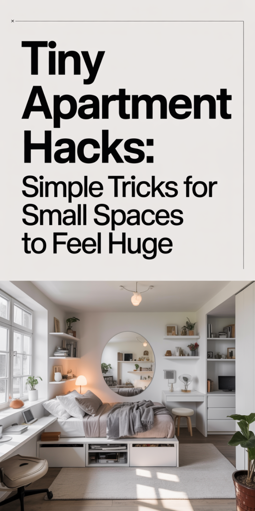
  • Tiny Apartment Hacks: Simple Tricks That Make Small Spaces Feel Huge In 2026

    We’ve all felt the squeeze of small-square-foot living: a kitchen that crowds when two people cook, a living room that’s more obstacle course than relaxation zone, and closets that refuse to cooperate. But tiny apartment living doesn’t have to mean compromise. With a mix of ruthless editing, smarter furniture choices, visual techniques, layered lighting, and disappearing storage, we can make even the smallest floor plans feel open, breathable, and intentional. In this guide, updated for 2026 trends and materials, we share practical, low-effort hacks that create measurable gain in perceived space. These are tactics we’ve tested in real layouts, ranging from studio micro-units to narrow one-bedrooms. No renovation blueprints required: just sensible decisions, a little creativity, and a focus on consistency. Read on and pick the few changes that fit your budget and lifestyle: applied together, they add up to a home that feels much larger than its footprint.

    Edit Ruthlessly: Declutter, Curate, And Keep Only What Matters

    First things first: the single fastest way to make a tiny apartment feel huge is to reduce clutter. We edit ruthlessly by asking three simple questions for every item: Do we use it regularly? Does it bring us joy or serve a clear purpose? Is it replaceable? If the answer is no twice, it goes. That doesn’t mean a sterile place, it means curation. Keep a small number of artful, meaningful pieces rather than a scatter of half-loved objects.

    Practical steps we use: set a 15-minute daily tidy window, do a quarterly purge of clothing and kitchenware, and apply the “one-in, one-out” rule for purchases. Use transparent bins and labeled containers inside drawers so surfaces stay clear without losing access. We also recommend consolidating like items: a single good set of knives beats three cheap sets shoved in different drawers.

    For sentimental items, photograph them and store the images digitally. A single curated display, a shelf or gallery wall of favorites, reads as intentional design rather than clutter. Editing is maintenance, not a one-off event: done consistently, it immediately increases perceived floor space and reduces visual noise.

    Choose Right-Scale, Multipurpose Furniture (And Where To Place It)

    Furniture choice determines flow. In tiny apartments, scale and multipurpose design trump style statements. We prioritize pieces that do double (or triple) duty: seating that stores, tables that expand, and beds that hide when not in use. Avoid oversized sofas and bulky dressers, they eat sightlines and block circulation.

    When shopping, measure twice and consider circulation paths: leave at least 24–30 inches for primary walkways and smaller clearance where necessary. Opt for furniture with slender legs and open bases: visible floor beneath pieces makes rooms feel airier. Choose mid-height storage rather than floor-to-ceiling in main living zones to prevent a boxed-in feeling. Lightweight materials (metal frames, low-profile upholstery) read less visually heavy.

    We also recommend a staged approach: start with essential pieces (bed, seating, table) in scale, live with them for a month, and then layer in storage and accents. This prevents overfurnishing and helps you notice which multipurpose items actually get used. In tiny spaces, restraint plus intelligent selection equals more room to breathe.

    Foldaway, Modular, And Convertible Pieces — Pros, Cons, And Best Uses

    Foldaway and convertible furniture are the backbone of functional tiny-home living. Pros: they free floor area, adapt to changing activities, and often add built-in storage. Cons: some budget options sacrifice comfort or durability: mechanisms can fail if overloaded: and certain pieces add visual bulk when closed.

    Best uses we’ve found:

    • Wall beds (Murphy beds): excellent in studio apartments where sleeping needs to tuck away. Look for models with integrated shelving to avoid extra dressers.
    • Drop-leaf and extendable tables: ideal for flexible dining and workspace needs. Keep a compact version permanently and expand only when guests arrive.
    • Modular seating: configurable sofas allow us to reconfigure a lounge into a guest bed or sectional based on need. Choose pieces with removable covers for easy cleaning.
    • Nesting tables and stools: provide occasional surfaces without permanent footprint.

    Tips: test mechanisms in person if you can, choose quality hardware, and plan for maintenance access. Convertible pieces should feel like real furniture, comfortable and reliable, not novelty items. When they work, they dramatically increase usable square footage without renovations.

    Anchor With Scale: How To Pick And Position Furniture To Maximize Perceived Space

    Anchoring a room correctly shapes how we perceive its size. We pick one or two anchor pieces, typically the bed or sofa and a table, and build around them. Choose anchors that match the room’s proportions: a low-profile sofa for low ceilings, a slim platform bed for narrow bedrooms.

    Placement rules that change everything:

    • Float the sofa away from walls where possible. Pulling a seating piece a few inches from the wall creates depth and allows light to circulate behind it.
    • Align furniture with long sightlines. Position the longest piece so that you can see across the room: this creates a visual corridor.
    • Keep tall pieces (bookcases, wardrobes) to one side rather than scattered. A single vertical mass reads as intentional and balances the space.
    • Angling a single piece slightly can sometimes increase perceived area by breaking predictable grids, but use this sparingly, too many angles feel chaotic.

    We avoid blocking natural walk paths and ensure that sightlines to windows are clean. Thoughtful scale and placement make rooms feel organized and much larger than their square footage suggests.

    Use Visual Tricks To Open Up The Room

    Visual tricks manipulate perception without changing the layout. They’re inexpensive and high-impact. We use color, texture, and negative space to craft depth and lightness. Pale, warm neutrals on walls reflect more light and make ceilings feel higher. Alternatively, a single darker accent wall can create a perceived depth if used thoughtfully behind a bed or sofa.

    Minimize busy, small-scale patterns. Tiny patterns tend to clutter a room visually: instead, choose larger-scale prints sparingly. Use rugs to define areas, but keep them appropriately sized: a rug that’s too small fragments the floor, making the room feel chopped up. Mirrored or glossy surfaces can amplify light but should be positioned to reflect pleasing scenes, not messy counters.

    Consistent palettes and material repeats (wood tone banding, metal accents) create continuity and make separate zones feel connected. Finally, negative space is a design decision: leave breathing room around furniture and artwork so each element can register. That white space is as important as the objects, it’s how perception of spaciousness is built.

    Lines, Patterns, And Negative Space: What To Use And What To Avoid

    Lines guide our eyes: used well, they lengthen the room. Horizontal stripes on walls or long, low furniture emphasize width. Conversely, vertical lines draw the eye upward, useful for low ceilings. But avoid combining both in the same small area, that creates visual tension.

    Patterns: prefer fewer, larger-scale patterns over lots of tiny motifs. A single bold patterned pillow or a larger geometric rug reads as curated rather than chaotic. Textural variety (woven baskets, a boucle chair) adds depth without competing for attention.

    Negative space: intentionally leave areas uncluttered. For example, leave a gap around a bed or couch, and resist filling every wall with art. Empty space helps the brain interpret the room as larger. When placing art, align pieces at eye level and in odd-numbered groupings for a relaxed, expansive feel.

    Avoid busy wallpaper in multiple small rooms and excessive wall-to-wall shelving in living spaces. The rule of thumb: if an element makes you feel visually crowded, remove or scale it back. Less frequently equals more spacious.

    Optimize Lighting, Mirrors, And Window Treatments

    Light transforms perception. Natural light is ideal, but we can amplify it with the right fixtures and window treatments. Start by maximizing window access: remove obstructive furniture from directly in front of windows and keep sill clutter minimal. Choose lightweight curtains or sheer panels that let daylight in while providing privacy.

    Layered artificial lighting compensates where daylight is limited. Combine ambient (overhead), task (under-cabinet, reading lamps), and accent (picture lights, small uplights) to avoid a single flat illumination that shrinks rooms. Use warm white LEDs (2700–3000K) in living areas for a cozy yet open feel.

    Mirrors are cheap spatial multipliers. A strategically placed mirror opposite a window effectively doubles incoming light and expands depth. Consider a full-length mirror along a narrow wall or mirrored closet doors when appropriate. Reflective surfaces, glossy tiles, metallic accents, also help, but balance them to avoid a clinical look.

    Window treatments should hang high and wide: mount rods several inches above the frame and extend them beyond the jamb so curtains stack outside the opening when open, revealing the full window and maximizing light.

    Layer Lighting And Mirror Placement To Multiply Light And Depth

    Layered lighting is non-negotiable. We start with ambient overhead light, then add task lighting where we work or cook, and finish with accent lights to highlight art or architectural features. Dimmable circuits or smart bulbs give us control over mood and perceived space, brighter for activity, softer for evenings.

    Placement tips:

    • Task lights: under-cabinet strips in kitchens, swing-arm lamps by reading chairs, and directional track lights over work desks.
    • Accent lights: small wall washers or picture lights to add depth and sculpt surfaces.
    • Ambient options: flush-mounts or semi-flush fixtures that don’t hang low in tight ceiling heights.

    For mirrors: place one opposite or adjacent to the primary window to capture and return daylight. In narrow rooms, a long horizontal mirror visually doubles width: in compact entryways, a tall, slim mirror stretches height. Avoid placing mirrors where they reflect cluttered views, they’ll just multiply the mess.

    Combine lighting and reflective surfaces thoughtfully: light hitting a mirror should create pleasant highlights, not glare. Done right, this combo multiplies both light and perceived depth in small apartments.

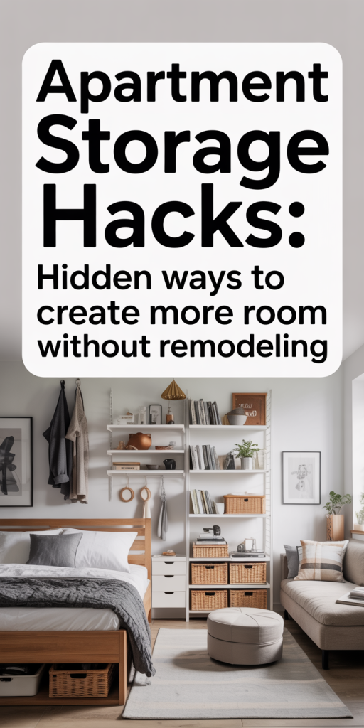
    Smart Storage That Disappears: Vertical, Hidden, And Dual-Purpose Solutions

    In tiny apartments, storage that disappears is essential. We think vertically and inside the furniture. Vertical storage uses wall height without encroaching on floor space: floating shelves, tall narrow cabinets, and pegboards. Choose open shelving sparingly and pair it with boxes or baskets to hide visual clutter.

    Hidden storage options: ottomans with cavities, beds with drawers, and sofas with under-seat compartments. These allow frequently used items to be kept handy but out of sight. Built-ins are ideal but not mandatory, freestanding pieces can be combined and finished to look integrated.

    Dual-purpose solutions include kitchen islands on casters that function as prep space, dining table, and extra storage: entry benches that store shoes: and wall-mounted desks that fold away. Use clear labeling inside concealed storage so items remain accessible without opening every box.

    We recommend a storage audit: map where items are used and place storage there. For example, keep seasonal items high and off-season clothing in vacuum bags under the bed. Invisible storage keeps surfaces clean and maintains the illusion of space while preserving functionality.

    Creative Nooks: Under-Bed, Above-Doors, And Behind-Closet Storage Ideas

    Creative nooks are where we reclaim lost inches. Under-bed storage remains one of the best untapped resources: shallow rolling bins for linens, shoe organizers, and slim luggage-style boxes for infrequently used items. For higher clearance beds, modular drawer units provide easy access and look tidy.

    Above-door and high-shelf storage capture vertical real estate. Install a shelf above door frames for luggage, seasonal decor, or rarely used electronics. Use attractive baskets or labeled boxes to keep these high spots organized and visually consistent.

    Behind-closet and door-back organizers multiply usable area. Slim hanging shoe pockets, hook systems, and narrow rail organizers store accessories and cleaning supplies. We also convert closet doors into micro command centers, slim shelves for mail, keys, and small electronics. In kitchens, magnetic strips on the inside of cabinet doors secure knives and tools without using counter space.

    The takeaway: treat every surface as potential storage, but prioritize accessibility. If an out-of-the-way nook becomes a dumping ground, it’s defeating the purpose. Make these solutions visible and pleasant so we’ll use them consistently.

    Conclusion: When combined, these tactics, ruthless editing, right-scale multipurpose furniture, visual tricks, layered lighting, and invisible storage, transform tiny apartments into calm, adaptable homes. We don’t need to increase square footage to live bigger: we need purposeful decisions that expand how we use the space. Start with one change this week, observe how it affects daily flow, and build from there. Small shifts add up quickly, and before long, your apartment will feel unexpectedly roomy and very much yours.

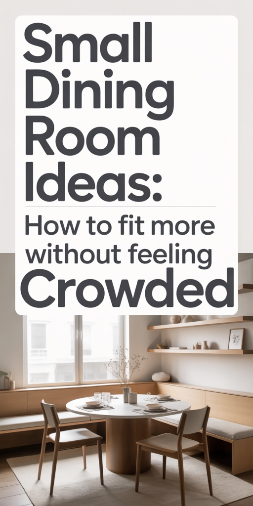
  • Small Dining Room Ideas: 25 Smart Ways To Fit More Without Feeling Crowded (2026 Edition)

    We know how frustrating it is to love hosting but not have the square footage to match the ambition. Small dining rooms can feel like a design puzzle: we want to seat more people, serve food comfortably, and keep movement easy, without turning the space into a cramped afterthought. In this guide we’ll walk through 25 practical, stylish strategies that make small dining rooms feel larger and work harder. We’ll start with measurement and planning, move into furniture choices and layouts that increase seating, then cover lighting, color, storage, and entertaining hacks. Each idea is something we’ve tested (or seen work) in real rooms, no vague platitudes, only approaches that actually help you fit more without feeling crowded.

    Measure, Prioritize, And Plan Your Layout

    Before buying anything we always measure, and we recommend you do the same. Start with a simple sketch: note wall lengths, window and door placement, radiators, and any architectural details (columns, niches, or half-walls). Measure the width of clearances you have for walkways: aim for a minimum 36 inches where people pass behind chairs, and 24–30 inches (60–75 cm) from table edge to wall when chairs are tucked in. Those numbers guide what table sizes and shapes will actually fit.

    Next, prioritize how you use the room. Is it primarily a formal dining space used once a week, or do you need everyday family dining, a assignments station, or a home office corner? Decide the primary function and secondary functions, that dictates which compromises to make. For instance, if daily family dinners are essential, allow more circulation space and pick a table that’s comfortable for frequent use rather than a showy centerpiece.

    We also map sightlines. A tight room becomes claustrophobic when furniture blocks windows or meaningful visual breaks. Place larger pieces against walls that don’t interrupt views. If you have a focal point, a fireplace, built-in shelving, or a window, orient seating to highlight it: the eye will travel outward and the room will feel more open.

    Finally, mock the layout in real scale. Tape the floor to outline the table and chair footprint, or use cardboard templates. It’s an old trick but invaluable: suddenly you can feel exactly how much movement remains. We often discover that swapping the table shape or moving a buffet to another wall gains the exact inches needed for comfortable traffic flow.

    Choose Multipurpose And Properly Scaled Furniture

    In a small dining room we believe furniture should earn its keep. Multipurpose pieces and smaller scale items let us seat more people without crowding the room.

    Start with the table. Round and oval tables often fit better in tight spaces because they eliminate corners and shorten the visual footprint. A 36–44 inch round table is ideal for cozy four-seaters: a 60-inch round will seat six if the room allows. Extendable tables are another favorite: they act compact most days and expand when guests arrive. Choose models with easy leaf storage or leaves that slide into the base, that convenience makes you more likely to use the extension regularly.

    Benches trump chairs in terms of fit, more on that later, but even when we use chairs, we pick armless, slim-profile designs. Look for chairs with exposed legs (not skirted or bulky), which preserve sightlines and reduce visual weight. Consider ghost chairs or transparent acrylic options for a modern look that literally takes up less visual space.

    Buffets and sideboards should be narrow yet tall, combining serving surface and storage vertically. A piece 14–18 inches deep is usually enough to hold dishes, linens, and a few appliances without encroaching on circulation. Wall-mounted or floating storage is even better: it frees floor space and creates the illusion of a larger room.

    Finally, keep proportions consistent. Oversized furniture in any small room reads as clutter. Measure the table-to-room ratio: ideally the table should take no more than 60% of the room’s floor area when chairs are pushed in. If you need to seat eight in a small footprint, prioritize an extendable table plus benches or slim chairs rather than a bulky formal table and armchairs.

    Smart Layouts That Maximize Seating

    When space is the constraint, layout choices determine how many people we can seat and how comfortable everyone feels. There’s no single right answer, we choose a layout based on room shape, traffic patterns, and primary uses. Below are high-impact layouts that repeatedly win in small dining rooms.

    Flexible Seating Solutions (Benches, Stools, And Foldables)

    Flexible seating is a small-room game-changer. Benches, stools, and foldable chairs compress seating footprint and add adaptability.

    Benches: A bench along one side of the table can typically seat as many as two chairs in the same length because people squeeze in more comfortably without armrests. For a narrow room, consider a built-in banquette along a wall or beneath a window. Banquettes not only maximize seating but also offer hidden storage beneath the seat for linens, boards, or kid paraphernalia. Remember to keep seat depth comfortable, 16–18 inches is standard, and leave at least 12–15 inches from the seat back to the wall for the cushion and posture.

    Stools: Backless stools tuck entirely under the table when not in use, reclaiming floor space. Use stools at the ends of rectangular tables or pair them with a bench for mixed seating. Choose stools with slim profiles and padded tops for comfort.

    Foldable Chairs and Stackables: For occasional entertaining, we like sleek foldables or stackable chairs that live in a closet and appear when needed. Modern folding chairs are surprisingly chic: choose versions with padded seats and neutral finishes so they don’t feel like temporary guests.

    Mix-and-match: Combine seating types for a relaxed, layered look, a bench on one side, chairs on the other, and a stool at the end. This mix increases capacity without adding visual bulk. Also, when planning, count the actual usable seats: an armless dining chair typically occupies 18–20 inches of table edge, while a bench can be counted at roughly 12–16 inches per person depending on spacing.

    Traffic Flow And Zoning Tips For Comfortable Movement

    Seating matters, but so does how people move. We always design with clear circulation paths and subtle zoning to keep the room functional during gatherings.

    Prioritize a main traffic corridor: keep at least one 36-inch path from entry to exit that avoids the primary serving area. If your room connects to the kitchen, ensure the route between counter/server and table is unobstructed: passing dishes across cramped spaces is the quickest way to ruin a dinner party.

    Create a service zone: designate one side of the room for serving and storage. Place a small buffet or bar cart there so dishes and drinks won’t cross traffic lanes. Using vertical storage, like a tall but shallow cabinet, keeps the service zone compact while still accessible.

    Use rugs to define zones: a rug sized correctly under the table (table plus chairs pulled out) visually anchors the dining area. For narrow rooms, a runner or rug strip can present an axis that guides movement and separates dining from other functions.

    Position chairs to allow backs to slide out without hitting walls or doorways. If space is tight, angle chairs slightly toward the center or choose chairs with casters for easier maneuvering. During parties we shift a few chairs away from walls and bring in stools or folding chairs to ease seating transitions.

    Lighting, Color, And Visual Tricks To Open The Space

    Light and color change perception dramatically, and those are tools we use first when making a small dining room feel larger.

    Layered lighting: Combine ambient, task, and accent lighting. A central pendant defines the table and draws the eye upward. Choose a pendant proportionate to the table (about 1/2 to 2/3 the table width) and hang it 28–34 inches above the tabletop to provide intimate illumination without blocking sightlines. Add wall sconces or picture lights to create depth: light on multiple planes makes walls recede.

    Natural light: Maximize it by keeping window treatments minimal. Sheer panels, blinds that tuck away, or curtains mounted high and wide all increase the perceived window size. If privacy is a concern, consider top-down shades that let light in while screening lower sightlines.

    Color strategies: Lighter hues open a room, but that doesn’t mean the space must be sterile. We often use a light, warm neutral on walls and add contrast with a darker accent on one wall, a painted ceiling, or trim in a complementary tone. Using the same color family for trim, doors, and built-ins reduces visual breaks and creates an uninterrupted flow.

    Reflective surfaces: Mirrors are classic because they double perceived space and bounce light. Place a mirror opposite a window or behind a buffet. Glossy finishes on cabinets, glass tabletops, and metallic accents also help. But, avoid too many busy patterns which can feel cluttered: keep patterns for textiles like seat cushions or a single artwork.

    Vertical emphasis: Painting the ceiling a slightly lighter shade than the walls or adding vertical striped wallpaper on one wall draws the eye up, making ceilings feel higher. Slim vertical moldings or floor-to-ceiling shelves work similarly: they add storage while stretching the perceived height of the room.

    Clever Storage, Serving, And Entertaining Hacks

    To fit more people comfortably, we reduce tabletop clutter and keep serving streamlined. Smart storage and service strategies are essential.

    Hidden storage: Choose furniture with built-in storage, benches with lift-up seats, tables with drawers, or consoles with cubbies. These hide napkins, placemats, and serving utensils so the table stays clear during meals.

    Wall-mounted solutions: Floating shelves, plate racks, and narrow peg rails keep frequently used items within reach without using floor space. A shallow wall-mounted cabinet near the dining table can store seasonal serving ware and double as a display area.

    Rolling service carts: A compact bar or serving cart is one of our favorite entertainment hacks. It acts as mobile storage and a staging area during meals. When not in use it tucks into a corner or hallway: during meals it travels between kitchen and table, removing the need for a large buffet.

    Pre-plating and family-style balance: To minimize passing and congestion, pre-plate salads or desserts, or serve family-style from a cart or two smaller dishes placed strategically around the table. Encourage guests to pass dishes toward the center rather than standing and reaching across the table: this small etiquette change reduces chair movement and accidental elbows.

    Use door and behind-chair space: The inside of a closet or pantry door can hold a slim organizer for placemats and table linens. Behind a chair, a narrow ladder shelf can hold water pitchers, extra glassware, or a pitcher of iced tea.

    Smart servingware: Invest in stackable serving bowls and nesting platters, they save storage and make buffet setups faster. Consider durable, attractive melamine or porcelain that looks good on the table and is easy to stack in tight cabinets.

    Conclusion

    Small dining rooms ask us to be intentional: we measure, choose multifunctional furniture, and design layouts that prioritize circulation and sightlines. By combining benches and slim chairs, using extendable tables, layering light, and adding clever storage and serving hacks, we can seat more people without sacrificing comfort or style. The solutions we’ve shared are practical and flexible, mix them to match your space and hosting habits, and you’ll find your small dining room doing a lot more than it used to. Let’s reclaim those square feet and make every meal feel like an occasion.

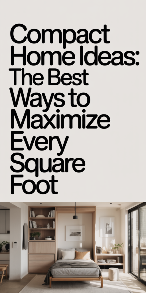
  • Compact Home Ideas: How To Maximize Every Square Foot For Comfortable Living (2026 Guide)

    Living well in a smaller footprint doesn’t mean sacrificing comfort, style, or function. In this 2026 guide, we break down practical, high-impact compact home ideas that help us squeeze every useful inch out of our homes. Whether we’re downsizing to a tiny house, rethinking a city apartment, or optimizing a cozy suburban bungalow, the strategies here focus on smart planning, clever storage, and design decisions that make small spaces feel generous. We’ll walk through the core principles, show how to zone and layer spaces, and highlight built-in, vertical, and convertible solutions that actually work in daily life. Expect actionable tips, real-world examples, and a few design rules we rely on when tackling compact interiors.

    Design Principles For Compact Homes

    Small spaces demand intention. When we design compact homes, we start with three guiding principles: clarity of purpose, simplicity of form, and flexibility of use. Clarity of purpose means every room or zone must serve one or two primary functions. If a corner doubles as a workspace and an entry, we intentionally plan for both rather than expecting one to hide in the other.

    Simplicity of form reduces visual clutter. Choosing fewer materials and cleaner silhouettes lets surfaces breathe, so the space reads as larger. We prefer unbroken sightlines and minimize heavy patterns, subtle texture wins over bold prints in small rooms.

    Flexibility of use is the most powerful principle. Furniture that can pivot between roles, rooms that accept different activities at different times, and storage designed for both daily items and seasonal overflow all let a compact home do more with less.

    We also consider movement. Efficient circulation avoids wasted transitional space: hallways longer than necessary are luxury we can’t afford. In small homes, circulation becomes part of the room rather than a separate element: we schedule furniture and openings so people can move naturally without creating dead zones.

    Smart Space Planning And Zoning

    Zoning turns a single room into distinct areas that feel purposeful. We start by mapping activities, sleeping, cooking, working, relaxing, and then place primary elements to support those activities while keeping clear pathways. For example, in a studio we might position the bed near a corner with a low headboard to create a separate sleeping niche while using shelving to define the boundary.

    Open plans can be effective in compact homes if we manage visual separation. Rugs, lighting, and changes in material define zones without building walls. A kitchen island acts as a boundary and workspace: an area rug anchors the living area: a pendant light marks the dining spot.

    We also plan for time-based zoning: the same surface used for daytime work can convert to a dining table at night. That requires thoughtful dimensions, work surfaces should be ergonomic while remaining compact, and nearby storage for items that need to be cleared quickly.

    Circulation paths should connect the most-used nodes directly. If we find ourselves walking through a bedroom to reach the bathroom, we redesign the plan. Compact plans benefit from radial layouts or L-shaped arrangements that reduce corridor length and bring everything within easy reach.

    Built-In And Hidden Storage Solutions

    Built-in and hidden storage are essential for keeping compact homes tidy and functional. We aim to integrate storage where furniture or structural elements already exist to avoid adding bulky standalone pieces.

    Understair areas, recessed niches, and the depth beneath window seats are prime real estate. When we design built-ins, we think vertically and in layers, deep drawers for bulky items, shallow shelves for books and display, and specific cubbies for shoes or electronics.

    Incorporating storage into fixtures keeps lines clean: a bench that opens for shoe storage, a headboard with concealed compartments, or kitchen kickboards fitted with pull-out trays. Hidden storage reduces visual clutter because possessions remain out of sight yet close at hand.

    We recommend using consistent hardware and finishes so built-ins read as part of the architecture rather than retrofit furniture. The result feels purposeful and custom, which elevates the perceived size and organization of the home.

    Understairs, Nooks, And Built-In Seating

    Understairs zones are an underused advantage in compact homes. We often convert them into a laundry alcove, pet area, pantry, or mini office. Fitted cabinetry with pull-out shelves makes access easy: for laundry, a slim stacking machine and fold-down drying rack maximize utility.

    Nooks and window bays become cozy built-in seating when fitted with a cushioned bench and integrated storage beneath. These seats create a sense of place without eating into floor area. We add task lighting and a narrow shelf for books to make the nook functional as reading or working space.

    Built-in seating along walls can double as storage, lift-up benches or drawers beneath the seat are excellent for linens, toys, or seasonal clothes. When we design these, we keep seat heights standardized so they work with occasional tables or stools, multiplying their usefulness.

    Multifunction Furniture And Convertible Pieces

    Selecting the right multifunction pieces is a game-changer in compact homes. We look for items that perform reliably across uses rather than gimmicky products that fail after a season. Good multifunction furniture is robust, easy to change, and attractive in both configurations.

    A well-designed sofa bed, an extendable dining table, or a console that becomes a desk can free up significant square footage. We prioritize pieces with simple mechanisms and solid warranties, ease of transformation matters more than novelty. When possible, choose modular systems that let you add or remove components as needs change.

    We also layer furniture functions: a bookshelf that conceals a Murphy bed, a coffee table with storage and adjustable height, or ottomans that shift from footrest to extra seating. These choices help maintain a clean look while giving us the flexibility to host guests, work from home, or rearrange for different activities.

    Murphy Beds, Expandable Tables, And Modular Sofas

    Murphy beds are a reliable way to reclaim floor area during the day. Modern versions integrate shelving and desks so the bed becomes part of a multifunction wall. We recommend units with gas-strut mechanisms and secure latching for safety and ease.

    Expandable tables come in many forms: drop-leaf, butterfly leaf, and fold-out panels. We pick tables sized for our usual household and plan storage for the extra leaves. A console that unfolds into a dining table works particularly well in narrow entryways or behind a sofa.

    Modular sofas offer configurability that fixed pieces can’t. We favor units that allow reorientation, chaise on either side, removable ottomans, or individual seating modules, so we can adapt to guests or new room layouts. Durable upholstery and replaceable covers keep these pieces looking fresh over time.

    Vertical And Wall-Mounted Solutions

    When floor area is scarce, we build upwards. Vertical storage and wall-mounted systems free up circulation space and create a layered interior that feels organized and intentional.

    Open shelving up to the ceiling stores rarely used items on higher shelves while keeping everyday things within reach at lower levels. We use a step stool that tucks away to access upper shelves safely. Wall-mounted desks and fold-down workstations are excellent for remote work: they retract when not in use and keep cables and supplies contained.

    Pegboards and rail systems in kitchens and bathrooms turn walls into flexible, reconfigurable storage. Hooks, baskets, and magnetic strips organize tools, cookware, and toiletries without taking up counter space. For electronics, wall-mounted monitors or TVs allow furniture to be placed more strategically and reduce the need for bulky media units.

    To keep vertical solutions from feeling heavy, we mix open and closed storage and use light-reflecting back panels or paint the highest shelves the same color as the wall so they recede visually.

    Lighting, Color, And Visual Tricks To Open Small Rooms

    Light and color are among the most cost-effective tools to make compact homes feel larger. We start with layering: ambient, task, and accent lighting give depth and keep corners from collapsing into shadow. Recessed or track lighting preserves headroom, while wall sconces free up surfaces.

    Color choices shape perception. We usually favor a restrained palette, three main tones at most, with low-contrast transitions between floors, trim, and walls. Monochromatic schemes elongate sightlines: warm accents add personality without chopping the space into smaller visual zones.

    Mirrors are classic for a reason: a strategically placed mirror doubles perceived space and amplifies natural light. We often use a tall mirror opposite a window or incorporate mirrored cabinet fronts in bathrooms and entryways.

    Scale is critical. Oversized art or heavy drapery will overwhelm: instead we select slim frames, lightweight fabrics, and slender furniture legs to maintain a sense of airiness. Finally, we let daylight lead, arranging seating and work areas to benefit from natural light reduces the need for excessive artificial lighting and makes rooms feel bigger and healthier.

    Compact Kitchen And Bathroom Strategies

    Kitchens and bathrooms are where compact living often faces its biggest challenges because of required appliances and fixtures. We approach these rooms by prioritizing essentials, shrinking footprints smartly, and choosing multifunction systems.

    In the kitchen, an efficient triangle, fridge, sink, and cooktop, still applies but at a compressed scale. We favor integrated appliances like slimline dishwashers, undercounter fridges, and two-burner induction cooktops. Vertical storage for pans and pull-out spice racks save counter space. A single deep sink with an over-sink cutting board or drying rack multiplies workspace.

    Bathrooms benefit from wet-room thinking: glass shower screens or half-walls create a continuous visual plane that makes the room feel less chopped up. Wall-hung toilets and vanities free up floor area and make cleaning easier. We choose pocket doors where possible to eliminate swing space or use sliding barn doors with soft-close hardware.

    Shared surfaces help: a vanity with a flush-mounted medicine cabinet keeps toiletries accessible without adding clutter. For laundry, a stacked washer-dryer behind a louvered door or integrated within a bathroom cabinet often makes more sense than a separate utility room.

    Conclusion

    Compact home ideas are less about making everything smaller and more about making choices that increase usefulness and comfort. By combining clear design principles, intentional zoning, built-in storage, multifunction furniture, vertical solutions, and smart lighting and finishes, we can create homes that feel larger than their square footage.

    If we prioritize adaptability and quality over gimmicks, small spaces reward us with greater efficiency, lower cost, and a calmer daily life. Start with one change, a built-in bench, an expandable table, or a new lighting plan, and build from there. Over time, these small interventions compound into a living environment that truly maximizes every square foot.

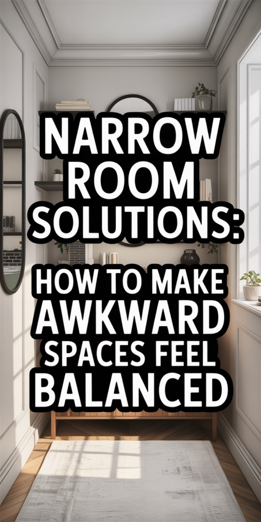
  • Narrow Room Solutions: How To Make Awkward Spaces Feel Balanced In 2026

    Narrow rooms have a reputation for being awkward, long hallways that try to be living rooms, slim bedrooms where furniture fights for breathing room, or compact dining areas that feel more like a corridor. In 2026, with smaller urban footprints and more people working from home, we’re seeing narrow spaces more often. The good news is that narrow doesn’t have to mean cramped or unbalanced. With the right principles, planning, and a few visual tricks, we can make these rooms feel intentional, comfortable, and even spacious. In this guide we’ll walk through practical, modern solutions, from measuring and zoning to furniture selection, built-ins, and lighting, so you can transform awkward narrow rooms into balanced, livable spaces.

    Principles For Balancing Narrow Rooms

    Narrow rooms demand an approach that’s part architecture, part interior design psychology. Before we pick furniture or colors, we rely on a handful of guiding principles that keep the space functional and visually balanced.

    1. Prioritize circulation over symmetry. In a narrow footprint, movement is king. Rather than forcing matching pieces on either side of the room, we focus on clear, unobstructed pathways. That often means centering circulation along a single axis and arranging furniture to support it.
    2. Think of scale as the language of comfort. Oversized sofas or bulky armoires will dominate: too many small pieces create clutter. We aim for a measured scale, pieces that relate to the length and width of the room. In practice that means longer, lower furniture rather than deep, high forms.
    3. Create a hierarchy of zones. Even in a single narrow room, we can define zones: a seating cluster, a workspace, a reading nook, or storage. Giving each zone a clear purpose reduces visual noise and increases usability.
    4. Embrace vertical strategy, not just horizontal. When floor area is limited, the walls become prime real estate. Vertical storage, integrated shelving, and tall art can shift emphasis upward, making the floor plan feel less tight.
    5. Use repetition and rhythm for calm. Repeating elements, a consistent leg height across furniture, a single material for storage fronts, or a continuous runner, creates visual rhythm. Rhythm reduces the perception of chaos in tight spaces.
    6. Balance contrast with continuity. High-contrast accents bring energy, but too many competing contrasts make a narrow room feel fragmented. We pair a restrained base palette with purposeful accents to maintain cohesion.

    These principles guide every subsequent decision we make: measuring, choosing furniture, and applying lighting and color. They ensure our interventions are deliberate and that every piece earns its place.

    Measure And Plan Before You Buy

    We can’t overstate this: measuring is the step most people skip and later regret. Narrow rooms exaggerate scale mistakes, so a precise plan prevents wasted purchases and awkward returns. This section covers the essential measuring and planning practices we rely on before buying or moving anything.

    Furniture Choices, Scale, And Placement

    Furniture is where narrow room strategies become tactile. Our goal is to pick pieces that respect the room’s proportions while delivering comfort and storage. The right choices make the room feel purposeful rather than improvised.

    Lighting, Mirrors, Color, And Visual Tricks

    Perception shapes experience. In narrow rooms we use lighting, mirrors, and color strategically to influence how wide and deep the space feels. These are visual tools that reinforce our physical layout decisions.

    Conclusion

    Narrow rooms are not design failures: they’re opportunities to be intentional. By measuring carefully, defining circulation and zones, choosing furniture with appropriate scale and multi-function, and using lighting, mirrors, and color to guide perception, we can turn awkward footprints into balanced, efficient, and attractive spaces. Start with a clear plan, test layouts with tape and mockups, and embrace built-ins and floating furniture where possible. With these strategies, narrow rooms can feel purposeful, and even welcome, rather than a compromise.

  • Small House Design Ideas: 12 Designer Visual Tricks That Make Tiny Spaces Feel Grand

    Living in a small house doesn’t mean sacrificing style or a sense of spaciousness. In our work designing and renovating compact homes, we’ve learned that clever visual tricks do more than decorate, they fundamentally change how a space feels. This article distills 12 proven designer techniques that make tiny rooms feel larger, brighter, and more intentional. We’ll explain why these approaches work, how to apply them without very costly, and the small decisions that yield the biggest perception gains. Whether you’re tackling a studio, a narrow rowhouse, or a tiny suburban cottage, these small house design ideas will help you get more room for living, and for living well.

    Why Visual Tricks Matter In Small Homes

    When square footage is limited, visual perception becomes the most valuable currency we have. People tend to evaluate a room by depth, light, continuity, and focal points, not by the exact number of square feet. That’s good news: designers can manipulate those cues. A single uninterrupted sightline, a high-contrast focal wall, or the strategic placement of light can shift your brain’s sense of scale.

    We think of these techniques as optical investments. They don’t literally add area, but they reduce visual clutter, guide the eye, and create implied space. For example: a uniform floor material between kitchen and living area erases an artificial boundary: a mirror doubles perceived depth: layered lighting collapses shadowed nooks into the whole. These are inexpensive moves with outsized returns.

    Beyond scale, visual tricks also increase comfort. A room that reads as airy and coherent makes daily routines feel less cramped. Over time, the psychology of space matters as much as the measurements, and that’s why small house design ideas that focus on perception are essential.

    Light And Color To Visually Expand Space

    We often start small-house projects with two straightforward questions: how can we increase perceived light, and how can color make surfaces recede rather than shout? Light and color are the foundation of many visual tricks because they alter depth cues and contrast relationships, the same visual signals the brain uses to judge size.

    Bright, reflective surfaces combined with coordinated color flow push walls and ceilings further away in the mind’s eye. But it isn’t just about white paint or brighter bulbs: it’s about controlled contrast and continuity. When we layer natural and artificial light, use colors that create depth, and keep transitions smooth, tiny spaces breathe.

    Below we break down practical, designer-level tactics for paint, accent walls, and lighting that make the biggest difference without a major renovation.

    Paint, Accent Walls, And Color Flow

    Paint is the easiest large-scale change we can make, and it’s surprisingly powerful. To visually expand a room, we favor low-contrast palettes with variations on the same hue. A continuous color from one room to the next creates a visual flow that removes perceived barriers. For open-plan small homes, painting the connected spaces in related tones makes the whole feel like one larger room.

    Accent walls still have a role if used sparingly. Instead of a dark, saturated wall that closes space, choose a slightly warmer or cooler tint of the base color to create depth without interruption. Horizontal stripes are a classic trick for widening narrow rooms: vertical stripes can lift a low ceiling if you keep them subtle and soft-edged.

    Don’t forget trim and ceiling strategy: painting the ceiling a shade lighter than walls raises the perceived height, while matching trim to the wall color reduces the number of visual edges the eye must process. Those fewer edges equal more perceived space.

    Natural And Layered Lighting Strategies

    Natural light is the most persuasive spatial enhancer. We prioritize maximizing daylight with unobstructed windows, slimline window treatments, and trimmed landscaping outside to allow deeper light penetration. Skylights or solar tubes are worth considering in dark corridors or central zones, they introduce a vertical source of light that tricks the eye into feeling more volume.

    Indoors, layered lighting eliminates shadow pockets that make rooms feel boxed in. We use a three-tier approach: ambient (ceiling or recessed), task (pendants, under-cabinet lighting), and accent (wall sconces, picture lights). Dimmers are essential: they let us dial contrast down in the evening so the room reads softer and larger.

    Finally, choose color temperature carefully. Warm light can cozy up a big room, but for small spaces, neutral-to-cool (2700–3500K) tends to feel cleaner and more open. Consistent temperature across fixtures prevents jarring shifts that break the visual flow.

    Mirrors, Glass, And Reflective Surfaces

    Reflective surfaces are an obvious, and enduring, trick for small houses. Mirrors duplicate views and light, effectively doubling perceived depth when placed opposite windows or long sightlines. We like full-height mirrors on closets or a gallery of smaller mirrors arranged to suggest a larger opening rather than a single heavy mirror that reads as decor.

    Glass is also a visual equalizer. Interior glass doors, clear balustrades, and glass cabinet fronts maintain sightlines while still providing function. Frosted or textured glass preserves privacy but keeps light moving. In kitchens, glass-front upper cabinets reduce the visual mass of wall units and make the space feel airier.

    Subtler reflective tactics include glossy backsplashes, high-sheen paint on trim, and metallic accents that catch light without becoming the focal point. The key is to use reflectivity to scatter light and soften edges, not to create small, glaring highlights that become distracting.

    Smart Layouts, Zoning, And Sightlines

    A smart layout is less about cramped efficiency and more about choreographing how the eye moves through space. We aim to create clear sightlines and purposeful zones so the brain reads the home as deliberately arranged, which feels inherently larger. Visual order beats a handful of square feet every time.

    Open-plan living often benefits small houses, but we avoid removing every dividing element. Partial walls, low bookshelves, or a change in floor texture can delineate zones while preserving sightlines. We place the largest furniture parallel to the longest wall to maintain a flowy central path and keep circulation clutter-free.

    Consider how doors and furniture align: a centered doorway framed by furniture creates a composed view: a zigzag of mismatched pieces fragments the eye. Stacking visual cues, repetition of materials, aligned vertical elements, and coordinated colors, helps knit separate areas into one coherent whole.

    Layout Tips For Small Rooms

    In small rooms, every inch of layout counts. We use a few layout rules repeatedly because they work: keep pathways at least 30 inches where possible, orient seating toward the room’s most generous anchor (a window, fireplace, or media wall), and leave a modest foreground zone in front of focal points so the eye can register depth.

    Floating furniture, pushing pieces slightly away from walls, can paradoxically create the sense of more space by revealing baseboards and floor continuity. Multi-zone furniture like a sofa with a thin console behind or an open-backed bookshelf as a room divider provides function without visually chopping the room.

    When arranging, we test different orientations by tape-marking furniture footprints on the floor. It’s a low-effort way to see which configuration preserves sightlines and clears circulation. Often the best layout feels obvious once you can walk through it.

    Multifunctional Furniture, Storage, And Vertical Tricks

    Furniture in a small house needs to earn its keep. Multifunctional pieces, sofa beds, extendable tables, nesting side tables, let us reduce visual noise and free up floor area when items aren’t in use. We encourage flexible furniture that adapts to different activities: a dining table that doubles as a workspace, or ottomans with hidden compartments that work as seating and storage.

    Visual trickery also occurs vertically. Drawing the eye upward makes rooms feel taller, so tall, slim storage feels less heavy than wide, squat units. Open shelving arranged asymmetrically can create a sense of height while keeping things accessible. We prefer slender legs on sofas and tables to reveal the floor plane underneath, which keeps the room feeling open.

    Modular furniture that can be reconfigured seasonally gives a small home longevity, and keeps layouts fresh without major expense.

    Built-In, Hidden, And Vertical Storage Solutions

    Built-ins are a small-house superpower because they convert awkward pockets into purposeful storage while blending with the architecture. Window seats with drawers, recessed shelving flanking a media niche, and under-stair cabinetry all remove standalone pieces that would otherwise crowd the floor.

    Hidden storage, benches with lift tops, plinths that open, or hollow ottomans, reduces visible clutter: and since clutter is one of the biggest factors that shrinks a space visually, hidden solutions are high-impact. We like toe-kick drawers under kitchen cabinets and built-in wardrobes that reach the ceiling to use vertical volume.

    When custom built-ins aren’t possible, we recommend high-reaching open shelving combined with matching storage boxes to keep a clean line. The goal is to present one continuous surface rather than a patchwork of items that break the eye’s path.

    Conclusion

    We’ve found that making a small house feel grand is mostly about focused decisions rather than bigger budgets. By controlling light, color, reflections, sightlines, and storage, we can alter perception dramatically. The twelve visual tricks above are flexible tools, mix and match them to suit your layout, lifestyle, and budget. Start with the moves that are easiest to carry out (paint, lighting, and decluttering) and then layer mirrored surfaces, built-ins, and multifunctional furniture as needed. With intention and a few designer tricks, tiny spaces stop feeling limiting and start feeling expansive, purposeful, and comfortable.

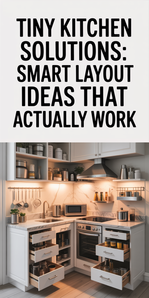
  • Tiny Kitchen Solutions: Smart Layout Ideas That Actually Work — Space-Saving Plans You Can Use Today

    We’ve all felt the frustration of trying to cook, store, and move in a kitchen that seems to shrink around us. Tiny kitchen solutions aren’t about settling for less, they’re about applying smart layout thinking so a small space feels efficient, calm, and even a little luxurious. In this text we’ll walk through the core design principles that govern successful tiny kitchens, show layouts that work for very small footprints, and give practical tactics for storage, surfaces, lighting, and visual tricks you can carry out now. Whether you’re renovating a studio, reconfiguring a galley, or fitting a kitchen into an odd nook, these ideas are proven in real homes and adaptable to different budgets. Let’s get started, and let’s make your small kitchen do more for you.

    Core Design Principles For Tiny Kitchens

    When we design for small kitchens, a few principles guide every decision. First: prioritize function over form. That doesn’t mean aesthetics get ignored, it means every beautiful choice must also earn its keep. We focus on sightlines, circulation, and workflow before choosing finishes.

    Simplicity is another central idea. Clean lines, limited material palettes, and consistent hardware reduce visual clutter and make the space feel larger. In practice we might limit cabinet door styles to one profile, use the same countertop edge throughout, and keep trim minimal.

    Scale matters. Appliances, sinks, and islands should be chosen to match the room’s proportions, oversized items will dominate and erode usable space. We favor compact appliances (24″ or smaller) and shallow cabinets for narrow areas.

    Zoning is subtle but powerful: define prep, cooking, and cleanup zones so tasks don’t overlap. Even in a tiny footprint, a clear zone layout prevents traffic jams. We layer storage by frequency of use, everyday items at arm’s reach, infrequently used gear higher or lower.

    Finally, think adaptability. Tiny kitchens must meet changing needs: drop-in cutting boards, removable shelves, or reversible islands extend the kitchen’s usefulness. If we build with adaptability in mind, the kitchen evolves instead of forcing us to rework it.

    Best Layouts For Very Small Kitchens

    Choosing the right layout is the biggest lever we have in a tight space. The proven options are galley, single-wall, compact L-shaped, and corridor variations. Each has trade-offs tied to circulation and storage.

    Single-wall layouts maximize openness but require disciplined storage, we compensate with tall cabinets, open shelving, and smart appliance placement. Galley and corridor formats deliver excellent workflow because the work triangle is tight: they can feel cramped unless we optimize sightlines and lighting. Compact L-shapes with a slim island or peninsula give a bit more counter area and can create a social edge without consuming square footage.

    When we compare layouts, we test for: unobstructed paths (at least 30 inches of clear walkway where possible), counter adjacency between sink and cooktop, and vertical storage potential. For very small kitchens we often hybridize layouts, a short run of cabinets plus a narrow peninsula, for example, to balance prep space and circulation.

    Below we cover the two most common, effective small-kitchen variants and how to make them work in real life.

    Adapting The Work Triangle For Tight Footprints

    The classic work triangle (sink, stove, refrigerator) still matters, but in tiny kitchens we adapt it into a line or small polygon rather than a wide triangle. Our goal is to minimize steps and avoid cross-traffic.

    In single-wall kitchens the triangle becomes a linear workflow: we arrange primary tasks left-to-right or right-to-left based on plumbing and ventilation. For galley kitchens the triangle tightens between the two runs: we make sure paths don’t cross by scheduling zones, prep near the sink, cooking on one side, cleanup consolidated.

    We pay attention to functional distances: ideally, no leg of of the adapted triangle exceeds about 8–12 feet in larger small kitchens: in very compact spaces 3–6 feet is common. If the fridge is far from the prep area, we create a mini landing station near the fridge with a cutting board and small drawer for utensils to prevent repeated trips.

    We also consider vertical workflow: place frequently used items (pots, oils, utensils) in reachable drawers or open shelves adjacent to the cooktop. For safety and speed, maintain clear counter space beside the stove for staging and cooling. Where possible, we incorporate pull-out surfaces that extend work area temporarily without stealing permanent room.

    High-Impact Storage Strategies For Maximum Function

    Storage is the battleground where small kitchens win or lose. We prioritize solutions that increase usable capacity without making the room feel crowded: think vertical, pull-out, and hidden storage.

    Start by mapping every item you own and grouping by frequency of use. That informs whether something belongs in a drawer, cabinet, or elsewhere. We often eliminate duplicate gadgets and adopt multifunctional tools, a single good food processor replaces several niche appliances and frees shelf space.

    Investing in customized inserts and pull-outs yields huge returns. Drawer organizers, roll-out trays in lower cabinets, and tilt-out sink trays make all the difference. Pull-out pantries and narrow sliding cabinets tucked beside appliances turn dead space into valuable storage.

    Consider open shelving strategically: it keeps everyday items accessible and lightens visual weight, but it requires discipline. Use matching containers and limit what’s displayed. For rarely used items, higher cabinets or ceiling-mounted racks (for pots) reclaim otherwise unused vertical real estate.

    We also recommend using cabinet doors for storage: magnetic knife strips, spice racks, or small baskets mounted behind doors keep counters clear. Finally, if built-ins aren’t an option, look for furniture with storage, benches, narrow buffets, or wall-mounted cabinets that don’t intrude on flow.

    Multi-Functional Surfaces And Flexible Furniture

    We’re big proponents of surfaces that do double or triple duty. In a small kitchen every inch of counter is precious, so islands, tables, and counters should serve multiple roles.

    A drop-leaf or flip-top counter can expand when we need extra prep or seating and fold down when we don’t. Pull-out cutting boards that tuck under counters are practically invisible until they’re needed. Integrated dish-draining racks over the sink free counter space and speed cleanup.

    Flexible furniture helps too. A slim, mobile island with lockable casters becomes extra prep, a buffet, or a coffee station that moves out of the way. Nesting stools slide under counters for seating without taking permanent floor space. We prefer pieces with built-in storage: drawers, shelves, or hooks.

    Multifunctional appliances also reduce clutter. Two-burner induction cooktops with an integrated griddle, combination microwave-convection ovens, and under-counter dishwashers conserve space and maintain capability. When selecting multiuse items, prioritize quality, we’d rather have one reliable combo appliance than several fragile single-use gadgets.

    Finally, design for temporary expansion. A rollaway table can host a holiday buffet: a wall-mounted drop-leaf table creates a dining spot that disappears when not needed. These small mechanisms give us the feeling of a larger kitchen without demanding permanent square footage.

    Lighting, Color, And Visual Tricks To Make Space Feel Bigger

    Perception can be as influential as actual square footage. Thoughtful lighting, color, and visual tricks make tiny kitchens read as bigger and airier.

    We layer lighting into ambient, task, and accent. Bright, even ambient light eliminates shadows that make spaces feel cramped: under-cabinet task lighting opens up work areas: and accent lights (inside glass-front cabinets or along toe kicks) add depth and dimension. Use warm-white LEDs for a welcoming feel and flexible dimming to change moods.

    Color choices matter: light, neutral tones with selective contrast work best. We usually recommend a dominant pale hue on walls and ceilings, a slightly darker durable counter, and strategic contrast in cabinetry or backsplash to add personality without narrowing the room. Glossy or semi-gloss finishes reflect light: matte finishes hide wear but can absorb light, so balance accordingly.

    Mirrors and reflective surfaces are classic tricks, mirrored backsplashes or glass-front cabinets reflect light and extend sightlines. Vertical patterns or long horizontal subway tiles laid in a stacked bond can visually lengthen or widen a kitchen depending on placement. Keeping the ceiling a shade lighter than walls also lifts the room.

    Finally, minimize visual clutter. Keep countertops clear, conceal small appliances when not in use, and choose a consistent hardware finish. Those small restraints make the room read as intentional and roomy rather than just small.

    Conclusion

    Tiny kitchen solutions aren’t a checklist, they’re a design mindset. When we apply core principles, choose the right layout, adapt the work triangle, and prioritize storage, a small kitchen becomes highly functional and enjoyable. Light, color, and flexible surfaces amplify the effect. Start by mapping how you actually use your kitchen, pick one layout change or storage upgrade, and test it for a month. Small tweaks compound quickly: a pull-out pantry, a slim island, or better lighting will change how the space works for you. With thoughtful choices, tiny kitchens don’t limit us, they invite smarter living.

  • Apartment Storage Hacks: 25 Clever Ways To Create More Room Without Remodeling (2026)

    We’ve all been there: an apartment that feels cozy until the clutter makes it claustrophobic. The good news is you don’t need a renovation or a storage unit to reclaim space. With a few smart apartment storage hacks, the right mindset, a handful of multipurpose pieces, and creative use of overlooked vertical and under-furniture space, we can dramatically increase usable room. In this guide we’ll walk through how to assess what matters, squeeze storage out of walls, doors, ceilings, and underbeds, and choose hidden-storage furniture that actually works. These are practical, renter-friendly strategies you can carry out in a weekend with basic tools and a modest budget. Read on to learn 25 clever ways to create more room without remodeling, including tips that save time, keep things visible yet tidy, and preserve your security deposit.

    Take Stock: How To Assess Space, Priorities, And Storage Needs

    Before we buy baskets or hang shelves, we take stock. A quick, honest assessment saves money and prevents trial-and-error. Start with three simple steps:

    1. Map the space. Walk through your apartment with a notebook or phone and note every underused zone, tops of closets, the space above the fridge, corners, the area under the bed, blank wall runs. Take photos so you can compare “before” and “after.”
    2. Audit your belongings. Sort items into four piles: keep (daily use), seasonal, sentimental, donate/sell. Be ruthless. If something hasn’t been used in 12–18 months and doesn’t carry real sentimental value, it’s a candidate for donation. We often overestimate what we need: an audit reveals the real demand for storage.
    3. Prioritize by frequency and visibility. Store daily-use items within easy reach: tuck seldom-used or seasonal items into harder-to-access spots. Make a running list of problem areas (e.g., shoes by the front door, cookware crowding cabinet shelves) and assign a priority score: high (fix now), medium (fix soon), low (defer).

    Measure before you buy. We always measure heights, widths, and depths of potential storage zones, door frames, closet interiors, alcoves, then shop with those dimensions. That avoids returns and ensures solutions like under-bed boxes, tall shelving units, or over-the-door organizers really fit.

    Finally, set simple rules to keep clutter from returning: a one-in-one-out policy for duplicates, a monthly 10-minute tidy, and labeled bins so everyone in the household knows where things go. These governance steps make physical hacks effective over time.

    Go Vertical: Shelving, Hooks, And Tall Storage Strategies

    Vertical real estate is the low-hanging fruit in small apartments. When floor space is scarce, look up.

    Install tall shelving. A 7–8 foot tall open shelving unit uses the same footprint as a small bookcase but multiplies storage. Place heavier items on lower shelves and lightweight or decorative boxes up top. Use matching bins or woven baskets to keep the visual clutter down, uniform containers make tall shelves appear intentional rather than chaotic.

    Create a wall ladder. Leaning ladder shelves or wall-mounted ladder racks bring storage and style. They’re perfect for bathrooms (towels, baskets), living rooms (plants, books), and entryways (hats, mail trays). Choose thin profiles to keep the aisle clear.

    Use hooks strategically. Install heavy-duty hooks behind doors, on entryway walls, and inside closets for bags, jackets, hats, and belts. A row of staggered hooks on a narrow wall can hold multiple items without taking up depth. For renters, use removable adhesive hooks rated for the load to avoid drilling.

    Think modular. Modular wall systems or floating shelving panels let us customize spacing for books, plants, and decor. Systems with adjustable brackets let us adapt as storage needs change.

    Stack vertically inside cabinets. Add a stackable shelf or riser in kitchen cabinets to double shelf capacity for mugs and plates. Similarly, tiered organizers in the pantry make cans visible and accessible without wasted vertical space.

    Small touches: use door-top shelves (for light items), magnetic knife strips in kitchens, and vertical file holders on desks to keep counters clear. By consistently thinking upward, we multiply storage without eating valuable floor space.

    Hidden-Storage Furniture: Dual-Purpose Pieces That Save Space

    Hidden-storage furniture is the backbone of efficient apartment living. We want pieces that serve at least two functions, sitting plus storing, sleeping plus stashing, so every square foot works harder.

    Ottomans with storage. A large upholstered ottoman with a lift-top stores blankets, books, or board games while doubling as seating or a coffee table. Look for models with hinges and a gas-lift mechanism for easy access.

    Beds with drawers or platforms. Platform beds with integrated drawers or a slatted base that accommodates rolling bins reclaim under-bed volume while offering a solid sleep surface. For renters who can’t switch beds, under-bed rolling containers with low profiles and wheels are a great alternative.

    Sofa beds and daybeds. Choose sofas with built-in storage beneath the seat cushions or convertible daybeds that tuck extra bedding into their frames. These pieces are essential in studios where the living room doubles as a bedroom.

    Nesting and folding furniture. Nesting tables and drop-leaf tables expand for guests and tuck away when not in use. Folding desks or wall-mounted desks that fold into a cabinet keep work setups contained. We opt for pieces that look good folded and functional when open.

    Entryway benches with cubbies. A slim bench with open cubbies or covered storage beneath gives us a place to sit while putting shoes on and holds bins for scarves, mittens, and shoe care.

    Look for hidden compartments. Some modern furniture incorporates secret drawers or shallow compartments ideal for documents, chargers, or jewelry. These are especially useful in small rentals because they keep valuables out of sight without additional space.

    When choosing hidden-storage furniture, we balance aesthetics with accessibility. Deep chests store more but are harder to retrieve from: shallow compartments are easier to use daily. Wherever possible, test functionality in-store or check measurements and hinge quality before ordering online.

    Door, Wall, And Ceiling Hacks To Reclaim Wasted Space

    Doors, walls, and even ceilings are often ignored storage opportunities. With a few renter-friendly solutions, they become powerful space multipliers.

    We’ll break this into two focused tactics: over-the-door and behind-the-door organizers, and magnetic, pegboard, and floating panel solutions for walls and ceilings.

    Under-Bed, Sofa, And Nook Storage Techniques

    Under-utilized zones, underbeds, under sofas, and awkward nooks, are reservoirs of hidden capacity. We can reclaim them with a few targeted hacks.

    Under-bed solutions. Low-profile rolling bins are the classic answer: choose clear or labeled fabric bins for easy retrieval. Vacuum-seal bags reduce the volume of bulky bedding and seasonal clothes for long-term storage. If we have a bit more budget, a bed riser (2–4 inches) increases clearance for larger wheeled bins or a small trunk.

    Sofa storage hacks. Look for sofas with removable skirts or bottom panels that hide storage beneath. If our sofa doesn’t have built-in storage, shallow rolling crates or decorative boxes can slide under while still allowing airflow. Another trick: use slim, flat boxes to store remotes, board games, or extra cushions.

    Make use of alcoves and nooks. Narrow alcoves beside radiators or between windows are perfect for custom slim shelving or a vertical shoe rack. Even a tall, skinny dresser can turn a useless niche into organized storage.

    Corner storage units. Triangular corner shelves or rotating corner carousels maximize dead corners in kitchens and bathrooms. These units hold glassware, spices, or toiletries without requiring additional wall space.

    Multi-level risers. In living rooms, stack low-profile trays or nesting crates for a layered look that adds storage without bulk. We like to use matching baskets for a cohesive aesthetic that hides visual clutter while keeping items accessible.

    Remember airflow and pest prevention. Keep fabrics in breathable containers when possible and avoid storing food in nooks without airtight protection. Regularly inspect hidden spaces and rotate items seasonally to avoid mildew or pests.

    Kitchen, Bathroom, And Closet Micro-Storage Tricks

    Micro-storage is about small interventions with outsized impact. Kitchens, bathrooms, and closets react well to focused organization because small items often cause the most visible clutter.

    Kitchen: use vertical dividers. Cutlery trays and vertical dividers for baking sheets and cutting boards transform drawer and cabinet depth into order. Magnetic spice jars on the wall or the inside of a cabinet door free counter and shelf space. Under-shelf baskets clip onto existing shelves to add a hidden tier for mugs or snacks.

    Bathroom: tiered shower caddies and suction solutions. A tension rod across the shower with hanging baskets keeps bottles off the tub rim. Suction caddies and adhesive hooks provide storage for razors and loofahs, choose rustproof materials. Over-the-toilet shelving units use the vertical real estate above the tank for towels and bins.

    Closet: slim hangers and shelf dividers. Swap bulky plastic hangers for slim, non-slip velvet ones to increase hanger count by up to 30%. Use shelf dividers to keep sweaters in neat stacks and prevent front-to-back collapse. Hanging organizers with compartments handle shoes, hats, and accessories without stealing floor space.

    Add small labels. A label on a pantry bin or bathroom basket speeds retrieval and reduces re-cluttering. Clear containers make contents visible, but we often prefer washable fabric bins with tags for a cleaner look.

    Portable caddies. Keep a small rolling caddy for cleaning supplies or cosmetics. We move it to wherever we’re working and return it to a slim closet or under-sink cabinet when finished, convenience encourages upkeep.

    These micro-steps are cheap and often renter-safe, but they compound. A dozen micro-upgrades across kitchen, bath, and closet free more visual and usable space than one major purchase.

    Conclusion

    We don’t need a remodel to make our apartments feel larger, just better organized. By taking stock, going vertical, choosing hidden-storage furniture, and exploiting doors, walls, ceilings, and nooks, we can create room for the life we actually live. Start with one or two hacks that solve your highest-priority pain points: a tall shelf, an under-bed system, or an over-the-door organizer. Those small changes compound quickly. Over time, maintaining simple rules, labeling, seasonal audits, and one-in-one-out, keeps the gains. Try three of these apartment storage hacks this weekend: you’ll be surprised how much space you reclaim without a single hammer stroke.

  • Small Entryway Ideas That Look Luxe: 15 Ways To Make A Tiny Entrance Feel Expensive In 2026

    A small entryway doesn’t have to feel cramped or cheap. In 2026 we’re seeing a clear shift: thoughtful details, deliberate storage, and a few investment pieces give even the tiniest entrance an unmistakably luxe vibe. In this guide we’ll walk through 15 practical design moves, organized around function, scale, materials, lighting, and curated styling, that help small entryways read as expensive without requiring a full remodel. Whether you’re in a studio, a narrow foyer, or a condo hallway, these ideas are easy to adapt and prioritize, so you get maximum impact from minimal square footage. Let’s start by planning around how you actually use the space.

    Plan Around Function First

    When we approach a small entryway, function must come before aesthetics. If the basic circulation, storage, and drop zones aren’t resolved, even the prettiest finishes will look forced. Start by mapping how people use your entry: do you need a place to stash shoes, a landing spot for keys, a pet station, or a micro bench for putting on boots? Make a short list of the primary tasks and set them as non-negotiables.

    We recommend sketching a 2D plan to scale, even a quick tape measure and paper diagram helps. Note door swing, sightlines from the living room, and any built-ins or niches. From there, prioritize solutions that serve multiple needs: a bench with hidden shoe storage, a shallow console that doubles as a mail catcher, or a wall hook rail that also displays art.

    Think vertical first. In tiny entryways floor space is precious: we lean on walls for storage and staging. Floating shelves, vertically stacked baskets, and slim hooks let us keep the floor visually light while providing real utility. A narrow runner rug defines circulation without overwhelming the footprint, and a small rug pad keeps it from slipping.

    Finally, plan lighting and power placement early, where you put a lamp or hardwire a sconce changes what furniture types will work. When function comes first, every decorative choice supports usefulness, and the result reads deliberate and expensive rather than cluttered.

    Use Scale, Color, And Materials To Create Depth

    Scale, color, and materials work together to make small entryways feel layered and expensive. We always consider the scale of furniture relative to the room: a bulky console will crush a tight entry, while a too-tiny side table will look underwhelming. Aim for pieces scaled to the width of the walkway, narrow, but with some presence: think 10–14 inches deep consoles or benches that match the door width proportionally.

    Color can expand or contract a space. A monochromatic palette with one contrasting focal color creates cohesion and perceived depth. For example, painting the door in a deep, saturated hue while keeping walls in a warm off-white draws attention without shrinking the space. Dark lower walls or a painted wainscot anchor the space and make the upper area feel taller.

    Materials signal quality. We favor natural textures, stone or terrazzo tile at the threshold, matte oak or walnut wood for furniture, and brushed brass or blackened steel hardware. Mixing one luxe material (marble-topped console, brass hook rail) with simpler supporting materials elevates the look without feeling overdone. A small glass vase, a leather tray for keys, or a felt-lined drawer adds tactile richness that suggests an expensive sensibility.

    Add Statement Lighting And Mirrors For Illusion

    Lighting and mirrors are essential for making small entryways feel expensive and larger than they are. We plan lighting in layers: ambient overhead illumination, task lighting for drop zones, and accent lighting to show off art or material details. A single striking fixture, a sculptural pendant or a low-profile chandelier, becomes a focal point and signals investment.

    Consider scale: pendants should be proportionate to ceiling height and walkway width. In narrow entries we prefer linear flush or semi-flush fixtures, or a small cluster of bulbs on a slim track. For low ceilings, a shallow drum fixture in a luxe finish like aged brass instantly elevates the space without encroaching.

    Mirrors double light and expand depth. A tall, narrow mirror opposite the door reflects arrival views and creates the illusion of depth. Round mirrors with a floating frame, or an oversized mirror with a thin metal edge, read expensive and keep the look airy. We often pair a mirror with an integrated shelf or slim console to create a purposeful vignette that’s both pretty and practical.

    Invest In High-Quality Small Details

    Small details are where an entryway truly reads as expensive. We encourage investing in a handful of quality touches rather than many cheap ones. Hardware is a quick confidence booster: upgrade door hardware, cabinet pulls, and hooks to cohesive finishes. A weighted doorstop, a solid brass key bowl, or a linen-lined drawer shows attention without shouting.

    Textiles add softness and tactile richness. A handwoven runner or a runner with a subtle pattern can be expensive-looking: choose natural fibers like wool or cotton with a low, durable pile for entry durability. Leather or brass-accented trays for keys, a felt pad for sunglasses, or a bespoke doormat signal care.

    Don’t forget scents and sound. A simple diffuser, a small candle in a matte ceramic vessel, or a compact Bluetooth speaker that plays soft music on arrival contributes to a sensory experience aligned with high-end spaces. These details compound: individually modest, together they shape the perception of quality and make a tiny entrance feel intentionally luxe.

    Create A Cohesive, Curated Look

    Cohesion is the final polish. We aim for a curated, edited look that feels lived-in rather than staged. Start by limiting your palette to two or three finishes (for example, warm wood, matte black, and aged brass) and repeat them in small doses so the eye reads consistency. Repeat textures, wood grain, woven fibers, matte metal, across the space to create a unified narrative.

    Edit down objects. Instead of scattering many small items, select two to three meaningful pieces: a sculptural lamp, a framed print, and a bowl for keys. Rotating objects seasonally keeps the space fresh without adding clutter. When art is small-scale, place it low, at eye level when seated on the bench, to make the entry feel intentional and human-scaled.

    We also think about the transition between entry and adjacent rooms. Match trim details or color accents to the next space so the entry reads like a natural extension of the home. Finally, incorporate one personal touch, a vintage mirror, a handmade ceramic vase, a family photo, to make the luxe look feel personal rather than catalog-like.

    Conclusion

    A tiny entryway can feel expensive when we prioritize function, choose proportionate furnishings, and layer materials and lighting thoughtfully. Small investments, quality hardware, a standout light, a well-chosen mirror, and restrained storage, deliver big returns in perceived value. By planning around how we use the space, editing carefully, and repeating a brief palette of finishes, we create tight, intentional entries that welcome and impress. Try one or two of these ideas first, then build on them as you go. The result will be a small entrance that feels unmistakably luxe.

  • Tiny Living Room Layouts That Change Everything: Smart Furniture Arrangements For 2026

    We’ve all stood in a tiny living room and felt the squeeze, one sofa too many, a TV that dominates, and zero circulation. In 2026, tiny living room layouts aren’t about cramming: they’re about precision. When we treat a small space like a set of design problems to solve, goal setting, careful measuring, and prioritizing function, the result is a room that looks larger and actually works for how we live. In this guide we’ll walk through the layout options, furniture choices, storage strategies, and styling tricks that consistently transform cramped living rooms into flexible, comfortable spaces. Expect practical diagrams you can imagine, shopping cues you’ll remember, and everyday strategies to keep the room usable long-term. Ready to redesign with intention? Let’s begin by defining what success looks like in a tiny living room and how to measure the space so every piece earns its place.

    Define Your Goal, Measure Carefully, And Prioritize Function

    Before we move any furniture, we define the goal for the room. Is this primarily a TV room, a home office that doubles as a lounge, a social hub for friends, or a quiet reading nook? That single question changes how we allocate square footage and what pieces become non-negotiable.

    Measure twice, design once. We take a tape measure and record three key numbers: overall room dimensions, clear walking paths (minimum 24–30 inches), and the footprint of large pieces such as sofas, media consoles, or area rugs. Sketch a simple floor plan to scale, even a paper cutout diagram helps. Knowing the door swing, window locations, and heat sources prevents surprises when a piece won’t fit where we imagined.

    Next, we prioritize function over aesthetics. In a tiny living room, every item should serve at least two purposes or contribute clear value: seating that also stores, an ottoman that works as a coffee table, or a console that hides media gear. We list activities the room must support (watching, working, entertaining, storing) and assign percentages of use. If 60% of time is streaming and 40% is work, the layout will center on comfortable viewing with a flexible work surface nearby.

    We also factor in future change. A layout that’s rigid will quickly become a headache: modular furniture and flexible circulation let us adapt to new needs or a new roommate. Finally, we set a visual priority: what should be seen first when we enter? Anchoring the room with one focal element, a sofa, a rug, or a bold art piece, makes the space feel intentional even if it’s small.

    Space-Saving Layout Options That Actually Work

    Good tiny living room layouts follow a few reliable principles: maintain circulation, maximize usable surfaces, and create zones without walls. Below are two practical arrangements we use repeatedly, each is scalable and adaptable.

    Floating Sofa And Open Pathway Layout

    The floating sofa layout places the sofa away from walls to define a central seating area while preserving a clear path along one side of the room. We position the sofa parallel to the longest dimension, leaving a 30–36 inch channel behind it if possible. On the opposite side, a narrow console or slim media cabinet keeps electronics low and unobtrusive. This arrangement feels airy because air flows around the furniture rather than being trapped against walls.

    Why it works: floating pieces create visual depth and allow light to pass behind furniture, preventing that boxed-in feeling. It’s especially effective in long, narrow rooms where walking past furniture would otherwise feel cramped. Use low-profile backs, open-legged pieces, and a rug to anchor the conversation area.

    Corner L‑Shape And Compact Conversation Zone

    When a corner is available, we favor an L-shaped layout with a compact sectional or a sofa paired with a small loveseat or two chairs forming a 90-degree conversation zone. The television or focal point sits diagonally across or on the adjacent wall, keeping sight lines clear. A round or oval coffee table prevents hard corners that impede movement and improves flow.

    Why it works: corners are wasted space in many tiny rooms: folding seating into the corner frees central floor area for circulation. This configuration supports social interaction better than one long sofa across the room, and it’s simple to tweak with a moveable pouf or nesting side tables for guests.

    Choosing Furniture For Small Rooms: Scale, Legs, And Multipiece Sets

    Selecting the right furniture is about scale and proportion more than brand or price. We avoid oversized silhouettes and favor pieces with exposed legs because they visually open the floorplane. Here’s how we decide what to buy.

    Scale first: Measure the piece against your sketch. A sofa that looks small in a showroom can dominate a compact room. Aim for maximum seating width that leaves at least 18–24 inches between the sofa and a coffee table, and 30 inches of clearance for primary walkways. If the room is under 120 square feet, prioritize seating for two to four people rather than a large sectional.

    Choose legs and openness: Furniture with open legs and slim frames keeps sight lines clear, so the eye travels through the room. We pick sofas and chairs with 4–6 inch legs when possible. Upholstered bases that touch the floor create visual weight and make small rooms appear heavier.

    Multipiece sets and modular systems: Modular sofas, nesting tables, and stacking stools are our favorites. They give us flexibility, we can reconfigure seating for guests, fold away sections for an open floor, or rearrange modules to suit a new task. Multipiece media consoles that separate into smaller units let us distribute storage along walls rather than concentrating bulk in one place.

    Material and finish choices matter, too. Light fabrics, low-profile arms, and slim metal or wooden frames read as less imposing. For upholstery, we choose mid-tones or subtle patterns that won’t dominate the visual field. In tiny rooms, fewer bold pieces and more cohesive, scaled elements create a calm, roomy impression.

    Multifunctional Pieces, Built‑Ins, And Clever Storage Tricks

    In tiny living rooms, storage is a superpower. We approach storage as a layered strategy: visible organization, concealed compartments, and built-in solutions that become part of the architecture.

    Multifunctional furniture: Look for coffee tables with lift tops, ottomans with internal storage, sofas with hidden drawers, and consoles that double as desks. A bench by the window can store blankets and double as extra seating. When we pick multifunctional pieces, we check mechanisms and durability, cheap hinges or flimsy drawers defeat the purpose.

    Built‑ins and vertical storage: Built-ins are the most efficient use of a small footprint. Even a wall of shallow shelving flanking a TV or a slim built-in bench beneath a window adds storage without eating floor space. Floor-to-ceiling shelves draw the eye upward, creating a sense of height. Use a mix of open shelving for decor and closed cabinets for clutter-prone items.

    Clever tricks we use often:

    • Use nesting tables instead of a single bulky coffee table so tables can be stowed when not needed.
    • Mount the TV to the wall and route cables through a narrow floating cabinet to avoid a heavy console.
    • Turn the top surface of a radiator cover or media cabinet into a display and a short-term landing zone for keys and mail.
    • Employ furniture with dual faces, like a console that works from both the entry side and the living area side for additional functionality.

    Finally, we maintain a strict edit: if an item doesn’t earn its place by function or joy, it goes. The fewer things competing for visual attention, the larger the room feels.

    Traffic Flow, Zones, And Flexible Arrangements For Daily Life

    Traffic flow in a tiny living room is non-negotiable. We design around movement patterns first, where people enter, how they access seating, and how they move between zones (work, entertainment, reading). A clear path of 24–36 inches is ideal for main thoroughfares: secondary paths can be narrower.

    Zoning without walls: We create implied zones using rugs, lighting, and furniture orientation. A small rug under the seating cluster defines the social area, while a slim console and task lamp can indicate a temporary work zone. The key is proportion: the rug shouldn’t be so small that it floats awkwardly: aim for at least the front legs of the sofa on the rug to unify the seating.

    Flexible arrangements for daily life: We design with change in mind. Modular seating pieces that detach give us more options for hosting or for clearing space during activities like yoga or playtime. Lightweight furniture with casters allows quick reconfiguration: we keep a pair of nesting stools or poufs for instant extra seating.

    Daily routines: We map the most common daily routines and test them in cardboard mockups or with painter’s tape on the floor. Does the path from the front door to the kitchen feel blocked when guests are seated? Can someone work on a laptop at the console without blocking the TV view? These practical checks often reveal whether a layout will survive regular use.

    Finally, we build small rituals to keep the room functional: a daily 5‑minute tidy, a designated drop zone, and seasonal edits to rotate out nonessential items. A tiny living room can’t sustain clutter, regular habits preserve the layout’s usefulness.

    Light, Color, Mirrors, And Styling Tricks To Boost Perceived Space

    Perception is everything in a small room. We use light, color, and reflective surfaces to expand the sense of space without changing square footage.

    Natural light first: Maximize window exposure by choosing lightweight curtains or roller shades that disappear when retracted. Position seating to benefit from daylight, but avoid blocking windows with tall, heavy pieces. When privacy is needed, layered window treatments (sheer plus blackout) let us control light without adding visual weight.

    Color strategies: Light, warm neutrals tend to open a room, but we don’t default to white. A cohesive palette with two to three tones, e.g., warm beige, soft gray, and a saturated accent, gives depth without chaos. Painting trim the same color as the walls reduces contrast and visually expands the edges of the room. We use a dark accent on one short wall or within built-ins to create perceived depth without overwhelming the space.

    Mirrors and reflective surfaces: Mirrors amplify daylight and create a sense of doubling. We place a mirror across from a window when possible, or use mirrored cabinet doors on a small console. Metallic finishes on lighting and hardware add tiny flashes of reflection that read as openness.

    Styling tricks that matter:

    • Keep top surfaces decluttered: a small curated vignette reads better than many competing objects.
    • Use vertical art or tall plantings to draw the eye upward and suggest height.
    • Select rugs and textiles with low-contrast patterns to avoid visual fragmentation.
    • Embrace scale in accessories: a single larger lamp instead of three small ones often looks cleaner and more intentional.

    Lighting layers complete the effect: ambient overhead light, task lamps for reading or work, and accent lighting for art or shelves. Good layering makes a tiny room feel purposeful at any hour.

    Conclusion: Making Your Tiny Living Room Work Long Term

    A tiny living room can be durable, delightful, and surprisingly flexible when we approach it with clear goals, careful measurement, and an eye for multifunctional solutions. We prioritize scale, circulation, and storage, favor furniture that breathes, and use color and light to widen perception. Most importantly, we design for how we really live, mapping routines, testing paths, and choosing pieces that adapt.

    If we commit to regular editing and small habits that prevent clutter, the room will continue to serve us as needs change. These layouts and strategies aren’t fads: they’re practical, human-centered ways to make a small space feel like a well-lived home. Let’s measure, plan, and then arrange, and watch a tiny living room change everything we thought it could be.