Stepping into a kitchen swathed in shades of dark gray and charcoal is like entering a space where elegance meets comfort in perfect harmony. These rich hues create a dramatic backdrop that elevates everyday moments—from morning coffee to family dinners—into something quietly extraordinary. Far from feeling cold or stark, a well-curated dark gray kitchen invites a sense of intimacy and depth, wrapping the room in a subtle, sophisticated embrace.
For those drawn to the allure of moody interiors but hesitant to sacrifice brightness, this design approach offers the best of both worlds. With thoughtful layering of textures, finishes, and lighting, charcoal tones can transform your kitchen into a sanctuary that feels grounded yet luminous. Whether you’re envisioning sleek modernity or a cozy, layered aesthetic, embracing these deep neutrals brings a timeless, captivating energy that makes the heart of your home truly unforgettable.
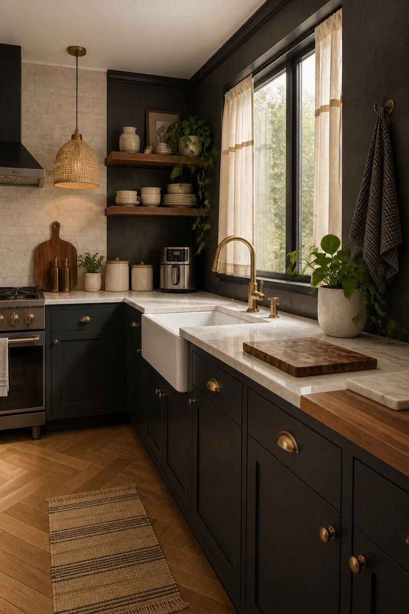
1. How Texture Transforms a Dark Gray Kitchen into a Cozy Haven
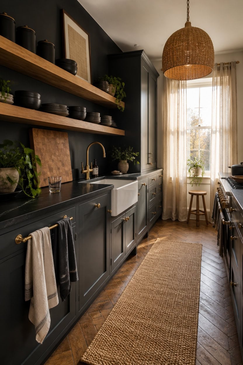
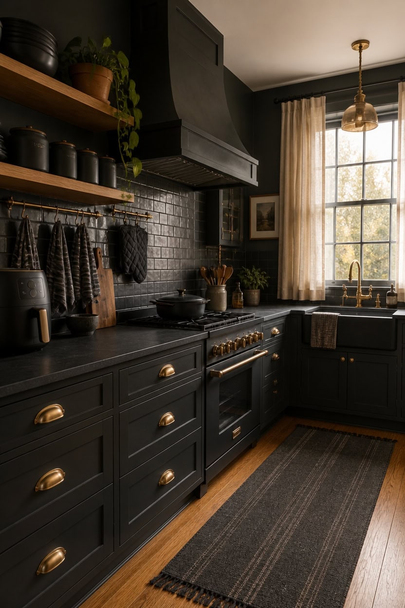
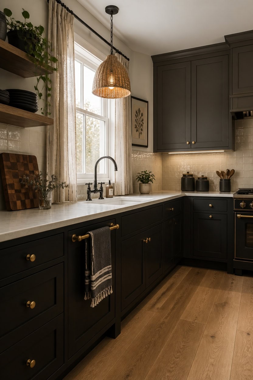
Incorporating various textures in a dark gray kitchen prevents the space from feeling too stark or chilly. Materials like coarse linens, unglazed pottery, and natural wood surfaces scatter light differently than sleek finishes, adding depth and warmth. Since charcoal tones tend to absorb light, combining at least three distinct textures—such as woven fabrics, matte stoneware, and raw timber—helps create an airy, inviting atmosphere.
Key Design Elements
- **Start with woven fabrics:** Placing a sisal or cotton rug on the floor softens the hard surfaces, instantly warming the kitchen’s overall feel.
- **Choose matte ceramics instead of shiny ones:** Matte-finish jars and dishware gently diffuse light rather than reflecting it harshly, toning down glare on countertops.
- **Incorporate natural wood elements:** Items like an untreated wooden breadboard or floating shelves introduce organic texture and cozy undertones that painted finishes can’t match.
- **Mix rough and smooth finishes:** Pairing a knitted dishcloth with a sleek marble soap dispenser creates a tactile contrast that reads as thoughtfully layered, not cluttered.
Pro Tip: For a balanced look, paint an accent wall in ‘Tricorn Black’ (SW 6258) paired with a ceiling in ‘Alabaster’ (SW 7008), allowing textured elements to feel rich and inviting rather than oppressive.
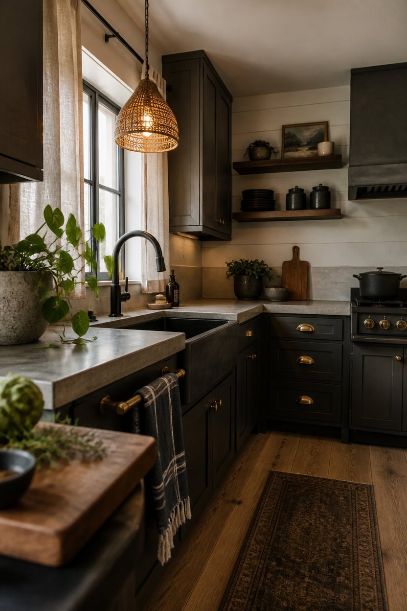
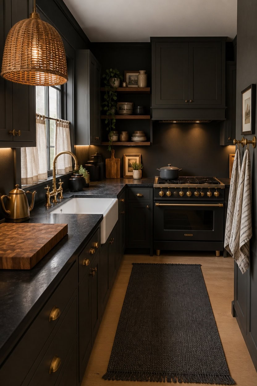
2. Illumination Techniques to Enrich Charcoal Kitchens with Warmth
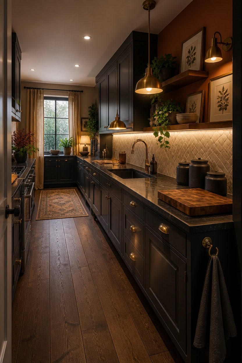
Selecting bulbs with a warm color temperature around 2700K is crucial for transforming a charcoal kitchen’s atmosphere from stark and uninviting to cozy and sophisticated. Because charcoal surfaces tend to absorb overhead light before it can brighten workspaces, a multi-layered lighting approach at varying heights is essential. Incorporate under-cabinet lighting, pendant fixtures, and accent lamps to create a balanced and welcoming environment that counters the darkness.
Key Design Elements
- **Under-cabinet lighting at 2700K:** These fixtures cast a gentle, warm light directly onto countertops, enhancing visibility and softening the intensity of charcoal surroundings in a way ceiling lights cannot.
- **Pendant lights as design anchors:** Installing a couple of warm-hued pendant lamps above key areas like the kitchen island or sink provides focused illumination and adds a comforting visual element.
- **Steer clear of cool-white LEDs:** Lights exceeding 3000K tend to emphasize cold blue undertones in charcoal finishes, resulting in a sterile, less appealing kitchen vibe.
- **Install dimmable controls throughout:** Using dimmer switches lets you effortlessly adjust the lighting from bright and functional for cooking to soft and atmospheric for relaxed evenings.
Pro Tip: Choose a soft, creamy ceiling shade like ‘Origami White’ (SW 7636) paired with a rich terracotta accent wall such as ‘Cavern Clay’ (SW 7701) to enhance the warmth of your lighting and highlight charcoal cabinetry beautifully.
3. Ideal Backsplash Choices for Kitchens with Dark Gray Cabinets
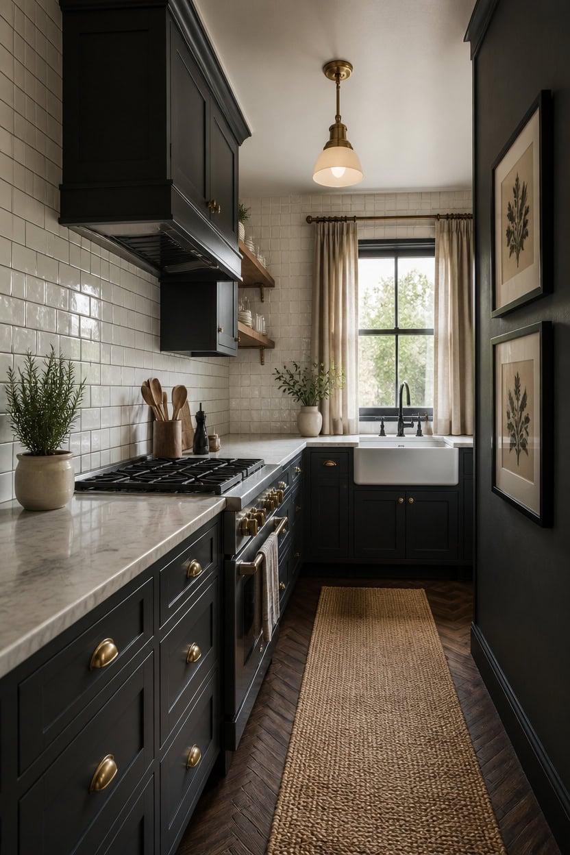
In kitchens featuring dark gray cabinetry, subway tile can be a standout choice when paired with a grout color that offers contrast—pure white grout tends to fade into the tile, but shades like warm taupe or soft greige outline each tile, creating a striking grid effect. The reflective quality of the tile helps brighten the space by bouncing light around, preventing the room from feeling overly shadowed. Opt for straightforward tile layouts, such as classic subway or vertically stacked patterns, allowing grout lines to define the backsplash without overwhelming the design.
Key Design Elements
- **Subway tile with warm grout:** Traditional white subway tile paired with beige or greige grout provides clear separation on dark gray walls, delivering a crisp, defined look that white grout alone can’t achieve.
- **Textured zellige-inspired tiles:** Use handcrafted or zellige-effect tiles in subtle cream tones to introduce tactile depth and varied light reflections, adding dimension beyond smooth, glossy surfaces.
- **Removable backsplash panels:** For those renting or seeking a temporary upgrade, peel-and-stick panels featuring warm marble or neutral stone textures offer an easy way to enhance dark kitchens without permanent changes.
- **Vertical tile arrangement:** Installing subway tiles vertically elongates the walls visually, creating the impression of higher ceilings in charcoal kitchens, all without needing additional natural light sources.
Pro Tip: Anchor your backsplash by painting an adjacent wall in Sherwin-Williams ‘Dovetail’ (SW 7018) and the ceiling in ‘Alabaster’ (SW 7008) to balance color depth without competing with the tile’s surface.
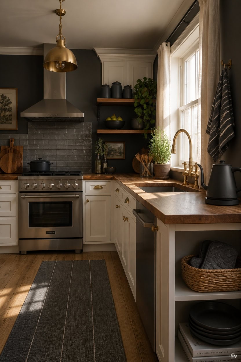
4. Choosing Hardware Finishes to Elevate Your Charcoal Kitchen
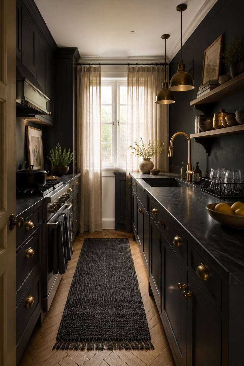
Matte black, brushed brass, and unlacquered brass stand out beautifully against charcoal cabinetry by providing clear visual contrast without overpowering the dark tone. Warm metallics like brass add richness and a subtle glow that’s hard to achieve with cooler metals such as chrome or polished nickel. For a balanced and polished look, select one primary finish for your cabinet pulls and a secondary finish for fixtures like faucets—using more than two finishes can create a cluttered appearance rather than a cohesive design.
Key Design Elements
- **Matte black paired with charcoal:** This combination works because both finishes share similar darkness levels, allowing texture rather than color to create depth and interest.
- **Brushed brass adds warmth:** Installing a brushed brass faucet against deep gray cabinetry acts like a warm accent light, drawing the eye and brightening the space.
- **Unlacquered brass’s timeless appeal:** Its evolving patina brings character and a sense of history, making the kitchen feel inviting and curated instead of overly pristine.
- **Steer clear of cool silver tones:** Finishes like chrome and polished nickel tend to highlight cooler blue-gray hues in charcoal, which can result in a cold, monotonous atmosphere.
Pro Tip: Use ‘Tricorn Black’ (SW 6258) on an accent wall paired with ‘Alabaster’ (SW 7008) on the ceiling to make brass and matte black hardware stand out gracefully without overwhelming the space.
5. Steps to Evolve Your Kitchen with a Charcoal Color Scheme
Introducing charcoal tones into your kitchen is most effective when done gradually—begin with textiles and decorative accents, advance to countertops and smaller surfaces, and finalize with permanent elements. Charcoal only feels intentional when it appears in several spots throughout the space; a single piece can seem accidental rather than thoughtfully placed. Establish a strong charcoal focal point, then repeat the color at least two more times before exploring additional changes.
Key Design Elements
- **Begin with easily changeable items:** Swap out small appliances, tea towels, and storage jars to subtly shift the room’s atmosphere without a long-term commitment.
- **Use the color trio rule:** A solitary charcoal item can look like an afterthought, but incorporating the tone in at least three different spots and heights reinforces a cohesive design.
- **Soften the darkness with warmth:** Incorporate wooden utensils, brass fixtures, or woven textiles to balance charcoal’s depth and keep the kitchen inviting, not stark.
- **Tackle permanent updates last:** After the charcoal accents feel balanced, confidently proceed to repaint cabinetry or replace hardware to cement the new palette.
Pro Tip: For a grounded yet airy feel, paint an accent wall in ‘Peppercorn’ (SW 7674) and choose ‘Accessible Beige’ (SW 7036) for the ceiling to create depth without overpowering your kitchen.
6. Expanding Space in a Compact Dark Gray Kitchen
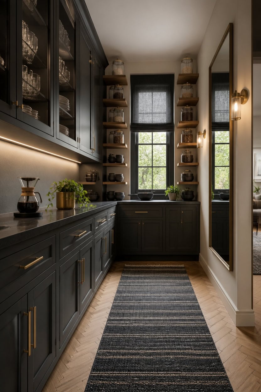
In a small kitchen dominated by dark gray tones, mirrors play a crucial role by reflecting light into shadowy corners that ceiling lights often miss. Since darker cabinets tend to absorb light, every bit of reflected brightness helps visually enlarge the space. Positioning a large mirror opposite the window can effectively double the incoming natural light before it fades against the cabinetry.
Key Design Elements
- **Think vertically with shelving:** Installing open shelves from floor to ceiling directs attention upward, creating the illusion of taller walls.
- **Choose transparency over opacity:** Cabinets with glass doors and clear containers allow light to flow through, preventing storage areas from looking heavy or closed off.
- **Keep lower areas minimal:** Maintaining clear countertops and avoiding clutter near the floor preserves open sightlines, counteracting the visual weight of dark finishes.
- **Use seamless flooring:** Extending the same flooring from the kitchen into adjoining rooms eliminates visual breaks, making the kitchen feel like part of a larger, continuous space.
Pro Tip: Opt for a bright white ceiling paint like ‘Extra White’ (SW 7006) paired with a soft off-white accent wall such as ‘Origami White’ (SW 7636) to elevate the ceiling and give intention to charcoal gray hues.
7. Incorporating Greenery and Organic Touches to Enliven a Charcoal Kitchen
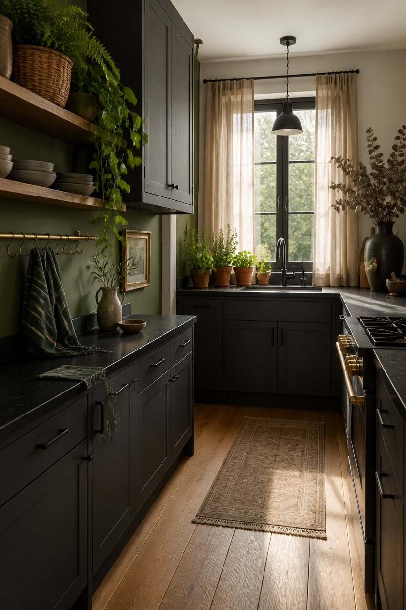
Integrating climbing plants, fragrant herbs, and textured branches can transform a charcoal kitchen from stark to inviting. The deep hues of dark cabinetry create a striking contrast that allows vibrant greens to truly stand out, much like foliage in a shadowy garden nook. Position your plants near windows to maximize sunlight, and combine various textures such as leafy greens with woody accents and natural woven containers to add depth and warmth.
Key Design Elements
- **Climbing greenery:** Varieties like pothos or string of pearls cascading from open shelving soften the sharp lines of dark gray cabinets with effortless natural charm.
- **Herb trio:** Group small pots of basil, rosemary, and mint on a sunny windowsill to infuse the space with fresh aroma and lush green color.
- **Textured branches:** Tall vases filled with dried eucalyptus or olive branches introduce rustic, earthy elements that balance the kitchen’s charcoal tones.
- **Natural containers:** Using terracotta or woven baskets for plants adds warmth and a tactile layer that complements the cool gray surfaces.
Pro Tip: Choose ‘Evergreen Fog’ (SW 9130) for an accent wall and ‘Aesthetic White’ (SW 7035) on the ceiling to reflect natural greenery and soften the interplay between dark cabinets and organic decor.
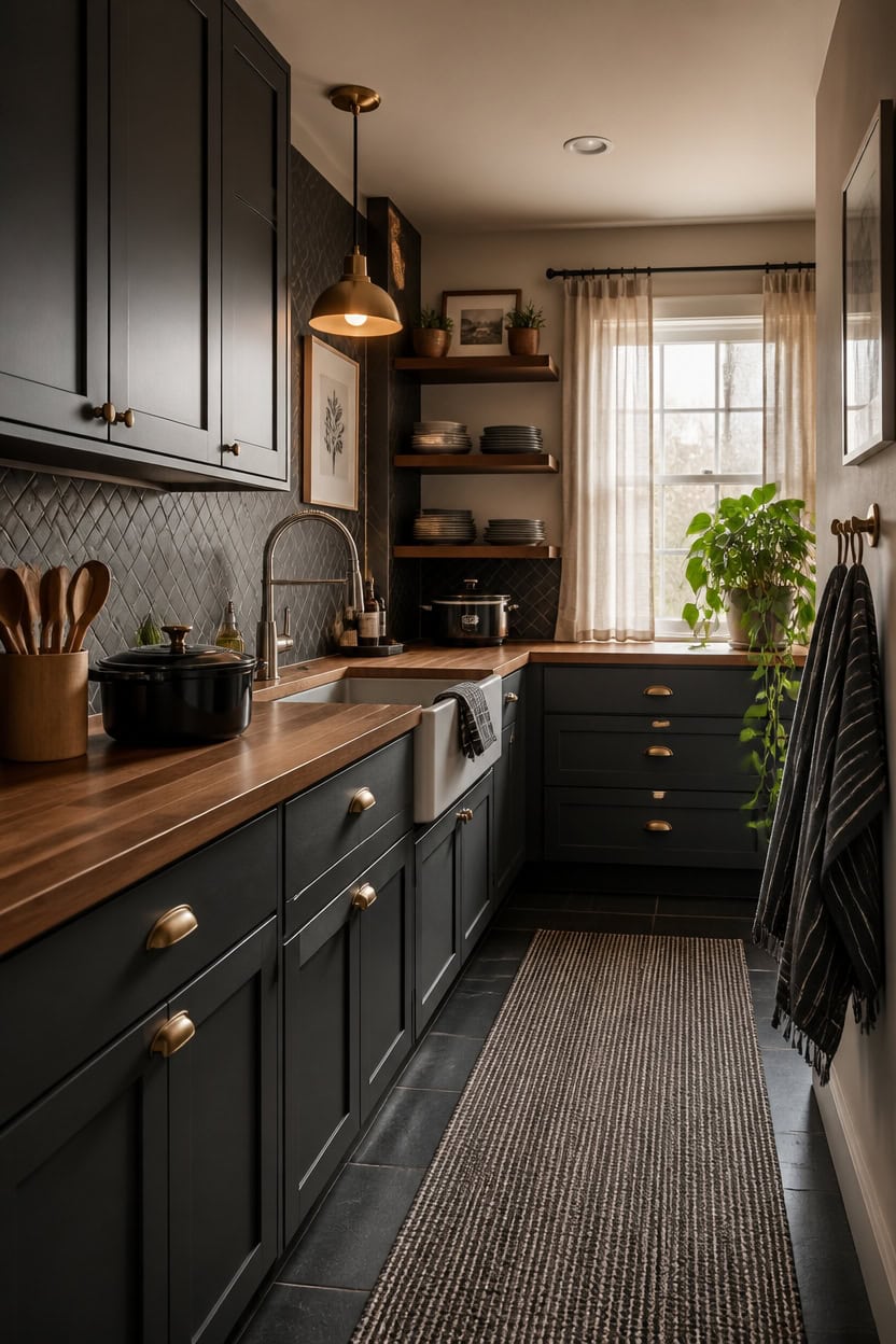
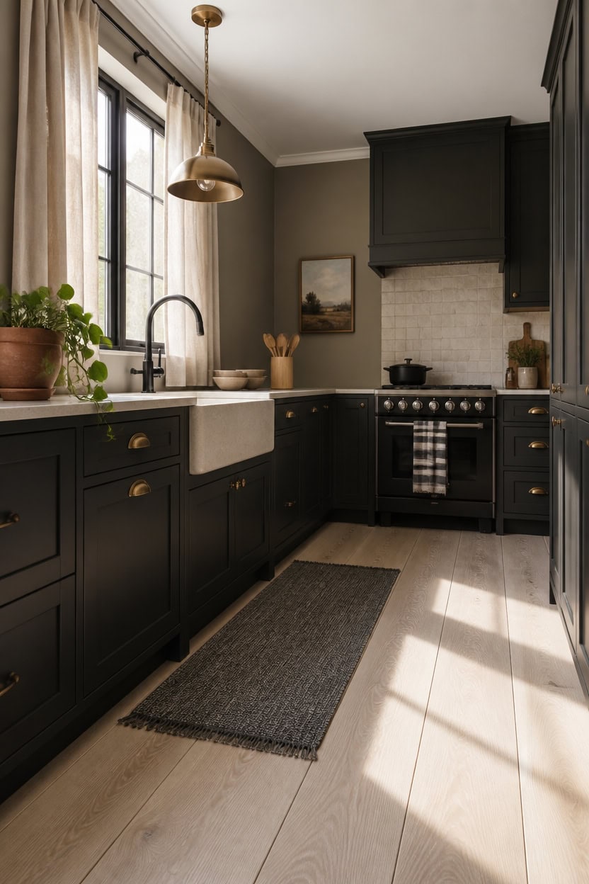
8. Rich Warm Tones to Enhance a Charcoal Kitchen
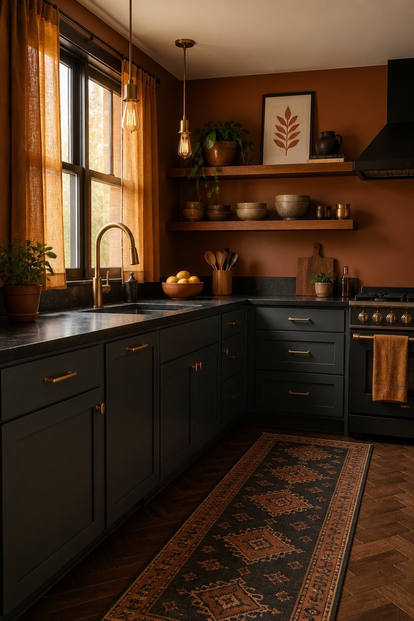
Incorporating shades like terracotta, brass, and ochre into a charcoal kitchen injects inviting warmth without diminishing its bold character. Each hue offers a unique warmth—terracotta gives grounded earthiness, brass adds radiant metallic glow, and ochre brings a soft, artistic touch—allowing them to coexist harmoniously. Use these colors in accessories, fixtures, and fabrics instead of walls to create a curated, layered vibe.
Key Design Elements
- **Terracotta’s natural warmth:** A terracotta planter, serving dish, or decorative tile provides an organic contrast against charcoal, infusing the space with rich, earthy tones that avoid coolness.
- **Brass’s glowing effect:** Incorporate brass elements such as drawer pulls, a sleek faucet, or pendant lighting to introduce a bright metallic warmth that complements and enlivens matte charcoal finishes.
- **Ochre’s subtle textile charm:** Choose textiles like kitchen towels, table runners, or cushions in a muted ochre to add depth and warmth without overpowering the overall look.
- **Create a vertical color flow:** Arrange terracotta near countertops, position brass fixtures around eye level, and place ochre accents closer to the floor to establish a welcoming vertical gradient throughout the kitchen.
Pro Tip: Opt for a ceiling painted in ‘Origami White’ (SW 7636) paired with an accent wall in ‘Cavern Clay’ (SW 7701) to enhance warm light reflections and underscore the intentionality of charcoal cabinetry.
9. Distinguishing Between Deep Gray and Soft Charcoal Hues
Though often used interchangeably, deep gray and soft charcoal possess distinct characteristics. Deep gray occupies a middle-to-dark position on the gray spectrum, clearly showing its gray identity with subtle hints of blue, green, or brown. In contrast, soft charcoal leans towards an almost black shade, revealing its gray qualities mainly in direct light, which makes it appear more like a rich neutral than a true color in dim settings.
Key Design Elements
- **Check lighting effects:** Deep gray colors tend to shift under warm artificial light, while soft charcoal remains consistent, providing a deliberate look at night.
- **Consider undertone visibility:** Deep gray subtly reveals its undertones when hit by direct light, whereas soft charcoal tends to absorb these nuances, making undertone choice less crucial.
- **Balance color depth with cabinetry placement:** Use soft charcoal for base cabinets and expansive surfaces to anchor a space, reserving deep gray for upper cabinetry where it feels lighter.
- **Combine for layered dimension:** Pairing soft charcoal on lower cabinets with deep gray above creates a smooth tonal transition that enhances perceived ceiling height without stark contrast.
Pro Tip: Try ‘Tricorn Black’ (SW 6258) for your lower cabinets and ‘Peppercorn’ (SW 7674) on upper cabinets to achieve a seamless and natural tonal progression.
10. Kitchen Designs That Complement Charcoal Shades Seamlessly
Charcoal hues truly shine in kitchens where rich, tactile materials take center stage—think natural wood grains, stone surfaces, brushed brass accents, or rough concrete elements. These textures provide the essential contrast that prevents charcoal from feeling like just another dark paint choice. Styles such as modern farmhouse, industrial, and transitional kitchens naturally embrace charcoal’s depth and complexity by balancing light and dark elements.
Key Design Elements
- **Modern farmhouse appeal:** Charcoal cabinetry harmonizes with beadboard walls, floating shelves, and warm wood finishes to create a cozy yet sophisticated atmosphere.
- **Industrial aesthetics:** The interplay of metal piping, concrete worktops, and matte hardware complements charcoal’s brooding tone without overwhelming the space.
- **Transitional elegance:** Charcoal units act as a bridge between classic cabinetry profiles and sleek contemporary pulls, especially when paired with a neutral, uncluttered backdrop.
- **Steer clear of stark white contrast:** Using charcoal alongside pure white without introducing warm intermediary shades can lead to a jarring visual effect instead of a layered, inviting feel.
Pro Tip: For a cohesive layered look, paint lower cabinets in Sherwin-Williams ‘Tricorn Black’ (SW 6258) and upper cabinets in ‘Peppercorn’ (SW 7674) to maintain tonal harmony.
11. Simple Updates to Infuse Dark Gray into Your Kitchen Without Major Changes
Incorporating dark gray into your kitchen can be achieved through subtle, strategic touches that avoid the need for extensive remodeling. This deep shade makes a striking accent through accessories, appliances, and textiles before any permanent alterations are considered. Begin by introducing a couple of key dark gray elements to set the tone, allowing the rest of the space to follow naturally.
Key Design Elements
- **Swap out textiles first:** Update your kitchen linens like dishcloths and pot holders with dark gray options to refresh your color scheme affordably and effortlessly.
- **Use a dark-hued appliance as a focal point:** Place a charcoal or matte black toaster, coffee maker, or blender on your countertop to create a cohesive and deliberate look without any construction.
- **Style open shelving with dark gray decor:** Position ceramic mugs, storage jars, or serving dishes in charcoal tones on your shelves to draw attention and unify the space visually.
- **Add layered floor coverings:** Lay down a dark gray runner or cushioned mat near your sink or cooking area to anchor the room’s palette subtly at ground level.
Pro Tip: Consider painting a single wall in ‘Peppercorn’ (SW 7674) and the ceiling in ‘Accessible Beige’ (SW 7036) to highlight dark gray accents and create a polished atmosphere without remodeling.
12. Avoiding Common Pitfalls with Dark Gray Kitchens
Many errors with dark gray kitchens occur early in the design process, often during initial purchases. When charcoal tones are scattered in small doses without a main focal point, the overall look can feel incomplete rather than deliberate. Start by choosing one prominent dark gray element, then build complementary accents around it to create a cohesive space.
Key Design Elements
- **Overloading with Dark Shades:** Introduce charcoal in stages, layering gradually to prevent the room from feeling too heavy or claustrophobic.
- **Neglecting Warm Elements:** Without touches of wood, brass, or cozy fabrics, charcoal can feel stark and cold instead of elegant and inviting.
- **Disregarding Light Levels:** In kitchens with limited natural light, opt for matte surfaces and warm lighting to ensure dark gray doesn’t dominate or shrink the room.
- **Mixing Conflicting Gray Tones:** Combining cool blue-based grays with warmer brown-based ones creates visual discord; choose one undertone and maintain consistency throughout all charcoal finishes.
Pro Tip: Try painting your upper cabinets in Sherwin-Williams ‘Peppercorn’ (SW 7674) and use ‘Accessible Beige’ (SW 7036) on the ceiling to prevent dark cabinetry from making the space feel closed off.
13. Countertop Choices That Shine Against Deep Charcoal Walls
Quartz and quartzite stand out beautifully against charcoal-colored walls, offering enough depth and pattern to avoid fading into the background or clashing with the dark hue. Their natural veining introduces a dynamic element that flat surfaces simply can’t provide. Opt for slabs featuring warm tones—such as creamy, golden, or taupe streaks—to ensure a striking contrast rather than cooler shades that might merge with the charcoal.
Key Design Elements
- **Warm-veined quartz:** Select a quartz countertop with soft white or ivory base tones accented by amber or caramel veins for a durable and eye-catching surface that resists staining and upkeep challenges.
- **Textured quartzite:** Embrace quartzite slabs in gentle blush or ivory shades that bring natural patterns and subtle color shifts, adding lively texture to balance charcoal’s intensity.
- **Wood accents:** Incorporate a butcher block segment near the sink or food prep area to introduce a touch of natural warmth that stone alone can’t provide in darker kitchens.
- **Matte finishes:** Choose honed or matte countertop surfaces to gently diffuse light, reducing harsh reflections and preventing charcoal walls from feeling oppressive or cave-like.
Pro Tip: Use a soft gray like ‘Agreeable Gray’ (SW 7029) on the walls paired with a crisp white ceiling such as ‘Alabaster’ (SW 7008) to create a smooth, inviting transition from dark walls to lighter countertops.
14. Choosing Flooring That Perfectly Anchors a Dark Gray Kitchen
Selecting lighter flooring is a smart strategy to lighten the overall feel of a kitchen with deep gray cabinets without changing the cabinetry itself. Cool shades such as pale concrete, soft white tiles, or light ash wood help bounce natural and artificial light around the space, offsetting the absorbing nature of dark tones. Alternatively, flooring with warm hues like honey oak, terracotta, or creamy limestone introduces contrast that balances the gray and prevents the room from feeling too heavy or somber.
Key Design Elements
- **Light wood or wood-inspired floors:** Blonde oak or pale ash planks laid lengthwise can visually expand a small kitchen while ensuring the floor stays subtle alongside the cabinetry.
- **Warm-toned stone tiles:** Soft beige or creamy stone tiles provide a neutral base with a touch of warmth, keeping the dark gray kitchen cozy rather than stark or cold.
- **Matte finishes over shiny:** Choosing a matte surface scatters light gently, reducing glare and complementing the boldness of dark cabinets without overwhelming the eye.
- **Large-format tiles:** Using bigger tiles means fewer grout lines, creating a seamless look that helps the kitchen feel more spacious and streamlined.
Pro Tip: For a harmonious palette, consider painting the ceiling in ‘Alabaster’ (SW 7008) and an accent wall in ‘Accessible Beige’ (SW 7036) to naturally connect cool gray cabinetry with warm flooring tones.
15. How Dark Gray Kitchens Achieve a Warm, Inviting Atmosphere
Dark gray tones create a welcoming ambiance by gently soaking up light instead of bouncing it back sharply, fostering a snug, intimate feel. This effect mimics wrapping the space in a soft embrace, perfect for kitchens used during quiet evenings. Incorporating warm materials like rich woods, golden hardware, and cozy fabrics ensures the space stays inviting rather than stark.
Key Design Elements
- **Opt for warm undertones first:** Select dark grays with hints of brown or olive, avoiding blue-based shades that can feel chilly under artificial lighting.
- **Introduce warm metallic accents:** Fixtures and handles in brass, bronze, or matte gold add subtle warmth to balance the cooler hues.
- **Embrace varied textures:** Incorporate matte finishes, natural fibers like linen, and rough-hewn woods to absorb light and create a softer, more tactile environment.
- **Choose soft, low-temperature lighting:** Use warm under-cabinet LEDs and pendant lights around 2700K to cast gentle, amber glows that counteract any coldness from the dark palette.
Pro Tip: For a rich yet cozy dark gray space, paint upper cabinetry in Sherwin-Williams ‘Peppercorn’ (SW 7674) paired with an ‘Inkwell’ (SW 6992) accent wall to add depth and warmth.
16. Ideal Cabinet Shades to Complement Dark Gray Walls
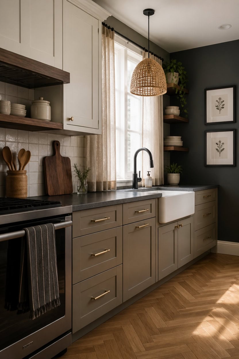
When paired with dark gray walls, cabinets need to bring balance and dimension to the kitchen. Shades like muted whites, soft creams, and rich wood finishes work harmoniously by brightening the space while respecting the wall’s intensity. Instead of matching the gray, opting for cabinets that introduce warmth or striking contrast ensures the room feels thoughtfully composed rather than visually flat.
Key Design Elements
- **Muted white cabinets:** A gentle white tone helps reflect natural and artificial light, creating a clean yet inviting contrast against deep gray walls.
- **Soft cream finishes:** Cream-colored cabinetry offers a subtle transition between dark walls and lighter elements, making the kitchen feel cozy without overwhelming it.
- **Warm wood grains:** Cabinet fronts in medium-toned woods such as walnut or oak introduce natural warmth that counterbalances the coolness of gray, enhancing depth without clashing.
- **Two-tone design:** Combining light upper cabinets with warm wood lower units adds layered interest and prevents the dark gray backdrop from feeling too heavy or uniform.
Pro Tip: Try painting upper cabinets in Benjamin Moore’s ‘White Dove’ and lower cabinets in ‘Manchester Tan’ to create a smooth yet striking connection with dark gray walls.
Conclusion
Embracing dark gray and charcoal in your kitchen design opens the door to a space that is both timeless and strikingly modern, offering depth and sophistication that lighter palettes often can’t achieve. These shades create a versatile canvas that beautifully complements various textures, metals, and natural elements, inviting you to craft a kitchen that feels both cozy and effortlessly chic. By stepping into this bold color story, you’re not just choosing a trend—you’re investing in a design that stands strong through seasons and styles, reflecting your unique taste with quiet confidence.
Don’t hesitate to take that first step toward a dark gray or charcoal kitchen; start small with accent walls, cabinetry, or countertops, and watch how these rich hues transform your space into a sanctuary of elegance and warmth. Trust in the palette’s ability to balance drama with comfort, and let your imagination guide you. With a little courage and thoughtful layering, your kitchen will become a beautifully grounded backdrop where every meal and moment feels refined and inviting.
Leave a Reply