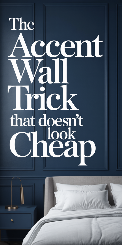
Accent walls are one of those design moves that can transform a room overnight, when done right. We’ve seen the good, the bad, and the painfully obvious attempts that read as cheap or awkward. This guide exists to help you use the accent wall trick that doesn’t look cheap, whether you’re refreshing a rental, staging to sell, or investing in a forever home. We’ll walk through when an accent wall still makes sense in 2026, the pitfalls to avoid, materials and finishes that read as high‑end, design rules to keep things cohesive, placement and proportion tips, plus budget-friendly, DIY-forward strategies that deliver wow without wasting money. Read on and you’ll be ready to design an accent wall that looks intentional, layered, and, most importantly, expensive.
Why Accent Walls Still Work — And When To Use One
Accent walls remain a powerful tool because they alter perception: they highlight, anchor, conceal, or expand a space without the expense of a full‑room overhaul. We still recommend them when you want to create a focal point quickly, define zones in an open plan, or add character to a neutral space that needs personality. But they’re not a universal fix. An accent wall works best when it responds to the room’s architecture, a fireplace wall, the back of a bed, a built‑in bookcase, or the wall behind a dining table. These positions naturally draw the eye and feel purposeful.
We avoid accent walls when they’re used to mask clutter or when they ignore proportional logic. If you’re in a tiny room with low ceilings, a heavy, dark accent on all four walls will make the space feel boxy. Similarly, painting a single short wall in a narrow room can make the room feel chopped. Instead, opt for finishes or treatments that enhance light and vertical lines if you want the room to feel larger. In 2026, with more open concept living and multifunctional rooms, accent walls are most effective when they define function and speak to the room’s natural focal architecture rather than imposing a trend on the space.
In short: use accent walls to amplify existing features, create intentional zones, and inject texture or color where it supports circulation and sightlines.
Common Mistakes That Make Accent Walls Look Cheap
Some mistakes show instantly: the accent wall that looks slapped on because it’s an afterthought. Here are the frequent errors we see and how to avoid them.
- Choosing the wrong wall. Picking the smallest or most hidden wall ruins the purpose, it should be the wall the eye naturally goes to. 2) Overly saturated colors without balance. An ultra‑bright or neon hue can be energetic, but without supportive neutrals and layered textures it reads gimmicky. 3) Using a single flat coat of paint as the only treatment. Cheapness often stems from lack of depth, the finish matters as much as the color. 4) Ignoring scale and proportion. Busy patterns or large panels in a cramped space overwhelm: too-small accents get lost. 5) Poor edges and transitions. Uneven lines, sloppy trim work, and visible seams make even premium materials look budget. 6) Clashing with existing finishes. An accent wall that fights the flooring, moldings, or fixed cabinetry will always look off.
We recommend a quick checklist before committing: test paint in multiple lights, view wallpaper or panel samples in situ, and consider how furniture or art will sit against the surface. If the treatment can’t hold up under a 30‑second gaze without feeling unresolved, rethink it.
Materials That Instantly Elevate An Accent Wall
Materials change everything. Where a single coat of paint can look cheap, well‑chosen materials signal intention and craft. Here are options that read as high‑end even on modest budgets.
- Real or engineered wood: Thin shiplap, reeded panels, or vertically installed planks add warmth and dimension. We prefer richer grain or painted tones that play with light rather than raw plywood strips that can look DIY.
- Stone veneer: A stacked stone veneer applied thoughtfully (not over an entire room) brings tactile luxury. Choose slim profiles and muted tones for a modern aesthetic.
- Plaster and limewash: Venetian plaster or a limewash glaze creates subtle depth and artisanal texture. These finishes refract light differently from paint and age beautifully.
- High‑quality wallpapers and grasscloths: Modern printed papers with satin or textile blends read expensive. Grasscloth in a restrained palette adds texture and works well behind sofas or beds.
- Porcelain or large‑format tiles: Tactile tiles installed with narrow grout lines near a fireplace or in a powder room offer durability and polish.
We like combining materials too, a painted wall with a slim wood-accent band, or wallpaper framed by millwork, to keep the look layered and intentional rather than flat.
Design Principles For A Cohesive, Sophisticated Look
A successful accent wall follows design principles that make it feel intentional rather than decorative. Here’s how we think through each project.
Hierarchy and focus: The accent wall should reinforce a single focal point, not compete with multiple elements. We ask: What do we want your eye to do when it enters the room? The answer defines the finish, scale, and contrast.
Balance and restraint: Sophistication often equals restraint. One strong wall paired with complementary, subtler textures and colors around the room reads curated. Avoid fighting patterns and colors: instead, echo elements like throw textiles or artwork hues.
Consistency of finish: If the room has matte wood or satin metals, consider finishes that harmonize, don’t juxtapose matte wallpaper with ultra‑gloss trim unless done intentionally.
Layering: Treat the accent wall as one layer in a system: paint or panels, a main furniture anchor, lighting, and an accessory layer (art, mirror, shelving). A layered approach makes even inexpensive materials feel considered.
Proportion and scale: We determine the scale of pattern, groove, or panel based on ceiling height and wall width. Large panels suit tall walls: narrow fluting works for smaller spaces.
When in doubt, we scale back and create detail through lighting and styling, often a great light fixture or a handful of well‑placed art pieces will make the wall feel deliberate.
Placement And Proportion: Where An Accent Wall Works Best
Placement is more important than material if you want a finish that looks intentional. Here are our rules of thumb.
Anchor the main focal point: Use the accent wall behind the primary piece, sofa, bed, console, or fireplace. This reinforces the functional center of the room.
Respect sightlines: Consider what visitors see first when they enter. The accent should complement, not confront, that view. In open plans, use an accent to delineate a zone rather than isolate it.
Vertical versus horizontal emphasis: Tall ceilings benefit from vertical treatments like fluted panels or vertical planks to emphasize height. Low ceilings respond better to horizontal grain or lighter tones that make the room feel wider.
Partial walls and half treatments: Sometimes a full wall is too much. We use a half-height panel, a framed wallpaper section, or a band of wood behind a headboard. These solutions reduce cost while adding deliberate visual interest.
Scale the pattern and material: Large‑scale patterns suit big, uninterrupted walls. If the wall has windows, doors, or radiators, choose simpler treatments that won’t compete with interruptions.
Finally, pair with lighting: A wall looks expensive when it’s lit intentionally. Picture lights, adjustable sconces, or concealed LED strips that wash texture will elevate even economical materials.
Budget-Friendly, High-Impact Ideas And DIY Tips
You don’t need a luxury decorator to create a high‑end accent wall. With thoughtful choices and a bit of elbow grease, we achieve big results on small budgets.
- Paint techniques over new materials: A layered paint finish (base coat + glaze or soft metallic wash) can mimic plaster or limewash for a fraction of the cost. Practice on boards first.
- Framed wallpaper panels: Buy a single roll of premium wallpaper, frame it with inexpensive trim, and mount two or three panels instead of papering a whole wall. It reads curated and saves money.
- Reclaimed or engineered wood planks: Instead of full‑thickness hardwood, use engineered planks or thin veneer. Lay them vertically or in chevron for interest. Pre‑finished boards reduce labor.
- Temporary peel-and-stick tiles and panels: High‑quality stick‑on tiles have come a long way. Use them behind an entry console or in a powder room: they’re renter‑friendly and easy to replace.
- Painted reeding with MDF: We cut thin MDF strips and glue them to the wall to create reeded texture, then paint in a sophisticated matte. It’s inexpensive and looks custom when the seams are filled and sanded.
- Add lighting strategically: A directional sconce or uplight transforms texture into luxury. Lighting is one of the highest ROI upgrades for an accent wall, it makes materials sing.
DIY tips to avoid the “cheap” look: take time on surface prep (patching, sanding, priming), use high‑quality caulk and paint tape for crisp edges, and invest in a good brush for cut‑in work. We also recommend trying a small mock‑up and living with it for a week to ensure the color and material play well with daily light.
Conclusion
The accent wall trick doesn’t have to look cheap, it just requires intention. By choosing the right wall, selecting materials that create depth, applying thoughtful finishes, and considering proportion, color, and lighting, we can make an accent wall feel custom and timeless. Even on a modest budget, techniques like framed wallpaper panels, engineered wood, textured paint, and smart lighting turn inexpensive materials into elevated design. Our final piece of advice: always test, edit, and layer. When an accent wall feels like a single thoughtful layer in a well‑curated room, it reads expensive, and that’s the real trick.
Leave a Reply