Mixing metals used to feel risky: a handful of mismatched pieces and suddenly a room reads as chaotic. But over the last few years we’ve watched pro designers refine a repeatable method that keeps spaces cohesive, current, and layered, without the visual noise. In 2026 the mixed metal trick is less about random pairing and more about strategy: pick an anchor, control temperature, repeat rhythmically, and use texture to bridge differences. In this guide we’ll explain why mixed metals work, how to choose a dominant metal, balance warm and cool tones, and give room‑by‑room recipes (kitchen, living room, bathroom, bedroom) that you can copy. We’ll also flag common mistakes we fix on client projects and how to correct them quickly. Read on and you’ll never be afraid to mix metals again, you’ll do it intentionally.
Why Mixed Metals Work And When To Use Them
Mixed metals work because they introduce visual contrast and nuance while reflecting a room’s layered history. When we use a single metal too rigidly, spaces can feel flat or overly matched, like a showroom. Mixing metals creates an approachable, collected look that reads as curated rather than manufactured.
When to use mixed metals:
- To add warmth or coolness where paint and textiles alone fall short. For example, a cool gray room lifts instantly with brass accents, while a warm taupe room gains sophistication from nickel or chrome.
- When you want intentional imperfection. A mix suggests that items were gathered over time, which helps residential spaces feel lived‑in and personal.
- To highlight architectural features. Contrasting hardware or light fixtures draws the eye to islands, mantels, and built‑ins.
Why the trick works from a design standpoint:
- Value contrast: Metals reflect light differently. Polished chrome reads brighter than matte black: burnished brass catches warm highlights. We use that to create focal points.
- Color temperature: Metals carry warm (brass, copper, bronze) or cool (chrome, nickel, stainless, pewter) undertones. Deliberate pairing manipulates the perceived warmth of a room.
- Texture and finish variance: Satin, matte, brushed, hammered and polished finishes each interact differently with materials like marble, wood, and fabric, creating depth.
A quick rule of thumb we rely on: pick one dominant metal, introduce a secondary metal in smaller doses, and optionally add a tertiary metal as an accent. That simple hierarchy keeps the mix intentional rather than messy.
Choosing A Dominant Metal To Anchor The Palette
Choosing a dominant metal is the single most effective decision we make when mixing metals. The dominant metal acts like the paint color of the palette: it’s the steady, consistent note that grounds everything else.
How to choose your dominant metal:
- Start with the largest visible elements. If your kitchen island lighting, cabinet pulls, or a major furniture piece is already in a metal, it’s often easiest to let that be dominant.
- Match the room’s temperature. In rooms with warm wood floors or warm wall colors, brass, aged bronze, or copper will feel cohesive as the dominant metal. In cool, contemporary spaces with concrete, glass, or cool gray paint, nickel, stainless, or matte black usually read better as the anchor.
- Consider longevity and resale. Polished nickel and stainless look timeless and are easy to change around: if you want a flexible base choose a neutral metal.
Practical anchor examples we use:
- Brass as dominant: great for traditional or transitional rooms. Use brass on lighting, large faucets, and fireplace tools. It makes the space feel curated and warm.
- Matte black as dominant: ideal for modern or industrial schemes. Black works across hardware, plumbing accents, and window frames, creating a strong graphic backbone.
- Satin nickel/stainless as dominant: a versatile middle ground. It reads clean and upscale, blending well with both warm and cool secondary metals.
Once the dominant metal is chosen, limit its use to roughly 60–75% of the metal surfaces in the room. Too much dominance defeats the purpose of mixing: too little means the room lacks cohesion. We suggest mentally inventorying visible metal pieces and keeping a rough count while planning.
Balancing Warm And Cool Tones
Balancing warm and cool metals is where the mixed metal trick stops feeling like guesswork and starts functioning as deliberate design. The goal is to make metals speak to each other rather than shout past one another.
Begin with temperature mapping:
- Warm metals: brass, antique brass, copper, warm bronze. They bring sunlight and glow.
- Cool metals: chrome, polished nickel, stainless, pewter, brushed nickel. They lend crispness and modernity.
Strategies to balance them:
- 60/30 principle: After choosing a dominant metal, use a secondary metal for about 20–30% of the metal surfaces. The tertiary metal, if used, should be sparingly (5–10%). This keeps visual weight in check.
- Repeat the secondary metal in at least three separate places to create a rhythm. Humans read patterns: repeating an accent metal across light fixtures, cabinet pulls, and a decor object ties the scheme together.
- Use bridging finishes: finishes like aged brass with darker patina or warm stainless can visually transition between warm and cool metals. Brushed finishes absorb light and reduce contrast, helping disparate tones coexist.
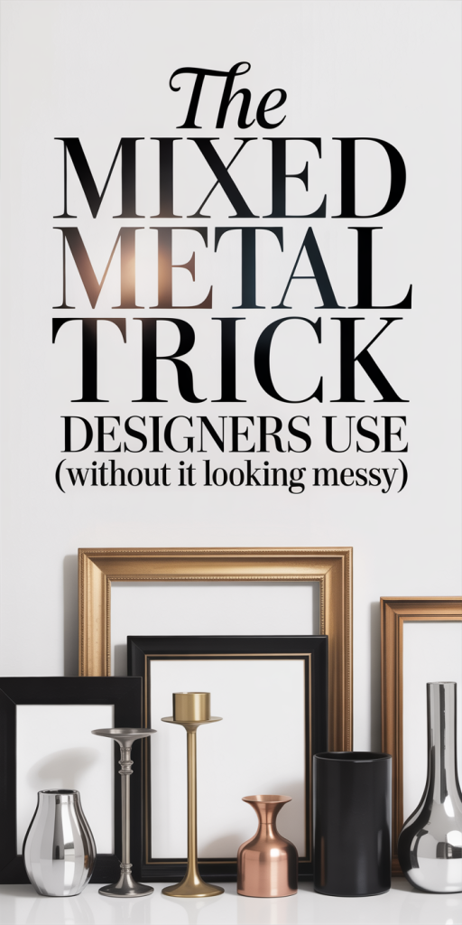
Using Accent Pieces To Tie The Palette Together
Accent pieces are our secret weapon. Small items, vases, picture frames, lamps, mirrors, are the easiest, least expensive ways to introduce a secondary or tertiary metal without committing to large fixtures.
Tactical use of accents:
- Place accent metals where the eye naturally rests: tabletop groupings, console tables, and bedside stacks. This creates micro‑moments of cohesion.
- Use reflective surfaces sparingly. A mirror with a different metal frame can echo fixtures in another part of the room, bridging temperature differences.
- Consider nonmetallic tie elements: leather straps, woven baskets, or upholstery piping in a color that complements both metals can visually connect them.
Layering Finishes And Textures For Depth
Finishes and textures are as important as the metal type. Matte black next to polished brass can feel harsh unless we introduce intermediary textures.
How we layer:
- Use matte and brushed finishes as intermediaries. A brushed nickel can soften the jump between polished chrome and burnished brass.
- Incorporate textured metal objects, hammered copper, fluted brass sconces, or hammered stainless bowls, to add dimension.
- Pair metals with tactile materials: natural wood, leather, stone, and textiles. These materials absorb and reflect metal tones differently and help anchor the mix.
Eventually, balancing warm and cool metals is about creating a conversation between elements, not forcing them to match. When we treat metals like members of an ensemble rather than lone stars, the result reads sophisticated and intentional.
Room‑Specific Recipes: Kitchen, Living Room, Bathroom, Bedroom
We find that having room‑specific recipes simplifies decision‑making. Below are practical, copy‑ready combinations that work in 2026 interiors, with variations for different styles.
Kitchen
- Transitional: Dominant metal, satin brass on cabinet knobs and island pendants (60%). Secondary, brushed nickel for faucets and appliance pulls (30%). Accent, matte black open shelving brackets or light switch plates (10%). Repeat the brushed nickel across three spots: faucet, range hood trim, and small appliance handles.
- Modern/contemporary: Dominant, matte black or gunmetal (60%). Secondary, polished chrome (25%) on faucets and appliance accents. Accent, warm copper or brass as subtle drawer pulls or a single decorative bowl (15%). Keep countertops neutral (quartz or concrete) to let metals sing.
Living Room
- Classic/curated: Dominant, aged brass on lighting and a coffee table base (65%). Secondary, warm bronze on picture frames and mirror trim (25%). Accent, satin nickel on lamp switches or media hardware (10%). Use textiles (wool, linen) in warm neutrals to bridge metals.
- Minimal/Scandi: Dominant, brushed nickel or satin stainless (55%). Secondary, matte black on legs and trims (30%). Accent, copper or brass in small vases or candle holders (15%). Keep accessories minimal and repeat accent metal in odd numbers.
Bathroom
- Spa‑like: Dominant, polished nickel or brushed stainless on faucet and shower hardware (60%). Secondary, warm brass in towel bars and mirror frames (30%). Accent, matte black for a soap pump or small shelf bracket (10%). Avoid mixing three high‑shine metals: instead pair polished with brushed or matte finishes.
- Vintage glam: Dominant, oil‑rubbed bronze or antique brass (65%). Secondary, porcelain or glass fixtures with small chrome details (25%). Accent, rose gold or copper for light fixtures (10%) to add warmth.
Bedroom
- Cozy eclectic: Dominant, warm brass on bedside lamps and drawer pulls (60%). Secondary, matte black on bed frame and picture frames (30%). Accent, brushed nickel or chrome in a mirror or clock (10%). Layer textiles in warm tones to amplify brass.
- Modern luxe: Dominant, satin nickel on lamps and dresser hardware (55%). Secondary, blackened steel for furniture legs (30%). Accent, polished brass in a single statement chandelier or curtain rods (15%).
General tips across rooms:
- Always repeat a secondary metal at least three times. It creates rhythm and familiarity.
- Use scale to control impact: larger items should stick to the dominant metal: smaller items are for accents.
- When in doubt, swap one large element (a light fixture or faucet) rather than changing many small pieces. It’s the fastest way to reanchor the palette.
Common Mistakes Designers Fix (And How To Correct Them)
We see the same missteps on client projects again and again. The good news: most are simple to correct without a full remodel.
Mistake 1, Random pairing without hierarchy
- Problem: No dominant metal, so the room feels scattered.
- Fix: Choose one anchor metal and swap or repaint a few items to create a 60–75% dominance. For example, spray‑paint small lamp bases or replace a set of knobs to reinforce the anchor.
Mistake 2, Using only high‑shine finishes that fight for attention
- Problem: Polished chrome, polished brass, and mirrored surfaces all compete, creating glare.
- Fix: Introduce brushed or matte finishes to dull the contrast. Replace one polished fixture with a brushed version or add matte black accents to absorb light.
Mistake 3, Accent metals used in single, isolated spots
- Problem: A lone copper tray or a single brass picture frame looks like an afterthought.
- Fix: Repeat the accent in at least two more locations, a small lamp, a faucet lever, or a decorative bookend. Repetition reads intentional.
Mistake 4, Ignoring scale and placement
- Problem: Tiny brass knobs next to a massive chrome pendant look visually off‑balanced.
- Fix: Keep large surfaces aligned with the dominant metal and move accent metals to smaller, peripheral items. Or scale up the secondary metal with a larger decor piece.
Mistake 5, Forgetting surrounding materials
- Problem: Metals clash with existing finishes (flooring, countertops, trim) because no one considered the whole material story.
- Fix: Introduce tie elements like wood tones or textiles that bridge the gap. A walnut shelf or woven rug can reconcile warm and cool metals.
Quick corrective actions we use in the field:
- Swap pull hardware on one cabinet run to create a dominant rhythm.
- Paint a metal item (e.g., spray matte black) to act as a unifying anchor.
- Add three matching accent objects in a secondary metal to create repetition.
- Replace a fixture finish (pendant, faucet) rather than upgrading many small items, it’s cost‑efficient and impactful.
Most fixes are about intention, not expense. Small, strategic swaps yield the biggest visual returns.
Conclusion
Mixing metals in 2026 isn’t a trend to fear, it’s a tool for layering personality and depth. When we choose a dominant metal, balance warm and cool tones, repeat accents, and use texture as a bridge, the result is a room that reads considered and effortless. Start small: change a faucet, add two matching metal accessories, or swap a light fixture. Those little moves let you test combinations and build confidence. Follow these simple rules and room recipes, and you’ll have a mixed‑metal scheme that feels modern, intentional, and far from messy.
Leave a Reply