Blog

  • 17 Decor Habits That Make Your House Feel Cluttered (Even When It’s Clean) — How To Edit Your Space For Calm In 2026

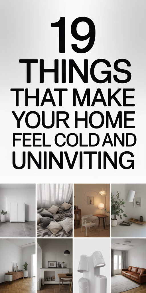
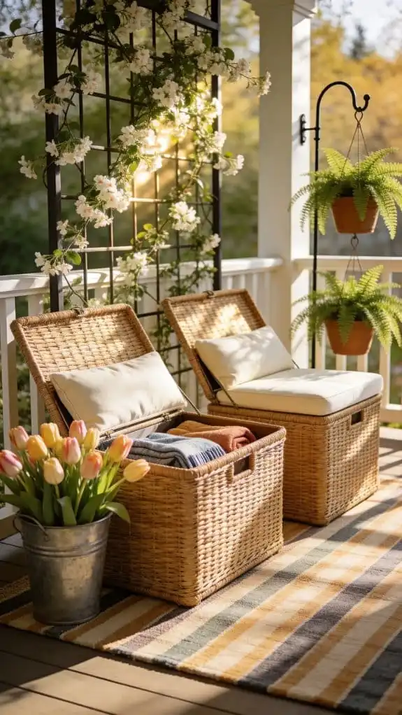
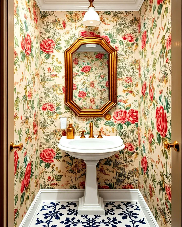
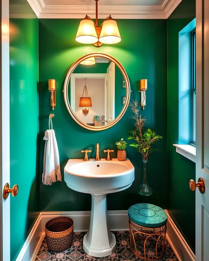
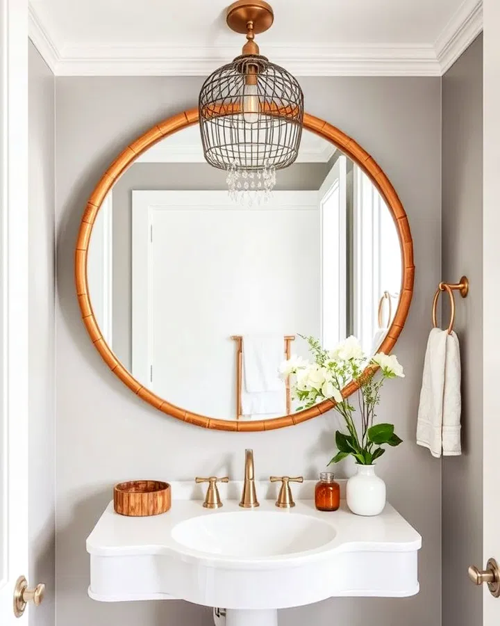
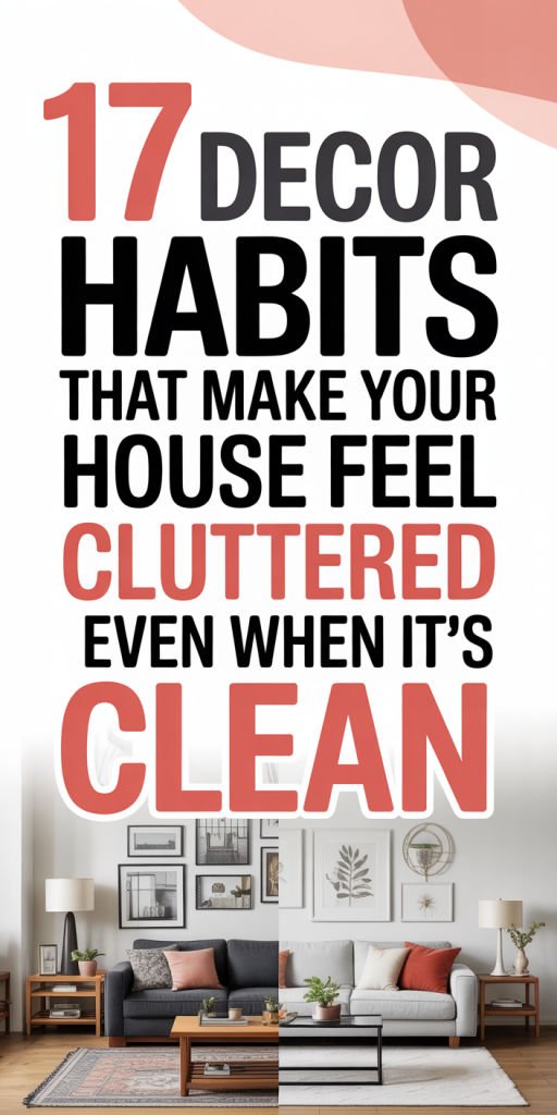
    We keep our surfaces wiped, linens folded, and floors vacuumed, yet our homes still feel busy, chaotic, or suffocating. That’s because visual clutter isn’t the same as dirt. It’s a language our brains read: too many objects, competing patterns, inconsistent scale, and visible ‘necessities’ all shout for attention even when everything’s technically tidy. In this piece we walk through 17 common decor habits that make a home feel cluttered and, more importantly, how to edit them away so our spaces feel calmer and more intentional in 2026. Expect practical rules, quick edits you can do in an afternoon, and principles that keep personality without the visual noise.

    Overloaded Surfaces: Why Flat Spaces Read As Busy

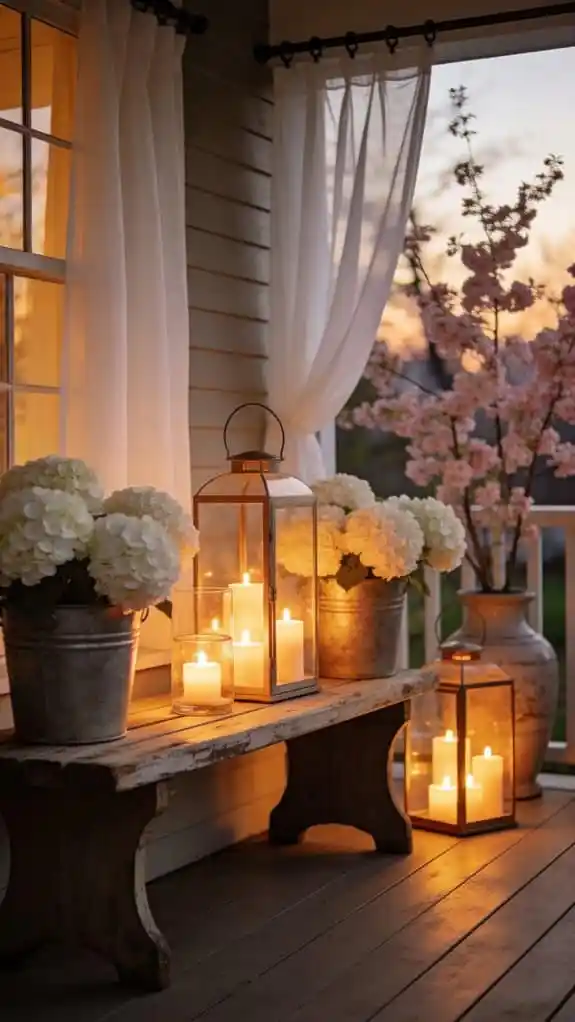
    We think a cleaned tabletop equals calm, but layered items across flat surfaces create a visual field that never rests. When every horizontal plane, coffee table, console, kitchen island, dresser top, is covered with a mix of objects, our eyes have nowhere to land. The result: a feeling of constant activity even though nothing is dirty.

    Why this happens

    • Horizontal surfaces are primary sightlines. When you enter a room your gaze naturally travels across them, so clutter there becomes clutter everywhere.
    • Mixed object types (books, candles, plants, mail) create micro-conversations. Instead of a single visual statement they argue with each other.
    • Repetition without rhythm reads as chaos. Ten unrelated items scattered across a console are louder than three curated pieces placed with intention.

    Quick edits that change the room’s “volume” immediately

    • Apply the 3-2-1 rule: aim for no more than three objects in each cluster, organized in groups of three, two, and one by height or scale. That creates rhythm instead of randomness.
    • Create negative space deliberately. Leave at least one flat surface largely empty: even a purposeful empty spot calms the whole room.
    • Use trays and shallow bowls to corral small items. Rather than scattering, grouping on a tray reads as a single element.
    • Rotate display objects seasonally. Keep a short-term rotation box: swap items monthly to avoid accumulation.

    Styling principles to adopt

    • Think in layers: base (large item like a book stack), middle (plant or sculptural object), and top (small accent). This layered approach keeps surfaces from feeling “flat noise.”
    • Limit materials per surface. If you have glass and brass on a table, avoid adding ceramics unless they’re color-coordinated.

    A practical afternoon exercise

    Pick one prominent surface and edit it down to three objects. Photograph before and after. The contrast will show how much visual weight a few small choices can remove. Once we do the exercise in one spot, the rest of the house feels easier to tackle.

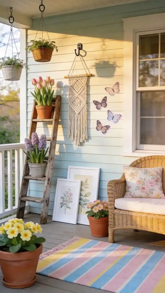
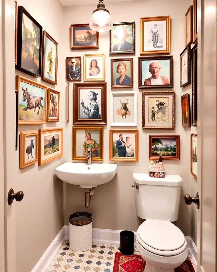
    Too Many Small Decorative Objects And Trinkets

    We adore souvenirs, gifts, and the little things that make a house feel like ours, but when every shelf and mantel becomes a museum of tiny items, the overall effect is clutter. Small objects are deceptive: individually they’re charming, but collectively they create a noisy texture that’s hard to ignore.

    Why tiny objects accumulate

    • Sentimentality: we’re emotionally attached and hesitate to remove items.
    • The ‘it will look better with something’ trap: we add another small piece to fill a perceived gap, and soon there’s no gap left.
    • Scale blindness: small items demand proximity to be appreciated, so placing many of them at eye level overwhelms the viewer.

    How to edit without losing meaning

    • Choose a few display narratives. Instead of showing all trinkets, pick two storytelling themes per shelf (family travel, pottery, vintage tools). Group similar items together rather than scattering them.
    • Use repetition for calm. Display three similar objects rather than six different ones. Repetition creates visual unity.
    • Photograph and store. For objects kept for memory rather than display, a high-quality photo in a digital album preserves the memory without occupying visual real estate.
    • Invest in a single landmark piece per shelf. A sculptural object, oversized book, or framed photo anchors the space so smaller objects subordinate rather than compete.

    Editing tactics

    • The one-in-one-out rule: for every new decorative purchase, let one item go. This simple habit prevents the collection from ever growing disproportionately.
    • Set a tiny-object budget: decide we’ll keep no more than four small items per shelf or vignette. Enforce with shelf dividers or decorative boxes to physically limit capacity.

    When objects matter most

    Keep sentimental items in rotation rather than permanent display. A small, curated rotating cabinet or a closed-front bookcase lets us showcase treasured pieces without visual overload. That balance preserves sentiment while safeguarding calm.

    Hidden Storage Is Missing: Visible Necessities Create Visual Noise

    Open storage solutions are fashionable, but they expose the tools of daily life, mail, chargers, cleaning supplies, kids’ artwork. When functional items are visible, they interrupt the decor narrative and turn our rooms into operating stations rather than restful spaces.

    Problems caused by missing hidden storage

    • Everyday necessities create clutter patterns. The things we use most are also the easiest to leave out.
    • Open shelving tempts accumulation. If every shelf is a display case, it will be filled with both decorative and practical items indistinguishably.
    • Mismatched containers and visible cords add friction to an otherwise composed aesthetic.

    Smart storage strategies that restore calm

    • Prioritize closed-front cabinetry in high-use zones. Kitchen counters, entryways, and living-room consoles benefit most from concealed drawers or doors that hide the practical stuff.
    • Designate daily-use bins. A single, attractive basket or drawer for daily mail, keys, and chargers keeps essentials contained.
    • Hide cables with simple hardware: cord clips, small cable boxes, or built-in grommets. Eliminating visible cords drops a room’s perceived clutter dramatically.
    • Use furniture with built-in storage: ottomans, benches with lids, and coffee tables with drawers both serve function and reduce visible noise.

    Aesthetic plus utility

    We don’t have to sacrifice style for storage. Choose cabinetry and baskets in finishes that echo the room’s palette. Matching a woven basket to the sofa throw, or selecting drawer faces that read like furniture instead of cabinets, integrates storage as part of the design rather than an afterthought.

    A weekend project

    Audit every visible container and surface for functional items. Move anything that’s used less than daily into closed storage. The immediate result is often a calmer room and a clearer sense of what we actually use.

    Mixing Too Many Patterns, Colors, Or Finishes

    A lively mix of texture and pattern gives a room personality, but when we ignore proportion and connection, the result is visual static. Our brains look for relationships: repeating colors, complementary patterns, and coherent finishes. Without those ties, variety becomes chaos.

    Why overloads happen

    • Desire to keep things interesting leads us to add more patterns rather than edit what’s already working.
    • Thinking ‘more = richer’ without considering how patterns scale relative to each other.
    • Buying pieces separately over time without a unifying palette or finish plan.

    How To Edit Patterns And Color Without Losing Personality

    How To Edit Patterns And Color Without Losing Personality

    • Start from a dominant neutral. Choose a grounding color or texture that occupies roughly 60% of the room (walls, large rug, main sofa). This neutral anchor gives us permission to add variety elsewhere.
    • Use the 60-30-10 rule for distribution. 60% dominant color/texture, 30% secondary, 10% accent. That keeps visual balance without restricting palette.
    • Control pattern scale. Pair one large-scale pattern, one medium, and one small. For example: a large geometric rug, medium striped curtains, and small-scale patterned pillows. This creates hierarchy and lets each pattern breathe.
    • Keep a shared color thread. Even wildly different patterns will read cohesive if they share one or two colors.
    • Limit saturated colors to accent doses. Bright hues are powerful, use them sparingly so they energize rather than dominate.

    Simple Rules For Choosing Finishes And Palette Limits

    Simple Rules For Choosing Finishes And Palette Limits

    • Pick two dominant finishes (e.g., matte wood and brushed brass). Use a third as an accent if needed. Too many metals or wood tones fragment the look.
    • Match finish warmth. If most of our metals are warm (brass, bronze), avoid adding cool metals (chrome) unless we intentionally want contrast.
    • Use texture to substitute for additional colors. A chunky knit throw or a rough linen pillow can add depth without introducing another hue.
    • Create a mood board before buying. A quick phone collage of existing items helps prevent mismatched additions.

    A calibration exercise

    Lay three representative items on the floor (rug swatch, throw, lamp). If they look like they belong in separate rooms, edit until there’s a thread connecting them, color, finish, or texture. This small test prevents pattern and color overload before purchases are permanent.

    Scale Issues: Furniture That’s Too Small, Too Large, Or Overstocked

    Scale determines how objects relate to the room and to each other. Pieces that are too small feel fussy and can make a space appear cluttered because they multiply visually. Conversely, oversized furniture can dominate awkwardly and force us to pack the rest of the room with smaller items.

    Common scale mistakes

    • Too many small items filling a large room. A dozen small tables, stools, and chairs fill the eye without providing a restful focal point.
    • Oversized furniture blocking sightlines. A massive sectional placed incorrectly breaks the room into disconnected zones that feel crowded.
    • Unbalanced groupings. A low coffee table paired with towering floor lamps and tiny side tables creates tension rather than harmony.

    How to correct scale problems

    • Measure before you buy. Use painter’s tape to map out proposed furniture footprints on the floor. Seeing the shape at actual size prevents regrettable purchases.
    • Choose fewer, larger pieces over many small ones. One well-proportioned sofa and a single substantial coffee table often read cleaner than multiple small seating options.
    • Maintain sightlines. Arrange furniture so we can see across the room to the focal point (a window, fireplace, or artwork). Open sightlines give the sense of space even in smaller rooms.
    • Balance vertical and horizontal weight. If we have tall bookcases on one wall, counter with a low, long console on the opposite side to stabilize the room visually.

    Smart grouping for less visual busyness

    • Anchor seating with a rug sized for the furniture, not just the coffee table. Rugs that are too small fragment the space into disjointed islands.
    • Edit the number of side tables. We don’t need a table next to every seat: choose two good ones and use ottomans or shared surfaces instead.

    A practical edit

    Walk through the room and remove the smallest or most decorative piece you find. Chances are the room will feel more spacious. If it doesn’t, try replacing two small pieces with one medium-sized item and observe the difference.

    Conclusion

    Visual clutter hides in habits more than dust. By editing overloaded surfaces, reducing tiny-object noise, integrating hidden storage, controlling pattern and finish variety, and getting scale right, we create rooms that feel calm even when life is lived in them. Start with one surface, one shelving edit, or one furniture swap, small, intentional changes compound. Our homes should support our days, not demand our attention. With these 17 habits in mind, we can edit for calm in 2026 without losing the personality that makes a house our home.

  • 15 Decor Trends That Will Age Your Home Fast (And What To Do Instead) — 2026 Guide

    Trends come and go faster than ever, and some design choices that looked fresh five years ago can make a home look instantly dated today. We’ve spent years helping homeowners refresh interiors without gutting walls or blowing budgets, and what we’ve learned is simple: subtle choices add up. In this guide we’ll walk through 15 decor trends that age a home quickly, explain why they fail, and offer practical, modern alternatives you can adopt right now. Whether you’re staging to sell or just want a timeless space you’ll love for years, these recommendations will keep your rooms feeling current, not stuck in a past design cycle.

    How To Tell If A Trend Is Making Your Home Look Dated

    Not every popular idea is a long-term winner. The quickest way we assess whether a trend is aging a home is to ask three focused questions: does it prioritize novelty over function, does it overwhelm the room’s architecture, and would it feel out of place in photographs taken five years from now? Trends that fail these checks often rely on extreme contrasts, excessive ornamentation, or materials that show wear quickly. We also look for visual cues: a room that reads as “themed” rather than lived-in, shiny finishes that spotlight fingerprints, or a single dominant motif repeated everywhere. Those are red flags.

    Another practical test we use is the one-minute edit: step into a room and give it one minute. If your eye lands on one single trend element and ignores circulation, lighting, or comfort, that element is probably overpowering the space. Finally, consider resale and flexibility. If a choice restricts how the room can be used or forces a future buyer to change things immediately, it’s likely to date the house. Our approach is to favor balance, subtlety, and materials that patina gracefully, then layer in personality with easy, replaceable pieces.

    Oversized Patterned Wallpaper And Busy Prints

    Oversized florals, maximalist murals, and loud geometric wallpapers made a splash in recent seasons. They’re bold and beautiful, until they dominate a space and anchor it to a specific moment in design history. The problem isn’t pattern itself: it’s scale and placement. When a busy print covers every wall or takes over an entire open-plan room, it leaves little visual breathing room and dates the house as trends shift.

    What to do instead: use pattern strategically. Create a feature wall rather than papering the whole room, or choose prints with smaller scale and a muted palette that can act as texture instead of a headline. We like removable wallpapers or fabric wall panels in high-impact areas (entryways, powder rooms) because they’re inexpensive to switch out. For upholstery, favor classic silhouettes with patterned throw pillows or a single patterned accent chair, it’s an easier swap when tastes change. Finally, balance is key: pair prints with solid surfaces, natural textures, and neutral grounding colors so the pattern enhances rather than defines the room.

    Matchy-Matchy Furniture Sets And Theme Rooms

    Themed rooms, everything from perfectly coordinated living sets to contrived hotel-room copycats, promise cohesion but often deliver a staged, furniture-showroom feel. Matchy-matchy sets were convenient for decades, but they make interiors predictable and, frankly, easy to date. A room where every piece looks like it came from the same product line lacks the layered, collected-over-time quality that ages well.

    Our alternative is thoughtful mix-and-match. Start with one anchor piece in a neutral tone (a sofa or dining table) and layer in different textures, finishes, and eras: a mid-century chair, a contemporary rug, a vintage lamp. Contrast materials, wood with metal, soft textiles with harder surfaces, to create visual interest that feels curated rather than catalogued. When shopping, prioritize scale and proportion over matching finishes: if a piece complements the room’s rhythm, it will fit regardless of brand. Finally, personalize with art, books, and small decor items that tell a story, those are the elements future-proofing your space.

    Overly Ornate Or Fussy Trim And Molding

    Crown molding, ornate chair rails, and excessive trim can add character, in the right context. But when applied indiscriminately, heavy, fussy molding makes contemporary homes look like a pastiche of old styles. The issue isn’t trim itself: it’s scale and application. Oversized, highly detailed profiles on simple, modern rooms create a visual mismatch that screams “decorative fad.”

    We recommend a lighter touch. Choose clean-lined moldings with modest profiles that complement a room’s proportions. For historic properties, keep traditional moldings but ensure they’re in scale and sympathetically restored. In modern homes, consider painted recessed panels or subtle baseboards that provide definition without competing with the architecture. If you already have ornate trim and want a modern update without removal, paint it the same color as the wall to downplay ornamentation, or add contemporary hardware and lighting to shift the room’s visual emphasis away from the molding.

    Too Much Gloss, Brass, Or Shiny Metallics

    Brass, chrome, and high-gloss lacquer had a moment, but excessive shine ages quickly because it highlights fingerprints, scratches, and dust, and trends in metallic finishes change often. Overusing bright brass fixtures, mirrored furniture, or lacquered cabinetry creates a look that says “trend focused” rather than timeless. After a few years, finishes that were once coveted can read as dated or overly flashy.

    A better route is to layer muted, tactile metals and matte finishes. Warm brushed or satin metals, aged brass, soft nickel, and oil-rubbed bronze, patina gracefully. Matte lacquers and low-sheen paints hide imperfections and feel current longer. We also advise mixing metals intentionally: pick a primary finish and introduce a secondary accent in small doses (lighting, cabinet pulls). If you’re stuck with shiny fixtures, swap only the hardware or fixture shades first: those changes are inexpensive and have a big visual impact without a full renovation.

    Overdecluttered Minimalism And Sterile White Rooms

    Minimalism that reads as “clinical” rather than “intentional” can make a home feel cold and dated. Ultra-white, sparsely furnished rooms were heralded as serene, but when they strip away warmth and personality, they become uninviting and flat in photographs or in person. A too-clean minimal look ages because it removes the human elements that signal a lived-in, cared-for space.

    We prefer layered minimalism: keep lines clean but introduce coziness through texture, color accents, and personal items. Natural fibers (linen, wool), tactile rugs, and warm-wood tones restore depth without clutter. A limited palette with one or two accent hues prevents sterility while maintaining restraint. Importantly, curate rather than remove: a few well-chosen objects, a houseplant, or an artful book stack makes the space feel curated and current instead of styled-by-algorithm. This approach keeps the minimalist aesthetic but gives it a timeless, human touch.

    Trend-Driven Materials That Age Quickly

    Certain materials cycle in and out of favor faster than others. We watch material choices closely because some look great initially but show wear or fall out of fashion, leaving homes with an obvious timestamp. Two common offenders are faux luxe finishes and low-quality engineered products.

    ###, Faux Marble, Cheap Mirrored Surfaces, And Acrylic

    Faux marble laminates, thin mirrored panels, and glossy acrylics were popular because they offered a luxe look at a lower cost. But when the imitation reads as such, unrealistic veining, visible seams, or scratches, it instantly ages a space. Real stone or high-quality reconstituted surfaces age with more dignity: they develop a patina and hide wear better. If you’ve got faux finishes, consider using them sparingly or applying a low-cost overlay (like a butcher-block top over laminate) to update focal areas.

    ###, Low-Quality Engineered Wood And Veneers

    Engineered wood and veneers are practical and sustainable, but low-grade versions delaminate, chip, or reveal substrate edges over time. That kind of failure dates cabinetry and floors quickly. When possible, invest in higher-grade engineered products with thick wear layers or choose real hardwood in visible, high-traffic areas. For cabinetry, replacing doors or resurfacing with a painted finish is often more budget-friendly than full replacement and drastically improves perceived quality. Small upgrades, new toe-kicks, replacing damaged veneer with solid-edge trim, make a big difference.

    How To Update Aged Decor Without A Full Renovation

    We often field the same question: how do we modernize a dated room without tearing everything out? The good news is you don’t need a full renovation to remove a trend’s timestamp. Start with three high-impact, low-cost moves: swap finishes, reconfigure lighting, and edit styling.

    First, swap small finishes, hardware, light fixtures, faucet finishes. These elements punch above their weight visually and are relatively inexpensive to replace. Second, improve lighting layers: add dimmers, introduce warm LED bulbs, and use task and accent lighting to reshape how the space feels. New lighting can transform materials and colors instantly. Third, edit styling: remove overly themed accessories, replace heavy drapery with lighter, tailored window treatments, and bring in textiles that add warmth and texture. If wallpaper or a dated finish is the issue, consider painting over it with a high-quality primer and neutral topcoat or applying peel-and-stick panels that mimic higher-end materials.

    For furniture updates, consider slipcovers, reupholstering key pieces, or swapping out sofa legs and cushions to change scale and silhouette. If budget allows, replace one anchor item (a sofa or dining table) and then coordinate smaller items around it. Finally, we recommend a staged approach: make a few changes, live with them for a month, then adjust. This method prevents over-investing in trends and ensures each update improves livability while keeping the space future-ready.

  • 19 Home Design Mistakes That Make Your Space Feel Cold (And How To Warm It Up in 2026)

    We’ve all walked into a home that looks polished but somehow feels unwelcoming, like a showroom rather than a lived-in space. In 2026, as design trends favor clean lines and minimal palettes, it’s easy to cross the line from modern to chilly. The difference between a cool, composed room and a cold, uninviting one usually comes down to a few consistent mistakes: layout choices that block flow, lighting that lacks depth, materials that prioritize style over comfort, and a hesitation to personalize. In this guide we’ll identify 19 common design missteps that make homes feel cold and give practical, up-to-date fixes so you can make your home feel warmer, cozier, and genuinely inviting, without undoing the aesthetic you love.

    Poor Layout And Blocked Flow

    A room’s layout is the skeleton of how it feels. When circulation is awkward or seating faces walls instead of one another, a space can feel sterile and unwelcoming. We often see rooms where furniture is pushed against walls to maximize floor space, entryways get cluttered, or focal points (like a fireplace or window) are ignored, all of which interrupt natural flow.

    Why it feels cold: A blocked layout creates friction. People instinctively avoid spaces that require awkward navigation or force them to sit away from conversational hubs. The result? A room that’s efficient but emotionally distant.

    How to warm it up:

    • Create conversational groupings: Pull seating into pods that encourage eye contact. Even in small rooms, angling a chair toward a sofa invites interaction.
    • Define pathways: Leave clear walking lanes (roughly 30–36 inches). Use low-profile furniture or rugs to subtly indicate routes.
    • Anchor with a focal point: If you don’t have one, create it, a gallery wall, a statement light, or a warm-textured rug will give people somewhere natural to gather.
    • Mix scales thoughtfully: Instead of lining a long sofa with tiny side tables, balance scale with a larger communal coffee table to make the zone feel intentional.

    Small changes here pay big emotional dividends. Rearranging for flow costs little but often transforms a formal-feeling room into one that invites people to stay a while.

    Harsh, One-Dimensional Lighting Or Insufficient Layers

    Lighting is one of the quickest ways to change how a room is perceived. Bright overhead fixtures that cast hard shadows, or single-source lighting that leaves corners in gloom, can make a space feel clinical or gloomy rather than cozy.

    Why it feels cold: Without layered lighting, ambient, task, and accent, rooms lack depth. Overhead fluorescents or naked bulbs create flatness and spotlight imperfections. Conversely, under-lighting leaves a space feeling dreary and uninviting.

    How to warm it up:

    • Build three layers: Start with a dimmable ambient source (recessed trim with warm LED or a pendant), add task lights where needed (reading lamps, under-cabinet lights), and finish with accent fixtures (wall washers, picture lights, table lamps).
    • Choose warmer color temperatures: Aim for 2700–3000K in living spaces. LEDs have improved: pick high CRI (90+) bulbs so colors stay true and skin tones look warm.
    • Use dimmers and smart controls: Being able to change intensity lets us shift mood from energetic to intimate in seconds.
    • Embrace multiple small sources: Clusters of table lamps, floor lamps, and candles create pools of light that feel human-scale and inviting.

    Lighting is an inexpensive lever for mood. Even swapping a single harsh bulb for a warm, diffused lamp can immediately soften a room’s personality.

    Cold, Monochrome Color Schemes And Overuse Of White

    White and monochrome palettes have a strong place in contemporary design, but when everything is flat and the same temperature, the space can read as hospital-like rather than serene. An all-white kitchen or living room with zero contrast, texture, or accent color often lacks visual and emotional warmth.

    Why it feels cold: Color carries temperature associations. Pure whites and cool grays skew toward an impersonal feel, especially under cool lighting. Without contrasts or warm accents, surfaces can appear sterile.

    How to warm it up:

    • Layer in warm neutrals: Introduce beiges, warm grays, tans, or greiges to soften stark whites without abandoning a minimalist aesthetic.
    • Add accent colors: Even a single warm accent, terracotta, mustard, olive, or dusty rose, can shift perception of the entire space.
    • Use undertones intentionally: Note that not all whites are created equal. Creamy whites with warm undertones will read cozier than blue-based whites.
    • Balance with natural elements: Wood tones, woven textiles, and matte earthenware bring color depth subtly.

    We don’t have to abandon a light, airy palette to create warmth. Thoughtful color layering and intentional accents preserve the aesthetic while making the room feel lived-in and welcoming.

    Hard Materials Without Soft Textures

    Minimalist interiors frequently showcase concrete, marble, metal, and glass, all beautiful, enduring materials. But when a room is dominated by hard surfaces with no soft counterpoints, it can feel unapproachable and echoey.

    Why it feels cold: Hard surfaces reflect sound and light, creating sharp edges in both acoustics and visual temperature. Without plush textiles to absorb sound and add tactile contrast, the space feels more like an exhibit than a home.

    How to warm it up:

    • Introduce layered textiles: Rugs, throws, cushions, and curtains in varied weaves add depth. Think chunky knits, linen blends, and wool for seasonal variety.
    • Balance materials: Pair a marble coffee table with a rounded upholstered ottoman, or temper stainless steel with a natural wood console.
    • Add soft window treatments: Sheers or heavier drapery warm window areas and improve acoustics.
    • Consider acoustic panels that double as art: These solve echo issues while appearing intentional and textured.

    Texture is a silent warmth-bringer. We recommend starting small, a rug and a few pillows, and building tactile layers until the room feels like someplace we want to linger.

    Furniture That’s Sparse, Misscaled, Or Arranged Poorly

    Furniture that’s too small, too large, or placed without considering human use makes a room feel either oddly empty or crowded. A massive sofa pushed against a wall with one lonely side table, or a tiny coffee table lost in a large seating area, disrupts the sense of comfort.

    Why it feels cold: Misscaled or sparse furniture sends a subtle signal that the room is staged, not inhabited. Poor arrangement prevents a space from supporting the activities we want: reading, socializing, relaxing.

    How to warm it up:

    • Right-size pieces: Measure and choose furniture that fills the space without overpowering it. Area rugs should anchor all main seating (or at least the front legs) to create unity.
    • Create purpose-driven zones: Define areas for conversation, reading, and work with appropriate furniture in each.
    • Opt for rounded edges and comfortable proportions: Overly angular, low-profile modern pieces can read as hostile: soften them with curves and cushions.
    • Add secondary seating: A bench, pouf, or accent chair makes a room feel ready for guests and shows a willingness to accommodate people.

    We often find that swapping one undersized coffee table for a larger, softer ottoman transforms both the look and the usability of a room. Little investments in scale have outsized comfort returns.

    Lack Of Personalization, Art, And Layered Accessories

    A space without personal items, photos, books, art, travel mementos, feels curated for a showroom rather than life. Minimalism is useful, but when it excludes the traces of people, the home loses warmth.

    Why it feels cold: Personalized items create stories and context. They signal history, personality, and lived experience. Without them, rooms look flat and disconnected from the people who occupy them.

    How to warm it up:

    • Curate a purposeful display: Rotate a small selection of framed photos, meaningful objects, and a couple of coffee table books rather than cluttering surfaces.
    • Layer accessories in odd numbers: Group objects in 3s or 5s across varying heights for a collected look.
    • Invest in art with emotional resonance: You don’t need an expensive piece, local artists, prints, or family-made work add warmth.
    • Keep it curated, not crowded: The goal is personality, not clutter. A few well-placed items make the biggest impact.

    We like the ‘lived but curated’ approach: let personality shine through in deliberate spots rather than scattering it everywhere. It feels homey without looking messy.

    Uninviting Senses: Smells, Sound, And Visual Clutter

    Design often focuses on sight, but smell and sound shape emotional responses quickly. A perfect vignette can’t override stale air or a space that echoes like a cathedral. Likewise, visual clutter or, conversely, sterile perfection, affects comfort.

    Why it feels cold: Unpleasant odors or excessive echo create subconscious discomfort. Overly sparse surfaces or over-curated perfection can make people feel like they’ll break something by touching it. Visual clutter, meanwhile, creates cognitive overload and stress.

    How to warm it up:

    • Attend to scent: Use layered fragrance strategies, subtle diffusers for daily ambiance, seasonal candles for a welcoming change, and kitchen ventilation to avoid lingering cooking odors.
    • Improve acoustics: Add rugs, wall textiles, bookshelves, and soft furnishings to absorb sound. In open-plan homes, consider area rugs and fabric partitions to reduce noise travel.
    • Control visual clutter: Carry out smart storage, baskets, closed cabinets, and designated drop zones. Keep surfaces tidy but personal.
    • Introduce natural soundscapes: A small fountain, indoor plants that rustle, or a curated playlist can create a soothing background texture.

    Senses compound. A room that smells pleasant, sounds calm, and looks thoughtfully arranged will feel warmer on first impression and more comfortable over time.

    Conclusion

    Warming a cold-feeling home is about intention more than trend-chasing. We don’t have to pick between modern aesthetics and comfort, the two coexist when we prioritize flow, layered lighting, tactile materials, right-scaled furniture, and personal touches. Start small: rearrange seating for conversation, swap a bulb for a warmer temperature, add a rug or a few curated accessories. Those adjustments compound quickly, transforming a technically perfect room into a welcoming home that invites people in and keeps them there. In 2026, good design is not just how a space looks, it’s how it makes us feel, and with a few focused changes, we can make ours feel like home.

  • 18 Signs Your Room Looks Half-Finished (And How To Fix Them Fast)

    We’ve all walked into a room that feels like someone hit pause midway through decorating: walls mostly painted, a lamp on a box, and a floor transition that screams “not done.” Those half-finished cues drain a space’s personality and make even the nicest furniture look out of place. In this guide we’ll walk through 18 common things that make your space look incomplete, from paint mishaps and exposed wiring to empty walls and mismatched trim, and give practical, fast fixes you can carry out this weekend. Our goal is simple: help you see the small details that make a big difference and give step-by-step solutions that don’t require a full renovation. Read on and let’s finish your room the right way.

    Uneven Or Incomplete Paint Coverage

    Nothing ages a room faster than patchy paint. Uneven sheen, roller marks, visible brush strokes, and patchy coverage where primer wasn’t applied all scream “unfinished.” We often underestimate how much paint quality, surface prep, and technique affect the outcome. The easiest way to tell if paint is the culprit: stand across the room and look at the wall from multiple angles. Light will reveal all inconsistencies.

    Quick fixes we recommend: touch up small areas with matching paint, but don’t try to blend single patches, repaint the whole wall when possible. Always start by cleaning surfaces: dust and grease repel paint and cause patchiness. Use primer on patched or repaired areas: primer seals the substrate and gives topcoat paint a uniform base. Choose a high-quality roller cover (3/8″ nap for smooth walls, 1/2″–3/4″ for lightly textured) and keep a wet edge while rolling to avoid lap marks.

    If sheen looks uneven, the issue may be varying finish levels or poor-quality paint. Flat and eggshell reflect differently: if you’re repainting, pick a finish that suits the room and be consistent. For a fast weekend refresh, two thin coats of better-quality paint applied with consistent technique beat one thick coat every time. And when in doubt, hire a pro for large walls or high ceilings, proper paint work instantly elevates a space from half-done to polished.

    Unfinished Or Jarring Flooring Transitions

    Flooring transitions are tiny design moments that either whisper cohesion or shout “unfinished.” When hardwood meets tile, or carpet hits laminate, abrupt edges, missing transition strips, or inconsistent heights make the whole room feel like a project still in progress. Transitions also pose a safety risk, trip hazards and exposed underlayment are both unsightly and dangerous.

    Start by identifying the type of transition you need: a T-molding for floors of equal height, a reducer for a higher-to-lower change, and a threshold or grout strip for tile-to-wood. Many hardware stores stock premade transition pieces that match common floor finishes: for an invisible look, choose ones that coordinate with your flooring tone. If the floors differ in height by more than 1/4″, sanding or adding a thin underlayment might be necessary before installing a reducer.

    For a quick aesthetic fix, add a narrow runner rug to visually bridge two materials, or use a decorative metal or wood threshold as a deliberate design detail. If transitions are unfinished because flooring stops short, consider continuing the primary floor through the doorway or installing an intentional border. Proper transitions make a room feel intentional: investing a few hours and a modest budget here pays big returns in perceived completeness.

    Exposed Wiring, Bare Bulbs, Or Temporary Light Fixtures

    Lighting is both functional and atmospheric. Exposed wiring, dangling temporary fixtures, and bare bulbs give a workspace vibe rather than a lived-in home. These elements tell visitors the room isn’t finished, and they can be safety hazards too.

    First, prioritize safety: if wiring is exposed, switch off power at the breaker before touching anything and call a licensed electrician for anything beyond swapping a fixture. For cosmetic quick wins, replace bare bulbs with simple, matching pendants or semi-flush fixtures, this alone can make the ceiling feel attended to. Use canopy covers and cord clips to tidy visible cables. If the wiring is aesthetic (like exposed conduit in industrial lofts), make it intentional: paint conduit the same color as the wall or ceiling, or use decorative conduit that fits the style.

    Avoid obvious temporary solutions like clamp lamps on furniture or lamps perched on boxes. Instead, choose a balanced mix of ambient, task, and accent lighting. A floor lamp or table lamp placed correctly can mask a lacking overhead fixture. Dimmers are an affordable upgrade that immediately makes lighting feel finished, allowing you to tailor mood and function without rewiring. Finished lighting equals a finished room.

    Empty Walls, Floating Furniture, And Awkward Scale

    Empty walls or misplaced furniture make a room read as incomplete. A sofa shoved against a wall with a huge expanse of blank paint above it, a lone chair that looks tiny in a large space, or furniture that’s too large for the room, all create awkward visual imbalance. Empty walls aren’t just about missing art: they reveal a lack of composition.

    We suggest starting with scale. Measure your wall and furniture before moving pieces. For statement walls, large-scale art or a gallery arrangement works better than tiny frames randomly spaced. A simple rule: artwork should span roughly 60–75% of the furniture width it’s above. Use layered lighting, picture lights, sconces, or floor lamps, to draw attention and add depth.

    Floating furniture (pieces not anchored to anything) looks indecisive. Create intentional groupings: place rugs to define conversation zones, add occasional tables beside seating, or assemble a console behind a sofa to visually support it. Mirrors are an inexpensive way to add presence and bounce light into empty walls. If you’re working with awkward scale, too much negative space or crowded corners, bring in plants, a bookcase, or a sculptural floor lamp to fill voids without cluttering. Thoughtful composition turns blankness into balance.

    Cluttered Storage, Half-Assembled Furniture, And Visible Boxes

    Visible clutter tells a story: either you have nowhere to store things, or you’re mid-move. Stacks of boxes, half-assembled furniture with loose hardware, and open storage that looks chaotic make even a stylish room feel transitional. We’ve found that storage solutions that look intentional, baskets, closed cabinets, and labeled bins, transform chaos into curated content.

    Attack the problem in three steps. First, clear and categorize: sort items into keep, donate, and discard piles. Second, conceal: use furniture with hidden storage like ottomans, storage benches, or media consoles with doors. If you must use open shelving, corral items in uniform containers so the shelf reads organized rather than messy. Third, complete the assembly. Don’t live with furniture in pieces: set aside a dedicated block of time to finish hardware and install any missing components. Keep a small box of extras (screws, anchors, instructions) in a drawer so future touch-ups are painless.

    For short-term fixes during moves, use decorative bins or fabric boxes that look intentional. A well-placed basket or vintage trunk not only hides clutter but adds texture. When storage is part of the design rather than an afterthought, the room instantly reads finished rather than staged.

    Missing, Damaged, Or Mismatched Trim And Baseboards

    Trim and baseboards are the punctuation marks of a room. When they’re missing, damaged, or mismatched, everything else looks unfinished. Gaps at the floor, uneven caulk lines, chipped paint, or different profiles from room to room disrupt flow and call attention to small deficiencies.

    Consistent trim ties rooms together visually and covers the seams between surfaces. If you’re replacing trim, choose a profile that complements your home’s style, simple square casings for modern rooms, or profile with a small ogee for traditional spaces. Paint trim in a semi-gloss to resist scuffs and make cleaning easier. Don’t forget the corners: filled and sanded miters look much nicer than visible gaps. When baseboards are damaged, replace only the affected sections rather than patching in mismatched pieces that will still read wrong.

    Small details matter: use paintable caulk to seal gaps between trim and wall, and touch up nail holes with wood filler before painting. When trim meets flooring, ensure the baseboard covers the flooring expansion gap for a clean edge. These fixes can take a weekend but make a dramatic difference in how finished the space appears.

    How To Properly Install Trim And Baseboards For A Polished Finish

    Installing trim so it looks custom requires a few practical steps. Measure twice and cut once: accurate measurements cut down on gaps. Use a miter saw for clean 45-degree cuts on corners: if you don’t have one, many local hardware stores will cut pieces to size. Dry-fit before nailing to ensure alignment.

    Nail trim into studs or use a nailer to set the board then countersink nails and fill holes with wood filler. Apply paintable caulk along the top edge between trim and wall to hide small inconsistencies. For inside corners, cope the joint, cut the profile of one piece to fit the contour of the other, this gives tighter seams than two mitered joints over time. Finish with two coats of paint or stain for protection and uniform color.

    If you’re uncomfortable with power tools, a qualified finish carpenter can do the job quickly and affordably: the cost is often worth the professional polish you’ll get in return.

    Conclusion: Small Fixes That Deliver A Finished, Cohesive Space

    We don’t need full renovations to make rooms feel finished, attention to paint, transitions, lighting, walls, storage, and trim does most of the heavy lifting. Tackle the visible details first: even paint touch-ups, installing proper transition strips, swapping temporary lighting for proper fixtures, arranging furniture with scale in mind, finishing assembly, and installing consistent trim will make your space feel intentional and complete.

    Start with a checklist of the items above and schedule small projects across a few weekends. The payoff is immediate: less visual noise, better flow, and a home that finally feels like it belongs to you. Let’s finish it right and enjoy the room the way we intended.

  • 12 Rental-Friendly Spring Porch Ideas That Instantly Transform Your Space

    Transform your porch into a fresh, inviting spring retreat—without risking your security deposit. These ideas focus on flexibility, portability, and style, so you can create a space that feels like home while staying completely renter-safe.

    1. Start With a Flexible Seating Foundation

    Create a comfortable base by choosing lightweight, movable furniture. Folding chairs, compact sofas, and stackable tables let you easily rearrange your layout depending on your needs—whether it’s morning coffee or hosting friends. Weather-resistant materials like aluminum or treated wood ensure durability without adding bulk.

    2. Define Zones With Layered Outdoor Rugs

    Give your porch structure by layering rugs. Start with a neutral base, then add a smaller patterned rug on top to create visual contrast. This technique helps separate areas like seating and plant corners while adding warmth and personality underfoot.

    3. Add Functional Storage With Ottomans

    Keep your porch clutter-free by incorporating storage ottomans. These dual-purpose pieces provide extra seating while hiding items like cushions, gardening tools, or décor. Foldable options are especially practical for renters who need easy portability.

    4. Soften the Space With Cushions and Textiles

    Introduce comfort and color with removable outdoor cushions, pillows, and throws. Mix patterns like florals and stripes or use coordinated colors for a cohesive look. These elements instantly make your porch feel cozy and can be swapped out seasonally.

    5. Bring Life With Freestanding Planters

    Use planters of varying heights to create depth and visual interest. Combine materials like ceramic, metal, and woven textures for a layered look. Fill them with flowers, herbs, or trailing plants to turn your porch into a lush, flexible garden.

    6. Maximize Vertical Space With Plant Stands and Trellises

    Draw the eye upward using freestanding trellises and tiered plant stands. These add dimension without taking up much floor space. Climbing plants like jasmine or morning glories enhance the effect, creating a vibrant vertical garden.

    7. Use Railing Planters for Extra Greenery

    Take advantage of unused railing space by adding hook-on or clamp-style planters. These allow you to grow flowers or herbs without sacrificing floor area, making them perfect for smaller porches.

    8. Enhance Railings With No-Drill Planter Boxes

    Upgrade your railing further with bracket-mounted planter boxes. These create a fuller, layered greenery effect and help soften hard architectural lines, making your porch feel more expansive and inviting.

    9. Create Privacy With Screens and Tall Plants

    Turn your porch into a secluded retreat by adding freestanding screens or lattice panels. Pair them with tall plants like bamboo or ornamental grasses to block unwanted views while maintaining a natural, airy feel.

    10. Install String Lights Using Adhesive Hooks

    Set the mood with overhead lighting using Command hooks or adhesive strips. Hang string lights along railings or ceilings to create a soft glow. Solar or battery-powered options make installation even easier without needing outlets.

    11. Add Warmth With Lanterns and Flameless Candles

    Layer your lighting with battery-powered candles and lanterns. Group them on tables or along railings to create a warm, flickering ambiance that feels cozy and elegant—without any fire risk or lease concerns.

    12. Personalize With Removable Décor and Art

    Finish your porch with personality using removable wall art, decals, or hanging décor. Command strips, freestanding easels, and temporary wallpaper let you express your style while keeping everything damage-free.

    Conclusion

    You don’t need permanent changes to create a beautiful porch. By layering furniture, greenery, lighting, and décor in a thoughtful order, you can design a space that feels intentional, stylish, and completely your own—all while staying renter-friendly.

  • 15 Dark Green Front Door Ideas for Bold, Elevated Curb Appeal

    A dark green front door isn’t just a color choice—it’s a design statement. Deep, rich, and incredibly versatile, dark green brings together elegance, warmth, and a natural connection to the outdoors. Whether your home leans modern, rustic, or traditional, this timeless shade can instantly elevate your exterior and create a memorable first impression.

    1. Midnight Green for Subtle Drama

    For a bold yet refined look, midnight green offers an almost-black tone with deep green undertones. It’s perfect for homeowners who want drama without going fully black. Pair it with light stone or brick exteriors and sleek black or silver hardware for a polished finish.

    2. Classic Matte Green Elegance

    A matte dark green door delivers understated sophistication. This timeless finish softens the richness of the color while maintaining strong visual impact. It pairs beautifully with white or cream exteriors and looks especially elegant with brass or gold hardware.

    3. Hunter Green with Luxe Gold Accents

    Hunter green brings a traditional, stately feel to any home. When combined with gold fixtures—like handles, knockers, or house numbers—it creates a refined, upscale look perfect for colonial or classic architecture.

    4. Glossy Emerald for a Polished Look

    If you want your entryway to stand out, a glossy emerald finish adds vibrancy and shine. The reflective surface enhances the richness of the color and works especially well against brick or neutral facades. Pair with modern black or chrome hardware for balance.

    5. Blackened Green for Modern Impact

    Blackened green blends deep green with charcoal tones, resulting in a bold, contemporary look. Ideal for modern or industrial homes, this shade pairs effortlessly with concrete, steel, or minimalist landscaping.

    6. Charcoal Green Minimalism

    For a subtle, modern aesthetic, charcoal green offers a muted blend of gray and green. This shade works beautifully with clean architectural lines and neutral palettes. Add matte black hardware and simple lighting for a cohesive, minimalist design.

    7. Deep Forest Green for Rustic Charm

    Inspired by nature, forest green creates a grounded, earthy feel. It’s perfect for homes with wood siding or stone details. Enhance the look with black iron hardware and natural elements like wreaths or wooden accents.

    8. Muted Olive for Soft Warmth

    Muted olive green is ideal if you prefer something softer and more understated. This tone complements beige or neutral exteriors and pairs beautifully with natural wood features for a cozy, modern farmhouse vibe.

    9. Dark Sage with Warm Accents

    Dark sage offers a calming, earthy tone that bridges traditional and modern styles. Combine it with bronze or copper hardware and add terracotta planters for a warm, welcoming entrance.

    10. Rich Jade for Vibrant Contrast

    Jade green adds a lively, jewel-toned richness to your entryway. It stands out beautifully against light-colored exteriors like cream or sandstone. Pair it with gold or bronze accents and lush greenery for a vibrant, inviting look.

    11. Teal-Green Fusion for Coastal Style

    For a breezy, coastal feel, opt for a teal-green blend. The subtle blue undertones create a fresh and relaxing aesthetic, especially when paired with white exteriors, lantern lighting, and nautical-inspired decor.

    12. Two-Tone Green for Added Dimension

    A two-tone design introduces visual interest and personality. Combine a darker green base with lighter green panels or trim to highlight architectural details. This approach works especially well on traditional homes.

    13. Dark Green with Crisp White Trim

    Nothing beats the classic contrast of dark green and white. White trim frames the door beautifully, enhancing its depth while keeping the overall look clean and balanced. This combination suits nearly any home style.

    14. Dark Green with Glass Panels

    Incorporating glass panels adds both style and function. Frosted or decorative glass allows natural light in while maintaining privacy. This design is perfect for contemporary homes seeking a blend of elegance and practicality.

    15. Vintage Patina Green Charm

    For a weathered, character-rich look, patina green delivers vintage appeal. Its slightly distressed finish pairs perfectly with antique-style hardware and complements brick or stone exteriors beautifully.

    Conclusion

    Dark green front doors strike the perfect balance between boldness and timeless appeal. From dramatic midnight tones to soft sage hues, this versatile color adapts effortlessly to different architectural styles and personal tastes. With the right hardware, trim, and surrounding decor, your front door can become a standout feature that elevates your home’s entire exterior.

  • 15 Spanish-Style Window Ideas to Elevate Your Home’s Exterior

    Spanish-style windows are more than just architectural features—they’re expressions of artistry, heritage, and thoughtful design. Known for their warm textures, elegant shapes, and handcrafted details, these windows create a distinctive look that feels both timeless and inviting. Whether you’re updating a modern home or restoring a traditional one, these ideas will help you capture the essence of Spanish architecture with style and authenticity.

    1. Deep-Set Window Designs

    Deep-set windows are a defining feature of Spanish architecture, thanks to thick stucco or masonry walls. This recessed design creates striking shadows on the exterior while offering practical benefits like improved insulation. Inside, the deep ledges can double as cozy seating areas or decorative nooks.

    2. Elegant Arched Windows

    Arched windows are one of the most recognizable elements of Spanish-style homes. Their soft, curved tops introduce a sense of romance and sophistication while breaking up rigid architectural lines. Often framed in stucco or accented with tiles, these windows draw the eye and enhance curb appeal.

    3. Classic Multi-Pane Windows

    Multi-pane windows, divided by wood or metal grids, reflect old-world craftsmanship. These windows create a charming visual rhythm and pair beautifully with shutters or iron grilles, reinforcing a cohesive traditional look.

    4. Functional Casement Windows

    Casement windows open outward like doors, making them both practical and stylish. They provide excellent ventilation and unobstructed views—perfect for warm climates—while maintaining a traditional aesthetic.

    5. Traditional Double-Hung Windows

    Double-hung windows offer flexible airflow with two operable sashes. Their timeless structure blends easily into Spanish-style homes, especially when paired with wood frames or decorative accents.

    6. Decorative Wrought Iron Grilles

    Wrought iron grilles bring both beauty and security. Intricate scrollwork and geometric designs create a handcrafted feel, while casting dramatic shadow patterns inside when sunlight passes through.

    7. Rustic Wooden Shutters

    Wooden shutters introduce warmth and authenticity. Made from rich natural materials, they provide privacy and shade while enhancing the rustic charm of Spanish-style exteriors.

    8. Windows with Decorative Awning Covers

    Awning covers made from terracotta tiles or wrought iron add both function and style. They protect windows from sun and rain while creating layered architectural depth.

    9. Vibrant Tile-Framed Windows

    Tile-framed windows inject color and artistry into your home. Hand-painted designs inspired by Spanish and Moorish traditions create bold focal points against neutral stucco walls.

    10. Ornate Stone-Framed Windows

    Carved stone frames elevate windows into architectural highlights. Their intricate detailing adds texture and a sense of luxury, reinforcing old-world craftsmanship.

    11. Subtle Accent Windows

    Small accent windows add visual interest to large walls. Often decorative rather than functional, they help break up flat surfaces and can feature ironwork, tiles, or stained glass.

    12. Unique Rounded Windows

    Rounded or circular windows soften the home’s structure and add a distinctive, playful touch. They’re ideal as accent features that enhance overall architectural balance.

    13. Artistic Stained Glass Windows

    Stained glass windows introduce vibrant color and storytelling. As sunlight filters through, it creates a dynamic and artistic interior atmosphere.

    14. Expansive Bay Windows

    Bay windows extend outward, adding dimension and interior space. They create cozy nooks while allowing more light to enter, blending function with elegance.

    15. Sophisticated French-Style Windows

    French-style windows feature tall, narrow panes that open outward, creating a seamless indoor-outdoor connection. They enhance airflow, symmetry, and overall elegance.

    Conclusion

    Spanish-style windows combine function, artistry, and tradition in a way few architectural elements can. From bold structural forms to intricate decorative details, each element contributes to a warm and inviting exterior. By thoughtfully combining these ideas, you can create a home that feels both timeless and uniquely personal.

  • 15 Charming Giraffe Nursery Ideas for a Cozy Safari-Inspired Baby Room

    Designing a giraffe-themed nursery is a beautiful way to create a space that feels warm, playful, and full of imagination. With soft textures, earthy tones, and whimsical accents, this theme blends comfort with a touch of adventure. Whether you want something subtle or bold, these ideas will help you build a nursery that grows with your baby while staying stylish and functional.

    1. Statement Giraffe Wallpaper for Instant Impact

    Set the tone of the room with giraffe-themed wallpaper that acts as a stunning focal point. Choose soft watercolor designs for a calming feel or go bold with jungle murals. Peel-and-stick options make it easy to update later, making this a flexible and high-impact design choice.

    2. A Cozy Plush Giraffe Play Nook

    Design a dedicated corner filled with plush giraffe toys to encourage comfort and imaginative play. Include one oversized giraffe as a centerpiece, paired with smaller plushies and a soft rug to create a safe and inviting mini play zone.

    3. Decorative Giraffe Growth Chart

    Turn milestone tracking into décor with a giraffe-shaped growth chart. Whether crafted from wood, canvas, or vinyl, this piece adds personality while documenting your child’s development in a fun, visual way.

    4. Soft Neutral Safari Bedding

    Create a calming sleep environment with neutral bedding featuring subtle giraffe prints. Shades like beige, cream, and soft gray keep the nursery serene while still reinforcing the safari theme without overwhelming the space.

    5. Artistic Safari Wall Prints

    Enhance your nursery walls with framed giraffe artwork. Watercolor illustrations or minimalist line drawings can add charm and sophistication. Arrange them as a gallery wall above the crib or dresser for a cohesive look.

    6. Functional Giraffe-Shaped Shelving

    Combine storage and style with giraffe-inspired wall shelves. These playful pieces are perfect for displaying books, toys, and décor while helping keep everything organized and within easy reach.

    7. Plush Giraffe-Themed Area Rug

    Anchor the room with a soft rug featuring giraffe patterns or shapes. Not only does it tie the design together, but it also provides a cozy surface for tummy time and play. Choose washable, baby-safe materials for practicality.

    8. Giraffe-Inspired Lighting Accents

    Introduce a warm, soothing glow with a giraffe lamp or nightlight. These small details enhance the theme while creating a relaxing bedtime atmosphere, perfect for winding down in the evening.

    9. Engaging Giraffe Crib Mobile

    Hang a giraffe-themed mobile above the crib to stimulate your baby’s visual development. Soft textures and gentle movement help keep your baby engaged while maintaining a peaceful ambiance.

    10. Whimsical Jungle Canopy Feature

    Add a dreamy safari feel with a light fabric canopy over the crib or play area. Soft greens, creams, or earthy tones mimic a natural environment while making the space feel cozy and magical.

    11. Stylish Giraffe Print Curtains

    Dress your windows with giraffe-patterned curtains to reinforce the theme. Opt for blackout fabrics to help regulate light during naps while still adding a decorative layer to the room.

    12. Playful Giraffe Rocking Chair

    Incorporate a giraffe-shaped rocker for both fun and development. This interactive piece encourages movement and coordination while doubling as an adorable design feature.

    13. Personalized Giraffe Name Sign

    Add a meaningful touch with a custom name sign featuring giraffe elements. Placed above the crib or changing table, it becomes a focal point that makes the nursery feel uniquely yours.

    14. Giraffe-Themed Storage Solutions

    Keep the nursery tidy with storage bins featuring giraffe prints or safari patterns. Use them for toys, clothes, or essentials while maintaining a cohesive design throughout the space.

    15. Cozy Giraffe Throw Blanket Accent

    Complete the room with a soft giraffe-patterned throw blanket. Drape it over a chair or crib for added texture and warmth—it’s both decorative and practical for cuddle time.

    Conclusion

    A giraffe-themed nursery blends comfort, creativity, and a sense of adventure into one beautiful space. By mixing functional elements like storage and lighting with playful touches like plush toys and wall art, you can create a room that feels both calming and inspiring. The key is balance—layering textures, keeping colors soft, and choosing a few standout pieces that define the theme without overwhelming it.

    With thoughtful design choices, your nursery becomes more than just a room—it becomes a cozy safari retreat where your baby can grow, play, and dream.

  • 15 Eclectic Powder Room Ideas to Elevate Small Spaces

    A powder room may be one of the smallest spaces in your home, but it offers one of the biggest opportunities to make a bold design statement. Because it’s compact and used for short visits, it’s the perfect place to experiment with daring colors, layered textures, and unexpected combinations that might feel overwhelming in larger rooms. Eclectic design thrives on contrast, personality, and creativity—making it an ideal style for transforming a simple powder room into a memorable, conversation-worthy space.

    Whether you’re drawn to vintage charm, modern edge, or a mix of everything in between, these eclectic powder room ideas will help you create a space that feels curated, expressive, and effortlessly stylish.

    1. Layered Vintage Wallpaper for Instant Character

    Bring personality into your powder room with richly patterned vintage-inspired wallpaper. Think bold florals, ornate damask, or intricate paisley prints that create a nostalgic yet curated feel. To elevate the look, pair these patterns with antique brass fixtures, a pedestal sink, and a gilded mirror. This layered approach adds depth while making even the smallest space feel intentional and timeless.

    2. Statement Lighting That Doubles as Art

    Lighting can completely transform a compact powder room. Swap standard fixtures for eye-catching pendant lights or sculptural chandeliers. Materials like blown glass, aged metal, or geometric frames create a striking focal point. Adding a dimmer allows you to shift from bright utility lighting to a softer, moodier glow for a more elevated atmosphere.

    3. Bold Floor-to-Ceiling Tile Moments

    Make a dramatic impact with patterned tiles that cover floors or extend up the walls. Moroccan zellige, encaustic tiles, or graphic geometric patterns add movement and personality. Keep surrounding elements simple so the tile becomes the star, turning your powder room into a visually immersive experience.

    4. Floating Vanities with Unexpected Materials

    Opt for a floating vanity to create the illusion of more space while showcasing unique materials like reclaimed wood, raw concrete, or live-edge slabs. Pair it with a vessel sink in a contrasting texture—such as ceramic or hammered copper—for a bold, curated look that feels both modern and eclectic.

    5. Rich, Vibrant Wall Colors

    Skip neutral walls and embrace saturated hues like emerald green, sapphire blue, or deep plum. These tones add drama and sophistication, especially when paired with metallic accents. For a lighter feel, consider coral or mustard tones to inject warmth and energy into the space.

    6. Curated Gallery Walls

    Turn your powder room into a mini art gallery with a mix of framed artwork, prints, and photography. Use mismatched frames for an eclectic feel and vary the scale of pieces for visual interest. A neutral wall backdrop helps the collection stand out while keeping the look cohesive rather than chaotic.

    7. Oversized Mirrors to Expand the Space

    An oversized mirror not only reflects light but also visually enlarges a small powder room. Choose unique shapes—arched, circular, or asymmetrical—to add a sculptural element. Frames in unexpected materials like bamboo or resin enhance the eclectic vibe.

    8. Artistic and Unconventional Sink Designs

    Upgrade your sink into a design feature with materials like carved stone, hand-painted ceramic, or glass. These statement sinks add texture and personality while becoming a natural focal point. Complement the design with a matching or contrasting faucet style for a cohesive finish.

    9. Mixed Metallic Accents for a Luxe Feel

    Introduce metallic finishes such as brushed gold, copper, or polished nickel through fixtures and accessories. For a more eclectic look, don’t be afraid to mix metals—like pairing black hardware with gold accents. Metallic wallpaper or reflective tiles can amplify light and add subtle glamour.

    10. Textured Walls for Depth and Dimension

    Instead of flat paint, experiment with finishes like Venetian plaster, limewash, or faux concrete. These textures create depth and make the space feel more tactile and layered. Pair textured walls with simple furnishings or ornate accents depending on your desired aesthetic.

    11. Stylish and Functional Storage Solutions

    Maximize storage without sacrificing style by using open shelving, floating ledges, or repurposed furniture. Display essentials in decorative containers like glass jars or woven baskets. Mixing materials—such as wood and metal—adds to the eclectic charm while keeping everything organized.

    12. Eye-Catching Flooring Designs

    Let your flooring anchor the entire design. Patterned tiles, painted wood floors, or decorative concrete can create a bold foundation. Keeping walls more understated allows the floor to stand out while maintaining balance in the room.

    13. Layered Mixed Materials for Visual Interest

    Blend materials like marble, rattan, leather, and glass to create a layered and curated look. For example, combine a marble sink with a woven mirror frame or a leather stool. Stick to a consistent color palette to keep the space cohesive despite the variety of textures.

    14. Statement Ceilings That Surprise

    Don’t overlook the ceiling—it’s an opportunity to add unexpected drama. Use bold paint, wallpaper, wood paneling, or even metallic finishes to draw the eye upward. A statement ceiling can tie the entire design together while adding a unique twist.

    15. Compact Greenery for a Fresh Finish

    Introduce life into your powder room with small plants like succulents, ferns, or air plants. Use wall-mounted planters or hanging options to save space while adding vertical interest. Greenery softens bold design elements and creates a refreshing, calming atmosphere.


    Conclusion

    Designing an eclectic powder room is all about embracing creativity and letting your personality shine through thoughtful contrasts and unexpected details. From bold wallpapers and dramatic lighting to layered materials and artistic fixtures, each element contributes to a space that feels curated rather than chaotic.

    The beauty of eclectic design lies in its flexibility—you can mix eras, textures, and colors while still creating a cohesive and inviting environment. With the right balance, even the smallest powder room can become a standout feature in your home, leaving a lasting impression on every guest who steps inside.

  • 15 Creative Bedroom Door Decorating Ideas to Instantly Elevate Your Space

    Your bedroom door doesn’t have to be just a functional piece—it can become a standout design feature that enhances your entire room. With a little creativity, this often-overlooked surface can reflect your personality, add texture, and even improve functionality.

    1. Turn Your Door into a Chalkboard Feature

    Give your door a fun and interactive upgrade by painting it with chalkboard paint. This allows you to write reminders, doodle designs, or display motivational quotes that you can change anytime. It’s perfect for adding personality without committing to permanent decor, and it works especially well in creative or teen bedrooms.

    2. Make a Statement with a Decorative Mirror

    A mirror on your bedroom door instantly enhances light and creates the illusion of more space. Opt for a bold frame—ornate, minimalist, or geometric—to match your room’s theme. This idea blends style and function, making it ideal for smaller bedrooms that need both brightness and practicality.

    3. Upgrade with Peel-and-Stick Wallpaper

    Removable wallpaper is one of the easiest ways to transform your door dramatically. Choose from floral prints, abstract patterns, or textured finishes to match your aesthetic. It’s renter-friendly, easy to swap out, and allows you to refresh your space whenever your style evolves.

    4. Add Seasonal Charm with a Wreath or Garland

    A simple wreath or garland can instantly make your bedroom feel warm and inviting. You can switch designs throughout the year—florals for spring, greenery for summer, warm tones for fall, or festive accents for holidays. This small detail adds charm without overwhelming the space.

    5. Create Custom Art with Stencils

    Stenciling is a great way to design a unique, custom door without needing advanced painting skills. From delicate florals to bold geometric shapes, stencils help you achieve a polished, artistic look. Layering colors or combining patterns can elevate the design even further.

    6. Swap in a Stylish Sliding Barn Door

    Replace your traditional door with a sliding barn door for a bold upgrade. This design saves space and adds character, whether you prefer rustic wood or sleek modern finishes. It’s a perfect solution for smaller rooms or anyone wanting a standout architectural feature.

    7. Paint It in a Bold, Eye-Catching Color

    A fresh coat of paint in a striking color can completely redefine your bedroom. Try deep navy, forest green, mustard yellow, or even matte black for a modern edge. A bold door creates contrast and instantly becomes a focal point.

    8. Elevate the Look with Molding or Paneling

    Adding molding or paneling transforms a plain door into something elegant and refined. This technique introduces depth, texture, and a more custom-built appearance. Paint it in a matching tone for subtle sophistication or use contrast for a dramatic effect.

    9. Design Playful Patterns with Washi Tape

    Washi tape is an easy and affordable way to decorate your door creatively. Use it to form stripes, grids, or abstract patterns without damaging the surface. Because it’s removable, it’s perfect for renters or anyone who enjoys changing designs frequently.

    10. Turn Your Door into a Mini Gallery Wall

    Why limit artwork to walls? Use your door to display framed photos, prints, or inspirational quotes. Arrange them symmetrically for a clean look or mix sizes for a more eclectic vibe. This idea adds personality and turns your door into a storytelling piece.

    11. Add Warmth with a Fabric-Covered Door

    Cover your door with fabric to introduce softness and texture. Materials like linen, cotton, or velvet can create a cozy and luxurious feel. This approach also helps absorb sound, making it both stylish and practical.

    12. Personalize with Vinyl Decals

    Vinyl decals are a quick way to customize your door with minimal effort. Choose quotes, patterns, or graphics that reflect your personality. They’re easy to apply and remove, making them perfect for temporary updates.

    13. Modernize with Frosted Glass Panels

    Frosted glass panels bring a sleek, contemporary look while maintaining privacy. They allow natural light to filter through, making your room feel brighter and more open. This option works especially well in modern or minimalist interiors.

    14. Bring Nature Indoors with Hanging Planters

    Attach small planters to your door to add greenery and life to your space. Choose trailing plants like pothos or small succulents for easy maintenance. This biophilic touch makes your room feel fresher and more relaxing.

    15. Replace the Door with Boho Textiles

    For a relaxed, artistic vibe, swap your door for beaded curtains or macramé hangings. These create a soft division between spaces while allowing light and airflow. Perfect for bohemian or eclectic interiors, this idea adds texture and movement.

    Conclusion

    Your bedroom door holds more design potential than you might think. Whether you prefer bold transformations like barn doors or simple updates like decals and wreaths, these ideas prove that even small changes can make a big impact. By combining creativity with functionality, you can turn your door into a feature that enhances your entire room—making it more personal, stylish, and uniquely yours.