Blog

  • 25 Fresh Spring Bedroom Curtain Ideas to Brighten Your Space

    Spring is all about renewal, light, and softness—and your bedroom curtains play a huge role in setting that mood. The right curtains don’t just frame your windows; they influence how light enters, how colors feel, and how cozy or airy your space becomes. Below are 25 beautifully expanded ideas to help you create a bright, refreshing, and relaxing spring retreat.

    1. Layered Curtains for Versatility

    Layering sheer curtains with heavier drapes is one of the smartest ways to balance style and function. During the day, keep the sheers closed to diffuse sunlight and create a soft glow throughout the room. At night, draw the thicker curtains to block light and add insulation. This setup also adds visual depth, making your windows look fuller and more luxurious. Choose complementary colors—like white sheers paired with beige or pastel drapes—for a cohesive spring palette.

    2. Airy Sheer White Linen

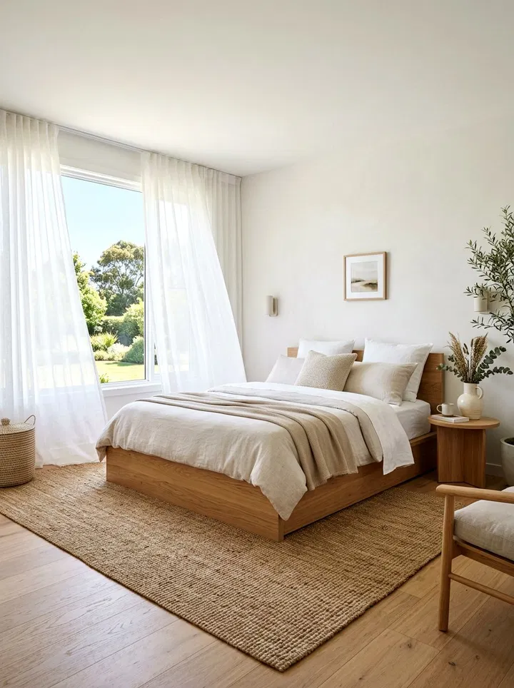
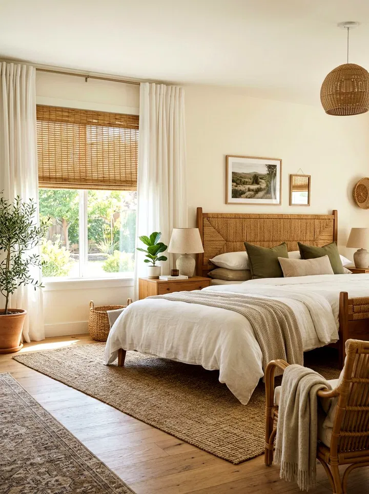
    Sheer white linen curtains are perfect for creating a light, breezy atmosphere. They allow sunlight to filter gently into your room, reducing harsh glare while still keeping things bright. The natural linen texture adds a subtle organic feel that pairs beautifully with wood furniture, woven decor, or neutral bedding. These curtains also move beautifully with airflow, giving your bedroom a fresh, open feel.

    3. Soft Sage Green Drapes

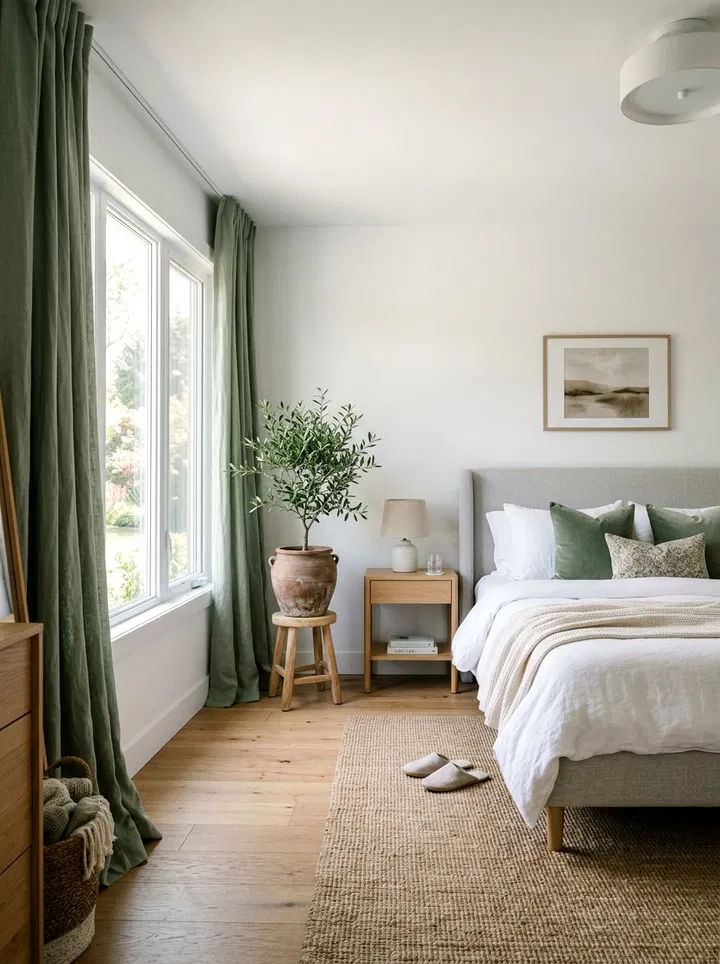
    Sage green is a calming, nature-inspired color that works effortlessly in spring interiors. It’s soft enough to act as a neutral but still brings in a refreshing hint of color. Pair these drapes with white walls, light wood finishes, or botanical decor to create a serene, spa-like bedroom. Opt for lightweight fabrics for an airy look or thicker materials if you want more light control.

    4. Cheerful Pastel Yellow Sheers

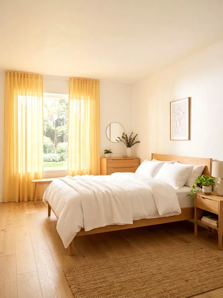
    Pastel yellow curtains mimic the warmth of sunshine, making them ideal for rooms that don’t get much natural light. When sunlight passes through, it creates a soft golden glow that instantly lifts the mood of the space. Pair them with white or gray bedding to keep the look balanced and modern. These curtains are especially great for creating a bright and happy morning environment.

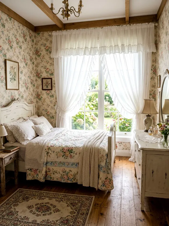
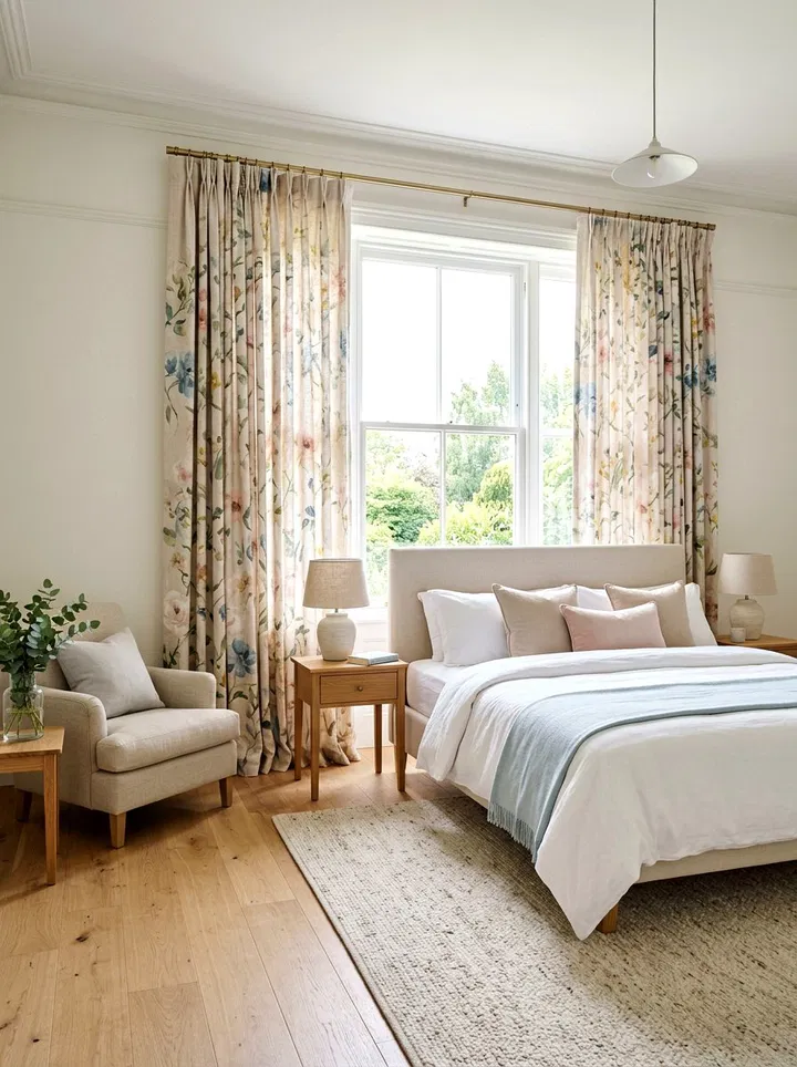
    5. Floral Print Statement Panels

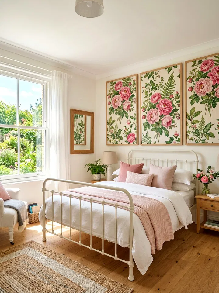
    Floral curtains bring the beauty of spring blooms right into your bedroom. Large-scale patterns make a bold statement, while smaller prints create a soft, vintage feel. To tie the room together, pick one or two colors from the print and repeat them in pillows, throws, or rugs. Floral panels are perfect for adding personality without needing to redecorate the entire room.

    6. Light Blue Linen Curtains

    Light blue curtains evoke the calmness of the sky and ocean, making them ideal for a relaxing bedroom. Linen fabric adds a casual, slightly textured look that feels effortless and inviting. Pair them with whites, sandy tones, or soft grays for a coastal-inspired design. This combination helps create a peaceful space where you can unwind easily.

    7. Elegant Embroidered Botanicals

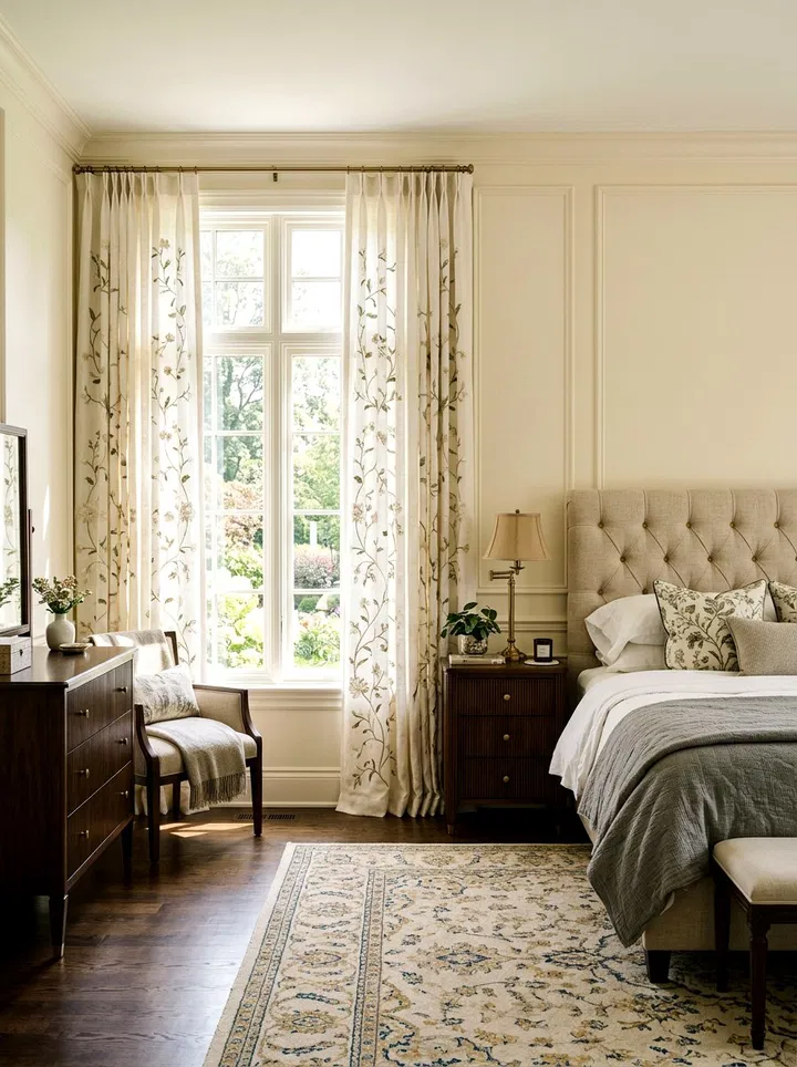
    Curtains with embroidered botanical details add subtle sophistication. The stitching creates a delicate, raised texture that catches light beautifully. Choose neutral backgrounds like cream or soft white so the embroidery stands out without overwhelming the room. This style works well if you want a refined, nature-inspired look without bold prints.

    8. Dusty Rose Velvet Drapes

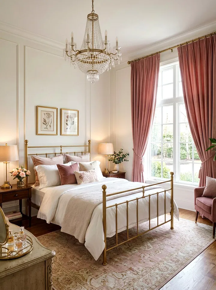
    Dusty rose velvet offers a soft, romantic feel while still being practical. The thicker fabric blocks light effectively, making it ideal for better sleep. Its gentle pink tone keeps it feeling appropriate for spring, especially when paired with lighter fabrics like cotton or linen. The slight sheen of velvet also adds a luxurious glow when light hits it.

    9. Classic Gingham Patterns

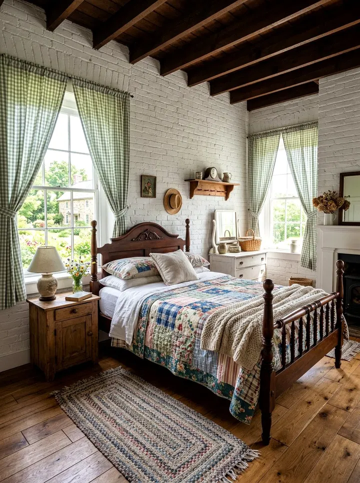
    Gingham curtains bring a cheerful, farmhouse-inspired vibe. Their simple checkered pattern adds visual interest without being overwhelming. Choose soft colors like blue, green, or yellow for a fresh spring look. Pair them with solid bedding and rustic decor to create a cozy and inviting bedroom.

    10. Artistic Macrame Panels

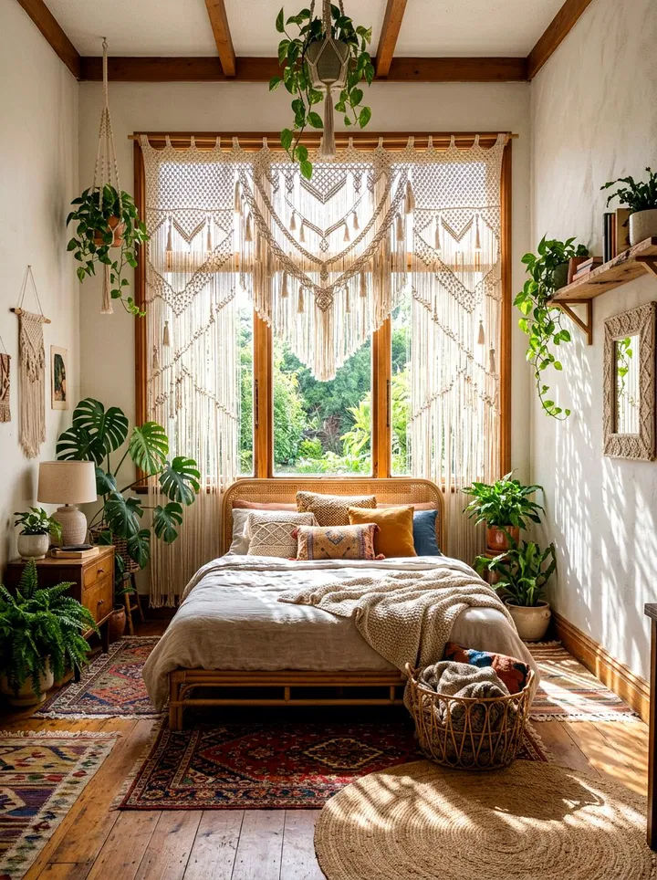
    Macrame window treatments add a handcrafted, artistic touch. These woven designs allow light to pass through while creating beautiful patterns on your walls. They’re perfect for boho-style bedrooms filled with plants, natural wood, and earthy tones. Use them as standalone pieces or layer them with sheer curtains for added dimension.

    11. Neutral Curtains with Tassel Accents

    Neutral curtains don’t have to be boring—tassel details add subtle charm and movement. The soft textures and playful edges create a relaxed, lived-in feel. These curtains work well with almost any decor style and are especially effective in minimalist or Scandinavian-inspired bedrooms.

    12. Playful Pom-Pom Trim Curtains

    Pom-pom trim curtains add a lighthearted and fun element to your bedroom. They’re perfect for adding personality without overwhelming the design. Use them in guest rooms, kids’ rooms, or even master bedrooms if you want a touch of whimsy. Choose neutral fabrics with colored trims for a balanced look.

    13. Calming Lavender Cotton Curtains

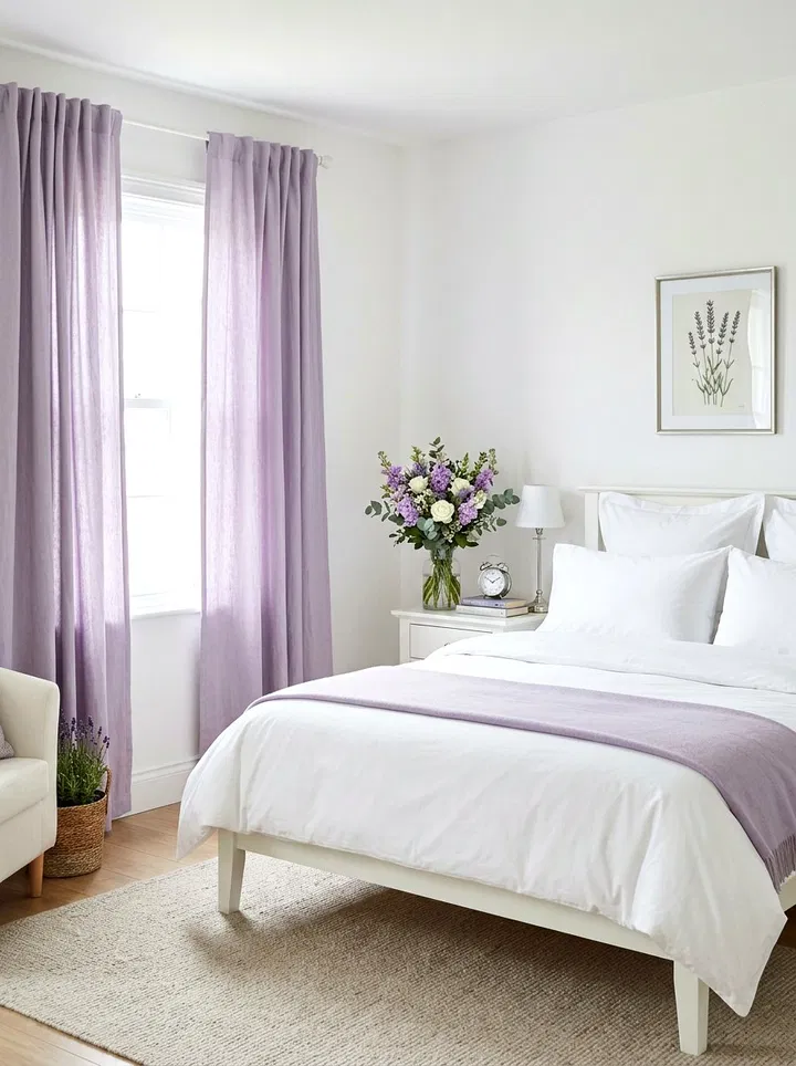
    Lavender is known for its calming and stress-relieving qualities. Cotton curtains in this shade are breathable and lightweight, making them ideal for spring. Pair them with white or silver accents for a clean, modern look. This color creates a peaceful environment perfect for rest and relaxation.

    14. Striped Café Curtains

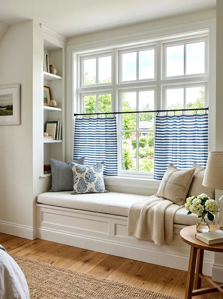
    Café curtains cover only the lower half of your window, giving you privacy while letting in plenty of light. Stripes add a crisp and structured look, and they can even make windows appear taller or wider. This style is great for small bedrooms or areas where full-length curtains feel too heavy.

    15. Romantic Ruffled Voile Panels

    Ruffled voile curtains create a soft, dreamy aesthetic. The layers of fabric add volume and movement, making the room feel more romantic and airy. These are perfect for vintage or shabby-chic interiors and pair beautifully with soft pastels and delicate decor.

    16. Mint Green Blackout Curtains

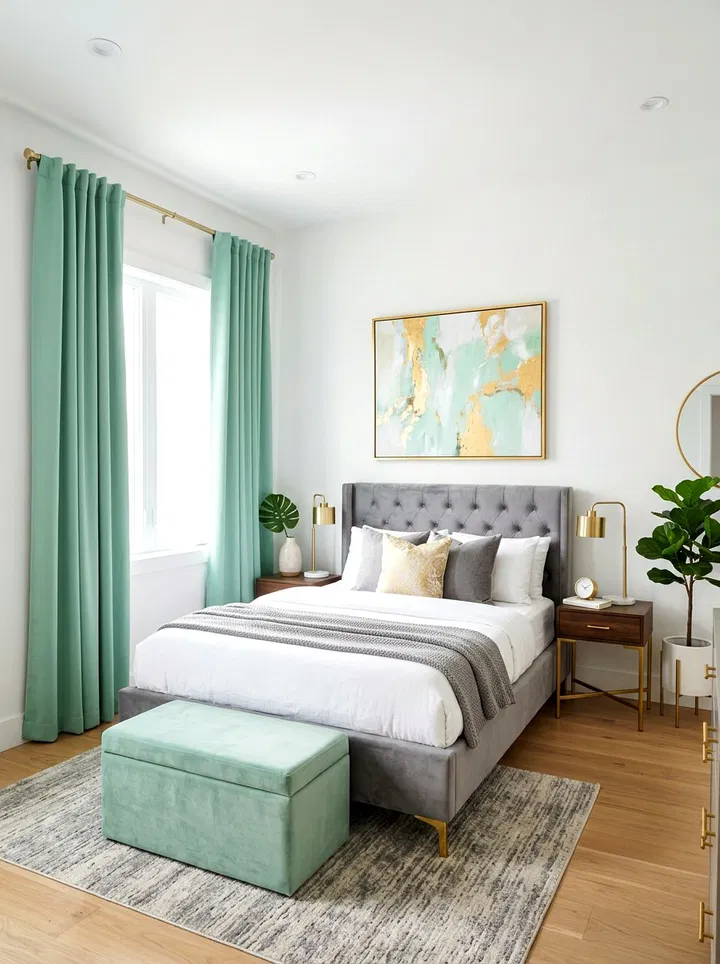
    Mint green blackout curtains combine functionality with fresh design. They block unwanted light while still adding a cheerful and modern touch. Pair them with white furniture or gold accents to keep the look bright and stylish.

    17. Watercolor Floral Designs

    Watercolor floral curtains offer a softer take on traditional prints. The blended colors create a gentle, artistic effect that feels calming rather than busy. These curtains can serve as a focal point while still maintaining a peaceful atmosphere.

    18. Timeless Toile Prints

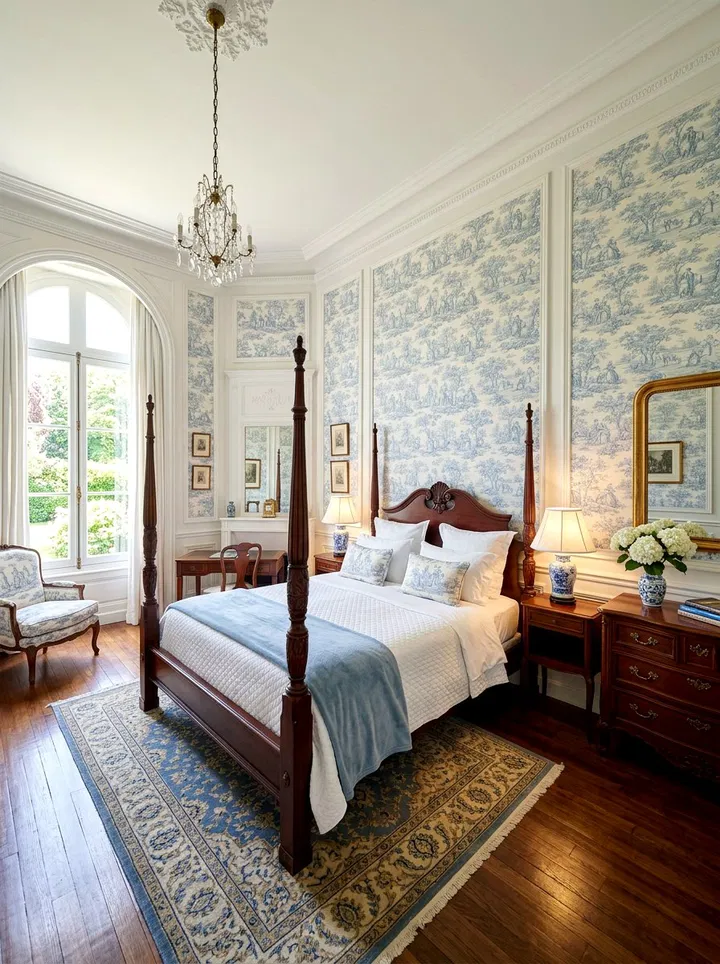
    Toile prints bring elegance and storytelling into your space. Their detailed patterns often depict nature or countryside scenes, adding depth and charm. Choose soft spring colors to keep the look light and airy.

    19. Warm Peach Linen Curtains

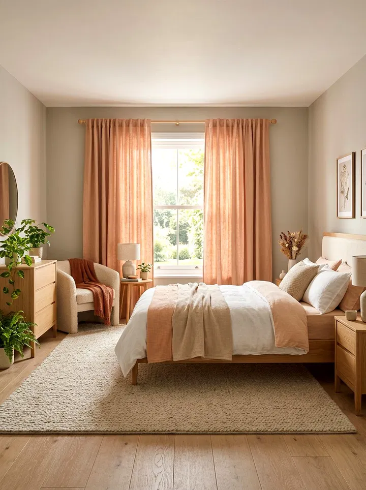
    Peach tones add warmth without being overpowering. Combined with linen texture, they create a cozy yet fresh feel. This color works well with neutral palettes and adds a subtle glow to the room.

    20. Scalloped Edge Details

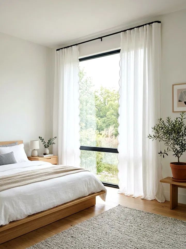
    Scalloped edges add a decorative and unique touch to your curtains. The curved design softens the look of your windows and adds a custom, high-end feel. This works especially well with simple or neutral fabrics.

    21. Bamboo Shades with Fabric Curtains

    Combining bamboo shades with soft curtains creates contrast and depth. The bamboo adds structure and natural texture, while the fabric keeps things soft and airy. This pairing works well in nature-inspired or minimalist bedrooms.

    22. Olive Green Sheer Panels

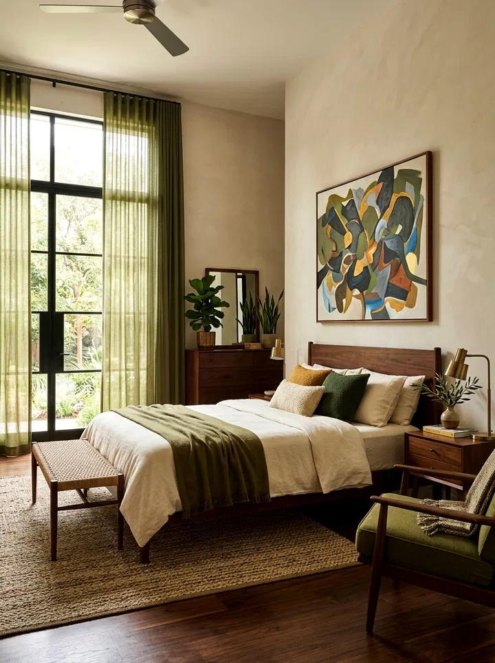
    Olive green sheers bring a slightly deeper tone while still allowing light to pass through. They create a moody yet soft ambiance that pairs beautifully with wood and neutral tones.

    23. Subtle Gold Thread Accents

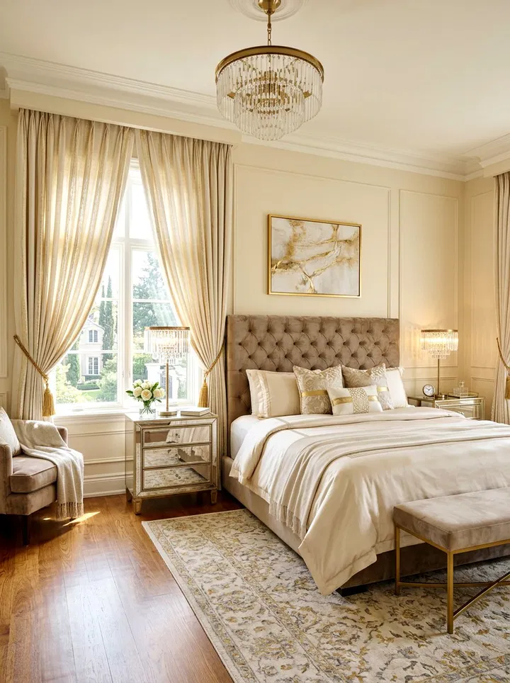
    Curtains with metallic threads add a hint of sparkle without being overwhelming. As sunlight hits the fabric, it creates a warm shimmer that enhances the overall lighting of your room.

    24. Boho Fringe Curtains

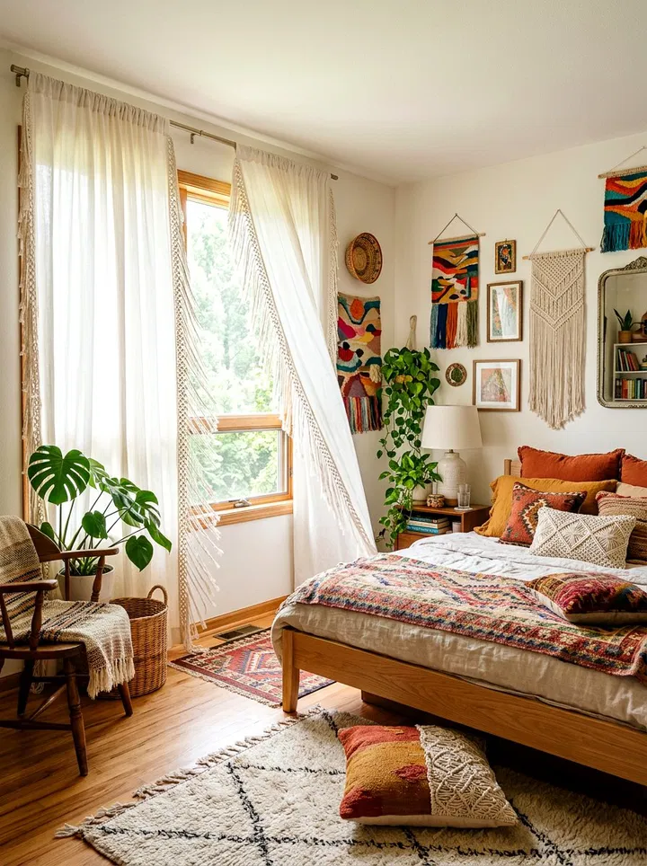
    Fringe details add movement and texture, giving your bedroom a relaxed, artistic feel. These curtains are perfect for bohemian spaces filled with layered textiles and natural elements.

    25. Sky Blue Pinch Pleat Drapes

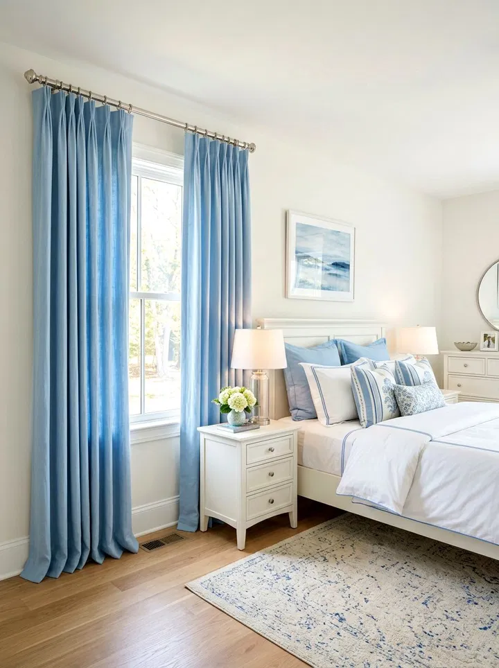
    Pinch pleat curtains provide a structured, elegant finish. In sky blue, they feel fresh and calming while still looking polished. This style works well in both modern and traditional bedrooms.

    Conclusion

    Updating your curtains is one of the simplest ways to refresh your bedroom for spring. By choosing lighter fabrics, soft colors, and natural textures, you can create a space that feels brighter, calmer, and more inviting. Whether you prefer minimal elegance or playful patterns, these ideas offer endless inspiration for a seasonal transformation.

  • 20 Elegant Grey and White Living Room Ideas to Elevate Your Space

    Grey and white living rooms are effortlessly timeless. This neutral pairing creates a calm, sophisticated base that works with almost any design style—from cozy and rustic to sleek and modern. The real beauty lies in how flexible this palette is. By layering textures, playing with contrast, and adding thoughtful accents, you can completely transform the mood of your space.

    Whether you want something minimal and airy or bold and dramatic, these ideas will help you design a grey and white living room that feels both stylish and inviting.

    1. Embrace a Full Monochrome Look

    A monochrome grey-and-white living room is all about subtle variation and balance. Instead of relying on just one shade, layer multiple tones—from soft dove grey to deep charcoal—to create dimension. Start with crisp white walls to reflect light and make the space feel open. Then introduce grey through larger furniture pieces like sofas or area rugs. Add depth with smaller accents such as cushions, throws, and décor in varying textures like velvet, linen, or knit. The key is contrast through texture rather than color, which keeps the room visually interesting while maintaining a clean, cohesive look.

    2. Add Vibrant Accent Pieces

    Grey and white provide the perfect neutral backdrop for experimenting with color. You can easily refresh your space seasonally by swapping out accent pieces like pillows, throws, or artwork. Try mustard yellow, deep navy, emerald green, or even blush pink for a modern touch. If you prefer subtlety, incorporate natural elements like indoor plants or dried florals. The beauty of this approach is flexibility—you can keep the base timeless while allowing accents to evolve with your style.

    3. Keep It Scandinavian-Inspired

    Scandinavian design thrives on simplicity, functionality, and warmth. Use light grey upholstery, white walls, and minimal décor to create a serene foundation. Then layer in cozy textures like wool blankets, sheepskin rugs, and soft cushions. Wooden elements—such as a pale oak coffee table or shelving—add warmth and prevent the space from feeling too cold. Keep clutter to a minimum and focus on intentional pieces that combine beauty with purpose.

    4. Go Industrial with Raw Materials

    An industrial-style grey and white living room leans into raw, unfinished elements. Think exposed brick walls painted white, concrete flooring, and metal fixtures. A grey sectional sofa paired with a reclaimed wood coffee table creates a balanced mix of rugged and refined. Incorporate industrial lighting—like black metal pendant lights or exposed bulbs—to enhance the aesthetic. This look works especially well in loft-style spaces or homes with architectural character.

    5. Create a Relaxed Coastal Feel

    Bring a sense of calm and openness into your living room with a coastal-inspired approach. Use soft greys and crisp whites alongside natural materials like rattan, wicker, and driftwood. Choose light, breathable fabrics for curtains and upholstery to maintain an airy feel. Subtle décor elements like ocean-inspired artwork, seashell accents, or striped textiles can reinforce the theme without overwhelming the space. The goal is to create a breezy, laid-back environment that feels like a retreat.

    6. Introduce Glamorous Elements

    For a more luxurious take, incorporate glam details into your grey and white palette. Opt for plush velvet seating, marble surfaces, and metallic finishes like gold, brass, or chrome. A statement chandelier or mirrored furniture can instantly elevate the room. Keep the base neutral so these elegant elements stand out without feeling excessive. This style is perfect if you want a living room that feels polished and sophisticated.

    7. Layer Different Textures

    Texture is essential in a neutral space. Combine soft and structured materials—like a linen sofa, wool rug, leather ottoman, and faux fur throws—to create a layered, inviting look. Even subtle textures like woven baskets or ribbed ceramics can add interest. Mixing textures prevents the room from feeling flat and gives it a more dynamic, lived-in feel.

    8. Keep It Clean and Minimal

    A minimalist grey-and-white living room focuses on simplicity and intentional design. Choose a few high-quality pieces rather than filling the space with décor. Stick to clean lines, uncluttered surfaces, and functional furniture. Built-in storage can help keep everything organized. This approach not only looks modern but also creates a calming environment that’s easy to maintain.

    9. Add Rustic Touches

    Introduce warmth and character by blending rustic elements into your space. Use reclaimed wood, distressed finishes, and vintage-inspired décor to soften the cool tones of grey and white. A weathered coffee table, antique mirror, or woven textiles can add charm and personality. This combination creates a cozy, farmhouse-inspired feel that’s both welcoming and stylish.

    10. Play with Bold Patterns

    Patterns can bring energy and movement into a neutral room. Incorporate geometric rugs, patterned cushions, or even wallpaper in grey and white tones. To keep things cohesive, limit yourself to two or three patterns and ensure they share a similar color palette. This adds visual interest without making the space feel chaotic.

    11. Use High-Contrast Styling

    Create a dramatic and modern look by emphasizing contrast. Pair bright white walls with deep charcoal furniture or vice versa. Black accents—like frames, lighting fixtures, or side tables—can further enhance the contrast. This bold approach adds definition and structure to the room, making it feel more dynamic and visually striking.

    12. Maximize Natural Light

    Natural light plays a huge role in how grey tones appear. Use sheer white curtains or leave windows uncovered to allow sunlight to flow freely. Position mirrors strategically to reflect light and make the room feel larger. Choose lighter shades of grey for walls and furniture to keep the space feeling bright and open.

    13. Mix Styles for an Eclectic Look

    An eclectic grey-and-white living room allows you to combine different styles while maintaining a cohesive base. Pair modern furniture with vintage finds, or mix sleek pieces with artistic décor. The neutral palette helps tie everything together, so you can experiment with unique textures, shapes, and accessories without overwhelming the space.

    14. Try Mid-Century Modern Design

    Mid-century modern design works beautifully with a grey-and-white palette. Look for furniture with clean lines, tapered legs, and organic shapes. Combine grey upholstery with white surfaces and warm wood tones for balance. Add retro-inspired décor like abstract art or geometric patterns to complete the look.

    15. Design a Cozy Corner

    Create a dedicated space for relaxation within your living room. A comfortable armchair, soft throw blanket, and warm lighting can turn any corner into a cozy retreat. Add a small side table for books or drinks to make it functional. This is perfect for reading, unwinding, or simply enjoying a quiet moment.

    16. Build a Gallery Wall

    A gallery wall is a great way to add personality to your space. Use frames in black, white, or metallic finishes to keep things cohesive. Mix artwork, photography, and prints to create visual interest. Arrange them in a structured grid or a more organic layout depending on your style.

    17. Mix Light and Dark Furniture

    Avoid a flat look by combining different shades of grey and white in your furniture. For example, pair a light grey sofa with darker chairs or a white coffee table with a charcoal rug. This layering creates depth and keeps the room visually balanced.

    18. Highlight the Fireplace

    If your living room has a fireplace, make it a focal point. Paint it in a contrasting shade or use textured materials like stone or tile. Arrange seating around it to create a natural gathering area. A well-designed fireplace can anchor the entire room.

    19. Install Floating Shelves

    Floating shelves are both practical and stylish. Use them to display books, plants, and decorative objects that complement your color scheme. Keep the styling simple to maintain a clean look. They’re especially useful in smaller spaces where you want storage without bulk.

    20. Choose Statement Lighting

    Lighting can completely transform your living room. A bold chandelier, sculptural floor lamp, or modern pendant light can act as a centerpiece. Choose designs that complement your overall style while adding a touch of personality. Layer different lighting sources—ambient, task, and accent—to create a warm and inviting atmosphere.

  • 15 Stylish Coffee Table Centerpiece Ideas to Elevate Your Living Room

    Your coffee table is more than just a place to set drinks—it’s a focal point that can instantly define your living room’s style. With the right centerpiece, you can add personality, warmth, and visual interest without a full redesign. Whether your aesthetic leans modern, rustic, or eclectic, these creative ideas will help you style your coffee table like a pro.

    1. Sculptural Vases That Make a Statement

    A bold, sculptural vase can instantly elevate your coffee table into an artistic display. Look for unique shapes, asymmetrical designs, or textured finishes like matte ceramic or glass. You can leave it empty for a minimalist feel or add fresh stems for a softer touch. Grouping multiple vases at varying heights creates even more visual drama.

    2. Layered Tray Styling for a Polished Look

    Using a decorative tray is one of the easiest ways to create a cohesive centerpiece. Arrange candles, books, or small plants within the tray to keep everything organized while adding dimension. This technique works beautifully in both modern and farmhouse interiors, depending on the tray material you choose.

    3. Fresh Floral Arrangements for Instant Life

    Nothing refreshes a space like fresh flowers. Choose blooms that complement your color palette, whether soft neutrals or vibrant tones. A simple bouquet of roses or tulips offers elegance, while mixed wildflowers create a relaxed, natural vibe.

    4. Coffee Table Books with Personality

    Stacking a few well-chosen coffee table books adds sophistication and tells a story about your interests. Choose books on topics like travel, fashion, or interior design. Top them with a decorative object—like a small sculpture or candle—for a styled finish.

    5. Cozy Candle Clusters with Varying Heights

    Candles bring warmth and ambiance to any space. Mix pillar candles, tealights, and tapers in different holders to create layers of soft lighting. Stick to a cohesive color palette for a refined look, or mix materials like glass and metal for added texture.

    6. Minimalist Succulent Displays

    If you want greenery without the upkeep, succulents are the perfect solution. Arrange a few in a shallow dish or modern planter. Their clean lines and subtle tones make them ideal for minimalist or contemporary spaces.

    7. Decorative Bowls Filled with Orbs

    A textured bowl filled with decorative spheres is simple yet visually impactful. Choose materials like wood, ceramic, or glass for the orbs, and match them with your room’s overall aesthetic. This is a low-maintenance option that always looks styled.

    8. Seasonal Decor That Evolves Year-Round

    Switching your centerpiece with the seasons keeps your space feeling fresh. Think pumpkins in fall, pinecones in winter, or seashells in summer. This flexible approach allows you to refresh your decor without starting from scratch.

    9. Artistic Figurines for a Personal Touch

    Unique figurines or small sculptures can add character and spark conversation. Choose pieces that reflect your personality—whether abstract designs, animals, or cultural artifacts—and pair them with books or greenery for balance.

    10. Mixed Material Arrangements for Texture

    Combining materials like wood, metal, glass, and stone creates a rich, layered look. For example, a wooden bowl with metallic accents or a glass vase paired with natural elements adds contrast and visual depth.

    11. Lantern and Candle Pairings for Warm Ambiance

    Lanterns paired with candles create a cozy, inviting atmosphere. This setup works especially well in rustic or transitional interiors. Choose neutral tones or metallic finishes so they blend seamlessly with your decor.

    12. Coastal-Inspired Centerpieces for a Relaxed Feel

    Bring a beachy vibe into your home with coastal elements like driftwood, shells, or coral. Arrange them in a tray or glass bowl, and incorporate soft blues and whites to complete the look. This style instantly creates a calm, airy atmosphere.

    13. Geometric Decor for a Modern Edge

    Geometric sculptures or decor pieces add a contemporary touch to your coffee table. Opt for clean lines and metallic finishes to create a bold focal point. Pair them with softer elements like books or plants to balance the look.

    14. Vintage Finds for Character and Charm

    Incorporating vintage items—like antique clocks, old books, or small collectibles—adds depth and storytelling to your space. Arrange them thoughtfully on a tray or runner to keep the display cohesive.

    15. Decorative Fruit Bowls for a Fresh Pop of Color

    A bowl filled with fresh or faux fruit is a timeless centerpiece. Bright colors like lemons, apples, or oranges add energy and warmth. For a more elevated look, mix in greenery or flowers for extra texture.

    Conclusion

    A beautifully styled coffee table can completely transform your living room without requiring a major overhaul. By combining elements like height, texture, and personal touches, you can create a centerpiece that feels both intentional and effortless. Whether you prefer minimalist greenery, cozy candle arrangements, or bold artistic pieces, the key is to keep your design balanced and reflective of your style.

    With these ideas, your coffee table becomes more than just functional—it becomes a true design statement.

  • 25 Stunning Bathroom Cabinet Color Ideas to Elevate Your Space

    Bathrooms aren’t just functional—they’re personal spaces where style and comfort come together. One of the most impactful ways to refresh your bathroom without a full renovation is by updating your cabinet color. The right shade can instantly change the mood of the room, making it feel brighter, cozier, more modern, or more luxurious.

    From timeless neutrals to bold statement hues, these expanded bathroom cabinet color ideas will help you create a space that truly reflects your style.

    1. Navy Blue Elegance

    Navy blue cabinets bring depth and refinement to your bathroom. This rich color adds a luxurious feel without being overly dramatic. It pairs beautifully with gold or brass hardware for a high-end look, while white countertops help balance its intensity. Navy works especially well in both classic and modern spaces, offering versatility with a bold edge.

    2. Soft Sage Serenity

    Sage green is a soothing, nature-inspired color that instantly creates a relaxing environment. Its muted tone makes it perfect for those who want subtle color without overwhelming the space. Pair sage cabinets with natural wood accents, stone countertops, and soft whites to enhance that calm, spa-like atmosphere.

    3. Matte Black Statement

    Matte black cabinets are sleek, modern, and undeniably bold. Unlike glossy finishes, matte black feels more refined and less harsh. It works best when balanced with lighter walls, mirrors, and countertops to avoid making the room feel too dark. Add metallic accents like chrome or brushed gold for a sophisticated finish.

    4. Warm Beige Comfort

    Warm beige cabinets create a cozy and welcoming feel. This neutral shade is ideal if you want a soft, timeless look that doesn’t feel cold or stark. It blends beautifully with natural textures like wood and stone, making it perfect for rustic, traditional, or transitional bathroom designs.

    5. Crisp White Classic

    White cabinets are a forever favorite—and for good reason. They reflect light, making even the smallest bathrooms feel larger and brighter. White cabinetry pairs effortlessly with any color palette, allowing you to easily update other elements like hardware, walls, or décor over time.

    6. Forest Green Depth

    Forest green offers a rich, earthy tone that adds both drama and tranquility. It creates a strong visual impact while still feeling grounded and natural. Pair it with wood finishes, marble countertops, or brass fixtures to achieve a luxurious yet organic look.

    7. Charcoal Gray Modernity

    Charcoal gray strikes the perfect balance between bold and neutral. It adds contrast without being as intense as black, making it a great option for modern bathrooms. Combine it with matte black fixtures or stainless steel accents for a cohesive, contemporary aesthetic.

    8. Blush Pink Charm

    Blush pink cabinets introduce a soft, warm glow to your bathroom. This color feels elegant and slightly playful, especially when paired with gold or brass details. It works beautifully in both modern and vintage-inspired spaces, offering a unique twist on traditional neutrals.

    9. Light Oak Natural Warmth

    Light oak cabinetry highlights the beauty of natural wood grain, bringing warmth and texture into your bathroom. It’s perfect for minimalist, Scandinavian, or rustic designs. Pair it with white walls and simple décor to let the natural material shine.

    10. Teal Vibrance

    Teal is a bold, eye-catching color that adds personality without feeling overwhelming. It strikes a balance between blue and green, making it versatile for different styles. Teal cabinets stand out best against neutral backgrounds and pair well with gold or black hardware.

    11. Pale Blue Calmness

    Pale blue cabinets create a light, airy feel that’s perfect for relaxing spaces. This soft shade reflects light beautifully and works well in coastal, classic, or minimalist bathrooms. Pair it with white accents and natural textures for a fresh, calming vibe.

    12. Creamy Soft Neutral

    Cream cabinets offer a warmer alternative to pure white. They maintain brightness while adding a hint of softness and comfort. This shade works well in traditional or farmhouse-style bathrooms and pairs nicely with warm-toned fixtures and finishes.

    13. Deep Burgundy Luxury

    Burgundy cabinets bring richness and elegance to your bathroom. This deep, wine-inspired color feels bold and dramatic while still maintaining sophistication. Pair it with metallic accents and lighter surfaces to keep the space balanced.

    14. Light Gray Simplicity

    Light gray cabinets provide a subtle and refined look. This versatile neutral complements both warm and cool tones, making it easy to match with various materials and finishes. It’s perfect for achieving a clean, modern, and calming aesthetic.

    15. Dusty Rose Vintage Touch

    Dusty rose is a muted pink that offers a romantic, vintage-inspired feel. It adds color without being too bold, making it a great option for those who want something unique yet understated. Pair it with marble surfaces and metallic hardware for a polished look.

    16. Slate Blue Sophistication

    Slate blue is a muted, slightly gray-toned blue that feels both modern and timeless. It adds depth without overpowering the space and works well with both warm and cool accents.

    17. Rich Espresso Boldness

    Espresso cabinets provide a deep, coffee-toned richness that enhances warmth and depth. They’re perfect for creating contrast in lighter bathrooms and pair beautifully with cream, beige, or white finishes.

    18. Soft Yellow Glow

    Soft yellow cabinets bring warmth and cheerfulness into your bathroom. This subtle hue brightens the space while maintaining a gentle, welcoming feel. It works best when paired with neutral tones to keep the look balanced.

    19. Pearl Gray Elegance

    Pearl gray adds a hint of shimmer and softness to your bathroom. It’s a refined neutral that feels modern yet subtle, perfect for smaller spaces that need light without stark brightness.

    20. Classic Black Contrast

    Classic black cabinets create a bold, dramatic look. When paired with white countertops or light walls, they offer a striking contrast that feels clean and modern. This choice is ideal for those who want a strong visual statement.

    21. Sky Blue Airiness

    Sky blue cabinets give your bathroom a fresh, breezy feel. This light tone helps open up the space, making it ideal for smaller bathrooms. It pairs beautifully with white and silver accents for a crisp finish.

    22. Mocha Brown Warmth

    Mocha brown cabinets bring warmth and richness to your bathroom. This earthy tone creates a cozy and grounded atmosphere, especially when combined with natural materials like wood and stone.

    23. Muted Lavender Softness

    Muted lavender adds a gentle, calming touch with a slightly unique twist. It’s perfect for creating a relaxing, spa-like environment while still offering a hint of color.

    24. Pastel Mint Freshness

    Pastel mint is light, playful, and refreshing. It adds personality to your bathroom without overwhelming the design. This shade works especially well in smaller spaces, helping them feel more open and lively.

    25. Warm Taupe Balance

    Taupe blends gray and beige tones, making it one of the most versatile neutrals. It adds warmth while maintaining a modern edge, making it suitable for a wide range of bathroom styles.

    Conclusion

    Your bathroom cabinet color plays a major role in shaping the overall look and feel of your space. Whether you prefer calming tones like sage and pale blue, timeless neutrals like white and beige, or bold choices like navy and black, there’s a perfect shade for every style.

    The key is not just choosing a color—but pairing it thoughtfully with the right hardware, countertops, and textures. With the right combination, even a simple cabinet update can completely transform your bathroom into a space that feels stylish, comfortable, and uniquely yours.

  • 15 Creative Corner Accent Wall Ideas to Transform Overlooked Spaces

    Corners are often the most underutilized areas in a home—but with the right design approach, they can become some of the most eye-catching features in any room. A thoughtfully styled corner accent wall adds dimension, personality, and purpose, turning empty nooks into intentional design moments.

    Whether you prefer bold statements or subtle textures, these reimagined ideas will help you elevate your space with style and creativity.

    1. Create a Statement with a Hand-Painted Mural

    Turn your corner into a true work of art with a custom-painted mural. From abstract designs to nature-inspired scenes, murals instantly personalize your space and create a one-of-a-kind focal point. This works especially well in creative spaces, kids’ rooms, or home offices where visual inspiration matters most.

    2. Add Depth with 3D Wall Panels

    For a modern and architectural feel, install 3D wall panels. These textured surfaces create movement and visual interest, especially when paired with strategic lighting. Choose geometric or wave patterns to give your corner a sleek, contemporary edge.

    3. Bring Nature Indoors with a Vertical Garden

    A living wall transforms any corner into a refreshing, calming feature. Use vertical planters, preserved moss, or low-maintenance greenery to add life and improve air quality. This idea is perfect for small spaces where traditional plants might not fit.

    4. Elevate the Space with a Metallic Finish

    Metallic paints in shades like gold, bronze, or silver reflect light beautifully, adding a subtle glow to your corner. This design works best in modern or glam interiors and can instantly make the area feel more luxurious without needing extra decor.

    5. Add Warmth with Vertical Wood Paneling

    Wood paneling brings natural warmth and texture while visually elongating your walls. Light wood tones create a modern, airy feel, while darker finishes add depth and sophistication. It’s a timeless solution that works in almost any room.

    6. Design a Cozy Corner with Woven Textures

    Introduce organic materials like rattan, bamboo, or woven panels for a soft, earthy aesthetic. This style pairs beautifully with bohemian or tropical interiors, creating a relaxed and inviting atmosphere.

    7. Make It Functional with a Chalkboard or Dry Erase Wall

    Combine style with practicality by turning your corner into a writable surface. Perfect for kitchens, home offices, or kids’ rooms, this idea keeps notes, reminders, and creativity all in one place while adding a playful touch.

    8. Brighten the Room with a Mirror Mosaic

    Mirrors are a powerful design tool, especially in small or dim spaces. A mosaic or large mirrored panels can reflect natural light, making the room feel bigger and brighter while adding a sophisticated shine.

    9. Add Character with a Brick or Faux Brick Finish

    Brick walls introduce texture and timeless appeal. Whether you go for real brick or a lightweight faux version, this look adds rustic charm and works beautifully in industrial or farmhouse-style interiors.

    10. Play with Color Using a Two-Tone Effect

    A two-tone painted corner adds subtle contrast and dimension. Try pairing a darker lower half with a lighter upper section to ground the space while keeping it airy. This is a simple yet effective way to modernize any room.

    11. Showcase Personality with a Minimalist Gallery Wall

    Turn your corner into a curated display of art or photos. Keeping the layout clean and cohesive ensures it enhances the space without overwhelming it. Black-and-white prints or neutral frames create a timeless look.

    12. Go Bold with Geometric Patterns

    Geometric designs add energy and a modern edge. Whether painted or applied with decals, bold patterns instantly draw attention and make your corner feel dynamic and unique.

    13. Experiment with Ombre Gradient Effects

    An ombre wall blends colors seamlessly from dark to light, creating a calming and sophisticated look. This works especially well in bedrooms or relaxation spaces where a soft visual flow enhances the ambiance.

    14. Add Artisanal Charm with Textured Plaster

    Textured plaster finishes bring depth and character through subtle imperfections. Earthy tones like beige or terracotta can create a Mediterranean-inspired feel, while white plaster keeps things minimal and refined.

    15. Refresh Instantly with Vibrant Wallpaper

    Wallpaper is one of the easiest ways to transform a corner. Choose bold florals, abstract prints, or tropical patterns to inject personality into your space. Peel-and-stick options make it renter-friendly and easy to update.

    Conclusion

    With a little creativity, even the smallest corner can become a standout feature in your home. From bold murals and geometric patterns to natural textures and functional designs, these corner accent wall ideas prove that no space has to go to waste.

    By choosing a style that reflects your personality and complements your existing decor, you can turn overlooked corners into beautiful, purposeful design elements that truly elevate your entire room.

  • The Texture Mixing Trick That Makes Rooms Feel Finished: How To Layer Textures For Polished Spaces

    We often think finishing a room is all about paint color or furniture placement, but the secret most designers lean on is texture. Texture gives depth, tells a room’s story, and, done right, cements a space so it reads as intentional rather than incidental. In this 2026 guide we’ll show the simple texture mixing trick that consistently moves a room from “nice” to “finished.” We’ll explain why texture matters, unpack the core principle of balancing contrast with cohesion, and give concrete steps for choosing, layering, and correcting textures in living rooms, bedrooms, kitchens, and bathrooms. Follow along and you’ll have a repeatable method to make any space feel polished without overhauling your budget.

    Why Texture Matters In Interior Design

    Texture is one of those design elements people sense before they can name. It affects how light behaves, how we perceive scale, and how comfortable we feel in a space. When we think of texture, we shouldn’t limit ourselves to fabrics: texture includes wall finishes, floor materials, trim, metal sheens, weave types, and even the negative space created by shadows.

    Why do we care so much? First, texture provides visual contrast without changing color. A matte plaster wall beside a glossy tile floor reads richer than two surfaces painted the same shade. Second, texture influences temperature perception: smooth, reflective surfaces tend to feel cooler, while nubby, tactile textiles make a place feel warm and lived-in. Third, texture anchors style. A room with layered textures reads intentional, think a mid-century sofa with a bouclé throw and a leather ottoman, because the variety signals thoughtfulness.

    We also need to consider touch. Even if occupants rarely run their hands along the walls, implied touchability matters. Textural variety invites interaction and suggests comfort. In retail and hospitality design, this principle is used to slow people down, luxury boutiques layer textures to make shoppers linger. At home, layering textures helps us feel grounded and at ease.

    Finally, texture helps with cohesion across different design pieces. A common mistake is matching colors closely but ignoring texture, leaving a room that feels flat. When we mix textures deliberately, color and pattern become more forgiving: a varied tactile palette makes diverse colors harmonize more easily. In short: texture matters because it delivers depth, comfort, and coherence, three pillars of a finished room.

    The Texture Mixing Trick: Balance Contrast With Cohesion

    At the heart of the texture mixing trick is a simple rule: balance contrast with cohesion. We want enough contrast to keep the eye moving, but enough cohesion so the room reads as a single, curated composition. Think of it like a musical arrangement, you need high notes and low notes, but they must share a key.

    Contrast comes from differences in scale, sheen, and material. Pair a large-scale, coarse element like reclaimed wood beams with finer, softer elements like linen cushions. The juxtaposition creates interest. Cohesion comes from repeating at least one common thread across those contrasts: a color, a pattern motif, or a material family. For instance, a brass lamp, brass drawer pulls, and a brass-accented mirror create a unifying echo that ties disparate textures together.

    We recommend using a three-tier texture strategy: anchor, mid-layer, and accents. The anchor is the dominant texture, flooring, large upholstery, or a statement wall. The mid-layer adds comfort and scale, rugs, curtains, and medium-sized furniture. Accents are small, tactile details, throws, pillows, decorative objects, and hardware. If we maintain contrast across tiers (rough anchor, soft mid-layer, smooth accents) while repeating one cohesive element (color, finish, or pattern), the room will feel polished.

    Another useful approach is the 60-30-10 idea adapted for texture: 60% anchor, 30% mid-layer, 10% accent. It’s not literal surface area but a visual weight guideline. We avoid overwhelming a room with too many dominant textures: instead, we let one texture lead while the others respond. That creates clarity.

    Finally, lighting is part of the trick. Texture is revealed by light, directional lighting emphasizes weave and relief, while diffused light softens them. We’re careful to test textures in the room’s actual lighting conditions before committing. The result of balancing contrast and cohesion is a layered space that looks effortless because every piece seems to belong.

    How To Choose Complementary Textures

    Choosing textures starts with understanding the mood we want. Do we aim for cozy warmth, modern crispness, or an eclectic collected look? Our choices should reinforce that intention. From there, we evaluate four key characteristics: scale, sheen, temperature, and density.

    Scale refers to the visual size of the texture’s pattern or surface variation. Large-scale textures, wide wood planks, oversized boucle, we’ll use sparingly as anchors: small-scale textures, fine linen, micro-knit, work well as accents. We avoid placing two large-scale textures next to each other unless one is muted: otherwise they compete.

    Sheen defines how reflective a surface is. High-gloss finishes bounce light and read contemporary: matte finishes absorb light and read calm. Mixing sheen creates depth, pairing a matte plaster wall with a satin wood tabletop, for example. We aim for a contrast in sheen but tie them together through color or material family.

    Temperature is more subtle but influential. Materials can read warm (wood, wool, terracotta) or cool (concrete, chrome, marble). We balance warm and cool textures for equilibrium. If a room skews warm, a cool metal or stone accessory can prevent it from feeling cloying.

    Density concerns how visually heavy a texture appears. A dense weave or heavy stone feels substantial: open weaves and glass feel light. Layering densities prevents a room from becoming monotonous, a heavy sofa offset by an airy rattan chair can breathe life into the layout.

    We find it helpful to create a quick texture inventory before shopping: list anchor, mid-layer, and accents, then note desired scale, sheen, temperature, and density for each. This checklist keeps purchases intentional. When in doubt, bring samples home, swatches, small material fragments, even a corner of fabric, and test them together in the space’s light. That physical comparison is worth more than any online photo.

    Layering Order: Walls To Accessories

    The order in which we layer textures matters because it sets visual hierarchy. We recommend working from the largest, least-changeable surfaces to the smallest details: walls → floors → major furniture → textiles → accessories. This order ensures foundational textures anchor the room and smaller textures refine the mood.

    Walls: Start with walls because their finish defines background texture. Options include smooth paint, plaster, textured wallpaper, wood paneling, or exposed brick. A textured wall can become an anchor, but if you choose it, keep other anchors simpler. For example, a limewash or Venetian plaster wall pairs well with streamlined furniture.

    Floors: Flooring is the second anchor. Natural hardwood, wide planks, or patterned tile set tone. If floors are visually rich, we often select a simpler wall finish and then use rugs for a contrasting mid-layer. Rugs are a powerful tool to introduce texture, they can be natural fiber, shaggy, flatweave, or kilim, each conveying a distinct character.

    Major Furniture: Large upholstered pieces should complement but not overpower the anchor textures. A leather sofa introduces smoothness and sheen: a linen sofa offers a softer, breathable texture. Keep the furniture scale in mind: a large sectional in a heavy weave will dominate and limit other textural choices.

    Textiles: Curtains, throws, and pillows are where we get playful. Curtains control the room’s vertical texture: heavier drapery feels formal, while lightweight sheers feel casual. Throws and pillows provide immediate, interchangeable texture updates, swap a chunky knit throw seasonally to shift warmth.

    Accessories: Finally, add metal finishes, ceramics, glass, baskets, and art. Accessories should echo one or two textures found earlier to maintain cohesion. For example, woven baskets can repeat the rug’s natural fiber, while brass picture frames can reflect a lamp’s finish.

    We always step back and edit. Too many textures without a repeated thread feel chaotic. We look for opportunities to repeat a shape, color, or material at least three times across the room, this repetition is the glue that makes layered textures read as intentional.

    Practical Texture Combinations For Common Rooms

    Living Room

    The living room benefits from a mix of comforting textiles and durable surfaces. A reliable combination is: hardwood floors (anchor), a low-pile wool or flatweave rug (mid-layer), a linen or leather sofa (major furniture), a boucle chair or chunky knit throw (textiles), and brass or matte-black metal accents (accessories). We like pairing smooth leather with nubby boucle because the contrast feels both modern and tactile.

    Bedroom

    Bedrooms should feel restful, so we prioritize softness with strategic contrast. Start with a painted or plastered wall in a soft matte finish (anchor), hardwood or sisal flooring with a plush underfoot rug (mid-layer), and an upholstered bed, linen for cool climates, velvet for drama. Layer cotton or linen bedding over a wool blanket, and use a mix of pillow textures: sateen, dobby weave, and embroidery. Add wood bedside tables and a ceramic lamp to balance tactile variety.

    Kitchen

    Kitchens are high-function areas where texture must be both aesthetic and practical. Choose a durable tile or stone floor (anchor) and consider a subtle textured backsplash, subway tile with a hand-glazed finish, for example. Countertops can be honed stone for a matte look or polished for reflection. Bar stools in leather or rattan add a human scale to hard surfaces. Metallic hardware, brass, nickel, or blackened steel, introduces sheen without competing with primary textures.

    Bathroom

    Bathrooms read as spa-like when soft and reflective textures are in balance. Use large-format matte tiles on the floor (anchor) and a slightly reflective subway or glazed tile for the shower wall (mid-layer). Towels and bathmats in thick cotton or bamboo terry provide plushness. Introduce wood or stone shelving and a glass or mirrored accessory to keep the space feeling open.

    Home Office

    An effective home office combines professionalism with comfort. Start with a smooth painted wall or subtle wallpaper (anchor), a medium-pile rug for acoustic damping (mid-layer), a leather or upholstered desk chair (major furniture), linen window treatments to diffuse light, and a mix of metal and wooden desktop accessories. Textural balance helps with focus, a tactile desk surface and comfortable chair make long hours more sustainable.

    Outdoor-Adjacent Spaces

    Porches and sunrooms need weather-appropriate textures: slate or concrete floors, outdoor-grade wicker or teak furniture, quick-dry cushions, and woven rugs designed for moisture resistance. Mix in glazed ceramics and metal planters for contrast. Outdoor textures should be rugged but layered for comfort.

    Common Mistakes And Quick Fixes

    Mistake: Too Many Dominant Textures

    Fix: Choose one dominant anchor and simplify surrounding elements. If your reclaimed wood wall and heavy-patterned tile both compete for attention, mute one, paint the wood a soft tone or swap the tile for a simpler floor. Remember the 60-30-10 visual-weight idea.

    Mistake: Matching Color But Missing Texture

    Fix: If everything is the same shade but still feels flat, introduce a contrasting sheen or weave. A matte wall with a glossy lamp or a velvet pillow next to a linen duvet creates depth without changing the palette.

    Mistake: Overuse of Identical Materials

    Fix: Repetition can be powerful, but too much of one material (e.g., all chrome finishes) can feel sterile. Break it up with organic textures, wood, woven fibers, or a single warm metal like brass to provide contrast.

    Mistake: Ignoring Scale and Proportion

    Fix: If a room feels visually out of balance, reassess scale. Large-scale textures need room to breathe. Swap a large-patterned rug for one with a subtler repeat, or add a few small-scale textures (throws, pillows) to offset a heavy sectional.

    Mistake: Not Testing in Real Light

    Fix: Always view samples in the room’s actual lighting, morning and evening. A plaster finish that looks warm under midday sun may read flat in the evening: add a reflective accent or a warmer lamp to correct for ambient shifts.

    Quick Fixes We Use Regularly

    • Swap pillows: Changing two or three pillow covers is the fastest way to shift a room’s texture story.
    • Add a single woven basket: It introduces natural fiber and storage without commitment.
    • Layer a runner or small rug over a larger rug: It adds immediate scale contrast and can define zones.
    • Introduce one reflective object: A mirror, tray, or lamp can lift a flat composition.

    These small edits let us correct texture missteps without a full redesign. We aim to edit ruthlessly: if an item doesn’t reinforce the room’s texture narrative, it goes.

    Conclusion

    Layering textures is a deceptively simple way to make rooms feel finished, and the best part is it’s repeatable. By balancing contrast with cohesion, working from walls to accessories, and applying the anchor/mid-layer/accents strategy, we can craft spaces that look curated yet lived-in. Start small: pick one room, identify your anchor texture, and introduce two contrasting textures with a shared thread. With practice, texture mixing becomes our go-to trick for polished, welcoming spaces that hold up over time.

  • The Warm Lighting Trick That Fixes Harsh Rooms Fast: How To Soften Any Space

    We’ve all been in a room that feels sharp, clinical, or just… uninviting. Often it’s not the furniture or the paint, it’s the lighting. In 2026, with more lighting options and smarter bulbs than ever, a simple shift to warm lighting can transform a harsh room into a cozy, flattering space in minutes. In this guide we’ll show why cool, blue-heavy light creates that unfriendly vibe, what the “warm lighting trick” really is, and how to apply it fast with bulbs, fixtures, and layering tactics that work in real homes. No jargon, no expensive renovations, just practical, design-backed steps that give immediate results.

    Why Harsh Lighting Makes Rooms Feel Cold And Unwelcoming

    Harsh lighting usually means light that’s too bright, too blue, or too focused in the wrong places. Commercial-grade fluorescent tubes, high-Kelvin LEDs, and unshaded recessed cans are common culprits. Psychologically, blue-white light stimulates alertness and mimics daylight: that’s useful in offices, but in living rooms, bedrooms, and dining areas it can make surfaces look washed-out and people appear sallow.

    There are three overlapping reasons a room feels “harsh.” First, color temperature: light above ~4000K tends toward blue, which reduces warmth and intimacy. Second, contrast and glare: a single bright source in a dark room produces sharp shadows and visual discomfort. Third, spectral quality: cheap bulbs with poor color rendering can distort colors and skin tones, making everything look unnatural.

    We should also account for context. A room painted in cool grays or whites will accentuate blue lighting: conversely, warm-toned walls can clash with cool bulbs and create visual dissonance. Reflective surfaces, glossy floors, mirrors, stainless steel, amplify glare and make light feel clinical. Finally, our expectations matter: we associate warm light with evening, comfort, and relaxation, whereas bright white light reads as “task mode.” When those cues clash with a room’s function, it feels unwelcoming.

    Understanding these causes helps us fix the problem without gutting the space. The warm lighting trick targets color temperature, diffusion, and layering, the three levers that change a room’s mood quickly and cost-effectively.

    The Warm Lighting Trick: What It Is And Why It Works

    The warm lighting trick is straightforward: shift primary light sources toward warmer color temperatures (lower Kelvin), improve diffusion to reduce glare, and layer light so illumination feels even and intentional. It’s not about making everything dim, it’s about changing the quality of light so materials and faces look better.

    Why this works comes down to perception and physiology. Warm light (roughly 2200K–3000K) increases perceived coziness because it contains more red and amber wavelengths that our brains associate with sunsets, firelight, and candlelight. These wavelengths flatter skin tones, deepen textures, and soften shadows. Diffused light spreads more evenly, reducing hard-edged shadows that feel “harsh.” Layering provides the right brightness where we need it while keeping the overall scene gentle and three-dimensional.

    We’ve seen this in practice: swapping a single cool 4000K fixture for a 2700K pendant plus table lamps and an accent fixture instantly changed a room from sterile to hospitable. The trick is efficient and reversible, no repainting required. It’s compatible with smart bulbs too, so you can tune scenes for day and night. The rest of the article breaks the trick into actionable steps so we can assess, pick products, and carry out changes based on room function and budget.

    How To Assess Your Room’s Lighting Needs Quickly

    Before buying bulbs or fixtures, take a quick diagnostic tour. We recommend a 7-point assessment that takes less than ten minutes and gives a clear plan.

    1. Identify the room’s primary functions. Is it for relaxing, dining, working, or circulating? Rooms used for relaxation benefit most from warm light: task areas may need a warmer ambient layer plus cooler task lighting.
    2. Note current bulb temperatures and types. Look at existing bulbs or fixtures, plastic diffusers, exposed LEDs, fluorescent tubes. If a bulb is labeled 4000K or higher, it’s likely contributing to a harsh feel.
    3. Observe glare and shadows. Stand in different parts of the room and look for bright spots, reflections in glass or TVs, and deep shadows behind furniture. Harsh rooms often have high contrast ratios between bright sources and dim areas.
    4. Check color rendering (CRI). If colors look “off” or skin tones appear washed, the CRI may be low. We prefer CRI 90+ for living spaces to maintain natural color.
    5. Assess wall and surface tones. Cool-toned walls or reflective surfaces amplify blue light. Make note of significant reflective elements, large windows, mirrors, glossy floors, or metal appliances.
    6. Measure light levels roughly. Use your phone’s light meter app or estimate: a bright living room might be ~150–300 lux, while task zones like kitchens need more. The exact numbers aren’t critical here: we just want to know whether the room is underlit, overlit, or patchy.
    7. Consider fixture placement and switches. Do you have flexible circuits or only a single central switch? Can you add plugs, floor lamps, or smart bulbs? Layering relies on ergonomic control, so wiring limits will guide our approach.

    After this quick assessment we should have a checklist: current Kelvin/CRI, problem areas (glare/shadow), surface tones, and control limitations. Armed with that, we can choose bulbs and layering strategies that deliver the warm lighting trick without guesswork.

    Practical Steps To Implement The Warm Lighting Trick

    Now we convert the assessment into action. The implementation has three parallel tracks: swap or adjust bulbs, change diffusion and fixtures, and layer light for flexibility. We’ll walk through budget-friendly to premium options so you can apply the trick immediately.

    Common Mistakes That Undermine Warm Lighting Efforts

    Even with good intentions, people often make predictable errors when trying to warm up a room. We want to call these out so we can avoid them.

    Mistake 1: Replacing only one bulb and calling it a day. A single warm bulb in a sea of cool sources will create mismatched color and uneven lighting. Aim to change the primary ambient sources first.

    Mistake 2: Choosing the wrong Kelvin for the room. Over-warm bulbs (below 2200K) can make a room feel orange and gloomy, while too-cool bulbs (4000K+) keep the space feeling clinical. For most living areas, 2700K–3000K hits the sweet spot.

    Mistake 3: Ignoring CRI. Low-CRI bulbs save money but make colors and skin tones look off. For living rooms and kitchens, we recommend CRI 90 or higher.

    Mistake 4: Forgetting diffusion. Exposed LEDs or bare bulbs cause glare and harsh shadows even if the Kelvin is warm. Use shades, diffusers, or frosted bulbs to soften the beam.

    Mistake 5: Not layering. Relying on a single overhead fixture creates flat, utilitarian light. Combine ambient, task, and accent light to add depth and control.

    Mistake 6: Dimming without the right dimmer. Not all dimmers work with all LEDs. Use compatible LED dimmers or smart bulbs to avoid flicker or limited dimming ranges.

    Mistake 7: Overcompensating with décor. Changing wall colors, rugs, or furniture can help, but these are costly ways to fix what lighting can solve more simply. Start with the bulbs and layering first.

    By spotting these common missteps up front we save time and money. The warm lighting trick isn’t a mystery: it’s a sequence: choose the right Kelvin and CRI, diffuse and soften, then layer and control. Skip a step and the room won’t reach its potential.

    Conclusion

    The warm lighting trick is one of the fastest, most cost-effective ways to change how a room feels. We’ve seen how cool, high-contrast light makes spaces feel harsh, why lower Kelvin and high CRI recreate a natural, flattering glow, and how diffusion and layering complete the transformation. Start with a quick assessment, swap primary bulbs to 2700K–3000K (CRI 90+), add soft diffuse fixtures and targeted task lights, and use dimmers or smart scenes to tune mood. In minutes you’ll soften the room, flatter people and surfaces, and create a space we’d actually want to spend time in. Try it tonight: swap one offending bulb, add a lamp, and notice how different the room feels.

  • The Microcement Trick Designers Are Using Everywhere: How To Get The Seamless Modern Look

    Microcement has become one of the most ubiquitous finishes in contemporary interiors, and for good reason. In 2026, designers are using this ultra-thin cementitious coating not just for its smooth, minimalist aesthetic but for its versatility, speed of application, and ability to create continuous surfaces that read as luxury. We’ll walk you through what microcement is, how it’s made and applied, and, crucially, the aesthetic tricks professionals use to make it sing. Whether you’re renovating a bathroom, specifying finishes for a hospitality project, or just curious about trending materials, this guide breaks down practical tips and real-world uses so you can get the seamless modern look without guessing.

    What Is Microcement And Why Designers Love It

    Microcement is a decorative cement-based coating, typically applied in very thin layers, usually between 2 and 3 millimeters total, over an existing substrate. It’s composed of cement, fine aggregates, polymers, and additives that improve adhesion, flexibility, and water resistance. Designers favor it for the way it creates continuous, monolithic surfaces that erase the visual interruptions of grout lines, baseboards, and threshold transitions.

    Why do designers love it? First, it delivers that modern, pared-back aesthetic instantly: surfaces look like polished concrete but without the need for heavy structural topping or saw-cut joints. Second, the system is adaptable, applied over concrete, tiles, drywall, plywood, and even radiant-heated floors, which keeps demo costs down and timelines tight. Third, it’s highly customizable: pigments, sealers, and application techniques allow us to dial tone and texture with precision. Finally, when specified correctly, microcement performs well in high-traffic spaces and wet areas, making it a practical as well as an aesthetic choice. In short, it’s the shortcut to seamless modernism that still allows genuine craft and nuance.

    The Aesthetic Tricks Designers Use To Make Microcement Pop

    What separates a factory-finish surface from a truly compelling microcement application isn’t just the material, it’s the strategies designers and skilled applicators use to shape light, depth, and tactile perception. We focus on layering color, manipulating tool marks, and designing transitions so surfaces feel intentional rather than insipid. These are the subtle moves that make microcement read as high-end rather than just a cheap overlay.

    A few recurring tactics have emerged in our projects: using underlayers of contrasting tones to give depth, selectively burnishing or dulling areas to direct reflection, and aligning float direction or subtle veins with architecture to make the space feel cohesive. Lighting strategy is another non-negotiable, microcement responds to light differently than tile or wallpaper, so we coordinate finish sheen and color with daylight and fixture positioning. Below we explore the specific techniques, color layering, texture control, and seamless transitions, that deliver the polished, modern look clients increasingly want.

    Practical Applications Around The Home And Commercial Spaces

    Microcement is versatile enough to be applied across residential and commercial contexts, and designers are experimenting with it in ways that go beyond floors and walls. Because it adheres to many substrates and comes in a range of finishes, we use it to unify disparate materials, create integrated fixtures, and deliver a consistent material language across an entire project. Below we outline the most successful applications and what to watch for in each scenario.

  • The Floating Shelf Trick That Makes Kitchens Look Custom: Simple Design Hacks To Elevate Any Space

    Floating shelves are arguably the easiest trick to make a kitchen look like it was custom-built for your home. They read as intentional, architectural, and, when done right, seamless with surrounding millwork. In this guide we’ll walk through why the floating shelf trick that makes kitchens look custom works so reliably, how to pick the right materials and sizes, where to place shelves for a built‑in feel, installation details that hide the hardware, and styling rules that keep the result elegant instead of cluttered. We’ll also flag common mistakes we see (so you don’t repeat them). Whether you’re updating a rental kitchen or planning a full remodel in 2026, these practical tips will help us get the high-end look without the high-end price tag.

    Why Floating Shelves Instantly Read As Custom Millwork

    Floating shelves have a visual simplicity that mimics custom cabinetry because they reduce visual noise and emphasize horizontal lines, the same traits architects use in built-in millwork. When a shelf appears to emerge directly from the wall with no visible brackets, our brains interpret that as a deliberate, permanent element rather than a temporary accessory. That permanence is a huge part of why the floating shelf trick that makes kitchens look custom is so effective.

    There are a few psychological and design reasons floating shelves read as custom: first, they create uninterrupted sightlines. Without bracket clutter, cabinets and countertops connect visually, which makes the whole run of kitchen elements feel unified. Second, they create shadow gaps that mimic inset cabinetry details and reveal crisp edges, small signals that suggest precision carpentry. Third, they encourage curated display rather than crowded storage, which aligns with the tidy, integrated aesthetic homeowners associate with custom work.

    Practically, floating shelves also allow us to extend materials and finishes into previously unused vertical space. Matching a simple wood shelf to a countertop or cabinet face ties elements together the same way a built-in open box would. In short, a well-chosen floating shelf reads like millwork because it borrows the visual language of custom design: continuity, restraint, and precision.

    How To Choose The Right Floating Shelf For Your Kitchen

    Choosing the right floating shelf is about three core decisions: material and finish, size and thickness, and load capacity. Each choice affects whether the shelf will feel integrated or out of place.

    We recommend starting with the room’s primary finishes. If your countertops are quartz, a painted or stained wood shelf can add warmth and contrast. If your cabinets are a warm wood tone, a shelf in the same species, or a close match, will make the shelving feel like a deliberate extension of the cabinetry. Conversely, a metal or painted shelf can serve as a subtle accent against wood cabinets if you want contrast. Remember the floating shelf trick that makes kitchens look custom often relies on harmony rather than loud contrast: the shelf should look like it belongs.

    The second decision is scale. Oversized, thick shelves can feel heavy and custom, but they demand strong anchors and can crowd small kitchens. Narrow, thin shelves read delicate and can vanish in a busy space. Measure the distance between countertops, upper cabinets, and the ceiling. A general rule is to keep shelf depth at least 6–12 inches for practical storage: for heavy items or cookbooks, plan 10–12 inches. Thickness between 1 to 2 inches looks modern: thicker planks (2–3 inches) look substantial and intentional.

    Finally, consider load capacity. Floating shelves use internal brackets or reinforced cleats, and the shelf material affects how much weight they can safely hold. MDF or plywood cores with a veneer layer are stable and resist bowing: solid wood looks great but can warp if not properly sealed. If you plan to store heavy pottery, mixing bowls, or stacked plates, design for at least 20–30 pounds per linear foot, and consult the manufacturer’s rating or a carpenter if you’re unsure. Choosing wisely here keeps the aesthetic we want and prevents sagging, the quickest way to ruin a custom look.

    Placement And Layout Strategies For A Built‑In Look

    Placement is where the floating shelf trick that makes kitchens look custom really becomes a craft. A shelf that’s misplaced will read as an afterthought: the right placement makes it look intentional and built-in.

    We begin by mapping sight lines. When you stand in a kitchen, your eye follows horizontal planes: counter, backsplash, open shelves, and upper cabinets. Align shelf runs with existing horizontal elements whenever possible. For example, placing a shelf so its underside lines up with the bottom of upper cabinets or the top of the backsplash creates a continuous profile that reads as designed.

    Consider the concept of negative space. Built-in millwork often balances open and closed storage: continuous base cabinets grounded on the floor, closed upper cabinets for concealed storage, with a deliberate open niche for display. We suggest using floating shelves to create that niche, group shelves across one run and keep the adjacent run closed. That contrast enhances the feeling that the open shelves are an architectural feature rather than random wall storage.

    Another tactic: staggered runs. On a long wall, break the length into sections with vertical anchors like a clock, a pendant, or a piece of art. Three shorter shelf runs with consistent depth feel more curated than one long shelf that collects clutter. Also, respect appliance clearance and functional zones, don’t place a shelf directly above a stove unless the shelf is heat-resistant and you’re intentional about what sits there. Finally, factor in human scale: shelves should be reachable for everyday items (about 48–52 inches from the floor for primary access) while higher shelves can serve decorative roles.

    Installation Tips For A Seamless, Built‑In Appearance

    Installation quality is where the floating shelf trick that makes kitchens look custom succeeds or fails. We can replicate a millwork look only if fastenings are invisible, edges are crisp, and shelves are perfectly level.

    Hidden fixings are your friend. There are a few reliable systems: internal steel brackets that slide into a hollow shelf, threaded rod inserts anchored into studs, or recessed cleats glued and screwed to the wall with the shelf fitted over them. The cleat method is time-tested for a sturdy, invisible look. Whatever system we pick, fasten into studs or use high-quality anchors rated for the expected load, sheetrock alone won’t cut it for most kitchen uses.

    Wall prep matters. Remove old drywall anchors and patch uneven surfaces. For tile backsplashes, consider placing shelves in grout lines or use a French cleat that spans multiple studs and hides minor irregularities. When mounting to plaster, pre-drill and use appropriate anchors to avoid cracking. We also recommend using a laser level and a straightedge during layout: a shelf off by even a quarter-inch will read as DIY.

    Reinforcement techniques: if you want long spans without visible supports, consider adding a slim steel rod through the shelf anchored into studs at both ends. For heavy loads, build a plywood core inside a veneer shelf and reinforce the internal bracket points with blocking. During finishing, fill and sand mounting seams, and caulk the back where the shelf meets the wall to create that continuous, built-in shadow line. The small finishing touches, tight joints, consistent paint or stain, and clean caulking, make the floating shelf trick that makes kitchens look custom truly convincing.

    Styling And Function: Decorating Floating Shelves Without Clutter

    Styling is where the floating shelf trick that makes kitchens look custom really shines. The goal is to create a curated display that feels functional and intentional rather than a catchall for everything.

    We use the rule of threes and consistent color stories. Group items in odd numbers and vary heights to create rhythm. For instance: a pair of stacked bowls, a medium vase, and a small stack of cookbooks create balance without looking staged. Stick to a limited palette, two neutrals and one accent color, so the shelf visually reads as part of the kitchen’s architecture.

    Mix function and decor. Alternate practical items (mugs, bowls, canisters) with decorative objects (small plants, a framed photo, a ceramic pitcher). Use matching containers for pantry items: clear glass jars with uniform lids or labeled canisters create visual cohesion and hide the mess. Consider baskets or boxes on lower shelves to store out-of-sight items while maintaining the tidy effect.

    Leave breathing room. A common mistake is to pack every inch, open shelves need negative space to feel high-end. Aim to fill roughly 60–70% of the shelf and rotate items seasonally. Lighting helps: under-shelf LEDs or a nearby pendant can highlight the display and create the shadow lines that mimic inset cabinetry. Finally, resist the urge to place too many small items together: a few well-chosen objects will always feel more intentional than a crowded mantel of miscellaneous items.

    Common Mistakes To Avoid When Using Floating Shelves In Kitchens

    Even small missteps can betray the built-in illusion. Here are the common mistakes we consistently advise clients to avoid so the floating shelf trick that makes kitchens look custom actually works.

    1. Skimping on Anchors: Relying on drywall anchors for anything beyond light decorative items is asking for sagging and disaster. Always anchor to studs or use heavy-duty anchors rated for the intended load.
    2. Picking the Wrong Depth: Too shallow and the shelf is useless: too deep and it overwhelms the space. Test with a cardboard mock-up before committing. Depth should align with intended use, 8–12 inches covers most kitchen needs.
    3. Ignoring Finish Consistency: A shelf that clashes with cabinet finishes or hardware will read as an add-on. Match undertones (warm vs. cool) rather than exact colors, and keep finishes matte or low-sheen to echo cabinetry.
    4. Overcrowding: Open shelves invite curation. If everything is visible, nothing reads as special. Keep only items you’d use or display confidently, and hide the rest.
    5. Poor Spacing and Leveling: Uneven gaps, crooked shelves, or inconsistent spacing between tiers instantly date the installation. Measure twice, level once, and have patience during layout.
    6. Placing Shelves Over Hazardous Zones Without Thought: Shelves above high-heat areas or where steam accumulates need appropriate materials and distance. Also consider grease buildup and how it will affect both the shelf surface and the items on display.

    Avoiding these mistakes keeps the floating shelf trick that makes kitchens look custom from becoming a cautionary tale. Careful planning and honest assessment of usage will pay off.

  • Get The Built-In Look Without The Built-In Price: Smart Strategies To Achieve High-End, Seamless Style

    Built-ins read as custom, high-end, and effortlessly tailored to a space, but they often come with a price tag that puts them out of reach for many projects. The good news: we don’t need full custom millwork to get that seamless, integrated aesthetic. In 2026 there are smarter materials, modular systems, and finishing tricks that let us emulate the built-in look at a fraction of the cost. In this guide we’ll walk through why built-ins cost so much, how to define the exact style you want, cost-effective material choices, planning strategies, practical DIY techniques, and when it still makes sense to hire a pro. By the end, we’ll have a clear, actionable plan so you can get the built-in look without paying for bespoke cabinetry.

    Why The Built-In Look Costs So Much

    Custom built-ins command premiums for several predictable reasons, and understanding those reasons helps us decide where to spend and where to save. First, custom millwork is labor-intensive. Skilled carpenters measure, cut, fit, and finish pieces on site to match walls, trim, and odd angles. That labor often represents 40–60% of a custom built-in’s final cost.

    Second, custom materials and joinery add expense. Solid wood, dovetail drawers, and integrated shelving systems aren’t cheap. When you specify hardwoods, specialty hardware, or inset doors, material costs climb quickly. Add in finishing, staining, multiple layers of topcoat, and professional paintwork, and the invoices add up.

    Third, site-specific work creates complexity. Built-ins often require structural considerations, electrical for integrated lighting and outlets, and precise fitting around windows, baseboards, or HVAC. That complexity increases both time and the chance of unexpected costs.

    Finally, design and customization carry value. A bespoke built-in is framed as a long-term investment and a reflection of professional design time. That premium is fair in many cases, but if our goal is the appearance rather than custom construction, we can selectively mimic the look. Knowing where the real costs live, labor, high-end materials, and complex site work, lets us target savings without sacrificing the seamless aesthetic we want.

    How To Define Your Desired Built-In Style Before You Start

    Before buying materials or scheduling labor, we need a clear, specific vision. Built-ins run a wide spectrum: library-style shelving with crown and fluted pilasters, minimalist floating units with concealed hardware, or media centers with recessed cabinets and wiring channels. Each direction changes material and labor choices.

    Start with three focused decisions: function, form, and finish. Function: what will this built-in do? Store books, hide media equipment, act as a window seat with storage, or frame a fireplace? Knowing function pins down shelving depth, drawer needs, and whether ventilation or cable access is necessary. Form: choose a style reference. Gather three to five photos (we recommend using a private board or folder) that show the exact proportions and details you like. Are you after floor-to-ceiling units, or a base cabinet with open shelves above? Finish: decide on paint vs. stain, type of door (shaker, slab, glass-front), and trim level (simple reveal or integrated crown and base molding).

    Dimensionally, sketch a scaled plan of the wall with rough measurements. Note obstacles, switches, outlets, vents, and consider sightlines from the main room. We’ll use this plan to compare modular options and to determine if we need filler pieces or site trimming. Finally, set a realistic budget range and a priority list: if we must choose, do we prefer perfect integration (seamless reveals) or lower cost? This clarity prevents scope creep and helps us evaluate cheaper alternatives that still deliver the look we want.

    Cost-Effective Materials That Mimic Custom Built-Ins

    The materials we pick make the biggest visual difference, and there are excellent cost-effective options that convincingly mimic custom millwork. Engineered wood products have improved dramatically and are our first stop. High-quality plywood ( cabinet-grade, Baltic birch where possible) gives solid edges for paint and holds screws better than particleboard. For painted built-ins, painted MDF carcasses with plywood faces combine stability and cost savings.

    Melamine and laminate-faced panels are inexpensive and durable for interiors where paint won’t be used. Newer thermofoil finishes can emulate painted doors while resisting chips. For visible faces, consider veneer plywood: a thin hardwood veneer over an MDF or plywood substrate delivers real wood grain appearance at a lower cost than solid hardwood.

    For trim, pre-primed MDF profiles are affordable and paintable: they install quicker than custom-milled hardwood trim. For countertops or seat tops, quartz slabs with minimal seams are usually less expensive than custom-cut solid stone when we limit the number of seams and edge profiles. Another budget-friendly option is a painted solid wood top (clear-coated) or a butcher-block insert.

    Hardware and lighting also shape perception. Choose concealed hinges and full-extension soft-close drawer slides to mimic custom cabinetry functionality without custom joinery. Integrated LED strips or puck lights with diffusers create that architectural look: they’re inexpensive and easy to hide in a valance or under a top shelf. In short, combining plywood/MDF carcasses, veneer or painted faces, and savvy hardware lets us get the tactile feel of built-ins without the premium materials.

    Smart Planning: Measurements, Layout, And Modular Alternatives

    Planning is where we save the most. Tight measurements, clear layouts, and intelligent use of modular systems can deliver near-custom results with predictable cost. Start with an accurate measured drawing and a template for obstacles. We recommend measuring each wall dimension three times and noting floor and ceiling irregularities, many old homes have out-of-plumb walls that need shimming.

    Layout decisions that affect price: whether units are continuous (floor-to-ceiling), or separated by furniture and trim: if base cabinets align with existing baseboard height: and whether appliances or the fireplace require nonstandard openings. When tolerances matter, plan for filler strips, narrow, painted slats that cover small gaps, rather than custom milling. Fillers are inexpensive and look intentional when finished properly.

    Modular cabinetry manufacturers now offer near-custom sizing and options for in-field trimming. Companies that produce semi-custom wall systems and box cabinetry allow us to combine standard widths into continuous runs with consistent face-frame styles. Using standard modular widths (12, 15, 18, 24, 30 inches) reduces cost because parts are pre-made and quicker to install. We can create the illusion of a single built-in by butting modules closely, aligning reveal gaps, and adding continuous trim across the face.

    For media or library walls, plan cable chases and ventilation in advance. Use open-back modules or add routed channels in the wall behind the cabinet, planning this during layout avoids costly retrofits. Finally, make a cut list and purchase a little extra material for on-site mistakes. The combination of precise measurement, modular units, and small finishing tweaks is the most reliable way to hit the built-in look on budget.

    DIY Techniques To Achieve Seamless Integration

    If we’re comfortable with basic carpentry, many finishing techniques make modular or pre-made units read as built-ins. A few hours of careful trimming, painting, and filler work can transform store-bought cabinets into an integrated wall of custom-looking millwork. The key is focusing on seams, consistent reveal widths, and transitions to existing trim so the installation reads as intentional and permanent.

    Before diving in, we recommend mock-fitting units on site and labeling every piece. Dry-fit gives us a chance to identify gaps, decide where to add shims, and plan trim placements. Prioritize creating a continuous cornice or top rail to visually tie modules together, even a simple 1×4 with a decorative profile makes a huge difference. Below we outline the highest-impact DIY finishing tricks and a straightforward approach to using ready-made cabinets as believable built-ins.

    Trim, Paint, And Caulking Tricks That Hide Joints

    Small finishing details are the illusionists of the built-in look. When we hide joints, control reveal widths, and finish consistently, the brain reads the assembly as custom. Start with trim: use continuous runs of crown moldings and baseboards to hide seams between modular units. We like using pre-primed MDF or finger-jointed pine for long runs because they’re straight and consistent. If the wall is out of plumb, scribe the trim to match: a tight scribe line filled and caulked will look intentional.

    Paint does heavy lifting. Sand edges, apply high-build primer, and use a good-quality satin or eggshell latex for durability. For the smoothest finish on painted millwork, consider a spray or an HVLP system: if that’s not available, a high-density foam roller cut down and an angled brush for corners works well. Multiple thin coats beat one thick one.

    Caulking rules: use a paintable acrylic-latex caulk for small gaps and a flexible polyurethane caulk for larger transitions that may move. Keep bead lines thin and tool them with a wet finger or caulking tool for a seamless look. We also feather caulk onto the adjoining drywall slightly, this removes shadow lines after paint.

    Create intentional reveals: uniform gaps (usually 1/16–1/8 inch) between doors and trim mimic factory tolerances found in custom cabinetry. Measure and shim cabinet boxes so doors sit flush: then use thin reveal strips where necessary to maintain consistency. These small efforts, continuous trim, careful priming and painting, and meticulous caulking, turn separate pieces into a cohesive built-in.

    When To Hire A Pro And How To Save On Labor Costs

    There are times when hiring a professional is the smartest move. We recommend a pro when structural modifications, electrical integration, or complex built-in features (like curved cabinetry or integrated refrigeration) are part of the plan. Also, if our desired finish is flawless painted millwork with tight reveals and complex molding, a finish carpenter or cabinet installer will deliver results that DIYers struggle to match.

    To save on labor without sacrificing quality, break the project into phases and keep the pro’s scope focused. For example, we can buy and partially assemble modular units ourselves, then hire a pro for precise in-field trimming, electrical rough-ins, and final installation. That approach lowers billable hours while guaranteeing the critical high-skill steps are done right.

    Get at least three bids and ask installers to break out costs: cabinet boxes, door/face costs, trim carpentry, paint, and electrical/lighting. Negotiating a flat price for a defined scope is usually better than an hourly rate for carpentry. Also, provide the installer with a clear plan, a material list, and pre-drilled pilot holes when possible, anything that reduces on-site problem-solving reduces labor time and cost.

    Consider hybrid labor solutions like hiring handymen for rough installation and a specialty finisher for painting and trim. We should also time work to avoid peak seasons: contractors often offer better rates in slower months. Finally, source materials and cabinet boxes ahead of time: installers mark up materials, so buying direct and supplying them can trim the budget significantly.

    Conclusion

    The built-in look is largely about proportion, finish, and details, not just bespoke construction. By defining our vision, choosing cost-effective materials, planning intelligently, and using a mix of DIY finishing techniques and selective professional help, we can achieve seamless, high-end results without the built-in price. Small investments in trim, paint, and consistent reveals produce outsized returns in perceived value. If we focus our budget where it matters (accurate installation, good faces, and refined finishing), we’ll end up with built-ins that look like custom millwork, and didn’t cost like it.