Blog

  • 20 Design Choices That Instantly Kill Any Room (And What To Do Instead)

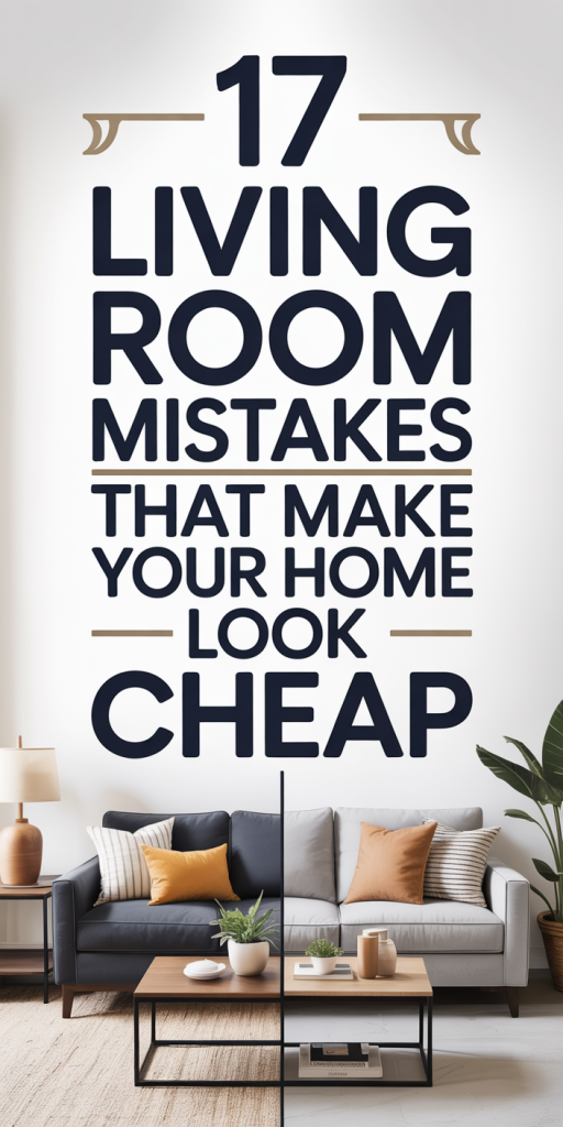
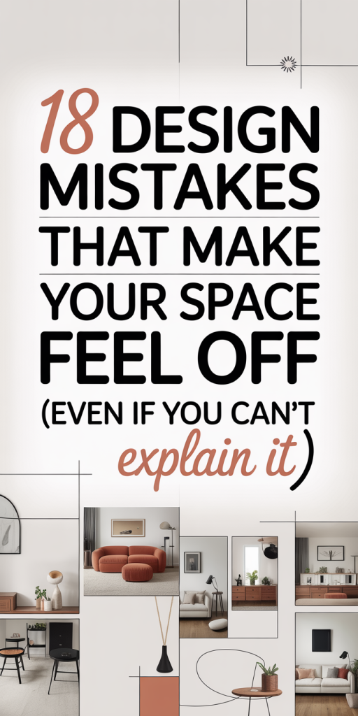
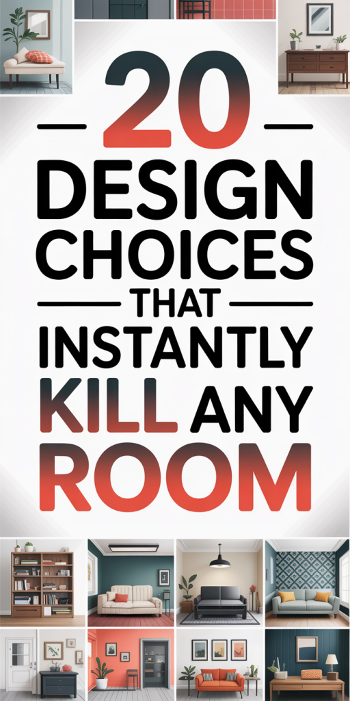
    We’ve all walked into a room that felt off the moment we stepped through the door, claustrophobic, chaotic, or just lifeless. Often it isn’t the size or the budget but a handful of design choices that sabotage the space. In this guide we’ll identify 20 common mistakes that kill a room’s energy and offer practical alternatives you can apply today. Whether you’re staging to sell, refreshing a rental, or renovating, these fixes are straightforward, cost-effective, and rooted in how people actually move through and experience rooms. Read on, we’ll help you spot the problem and show you exactly what to do instead.

    Scale And Proportion Mistakes Furniture That’s Too Big Or Too Small

    Scale and proportion are the invisible rules that make a room feel intentional or accidental. When furniture is too large for a space, it swallows circulation and makes everything feel cramped. Conversely, pieces that are too small, tiny sofas, narrow rugs, petite tables, leave negative space that reads as underfurnished and awkward. We see this most often in living rooms where a massive sectional crowds a small apartment or a dainty sofa drowns in a large formal room.

    What to do instead: measure, measure, measure. Start with the room’s clearances, leave at least 18–24 inches between a coffee table and a sofa and 30–36 inches for primary traffic paths. Choose furniture that relates to the architecture: higher ceilings can handle taller-backed seating: low ceilings benefit from lower-profile pieces. Use rugs to define areas: a rug that’s too small breaks visual flow. When in doubt, scale up rather than down if the room allows: larger, simple shapes often feel more grounded than many tiny items. Finally, arrange seating to encourage conversation, group pieces so there’s an implied center. That single shift in proportion transforms awkward into intentional.

    Blocking Sight Lines And Traffic Flow With Poor Layouts

    Bad layouts kill a room faster than bad paint. We often prioritize symmetry or focal points and forget how people actually move through spaces. Placing furniture to block sight lines, like a tall bookcase in front of a window or a sofa perpendicular to the main path, creates visual and physical friction. Likewise, cluttered arrangements that force detours or pinch points make a room feel smaller and frustrating to use.

    What to do instead: map the movement. Stand at each door and imagine walking in, what should be visible and what should be hidden? Aim for clear sight lines to windows and focal points: position seating so people can enter a conversation without squeezing past. Use floating furniture (pulled away from walls) to create purposeful paths and zones. Keep a minimum of 30–36 inches for main walkways and 24–30 inches for secondary routes. If a piece blocks a natural path, consider rotating it, switching it to another wall, or replacing it with a slimmer alternative. Finally, embrace negative space, an uncluttered path signals an organized, breathable room.

    Single Overhead Light Or Harsh Lighting That Flattens Space

    Relying on one central ceiling fixture is a classic mistake that makes rooms look flat and uninviting. A single overhead light often casts harsh shadows, creates glare, and removes depth. It’s especially damaging in rooms with architectural details or layered surfaces: instead of accentuating features, the light washes everything out.

    What to do instead: build layers. We recommend a three-layer approach, ambient, task, and accent lighting, to add depth and flexibility. Ambient lighting provides general illumination: task lighting focuses on activities like reading or cooking: accent lighting highlights textures, art, or architectural features. Mix ceiling fixtures with floor lamps, table lamps, and wall-mounted lights to create pockets of light. Dimmer switches are inexpensive investments that let us tune the mood. Position fixtures to avoid glare on screens and mirrors, and use adjustable sources where possible to refine angles and emphasis. Thoughtful layering instantly makes a room look curated and comfortable.

    Wrong Bulb Temperature And Inconsistent Lighting Layers

    Bulb choice is the unsung design killer. We often pick bulbs for brightness alone and forget about color temperature. Mixing cool, bluish bulbs with warm, yellow ones creates a dissonant, patchy look that undermines cohesion. Too-cool light can feel clinical, while overly warm light muddies colors and flattens texture.

    What to do instead: get the color temperature right and be consistent. For living rooms and bedrooms aim for 2700K–3000K (warm white) to foster relaxation and flattering skin tones. Kitchens and work areas benefit from 3000K–3500K for clarity without harshness. Use consistent temperatures across fixtures within the same zone: if you want a warmer reading lamp, make sure surrounding lights harmonize. Pay attention to CRI (color rendering index): choose bulbs with CRI 90+ to reveal colors accurately. Finally, avoid extreme brightness, too many lumens at once flattens detail. Proper bulb choices complement your layered plan and make fabrics, finishes, and artwork sing.

    Color Decisions That Make A Room Feel Small Or Tired

    Color can expand a room or contract it. We’ve seen spaces painted in very dark hues that feel like closed boxes, or rooms with washed-out neutrals that lack personality and appear tired. Choosing color without considering light, scale, or how finishes reflect the hue often produces disappointing results: ceilings that read low, walls that look muddy, or rooms that feel emotionally cold.

    What to do instead: choose color with context. Test large swatches on multiple walls and observe them at different times of day. Use lighter, cooler shades on ceilings and trim to open vertical space and warmer, saturated tones on focal walls to add depth. Don’t be afraid of mid-tones, very pale or very dark can be limiting. If you want drama, balance a deep color with crisp white trim and well-lit accents. For small rooms, reflectivity matters: eggshell or satin finishes bounce more light than matte. Eventually, pick colors that harmonize with the room’s natural light and your furnishings, not just a trendy swatch.

    Overuse Of Trend Colors Or All-Over Neutral Mud

    Chasing trends or defaulting to indistinct neutrals are both ways to kill a room’s personality. Trend colors applied everywhere become dated quickly: we’ve seen entire homes painted in a single fashionable hue that looked stylish for one season and tired the next. On the other hand, layering the same beige or gray across walls, upholstery, and textiles creates a flat, indistinguishable space lacking contrast or warmth.

    What to do instead: use trends sparingly and layer neutrals with contrast. Treat trend colors as accents, on a single wall, in an upholstered chair, or through accessories, so they’re easy to swap. When using neutrals, introduce texture and tonal variation: a warm linen sofa, a cool wool rug, and metal or wood accents prevent the “mud” effect. Add at least one deliberate contrasting element, black window frames, brass hardware, or a saturated art piece, to give the eye a resting point. This strategy keeps the room current without sacrificing longevity.

    Pattern Overload Or Matching Everything Too Closely

    Patterns add personality, but too much pattern or overly coordinated patterns turns a room into visual noise. We often see mismatched scales, tiny repetitive prints next to large busy florals, or a fearful approach where everything is made to match exactly. Both extremes remove balance: one overwhelms, the other sterilizes.

    What to do instead: balance scale and rhythm. Combine patterns across three scales, small, medium, and large, to create harmony. For example: a large-scale geometric rug, medium-scale striped pillows, and a small floral lamp shade. Keep colors consistent across patterns to maintain cohesion, and use solids strategically to rest the eye. If a pattern dominates, tone it down with neutral textures or a single large-scale piece to anchor the room. We also recommend limiting pattern variety to three main motifs in a single room: simplicity often reads as sophistication.

    Ignoring Texture And Contrast For A Flat, Lifeless Look

    A room without texture feels inert. Flat paint, smooth surfaces, and uniform fabrics produce a showroom-like sterility that’s uncomfortable to inhabit. Texture creates tactile interest and visual depth, think nubby wovens, rough-hewn wood, soft velvet, and reflective metals. Contrast, light against dark, matte against gloss, guides the eye and brings out detail.

    What to do instead: layer materials and finishes. Pair rough textures with sleek surfaces: a reclaimed-wood coffee table next to a leather sofa, or a boucle throw on a velvet chair. Vary finishes, matte plaster walls, semi-gloss trim, and satin metal hardware, to catch light differently across surfaces. Introduce natural elements like stone, woven baskets, or live plants to add organic contrast. Aim for at least three distinct textures in a room so the space feels curated rather than staged. Texture invites touch and makes a room feel lived-in and welcoming.

    Cheap Finishes, Visible Hardware, And Poor Details

    The devil is in the details. Corners where paint peels, cabinet doors that don’t align, or visible, cheap-looking hardware instantly lower perceived quality. We’ve found that low-quality finishes read poorly even in otherwise thoughtful rooms, think laminate that blisters, off-center door handles, or countertops with seams in obvious places. These small failures erode trust in the overall design.

    What to do instead: invest where it counts and hide the rest. Spend on durable, visible surfaces, countertops, flooring, key furniture, and choose reliable hardware with a measured finish (matte black, aged brass, or brushed nickel are timeless). Ensure alignment and proportion: cabinet hardware should be consistent in size and placement. Conceal functional ugliness, use toe-kicks, built-in outlets, and integrated appliances where possible. If budget is tight, prioritize visible, tactile elements: a well-chosen knob or a clean paint job elevates everything else.

    Cluttered Styling, Too Many Small Pieces, And No Focal Point

    A room filled with small, indecisive objects becomes noisy. We often over-accessorize, dozens of small items on shelves and tables that compete for attention, so the room lacks a center and feels chaotic. Without a clear focal point, the eye wanders and the space loses narrative. Conversely, too few impactful items make the room forgettable.

    What to do instead: curate with intent. Start by selecting a single focal point, fireplace, large artwork, a statement light, or a bold piece of furniture. Edit accessories through negative space: choose fewer objects with scale and importance rather than many small trinkets. Group items in odd numbers and vary heights to create rhythm. Keep flat surfaces partly clear and rotate displays seasonally to avoid collection creep. If you’re unsure, photograph the room, images reveal clutter that we normalize in person. Thoughtful editing makes a room feel calm and purposeful rather than cluttered and confused.

  • 17 Living Room Mistakes That Make Your Home Look Cheap (And How To Fix Them)

    We walk into living rooms every day and instantly get a feel for whether a space was thoughtfully designed or thrown together. Often, it isn’t one glaring issue but a handful of small mistakes that, combined, make a room read as inexpensive. In this guide we’ll point out the 17 most common living room mistakes that make your home look cheap, and give practical, budget-savvy fixes you can carry out without a full remodel. We’ll cover furniture, textiles, lighting, layout, color, decor, and upkeep so you can prioritize the changes that will have the biggest impact. Read on and you’ll learn how to make even modest investments read luxurious.

    Furniture Mistakes: Wrong Scale, Cheap Materials, And Overcrowding (Mistakes 1–3)

    Mistake 1, Wrong scale: Furniture that’s too small or too large relative to the room kills cohesion. A too-small sofa on a large wall looks like an afterthought: an oversized sectional in a compact living room creates tension and blocks sightlines. Scale affects perceived value because proportion signals that a space was planned. Fix: Measure first. We recommend dividing the room into functional zones and choosing a sofa that fills about two-thirds of the main wall it sits against. Use painter’s tape to map out the footprint of big pieces before buying.

    Mistake 2, Cheap materials: Particleboard, low-density foam cushions, and glossy hollow-core finishes age poorly and photograph as low-end. Instead of chasing a brand name, focus on structural elements: solid hardwood frames (or metal for modern styles), eight-way hand-tied or sinuous springs, and higher-density foam wrapped in down or down-alternative for comfort and longevity. Fix: If new investment isn’t possible, reupholster a well-built frame or swap out cushions with higher-density inserts. Even replacing sofa legs with solid wood or metal can elevate the look.

    Mistake 3, Overcrowding: We often assume more furniture equals more comfort, but cluttered layouts feel chaotic and cheap. Too many small tables, mismatched chairs, and stacks of accessories make the room look like a hand-me-down collection rather than a curated space. Fix: Edit ruthlessly. Keep only pieces that serve a purpose or contribute to balance. Aim for negative space, areas where the eye can rest. Replace multiples of small items with one well-chosen statement piece (a console table, a single accent chair, or a sculptural floor lamp) to create a sense of intention.

    Textile And Rug Mistakes: Thin Fabrics, Wrong Rug Size, And Mismatched Textures (Mistakes 4–6)

    Mistake 4, Thin, flimsy fabrics: Lightweight polyester throws, cheap drapery panels, and thin cushion covers look shiny, dated, and fragile. They also wear quickly. Fix: Opt for mid-weight to heavyweight fabrics with texture, linen blends, cotton-linen, wool, and performance boucle. For curtains, choose fully lined panels with a substantial header and hang them high and wide to create height and drama.

    Mistake 5, Wrong rug size: A too-small rug is one of the quickest ways to make a room look cheap. Small rugs that float under a coffee table with all furniture sitting off the rug fragment the space. Fix: Choose a rug large enough that at least the front legs of the sofa and chairs sit on it: ideally, all major seating pieces should touch the rug. If you can’t fit a large rug, layer a smaller, higher-quality rug over a neutral jute or sisal to add texture and scale.

    Mistake 6, Mismatched textures: A room with everything slick or everything flat lacks depth. When all textiles are the same sheen or weight, think shiny velvet sofa with glossy leather poufs and polyester throws, the eye gets bored or senses cheapness. Fix: Build contrast by mixing textures: pair matte woven rugs with a soft nubby throw, smooth leather with raw wood, and crisp linen with boucle pillows. This layered approach feels intentional and gives a small space the richness usually reserved for higher budgets.

    Lighting Mistakes: Flat Overhead Light And Inconsistent Bulbs (Mistakes 7–8)

    Mistake 7, Relying on one flat overhead light: A single ceiling fixture produces flat, unflattering light and highlights every imperfection. Rooms that rely solely on overhead lighting appear utilitarian and cheap. Fix: Layer lighting in three zones, ambient, task, and accent. Combine a central fixture with floor lamps, table lamps, and directional spots for art or architectural features. Dimmers are transformational: they instantly make a space feel more sophisticated because you control mood.

    Mistake 8, Inconsistent bulbs and color temperatures: Mixing warm and cool bulbs creates a fractured look that reads as sloppy. Cheap bulbs also produce poor color rendering (low CRI), which dulls textiles and skin tones. Fix: Standardize color temperature across each zone, 2700K–3000K for living rooms, and choose bulbs with CRI 90+ where possible. We’ll often use slightly warmer bulbs for ambient fixtures and a neutral warm for task lighting to keep eyes comfortable. Swapping mismatched bulbs is inexpensive and has an outsized impact on perceived quality.

    Layout And Scale Mistakes: Poor Traffic Flow, Floating Furniture, And TV-First Arrangements (Mistakes 9–11)

    Mistake 9, Poor traffic flow: Blocking natural pathways with furniture turns a living room into an obstacle course. People subconsciously notice when they have to squeeze around pieces and that friction cheapens the experience. Fix: Create clear circulation paths, leave at least 30–36 inches for main walkways and 24 inches for secondary routes. Arrange seating to help conversation rather than forcing everyone to face a corner or the TV.

    Mistake 10, Floating furniture with no anchor: When sofas and chairs float in the middle of a room without visual anchors, the space can feel unfinished. Mistake is common in open-plan layouts where pieces are placed without regard for boundaries. Fix: Anchor seating with a properly sized rug (see Mistake 5) or with a console behind the sofa. Coffee tables and ottomans also help ground the arrangement: choose pieces with presence and balanced proportions.

    Mistake 11, TV-first arrangements: Designing the room solely around the TV often sacrifices scale, balance, and focal quality. A TV-dominant room usually means small seating choices, low-profile consoles, and little attention to symmetry. Fix: Treat the TV like one of several focal points. If it must be the center, incorporate built-ins or flanking shelving to integrate it into a composed vignette. Alternatively, arrange seating first for conversation and comfort, and make sure the TV is on a swivel mount or placed where it doesn’t dictate the entire layout.

    Color, Pattern, And Finish Mistakes: Too Many Competing Patterns, Wrong Paint Choices, And Distracting Finishes (Mistakes 12–14)

    Mistake 12, Too many competing patterns: Layering patterns can be sophisticated, but when everything fights for attention, the room feels chaotic and cheap. Mixing scale, rhythm, and color is an art. Fix: Limit yourself to a dominant pattern and one or two supporting patterns. Think in terms of scale: pair a large-scale pattern with a small-scale one and a neutral textured ground. Repeat a unifying color across patterns to harmonize the mix.

    Mistake 13, Wrong paint choices: High-gloss or chalky paint in the wrong place reveals flaws and looks inexpensive. Extremely bright or dated hues applied to large expanses without balancing elements can age a room quickly. Fix: Choose paints with the right sheen, matte or low-sheen (eggshell) on walls to hide imperfections: satin or semi-gloss for trim and high-touch surfaces. Use color to create depth: a slightly darker or saturated accent wall behind a sofa can make the room read as designed rather than accidental.

    Mistake 14, Distracting finishes and overly matchy metals: Everything shiny and identical (matching brass, chrome, and gold across knobs, lamps, and frames) can look like a catalog sample rather than a layered space. Conversely, random clashing finishes are also jarring. Fix: Pick two metal tones and carry them through the room for cohesion, one warm (antique brass) and one cool (matte black or brushed nickel) work well. Matte finishes and subtle patinas feel more expensive than high-shine alternatives.

    Decor And Accessory Mistakes: Overdecorating, Tiny Art, And Cheap-Looking Hardware (Mistakes 15–16)

    Mistake 15, Overdecorating with small pieces: A thousand tiny accessories never add up to sophistication. Over-accessorizing creates visual noise and makes the room look cluttered and low-budget. Fix: Curate with restraint. We aim for clusters of three to five objects arranged with varying heights and materials on a console or coffee table. Larger, fewer pieces make more impact: a sculptural vase, a stack of well-chosen books, or a single large basket instead of many small trinkets.

    Mistake 16, Tiny art and cheap-looking hardware: Art that’s too small for the wall reads like an afterthought: cheap frames, plastic-looking knobs, and flimsy curtain rods signal low quality even if everything else is decent. Fix: Scale art to the wall, large-scale pieces or well-composed galleries make walls feel intentional. For hardware, choose solid, tactile pieces in materials that age well. Upgrading knobs, pulls, and curtain rods is a relatively low-cost update that instantly elevates cabinets, doors, and windows. We often swap out plastic-looking pieces for mid-priced metal options and see rooms gain instant polish.

    Neglect And Upkeep Mistake: Failing To Maintain, Clean, Or Update (Mistake 17)

    Mistake 17, Failing to maintain, clean, or update: Even the best-designed room will read cheap if cushions are flattened, fabrics stained, or finishes scuffed. Small signs of neglect, sun-faded fabric, wobbling furniture, or outdated electronics, tell a story of carelessness that undermines any design effort. Fix: Establish seasonal maintenance routines. Rotate cushions to avoid uneven wear, have upholstery professionally cleaned when needed, touch up scuffed wood with markers or wax sticks matched to the finish, and replace broken or worn hardware promptly. Updating textiles (throws, pillows) and swapping a few accessories seasonally keeps the room feeling fresh without big expense. Regular maintenance is the highest-return investment for making a home look cared-for and, by extension, more expensive.

    Conclusion

    Making a living room look more expensive rarely requires a total overhaul. By addressing scale, materials, lighting, layout, color, accessories, and upkeep, we can lift the overall impression dramatically. Start with the high-impact, low-cost changes, right-sized rug, consistent lighting, upgraded bulbs, and edited accessories, then phase in bigger investments like reupholstery or quality textiles. Thoughtful editing, a few strategic swaps, and regular care will make your living room feel intentional, comfortable, and much more refined.

  • 15 Decor Choices That Try To Look Expensive—And Why They Don’t (Plus What To Do Instead)

    We all want a home that reads polished and intentional without emptying our wallets. The problem: a lot of decor tries to look expensive but ends up shouting “budget buy” instead, sometimes loud enough to ruin an otherwise well-designed room. In this guide we’ll identify 15 common decor choices that aim for luxury but miss the mark, explain exactly why they fail, and give practical swaps and tweaks that actually elevate a space. Whether you’re staging, decorating on a tight budget, or simply tired of feeling like your pieces are pretending to be high-end, we’ll show how small changes in material choices, scale, placement, and finish transform the same items from tacky to tasteful. Read on for clear, confident guidance: spot the giveaways, fix them fast, and make your decor finally look the way you want it to, effortlessly refined, not contrived.

    Overly Shiny Metals, Gold-Plating, And Polished Chrome Overuse

    High-shine metals are seductive: they catch the eye and can imply polish. But relentless gloss or obvious gold-plating often reads cheap because the finish is masking subpar construction. Bright, mirror-like chrome or gold that peels or chips reveals its budget origins quickly. Also, mixing too many shiny metals, polished chrome faucets, bright brass knobs, and glossy light fixtures, creates a disjointed look that feels mass-produced.

    We prefer finishes that show a bit of subtlety. Brushed or satin metals conceal fingerprints and minor imperfections and feel more tailored. Warm, low-luster brass or oxidized metals have depth and age gracefully, which gives them a perceived value beyond the sticker price. When picking finishes, aim for consistency within sightlines: keep hardware and major fixtures in the same family, and reserve high-gloss pieces for small accents rather than whole rooms. Finally, think texture, pairing a satin brass lamp with a matte ceramic base and linen shade creates a layered, intentional look rather than a plastic-y shine.

    Velvet, Chenille, And Overstuffed Fabrics That Look Dated Or Cheap

    Soft, plush fabrics feel luxurious in principle, but certain treatments and silhouettes age poorly. Oversized tufted sofas with shiny velvet, or cheap chenille throws with visible pill, can instantly date a space. Overstuffing furniture to the point it loses shape is another common misstep, it reads like trend-driven fast furniture rather than enduring design. Fabric quality, scale, and context determine whether plush textiles upgrade a room or sink it.

    To keep soft fabrics looking high-end, we recommend several strategies. First, choose looser, matte velvets rather than glossy crushed velvet: the nap should be fine and consistent. Opt for tailored silhouettes with clean lines and modest tufting rather than exaggerated, low-quality padding. For throws and pillows, invest in natural fills (down or high-quality down alternatives) and covers in linen, wool, or brushed cotton. Finally, balance plush materials with firmer textures, think a linen bench, raw-wood coffee table, or metal-framed side table, so the room feels layered and intentional, not over-padded.

    Statement Pieces That Date Fast: Neon, Oversized Abstracts, And Trendy Sculptures

    Trend-forward statement pieces are tempting. They promise personality and immediacy. But their shelf life is often short. Neon signs, oversized abstract works in trendy palettes, and sculptural pieces tied to a micro-trend can anchor a room to a specific moment, and that moment may pass quickly. When a bold centerpiece feels temporally bound, the rest of the room can start to feel like it’s wearing last season’s outfit.

    We don’t mean to avoid boldness altogether: we just suggest strategic placement and flexibility. Treat highly trendy statement items as replaceable accents rather than permanent fixtures. Put them on a wall where they can be swapped easily, or stage them on a movable surface like a console or shelf. If you love neon or vivid abstracts, balance them with timeless elements, high-quality rugs, classic furniture silhouettes, and muted wall tones. That way, when the trend fades, the room still stands on solid, enduring bones.

    Cheap-Looking Lighting, Mirrors, And Decorative Accessories (Blown Glass, Plastic-Look Lamps)

    Lighting and mirrors are deceptively powerful, they can elevate or flatline an entire space. Lamps with clearly visible seams, blown glass that looks thin and overly glossy, or mirrors with fake antiquing patterns are all quick indicators of cheap production. Plastic-look components, obvious glued trims, and lightweight hardware that wobbles under touch are also giveaways. These items sit in sightlines and touch zones, so their perceived quality matters.

    When shopping, we focus on weight, joinery, and finish. A heavier lamp base often signals denser materials and better balance. Look for well-fitted seams, secure sockets, and high-quality fabric shades rather than flimsy paper. Mirrors should have flat, well-mounted glass and authentic backing or subtle, genuine patina if antique-looking. For decorative glass, prefer pieces with slight imperfections and depth, those qualities hint at handcrafting. Where budget limits us, prioritize good lighting and a single quality mirror: smaller accessories can be rotated or upgraded later.

    Conclusion

    Luxury in decor isn’t about price, it’s about choices. We’ve walked through common traps: faux materials, over-ornamentation, shiny finishes, dated textiles, fleeting statement pieces, and flimsy fixtures. The antidote is simple: prioritize authenticity of finish, control scale and balance, and choose pieces that layer well and age gracefully. Small upgrades, a satin metal finish, a matte stone look, a well-proportioned frame, or a weighted lamp, cost little compared with full replacements but punch well above their price.

    As we decorate, let’s think like curators. Keep the majority of elements calm and timeless, let the occasional trend be a replaceable accent, and invest where touch and sightlines matter most. Do that, and your decor will reliably read refined, not because it tries to look expensive, but because it’s thoughtfully composed.

  • 14 Things Designers Notice Immediately (And Judge Quietly) — How To Avoid The Red Flags In 2026

    We all judge a book by its cover, designers just do it faster and more often. In 2026, with design trends shifting faster and accessibility expectations higher, certain visual and interaction mistakes stand out immediately to anyone who designs for a living. This article walks through the dozen-plus things designers notice in the first few seconds of viewing a website, app, or brand touchpoint, and explains why those details matter. Our goal isn’t to nitpick: it’s to help you recognize and fix common red flags so your product reads as intentional, trustworthy, and polished. Read on and you’ll learn what gives a design away, what signals professionalism, and practical fixes we use every day.

    Layout And Visual Hierarchy: The First Instant Read

    Layout is the shorthand we use to understand priorities. In the first three to five seconds, designers are decoding whether content is organized, where to look first, and whether the interface respects the user’s time. A strong visual hierarchy communicates purpose without words: a weak one creates friction.

    We scan for whether primary and secondary elements are clearly separated, if the page has a deliberate rhythm, and whether white space is used as a tool rather than an afterthought. A cramped page tells us the team rushed wireframes or ignored responsive needs. Conversely, a grid-guided layout signals discipline and forethought.

    Why it matters: users decide quickly whether to stay or leave. A coherent layout reduces cognitive load and increases conversions, engagement, and perceived credibility. Fixes are often simple, reweight typographic scale, increase spacing around the primary call-to-action, or tighten a grid, but their impact is immediate and measurable.

    Typography, Color, And Brand Voice: What Signals Quality

    Typography and color are the stretchiest parts of brand expression, they can make a simple layout feel premium or cheap. We judge whether type choices align with brand voice and whether color is used intentionally to signal function (links, CTAs, warnings). Poor typographic choices are one of the fastest giveaways that a design is amateur.

    We listen with our eyes for tone: Is the typography playful, serious, or neutral? Does color palette feel cohesive or like someone picked shades from different decades? In 2026, designers are also looking for support across devices and locales, variable fonts, proper fallbacks, and sufficient color contrast for accessibility.

    Why this matters: typography and color define perception before users read a single word. Invest in a coherent system and you reduce visual friction, strengthen brand recall, and create a consistent experience across touchpoints.

    Imagery, Icons, And Microdetails That Give Away Laziness

    Imagery is high-bandwidth communication, the wrong photo can undo careful copy and layout. We notice mismatched imagery immediately: low-resolution hero shots, inconsistent photo treatments, or stock images that scream generic stock. Icons are another giveaway: a mixed icon set with different stroke weights or perspectives tells us the asset library wasn’t curated.

    Microdetails, like inconsistent border radii, shadows that don’t align with a single light source, or decorative elements that conflict with function, are the design sins that say “we didn’t finish.” These are the things users may not consciously name, but they feel them.

    How we evaluate: quality first (resolution, crop, and subject relevance), then consistency (color treatment, filter, or illustration style), and finally function (does the image support the message or just fill space?). Replace lazy imagery with a small library of vetted photos or simple illustrations and you’ll lift perceived quality immediately.

    Interaction, Usability, And Accessibility: The Silent Tests

    Design is interactive by nature. We judge not just how things look but how they behave. Do buttons communicate affordance? Are interactive elements discoverable? Is the path to conversion frictionless? These are the silent tests that really determine whether a design works in the wild.

    We often simulate tasks as new users and check common flows: sign-up, search, add-to-cart, or contact. Little annoyances like ambiguous labels, tiny tap targets, or modal traps break trust quickly. Accessibility is central: if keyboard navigation, focus states, and ARIA roles are missing, that’s a red flag that inclusiveness was an afterthought.

    Practical mindset: design for the first interaction and the hundredth. Smooth onboarding, predictable interactions, and clear signposting improve retention and reduce support costs.

    Conclusion

    Designers notice more than aesthetics, we read intent. The details above are the fastest shortcuts we use to assess quality: layout rigour, typographic clarity, consistent imagery, and robust interaction patterns. When those elements align, a product feels trustworthy and usable: when they don’t, users leave and conversions drop.

    If you take one thing away, let it be this: small, consistent systems beat one-off flourishes every time. Invest in grids, type scales, curated assets, and accessible interactions. The work is mostly discipline, not glamour, and it pays off in credibility, customer satisfaction, and fewer redesigns down the road. We’ve seen it repeatedly, fix the basics, and the rest falls into place.

  • 14 Home Trends That Need To Be Banned Immediately: Stop Making These Decorating Mistakes In 2026

    We’ve watched decorating trends come and go, but some fads keep resurfacing even after designers and homeowners agree they don’t work. In 2026, it’s time to call out the trends that cause more harm than good, the ones that look impressive in a glossy photo but fail in everyday life. This article lists 14 recurring choices that clutter our homes, complicate maintenance, or strip spaces of personality. We’re not here to police taste: we’re here to point out when a trend crosses the line from stylish to silly. Expect practical reasons, design consequences, and alternatives that actually improve how your home looks and functions.

    Why These ‘Trends’ Should Be Banned — What Designers And Homeowners Are Missing

    Trends often start with great intentions: novelty, problem-solving, or an aesthetic pivot. But several popular home trends ignore the realities of daily life. We’re not just nitpicking, we’re looking at recurring problems: wasted time on cleaning, poor ergonomics, reduced resale value, and emotional effects like stress or blandness. When a trend prioritizes looks over utility, it becomes performative. That’s a problem.

    Designers sometimes chase visual coherence at the expense of comfort. Homeowners follow glossy feeds and end up with spaces that photograph well but are unpleasant to live in. Here are common blind spots we’ve seen:

    • Underestimating maintenance: finishes and materials that show wear quickly or demand professional care.
    • Ignoring scale and proportion: oversized or undersized furniture that upends circulation and function.
    • Prioritizing novelty over longevity: tech or materials that become obsolete or break down fast.
    • Losing personality: trends that push uniformity so hard homes feel like hotel lobbies.

    We’ll examine 14 specific trends that keep resurfacing even though these pitfalls. For each, we’ll explain why it fails, who it hurts most, and offer alternatives that respect both form and function. Our aim is constructive: to help you make choices that elevate your home long-term, not just for the hour it’s photographed.

    Open Shelving Everywhere

    Open shelving showed up as a breath of fresh air, lightening kitchens and making living rooms feel airy. But the “everywhere” part is where things go wrong. The aesthetic promise of open shelves is visibility and display: the reality often becomes dust, clutter, and chaos.

    Open shelves expose everything. That’s great if you have curated dishware and the time to keep it pristine. Most households don’t. Our kitchens and bathrooms collect grease, steam, and fingerprints, and open shelving amplifies that maintenance burden. Daily-use items that are easy to tuck behind closed doors instead become styling problems. We find ourselves arranging and rearranging instead of cooking and living.

    Another issue is inconsistency of scale and storage needs. Open shelving invites a mix of objects, functional items next to decorative pieces, which looks eclectic until it doesn’t. In many homes it reads as incomplete or messy. And for smaller households with fewer display-worthy items, long runs of open shelves simply highlight emptiness.

    There’s also a hygiene angle. In bathrooms, open shelving near showers and sinks exposes linens and toiletries to humidity. In kitchens, airflow increases dust accumulation on ceramics and glass. For families with children or pets, fragile items are more likely to be knocked over when they’re literally at arm’s reach.

    Alternatives: combine open shelving with closed cabinetry, use open runs sparingly for curated displays, and keep everyday essentials behind doors. Consider glass-front cabinets for visibility without full exposure. If you love the look but not the upkeep, choose fewer open shelves at eye level and deep, closed storage below.

    Hygiene, Clutter And Practicality Problems With Open Shelves

    Let’s break down the main practical headaches. First: dust and grease. Open shelves accumulate grime on horizontal surfaces: glass and white ceramics show every speck. We’ve seen kitchens where homeowners spend more time cleaning display items than cooking. Second: visual clutter. Human brains prefer organized categories. Open shelves encourage a hodgepodge, and without strict curation that looks intentional, it reads as sloppy.

    Third: accessibility vs. safety. Items within reach are easier to grab, but also easier to break or contaminate. For households with small kids or pets, fragile décor or attractive pantry items become hazards. Finally: inventory fatigue. It’s easier to forget what you have when it’s not hidden but also not in labeled systems. Closed drawers and cabinets with organizers actually save time and reduce waste.

    If you insist on open shelves, commit: limit how much you display, choose materials that tolerate cleaning, and prioritize durability. Otherwise, we recommend closed storage as the practical baseline for most rooms.

    All-White Everything — The Sterile, Hard-To-Maintain Look

    All-white interiors are a classic for a reason: they feel bright, timeless, and versatile. But the “all” part, walls, cabinets, floors, upholstery, can sterilize a home. It creates a curated showroom vibe that’s difficult to live in and even harder to maintain.

    White surfaces show every mark. If you have kids, pets, or an active social life, white upholstery and rugs become an exercise in stress management. Even in low-traffic rooms, sunlight and everyday wear introduce subtle discoloration over time. The result is spaces that age poorly unless you’re prepared to replace or deep-clean frequently.

    Aesthetic problems arise too. An entirely white palette flattens depth and texture, making rooms feel bland unless you layer contrast through materials and accents. When homeowners try to ‘add’ interest, they often resort to trendy pops of color or patterns that clash with the intended calmness, producing visual tension instead of balance.

    There’s also environmental and economic waste. Maintaining pristine white often requires professional cleaning, special detergents, or replacing items sooner. That’s costly and unsustainable.

    What to do instead: embrace a light palette but mix warm neutrals, natural woods, and textured fabrics. Use white as a canvas rather than the sole design language. Add durable, washable fabrics in high-traffic areas and accept that lived-in patina can be beautiful.

    Matching Furniture Sets That Make Homes Look Like Showrooms

    Matching living-room sets, the couch, loveseat, armchair trilogy, have a tidy logic. But they often make homes look staged rather than personal. When every piece shares the exact same scale, finish, and fabric, rooms lose the layered look that signals history and thoughtfulness.

    There’s also a practical downside. Matching sets often come from big-box retailers and are designed for short-term appeal. They can wear uniformly, making a room feel dated all at once instead of developing character. And because every piece matches, there’s no opportunity to replace a worn item without upsetting the aesthetic harmony, nudging homeowners back into the same store for a full set replacement.

    Scale mismatch is another issue masked by sets. A living room needs a mix of heights, depths, and visual weights to feel balanced. Sets prioritize uniformity over contrast, so spaces can read flat. We’ve seen small rooms dominated by oversized matching sofas that crush circulation, and large rooms where tiny matching chairs float unanchored.

    Alternatives: mix and match intentionally. Start with one anchor piece you love, then layer complementary items in different textures, finishes, or eras. Thrifted or vintage finds can add warmth and uniqueness. If you prefer cohesive color, keep hues related but vary shapes and materials.

    Excessive Minimalism And The Decluttering Obsession

    Minimalism morphed from a useful lifestyle into a performative trend: living with as little as possible because of aesthetics or social media clout. We appreciate the clarity minimalism offers, but when it becomes an obsession, it strips homes of personality and can even harm well-being.

    Extreme decluttering often results in sterile interiors that feel more like offices than living spaces. There’s a difference between removing excess and erasing history. Sentimental objects, books, and crafted items tell stories. When everything is removed for the sake of a clean silhouette, homes lose those narrative layers.

    There’s also a cycle of purchase and purge. People buy minimal, photograph it, then swap items for the next image, which is wasteful and unsustainable. And for households with kids or multiple residents, rigid minimalism can be unrealistic and foster guilt when things inevitably get messy.

    In functional terms, minimalism sometimes eliminates necessary storage. We’ve seen kitchens with gorgeous countertops but nowhere to stash everyday appliances, leading to cluttered counters and frustration. The problem isn’t minimalism itself: it’s a version that ignores how people actually live.

    A better approach: intentional minimalism. Keep possessions that provide function, joy, or story. Use smart storage that conceals clutter without erasing personality. Let negative space exist, but not at the cost of comfort.

    Design Sterility And Mental Health Costs Of Over-Minimalism

    There’s growing evidence that our physical spaces affect mental health. Over-minimalized interiors can feel cold and anonymous, which may elevate feelings of isolation or stress for some people. Humans crave sensory input: texture, color, and small visual anchors that create a sense of safety.

    Design sterility can also make decision-making harder. When every surface is empty, the choice to personalize becomes anxiety-inducing rather than liberating. We’ve noticed clients who feel paralyzed, fearful of ‘ruining’ the minimalist aesthetic, and so they never make the space their own.

    Instead of erasing the past, we recommend curated accumulation: a few meaningful objects, layered textiles, and living elements like plants. These choices introduce warmth and decrease cognitive load by making a home feel familiar and supportive rather than like a photograph.

    Over-Engineered Smart Home Gimmicks That Add Complexity, Not Value

    Tech in the home promised convenience, and some smart solutions deliver, thermostats that learn patterns, lighting that adjusts with routines. But a wave of over-engineered gadgets has turned homes into ecosystems of novelty devices that complicate life rather than simplify it.

    We’re talking about single-purpose gadgets with short lifespans, obscure apps, and fragile integrations. Wi‑Fi light bulbs that blink when your router hiccups, voice-controlled faucets that misinterpret commands, or smart fridges that become obsolete after a software update: these are common frustrations. Every new device creates another app, another login, another firmware update.

    There’s also a privacy and security angle. Many low-cost smart devices lack robust update policies and are susceptible to breaches. We’ve seen poorly secured cameras and doorbells introduce real risk. And when vendors discontinue support or lock devices behind subscriptions, homeowners are left with partially functional or worthless hardware.

    Functionality vs. fuss: choose tech that solves a real, recurring problem rather than the latest shiny feature. Prioritize interoperability (open ecosystems), reliable manufacturers with update guarantees, and local control where possible. We’d rather have a simple programmable thermostat that works consistently than six novelty devices that fight for attention.

    When installing smart features, plan for longevity. Will this device be supported in five years? Can it be reset, repurposed, or integrated with other systems? If the answer is no, skip it.

    Conclusion

    Trends aren’t inherently bad, but when they repeat even though causing real-world problems, we should stop treating them as design commandments. Open shelving, all-white everything, matching sets, over-minimalism, and gadget overload are trends that too often prioritize image over life.

    Our advice: choose durability and delight over Instagram-ready aesthetics. Mix practical storage with curated displays, introduce warm textures, and pick tech that reduces friction. Homes should be comfortable, resilient, and reflective of the people who live in them. If a trend makes daily life harder, it doesn’t belong in our homes, no matter how pretty it looks in a photo.

  • 15 Home Upgrades That Actually Make Your Space Worse (And How To Avoid Them)

    We love the idea of upgrading a home, the thrill of better finishes, trend-forward fixtures, and the promise of increased value. But not every “upgrade” is a genuine improvement. Some choices look brilliant on Pinterest and in glossy showrooms yet create long-term problems: awkward flow, maintenance headaches, or a market that won’t reward the expense. In this text we’ll walk through 15 common upgrades that often make spaces worse, explain why they fail, and give practical alternatives so your next remodel actually improves day-to-day living and resale prospects. We’ll focus on decisions that feel right in the moment but have predictable downsides, and we’ll show how to avoid those pitfalls with clear, actionable guidance.

    Why Some ‘Upgrades’ Backfire More Than They Help

    We’ve seen the same pattern: an upgrade is chosen because it’s fashionable, impressive, or promises quick ROI, but nobody fully thinks through how people will live with it over time. Upgrades backfire for a few repeatable reasons: they prioritize aesthetics over function, they assume a single lifestyle fits all future owners, or they introduce high ongoing costs and maintenance. For example, a dramatic wall removal may create an airy look but leave you with poor acoustics and no private spaces: exotic hardwood might be drop-dead beautiful yet scratch-prone and impossible to repair locally. Often the issue isn’t the idea itself but how it’s executed and whether the choice aligns with daily use.

    To avoid these traps we recommend three rules we follow on every project: (1) test lifestyle fit before committing, live with a mock-up or temporary version if possible: (2) favor reversible or repairable solutions: and (3) account for total cost of ownership, not just upfront price. Apply those principles and the majority of trendy, risky upgrades become manageable or can be skipped in favor of options that age gracefully.

    Removing Walls Without Considering Flow And Function

    Open-plan living remains popular, but knocking down walls without a plan is one of the fastest ways to ruin a home’s function. We’ve walked through countless homes where structural changes created awkward zones: a kitchen island floating in a traffic path, a living room with poor sightlines to the TV, or a dining area that’s never used because it lacks definition. Beyond flow, removing walls can compromise storage, reduce natural sound barriers, and even create heating and cooling inefficiencies.

    Before committing, map how you and your family actually use rooms for a week. Mark traffic routes, note where clutter accumulates, and test furniture layouts. If you’re considering removing a load-bearing wall, consult a structural engineer to explore alternatives like adding a beam or partial opening with a framed pass-through. We often recommend partial removals that maintain defined zones: a wide opening with a lower pony wall, a bank of built-ins to anchor a space, or a large interior window that keeps light while preserving definition. These approaches preserve flow and natural function while delivering the openness you want.

    Open Shelving And Trendy Built-Ins That Age Poorly

    Open shelving looks great in curated photos, but in real life it often becomes a visual mess. We’ve found open shelves collect dust, force you into constant styling, and highlight whatever mismatched dishes you own. Trendy built-ins, think niche display alcoves, floating shelves, or oddly shaped cabinetry, can similarly date a space quickly and make resale harder because they’re specialized and rarely match buyers’ tastes.

    If you want the style of open shelving without the drawbacks, try a hybrid approach: closed cabinets for everyday items and a single upper shelf or two for curated display. Choose adjustable shelving systems so future owners, or you, if tastes change, can reconfigure easily. For built-ins, aim for neutral proportions and easily reversible installations. We also recommend investing in high-quality hardware and backing materials: poorly finished built-ins are the quickest way to look cheap. Finally, plan for lighting: integrated, subtle LED strips avoid the theatrical look but provide useful task illumination.

    High-Maintenance Flooring Choices That Look Great Until They Don’t

    Exotic woods, untreated concrete, and certain porous natural stones are tempting because they feel luxurious, until they need repair, refinishing, or constant sealing. We’ve seen homeowners choose pale, matte hardwoods that show every scuff from kids and pets, or polished concrete that cracks and feels cold without radiant heat. Cork and some softer woods dent and wear quickly in high-traffic zones.

    When choosing floors, ask practical questions: How much foot traffic will this room see? Do we have pets or small kids? Can the finish be repaired or refinished locally? Engineered hardwood often gives the look of real wood with better moisture resistance and easier installation. For durability, consider porcelain tiles that mimic stone or wood, they scratch less and are low maintenance. If you love the look of concrete, plan for proper reinforcement, a breathable finish, and heating. Finally, pick colors and textures that tolerate wear: mid-tone grains and varied planks hide imperfections better than pristine single-tone surfaces.

    Oversized Statement Lighting That Overpowers The Room

    A dramatic chandelier or oversized pendant can feel like a personality-filled choice, until it dominates sightlines and makes the room feel smaller. We often encounter fixtures that dwarf furniture, block ceiling fans, or create awkward shadows. Statement lighting should complement, not consume, the space.

    Measure before you buy. A simple rule: the fixture’s diameter in inches should roughly equal the sum of the room’s length and width in feet (for example, a 10×12 room = 22-inch fixture). For dining areas, hang fixtures 28–34 inches above the tabletop for standard ceiling heights: adjust for higher ceilings. Consider scale in three dimensions: how a large pendant reads from multiple angles, whether its visual weight clashes with nearby architecture, and whether its finish plays well with your palette. If you crave drama, layer lighting, a modestly sized central fixture plus recessed cans, wall sconces, or pendant pairs, for a bold effect without overpowering the room.

    Over-Polished Luxury Kitchens: Materials And Layout Mistakes

    High-end kitchens can become impractical when the aesthetic wins over usability. We’ve seen ultra-polished stone countertops that stain easily, all-white cabinetry that shows every smudge, and layouts that prioritize a showstopping island at the expense of usable prep space. Buying the most expensive or rare materials doesn’t guarantee better daily performance.

    Balance is key. Prioritize durable surfaces where work happens: choose honed or leathered stone finishes that conceal scratches and wear, or select quartz for its stain resistance. Plan zones correctly, prep, cook, clean, and storage, and ensure proper clearances around islands and ranges (at least 42 inches for a single-cook workspace, more for a multi-cook kitchen). Opt for mixed finishes to hide use: darker bases and lighter uppers are a forgiving combo. Think about hardware: high-quality, ergonomic pulls make an outsized difference in daily feel. Finally, design kitchens for how you actually cook, not how you imagine cooking on a staged day.

    Bathroom Overdesign: Too Much Glass, Tile, And Niche Clutter

    Bathrooms are small spaces where overdesign quickly becomes claustrophobic. We’ve seen endless floor-to-ceiling tile that looks sumptuous in photos but makes the room feel cold and clinical. Frameless glass showers without strategic hardware create constant water spots and a heavy maintenance burden. And while niches sound handy, too many oddly placed niches break tile patterns and gather grime.

    A smarter approach uses restraint: select a single feature wall or shower tile and keep the rest simple. For showers, choose glass treatments that include protective coatings or consider a modest framed system that’s easier to maintain. Limit niches to one or two, placed at practical heights for shampoo and soap, and design them with a slight slope or waterproof shelf to avoid standing water. For vanities, prefer durable, low-maintenance surfaces, and ensure adequate storage: we’d rather hide clutter than showcase it.

    Smart Home Overreach: Proprietary Systems And Overcomplication

    Smart home tech promises convenience, but a fragmented set of proprietary devices can lock us into ecosystems that are hard to expand or repair. We’ve installed smart locks, thermostats, shades, and lighting only to find they don’t play together, rely on cloud services that change terms, or become obsolete when the manufacturer discontinues support. Over-automation also adds friction: a smart light that needs an app to turn on frustrates more than it delights when the network hiccups.

    We advise focusing on interoperability and user-friendliness. Choose standards-based protocols (Zigbee, Z-Wave, Matter-compliant devices) and prioritize local control options that work without cloud dependencies. Keep critical functions simple: physical switches should remain available even if the smart hub is offline. Document setups and passwords in a secure, shared place for future owners. Finally, think in phases: start with a handful of high-value automations, a smart thermostat, whole-home security with local backup, and a reliable smart lighting plan, rather than attempting to automate every outlet and appliance at once.

    Outdoor ‘Improvements’ That Hurt Curb Appeal And Usability

    Outdoor projects can either elevate a home or become wasted money that reduces curb appeal. Common missteps include overbuilt hardscapes that block garden beds, mismatched exterior finishes applied without cohesion, and lawn-to-patio conversions that leave little usable green for families or pets. We’ve also seen extravagant landscaping with species unsuited to local climate, resulting in dead plantings and maintenance headaches.

    Plan outdoors with seasons, scale, and maintenance in mind. Aim for a layout that prioritizes accessible entertaining zones while keeping a portion of lawn or native planting for biodiversity. Choose materials and colors that complement the house rather than compete with it. For landscaping, pick native or drought-tolerant plants to cut long-term water and care costs. And remember practicality: wide, level pathways, adequate lighting, and purposeful shading (like a pergola positioned for afternoon sun) increase everyday use and resale appeal more than a decorative but unusable feature.

    Conclusion

    Upgrades should solve problems, not create new ones. When we evaluate projects now, we start by asking how a change will function in real life over months and years, not just how it photographs. Favor reversible choices, prioritize durability where daily wear occurs, and design for the people who actually live in the house, not an idealized version of them. By applying practical tests, sizing things to human scale, and selecting interoperable or repairable systems, we can enjoy stylish, modern updates that truly improve our homes rather than making them harder to live in or sell. If you’re planning a remodel, take a step back: measure daily habits, consult pros early, and choose solutions that age gracefully.

  • 17 Home Mistakes That Are Killing Your First Impression — Quick Fixes That Actually Work (2026)

    First impressions aren’t fair, but they’re decisive. Whether we’re showing a house to potential buyers, preparing for guests, or just trying to feel proud of our space, the first 10–30 seconds set the emotional tone. In our experience, small, fixable issues are the real culprits, not the big renovation projects. This guide walks through the most common home mistakes that silently sabotage first impressions and gives quick, realistic fixes you can carry out today. We’ll focus on what visitors notice first, what truly matters to buyers, and the practical steps that make the biggest impact without draining time or budget.

    Neglected Curb Appeal: The First 10 Seconds That Determine Interest

    Curb appeal is theater for the driveway: it creates expectation before anyone steps inside. We’ve seen listings lose attention within seconds because the lawn was patchy, the mailbox was leaning, or the front path was cluttered. Buyers and visitors form an emotional impression quickly, and it’s surprisingly hard to overwrite a negative one once it’s anchored.

    When we coach homeowners, we focus on three quick wins: clean lines, a hint of color, and a sense of care. Trim hedges, mow or edge the grass, clear debris from walkways, and sweep the porch. Small plantings like a pair of matching potted plants by the door or a seasonal wreath signal upkeep and warmth. Don’t forget the details: a working porch light, a fresh house number, and a tidy mailbox add up to perceived value.

    We recommend photographing the house from the street at the same time a buyer would approach it: if the shot looks uninviting, fix what you see. Curb appeal doesn’t require perfect landscaping, it requires obvious maintenance. That single afternoon of effort often pays off in more showings and better offers.

    Cluttered, Ungroomed Entryway And Mudroom

    The entryway is the handshake of the home. A messy, shoe-strewn entry signals disorder and raises questions about how the rest of the house is kept. We’ve noticed that buyers mentally subtract value when they encounter clutter right away: it’s an emotional shortcut to “this place needs work.”

    Quick fixes: clear the floor, add a catch-all tray for keys, and store shoes out of sight in a closed unit or bin. Hooks or a small bench with hidden storage instantly read as intentional design choices. If your mudroom is a dumping ground, we suggest a 30-minute purge: sort items into keep, donate, and relocate piles. Then wipe down surfaces, dust, scuffs, and cobwebs are small but telling flaws.

    Staging tip: keep one or two tasteful elements, a small rug, a mirror, or a plant, to guide the eye. Mirrors make the space feel larger and more inviting, and a simple rug establishes a clean boundary between outdoors and interior. These gestures help visitors feel welcome and confident as they move into the rest of the house.

    Poor Lighting And Dark, Uninviting Rooms

    Lighting is more than brightness: it’s mood, perceived space, and functionality. Dark rooms feel smaller and neglected, and that perception hits faster than structural issues in the buyer’s brain. We’ve walked through otherwise lovely homes and immediately wished for more light.

    Start by replacing dim or mismatched bulbs with warm-white LED bulbs at a consistent color temperature (2700K–3000K). Clean every fixture and lamp shade: grime reduces output noticeably. Use layered lighting: ambient (ceiling), task (under-cabinet, reading lamps), and accent (picture lights, floor lamps) to create depth. Open curtains and blinders during showings to maximize daylight and remove heavy drapes that block light.

    Consider inexpensive upgrades: add plug-in wall sconces, swap outdated fixtures for contemporary ones, or install dimmers to control ambiance. If a room still reads dark even though these efforts, strategically placed mirrors reflect natural light and give the impression of a larger, brighter room. Proper lighting not only lifts mood but boosts perceived square footage and value.

    Wrong Furniture Scale, Poor Layout, And Blocked Sightlines

    Furniture that’s too large or poorly arranged can make a home feel cramped, even when square footage is ample. We often see oversized sofas pressed against walls, coffee tables that interrupt flow, or ottomans placed where a visitor’s eye should travel. These missteps kill flow and distract from architectural strengths.

    Begin by evaluating sightlines from the entry: can you see the focal points, fireplace, view, kitchen? If not, rearrange. Pull furniture a few inches away from walls to create depth, and choose pieces proportional to the room: smaller-scale sofas and leggy chairs visually open a space. Remove nonessential pieces, fewer, well-placed items work better than cluttered abundance.

    Define zones with rugs sized to anchor furniture clusters (front legs on the rug is a good rule). Ensure at least a 30–36 inch traffic path for comfortable movement. For smaller rooms, swap bulky pieces for streamlined alternatives: armless chairs, nesting tables, and transparent materials (glass or acrylic) which reduce visual weight. Thoughtful layout showcases a home’s potential and helps buyers imagine living there.

    Visible Wear And Tear: Floors, Walls, And Rugs

    Scratches, scuffed baseboards, stained carpets, these are the visual shorthand of neglect. We don’t need renovations to fix many of these issues: targeted repairs can change perception dramatically. Buyers notice flooring first because it’s pervasive and hard to conceal.

    For hardwood, a quick buff and a small repair kit can disguise scratches. For visible gaps or wear, consider a professional refinish if within budget: otherwise, area rugs can mask trouble spots while adding style. With carpets, a professional deep clean often renews appearance more effectively than replacement, unless the carpet is dated or badly stained.

    Walls tell a similar story. Fill nail holes, touch up paint, and remove permanent scuffs with a magic eraser or a small repaint. If you have high-traffic zones near doors, consider a semi-gloss trim paint that’s easier to keep clean. Rugs should be clean and flat: curled edges look careless. These relatively small investments signal maintenance and reduce buyer objections that equate wear with hidden problems.

    Neglected Kitchen And Bathroom Details That Scream ‘Needs Work’

    Kitchens and bathrooms sell houses. Even minor issues here, loose cabinet hinges, grout mildew, or mismatched hardware, can undermine confidence. In our experience, buyers scrutinize these rooms for signs of deferred maintenance more than any other.

    Start with the basics: tighten cabinet hardware, clean or re-caulk around tubs and sinks, and replace worn faucet aerators for better flow. Swap out dated knobs and pulls for a cohesive finish: it’s a small change with a modernizing effect. Clean grout lines with an oxygen bleach product or regrout in small areas where mildew persists.

    Appliance condition matters but so do perception cues. Clear countertops of clutter, store small appliances, and stage with a couple of tasteful items (a wooden cutting board, a bowl of fruit) to emphasize utility. In bathrooms, replace cheap shower curtains with glass or crisp new ones, and ensure towels are fresh and folded neatly. These details reduce red flags and reassure visitors that the house has been cared for.

    Strong Odors, Pet Signs, And Lingering Smells

    Smell is a powerful, unconscious cue. We’ve lost interest in otherwise beautiful homes because of persistent odors: pet smells, cooking, smoke, or mustiness. Unlike visual flaws, smells are hard to ignore and even harder to erase from a buyer’s memory.

    First, identify and eliminate sources. Deep-clean carpets, wash curtains, and launder upholstery covers. If pets live in the house, groom and bathe them before showings and clear litter boxes. For kitchens, clean garbage disposals and drains and empty trash regularly. If a musty odor exists, check for hidden moisture, basements, crawlspaces, and attic vents, as odors may indicate a real problem.

    Avoid masking smells with strong air fresheners: they can be off-putting or suggest you’re covering something up. Instead use subtle strategies: ventilate rooms before showings, bake something mild like a tray of sliced lemons (or simulate with citrus-scented, low-intensity diffusers), and use clean linens. Air purifiers with activated carbon filters help remove volatile compounds and are a discreet, effective investment.

    Overly Personalized Or Dated Decor That Distracts Buyers

    Personal touches make a house a home, but when preparing for showings, personalization becomes a distraction. We find that buyers need to imagine their lives in the space: photos of family vacations, political posters, and eccentric décor narrow that imagination. Similarly, very dated wallpaper, neon paint, or themed rooms can anchor a buyer in the past.

    Depersonalize with intention: pack away most family photographs, remove bold artwork that dominates a room, and neutralize color palettes where possible. Repainting in neutral, warm tones restores flexibility and improves photographic appeal. Replace dated fixtures (think brass light switches, ornate towel bars) with simple, contemporary options to broaden appeal.

    Staging is not about making everything bland, it’s about creating a neutral canvas with defined accents. Add a few modern, inoffensive accessories (pillows, throws, a sculptural vase) to convey lifestyle without dictating it. When buyers can mentally reorganize the space to fit their tastes, they linger longer and consider higher offers.

  • 15 Things In Your House That Are Secretly Ruining The Whole Vibe (And How To Fix Them Fast)

    We walk into our homes expecting comfort, calm, and a little bit of pride. Yet so often a handful of small, everyday things silently undermine that feeling, cluttered entryways, outdated tech, harsh lighting, and stale air among them. In this guide we’ll call out 15 specific offenders around the house that quietly sap atmosphere and show straightforward fixes we can carry out tonight or this weekend. No huge renovations, no trendy fluff, just practical changes that restore warmth, cohesion, and a welcome vibe that actually feels intentional. Let’s walk through each room, spot the offenders, and grab quick wins we can live with.

    Entryway Offenses That Set The Wrong Tone

    The moment someone steps inside, the entryway communicates how the rest of the house will feel. If that area says ‘messy’ or ‘neglected,’ it colors perception instantly. Common issues that ruin first impressions are often minor but visible: overflowing shoe piles, mail mountains, mismatched doormats, and poor lighting. They shout chaos even when the rest of the home is tidy.

    Start by decluttering: give every item a home. A narrow console with a shallow drawer or a wall-mounted key tray takes care of small items: a bench with hidden storage or an attractive basket can corral shoes. Replace multiple worn mats with a single, durable runner that complements the floor tone, it’s a small design choice with outsized impact. Create a mail routine: a designated inbox, immediate recycling for junk, and a weekly paper purge. Finally, add a mirror to make the space feel bigger and check our appearance before we leave. These moves take an hour or two but immediately change the vibe from chaotic to curated.

    Living Room Lowers: Visual Noise And Outdated Tech

    The living room is where our personality should shine, but visual clutter and relics of past technology often pull focus away from what matters. Think: mismatched frames with different matting styles, an avalanche of throw pillows with competing patterns, stacks of old electronics, and cables draped across surfaces. These elements create visual noise that overwhelms even thoughtful furniture arrangements.

    We can quiet the room by editing what’s visible. Keep decorative objects grouped in small vignettes (three is usually a good number) and stick to a simple palette for pillows, two patterns and one solid color keeps variety without chaos. Hide or minimize tech: mount the TV at a comfortable height, tuck consoles into cabinets with ventilation, and use cord covers or raceways to keep cables out of sight. If electronics are obsolete, recycle or donate them. Finally, adopt a surface rule: no more than one statement object per coffee table or sideboard to avoid a cluttered look.

    Small staging moves, consistent frames, a trimmed pillow set, and hidden cords, will transform the living room from distracted to composed, making relaxation easier and gatherings feel more intentional.

    Kitchen Killers That Drain Warmth And Flow

    Kitchens that feel cold or chaotic usually suffer from a few recurring issues: overcrowded countertops, mismatched storage containers, poor lighting under cabinets, and an inefficient layout where the work triangle is compromised. We underestimate how much countertop clutter ages a space, small appliances and open mail will visually shrink even a large kitchen.

    Reclaim counter space by relocating rarely used appliances to upper cabinets or a pantry. Standardize storage with clear, stackable containers labeled for staples, it looks better and makes cooking less stressful. Install under-cabinet lighting to brighten prep zones and add task lighting over the sink. If flow is an issue, create defined zones: prep, cooking, cleanup, and storage, and keep the necessary tools for each zone within arm’s reach. A quick weekend of editing and modest lighting upgrades can revive the kitchen’s warmth and usability without a full remodel.

    Bathroom Buzzkills: Smell, Mold, And Harsh Finishes

    Bathrooms are high-impact spaces, if they’re unpleasant, the whole home’s vibe suffers. Lingering smells, visible mold, and hard, institutional finishes make bathrooms feel uninviting. Often we ignore the small, persistent issues until they become noticeable.

    Combat odors with regular ventilation: run the exhaust fan during and after showers, and consider a humidity-sensing fan upgrade. Use a simple schedule for grout cleaning and reseal grout annually to prevent mold: natural mixes like baking soda and hydrogen peroxide work well for maintenance. Swap harsh fluorescent fixtures for warm LED lighting and add a soft-touch element, such as plush towels, a woven bathmat, or a scented candle. Replace cracked caulk and chipped hardware, small repairs make the room feel cared for. These improvements are inexpensive and deliver a big uplift in perceived cleanliness and comfort.

    Bedroom Mood Sappers: Bedding, Clutter, And Awkward Layouts

    Bedrooms should feel restorative, but mismatched bedding, cluttered bedside tables, and poor furniture placement can turn them into stressful spaces. A bed with tired sheets, too many mixed patterns, or an uncomfortable mattress immediately undermines relaxation. Cluttered surfaces force the brain to keep scanning, which disrupts sleep.

    We should start with the bed: invest in a quality, breathable duvet and a simple layering system, fitted sheet, flat sheet, duvet, and two pillow types (support and comfort). Limit decorative pillows to two or three: they look great but make nightly bed-making tedious. Clear bedside surfaces, a small lamp, one book, and a coaster are enough. Reconsider layout: if the bed blocks natural light or entry paths, try rotating or moving it to create better flow. If space is tight, floating shelves or under-bed storage can keep items off the floor and out of sight.

    Simple adjustments to bedding and a thoughtful edit of surfaces make the bedroom feel intentional, calm, and designed for rest, not for catching up on chores.

    Hidden Triggers: Bad Houseplants, Burnt-Out Bulbs, And Tangled Cords

    Some vibe-ruiners hide in plain sight: a drooping houseplant that says ‘we forgot you,’ dead bulbs that create uneven lighting, and cable spaghetti behind furniture. These small, fixable issues collectively drag the mood down.

    With plants, choose species suited to the light you actually have, snake plants, pothos, and ZZ plants tolerate low light and forgiving watering. Repot plants that look root-bound, prune dead leaves, and rotate them for even growth. Replace any burned-out bulbs promptly and standardize the color temperature across rooms to avoid jarring shifts in tone.

    For cords, use cable ties, adhesive clips, or a cable box to hide outlets and power strips. Label cords if you need to unplug devices occasionally. A neat cable setup reduces visual stress and prevents accidental trips or damage. These tasks take minutes but restore a sense of care and order in the home.

    Conclusion: Quick Priorities To Restore Your Home’s Vibe

    Restoring a home’s vibe is less about big investments and more about targeted, consistent edits. We can reclaim atmosphere by tackling entryway clutter, harmonizing lighting, editing visual noise in the living room, simplifying the kitchen, and maintaining bathrooms and bedrooms with small repairs and better organization. Prioritize quick wins: clear the entry, swap mismatched bulbs, hide cables, and clean grout. Those four actions alone change first impressions and everyday experience.

    Make a one-week plan: pick two 30–60 minute tasks we can finish tonight, and schedule one larger weekend project. The incremental wins will compound fast, and before long our home will feel as intentional and inviting as we want it to be.

  • Why Your Room Feels “Off”: 18 Subtle Design Mistakes And How To Fix Them (Practical Tips For 2026)

    We’ve all walked into a room that felt oddly wrong, not ugly, not broken, just…off. You can’t point to a single element, but something about the proportions, light, or layout puts your brain on edge. That sensation usually comes from a handful of repeatable design mistakes. In this text we break down 18 subtle issues that sabotage a room’s comfort and cohesion, explain why your space reacts the way it does, and give straightforward fixes you can carry out this weekend. Our focus is practical: scale, sightlines, lighting, texture, and simple behavioral tweaks that make rooms feel composed instead of chaotic. Read on and we’ll walk you through the common traps and how to repair them so your home feels intentional, not just stylish.

    Out-of-Scale Furniture And Poor Proportions

    One of the fastest ways to make a room feel off is to use furniture that’s out of scale. A massive sectional in a modest living room overwhelms circulation: a tiny coffee table disappears in front of a deep sofa and leaves the design feeling unanchored. Human perception responds to proportion, when pieces are too large or too small relative to the room and one another, our brains detect imbalance.

    How to diagnose it

    • Measure first: note room length, width, ceiling height, and major openings. Compare those with the furniture footprint before buying.
    • Visual distance: if you can’t place two people comfortably on a sofa without their knees touching, it’s probably too small. If a rug doesn’t at least tuck under the front legs of the seating, it’s too small.

    Practical fixes

    • Right-size the rug: aim for a rug that at least fits the front legs of all primary seating. In open-plan rooms go larger, 8×10 becomes 9×12 for the same furniture group in a bigger space.
    • Scale in layers: pair larger pieces with smaller ones only when they share a common visual weight. For example, a large sofa balanced with a robust media console and a substantial floor lamp.
    • Use negative space intentionally: don’t cram every inch. Letting breathing room around furniture clarifies proportion and makes pieces feel intentional.

    Quick swaps to try this weekend

    • Swap a low, delicate coffee table for something more substantial to anchor a deep sofa.
    • Replace a tiny armchair with two slim but taller accent chairs to improve balance.

    When we correct scale, rooms immediately read as composed. Proportion is a quiet rule, follow it and the room stops whispering “off.”

    Awkward Traffic Flow And Misplaced Focal Points

    Traffic flow and focal points are about choreography. If people keep cutting across a carefully arranged seating area, or if your eye repeatedly lands on a TV or closet instead of the fireplace or view, the room feels dysfunctional.

    Why flow matters

    Our spatial comfort depends on unobstructed routes and clear destinations. Interruptions, like a coffee table blocking a natural path, create tension. Similarly, competing focal points leave the eye unsettled because there’s no single place to rest.

    How to improve flow and focal clarity

    • Map movement paths: walk through the room and note the natural routes. Arrange seating and tables so paths remain clear and circulation is at least 30–36 inches wide where people pass.
    • Define a single focal point: emphasize the most compelling element (fireplace, window, or art). If the TV is not the primary focus, disguise or flank it with shelving, artwork, or a painted surround to reduce its visual dominance.
    • Use layout anchors: rugs, lighting, and furniture groups direct attention. Align the rug and sofa to the focal point to make the composition cohesive.

    Design tweaks that help immediately

    • Angling one chair slightly toward the main focal point can redirect sightlines without moving large items.
    • Replace a console that interrupts traffic with a narrower alternative or move it to a wall where it helps define the entry rather than block it.

    We find that when traffic becomes predictable and focal points are clear, rooms feel purposeful and calmer, which is exactly what a living space should be.

    Flat, Unlayered Lighting That Kills Ambience

    Lighting is a language: mood, depth, and function are all conveyed by light. Relying on a single overhead fixture creates flatness, hard shadows, and a clinical vibe. Conversely, layered lighting, ambient, task, and accent, creates depth and warmth.

    Common lighting sins

    • Only overhead light: makes faces look washed out and surfaces dull.
    • Wrong bulb color temperature: too cool (5000K+) feels institutional: too warm (below 2700K) can muddy colors.
    • No dimming: everything feels either too bright or too dark with no middle ground.

    How we fix it

    • Layer three types: ambient (soft overhead or multiple sources), task (reading lamps, under-cabinet in kitchens), and accent (art lights, uplights for plants). Each layer should be controllable.
    • Match color temperature: keep most fixtures within one color family, usually 2700K–3000K for living spaces in 2026 homes for a warm, modern look that still renders color accurately.
    • Add dimmers and zones: dimmers and smart switches let us tune mood for morning routines, movie nights, and entertaining.

    Practical swaps

    • Replace a single pendant with a cluster of pendants at varying heights over a dining table.
    • Add a floor lamp behind a sofa and plug-in wall sconces beside bedside tables if rewiring isn’t an option.

    When light is layered correctly, the room gains dimension and our brains interpret it as inviting and well-composed, an immediate psychological upgrade.

    Wrong Color Choices And Poor Contrast

    Color is powerful but tricky. The wrong hue or lack of contrast flattens a room or causes visual fatigue. Designers use color to guide attention and create depth: when we get it wrong, spaces feel murky or dissonant.

    Where people slip up

    • Using only one tone: monochrome rooms without contrast can read as washed out.
    • Picking paint from small swatches: tiny samples don’t show the full effect across a wall under different light.
    • Ignoring undertones: whites, grays, and beiges each have warm or cool undertones that shift with lighting.

    How to choose color that works

    • Test big: paint large sample swatches and observe at different times of day.
    • Create three levels of contrast: background (walls), mid-tone (sofas, rugs), and accents (pillows, art). That hierarchy gives depth.
    • Use color psychology sparingly: blues calm, greens soothe, and warm terracottas energize. But personal preference should guide primary choices.

    Simple fixes to add contrast

    • Introduce a darker accent wall or a bold piece of furniture to anchor a light room.
    • Swap neutral pillows for richer tones and mixed textures to bring the palette to life without repainting.

    We’ve found that even small injections of contrast (a navy pillow, a wood console) immediately readjust the eye and make the space feel deliberate rather than accidental.

    Cluttered Layouts And Poor Use Of Negative Space

    Clutter isn’t just about mess: it’s about too many competing visual elements. A room filled with objects of similar scale, color, and texture reads noisy. Negative space, the deliberate empty areas around objects, allows focal pieces to shine.

    Understanding visual clutter

    • Overlapping patterns and finishes create visual competition.
    • Too many small items on surfaces reduces legibility and makes cleaning difficult.
    • Open shelving that’s fully packed becomes a visual wall of clutter.

    How to apply negative space

    • Edit ruthlessly: keep surfaces to three-to-five meaningful objects maximum. Use trays to group smaller items so they read as one unit.
    • Add breathing room: leave empty wall or shelf segments intentionally blank to create rhythm.
    • Rotate collections: swap decorative items seasonally so displays remain fresh and minimal.

    Organizational strategies

    • Hidden storage: baskets, lidded bins, and furniture with drawers keep necessary items out of sight.
    • Zoned storage: designate specific containers for chargers, mail, and kid’s toys to prevent drift.

    When we reduce visual clutter and respect negative space, rooms feel larger, calmer, and more curated. That sense of calm is often what people mean when they say a space feels “right.”

    Ignoring Sightlines, Visual Anchors, And Balance

    Sightlines and anchors are subtle compositional tools that guide how we experience a room. If furniture blocks views or anchors are missing, the room feels disjointed. Balance, visual weight distributed across the space, keeps things grounded.

    Common problems

    • Blocking important views: a tall bookcase in front of a window or a sofa that interrupts the sightline between rooms.
    • No anchor: seating that floats without a rug, art, or console to tie it to the space.
    • Uneven visual weight: heavy items clustered on one side leave the other side feeling empty.

    Fixes that create cohesion

    • Reframe sightlines: angle furniture or swap tall items so windows and doorways remain visible. A low media console instead of a tall cabinet preserves the view.
    • Add anchors: rugs, lighting, and artwork act as visual anchors. Always consider an anchor when you design a seating group.
    • Balance asymmetrically: mirror visual weight rather than shapes. A tall plant can balance a stack of low bookshelves.

    Micro-adjustments that help

    • Move a rug slightly under the front legs of seating rather than centered in the room to better anchor a conversation area.
    • Place a taller lamp opposite a bulky sofa to balance vertical mass.

    We notice that once sightlines are respected and anchors added, rooms feel intentional. Balance isn’t symmetry: it’s a visual compromise that satisfies the eye.

    Texture, Pattern, And Material Mismatches

    Texture and pattern are where rooms gain personality. But conflicting scales, competing patterns, or materials that clash (like multiple metals without a common thread) throw off cohesion.

    The issues we see often

    • Too many patterns at one scale: large florals, big geometrics, and bold stripes all fighting for attention.
    • Texture mismatch: pairing slippery leather, glossy acrylic, and lightweight linen without a unifying element creates a disjointed tactile story.
    • Material chaos: mixed metals and finishes with no repetition feel accidental.

    How to harmonize materials and patterns

    • Limit pattern families: pick one dominant, one supporting, and one accent pattern. Vary scale, large, medium, small, for balance.
    • Repeat a material three times: repeat wood, brass, or matte black three times across the room to create cohesion.
    • Mix textures intentionally: balance soft textures (wool, velvet) with harder ones (wood, stone) to create tactile interest without visual conflict.

    Quick swaps to harmonize

    • Swap one patterned pillow for a textured solid to reduce competition.
    • Introduce a unifying trim or color that repeats across textiles and surfaces to tie disparate materials together.

    When we orchestrate texture and pattern with restraint, rooms feel rich rather than chaotic, more curated gallery than flea market.

    Inconsistent Style, Finishes, Or Hardware

    A mix-and-match approach can be charming, but inconsistency in style and finishes often produces a disjointed effect. Mismatched hardware, wildly different leg styles, or an inconsistent finish palette make the design look accidental rather than edited.

    Where inconsistency creeps in

    • Buying pieces over time without a guiding aesthetic or finish palette.
    • Swapping out hardware in one area but not another, creating visual interruptions.
    • Pairing modern, minimalist pieces with ornate traditional items with no common thread.

    How we align style and finishes

    • Choose a base finish palette: pick two primary finishes (for example, warm wood and matte black) and use them consistently for hardware and larger pieces.
    • Edit with a rule: allow one contrasting accent style (a vintage piece in an otherwise modern room) but keep it purposeful.
    • Standardize hardware: swapping kitchen and bathroom hardware to a consistent finish immediately reads as cohesive.

    Practical projects to unify a room

    • Refinish or sand-and-stain a thrifted table to more closely match other wood tones.
    • Replace mismatched drawer pulls with a single style and finish throughout a cabinet run.

    When finishes and styles relate to one another, the room reads as a single, intentional composition rather than a collage of choices.

    Functional Blind Spots: Storage, Acoustics, And Usability

    Sometimes rooms feel wrong for practical reasons: poor storage leads to perpetual clutter, bad acoustics make conversations tiring, and layouts that ignore daily routines create friction. These functional blind spots quietly degrade comfort.

    Common functional flaws

    • Insufficient storage: open surfaces covered in necessities (keys, mail, chargers) make the room look unfinished.
    • Harsh acoustics: hard floors and bare walls bounce sound and make rooms feel echoey and unsettled.
    • Poor ergonomics: seating too low for consoles, insufficient task lighting, or outlet placement that forces extension cords across walkways.

    How to fix functional issues

    • Add purposeful storage: built-ins, multi-functional furniture (beds with drawers, ottomans with lift tops), and attractive baskets reduce visible clutter.
    • Improve acoustics: rugs, upholstered furniture, curtains, and acoustic panels absorb sound. Even a large bookshelf with mixed objects can soften reflections.
    • Audit usability: evaluate daily routines and adjust. Move charging stations to a drawer, relocate a workspace near natural light, or add a few strategically placed outlets.

    Small upgrades with big impact

    • Add a bench with cubbies at the entry to contain shoes and bags.
    • Hang heavy curtains to both frame windows and improve acoustics.

    When we address these blind spots, spaces become not only prettier but more livable. Usability is the silent partner of good design, neglect it and the room will always feel out of step with how we actually live.

    Conclusion

    When a room feels “off” it’s rarely one problem, it’s a constellation of small mismatches: scale, light, sightlines, texture, and function. Our favorite approach is a quick audit: measure scale, map traffic, layer lighting, add contrast, and edit objects. Make one change at a time and observe: these incremental corrections compound quickly. With a few targeted tweaks, right-sized furniture, clearer focal points, layered light, thoughtful texture, and improved storage, your space will stop nagging at your brain and start supporting how you live. Let’s fix one thing this weekend, then the next: the momentum makes the room, and your home, finally feel right.

  • 16 Design Mistakes That Make Your Home Feel Smaller — And How To Fix Them In 2026

    We often think a home feels cramped because it’s small on paper, but more often it’s the way we design and arrange space that shrinks it. In 2026, design trends and new lighting technology give us better tools than ever to open up rooms, but those gains are undone when we repeat the same layout, color, and storage mistakes. In this guide we’ll walk through the 16 most common design mistakes that make your home feel smaller and, more importantly, practical fixes you can carry out today. We’ll blend visual principles, modern products, and simple behavioral tweaks so you can create rooms that look, and feel, larger without a renovation.

    Poor Furniture Layout And Blocked Traffic Flow

    One of the quickest ways to make a room feel cramped is to disrespect how people move through it. When furniture blocks natural pathways or is clustered too tightly around a focal point, the space becomes difficult to navigate and, psychologically, feels smaller. We’re not talking about strict rules, layouts are flexible, but about respecting circulation and sightlines.

    Why it matters: Our perception of space depends on unobstructed visual and physical flow. When a couch cuts off a walkway or a console table sits directly behind a door, the room feels segmented and claustrophobic.

    Common examples

    • Placing a sofa with its back to the entry without enough clearance. People squeeze past rather than walk freely.
    • Floating furniture too close together to “fill” the room, which creates visual clutter.
    • Television or media centers dominating the longest wall so everything funnels toward a single point.

    How we fix it

    • Measure circulation paths: Allow at least 30–36 inches (76–91 cm) for main walkways: 24–28 inches can work for secondary paths. These small clearances make a big difference in how spacious a room feels.
    • Use zoning, not clustering: Instead of crowding chairs around a coffee table, create conversational zones that still allow flow. Angling a chair or using a slim console to define a path keeps the room airy.
    • Embrace scaled furniture: Swap an oversized sectional for a slightly smaller sofa plus a pair of slim chairs. The air between pieces becomes a visual rest.
    • Keep sightlines open: Position lower-profile furniture near windows and doorways, and avoid tall pieces that interrupt views. If you need storage near an entry, choose shallow consoles or wall-mounted shelves.

    Quick tweaks with big impact

    • Move the largest piece first: Re-center the sofa and adjust secondary pieces around a clear path.
    • Pick multi-purpose pieces on casters to rearrange easily for different needs.
    • Add a rug that defines but doesn’t confine, a rug that’s too small can make seating feel crowded: a properly sized rug provides unity and perceived expansion.

    When space is tight, we sometimes try to cram more function into a footprint and forget how much we value empty space. Respecting movement and visibility is the low-cost, high-impact way to make rooms breathe.

    Wrong Color Choices And Ignoring Natural Light

    Color and light are twin engines of perception. The wrong combination can squash a room: the right one can make it feel airy and expansive. Many people still cling to dark, saturated hues or paint ceilings the same color as walls, unintentionally lowering perceived height and volume.

    Why it matters: Lighter colors reflect more light and reduce visual weight, expanding perceived space. Natural light amplifies this effect, but only if we let it in.

    Common color mistakes

    • Using deep, dark colors on all four walls and the ceiling, especially in rooms with limited windows.
    • High-contrast trim that creates a strong frame around a small area, making it feel boxed in.
    • Matchy-matchy monochrome schemes with no tonal variation or texture, they can feel flat rather than open.

    Natural light mistakes

    • Heavy window treatments that block daytime light.
    • Overlooking the placement of mirrors or reflective surfaces that could bounce light into dark corners.
    • Failing to consider the direction of windows: north-facing rooms need different strategies than southern exposures.

    How we fix it

    • Aim for a light, warm base: Soft neutrals with subtle warm or cool undertones (based on sun exposure) create depth without closing in. Off-whites, warm greiges, and pale, muted pastels in 2026 color palettes work well.
    • Paint the ceiling a shade lighter than the walls or a crisp white to visually lift the plane. For low ceilings, even a satin finish can add perceived height.
    • Use semi-gloss or satin finishes selectively: Reflective surfaces on trims or doors can catch light, but avoid high-gloss on large expanses where it draws attention to imperfections.
    • Maximize daylight: Use sheer or top-down shades, mount curtains high and wide to make windows read larger, and keep furniture clear of window sash lines.
    • Mirror strategically: Place mirrors across from windows to double daylight. Large, slim-framed mirrors add depth without bulk.

    Lighting design in 2026

    LED technology now gives us tunable white lighting that mimics daylight cycles. Use layered lighting, ambient (recessed or ceiling fixtures), task (reading lamps), and accent (wall washers, picture lights), to keep rooms uniformly bright without harsh shadows. Investing in dimmable, color-temperature-adjustable fixtures makes small rooms feel adaptable and larger throughout the day.

    Furniture That’s Too Bulky Or Wrongly Scaled

    Furniture scale is deceptively simple: too big, and a room closes in: too small and the space feels oddly empty. The problem isn’t always size, it’s proportion and visual weight. Bulky silhouettes, overstuffed upholstery, and heavy frames eat up perceived space even when they physically fit.

    Why it matters: Our eyes read mass and scale before measuring dimensions. Heavy pieces create visual anchors that make remaining areas look smaller.

    Typical scale mistakes

    • Oversized sectionals that press against walls and obscure pathways.
    • Large coffee tables with wide legs that block sightlines and footspace.
    • Furniture pushed flush to walls without breathing room, which flattens depth perception.

    How we fix it

    • Choose pieces with lighter profiles: Exposed legs, lower backs, and slim arms reduce visual weight. A sofa with an elevated base and tapered legs reveals floor beneath, which helps the room feel more expansive.
    • Prioritize proportions over absolute size: Measure sightlines and choose furniture that leaves negative space around it. Aim for at least 12–18 inches between a sofa and coffee table for comfortable movement and to avoid crowding.
    • Mix scales mindfully: Pair one larger anchor piece with several smaller, lighter items rather than multiple heavy pieces. For example, a modest sofa plus two airy armchairs reads lighter than a single massive sectional.
    • Opt for multifunctional, slimline furnishings: Narrow console tables, floating vanities, and wall-mounted media units free up floor space.
    • Use transparent or glass pieces: A glass coffee table or acrylic side chairs occupy visual space but not visual weight, which tricks the eye into seeing more room.

    Materials and finishes

    Light-colored or low-contrast upholstery works well in small rooms: patterned or dark fabrics amplify mass. If you love texture, try looped weaves, corduroys, or subtle herringbones that read textured without heavy visual bulk.

    We recommend creating a furniture plan before buying. Tape out the footprint on the floor to visualize scale, and sit in the space if possible. Our perception changes when we physically experience circulation and sightlines.

    Overuse Of Patterns, Heavy Textiles, And Dark Finishes

    Patterns and textiles bring personality, but overdoing them compresses space. Dense prints, floor-to-ceiling drapery in heavy fabrics, and dark wood finishes can all make a room read as smaller than it actually is. The trick is to balance interest with restraint.

    Why it matters: Busy visual information reduces the brain’s ability to parse depth and scale. That creates an impression of enclosure.

    Common missteps

    • Applying large-scale patterned wallpaper on every wall in a small room.
    • Layering heavy curtains, valances, and pelmets that block light and add visual weight.
    • Using dark-stained floors or furniture across the room without contrast or texture to break the visual plane.

    How we fix it

    • Use pattern as an accent, not a default: Choose one wall, a rug, or cushions to introduce pattern. In small spaces, scaled-down patterns and more negative space around motifs help maintain openness.
    • Choose lightweight window treatments: Linen blends and sheers allow light in while adding softness. If you want full blackout, choose a light-colored blackout lining rather than heavy fabric facing the room.
    • Layer textiles thoughtfully: Instead of three heavy layers, pick one functional layer and one decorative lighter layer. For example, a slim roller shade for privacy plus a sheer curtain for softness.
    • Reconsider dark finishes: If you love dark wood, offset it with lighter walls, area rugs with light fields, or metal and glass accents that break the weight. Alternatively, use dark finishes sparingly as punctuation, a coffee table or credenza rather than an entire wall of cabinetry.
    • Use texture to add depth: Textural fabrics, nubby wools, boucle, or ribbed ceramics, add interest without the busy-ness of pattern. Texture catches light differently and creates perceived depth instead of compression.

    Styling tips

    Keep smaller décor items to a curated minimum. Vignettes with too many small objects scatter attention: instead, group items in odd numbers and leave some breathing room. This restraint keeps visual noise low and makes the room feel larger.

    Insufficient Storage And Visible Clutter

    Clutter is the silent space thief. A room with visible items stacked, cables spilling, or toys strewn across the floor instantly reads smaller. The solution isn’t minimalism as a style, it’s deliberate storage and habit changes that keep surfaces calm.

    Why it matters: Clutter adds layers of visual information that break rhythm and compress the perceived size of a room. When belongings define the space, the architecture disappears.

    Common clutter sources

    • Open shelving overloaded with mismatched objects.
    • Bulky storage furniture that’s inefficient (deep cabinets in narrow rooms).
    • Lack of drop-zone storage near entries causing items to pile on surfaces.

    How we fix it

    • Prioritize concealed storage: Built-ins with door fronts, baskets inside cabinets, and ottomans with lift tops keep items out of sight. Concealed storage reduces visual noise and creates clean planes that feel expansive.
    • Use vertical space: Tall cabinets, wall-mounted shelving set high, and peg rails free floor area. But balance vertical storage with open wall segments to avoid a claustrophobic effect.
    • Design functional drop zones: Near entries, include a shallow cabinet, drawer unit, or stack of labeled baskets for mail, keys, and daily items, this prevents surface creep.
    • Create storage that complements the room: Low-profile media consoles, wall-hung dressers, and modular units that can be resized prevent bulk.
    • Carry out daily habits: A five-minute nightly reset where we clear countertops and stash loose items has a cumulative effect on how spacious our homes feel.

    Tech and organization hacks for 2026

    Magnetic cable organizers, slim docking stations, and integrated charging drawers reduce visible electronics. Subscription boxes for rotating décor (we’re not joking, they help avoid accumulation) and label-friendly storage systems make ongoing organization easy. Small investments in clever hardware and fitting interiors transform messy cabinets into invisible order.

    Small Or Poorly Treated Windows And Window Placement Mistakes

    Windows are the eyes of a home. Small or badly handled windows are like squinting: you lose light, view, and a sense of connection to outside, all of which shrink interior space. Sometimes the problem is the window itself: other times it’s how we frame and treat it.

    Why it matters: Windows provide daylight, views, and a visual extension of the room. When they’re underutilized, rooms feel boxed in.

    Common window mistakes

    • Installing curtains inside the window frame and stopping short of the wall, which makes windows appear smaller.
    • Choosing deeply colored or patterned blinds that draw focus inward.
    • Placing large furniture directly in front of lower windows, blocking light and horizon lines.

    How we fix it

    • Go high and wide with window treatments: Mount curtain rods close to the ceiling and extend them several inches beyond the jamb. This makes windows read larger and brings the eye upward, increasing perceived height.
    • Consider floor-length sheer panels to lengthen the vertical plane. In rooms where privacy is a concern, combine a slim roller shade with a sheer overlay for a layered solution.
    • Use glazing and frame choices to maximize view: In 2026 there are slim-profile, thermally efficient frames that minimize visual obstruction while improving performance. If replacing windows is possible, choose options with narrow sightlines.
    • Don’t block windows with heavy furniture: If a sofa must sit beneath a window, choose a lower-backed option. Use floating shelving or wall-mounted storage instead of tall bookcases that cut the light.
    • Add reflective surroundings: Pale window seats, light sill treatments, or even a low bench in a reflective finish can bounce natural light back into the room.

    When placement is the issue

    If your home has small or awkwardly placed windows and changing them isn’t feasible, amplify artificial daylight with wall-washing fixtures, uplights, and strategically placed mirrors. Even a well-placed picture light can give a sense of height by illuminating a vertical plane.

    Conclusion

    In 2026, making a home feel larger is about smarter choices, not bigger budgets. We’ve covered 16 design mistakes, from blocked traffic flow and poor color decisions to wrong-scale furniture, overused patterns, inadequate storage, and neglected windows, and given practical fixes you can carry out this weekend or plan into future updates. The throughline is simple: reduce visual weight, maximize light, and honor circulation. Start with one change, move the sofa, rehang curtains, or add a mirror, and you’ll see how quickly a room opens up. Small interventions compound. When we design with light, scale, and storage in mind, our homes grow without walls being moved.