The push-and-pull between bold statement walls and serene neutral rooms isn’t new, but in 2026 it’s reached a new level of subtlety and strategic intent. As designers, we’re no longer choosing sides out of fashion alone: we’re balancing psychology, sustainability, resale value, and how people actually live. This debate matters because a single wall, or the absence of one, can reshape perceived space, influence mood, and determine how furniture, art, and light perform. In this text we’ll unpack the current landscape of trends, the color psychology behind choices, where each approach shines (and fails), and practical tactics we use to make statement walls sing or to craft neutral rooms that never feel boring. By the end you’ll have a decision framework to pick the right direction for your project, not a trend-driven guess.
Why This Debate Matters In 2026
Design in 2026 is operating at several intersections: climate-conscious materials, hybrid work lifestyles, and an appetite for personal expression after years of minimalism. That’s why the statement wall vs neutral room debate matters more than ever. A statement wall can communicate identity, create a strong focal point for video calls, and salvage an awkward layout. Meanwhile, neutral rooms provide flexibility, make resale easier, and support multi-use living where visual calm aids concentration.
We’re seeing clients ask not just “what looks good” but “what will serve us for five years?” That question forces us to evaluate durability, adaptability, and emotional impact. Digital influencers and showrooms accelerate bold color cycles, yet homeowners are increasingly pragmatic: they want impact without remorse. In short, the choice is rarely purely aesthetic: it shapes daily life, resale prospects, and the environmental cost of repainting or renovating. For designers who juggle client desires, budgets, and long-term value, understanding the trade-offs has become central to good practice.
The Current Design Landscape: Bold Statements And Quiet Backdrops
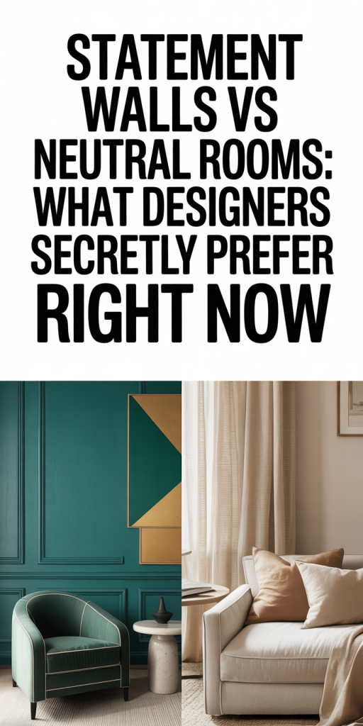
The landscape today is less binary than it might seem. We have three dominant directions coexisting: maximalist color-forward spaces, refined neutrals with texture-forward layers, and hybrid approaches that mix restrained palettes with targeted pops. Social platforms and retailers pushed saturated hues for several seasons, jewel tones, saturated ochres, and moody greens dominated, but the pendulum has swung toward curated restraint. That doesn’t mean color is gone: it means color is more intentional.
Retail and hospitality projects are leading with bold theatrical statements, oversized murals, geometric feature walls, and large-scale wallpaper. Residential projects favor restraint but with strong accents: a moody fireplace wall, a painted kitchen island, or a built-in with a contrasting back panel. We’re also seeing more permanence in material choices: tile, wood veneer, and plaster finishes are replacing simple paint for statement surfaces because they age better and feel more considered.
On the neutral side, designers are expanding the definition beyond beige-and-white. Neutrals now include warm greiges, mushroom tones, and layered off-whites paired with rich textures, boucle upholstery, matte plaster, and natural oak. This approach supports longevity and resists visual fatigue. In the end, the dominant trend is intentionality: whether you choose a statement wall or a neutral room, it should respond to lifestyle, architecture, and future adaptability.
How Color Psychology Shapes Preference
Color isn’t decoration alone: it’s behaviorally relevant. When we choose a statement wall, we aren’t just adding color, we’re shaping mood and social dynamics. Deep blues and greens tend to calm and ground, making them ideal for bedrooms or study nooks. Warm saturated hues, terracotta, saffron, coral, energize spaces where conversation and activity happen. High-chroma accents raise perceived warmth and can make large rooms feel cozier.
Neutral rooms wield a quieter psychological power. Toned-down palettes reduce cognitive load, which is why we recommend them in multipurpose rooms and areas used for focused work. Neutrals also act like visual “silencers,” allowing art, plants, and furnishings to stand out without competition.
Importantly, context changes meaning. A green statement wall in a small north-facing room will read differently from the same hue in a sunlit open-plan loft. We always test colors at different times of day on the actual wall, because reflected light and adjacent materials alter perceived temperature and saturation. Eventually, color psychology informs preference but doesn’t dictate it, function and light conditions do.
When To Choose A Statement Wall (And When Not To)
We recommend a statement wall when you want to define or rescue a space quickly and with relatively low cost. Typical scenarios include:
- Architecturally bland rooms that need a focal point: a bold painted wall, wallpaper, or textured finish can create instant architecture.
- Small spaces where a single strong color creates depth and drama without overwhelming the room.
- Rooms used for socializing or creative work where energy and personality are desirable.
- Homes with clear personal branding needs, think home offices, content creators, or hospitality projects.
When not to choose a statement wall:
- In multifunctional rooms where flexibility is paramount (e.g., living-dining-kitchen combos used for work, dining, and hosting). A strong wall may limit future layout changes.
- In homes preparing for sale where buyers expect a neutral canvas: a highly personalized wall can narrow appeal and may reduce perceived value.
- When the architectural finish or adjacent materials clash: a statement wall can amplify awkward proportions if not carefully planned.
We also caution against choosing a statement wall to mask poor spatial planning. It’s a tool, not a bandage. If the room’s bones are problematic, prioritize architectural fixes before applying bold color.
When A Neutral Room Is The Better Move
Neutral rooms are the safer long game for many clients, but they’re not synonymous with boring. We recommend a neutral approach when:
- The room must adapt to multiple functions or divergent occupant tastes. Neutrals act as a flexible backdrop that supports changing furniture, art, and textiles.
- There’s a high likelihood of redecoration or resale in the near future. Neutral palettes maximize market appeal.
- The space is small and poorly lit: carefully chosen neutrals can reflect light and make the room feel larger and airier.
- The client values calm and minimal visual stimulation for stress reduction or focus.
To avoid a bland result, we layer neutrals through contrast in tone (warm vs cool), texture (matte plaster vs nubby textiles), and subtle accents (brass hardware, deep-stained wood). We also use tonal variation to create depth: a room of three complementary neutrals feels curated rather than monotonous. In short, neutral doesn’t mean inert. Done well, it’s a strategy for longevity and versatility.
Practical Strategies For Making Statement Walls Work
When we commit to a statement wall, detail matters. Below are the tactics we deploy to ensure impact without buyer’s remorse or visual fatigue.
Lighting, Functionality, And Longevity: Balancing Beauty With Use
Lighting transforms color. A wall that looks sumptuous at noon may feel flat at night. We design lighting layers, ambient, task, and accent, to support both statement walls and neutral rooms. Accent lighting (picture lights, wall washers, or LED strip behind a headboard) brings texture forward and keeps a statement wall readable after dark.
Functionality is non-negotiable. For example, a bold-colored kitchen backsplash must be resilient to grease and frequent cleaning: we’ll specify glazed porcelain or glass there rather than matte paint. In living rooms, consider how furniture repositioning will interact with the wall. Fixed installations (bookcases, TV units) can be integrated into the statement so the wall remains relevant as layout shifts.
Longevity requires material strategy and color restraint. We advise clients to avoid overly trendy hues in large, permanent surfaces unless they’re committed to frequent updates. For dramatic effect with less risk, we suggest statement elements that are easier to reverse: removable wallpaper, painted panels, or modular veneers. That way the impact is reversible and the space stays future-proof.
Common Mistakes Designers Make With Both Approaches
We’ve learned from projects that certain mistakes repeat themselves, whether a team chooses a statement wall or a neutral room. Here are the ones we see most and how we avoid them:
- Choosing color without live testing: Digital swatches and sample pots under different lights prevent costly missteps. We always paint large swatches on the actual wall and observe for several days.
- Overstating permanence: Committing to a single, highly personalized hue across open-plan spaces can date a home and limit future staging. We recommend reversible treatments when taste is unknown.
- Ignoring material compatibility: Pairing a delicate plaster finish in a kid’s playroom or using high-gloss paint where fingerprints will show is a practical error. Material selection must match use.
- Failing to plan for lighting: A brilliant statement wall that disappears at night because of poor lighting undermines the whole point. Lighting design is part of color design.
- Under-layering neutrals: Many neutrals look flat because they lack tonal variation and texture. We counter that with layered textiles, mixed warm/cool tones, and intentional contrast.
If there’s one final takeaway: intention beats imitation. Whether we opt for a striking statement wall or a layered neutral room, the choice should be intentional, tested, and tied to how people will live in the space. That’s how design stays beautiful and useful.
Leave a Reply