Category: Interior Design

  • Get The Built-In Look Without The Built-In Price: Smart Strategies To Achieve High-End, Seamless Style

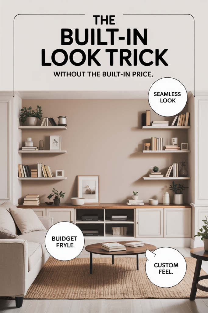
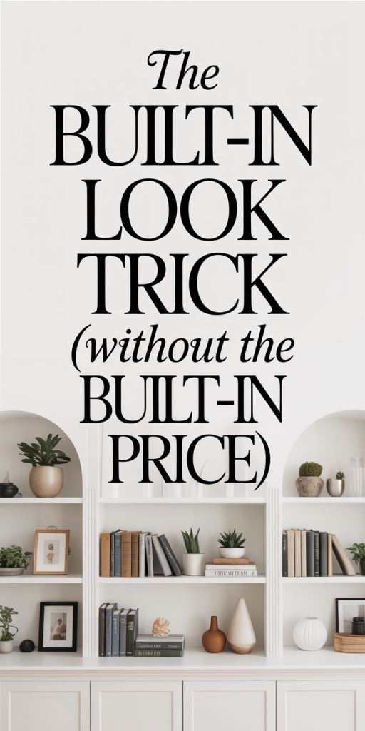
    Built-ins read as custom, high-end, and effortlessly tailored to a space, but they often come with a price tag that puts them out of reach for many projects. The good news: we don’t need full custom millwork to get that seamless, integrated aesthetic. In 2026 there are smarter materials, modular systems, and finishing tricks that let us emulate the built-in look at a fraction of the cost. In this guide we’ll walk through why built-ins cost so much, how to define the exact style you want, cost-effective material choices, planning strategies, practical DIY techniques, and when it still makes sense to hire a pro. By the end, we’ll have a clear, actionable plan so you can get the built-in look without paying for bespoke cabinetry.

    Why The Built-In Look Costs So Much

    Custom built-ins command premiums for several predictable reasons, and understanding those reasons helps us decide where to spend and where to save. First, custom millwork is labor-intensive. Skilled carpenters measure, cut, fit, and finish pieces on site to match walls, trim, and odd angles. That labor often represents 40–60% of a custom built-in’s final cost.

    Second, custom materials and joinery add expense. Solid wood, dovetail drawers, and integrated shelving systems aren’t cheap. When you specify hardwoods, specialty hardware, or inset doors, material costs climb quickly. Add in finishing, staining, multiple layers of topcoat, and professional paintwork, and the invoices add up.

    Third, site-specific work creates complexity. Built-ins often require structural considerations, electrical for integrated lighting and outlets, and precise fitting around windows, baseboards, or HVAC. That complexity increases both time and the chance of unexpected costs.

    Finally, design and customization carry value. A bespoke built-in is framed as a long-term investment and a reflection of professional design time. That premium is fair in many cases, but if our goal is the appearance rather than custom construction, we can selectively mimic the look. Knowing where the real costs live, labor, high-end materials, and complex site work, lets us target savings without sacrificing the seamless aesthetic we want.

    How To Define Your Desired Built-In Style Before You Start

    Before buying materials or scheduling labor, we need a clear, specific vision. Built-ins run a wide spectrum: library-style shelving with crown and fluted pilasters, minimalist floating units with concealed hardware, or media centers with recessed cabinets and wiring channels. Each direction changes material and labor choices.

    Start with three focused decisions: function, form, and finish. Function: what will this built-in do? Store books, hide media equipment, act as a window seat with storage, or frame a fireplace? Knowing function pins down shelving depth, drawer needs, and whether ventilation or cable access is necessary. Form: choose a style reference. Gather three to five photos (we recommend using a private board or folder) that show the exact proportions and details you like. Are you after floor-to-ceiling units, or a base cabinet with open shelves above? Finish: decide on paint vs. stain, type of door (shaker, slab, glass-front), and trim level (simple reveal or integrated crown and base molding).

    Dimensionally, sketch a scaled plan of the wall with rough measurements. Note obstacles, switches, outlets, vents, and consider sightlines from the main room. We’ll use this plan to compare modular options and to determine if we need filler pieces or site trimming. Finally, set a realistic budget range and a priority list: if we must choose, do we prefer perfect integration (seamless reveals) or lower cost? This clarity prevents scope creep and helps us evaluate cheaper alternatives that still deliver the look we want.

    Cost-Effective Materials That Mimic Custom Built-Ins

    The materials we pick make the biggest visual difference, and there are excellent cost-effective options that convincingly mimic custom millwork. Engineered wood products have improved dramatically and are our first stop. High-quality plywood ( cabinet-grade, Baltic birch where possible) gives solid edges for paint and holds screws better than particleboard. For painted built-ins, painted MDF carcasses with plywood faces combine stability and cost savings.

    Melamine and laminate-faced panels are inexpensive and durable for interiors where paint won’t be used. Newer thermofoil finishes can emulate painted doors while resisting chips. For visible faces, consider veneer plywood: a thin hardwood veneer over an MDF or plywood substrate delivers real wood grain appearance at a lower cost than solid hardwood.

    For trim, pre-primed MDF profiles are affordable and paintable: they install quicker than custom-milled hardwood trim. For countertops or seat tops, quartz slabs with minimal seams are usually less expensive than custom-cut solid stone when we limit the number of seams and edge profiles. Another budget-friendly option is a painted solid wood top (clear-coated) or a butcher-block insert.

    Hardware and lighting also shape perception. Choose concealed hinges and full-extension soft-close drawer slides to mimic custom cabinetry functionality without custom joinery. Integrated LED strips or puck lights with diffusers create that architectural look: they’re inexpensive and easy to hide in a valance or under a top shelf. In short, combining plywood/MDF carcasses, veneer or painted faces, and savvy hardware lets us get the tactile feel of built-ins without the premium materials.

    Smart Planning: Measurements, Layout, And Modular Alternatives

    Planning is where we save the most. Tight measurements, clear layouts, and intelligent use of modular systems can deliver near-custom results with predictable cost. Start with an accurate measured drawing and a template for obstacles. We recommend measuring each wall dimension three times and noting floor and ceiling irregularities, many old homes have out-of-plumb walls that need shimming.

    Layout decisions that affect price: whether units are continuous (floor-to-ceiling), or separated by furniture and trim: if base cabinets align with existing baseboard height: and whether appliances or the fireplace require nonstandard openings. When tolerances matter, plan for filler strips, narrow, painted slats that cover small gaps, rather than custom milling. Fillers are inexpensive and look intentional when finished properly.

    Modular cabinetry manufacturers now offer near-custom sizing and options for in-field trimming. Companies that produce semi-custom wall systems and box cabinetry allow us to combine standard widths into continuous runs with consistent face-frame styles. Using standard modular widths (12, 15, 18, 24, 30 inches) reduces cost because parts are pre-made and quicker to install. We can create the illusion of a single built-in by butting modules closely, aligning reveal gaps, and adding continuous trim across the face.

    For media or library walls, plan cable chases and ventilation in advance. Use open-back modules or add routed channels in the wall behind the cabinet, planning this during layout avoids costly retrofits. Finally, make a cut list and purchase a little extra material for on-site mistakes. The combination of precise measurement, modular units, and small finishing tweaks is the most reliable way to hit the built-in look on budget.

    DIY Techniques To Achieve Seamless Integration

    If we’re comfortable with basic carpentry, many finishing techniques make modular or pre-made units read as built-ins. A few hours of careful trimming, painting, and filler work can transform store-bought cabinets into an integrated wall of custom-looking millwork. The key is focusing on seams, consistent reveal widths, and transitions to existing trim so the installation reads as intentional and permanent.

    Before diving in, we recommend mock-fitting units on site and labeling every piece. Dry-fit gives us a chance to identify gaps, decide where to add shims, and plan trim placements. Prioritize creating a continuous cornice or top rail to visually tie modules together, even a simple 1×4 with a decorative profile makes a huge difference. Below we outline the highest-impact DIY finishing tricks and a straightforward approach to using ready-made cabinets as believable built-ins.

    Trim, Paint, And Caulking Tricks That Hide Joints

    Small finishing details are the illusionists of the built-in look. When we hide joints, control reveal widths, and finish consistently, the brain reads the assembly as custom. Start with trim: use continuous runs of crown moldings and baseboards to hide seams between modular units. We like using pre-primed MDF or finger-jointed pine for long runs because they’re straight and consistent. If the wall is out of plumb, scribe the trim to match: a tight scribe line filled and caulked will look intentional.

    Paint does heavy lifting. Sand edges, apply high-build primer, and use a good-quality satin or eggshell latex for durability. For the smoothest finish on painted millwork, consider a spray or an HVLP system: if that’s not available, a high-density foam roller cut down and an angled brush for corners works well. Multiple thin coats beat one thick one.

    Caulking rules: use a paintable acrylic-latex caulk for small gaps and a flexible polyurethane caulk for larger transitions that may move. Keep bead lines thin and tool them with a wet finger or caulking tool for a seamless look. We also feather caulk onto the adjoining drywall slightly, this removes shadow lines after paint.

    Create intentional reveals: uniform gaps (usually 1/16–1/8 inch) between doors and trim mimic factory tolerances found in custom cabinetry. Measure and shim cabinet boxes so doors sit flush: then use thin reveal strips where necessary to maintain consistency. These small efforts, continuous trim, careful priming and painting, and meticulous caulking, turn separate pieces into a cohesive built-in.

    When To Hire A Pro And How To Save On Labor Costs

    There are times when hiring a professional is the smartest move. We recommend a pro when structural modifications, electrical integration, or complex built-in features (like curved cabinetry or integrated refrigeration) are part of the plan. Also, if our desired finish is flawless painted millwork with tight reveals and complex molding, a finish carpenter or cabinet installer will deliver results that DIYers struggle to match.

    To save on labor without sacrificing quality, break the project into phases and keep the pro’s scope focused. For example, we can buy and partially assemble modular units ourselves, then hire a pro for precise in-field trimming, electrical rough-ins, and final installation. That approach lowers billable hours while guaranteeing the critical high-skill steps are done right.

    Get at least three bids and ask installers to break out costs: cabinet boxes, door/face costs, trim carpentry, paint, and electrical/lighting. Negotiating a flat price for a defined scope is usually better than an hourly rate for carpentry. Also, provide the installer with a clear plan, a material list, and pre-drilled pilot holes when possible, anything that reduces on-site problem-solving reduces labor time and cost.

    Consider hybrid labor solutions like hiring handymen for rough installation and a specialty finisher for painting and trim. We should also time work to avoid peak seasons: contractors often offer better rates in slower months. Finally, source materials and cabinet boxes ahead of time: installers mark up materials, so buying direct and supplying them can trim the budget significantly.

    Conclusion

    The built-in look is largely about proportion, finish, and details, not just bespoke construction. By defining our vision, choosing cost-effective materials, planning intelligently, and using a mix of DIY finishing techniques and selective professional help, we can achieve seamless, high-end results without the built-in price. Small investments in trim, paint, and consistent reveals produce outsized returns in perceived value. If we focus our budget where it matters (accurate installation, good faces, and refined finishing), we’ll end up with built-ins that look like custom millwork, and didn’t cost like it.

  • The Ceiling Paint Trick That Changes the Entire Room: How One Color Transforms Light, Height, and Mood

    We often focus on walls, furniture, and flooring when updating a room, but the ceiling quietly governs how a space feels, its light, height, and emotional tone. The ceiling paint trick we’re about to walk through is simple: pick the right color and finish and you can make a low ceiling feel taller, brighten a dim room, or create a cozy, enveloping atmosphere without spending a fortune. In this text we’ll explain why ceiling color matters, how paint finish and hue change perception, practical painting techniques, design strategies for pairing ceiling color with walls and trim, and common mistakes to avoid. Whether you’re painting a studio apartment, a formal dining room, or a nursery, our guidance will help you make a thoughtful choice that transforms the entire room.

    Why Ceiling Color Matters More Than You Think

    Most people treat the ceiling as background, something to keep plain and forgettable. But the ceiling is a visual plane that interacts with light and color to shape perception. When we change ceiling color, we’re not just altering an overhead surface: we’re modifying how light bounces, where our eyes travel, and how the room’s proportions read. A pale, reflective ceiling throws light back into the room, making it feel airy. A darker ceiling absorbs light and visually pulls the plane downward, creating intimacy. That matters because mood and utility in a room are tightly linked to light and scale. Natural light behaves differently depending on ceiling tone and finish, and even artificial light fixtures reveal different personalities when set against a colored overhead. Beyond atmosphere, ceiling color can correct architectural quirks: we can visually raise soffits, soften harsh angles, or hide imperfections with a considered hue. In short, the ceiling is an opportunity, a kind of architectural punctuation mark that can shift a room’s story with one decisive stroke of paint.

    Choose The Right Ceiling Paint Finish And Tone

    Selecting the appropriate finish and tone for ceiling paint is as important as choosing the color itself. Ceilings traditionally get flat or matte finishes because they minimize glare and mask imperfections. We generally recommend an eggshell to flat sheen range for most ceilings: flat for hiding flaws in older homes, and a low-sheen eggshell or matte for modern spaces where durability and washability matter. The tone, warm, cool, neutral, will change how the room reads. Warm whites lean cream or ivory and add coziness: cool whites (with bluish or gray undertones) read crisp and airy. Undertones are sneaky: two paints labeled “white” can look dramatically different side by side, especially under different light sources. Test swatches on the ceiling itself and observe them at different times of day. If you’re leaning toward color rather than white, aim for a hue that’s slightly lighter and less saturated than the walls to avoid making the ceiling overpowering. Balance finish, tone, and the room’s lighting when making your choice, those three variables together determine the final effect.

    How Ceiling Paint Affects Perceived Height And Light

    Perception of height and light depends on contrast, value, and how our eyes draw boundaries. A high-contrast ceiling, dark against light walls, makes the ceiling feel lower because our eye stops at that darker band. Conversely, when the ceiling is noticeably lighter than the walls, it visually recedes, making the room feel taller. We can exploit this to solve design problems: in a room with a low ceiling but tall, heavy furnishings, a pale ceiling paired with slightly darker walls creates an airy balance. Light distribution is also heavily influenced by ceiling color. Light-colored, reflective ceilings return more of both natural and artificial light into the space, reducing the need for intense fixtures. Darker ceilings absorb light, which is ideal when you want to soften glare, create a cozy lounge vibe, or disguise ductwork and beams in industrial spaces. One subtle trick we like is painting the ceiling a fraction warmer or cooler than the walls to manipulate how light “warms” the room throughout the day. Small shifts in value, 20–30% difference in lightness, produce noticeable changes without feeling contrived.

    Practical Techniques For Painting Ceilings

    Knowing the theory is vital, but the execution makes the difference between a pro finish and a patchy ceiling. We always start by planning the sequence: prep, cut-in, roll, and touch-up. Choose a high-quality ceiling paint formulated for minimal splatter and good coverage. Use a roller with a short to medium nap (3/8″ to 1/2″) for smooth ceilings and a slightly thicker nap for textured ones. Begin with thorough surface prep, wash away grease, patch cracks, and prime stains. When cutting in, use a good-angle sash brush and create a perimeter band of about 2–3 inches. For rolling, attach an extension pole so you can maintain a consistent pressure and avoid stepping on ladders mid-roll. Overlap each pass slightly and maintain a wet edge to prevent lap marks. If you’re painting a darker color over white, multiple coats or a tinted primer will be required. For color-matched ceilings, get tint added to the primer to reduce the number of topcoats. Work in natural light or with good daylight-balanced bulbs so you can see true color and sheen while you paint.

    Prepping, Tools, And Safety Tips

    Proper prep shortens the project and improves the outcome. Start by removing or covering furniture, taping off trim, and protecting floors with a canvas drop cloth. Inspect for mold or moisture damage, if found, address the source before painting. Tools we recommend: an angled 2–2.5″ sash brush for crisp edges, a high-quality roller frame, extension pole, roller covers sized to your room, a paint tray with a grid, spackle for small repairs, and a respirator or mask rated for paint fumes. For safety, use a sturdy stepladder and have a helper when possible. If the ceiling is textured (popcorn or heavy stipple), consider whether you want to preserve the texture: painting can make texture more pronounced. For high ceilings, extendable poles and a stable, wide-base ladder are essential. Ventilation is crucial, open windows and use fans to move fumes outside. If you’re working around electrical fixtures, turn power off at the circuit and remove fixtures before painting. Finally, wear old clothes and eye protection: ceiling paint tends to splatter even though best efforts.

    When To Use White Or Off-White

    White and off-white ceilings are classic for a reason: they maximize perceived height and bounce light. We choose pure white (with neutral undertones) when the goal is maximum brightness, hallways, kitchens, and small bathrooms benefit most. Off-white variants, ivory, cream, or warm beige, are ideal in rooms where a slightly cozier feel is desired without losing light. Use warm off-white ceilings in living rooms and bedrooms that have warm wall colors or wood tones to harmonize the palette. In rooms with cool-toned walls or lots of natural light, a cool white (with faint blue or gray undertones) feels crisp and modern. Remember that what appears white on a paint card can shift dramatically under different lighting: always test a large swatch on the actual ceiling and view it at morning, midday, and evening light. For rental properties or open-concept homes, we often recommend a neutral white with minimal undertone so it pairs easily with varied wall colors and furnishings.

    Using Color On The Ceiling To Add Depth

    Painting the ceiling a color, not just white, can add sophistication and depth. A soft, muted color like pale blue or sage green can make a room feel larger by suggesting an extension of the sky or landscape. For dramatic effect, a deep navy or charcoal ceiling in a dining room or home theater creates an enveloping, luxurious feel. When using color, keep saturation moderate: highly saturated ceilings can feel oppressive if the walls aren’t balanced correctly. A popular technique is the ‘slightly lighter ceiling’ approach: pick a ceiling color that’s one to two shades lighter than the walls’ base color. That keeps harmony while creating dimensional layering. We also recommend considering adjacent rooms, if you have an open floor plan, use ceiling color to delineate zones without changing wall colors. Finally, metallic or pearlescent paints can subtly reflect light and add glamour when used sparingly, such as on coffered ceilings or architectural details.

    Design Strategies: Matching Ceiling Color With Walls And Trim

    Harmonizing ceiling color with walls and trim requires strategy. The traditional approach pairs a white or off-white ceiling with colored walls and matching trim, creating a clean delineation. But intentional continuity can also work, painting trim the same color as the ceiling can blur edges and make a room feel larger. We often suggest the following rules of thumb: if you want a room to feel taller, choose a ceiling several shades lighter than the walls: if you want a cozy, cocooned environment, pick a ceiling slightly darker. Consider undertones: if your walls have warm undertones, choose a ceiling with complementary warmth to avoid visual discord. For rooms with crown molding, painting the crown and ceiling the same color while contrasting the wall can be an elegant move that emphasizes architectural detail. In open plans, subtle continuity, like keeping ceiling color consistent across connected spaces, maintains flow while wall colors define each area. Finally, test how trim looks when painted in either ceiling or wall color: small changes in trim can dramatically shift the perceived balance.

    Common Mistakes And How To Avoid Them

    Even experienced DIYers make ceiling-paint mistakes, but most are avoidable. One frequent error is ignoring undertones: choosing a ‘white’ that clashes with wall tones can make colors look off. Avoid this by testing large swatches. Another mistake is using the wrong finish, high gloss on ceilings will highlight imperfections: stick to flat or low-sheen finishes. Poor prep causes flaking and uneven texture: take time to clean, patch, and prime. Lap marks happen when the paint edge dries before the next pass: maintain a wet edge and work in small sections. Skimping on primer when transitioning from dark to light will cost time, prime first. Overly saturated ceiling colors without balancing wall hues can feel heavy: if you want a dramatic ceiling, pair it with neutral or lighter walls. Finally, bad lighting choices during painting can mislead color perception. Use daylight-balanced bulbs while painting and review swatches at different times of day before committing. Taking these precautions saves time and delivers the polished result we all want.

  • The Arched Mirror Trick That Instantly Elevates Your Space: How Curved Mirrors Add Light, Height, And Style

    We’ve seen trends come and go, but the arched mirror has earned a permanent place in interiors for a reason: it’s an easy, high-impact move that changes how a room feels without a major renovation. In this guide we’ll explain why arched and curved mirrors work so well, the little placement and proportion tricks that make them read as intentional rather than accidental, and how to choose frames, finishes, and sizes that complement your home. Whether you want to add height to a low-ceilinged entry, double the daylight in a dim living room, or give a bedroom a quietly elegant focal point, the arched mirror trick is one of the simplest design investments with outsized returns. Read on, we’ll walk through practical rules, styling tips, common mistakes, and where to buy reliable options from budget-friendly to splurge-worthy.

    Why Arched Mirrors Work So Well In Any Room

    Arched mirrors succeed because they tap into several visual cues our brains use to read space: curvature suggests softness and motion, verticality implies height, and reflective surfaces amplify light and depth. Put together, these qualities make a compact object, one mirror, perform several design jobs at once.

    Curves are psychologically approachable. Unlike a square or rectangle, an arch introduces a gentle, human-scale line that feels more organic and luxe. That soft silhouette is why arched mirrors frequently read as designer features even when they’re budget purchases. We find our eyes naturally trace the arch upward, which creates an impression of increased ceiling height and graceful flow.

    On a practical level, curved mirrors reflect and redistribute light differently than flat-edged shapes. The arch’s top reaches into higher sight lines, catching and returning daylight or ambient light in ways that help brighten corners and hallways. In narrow spaces, an arched mirror placed thoughtfully can create a sense of depth without cluttering sightlines.

    Finally, arched mirrors offer versatility. They play well with many styles, from traditional and French-country to modern minimalism and Japandi, because the shape is both historic and contemporarily relevant. That versatility makes them a safe, strategic choice when we want a single object to elevate an entire room’s aesthetic.

    The Arched Mirror Trick Explained: Placement, Reflection, And Visual Weight

    When we talk about the arched mirror trick, we mean more than “hang a pretty mirror and call it a day.” The trick is about thoughtful placement, using reflection intentionally, and balancing the mirror’s visual weight within the room.

    Placement: The most powerful placements are opposite windows, near entryways, or behind seating. Opposite a window, an arched mirror doubles daylight and draws the outdoors inward, that’s instant ambiance. Near an entry, it introduces presence and checks sightlines so guests step into a space that feels larger and curated. Behind a sofa or console, the arch creates a focal layer that elevates even the simplest furniture arrangement.

    Reflection: What the mirror reflects matters. We should avoid reflecting cluttered areas or unattractive elements. Instead, aim mirrors toward appealing views, garden layers, vignettes, architectural details, or interesting light fixtures. The arch’s curvature tends to soften the reflected image, which can be forgiving and flattering for portraits or dressing areas.

    Visual weight: Arched mirrors carry a certain visual gravity. A large, dark-framed arch will anchor a wall like a piece of art: a slim, metallic arch will read lighter and more decorative. We balance that weight by considering scale and surrounding elements: pair a heavy arch with minimal furniture to prevent crowding, or use a lighter arch to add interest without dominating a small room. The trick is to make the mirror feel intentional, part of the design story, rather than an afterthought.

    Choosing The Right Size, Shape, And Frame For Your Space

    Selecting the correct size, shape, and frame is where the arched mirror moves from decorative to transformative. We start with size: generally, larger mirrors create more impact, but scale must respect the wall and furniture they accompany. A good rule of thumb is that a mirror over a console, mantel, or bed should be about two-thirds to three-quarters the width of the furniture beneath it. For full-height arches meant to visually raise ceilings, choose a mirror that reaches within 8–12 inches of the floor and tops out comfortably below any crown molding.

    Shape nuances matter. A strict semicircular arch reads traditional and formal: a softer elongated arch with more vertical rise looks modern and elegant. Consider the proportions of the room: short, wide rooms can benefit from broader arches that emphasize horizontal space, while tall skinny rooms respond well to elongated arches that accentuate height.

    Frame choices define the mood. Wood frames warm a space and pair well with natural or rustic interiors: painted frames can either blend into walls for a subtle look or contrast for a graphic statement. Metal frames, brass, blackened iron, or polished chrome, deliver a sleek, contemporary edge and reflect light off the frame itself, adding shimmer. Then there are frameless arched mirrors, which offer a minimalist, gallery-like presence and are excellent in modern bathrooms or dressing areas.

    We also think about finish and detail. Antiqued mirrors with slight mottling add character and work beautifully in vintage or eclectic settings. Meanwhile, thin metal borders with mitred corners signal modernity. When in doubt, match the frame material to prominent metals in the room, lighting, hardware, or furniture legs, to keep the palette cohesive.

    Measuring And Placement Rules To Maximize Impact

    Accurate measuring prevents disappointment. Before you buy or hang an arched mirror, we measure both the wall and the furniture it’s meant to relate to, and mentally map the sightlines. A few straightforward placement rules help us squeeze maximum effect from every mirror.

    Rule 1: Eye-line and focal relationship. When hanging a mirror for everyday use, in a dressing area or entryway, the center of the reflective surface should sit roughly 57–65 inches from the floor, which aligns with average eye level. For purely decorative mirrors where practical viewing isn’t necessary, placing the top of the arch closer to the ceiling can maximize perceived height.

    Rule 2: Leave breathing room. Avoid cramming the arch into a crowded composition. Leave 2–4 inches between the mirror and moldings or adjacent artwork, and allow a proportional gap between the mirror and any furniture beneath it. Overly tight spacing makes a mirror feel like a worldly sticker: adequate spacing gives it presence.

    Rule 3: Respect sightlines. Don’t place a mirror where it will reflect unattractive utilities, small TVs, or chaotic corners. Instead, angle or site the mirror to reflect light and architecture. In many cases, the most intentional placement is slightly off-center from a piece of furniture to create a layered, editorial look rather than a matched-for-museum symmetry.

    Rule 4: Consider wall material and reinforcement. Large arched mirrors can be heavy: drywall anchors or studs are necessary. We always check backing and use appropriate hanging hardware rated above the mirror’s weight.

    These measuring and placement rules give predictable results, but small adjustments, a few inches higher or lower, slightly left or right, can shift the perception of an entire room. We recommend dry-mounting paper templates to the wall to test positions before drilling.

    Living Room And Entryway Placement Strategies

    Because living rooms and entryways are social and functional zones, the arched mirror strategy focuses on light, first impressions, and focal balance. In an entryway, a single, well-placed arch directly opposite or adjacent to the door creates a gracious welcome. If space allows, pair the mirror with a narrow console, a tray for keys, and a small lamp: the mirror multiplies both light and vignette.

    In living rooms, we often place an arched mirror above a mantel or sofa. Above a mantel, a centered arch reads like a framed artwork and adds seasonal flexibility: change the mantel vignette and the mirror keeps the composition grounded. Over a sofa, slight off-centering can feel more editorial. If you have a sectional, consider a tall arched mirror on the longest wall to balance the low, horizontal mass of seating.

    In both rooms, use the mirror to capture an appealing reflection, a window view, art wall, or pendant fixture. When the arch reflects a window, it creates a layered view that expands the perceived depth. For living rooms with low ceilings, an arched mirror that extends vertically can be far more effective than installing new lighting: it visually lifts the room.

    Practical tip: If you’re concerned about a mirror appearing too heavy over furniture, choose a slim metal or wood frame with a warm finish to keep the look grounded but not overwhelming.

    Bedroom, Bathroom, And Dressing-Area Placement Strategies

    Bedrooms and dressing areas call for a balance of beauty and utility. In bedrooms, the arched mirror often functions as both a decorative anchor and a practical dressing mirror. Over a dresser, choose a mirror that’s wide enough to create proportion with the dresser, again, roughly two-thirds to three-quarters the width, and place it so the top of the arch sits comfortably below any ceiling detail.

    Full-length arched mirrors are invaluable for dressing areas. If you don’t have space for a built-in wardrobe mirror, lean an oversized arched mirror against a wall at a slight angle. Leaned mirrors bring casual elegance: they create a soft vignette and are easier to reposition than wall-mounted options. Ensure the bottom sits on a stable floor protector to avoid slipping.

    Bathrooms are trickier due to moisture and scale. A large arched mirror above a double vanity makes the room feel larger and elevates a simple vanity to a design moment. Use a properly sealed or humidity-rated mirror and hardware to prevent corrosion. For small powder rooms, a single dramatic arched mirror can replace multiple decor items and make the space feel like a boutique bath.

    Lighting considerations: In dressing areas and bedrooms, lighting at eye level is essential. If the mirror reflects a window, it will help with daylight: for evening routines, flank the arch with sconces or integrate LED backlighting to avoid harsh top-down shadows. We prefer soft, warm light for dressing, around 2700K to 3000K, which is flattering to skin tones and fabrics.

    Safety note: If you’re leaning a heavy arched mirror, secure it to the wall with an anti-tip device. That small precaution prevents accidents and keeps the look intentional rather than precarious.

    Hanging And Styling Tips For A Polished, Cohesive Look

    Hanging and styling an arched mirror well turns it from an object into a room-defining element. We approach hanging like framing a painting: level, centered to the composition, and at an appropriate height. For heavy mirrors, use two hanging points attached to studs or quality anchors to prevent shifting.

    Styling around the mirror is where personality comes in. Keep the area beneath the mirror clean and purposeful: a console with a single lamp and one or two curated objects looks better than a crowded tabletop. Mirrors pair beautifully with layered textures, a woven basket, a stack of books, or a sculptural ceramic. We aim for contrast in scale and texture: a slim-framed arch against plastered walls, or a heavy wooden arch softened with a linen runner.

    Anchoring the mirror with lighting enhances its effect. Wall sconces mounted at about two-thirds of the mirror’s height, or a pair flanking the arch, create symmetry and illuminate the reflected view. If you prefer a more modern look, backlit mirrors provide soft, haloed light that’s both functional and atmospheric.

    Another stylistic lever is repetition. If you have multiple small rooms or a long hallway, repeating small arched mirrors at intervals creates rhythm and a cohesive thread throughout the home. But don’t overdo it: varied frames or slight differences in size prevent the look from feeling like a factory.

    Finally, embrace the mirror’s reflective power in decor choices. Position plants near the mirror to double their presence: use it to showcase an art wall from another angle: or let it capture evening candlelight for a warm, enveloping glow. When we style mirrors, we think in layers, the mirrored surface is just one layer that interacts with furniture, lighting, and accessories to create atmosphere.

    Common Mistakes To Avoid When Using Arched Mirrors

    Arched mirrors are forgiving, but a few common missteps can blunt their impact. We’ve seen these mistakes in real homes, and avoiding them will save time and money.

    Mistake 1: Choosing the wrong scale. Too small and the mirror looks like an afterthought: too big and it overwhelms the space. Always measure and visualize with templates before purchase.

    Mistake 2: Reflecting the wrong thing. Mirrors that bounce back clutter, utility boxes, or unattractive HVAC units defeat their purpose. Pretend you’re framing a photograph, what you reflect should be as considered as any artwork.

    Mistake 3: Ignoring mounting specifications. A heavy arched mirror hung on inadequate anchors is both unsafe and likely to tilt over time. Use hardware rated above the mirror’s weight and secure to studs when possible.

    Mistake 4: Mismatched style. While arched mirrors are versatile, pairing a highly ornate gold arch with ultra-minimalist décor can feel dissonant. We recommend aligning the mirror’s material and finish with key elements in the room: lighting fixtures, cabinet hardware, or furniture legs.

    Mistake 5: Poor lighting. Mirrors amplify light, but they don’t replace proper task lighting. Don’t rely on a mirrored surface to do the work of vanity lighting or reading lamps, instead, use the mirror to enhance existing light sources.

    Avoiding these errors will keep an arched mirror reading as a purposeful design decision rather than a styling shortcut.

    Where To Buy Arched Mirrors And Budget-To-Splurge Options

    We like to recommend retailers and makers across a range of budgets, so you can find a quality arched mirror whether you’re decorating a rental or outfitting a new build.

    Budget-friendly options: Big-box and fast-furniture stores now offer handsome arched mirrors at accessible price points. Look for retailers that provide verified customer photos, they’re invaluable for judging true scale and finish. For a budget arc, choose a simple, thin metal or molded composite frame: these are lightweight, easier to hang, and often come in multiple finishes.

    Mid-range: Specialty home retailers and online boutiques typically offer better materials and craftsmanship. Here you’ll find solid wood or genuine metal frames, hand-finished details, and tempered glass. These options balance durability with design-forward shapes and are ideal for living rooms, entryways, and bathrooms where the mirror will be central to the composition.

    Splurge and artisanal: For a statement piece, consider working with a small studio or artisan maker who can customize dimensions, frame material, and glass treatments (such as antiqueing or low-iron glass). Custom mirrors are worth the investment when scale or finish will make or break the room’s design. High-end furniture showrooms and local framers often offer bespoke services and installation.

    Sourcing tips: Always request a sample of the frame finish when possible, and check the glass specification (low-iron for the truest reflection, tempered or sealed for bathrooms). For online shopping, verify return policies and delivery protection, large mirrors can be damaged in transit. We also recommend reading reviews specifically about hanging and durability: a beautiful mirror that warps or hangs crooked will cost more in frustration than a slightly pricier, sturdier alternative.

    Brands and places we’ve had consistent success with include a mix of national retailers and smaller workshops. If you want tailored recommendations based on your specific room dimensions and style, we’re happy to suggest options after a quick room description.

    Conclusion

    The arched mirror trick is simple but strategic: the right arch, placed thoughtfully, amplifies light, suggests height, and injects instant style. We’ve covered why curved mirrors resonate, how to choose scale and frame, practical measuring and hanging rules, room-specific placement strategies, common pitfalls, and where to buy. When we approach mirrors as deliberate design tools, not just decorative afterthoughts, they repay us with atmosphere and function.

    If you’re decorating a room, start with a template on the wall and test a few placements. Lean on the mirror to frame a great view, pair it with complementary finishes, and use lighting to make the reflection sing. With a little care, an arched mirror will lift a space dramatically, often for a fraction of the cost of structural changes. We can’t promise it will fix everything, but it will change how the room feels, and that’s the whole point.

  • The Limewash Wall Trick That Makes Any Room Look Expensive (Easy Steps + Finish Ideas)

    We’ve all seen those photos: soft, layered walls that look like they were lifted from a high-end hotel or a centuries-old Mediterranean villa. The secret behind that lived-in, luxurious depth isn’t always pricey paint or custom plaster, it’s limewash. The limewash wall trick that makes any room look expensive is as much about texture and subtlety as it is about color. In this guide we’ll explain why limewash elevates a room, how it differs from paint, the exact tools and safety steps you need, and step-by-step application techniques to get a layered, bespoke finish. We’ll also cover color blending, maintenance, and troubleshooting so you can avoid common pitfalls. Whether you’re a DIYer tackling a weekend project or a pro refining a signature look, we’ll walk through how to achieve a high-end finish that’s both durable and unmistakably elegant.

    Why Limewash Instantly Elevates A Room

    Limewash elevates a room because it creates depth and nuance in a way flat paint rarely can. Instead of a uniform single tone, limewash absorbs light differently across tiny surface variations, producing a soft glow and gentle tonal shifts that read as intentional ageing or artisan texture. That subtle, non-reflective finish reads as expensive for a few reasons we should understand.

    First, limewash is translucent. It doesn’t sit on the surface like latex paint: it penetrates and bonds chemically with mineral substrates (lime + masonry). That bond makes the finish part of the wall, not an applied layer, and produces variations in tone as the material soaks up pigment differently across the surface.

    Second, limewash pairs texture with tonality. Small irregularities, trowel marks, micro-roughness, joins, aren’t flaws here: they create visual interest. High-end interior design often uses this kind of subtle imperfection to avoid the plastic look of modern finishes.

    Third, limewash has historical and material associations. It’s been used for centuries across Europe and the Mediterranean. That connection to craft and time-worn surfaces conveys authenticity and permanence that instantly uplifts a space.

    Finally, limewash’s matte, breathable finish complements natural materials, wood, stone, brass, allowing those elements to take center stage. Instead of competing with glossy paint, limewashed walls provide a calm, sophisticated backdrop that reads as curated and expensive.

    What Limewash Actually Is And How It Differs From Paint

    Limewash is a traditional wall finish made from slaked lime (calcium hydroxide) often mixed with water and natural pigments. When applied, the lime reacts with carbon dioxide in the air to form calcium carbonate, essentially a mineralized, breathable layer that becomes part of the substrate. That chemical reaction is key: limewash doesn’t just sit on the surface: it transforms into a durable, mineral finish.

    How it differs from paint:

    • Composition: Conventional paint uses acrylic or alkyd binders to form a film. Limewash is binder-free (or uses minimal natural binders) and relies on a carbonation process to set.
    • Breathability: Limewash is vapor-permeable, allowing moisture to pass through. This quality reduces issues in older masonry and is preferable in humid or historic settings. Most modern paints form impermeable films that can trap moisture.
    • Appearance: Paint typically gives uniform color and either a glossy or matte film. Limewash provides a matte, soft, stone-like patina with natural variations and layering effects.
    • Longevity and upkeep: Limewash, when used on suitable substrates, can last for many years and weathers gracefully, often becoming more attractive over time. Painted films may peel, chalk, or require sanding and stripping when failing.

    Important caveats: limewash works best on porous, mineral-based surfaces, lime plaster, cement render, brick, and some unglazed surfaces. It’s not ideal for glossy primed drywall or previously painted walls unless those coatings are removed or properly prepared. Modern limewash products sometimes include acrylic additives for adhesion on more surfaces, so read labels and choose the appropriate formulation for interiors.

    Tools, Materials, And Safety You’ll Need

    Before we start, gather everything so the job flows. Working with lime requires attention to safety and the right materials for a consistent finish.

    Essential materials:

    • Hydrated lime putty or powdered hydrated lime (Type S or same grade recommended for interior finishes)
    • Distilled or clean water
    • Mineral pigments (iron oxides, umbers) or pre-tinted limewash base
    • Optional: small percentage of natural binder (casein or light acrylic modifier) if applying to less-porous surfaces

    Tools:

    • Large mixing bucket and paddle mixer (or a drill with mixing attachment)
    • Masonry brush (stiff, natural bristle) for traditional brushing techniques
    • Trowel and hawk for application on plastered surfaces
    • Soft bristle brushes and foam brushes for blending and softening
    • Rags, sea sponges, and natural fiber cloths for ragging and patina
    • Sandpaper (fine grit) and a sanding block for light smoothing between layers
    • Drop cloths, painter’s tape, and masking items to protect trim and floors

    Safety gear:

    • NIOSH-approved respirator with P100 filters (lime dust can be an irritant)
    • Goggles or full-face protection
    • Chemical-resistant gloves (nitrile or neoprene)
    • Long sleeves and pants (lime is caustic in concentrated form)

    Why safety matters: wet lime is alkaline and can irritate skin and eyes: dry powdered lime creates fine dust that can aggravate lungs. We always mix and apply in a well-ventilated area, and keep a spray bottle of water and eye wash nearby. If you’re unsure about working with lime, consult a professional or test a small wall area first.

    Prep Work: How To Get Your Walls Ready For Limewash

    Preparation determines the finish. We can’t overstate that a beautiful limewash look begins with proper substrate prep. Here’s how we prepare different wall conditions.

    1. New lime or cement plaster: These are ideal. Make sure the plaster has cured for at least 28 days. The surface should be free of dust: we lightly mist and wipe before starting.
    2. Bare masonry (brick, stone): Clean off efflorescence, grease, and loose mortar. A stiff brush and water usually suffice. For heavy soiling, use a mild detergent solution, rinse thoroughly, and allow to dry.
    3. Previously painted walls: Remove loose paint and any glossy coatings. Full stripping to a porous base is ideal. If that’s impossible, use a bonding primer specifically rated for limewash adhesion, or consider a limewash product formulated for painted surfaces.
    4. Drywall: Standard limewash does not bond well to finished drywall or joint compound. If we must work on drywall, we either apply a specialized lime primer/undercoat formulated for gypsum or create a thin lime or cement render skim coat to provide a mineral surface.
    5. Repairing cracks and holes: Patch with compatible lime-based filler or a fine cementitious patch. Avoid using vinyl spackle: it won’t bond well with lime.
    6. Masking and protection: Cover floors, furniture, and trim with drop cloths. Tape edges carefully. Limewash can be difficult to remove from fabric and porous trims.
    7. Test patch: Always do a small 1–2 sq ft test patch using your chosen mix and application technique. Let it cure and live with it for a few days to see how color and texture develop under your room’s light.

    A clean, appropriately porous surface helps limewash penetrate and carbonate properly, giving the layered, expensive look we’re after.

    Application Techniques For A Luxe, Layered Look

    Getting a luxe, layered limewash look is about building depth through multiple thin layers and varied application techniques. We’ll outline the core approach: start thin, work fast, and embrace irregularity.

    General rules:

    • Thin coats: Limewash should usually be applied in several thin coats rather than one thick pass. Thin coats carbonate more evenly and allow underlying tones to show.
    • Work wet-on-wet or allow partial drying: Some techniques look better when layers are applied before full drying, which blends pigments: others rely on drying between coats for contrast.
    • Vary tools: Use brushes, rags, sponges, and trowels in sequence to create natural variations.
    • Keep edges soft: Hard, crisp lines read as artificial. We soften edges with a dry brush or rag while the lime is still damp.

    Sequence example for a simple layered finish:

    1. Base coat: Apply a diluted base limewash (lighter tone) with a masonry brush, working in sweeping, overlapping strokes. Let it set until slightly tacky.
    2. Mid layer: While the base is tacky, apply a darker, more pigmented limewash in selective areas, using a rag or sea sponge to dab and blend.
    3. Highlight glaze: Thin a small amount of pigment and brush lightly across high areas or around architectural features to create subtle highlights.
    4. Burnish: After the final coat has set but not fully cured, lightly burnish with a soft brush or cloth to compress the surface and reveal sheen variations.

    We’ll walk through specific brush and rag methods in the next subsections so you can replicate classic looks step by step.

    Brushing, Layering, And Burnishing: Step‑By‑Step Method

    This method delivers that effortless, polished patina often seen in boutique interiors.

    Step 1, Mix your base: We mix hydrated lime with water to a creamy, milk-like consistency for the first coat. For the base tone choose a light color, off-white, warm taupe, or soft gray.

    Step 2, Apply the base: Using a large masonry brush, apply the base in long, slightly arched strokes. Overlap each stroke by about 30–40% to avoid banding. Keep the coat thin and even: you should still see subtle texture from the substrate.

    Step 3, Mid-tone layering: After the base becomes tacky (not bone-dry), we mix a mid-tone with a little more pigment and a slightly thicker body. With a smaller brush or rag, selectively apply this tone in vertical or horizontal passes, focusing on corners, around trim, and in areas where natural shadow would fall.

    Step 4, Soft blending: Immediately after laying down the mid-tone, use a dry, soft-bristled brush or a clean rag to drag and soften edges. Work quickly, lime sets as it carbonates.

    Step 5, Highlight and depth: For final depth, thin a stronger pigment with more water and splatter or stipple lightly with a sponge in small areas. This isn’t full coverage: it’s accentuation.

    Step 6, Burnishing: Once the final coat is set enough to resist sticking, but not fully cured (usually within hours, depending on humidity), rub a tightly woven cotton cloth over sections to compress the surface and bring out subtle sheen in peaks. Burnishing refines the finish and creates that luxe, tactile quality.

    Step 7, Curing: Allow the surface to carbonate slowly: avoid rapid drying by controlling air movement and humidity. A slow cure improves durability and color depth.

    Ragging, Sponging, Distressing, And Creating Patina Effects

    If we want a more weathered, patinated look, ragging, sponging, and controlled distressing are our go-to techniques. These mimic decades of wear and are especially effective in layered color schemes.

    Ragging: We dip a loosely twisted cotton rag into a mid-toned limewash and blot excess. Press and lift in random, overlapping motions to build translucent patches of color. Ragging is forgiving: you can remove or soften areas immediately with a damp sponge.

    Sponging: Using a natural sea sponge, we dab a diluted pigment onto the wall. The irregular cell structure of the sponge creates soft-edged spots that look organic. Vary pressure and pigment concentration to avoid repetitive marks.

    Distressing: To create worn edges, we apply a slightly darker wash near corners and then, after partial drying, sand very lightly with fine-grit paper to reveal the base coat. Another method is to use a barely damp cloth to remove small amounts of wet limewash for a peeled, exposed effect.

    Layered patina: For depth, alternate warm and cool undertones across three or four thin layers. For example, start with a warm beige base, rag on a cool gray mid-layer, then spatter a warm umber in select areas. The human eye reads these subtle temperature shifts as age and richness.

    Tips for authenticity:

    • Work in small sections so blends look intentional.
    • Step back frequently under the room’s natural light to judge effect.
    • Less is more: subtlety sells the expensive look, if it reads too fussy, scale back.

    These techniques let us sculpt visual history into a wall, an instant way to make a room look curated and costly without a high budget.

    Color, Tone Blending, And Finishes To Match Your Style

    Color selection and tone blending are where design intent meets material logic. We approach color with the goal of creating a backdrop that complements furnishings while providing subtle shifts that reward close inspection.

    Choosing base tones:

    • Neutral, warm bases (soft beiges, warm whites) suit rustic, Scandinavian, and classic interiors. They pair beautifully with wood and leather.
    • Cool bases (muted grays, soft blues) work for modern, minimalist, or coastal looks and harmonize with metal and glass.
    • Earthy, saturated bases (terracotta, olive, deep umber) create dramatic, enveloping rooms that feel curated and intimate.

    Blending strategies:

    • Two-tone approach: Start with a light base and add a single mid-tone for shadows and interest. This is safe and versatile.
    • Triadic layering: Use three related tones, base, mid, and accent, to create complex depth. We often use a neutral base, one warm mid, and a cool accent for visual tension.
    • Undertones: Be mindful of undertones (yellow, blue, red). Two neutrals can clash if their undertones differ. Test swatches next to furniture and fabrics.

    Finish considerations:

    • Matte, low-sheen limewash reads most luxurious. It avoids glare and looks more tactile.
    • Slightly burnished areas can introduce localized satin-like reflections that add richness without gloss.
    • For high-traffic areas, consider a limewash with a mild acrylic modifier for extra durability, but keep the percentage low to preserve breathability and appearance.

    Lighting: Observe how color reads at different times of day. Limewash can appear warmer in morning light and cooler under LED fixtures. We always test large swatches on multiple walls before committing.

    Pairing with decor: Use limewash to set a tone, muted walls for bold furniture, or deep limewashed hues to make lighter art and moldings pop. The goal is a cohesive, intentional palette that reads like a thoughtfully styled interior.

    Maintenance, Longevity, And When To Re‑Limewash

    One advantage of limewash is its graceful aging. With the right care, a limewashed wall can last for years and actually improve in appearance as patina develops. Here’s how to look after it.

    Cleaning: Avoid harsh cleaners. For routine cleaning, dust or vacuum with a soft brush. For spots, use a damp (not wet) sponge and mild soap: dab gently rather than scrub. Harsh abrasives will remove the lime binder and disturb the finish.

    Durability: True limewash becomes mineralized and durable after full carbonation, which can take weeks. Surfaces with an acrylic modifier will be more forgiving in high-traffic zones. For kitchens and bathrooms, consider sealing the limewash with a breathable, water-repellent treatment if moisture is a concern, test first.

    Touch-ups: Because limewash is layered and mineral in nature, touch-ups are usually invisible if we replicate the original mix and technique. Keep leftover mixed batches (stored tightly and refrigerated for short periods) and record pigment ratios. For larger repairs, feather new work into surrounding areas to avoid hard edges.

    When to re-limewash: Over time, limewash can naturally thin or wear in high-contact areas. We typically reapply a fresh thin coat every 5–10 years depending on exposure and wear. In historic or exposed settings, more frequent maintenance may be necessary.

    Environmental benefits: Limewash is low-VOC and breathable, which is kinder to indoor air quality compared with many modern paints. Its ability to regulate moisture in masonry also contributes to healthier wall systems in older homes.

    In short, with gentle care and occasional refreshes, limewashed walls remain beautiful and functional for a long time.

    Common Mistakes To Avoid And Troubleshooting Tips

    We’ve learned from projects where things didn’t go to plan. Here are the common mistakes and how to fix or avoid them so your limewash project reads high-end, not amateur.

    Mistake 1, Applying too thickly: Heavy coats crack and look patchy. Fix: scrape or sand off peaks and reapply thin, more diluted coats.

    Mistake 2, Working on non-porous surfaces without a proper primer: Lime won’t bond to glossy paint or sealed drywall. Fix: remove the coating or scuff, and apply a mineral primer or a thin lime/render skim coat.

    Mistake 3, Inconsistent mixing or unknown pigment ratios: Colors shift between batches. Fix: measure pigments by weight and record ratios. Mix enough for the wall or make test batches and compare.

    Mistake 4, Rushing drying/cure time: Rapid drying causes powdery, weak surfaces. Fix: control ventilation and humidity, slower drying yields better carbonation. In a hurry, mist lightly and avoid direct fans.

    Mistake 5, Overworking the surface: Excessive sanding, scrubbing, or aggressive wiping removes layers and creates shiny spots. Fix: be gentle: if the finish shows shine in places, lightly scuff and apply another thin coat to balance.

    Mistake 6, Ignoring test patches: Skipping tests leads to surprises in color and texture. Fix: always test across different walls and lighting conditions: live with the sample for a few days.

    Troubleshooting quick reference:

    • Powdery surface: Indicates incomplete carbonation or poor adhesion. Improve ventilation and consider a recoat after cleaning.
    • Flaking: Usually caused by moisture trapped under a non-breathable layer. Remove incompatible coatings and reapply to a breathable substrate.
    • Uneven sheen: Burnish selectively to even out, or add a thin matching wash to high or low spots.

    If a problem persists, don’t be afraid to consult a lime plaster or conservation professional, especially on historic substrates. We’ve found that small, patient fixes outperform aggressive corrections every time.

  • The Statement Stone Trick That Replaces Backsplashes: How To Make Your Countertop Do The Heavy Lifting

    We’re in a moment where less can be more, especially in kitchen design. Instead of layering a separate backsplash material over the wall, more homeowners and designers are letting the countertop reach up the wall as a single, dramatic plane: what we’re calling the statement stone trick. It’s bold, clean, and remarkably practical. In 2026, with better fabrication techniques and wider stone options, using a full-height or partial-height stone application to replace a traditional tile or subway backsplash is one of the fastest ways to modernize a kitchen and add long-term value.

    In the sections that follow, we’ll explain what the statement stone trick is and why it works, compare it to traditional backsplashes, break down the best materials and edge treatments, walk through installation options and substrate needs, and give design-forward tips so the look reads cohesive rather than contrived. Whether you’re planning a full remodel or a targeted refresh, we’ll help you make your countertop do the heavy lifting, literally and visually.

    The Statement Stone Trick: What It Is And Why It Works

    The statement stone trick is simple in concept but powerful in effect: extend the countertop material up the wall behind the sink and cooktop to replace a separate backsplash. That extension can be a full-height slab running from counter to ceiling, a mid-height splash (commonly 12″–24″), or a continuous waterfall that wraps the countertop edge and climbs the wall. The idea is to rely on one continuous material to create a strong visual anchor rather than piecing multiple surfaces together.

    Why it works now: fabrication and transport advances let us work with larger, lighter slabs and tighter seams than a decade ago. Engineered stones and large-format porcelain mimic natural veining while offering greater consistency, useful when you want a dramatic, book-matched slab. From a design standpoint, a single stone plane reads as less busy and more luxe: it simplifies the silhouette, highlights veining or veined book-matching, and provides a practical, wipe-clean surface in the most splash-prone area.

    Functionally, statement stone is durable and hygienic. Solid, non-porous engineered quartz and some porcelains resist staining and microbial growth better than grout-lined tile. Even natural stones like honed marble or leathered granite perform well if sealed properly and used in the right applications. Finally, the statement stone trick reduces maintenance headaches: fewer grout lines, no caulk that’s constantly failing, and a unified surface that’s easy to keep looking new.

    Benefits Over Traditional Backsplashes

    Choosing statement stone instead of traditional tile backsplashes delivers benefits across aesthetics, durability, and resale value. Aesthetic benefits are immediate: a full slab behind the work zones reads as high-end, creates visual continuity, and allows veining or pattern to become the room’s focal point. We often see this in modern open-plan kitchens where the backsplash is visible from living spaces, the uninterrupted stone reads like art.

    From a durability and maintenance standpoint, stone reduces porous surfaces and eliminates grout lines where dirt, grease, and mildew accumulate. This is especially valuable behind the range and sink. Engineered materials typically come with manufacturer care guidelines and warranties that outpace older backsplash installations. For households that cook frequently, that’s a real time-saver.

    On the value side, cohesive material selections tend to fetch higher appraisals. Buyers perceive continuous slabs as intentional, premium choices. When we compare kitchens with tiled backsplashes to those with integrated stone, the latter often scores better in listings and staging scenarios. Also, water infiltration issues related to failed backsplash caulk are less likely when the material runs into a properly prepped substrate, reducing potential long-term repair costs.

    There are trade-offs, cost and the potential for a colder look if overused, but we find that with thoughtful pairing of texture and color, the benefits generally outweigh the downsides for most mid- to high-end projects.

    Best Materials, Finishes, And Edge Treatments For Statement Stone

    Material choice is the single biggest decision when using the statement stone trick. Here’s what we recommend based on performance and aesthetics:

    • Engineered quartz: Low maintenance, high consistency, and excellent for bold veining or uniform colors. Many manufacturers now produce slabs in generous sizes suitable for full-height runs. Quartz is non-porous, which makes it ideal behind sinks and ranges.
    • Large-format porcelain: Extremely resilient to heat and scratching, porcelain is available in very large panels and can convincingly mimic marble, fossil, or concrete. It’s lighter than many natural stones and resists staining without sealing.
    • Natural stone (marble, granite, quartzite): Marble offers unmatched beauty for dramatic veining and book-matching, but it’s more maintenance-heavy and requires proper sealing. Granite and quartzite are tougher and more heat resistant: quartzite’s veining can be stunning when finished properly.
    • Sintered stone (e.g., Neolith): Highly durable and heat-resistant with wide format options, great for full-height applications and exterior uses.

    Finishes to consider:

    • Polished: Reflective and elegant: shows veining clearly but can reveal water spots.
    • Honed: Softer, matte finish that hides smudges and gives a warmer look.
    • Leathered: Textured surface that reduces fingerprints and adds tactile interest, works well for casual, layered kitchens.

    Edge treatments:

    • Simple eased or beveled edges keep the look modern and let the slab speak.
    • A waterfall edge continuing down to the floor is dramatic and pairs well with island focal points.
    • Integrated sinks and undermount detail reduce visual seams and reinforce the monolithic appearance.

    When choosing material and finish, we balance the visual impact with day-to-day use. For heavy-cooking households we lean toward porcelain, quartzite, or engineered quartz: for show-stopping design statements we might choose book-matched marble with a honed or leathered finish to minimize wear visibility.

    Installation Options And What Each Entails

    There are several installation strategies for executing a statement stone backsplash, and each comes with different costs, skill requirements, and lead times. We break them into three practical pathways: full-height slab installations, waterfall integrations, and panel systems. Selecting the right method depends on slab size availability, structural wall conditions, and budget.

    Key factors that influence choice include: slab format and availability (larger slabs reduce seams), substrate flatness (walls often require furring or backerboard), and site logistics, can the slab be transported and maneuvered through the home? We recommend consulting your fabricator early so slab selection and templating can be coordinated with cabinetry trades to minimize seams and ensure continuous pattern flows.

    Below, we cover surface prep and substrate requirements as well as common attachment methods so you can weigh options with contractors and suppliers.

    Surface Prep And Substrate Requirements

    (This section is an H3 subordinate to “Installation Options And What Each Entails”)

    Proper surface preparation is non-negotiable. Walls behind countertops are rarely perfectly flat or plumb: small deviations magnify when you apply a slab. We always start by assessing the substrate: drywall over studs, cement board, existing tile, or masonry each requires different prep.

    Typical steps include:

    • Remove loose finishes and old tile backer where necessary. You want a stable, flat plane.
    • Install a rigid, water-resistant backer such as cement board or a gypsum-based tile backer for heavy slabs. For thin porcelain paneling, manufacturers often allow directly fastening to studs with appropriate blocking.
    • Add blocking where heavy anchoring is required, especially at seam lines, upper supports, and around extractor hoods.
    • Confirm the wall is plumb and shim where necessary: fabricators rely on very tight tolerances for edge spans and seam alignment.

    We also pay attention to penetration points like faucets, electrical outlets, and range hoods. Pre-place blocking and coordinate heights to avoid awkward seams or exposed mechanical work. For wet areas, we’ll specify a moisture barrier behind the backerboard to prevent long-term issues.

    A clear, detailed template taken by the fabricator after cabinets are installed is essential: it’s the roadmap that prevents costly mistakes and ensures tight seams and pattern alignment.

    Design And Styling Tips For A Cohesive Look

    Treat the statement stone as a design centerpiece and plan the room’s other elements around it. We aim for balance: when the wall is visually heavy, cabinets, hardware, and lighting should either recede or complement without competing. Consider scale, proportion, and contrast, those three moves will keep the room grounded rather than visually top-heavy.

    Practical starting points:

    • Decide whether the stone will be the feature or a background. If it’s the feature, keep cabinet colors softer and hardware minimal. If the stone is a backdrop (subtle veining, neutral color), you can introduce stronger cabinet contrast or patterned tile on adjacent walls.
    • Use repetition. Pull a color from the stone’s veins into a pendant finish, cabinet paint, or open shelving to create intentional repetition that reads as curated.
    • Be mindful of appliances. Stainless, black stainless, or paneled appliances each interact differently with the stone’s finish. We often advise mockups or swatches installed near the space to test shifting light.

    Below we break down pairing scale, color and pattern considerations, then get specific about lighting, trims, and seams to help you elevate the finish.

    Conclusion

    The statement stone trick gives us a smart way to simplify kitchen surfaces and amplify style. In 2026, better materials and panel systems make it easier and more cost-effective than before to let the countertop do the heavy lifting. When we choose the right material and finish, prep the substrate carefully, and coordinate lighting and seams, a single stone plane becomes a durable, low-maintenance, high-impact solution.

    If you’re remodeling, start conversations early with your fabricator and cabinetmaker, get slabs chosen before finalizing cabinet heights so patterns align and seams fall where they’re least visible. The result is a kitchen that reads as cohesive, modern, and thoughtfully detailed, exactly what buyers and homeowners want today.

  • 22 Shabby Chic Wallpaper Ideas That Turn Any Room Into a Romantic Retreat

    Soft Florals That Set the Tone

    1. Faded Vintage Rose Wallpaper

    This is the easiest way to get that classic shabby chic look right. The key is choosing roses that feel slightly washed out—not bold or high-contrast. You want them to look like they’ve been sitting in sunlight for years.

    Use this in a bedroom with:

    • White or cream furniture
    • Linen bedding
    • Light wood tones

    It creates that soft, romantic feel without trying too hard.


    2. Watercolor Peony Wallpaper

    Peonies already feel elegant, but the watercolor effect softens everything even more. It almost blurs the edges, which makes the room feel calmer and more open.

    This works especially well if:

    • Your space feels small or tight
    • You want something floral but not “busy”

    Pair it with minimal decor so the walls can do the work.


    3. Cream & Sage Botanical Wallpaper

    This one leans a little more modern while still staying in the shabby chic lane. The sage green keeps things grounded, while the cream background keeps it light.

    It’s a great “safe” choice if you:

    • Don’t want overly feminine florals
    • Want something that works long-term

    Add plants nearby and it all ties together naturally.

    4. English Garden Mixed Blooms

    This is a fuller, layered look—multiple flowers, vines, and colors working together. It feels like a real garden instead of a single plant repeated over and over.

    Best used on:

    • One accent wall
    • Dining rooms or sitting areas

    Too much of this in a small room can feel heavy, so balance it with simple furniture.

    Botanical & Nature-Inspired Styles

    5. Pressed Botanical Print Wallpaper

    This gives off a vintage collector vibe—like pages out of an old plant journal. Each flower or leaf feels intentional.

    Use it when you want:

    • A quieter, more refined look
    • Something that feels intellectual, not decorative

    Great for offices or reading spaces.

    6. Lavender Field Wallpaper

    This one is more about the feeling than the pattern. Long rows of lavender create depth and calm.

    It works best:

    • Behind a bed
    • In spaces meant for relaxing

    Keep everything else simple—light fabrics, neutral tones, maybe a wood bench or stool.

    7. Bird & Birdcage Motif Wallpaper

    Adds a little story to the room. Birds, branches, and cages bring a soft, almost nostalgic feel.

    Best approach:

    • Use it as a feature wall
    • Keep surrounding decor minimal

    It’s subtle, but it gives the room personality.

    Textured & Aged Finishes (Where It Gets Real)

    8. Distressed Wood Panel Wallpaper

    If you want warmth, this is it. It mimics reclaimed wood and instantly makes a room feel more grounded.

    Use it in:

    • Bedrooms
    • Offices
    • Even entryways

    Lighter tones = airy cottage
    Darker tones = cozy cabin

    9. Peeling Paint Effect Wallpaper

    This gives you that imperfect, aged look—without actually damaging your walls.

    It works well when:

    • You want character without pattern
    • You’re mixing modern and vintage

    Think of it as a backdrop, not the main feature.

    10. Whitewashed Brick Wallpaper

    This one brightens a room while still adding texture. It’s a great alternative to real brick.

    Perfect for:

    • Living rooms
    • Kitchens
    • Open spaces

    Add a big mirror or natural light and it really opens things up.

    11. Crackled Paint (Pastels)

    The crackle effect adds just enough detail without feeling busy. It’s subtle, but you notice it.

    Best in:

    • Small bedrooms
    • Reading corners

    Stick with soft colors like blush or mint to keep it cohesive.

    12. Beadboard Wallpaper

    Clean, vertical lines that mimic real paneling. It’s simple but effective.

    Use it when you want:

    • A classic cottage feel
    • Something that won’t go out of style

    Works almost anywhere.

    13. Linen-Texture Wallpaper

    No pattern, just texture. This is your fallback if everything else feels like too much.

    Great for:

    • Layering with other textures
    • Keeping things calm and neutral

    It makes a room feel finished without drawing attention.

    French-Inspired Looks

    14. Soft Pink Damask

    This is where shabby chic meets traditional elegance. The key is keeping the pink muted—not bright.

    Best for:

    • Bedrooms
    • Accent walls behind beds

    It adds depth without feeling formal.

    15. French Script Wallpaper

    Looks like old handwritten letters layered across the wall.

    Use it when you want:

    • Subtle detail
    • A slightly vintage, European feel

    It works especially well in neutral color schemes.

    16. Toile Wallpaper

    Classic countryside scenes repeated across the wall. It’s detailed but still calm.

    Best approach:

    • Use in larger rooms
    • Or as a single feature wall

    Pairs really well with traditional furniture.

    17. Chandelier Pattern Wallpaper

    This is more of a statement. It draws attention immediately.

    Use it:

    • Behind a bed
    • Behind a dining table

    Keep everything else simple so it doesn’t compete.

    Subtle Patterns & Finishing Touches

    18. Lace Pattern Wallpaper

    Soft, detailed, and very light visually. It reflects light nicely, which helps small rooms.

    Best for:

    • Bedrooms
    • Dressing areas

    Keep decor soft and layered.

    19. Blue Gingham

    Feels casual and homey. Not overly styled—just comfortable.

    Works well in:

    • Kitchens
    • Breakfast areas

    Add wood accents and you’re done.

    20. Faded Stripes

    A subtle way to add pattern without going floral.

    Use when:

    • You want structure
    • You don’t want visual clutter

    Vertical stripes can also make ceilings feel taller.

    21. Tarnished Mirror & Frame Patterns

    This adds depth and a slightly dramatic feel, but still fits the vintage theme.

    Best for:

    • Smaller rooms
    • Powder bathrooms

    It reflects light visually, making the space feel bigger.

    22. Pastel Patchwork (Quilt Look)

    This one leans cozy. It feels layered and soft, almost like fabric on the walls.

    Best used in:

    • Bedrooms
    • Guest rooms

    Keep furniture simple so it doesn’t feel too busy.

    Quick Reality Check (What Actually Works)

    If you’re doing this in a real home—not just Pinterest:

    • Pick one dominant style per room
    • Use bold patterns on one wall max
    • Balance everything with white, wood, and neutral textures

    That’s how you keep it from looking cluttered.