Blog

  • The Cozy Lighting Trick That Makes Your Home Feel Like a Hotel — Layered Warmth Hacks for 2026

    We’ve all walked into a hotel room and felt an almost instant calm: the lighting looks softer, corners feel inviting, and the whole space seems designed to breathe. Replicating that hotel-style comfort at home isn’t about splurging on chandeliers or copying a hospitality designer’s exact plan. It’s about a single, repeatable principle that hotels use everywhere: layered, warm lighting designed with intention. In this guide we’ll explain why hotel lighting feels so comfortable, reveal the one cozy trick that pulls it all together, and show practical, room-by-room ways to carry out layered warmth in 2026, using modern smart controls, dimmers, and fixtures that are actually affordable. If you’re ready to make your home feel more restful, luxe, and effortless, let’s dig in.

    Why Hotel Lighting Feels So Comfortable

    Hotels aren’t comfortable by accident. Hospitality designers think about pace, function, and mood for every square foot. Three core principles explain that “comfort” we notice immediately: warm color temperature, layered sources, and deliberate control. Warm color temperature, usually around 2700K to 3000K, mimics incandescent light and skin tones in a flattering way. That gentle amber quality reduces visual harshness and signals the brain that it’s time to relax.

    Layering means hotels never rely on a single overhead light. Instead, they mix ambient light (overall brightness), task light (for reading or getting ready), and accent light (to highlight objects, textures, or architecture). Each layer has a slightly different intensity and placement so the eye finds rest in the darker planes and focus where needed.

    Finally, hotels use control: dimmers, separate switches, and preset scenes allow staff (and guests) to change mood instantly. The difference between a well-lit hotel suite and a typical home often comes down to this orchestration, not necessarily more fixtures, but smarter placement and control. When we decode these three elements, we can copy what works without copying the look exactly. It’s less about installing more lights and more about arranging them thoughtfully.

    The One Cozy Trick: Strategic Layered Lighting

    If we had to distill hotel lighting into one trick, it would be this: intentionally layer warm light sources so each layer can be used independently or together. That sounds straightforward, but it upends how many people light a room. Most homes use a bright central ceiling lamp for everything: hotels distribute several lower-intensity sources around the room so no single fixture dominates.

    Why does layering work so well? First, it reduces contrast. With multiple low-level lights, shadows are softer and the eye doesn’t have to constantly adjust. Second, layering creates depth, corners recede, textures pop, and surfaces look richer. Third, it gives us choice: we can light only the zone we’re using and keep the rest dim. That economy of light is calming and efficient.

    Practically, the strategy asks us to specify three layers: ambient for general visibility, task for focused activities, and accent for mood. Each layer should be on its own control and use warm color temperatures. When we combine them thoughtfully, say a dimmed overhead plus a bedside lamp and a wall wash on art, we get that hotel-level coziness. We’ll show how to pick fixtures, positions, and controls next so the approach is easy to carry out in real rooms.

    Layering In Practice: Ambient, Task, Accent

    Layered lighting becomes intuitive once we understand the job each layer does and how they interact. Below we break down the three layers, ambient, task, and accent, with practical choices, fixture suggestions, and rules of thumb to translate hotel design into home-friendly moves.

    Ambient Lighting: The Foundation of Hotel Warmth

    Ambient lighting provides the base level of visibility and sets the general mood. In hotels this is often achieved with recessed downlights on a dimmer, concealed cove lighting, or soft ceiling fixtures with frosted diffusers. For homes, we want the same soft, even spread but without glare.

    Fixtures and placement: For living rooms and bedrooms, consider recessed LEDs with wide beam angles, or a central semi-flush fixture paired with wall sconces. Cove lighting or LED tape hidden in crown molding is an elegant way to wash the ceiling and create that floating, spacious feel hotels get. If our ceilings are low, avoid bright, direct fixtures overhead: instead use uplighting (floor lamps that bounce light off the ceiling) to mimic a higher ceiling and distribute light more evenly.

    Color and intensity: Aim for 2700K–3000K color temperature and set ambient levels low enough that individual task lights can be brighter without clashing. In terms of lumens, living room ambient should hover around 1,500–3,000 lumens total (distributed across fixtures), and bedrooms can be lower, 1,000–2,000 lumens, depending on room size.

    Control tip: Put ambient lighting on a dimmer and name that scene “Relax” or “Evening.” Hotels use similar central scenes to quickly shift the entire room’s tone.

    Task Lighting: Practical Comfort Without Glare

    Task lights give us comfortable, shadow-free illumination for reading, cooking, working, or grooming. Hotels often place these as bedside reading lamps, vanity lights around mirrors, and adjustable desk lamps. Our aim is to replicate that focused clarity without adding harshness.

    Fixture choices: For reading and bedside use, go for adjustable swing-arm lamps or small table lamps with opaque shades that direct light downward. In kitchens, under-cabinet LED strips provide even workspace lighting: over stovetops and counters, pendant lights or recessed fixtures positioned to avoid casting shadows are ideal.

    Brightness and placement: Task lighting should be noticeably brighter than ambient in the immediate zone, think 300–500 lumens for bedside reading, 700–1,200 lumens for kitchen counters. Position lights so they illuminate the task surface directly and reduce glare: eyes should not look into the light source when seated at a desk or lying in bed.

    Design note: Choose fixtures with good shielding and consistent color temperature (match to ambient). In bathrooms, place vanity lights at eye level on either side of the mirror or use layered vertical sconces to eliminate shadowing on the face.

    Accent And Decorative Lighting: The Finishing Touch

    Accent lighting is what makes a space feel curated. Hotels use it to highlight artwork, textures, architectural details, and plants, those subtle cues make a room feel considered and lived-in. Accent lights are lower in intensity but high in impact.

    Common accent fixtures: Picture lights, adjustable spotlights, LED strip lighting behind furniture or in shelving, and small recessed eyeballs are all excellent choices. For dramatic effect, a floor uplight behind a plant or a wall washer that emphasizes texture adds depth.

    Placement and intensity: Accent lights should be about one-third to one-half the intensity of task lights in the same visual field. They’re directional and focused: aim beams precisely to avoid eye-level glare. When highlighting art, use narrow beam angles (15–30 degrees) and position fixtures so the brightest area sits slightly below the top third of the artwork for even distribution.

    Stylistic tip: Use accent lighting to create vignettes, a lamp, a stack of books, and a framed photo lit together read like a small scene. Those curated pockets are a big part of the “hotel” feeling because they draw attention to texture and story rather than to utilitarian brightness.
    Where To Place Lights For Maximum Warmth And Flow

    Placement is where layered lighting moves from theoretical to transformational. Hotels plan sightlines and user flow so lighting supports how guests move through the room. We can adopt the same approach in our home, focusing on pathways, focal points, and zones.

    Entry and sightlines: The entry or hallway sets first impressions. A soft overhead or wall sconce paired with a console lamp creates an inviting arrival. Avoid harsh, single-bulb fixtures that reveal every imperfection. Instead, use multiple lower-level sources that create pools of light and shadow: that contrast reads as warmth.

    Living areas and seating: Place task lights next to seating for reading and accent lights to frame artwork or architectural niches. Floor lamps behind sofas that wash light upward are great for rooms with low ceilings, they visually lift the space. Keep the central overhead light optional rather than default: when we entertain, we can use it, but for everyday evenings rely on layers.

    Kitchen and dining flow: The kitchen needs functional task lighting over counters and an ambient layer for the rest of the room. Pendant lights above islands should be hung at 28–34 inches above the counter for balance. In dining areas, a dimmable pendant over the table provides focus, while wall sconces or a buffet lamp provide peripheral warmth.

    Bedroom placement: Bedrooms benefit from symmetrical bedside lamps or wall-mounted sconces with individual switches. Add a low-level floor lamp or cove light to create a glow that helps us wind down. Position closet lighting so it’s triggered by the door or switch and avoids harsh overhead bursts when getting dressed at night.

    Circuits and practicalities: Whenever possible, put layers on separate circuits or switches. That simple wiring decision gives us the flexibility hotels rely on and prevents the temptation to over-illuminate with a single master switch.

    Dimmers, Smart Controls, And Lighting Scenes To Set The Mood

    Control is where layered lighting becomes magical. Hotels use dimmers, preset scenes, and centralized controls so lighting adapts instantly to activity. In 2026, smart lighting technology is affordable and standardized, making it easy to replicate those scenes at home.

    Dimmers first: Always use dimmable fixtures and invest in quality dimmer switches. Dimming not only changes intensity but alters perceived color slightly, making light feel warmer at lower levels. Choose LED-compatible dimmers to avoid flicker and compatibility issues.

    Smart controls and scenes: Smart bulbs, wall controllers, or integrated home automation systems let us create scenes like “Wake,” “Work,” “Dinner,” and “Relax.” For example, a “Relax” scene might set ambient to 25%, bedside lamps to 60%, and accent lights to 20% with 2700K color. Using voice commands or a simple button on a bedside paddle matches the hotel quick-change experience.

    Grouping and scheduling: Group lights by zone (bedside, living, kitchen) and schedule gentle fades in the evening and wake-up scenes in the morning. For instance, schedule ambient lights to slowly brighten over 15 minutes before alarm time: that gentle light transition supports circadian rhythms better than a sudden beeping alarm.

    Practical advice: Keep a manual fallback, labeled physical switches or a simple dimmer, so guests and family members who aren’t tech-savvy can still use the lights with ease. The goal is convenience, not complexity.

    Quick Room‑By‑Room Setup Guide — From Entry To Bedroom

    We’ll walk through a practical, quick setup for each major room so you can start implementing layered warmth this weekend. Each mini-plan lists essential layers, fixture suggestions, and a simple scene to program.

    Entry/Hallway

    • Layers: Ambient (sconce or soft overhead), Accent (console lamp), Motion-triggered pathway lights.
    • Fixtures: Wall sconces at 60–66 inches, small table lamp on console, LED step lights if needed.
    • Scene: “Welcome”, ambient 40%, console lamp 80%.

    Living Room

    • Layers: Ambient (recessed or cove), Task (floor/table lamps), Accent (picture lights or shelf LED).
    • Fixtures: 2–3 floor/table lamps, dimmable recessed for ambient, LED strips in shelving.
    • Scene: “Evening”, ambient 30%, task 60% where occupied, accents 25%.

    Kitchen

    • Layers: Ambient (ceiling), Task (under-cabinet), Accent (over-island pendants, toe-kick LED).
    • Fixtures: Under-cabinet strips, pendants 28–34″ over island, recessed ambient.
    • Scene: “Cooking”, task 100% on counters, ambient 50%, pendants 60%.

    Dining Room

    • Layers: Pendant over table, wall sconces or buffet lamp, optional accent for art.
    • Fixtures: Dimmable pendant centered over table, sconces at 60–66″.
    • Scene: “Dinner”, pendant 40–60% depending on desired mood, sconces 30%.

    Bathroom/Vanity

    • Layers: Ambient (ceiling), Task (mirror/vanity lights), Accent (recessed niche light).
    • Fixtures: Vertical fixtures at eye level or LED mirror lights to avoid shadows.
    • Scene: “Groom”, vanity lights 100%, ambient 50%.

    Bedroom

    • Layers: Ambient (cove or soft overhead), Task (bedside lamps), Accent (reading uplight or art wash).
    • Fixtures: Wall-mounted reading lights or bedside lamps with individual switches: cove lighting behind headboard if possible.
    • Scene: “Wind Down”, ambient 20–30%, bedside 40–60%, accent 20%.

    Office/Workspace

    • Layers: Ambient (ceiling), Task (desk lamp with adjustable color temp), Accent (shelf LED for contrast).
    • Fixtures: High-CRI task lamp at desk, ambient on dimmer.
    • Scene: “Focus”, task 100% (cooler 3000–3500K if needed), ambient 40%.

    Practical rollout: Start with one room, usually the living room or bedroom, and add layers over a few weekends. Swap bulbs to 2700K–3000K and add a dimmer and one task lamp: that small investment yields an outsized feel-good return.

    Conclusion

    Hotel-style lighting isn’t an aesthetic reserved for high-end suites, it’s a practice: warm color, layered sources, and thoughtful control. By prioritizing ambient, task, and accent layers: placing fixtures with intention: and using dimmers or smart scenes, we can recreate that welcoming, restorative atmosphere at home. Start small: swap to warm bulbs, add one quality task lamp, and program a “Relax” scene. Those three moves alone will change how your space feels every evening. Once you begin thinking like a hospitality designer, focusing on flow, choice, and subtle contrast, making your home feel like a hotel becomes simple, enjoyable, and surprisingly affordable.

  • The Mixed Metal Trick Designers Use (Without It Looking Messy): Simple Rules And Room Recipes For 2026

    Mixing metals used to feel risky: a handful of mismatched pieces and suddenly a room reads as chaotic. But over the last few years we’ve watched pro designers refine a repeatable method that keeps spaces cohesive, current, and layered, without the visual noise. In 2026 the mixed metal trick is less about random pairing and more about strategy: pick an anchor, control temperature, repeat rhythmically, and use texture to bridge differences. In this guide we’ll explain why mixed metals work, how to choose a dominant metal, balance warm and cool tones, and give room‑by‑room recipes (kitchen, living room, bathroom, bedroom) that you can copy. We’ll also flag common mistakes we fix on client projects and how to correct them quickly. Read on and you’ll never be afraid to mix metals again, you’ll do it intentionally.

    Why Mixed Metals Work And When To Use Them

    Mixed metals work because they introduce visual contrast and nuance while reflecting a room’s layered history. When we use a single metal too rigidly, spaces can feel flat or overly matched, like a showroom. Mixing metals creates an approachable, collected look that reads as curated rather than manufactured.

    When to use mixed metals:

    • To add warmth or coolness where paint and textiles alone fall short. For example, a cool gray room lifts instantly with brass accents, while a warm taupe room gains sophistication from nickel or chrome.
    • When you want intentional imperfection. A mix suggests that items were gathered over time, which helps residential spaces feel lived‑in and personal.
    • To highlight architectural features. Contrasting hardware or light fixtures draws the eye to islands, mantels, and built‑ins.

    Why the trick works from a design standpoint:

    • Value contrast: Metals reflect light differently. Polished chrome reads brighter than matte black: burnished brass catches warm highlights. We use that to create focal points.
    • Color temperature: Metals carry warm (brass, copper, bronze) or cool (chrome, nickel, stainless, pewter) undertones. Deliberate pairing manipulates the perceived warmth of a room.
    • Texture and finish variance: Satin, matte, brushed, hammered and polished finishes each interact differently with materials like marble, wood, and fabric, creating depth.

    A quick rule of thumb we rely on: pick one dominant metal, introduce a secondary metal in smaller doses, and optionally add a tertiary metal as an accent. That simple hierarchy keeps the mix intentional rather than messy.

    Choosing A Dominant Metal To Anchor The Palette

    Choosing a dominant metal is the single most effective decision we make when mixing metals. The dominant metal acts like the paint color of the palette: it’s the steady, consistent note that grounds everything else.

    How to choose your dominant metal:

    • Start with the largest visible elements. If your kitchen island lighting, cabinet pulls, or a major furniture piece is already in a metal, it’s often easiest to let that be dominant.
    • Match the room’s temperature. In rooms with warm wood floors or warm wall colors, brass, aged bronze, or copper will feel cohesive as the dominant metal. In cool, contemporary spaces with concrete, glass, or cool gray paint, nickel, stainless, or matte black usually read better as the anchor.
    • Consider longevity and resale. Polished nickel and stainless look timeless and are easy to change around: if you want a flexible base choose a neutral metal.

    Practical anchor examples we use:

    • Brass as dominant: great for traditional or transitional rooms. Use brass on lighting, large faucets, and fireplace tools. It makes the space feel curated and warm.
    • Matte black as dominant: ideal for modern or industrial schemes. Black works across hardware, plumbing accents, and window frames, creating a strong graphic backbone.
    • Satin nickel/stainless as dominant: a versatile middle ground. It reads clean and upscale, blending well with both warm and cool secondary metals.

    Once the dominant metal is chosen, limit its use to roughly 60–75% of the metal surfaces in the room. Too much dominance defeats the purpose of mixing: too little means the room lacks cohesion. We suggest mentally inventorying visible metal pieces and keeping a rough count while planning.

    Balancing Warm And Cool Tones

    Balancing warm and cool metals is where the mixed metal trick stops feeling like guesswork and starts functioning as deliberate design. The goal is to make metals speak to each other rather than shout past one another.

    Begin with temperature mapping:

    • Warm metals: brass, antique brass, copper, warm bronze. They bring sunlight and glow.
    • Cool metals: chrome, polished nickel, stainless, pewter, brushed nickel. They lend crispness and modernity.

    Strategies to balance them:

    • 60/30 principle: After choosing a dominant metal, use a secondary metal for about 20–30% of the metal surfaces. The tertiary metal, if used, should be sparingly (5–10%). This keeps visual weight in check.
    • Repeat the secondary metal in at least three separate places to create a rhythm. Humans read patterns: repeating an accent metal across light fixtures, cabinet pulls, and a decor object ties the scheme together.
    • Use bridging finishes: finishes like aged brass with darker patina or warm stainless can visually transition between warm and cool metals. Brushed finishes absorb light and reduce contrast, helping disparate tones coexist.

    Using Accent Pieces To Tie The Palette Together

    Accent pieces are our secret weapon. Small items, vases, picture frames, lamps, mirrors, are the easiest, least expensive ways to introduce a secondary or tertiary metal without committing to large fixtures.

    Tactical use of accents:

    • Place accent metals where the eye naturally rests: tabletop groupings, console tables, and bedside stacks. This creates micro‑moments of cohesion.
    • Use reflective surfaces sparingly. A mirror with a different metal frame can echo fixtures in another part of the room, bridging temperature differences.
    • Consider nonmetallic tie elements: leather straps, woven baskets, or upholstery piping in a color that complements both metals can visually connect them.

    Layering Finishes And Textures For Depth

    Finishes and textures are as important as the metal type. Matte black next to polished brass can feel harsh unless we introduce intermediary textures.

    How we layer:

    • Use matte and brushed finishes as intermediaries. A brushed nickel can soften the jump between polished chrome and burnished brass.
    • Incorporate textured metal objects, hammered copper, fluted brass sconces, or hammered stainless bowls, to add dimension.
    • Pair metals with tactile materials: natural wood, leather, stone, and textiles. These materials absorb and reflect metal tones differently and help anchor the mix.

    Eventually, balancing warm and cool metals is about creating a conversation between elements, not forcing them to match. When we treat metals like members of an ensemble rather than lone stars, the result reads sophisticated and intentional.

    Room‑Specific Recipes: Kitchen, Living Room, Bathroom, Bedroom

    We find that having room‑specific recipes simplifies decision‑making. Below are practical, copy‑ready combinations that work in 2026 interiors, with variations for different styles.

    Kitchen

    • Transitional: Dominant metal, satin brass on cabinet knobs and island pendants (60%). Secondary, brushed nickel for faucets and appliance pulls (30%). Accent, matte black open shelving brackets or light switch plates (10%). Repeat the brushed nickel across three spots: faucet, range hood trim, and small appliance handles.
    • Modern/contemporary: Dominant, matte black or gunmetal (60%). Secondary, polished chrome (25%) on faucets and appliance accents. Accent, warm copper or brass as subtle drawer pulls or a single decorative bowl (15%). Keep countertops neutral (quartz or concrete) to let metals sing.

    Living Room

    • Classic/curated: Dominant, aged brass on lighting and a coffee table base (65%). Secondary, warm bronze on picture frames and mirror trim (25%). Accent, satin nickel on lamp switches or media hardware (10%). Use textiles (wool, linen) in warm neutrals to bridge metals.
    • Minimal/Scandi: Dominant, brushed nickel or satin stainless (55%). Secondary, matte black on legs and trims (30%). Accent, copper or brass in small vases or candle holders (15%). Keep accessories minimal and repeat accent metal in odd numbers.

    Bathroom

    • Spa‑like: Dominant, polished nickel or brushed stainless on faucet and shower hardware (60%). Secondary, warm brass in towel bars and mirror frames (30%). Accent, matte black for a soap pump or small shelf bracket (10%). Avoid mixing three high‑shine metals: instead pair polished with brushed or matte finishes.
    • Vintage glam: Dominant, oil‑rubbed bronze or antique brass (65%). Secondary, porcelain or glass fixtures with small chrome details (25%). Accent, rose gold or copper for light fixtures (10%) to add warmth.

    Bedroom

    • Cozy eclectic: Dominant, warm brass on bedside lamps and drawer pulls (60%). Secondary, matte black on bed frame and picture frames (30%). Accent, brushed nickel or chrome in a mirror or clock (10%). Layer textiles in warm tones to amplify brass.
    • Modern luxe: Dominant, satin nickel on lamps and dresser hardware (55%). Secondary, blackened steel for furniture legs (30%). Accent, polished brass in a single statement chandelier or curtain rods (15%).

    General tips across rooms:

    • Always repeat a secondary metal at least three times. It creates rhythm and familiarity.
    • Use scale to control impact: larger items should stick to the dominant metal: smaller items are for accents.
    • When in doubt, swap one large element (a light fixture or faucet) rather than changing many small pieces. It’s the fastest way to reanchor the palette.

    Common Mistakes Designers Fix (And How To Correct Them)

    We see the same missteps on client projects again and again. The good news: most are simple to correct without a full remodel.

    Mistake 1, Random pairing without hierarchy

    • Problem: No dominant metal, so the room feels scattered.
    • Fix: Choose one anchor metal and swap or repaint a few items to create a 60–75% dominance. For example, spray‑paint small lamp bases or replace a set of knobs to reinforce the anchor.

    Mistake 2, Using only high‑shine finishes that fight for attention

    • Problem: Polished chrome, polished brass, and mirrored surfaces all compete, creating glare.
    • Fix: Introduce brushed or matte finishes to dull the contrast. Replace one polished fixture with a brushed version or add matte black accents to absorb light.

    Mistake 3, Accent metals used in single, isolated spots

    • Problem: A lone copper tray or a single brass picture frame looks like an afterthought.
    • Fix: Repeat the accent in at least two more locations, a small lamp, a faucet lever, or a decorative bookend. Repetition reads intentional.

    Mistake 4, Ignoring scale and placement

    • Problem: Tiny brass knobs next to a massive chrome pendant look visually off‑balanced.
    • Fix: Keep large surfaces aligned with the dominant metal and move accent metals to smaller, peripheral items. Or scale up the secondary metal with a larger decor piece.

    Mistake 5, Forgetting surrounding materials

    • Problem: Metals clash with existing finishes (flooring, countertops, trim) because no one considered the whole material story.
    • Fix: Introduce tie elements like wood tones or textiles that bridge the gap. A walnut shelf or woven rug can reconcile warm and cool metals.

    Quick corrective actions we use in the field:

    • Swap pull hardware on one cabinet run to create a dominant rhythm.
    • Paint a metal item (e.g., spray matte black) to act as a unifying anchor.
    • Add three matching accent objects in a secondary metal to create repetition.
    • Replace a fixture finish (pendant, faucet) rather than upgrading many small items, it’s cost‑efficient and impactful.

    Most fixes are about intention, not expense. Small, strategic swaps yield the biggest visual returns.

    Conclusion

    Mixing metals in 2026 isn’t a trend to fear, it’s a tool for layering personality and depth. When we choose a dominant metal, balance warm and cool tones, repeat accents, and use texture as a bridge, the result is a room that reads considered and effortless. Start small: change a faucet, add two matching metal accessories, or swap a light fixture. Those little moves let you test combinations and build confidence. Follow these simple rules and room recipes, and you’ll have a mixed‑metal scheme that feels modern, intentional, and far from messy.

  • The Accent Wall Trick That Doesn’t Look Cheap: A 2026 Guide To High-End Results On Any Budget

    Accent walls are one of those design moves that can transform a room overnight, when done right. We’ve seen the good, the bad, and the painfully obvious attempts that read as cheap or awkward. This guide exists to help you use the accent wall trick that doesn’t look cheap, whether you’re refreshing a rental, staging to sell, or investing in a forever home. We’ll walk through when an accent wall still makes sense in 2026, the pitfalls to avoid, materials and finishes that read as high‑end, design rules to keep things cohesive, placement and proportion tips, plus budget-friendly, DIY-forward strategies that deliver wow without wasting money. Read on and you’ll be ready to design an accent wall that looks intentional, layered, and, most importantly, expensive.

    Why Accent Walls Still Work — And When To Use One

    Accent walls remain a powerful tool because they alter perception: they highlight, anchor, conceal, or expand a space without the expense of a full‑room overhaul. We still recommend them when you want to create a focal point quickly, define zones in an open plan, or add character to a neutral space that needs personality. But they’re not a universal fix. An accent wall works best when it responds to the room’s architecture, a fireplace wall, the back of a bed, a built‑in bookcase, or the wall behind a dining table. These positions naturally draw the eye and feel purposeful.

    We avoid accent walls when they’re used to mask clutter or when they ignore proportional logic. If you’re in a tiny room with low ceilings, a heavy, dark accent on all four walls will make the space feel boxy. Similarly, painting a single short wall in a narrow room can make the room feel chopped. Instead, opt for finishes or treatments that enhance light and vertical lines if you want the room to feel larger. In 2026, with more open concept living and multifunctional rooms, accent walls are most effective when they define function and speak to the room’s natural focal architecture rather than imposing a trend on the space.

    In short: use accent walls to amplify existing features, create intentional zones, and inject texture or color where it supports circulation and sightlines.

    Common Mistakes That Make Accent Walls Look Cheap

    Some mistakes show instantly: the accent wall that looks slapped on because it’s an afterthought. Here are the frequent errors we see and how to avoid them.

    1. Choosing the wrong wall. Picking the smallest or most hidden wall ruins the purpose, it should be the wall the eye naturally goes to. 2) Overly saturated colors without balance. An ultra‑bright or neon hue can be energetic, but without supportive neutrals and layered textures it reads gimmicky. 3) Using a single flat coat of paint as the only treatment. Cheapness often stems from lack of depth, the finish matters as much as the color. 4) Ignoring scale and proportion. Busy patterns or large panels in a cramped space overwhelm: too-small accents get lost. 5) Poor edges and transitions. Uneven lines, sloppy trim work, and visible seams make even premium materials look budget. 6) Clashing with existing finishes. An accent wall that fights the flooring, moldings, or fixed cabinetry will always look off.

    We recommend a quick checklist before committing: test paint in multiple lights, view wallpaper or panel samples in situ, and consider how furniture or art will sit against the surface. If the treatment can’t hold up under a 30‑second gaze without feeling unresolved, rethink it.

    Materials That Instantly Elevate An Accent Wall

    Materials change everything. Where a single coat of paint can look cheap, well‑chosen materials signal intention and craft. Here are options that read as high‑end even on modest budgets.

    • Real or engineered wood: Thin shiplap, reeded panels, or vertically installed planks add warmth and dimension. We prefer richer grain or painted tones that play with light rather than raw plywood strips that can look DIY.
    • Stone veneer: A stacked stone veneer applied thoughtfully (not over an entire room) brings tactile luxury. Choose slim profiles and muted tones for a modern aesthetic.
    • Plaster and limewash: Venetian plaster or a limewash glaze creates subtle depth and artisanal texture. These finishes refract light differently from paint and age beautifully.
    • High‑quality wallpapers and grasscloths: Modern printed papers with satin or textile blends read expensive. Grasscloth in a restrained palette adds texture and works well behind sofas or beds.
    • Porcelain or large‑format tiles: Tactile tiles installed with narrow grout lines near a fireplace or in a powder room offer durability and polish.

    We like combining materials too, a painted wall with a slim wood-accent band, or wallpaper framed by millwork, to keep the look layered and intentional rather than flat.

    Design Principles For A Cohesive, Sophisticated Look

    A successful accent wall follows design principles that make it feel intentional rather than decorative. Here’s how we think through each project.

    Hierarchy and focus: The accent wall should reinforce a single focal point, not compete with multiple elements. We ask: What do we want your eye to do when it enters the room? The answer defines the finish, scale, and contrast.

    Balance and restraint: Sophistication often equals restraint. One strong wall paired with complementary, subtler textures and colors around the room reads curated. Avoid fighting patterns and colors: instead, echo elements like throw textiles or artwork hues.

    Consistency of finish: If the room has matte wood or satin metals, consider finishes that harmonize, don’t juxtapose matte wallpaper with ultra‑gloss trim unless done intentionally.

    Layering: Treat the accent wall as one layer in a system: paint or panels, a main furniture anchor, lighting, and an accessory layer (art, mirror, shelving). A layered approach makes even inexpensive materials feel considered.

    Proportion and scale: We determine the scale of pattern, groove, or panel based on ceiling height and wall width. Large panels suit tall walls: narrow fluting works for smaller spaces.

    When in doubt, we scale back and create detail through lighting and styling, often a great light fixture or a handful of well‑placed art pieces will make the wall feel deliberate.

    Placement And Proportion: Where An Accent Wall Works Best

    Placement is more important than material if you want a finish that looks intentional. Here are our rules of thumb.

    Anchor the main focal point: Use the accent wall behind the primary piece, sofa, bed, console, or fireplace. This reinforces the functional center of the room.

    Respect sightlines: Consider what visitors see first when they enter. The accent should complement, not confront, that view. In open plans, use an accent to delineate a zone rather than isolate it.

    Vertical versus horizontal emphasis: Tall ceilings benefit from vertical treatments like fluted panels or vertical planks to emphasize height. Low ceilings respond better to horizontal grain or lighter tones that make the room feel wider.

    Partial walls and half treatments: Sometimes a full wall is too much. We use a half-height panel, a framed wallpaper section, or a band of wood behind a headboard. These solutions reduce cost while adding deliberate visual interest.

    Scale the pattern and material: Large‑scale patterns suit big, uninterrupted walls. If the wall has windows, doors, or radiators, choose simpler treatments that won’t compete with interruptions.

    Finally, pair with lighting: A wall looks expensive when it’s lit intentionally. Picture lights, adjustable sconces, or concealed LED strips that wash texture will elevate even economical materials.

    Budget-Friendly, High-Impact Ideas And DIY Tips

    You don’t need a luxury decorator to create a high‑end accent wall. With thoughtful choices and a bit of elbow grease, we achieve big results on small budgets.

    1. Paint techniques over new materials: A layered paint finish (base coat + glaze or soft metallic wash) can mimic plaster or limewash for a fraction of the cost. Practice on boards first.
    2. Framed wallpaper panels: Buy a single roll of premium wallpaper, frame it with inexpensive trim, and mount two or three panels instead of papering a whole wall. It reads curated and saves money.
    3. Reclaimed or engineered wood planks: Instead of full‑thickness hardwood, use engineered planks or thin veneer. Lay them vertically or in chevron for interest. Pre‑finished boards reduce labor.
    4. Temporary peel-and-stick tiles and panels: High‑quality stick‑on tiles have come a long way. Use them behind an entry console or in a powder room: they’re renter‑friendly and easy to replace.
    5. Painted reeding with MDF: We cut thin MDF strips and glue them to the wall to create reeded texture, then paint in a sophisticated matte. It’s inexpensive and looks custom when the seams are filled and sanded.
    6. Add lighting strategically: A directional sconce or uplight transforms texture into luxury. Lighting is one of the highest ROI upgrades for an accent wall, it makes materials sing.

    DIY tips to avoid the “cheap” look: take time on surface prep (patching, sanding, priming), use high‑quality caulk and paint tape for crisp edges, and invest in a good brush for cut‑in work. We also recommend trying a small mock‑up and living with it for a week to ensure the color and material play well with daily light.

    Conclusion

    The accent wall trick doesn’t have to look cheap, it just requires intention. By choosing the right wall, selecting materials that create depth, applying thoughtful finishes, and considering proportion, color, and lighting, we can make an accent wall feel custom and timeless. Even on a modest budget, techniques like framed wallpaper panels, engineered wood, textured paint, and smart lighting turn inexpensive materials into elevated design. Our final piece of advice: always test, edit, and layer. When an accent wall feels like a single thoughtful layer in a well‑curated room, it reads expensive, and that’s the real trick.

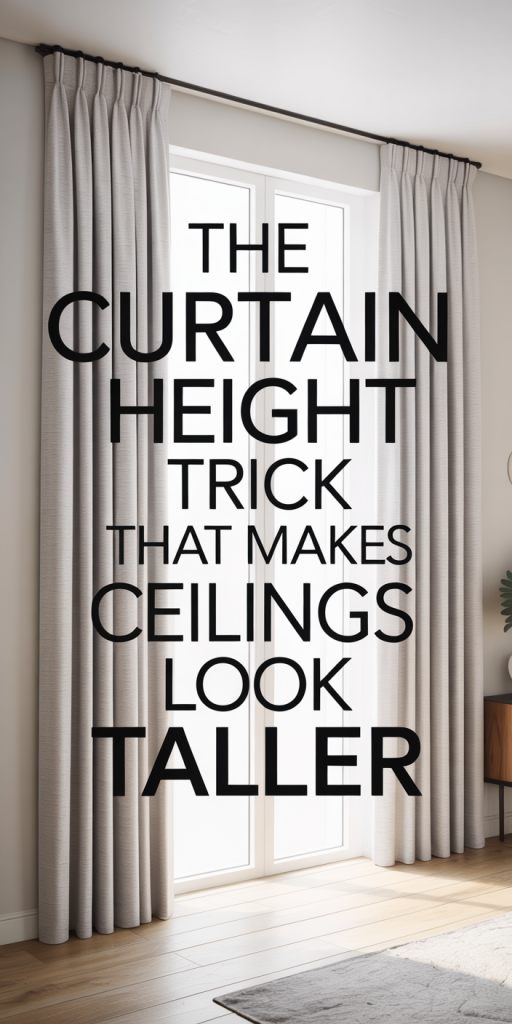
  • Raise Your Curtains, Raise Your Room: The Curtain Height Trick That Makes Ceilings Look Taller In 2026

    Ceiling height is one of those room features people notice, even if they can’t name why a space feels cramped. We’ve learned a simple visual hack interior designers use again and again: raising curtain hardware and lengthening drapery to create a powerful vertical illusion. In this guide we’ll explain why the curtain height trick works, show exactly where to place rods (including ceiling-mount options), give practical measurements so the result looks natural, and recommend fabrics, rods, and styling choices that amplify height. We’ll also cover variations for low ceilings, vaulted rooms, and irregular layouts so you can use the trick in almost any home. By the end, you’ll have the confidence to reposition or replace your curtains in a way that lifts the whole room, without construction or renovating the ceiling.

    How The Curtain Height Trick Creates The Illusion Of Taller Ceilings

    Perception is everything. When we look at a room, our eyes naturally follow lines, walls, windows, and vertical elements, toward a vanishing point. The curtain height trick exploits that tendency: by extending fabric and hardware upward, we create continuous vertical lines that suggest the ceiling is farther away than it really is. There are a few visual principles at work here. First, the uninterrupted vertical line. A long panel, hung high, draws the eye upward and reduces the visual emphasis on the actual window edge, which often sits well below the ceiling. Second, scale and proportion. When curtains start closer to the ceiling, the window reads as part of the wall rather than a separate, limiting frame. That shifts perceived scale in favor of height.

    Third, contrast and framing. Dark or clearly defined frames near the ceiling can either shorten a room or create drama, used correctly, a slim rod or discreet cornice close to the ceiling keeps attention moving up instead of stopping at the window. Finally, floor-to-ceiling continuity matters: when both the top and bottom of the drapery connect visual anchors (ceiling line and floor plane), the vertical dimension feels extended. We also see psychological effects: taller rooms feel airier and more elegant, and taller vertical cues give the impression of grandeur even in modest spaces.

    In short, the trick isn’t about magic so much as redirecting how the eye reads architectural proportions. With selective hardware placement, panel length, and styling decisions, a room can feel feet taller without touching a single joist.

    Where To Hang The Rod: Ceiling-Mount Versus High Wall-Mount

    Choosing between a ceiling-mount or a high wall-mount rod is one of the most important decisions we make when applying the curtain height trick. Each option has strengths and constraints.

    Ceiling-mount: This approach attaches the rod or track directly to the ceiling. It offers the strongest illusion because the rod sits at the absolute top of the room, eliminating any visual gap between the curtain and ceiling. Ceiling-mounts work particularly well with lightweight tracks, minimal hardware, or sheer panels that want to appear as though they’re flowing from the ceiling itself. They’re ideal when we want a seamless, airy look or when architectural details (like crown molding) are minimal. Installation typically requires anchors appropriate for the ceiling material: hollow-core or plaster ceilings may need toggle anchors or professional help.

    High wall-mount: This method positions the rod on the wall several inches above the window frame, commonly 4–12 inches up, but sometimes more. High wall-mounts are less invasive to install and offer flexibility when the ceiling prevents a direct mount (for example, heavy crown molding or irregular surfaces). We recommend wall-mounts when hanging over windows with existing casings or when the ceiling is too complex for a safe ceiling attachment. The key with high wall-mounting is to keep the rod close enough to the ceiling line to preserve the illusion. Mounting too low defeats the effect.

    Practical considerations: If insulation, HVAC, or crown molding gets in the way, a high wall-mount is often the pragmatic choice. For renters or those avoiding holes in the ceiling, use high wall-mounts and make sure to place them as high and discreet as structural constraints allow. For the most dramatic lift, we favor ceiling-mounted tracks for their uninterrupted verticality, but both methods can produce excellent results if installed thoughtfully.

    How High To Hang Curtains: Practical Measurements That Always Look Natural

    Measurements turn this trick from guesswork into a repeatable result. We use a few reliable rules of thumb depending on ceiling height and window placement.

    Standard approach (most rooms): Hang the rod 2–4 inches below the ceiling line or crown molding. This keeps hardware close enough to read as part of the ceiling plane without risking scuffs. If your ceiling is 8 feet, placing the rod 2–4 inches from the ceiling still leaves enough fabric to reach the floor elegantly.

    Rental-friendly approach: If you can’t touch the ceiling, mount the rod as high above the window casing as possible, ideally 6–12 inches above the frame. The higher the better within reason: avoid mounting so high it clashes with doorways or feels awkward. Even a 6–8 inch increase over traditional placement creates a noticeable lift.

    Floor clearance: For the bottom, choose one of three looks: 1) floating (1/2″ clearance from the floor) for casual modern spaces, 2) grazing (1/8″–1/4″ clearance) for crisp, tailored rooms, or 3) puddling (2–6 inches on the floor) for romantic, layered interiors. We generally recommend grazing or half-inch clearance because both maintain vertical continuity without collecting dust.

    Panel width and overlap: Each panel should be 1.5–2.5 times the width of the window for proper fullness when closed. That fullness helps maintain the vertical line: too narrow panels look skimpy and reveal the window frame, wasting the height illusion.

    Measure twice: Start by marking the ceiling line and use a laser level for accuracy. If you’re unsure, mock up with inexpensive tension rods or clip-up fabric to test visual effect before committing to screw holes.

    Fabric, Rods, And Hardware That Amplify Vertical Lines

    Not all materials play equally well with vertical illusions. The right fabric, rod finish, and hardware design will either accentuate or undermine the effect.

    Fabric: Choose fabrics with a vertical drape and medium to heavy weight for most rooms. Linen blends, cotton sateen, and wool-rich textiles create straight, uninterrupted lines. Sheers can work if we double-layer them with heavier panels: the sheer gives translucent height while the opaque panel provides the vertical continuity. Avoid overly textured, stiff fabrics (like heavy brocades) that bunch or disrupt vertical flow.

    Pattern and color: Vertical stripes or subtle linear weaves enhance height. Solid, monochromatic panels reduce visual breaks and push the eye upward. For small rooms, lighter tones reflect light and amplify airiness: for grander statements, deep monochromes hung high add drama and still elongate.

    Rods and tracks: Minimal, slim rods keep attention on the fabric rather than the hardware. Concealed tracks installed in the ceiling or slim metal rods painted to match the ceiling color become visually invisible and extend the curtain’s perceived start point. If using decorative rods, select ones with a modest profile, large finials can draw attention back toward the window and shorten the look.

    Hardware placement and accessories: Use rings or gliders that allow the panel to fall evenly. Clip-top rings can create a casual ripple while sewn-in pockets create a staunched, vertical fall. We like curtain hooks that create soft, uniform folds. When using tiebacks, position them lower than mid-height: too-high tiebacks chop the vertical sweep. For a clean, column-like look, consider motorized ceiling tracks which maintain a perfectly straight header and are especially useful for very high installations.

    Styling Tips To Reinforce The Vertical Illusion (Length, Pleats, And Panel Width)

    Styling choices are where the trick starts to feel intentional rather than accidental. We focus on length, pleats, and panel width to keep lines pure and proportion right.

    Length: As noted, panels should either graze or slightly brush the floor. If we’re after a modern, tailored effect, we measure for a 1/8″–1/2″ clearance. For a relaxed or luxurious look, add 2–6 inches of puddling. Whatever we choose, being consistent in all windows in a room preserves the vertical rhythm.

    Pleats and headers: The type of header affects how the fabric falls. Pinch pleats create structured vertical folds that emphasize height. Pencil pleats and ripple folds create smooth, continuous lines, less formal but very effective for elongation. Avoid wide box pleats that create horizontal breaks near the header and can visually cut the room’s height.

    Panel width and stacking: When curtains are open, they should stack neatly to the side without blocking light or creating visual clutter. For larger windows or sliding doors, consider three-panel systems where the center panel stacks between two side panels, this maintains verticality even when open. Overly narrow panels leave gaps and reveal window frames, which reduces the illusion.

    Color blocking and borders: Resist horizontal contrast at the top or bottom of panels. Horizontal bands, bold hem details, or contrasting toppers interrupt the vertical read. If you want interest, add vertical trim or double panels of slightly different tones to keep the eye moving vertically.

    Layering: A sheer underpanel plus an opaque outer panel creates depth without breaking vertical lines. We often use sheers hung from the same high track so they appear as one continuous layer from ceiling to floor.

    Adapting The Trick For Different Ceiling Types

    The curtain height trick needs tweaks depending on ceiling architecture. We break down the practical adaptations for low ceilings and for sloped, vaulted, or irregular ceilings so you can apply the approach in any room without losing style or function.

    Low Ceilings: Small-Room Strategies

    Low ceilings are where this trick can make the biggest psychological difference, if we avoid common mistakes. First, keep rods as close to the ceiling as possible. Even an extra 4–6 inches above a standard window makes a pronounced change. Use lighter fabrics that collect less bulk at the top: heavy pelmets or large valances defeat the purpose by creating horizontal weight near the ceiling.

    We recommend choosing narrow vertical stripes or plain light-colored panels that blend with the wall color to reduce visual breaks. Avoid heavy crown molding or large decorative cornices above the rod, if those exist, mount the rod just under the molding and paint the molding and wall in a continuous tone to visually push the ceiling line upward.

    Another handy trick is to run rods across multiple adjacent windows or across a wall to create a continuous band of fabric. That horizontal continuity across the top can paradoxically make the room read taller because the eye sees a unified vertical field rather than multiple cropped windows.

    Finally, keep furniture low and avoid tall, chunky furniture against the window wall. Low-profile furnishings preserve the new vertical emphasis and prevent the room from feeling top-heavy.

    Sloped, Vaulted, Or Irregular Ceilings: Placement Solutions

    Sloped and vaulted ceilings present both opportunity and complexity. The dramatic height is naturally elongating, but windows under slopes can read oddly if curtains are hung in a conventional way. For vaulted spaces, ceiling-mounted tracks that follow the slope can look spectacular: they allow curtains to hang from the true ceiling line and maintain uninterrupted vertical flow along the wall plane. Motorized flexible tracks are particularly useful here because they handle curves cleanly.

    For triangular or irregular-shaped window openings, we suggest framing the window with a straight horizontal rod placed at the visual apex of the wall (often where the wall meets the ceiling at the highest point). Then use full-length panels on the adjacent flat wall to continue the vertical rhythm. If the slope makes ceiling mounting impossible above the window, mount a continuous track at the highest practical point on either side of the window and let panels hang straight down, this creates the read of a taller vertical field beside the unusual window shape.

    In rooms with exposed beams or complex architectural details, match hardware finish to the beams or ceiling elements so the rod recedes visually. This helps the curtains become the vertical canvas rather than a competing design element. Always test with sample drop cloths or temporary tension rods first: these spaces reward careful mockups before permanent installation.

    Conclusion

    The curtain height trick is one of the highest-return upgrades we can make to a room: minimal cost, reversible installation, and instant visual impact. By choosing the right mounting method, measuring precisely, selecting fabrics and hardware that support continuous vertical lines, and adapting the approach to ceiling type, we can make spaces feel taller, airier, and more composed. Try one change at a time, raise the rod, lengthen the panels, or swap a header style, and you’ll quickly see why this is a favorite tool among designers. In short: hang higher, measure carefully, and let the curtains do the lifting.

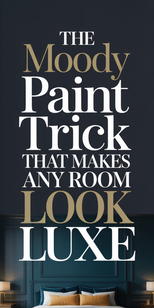
  • The Moody Paint Trick That Makes Any Room Look Luxe (How To Do It Right In 2026)

    We’ve all seen rooms that look effortlessly expensive: deep, saturated walls, dramatic contrast, and an overall sense of intention that reads as luxe. The secret in many of those spaces is a specific moody paint technique that balances depth with clarity, not just slapping on a dark color, but manipulating undertone, finish, lighting, and trim to make the entire room sing. In 2026 that trick is more refined: designers are pairing jewel-toned neutrals, updated charcoal blends, and warmer black formulations with modern finishes and strategic lighting to create rooms that feel both cozy and elevated. In this guide we’ll explain exactly what the moody paint trick is, why it works, how to choose the right palette, which surfaces benefit most, step-by-step application tips, and how to style the finished space so the effect reads thoughtful rather than heavy.

    What The Moody Paint Trick Is And Why It Works

    The moody paint trick is a calculated approach to using saturated, low-value paint colors to create perceived luxury. It’s not simply choosing the darkest paint available: it’s about selecting hues with controlled undertones, matching them with finishes and trim treatments, and optimizing light so shadows and highlights sculpt the room. When done right, a moody room feels curated, intimate, and rich, even in modest square footage.

    Why this works: our brains associate depth and restraint with cost and intention. Darker, nuanced walls reduce visual clutter and make furnishings and architectural details pop. A deep charcoal wall behind a gold mirror reads as deliberate and expensive: the same mirror on a pale, busy wallpaper might feel accidental or ordinary. The trick also plays on contrast: pairing moody walls with carefully chosen trim, metallic accents, and lighting creates a layered visual hierarchy that reads as high-end.

    There’s a science to it. Color appearance changes with light temperature, surface sheen, and surrounding materials. A blue-black with a cool undertone can appear flat under warm incandescent light, while a slightly warmer black with brown undertones will feel richer and less like a void. In 2026 we’re seeing smarter pigment blends and formulations that retain chroma in low lighting, meaning moody colors can read luxe without swallowing a room whole.

    We should also call out psychological effect: moody colors encourage focus and calm. They’re commonly used in dining rooms, studies, and master bedrooms because they promote relaxation and intimate conversation, emotional states associated with refined living. When we combine psychological resonance with the visual mechanics above, the result is a room that feels intentionally luxurious rather than merely dark.

    Choosing The Right Moody Palette For Your Space

    Selecting the right palette is the foundation of the moody paint trick. The best moody palettes balance chroma (color intensity), value (lightness/darkness), and undertone (the hidden color that shifts with light). Here’s how we approach palette selection in practice.

    Start with function and mood: what do we want the room to feel like? For intimacy and warmth, we lean toward deep burgundy, warm black, or chocolate-toned paints. For modern drama, cooler navy-blacks, inky teals, and graphite grays work well. For a luxe-but-soft look, muted plum or moss green with low saturation reads elevated without feeling heavy.

    Consider scale and natural light: small, north-facing rooms benefit from moody colors that have warmer undertones or slight reflectance. A pure blue-black in a north-facing room can feel cold and cave-like: a black with brown or red undertones will reflect subtle warmth. Conversely, sunlit rooms can take cooler moody colors, think indigo or slate, because daylight balances the shade.

    Mixing neutrals with jewel tones: one of our favorite strategies is to anchor a room in a moody neutral (charcoal, deep taupe, or blackened gray) and add one or two jewel-toned accents, a sapphire cabinet, a malachite vase, or a ruby cushion. This creates contrast and prevents monotony while reinforcing a luxe palette.

    Palette tools and palettes to try in 2026:

    • Blackened Brown: a near-black with warm brown undertones, immersive and warm.
    • Slate Indigo: deep blue with gray base, modern and calm.
    • Forest Noir: muted deep green with a touch of gray, organic, luxe.
    • Warm Charcoal: charcoal with subtle red or brown undertone, great for living spaces.
    • Dusty Plum: deep plum, low chroma, feminine and sophisticated.

    Undertones, Finishes, And Sample Testing

    We can’t overstate how important sample testing is. Paint swatches in the store rarely tell the full story. Take 12″x12″ samples, paint them on foam core or large poster board, and view them at different times of day and under your room’s lamps. Observe for at least three days: morning daylight, afternoon brightness, and evening artificial lighting. Note how undertones emerge, a green undertone in a gray might appear only in twilight, which could be exactly the look you want or an unwelcome surprise.

    Finish matters. Matte and low-sheen finishes absorb light and deepen color: they’re perfect for walls where we want a velvety, continuous field. Satin and eggshell reflect more light and can enhance depth while adding slight sheen that reads more formal. For trim and doors, we often suggest a higher sheen (semi-gloss or satin) to create crisp contrast and to stand up to wear. In 2026, hybrid finishes that mimic matte depth but are wash-resistant give us the best of both worlds, pick those if you expect wear or moisture exposure.

    Finally, consider color families across connecting rooms. If your hallway flows into a living room, ensure the moody color reads cohesive when seen in sequence: test the most visible vantage points to avoid jarring transitions.

    Best Rooms And Surfaces For The Trick

    Not every surface benefits equally from moody paint. We prioritize rooms and surfaces where moodiness enhances function and looks intentional. Here are the prime candidates and why they work.

    Dining Rooms

    Dining rooms are a classic stage for moody paint. Deep walls make the table, lighting fixture, and tabletop objects the focal point. Moony colors create intimacy for dinner parties and highlight metallic accents and linens. A dark backdrop also makes artwork and mirrors read like editorial statements.

    Bedrooms

    Bedrooms benefit from the calming effects of deep colors. In master suites, a moody palette paired with layered lighting and soft textiles creates a cocooning effect that feels luxurious. We often recommend painting the entire room including the ceiling in an ultra-soft matte to reinforce the enveloping sensation.

    Living Rooms and Libraries

    For living rooms, choose moody colors when you want a dramatic, sophisticated entertaining space. Libraries and home offices, by contrast, gain a studious, archival vibe from dark walls, it feels like a grown-up sanctuary.

    Bathrooms and Powder Rooms

    Small bathrooms and powder rooms are excellent laboratories for moody paint. Because they’re contained and usually have a focal sink or vanity, a dramatic color reads like a design statement rather than an oppressive choice. Pair with lighter stone or metallic fixtures for contrast.

    Built-Ins, Alcoves, and Accent Walls

    Using moody paint on built-ins or alcoves is a smart, lower-commitment way to try the trick. Painted shelves in dark green or navy make books and objects pop. Accent walls behind headboards or sofas create depth without overwhelming the entire room.

    Doors, Ceilings, and Trim

    In 2026, designers increasingly paint ceilings and doors in moody hues to create cohesion. A painted ceiling in a slightly lighter shade than the walls can lift a room while still feeling luxurious. Painting interior doors and built-in cabinetry the same moody color extends the effect and creates a curated, enveloping look.

    Surfaces to Avoid

    We avoid heavy moody paint on cramped, windowless rooms unless balanced with strong artificial lighting and reflective accents. Also be cautious with large patterned textiles or busy wallpaper, pairing them with moody paint can create visual conflict unless carefully curated.

    Overall, the best rooms for the moody paint trick are spaces where you want to slow the pace and make objects and finishes feel intentional. That’s where the trick reads luxe rather than just dark.

    Step-By-Step: Prep, Paint, And Finishing Techniques

    Executing the moody paint trick requires disciplined prep and thoughtful technique. We’ll walk through a reliable process that minimizes surprises and maximizes the high-end look.

    1. Prep the Space
    • Clear and clean: Remove furniture or move it to the center and cover. Clean walls with a mild degreaser: grime shows up more on dark colors. Repair holes and sand rough spots.
    • Prime: Use a high-quality primer, especially if covering a lighter color. For very deep hues, use a tinted primer matched closer to the final color to reduce the number of finish coats. A stain-blocking primer helps with water stains or tannin bleed-through on older walls.
    1. Choose Tools and Paint Quality
    • Paint quality matters more than technique here. Upscale, richly pigmented paints provide better depth and hide: they also tend to level more smoothly. In 2026, many premium lines include pigments that retain chroma in low light, choose those if available.
    • Rollers: Use a high-density microfibre roller for smooth coverage. For a velvet finish, a 1/4″ nap roller often gives the best result. Trim brushes should be high-quality synthetic or natural blends for crisp lines.
    1. Cut In Carefully
    • Cut in around ceilings, corners, and trim with a steady hand. For best results, we like to use painter’s tape sparingly, only where a super-crisp edge is essential. Taping can sometimes lift matte finishes or create seams: a steady brush technique produces a cleaner, more natural edge.
    1. Apply Even Coats
    • Moony colors often need two to three thin coats. Avoid heavy single coats, they dry unevenly and highlight imperfections. Allow proper drying time between coats, and watch for lap marks. Work in small sections and maintain a wet edge.
    1. Blend Sheen and Texture
    • If you’re painting trim in a higher sheen, paint walls first and trim second. Use a light blocking coat between the two if you want perfectly crisp lines. For built-ins or cabinets painted in the same moody hue, consider spraying for a factory-smooth finish.
    1. Special Finishes and Techniques
    • Soft Gradation (Ombre Accent): For a subtle luxe effect, create a soft gradation on an accent wall using the same pigment at varying values. This reads custom and high-end when done by a steady hand or professional.
    • Glaze or Wax: In formal rooms, a very light glaze over a dark paint can add depth and movement. We only recommend this for textured walls or architectural spaces where the extra nuance will be appreciated.
    1. Final Inspection and Touch-Ups
    • Live with the color for a few days and note spots that read uneven. Patch small inconsistencies with a touch-up brush rather than repainting large areas. Clean up edges and remove any tape slowly at a 45-degree angle to avoid peeling.
    1. Maintenance
    • Dark walls show fingerprints more easily in high-traffic zones. Use washable or scrubbable paint in hallways and family rooms. Keep a small touch-up can for future nicks, matching sheen is the main challenge, so store leftover paint properly.

    Follow these steps and the moody paint will look deliberate, flawless, and luxurious rather than rushed or heavy.

    Lighting, Trim, And Styling To Elevate The Effect

    A moody paint job is only as good as the context around it. Lighting, trim choices, and styling decisions make the difference between moody and majestic.

    Lighting: Layered and Intentional

    • Ambient + Accent + Task: Layered lighting is essential. Ambient light provides overall visibility, accent lights highlight artwork and architectural features, and task lighting serves functional areas. In a moody room, accent lights become dramatic players, picture a picture light over a painting or a directional sconce that throws soft pools of light across textured walls.
    • Color Temperature: Choose warmer LEDs (2700–3000K) to keep deep walls feeling cozy. Cooler light (4000K+) can make moody blues and greens feel crisp, but may read clinical in intimate spaces. Use dimmers, they’re non-negotiable: dimming deep colors adds mood and reveals hidden undertones.
    • Reflective Fixtures: Brass, polished nickel, or smoked glass fixtures create interesting reflections against deep walls: use them strategically to add sparkle without overpowering the color.

    Trim and Millwork: Contrast With Purpose

    • Match or Contrast: For a seamless, enveloping look, paint trim the same color as the walls but in a slightly glossier sheen. This creates depth without the hard lines of white trim. Conversely, crisp white trim against moody walls reads modern and graphic: choose the approach that aligns with your design language.
    • Doors and Cabinetry: Painting doors and cabinetry in the same moody color extends the field and creates a built-in feel. For a layered look, paint trim and doors in a slightly lighter or warmer variant of the wall color.

    Styling: Material Choices That Pop

    • Metallics: Gold, brass, and champagne tones contrast beautifully with deep walls. Use them sparingly, a mirror frame, lamp base, or drawer pulls are enough to read luxe.
    • Textiles: Layer tactile fabrics, velvet cushions, wool throws, and silk drapery. Textures read more important against a dark backdrop: even modest pieces will look richer.
    • Art and Accessories: Seek high-contrast artwork or sculptural objects. A large-scale painting with lighter values or a marble sculpture will become an instant focal point. For shelves, arrange objects in small groupings to avoid visual clutter.
    • Flooring: A lighter, neutral floor (wide-plank oak, pale stone) balances deep walls and prevents the room from feeling grounded too low. If you prefer dark floors, introduce area rugs with pattern and light tones to lift the palette.

    Practical Touches

    • Mirrors: Use mirrors to bounce light around and open sightlines. A large mirror opposite a window will amplify daylight and make moody walls feel less confining.
    • Plants: Deep greens, both painted walls and living plants, complement each other. Plants add life and break the visual stillness of moody color.

    When we combine considered lighting, purposeful trim choices, and curated styling, the moody paint trick transcends simple color and becomes a complete design composition that reads truly luxurious.

    Common Mistakes To Avoid

    The moody paint trick is high-reward but also easy to botch if we hurry or skip steps. Here are common mistakes we consistently see and how to avoid them.

    1. Skipping Samples and Relying on Swatches

    Problem: A small paper swatch rarely captures how a color behaves under your light.

    Solution: Paint multiple large samples on poster board and observe at different times and with your room’s lighting. Take photos and live with them for a few days.

    1. Ignoring Undertones

    Problem: Choosing a color based purely on name (“charcoal”) without testing can reveal surprising undertones that clash with furnishings.

    Solution: Look for colors in person and compare against your dominant finishes (floor, upholstery, cabinetry). If your wood has red undertones, choose a wall color with complementary warmth.

    1. Using Wrong Sheen

    Problem: Flat or velvet finishes can look beautiful but are harder to clean and may scuff in high-traffic areas.

    Solution: Use washable matte or low-sheen technology in busy rooms, and reserve true flat sheens for low-traffic zones like adult bedrooms or formal dining rooms.

    1. Over-Contrasting Trim Without Intention

    Problem: Bright white trim against a deep wall can sometimes read too stark or dated if not thoughtfully executed.

    Solution: Decide whether you want the crisp modern contrast or an enveloping tonal look. If the former, choose a warm white that relates to your flooring and furnishings.

    1. Poor Lighting Planning

    Problem: Dark paint plus inadequate lighting turns a room into an uninviting cave.

    Solution: Plan layered lighting before painting. Consider the function of each zone and install dimmers so you can adjust mood easily.

    1. Painting Everything the Same Dark Color Without Texture

    Problem: A uniformly dark room with no texture or contrast can feel flat and heavy.

    Solution: Mix materials, matte walls, glossy trim, metallic accents, textiles, to create dimensionality. Use an accent furniture piece or rug to break the field.

    1. Underestimating Maintenance

    Problem: Dark walls show dust and fingerprints more readily, especially near light switches, doorways, and handrails.

    Solution: Use scrubbable paint and keep a touch-up kit handy. For high-traffic zones, choose a finish that balances depth with durability.

    By recognizing and sidestepping these mistakes, we make the moody paint trick feel intentional and lasting rather than experimental or regrettable.

    Conclusion

    The moody paint trick is a deceptively simple way to make any room feel luxe, but it relies on decisions at every step. We’ve walked through why moodiness works, how to pick the right palette, where to apply it, and the technical and styling moves that elevate the result. When we take time to test samples, plan lighting, choose appropriate finishes, and style with contrast and texture, deep colors don’t close a room down: they lift everything inside it. In 2026 the most successful moody rooms are those that marry pigment technology with thoughtful layering, and the payoff is a space that feels considered, intimate, and unmistakably upscale.

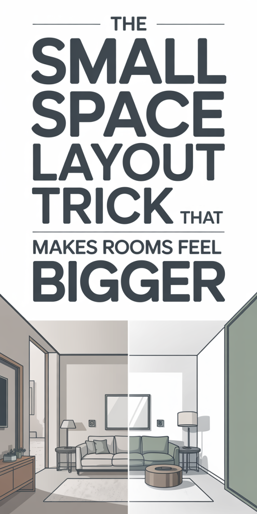
  • The Small-Space Layout Trick That Makes Any Room Feel Bigger (One Simple Shift You Can Do Today)

    We’ve all stood in a compact living room or a snug bedroom and wished for more space. The truth is, bigger square footage helps, but perception is everything. A clever layout shift can make the same four walls read as more open, breathable, and functional without renovation or major expense. In this guide we’ll show the single small-space layout trick that changes how a room feels the moment you apply it, explain why it works, where it’s strongest (and where it can backfire), and give step-by-step instructions you can follow today. Expect practical measuring tips, styling ideas, and common mistakes to avoid so you don’t waste effort on moves that look smart but actually shrink the feel of a room.

    Why Layout, Not Square Footage, Is The Real Influence On Perception

    We often default to square footage as the metric for how spacious a room feels, but our perception of space comes from sightlines, scale, and flow more than sheer area. Two rooms with identical dimensions can feel worlds apart depending on how furniture, pathways, and focal points are arranged. Visual clutter, blocked sightlines, and islands of furniture create perceived density: conversely, a few intentional choices let the eye travel and give a sense of generosity.

    Psychology helps explain this. Our brains use cues like uninterrupted lines, consistent scale, and contrast between foreground and background to judge depth. When we can see across a room, from doorway to window or from sofa to opposite wall, the brain interprets that as openness. If objects interrupt these lines, the space feels chopped up and smaller.

    Lighting also interacts with layout. Natural light becomes an ally when we orient furniture to let it penetrate and reflect, while heavy pieces placed against windows or in the path of light can create pockets of shadow that visually compress the space. Finally, functional zones matter: a room that clearly signals where we sit, work, and move without overlapping functions feels more ordered and hence larger.

    In short: square footage sets the limit, but layout determines the experience. That’s why a layout-focused trick can outperform investments in storage or color alone when our goal is to make a space feel bigger right now.

    The Layout Trick: Anchor, Align, And Clear The Flow

    The core trick we recommend is simple but surprisingly transformative: choose a single anchor piece, align secondary furniture to reinforce sightlines, and deliberately clear primary pathways. We summarize this as Anchor, Align, Clear, three related moves that together create the illusion of space.

    Anchor: Pick one dominant piece, a sofa, bed, or dining table, and make it the visual and functional center. Keep it proportional to the room: too big and it dominates negatively, too small and the space fragments.

    Align: Arrange other elements so they support continuous sightlines. That means avoiding mid-room furniture that interrupts the eye, orienting seating toward natural light or a focal wall, and using parallel or radial alignments that create implied lanes of vision.

    Clear: Designate and maintain unobstructed walkways between entry points, seating areas, and exits. Clearing these routes not only improves flow but lets light and perspective travel across surfaces with minimal interruption.

    When we apply Anchor, Align, Clear together, the room reads as intentional and spacious. Each step alone helps, but the combination multiplies the effect, the anchor gives purpose, alignment creates visual continuity, and clear paths allow perspective to do the rest.

    Where This Trick Works Best — And When To Be Cautious

    This layout approach is highly adaptable, but it performs best in certain contexts and requires caution in others.

    Where it excels:

    • Open-plan living rooms and studio apartments: With fewer fixed walls, anchoring a zone and aligning furniture can dramatically open perceived space. In studios, a single anchor (like a daybed or compact sofa) helps define living and sleeping areas without heavy partitions.
    • Narrow rooms and long corridors: Aligning furniture along the long axis visually stretches the room. Placing major pieces parallel to the longest wall emphasizes depth.
    • Rooms with strong natural light or windows: Anchoring away from the window and aligning elements to let light cross the room amplifies brightness and perceived volume.

    When to be cautious:

    • Rooms with awkward structural features: Low ceilings, numerous columns, or nonstandard alcoves may limit alignment options. Forcing a central anchor piece in these spaces can create congestion rather than clarity.
    • Very small spaces with multifunction needs: If a room must serve multiple functions (sleep, work, dining) and you pick an oversized anchor, you can unintentionally box out other uses. In those cases, choose modular or multi-use anchors.
    • Historic or ornate spaces: When architectural details are the hero, an intrusive modern anchor or overly strict alignment can fight the room’s character. We recommend letting the architecture inform anchor selection.

    The rule: adapt Anchor, Align, Clear to the room’s constraints rather than imposing it rigidly. When we read the space first, the trick enhances it: when we ignore structural realities, it can backfire.

    How To Apply The Trick: Three Practical Steps

    We break application into three pragmatic steps that match Anchor, Align, Clear. Each step is a short exercise you can do in under an hour, and you’ll see the impact immediately.

    Step 1: Measure, map, and choose your anchor piece. Step 2: Align furniture to reinforce sightlines and openness. Step 3: Create and maintain clear pathways for natural flow.

    Below we expand each step into actionable tasks and quick checks so you can carry out the layout change with confidence and minimal effort.

    Measure, Map, And Choose Your Anchor Piece

    Measure, Map, And Choose Your Anchor Piece

    First, measure the room: length, width, ceiling height, window and door locations. Sketch a simple floor plan, you don’t need pro software, a pencil sketch on graph paper works fine. Mark where light comes in and where foot traffic naturally flows.

    Next, pick an anchor. We choose a single piece that will define the room’s purpose: a sofa in a living room, a bed in a bedroom, or a table in a dining area. The right anchor is about proportion. Aim for roughly 60–70% of the room’s usable zone for that function. For example, in a small living room that’s 10×12, choose a sofa that doesn’t exceed the long wall’s comfortable span and leaves breathing room on either end.

    If we need multifunctionality, select an anchor with dual purpose: a daybed that doubles as seating, a desk that tucks under a window, or a foldable dining table. Measure the anchor’s footprint and note where it will sit relative to windows and doors. In our map, draw the anchor first, then other major elements.

    Quick checks: step back and look at your sketch, do you still see lines from entry to window? Is there a visible channel for movement? If yes, your anchor choice is likely appropriate: if not, resize or reposition before moving furniture.

    Styling And Material Tips To Amplify The Effect

    Styling and material choices amplify the Anchor–Align–Clear layout by reinforcing light, depth, and continuity.

    Color and contrast: Use a consistent, lighter palette on walls and larger furniture to expand perceived volume. But don’t go monochrome, introduce contrast in smaller accents to add depth. Dark floors with lighter walls, for instance, draw the eye across the room.

    Reflective and translucent surfaces: Strategically placed mirrors multiply sightlines and bounce light. An oversized mirror opposite a window is classic, but smaller mirrored groupings or metallic accents can achieve similar depth. Glass and acrylic furniture reduce visual weight, making the layout feel less crowded.

    Rug strategy: Use rugs to delineate zones without blocking flow: pick sizes that allow furniture legs to sit on the rug’s surface to avoid floating islands. In narrow rooms, a runner along the axis can accentuate length.

    Vertical rhythm: Create vertical visual continuity with tall, slim elements, floor lamps, vertical artwork, or narrow shelving, positioned where they won’t interrupt cross-vision. This draws the eye upward and adds perceived height.

    Scale and proportion: Keep accessory scale consistent with the anchor. Oversized coffee tables or huge art over a small sofa will make the room feel disproportionate. Conversely, a too-small anchor with huge accessories fragments the space.

    Lighting layering: Combine ambient, task, and accent lighting. Low-level ambient light alone can flatten a room. Instead, use layered sources to model depth, uplights, sconces, and a statement pendant aligned with the anchor help guide sightlines and create depth cues.

    Common Mistakes To Avoid When Reconfiguring Small Rooms

    When we reconfigure small rooms, a few recurring mistakes can undercut the layout gains. Watch for these pitfalls:

    1. Overanchoring with oversized furniture. A massive sofa or bed may feel luxurious, but in a small room it becomes a visual block. Measure first and aim for proportional anchors.
    2. Floating everything in the middle. Placing multiple pieces mid-room creates islands that interrupt flow. Use walls and long axes to anchor secondary pieces when possible.
    3. Ignoring vertical space. We often focus on floor plan alone, but neglecting vertical storage or decorative rhythm wastes volume. Slim shelving or wall-mounted lighting frees floor area and adds height.
    4. Blocking natural light. Positioning tall furniture in front of windows is a fast way to shrink a room. If privacy is needed, choose lower silhouettes or sheer window treatments.
    5. Using too many small, mismatched items. Excessive decor scatters attention. Group smaller objects into curated vignettes so they read as intentional instead of chaotic.
    6. Forgetting circulation widths. Cramped walkways kill the perception of space. Keep primary paths at least 28–32 inches wide.
    7. Over-relying on trends. A trendy oversized chair or dense patterned wallpaper can date a space and make it feel heavy. Prioritize timeless proportion and neutrality, then layer trends through inexpensive accents.

    By anticipating these mistakes, we preserve the benefits of the Anchor, Align, Clear trick and avoid undoing our work with a thoughtless purchase or placement.

    Conclusion

    The small-space layout trick, Anchor, Align, Clear, is one simple shift that yields outsized results. We don’t need to remodel or buy everything new: we need to make deliberate choices about what anchors the room, how secondary pieces align to create continuous sightlines, and how pathways remain unobstructed. With a measuring tape, a quick floor plan, and modest styling edits, we can make rooms feel larger, brighter, and more usable today. Try the three-step process in one room this weekend: measure and place your anchor, align supporting pieces, and clear the main paths. The change is immediate, and once you notice how much more generous the space feels, you’ll start seeing layout opportunities everywhere.

  • The Hidden Storage Trick That Keeps Homes Looking Minimal In 2026: Clever Concealment Ideas That Actually Work

    Minimal homes don’t happen by accident. They’re the result of intentional hiding, not throwing away. In 2026, the most persuasive minimalist interiors rely less on ruthless purging and more on clever concealment: storage that disappears into architecture, furniture, or trim so the eye sees calm surfaces instead of clutter. We’ll unpack the hidden storage trick that keeps homes looking minimal, explain why it works psychologically and practically, and show where to apply it room-by-room. Along the way we’ll share practical design principles, product- and material-focused advice, and budgeting tips so you can make concealed storage both beautiful and affordable. If you want fewer visible bins, better flow, and a cleaner aesthetic without sacrificing everyday function, read on, we’ll give you the tactics that actually work.

    What The Hidden Storage Trick Is And Why It Works

    The hidden storage trick is simple in concept and powerful in effect: store items in places that don’t read as storage. That might mean drawers under stairs, cavities behind trim, integrated lift-top sofas, or toe-kick drawers in the kitchen. The key is concealment that preserves a room’s silhouette and visual rhythm so the brain interprets the space as calm and intentional. Psychologically, decluttered sightlines reduce cognitive load and stress. Behavioral research shows environments with fewer visible objects improve focus and perceived spaciousness. Practically, concealed storage protects belongings from dust and daily chaos and often increases usable space compared with standalone bins.

    Concealment works best when it follows three simple rules: continuity, accessibility, and honesty. Continuity means hidden storage follows the room’s lines and materials so it doesn’t interrupt the aesthetic. Accessibility ensures the storage is used, if something is hard to reach, people stop using it and clutter reappears. Honesty acknowledges that hidden storage should solve real needs rather than be decorative gimmicks: it must fit the items we actually own.

    We should also recognize that “hidden” doesn’t equal “invisible.” Good concealed storage announces itself with subtle cues, a seam in a panel, a handle groove, or an opening reveal, so people know where to put things. In short, the hidden storage trick is about designing storage into the bones of a space, not hiding storage behind a mountain of boxes.

    Core Design Principles For Effective Concealed Storage

    Before we sketch a plan, we need rules that keep concealed storage functional and beautiful. These core design principles guide decisions from placement to materials.

    Function-first: Start with the items you need to store. Measure them and plan compartments accordingly. A drawer sized for throw blankets is different from one for board games or chargers. We recommend creating a “use map” that records who uses what, how often, and where, this prevents awkward, unused compartments.

    Blend with architecture: Concealed storage reads as an integral part of the room when it uses consistent materials, trim heights, and sightlines. Match baseboard profiles and paint colors where possible: consider hiding doors behind continuous paneling or shiplap to preserve visual flow.

    Maintain access: Choose mechanisms that make daily use effortless: full-extension drawers, soft-close slides, lift-assist hinges, and removable dividers. Accessibility also means ergonomics, place heavy or frequently used items at waist height rather than in ceiling-high cabinets.

    Layer types of concealment: Combine visible and invisible solutions. Open shelving can coexist with hidden drawers beneath: a built-in bench with a hinged lid plus cubby niches blends immediate access with concealment for seasonal items.

    Design for maintenance: Use durable, easy-to-clean materials inside concealed storage, laminate, sealed wood, or powder-coated metal. Ventilation is important for textile storage to avoid stale smells: include perforated panels or small vents where appropriate.

    Plan for evolution: Our needs change, babies, hobbies, remote work setups. Design modular concealed storage that can be reconfigured: adjustable shelving, removable dividers, and interchangeable fronts let a system evolve without a full remodel.

    High-Impact Room Applications

    Not all rooms benefit equally from hidden storage. Some spaces give the best return on effort. Below, we break down effective concealment strategies by room so you can prioritize where to focus your budget and time.

    Living Room And Media Areas

    Living rooms are where minimalism is most visible, flat surfaces, electronics, books, and consoles can quickly clutter sightlines. Concealed storage strategies here focus on cleaning the horizontal plane while keeping frequently used items within reach.

    Built-in media walls with flush cabinet doors are a classic solution. We like units with a combination of open display for curated objects and deep concealed drawers for remotes, controllers, cables, and gaming accessories. Integrate wire channels and removable panels for easy equipment access. For sofas, consider models with under-seat storage or lift-top coffee tables that hide blankets and board games. An alternative is a low-profile credenza with soft-close drawers: the continuous top acts as a display space that remains uncluttered because the storage is right beneath.

    If you want a super-sleek look, conceal the TV within a cabinet that rises or slides away when not in use. These systems are pricier but transform the room from media hub to minimal living space instantly. Finally, don’t forget floor-level concealment: hidden drawers under benches or window seats are perfect for throws and magazines without interrupting the room’s visual balance.

    Kitchen And Pantry Hacks

    Kitchens demand clever concealment because function and clutter live so closely together. Small appliances, utensils, and pantry staples can dominate counters: the solution is to integrate storage where it won’t disrupt workflow.

    Toe-kick drawers reclaim wasted space under base cabinets for baking sheets, cutting boards, or rarely used pans. Appliance garages, recessed cabinets with roll-up or lift doors, hide coffee makers and toasters while keeping them accessible. Pull-out pantries and narrow vertical cabinets maximize small gaps, offering neat storage for oils, spices, and canned goods.

    For pantries, we recommend a mix of labeled opaque containers and pull-out shelving. Opaque containers reduce visual clutter and create uniformity: labels ensure functionality. Consider built-in waste and recycling centers behind cabinet fronts to keep bins out of sight. Also, plan for ventilation if you store root vegetables or bulk goods that need air. Finally, magnetic knife strips and under-cabinet rail systems store tools off the counter without adding visual noise.

    Entryway, Mudroom, And Drop Zones

    Entryways set the mood of a home, so concealing daily detritus there pays big emotional dividends. The goal is to create a quick action zone where shoes, bags, and mail vanish immediately upon arrival.

    Built-in benches with cubbies beneath are foundational, use hinged seats or deep drawers for shoes, winter boots, and umbrellas. Wall panels with integrated hooks hide the hardware when not in use: choose recessed niches with sliding doors for a more seamless look. A shallow concealed cabinet or drawer at waist height is perfect for keys, sunglasses, and masks: add a felt-lined tray or divider so small items don’t rattle around.

    For families, consider individual locker systems behind a single facade. Each family member has a labeled compartment for shoes and outerwear, but the exterior reads as a single, tidy wall. Mail organizers that open inward keep paper out of sight and encourage daily sorting rather than piling on top of a console.

    Bedroom And Wardrobe Solutions

    Bedrooms benefit immensely from concealed storage because our sleeping environment should promote rest. Visible clothing, electronics, and accessories undermine a restful atmosphere: integrated storage restores serenity.

    Built-in wardrobes with flush-front panels provide a seamless wall while housing everything from seasonal clothing to luggage. Incorporate modular interiors, shoe racks, tie holders, jewelry drawers, and pull-out shelves, so the exterior can remain minimal while the interior is highly organized. Under-bed drawers or lift-up beds are invaluable for linens and out-of-season clothing: we prefer gas-lift mechanisms for ease.

    Nightstands with concealed compartments, hidden drawers or flip-top sections, allow bedside essentials to be nearby but out of sight. If space is tight, consider a wall niche behind the headboard with sliding panels to hide books and chargers. For smaller apartments, multifunctional furniture like an ottoman with storage or a dresser with a fold-out mirror keeps surfaces clear and provides dedicated places for everyday items.

    Smart Furniture, Built-Ins, And Architectural Trim Options

    Choosing the right mix of furniture, built-ins, and trim details makes concealed storage feel intentional rather than patchy. Let’s break down the best options and how to select them.

    Smart furniture: Look for pieces designed first as furniture, second as storage. Sofas with deep seat storage, lift-top coffee tables, and ottomans with internal compartments offer immediate wins. Choose neutral upholstery and consistent hardware finishes so these pieces blend into the larger palette.

    Built-ins: Custom millwork is the most seamless approach. Bookcases that transition into closed lower cabinets, window seats with hidden lids, and integrated desk nooks with roll-down doors deliver a unified aesthetic. Customization allows for tailored compartments, but it can be costly, consider semi-custom cabinet systems as a lower-cost middle ground.

    Architectural trim tactics: Use reveal lines, continuous panels, and shadow gaps to disguise doors and drawers. Flush doors with magnetic touch latches eliminate visible hardware, while recessed hand grooves read as part of the millwork. We’ve had success using the same veneer or paint across walls and storage fronts: continuity makes the storage recede visually.

    Multifunctional trim: Toe-kick drawers, built-in bench bases, and recessed niches in thick walls transform ordinary architectural elements into storage opportunities. These options are often more budget-friendly than full built-ins and can be added incrementally.

    Installation, Materials, And Budgeting Tips For Hidden Storage

    Concealed storage can be expensive if approached without planning. Here are practical installation, material, and budgeting tips to maximize value and avoid costly mistakes.

    Start with a plan and prioritized list. Audit what you own and decide which hidden solutions will deliver the most benefit. Rank projects, tackle the entry and living areas first if daily clutter is the problem, or prioritize kitchen work if countertops are constantly crowded.

    Materials: For interiors, use plywood or furniture-grade MDF with edge banding rather than cheap particleboard: they resist sagging and handle hardware better. For visible fronts, choose durable finishes, painted MDF for smooth, flat panels: real wood veneer for warmth: or high-pressure laminate for high-traffic rooms. Hardware matters: full-extension ball-bearing slides and soft-close hinges last longer and feel premium.

    Installation: If you’re handy, many solutions are DIY-friendly, toe-kick drawers, bench lids, and simple paneling can be assembled with basic tools. For electrical or structural changes (routed wiring for media walls, lifting mechanisms for TVs), hire pros. Get quotes from multiple contractors and request references for millwork.

    Budgeting: Expect custom built-ins to cost 2–3x more than box-store furniture per linear foot. Set aside 10–20% contingency for unforeseen issues. Consider phased implementation: start with smart furniture purchases, then add semi-custom cabinets, and finally invest in full custom millwork when budget allows.

    Maintenance and longevity: Choose finishes you’ll want to live with for years. Concealed storage is an investment in daily life: spending slightly more on durable materials reduces long-term replacement costs and preserves resale value.

    Conclusion

    The hidden storage trick that keeps homes looking minimal is less about hiding everything and more about designing storage that supports daily life without fighting the room’s aesthetic. When we plan around continuity, accessibility, and durability, concealed storage moves from novelty to essential. Start with small wins, a bench with a hinged seat, a few hidden drawers, or a media wall, and watch how quickly the house feels calmer. Over time, incremental investments in built-ins and smart furniture will compound, giving us a home that feels generous and orderly without sacrificing warmth or function.

  • The Ultimate Guide to Starbucks Secret Menu Drinks

    If you believe you have exhausted every option on the official Starbucks menu, think again. The Starbucks secret menu is a thriving, community-driven collection of custom drinks that baristas can craft on request — provided you know exactly what to ask for. From visually stunning Frappuccinos to light and fruity Refreshers, and from cozy espresso-based lattes to indulgent dessert-inspired beverages, these off-menu creations represent the full spectrum of what Starbucks is capable of producing.

    This guide organises all 17 drinks into three intuitive categories — Decadent Frappuccinos, Fruity & Refreshing Drinks, and Cozy Lattes & Hot Beverages — so you can zero in on exactly the kind of experience you are after. Each entry includes a full ingredient list, step-by-step preparation instructions, pro tips, and quick answers to the most common questions.

    How to Order Secret Menu Drinks: Because these drinks are not listed on any official menu, always bring the full recipe with you or have it ready on your phone. Politely walk your barista through the ingredients and customisations, and be prepared to pay for any add-ons separately.


    Quick Reference: All 17 Drinks at a Glance

    DrinkCategoryApprox. CaloriesKey Flavour Profile
    Mermaid FrappuccinoFrappuccino400Blue raspberry, lavender, vanilla
    S’mores FrappuccinoFrappuccino420Chocolate, marshmallow, graham cracker
    Cookie Crumble FrappuccinoFrappuccino450Mocha, chocolate cookies, vanilla
    Chocolate Covered Strawberry FrappuccinoFrappuccino460Strawberry, chocolate
    Chai Crème FrappuccinoFrappuccino380Chai spice, cream, cinnamon
    Birthday Cake FrappuccinoFrappuccino410Vanilla, hazelnut, sprinkles
    Pink DrinkRefresher350Strawberry acai, coconut milk
    Rainbow DrinkRefresher300Mixed tropical refreshers
    Strawberry Açaí RefresherRefresher140Açaí, fresh strawberry
    Nutella MochaHot Beverage350Espresso, hazelnut, chocolate
    Pumpkin Spice LatteHot Beverage450Espresso, pumpkin, autumn spices
    Honey Almondmilk Flat WhiteHot Beverage220Espresso, almond milk, honey
    Pistachio LatteHot Beverage350Espresso, pistachio, whipped cream
    Nutty IrishmanHot Beverage320Espresso, hazelnut, steamed milk
    Lavender LatteHot Beverage250Espresso, lavender, steamed milk
    Tiramisu LatteHot Beverage400Espresso, tiramisu syrup, cocoa
    Matcha Green Tea LatteHot/Iced280Matcha, steamed milk

    Part One: Decadent Frappuccinos

    Frappuccinos are the crown jewel of the Starbucks secret menu. Blended, chilled, and generously topped with whipped cream, these drinks are as much a visual treat as they are a flavour experience.


    1. The Mermaid Frappuccino

    Bright turquoise with a swirl of purple, the Mermaid Frappuccino is one of the most visually striking drinks on the secret menu. It is built on a vanilla bean Frappuccino base, infused with blue raspberry syrup and finished with a pump of lavender syrup for a dreamy, floral contrast. Topped with whipped cream and optional edible glitter, it is as much a social media moment as it is a beverage.

    Nutrition: ~400 cal | Sugar: 50 g | Fat: 18 g | Protein: 6 g

    Ingredients:

    • 1 cup vanilla bean Frappuccino base
    • 1–2 pumps blue raspberry syrup
    • 1 pump lavender syrup
    • Whipped cream
    • Edible glitter (optional)

    How to Make It:

    1. Order a vanilla bean Frappuccino in your preferred size.
    2. Request 1–2 pumps of blue raspberry syrup blended into the base.
    3. Ask for 1 pump of lavender syrup to be added for contrast.
    4. Top with whipped cream and, if desired, a sprinkle of edible glitter.

    Pro Tips:

    • Adjust the number of syrup pumps to control sweetness.
    • Sugar-free syrups are available at most locations if you prefer a lighter version.
    • This drink is best served cold — it does not translate well as a hot beverage.

    2. The S’mores Frappuccino

    Few flavour combinations are as universally beloved as the campfire s’more, and this Frappuccino captures that nostalgia perfectly. A rich coffee Frappuccino base is layered with chocolate and marshmallow syrups, then crowned with whipped cream and crushed graham crackers. The result is a sweet, creamy drink with a faint hint of toasted marshmallow that will transport you straight to a summer evening around the fire.

    Nutrition: ~420 cal | Sugar: 55 g | Fat: 20 g | Protein: 6 g

    Ingredients:

    • 1 cup coffee Frappuccino base
    • 1 pump chocolate syrup
    • 1 pump marshmallow syrup
    • Whipped cream
    • Crushed graham crackers for topping

    How to Make It:

    1. Order a coffee Frappuccino in your preferred size.
    2. Add one pump each of chocolate and marshmallow syrup before blending.
    3. Blend until smooth and creamy.
    4. Top with whipped cream and a generous sprinkle of crushed graham crackers.
    5. Add an extra drizzle of chocolate syrup for additional indulgence.

    Pro Tips:

    • Request extra whipped cream for a more decadent finish.
    • Ask for a decaf base if you want the flavour without the caffeine.
    • A little extra milk will thin the texture if you prefer a less dense drink.

    3. The Cookie Crumble Frappuccino

    This drink is a love letter to chocolate cookies. A mocha Frappuccino base is blended with crushed chocolate cookies and a touch of vanilla, then finished with whipped cream and a chocolate drizzle. Each sip delivers a rich, chocolatey flavour punctuated by satisfying crunchy bits — a nostalgic treat that recalls childhood afternoons spent baking.

    Nutrition: ~450 cal | Sugar: 48 g | Fat: 18 g | Protein: 7 g

    Ingredients:

    • 1 cup mocha Frappuccino base
    • 2–3 crushed chocolate cookies
    • Whipped cream
    • Chocolate drizzle for topping

    How to Make It:

    1. Order a mocha Frappuccino in your preferred size.
    2. Ask for 2–3 crushed chocolate cookies to be blended into the base.
    3. Blend until smooth, ensuring the cookie pieces are fully incorporated.
    4. Top with whipped cream and a drizzle of chocolate syrup.

    Pro Tips:

    • Use your favourite brand of chocolate cookies for a personalised twist.
    • Request extra cookie crumbles on top for added crunch.
    • Swap dairy milk for almond or oat milk to make it vegan-friendly.

    4. The Chocolate Covered Strawberry Frappuccino

    Inspired by the classic confection, this Frappuccino combines a strawberry base with chocolate syrup for a drink that is simultaneously fruity and indulgent. Topped with whipped cream and a generous chocolate drizzle, it is a visual showstopper that tastes every bit as good as it looks — perfect for spring and summer.

    Nutrition: ~460 cal | Sugar: 55 g | Fat: 18 g | Protein: 6 g

    Ingredients:

    • 1 cup strawberry Frappuccino base
    • 1 pump chocolate syrup
    • Whipped cream
    • Chocolate drizzle for topping

    How to Make It:

    1. Order a strawberry Frappuccino in your preferred size.
    2. Add one pump of chocolate syrup before blending.
    3. Blend until smooth and creamy.
    4. Top with whipped cream and a drizzle of chocolate sauce.

    Pro Tips:

    • Request extra chocolate syrup for a more intense flavour.
    • Fresh strawberry slices make an elegant garnish.
    • All ingredients are naturally gluten-free; simply confirm with your barista.

    5. The Chai Crème Frappuccino

    For those who love the warming complexity of chai spice but prefer a chilled beverage, this Frappuccino is the answer. Traditional chai tea is blended with milk and ice into a smooth, creamy drink, then topped with whipped cream and a dusting of cinnamon. The balance of warm spice and cool creaminess makes it equally appealing on a hot afternoon or a crisp autumn day.

    Nutrition: ~380 cal | Sugar: 37 g | Fat: 14 g | Protein: 5 g

    Ingredients:

    • 1 cup brewed chai tea (cooled)
    • 1/2 cup milk
    • 1 cup ice
    • Whipped cream
    • Ground cinnamon for topping

    How to Make It:

    1. Brew a cup of chai tea and allow it to cool completely.
    2. Blend the cooled chai tea with milk and ice until smooth.
    3. Pour into a cup and top with whipped cream.
    4. Finish with a sprinkle of ground cinnamon.

    Pro Tips:

    • Substitute almond milk or oat milk for a dairy-free version.
    • Adjust sweetness by adding honey or a flavoured syrup.
    • Note that chai tea contains caffeine; request a decaffeinated chai blend if needed.

    6. The Birthday Cake Frappuccino

    Every day is worth celebrating with this playful, dessert-inspired Frappuccino. A vanilla bean base is enhanced with hazelnut syrup and finished with whipped cream and rainbow sprinkles, creating a drink that tastes remarkably like a slice of birthday cake. It is a fun, sweet treat that appeals to all ages.

    Nutrition: ~410 cal | Sugar: 50 g | Fat: 15 g | Protein: 5 g

    Ingredients:

    • 1 cup vanilla bean Frappuccino base
    • 1 pump hazelnut syrup
    • Whipped cream
    • Rainbow sprinkles for topping

    How to Make It:

    1. Order a vanilla bean Frappuccino in your preferred size.
    2. Add one pump of hazelnut syrup before blending.
    3. Blend until smooth and creamy.
    4. Top with whipped cream and a generous handful of rainbow sprinkles.

    Pro Tips:

    • Request extra sprinkles for a more festive presentation.
    • A dash of vanilla extract can deepen the cake-like flavour.
    • This drink is entirely customisable — ask your barista about additional toppings.

    Part Two: Fruity & Refreshing Drinks

    When the weather calls for something light, vibrant, and thirst-quenching, the Refresher-based secret menu drinks are the ideal choice. These beverages are lower in calories than Frappuccinos and deliver a bright, fruity energy that is perfect for warm days.


    7. The Pink Drink

    Perhaps the most famous entry on the entire Starbucks secret menu, the Pink Drink has earned its iconic status through a combination of striking colour and genuinely delicious flavour. A Strawberry Acai Refresher is combined with coconut milk in place of water, then finished with fresh strawberry slices. The result is a light, creamy, blush-coloured beverage that is as photogenic as it is refreshing.

    Nutrition: ~350 cal | Sugar: 45 g | Fat: 10 g | Protein: 5 g

    Ingredients:

    • 1 cup Strawberry Acai Refresher
    • 1/2 cup coconut milk
    • Fresh strawberries, sliced

    How to Make It:

    1. Order a Strawberry Acai Refresher in your preferred size.
    2. Request coconut milk in place of water for the base.
    3. Ask for fresh strawberry slices to be added.
    4. Stir gently and enjoy.

    Pro Tips:

    • Order with less ice for a stronger, more concentrated flavour.
    • The Pink Drink is not on the official menu — bring the recipe or describe it clearly to your barista.
    • Additional fruits or flavoured syrups can be added to personalise the drink further.

    8. The Rainbow Drink

    A celebration of colour and flavour, the Rainbow Drink is made by carefully layering three different iced Refreshers in a clear cup to create a stunning ombre effect. The combination of Strawberry Acai, Mango Dragonfruit, and Passion Fruit Refreshers produces a drink that is as visually impressive as it is delicious — a true crowd-pleaser.

    Nutrition: ~300 cal | Sugar: 40 g | Fat: 0 g | Protein: 0 g

    Ingredients:

    • 1/2 cup Strawberry Acai Refresher
    • 1/2 cup Mango Dragonfruit Refresher
    • 1/2 cup Passion Fruit Refresher
    • Ice

    How to Make It:

    1. Fill a clear cup with ice to the top.
    2. Slowly pour the Strawberry Acai Refresher as the bottom layer.
    3. Gently add the Mango Dragonfruit Refresher as the middle layer.
    4. Carefully top with the Passion Fruit Refresher to complete the rainbow.
    5. Serve with a straw and admire before stirring.

    Pro Tips:

    • Ask your barista to pour each layer carefully to keep the colours distinct.
    • A tall cup emphasises the rainbow effect far more effectively than a short one.
    • Caffeine-free Refresher options are available if you prefer a non-caffeinated version.
    • Natural light is your best friend when photographing this drink.

    9. The Strawberry Açaí Refresher

    A straightforward but deeply satisfying drink, the Strawberry Açaí Refresher is the lightest option on this list at just 140 calories. Açaí berry juice is poured over ice and topped with fresh strawberry slices, creating a thirst-quenching, energising beverage that is perfect for long, hot afternoons. It is entirely caffeine-free, making it an excellent choice for those who want a flavourful pick-me-up without the stimulant.

    Nutrition: ~140 cal | Sugar: 20 g | Fat: 0 g | Protein: 1 g

    Ingredients:

    • 1 cup açaí berry juice
    • Fresh strawberries, sliced
    • Ice

    How to Make It:

    1. Fill a glass with ice.
    2. Pour the açaí berry juice over the ice.
    3. Add fresh strawberry slices for flavour and decoration.
    4. Stir and serve immediately.

    Pro Tips:

    • A splash of lemonade adds a pleasant zesty dimension.
    • Other berries or citrus fruits can be substituted or added alongside the strawberries.
    • This drink is naturally caffeine-free, making it suitable for all times of day.

    Part Three: Cozy Lattes & Hot Beverages

    For those who prefer warmth and depth over icy refreshment, the espresso-based and tea-based secret menu drinks offer a rich, comforting experience. These beverages range from the nutty and indulgent to the floral and serene.


    10. The Nutella Mocha

    Nutella enthusiasts, this one was made for you. Rich espresso is combined with velvety steamed milk and a generous spoonful of Nutella, then finished with whipped cream and a chocolate drizzle. The result is a warm, deeply chocolatey drink with a pronounced hazelnut character — essentially a liquid chocolate hazelnut cookie in a cup.

    Nutrition: ~350 cal | Sugar: 39 g | Fat: 15 g | Protein: 8 g

    Ingredients:

    • 1 shot espresso
    • 1 cup steamed milk
    • 2 tablespoons Nutella
    • Whipped cream
    • Chocolate drizzle for topping

    How to Make It:

    1. Brew a shot of espresso.
    2. While the espresso brews, heat the milk until steaming but not boiling.
    3. In a cup, stir the espresso and Nutella together until fully combined.
    4. Pour in the steamed milk, stirring to incorporate.
    5. Top with whipped cream and a drizzle of chocolate syrup.

    Pro Tips:

    • Use a milk frother to create a luxuriously textured foam.
    • Adjust the quantity of Nutella to control the intensity of the hazelnut flavour.
    • This drink works equally well iced — simply add ice after mixing the espresso and Nutella.
    • A decaf espresso base or hot chocolate can be substituted for a caffeine-free version.

    11. The Pumpkin Spice Latte

    A seasonal icon that has transcended its autumn origins, the Pumpkin Spice Latte combines espresso with steamed milk, real pumpkin purée, and a blend of warming spices. Topped with whipped cream and a dusting of cinnamon, it is the quintessential cosy drink — sweet, spiced, and deeply comforting. While it is typically a seasonal offering beginning in late summer, knowing the recipe means you can request it year-round.

    Nutrition: ~450 cal | Sugar: 39 g | Fat: 15 g | Protein: 9 g

    Ingredients:

    • 1 shot espresso
    • 1 cup steamed milk
    • 2 tablespoons pumpkin purée
    • Pumpkin spice syrup (sweetened to taste)
    • Whipped cream
    • Ground cinnamon for topping

    How to Make It:

    1. Brew a shot of espresso and steam the milk simultaneously.
    2. In a cup, whisk the pumpkin purée into the espresso until smooth.
    3. Add the steamed milk and stir well to combine.
    4. Sweeten with pumpkin spice syrup to taste.
    5. Top with whipped cream and a sprinkle of ground cinnamon.

    Pro Tips:

    • Request extra pumpkin spice syrup for a more pronounced spiced flavour.
    • An iced version is equally enjoyable on warmer autumn days.
    • Reduce or eliminate the syrup, or request a sugar substitute, to lower the sugar content.

    12. The Honey Almondmilk Flat White

    A refined, dairy-free take on the classic flat white, this drink pairs two shots of espresso with frothy steamed almond milk and a touch of honey. The result is a smooth, nutty, subtly sweet beverage that delivers a full coffee experience without any dairy. It is an excellent choice for those who want something sophisticated and satisfying without the heaviness of a cream-based drink.

    Nutrition: ~220 cal | Sugar: 12 g | Fat: 7 g | Protein: 5 g

    Ingredients:

    • 2 shots espresso
    • 1 cup almond milk
    • 1–2 teaspoons honey (to taste)

    How to Make It:

    1. Brew two shots of espresso.
    2. Steam the almond milk until frothy and warm.
    3. Stir the honey into the brewed espresso until fully dissolved.
    4. Pour the steamed almond milk over the espresso.
    5. Finish with an optional extra drizzle of honey on top.

    Pro Tips:

    • Maple syrup is an excellent substitute for honey.
    • A dash of cinnamon adds a pleasant warming note.
    • Decaf espresso is available on request.

    13. The Pistachio Latte

    The drink that inspired the title’s promise of #9 being unmissable, the Pistachio Latte is a genuinely unique flavour experience. Rich espresso meets steamed milk and pistachio syrup in a drink that is nutty, creamy, and deeply satisfying. The whipped cream and crushed pistachio topping add both texture and visual appeal, making this one of the most memorable lattes on the secret menu.

    Nutrition: ~350 cal | Sugar: 30 g | Fat: 14 g | Protein: 6 g

    Ingredients:

    • 1 shot espresso
    • 1 cup steamed milk
    • 1 pump pistachio syrup
    • Whipped cream
    • Crushed pistachios for topping

    How to Make It:

    1. Brew a shot of espresso.
    2. Steam the milk until frothy and hot.
    3. Stir the pistachio syrup into the espresso.
    4. Pour the steamed milk over the espresso and syrup mixture.
    5. Top with whipped cream and a sprinkle of crushed pistachios.

    Pro Tips:

    • Experiment with the number of pistachio syrup pumps to find your preferred sweetness level.
    • Add an extra shot of espresso for a bolder coffee flavour.
    • This drink can be served iced — simply add ice after combining the espresso and syrup.
    • Availability may be seasonal; check with your local Starbucks.

    14. The Nutty Irishman

    Named for its Irish cream-inspired flavour profile, the Nutty Irishman is a cosy, indulgent espresso drink that combines a shot of espresso with steamed milk and two pumps of hazelnut syrup. Topped with whipped cream, it delivers a warm, nutty sweetness that transforms a standard latte into something genuinely special — ideal for a slow afternoon pick-me-up.

    Nutrition: ~320 cal | Sugar: 28 g | Fat: 10 g | Protein: 6 g

    Ingredients:

    • 1 shot espresso
    • 1 cup steamed milk
    • 2 pumps hazelnut syrup
    • Whipped cream

    How to Make It:

    1. Brew a shot of espresso.
    2. Steam the milk until frothy.
    3. Stir the hazelnut syrup into the espresso.
    4. Pour the steamed milk over the espresso and syrup mixture.
    5. Top with whipped cream before serving.

    Pro Tips:

    • A sprinkle of cocoa powder on top adds an extra layer of indulgence.
    • Almond milk enhances the nutty character of this drink.
    • A decaf espresso base is available on request.
    • To make it vegan, substitute the milk with any plant-based alternative.

    15. The Lavender Latte

    Floral, soothing, and quietly elegant, the Lavender Latte is unlike anything else on this list. Smooth espresso is combined with steamed milk and a pump of lavender syrup, producing a drink that is aromatic, gently sweet, and genuinely calming. It is the ideal choice for a morning that calls for something a little more serene than a standard latte.

    Nutrition: ~250 cal | Sugar: 20 g | Fat: 7 g | Protein: 6 g

    Ingredients:

    • 1 shot espresso
    • 1 cup steamed milk
    • 1 pump lavender syrup
    • Whipped cream (optional)

    How to Make It:

    1. Brew a shot of espresso.
    2. Steam the milk until hot and frothy.
    3. Stir the lavender syrup into the espresso.
    4. Pour the steamed milk over the espresso mixture.
    5. Top with optional whipped cream or lavender-infused sprinkles.

    Pro Tips:

    • Ask your barista about adding dried lavender sprigs for an intensified floral aroma.
    • This drink pairs beautifully with a sweet pastry for a relaxed brunch experience.
    • It can be served iced and is generally available year-round at most locations.

    16. The Tiramisu Latte

    Italy’s most beloved dessert, reimagined as a Starbucks latte. Espresso is combined with steamed milk and tiramisu syrup — a blend that evokes the mascarpone creaminess and coffee richness of the classic dessert — then finished with whipped cream and a dusting of cocoa powder. It is rich, decadent, and deeply satisfying, particularly on days when you need something that feels genuinely special.

    Nutrition: ~400 cal | Sugar: 32 g | Fat: 18 g | Protein: 7 g

    Ingredients:

    • 1 shot espresso
    • 1 cup steamed milk
    • 2 pumps tiramisu syrup
    • Whipped cream
    • Cocoa powder for dusting

    How to Make It:

    1. Brew a shot of espresso.
    2. Steam the milk until frothy.
    3. Stir the tiramisu syrup into the espresso.
    4. Pour the steamed milk over the coffee mixture.
    5. Top with whipped cream and dust generously with cocoa powder.

    Pro Tips:

    • Request extra tiramisu syrup for a more pronounced dessert flavour.
    • Pair with a sweet pastry for the ultimate dessert-café experience.
    • Decaf espresso and plant-based milk alternatives are both available on request.

    17. The Matcha Green Tea Latte

    A favourite among health-conscious coffee drinkers and matcha enthusiasts alike, the Matcha Green Tea Latte is a clean, energising alternative to espresso-based drinks. High-quality matcha powder is whisked with a small amount of hot water to form a smooth paste, then combined with steamed milk and a touch of sweetener. The result is a vibrant green, creamy beverage that provides a calm, sustained energy boost — without the jitteriness sometimes associated with coffee.

    Nutrition: ~280 cal | Sugar: 18 g | Fat: 8 g | Protein: 7 g

    Ingredients:

    • 1–2 teaspoons matcha powder
    • 1 cup steamed milk
    • Sweetener to taste

    How to Make It:

    1. Whisk the matcha powder with a small amount of hot water in a bowl until a smooth, lump-free paste forms.
    2. Steam the milk until hot and frothy.
    3. Combine the matcha paste with the steamed milk and stir well.
    4. Add sweetener to taste, if desired.
    5. Serve hot, or pour over ice for a refreshing iced version.

    Pro Tips:

    • Oat milk creates an exceptionally creamy texture that complements matcha particularly well.
    • Adjust the sweetness freely — this drink is equally enjoyable unsweetened.
    • Matcha contains caffeine, but it delivers a gentler, more sustained energy than espresso.

    Conclusion

    The Starbucks secret menu is a testament to the creativity of the coffee community and the flexibility of Starbucks baristas. Whether you are drawn to the theatrical colour of the Mermaid Frappuccino, the nostalgic warmth of the S’mores Frappuccino, or the serene elegance of the Lavender Latte, there is a hidden gem here for every palate and every mood.

    The key to a successful secret menu order lies in preparation: know your recipe, communicate it clearly, and be patient with your barista. With a little effort, your next Starbucks visit could yield your new favourite drink — one that nobody else at the counter even knew existed.

  • 21 Inspiring Southwestern Bedroom Ideas to Transform Your Space

    If you are looking to infuse your home with the warm, rustic charm of the American Southwest, these bedroom design ideas offer the perfect starting point. The Southwestern aesthetic is defined by its use of earthy color palettes, rich textures, and natural materials. You do not need to live in the desert to embrace this style; with the right elements, you can create a cozy, casual, and inviting retreat anywhere. Here are 21 inspiring ways to bring the Southwestern vibe into your bedroom.

    Embrace Earthy and Warm Color Palettes

    1. Ground the Space with Earth Tones
    A classic Southwestern bedroom relies heavily on earth tones to create a warm foundation. Reddish-brown walls paired with red and orange bedding can instantly evoke the feeling of a desert landscape. To keep the room balanced, incorporate cream-colored rugs and throw pillows, which provide a soft contrast to the deeper hues. A wood and iron bed frame, along with rustic nightstands, completes this traditional look.

    2. Make a Statement with Orange Walls
    For a more vibrant approach, consider an orange accent wall. This bold choice captures the essence of Southwestern sunsets. To prevent the color from overwhelming the space, use bright white bedding and light wall art. Tying the room together with a rug, throw pillow, and blanket in matching shades of orange creates a cohesive and airy environment.

    3. Soften the Look with Pink Walls
    Southwestern style is not strictly limited to traditional earth tones. A soft pink accent wall can bring a warm, inviting, and slightly modern feel to the bedroom. This color pairs beautifully with light wood furniture and crisp white linens. A vintage rug can add a subtle layer of color and texture without detracting from the room’s serene atmosphere.

    4. Introduce a Pop of Color Subtly
    If you prefer a more subdued approach to color, you can introduce bright hues through accessories. Bright red throw pillows or a rug with red undertones can add significant contrast and warmth to a room with white walls and natural wood furniture. This method allows you to enjoy the vibrancy of Southwestern colors without committing to a bold wall color.

    5. Create a Patterned Accent Wall
    For those who want to make a bold statement, a patterned accent wall featuring Aztec-inspired designs in red, orange, and white can serve as a stunning focal point. When using such a striking feature, it is best to keep the rest of the room’s decor simple and neutral, allowing the wall to truly shine.

    Incorporate Natural Elements and Textures

    6. Bring the Desert Indoors with Cacti
    Nothing says Southwest quite like a cactus. Incorporating cactus-themed decor, from potted plants to patterned pillows and wall art, is an excellent way to bring the outdoors inside. A black and white color scheme can help keep the focus on the greenery, ensuring the theme remains stylish rather than overwhelming.

    7. Add Rustic Charm with a Cowhide Rug
    A cowhide rug is a quintessential element of rustic Southwestern design. Whether you choose a classic black and white pattern, a traditional brown and white, or even a dyed colorful option, a cowhide rug adds immediate texture and character to the floor. Keeping the surrounding decor simple allows the rug to take center stage.

    8. Utilize Wooden Bed Frames
    Furniture plays a crucial role in establishing a Southwestern vibe. A wooden bed frame, especially one featuring subtle Southwestern carvings or patterns on the headboard, adds an authentic touch. Matching the wood finish of the bed frame with the nightstands creates a unified look that pairs perfectly with colorful rugs and textiles.

    9. Enhance Warmth with a Wooden Ceiling
    If your architecture allows, a wooden ceiling can significantly enhance the rustic feel of a Southwestern bedroom. The natural wood tones draw the eye upward and tie in beautifully with wooden furniture and flooring, creating a cohesive, cabin-like atmosphere.

    Play with Patterns and Textiles

    10. Anchor the Room with a Patterned Rug
    If you are unsure where to begin with Southwestern decor, a patterned area rug is an excellent starting point. A rug featuring traditional geometric patterns and warm colors can serve as the room’s focal point. By keeping the rest of the decor relatively simple, the rug can dictate the color palette and mood of the entire space.

    11. Blend Styles with a Moroccan Rug
    Southwestern and Moroccan design styles share an affinity for rich colors and intricate patterns, making them highly compatible. A Moroccan rug featuring shades of pink, cream, and blue can add a unique, global twist to a Southwestern bedroom, seamlessly tying together various elements in the room.

    12. Hang a Southwestern Tapestry
    For an easy, affordable, and low-commitment way to introduce color and pattern, consider hanging a Southwestern-inspired tapestry above your bed. The bold colors and intricate designs can set the stage for the room, especially when echoed in throw pillows and other textiles.

    13. Layer with a Southwestern Blanket
    A beautifully patterned Southwestern blanket draped at the foot of the bed is a simple yet effective way to add visual interest. This versatile accessory can easily be swapped out as the seasons change or when you want to refresh the room’s look.

    Mix and Match Design Styles

    14. Combine Southwestern and Boho Vibes
    The relaxed, eclectic nature of Bohemian style pairs wonderfully with Southwestern decor. A bed filled with an array of colorful, patterned throw pillows, combined with a large macrame wall hanging, creates a cozy and textured space. Balancing these warm elements with white walls and plenty of greenery results in a vibrant, inviting retreat.

    15. Modernize the Traditional Look
    You can easily update traditional Southwestern design for a more contemporary feel. Stick to a simple, neutral color palette but incorporate Southwestern-inspired patterns through area rugs, throw pillows, and curtains. Replacing traditional landscape art with modern black-and-white photography can also give the room a fresh, updated look.

    16. Opt for a Black and White Palette
    If bright colors are not your preference, you can still achieve a Southwestern vibe using a black and white color scheme. By focusing on geometric patterns, rich textures, and natural materials, you can create a modern, sophisticated space that still feels distinctly Southwestern.

    17. Embrace a Minimalist Approach
    For a subtle nod to the Southwest, try a minimalist design. A bedspread with a delicate Southwestern pattern can serve as the room’s focal point. Keep the rest of the decor sparse, utilizing a few plants, a small rug, and matching throw pillows to create a clean, cozy, and inviting environment.

    Elevate the Space with Unique Features

    18. Personalize with a Gallery Wall
    A gallery wall is a fantastic way to inject personality into your bedroom. Mixing prints, paintings, and photographs that reflect Southwestern themes can create a unique focal point. Using a neutral color palette for the surrounding walls ensures the artwork stands out without overwhelming the space. Alternatively, a leaning ladder can be used to display a curated selection of pieces.

    19. Add Elegance with a Canopy Bed
    To bring a sense of luxury to your Southwestern bedroom, consider a canopy bed. The clean lines of the bed frame can serve as a striking contrast to patterned wallpaper or bold textiles. Keeping the rest of the decor simple allows the bed to remain the elegant centerpiece of the room.

    20. Create a Cozy Nook with a Rustic Bench
    Placing a rustic wooden bench at the end of the bed not only adds to the Southwestern aesthetic but also provides a practical seating area. This addition can help create a cozy reading nook or simply serve as a stylish spot to lay out clothes or extra blankets.

    21. Add Warmth with a Faux or Real Fireplace (New Idea)
    Nothing encapsulates the cozy, inviting atmosphere of a Southwestern retreat quite like a fireplace. Whether you have the luxury of a built-in adobe-style kiva fireplace or opt for a modern electric or faux fireplace with a rustic wooden mantel, this feature instantly becomes the heart of the room. The flickering light and added warmth complement the earthy tones and layered textiles, making your bedroom feel like a true desert sanctuary.

    Conclusion

    Creating a Southwestern-inspired bedroom is all about blending warm colors, natural textures, and rustic elements to build a cozy and inviting space. Whether you choose to incorporate just a few subtle accessories or commit to a complete room makeover, these 21 ideas offer plenty of inspiration to help you design a beautiful, personalized retreat.

  • 15 Vinyl Flooring Bedroom Ideas for Style, Comfort, and Durability

    Vinyl flooring has quickly become one of the most popular bedroom flooring choices for modern homes. It offers the perfect combination of style, comfort, affordability, and durability, making it ideal for homeowners who want beautiful floors without the high cost or maintenance of natural materials. Today’s vinyl flooring can realistically mimic hardwood, marble, stone, and even intricate tile patterns while remaining soft underfoot and easy to clean.

    Whether you’re creating a cozy farmhouse bedroom, a sleek minimalist retreat, or a luxurious modern space, vinyl flooring provides endless design opportunities. From light and airy finishes to dramatic dark wood tones, these ideas can help transform your bedroom into a relaxing and visually stunning sanctuary.

    1. Natural Hardwood-Look Vinyl

    Natural hardwood-look vinyl flooring remains one of the most timeless options for bedrooms because it combines warmth, elegance, and practicality. Advanced printing technology allows vinyl planks to closely replicate the grain, knots, and texture of real hardwood, giving your room an authentic appearance without the high maintenance requirements.

    Light oak finishes can make smaller bedrooms feel larger and brighter, while darker walnut or chestnut tones create a cozy and luxurious atmosphere. This flooring works beautifully in modern, traditional, Scandinavian, and rustic interiors alike. Since vinyl is resistant to scratches and moisture, it’s also an excellent long-term choice for busy households or pet owners.

    Pair hardwood-look vinyl with layered rugs, upholstered furniture, and soft lighting to create a welcoming and relaxing bedroom retreat.

    2. Soft Gray Vinyl Planks

    Gray vinyl flooring offers a calm and sophisticated look that works with nearly every bedroom color palette. Soft gray planks provide a neutral foundation that allows furniture, bedding, and wall décor to stand out without overwhelming the space.

    In contemporary bedrooms, gray flooring creates a sleek and polished atmosphere, especially when paired with black accents, white walls, or minimalist furniture. For a softer and cozier feel, combine gray planks with warm textures like knitted throws, linen bedding, and natural wood furniture.

    One of the biggest advantages of gray vinyl is its versatility. Whether your bedroom style leans modern, industrial, coastal, or farmhouse-inspired, gray flooring can easily adapt while maintaining a clean and elegant appearance.

    3. Herringbone Vinyl Patterns

    Herringbone vinyl flooring instantly elevates the visual appeal of a bedroom by introducing movement and sophistication. The distinctive zigzag arrangement creates a luxurious, designer-inspired look that feels both classic and modern.

    This flooring pattern is especially effective in bedrooms that need extra visual depth or character. In smaller spaces, herringbone layouts can make the room appear more expansive by drawing the eye across the floor. Wood-look herringbone planks add warmth, while stone-inspired finishes create a more upscale and refined atmosphere.

    To keep the space balanced, pair herringbone floors with simple furniture and understated décor. The flooring itself becomes a statement feature that adds personality without requiring excessive decoration.

    4. Wide-Plank Vinyl Flooring

    Wide-plank vinyl flooring creates a clean and seamless appearance that makes bedrooms feel more spacious and uncluttered. Because there are fewer seams between planks, the flooring appears smoother and more continuous across the room.

    This style works particularly well in minimalist, modern, and Scandinavian-inspired interiors where simplicity and openness are key design elements. Wide planks in light wood tones create an airy atmosphere, while darker finishes offer warmth and richness.

    Beyond aesthetics, wide-plank vinyl is highly practical. It’s easy to maintain, comfortable underfoot, and durable enough to withstand daily wear while maintaining its polished appearance for years.

    5. Light-Colored Vinyl Flooring

    Light-colored vinyl flooring is ideal for creating a bright, relaxing, and open bedroom environment. Shades such as white oak, pale ash, bleached pine, or soft beige help reflect natural light, making even compact bedrooms feel larger and more inviting.

    This flooring style pairs beautifully with neutral décor, soft pastel tones, and natural textures. It’s especially popular in coastal, bohemian, and Scandinavian interiors because it enhances the sense of calm and simplicity.

    Light vinyl floors also create an excellent backdrop for layering textures like woven rugs, linen curtains, and cozy bedding. The result is a bedroom that feels peaceful, fresh, and effortlessly stylish.

    6. Dark Wood-Look Vinyl

    Dark wood-look vinyl flooring adds drama, richness, and intimacy to a bedroom. Deep tones like espresso, mahogany, or dark walnut instantly create a luxurious and cozy atmosphere that feels elegant and timeless.

    This flooring works best when balanced with lighter walls, soft lighting, and neutral furnishings to prevent the room from feeling overly heavy. Metallic accents, velvet fabrics, and warm lighting can further enhance the upscale appearance.

    Dark vinyl flooring is also practical because it hides minor imperfections and everyday wear more effectively than lighter finishes, making it an attractive choice for high-traffic bedrooms.

    7. Patterned Vinyl Tiles

    Patterned vinyl tiles allow homeowners to introduce creativity and personality directly into the bedroom floor design. Whether you choose geometric motifs, floral prints, Moroccan-inspired patterns, or vintage-inspired tiles, patterned vinyl can become the focal point of the entire room.

    This flooring option works exceptionally well in eclectic, bohemian, or artistic interiors where bold design choices are encouraged. It can even reduce the need for large area rugs since the floor itself already adds visual interest.

    Despite their decorative appearance, patterned vinyl tiles remain highly durable, waterproof, and easy to maintain, making them as functional as they are stylish.

    8. Textured Vinyl Flooring

    Textured vinyl flooring adds dimension and realism by mimicking the tactile feel of natural wood or stone. Embossed surfaces create subtle grooves and grain patterns that enhance the authenticity of the flooring while making the bedroom feel warmer and more inviting.

    The added texture also improves slip resistance, which can be beneficial for households with children or elderly family members. Textured vinyl pairs beautifully with rustic, farmhouse, and contemporary bedroom styles because it adds depth without overpowering the décor.

    Layering textured flooring with plush rugs and soft textiles creates a comfortable and relaxing environment perfect for rest and relaxation.

    9. Marble-Look Vinyl Flooring

    Marble-look vinyl flooring offers the elegance of natural stone without the expensive installation and maintenance costs associated with real marble. The soft veining and polished appearance create a luxurious atmosphere that instantly elevates the bedroom.

    White marble-look vinyl can make a bedroom feel bright and glamorous, while darker marble finishes add sophistication and drama. Pair this flooring with gold accents, mirrored furniture, and soft neutral palettes for a truly upscale design.

    In addition to its beauty, marble-look vinyl is warmer and softer underfoot than actual stone, making it a more comfortable option for bedrooms.

    10. Eco-Friendly Vinyl Flooring

    Eco-friendly vinyl flooring is a great option for homeowners who want stylish interiors while prioritizing sustainability. Many modern vinyl flooring products are now made using recycled materials and low-VOC manufacturing processes that improve indoor air quality.

    These environmentally conscious options are available in a wide range of finishes, including realistic wood and stone looks, so you don’t have to compromise style for sustainability. Eco-friendly vinyl also tends to be highly durable, reducing the need for frequent replacements and minimizing long-term waste.

    Choosing sustainable flooring can help create a healthier and more environmentally responsible bedroom design.

    11. Beige Vinyl Flooring

    Warm beige vinyl flooring creates a soft and welcoming foundation that works beautifully in nearly any bedroom style. Beige tones add warmth without overpowering the room, making the space feel cozy, balanced, and relaxing.

    This flooring complements both light and dark furniture, allowing for greater flexibility when decorating. It also pairs well with earthy color palettes, natural textures, and layered neutral tones.

    For homeowners who prefer timeless interiors over trendy designs, beige vinyl flooring offers lasting versatility and understated elegance.

    12. Checkerboard Vinyl Flooring

    Checkerboard vinyl flooring introduces bold contrast and vintage-inspired charm into the bedroom. Traditionally featuring black-and-white squares, this flooring style creates a dramatic visual effect that instantly captures attention.

    Modern interpretations may use softer colors like beige and white or gray and charcoal for a subtler appearance. Checkerboard flooring works particularly well in retro, eclectic, or artistic interiors where personality and creativity are emphasized.

    When styled thoughtfully, checkerboard floors can feel playful yet sophisticated, adding a unique design statement to the bedroom.

    13. Mixed-Tone Vinyl Planks

    Mixed-tone vinyl planks create a layered and dynamic appearance by combining multiple wood shades and textures within the same floor design. This variation adds natural depth and character while preventing the flooring from appearing too uniform.

    Mixed-tone flooring works beautifully in rustic, industrial, and transitional bedrooms because it feels organic and visually interesting. It also helps disguise dust, scratches, and daily wear more effectively than single-tone floors.

    Pair mixed-tone planks with textured bedding, vintage furniture, or metal accents to create a cozy and balanced bedroom aesthetic.

    14. Matte Finish Vinyl Flooring

    Matte finish vinyl flooring provides a soft, understated elegance that works particularly well in modern and minimalist bedrooms. Unlike glossy floors that reflect large amounts of light, matte finishes create a smooth and calming appearance.

    This subtle finish helps make the room feel more relaxed and sophisticated while reducing the visibility of smudges, footprints, and scratches. Matte vinyl pairs beautifully with neutral palettes, natural woods, and simple furnishings.

    Its quiet elegance makes it an excellent choice for homeowners who prefer a refined and contemporary bedroom design.

    15. Rustic Reclaimed Wood-Look Vinyl

    Rustic reclaimed wood-look vinyl flooring captures the charm of aged timber with distressed textures, weathered finishes, and rich character details. It’s an ideal option for farmhouse, cottage, industrial, or cabin-inspired bedrooms.

    The worn appearance adds warmth and authenticity, creating a comfortable and inviting atmosphere. Pair reclaimed wood-look flooring with cozy blankets, vintage furniture, and earthy tones to enhance the rustic aesthetic.

    Unlike actual reclaimed wood, vinyl offers easy maintenance, moisture resistance, and long-lasting durability, making it a practical solution for everyday living.

    Conclusion

    Vinyl flooring offers endless opportunities to create a stylish, comfortable, and durable bedroom. Whether you prefer the warmth of wood-look planks, the sophistication of marble-inspired finishes, or the bold personality of patterned tiles, there’s a vinyl flooring style to match every design preference.

    Its affordability, low-maintenance nature, and wide range of finishes make vinyl one of the most practical flooring choices for modern bedrooms. By selecting the right texture, tone, and pattern, you can transform your bedroom into a relaxing retreat that feels both functional and beautifully designed.