A mountain house kitchen should feel warm, welcoming, and connected to nature. The best designs combine rugged textures, natural materials, and cozy details that make the kitchen both practical and inviting. Whether you love rustic cabins or modern alpine homes, these mountain-inspired kitchen ideas can help you create a space that feels timeless and comfortable year-round.
1. Reclaimed Wood Cabinets for Rustic Warmth
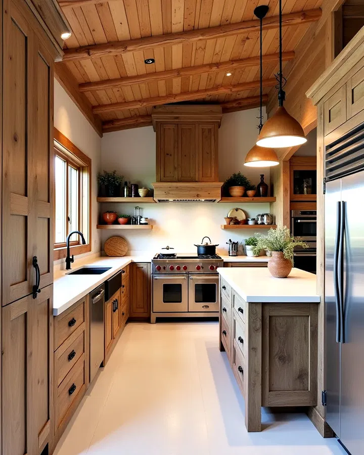
Reclaimed wood cabinets instantly give a mountain kitchen authentic character. Their weathered textures, knots, and rich grain patterns create a cozy atmosphere that feels deeply connected to the outdoors. Pair them with black iron hardware or open shelving for an even more rustic look. Warm lighting will further highlight the natural beauty of the wood and make the kitchen feel inviting.
2. Dramatic Stone Accent Walls
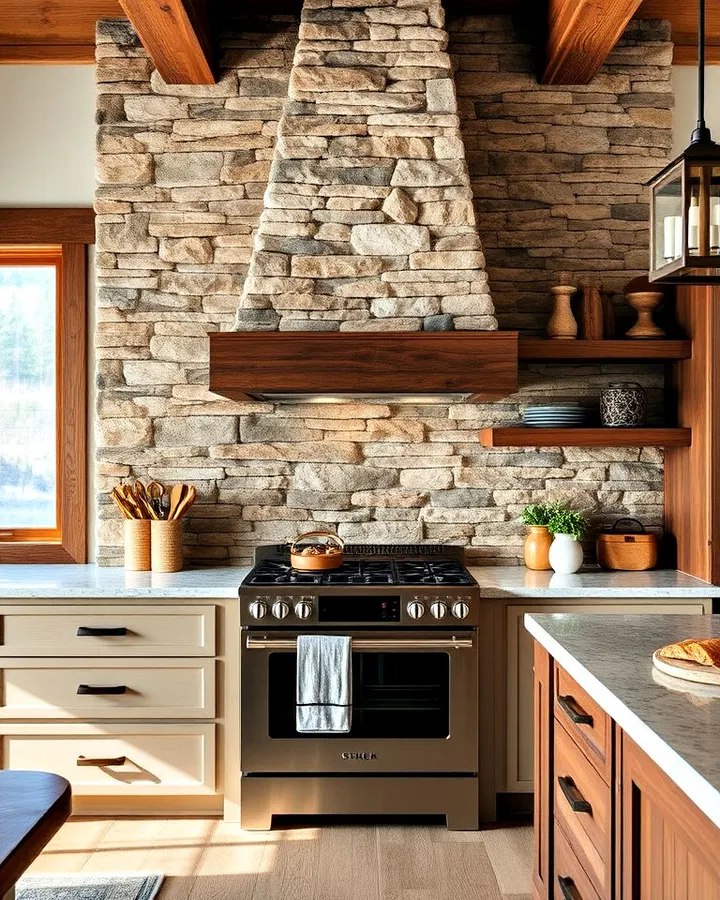
A stone accent wall can completely transform a mountain kitchen into a rustic retreat. Natural stone adds texture, depth, and an earthy feel that mirrors the surrounding landscape. Use stacked stone behind the stove or along a feature wall to create a strong focal point. Combining stone with warm wood tones keeps the design balanced and welcoming.
3. Oversized Windows with Mountain Views
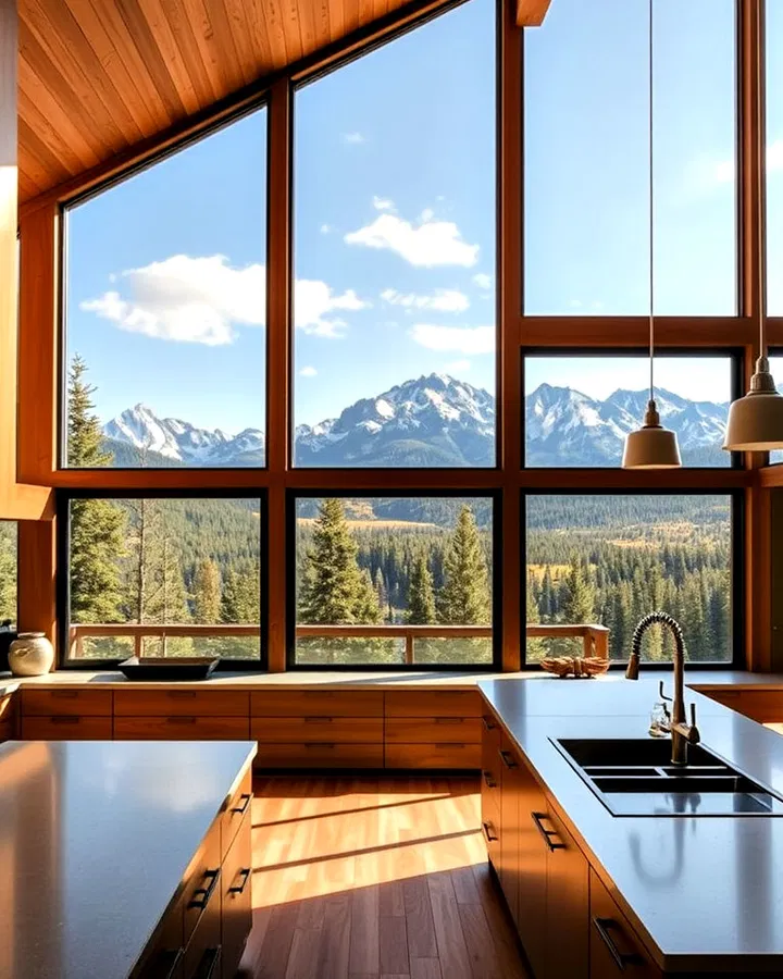
Large windows are one of the most important features in a mountain home kitchen. They flood the room with natural light while showcasing beautiful outdoor scenery. Minimal window frames help maximize the view and create a seamless connection between indoor and outdoor spaces. Keep surrounding decor simple so the landscape becomes part of the design itself.
4. Exposed Wooden Ceiling Beams
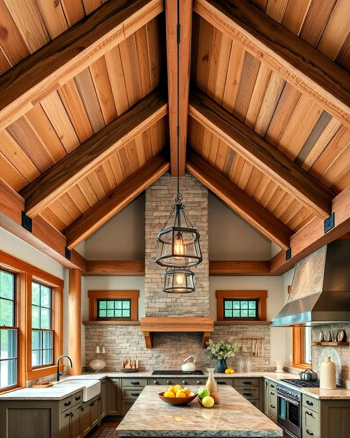
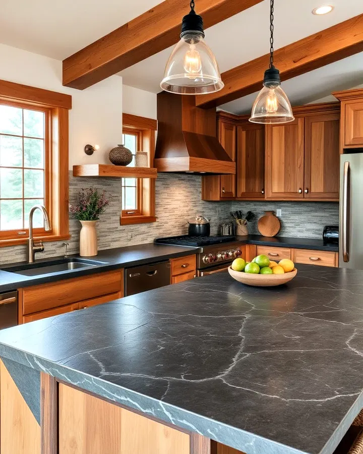
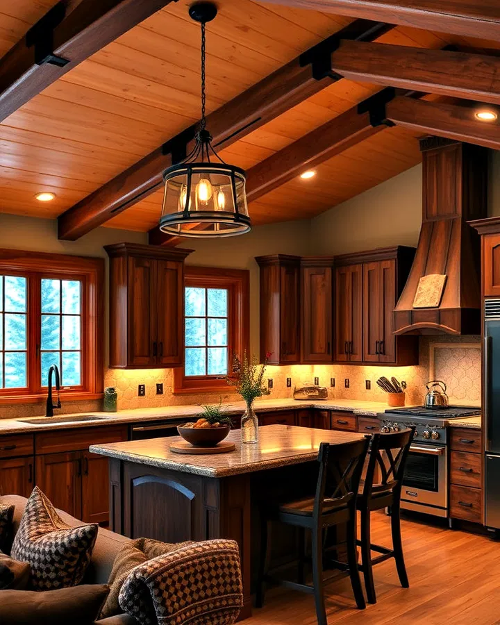
Exposed beams add instant charm and architectural interest to a mountain kitchen. Whether your style is rustic or modern, natural wood beams bring warmth and texture to the ceiling. They work especially well with vaulted ceilings, making the kitchen feel larger and more dramatic. Pendant lights hanging between the beams can enhance the cozy lodge-inspired atmosphere.
5. Durable Slate or Stone Countertops
Stone countertops are both practical and visually striking in mountain kitchens. Materials like slate, soapstone, or granite provide durability while complementing rustic interiors. Their natural patterns and earthy shades pair beautifully with wooden cabinetry and stone backsplashes. These surfaces are also resistant to heat and scratches, making them ideal for busy kitchens.
6. Open Shelving with Natural Decor
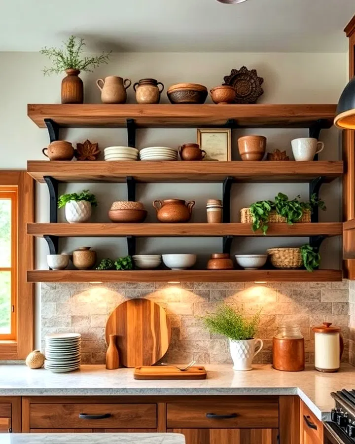
Open shelving keeps a mountain kitchen feeling airy and relaxed. Reclaimed wood shelves can display pottery, woven baskets, greenery, or handcrafted decor that reflects the natural surroundings. This setup also makes everyday items easier to access while adding personality to the space. Soft accent lighting can help showcase decorative pieces beautifully.
7. Rustic Wrought Iron Details
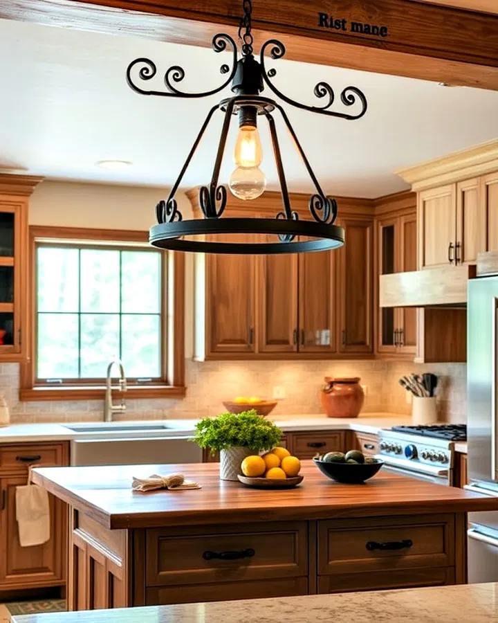
Wrought iron fixtures add a handcrafted feel that fits perfectly in mountain-inspired homes. Cabinet handles, hanging pot racks, and light fixtures in matte black or aged iron create timeless rustic appeal. These dark accents contrast beautifully against wood and stone finishes while giving the kitchen added character.
8. Copper Farmhouse Sink for Old-World Charm
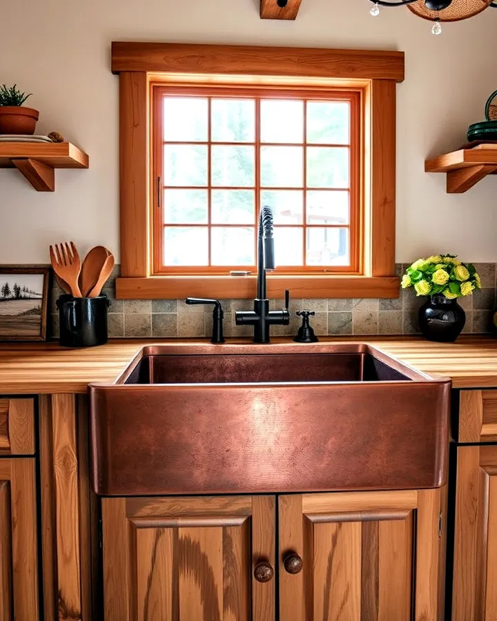
A copper farmhouse sink combines practicality with rustic elegance. The deep basin is perfect for handling large cookware, while the warm copper tones bring richness to the kitchen design. Over time, the natural patina develops even more personality, making the sink feel unique and lived-in. Pair it with wood countertops or stone surfaces for a cohesive mountain look.
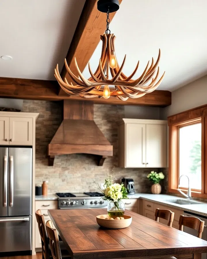
9. Antler-Inspired Lighting Fixtures
Antler-inspired chandeliers and pendant lights add a playful yet sophisticated mountain touch. These fixtures create a striking focal point without overwhelming the room. Smaller antler pendants work well over kitchen islands, while larger chandeliers can anchor open-concept spaces. They pair especially well with exposed beams and natural stone features.
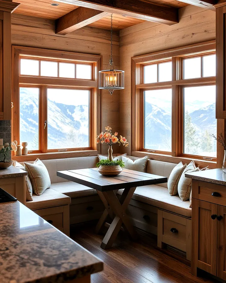
10. A Cozy Breakfast Nook by the Window
A breakfast nook creates the perfect place to enjoy coffee while taking in mountain views. Built-in benches with plush cushions and a rustic wooden table make the area feel warm and inviting. Positioning the nook near large windows allows sunlight to brighten the space throughout the day. Layered lighting can make the corner feel even cozier during evenings.
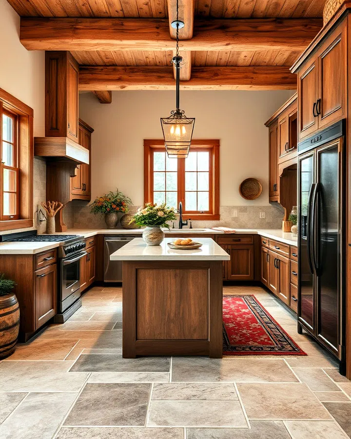
11. Natural Stone Flooring for Rustic Texture
Natural stone flooring gives mountain kitchens durability and timeless style. Slate, travertine, or flagstone floors can handle heavy foot traffic while maintaining their rugged beauty. Their earthy colors help ground the space and connect the kitchen to the outdoors. Adding soft rugs or runners can balance the coolness of the stone and make the room feel more comfortable.
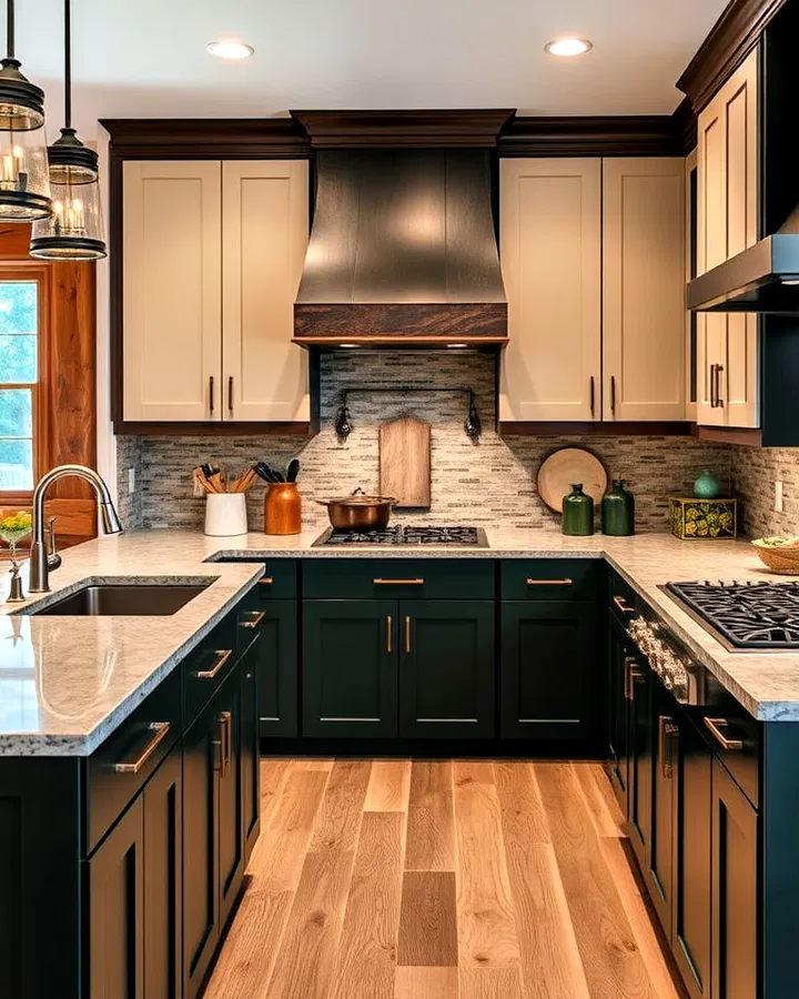
12. Two-Tone Cabinets for Added Depth
Two-tone cabinetry introduces contrast and dimension into a mountain kitchen. Dark lower cabinets in charcoal, forest green, or deep brown create a grounded feel, while lighter upper cabinets keep the room bright and open. This combination works beautifully with stone countertops and rustic hardware, giving the kitchen a modern mountain-inspired look.
13. A Fireplace for Ultimate Coziness
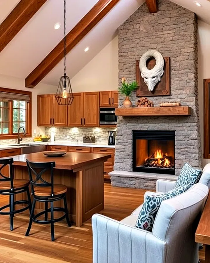
Adding a fireplace to the kitchen creates a warm and welcoming atmosphere, especially during colder months. A stone fireplace fits naturally into mountain-style homes and can become the heart of the space. Whether wood-burning or gas-powered, the fireplace encourages gathering and relaxation while enhancing the rustic charm of the kitchen.
14. Textured Backsplashes with Rustic Appeal
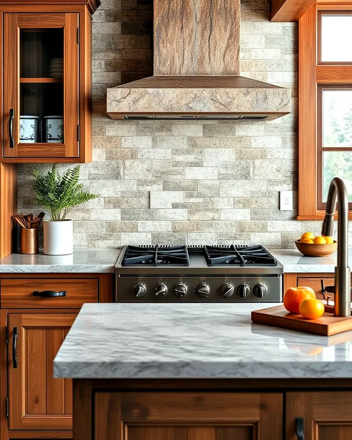
Textured backsplashes add visual interest while protecting kitchen walls from spills and splatters. Handmade tiles, rough stone, or uneven subway tiles all work beautifully in mountain-inspired interiors. Choosing earthy tones helps maintain a natural and cohesive design. These textured surfaces also reflect light in unique ways, adding warmth and depth to the room.
15. Warm Ambient Lighting Throughout the Kitchen
Layered lighting is essential for creating a cozy mountain atmosphere. Combine pendant lights, recessed lighting, and under-cabinet fixtures to create soft illumination throughout the kitchen. Warm-toned bulbs mimic the comforting glow of a fireplace and make the room feel more inviting. Rustic finishes like iron, bronze, or aged brass help tie the entire look together.
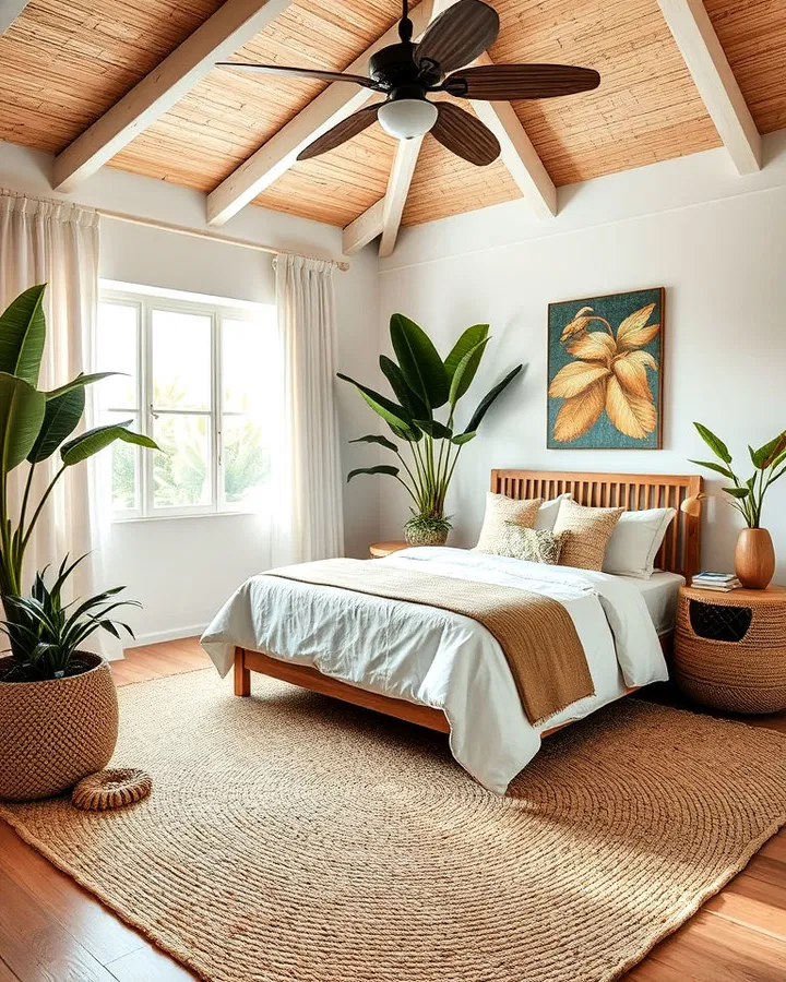
Creating a tropical bedroom is all about blending natural textures, calming colors, and island-inspired details that make your space feel like a peaceful getaway. From breezy linens and woven furniture to lush greenery and coastal accents, tropical decor brings warmth, freshness, and relaxation into your home. Whether you want a bold jungle-inspired retreat or a soft coastal escape, these tropical bedroom ideas can help you design a room that feels stylish, airy, and inviting.
1. Create a Relaxing Escape With a Canopy Bed
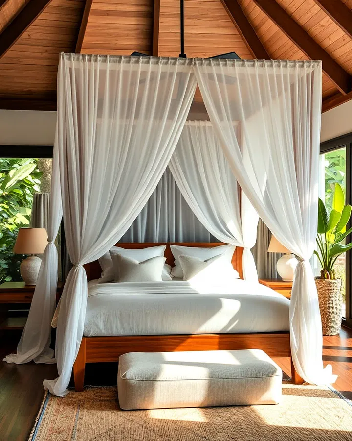
A canopy bed instantly gives your bedroom a luxurious tropical resort feel. Choose a wooden or rattan frame and pair it with flowing white sheer curtains to create a soft and calming atmosphere. The draped fabric adds elegance while making the space feel cozy and private. Complete the look with neutral bedding and warm lighting for a true island-inspired retreat.
2. Add Palm Leaf Wallpaper for a Bold Tropical Statement
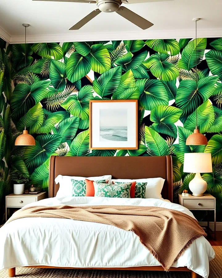
Palm leaf wallpaper is one of the easiest ways to transform a plain bedroom into a lush tropical oasis. Large leafy prints in green tones instantly bring energy and freshness into the room. Whether you go with dramatic dark greens or softer pastel versions, this wallpaper creates a stunning focal point that pairs beautifully with natural furniture and earthy decor.
3. Use Rattan Furniture for Natural Island Texture
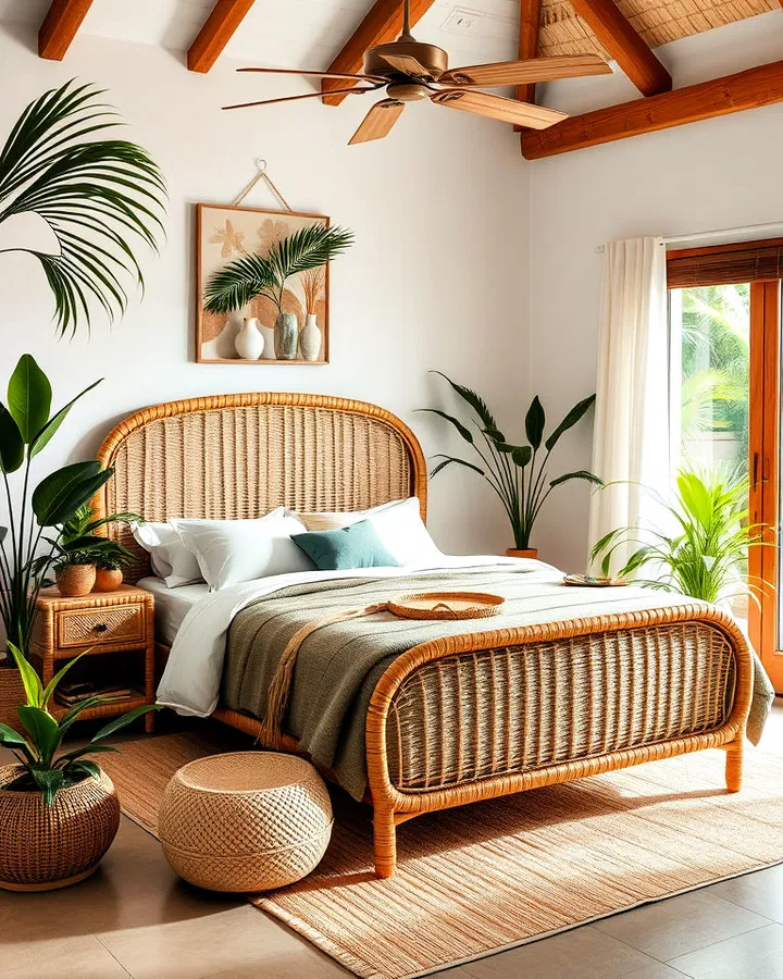
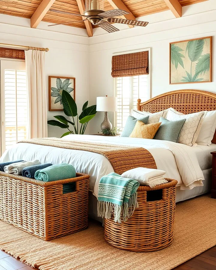
Rattan furniture brings effortless tropical charm to any bedroom. A rattan bed frame, accent chair, or nightstand adds warmth and texture while keeping the space feeling light and airy. Its woven design works perfectly with tropical themes and blends beautifully with indoor plants, linen fabrics, and coastal accessories.
4. Style the Room With Breezy White Linen Bedding
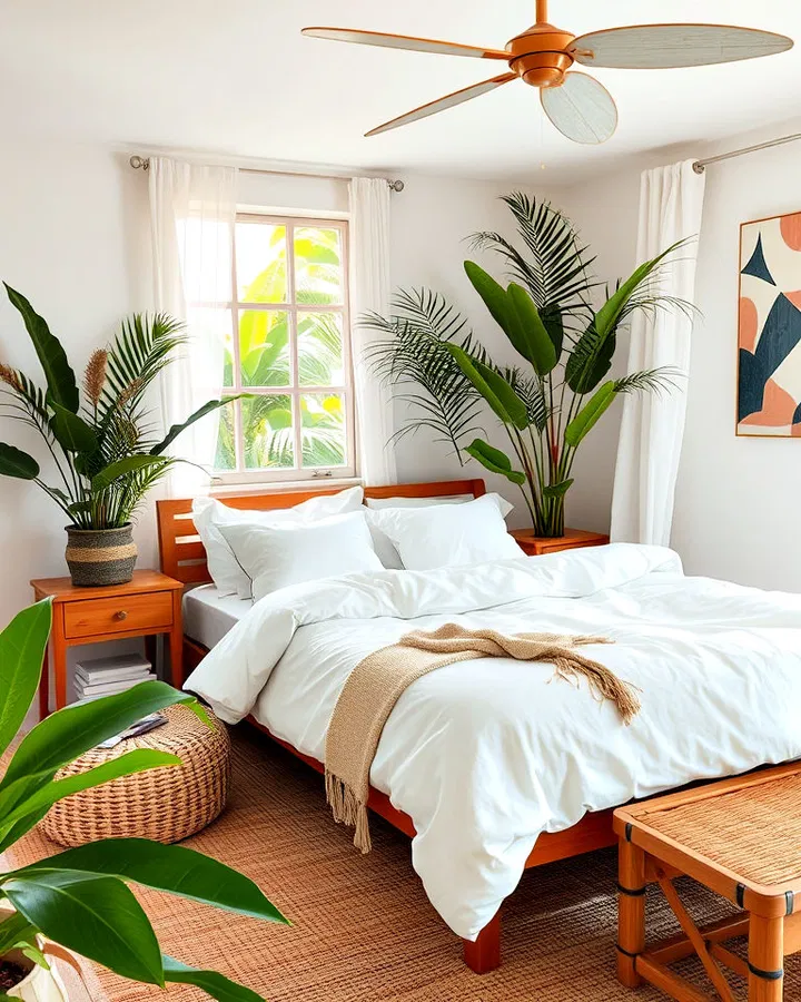
White linen bedding creates a relaxed and airy feel that perfectly matches tropical interiors. Linen fabric looks effortlessly elegant while also staying cool and breathable in warm weather. Layer soft white sheets with textured pillows and lightweight throws to create a calm and refreshing bedroom that feels like a luxury beach resort.
5. Decorate With Oversized Indoor Palm Plants
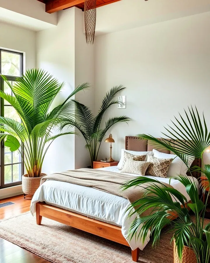
Large tropical plants instantly breathe life into a bedroom. Indoor palms placed beside the bed or in empty corners create a lush jungle-inspired atmosphere while adding height and texture to the room. Their rich green leaves make the space feel vibrant, fresh, and connected to nature.
6. Bring in Earthy Warmth With a Woven Jute Rug
A woven jute rug helps ground the room with natural texture and cozy warmth. Its organic look complements tropical decor beautifully while adding a relaxed coastal feel. Jute rugs pair especially well with rattan furniture, wood accents, and leafy greenery, helping the room feel balanced and inviting.
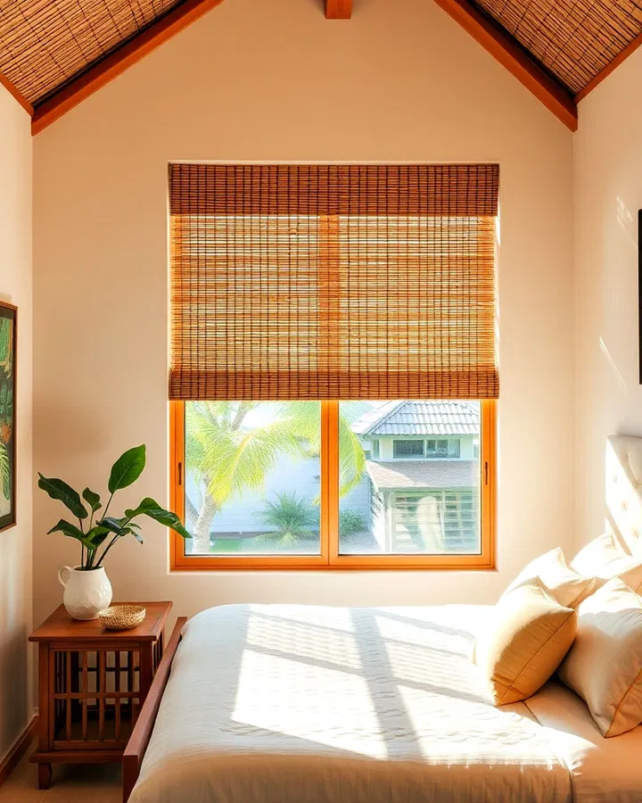
7. Install Bamboo Blinds for a Tropical Window Treatment
Bamboo blinds are a practical and stylish way to enhance a tropical bedroom. Their warm natural tones soften the room while allowing filtered sunlight to create a calming atmosphere. Bamboo textures work perfectly with tropical decor and help reinforce the relaxed island-inspired aesthetic.
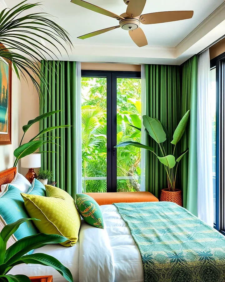
8. Choose a Green and Blue Color Palette
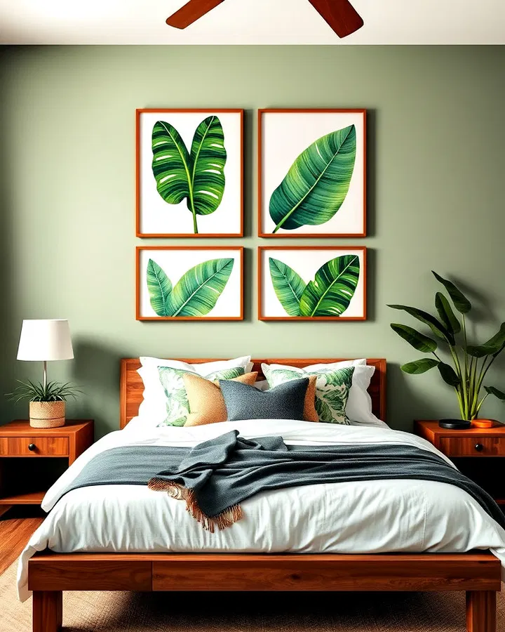
Tropical spaces often draw inspiration from lush rainforests and ocean views. Combining shades of green and blue creates a refreshing and calming color palette that instantly transforms the room. Add these colors through pillows, bedding, curtains, or wall art while balancing them with white or beige tones for a softer look.
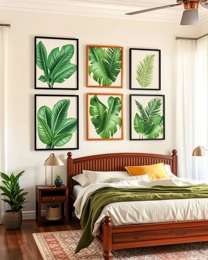
9. Add Tropical Leaf Prints as Wall Art
Tropical leaf artwork is a simple way to introduce island-inspired style without overwhelming the space. Framed banana leaves, palms, or fern prints add natural beauty and color to the walls. Create a gallery wall for a bold statement or use a single oversized print for a more minimal tropical touch.
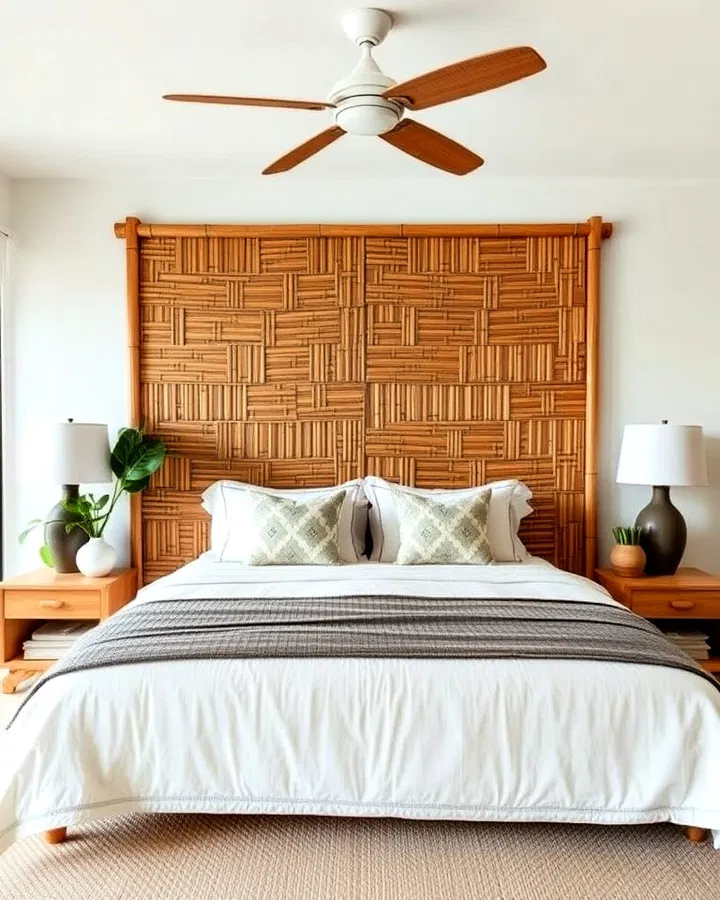
10. Use a Bamboo or Wooden Headboard as a Focal Point
A bamboo or reclaimed wood headboard instantly adds earthy texture and tropical warmth to the bedroom. Natural wood grains and woven patterns create a relaxed resort-inspired vibe while making the bed the center of attention. This detail works especially well in neutral tropical interiors.
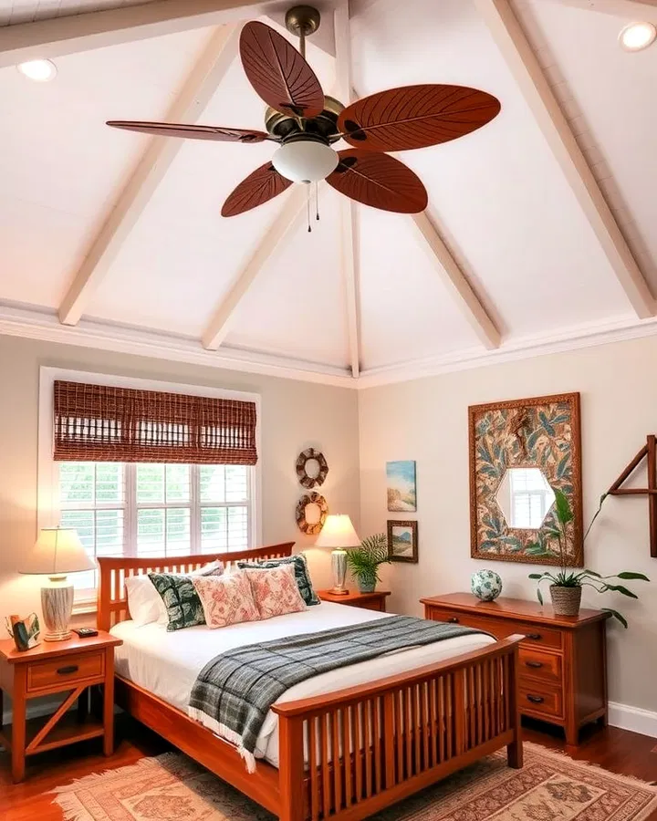
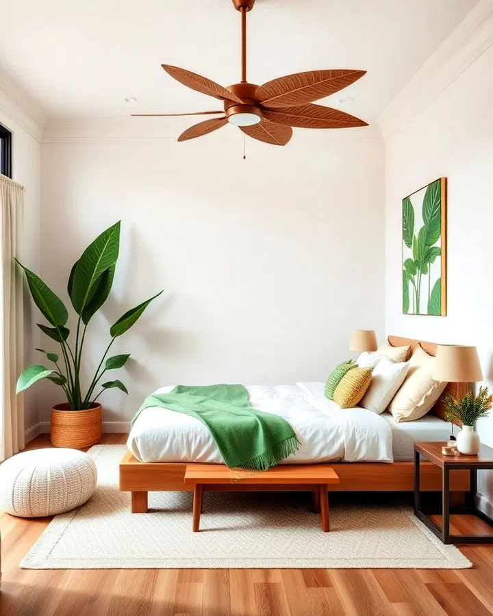
11. Add a Ceiling Fan With Coastal Style
A ceiling fan is both functional and decorative in a tropical bedroom. Fans with wooden blades or palm-inspired designs reinforce the tropical aesthetic while keeping the room cool and comfortable. They also help create that breezy vacation-home atmosphere found in tropical resorts.
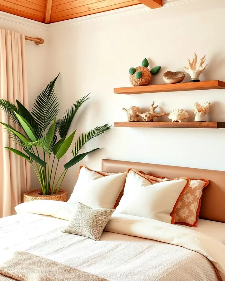
12. Decorate With Coral and Seashell Accents
Small coral pieces, shells, and ocean-inspired decor can bring subtle coastal elegance into your tropical bedroom. Place them on shelves, dressers, or bedside tables to add texture and beach-inspired charm. These details pair beautifully with neutral palettes and tropical greenery.
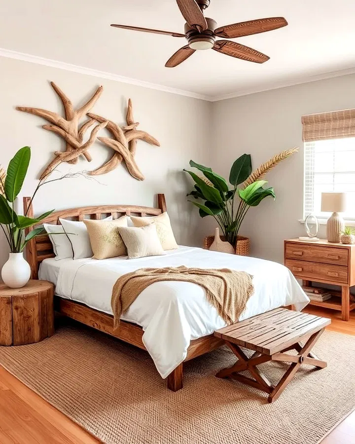
13. Use Driftwood Decor for Rustic Coastal Charm
Driftwood decor adds a weathered beach-house feel that fits perfectly into tropical interiors. Whether used as wall art, lamp bases, mirrors, or decorative accents, driftwood introduces rustic texture and natural beauty into the space. Its organic appearance helps the room feel relaxed and connected to nature.
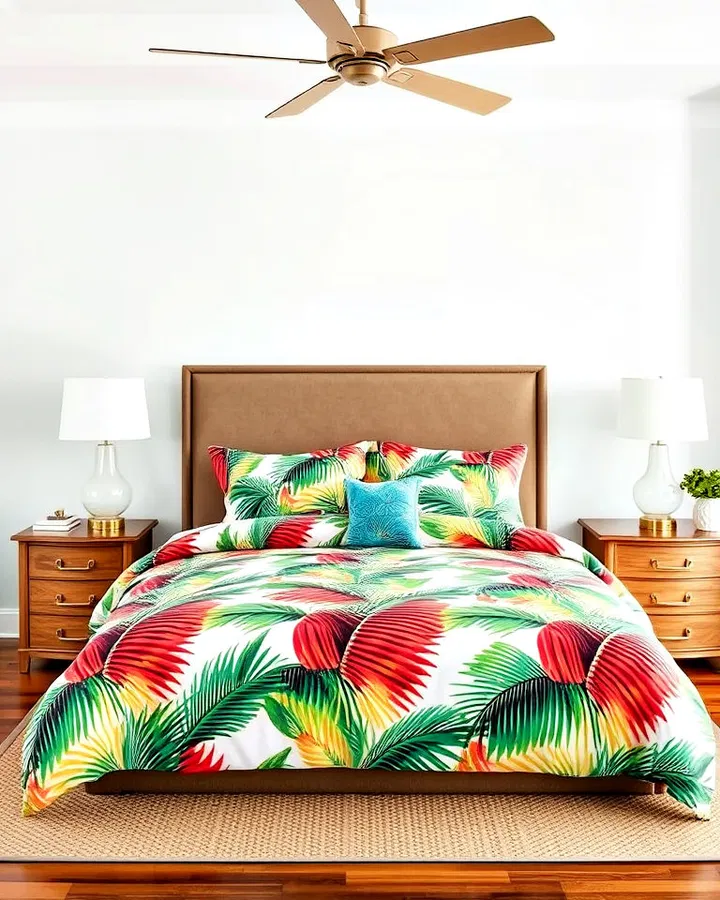
14. Make the Bed Stand Out With Bold Tropical Bedding
Tropical-print bedding featuring palm leaves, exotic flowers, or colorful birds can instantly energize the room. This approach works especially well in bedrooms with neutral walls and simple furniture, allowing the bedding to become the main focal point. It’s a fun way to create a vibrant vacation-inspired atmosphere.
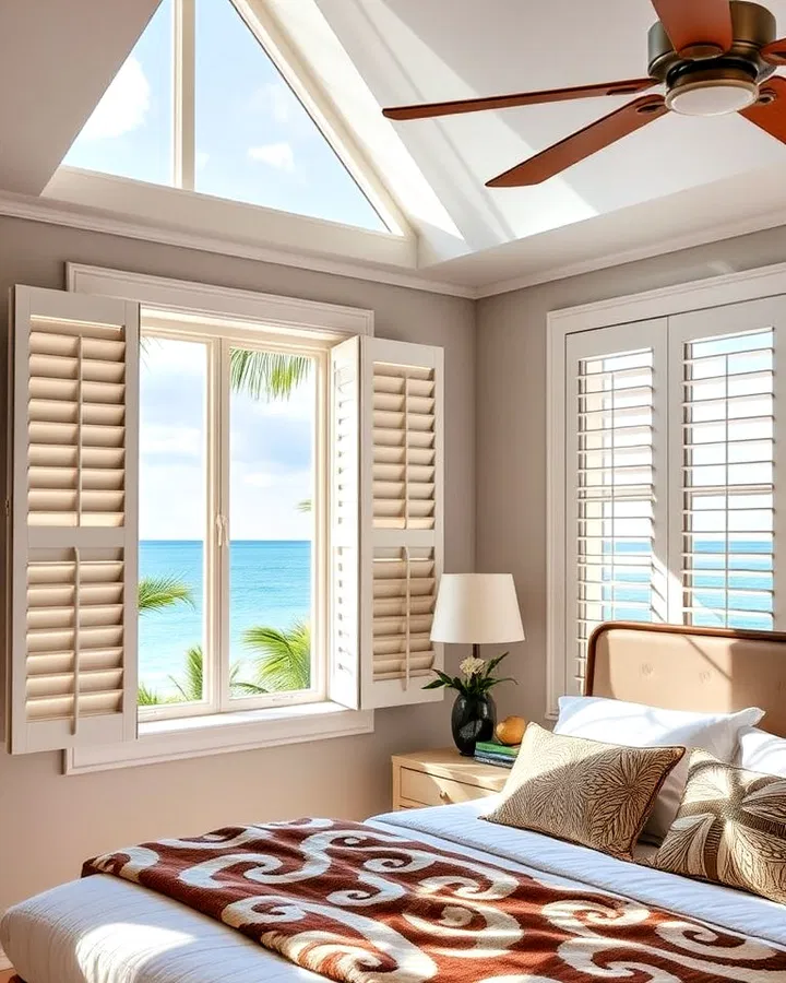
15. Replace Curtains With Wooden Shutters
Wooden shutters give tropical bedrooms a clean and airy coastal look. They allow natural light to filter beautifully into the room while also providing privacy and ventilation. White or natural wood shutters pair especially well with tropical decor styles and create a polished beach-inspired finish.
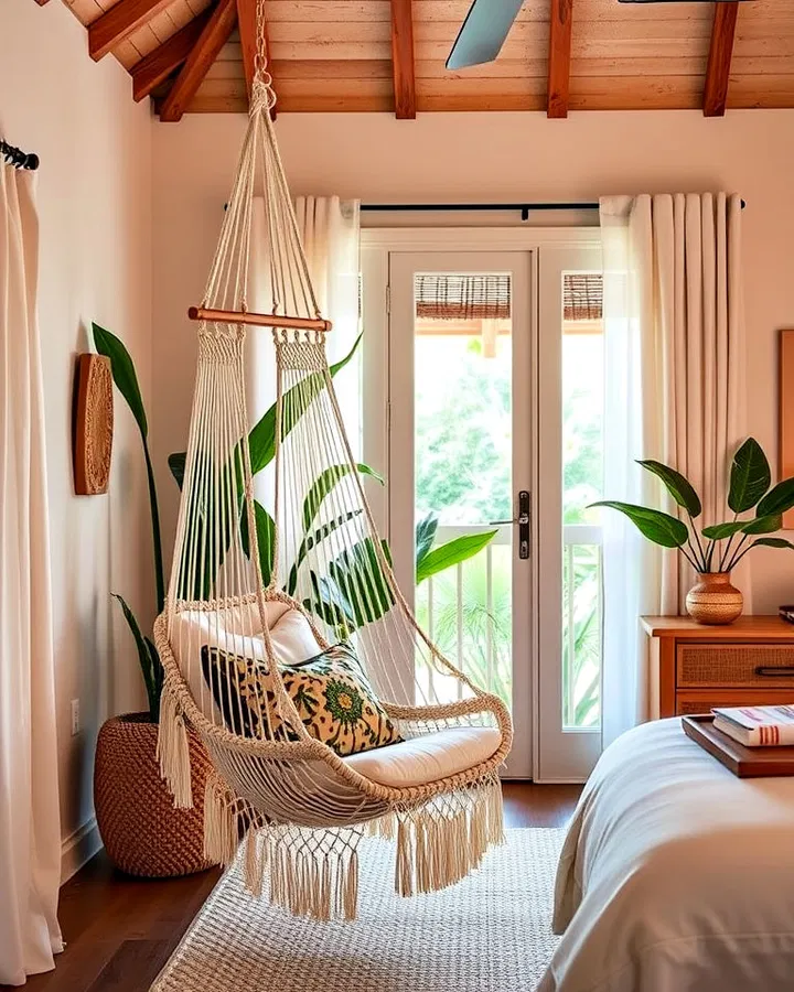
16. Add a Hammock Chair for a Relaxed Vibe
A hammock chair instantly makes a bedroom feel playful and relaxing. Hanging one in a corner creates the perfect reading nook or lounging spot while adding texture and personality to the room. Choose cotton, macrame, or woven materials to enhance the tropical aesthetic.
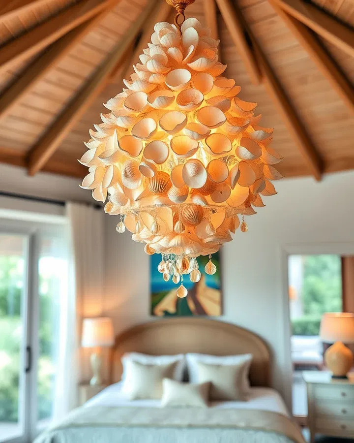
17. Install a Seashell Chandelier for Island Elegance
A seashell chandelier creates a soft coastal glow while serving as a beautiful statement piece. The cascading shells add texture and movement, giving the room a luxurious tropical resort feel. This decorative lighting choice works especially well in light, airy bedrooms with neutral color palettes.
18. Keep the Space Calm With Neutral Tones and Tropical Accents
For a softer tropical design, stick to neutral shades like beige, white, cream, and sand while adding tropical elements through greenery and accessories. This approach creates a calm and sophisticated bedroom that still captures the essence of island living without feeling overly bold.
19. Organize the Room With Stylish Wicker Baskets
Wicker baskets are both decorative and functional in tropical bedrooms. Use them to store blankets, laundry, magazines, or extra pillows while adding woven texture throughout the room. Their natural look complements coastal and tropical decor effortlessly.
20. Mix Banana Leaf Prints Into the Decor
Banana leaf patterns are timeless in tropical interiors because they instantly bring freshness and energy into the room. Add them through framed artwork, accent pillows, wallpaper, or bedding to create a lively botanical feel without overwhelming the space. These leafy patterns make any bedroom feel vibrant and vacation-ready.
Windows can completely change the mood and functionality of a bedroom. The right design can make a small room feel bigger, improve airflow, highlight beautiful outdoor views, or add a layer of charm and personality. Whether you prefer modern minimalism, cozy cottage aesthetics, or timeless elegance, these bedroom window ideas can help you create a more relaxing and visually appealing retreat.
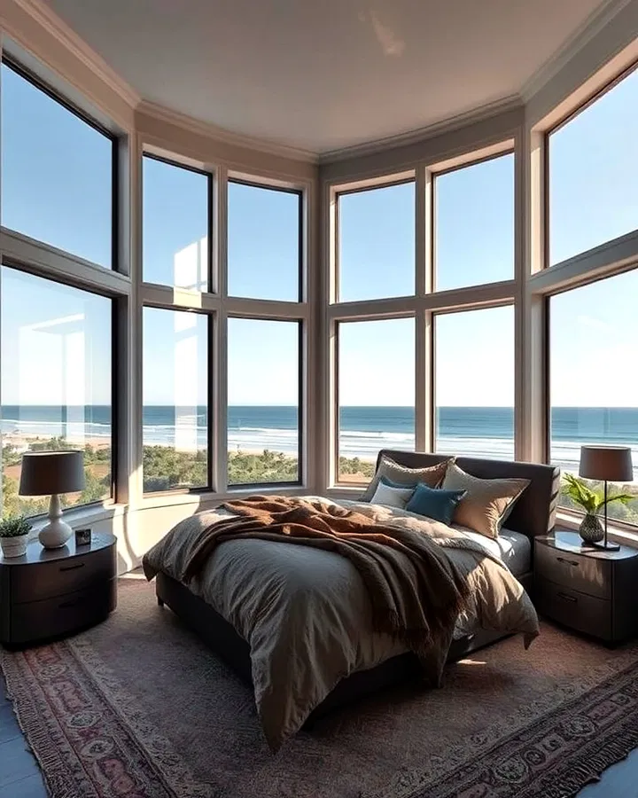
1. Create a Luxury Feel With Floor-to-Ceiling Windows
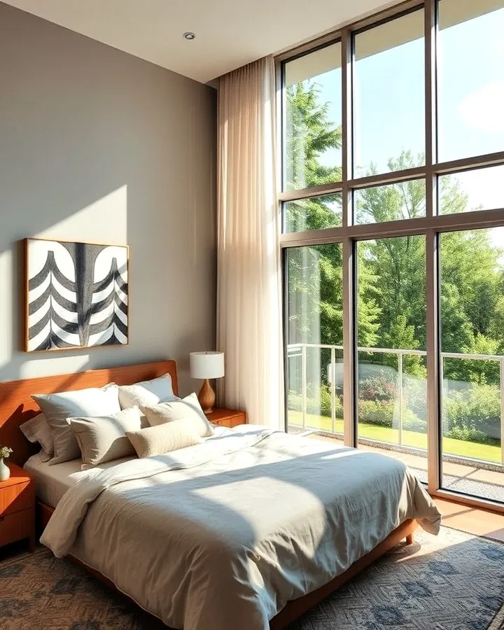
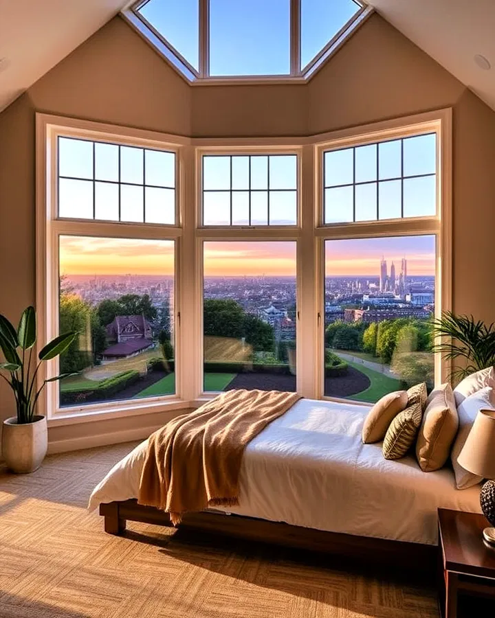
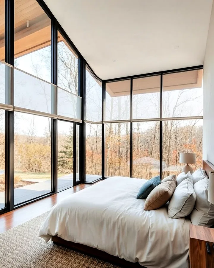
Large floor-to-ceiling windows instantly make a bedroom feel brighter and more spacious. They bring in abundant sunlight and create a seamless connection to the outdoors. This style works especially well in homes with scenic landscapes, city skylines, or garden views. Add sheer drapes to soften the look while maintaining natural light.
2. Add Comfort With a Cozy Bay Window Nook
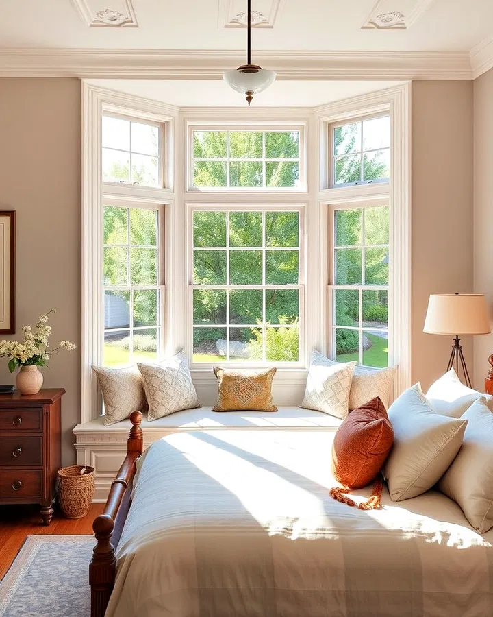
Bay windows can become the perfect reading corner or relaxation spot when paired with built-in seating. A cushioned bench beneath the windows adds warmth and functionality while maximizing unused space. This setup also creates a charming architectural feature that gives the bedroom extra depth.
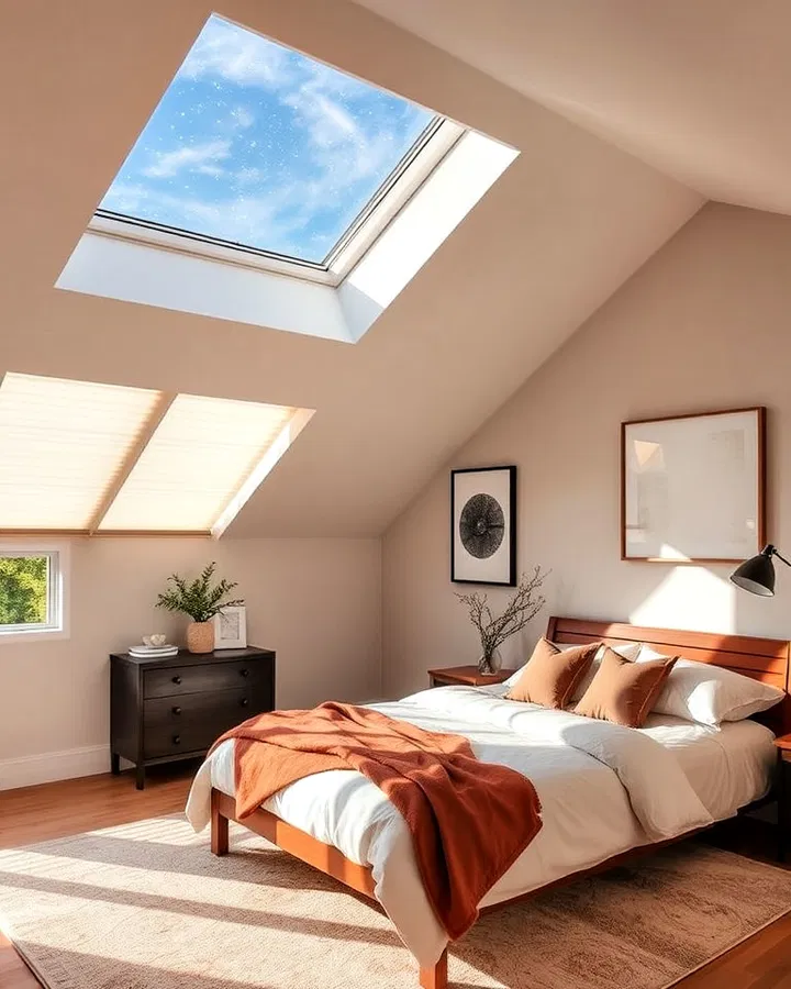
3. Bring in Sunshine Through Skylights
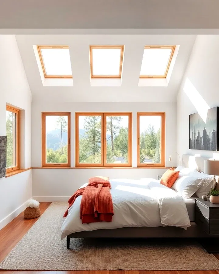
Skylights are ideal for bedrooms that need more natural light without sacrificing wall space. They brighten the room during the day and create a dreamy atmosphere at night for stargazing. Remote-controlled blinds can help manage sunlight and privacy when needed.
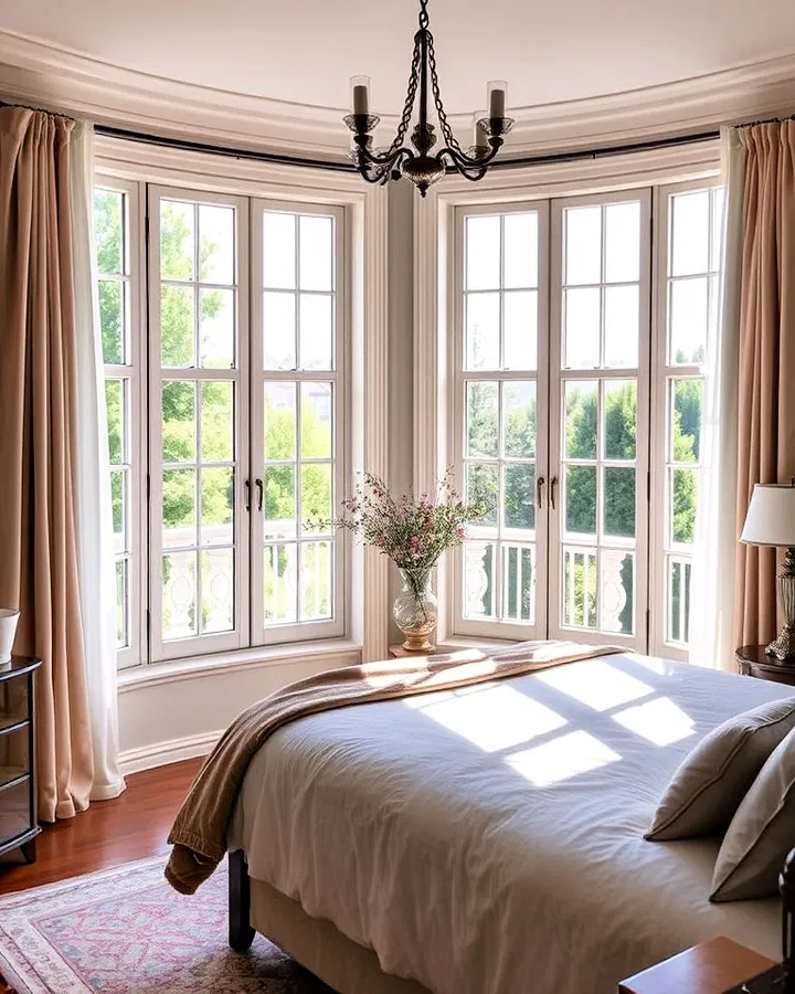
4. Use French Windows for Timeless Elegance
French windows add sophistication and romantic charm to a bedroom. Their tall glass panels allow sunlight to flow through the room while offering direct access to balconies or patios. Pairing them with soft curtains enhances the airy and elegant feel.
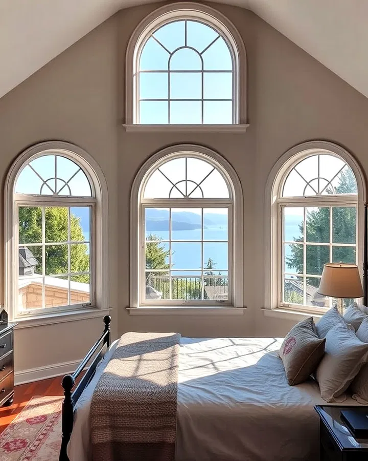
5. Make a Statement With Arched Windows
Arched windows introduce graceful curves that soften the appearance of a room. They work beautifully in both traditional and contemporary interiors and can serve as an eye-catching focal point. Positioned above regular windows or doors, they add extra architectural interest.
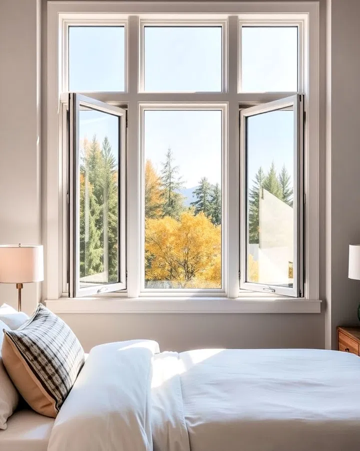
6. Improve Airflow With Casement Windows
Casement windows are perfect for bedrooms that need better ventilation. Hinged on the side, they open outward to allow fresh air to circulate freely. Their clean and modern design also provides unobstructed outdoor views.
7. Frame Scenic Views With Picture Windows
Picture windows are designed to showcase outdoor scenery like living artwork. Since they do not open, they work best in bedrooms where ventilation is less important than maximizing natural light and panoramic views. This style creates a peaceful and luxurious atmosphere.
8. Blur Indoor and Outdoor Spaces With Window Walls
Window walls transform a bedroom into a bright, open retreat. Large glass panels make the room feel connected to nature and allow sunlight to flood the space. Roller shades or motorized blinds can help maintain privacy without sacrificing style.
9. Brighten the Room With Transom Windows
Transom windows are placed above doors or larger windows to increase natural light while maintaining privacy. They are especially useful in bedrooms with high ceilings and add subtle architectural detail that enhances the room’s design.
10. Install Sliding Glass Doors for Easy Outdoor Access
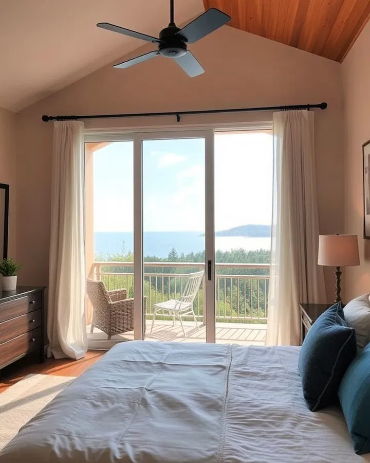
Sliding glass doors combine the function of a window and doorway in one sleek design. They create smooth access to balconies, patios, or gardens while saving floor space compared to swinging doors. Light curtains help preserve the open and airy feel.
11. Open Up the Room With Corner Windows
Corner windows create a panoramic effect that visually expands the bedroom. By wrapping around two walls, they allow sunlight to enter from multiple directions and showcase stunning outdoor views. This design feels modern, fresh, and spacious.
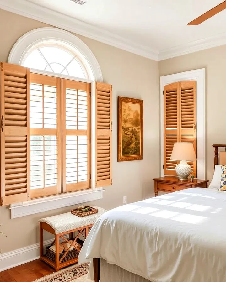
12. Add Vintage Character With Shuttered Windows
Interior shutters bring timeless charm and functionality to a bedroom. They provide adjustable privacy and light control while adding texture and warmth to the space. White shutters suit coastal rooms, while natural wood tones create a rustic atmosphere.
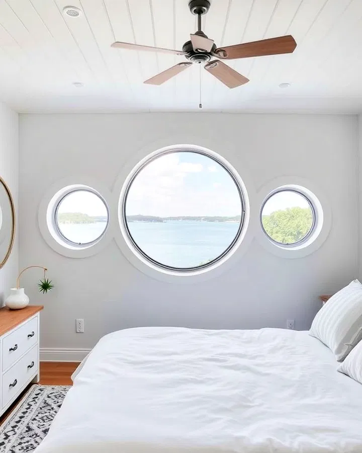
13. Try Circular Windows for a Unique Accent
Circular windows instantly stand out because of their unusual shape. They add visual interest without overwhelming the room and work beautifully in small spaces or eclectic interiors. Positioned correctly, they can frame outdoor scenery like a decorative piece of art.
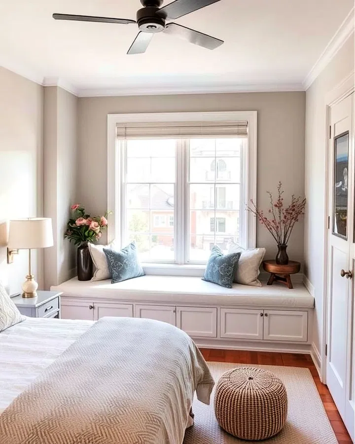
14. Turn a Window Into a Relaxing Seating Area
A built-in window seat creates a comfortable spot for reading, relaxing, or enjoying morning coffee. Storage beneath the bench adds functionality while maximizing space. This idea works particularly well with bay and picture windows.
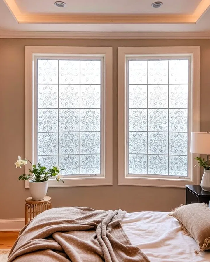
15. Maintain Privacy With Frosted Glass
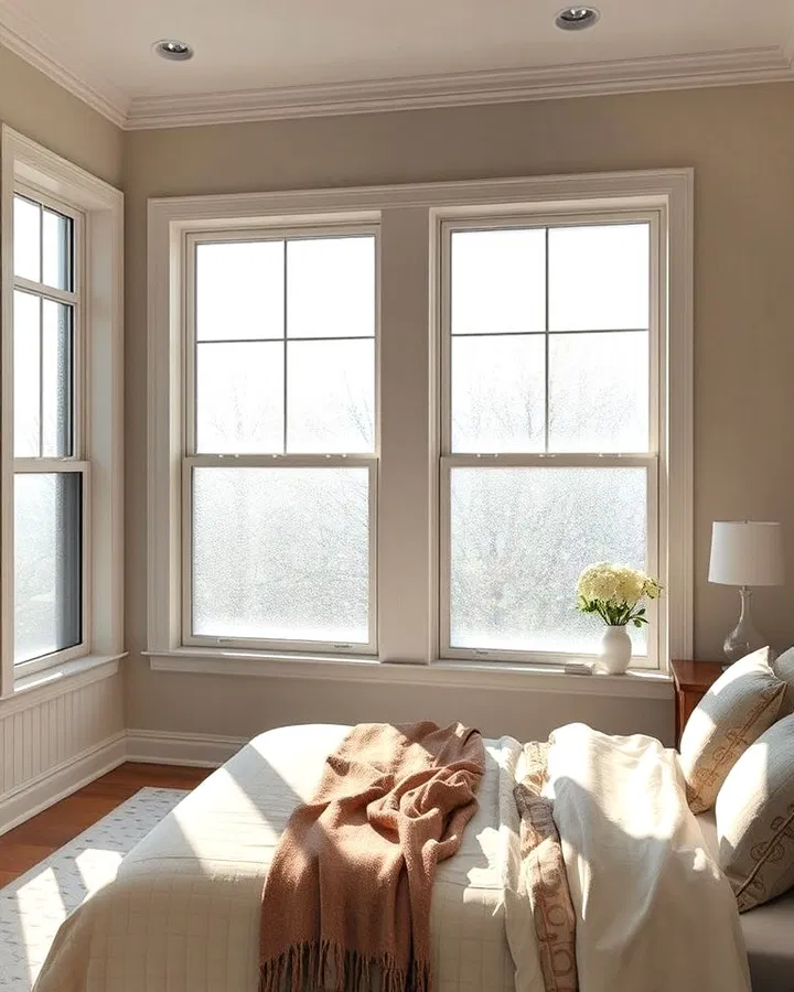
Frosted glass windows allow sunlight to filter through while blocking outside visibility. They create a soft glow that makes the bedroom feel calm and serene. This option is especially useful for rooms facing neighboring houses or busy streets.
16. Choose Tilt-and-Turn Windows for Flexibility
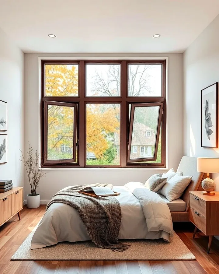
Tilt-and-turn windows provide multiple ventilation options. They can tilt inward slightly for gentle airflow or swing fully open for maximum circulation. Their practical design also makes cleaning easier, making them a smart and stylish choice.
17. Add Traditional Charm With Window Grilles
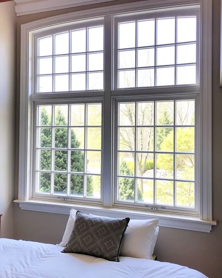
Decorative grilles divide window panes into smaller sections, creating a classic and timeless appearance. They work beautifully in farmhouse, cottage, or traditional bedrooms and add texture without reducing natural light.
18. Save Wall Space With Clerestory Windows
Clerestory windows are installed high on the wall, allowing sunlight to enter while leaving lower walls free for furniture or artwork. This style is perfect for minimalist and modern bedrooms that prioritize both brightness and privacy.
19. Stick to a Classic Look With Double-Hung Windows
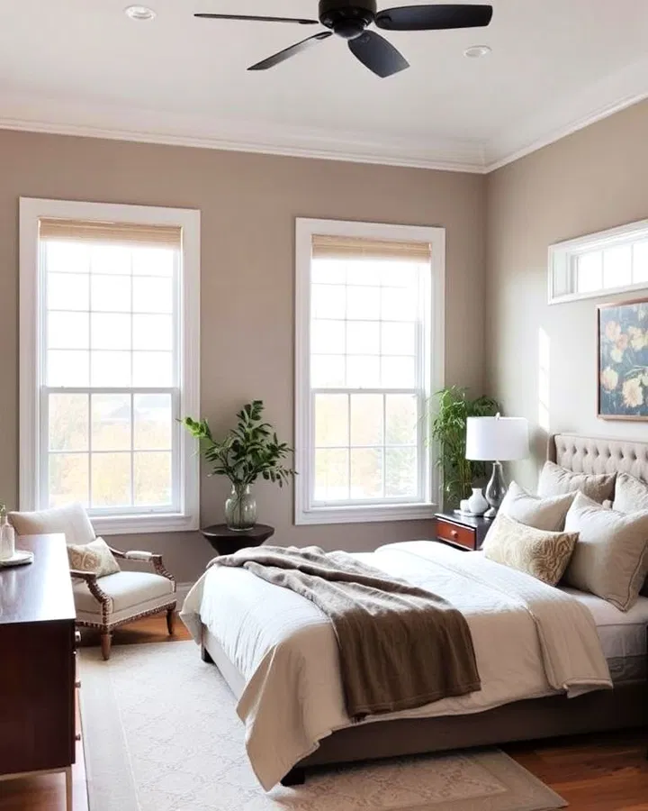
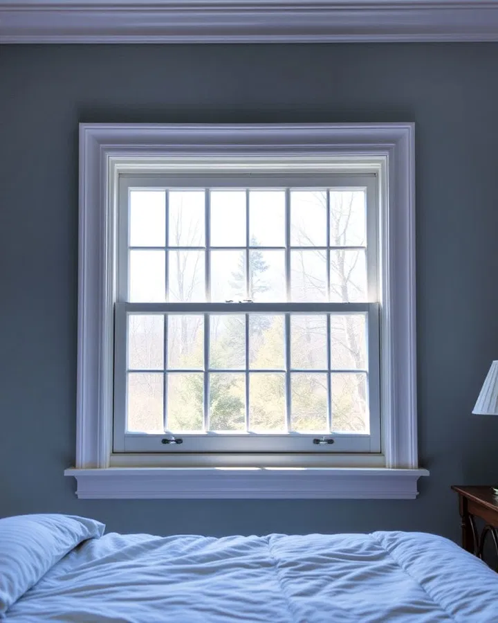
Double-hung windows remain a popular choice because of their versatility and traditional appearance. Both the upper and lower sashes can open, allowing better airflow control. Their timeless style suits nearly any bedroom design.
20. Create Contrast With Black-Framed Windows
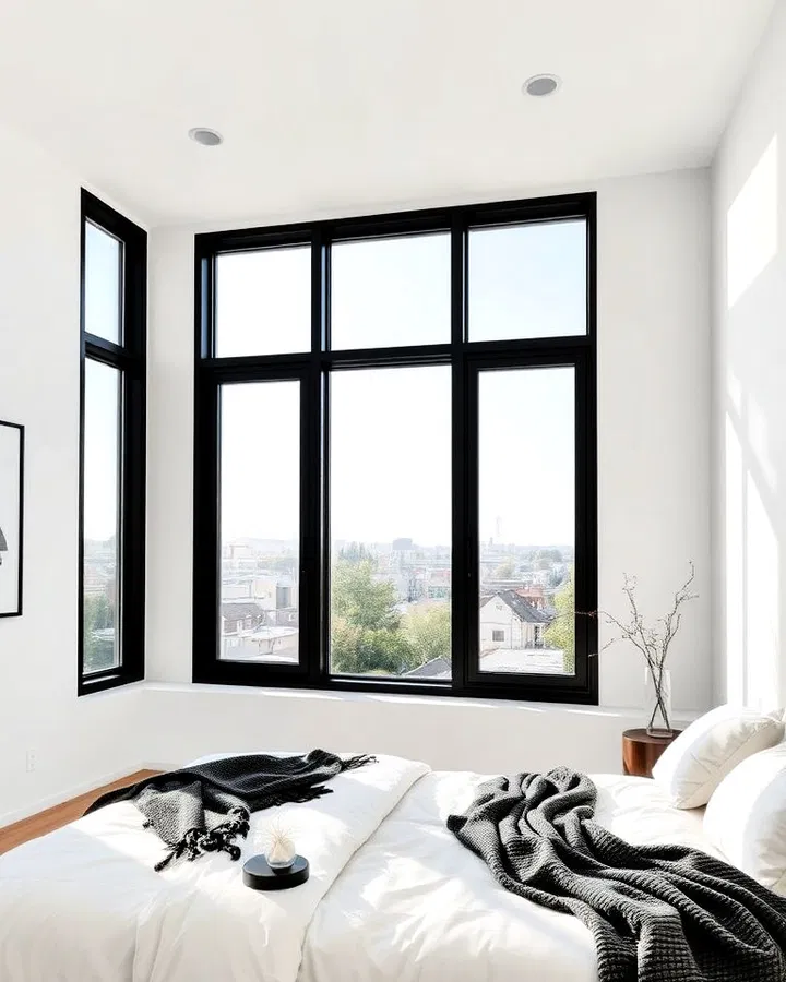
Black-framed windows add bold definition and modern character to a bedroom. The dark frames contrast beautifully against light-colored walls and highlight outdoor views. This look pairs especially well with industrial and contemporary interiors.
21. Add Artistic Beauty With Stained Glass
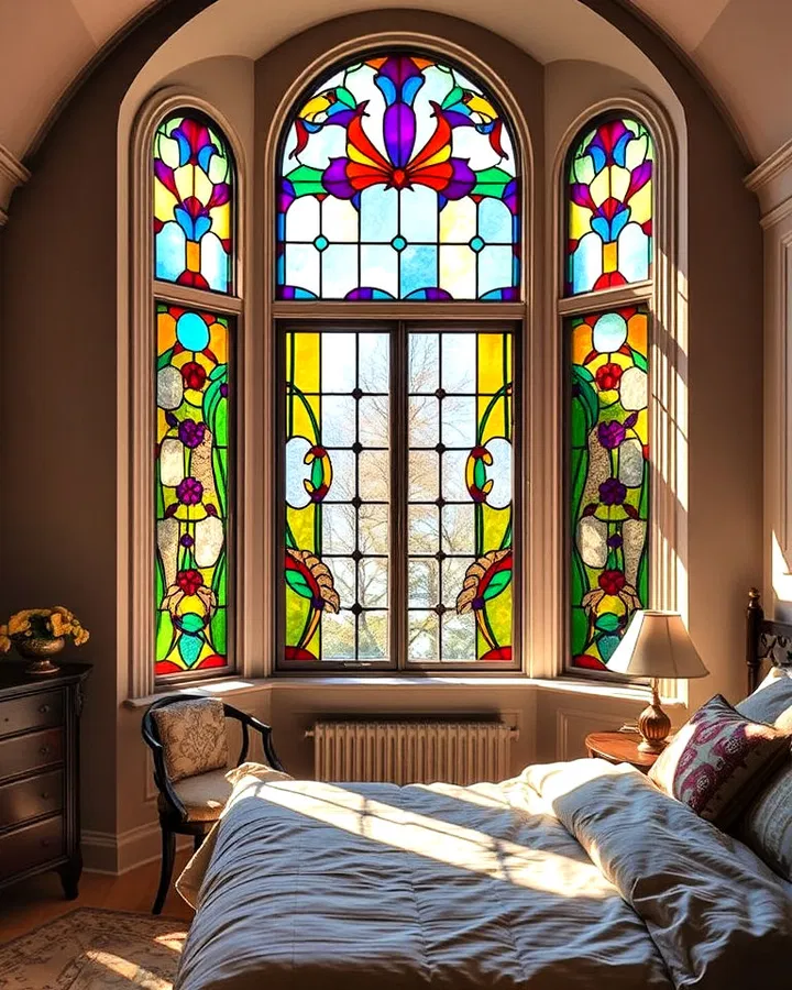
Stained glass windows fill a bedroom with colorful light and artistic detail. They can become the centerpiece of the room while creating a warm and creative atmosphere. Depending on the design, stained glass can feel vintage, bohemian, or elegant.
22. Maximize Small Rooms With Awning Windows
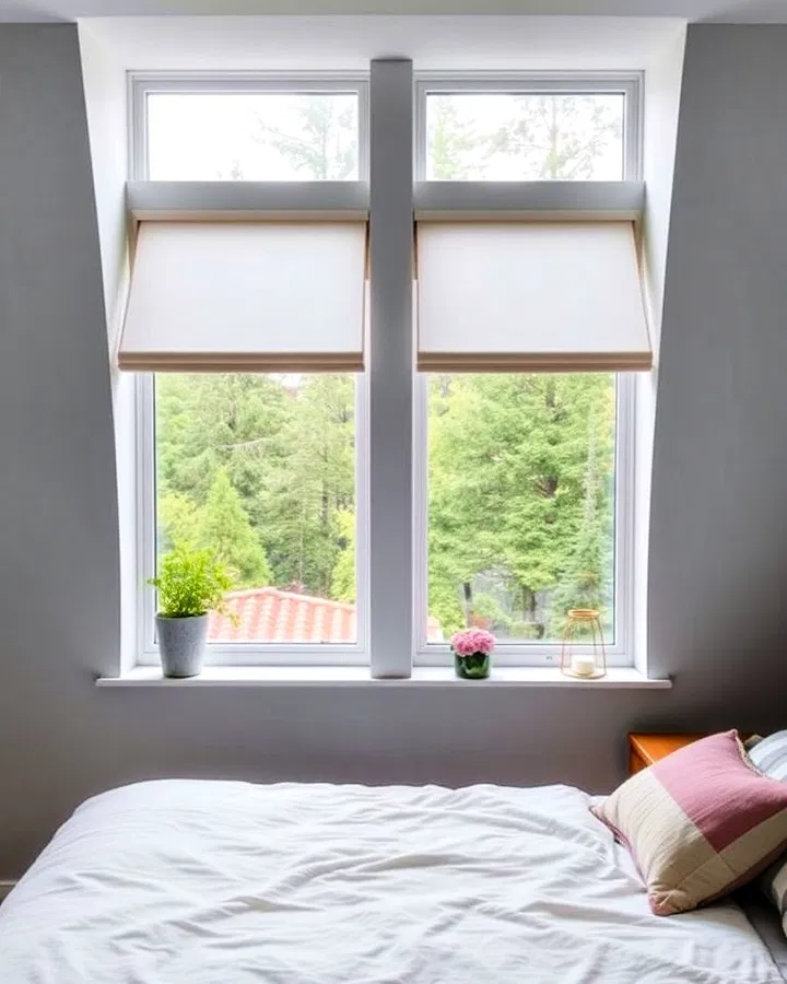
Awning windows are hinged at the top and open outward, making them ideal for compact bedrooms. They allow ventilation even during light rain and have a sleek profile that doesn’t overpower small spaces.
23. Bring Tropical Style With Louvered Windows
Louvered windows feature adjustable slats that help control airflow and sunlight. They are ideal for warm climates where ventilation is important and instantly create a breezy, resort-inspired atmosphere in the bedroom.
24. Customize Privacy With Decorative Window Film
Window film is an affordable way to improve privacy while still allowing natural light inside. Available in countless patterns and textures, it can mimic frosted glass or add decorative detail to plain windows without permanent changes.
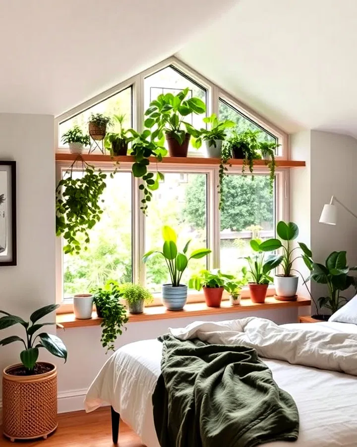
25. Display Plants Beautifully With Garden Windows
Garden windows extend outward from the wall, creating extra shelf space for indoor plants and decor. They function like miniature greenhouses, bringing fresh greenery and a calming natural vibe into the bedroom.
Conclusion
The right bedroom window design can dramatically improve your space by enhancing natural light, increasing comfort, and adding personality. From dramatic floor-to-ceiling glass to charming shuttered windows, every option offers its own mix of beauty and practicality. By choosing a style that fits your needs and aesthetic, you can transform your bedroom into a peaceful retreat that feels both stylish and inviting.
A white and cream color palette creates a bedroom that feels calm, airy, and effortlessly elegant. By layering textures and subtle contrasts, you can avoid a flat look while keeping the space warm and inviting. Below are thoughtfully organized ideas to help you design a serene and stylish retreat.
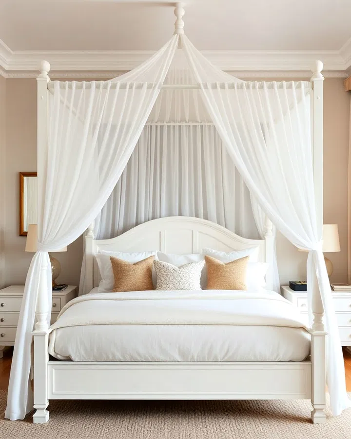
1. Create a Dreamy Focal Point with a White Canopy Bed
A white canopy bed instantly elevates the bedroom into a soft, romantic space. Light, flowing curtains add an airy feel, while cream bedding introduces warmth. Finish the look with textured pillows to bring in depth without disrupting the neutral palette.
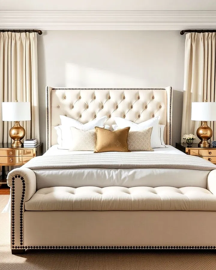
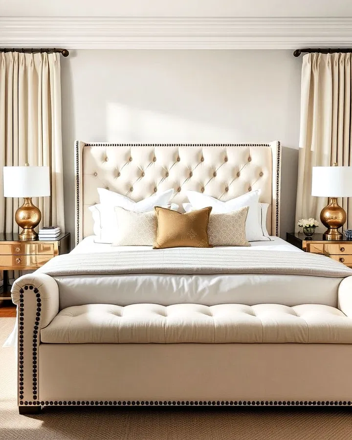
2. Add Sophistication with a Cream Upholstered Headboard
A cream upholstered headboard brings a refined and cozy touch. Pair it with crisp white bedding for contrast, and incorporate metallic or neutral accessories to keep the look polished and balanced.
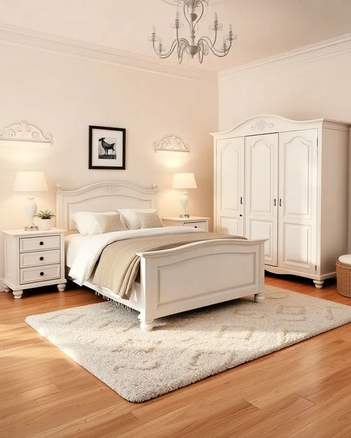
3. Use White Wooden Furniture for Timeless Appeal
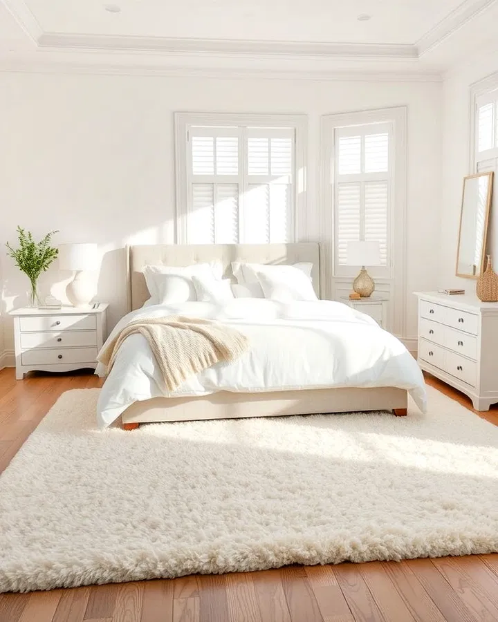
White wooden furniture—like bed frames, dressers, or nightstands—creates a clean and classic foundation. To soften the look, balance it with cream walls, linens, or rugs for a cozy, welcoming atmosphere.
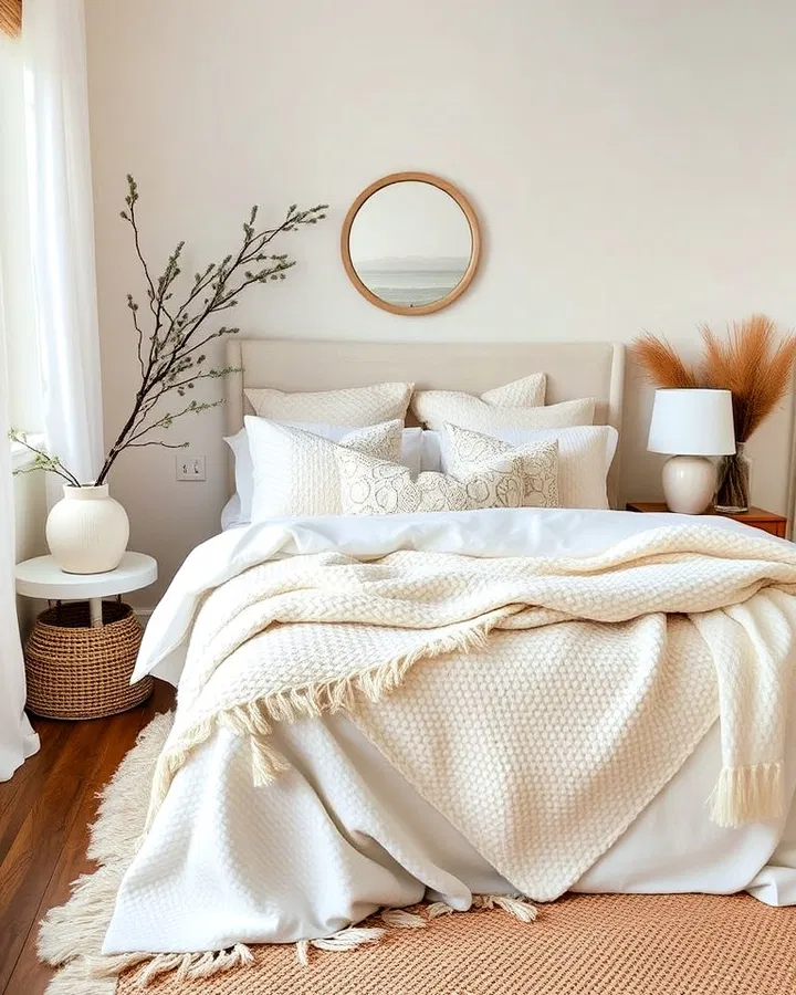
4. Layer Neutral Textiles for Depth and Comfort
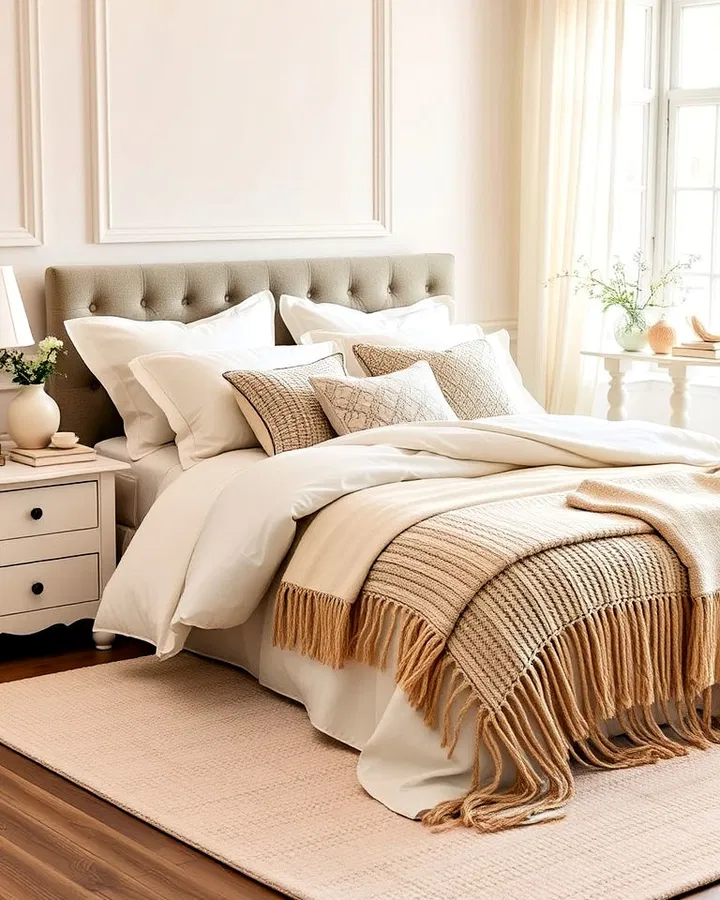
Layering is key in a neutral bedroom. Combine white and cream throws, pillows, and blankets in varied textures such as linen, knit, or faux fur. This adds dimension while maintaining a soft, cohesive look.
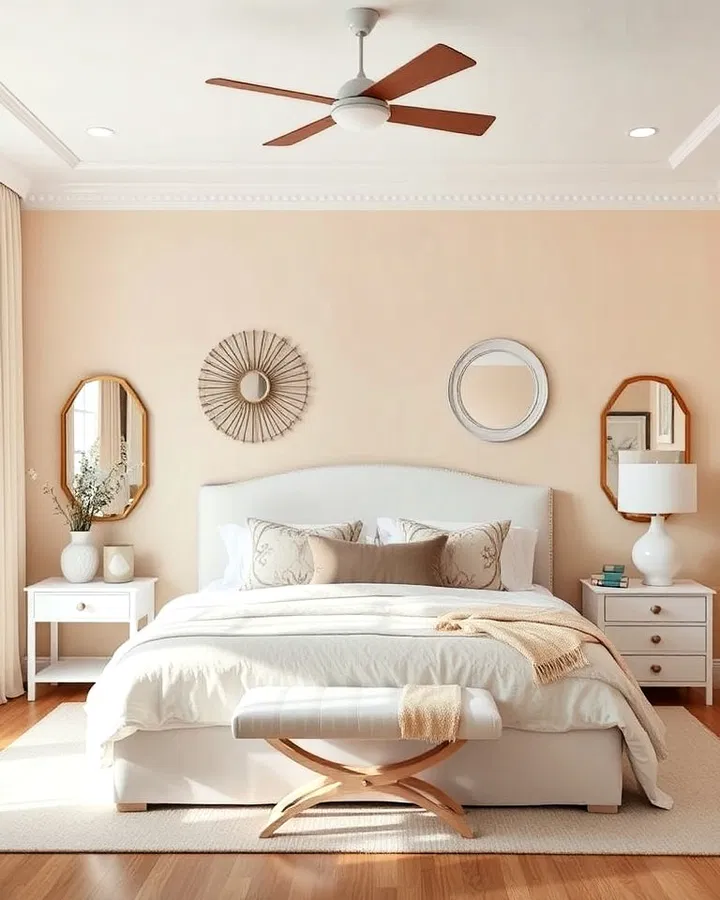
5. Design a Subtle Cream Accent Wall
A cream accent wall adds warmth and depth without overpowering the space. Keep the surrounding furniture white to maintain brightness, and use artwork or mirrors to highlight the wall as a focal point.
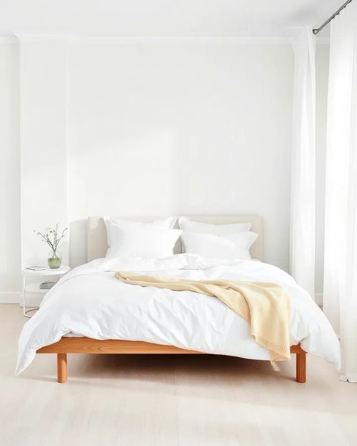
6. Keep It Clean with Minimalist White Bedding
Minimalist white bedding creates a fresh and uncluttered feel. Choose breathable fabrics like cotton or linen, then add a few cream accents—like a throw or pillows—for a softer finish.
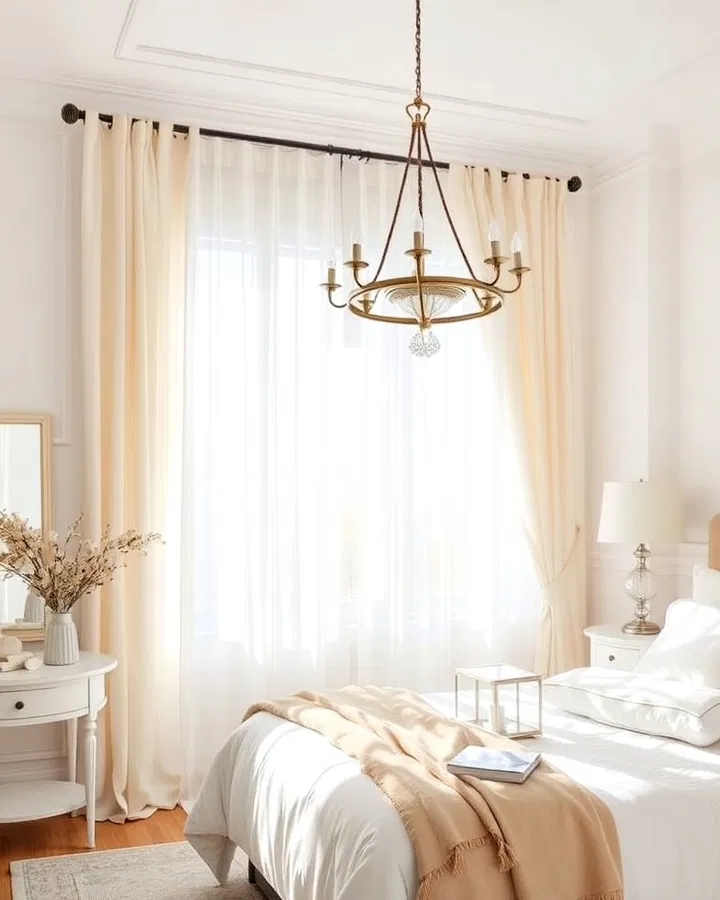
7. Let in Light with Cream Curtains
Cream curtains gently filter natural light, creating a soft glow throughout the room. Sheer or lightweight fabrics work best to enhance the airy atmosphere while maintaining privacy.
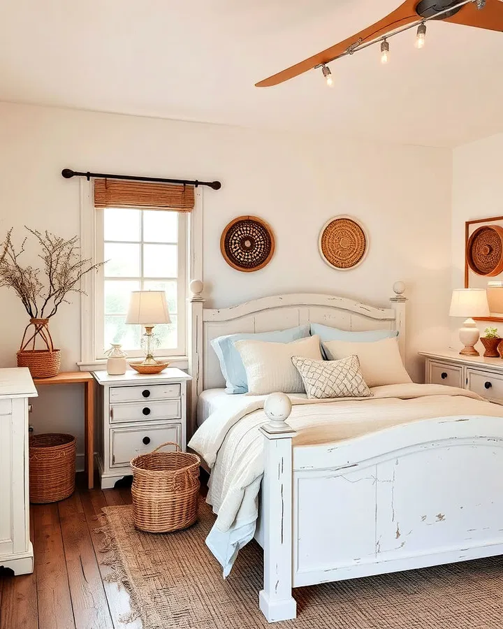
8. Introduce Rustic White and Cream Elements
For a cozy, lived-in feel, incorporate rustic touches like whitewashed wood furniture, woven baskets, or vintage-style rugs. These textures add character while staying within the neutral theme.
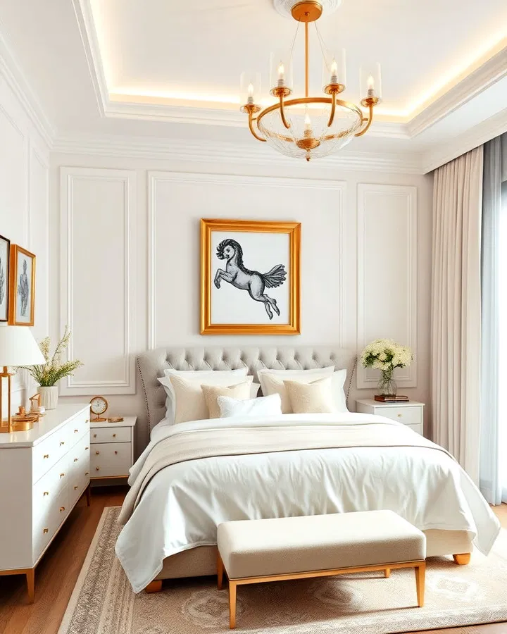
9. Elevate the Look with Subtle Gold Accents
Small gold details—such as lamps, frames, or trays—bring a hint of luxury to a white and cream bedroom. These accents add warmth and elegance without overwhelming the simplicity of the palette.
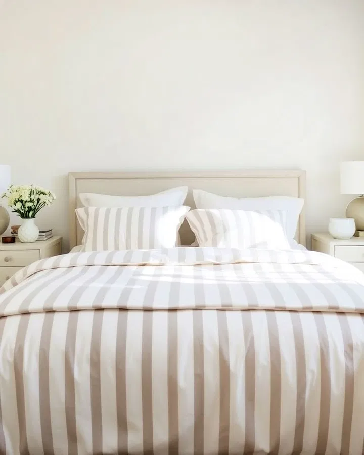
10. Add Interest with White and Cream Striped Bedding
Striped bedding in soft white and cream tones introduces pattern while staying understated. Pair it with solid-colored pillows or throws to keep the design balanced and cohesive.
11. Decorate with Soft-Toned Wall Art
Choose wall art in shades of white, cream, or muted neutrals to enhance the calming vibe. Abstract pieces, textured canvases, or watercolor designs add personality without disrupting the color scheme.
12. Ground the Space with a Cream Area Rug
A cream area rug adds warmth and comfort underfoot while tying the room together. Opt for subtle patterns or plush textures to create visual interest without overpowering the design.
13. Go Monochromatic with Cream Bedding
An all-cream bedding setup creates a rich, layered look when different textures are used. Combine quilted blankets, smooth sheets, and woven throws to keep the space visually engaging.
14. Incorporate White Built-In Shelving
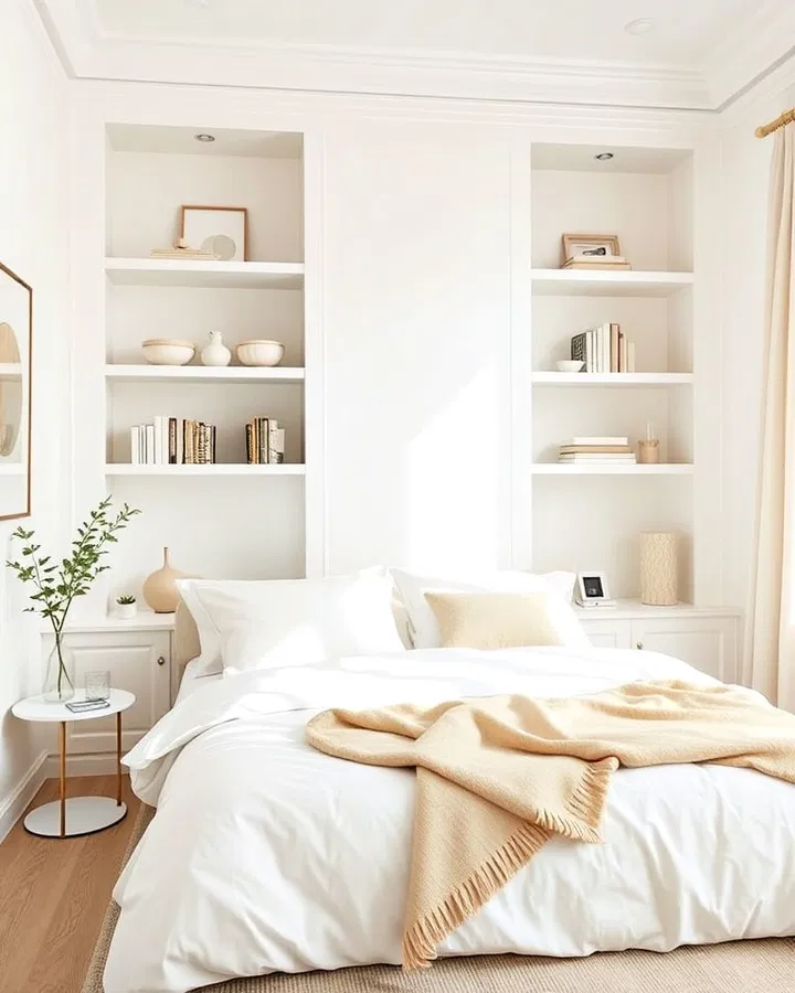
White built-in shelves provide both storage and style. Decorate them with neutral accessories like books, ceramics, and textiles to maintain a clean and cohesive aesthetic.
15. Add Function with a Cream Upholstered Bench
A cream bench at the foot of the bed offers both practicality and style. Whether tufted or sleek, it adds an extra layer of comfort while completing the overall look of the room.
Final Thoughts
A white and cream bedroom is all about balance—combining light tones with texture, warmth, and subtle contrast. By mixing materials, layering fabrics, and adding small accents, you can create a space that feels both elegant and inviting without ever feeling plain.
We’ve all seen homes that look mass-produced, perfectly coordinated but somehow soulless, and others that feel like curated stories told over generations. The trick that reliably turns the former into the latter is deceptively simple: pair a single, thoughtful vintage piece with a modern, pared-back foundation. In 2026, with secondhand markets booming and modern design continuing to favor clean lines and neutral palettes, that one vintage element can act like a punctuation mark: it arrests the eye, suggests provenance, and makes a room read as intentional rather than accidental. In this text we’ll explain why a single vintage choice matters, how to select and place it, and which modern anchors and textural strategies make the pairing feel cohesive and elevated. We’ll also walk through room-by-room placements so you can start applying the approach today.
The Concept: Why One Vintage Piece Changes Everything
There’s a psychology behind why one vintage piece radically shifts how a room reads. When we introduce an object with clear history, patina, craft details, or a slightly irregular finish, it signals depth and narrative. Our brains interpret that difference as “story,” which automatically elevates the entire space from showroom to lived-in. Importantly, we don’t need a roomful of antiques to achieve that effect: a single, well-chosen item provides contrast and focal interest without competing with contemporary elements.
Practically, one vintage piece works because it introduces texture, line, or color that mainstream modern furniture rarely offers. For example, an Art Deco mirror with brass details gives warmth and visual complexity against a minimalist sofa and white walls. The juxtaposition helps both the vintage and modern pieces read stronger: the vintage feels anchored in place and the modern pieces look intentionally simple rather than generic. Economically and sustainably, buying one quality vintage item can be easier on the budget (and the planet) than overhauling a room.
Finally, from an interior-design perspective, restraint is a tool. When we limit ourselves to one bold historical element, we retain control over the room’s narrative. That piece becomes our design thesis, everything else is evidence supporting it. This is why the “one vintage + many modern” trick remains a fast, repeatable route to interiors that feel bespoke.
Why The Vintage + Modern Pairing Feels Intentional (Not Thrifted)
There’s a fine line between an intentionally curated vintage accent and something that looks like it simply landed in the room. We make that distinction by thinking like storytellers: every item should have a purpose. When a vintage piece looks intentional, it aligns with scale, palette, and function. It’s placed strategically (entry, mantel, console) and paired with modern elements that complement rather than compete.
We also rely on consistency in finish and restraint in quantity. For a look to feel curated, use vintage sparingly and repeat one or two modern materials, matte black metal, warm oak, or soft linen, across the room. That repetition creates visual rhythm and frames the vintage piece as a deliberate accent. Styling details matter: a single vase, a stack of curated books, and a balanced lamp can turn an old dressing table into a gallery-ready moment.
Lighting and negative space play a role too. We often spotlight vintage with directional lighting or place it against a simple, uncluttered backdrop so the eye immediately registers it as a composed element. Finally, practical touches like restoring hardware, reupholstering in a contemporary fabric, or pairing a vintage table with modern chairs create harmony. Those small investments transform thrifted finds into heirloom-worthy features that read as custom, not accidental.
How To Choose The Right Vintage Piece
Choosing the right vintage item is where the concept becomes craft. We start with clarity: decide what role the piece will play, statement focal point, subtle accent, or functional heirloom. Once we know its role, we evaluate three practical criteria: authenticity and condition, scale and proportion, and how it will resonate with the room’s palette and materials. Below we unpack what to look for and how to assess trade-offs when a perfect piece isn’t pristine.
Assess Authenticity, Condition, And Value
When evaluating vintage, authenticity matters for both aesthetics and value. We check maker’s marks, joinery, labels, or provenance when possible, these clues tell us whether a piece is genuinely from its stated era or a later reproduction. Condition is next: wear can be beautiful, but structural issues are not. A loose joint or water damage may be repairable: rot or heavy insect damage is often a deal-breaker.
We balance sentimental or aesthetic appeal with restoration cost. For example, a mid-century dresser with original chevron veneer might need minor veneer repair and refinishing, reasonable if the form and hardware are desirable. Reupholstery is often a good value: replacing fabric is usually cheaper than buying an original in perfect condition. If value or resale is a concern, we look up comparable sales on auction sites and local vintage dealers to gauge pricing.
Finally, we consider ethical sourcing: buying from reputable sellers reduces risk of misattribution and supports sustainable reuse. Authentic vintage with honest restoration will last longer and integrate more confidently into our modern interiors.
Scale, Proportion, And Visual Weight For Balanced Rooms
Scale and proportion are non-negotiable. A tiny vintage lamp on a vast modern console looks like an afterthought: an oversized armoire can swamp a small apartment. We measure first. Think of visual weight, materials and color affect perceived heft. Dark, dense woods read heavier than glass or brass, and ornate carving draws the eye more than plain surfaces.
To balance, we match the vintage piece to a dominant modern element. If the sofa anchors the living room, the vintage statement should either echo its height or deliberately contrast in a way that feels intentional. For instance, a compact vintage sideboard works with a low-profile sofa, while a tall, narrow étagère can punctuate a high-ceilinged entry.
Proportion also extends to detail scale. If the room features thin metal legs and delicate lines, a heavily carved Victorian table might overwhelm. Conversely, a bold, sculptural vintage lamp can become the counterpoint in a room of soft, rounded furniture. We aim for dialogue, each piece should acknowledge the other rather than compete.
Modern Anchors That Ground The Look
Modern anchors are the visual scaffolding that let the vintage piece sing. We choose a small palette of contemporary anchors, seating, rugs, lighting, or storage, that provide simplicity and repetition. Their role is to stabilize the room: clean silhouettes, consistent finishes, and contemporary fabrics create the calm backdrop against which the vintage item registers as special.
Functionally, modern anchors should be comfortable and practical. A minimalist sofa with durable performance fabric, a low-profile media unit with concealed storage, and a neutral area rug form a reliable base. These choices free us to invest in a single striking vintage element without sacrificing everyday usability.
We also think in terms of rhythm: repeating a modern finish like matte black metal or warm walnut across hardware, legs, and lamp bases ties the room together. That repetition creates coherence, so when we drop in a brass vintage mirror or an antique chest, it reads as a curated accent rather than an isolated relic.
Materials, Finishes, And Color Choices That Complement Vintage
Selecting complementary materials is subtle but powerful. Warm woods (walnut, oak) and aged metals (brass, bronze) naturally harmonize with many vintage pieces, while cool metals and glass can create contrast. We often pair a vintage wood piece with modern upholstery in neutral tones, cream, dove gray, or muted olive, to let the wood’s grain and patina stand out.
Finishes matter: matte modern finishes reduce visual clutter and let a polished vintage brass or lacquered surface become the hero. For color, we typically limit the primary palette to two neutrals and one accent. The accent can be pulled from the vintage piece, a deep teal drawer front or rusted copper tone, and repeated in small doses through pillows, art, or a lamp.
We’re mindful of texture too: vintage leather, woven cane, or hand-carved wood introduce tactile variety. Counterbalance these with modern textiles, linen curtains, boucle throws, and smooth ceramics, to create depth without chaos. The result is an elevated, layered look that reads cohesive rather than collected at random.
Mixing Textures, Patterns, And A Cohesive Color Palette
Texture and pattern are our secret weapons for making vintage-modern mixes feel deliberate. We layer three to four textures in a room, soft upholstery, a structured rug, a tactile vintage surface, and a sleek metal or glass element, to achieve richness without excess. Patterns should be used sparingly: a single bold pattern alongside understated solids usually reads more composed than multiple competing prints.
When integrating a patterned vintage textile (kilim rug, embroidered cushion), we pull a secondary color from that pattern into modern accessories. This creates visual echoes that make the vintage piece feel embedded in the overall scheme. For wallpapers or accent walls, we avoid busy historical patterns unless the rest of the room is deliberately minimal: the goal is balance, not visual overload.
Contrast is essential. Pair rough-hewn wood with smooth marble, or a nubby wool rug with satin-finished metals. That tension, raw vs. refined, gives rooms energy. We also monitor value (lightness/darkness): if the vintage piece is dark, introduce lighter textiles and reflective surfaces to prevent the room from feeling heavy. Consistent small repeats, same metal tone, a couple recurring colors, help the composition read cohesive and custom.
Room-By-Room Applications: Where To Place Vintage Statements
Placement determines whether vintage reads as a focal, a supporting character, or an afterthought. We prioritize high-impact locations: entryways, living room mantels, dining room walls, and kitchen islands. In each case, the vintage item should serve a purpose, storage, display, mirror, or seating, and be easy to appreciate at a glance. Below we outline practical placement strategies and pairing ideas by room so you can visualize where that single vintage piece will create the most effect.
Living Room, Entry, And Kitchen/Bath Placement Tips
Living Room: We often make the vintage element the conversation starter. A vintage coffee table, sculptural floor lamp, or a reclaimed-wood console under a TV creates a point of interest without overwhelming seating. Pair the piece with neutral seating and an area rug that defines the layout. If the vintage item has ornate detail, keep surrounding decor minimal, one or two modern art pieces and simple lighting.
Entry: The entry is where first impressions form, so a vintage console, mirror, or chest works brilliantly. We place a mirror above a slim vintage table, add a modern tray, a small lamp, and a curated stack of books. This immediately establishes character and can act as a template for the rest of the house.
Kitchen/Bath: These rooms benefit from vintage hardware, lighting, or a single statement piece like an antique Hutch or a restored sink basin. In kitchens, swap one cabinet facade for a vintage door or incorporate an antique stool at a breakfast counter. In bathrooms, an old brass faucet or a vintage mirror framed by simple modern sconces creates an upscale, collected look. Always ensure functional upgrades (plumbing, electrical) are professionally handled so the piece is both beautiful and safe.
Across rooms, we recommend testing placement by photographing the item in multiple locations and evaluating it at different times of day. Natural light changes how finishes read, and what looks perfect in the morning may read heavy at night. When in doubt, choose the location where the piece will be seen most and used frequently, rooms that are lived-in reward the investment in a single, well-chosen vintage statement.
First impressions of a home happen in seconds, often before a guest has even taken off their shoes. We’ve learned that the secret to a welcoming, polished entryway isn’t an expensive renovation or a pile of décor. It’s one deliberate styling decision that anchors everything else and communicates intent, order, and personality the moment someone steps across the threshold. In this text we’ll explain that trick, why it works from a design and psychological perspective, and how to apply it step-by-step. Along the way we’ll cover complementary elements like lighting, rugs, mirrors, and storage, highlight common mistakes (and quick fixes), and give budget-friendly before-and-after ideas you can carry out this weekend. If you want guests, or potential buyers, to feel instantly at ease and impressed, read on.
The Entryway Styling Trick That Changes First Impressions: What It Is And Why It Works
The trick is simple and repeatable: choose a single, well-proportioned anchor piece for the entryway and design everything else around its scale, color, and function. By “anchor” we mean a purposeful object that immediately communicates the room’s role, usually a console table, narrow bench, or statement piece of furniture, rather than a cluttered collection of mismatched items. When we start with an anchor, we create a clear focal point, define circulation, and give the eye something intentional to land on.
Why does this work? First, human perception favors clear hierarchy. When the brain encounters a defined focal point, it interprets the space as curated and cared for. Second, an anchor solves proportional confusion. Entryways are often transitional, small, and awkwardly shaped: without an anchor, homeowners pile functional items, keys, mail, shoes, on top of each other, creating visual noise. An appropriately sized anchor organizes those functions, turning chaos into composed utility. Third, anchors let us control flow. By placing a bench or console in the right spot, we subtly guide how people enter, take off coats, or set down bags, improving both experience and photos (key if you’re selling).
Beyond psychology and function, the anchor gives us a design rule to follow: match the anchor’s scale to the entry dimensions, echo a dominant color in two other elements, and repeat a material to create cohesion. That triad, scale, color, material, keeps styling decisions coherent. Over years of testing and staging homes, we’ve seen this single decision transform cramped, forgettable entryways into spaces that feel spacious, composed, and instantly inviting.
How To Apply The Trick — Step-By-Step
We break the application into a short, repeatable workflow so you can adopt the anchor approach in under an hour, then refine over days. Follow these steps in order: measure, select, position, style, and test. Each step narrows choices and prevents the common temptation to over-accessorize.
Measure: Start with the obvious but overlooked step. Use a tape measure to note the width of the entry wall, depth from door swing to opposite wall, and ceiling height. These numbers dictate the anchor’s maximum dimensions. For example, a console should generally be no more than two-thirds the width of the wall and about 12–16 inches deep in narrow hallways. Benches need to leave 30–36 inches of traffic space in front.
Select: Choose an anchor that fits the proportions and aligns with your home’s style. If the entry is narrow, pick something slim, an open-leg console, a narrow bench, or a floating shelf. For wider foyers, a wider console or a small settee can read as inviting. Material matters: wood introduces warmth, metal reads contemporary, and stone or marble feels luxe. We recommend an anchor with at least one surface for staging and one functional element (drawer, shelf, or storage) to keep clutter off sight.
Position: Center the anchor on the primary wall, not awkwardly off to one side. If the door swings into that wall, leave clearance so it won’t hit handles or clothing. Use painter’s tape on the floor to visualize traffic flow before committing. Height matters: console tabletop should be roughly hip to waist height for most people (about 30–36 inches), while bench height should match comfortable seating (16–20 inches).
Style: Layer accessories thoughtfully, start with a foundation group (lamp or sconce + mirror + small tray), then add one or two personal items (a plant, sculptural object, or a stack of two books). Keep to a simple palette: introduce one accent color and repeat it in two other places (a rug accent, a framed print, or a throw). Resist the urge to place every small object you own on the anchor: negative space increases perceived value.
Test: Walk through the entry both yourself and with a partner carrying items, opening doors, and seating to ensure comfort. Photograph the entry in natural light and in evening light, you’ll often notice balance issues in photos that aren’t obvious in person. Adjust until the anchor feels like it belongs rather than dominates.
Choosing And Positioning Your Anchor
Choosing the right anchor starts with the entry’s size and how you use it. If your entry is mostly a pass-through, prioritize depth and clearance: a slim console or floating shelf will do the job. If the entry is a drop zone where we take off shoes and bags, choose a bench with storage or a console that incorporates hooks or drawers.
Think materials in terms of the story you want the home to tell. Warm wood signals comfort and tradition: dark metal or matte-black frames read modern: natural rattan suggests casual coastal: marble or lacquer reads formal and elegant. We aim to make the anchor feel intentional: if the rest of the home is mid-century modern, a chunky farmhouse bench will clash and confuse visitors.
Positioning is largely a matter of visual balance. Center the anchor on the main sightline, the wall opposite the front door or the longest visible surface when the door is open. If placing the anchor to one side is necessary (for example around a staircase or coat closet), balance it with a tall plant or artwork on the opposite side so the entry reads composed from multiple angles.
Keep circulation in mind: the anchor should define, not block, the path. We like to keep 30–36 inches of clear space in front of seating and 28–36 inches for primary walking paths. For entries that double as mudrooms, consider a narrower depth but with built-in hooks and a shoe shelf below the bench. Finally, if you’re in a rental or can’t make permanent changes, a lightweight console or bench that’s easy to move still provides the necessary anchor effect without commitment.
Layering Accessories And Maintaining Flow
Once the anchor is placed, accessories are the tools that make the entry feel curated rather than staged. We recommend layering in three planes: vertical (art, mirror, wall lamp), surface (tray, lamp, books, decorative objects), and lower level (basket, shoe tray, storage bench). This creates visual rhythm and prevents everything from sitting at the same height, which flattens the composition.
Start with a single large vertical element above the anchor, typically a mirror or artwork, to extend the focal point upward and reflect light. Mirrors are particularly powerful in small entries because they double perceived space and improve lighting for last-minute checks. Next, add a functional lamp or sconce to provide warmth in the evening: layered lighting makes an entry feel purposeful and cozy.
On the surface, divide the tabletop into two zones: functional and decorative. The functional zone (closest to the door) contains a small tray for keys, a shallow bowl for pocket change, and a slim catch-all for sunglasses. The decorative zone can hold a single plant, a stack of two books, or a sculptural object. Keep groupings odd-numbered for visual interest, and vary heights to create a small vignette.
Below the anchor, introduce practical storage that complements the look: woven baskets, a low shelf with baskets, or hidden drawers. Baskets are forgiving, they hide last-minute clutter while adding texture. Maintain flow by keeping the main walking area clear and using storage as the “drop zone” for daily items. Finally, revisit the setup at night. We often discover items that interrupt flow, a protruding bag strap, a basket that spills into the path, and correcting these small issues preserves the entry’s functionality and aesthetic.
Styling Elements To Complement The Trick (Lighting, Rug, Mirror, Storage)
Complementary styling elements turn the anchor from a single object into a cohesive entry experience. Lighting, rug, mirror, and storage are the high-impact items we recommend prioritizing after the anchor.
Lighting: Layered lighting is essential. If you have good overhead light, add a table lamp on one side of the console or wall sconces flanking a mirror. We prefer warm LED bulbs around 2700K–3000K for entries: they render skin tones and finishes pleasantly and make the space feel inviting. If possible, install a dimmer so the entry’s mood adjusts from morning bustle to evening calm.
Rug: A rug anchors the floor plane and defines the entry footprint. Choose a rug that fits the door swing and leaves at least 4–6 inches of floor border on either side for balance. In narrow entries, a runner is the obvious choice. For foyer squares, pick a rug proportional to the wall with the anchor. We favor low-pile, durable materials with a pattern that hides traffic stains, indoor-outdoor flatweaves or wool blends are pragmatic and pretty.
Mirror: Mirrors do double duty: they expand the perceived space and serve a last-second check before leaving. The mirror’s scale should match the anchor, a mirror that’s too small reads tacked-on: one that’s too large overwhelms. Consider vertical mirrors for low ceilings (they draw the eye up) and horizontal mirrors for wide consoles (they emphasize the tabletop). Frames should echo the anchor’s material for cohesion.
Storage: The anchor reduces visible clutter, but good storage completes the system. Think multifunctional: benches with hidden compartments, consoles with drawers, or open shelves with attractive baskets. For everyday convenience, keep an out-of-sight catch-all for mail and a dedicated spot for umbrellas and shoes. If you have kids or pets, include wash-and-wear bins for leashes and reusable grocery bags. We like labeled baskets for family members, it’s a small behavioral nudge that keeps drop zones orderly.
Common Mistakes And Easy Fixes
Even with the right idea, it’s easy to undermine an entry’s potential with a few common missteps. We see the same issues over and over, and they’re all fixable quickly.
Mistake 1: Wrong scale anchor. People often pick furniture that’s too large or too small. Fix: refer to your measurements and choose an anchor that’s roughly two-thirds of the wall width. Use painter’s tape to mock up the footprint before buying.
Mistake 2: Visual clutter. Stuffing the tabletop with every small item creates noise. Fix: adopt a “one functional tray + one decorative object” rule. Everything else goes into drawer or basket storage.
Mistake 3: Poor lighting. Harsh overhead light or no light at all kills ambiance. Fix: add a table lamp or wall sconce and swap to warm bulbs. A motion-sensor LED puck can be a cheap, temporary fix.
Mistake 4: Ignoring circulation. Anchors that block the path frustrate users. Fix: ensure 30–36 inches of clear walkway: if your entry is tight, choose a shallower piece or wall-mounted shelf.
Mistake 5: Mismatched styles without cohesion. A high-gloss console next to a rustic farmhouse door can feel disjointed. Fix: create cohesion by repeating one material (wood, metal, or rattan) in at least two places: anchor, mirror frame, rug accents, or storage baskets.
Mistake 6: Neglecting maintenance. Even the best-styled entry looks bad when shoes and mail pile up. Fix: institute a five-minute nightly tidy: file mail, empty the key tray, and place shoes in baskets. Low-effort rituals keep the space working long-term.
Most fixes are behavioral rather than expensive. We find we can transform an entry by swapping one piece for proper scale, removing three items, and adding a tray and a lamp, usually under an hour and a modest budget.
Quick Budget-Friendly Before-And-After Ideas
You don’t need a big budget to get a dramatic before-and-after. Here are quick, inexpensive interventions that deliver high perceived value.
Swap or add a mirror (Budget: $30–$150). A well-placed mirror instantly enlarges the space. Look for sales at home stores or buy secondhand and refinish the frame for a custom look.
Add a runner or small rug (Budget: $20–$200). A patterned flatweave hides wear and visually anchors the anchor. Measure first so the runner doesn’t look like an afterthought.
Create a DIY console with a shelf and hairpin legs (Budget: $50–$150). A simple pine board and metal legs can replace a cluttered table and give a more intentional focal point.
Use baskets for hidden storage (Budget: $20–$80). Woven baskets under a console or bench hide shoes and gear while adding texture.
Install a hook strip or rail (Budget: $15–$60). Replace a clutter of mismatched hooks with a single rail for a cleaner look and uniform hang height.
Swap bulbs and add a lamp (Budget: $10–$80). Warm LED bulbs and an affordable table lamp change mood immediately.
Curate a simple tabletop vignette (Budget: $0–$50). Use a tray you already own, add a houseplant clipping from another room, and place a stack of two books. The goal is cohesion, not accumulation.
Before-and-after routine: remove everything, clean the surface, place the anchor, add vertical element (mirror/art), place functional tray, add one decorative object, and add storage beneath. Often a single weekend and under $200 will turn a messy, forgettable entry into an inviting threshold that looks staged by a pro. We’ve applied these quick fixes in rentals, newly purchased homes, and listings with consistent success.
Conclusion
The entryway styling trick, selecting a single well-proportioned anchor and designing everything around it, gives us a reliable framework to upgrade first impressions without major expense or upheaval. It addresses perception, proportion, and function all at once, and it’s flexible enough for any home style or budget. Start by measuring, pick an anchor that suits your flow, layer lighting and storage, and enforce a simple nightly tidy ritual. In short order your entry will stop being a catch-all and become a confident, welcoming introduction to the rest of the house, which is precisely the first impression we want guests and buyers to remember.
We’ve all walked into a hotel room and felt an almost instant calm: the lighting looks softer, corners feel inviting, and the whole space seems designed to breathe. Replicating that hotel-style comfort at home isn’t about splurging on chandeliers or copying a hospitality designer’s exact plan. It’s about a single, repeatable principle that hotels use everywhere: layered, warm lighting designed with intention. In this guide we’ll explain why hotel lighting feels so comfortable, reveal the one cozy trick that pulls it all together, and show practical, room-by-room ways to carry out layered warmth in 2026, using modern smart controls, dimmers, and fixtures that are actually affordable. If you’re ready to make your home feel more restful, luxe, and effortless, let’s dig in.
Why Hotel Lighting Feels So Comfortable
Hotels aren’t comfortable by accident. Hospitality designers think about pace, function, and mood for every square foot. Three core principles explain that “comfort” we notice immediately: warm color temperature, layered sources, and deliberate control. Warm color temperature, usually around 2700K to 3000K, mimics incandescent light and skin tones in a flattering way. That gentle amber quality reduces visual harshness and signals the brain that it’s time to relax.
Layering means hotels never rely on a single overhead light. Instead, they mix ambient light (overall brightness), task light (for reading or getting ready), and accent light (to highlight objects, textures, or architecture). Each layer has a slightly different intensity and placement so the eye finds rest in the darker planes and focus where needed.
Finally, hotels use control: dimmers, separate switches, and preset scenes allow staff (and guests) to change mood instantly. The difference between a well-lit hotel suite and a typical home often comes down to this orchestration, not necessarily more fixtures, but smarter placement and control. When we decode these three elements, we can copy what works without copying the look exactly. It’s less about installing more lights and more about arranging them thoughtfully.
The One Cozy Trick: Strategic Layered Lighting
If we had to distill hotel lighting into one trick, it would be this: intentionally layer warm light sources so each layer can be used independently or together. That sounds straightforward, but it upends how many people light a room. Most homes use a bright central ceiling lamp for everything: hotels distribute several lower-intensity sources around the room so no single fixture dominates.
Why does layering work so well? First, it reduces contrast. With multiple low-level lights, shadows are softer and the eye doesn’t have to constantly adjust. Second, layering creates depth, corners recede, textures pop, and surfaces look richer. Third, it gives us choice: we can light only the zone we’re using and keep the rest dim. That economy of light is calming and efficient.
Practically, the strategy asks us to specify three layers: ambient for general visibility, task for focused activities, and accent for mood. Each layer should be on its own control and use warm color temperatures. When we combine them thoughtfully, say a dimmed overhead plus a bedside lamp and a wall wash on art, we get that hotel-level coziness. We’ll show how to pick fixtures, positions, and controls next so the approach is easy to carry out in real rooms.
Layering In Practice: Ambient, Task, Accent
Layered lighting becomes intuitive once we understand the job each layer does and how they interact. Below we break down the three layers, ambient, task, and accent, with practical choices, fixture suggestions, and rules of thumb to translate hotel design into home-friendly moves.
Ambient Lighting: The Foundation of Hotel Warmth
Ambient lighting provides the base level of visibility and sets the general mood. In hotels this is often achieved with recessed downlights on a dimmer, concealed cove lighting, or soft ceiling fixtures with frosted diffusers. For homes, we want the same soft, even spread but without glare.
Fixtures and placement: For living rooms and bedrooms, consider recessed LEDs with wide beam angles, or a central semi-flush fixture paired with wall sconces. Cove lighting or LED tape hidden in crown molding is an elegant way to wash the ceiling and create that floating, spacious feel hotels get. If our ceilings are low, avoid bright, direct fixtures overhead: instead use uplighting (floor lamps that bounce light off the ceiling) to mimic a higher ceiling and distribute light more evenly.
Color and intensity: Aim for 2700K–3000K color temperature and set ambient levels low enough that individual task lights can be brighter without clashing. In terms of lumens, living room ambient should hover around 1,500–3,000 lumens total (distributed across fixtures), and bedrooms can be lower, 1,000–2,000 lumens, depending on room size.
Control tip: Put ambient lighting on a dimmer and name that scene “Relax” or “Evening.” Hotels use similar central scenes to quickly shift the entire room’s tone.
Task Lighting: Practical Comfort Without Glare
Task lights give us comfortable, shadow-free illumination for reading, cooking, working, or grooming. Hotels often place these as bedside reading lamps, vanity lights around mirrors, and adjustable desk lamps. Our aim is to replicate that focused clarity without adding harshness.
Fixture choices: For reading and bedside use, go for adjustable swing-arm lamps or small table lamps with opaque shades that direct light downward. In kitchens, under-cabinet LED strips provide even workspace lighting: over stovetops and counters, pendant lights or recessed fixtures positioned to avoid casting shadows are ideal.
Brightness and placement: Task lighting should be noticeably brighter than ambient in the immediate zone, think 300–500 lumens for bedside reading, 700–1,200 lumens for kitchen counters. Position lights so they illuminate the task surface directly and reduce glare: eyes should not look into the light source when seated at a desk or lying in bed.
Design note: Choose fixtures with good shielding and consistent color temperature (match to ambient). In bathrooms, place vanity lights at eye level on either side of the mirror or use layered vertical sconces to eliminate shadowing on the face.
Accent And Decorative Lighting: The Finishing Touch
Accent lighting is what makes a space feel curated. Hotels use it to highlight artwork, textures, architectural details, and plants, those subtle cues make a room feel considered and lived-in. Accent lights are lower in intensity but high in impact.
Common accent fixtures: Picture lights, adjustable spotlights, LED strip lighting behind furniture or in shelving, and small recessed eyeballs are all excellent choices. For dramatic effect, a floor uplight behind a plant or a wall washer that emphasizes texture adds depth.
Placement and intensity: Accent lights should be about one-third to one-half the intensity of task lights in the same visual field. They’re directional and focused: aim beams precisely to avoid eye-level glare. When highlighting art, use narrow beam angles (15–30 degrees) and position fixtures so the brightest area sits slightly below the top third of the artwork for even distribution.
Stylistic tip: Use accent lighting to create vignettes, a lamp, a stack of books, and a framed photo lit together read like a small scene. Those curated pockets are a big part of the “hotel” feeling because they draw attention to texture and story rather than to utilitarian brightness.
Where To Place Lights For Maximum Warmth And Flow
Placement is where layered lighting moves from theoretical to transformational. Hotels plan sightlines and user flow so lighting supports how guests move through the room. We can adopt the same approach in our home, focusing on pathways, focal points, and zones.
Entry and sightlines: The entry or hallway sets first impressions. A soft overhead or wall sconce paired with a console lamp creates an inviting arrival. Avoid harsh, single-bulb fixtures that reveal every imperfection. Instead, use multiple lower-level sources that create pools of light and shadow: that contrast reads as warmth.
Living areas and seating: Place task lights next to seating for reading and accent lights to frame artwork or architectural niches. Floor lamps behind sofas that wash light upward are great for rooms with low ceilings, they visually lift the space. Keep the central overhead light optional rather than default: when we entertain, we can use it, but for everyday evenings rely on layers.
Kitchen and dining flow: The kitchen needs functional task lighting over counters and an ambient layer for the rest of the room. Pendant lights above islands should be hung at 28–34 inches above the counter for balance. In dining areas, a dimmable pendant over the table provides focus, while wall sconces or a buffet lamp provide peripheral warmth.
Bedroom placement: Bedrooms benefit from symmetrical bedside lamps or wall-mounted sconces with individual switches. Add a low-level floor lamp or cove light to create a glow that helps us wind down. Position closet lighting so it’s triggered by the door or switch and avoids harsh overhead bursts when getting dressed at night.
Circuits and practicalities: Whenever possible, put layers on separate circuits or switches. That simple wiring decision gives us the flexibility hotels rely on and prevents the temptation to over-illuminate with a single master switch.
Dimmers, Smart Controls, And Lighting Scenes To Set The Mood
Control is where layered lighting becomes magical. Hotels use dimmers, preset scenes, and centralized controls so lighting adapts instantly to activity. In 2026, smart lighting technology is affordable and standardized, making it easy to replicate those scenes at home.
Dimmers first: Always use dimmable fixtures and invest in quality dimmer switches. Dimming not only changes intensity but alters perceived color slightly, making light feel warmer at lower levels. Choose LED-compatible dimmers to avoid flicker and compatibility issues.
Smart controls and scenes: Smart bulbs, wall controllers, or integrated home automation systems let us create scenes like “Wake,” “Work,” “Dinner,” and “Relax.” For example, a “Relax” scene might set ambient to 25%, bedside lamps to 60%, and accent lights to 20% with 2700K color. Using voice commands or a simple button on a bedside paddle matches the hotel quick-change experience.
Grouping and scheduling: Group lights by zone (bedside, living, kitchen) and schedule gentle fades in the evening and wake-up scenes in the morning. For instance, schedule ambient lights to slowly brighten over 15 minutes before alarm time: that gentle light transition supports circadian rhythms better than a sudden beeping alarm.
Practical advice: Keep a manual fallback, labeled physical switches or a simple dimmer, so guests and family members who aren’t tech-savvy can still use the lights with ease. The goal is convenience, not complexity.
Quick Room‑By‑Room Setup Guide — From Entry To Bedroom
We’ll walk through a practical, quick setup for each major room so you can start implementing layered warmth this weekend. Each mini-plan lists essential layers, fixture suggestions, and a simple scene to program.
Layers: Ambient (ceiling), Task (desk lamp with adjustable color temp), Accent (shelf LED for contrast).
Fixtures: High-CRI task lamp at desk, ambient on dimmer.
Scene: “Focus”, task 100% (cooler 3000–3500K if needed), ambient 40%.
Practical rollout: Start with one room, usually the living room or bedroom, and add layers over a few weekends. Swap bulbs to 2700K–3000K and add a dimmer and one task lamp: that small investment yields an outsized feel-good return.
Conclusion
Hotel-style lighting isn’t an aesthetic reserved for high-end suites, it’s a practice: warm color, layered sources, and thoughtful control. By prioritizing ambient, task, and accent layers: placing fixtures with intention: and using dimmers or smart scenes, we can recreate that welcoming, restorative atmosphere at home. Start small: swap to warm bulbs, add one quality task lamp, and program a “Relax” scene. Those three moves alone will change how your space feels every evening. Once you begin thinking like a hospitality designer, focusing on flow, choice, and subtle contrast, making your home feel like a hotel becomes simple, enjoyable, and surprisingly affordable.
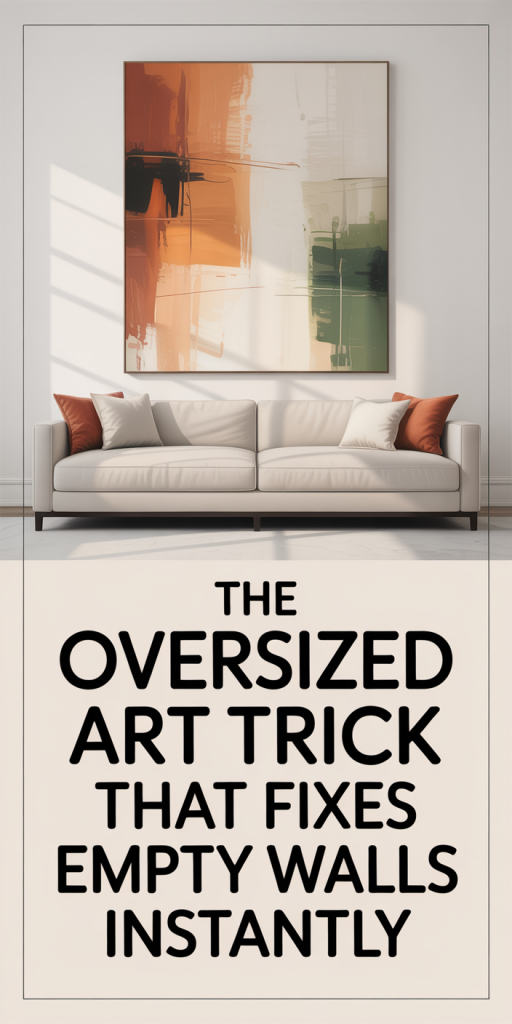
Empty walls are one of the fastest ways a room feels unfinished, yet they’re also the easiest place to create personality and drama. In 2026, oversized art remains our go-to trick: one well-chosen piece can anchor a living room, elevate a bedroom, or create a gallery-worthy entry without weeks of redesign. In this guide we’ll walk through why oversized art works, how to choose the right size and scale for your space, what to look for in color and material, and practical hanging and styling advice. We’ll include budget-friendly DIY options and lightweight alternatives so you can get the statement look even in tricky spaces like renters’ units. Read on for the measuring rules, placement hacks, and styling moves that make oversized art feel intentional, not just big.
Why Oversized Art Works So Well
Oversized art grabs attention the way a headline does in a newspaper: it gives the eye somewhere to land and instantly sets a tone. Psychologically, large-scale pieces help us define space, they create an anchor point that unifies furniture, color, and lighting. That’s why a single large painting, photograph, or textile can solve multiple design problems at once: it fills negative space, introduces scale, and conveys mood.
There’s also an architectural impact. Walls are vertical planes, when left bare they make rooms feel empty and under-considered. A large artwork transforms a flat plane into a focal wall, improving perceived proportions and making the room feel curated. In open-plan homes, oversized pieces can visually separate zones (dining vs. living) without physical barriers.
From an aesthetic standpoint, oversized art lends confidence. It reads as intentional design rather than an afterthought. But the success of this trick depends on proportion, placement, and content: size alone won’t rescue a room if the piece competes with furniture or clashes with the palette. That’s why we focus not just on finding big art, but on choosing the right big art for your space and lifestyle.
How To Choose The Right Size And Scale
Choosing the right size is more science than guesswork. The core rule we use is simple: large art should relate to the surrounding architecture and furniture. Too small and it looks lost: too big and it overwhelms. Follow these practical, repeatable steps.
Measure first. Take wall width and height, note nearby furniture, and measure ceiling height. A common living-room guideline: the artwork’s width should be roughly 60–75% of the sofa width when hung above a couch. For example, a 84-inch sofa pairs well with a piece about 50–62 inches wide. For walls without furniture, aim for a piece that leaves a margin of at least 6–12 inches on each side (depending on wall size) so it doesn’t look cramped.
Vertical scale matters too. Don’t forget sightlines: when hanging above furniture, the bottom edge of the art should sit about 6–10 inches above the furniture top. If the art is the main feature of an empty wall, place its center at eye level, usually around 57–60 inches from the floor, but adjust if you have higher ceilings or primarily seated/viewing positions.
Consider ceiling height. With low ceilings (8 feet), avoid extremely tall pieces that run into crown molding: horizontal oversized art often works better. With high or vaulted ceilings, lean into vertical formats to emphasize height. In rooms with scale mismatches (tiny furniture with big walls), use multiple stacked pieces, a large textile, or a wide console to bridge proportion.
Finally, think about balance. If you have a visually heavy piece on one wall, balance it with a grouping or a sculptural object on the opposite side rather than trying to match size exactly. Scale is a relationship, not an isolated number, and once you measure, you’ll be surprised how many oversized pieces actually fit your space perfectly.
Picking The Perfect Artwork: Color, Style, And Mood
Once size is settled, color and style determine whether a piece integrates harmoniously or fights the room. We recommend starting with mood: what feeling do we want this wall to evoke? Calm and minimal, bold and dramatic, warm and cozy, or modern and crisp? Your choice guides color, composition, and subject.
Color strategy matters. Pull one or two accent colors from existing textiles (throw pillows, rugs) and use the oversized art to amplify them. If your palette is neutral, a large, colorful artwork can become the focal point: conversely, if your room already has vibrant patterns, a subdued monochrome piece can provide visual rest.
We also consider tonal balance. Large fields of high-contrast color read more aggressively at scale: soft gradients and textured neutrals feel more calming. If you have wood tones and warm metals, choose art with warm undertones to create cohesion. For cool, modern rooms with lots of glass and chrome, consider cooler palettes or high-contrast black-and-white photography.
Choose a style that fits the architecture and your lifestyle. Abstracts are forgiving with scale and can be easier to live with in family homes since they don’t demand narrative. Figurative or landscape works add warmth and storytelling, while graphic prints and typographic pieces give a contemporary edge.
Finally, consider permanence. Very personal or overly trendy work may feel tiring at scale. If you’re investing in a large piece, we prefer art that can evolve with the room, either because it’s classic in palette and form or because it’s easy to swap out in a large but lightweight format.
Framing, Hanging, And Lightweight Alternatives
Framing and hardware choices determine whether an oversized piece looks polished and stays put. Let’s break down framing styles and hanging methods that work in modern homes, including renter-friendly approaches and lightweight alternatives.
Framing options
Floater frames: Give canvases a clean, contemporary border without covering edges.
Slim metal frames: Great for prints and photography: they read modern and minimal.
No frame (gallery wrap): Can be the freshest look, especially with large canvases where the edge is part of the composition.
Hanging hardware basics
French cleats: Two interlocking angled strips that distribute weight across a wide section of wall, ideal for heavy or large pieces.
D-rings and braided steel wire: Common for framed works: ensure wire and screws are rated above the artwork’s weight.
Picture rails: Historic and adaptable: they allow easy repositioning without new holes.
Wall anchors and studs
Always anchor heavy pieces into studs when possible. Use a stud finder and lag screws for pieces over ~30–40 pounds.
For drywall-only hanging, use heavy-duty hollow-wall anchors rated for the load. Toggle bolts and molly bolts can hold substantial weight if installed correctly.
Lightweight alternatives that still read oversized
Foam core or gatorboard prints: These offer the visual impact of a large print at a fraction of the weight.
Fabric prints on dowels: Lightweight and renter-friendly: hang from a single hook or rod.
Peel-and-stick murals: Great for renters and temporary needs: they cover large areas without permanent hardware.
Paper or vinyl art taped or clipped: Works for gallery walls or layered looks if you want flexibility.
Lighting and finishing touches
Dedicated picture lights or adjustable track lighting can elevate the piece and reduce reflection on glass.
For extremely large works, consider mounting a French cleat across two studs and using multiple attachment points to keep the artwork flush to the wall.
We recommend planning the hanging method before buying. Ask the seller about weight, framing options, and recommended hardware. When in doubt, choose a lightweight substrate or a professional installer, oversized scale looks best when it’s secure and properly framed.
Styling The Room Around Your Oversized Piece
Once your oversized artwork is in place, the next step is to style the room so the piece feels integrated rather than pasted on. We think of the artwork as a hub that spokes, furniture, lighting, and accessories should orbit it.
Anchor with furniture: Place a sofa, console, or credenza beneath the artwork to create a relationship. If the piece is large and heavy on color, keep immediate furnishings simpler in tone and texture to avoid visual competition.
Layer with lighting: Use directional lighting to highlight surface texture or color shifts. For large pieces, consider two smaller adjustable sconces or a discreet picture light to wash the surface evenly. Avoid single harsh overheads that create glare.
Echo colors and shapes: Pull one or two colors from the artwork into textiles (a throw, a rug) and a smaller accent piece (vase, lamp) to build cohesion. Repeating a shape, round mirror, angular coffee table, can also reinforce composition and rhythm.
Balance with negative space: Don’t overfill the wall with too many objects. One oversized piece usually needs breathing room. If you want more visual interest, add a smaller shelf or sculptural object nearby rather than another large framed work.
Consider scale elsewhere: Large art can make small accessories look out of place, balance by using a few larger decor items (oversized vase, substantial lamp) rather than many tiny knickknacks.
Create a vignette: If the piece sits above a console, style the surface with layered objects, a stack of books, a medium-height lamp, and a low sculpture, keeping a clear center point beneath the artwork.
Make it intentional for traffic flow: If the oversized piece sits in a corridor or near a doorway, ensure it won’t be bumped by passing furniture or carted items. If it’s in direct sunlight, consider rotating pieces seasonally or choosing UV-resistant materials.
By styling around the art thoughtfully we make the piece feel like the room’s deliberate centerpiece, not an afterthought. It’s about rhythm and restraint: let the artwork lead, and let other elements support.
Conclusion
Oversized art is a quick, high-impact way to fix empty walls and give a room instant personality. When we measure for proportion, choose materials that fit our lifestyle, and plan hanging and lighting carefully, large pieces elevate a space without feeling showy. Whether we buy, DIY, or use lightweight alternatives, the key is to let scale, color, and placement work together. Try the measuring rules, test with paper templates, and then commit, a single well-placed oversized piece can change how an entire room reads, and in 2026 it remains one of the most efficient design moves we can make.
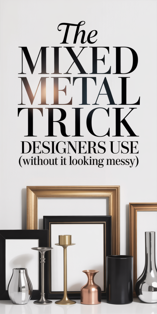
Mixing metals used to feel risky: a handful of mismatched pieces and suddenly a room reads as chaotic. But over the last few years we’ve watched pro designers refine a repeatable method that keeps spaces cohesive, current, and layered, without the visual noise. In 2026 the mixed metal trick is less about random pairing and more about strategy: pick an anchor, control temperature, repeat rhythmically, and use texture to bridge differences. In this guide we’ll explain why mixed metals work, how to choose a dominant metal, balance warm and cool tones, and give room‑by‑room recipes (kitchen, living room, bathroom, bedroom) that you can copy. We’ll also flag common mistakes we fix on client projects and how to correct them quickly. Read on and you’ll never be afraid to mix metals again, you’ll do it intentionally.
Why Mixed Metals Work And When To Use Them
Mixed metals work because they introduce visual contrast and nuance while reflecting a room’s layered history. When we use a single metal too rigidly, spaces can feel flat or overly matched, like a showroom. Mixing metals creates an approachable, collected look that reads as curated rather than manufactured.
When to use mixed metals:
To add warmth or coolness where paint and textiles alone fall short. For example, a cool gray room lifts instantly with brass accents, while a warm taupe room gains sophistication from nickel or chrome.
When you want intentional imperfection. A mix suggests that items were gathered over time, which helps residential spaces feel lived‑in and personal.
To highlight architectural features. Contrasting hardware or light fixtures draws the eye to islands, mantels, and built‑ins.
Why the trick works from a design standpoint:
Value contrast: Metals reflect light differently. Polished chrome reads brighter than matte black: burnished brass catches warm highlights. We use that to create focal points.
Color temperature: Metals carry warm (brass, copper, bronze) or cool (chrome, nickel, stainless, pewter) undertones. Deliberate pairing manipulates the perceived warmth of a room.
Texture and finish variance: Satin, matte, brushed, hammered and polished finishes each interact differently with materials like marble, wood, and fabric, creating depth.
A quick rule of thumb we rely on: pick one dominant metal, introduce a secondary metal in smaller doses, and optionally add a tertiary metal as an accent. That simple hierarchy keeps the mix intentional rather than messy.
Choosing A Dominant Metal To Anchor The Palette
Choosing a dominant metal is the single most effective decision we make when mixing metals. The dominant metal acts like the paint color of the palette: it’s the steady, consistent note that grounds everything else.
How to choose your dominant metal:
Start with the largest visible elements. If your kitchen island lighting, cabinet pulls, or a major furniture piece is already in a metal, it’s often easiest to let that be dominant.
Match the room’s temperature. In rooms with warm wood floors or warm wall colors, brass, aged bronze, or copper will feel cohesive as the dominant metal. In cool, contemporary spaces with concrete, glass, or cool gray paint, nickel, stainless, or matte black usually read better as the anchor.
Consider longevity and resale. Polished nickel and stainless look timeless and are easy to change around: if you want a flexible base choose a neutral metal.
Practical anchor examples we use:
Brass as dominant: great for traditional or transitional rooms. Use brass on lighting, large faucets, and fireplace tools. It makes the space feel curated and warm.
Matte black as dominant: ideal for modern or industrial schemes. Black works across hardware, plumbing accents, and window frames, creating a strong graphic backbone.
Satin nickel/stainless as dominant: a versatile middle ground. It reads clean and upscale, blending well with both warm and cool secondary metals.
Once the dominant metal is chosen, limit its use to roughly 60–75% of the metal surfaces in the room. Too much dominance defeats the purpose of mixing: too little means the room lacks cohesion. We suggest mentally inventorying visible metal pieces and keeping a rough count while planning.
Balancing Warm And Cool Tones
Balancing warm and cool metals is where the mixed metal trick stops feeling like guesswork and starts functioning as deliberate design. The goal is to make metals speak to each other rather than shout past one another.
Begin with temperature mapping:
Warm metals: brass, antique brass, copper, warm bronze. They bring sunlight and glow.
Cool metals: chrome, polished nickel, stainless, pewter, brushed nickel. They lend crispness and modernity.
Strategies to balance them:
60/30 principle: After choosing a dominant metal, use a secondary metal for about 20–30% of the metal surfaces. The tertiary metal, if used, should be sparingly (5–10%). This keeps visual weight in check.
Repeat the secondary metal in at least three separate places to create a rhythm. Humans read patterns: repeating an accent metal across light fixtures, cabinet pulls, and a decor object ties the scheme together.
Use bridging finishes: finishes like aged brass with darker patina or warm stainless can visually transition between warm and cool metals. Brushed finishes absorb light and reduce contrast, helping disparate tones coexist.
Using Accent Pieces To Tie The Palette Together
Accent pieces are our secret weapon. Small items, vases, picture frames, lamps, mirrors, are the easiest, least expensive ways to introduce a secondary or tertiary metal without committing to large fixtures.
Tactical use of accents:
Place accent metals where the eye naturally rests: tabletop groupings, console tables, and bedside stacks. This creates micro‑moments of cohesion.
Use reflective surfaces sparingly. A mirror with a different metal frame can echo fixtures in another part of the room, bridging temperature differences.
Consider nonmetallic tie elements: leather straps, woven baskets, or upholstery piping in a color that complements both metals can visually connect them.
Layering Finishes And Textures For Depth
Finishes and textures are as important as the metal type. Matte black next to polished brass can feel harsh unless we introduce intermediary textures.
How we layer:
Use matte and brushed finishes as intermediaries. A brushed nickel can soften the jump between polished chrome and burnished brass.
Incorporate textured metal objects, hammered copper, fluted brass sconces, or hammered stainless bowls, to add dimension.
Pair metals with tactile materials: natural wood, leather, stone, and textiles. These materials absorb and reflect metal tones differently and help anchor the mix.
Eventually, balancing warm and cool metals is about creating a conversation between elements, not forcing them to match. When we treat metals like members of an ensemble rather than lone stars, the result reads sophisticated and intentional.
Room‑Specific Recipes: Kitchen, Living Room, Bathroom, Bedroom
We find that having room‑specific recipes simplifies decision‑making. Below are practical, copy‑ready combinations that work in 2026 interiors, with variations for different styles.
Kitchen
Transitional: Dominant metal, satin brass on cabinet knobs and island pendants (60%). Secondary, brushed nickel for faucets and appliance pulls (30%). Accent, matte black open shelving brackets or light switch plates (10%). Repeat the brushed nickel across three spots: faucet, range hood trim, and small appliance handles.
Modern/contemporary: Dominant, matte black or gunmetal (60%). Secondary, polished chrome (25%) on faucets and appliance accents. Accent, warm copper or brass as subtle drawer pulls or a single decorative bowl (15%). Keep countertops neutral (quartz or concrete) to let metals sing.
Living Room
Classic/curated: Dominant, aged brass on lighting and a coffee table base (65%). Secondary, warm bronze on picture frames and mirror trim (25%). Accent, satin nickel on lamp switches or media hardware (10%). Use textiles (wool, linen) in warm neutrals to bridge metals.
Minimal/Scandi: Dominant, brushed nickel or satin stainless (55%). Secondary, matte black on legs and trims (30%). Accent, copper or brass in small vases or candle holders (15%). Keep accessories minimal and repeat accent metal in odd numbers.
Bathroom
Spa‑like: Dominant, polished nickel or brushed stainless on faucet and shower hardware (60%). Secondary, warm brass in towel bars and mirror frames (30%). Accent, matte black for a soap pump or small shelf bracket (10%). Avoid mixing three high‑shine metals: instead pair polished with brushed or matte finishes.
Vintage glam: Dominant, oil‑rubbed bronze or antique brass (65%). Secondary, porcelain or glass fixtures with small chrome details (25%). Accent, rose gold or copper for light fixtures (10%) to add warmth.
Bedroom
Cozy eclectic: Dominant, warm brass on bedside lamps and drawer pulls (60%). Secondary, matte black on bed frame and picture frames (30%). Accent, brushed nickel or chrome in a mirror or clock (10%). Layer textiles in warm tones to amplify brass.
Modern luxe: Dominant, satin nickel on lamps and dresser hardware (55%). Secondary, blackened steel for furniture legs (30%). Accent, polished brass in a single statement chandelier or curtain rods (15%).
General tips across rooms:
Always repeat a secondary metal at least three times. It creates rhythm and familiarity.
Use scale to control impact: larger items should stick to the dominant metal: smaller items are for accents.
When in doubt, swap one large element (a light fixture or faucet) rather than changing many small pieces. It’s the fastest way to reanchor the palette.
Common Mistakes Designers Fix (And How To Correct Them)
We see the same missteps on client projects again and again. The good news: most are simple to correct without a full remodel.
Mistake 1, Random pairing without hierarchy
Problem: No dominant metal, so the room feels scattered.
Fix: Choose one anchor metal and swap or repaint a few items to create a 60–75% dominance. For example, spray‑paint small lamp bases or replace a set of knobs to reinforce the anchor.
Mistake 2, Using only high‑shine finishes that fight for attention
Problem: Polished chrome, polished brass, and mirrored surfaces all compete, creating glare.
Fix: Introduce brushed or matte finishes to dull the contrast. Replace one polished fixture with a brushed version or add matte black accents to absorb light.
Mistake 3, Accent metals used in single, isolated spots
Problem: A lone copper tray or a single brass picture frame looks like an afterthought.
Fix: Repeat the accent in at least two more locations, a small lamp, a faucet lever, or a decorative bookend. Repetition reads intentional.
Mistake 4, Ignoring scale and placement
Problem: Tiny brass knobs next to a massive chrome pendant look visually off‑balanced.
Fix: Keep large surfaces aligned with the dominant metal and move accent metals to smaller, peripheral items. Or scale up the secondary metal with a larger decor piece.
Mistake 5, Forgetting surrounding materials
Problem: Metals clash with existing finishes (flooring, countertops, trim) because no one considered the whole material story.
Fix: Introduce tie elements like wood tones or textiles that bridge the gap. A walnut shelf or woven rug can reconcile warm and cool metals.
Quick corrective actions we use in the field:
Swap pull hardware on one cabinet run to create a dominant rhythm.
Paint a metal item (e.g., spray matte black) to act as a unifying anchor.
Add three matching accent objects in a secondary metal to create repetition.
Replace a fixture finish (pendant, faucet) rather than upgrading many small items, it’s cost‑efficient and impactful.
Most fixes are about intention, not expense. Small, strategic swaps yield the biggest visual returns.
Conclusion
Mixing metals in 2026 isn’t a trend to fear, it’s a tool for layering personality and depth. When we choose a dominant metal, balance warm and cool tones, repeat accents, and use texture as a bridge, the result is a room that reads considered and effortless. Start small: change a faucet, add two matching metal accessories, or swap a light fixture. Those little moves let you test combinations and build confidence. Follow these simple rules and room recipes, and you’ll have a mixed‑metal scheme that feels modern, intentional, and far from messy.
Accent walls are one of those design moves that can transform a room overnight, when done right. We’ve seen the good, the bad, and the painfully obvious attempts that read as cheap or awkward. This guide exists to help you use the accent wall trick that doesn’t look cheap, whether you’re refreshing a rental, staging to sell, or investing in a forever home. We’ll walk through when an accent wall still makes sense in 2026, the pitfalls to avoid, materials and finishes that read as high‑end, design rules to keep things cohesive, placement and proportion tips, plus budget-friendly, DIY-forward strategies that deliver wow without wasting money. Read on and you’ll be ready to design an accent wall that looks intentional, layered, and, most importantly, expensive.
Why Accent Walls Still Work — And When To Use One
Accent walls remain a powerful tool because they alter perception: they highlight, anchor, conceal, or expand a space without the expense of a full‑room overhaul. We still recommend them when you want to create a focal point quickly, define zones in an open plan, or add character to a neutral space that needs personality. But they’re not a universal fix. An accent wall works best when it responds to the room’s architecture, a fireplace wall, the back of a bed, a built‑in bookcase, or the wall behind a dining table. These positions naturally draw the eye and feel purposeful.
We avoid accent walls when they’re used to mask clutter or when they ignore proportional logic. If you’re in a tiny room with low ceilings, a heavy, dark accent on all four walls will make the space feel boxy. Similarly, painting a single short wall in a narrow room can make the room feel chopped. Instead, opt for finishes or treatments that enhance light and vertical lines if you want the room to feel larger. In 2026, with more open concept living and multifunctional rooms, accent walls are most effective when they define function and speak to the room’s natural focal architecture rather than imposing a trend on the space.
In short: use accent walls to amplify existing features, create intentional zones, and inject texture or color where it supports circulation and sightlines.
Common Mistakes That Make Accent Walls Look Cheap
Some mistakes show instantly: the accent wall that looks slapped on because it’s an afterthought. Here are the frequent errors we see and how to avoid them.
Choosing the wrong wall. Picking the smallest or most hidden wall ruins the purpose, it should be the wall the eye naturally goes to. 2) Overly saturated colors without balance. An ultra‑bright or neon hue can be energetic, but without supportive neutrals and layered textures it reads gimmicky. 3) Using a single flat coat of paint as the only treatment. Cheapness often stems from lack of depth, the finish matters as much as the color. 4) Ignoring scale and proportion. Busy patterns or large panels in a cramped space overwhelm: too-small accents get lost. 5) Poor edges and transitions. Uneven lines, sloppy trim work, and visible seams make even premium materials look budget. 6) Clashing with existing finishes. An accent wall that fights the flooring, moldings, or fixed cabinetry will always look off.
We recommend a quick checklist before committing: test paint in multiple lights, view wallpaper or panel samples in situ, and consider how furniture or art will sit against the surface. If the treatment can’t hold up under a 30‑second gaze without feeling unresolved, rethink it.
Materials That Instantly Elevate An Accent Wall
Materials change everything. Where a single coat of paint can look cheap, well‑chosen materials signal intention and craft. Here are options that read as high‑end even on modest budgets.
Real or engineered wood: Thin shiplap, reeded panels, or vertically installed planks add warmth and dimension. We prefer richer grain or painted tones that play with light rather than raw plywood strips that can look DIY.
Stone veneer: A stacked stone veneer applied thoughtfully (not over an entire room) brings tactile luxury. Choose slim profiles and muted tones for a modern aesthetic.
Plaster and limewash: Venetian plaster or a limewash glaze creates subtle depth and artisanal texture. These finishes refract light differently from paint and age beautifully.
High‑quality wallpapers and grasscloths: Modern printed papers with satin or textile blends read expensive. Grasscloth in a restrained palette adds texture and works well behind sofas or beds.
Porcelain or large‑format tiles: Tactile tiles installed with narrow grout lines near a fireplace or in a powder room offer durability and polish.
We like combining materials too, a painted wall with a slim wood-accent band, or wallpaper framed by millwork, to keep the look layered and intentional rather than flat.
Design Principles For A Cohesive, Sophisticated Look
A successful accent wall follows design principles that make it feel intentional rather than decorative. Here’s how we think through each project.
Hierarchy and focus: The accent wall should reinforce a single focal point, not compete with multiple elements. We ask: What do we want your eye to do when it enters the room? The answer defines the finish, scale, and contrast.
Balance and restraint: Sophistication often equals restraint. One strong wall paired with complementary, subtler textures and colors around the room reads curated. Avoid fighting patterns and colors: instead, echo elements like throw textiles or artwork hues.
Consistency of finish: If the room has matte wood or satin metals, consider finishes that harmonize, don’t juxtapose matte wallpaper with ultra‑gloss trim unless done intentionally.
Layering: Treat the accent wall as one layer in a system: paint or panels, a main furniture anchor, lighting, and an accessory layer (art, mirror, shelving). A layered approach makes even inexpensive materials feel considered.
Proportion and scale: We determine the scale of pattern, groove, or panel based on ceiling height and wall width. Large panels suit tall walls: narrow fluting works for smaller spaces.
When in doubt, we scale back and create detail through lighting and styling, often a great light fixture or a handful of well‑placed art pieces will make the wall feel deliberate.
Placement And Proportion: Where An Accent Wall Works Best
Placement is more important than material if you want a finish that looks intentional. Here are our rules of thumb.
Anchor the main focal point: Use the accent wall behind the primary piece, sofa, bed, console, or fireplace. This reinforces the functional center of the room.
Respect sightlines: Consider what visitors see first when they enter. The accent should complement, not confront, that view. In open plans, use an accent to delineate a zone rather than isolate it.
Vertical versus horizontal emphasis: Tall ceilings benefit from vertical treatments like fluted panels or vertical planks to emphasize height. Low ceilings respond better to horizontal grain or lighter tones that make the room feel wider.
Partial walls and half treatments: Sometimes a full wall is too much. We use a half-height panel, a framed wallpaper section, or a band of wood behind a headboard. These solutions reduce cost while adding deliberate visual interest.
Scale the pattern and material: Large‑scale patterns suit big, uninterrupted walls. If the wall has windows, doors, or radiators, choose simpler treatments that won’t compete with interruptions.
Finally, pair with lighting: A wall looks expensive when it’s lit intentionally. Picture lights, adjustable sconces, or concealed LED strips that wash texture will elevate even economical materials.
Budget-Friendly, High-Impact Ideas And DIY Tips
You don’t need a luxury decorator to create a high‑end accent wall. With thoughtful choices and a bit of elbow grease, we achieve big results on small budgets.
Paint techniques over new materials: A layered paint finish (base coat + glaze or soft metallic wash) can mimic plaster or limewash for a fraction of the cost. Practice on boards first.
Framed wallpaper panels: Buy a single roll of premium wallpaper, frame it with inexpensive trim, and mount two or three panels instead of papering a whole wall. It reads curated and saves money.
Reclaimed or engineered wood planks: Instead of full‑thickness hardwood, use engineered planks or thin veneer. Lay them vertically or in chevron for interest. Pre‑finished boards reduce labor.
Temporary peel-and-stick tiles and panels: High‑quality stick‑on tiles have come a long way. Use them behind an entry console or in a powder room: they’re renter‑friendly and easy to replace.
Painted reeding with MDF: We cut thin MDF strips and glue them to the wall to create reeded texture, then paint in a sophisticated matte. It’s inexpensive and looks custom when the seams are filled and sanded.
Add lighting strategically: A directional sconce or uplight transforms texture into luxury. Lighting is one of the highest ROI upgrades for an accent wall, it makes materials sing.
DIY tips to avoid the “cheap” look: take time on surface prep (patching, sanding, priming), use high‑quality caulk and paint tape for crisp edges, and invest in a good brush for cut‑in work. We also recommend trying a small mock‑up and living with it for a week to ensure the color and material play well with daily light.
Conclusion
The accent wall trick doesn’t have to look cheap, it just requires intention. By choosing the right wall, selecting materials that create depth, applying thoughtful finishes, and considering proportion, color, and lighting, we can make an accent wall feel custom and timeless. Even on a modest budget, techniques like framed wallpaper panels, engineered wood, textured paint, and smart lighting turn inexpensive materials into elevated design. Our final piece of advice: always test, edit, and layer. When an accent wall feels like a single thoughtful layer in a well‑curated room, it reads expensive, and that’s the real trick.