Author: Nick Garcia

  • Open Concept Kitchens vs Hidden Kitchens: The Unexpected Pros and Cons (Which One Fits Your Life in 2026)

    Kitchen layout trends come and go, but the debate between open concept kitchens and hidden kitchens feels as alive now as ever. As we rethink how we live, work, and entertain at home in 2026, the choice between blowing walls open or keeping cooking out of sight is no longer purely stylistic, it’s about daily habits, family dynamics, resale strategy, and even mental energy. In this guide we’ll define both approaches, dig into practical design considerations, and uncover advantages and disadvantages you probably haven’t considered. Our goal is to give you a clear framework so you can decide which kitchen type fits your life, not a passing trend. Let’s walk through the trade-offs with real-world logic, targeted questions, and actionable takeaways.

    What Defines An Open Concept Kitchen? Key Features And Variations

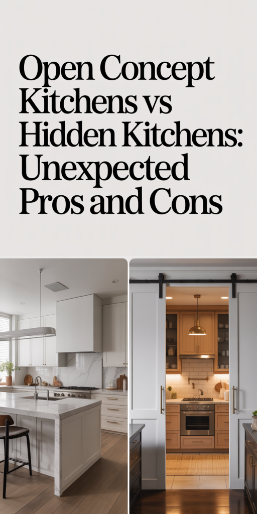
    Open concept kitchens remove barriers between cooking, dining, and living areas to create a shared, continuous space. The hallmark is visual and spatial integration: islands that face living rooms, continuous flooring, and sightlines that allow conversation across zones. We typically see a few consistent variations:

    • The Great Room Kitchen: Fully integrated with the living area, often centered around a multifunctional island used for prep, dining, and assignments.
    • The Island-as-divider: A large island marks the kitchen boundary without walls, providing storage, seating, and a gentle visual separation.
    • The L-shaped Open Plan: Keeps one side of the kitchen dedicated to appliances and storage while opening the other side to the living area for flow.

    Key features that distinguish open concept kitchens are uninterrupted sightlines, multipurpose islands, consistent finishes across spaces, and flexible lighting schemes. Because the cooking area is exposed, venting, flooring durability, and noise control become more important. Open designs favor social cooking, entertaining, and homes where we want constant visibility, for supervising kids or staying connected while we cook. In 2026, open plans also commonly integrate hybrid work nooks, charging stations, and intentional tech placement so the kitchen isn’t just for food but for daily life.

    What Defines A Hidden Kitchen? From Galley To Scullery And Everything In Between

    Hidden kitchens range from enclosed traditional kitchens to modern takes like sculleries and butler’s pantries that conceal mess and systems. The defining trait is separation, walls, doors, or architectural buffers that keep cooking activity out of primary living sightlines. Popular variations include:

    • The Galley Kitchen: Efficient, narrow, and typically enclosed, great for focused cooks who want everything within reach.
    • The Enclosed U-Shaped Kitchen: Offers abundant counter and storage while keeping noise and smells contained.
    • Scullery or Butler’s Pantry: A secondary prep and cleanup zone that hides the dirty work while the main kitchen or serving area remains tidy.
    • The Pocket Kitchen: A compact, doorable cabinet-style kitchen that tucks away in a living space when not in use.

    Hidden kitchens prioritize function and containment. They make it easier to keep clutter and cooking smells out of sight, which appeals to people who entertain formally or want a calmer living room. In modern renovations we increasingly pair a modest show-kitchen, a curated area for serving and socializing, with a functional hidden kitchen behind it for heavy tasks. That hybrid approach gives us both presentation and practicality without exposing the full scope of kitchen activity.

    Design And Layout Considerations: Flow, Sightlines, And Zoning

    Choosing between open and hidden kitchens starts with three design fundamentals: flow, sightlines, and zoning. Each influences how we move through the house and how the kitchen interacts with daily life.

    Flow: We map circulation paths around work triangles, islands, and dining seating. Open plans favor free movement and social flow: hidden kitchens often restrict traffic to purposeful paths, which can improve efficiency for multi-cook households.

    Sightlines: Open layouts require intentional aesthetics because the kitchen is constantly visible. That means cohesive materials, concealed appliances, and thoughtful storage. Hidden kitchens allow more utilitarian finishes out of sight, often prioritizing durability and task lighting over visual harmony with adjacent rooms.

    Zoning: This is about defining activity areas. In open plans we rely on furniture, rugs, and lighting to create zones: islands become multifunctional anchors. In hidden kitchens we can zone vertically and horizontally, dedicate counters for baking, a scullery for prep and cleanup, and keep a pantry-station isolated to avoid cross-contamination.

    Other practical considerations include mechanical systems (venting and HVAC), acoustic buffering, and electrical placement for smart appliances. For example, an open kitchen needs stronger range hood ventilation to protect living room air quality: hidden kitchens let us contain odors more easily. Finally, consider adaptability: if we plan to age in place or want flexible multi-use rooms, layouts that allow future wall additions or removals give us long-term options.

    Unexpected Advantages Of Open Concept Kitchens

    We often celebrate open kitchens for sociability, but some advantages are less obvious until we live with them.

    1. Multitasking Made Real: With direct sightlines to living areas, we can supervise kids, keep an eye on virtual meetings, or watch TV while prepping dinner. That reduces task-switching friction and saves time.
    2. Perceived Space and Light: Removing walls lets natural light travel further and makes even modest homes feel larger. This perceived spaciousness often improves mood and lowers stress, a subtle but meaningful benefit.
    3. Flexible Entertaining: Open kitchens let gatherings flow organically: guests can chat while we cook, and buffet setups are simpler. That flexibility translates to fewer separate serving pieces and more relaxed hosting.
    4. Better Social Inclusion: Open plans support communal living arrangements and multigenerational homes. Whether we’re helping a teenager with assignments or hosting a potluck, the kitchen becomes a social hub rather than a workspace hidden away.
    5. Increased Visibility of Upgrades: High-end finishes, statement islands, and designer lighting are more impactful in open plans, potentially enhancing perceived value during viewings or open houses.

    These advantages make open kitchens compelling for families who prioritize connection, daylight, and flexible entertaining.

    Unseen Drawbacks Of Open Concept Kitchens

    Open kitchens aren’t without downsides. Beyond the obvious loss of privacy or noise, there are several less visible costs we should weigh.

    1. Acoustic Spillover: Cooking, dishwasher cycles, and conversations travel. Without walls, sound control requires better acoustic planning, soft furnishings, ceiling treatments, and appliance selection to reduce noise.
    2. Constant Visibility of Clutter: Because the kitchen is always on display, daily messes feel more stressful. That can pressure us into continual tidiness or attract cleaning service costs.
    3. Ventilation Load: Open plans demand more powerful range hoods and thoughtful HVAC zoning to prevent food odors and humidity from migrating into living spaces.
    4. Design Compromises: Making a kitchen visually consistent with a living room limits some practical choices, exposed storage, industrial finishes, or heavy-duty surfaces might clash with a relaxed living palette.
    5. Higher Renovation Complexity: Removing load-bearing walls or rerouting mechanicals to create openness often increases project complexity and cost. Even if we love the look, the structural or permitting hurdles can be significant.
    6. Resale Polarization: While many buyers prefer open plans, some segments, particularly in certain regions or older buyer demographics, still value enclosed kitchens. Going fully open risks narrowing appeal.

    Knowing these trade-offs helps us plan mitigations: invest in quiet appliances, create hidden storage strategies, and ensure ventilation capacity aligns with the openness of the design.
    Surprising Benefits Of Hidden Kitchens

    Hidden kitchens deliver predictability and control in ways that pleasantly surprise once we live with them.

    1. Stress Reduction: Out-of-sight cooking reduces visual clutter, which in turn lowers cognitive load. We notice this when hosting, dishes can be washed and stored out of view while guests remain in a calm living room.
    2. Better Scent and Air Management: Enclosed layouts naturally contain smells, making them a boon for homes that cook strongly flavored cuisines or frequently use deep-frying methods.
    3. Focused Culinary Workflows: For serious cooks, a hidden kitchen allows specialized zones (baking center, prep island, heavy-duty range) without worrying about aesthetics in the main living area. We can have industrial-style shelving, hanging pots, and heavy-duty counters that wouldn’t work visually in an open plan.
    4. Improved Safety and Containment: With doors or partitions, we can keep pets and small children out of dangerous areas more easily. That’s practical for households with curious toddlers.
    5. Easier Clean-up and Maintenance: Because the kitchen doesn’t need to always be presentation-ready, we can store frequently used tools and leave small projects in progress without social pressure to tidy immediately.
    6. Architectural Character: Enclosed kitchens often sit in older homes as intact rooms with defined scale, windows, and built-in features. Restoring or updating these spaces can preserve character that open plans might erase.

    Those benefits show why hidden kitchens remain a strong option for people who cook intensely, prefer formal entertaining, or want strict separation between life and workspaces at home.

    Challenges And Tradeoffs Of Hidden Kitchens

    Hidden kitchens come with their own compromises, mobility, social disconnection, and sometimes inefficient use of space.

    1. Social Isolation: When we shut the kitchen away, cooks can feel cut off from guests or family. That’s a real consideration if we enjoy social cooking or need to supervise activities while we work.
    2. Space Perception: Enclosed kitchens can make homes feel compartmentalized and smaller, especially if natural light is limited. That reduction in perceived space can affect mood and how we use adjacent rooms.
    3. Workflow Constraints: Traditional closed layouts like narrow galley kitchens may hinder multiple cooks. Tight corridors and lack of island space can create bottlenecks during busy meal prep.
    4. Underused Rooms: If the kitchen is too isolated, it risks becoming a back-of-house area that family members avoid, reducing interaction opportunities and amortized value of the footprint.
    5. Lighting and Ventilation Needs: Enclosed kitchens often require more artificial lighting and mechanical ventilation solutions, which can marginally increase operating costs and energy use.
    6. Resale Considerations: While many buyers appreciate a concealed kitchen, others, particularly younger buyers and those who value open living, may see it as dated. We need to balance current lifestyle benefits against potential buyer preferences in our market.

    We can address some trade-offs by designing openings, pass-throughs, or glazed doors that allow light and partial connectivity without full exposure, achieving compromise between privacy and inclusion.

    Cost, Renovation Complexity, And Resale Impact For Both Styles

    Budget and future resale value are pivotal when choosing a kitchen layout. The financial picture differs markedly between open and hidden designs.

    Costs and Complexity:

    • Open Concept: Creating an open plan often involves removing load-bearing walls, upgrading floor joists, and rerouting HVAC and electrical systems. These structural and mechanical changes raise renovation budgets significantly. Expect higher upfront costs for structural engineering, permits, and robust ventilation systems. That said, the visibility of premium finishes in an open plan can justify spending on high-end cabinetry and appliances.
    • Hidden Kitchens: Enclosed kitchens usually avoid structural work but may require investments in lighting, ventilation, and cabinetry optimized for storage. If we add sculleries or butler’s pantries, incremental cabinetry and plumbing costs rise, but complexity often stays moderate compared with wall removals.

    Resale Impact:

    • Market Preference: In many urban and suburban markets, open concept kitchens are still widely favored and can positively influence appraisal perceptions. But, market nuance matters: in areas with traditional homebuyers or where formal entertaining is common, a hidden kitchen or hybrid solution may attract a premium.
    • Flexibility Sells: Homes that offer adaptability, e.g., an open plan with the option to reintroduce doors or a hidden scullery paired with a show-kitchen, appeal to a broader buyer pool. That flexibility can protect resale value and reduce the risk of alienating buyers.

    Return on Investment:

    • We generally see better ROI by improving functionality and flow rather than chasing stylistic extremes. Investing in good ventilation, durable surfaces, and smart storage provides steady value regardless of the chosen layout.

    In sum, budget for structural work and mechanical upgrades if going open, and consider hybrid approaches to balance cost with market appeal.

    How To Choose Based On Lifestyle, Family, And Cooking Habits

    The right choice hinges on how we actually use our kitchen day-to-day. To decide, ask practical, personal questions and test assumptions.

    Questions to Guide Us:

    • How often do we entertain? Frequent hosts who favor casual entertaining lean toward open kitchens: formal hosts often prefer hidden or hybrid setups.
    • Do we need to supervise children or work from home while cooking? Open plans help visibility and multitasking.
    • How intense is our cooking? If we regularly cook complex meals or use heavy equipment, a hidden kitchen or scullery protects living spaces from mess and odor.
    • What’s our tolerance for clutter? If we prefer tidy living rooms and relax into mess behind closed doors, hidden kitchens align with that preference.
    • How important is natural light and perceived space? Open plans amplify both.

    Design Strategies Based on Answers:

    • For Families with Kids: Open plan with dedicated zones works well, but add ample concealed storage and noise damping.
    • For Serious Home Chefs: Enclosed prep areas or sculleries with heavy-duty appliances provide functional advantage.
    • For Entertainers: An open show-kitchen plus hidden prep scullery gives the best of both worlds: guests see a polished space while we pair it with a functional back kitchen.
    • For Tight Budgets: Retaining existing walls and upgrading inside the envelope is often more cost-effective: choose hidden or partial openness depending on natural light and circulation.

    We recommend prototyping with simple visualizations: mark the proposed island, furniture, and traffic paths on the floor with tape for a week. Living with a mockup surfaces issues you won’t see on paper, it’s the fastest way to validate whether an open or hidden layout truly fits your rhythm.

    Conclusion: Making The Right Call For Your Home And Future Needs

    There’s no universal winner between open concept kitchens and hidden kitchens, only the right fit for how we live now and how we expect to live in the years ahead. Open kitchens reward connection, light, and flexible entertaining but demand acoustic planning, stronger ventilation, and constant visual upkeep. Hidden kitchens offer containment, focused workflows, and lower social pressure at the cost of potential isolation and perceived smaller space.

    Practically, hybrid approaches often deliver the best balance: a curated show-kitchen for guests paired with a hidden scullery for prep and cleanup, or glazed doors that allow light and sightlines without full exposure. Our final recommendation is to prioritize everyday function over aesthetic trend, budget realistically for the mechanical work an open plan requires, and prototype layouts before committing. If we design around how we actually cook, host, and live, not just what looks trendy, we’ll make a choice that serves our home well into the future.
  • Open Floor Plans Vs Defined Rooms: Which Feels Better To Live In Daily — A Practical 2026 Guide

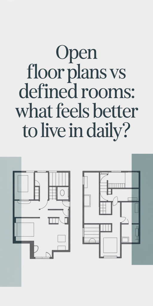
    We’ve all walked into a home and felt an immediate emotional reaction, light flooding a single, open space: or the calm of a series of smaller, purpose-built rooms. In 2026, with more people working from home, multi-generational households, and a renewed interest in wellness at home, the question of whether an open floor plan or defined rooms feel better to live in daily matters more than ever. In this guide we’ll cut through the design clichés and look at the psychology, everyday pros and cons, and practical strategies for choosing, or adapting, a layout that actually supports how we live. Expect research-backed observations, real-life trade-offs, and actionable suggestions you can use whether you’re buying, remodeling, or simply rearranging. Our aim is to help you decide which layout will make routine life easier, calmer, and more enjoyable for your household.

    The Psychology Of Space: How Layout Shapes Everyday Comfort

    Space isn’t just architecture: it’s an emotional regulator. When we talk about how a home feels, we’re describing cognitive and sensory reactions, perceived safety, social connectedness, control over stimuli, and the ability to focus. Neuroscience and environmental psychology show that spatial configuration influences stress, attention, and social behavior. For example, visual openness tends to increase feelings of freedom and social possibility, while defined rooms often create clear behavioral scripts: we eat in the dining room, sleep in the bedroom, work in an office. Those scripts reduce decision fatigue and can improve routines.

    Beyond scripts, our sensory thresholds vary. Some people need visual boundaries to feel secure: others feel confined by walls. Light, sightlines, and acoustics modify perception deeply. Natural light exposure correlates with better mood and sleep patterns, and open plans often maximize daylight penetration. But noise travels more in open layouts, elevating chronic stress for those sensitive to sound. Control is another psychological variable: the more control we have over our environment, closing a door, dimming a lamp, or carving out a quiet corner, the more restorative the space becomes. That’s why we should evaluate layouts not only by aesthetics, but by who we are, how we use time at home, and which daily stresses a layout must help manage.

    Finally, social dynamics matter. Open spaces encourage spontaneous interaction and supervision (vital for families with kids), while defined rooms support privacy and concentrated work. As we weigh open versus defined plans, we must map layout traits to our household’s rhythms, sensory tolerance, and social needs to predict which will feel better day-to-day.

    Open Floor Plans — Benefits That Make Daily Life Easier

    Open floor plans dominated new construction and remodels for years because they solve practical problems: they connect people, simplify flow, and maximize daylight. When we evaluate the benefits, three stand out, social flow, light and flexibility, entertaining and visual spaciousness, each of which directly affects daily living.

    Social Flow, Light, And Flexibility

    An open plan naturally merges cooking, dining, and living zones so we can cook while watching kids, socialize while prepping dinner, or keep an eye on a video call without feeling boxed into a separate room. This visibility reduces friction in multitasking and helps households run more smoothly. Open plans also improve daylight distribution: fewer partitions mean sunlight penetrates deeper into the footprint, reducing reliance on artificial lighting and enhancing circadian benefits. Flexibility is another practical upside: furniture arrangements can be swapped to suit changing needs, home gym one month, play area the next, without structural changes.

    Entertaining And Visual Spaciousness

    For anyone who entertains, an open plan simplifies hosting logistics. Guests flow from kitchen to seating areas without bottlenecks: cooks aren’t isolated: and the visual continuity creates a perceived increase in square footage that makes daily life feel less cramped. Even for smaller homes, a well-executed open plan can feel luxurious by eliminating narrow corridors and awkwardly sized rooms.

    These benefits translate directly into daily convenience: fewer closed doors to manage, more social connection during routine tasks, and a heightened sense of light and space. That said, the conveniences carry trade-offs we need to weigh next.

    Open Floor Plans — Everyday Drawbacks To Consider

    Open plans aren’t a universal solution. The very features that make them appealing, connectivity, light, and openness, create problems that affect daily comfort.

    First, acoustics. Sound carries in open spaces, so ordinary activities, cooking, conversations, television, can interfere with concentration or sleep when rooms aren’t isolated. For households with remote workers or students, that’s a real day-to-day annoyance. Second, scent and visual clutter. Cooking odors and messes are harder to contain: an unwashed sink or laundry basket is visible from multiple sightlines, adding to mental load. Third, temperature control. Larger contiguous volumes can be harder to heat or cool efficiently, especially in older homes without zoned HVAC. That raises energy costs and sometimes creates persistent hot or cold pockets.

    Privacy is another consideration. We may like seeing family members, but we also need spots to retreat. Open layouts reduce opportunities for private phone calls, quiet reading, or focused work unless we create intentional nooks. Also, storage can be a challenge, open spaces push storage needs into furniture solutions rather than built-in closets, which may not match how we organize daily life.

    Finally, aesthetics vs. function: open plans require discipline about tidiness and design cohesion. Without consistent finishes and clutter control, the openness amplifies mess instead of making a space feel larger. In short, open plans simplify some aspects of daily life but complicate others, especially in households with mixed needs for focus, privacy, and environmental control.

    Defined Rooms — Benefits For Privacy, Focus, And Routine

    Defined rooms, distinct spaces delineated by walls and doors, offer features that support focused, lower-stress daily living. The primary benefits we see are improved privacy, better conditions for concentration, and more intentional routines.

    Privacy matters for adults and kids alike. Bedrooms, studies, and dedicated workrooms allow us to close a door and create psychological separation between activities: work stays in the office, sleep happens in the bedroom. That separation helps us disengage mentally, improving sleep quality and work-life balance. For households with multiple adults or frequent remote work, defined rooms reduce interruptions and enable scheduled quiet times.

    Defined rooms also foster focus. Acoustically and visually isolated spaces minimize distractions, which boosts productivity and reduces cognitive load. If you’re on an important call or deep into a concentrated task, having a room to retreat into is invaluable. Purpose-built rooms let us design for specific needs: blackout shades in the bedroom, bookshelves and task lighting in the study, or soundproofing where necessary.

    Routine and habit formation benefit too. When activities consistently occur in specific rooms, meals in the dining room, reading in a den, our brains build habits faster and with less conscious effort. That predictability makes daily logistical decisions easier and reduces decision fatigue. For families, defined rooms can also support different schedules: a teenager’s music practice won’t carry into a sleeping adult’s space as easily.

    In short, if our daily life demands focused work, clear boundaries between functions, or lower sensory load, defined rooms typically feel better and more sustainable over time.

    Acoustics, Temperature Control, And Purposeful Storage

    When we pick defined rooms, we gain several technical advantages that influence everyday comfort: better acoustics, easier temperature zoning, and more effective storage solutions.

    Acoustics: Walls and doors are simple, effective noise barriers. They let us isolate sound-generating activities and maintain quieter zones for sleep or focused work. We can enhance this further with soft finishes, rugs, curtains, upholstered furniture, or add targeted soundproofing where needed. For families or people who need to record audio or participate in frequent video calls, this separation is often non-negotiable.

    Temperature control: Smaller, compartmentalized rooms are simpler to heat or cool individually. Zoned HVAC systems or even portable heaters/coolers work more efficiently in defined rooms because there’s less wasted air exchange. That translates to lower utility bills and more consistent thermal comfort in everyday life, especially in climates with large seasonal swings.

    Purposeful storage: Defined rooms encourage built-in storage, walk-in closets, pantry rooms, mudrooms, and dedicated laundry spaces, that keep daily clutter out of sight. When storage is integrated into the architecture, we spend less time moving items around or staging for guests. Purpose-built storage supports specific routines: a mudroom for shoes and coats, a pantry organized for weekly meal prep, or a craft room with labeled bins. Those habits reduce friction in day-to-day tasks.

    All of these practical technical benefits add up: when acoustics, thermal comfort, and storage are addressed, daily life feels more controlled, less noisy, and easier to manage.

    Common Limitations And Workarounds For Defined Rooms

    Defined rooms aren’t without limits. They can fragment social life, reduce perceived space, and sometimes make small homes feel compartmentalized. Fortunately, there are intelligent workarounds that preserve the advantages of defined rooms while mitigating downsides.

    First, fragmented social interaction. We can address this by creating intentional transition zones: a breakfast nook that opens to the kitchen through a wide doorway, or a half-wall that provides sightlines without removing all separation. Pocket doors and wide cased openings allow rooms to be opened for gatherings and closed for privacy. Second, lighting and daylight. Smaller rooms can feel dim: we offset this with strategic skylights, clerestory windows, or light wells that channel daylight into interior rooms. Mirrors and reflective finishes also help redistribute natural light.

    Third, perceived crampedness. Removing unnecessary corridors and using multifunctional furniture (daybeds, fold-down desks, integrated storage) increases usable square footage. Open shelving or glass doors on cabinets can visually expand a room without compromising function. We can also choreograph color and material palettes across rooms to maintain cohesion and avoid a choppy visual experience.

    Fourth, flexibility. If adaptability is a concern, we recommend modular solutions: movable partitions, sliding doors, or furniture that defines zones without permanent walls. These let us toggle between privacy and openness depending on the occasion.

    By thinking like both designers and psychologists, we can retain the control and focus benefits of defined rooms while keeping life sociable and bright, often achieving the best of both worlds with modest investments.

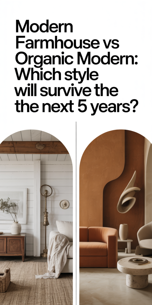
  • Modern Farmhouse Vs Organic Modern: Which Style Will Survive The Next 5 Years (And How To Future‑Proof Your Home)

    The debate between modern farmhouse and organic modern feels less like interior-design posturing and more like a fork in the road for anyone who owns a home or plans to sell one in the near future. As designers, buyers, and platform algorithms evolve, the choices we make now about finishes, furnishings, and layouts will influence comfort and resale value for years to come. In this piece we’ll unpack both styles, where they came from, what they stand for visually and materially, who’s buying them, and which one looks most resilient through 2026–2031. Then we’ll give practical, actionable tactics to blend or future‑proof a space so it stays relevant without forcing a full remodel every few years.

    Why This Style Debate Matters In 2026

    We’ve seen design trends come and go, but the stakes feel higher today. Real estate markets are more competitive, buyers are savvier about lifestyle-driven listings, and sustainability has moved from niche to mainstream. That combination means the look of a home can materially affect selling speed and perceived value. In 2026, platforms like Pinterest and Instagram still shape discovery, but search intent has matured, people want homes that feel authentic, comfortable, and low‑maintenance.

    Beyond curb appeal, the debate matters because each style signals different priorities. Modern farmhouse says warmth, heritage, and approachable simplicity. Organic modern signals sustainability, material honesty, and a quieter, nature‑connected aesthetic. Buyers hungry for nostalgia and family-friendly layouts tend to gravitate to farmhouse cues: younger, eco‑conscious buyers increasingly prefer the restrained, tactile language of organic modern.

    We also need to consider supply-chain and material trends. Wood species, engineered materials, and textile sourcing affect cost and availability: what was easy to source in 2018 isn’t necessarily so today. Regulations and buyer awareness about VOCs (volatile organic compounds) and sustainable manufacturing have nudged demand toward naturally finished woods, plant-based fabrics, and low‑emission paints, elements that tend to favor organic modern’s premise.

    Finally, longevity comes down to adaptability. A style that’s easy to layer, update, and personalize without major structural change will fare better in five years. That’s the lens we’ll use: not just which style looks good now, but which one is easier to evolve as tastes and priorities shift.

    What Is Modern Farmhouse? Origins, Core Principles, And Visual Language

    Modern farmhouse is a hybrid: the rustic, utilitarian roots of rural American homes married to streamlined, contemporary proportions. The style exploded into mainstream awareness in the 2010s, helped by TV renovators and social media, and persisted because it promises comfort without clutter. Its essence is familiarity: exposed structural elements, generous gathering spaces, and a palette that balances light neutrals with earthy textures.

    Core principles of modern farmhouse include convivial spaces (think large kitchen islands and open-plan living), a focus on function-forward details (aprons, utility sinks, built-in storage), and an aesthetic that reads as collected rather than precious. The architecture often features pitched roofs, board-and-batten or shiplap siding, and large, multi‑paned windows. Inside, you’ll find a mix of antique or vintage pieces with new, durable finishes, an intentional patina that suggests history.

    Visually, the style favors contrast: white or cream backdrops against matte‑black or oil‑rubbed bronze hardware, wide‑plank flooring that shows grain, and layered textiles for a cozy effect. Rather than minimalism, modern farmhouse celebrates warmth and a lived‑in look that says “we use this house.” That’s a big part of its appeal to families and buyers seeking psychological comfort from their environment.

    Signature Materials, Colors, And Furnishings Of Modern Farmhouse

    • Materials: Reclaimed or distressed wood, shiplap, painted brick, galvanized metal, and simple ceramic tiles. Engineered materials are often finished to emulate aged wood when budget or durability requires.
    • Colors: Warm whites, soft creams, taupes, and charcoal accents. Pastels are rare: the palette skews toward muted, earthy tones that read as timeless rather than trendy.
    • Furnishings: Oversized, comfortable sofas: farmhouse tables with bench seating: wrought‑iron chandeliers or simple pendant lighting: open shelving in kitchens: built‑in banquettes. Accessories are curated to suggest family life, heavy linen throws, woven baskets, and vintage ceramics.

    The modern farmhouse’s resilience comes from its emotional resonance: it looks like a place where memories are made. The challenge for longevity is avoiding over‑themed execution, when every room feels like a staged barn. When done with restraint and high‑quality materials, the style can be updated incrementally and remain desirable for years.

    What Is Organic Modern? Origins, Core Principles, And Visual Language

    Organic modern emerged as a counterpoint to stark minimalism and maximalist pattern trends. It blends mid‑century modern simplicity with biophilic design, prioritizing natural materials, curves, and a soft, tactile aesthetic. The movement gained traction as sustainability and wellness became central to design conversations: materials with lower environmental impact and spaces that foster calm began to matter as much as style.

    The core principles are restraint, connection to nature, and sensory comfort. Organic modern reduces visual noise but replaces coldness with texture, soft plaster walls, tactile linens, and sculptural furniture that invites touch. The forms are often rounded rather than rectilinear, and the layout emphasizes flow and daylight.

    Visually, organic modern reads like a curated gallery that still feels lived in. Neutral tones dominate, but they are warmer and richer: terracotta, clay, muted sage, and sand. Wood tones are honest and varied, oiled oak, walnut, and bamboo appear alongside renewable materials like cork and hemp. The movement also leans into artisan-made pieces and natural fibers, which align with consumers’ increasing appetite for transparency about origins and manufacturing.

    Signature Materials, Colors, And Furnishings Of Organic Modern

    • Materials: Oiled and unfinished woods, stone (limestone, travertine), natural plaster, cork, leather, wool, and plant‑based textiles. Recycled glass and low‑VOC finishes are common.
    • Colors: Earthy neutrals, sand, clay, warm grays, olive greens, and muted rusts. Accent tones are drawn from nature rather than saturated pigments.
    • Furnishings: Sculptural sofas with rounded profiles, low‑slung lounge chairs, simple wooden dining tables with tapered legs, organic ceramic tableware, and woven rugs with subtle texture. Lighting is soft and sculptural, paper shades, blown glass, and hand‑forged metal in muted finishes.

    Organic modern’s strength is its alignment with emergent values: wellness, sustainability, and authenticity. Its vulnerability is price and availability, authentic, sustainably sourced materials and artisan pieces can be cost‑prohibitive for mass adoption. Still, the style’s emphasis on longevity and material honesty gives it an advantage when buyers prioritize health and environmental footprint.

    Market Trends, Sales Data, And A 5‑Year Forecast

    Reading market signals in 2026, we find both styles maintaining strong niches but with different growth vectors. Modern farmhouse retains a broad base, especially in suburban single‑family markets, because it maps neatly onto family‑oriented floor plans and mainstream staging imagery. Organic modern is growing faster in urban and high‑income suburban pockets, driven by younger buyers who prize sustainability and curated simplicity.

    Search and social metrics show a slower decline for farmhouse terms than many expected: phrases like “modern farmhouse kitchen” still generate substantial monthly searches. But engagement rates for organic modern content, pins saved, time on page, and shoppable lookbooks, have climbed year over year. That indicates not just curiosity but purchasing intent.

    From a resale perspective, homes that feel intentionally designed but not overly themed tend to sell faster. Real estate agents report that neutral, high‑quality finishes (e.g., oiled wood floors, stone countertops, neutral plaster walls) outperform trend‑heavy statements. In practical terms, a modern farmhouse with high‑end, subdued finishes will hold similarly to an organic modern home with durable, low‑VOC materials.

    Forecast for the next five years (2026–2031):

    • Continued coexistence: Both styles will remain relevant. Modern farmhouse will keep appeal in family-focused markets: organic modern will expand with eco-conscious buyers and urban renovations.
    • Niche growth for organic modern: Expect higher year‑over‑year interest in sustainable materials, artisan furnishings, and biophilic features. Incentives for energy efficiency and healthy materials may accelerate this.
    • Hybridization: The dominant movement won’t be one style replacing the other but a blending of principles, simplicity, natural materials, and adaptable layouts.

    We should note economic variables: material costs, interest rates, and supply chains could shift adoption velocities. If budgets tighten, expect more accessible farmhouse-inspired finishes (painted shiplap, laminate surfaces that mimic wood), which risks visual saturation. Conversely, if sustainability incentives become more mainstream (tax credits, local rebates for healthy materials), organic modern could transition from niche to mainstream more rapidly.

    Buyer Demographics, Resale Impact, And Where Demand Is Headed

    Buyer profiles are clear: Modern farmhouse skews toward middle‑aged buyers and families seeking functional, warm spaces, often in suburban or exurban locations. These buyers prioritize storage, flexible rooms, and cozy communal areas. On the other hand, organic modern appeals to younger urban professionals, creative households, and buyers willing to invest more in material quality and sustainable credentials.

    Resale impact depends on execution. A well‑executed farmhouse remodel that uses neutral, wearable finishes will attract a wide buyer pool. Over‑themed choices, excessive barn doors, heavy shiplap, or overly literal décor, can narrow appeal. Organic modern properties that demonstrate material authenticity, good daylighting, and low‑emission products can command premiums in markets where buyers value health and sustainability.

    Where demand is headed:

    • Suburbs and family markets: Continued appetite for farmhouse cues, but buyers will expect higher performance (durable surfaces, efficient HVAC, smart storage).
    • Urban and affluent markets: Growing demand for organic modern, especially in communities where walkability and sustainable living are selling points.
    • Hybrid seekers: A rising segment wants the warmth of farmhouse plus the material honesty of organic modern, think warm wood floors with simple, sculptural furniture and houseplants. This overlap is where most savvy sellers should position properties to maximize buyer reach.

    Eventually, demand will reward adaptability. Homes that can be updated with inexpensive surface swaps (paint, lighting, switch plates, textiles) while maintaining a durable, health‑forward baseline will outperform those that require costly overhauls.

    How To Decide, Blend, Or Future‑Proof Your Home For Longevity

    We recommend a three‑step approach: assess, choose intentionally, and layer for flexibility.

    1. Assess: Start with your market and lifestyle. Who is most likely to buy your house if you move? If you plan to stay long term, prioritize comfort and values (sustainability, family function). For short‑term resale, aim for broad appeal: neutral palettes, durable materials, and uncluttered spaces.
    2. Choose intentionally: If you favor modern farmhouse, dial back on literal motifs. Keep the warm neutrals and robust textiles, but pick hardware, lighting, and cabinetry styles that read as contemporary rather than period costume. If you prefer organic modern, invest in tactile finishes and a few statement pieces rather than furnishing the whole house with high‑cost artisanal items. Choose timeless proportions: a well‑proportioned island, generous windows, and a logical flow between rooms.
    3. Layer for flexibility: This is the future‑proofing sweet spot. Use changeable elements to communicate style and reserve permanent, high‑cost choices for neutral, long‑wearing options.
    • Paint and wall finishes: Opt for neutral or slightly warm bases. Consider plaster or low‑sheen paints that feel tactile. Paint is the easiest, cheapest rebrand.
    • Hardware and lighting: These are quick swaps. Matte‑black or brushed‑nickel can read modern farmhouse or organic modern depending on surrounding textures.
    • Flooring: Choose durable wood or engineered wood in mid tones. Wide planks with natural grain read well for both aesthetics and resale.
    • Textiles and furniture: Use these to pivot a room’s identity. Linen slipcovers, woven baskets, and a reclaimed‑wood table lean farmhouse: sculptural sofas, clay pottery, and a sisal rug tip toward organic modern.
    • Greenery and biophilic touches: Houseplants, living walls, and natural daylight are universal value‑adds. They signal health and care regardless of stylistic camp.

    Practical examples:

    • Kitchen: Pair a simple shaker or slab‑front cabinet in a warm off‑white with an oiled‑wood butcher‑block shelf and a stone composite countertop. That combination reads as both approachable and material‑honest.
    • Living room: Keep a neutral, tactile base (wool rug, linen sofa) and swap accent tables, an antique pine trestle table for farmhouse warmth or a sculptural walnut table for organic modern refinement.

    Budgeting tip: Spend where it matters long-term, flooring, windows, and HVAC, and save on decorative items that can be replaced for a few hundred dollars. This strategy lets us adapt to shifting tastes with minimal investment.

    Finally, document choices. Keep receipts, material names, and care instructions for sustainable or specialty items, buyers and future owners will value provenance and maintenance clarity.

    Conclusion

    Both modern farmhouse and organic modern are here to stay, but not in isolation. The coming five years will favor homes that combine the emotional warmth and functionality of farmhouse design with the material integrity and wellness focus of organic modern. Our best advice is pragmatic: choose durable, health‑forward materials for permanent elements and use paint, lighting, hardware, and textiles to express style. That way, whether trends shift toward nostalgia or nature, your home remains comfortable, marketable, and genuinely yours.

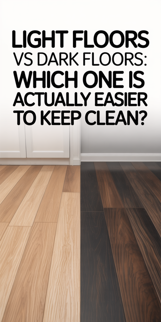
  • Light Floors vs Dark Floors: Which One Is Actually Easier to Keep Clean? A Practical 2026 Guide

    Choosing between light floors and dark floors often starts as an aesthetic decision, but very quickly becomes a practical one: which hides the mess, which shows scratches, and which will make our cleaning routine easier? In this 2026 guide we cut past the design advice and look at real-world maintenance. We’ll compare how dust, dirt, stains, and wear show up on different colors and materials, explain why finish and texture are often more important than color, and give concrete rules for pet owners, families, and low‑maintenance households. Our goal is to leave you with a clear decision framework so you can pick the floor color that fits your lifestyle, not just your Pinterest board. We’ll also cover everyday cleaning, stain removal, and long‑term wear so you know what to expect after the install.

    The Visual Reality: How Dust, Dirt, And Scratches Show On Light Versus Dark Floors

    When we talk about visibility, it helps to separate three things: particulate (dust and fine dirt), mud/stains, and surface damage (scratches/scuffs). Light floors reflect more light and can make dark particulates, dust, tracked-in soil, stand out because of the contrast. That’s why pale oak or whitewashed floors can look dusty the morning after a day with pet hair or flour around the kitchen. Dark floors, on the other hand, swallow up fine dust visually but amplify lighter residues: dried water spots, salt, soap scum, and pale pet dander.

    Scratches and scuffs behave a bit differently. On light-colored wood, scratches that expose a darker underlayer are more visible: on very dark-stained floors, scratches that reveal lighter wood or the substrate will jump out. The direction of light matters, too: a gloss-finished dark floor under bright angled sun will reveal every nick and scuff through specular highlights. Matte light floors can hide minor wear better because they scatter reflections.

    In practice, neither light nor dark floors are universally “cleaner-looking”, they simply show different kinds of dirt. Our takeaway: match the color to the kinds of dirt you expect in your home (e.g., dusty vs muddy) and to how often you’re willing to clean.

    Material, Finish, And Surface Texture Matter More Than Color

    Color is only one variable. The material (hardwood, laminate, tile, vinyl), finish (matte, satin, gloss), and surface texture (hand-scraped, wire-brushed, smooth) shape how dirt and wear appear and how easy floors are to maintain. We often see people choose a color and later regret overlooking finish and texture.

    Think about three practical consequences: durability, visibility, and cleaning technique. Durable finishes resist stains and scratches: textured surfaces can hide small abrasions but trap grit: and some materials respond to cleaners differently. Before we get into material-specific notes, remember: a light glossy laminate might show fingerprints and streaks more than a medium-toned matte hardwood, even though the laminate is lighter in color.

    Below we break down common materials and why finish changes what you notice first.

    Hardwoods, Laminate, Tile, And Vinyl: How Color Interacts With Each Material

    Hardwood: Natural wood varies in grain and undertone. Light hardwoods (maple, ash) show darker grit easily but often hide light dust: dark hardwoods (walnut, stained oak) conceal dark particles but reveal pale scratches. Solid hardwood can be refinished, so long-term wear is less of an aesthetic worry, but it’s still a maintenance concern.

    Laminate: Laminate’s printed surface makes color and pattern repeatable. It resists staining but can’t be refinished: deep scratches are permanent. Because laminate often has a protective wear layer, color choice mainly affects how visible crumbs and dust are.

    Tile: Porcelain and ceramic tile are forgiving. Grout color is the real visibility problem: white grout with dark tile shows dirt fast, and dark grout can hide stains but collect soap scum. Textured tiles hide slips and scuffs but take more effort to clean.

    Luxury Vinyl (LVP/Vinyl plank): Vinyl often mimics wood and is highly stain-resistant. Its wear layer determines scratch resistance. Light vinyl floors feel bright and hide small debris: dark vinyl hides dust but can show water spots.

    Across all materials, mid-tones with natural grain/patterning are often the easiest visual compromise, less contrast for both light and dark messes.

    Matte Versus Gloss: Why Finish Changes What You Notice First

    Finish controls reflection. Glossy floors reflect directional light, which makes scratches, streaks, and scuffs pop. They look dramatic when perfect, but demand more frequent buffing to maintain that mirror finish. Matte finishes scatter light, reducing glare and masking micro-scratches: they’re more forgiving in daily life.

    If we’re honest, matte is the practical choice for high-traffic areas. It hides mop streaks, small abrasions, and the constant parade of pet paw marks better than gloss. Satin finishes give a middle ground: a little sheen without the high-maintenance sparkle. For dark floors, we prefer matte or satin to avoid the show-every-defect problem: for very light floors, gloss can look pristine but will require more visible upkeep.

    Finish also affects cleaning technique: glossy surfaces show streaking from certain cleaners and require microfiber or squeegee-style tools, whereas matte surfaces tolerate broader cleaning methods with less streak concern.

    Common Mess Types And Which Floor Color Masks Them Best

    Let’s map common messes to the floor color that typically masks them best.

    • Dust and fine debris: Dark floors. Light-colored dust (pollen, flour) appears on dark backgrounds as a high-contrast film: but dark floors visually absorb the common gray house dust better.
    • Mud and soil: Mid-tones and patterned floors. Mud is a mix of light and dark: patterned or medium-tone floors hide it better until you notice the texture.
    • Pet hair: Depends on pet color. If you have a black dog, dark floors hide fur: a white cat’s hair shows more on dark floors. Neutral mid-tones are often the safest bet for multi-color shedding.
    • Water spots and salt: Light floors. Water evaporation leaves pale mineral residue that stands out on dark surfaces: on light floors it’s less noticeable.
    • Grease and food stains: Dark floors often hide some food stains, but oily films can appear as darker spots. Light, sealed floors show discoloration more, but many stains wipe away if addressed quickly.
    • Scratches and scuffs: If a scratch reveals a different wood tone or lighter substrate it will be most visible on the opposite contrast (light scratch on dark floor, dark scratch on light floor). Again, textured finishes reduce visibility.

    That mapping makes it clear: no color is a universal winner. Assess the biggest mess type for your household and choose accordingly.

    Daily Maintenance: Sweeping, Vacuuming, And Mopping — What’s Easier On Each Color

    Daily maintenance falls into three tasks: removing loose debris (sweeping/vacuuming), spot-cleaning spills, and routine mopping. Color affects our perception of “clean” and hence our tolerance for visible dirt.

    Sweeping and vacuuming: Dark floors make dust look less dramatic, so many people vacuum less often. But that’s a false economy: grit that sits on a dark floor still abrades finishes. Light floors show dust quickly, nudging us to sweep more often. We recommend a lightweight cordless vacuum for daily touch-ups regardless of color: it keeps debris from embedding.

    Spot-cleaning: On dark floors we often notice water rings or soap film: on light floors we spot dark spills and tracked-in mud faster. Keep a spray bottle with a gentle pH-balanced cleaner and microfibre cloths handy for immediate cleanup.

    Mopping: The technical ease of mopping isn’t color-dependent, but streak visibility is. Dark gloss floors show mop streaks and drying rings: use a damp mop and follow with a microfiber pad or squeegee to avoid marks. For light floors, mop residue is usually less obvious, but discolored mop water will show if you aren’t using clean water.

    Routine tip: We suggest a scheduled quick sweep every other day and a full vacuum + mop once weekly for average households. Adjust frequency up for pets and kids. A consistent routine matters more than the floor color.

    Practical Decision Guide: Choosing The Right Floor Color For Your Lifestyle And Home

    We like decision guides that reduce choice anxiety. Here’s a practical flow to match floor color to lifestyle.

    1. Identify your primary mess type: daily dust, mud, pet hair, or liquid spills. If dust dominates, consider mid-to-dark tones: if mud or light stains dominate, favor mid-tones or light colors with textured finishes.
    2. Consider foot traffic and furniture: High-traffic zones benefit from textured, matte finishes and mid-tones. If you entertain a lot and prefer a polished look, choose a satin finish that balances elegance and forgiveness.
    3. Match to lighting: In low-light rooms, very dark floors can make the space feel heavy and reveal scuffs under directional light. In bright, well-lit homes, dark floors create drama but will require closer maintenance to look perfect.
    4. Evaluate long-term maintenance: If you plan to refinish (solid hardwood), color matters less long-term. For veneer, laminate, or vinyl, choose a tone you can live with because wear patterns are more permanent.
    5. Test large samples: Bring 2–3 big samples home, observe them at different times of day, and sprinkle flour or dust to preview how each color shows common debris.

    This method gets us out of theoretical debates and into a choice that aligns with how we actually live in our homes.

    Quick Rules For Pet Owners, Families With Kids, And Low‑Maintenance Households

    Pet owners:

    • Match floor tone to predominant pet color when possible. Dark pets + dark floors = less visible fur: light pets + light floors = same. Choose matte finishes and robust wear layers: consider urethane or aluminum-oxide finishes for hardwood.
    • Opt for textured surfaces or hand-scraped looks to hide claw marks.

    Families with kids:

    • Choose mid-tone floors with a forgiving pattern, sand, gray-brown, or warm oak hides spills, crumbs, and scuffs well.
    • Pick a durable finish and avoid ultra-gloss in play areas. Water-resistant materials like LVP are practical for quick cleanup.

    Low-maintenance households:

    • Select mid-tones and matte finishes. These hide a broad range of mess types and reduce the pressure to clean daily.
    • Prioritize materials with easy-clean warranties (vinyl, porcelain tile) and pick grout colors that won’t demand frequent regrouting or scrubbing.

    Across all three groups, we recommend keeping a small cleaning kit in the busiest zone: microfibre cloths, a gentle cleaner, and a compact vacuum. Preparedness beats perfection.

    Cleaning Products, Stain Removal, And Long‑Term Wear Considerations

    Choosing the right cleaners and techniques is essential no matter the floor color. The wrong product can dull a finish or leave residue that makes streaks more visible on dark floors.

    General rules:

    • Use pH-neutral cleaners for sealed wood and laminate. Acidic or alkaline cleaners can break down finish layers.
    • Avoid oil-based soaps for floors: they leave a film that attracts dirt and darkens over time.
    • For tile and grout, use a grout brush and an oxygen-based cleaner for stubborn stains: bleach will whiten grout but can damage surrounding materials if used improperly.

    Stain removal: Act quickly. For oil/grease, use an absorbent (baking soda) then a gentle degreaser. For tannin stains (coffee, wine), blot, then use a recommended wood-safe stain remover or oxygenated bleach for tile grout. Dark floors are forgiving on small food stains: light floors require faster response to prevent permanent discoloration on porous materials.

    Long-term wear:

    • Recoating or refinishing solid wood every 7–15 years (depending on traffic) refreshes color and addresses scratches. Lighter floors sometimes need less visual touch-up because scratches blend more naturally: darker floors often show wear sooner and might be refinished to a slightly different shade to hide accumulated damage.
    • For engineered products, follow the manufacturer’s care instructions, many offer repair kits for minor surface damage.

    The bottom line: choose products designated for your material, test in a discreet spot, and set a renewal schedule that fits your household’s use.

    Conclusion

    Deciding between light floors and dark floors isn’t just about looks, it’s about matching color, material, and finish to the types of mess we face and the time we’ll spend cleaning. Light floors make dust and dark stains more visible: dark floors hide dust but reveal water spots, light hair, and scratches. In our experience, mid-tones with textured, matte finishes offer the best compromise for most households: they reduce contrast for common messes and make daily maintenance less punishing. Eventually, test samples at home, consider your family’s habits, and pick materials and finishes that align with how you live. That’s how we guarantee a floor that stays beautiful with realistic upkeep.

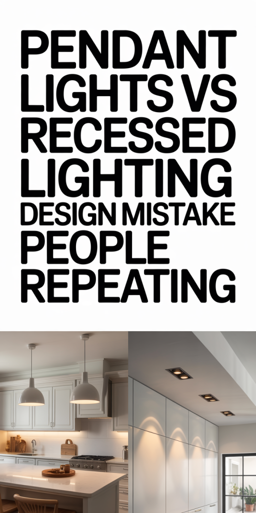
  • Pendant Lights Vs Recessed Lighting: The Design Mistake People Keep Repeating — How To Get It Right In 2026

    We keep seeing the same lighting error in renovated homes and new builds: choosing pendant lights OR recessed lighting as if they’re mutually exclusive statements about good design. In 2026 the tools, bulbs, and fixture styles have evolved, but the mistake hasn’t. The truth is simpler and more useful, lighting is about layers, intent, and proportion, not a binary choice.

    In this text we’ll explain why designers and homeowners keep repeating this mistake, break down the real strengths and limitations of pendant lights and recessed downlights, and show the practical, room-by-room specs that let you get it right. Whether you’re planning a kitchen overhaul or just swapping fixtures, we’ll give clear rules for placement, bulb selection, beam angles, and spacing so your lighting looks intentional and performs well. Read on to stop guessing and start lighting like you mean it.

    Why Designers And Homeowners Keep Making The Same Lighting Mistake

    We see three recurring causes behind the pendant-versus-recessed mistake.

    First: aesthetic fixation. Pendant lights are photogenic, striking silhouettes, decorative shades, and dramatic drops photograph well on social media and in magazines. That visual appeal pushes people to prioritize pendants as the room’s signature element, then try to make them do everything: ambient, task, and accent lighting. But pendants excel at shaping zones and creating focal points: they’re not automatically sufficient for even general illumination.

    Second: cost and retrofit constraints. Recessed lighting feels like a large, invasive upgrade, cutting ceilings, running wiring, and meeting insulation or IC-rated requirements. Homeowners often opt for pendants because they’re cheaper and easier to install. That practical decision becomes a design decision when the pendants are expected to replace a full lighting plan.

    Third: misunderstanding of light layering. We still meet many clients who think a single fixture type equals a complete solution. The result is underlit work zones, harsh shadows, or dead spots. Good lighting design uses ambient, task, and accent layers. Choosing pendants OR recessed lights instead of combining them is the core misstep, we’ll unpack why each fixture type belongs in a layered plan and how to do that without overcomplicating the ceiling.

    Throughout the rest of this guide we’ll use clear placement rules, fixture choices, and practical specs so you can avoid these pitfalls in your own projects.

    Pendant Lights: Strengths, Limitations, And When They Shine

    Pendants are about presence. They define zones, kitchen islands, dining tables, reading nooks, and create visual hierarchy. Their strengths include directional lighting, decorative impact, and the ability to hang at precise heights for task illumination.

    Where pendants shine:

    • Zone definition: A trio above an island anchors the space: a single pendant over a bedside table makes a statement and frees up surface area.
    • Task emphasis: With the right shade and bulb they provide focused light for chopping, reading, or grooming.
    • Aesthetic flexibility: Materials, shapes, and finishes let us tailor pendants to any style, from industrial to minimalist.

    Limitations to account for:

    • Coverage: One or several pendants won’t evenly light a whole room. They create pools of light and shadows between fixtures.
    • Glare and sightlines: Improper height or transparent shades cause uncomfortable glare, especially when seated across a table.
    • Scale mistakes: Too-large pendants overwhelm: too-small ones look lost.

    When to choose pendants: we recommend them whenever you need a focal point, localized task light, or a stylistic accent. But they should rarely be the only source of general light.

    Pendant Placement And Scale Rules That Designers Use

    • Height rules: Over dining tables or islands, hang pendants 28–34 inches above the surface for standard ceiling heights (8–9 ft). For taller ceilings, add 3 inches per extra foot. If multiple pendants are used, keep consistent height for rhythm.
    • Spacing: Center pendants evenly across the zone. For islands, allow 12–18 inches from the island edge to the nearest pendant edge, and 24–30 inches between multiple pendants depending on diameter.
    • Proportion: A quick rule is that a pendant’s diameter should be about one-third the width of the table or island it serves. In open-plan rooms, scale pendants to the furniture, not just the ceiling.

    Light Quality, Bulbs, And Shade Choices For Pendant Fixtures

    • Bulb type: Choose LEDs with CRI 90+ for accurate color and 2700–3000K for warm, flattering light in living/dining spaces: 3000–3500K for kitchens where clarity matters.
    • Diffusion: Opaque or lined shades provide soft downward light and reduce glare. Clear glass or exposed bulbs work for decorative effect but need careful positioning or frosted bulbs to avoid eye strain.
    • Beam control: Use directional inserts, reflectors, or internal baffles if you need concentrated task light. Avoid wide, shallow shades over tasks that require even illumination.

    Pendants are powerful tools. When we treat them as part of a layered plan, paired with ambient sources and accent lights, they transform both the look and function of a space.

    Recessed Lighting: Strengths, Limitations, And Best Uses

    Recessed downlights are the stealth players of a lighting scheme: they disappear into the ceiling yet deliver broad ambient light. Their low visual impact makes them ideal when we want the architecture, art, or furniture to stand out instead of the fixtures.

    Strengths:

    • Even ambient illumination: Properly spaced, recessed fixtures eliminate shadows and provide consistent baseline light across a room.
    • Minimalist aesthetic: No hanging fixtures, clean lines, and flexibility for orientation and dimming.
    • Layering compatibility: They pair well with pendants and wall sconces to build depth without visual clutter.

    Limitations:

    • “Hospital” feel risk: Too many downlights or the wrong color temperature make spaces feel flat and clinical.
    • Installation complexity: New construction is straightforward: retrofits require ceiling access, IC-rated fixtures near insulation, and sometimes insulation contact considerations.
    • Glare and beam overlap: Incorrect spacing or narrow beam angles produce bright hotspots and uneven light.

    Best uses: Recessed lights are ideal for uniform ambient lighting in living rooms, kitchens (general illumination), hallways, and basements. They’re also excellent for highlighting artwork when used with adjustable trims.

    Layout, Beam Angle, And Spacing Considerations For Recessed Downlights

    • Spacing rule of thumb: For general ambient light, divide the ceiling height by two to get the spacing (for a 9-foot ceiling, aim for 4.5 feet between fixtures). This is a quick-start rule: adjust based on lumens and beam angles.
    • Beam angles: Use 60°–90° trims for ambient lighting to avoid hot spots. For accenting art or pendant-mixed schemes, 24°–36° directional trims work well.
    • Lumens per fixture: For kitchens and active spaces aim for 700–1,000 lumens per downlight if they’re the primary ambient source: reduce to 400–600 lumens when combined with other layers.
    • Dimming and controls: Put recessed lighting on a dimmer or zone control so we can tune overall brightness without altering pendant mood lighting.

    When planned thoughtfully, recessed lighting gives us a neutral, reliable backdrop that lets targeted fixtures, pendants, sconces, track heads, do the expressive work.

    The Core Design Mistake: Choosing One Fixture Type Instead Of Layering

    This is the hard lesson: treating pendant lights and recessed downlights as either/or makes the lighting do less than it could, and often leads to a room that looks great in photos but feels wrong in daily life.

    Why layering matters:

    • Functionality: Tasks require directed light: ambient layers reduce contrast and eye strain: accent layers add depth and drama. No single fixture covers all three well.
    • Flexibility: Layered systems let us change mood and function, bright for cooking, dimmed for dinner, and accent lighting for a movie, without rewiring or swapping fixtures.
    • Visual comfort: Combining diffuse recessed light with targeted pendants prevents harsh shadows and keeps faces well-lit during conversation.

    Common mistakes we encounter:

    • Relying solely on pendants: Islands with three pendant fixtures but no ambient lighting create dark perimeters and require high wattage bulbs that glare.
    • Overcrowding the ceiling with recessed cans: When every square foot has a can light, the room loses texture and personality: plus, costs balloon and insulation performance can be impacted.
    • Mismatched color temperatures: Mixing warm pendants with cool recessed lights without coordination creates visual dissonance. Always plan CCT (correlated color temperature) and CRI together.

    How we fix it: start by defining the room’s primary activities. Specify a baseline ambient level (recessed or uplighting), add focused task lighting (pendants, under-cabinet, sconces), and sprinkle accents (wall washers, picture lights). Keep color temperature and dimming compatibility consistent across layers so everything blends. Layering isn’t indulgent, it’s how we make spaces usable and beautiful.

    Room-By-Room Fixes: Practical Specs For Kitchen, Living Areas, And Bedrooms

    Here are practical, plug-and-play specs we use on projects to get lighting right quickly.

    Kitchen

    • Ambient: Recessed downlights spaced using the ceiling-height/2 rule. Aim for total kitchen lumens of 5,000–7,000 depending on size and finishes.
    • Task: Pendants above islands, hang 30–32 inches above the countertop (for 8–9 ft ceilings): choose 3000–3500K, CRI 90+, 400–700 lumens per pendant for targeted work.
    • Under-cabinet: Continuous LED strips or puck lights at 3000K for countertop illumination: 200–400 lumens per linear foot.
    • Controls: Two circuits, one for recessed ambient (dimmable), one for pendants/task lights, let us set bright cooking scenes and cozy dining scenes.

    Living / Dining Areas

    • Ambient: Recessed lights with wide trims or a central ceiling fixture if the room is small. Target 1,500–3,000 lumens total for living rooms, higher for open-plan spaces.
    • Accent: Pendant over dining table at 28–34 inches above the surface: consider a dimmer to shift from dinner to ambient mood.
    • Layer: Add wall washers or picture lights for art: table/floor lamps for reading nooks. Match CCT across all fixtures, 2700–3000K for warm, relaxing spaces.

    Bedrooms

    • Ambient: Fewer recessed fixtures or a central semi-flush fixture to avoid a ‘lit like an exam room’ feel, target 1,000–1,500 lumens total.
    • Task: Pendant or wall-mounted swing arms beside the bed. Position pendants about 28–30 inches above nightstand surfaces to clear sightlines when seated.
    • Accent: Low-level night lighting (step lights, LED strips) for wayfinding at 2–10% of main lighting: use warm 2700K to preserve sleep-friendly atmosphere.

    We also recommend specifying dimmable, high-CRI LEDs and keeping all layers on compatible control systems (preferably with scene presets). That allows us to change a room’s function without swapping fixtures.

    Conclusion: A Simple Checklist To Avoid The Pendant Vs Recessed Trap

    Here’s a compact checklist to help us stop treating pendant lights and recessed lighting as rivals and start using them as partners:

    • Define activities first: list tasks, focal points, and mood for the room.
    • Establish an ambient baseline: use recessed or central fixtures to remove dark spots.
    • Add targeted task pendants where focused light is needed, follow placement and scale rules.
    • Coordinate CCT and CRI across all fixtures (2700–3500K: CRI 90+ for true color).
    • Put major layers on separate circuits and dimmers for flexible scenes.
    • Avoid over- or under-lighting: use lumens/room-size guidelines above and adjust for finishes.

    When we design with layers in mind, pendant lights and recessed downlights stop competing and start complementing each other. The result is a room that looks intentional, photographs well, and, most importantly, works for how we actually live in it.

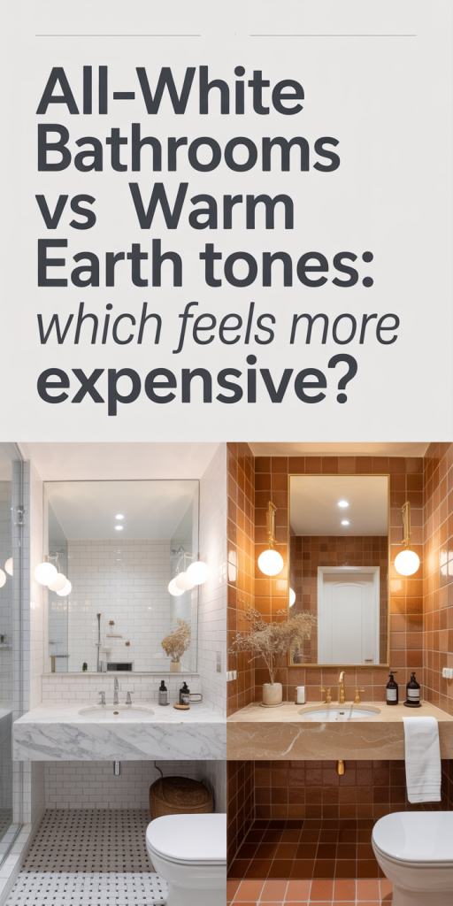
  • All-White Bathrooms Vs Warm Earth Tones: Which One Really Feels More Expensive?

    We often get asked whether an all-white bathroom or a warm earth-toned design reads as more luxurious. The quick answer is: it depends. Luxury isn’t a single color or finish: it’s an orchestration of materials, light, scale, and detail. In this text we’ll walk through the design mechanics that create perceived value, compare the strengths and weaknesses of crisp white schemes versus richer, earthy palettes, and give practical guidance to help you choose based on budget, maintenance, and resale priorities. Along the way we’ll share hands-on strategies to make each approach feel intentionally high-end rather than merely trendy.

    What Makes A Bathroom Feel Luxurious?

    There’s a short list of repeatable factors that make any bathroom feel expensive, and they’re mostly about sensory cues and craftsmanship rather than color alone. When we evaluate a bathroom’s perceived quality, we look for coherence across three broad categories: materials and finishes, lighting and spatial proportion, and detail work.

    Materials, Finish Quality, And Color Psychology

    High-end bathrooms lean on honest materials with tactile presence. Natural stone, honed or polished porcelain, solid-surface countertops, brass or matte-black hardware, and high-density cabinetry read as premium because they age well and reveal craftsmanship. Finish quality matters: tight grout lines, consistent polish, and continuous veining in stone signal attention to specification and installation.

    Color plays a psychological role. White communicates cleanliness, clarity, and quiet luxury when paired with substantial materials. Warm earth tones, think terracotta, ochre, deep taupe, olive, and warm greys, evoke comfort, heritage, and boutique hotel or spa vibes. Neither palette is inherently more luxurious: it’s how color integrates with materiality and texture. We look for palettes that support the materials rather than compete with them.

    Lighting, Scale, And Detail Work

    Lighting converts good finishes into gorgeous ones. Layered lighting, ambient overhead, task lighting at vanities, and accent or grazing lights on textured walls, creates depth and emphasizes chosen materials. Scale matters too: large-format tiles, generous countertops, and properly proportioned fixtures make a room feel spacious and intentional. Conversely, undersized fixtures or cramped layouts read cheap, regardless of finishes.

    Detail work is the tie-breaker. Grout color choices, shadow gaps around cabinetry, integrated drains, concealed fasteners, harmonized trim, and consistent hardware finishes communicate craftsmanship. We always advise clients: spend on the small details that are highly visible, a well-detailed edge profile or a high-quality shower valve, and the room will read far more expensive than its nominal cost.

    Bringing these elements together, premium-feeling materials, layered lighting, correct scale, and considered detailing, is what eventually determines whether a bathroom feels luxurious, not just whether it’s white or warm-toned.

    Why All-White Bathrooms Read As High-End — When Done Right

    An all-white bathroom can feel unequivocally luxe when executed with restraint and quality. White’s advantage is its ability to elevate contrast, highlight texture, and let form speak. But if we simply slap white tiles everywhere without thought, the space can quickly feel clinical.

    Design Strategies For A High-End All-White Scheme

    • Layer textures: Combine polished marble, honed stone, matte subway tiles, and satin cabinetry finishes to give white surfaces depth. A honed marble vanity top against matte tile walls creates a whisper of contrast that reads expensive.
    • Use large-format materials: Fewer grout lines mean a cleaner, more continuous surface that reads as custom. Large slabs of porcelain or bookmatched marble introduce drama and reduce the “busy” look small tiles can create.
    • Invest in quality fixtures: In an all-white setting, metal finishes and fittings become focal points. We recommend spending on a statement faucet, solid brass hardware, and a substantial mirror. These items anchor the room and provide the tactile cues of luxury.
    • Control gloss and reflectivity: Too much high-gloss white becomes glaring. Pair glossy elements with satin or matte surfaces to balance reflectivity and prevent sterilization.
    • Accent subtly: Use soft neutrals or natural woods sparingly, on a vanity face, floating shelf, or bench, to warm the space without shattering the all-white aesthetic.
    • Pay attention to grout: Match or very slightly contrast grout color to tile for a refined look. Pixel-perfect, narrow grout lines feel bespoke.

    Common Pitfalls And How To Avoid A Sterile Look

    The biggest risk with white is sterility. We’ve seen hundreds of white bathrooms that look like hospital wings: the difference between hospital-clean and hotel-chic is richness of material and warmth of light. To avoid a sterile result:

    • Avoid uniform gloss: Mix finishes so white reads layered. Use a matte tile on the floor and a semi-polished slab on the vanity.
    • Don’t overuse bright, cool lighting: Cooler LEDs heighten clinical vibes. Opt for tunable or warm white (2700K–3000K) with layered sources to produce flattering skin tones and softer shadows.
    • Introduce texture and pattern: A subtly patterned mosaic or a honed stone wall gives complexity without adding color. Texture sells tactile luxury.
    • Include warmth through metals: Brass, bronze, or aged nickel introduce a lived-in richness that counters sterility.

    When we design high-end all-white bathrooms, we treat white as the canvas for material richness rather than the design goal itself. That mindset keeps the result elevated rather than antiseptic.

    Why Warm Earth Tones Can Look Richer — Context Matters

    Warm earth tones can create instant perception of luxury because they echo natural materials and cultural craft traditions: plastered lime walls, handmade terracotta, warm wood, and patinated metals. These tones feel layered and soulful in ways white sometimes struggles to achieve. But wealth of result hinges on restraint and context.

    Earthy palettes read expensive for several reasons:

    • They mask wear: Slight staining or water marks are more forgiving on warm surfaces, which can make finishes appear older and hence more curated.
    • They reference artisan craft: Natural pigments and textured plasters communicate a handcrafted quality that many perceive as bespoke and high-end.
    • They produce a mood: Warm palettes convey comfort and timelessness, often associated with boutique hotels, restored country homes, or upscale spas.

    Context is crucial. A warm-toned bathroom in a home with contemporary minimal architecture can feel unexpectedly sumptuous, but the same palette in a small, poorly lit bathroom can feel dull or dated. Proportion, light, and material choices determine whether earth tones look rich or simply dark.

    Design Strategies For A Luxurious Earth-Tone Bathroom

    • Prioritize natural, tactile surfaces: Venetian plaster, tadelakt, honed travertine, and matte-glazed ceramic tiles give earth tones depth. We prefer finishes with subtle variation, it reads like craftsmanship rather than paint-by-number.
    • Layer tonal variations: Use a dominant warm neutral (e.g., warm greige) with deeper accents (burnt umber or olive) and lighter highlights (creamy off-white) to create dimension. Avoid a single flat tone across every surface.
    • Add refined metals: Aged brass, oil-rubbed bronze, or muted golds warm the palette and provide a luxe contrast to matte earth finishes.
    • Use warming lighting: Slightly warmer color temperature (2700K–3000K) brings out deep hues and makes the space feel cozy and curated.
    • Balance with negative space: Even a warm scheme needs quiet areas, a white sink basin or a lighter ceiling can prevent the room from feeling heavy.
    • Consider patterned textiles: Natural-fiber towels, linen shower curtains, and woven bath mats add an artisanal layer that amplifies the perceived richness.

    When we get these moves right, a warm, earthy bathroom can feel like a high-end retreat: inviting, layered, and precisely considered. But the margin for error is smaller than people assume, poorly chosen pigments or flat finishes can tip a room toward gloom rather than grandeur.

    Cost, Maintenance, And Longevity: Practical Comparisons

    When choosing between all-white and warm earth tones, we have to factor in real homeowner concerns: budget, maintenance, and how finishes age.

    Cost

    • Materials: Cost variance is driven more by material choice than color. Large-format porcelain slabs and bookmatched marble (often used in white schemes) can be expensive. Similarly, tadelakt or polished travertine for an earthy look can be costly. You can achieve either palette on a budget with quality-engineered porcelain or high-grade ceramic, but the perceived luxury remains linked to finish quality and installation.
    • Labor: Specialized finishes (e.g., tadelakt plastering or precision stone bookmatching) require skilled labor, adding to cost. All-white schemes often demand equally meticulous work if you want narrow grout lines and seamless transitions.

    Maintenance

    • Cleaning: White surfaces show soap scum, hard-water spots, and grout discoloration more readily, which drives ongoing maintenance. That said, if grout is narrow and matched, and if you select vapor-resistant grout and sealed stone, upkeep is manageable.
    • Stain tolerance: Warm earth tones conceal minor staining and patina better, which can be an advantage in family homes. Natural materials like unsealed lime plaster will require re-waxing or resealing over time.

    Longevity and Aging

    • White: Crisp white can feel timeless in minimalist settings, but if it lacks texture, it risks aging faster as trends shift. A well-detailed white bathroom with classic elements (freestanding tub, high-quality plumbing fixtures) retains value because buyers see the neutral canvas as adaptable.
    • Earth tones: These can feel timeless if they reference traditional materials and restrained palettes, yet they’re slightly more subjective. A bold terracotta tile may feel dated in a decade, while a muted warm greige will likely age well.

    Practical Recommendations

    • For resale-focused projects: Neutral whites with high-quality finishes tend to appeal to a broader pool of buyers. We recommend an elegant white canvas with warm metal accents if resale is a priority.
    • For personal, long-term enjoyment: If you’re designing for your own lifestyle and prefer mood and warmth, invest in durable earthy materials and professional finishes. You’ll likely appreciate the character they develop.
    • Hybrid approach: Consider a largely white scheme with earth-tone accents (vanity faces, alcove walls, or textiles) or a predominantly warm palette punctuated with white fixtures to balance maintenance and longevity concerns.

    Both palettes can deliver long life and good return on investment if materials are chosen wisely and installation is executed well. The smart move is to prioritize finishes and workmanship over strict adherence to color.

    How To Choose For Your Home: Style, Resale, And Personal Use

    Choosing between all-white and warm earth tones comes down to three practical filters: our home’s architecture and natural light, our lifestyle and maintenance tolerance, and whether resale is an important horizon.

    Assess the architecture and light

    • Bright, high-ceiling spaces: All-white schemes excel in rooms with ample natural light and generous proportions, white amplifies brightness and emphasizes scale. We often recommend white in modern, airy homes where the architecture itself is a selling point.
    • Low-light or cozy footprints: Warm earth tones perform better in intimate or north-facing bathrooms. They make small spaces feel intentional and designed rather than cramped.

    Match choice to lifestyle and maintenance

    • Busy households with kids or active use: Earth tones and textured surfaces will hide wear better and reduce the stress of constant cleaning. Durable glazed tiles and sealed stone are practical here.
    • Owners who want a spa-like, pristine aesthetic: A white scheme with matched grout and high-quality fixtures delivers a calm, hotel-like experience, provided you’re comfortable with slightly more upkeep.

    Resale considerations

    • Broader appeal: Neutral white is often the safer bet for resale because it’s a blank canvas for buyers. If we were renovating to flip or to maximize buyer interest, we’d select a restrained white with warm metal accents and quality finishes.
    • Distinctive value: If our market leans toward design-forward buyers or if our property is a custom, high-end home, a tasteful warm palette can differentiate the listing and attract buyers seeking a curated look.

    Practical decision steps we recommend

    1. Audit the natural light and room proportions: take photos at different times of day. This informs whether white will brighten or whether earth tones will add welcome warmth.
    2. Set a maintenance threshold: how often will we realistically clean and reseal surfaces? Be honest: maintenance appetite should shape material choices.
    3. Identify priority features: are we investing in long-term enjoyment (materials and finishes that age gracefully) or in resale (neutral, widely appealing choices)?
    4. Test full-scale samples: Tape up 4×8 sheets or install large tile mockups. Color and texture behave differently at scale and under bathroom lighting.
    5. Consider a hybrid: Use white on major surfaces and earth tones as accents (or vice versa). It often yields the best of both worlds, timeless resale appeal plus warm personality.

    Final takeaways (100 words)

    We’ve found that neither all-white nor warm earth tones are universally more “expensive”, perceived luxury comes from materiality, lighting, scale, and the precision of execution. White excels at clarity and timelessness: warm earth tones offer depth and a curated mood. For resale, a neutral white canvas with thoughtful warm accents is safest. For long-term personal enjoyment, embrace the palette that resonates with how you want to feel every morning. Whatever direction we choose, prioritizing quality finishes, layered lighting, and thoughtful detailing will ensure the bathroom reads as intentionally high-end rather than simply fashionable.

  • Minimalist Homes vs Cozy Spaces: Why Your “Perfect” Style Might Secretly Be Wearing You Out (And What To Do About It)

    We’ve all been seduced by interior-design aesthetics that promise calm, order, or warmth. Minimalist homes allure with clean lines and invisible breathing room: cozy spaces promise softness, nostalgia, and an enveloping sense of safety. But after living in one style or the other, some of us discover a surprise: the very environment we chose to soothe us can quietly drain our energy. In this text we’ll define what each approach really aims to deliver, explore why minimalism can feel exhausting and why coziness can also sap us, and map personality, life-stage, and environmental triggers that change how spaces affect mood and productivity. Most importantly, we’ll share practical, room-by-room strategies for finding a sustainable middle ground, small experiments you can run this weekend to test what actually helps you feel better. Our goal: help you keep the benefits of both styles while avoiding the hidden costs.

    Understanding Minimalist And Cozy Design—Definitions, Origins, And What People Aim To Get From Each

    Minimalism and cozy design come from different cultural lineages and answer different emotional needs. Minimalism, in the modern Western context, traces its lineage to early 20th-century movements, Bauhaus, Japanese wabi‑sabi interpretations, and post‑war modernism, that elevated function, negative space, and material honesty. When people pursue a minimalist home they’re often looking for fewer decisions, clearer visual focus, and the psychological benefits of order: less distraction, easier cleaning, and a sense of control.

    Cozy design (think hygge, cottagecore, or boho comfort) is the opposite on the surface: warm textures, layered textiles, curated clutter, and objects with history. Its cultural revival responds to urban stress and digital overload, people want places that feel tactile, safe, and emotionally resonant. The aim is intimacy, sensory richness, and a slow-down effect.

    Both styles promise wellbeing but via different pathways. Minimalism promises cognitive relief through reduction: cozy spaces promise emotional replenishment through presence. The mismatch between promised benefits and lived experience is where problems arise: what helps one person recharge might overtax another. Understanding the origins and intended outcomes sets us up to diagnose why either approach can sometimes backfire.

    Why Minimalist Homes Can Feel Exhausting

    Minimalist homes look serene in photos, but living in them long-term can produce a surprising fatigue. There are psychological dynamics behind that phenomenon: the constant enforcement of restraint, the narrowness of sensory input, and the pressure to keep surfaces and choices pared down. Minimalism reduces external clutter, but sometimes also reduces emotional anchors and spontaneous sensory cues that help us feel grounded.

    When the visual palette is limited and every object is purposeful, small decisions, what to leave out, what to keep, carry disproportionate weight. That pressure can become tiring, especially for people who draw identity from objects or who live in fluctuating seasons of life.

    Also, a minimalist environment demands an ongoing maintenance of discipline. This emotional labor is invisible but real: it’s not just tidying, it’s curating an identity and a look. Over time, that effort can result in a low‑grade exhaustion: everything is controlled, but there’s less room for surprise, comfort, or sensory variation, and that can make the home feel more like a showroom than a refuge.

    Decision Fatigue And The Pressure To Edit

    When we commit to minimalism, every possession becomes a deliberate choice. That sounds freeing, but the day‑to‑day reality is a steady stream of micro‑decisions: will this item stay? How does it fit the aesthetic? Do we keep sentimental pieces that don’t “match”? These micro‑choices add up and create decision fatigue, the mental exhaustion that comes from repeatedly evaluating options.

    Decision fatigue affects executive function and emotional resilience: we make poorer choices, feel irritable, and avoid social hosting because the work of editing is emotionally costly. Minimalism’s invisible maintenance often falls disproportionately on one household member, too, creating relational friction. The cure isn’t abandoning the aesthetic entirely, but reframing the approach: create high‑tolerance zones (a drawer or bin for items in transition), set seasonal review rituals rather than constant editing, and delegate judgment calls so the cognitive load is shared.

    Those small policy changes reduce daily friction and restore the promise of minimalism, clarity without constant policing.

    Sensory Flatness And Emotional Disconnection

    Minimalism often prioritizes visual quiet, neutral palettes, smooth surfaces, and limited textures. That visually calm environment can paradoxically create sensory flatness: the home stops offering tactile or olfactory cues that register as comforting or stimulating. We rely on subtle sensory input, rug underfoot, warm wood grain, the smell of old paper, to feel attached to a space. When those cues are minimized, emotional connection can falter.

    This sensory austerity can also blunt mood regulation. If our environment isn’t providing small pleasures, we must seek stimulation elsewhere, screens, impulsive purchases, or social outings, leading to burnout. To avoid emotional disconnection while keeping a clean aesthetic, we can introduce curated texture and scent, rotate personal objects, or use lighting layers to add warmth. These interventions maintain minimalist principles but reintroduce humane sensory anchors that keep us engaged and at ease.

    Why Cozy Spaces Can Also Drain Energy

    Cozy spaces feel inviting in snapshots and for weekend hibernation, but their abundance of fabrics, objects, and layered elements carries hidden costs. The emotional comfort cozy design offers comes with maintenance demands: washing throw blankets, dusting knickknacks, managing textiles that attract odors, and constantly negotiating space with items that claim sentimental value.

    There’s also a cognitive angle: when every surface holds a memory or story, our brains are continuously processing those associations. That ongoing processing burns cognitive resources. In social terms, cozy homes can feel like theatrical stages, perfect for hosting but exhausting to maintain as a genuine living environment.

    Finally, cozy aesthetics sometimes hide disorganization: what looks purposefully collected can be functionally chaotic. When we can’t find things or have to tidy before guests, the emotional ease evaporates and effort rises. Cozy design’s warmth is powerful, but without simplified systems and acceptance of imperfection, the style can become a slow leak on our time and energy budgets.

    Hidden Clutter, Maintenance, And Cognitive Load

    Cozy spaces often accumulate “soft clutter”: textiles, stacks of books or magazines, layered décor, craft supplies, and sentimental objects. These items create a visual and practical density that increases maintenance time. Soft clutter may not look messy at first glance, but it increases the effort required to clean, relocate, or refresh a room.

    Maintenance demands translate to cognitive load. When our surroundings require frequent upkeep, we constantly allocate mental energy to managing them, remembering to launder pillows, deciding where new items will live, and coping with the friction of partial organization. That persistent background task list reduces mental bandwidth for creative or restorative activities.

    Practical systems can minimize load without stripping away warmth: create designated rotation zones for textiles, establish a simple declutter rhythm (for example, a monthly 15‑minute shelf sweep), and use storage that preserves the look but reduces visible chaos. Doing so keeps the cozy character while lowering the invisible tax on attention.

    Personality, Life Stage, And Environmental Triggers That Shape How Spaces Affect You

    Not all people respond to the same environment. Personality traits, life stage, and environmental triggers strongly influence whether minimalism or coziness energizes or drains us. People high in openness may relish eclectic, cozy stimuli, while those high in conscientiousness might prefer the order and predictability of minimalist spaces. Introverts may prioritize sensory solitude: extroverts might want more social cues and tactile surfaces.

    Life stage matters: new parents often need functional minimalism for sleep and safety, readers or creatives might crave cozy nooks for long focus periods, and empty‑nesters could swing toward curated minimalism for low‑maintenance living. Environmental triggers, seasonal affective patterns, local climate, urban noise, or home layout, change what feels restorative. A sunny airy minimal apartment may soothe someone in a temperate climate but feel cold to someone who needs warmth in a rainy season.

    The point: design isn’t one‑size‑fits‑all. We recommend running short experiments tailored to personality and stage rather than wholesale adoption of a style. This helps us learn which sensory inputs sustain our energy and which sap it.

    Practical Strategies To Find A Sustainable Middle Ground

    A middle path lets us keep minimalism’s clarity and cozy design’s emotional warmth without their downsides. Start with values: list the three things you want your home to provide (for example: restful sleep, easy hosting, concentrated work). Use these values as tiebreakers for decisions.

    Adopt “selective layering”: maintain a neutral base, simple furniture and uncluttered surfaces, then add pockets of texture and meaningful objects in targeted zones: a reading corner with a plush throw, a kitchen shelf with a favorite mug collection, or a bedside ritual stack. This preserves visual calm while allowing sensory anchors.

    Set maintenance thresholds that match your capacity. If daily tidying isn’t realistic, design for weekly rituals. Use closed storage to hide higher‑effort items and open display only for things you genuinely enjoy. Invest in a few multipurpose, easy‑care textiles (washable rugs, removable cushion covers) to get cozy benefits without the upkeep.

    Finally, treat design like an experiment: try changes for a month and note mood and energy impacts. Use small, reversible steps, swap a lamp, rotate art, or introduce a scent, so we can learn without high emotional cost.

    Room-By-Room Checklist And Small Experiments To Test What Works

    Living rooms

    • Keep a neutral anchor (sofa, coffee table) and add a single cozy zone: one textured throw, two pillows, and a side lamp on a dimmer. Experiment: remove all textiles for a week, then reintroduce one item and track mood changes.

    Bedrooms

    • Prioritize sleep hygiene: declutter surfaces, invest in layered lighting, and choose one comforting object (a favorite blanket or book). Experiment: swap heavy curtains for lighter fabric for two weeks to see if light changes sleep quality.

    Kitchens

    • Embrace functional minimalism: visible surfaces clear, everyday tools accessible. Keep a small rotating display of sentimental items. Experiment: limit countertop décor to three items and observe cleaning time savings.

    Home offices

    • Optimize for focus: clear desk, one plant, a tactile object to ground during breaks. Experiment: alternate between minimalist desk setup and a slightly cozier desk for a week each, tracking productive hours.

    Entryways and circulation spaces

    • Use hooks, a simple bench, and a ‘landing’ basket for transition clutter. Experiment: carry out a five‑minute nightly reset for a month and note stress before bedtime.

    Across all rooms, document subjective energy and practical time spent on maintenance. Small, measurable experiments let us refine a personalized blend of minimal and cozy that supports daily life.

    Conclusion

    Minimalist homes and cozy spaces each offer genuine benefits, clarity and warmth, but both can secretly exhaust us if we accept them as absolute rules rather than tools. By understanding the psychological tradeoffs, acknowledging personality and life‑stage influences, and running small, reversible experiments, we can craft homes that serve our energy rather than chew it up. Our recommendation: define what you want your home to do, test targeted changes room by room, and adopt maintenance rhythms that match your real life. That way, we keep what restores us and let go of what doesn’t, without guilt.

  • White Kitchens Vs Wood Tones: Which Ages Better? A Practical Guide To Timeless Choices In 2026

    Choosing a kitchen finish is one of those decisions that feels immediate but echoes for decades. We often find clients, and ourselves, torn between the crisp minimalism of white kitchens and the tactile warmth of wood tones. Each option carries aesthetic and practical trade-offs that reveal themselves over time: how surfaces take scuffs, how finishes yellow or mellow, how trends shift, and how resale value is affected. In this guide we compare white kitchens and wood tones through the lens of aging: not just how they look now, but how they wear, how easy they are to maintain, and which choice better preserves value and satisfaction over the long run. By the end you’ll have a practical framework to pick the right palette for your home, lifestyle, and budget, plus concrete upkeep and renovation strategies to ensure whichever direction we choose grows more graceful with age.

    Why Kitchen Aging Matters: Function, Value, And Visual Longevity

    When we talk about how a kitchen “ages,” we’re considering three overlapping dimensions: function (how well it performs everyday tasks), value (resale appeal and cost-to-benefit over time), and visual longevity (how pleasant it remains to look at). These aren’t separate concerns. A countertop that stains easily lowers function and visual appeal: a finish that looks dated can nudge buyers away, reducing value.

    Function: Kitchens are high-use spaces. Cabinets are opened hundreds of times a week, countertops endure heat and knives, and flooring gets foot traffic, spills, and dropped pans. Materials that handle repeated stress with minimal visible signs will feel fresher longer.

    Value: Realtors will tell us that kitchens sell houses. Neutral, well-maintained kitchens usually fetch higher offers. But “neutral” changed over the last decade, white kitchens once epitomized neutrality, while warmed wood tones now read as timeless to many buyers. What matters is perceived quality and upkeep: a well-cared-for wood island can trump a neglected white one.

    Visual longevity: Trends move, but patina and craftsmanship age differently than trend-driven finishes. A finish that acquires a pleasing patina (we’ll talk about this for wood) can gain character. Conversely, white surfaces may yellow or reveal grime in ways that shout their age. Understanding these aging trajectories helps us make a choice that still makes us smile in five, ten, or twenty years.

    The Case For White Kitchens: Strengths, Vulnerabilities, And Long-Term Appeal

    White kitchens have dominated design imaginations for years, and for good reasons. Their strengths make them a safe, flexible choice for many homes.

    Strengths

    • Perceived cleanliness: White signals sanitary surfaces and reflects light, making spaces feel brighter and larger. That psychological clarity often translates into stronger resale appeal.
    • Versatility: White pairs with virtually any countertop, hardware, or accent color. If we like to refresh paint, tile backsplashes, or accessories frequently, white is a forgiving backdrop.
    • Contemporary neutrality: In 2026, modern minimalist and Scandinavian influences still favor white as a core canvas, especially in smaller kitchens where light matters.

    Vulnerabilities

    • Shows wear: Scratches, grease specks, and stains are easier to spot on white, especially in gloss finishes. Grout lines, food splatters, and soap residues can accumulate visually.
    • Yellowing and discoloration: Older acrylics, poorly formulated paints, and low-quality laminates can yellow with UV exposure, heat, or nicotine. Even high-quality whites can shift slightly over many years.
    • Trend cycling: While white is versatile, very stark, clinical whites can feel dated if the market shifts towards warmer, textured finishes, something we’ve seen as wood tones regained popularity.

    Long-Term Appeal and Mitigation

    To keep white kitchens aging well, we recommend high-quality materials and finishes: durable urethane or catalyzed conversion varnishes for painted cabinetry, quartz or high-grade porcelain for counters (they resist staining better than many natural stones), and matte or satin sheens where scratches show less. Thoughtful hardware and layered lighting minimize the clinical feel and help the kitchen remain welcoming as we age.

    In short: white ages cleanly if we maintain it and choose robust finishes: it ages poorly if we skimp on material quality or neglect regular upkeep.

    The Case For Wood Tones: Warmth, Patina, And How Natural Materials Mature

    Wood tones, whether painted, stained, or left raw, bring an immediate sense of warmth and texture that often improves with time.

    Why wood ages attractively

    • Patina development: Wood acquires a surface character over time, tiny dents, softened edges, subtle color shifts, that many people find appealing. This patina reads as authenticity and lived-in comfort rather than damage.
    • Visual depth: Grain and variation conceal minor scratches and smudges more easily than a flat white plane. In practice, simple abrasions blend into wood’s natural variation.
    • Timeless association: Natural materials have cultural staying power. Oak, walnut, and maple have been used for centuries: in 2026, the renewed focus on biophilic design gives wood an enduring advantage.

    Potential downsides

    • Vulnerability to moisture and warping: If not sealed or installed correctly, wood can swell, warp, or delaminate, especially in humid kitchens. This is a functional concern as much as an aesthetic one.
    • Surface damage visibility: Deep gouges or burns can be more noticeable and harder to repair invisibly on certain species and finishes.
    • Color trends: Very dark or very light wood stains can fall in and out of favor: but, moderate, natural-looking tones tend to remain more neutral.

    How to make wood age well

    Choose stable species and engineered products where appropriate (engineered veneers, kiln-dried solid wood). Use durable finishes like hard-wax oils, conversion varnishes, or waterborne catalyzed finishes that protect against moisture while allowing wood’s beauty to show. Plan for regular care: re-oiling open-pored surfaces every 6–18 months, avoiding excessive sponge-abrasion on sealed finishes, and using cutting boards and trivets to limit direct damage.

    When done right, wood tones don’t just resist aging, they gain character. For homeowners who appreciate tactile warmth and evolving beauty, wood often wins the subjective age test.

    Durability And Maintenance: How Wear Actually Shows Over Time

    Durability is not just a material property: it’s a lived experience. Below we look at how wear patterns unfold daily and over the long term, and what that means for our choice between white and wood.

    Daily Wear Patterns: Stains, Scratches, And Surface Recovery

    Daily wear defines our immediate impression of age. White surfaces reveal spills and grease, while wood masks them to a degree. Here are typical daily patterns:

    • Stains: Acidic foods, red wine, tomato sauce, these make a white laminate or painted door look tired if not wiped promptly. Quartz and high-quality porcelain resist staining better, which helps white kitchens retain freshness. Wood, if sealed, resists surface staining: if unsealed or oil-finished, stains can penetrate and darken grain.
    • Scratches: Utensils and dishes leave micro-scratches on white lacquer or gloss paint that reflect light differently and become visible. Wood’s grain distraction makes minor scratches less apparent, but gouges can be deeper.
    • Fingerprints and smudges: High-gloss white finishes show prints. Matte whites hide them, but matte surfaces can be harder to clean without leaving streaks. Wood shows fingerprints less, especially textured or oiled finishes.

    Recovery: The capacity to quickly restore a surface matters. Painted cabinetry may be touch-up-friendly with matching paint. Solid wood can be sanded and refinished locally, but that’s more labor-intensive and may alter profiles or veneers.

    Long-Term Changes: Fading, Warping, Patina, And Repairability

    Over years, cumulative environmental factors create more permanent changes:

    • Fading and yellowing: Sunnier rooms can cause yellowing in whites, especially older paints or certain plastics. Wood tones can fade too, some species darken with UV exposure, while others bleach. Expect differential fading where an island sits under a skylight.
    • Warping and dimensional changes: Humidity cycles can make solid wood expand and contract. Proper acclimation, engineered cores, and adequate sealing mitigate this risk. Painted MDF resists movement but can delaminate if moisture penetrates.
    • Patina vs. degradation: Wood often develops patina, which we value. But if finishes break down, flaking, cracking, or uneven wear, the surface can look neglected. White finishes that crack or peel read as poor maintenance and age the kitchen quickly.
    • Repairability: Small chips in painted surfaces are usually patched with paint. Scratches in wood can be filled, sanded, or re-stained, sometimes invisibly. For both, matching the original finish decades later is the common challenge. We recommend keeping spare finish materials and documenting original colors/brands to ease future repairs.

    Understanding these patterns lets us choose materials and finishes that align with how we actually live, so the kitchen ages as gracefully as possible rather than merely surviving.

    A Practical Decision Framework: Choose Based On Home, Lifestyle, And Budget

    We find decision-making becomes easier when framed by three concrete axes: the home (architecture and light), lifestyle (how we use the kitchen), and budget (initial cost vs lifecycle cost). Use the following framework to evaluate which direction, white or wood, fits best.

    1. Evaluate the home
    • Light and scale: Small, low-light kitchens benefit from white for brightness. Large, open-plan homes with lots of natural light can support richer wood tones that show off grain and texture.
    • Architectural style: Contemporary glass-and-steel homes pair naturally with white. Traditional or farmhouse homes align better with wood tones. That said, mixing, white upper cabinets with a wood island, often yields the best of both worlds.
    1. Assess lifestyle
    • Heavy cooks and families with kids: If we cook daily or have messy eaters, materials that hide wear (mid-tone wood or textured laminate) and stain-resistant counters (quartz, porcelain) are practical. White can work if we’re disciplined about wiping and choose durable finishes.
    • Entertaining or resale priorities: If we plan to sell in the near term, white kitchens often broaden buyer appeal. For long-term ownership, choosing what we’ll enjoy in ten years matters more, wood tones may feel cozier over time.
    1. Consider budget and lifecycle cost
    • Upfront vs maintenance: A cheap white laminate may look good initially but yellows and chips, leading to earlier replacement. Mid-range or high-end wood (or engineered wood) has a higher upfront cost but can be refreshed multiple times, extending lifecycle value.
    • Repair and refresh strategy: Painted cabinets can be repainted for a refresh: solid wood can be sanded and refinished. Factor in the cost and disruption of potential future refreshes into the initial budget.

    Decision shortcuts we use with clients

    • If you want low-effort brightness and plan to sell in 1–5 years: favor white with high-quality, low-maintenance surfaces.
    • If you value a lived-in, warm aesthetic and will live in the home 5+ years: favor wood tones with stable construction and durable finishes.
    • If you want both: combine, white uppers for lightness, wood lower cabinets or an island for warmth and resilience. This hybrid approach often future-proofs stylistic shifts while balancing maintenance.

    Styling, Upkeep, And Renovation Strategies To Make Either Choice Age Gracefully

    Aging gracefully is as much about styling and upkeep as it is about initial material choice. Here are practical strategies to keep either white or wood kitchens looking intentional and cared-for over time.

    Styling for longevity

    • Layer textures: Whether white or wood, introduce texture, textured tiles, matte metal hardware, woven rugs. Texture distracts from minor wear and creates visual depth.
    • Limit trend-specific elements: Avoid overly trendy backsplash patterns or cabinet detailing that will lock the kitchen into a short-lived look. Instead, use changeable accents, pendant lights, stools, or tile rugs, that are easy to update.
    • Thoughtful contrast: For white kitchens, warm wood or brass accents prevent a clinical look. For wood kitchens, select light counters and backsplashes to keep the space bright and balanced.

    Upkeep routines that matter

    • Daily: Wipe spills promptly: use mild, non-abrasive cleaners on painted or wood surfaces. For wood, wipe with damp cloths and dry immediately, never leave standing water.
    • Monthly: Deep-clean cabinet faces and hardware: inspect grout and seals. Address small chips or loose hardware immediately before they worsen.
    • Annual: Re-oil open-pore wood surfaces where applicable: reseal grout lines: inspect under-sink areas for leaks.

    Renovation and refresh options

    • Paint refresh: Painted white cabinetry is one of the easiest to refresh, repaint every 7–12 years depending on wear. Using the original paint can simplify color matching.
    • Partial updates: Replace countertops or hardware rather than full cabinets to change the kitchen’s character with less cost and waste. Swapping cabinet doors is another cost-effective way to change from white to wood-look or vice versa.
    • Professional refinishing: For real wood, a professional sand-and-refinish can restore surfaces and even change stain tone, giving the kitchen a new life without full replacement.

    Accessory strategies

    • Use practical zoning: Place a washable rug or runner in high-traffic prep areas to protect flooring and collect crumbs.
    • Adopt protective habits: Trivets, cutting boards, and pan rests minimize direct contact damage. Over time these small habits preserve both white and wood finishes.

    With thoughtful styling and routine care, both white and wood kitchens can look intentionally aged, meaning attractive rather than neglected. Our job is to pick details and habits that reduce the visible signs of everyday use.

    Conclusion: Which Option Ages Better For You—and How To Future-Proof Your Kitchen

    There’s no universal winner: white and wood age differently, and the “better” choice depends on how we live and what we value. If we prioritize brightness, resale flexibility, and easy refreshes, white with durable surfaces will usually serve us best. If we value warmth, character, and a finish that gains personality over time, well-specified wood tones are the smarter long-term bet.

    Practical takeaway: match material performance to daily habits, invest in quality finishes, and plan for routine upkeep. When in doubt, blend, the hybrid approach (white uppers, wood lowers or an island) often gives us the immediate freshness of white and the forgiving patina of wood. That way, whether we’re staying or selling, the kitchen will age in a way that keeps the space feeling intentional, usable, and undeniably ours.

  • Statement Walls Vs Neutral Rooms: What Designers Secretly Prefer Right Now (2026 Trends And How To Choose)

    The push-and-pull between bold statement walls and serene neutral rooms isn’t new, but in 2026 it’s reached a new level of subtlety and strategic intent. As designers, we’re no longer choosing sides out of fashion alone: we’re balancing psychology, sustainability, resale value, and how people actually live. This debate matters because a single wall, or the absence of one, can reshape perceived space, influence mood, and determine how furniture, art, and light perform. In this text we’ll unpack the current landscape of trends, the color psychology behind choices, where each approach shines (and fails), and practical tactics we use to make statement walls sing or to craft neutral rooms that never feel boring. By the end you’ll have a decision framework to pick the right direction for your project, not a trend-driven guess.

    Why This Debate Matters In 2026

    Design in 2026 is operating at several intersections: climate-conscious materials, hybrid work lifestyles, and an appetite for personal expression after years of minimalism. That’s why the statement wall vs neutral room debate matters more than ever. A statement wall can communicate identity, create a strong focal point for video calls, and salvage an awkward layout. Meanwhile, neutral rooms provide flexibility, make resale easier, and support multi-use living where visual calm aids concentration.

    We’re seeing clients ask not just “what looks good” but “what will serve us for five years?” That question forces us to evaluate durability, adaptability, and emotional impact. Digital influencers and showrooms accelerate bold color cycles, yet homeowners are increasingly pragmatic: they want impact without remorse. In short, the choice is rarely purely aesthetic: it shapes daily life, resale prospects, and the environmental cost of repainting or renovating. For designers who juggle client desires, budgets, and long-term value, understanding the trade-offs has become central to good practice.

    The Current Design Landscape: Bold Statements And Quiet Backdrops

    The landscape today is less binary than it might seem. We have three dominant directions coexisting: maximalist color-forward spaces, refined neutrals with texture-forward layers, and hybrid approaches that mix restrained palettes with targeted pops. Social platforms and retailers pushed saturated hues for several seasons, jewel tones, saturated ochres, and moody greens dominated, but the pendulum has swung toward curated restraint. That doesn’t mean color is gone: it means color is more intentional.

    Retail and hospitality projects are leading with bold theatrical statements, oversized murals, geometric feature walls, and large-scale wallpaper. Residential projects favor restraint but with strong accents: a moody fireplace wall, a painted kitchen island, or a built-in with a contrasting back panel. We’re also seeing more permanence in material choices: tile, wood veneer, and plaster finishes are replacing simple paint for statement surfaces because they age better and feel more considered.

    On the neutral side, designers are expanding the definition beyond beige-and-white. Neutrals now include warm greiges, mushroom tones, and layered off-whites paired with rich textures, boucle upholstery, matte plaster, and natural oak. This approach supports longevity and resists visual fatigue. In the end, the dominant trend is intentionality: whether you choose a statement wall or a neutral room, it should respond to lifestyle, architecture, and future adaptability.

    How Color Psychology Shapes Preference

    Color isn’t decoration alone: it’s behaviorally relevant. When we choose a statement wall, we aren’t just adding color, we’re shaping mood and social dynamics. Deep blues and greens tend to calm and ground, making them ideal for bedrooms or study nooks. Warm saturated hues, terracotta, saffron, coral, energize spaces where conversation and activity happen. High-chroma accents raise perceived warmth and can make large rooms feel cozier.

    Neutral rooms wield a quieter psychological power. Toned-down palettes reduce cognitive load, which is why we recommend them in multipurpose rooms and areas used for focused work. Neutrals also act like visual “silencers,” allowing art, plants, and furnishings to stand out without competition.

    Importantly, context changes meaning. A green statement wall in a small north-facing room will read differently from the same hue in a sunlit open-plan loft. We always test colors at different times of day on the actual wall, because reflected light and adjacent materials alter perceived temperature and saturation. Eventually, color psychology informs preference but doesn’t dictate it, function and light conditions do.

    When To Choose A Statement Wall (And When Not To)

    We recommend a statement wall when you want to define or rescue a space quickly and with relatively low cost. Typical scenarios include:

    • Architecturally bland rooms that need a focal point: a bold painted wall, wallpaper, or textured finish can create instant architecture.
    • Small spaces where a single strong color creates depth and drama without overwhelming the room.
    • Rooms used for socializing or creative work where energy and personality are desirable.
    • Homes with clear personal branding needs, think home offices, content creators, or hospitality projects.

    When not to choose a statement wall:

    • In multifunctional rooms where flexibility is paramount (e.g., living-dining-kitchen combos used for work, dining, and hosting). A strong wall may limit future layout changes.
    • In homes preparing for sale where buyers expect a neutral canvas: a highly personalized wall can narrow appeal and may reduce perceived value.
    • When the architectural finish or adjacent materials clash: a statement wall can amplify awkward proportions if not carefully planned.

    We also caution against choosing a statement wall to mask poor spatial planning. It’s a tool, not a bandage. If the room’s bones are problematic, prioritize architectural fixes before applying bold color.

    When A Neutral Room Is The Better Move

    Neutral rooms are the safer long game for many clients, but they’re not synonymous with boring. We recommend a neutral approach when:

    • The room must adapt to multiple functions or divergent occupant tastes. Neutrals act as a flexible backdrop that supports changing furniture, art, and textiles.
    • There’s a high likelihood of redecoration or resale in the near future. Neutral palettes maximize market appeal.
    • The space is small and poorly lit: carefully chosen neutrals can reflect light and make the room feel larger and airier.
    • The client values calm and minimal visual stimulation for stress reduction or focus.

    To avoid a bland result, we layer neutrals through contrast in tone (warm vs cool), texture (matte plaster vs nubby textiles), and subtle accents (brass hardware, deep-stained wood). We also use tonal variation to create depth: a room of three complementary neutrals feels curated rather than monotonous. In short, neutral doesn’t mean inert. Done well, it’s a strategy for longevity and versatility.

    Practical Strategies For Making Statement Walls Work

    When we commit to a statement wall, detail matters. Below are the tactics we deploy to ensure impact without buyer’s remorse or visual fatigue.

    Lighting, Functionality, And Longevity: Balancing Beauty With Use

    Lighting transforms color. A wall that looks sumptuous at noon may feel flat at night. We design lighting layers, ambient, task, and accent, to support both statement walls and neutral rooms. Accent lighting (picture lights, wall washers, or LED strip behind a headboard) brings texture forward and keeps a statement wall readable after dark.

    Functionality is non-negotiable. For example, a bold-colored kitchen backsplash must be resilient to grease and frequent cleaning: we’ll specify glazed porcelain or glass there rather than matte paint. In living rooms, consider how furniture repositioning will interact with the wall. Fixed installations (bookcases, TV units) can be integrated into the statement so the wall remains relevant as layout shifts.

    Longevity requires material strategy and color restraint. We advise clients to avoid overly trendy hues in large, permanent surfaces unless they’re committed to frequent updates. For dramatic effect with less risk, we suggest statement elements that are easier to reverse: removable wallpaper, painted panels, or modular veneers. That way the impact is reversible and the space stays future-proof.

    Common Mistakes Designers Make With Both Approaches

    We’ve learned from projects that certain mistakes repeat themselves, whether a team chooses a statement wall or a neutral room. Here are the ones we see most and how we avoid them:

    • Choosing color without live testing: Digital swatches and sample pots under different lights prevent costly missteps. We always paint large swatches on the actual wall and observe for several days.
    • Overstating permanence: Committing to a single, highly personalized hue across open-plan spaces can date a home and limit future staging. We recommend reversible treatments when taste is unknown.
    • Ignoring material compatibility: Pairing a delicate plaster finish in a kid’s playroom or using high-gloss paint where fingerprints will show is a practical error. Material selection must match use.
    • Failing to plan for lighting: A brilliant statement wall that disappears at night because of poor lighting undermines the whole point. Lighting design is part of color design.
    • Under-layering neutrals: Many neutrals look flat because they lack tonal variation and texture. We counter that with layered textiles, mixed warm/cool tones, and intentional contrast.

    If there’s one final takeaway: intention beats imitation. Whether we opt for a striking statement wall or a layered neutral room, the choice should be intentional, tested, and tied to how people will live in the space. That’s how design stays beautiful and useful.

  • Sectionals Vs Sofas: How One Living Room Choice Transforms Comfort, Style, And Space In 2026

    Choosing between a sectional and a sofa feels like an interior-design fork in the road, and in 2026 the stakes are higher. Our living rooms are multifunctional hubs: remote work, streaming marathons, hosting friends, and quiet reading time. One seating choice affects traffic flow, acoustics, ergonomics, and even how we entertain. In this guide we’ll walk through the practical differences between sectionals and sofas so you can choose the piece that truly changes how your living room functions and feels. We’ll cover layout, comfort, materials, longevity, and budget, then give a hands-on checklist and buying tips. By the end you’ll know not just which looks better, but which one saves time, money, and headaches in daily life.

    Why Your Seating Choice Matters More Than You Think

    A couch is more than furniture: it’s a behavioral engine. The difference between a sectional and a sofa ripples through how we live at home. A sectional encourages lounging together, creates natural conversation zones, and often becomes the default hangout for kids and pets. A sofa tends to shape more formal sitting, clearer pathways, and defined seating places, which can be useful if you want to preserve structure in a room.

    Beyond behavior, seating affects acoustics, sightlines to the TV, and how air and light move through the space. An L-shaped sectional can block a path or create a cozy nook that muffles sound: a sleek sofa makes the room feel more open but may leave awkward empty corners. There are also psychological effects: large, enveloping seating cues relaxation and togetherness: minimal sofas cue intentionality and tidier habits.

    We should also consider adaptability. With remote work and hybrid lifestyles, our living rooms are now offices, classrooms, and entertainment centers. Picking the wrong footprint can lock us into compromises, poor ergonomics for long laptop sessions, or insufficient seating for hosting. So when we choose seating, we’re making a small architectural decision with big day-to-day consequences.

    Layout, Flow, And Room Size: Which Works Best Where

    Layout and circulation are the first practical constraints we check. Sectionals occupy more linear and corner space and can dominate a floorplan. In open-plan living rooms they’re great for zoning: an L-shape creates a visual boundary between living and dining areas without adding walls. But, in narrow or highly trafficked rooms a sectional can create bottlenecks.

    Sofas are far more flexible in tight spaces. A two- or three-seater leaves room for side tables, accent chairs, and clear paths. When we want to preserve multiple furniture arrangements, say, switching between conversation cluster and media-focused layout, a standalone sofa with movable chairs lets us reconfigure easily.

    Room size guidelines: in rooms under 12×14 feet, a compact sofa often reads better and keeps sightlines open. For rooms 14×18 feet or larger, a sectional can anchor the space and fill voids that would otherwise look awkward. Corner positioning, window placement, and door swings matter. If you’re unsure, we recommend mapping to scale on graph paper or using an AR room planner. Visualizing the footprint before buying prevents surprise fit issues and costly returns.

    Comfort, Seating Capacity, And How People Actually Use Them

    Comfort isn’t just cushion density, it’s how seating supports the real ways people sit and interact. Sectionals typically offer more varied lounging positions: corners for knees-up reading, chaise ends for naps, and contiguous surfaces for kids to sprawl. That makes them winners for families and households who prioritize casual comfort and communal lounging.

    Sofas usually define individual seats, which helps when people want personal space or when guests expect a more formal arrangement. If your typical use involves a mix of watching TV, working on a laptop, and hosting a small group, we find that pairing a sofa with one or two flexible chairs offers versatility: guests can migrate during conversation: someone can turn a chair toward the window for light.

    Seating capacity is another reality check. A sectional may advertise seating for five, but comfortable seating depends on cushion depth and arm placement. Measure “functional seating”, how many adults can sit without invading personal space. Test patterns: will someone watch TV from the chaise comfortably? Can three adults sit on the sofa with laptops? These practical tests reveal the real-world capacity more reliably than spec sheets.

    Style, Materials, And Aesthetic Flexibility

    Style choices are where personal taste meets practical durability. Sectionals today come in modular designs, mid-century silhouettes, and plush contemporary versions. They’re bold statements, so their fabric and color choices set the tone for the whole room. A velvet sectional creates a luxe, intimate feeling: a light linen modular evokes breezy minimalism.

    Sofas offer a neutral canvas for layered styling. You can swap accent chairs, coffee tables, and rugs more easily around a sofa. If you enjoy changing decor seasonally, a sofa’s smaller visual footprint makes refreshes cheaper and faster.

    Material matters. Performance fabrics with stain-resistant weaves are a smart default, especially microfiber, Crypton, or specially treated poly-linen blends. Leather ages uniquely: full-grain leather develops patina, while faux leather is easier to clean but may crack sooner under heavy use. For sectionals, also check seam quality at joints: modular pieces often see stress where sections connect. Finally, consider color and pattern strategically: a sectional in a mid-tone neutral offers longevity, while patterned sofas can hide wear but limit future styling choices.

    Durability, Maintenance, And Long-Term Ownership Costs

    A couch is an investment that earns returns in years of comfortable use, but costs add up when maintenance and repairs are factored in. Sectionals, especially large or modular models, often have multiple cushions, seams, and mechanisms. Those extra parts mean more potential points of wear: cushion flattening, zipper failures, or connector hardware loosening.

    Sofas typically have fewer components and are easier to service. Replacing cushions or reupholstering a sofa is usually less expensive than doing the same for a multi-piece sectional. That said, modular sectionals with replaceable covers and standardized connectors can be surprisingly economical long-term if they’re designed for disassembly.

    Maintenance routines influence longevity. Vacuuming, rotating cushions, and prompt stain treatment extend life significantly. For leather, scheduled conditioning prevents cracking: for fabric, following manufacturer cleaning codes (W/S/X) keeps warranties valid. We recommend buying extended warranties only after evaluating the build: solid hardwood frames and eight-way hand-tied springs often justify higher warranty coverage due to repairability and durability.

    Budget Considerations: Upfront Price Versus Lifetime Value

    Budget decisions aren’t just about the sticker price, they’re about total cost of ownership. Upfront, a sectional generally costs more than a comparable sofa because it uses more material and construction. But if you frequently host and the sectional eliminates the need for extra chairs, its value-per-seat might be better over time.

    Consider resale and modular upgradeability. A high-quality sofa from a reputable maker may retain resale value better than a trendy sectional that falls out of fashion. Conversely, modular sectionals that allow adding pieces later can be cost-effective if your household expands or you move to a larger space.

    We recommend this mental math: estimate expected lifespan (5, 10, 15 years), add maintenance and probable reupholstery costs, then divide upfront cost by years of functional use to get an annualized price. Also factor in soft costs: will the purchase improve daily comfort, reduce clutter, or obviate future purchases? Those benefits aren’t always monetary but should inform a rational buying decision.

    Measure, Visualize, And Test: A Practical Decision Checklist

    Before buying, follow a short checklist we use to avoid regrets:

    • Measure twice: Room dimensions, doorways, elevator and stair clearances, and the seating footprint. Don’t forget baseboard heaters, radiator protrusions, and fireplace hearths.
    • Visualize at scale: Use graph paper or an AR app to place footprints. Sketch multiple layouts (TV-focused, conversation, traffic flow) and note sightlines.
    • Test ergonomics: Sit for 10–15 minutes in-store or borrow a similar piece to see how lumbar support, seat depth, and arm height feel. Bring a laptop to test lap comfort if you’ll work on it.
    • Check accessibility: Can you move sections through your entry path? Are connectors and legs removable? If not, delivery teams may refuse to install.
    • Inspect construction: Ask for frame material (kiln-dried hardwood is preferred), suspension type (webbing vs springs), and cushion fill (foam density with feather wrap vs blown fiber).

    This checklist keeps us from being seduced by looks alone and ensures the furniture integrates practically into our daily routines.

    Match To Lifestyle: Families, Entertainers, And Small-Space Dwellers

    Lifestyle is the decisive variable. For families with kids or pets, durability and cleanability trump trendiness. We recommend performance fabric sectionals with washable covers or leather sofas treated with a protective finish. Sectionals give the extra surface area kids need for projects or afternoon movie marathons, but pick one with removable, washable cushion covers to handle spills.

    For entertainers who host often, flexibility matters. A sectional creates one large conversation area that’s great for group viewing, but if you often want separate conversation clusters, choose a sofa plus moveable chairs or a modular sectional you can reconfigure. Consider additional seating like ottomans and benches that tuck under coffee tables when not in use.

    Small-space dwellers should prioritize scale and multifunctionality. A compact sofa that doubles as a daybed or a sectional with a slim chaise can stretch usable seating without overwhelming the room. Also think vertically: use wall-mounted storage and slim-profile side tables to keep floor space open.

    Customization, Modular Options, And Smart Buying Tips

    Customization and modularity have transformed the seating market. Many retailers now offer configurable sectionals where we can choose arm style, leg finish, cushion fill, and fabric performance. That’s useful for getting a tailored fit in awkward rooms.

    Smart buying tips we use:

    • Prioritize frame and suspension over fabric: these are harder to change later.
    • Opt for removable cushion covers when possible, they’re a lifesaver for spills.
    • When buying online, request fabric swatches and ask about returns: color shifts under different lighting are common.
    • Consider modular purchases over time: start with a two- or three-seater and add chaise or corner pieces later as budget allows.
    • Negotiate delivery and setup fees, and confirm whether installation includes connector clips for sectionals.

    Finally, check warranty details carefully. Some brands cover frame and springs for longer periods but exclude upholstery. Knowing what’s covered helps us avoid surprise expenses.

    Maintenance Routines And Repair/Replacement Guidance

    A little maintenance goes a long way. Our go-to routine: vacuum weekly, rotate cushions monthly, and address spills immediately with manufacturer-recommended cleaners. For pet owners, we recommend a lint-roller plus a pet-hair brush weekly and protective throws over high-wear zones.

    Repair guidance: for sagging cushions, check whether the cushions are reversible or have replaceable inserts, many high-quality manufacturers allow you to buy new foam inserts rather than reupholster. For wobbly frames, tighten exposed bolts first: if the problem is internal, contact a certified repair service. For seams and small tears, a professional upholstery shop can often patch without full reupholstery.

    Replacement planning: expect mid-range pieces to show significant wear after 7–10 years under heavy use: premium builds often last 12–15 years. When deciding whether to repair or replace, weigh the cost of repair, the extent of wear, and whether the piece still fits your aesthetic. Sometimes a new slipcover or fresh cushions gives the old sofa a second life at a fraction of replacement cost.

    Conclusion

    Choosing between a sectional and a sofa isn’t just about taste, it’s a decision that shapes daily life. When we align layout, comfort needs, materials, and budget, the right choice becomes obvious: a sectional when communal lounging and zoning are priorities: a sofa when flexibility, formality, or small spaces demand it. Use our checklist, test ergonomics, and plan for maintenance to make a purchase that pays dividends in comfort and longevity. The best seating is the one that fits how we live, not just how it looks.