Author: Nick Garcia

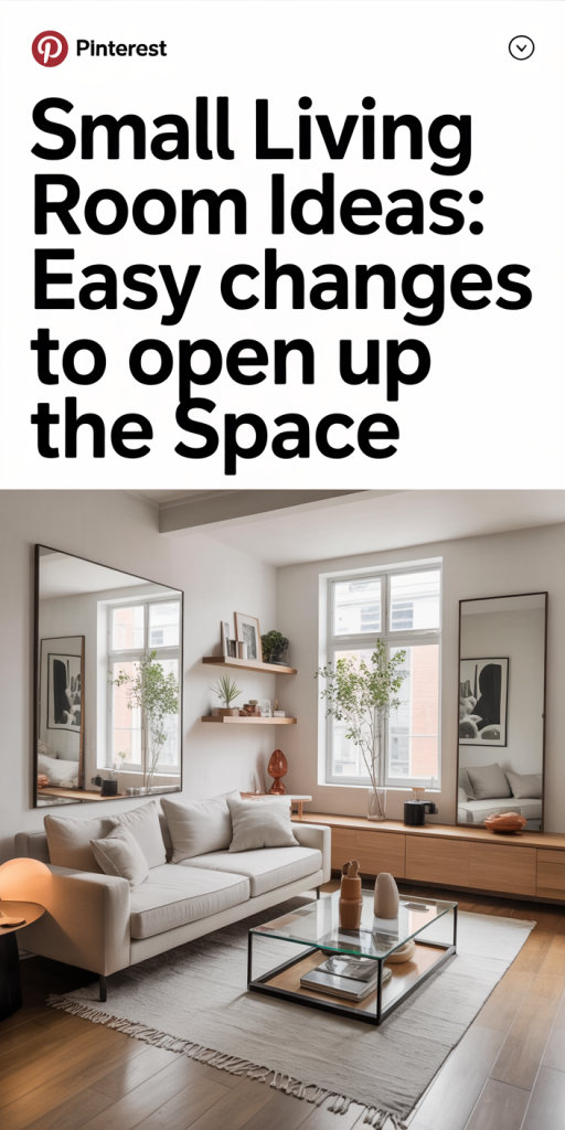
  • Small Living Room Ideas That Instantly Open Up Space: 12 Easy Changes You Can Do Today

    Small living rooms can feel like a puzzle: we want comfort, style, and storage, but every piece we add seems to make the room smaller. The good news is that a handful of smart moves, think scale, light, and strategic storage, can transform a cramped living room into one that breathes. In this guide we’ll share 12 easy, practical small living room ideas you can carry out today. These are not big renovations: they’re high-impact, low-effort changes that play to visual perception and flow. Whether we’re working with an awkward layout, low ceilings, or a tight footprint, you’ll find real-world tactics to open up the space, increase function, and keep the room feeling cozy rather than claustrophobic. Read on and pick the three changes you can do this weekend to see an instant difference.

    Why Small Living Rooms Feel Cramped (And What To Fix First)

    Before we start rearranging furniture or repainting walls, it helps to know why a room feels small. Often it’s not just square footage: perception plays a huge role. Here are the common causes and the first things we should fix.

    • Poor scale: Oversized sofas, chunky coffee tables, or too many armchairs steal visual breathing room. When furniture dominates the sightline, the room instantly feels boxed in.
    • Blocked sightlines: Too many visual barriers, tall furniture, curtains that cut off windows, or furniture placed in the middle of walkways, interrupt the eye and make space feel compartmentalized.
    • Low or uneven light: Dim corners and single overhead fixtures create pockets of darkness: our brain reads that as tighter space.
    • Clutter and mismatched storage: When storage is inefficient, things pile up on surfaces and floors, reducing perceived room volume.
    • Incohesive scale and color: High-contrast patterns, dark paint on all walls, or many competing focal points can make a space appear busier and hence smaller.

    What we fix first: start with scale and sightlines. Reducing oversized pieces and creating clear walkways gives the quickest visual payoff. After that, boost light and hide clutter, those two moves compound the effect. Think of it as triage: clear the sightlines, correct the scale, and then layer lighting and storage so the room actually functions as it looks.

    Optimize Layout And Furniture Scale

    Getting the layout right is the foundation of every small living room strategy. When we optimize furniture scale and placement for the room’s dimensions, circulation improves and the space reads as larger. Focus on proportion, negative space, and flexible pieces that match how we live.

    Choose Multipurpose And Slimline Furniture

    We should favor multipurpose pieces and slimline silhouettes in a small living room. Here are actionable choices that keep the footprint light without sacrificing comfort:

    • Slim arms and exposed legs: Sofas and chairs with narrow arms and visible legs create more visual air beneath furniture, making floors feel continuous.
    • Narrow-profile sofas or apartment-sized loveseats: These offer seating without dominating the floor plan.
    • Nesting or stackable side tables: They tuck away when not needed and expand for guests.
    • Lift-top or ottoman coffee tables: Provide hidden storage and surface when required.
    • Wall-mounted or floating media units: Free up floor space and reduce bulk: we can route cables behind the wall or use slim cable covers.
    • Murphy or wall beds for studio setups: If the living room doubles as a guest room, a fold-away bed keeps the daytime footprint minimal.

    Think in terms of “less visual mass.” A slim console table or a pair of armless occasional chairs can provide the same function as heavier pieces while preserving openness. When in doubt, pick the piece with thinner profiles and dual functions.

    Arrange For Flow, Sightlines, And Conversation

    How we arrange furniture shapes the room’s perceived size. We want clear pathways, uninterrupted sightlines, and seating that encourages conversation without crowding the center. Try these configuration rules:

    • Anchor, don’t block: Place larger pieces against walls when possible to keep the center open. If the room is oddly shaped, angle a sofa slightly to create the illusion of depth.
    • Leave walkways: Maintain at least 24–30 inches for primary walkways: narrower paths look cramped and interrupt flow.
    • Floating arrangements: In small rooms, pulling furniture a few inches away from the wall can create a sense of depth, just don’t cut off circulation.
    • Visual triangles: Arrange three points of interest (sofa, armchair, media or fireplace) to form a triangle, this feels balanced and draws the eye around the room.
    • Zone with rugs and lighting: Use a rug the right size (at least the front legs of main seating on the rug) to define a seating area without shrinking it. Lighting zones (floor lamp + table lamp) guide the eye upward and outward.

    We should also avoid forcing symmetry when the room is small, asymmetrical groupings often feel more relaxed and spacious. Finally, always test a layout: tape out furniture footprints on the floor before you move heavy pieces. It saves time and prevents mistakes.

    Maximize Light: Natural And Artificial Strategies

    Light is one of the fastest ways to make a small living room feel larger. Our eyes interpret illuminated space as more expansive, so we should optimize both natural and artificial light.

    Natural light tactics:

    • Keep windows unobstructed: Replace heavy drapes with sheer or light-filtering panels mounted high and wide, hung close to the ceiling and extending past the window frame makes the window feel larger.
    • Trim outdoor obstructions: If trees or bushes block sunlight, consider selective pruning to increase daylight.
    • Reflective surfaces: Place mirrors opposite windows or use glossy finishes on a side table to bounce light into darker corners.

    Artificial light tactics:

    • Layer lighting: Combine ambient (overhead), task (reading lamps), and accent lighting (wall sconces or picture lights). Layering prevents one dark spot from shrinking the room.
    • Use wall-mounted fixtures: Sconces free up floor and table space while lifting the eye.
    • Choose warm-bright bulbs: Aim for 2700–3000K for a cozy tone but higher lumens for adequate brightness, use dimmers so we can modulate ambiance.
    • Up-light with floor lamps: A slender floor lamp that directs light upward visually increases ceiling height.

    Color and finish also influence perceived brightness. A light-reflective paint sheen (eggshell rather than matte) and a soft, pale palette will help light travel farther across the room. Small changes, like swapping a heavy curtain for a sheer panel and adding a mirror, can dramatically change how open the space feels.

    Smart Storage That Hides Clutter Without Closing In The Room

    Clutter steals space even when it doesn’t occupy square footage. Our goal is storage that hides the mess while preserving openness. Smart storage keeps surfaces clean, simplifies the visual field, and supports an airy atmosphere. Below are practical strategies to integrate hidden storage without adding bulk.

    Built‑In, Vertical, And Low‑Profile Storage Solutions

    Built-in and vertical storage are lifesavers in small living rooms because they use wall space rather than floor space. Consider these options:

    • Built-in shelving around a media wall: Custom cabinetry can tuck electronics, books, and baskets behind doors while keeping the visual line continuous. If custom is out of budget, modular wall systems give a similar effect.
    • Floor-to-ceiling shelving: Vertical storage draws the eye upward and provides generous storage without spreading across the floor. Use closed doors on lower sections and open shelves higher up to balance openness with hidden storage.
    • Low-profile credenzas and consoles: These provide surface area and concealed storage while keeping sightlines low: they’re ideal under windows or behind sofas.
    • Multipurpose ottomans and benches: Choose seating with internal storage for blankets, magazines, or remote controls.
    • Slim wall hooks and pegboards: For entry-adjacent living rooms, vertical hooks keep coats and bags off chairs and floors.
    • Floating shelves with baskets: Open shelves maintain an airy feel: baskets or decorative boxes hide clutter without a heavy cabinet.

    We should pick storage that complements the room’s lines, low, horizontal pieces can make the space feel wider, while vertical pieces make ceilings read taller. Wherever possible, conceal frequently used items (remotes, chargers, kids’ toys) behind doors or in drawers so tabletops stay clean and the room feels orderly.

    Quick Styling Tips That Visually Open The Space

    Styling choices amplify everything else we do. Small tweaks in color, mirror placement, and accessory scale can dramatically change perceived room size. These quick styling tips are easy to carry out and deliver fast results.

    • Keep larger color fields light: Paint or large fabrics in a light, warm neutral help surfaces recede. Reserve darker or saturated tones for small accents, not entire walls.
    • Use a single, continuous floor material: A consistent floor surface, hardwood, laminate, or a single carpet, avoids chopping the room into visual fragments.
    • Create vertical emphasis: Tall plants, floor-to-ceiling curtains, or vertical stripes direct the eye upward and make ceilings feel higher.
    • Reduce the number of focal points: One or two clear focal areas (a media wall, a fireplace, or a gallery wall) prevent visual competition and make the room feel cohesive.
    • Choose a few larger accessories over many small ones: A single sculptural vase, a showpiece lamp, or a large piece of art will feel less cluttered than an array of small objects.

    We should also be ruthless about editing, if an accessory doesn’t serve a purpose or contribute to the calm palette, it’s okay to store it away. The goal is to present a relaxed, intentional space, not a staged showroom.

    Textiles, Patterns, And Accessory Rules For An Airy Look

    Textiles and patterns have outsized impact in a small living room. The right rules keep the space light and layered without adding visual weight.

    • Scale patterns to the room: Large-scale patterns on upholstery or rugs can actually make a room feel bigger than many small, busy prints. Use one dominant pattern and balance it with solids.
    • Keep textiles lightweight: Linen, cotton, and lightweight wools drape more softly than heavy velvets: they read as airier and less dense.
    • Rugs: Choose a rug that fits the seating area, too small and it fragments the space: oversized rugs that run under most furniture create visual continuity.
    • Curtains: Hang curtains close to the ceiling and extend them beyond the window frame: choose lighter fabrics and avoid heavy prints that draw the eye inward.
    • Accessory scale: Opt for a few medium-to-large accessories rather than many small ones. A single oversized mirror, a large floor plant, or a bold lamp provides presence without clutter.

    We should use patterns as punctuation, not wallpaper. A patterned throw pillow or a feature rug anchored by neutral furniture is enough to bring personality while keeping the room bright and open.

    Conclusion: A Simple Plan To Make Your Small Living Room Feel Bigger Today

    We’ve covered 12 practical small living room ideas, scale down, clear sightlines, maximize light, hide clutter, and style with restraint. To make real progress today, pick three quick wins: rearrange to open a walkway, swap heavy curtains for sheers and hang them high, and declutter visible surfaces by adding one hidden storage piece. These moves compound: better layout improves light flow, which makes storage choices more effective, and styling finishes the look. Start small, test what works, and iteratively refine, within a weekend we can create a living room that feels larger, functions better, and reflects how we live.

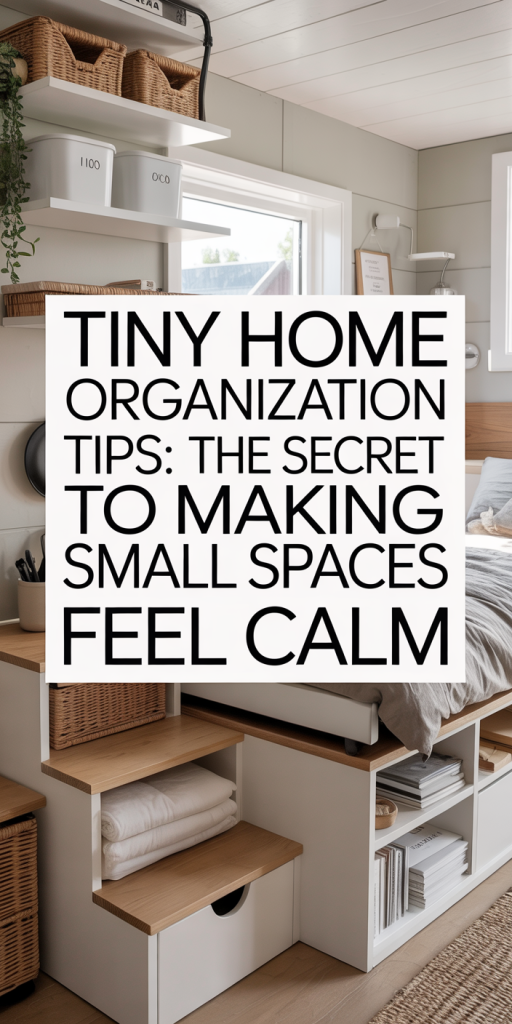
  • Tiny Home Organization Tips: How To Make Small Spaces Feel Calm — Smart Strategies For 2026

    Living small doesn’t mean living cluttered. As more of us choose tiny homes, vans, and compact apartments, the challenge becomes how to create a calm, functional environment out of limited square footage. In this guide we’ll share practical tiny home organization tips that actually work, strategies born from real experiments, design principles, and everyday habits. You’ll learn how to edit your belongings compassionately, use vertical and hidden storage, pick multi-functional furniture, and build routines that keep your space feeling serene. These aren’t trendy hacks: they’re sustainable practices tuned for 2026 living: efficient, low-stress, and adaptable. Read on and you’ll walk away with a clear plan to turn your small space into a calm home that supports how you want to live.

    Principles Of Calm Tiny Home Design

    Designing for calm in a tiny home begins with a few core principles that guide every decision we make. First: intention. Every object, surface, and layout choice should support the life we want to live, not just fill space. Second: visual quiet. Calm spaces reduce visual noise through limited color palettes, consistent materials, and a handful of meaningful items rather than many competing ones. Third: clear pathways. Even small homes need unobstructed movement: a clear circulation path makes a place feel larger and less stressful. Fourth: adaptability. Our needs change, work zones, sleep arrangements, and storage demands vary, so flexible solutions matter.

    We also prioritize sensory balance. Calm isn’t only visual: it’s about sound, texture, and air. Soft textiles, warm lighting, and a few plants can offset hard edges and compact proportions. Finally, ecosystem thinking: storage and organization must be part of daily routines. A well-placed drawer is worthless if we don’t maintain it. When we apply these principles consistently, small spaces stop feeling squeezed and start feeling intentional, quiet backdrops that let life happen with less friction.

    Declutter Strategically: What To Keep, Donate, And Store

    Decluttering is the foundation of calm in tiny homes, done right, it frees space and reduces decision fatigue. But decisive editing can be emotionally charged, so we approach it with structure and compassion. Begin by sorting items into three categories: keep (daily-use essentials and things that bring clear joy), donate/sell (items in good shape that we no longer need), and store (seasonal or infrequent-use pieces). Use a timer: work in 20–30 minute sessions to avoid burnout, and tackle one zone at a time, kitchen drawers, then clothing, then paperwork.

    Be honest about frequency of use. If we haven’t used something in six months and it’s not seasonal or sentimental, it probably doesn’t belong in a tiny home. Photograph sentimental items before letting them go: a digital memory often preserves value without taking physical space. For things we decide to store, choose compact, labeled containers and a single, designated storage spot, scattered boxes defeat the purpose. Finally, set realistic disposal plans: schedule donation pickups or drop-offs so items leave quickly. The faster things exit the home, the sooner we feel the benefit.

    How To Edit Your Belongings Quickly And Compassionately

    Editing doesn’t have to be brutal. We use a blend of objective criteria and gentle techniques to move fast without regrets. Start by asking three quick questions for each item: Have I used it in the last six months? Do I own an adequate replacement? Does it add meaningful value or joy? If the answer is no to two or more, it’s a candidate to leave. Keep decision rules simple to avoid second-guessing.

    Use compassion, not shame. Many of us hold items for complex reasons, memory, guilt, or imagined future use. We acknowledge those feelings, then separate the memory from the object: photograph, write a note, or keep a single representative item rather than the whole set. If parting is hard, box items for a ‘maybe’ period (30–90 days) and store the box out of sight: if we don’t open it, we donate the contents. Editing quickly requires momentum, play upbeat music, set a timer, and celebrate small wins. Editing well is less about ruthless minimalism and more about aligning possessions with present needs.

    Rotation, Seasonal Storage, And The One-In/One-Out Rule

    Rotation and seasonal storage let us keep tiny homes functional year-round without overcrowding. We maintain a compact seasonal kit: off-season clothing in vacuum bags, holiday décor in slim bins, and bulky outdoor gear in a dedicated loft or external storage locker when possible. Label bins clearly and list contents on the lid, so we can find things without unpacking several boxes.

    The one-in/one-out rule is simple but powerful: when we bring a new non-essential item home, we remove one similar item. It prevents slow accumulation and creates a built-in decision moment, do we actually need this new thing? For families sharing a tiny home, make the rule household policy so everyone follows the same standard.

    Rotation also extends to daily-use items. Keep frequently used kitchen tools within reach and move specialty gadgets to labeled storage. Every 3–6 months, do a quick scan: if stored items haven’t been needed, consider donating them. That ongoing pruning keeps our small space from becoming a storage museum and helps maintain the calm we built during the initial declutter.

    Maximize Vertical And Hidden Storage Without Clutter

    When floor area is precious, vertical and hidden storage are our best friends. Think upward: tall cabinets, floor-to-ceiling shelving, and wall-mounted racks free the floor and create the illusion of height. Use slim, deep shelves for books and décor, and reserve open shelving for items that contribute to calm: too many exposed items read as clutter. Integrate closed cabinetry lower down to keep visual lines tidy.

    Hidden storage, under-bed drawers, toe-kick drawers beneath kitchen cabinets, bench seating with internal bins, keeps necessary items accessible but out of sight. We also repurpose unexpected vertical zones: the back of doors for shoe or accessory organizers, the side of kitchen islands for spice rails, and high narrow shelves for light seasonal items. Magnetic strips and pegboards on walls organize tools, utensils, and craft supplies without bulky containers.

    When installing vertical systems, maintain balance and proportion. Heavy items should sit lower for safety and visual anchoring. Use consistent hardware and finishes to create cohesion. The goal is functional density: holding more without making the space feel crowded or chaotic.

    Multi-Functional Furniture And Thoughtful Zoning

    In tiny homes, every furniture piece should earn its place. Multi-functional furniture multiplies usefulness: beds with storage drawers, fold-down desks, sofa beds, and tables with nesting chairs. When selecting pieces we ask, what does this do at minimum three times per day or significantly improve our comfort? If the answer is no, we look for alternatives.

    Thoughtful zoning lets us define purpose within compact footprints. Rather than rigid rooms, we create zones: a sleep zone, a work/desk nook, a dining/meal zone, and a relaxation area. We define zones with furniture arrangement, rugs, lighting, and subtle visual cues like shelving orientation. Zoning helps the brain categorize activities, which reduces cognitive load and supports calm.

    We also favor pieces that collapse or reconfigure: drop-leaf tables expand for guests then tuck away: murphy beds free daytime floor space: rolling carts serve as mobile prep stations or office storage. Investing a bit more in a convertible, high-quality piece often pays off through years of efficient use and fewer replacements.

    Choosing Convertible Pieces And Defining Flexible Zones

    Choosing the right convertible pieces requires honest assessment of daily routines. We start by mapping how we use the space across a typical day: when we work, cook, socialize, and sleep. From that map we identify when areas need to transform. For instance, a daytime work area that converts to an evening dining spot benefits from a small folding table and a chair that stacks or tucks away.

    When picking convertible pieces, check durability and ease of transition. Mechanisms should be smooth and secure, annoying hardware kills the usefulness of convertible furniture. Evaluate weight (lighter options are easier to move) and storage footprint when folded. For zoning, use rugs to anchor areas, and adjust lighting layers, task lights for work, warm ambient lights for relaxation. Open shelving can act as a soft divider between zones while providing storage. The net effect: flexible zones let one small space do many jobs, and when transitions are quick and intuitive, the home stays calm rather than feeling like a compromise.

    Smart Organization Systems, Habits, And Routines

    Organization systems are only as good as the habits that support them. We pair built-in systems with daily and weekly routines that keep maintenance low-effort. Start with clear homes for everything, every item should have a named place. Use labeled containers, drawer dividers, and consistent trays so returning things becomes instinctive. For visible surfaces, adopt a one-minute rule: if a flat surface has something out of place, spend one minute returning items to their zones.

    Create low-friction routines: a five-minute tidy before bed, a weekly 20-minute surface reset, and a monthly inventory of stored bins. Use checklists during season changes to rotate clothing and swap storage. Digital reminders help until routines feel automatic: calendar blocks for decluttering sessions or seasonal swaps reduce procrastination.

    We also use habit stacking, attach a small organization habit to an existing daily routine. For example, after morning coffee we put away any dishes left out: after showering we spot-check the laundry basket. Habit stacks make maintenance frictionless. Eventually, organization in tiny homes is less about perfect systems and more about reliable tiny actions that prevent disorder from accumulating.

    Use Color, Light, And Texture To Create A Calm Atmosphere

    A calm tiny home is more than tidy storage, it’s an atmosphere crafted with color, light, and texture. We favor cohesive, restrained color palettes that visually expand space: warm neutrals, soft pastels, or monochrome schemes with a single accent hue. Light colors reflect more light and reduce visual busyness, but contrast and accents add personality without clutter.

    Layered lighting is crucial. Combine ambient light (overhead fixtures), task lighting (under-cabinet strips, reading lamps), and accent lights (LED strips, small spotlights) to control mood. Dimmable fixtures let us shift energy from productive daytime to relaxed evening. Natural light is a premium, keep windows unobstructed, use lightweight window treatments, and place mirrors strategically to bounce daylight into darker corners.

    Texture softens compact proportions. Introduce tactile elements, wool throws, woven baskets, linen curtains, to add warmth and depth without adding objects. Choose materials intentionally: built-in wood tones, matte metals, and fabric finishes that coordinate across zones. The goal is a curated sensory experience: calm, tactile, and visually cohesive, where every element earns its place.

    Conclusion: Maintain Calm In Your Tiny Home Long Term

    Sustaining calm in a tiny home is an ongoing practice, not a one-time project. By following core design principles, decluttering with compassion, maximizing vertical and hidden storage, choosing multi-functional furniture, and building simple daily routines, we create a resilient system that supports calm living. Remember: small, consistent actions, one-in/one-out decisions, a five-minute nightly tidy, seasonal rotation, deliver the biggest returns.

    As we move through 2026, flexibility and intention are our best tools. Tiny home living asks us to be deliberate about what matters and to design spaces that reflect that clarity. Adopt these tips, adapt them to your rhythms, and you’ll find a small space can feel expansive, slow, and calm, exactly what home should be.

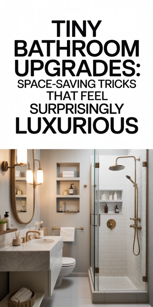
  • Tiny Bathroom Upgrades That Feel Surprisingly Luxurious: Space-Saving Tricks For Big Impact In 2026

    We’ve all stood in a cramped bathroom and wished for more elbow room, without a full renovation. In 2026, smart design and a few targeted upgrades let us reclaim space and add real luxury without gutting walls or blowing the budget. This guide walks us through a quick audit to find the highest-impact swap, shows fixtures that save space while feeling high-end, and outlines storage, lighting, and finish tricks that visually expand a small bathroom. We’ll focus on solutions that are easy to execute, proven to work in tight footprints, and deliberately chosen to give a luxe feel: tactile finishes, layered lighting, clever storage, and fixtures that read premium. Read on and you’ll walk away with a prioritized plan, what to change first, what to save for later, and how to make every square inch feel bigger and more refined.

    Quick Audit: How To Identify The Highest-Impact Space Savings

    Before we buy a single fixture or hang a new mirror, we do a quick audit to find the highest-impact interventions. Start by mapping the circulation path: draw the outline of the room and mark the door swing, access to the toilet, sink, and shower. Note obstructions, towel racks, laundry baskets, storage towers, that interrupt sightlines and movement. Measure the clearances: typical minimums are 21 inches in front of a toilet and 24 inches for a sink, but in tight spaces we look for opportunities to reclaim every inch.

    Next, classify items by impact and cost: “low cost/high impact” (decluttering, changing door swing, adding a mirror), “medium” (slimline vanity, wall-mounted toilet), and “high” (moving plumbing, replacing tub with shower). We prioritize low-to-medium changes first: they often yield the biggest perceived gain for the least disruption.

    We also check vertical space. Many small baths have wasted height above doors, toilets, or beside mirrors. Measuring wall height and noting usable vertical zones helps us plan for recessed niches, tall cabinets, and layered lighting. Finally, take photos from the doorway and standing in the room, the camera exaggerates scale and highlights awkward shadows. Those images guide what to change to create a more open, luxurious feel.

    Space-Saving Fixtures That Actually Feel Luxurious

    Choosing the right fixtures is where small bathrooms transform from cramped to curated. We want pieces that reduce footprint while reading upscale, clean lines, tactile materials, and smart proportions. Below are specific fixtures that deliver space savings and a luxe presence.

    Wall-Mounted Toilets, Slimline Vanities, And Floating Sinks

    Wall-mounted toilets free floor space and create a continuous visual plane, making the room feel larger. We opt for a concealed in-wall tank system with a slim flush plate: modern designs come with soft-close seats and quiet flush mechanics so they don’t sacrifice comfort for compactness. Slimline vanities, 12–18 inches deep rather than the standard 21–24, give us sink space and under-shelf storage without projecting into circulation paths. Pairing a slim vanity with a floating sink or wall-hung basin clears the floor visually and makes cleaning easier. For a luxury touch, choose a stone or solid-surface top with an integrated trough sink or a matte, low-porosity finish.

    Compact Shower Solutions And Space-Saving Bathtub Alternatives

    In small bathrooms, showers often win for spatial efficiency. Curbless, corner, or neo-angle showers reduce required footprint and improve accessibility. We like frameless glass to minimize visual barriers, the clearer the glass, the less the shower interrupts the room. When a tub is non-negotiable, consider a Japanese soaking tub or a shorter alcove tub that’s deeper but takes less floor length: these feel indulgent without demanding a long bay. Another trick: a wet-room approach with a single drain can visually expand the space, but requires good waterproofing and slope planning. For luxury, choose large-format tile on the shower wall, a rain-head plus hand shower combo, and a built-in niche with accent lighting for a salon-like finish.

    Smart Storage Strategies For A Clutter-Free, High-End Look

    Storage is the difference between a tight room and a tranquil retreat. We aim for solutions that eliminate countertop clutter, keep essentials out of sight, and use dead zones effectively. The goal is a clean, high-end aesthetic where every item has a home.

    Vertical, Recessed, And Corner Shelving To Reclaim Floor Space

    When floor space is scarce, vertical is our friend. Tall, shallow cabinets take advantage of height without intruding into the room. Recessed medicine cabinets and shelving are especially valuable: they add storage within the wall cavity and produce flush surfaces that feel custom. Corner shelving, either fixed glass tiers in a shower or built-in wood/stone shelves in the vanity area, uses otherwise wasted niches. Open vertical shelving above the toilet is a classic move, but we prefer closed cabinetry or baskets to maintain a serene, hotel-like look.

    Multi-Functional Fixtures, Hidden Organizers, And Towel Storage

    We prioritize multi-functional solutions: vanities with integrated laundry hampers, mirrored cabinets with built-in lighting and electrical outlets, and drawers with removable inserts for grooming tools. Hidden organizers, pull-out trays, toe-kick drawers, and sliding trays behind mirrors, make small storage highly usable. For towels, wall-mounted heated towel rails double as drying and warming units without bulky towers: towel rings, hooks, and recessed rails near the shower reduce the need for freestanding storage. Every organizer should be specified by function: shaving tools near the mirror, daily toiletries in the top drawer, less-used items higher up. That intentionality yields the decluttered, luxury feel we want.

    Light, Mirror, Surface, And Finish Tricks To Visually Expand And Elevate

    Beyond fixtures and storage, finishes and lighting shape perception of space. We use reflective surfaces, layered lighting, and contrasting textures to create depth and a sense of scale. The aim is to make the room look and feel larger while reading polished and intentional.

    Layered Lighting, Mirror Placement, And Reflective Surfaces

    Layered lighting is non-negotiable: ambient overhead, task lighting around mirrors, and accent lights in niches create hierarchy and soften shadows. We prefer a dimmable overhead fixture or recessed LEDs with a warm color temperature (2700K–3000K) combined with vertical wall sconces flanking the mirror to reduce facial shadows. Large mirrors instantly double perceived space by reflecting the room and bouncing light: mounting a mirror across the vanity or installing a full wall mirror can transform a tiny bathroom.

    Reflective finishes amplify light. Glossy subway tile or a calibrated metallic accent wall behind the vanity adds glamour and depth, while large-format tiles with minimal grout lines visually expand surfaces. Matte countertops paired with polished fixtures create a tactile contrast that feels premium. We also use consistent grout tone and minimal transitions between wall and floor to avoid visual breaks that shrink the space. Finally, choosing monochromatic or near-monochromatic palettes with a pop of texture, natural stone, fluted cabinetry, or a woven wall panel, keeps the look layered and luxurious without cluttering the eye.

    Conclusion

    Small bathrooms don’t require grand structural changes to feel luxurious. By auditing the space, prioritizing interventions, and selecting space-saving fixtures, smart storage, and refined finishes, we turn constraints into design strengths. Start with a short list: wall-mounted toilet or slimline vanity, improved lighting and a larger mirror, and a few hidden organizers, those three moves alone deliver noticeable breathing room and an elevated look. As we plan, we stay deliberate: measure twice, choose finishes that reflect light, and prioritize usability. With focused upgrades, a tiny bathroom can feel calm, expansive, and surprisingly luxurious, even in 2026.

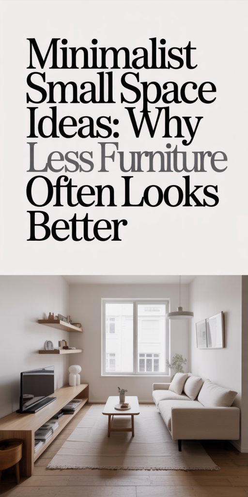
  • Minimalist Small Space Ideas: How Less Furniture Creates Bigger, Calmer Rooms In 2026

    We’ve all felt the squeeze of a small apartment or a cozy home office: too many pieces, too little breathing room, and a constant visual noise that makes the space feel smaller than it is. In 2026, minimalist small space ideas aren’t about austerity, they’re about choosing the right things, placing them well, and letting light, proportion, and purpose do the heavy lifting. In this guide we’ll explain why less furniture often looks better in small rooms, the design principles to follow, how to pick pieces that disappear visually, layout tactics that boost flow, and practical styling and budget tips you can use this weekend. Expect clear examples, simple rules of thumb, and a checklist to keep your small spaces feeling larger, calmer, and more intentional.

    Why Less Furniture Often Looks Better In Small Spaces

    When we remove furniture, the most immediate change is visual, open sightlines and uninterrupted floor area trick the eye into perceiving more room. But the effect goes deeper than that. Less furniture reduces cognitive load: our brains don’t have to process as many objects, patterns, or competing focal points, so the space feels calmer. In small rooms, every object competes for attention. A single bulky sofa, an ornate side table, and an oversized rug create visual clutter even if they technically fit.

    We should also think in terms of negative space. Empty floor and wall areas are design elements in their own right: they give surrounding pieces room to breathe and emphasize their shape and function. The result isn’t minimalism as a cold aesthetic, but minimalism as spatial clarity: each remaining piece looks intentional, proportional, and valuable. That’s why less furniture often looks better, it amplifies what’s left and creates a sense of order.

    Finally, less furniture improves flow and flexibility. If we keep fewer fixed pieces, the room can adapt to different activities (work, dining, relaxing) without a complete reconfiguration. In short, removing nonessential items is a force multiplier: it increases perceived size, reduces stress, and makes the space more usable.

    Core Principles Of Minimalist Small‑Space Design

    Minimalist small-space design rests on a few repeatable principles. If we internalize these rules, we can make confident choices instead of guessing.

    • Prioritize scale and proportion over trend. Small spaces need furniture sized for the room: compact, lower-profile pieces often work better than scaled-down versions of luxury items.
    • Emphasize sightlines and negative space. Avoid placing tall, solid pieces in the center of view corridors. Let light travel through.
    • Choose multi-functionality. Each item should ideally serve more than one purpose.
    • Use color, texture, and contrast sparingly to create depth without noise.

    We’ll unpack two of these principles next, scale, proportion and visual weight: and negative space, light and sightlines, since they’re the foundation of everything else.

    Choosing Multi‑Functional Furniture That Disappears

    Multi-functional furniture is the backbone of effective small-space living. But not all multi-purpose pieces are created equal: the best ones ‘disappear’ visually and functionally when not in use.

    Look for furniture that performs multiple roles at once: a storage ottoman that’s also a coffee table, a sofa bed with a slim profile, nesting tables that tuck away, or a wall bed with integrated shelving. The trick is to prioritize pieces with clean lines and neutral finishes so they blend into the room’s background when idle. Avoid overly mechanical or bulky mechanisms: they draw the eye.

    Materials matter. Lightweight frames in metal or walnut veneer often read less imposing than solid block pieces. Upholstery in mid-tone neutrals hides wear without calling too much attention. We recommend choosing one anchor piece (a sofa or bed) and then building flexible layers around it: stackable stools, a slim console that doubles as a desk, and lighting that clips or straps rather than standing fixtures.

    Finally, think about storage as furniture. Wall-mounted cabinets and open shelving keep things off the floor. When storage is integrated and stylistically consistent, the room feels tidy and breathable, the best kind of invisibility.

    Layout Strategies To Maximize Flow And Perceived Space

    A thoughtful layout makes the difference between a cramped room and a roomy-feeling one. Layout is less about filling space and more about choreographing movement: where we enter, how we move, and where activities happen.

    Start by mapping activities: sleeping, working, eating, relaxing. Place the largest piece for each activity first, then arrange secondary pieces to support it without blocking paths. In studio apartments, orient the bed so it’s not the first thing seen from the entrance: a low bookshelf or a curtain can create a subtle visual partition without closing the room off.

    We should allow 30–36 inches of circulation in primary pathways and 18–24 inches around seating and tables for comfort. Floating furniture away from the walls can actually increase perceived depth, it creates space behind objects so light and shadow give the room dimensionality. Conversely, too many pieces pushed tightly against walls create a museum-like, static feel that can read smaller.

    If we must place a TV, mounting it on the wall saves floor space and avoids creating a large visual mass. Use thin area rugs to anchor zones rather than large rugs that swallow the room. Small changes in furniture placement can unlock an otherwise suffocating layout, so experiment with temporary solutions (folding chairs, cushions) before committing to heavy purchases.

    Color, Texture, Decluttering, And Smart Storage

    Color and texture give personality while decluttering and storage keep that personality readable. We approach color like a three-tone outfit: a dominant neutral, a secondary mid-tone, and one accent. Neutral walls (soft whites, warm greys, pale taupes) reflect light and act as a forgiving backdrop. Add mid-tone furniture and a single accent color in soft furnishings to create depth.

    Texture replaces visual clutter. A boucle pillow, a wool throw, or a woven basket adds tactile interest without introducing more objects. We use texture strategically to make minimalist spaces feel warm and layered.

    Decluttering is ongoing. Adopt a one-in-one-out rule for small spaces: when a new item comes in, reassess something else. Regularly audit surfaces: clear them every few weeks so visual boundaries remain sharp. Smart storage makes minimalism sustainable: under-bed drawers, vertical built-ins, and furniture with hidden compartments keep essentials accessible yet out of sight.

    Label containers, keep daily items at arm’s reach, and slow the accumulation of decorative objects. When everything has a place, the room reads as intentional rather than sparse.

    Practical Styling Checklist, Common Mistakes, And Budget Shopping Tips

    Practical Styling Checklist

    • Start with a single anchor piece and plan the rest around scale.
    • Keep visible surfaces to one or two curated items (lamp + plant, tray + book).
    • Use legs-on furniture to reveal floor area.
    • Limit palette to three colors and vary texture instead of adding more hues.
    • Invest in flexible lighting: dimmers, layered lamps, and adjustable wall sconces.

    Common Mistakes to Avoid

    • Buying furniture that’s too large because it ‘fills’ the space, oversized items can shrink perception.
    • Matching everything exactly: too much uniformity can be boring. Mix materials subtly.
    • Ignoring storage needs: storage solves more layout problems than decoration.
    • Over-committing to trends that add visual complexity (heavy patterns, ornate frames).

    Budget Shopping Tips

    We can make a tight budget work. Look for secondhand mid-century pieces with simple lines: they often have smaller proportions and quality construction. Floating shelves, modular shelving cubes, and flat-pack console tables give high impact at low cost. Thrift stores and local marketplaces are great for lamps and small side tables. When buying new, prioritize key functional pieces (a good sofa or mattress) and save on accessories. Finally, try DIY paint or reupholstery to refresh older items rather than replacing them.

    Conclusion

    Less furniture isn’t about stripping a room bare, it’s about making deliberate choices so what stays matters more. By honoring scale, maximizing negative space, choosing invisible multi-functional furniture, and organizing with intent, we can make small rooms feel larger, calmer, and more adaptable. Start with one area: remove one oversized piece, add a storage solution, or reorient your layout. Small, thoughtful changes compound quickly. In 2026, minimalist small space ideas mean living smarter, not emptier, and the payoff is a home that looks and feels like it breathes.

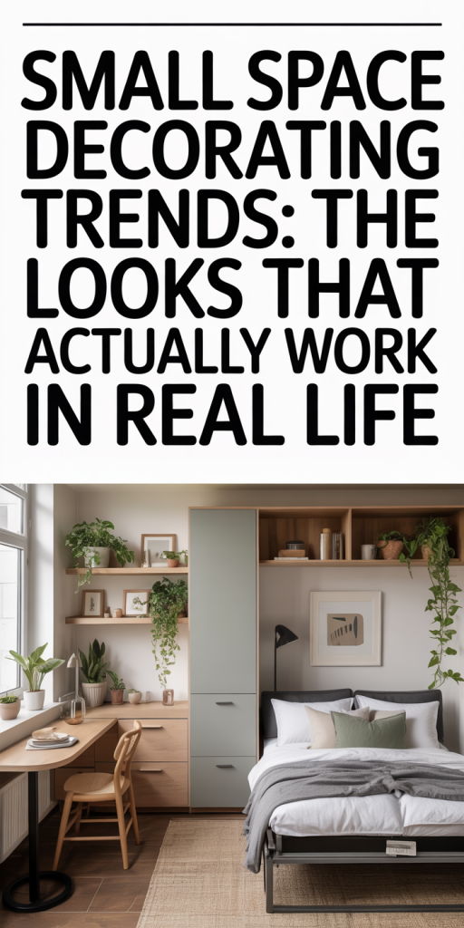
  • Small Space Decorating That Actually Works: 2026 Trends, Tricks, and Real-Life Looks

    Living small doesn’t mean living without style. In 2026, the smartest small space decorating blends clever engineering with quiet aesthetics so our homes feel roomy, functional, and distinctly ours. In this guide we’ll walk through the core principles that make compact rooms work, the furniture choices that save space without sacrificing style, and the color, pattern, and material tricks that expand visual space. We’ll also cover storage that doubles as design and lighting, layout, and zoning strategies that create flow and function. Expect practical, real-world solutions you can carry out this weekend, no hero-level DIY required.

    The Core Principles That Make Small Spaces Work

    When we talk about small space decorating, we’re really talking about problem-solving. The core principles below form the foundation for every successful compact home: clarity of purpose, prioritized function, visual continuity, and intentional editing.

    Clarity of purpose: Every zone should have a clear job. Is that corner for reading, working, or displaying plants? When we decide purpose first, furniture and accessories follow, and the space stops feeling like it’s trying to do everything at once.

    Prioritize function: We always ask: which items do we use daily? Those stay. The rest go in storage. That instinct keeps surfaces clear and reduces visual clutter, arguably the single most effective thing we can do to make a space feel larger.

    Visual continuity: Using a consistent color palette and repeating a few materials (wood tone, brass, matte black) helps the eye move across a room without frequent stops. That continuous visual flow tricks the brain into reading a small footprint as more cohesive and hence larger.

    Intentional editing: We’re ruthless about editing accessories. A handful of well-chosen objects, art, and plants read as curated: lots of small, mismatched items read as clutter. We recommend rotating decorative items seasonally, storing rather than displaying everything at once.

    Circulation and negative space: Allow breathing room around furniture. Narrower clearances can work (28–30 inches for major pathways) but we avoid cramming furniture lengthwise against every wall. Negative space, the empty areas, becomes a design element that gives the eye places to rest.

    Vertical thinking: Small footprints demand vertical solutions. Wall-mounted storage, tall narrow shelving, and window-hugging planters reclaim floor area. We also think vertically for sightlines: drawing the eye upward with tall art or crown molding adds perceived height.

    Flexibility as a rule: Finally, we design for change. Our needs evolve, guest needs, work-from-home demands, or new hobbies, so the best small spaces are inherently adaptable. When we choose pieces that can multitask or be reconfigured, our homes remain functional without constant upheaval.

    Smart Furniture Choices That Save Space Without Sacrificing Style

    Choosing furniture for a small space is about economies: the more utility per square inch, the better. We focus on multipurpose pieces, proportionate scale, and seating that adapts to different scenarios.

    Multipurpose And Modular Pieces

    Multipurpose furniture is the backbone of small space decorating. We favor sofas with hidden storage under cushions, ottomans that become coffee tables or extra seating, and bench seating with drawers beneath. Convertible beds, murphy beds and daybeds with trundles, are classic moves, but in 2026 we’re also seeing fold-away desks that tuck into credenzas and wall beds with integrated shelving that look custom-built.

    Modular seating is another big win. A set of lightweight modular ottomans or sectional pieces can be pushed together for a movie night and dispersed for a dinner party. The advantage is twofold: versatility and the ability to scale the layout to the occasion. We prefer modulars on casters or with handles so we can move them without dragging heavy furniture across floors.

    Scale, Clearance, And Flexible Seating

    Scale matters as much as style. Oversized furniture overwhelms: too-small pieces look insubstantial. We measure thoughtfully: a sofa should provide comfortable seating without blocking flow, and tables should allow about 18–24 inches from chair seat to tabletop edge. Clearances are practical: maintain a 28–30 inch main path and at least 18 inches between a sofa and coffee table for easy movement.

    Flexible seating options, stackable chairs, nesting stools, and slim-profile benches, let us add capacity without permanent bulk. We also love fold-flat furniture for guests: a compact folding dining table or chairs that stow in a closet are lifesavers for those who entertain intermittently.

    Material choices play into perceived weight. Lighter visual weight, open legs, streamlined frames, and upholstery with vertical seams, reads less heavy than solid blocky silhouettes. Glass-topped tables and acrylic chairs are stylistic tools that reduce visual mass while keeping a room functional.

    When we buy, we ask three questions: does it serve more than one purpose? Does it fit the circulation? Will it feel heavy in the room? If the answer to any is no, we keep looking.

    Color, Pattern, And Material Tricks To Expand Visual Space

    Color and materials are our optical tool kit. The right combinations can lighten a room, add depth, and create the impression of scale beyond the actual square footage.

    Start with a cohesive base: a restrained palette of two to three colors. Soft neutrals, warm greige, ivory, or muted sage, still dominate because they reflect light and simplify the visual field. But 2026 trends show color confidence: instead of painting every wall white, we’ll often paint one wall in a saturated tone (deep teal, terracotta, or inky blue) to create perceived depth when paired with lighter surrounding walls.

    Use accents strategically. Patterned rugs, small-scale wallpaper on a narrow wall, or a textured fabric can add personality without overwhelming. We stick to scale rules: larger patterns feel proportionate in larger rooms, while small-scale, repeated motifs are better in compact spaces. A geometric or diamond pattern rug in a neutral palette can visually lengthen a room when placed longitudinally.

    Create contrast with materials. Mixing matte brass with warm wood and matte black hardware creates layers that feel intentional. Reflective surfaces, mirrors, gloss trims, and metallic accents, bounce light and open sightlines. One of our favorite tricks: flank a window with narrow mirrors instead of solid art to amplify natural light and extend the view.

    Ceilings and trim: Paint ceilings a shade lighter than walls to heighten perceived volume. Alternatively, paint the ceiling a bold color to make a low room feel purposefully cozy. Thin crown molding painted the same as the wall draws the eye upward without creating a visual break.

    Rugs for proportion: A correctly sized rug anchors a seating area: too small and it fragments the space. We aim for furniture at least partly on the rug or for rugs that extend beyond key pieces to create unified zones. Transparent or low-pile rugs keep sightlines clear and reduce visual clutter.

    Finally, texture is essential. In a small space we can’t rely on scale alone, so texture, bouclé cushions, woven baskets, and linen drapery, adds tactile depth and keeps the room interesting without increasing visual noise.

    Storage Solutions That Double As Design

    Effective small space decorating hides and showcases storage simultaneously. The best storage solutions are thoughtful, stylish, and integrated into the architecture or furniture so they feel intentional rather than an afterthought.

    Built-ins and bespoke shelving: When budget allows, built-ins transform awkward nooks into purposeful storage. A tall built-in bookshelf with closed cabinets at the base creates display opportunities above and concealed storage below. If custom isn’t possible, modular shelving systems that fit wall-to-wall offer a similar effect: we select finishes that match wall trim to maintain visual continuity.

    Multi-function furniture: We mentioned sofas with storage, but there are subtler options too: console tables with drawers that double as mail centers, beds with drawers beneath, and stair-tread storage in multi-level lofts. We often repurpose kitchen cabinetry in the living room, stacked shallow cabinets become a media wall with enclosed wiring, keeping surfaces clean.

    Open vs closed storage balance: Closed storage hides the mess but can feel heavy: open storage displays objects but requires editing. A hybrid approach works best: closed lower cabinets for items we don’t want visible, open upper shelves for carefully curated objects. We use baskets and boxes in natural materials to group smaller items on open shelves so they read as intentional styling.

    Hidden solutions: Toe-kick drawers under kitchen cabinets, pull-out pantry units, and under-sofa drawers reclaim overlooked spaces. Wall-mounted fold-down desks that close to reveal art or cabinetry are excellent in studio apartments.

    Use vertical storage strategically: Over-door organizers, high shelves for infrequently used items, and pegboard walls in entryways or kitchens create function without sacrificing floor area. In closets, we add double hanging rods and slim shelving for shoes to maximize capacity.

    Styling as a storage tactic: We make storage part of the decor, stacked woven baskets, curated book spines, and neatly folded textiles become visual features. Labels and uniform containers reduce visual clutter and help maintain the system. The psychological benefit is important: if storage is attractive, we’re likelier to use it correctly.

    Lighting, Layout, And Zoning For Flow And Function

    Lighting and layout are the connective tissue of small space decorating. Good lighting opens a room: poor lighting flattens it. Similarly, a thoughtful layout and clear zoning let us live large in a small footprint.

    Layered lighting: We always use a three-layer approach, ambient, task, and accent. Ambient light comes from overhead fixtures or well-placed floor lamps. Task lighting focuses on work areas: an adjustable desk lamp or directional pendant over the kitchen counter. Accent lighting, picture lights, LED strips behind shelving, or a small uplight, adds mood and highlights focal points. Dimmers are essential in small spaces: they allow us to change the room’s perceived size and mood instantly.

    Maximizing natural light: Keep window treatments minimal. Sheer curtains, top-mounted blinds, or no obstructions at all preserve daylight. Positioning mirrors opposite windows or on adjacent walls multiplies incoming light. When natural light is limited, increase ambient layers with warm yet bright LEDs (2700–3000K) to create an inviting, sunlit effect.

    Layout principles for flow: We arrange furniture to support primary movement paths rather than pushing everything to the perimeter. Anchoring seating around a focal point, window, fireplace, or TV, creates purpose. Avoid blocking the line from the entryway to major zones: even a small foyer rug and a slim console can define an entry without crowding.

    Zoning in open plans: Area rugs, lighting, and furniture orientation separate functions in studio or open-plan layouts. Instead of full-height dividers, we use low shelving, open bookcases, or glass partitions to delineate zones while maintaining sightlines. Channeling circulation along one side of the room keeps the central area free for flexible use.

    Acoustics and comfort: Hard surfaces amplify noise in compact spaces. Rugs, upholstered panels, and curtains help dampen sound. We incorporate soft textiles not only for comfort but to create an intimate, pleasant acoustic environment that feels larger because it’s more comfortable to inhabit.

    Technology and wiring: Concealed wiring and smart plug solutions prevent cords from becoming visual clutter. Wall-mounted TVs at ergonomic heights and integrated charging stations in consoles reduce countertop chaos. Smart lighting scenes controlled by voice or app simplify changing the mood and function of a room on the fly.

    Finally, test the layout before committing: use painter’s tape to outline furniture footprints or place boxes where large pieces will go. Living with the taped outline for a weekend often reveals obstacles we’d miss on paper.

    Conclusion

    Small space decorating in 2026 is less about fitting everything in and more about designing what truly matters. By applying core principles, clarity of purpose, visual continuity, and intentional editing, paired with smart furniture, layered materials, integrated storage, and purposeful lighting, we create compact homes that feel open, comfortable, and personal.

    Start small: pick one zone to optimize this weekend, swap a bulky table for a modular alternative, add a mirror opposite a window, or declutter and add a couple of baskets. These focused changes compound quickly. When we approach our small spaces with strategy and restraint, the result is not just functional, it’s stylish, livable, and unmistakably ours.

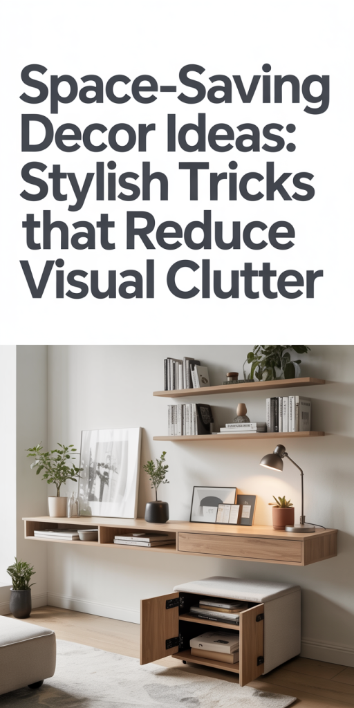
  • Space-Saving Decor Ideas: Stylish Tricks To Reduce Visual Clutter In Every Room (2026 Guide)

    Small spaces don’t have to look cramped. In fact, with the right space-saving decor ideas we can make tiny rooms feel calm, functional, and intentionally styled, not like a storage unit. This 2026 guide focuses on practical, stylish tricks that reduce visual clutter while keeping living areas usable and inviting. We’ll explain why visual clutter makes small rooms feel worse, outline core design principles, and give hands-on solutions: multifunctional furniture, vertical storage strategies, decorative containers, and smart use of color and lighting. Read on and you’ll come away with actionable ideas you can apply today, whether you’re in a studio, a narrow hallway, or a family home with tight corners.

    Why Visual Clutter Hurts Small Spaces — And How Better Design Helps

    Visual clutter is more than an aesthetic gripe: it changes how we perceive space and how we feel inside it. When surfaces are piled, walls are busy, and items are uncontained, our brains register chaos. That adds stress and makes rooms feel smaller than they are. In small apartments and modest rooms, every object competes for attention: a mismatched stack of books, cords, random décor, and overflowing furniture can fragment sightlines and make circulation feel awkward.

    Better design reduces competing elements and creates intentional focal points. Instead of trying to cram storage solutions everywhere, we prioritize a few tidy zones: a clear pathway, one accent wall, and designated storage that hides what we don’t need every day. This is where space-saving decor ideas earn their keep, they combine function with restraint. For example, selecting furniture with hidden storage or choosing consistent containers means fewer visual interruptions. The result is a space that reads as larger, calmer, and more thoughtfully curated. We’ll show practical tactics that accomplish that balance without turning your home into a minimalist showroom you can’t actually live in.

    Core Principles Of Clutter-Minimizing Decor

    Before choosing pieces, we follow a set of core principles that guide every decision and keep clutter at bay.

    1. Edit ruthlessly: The single most effective move is removing what we don’t use. Less stuff equals fewer visual interruptions. We recommend a seasonal edit, quarterly quick passes to purge and rehome extras.
    2. Group and contain: Objects that belong together should live together. Grouping reduces the visual rhythm of small items and creates tidy islands of purpose: a reading nook, a coffee station, a kid’s play corner.
    3. Prioritize multifunction: When furniture doubles as storage or a surface becomes a sculptural container, we reduce the number of standalone items that crowd a room.
    4. Consistent visual language: Choose a limited palette of materials and finishes. When baskets, trays, and furniture share tones or textures, the eye reads them as a cohesive system rather than competing pieces.
    5. Maintain sightlines and negative space: Leave breathing room around furniture and artwork. Negative space helps the eye rest and makes key pieces feel intentional instead of crowded.

    These principles inform the tactical ideas we cover next, each recommendation is meant to be combined rather than applied in isolation.

    Choose Multifunctional Furniture That Hides And Serves

    Multifunctional furniture is the backbone of most space-saving decor ideas. The right piece gives us storage without adding visual weight.

    Start with beds: lift-up platform storage or beds with built-in drawers reclaim under-bed volume that often becomes wasted. Daybeds and sleeper sofas provide seating by day and guests’ beds by night. For living rooms, ottomans with internal storage or coffee tables with drawers keep remotes, throws, and magazines out of sight but within reach.

    Dining spaces benefit from extendable tables and benches with hidden compartments. In small kitchens, a cart on casters can store prep gear and tuck against a wall when not in use. Floating desks and wall-mounted fold-down tables create work zones that disappear visually when closed.

    When selecting multifunctional pieces, watch for two pitfalls: oversized silhouettes that overwhelm the room and visible clutter inside open storage. Choose streamlined profiles in lighter finishes for small spaces, and pair hidden storage with a disciplined approach to what we store. Functionality is vital, but the goal is to reduce the number of visible objects, not replace them with bulky furniture.

    Maximize Vertical Real Estate With Smart Wall Storage

    In tight rooms, the floor is precious, we reclaim it by building up. Vertical storage shifts storage load to walls, freeing circulation and expanding perceived space.

    The trick is layering: a mix of open shelves for display, closed cabinets for hidden items, and hooks or rails for everyday essentials. Done well, vertical systems become architectural features rather than afterthoughts.

    We recommend planning height zones: lower storage for heavier, frequently used items: mid-level for reachable display: and higher shelves for seasonal or infrequent belongings. Use a step stool that tucks away to maintain access without cluttering the floor. Paint higher shelving the same color as the wall to visually push it back: contrast for lower shelves to create intentional focal points.

    Vertical storage also helps define zones in open-plan spaces. A tall bookcase with backboard can act as a divider that contains items on both sides while keeping the floor largely open. Next we’ll get specific about shelf types and overhead options that work best.

    Decorative Storage That Doubles As Art

    Storage doesn’t have to be hidden to reduce visual clutter, it can be beautiful and purposeful. Decorative storage items act like functional art, giving us contained utility while contributing to a curated aesthetic.

    Baskets woven in natural tones add warmth and texture, and grouped in sets they look intentional. Trunks serve as coffee tables and hold blankets: choose one with a low profile so it reads as furniture rather than a pile. Stylish bins and lidded boxes in matching colors unify odd-sized items and keep surfaces visually calm.

    We can also display select items in deliberate ways: a row of matching glass jars for pantry staples, or a neatly arranged stack of suitcases at the foot of a bed for a travel-inspired vignette. When we display storage, the rule is consistency, common material, color, or scale ties the composition together and prevents it from appearing chaotic.

    Decorative storage becomes especially powerful in entryways and open shelving, where it transforms necessary containment into part of the room’s design language.

    Use Color, Pattern, And Lighting To Minimize Visual Noise

    Color, pattern, and lighting are powerful tools for reducing visual clutter without removing items. A limited color palette ties a room together and reduces the number of competing focal points. We suggest choosing two dominant neutrals and one accent color: repeat them across textiles, containers, and furniture.

    Patterns should be scaled and used sparingly. In a small room, large-scale patterns can make surfaces feel busy: instead, opt for subtle textures or one patterned element like a rug or throw. Patterns that echo the room’s color palette feel cohesive rather than chaotic.

    Lighting changes perception: well-placed lights create depth and highlight key zones. Layer ambient light with task and accent lighting, a narrow floor lamp near a reading chair, under-cabinet LEDs in the kitchen, or picture lights to draw attention to a single art piece. Good lighting reduces reliance on multiple small lamps or decorative items that contribute to clutter.

    Finally, paint storage interiors the same color as their doors to disguise them when closed. When we control color and light carefully, the room feels intentionally edited instead of overwhelmed.

    Right-Size Furniture Placement, Scale, And Negative Space

    Proper placement and scale turn good pieces into great layouts. A too-large sofa or an awkwardly placed side table can break circulation and create visual crowding. We prioritize appropriately scaled furniture and deliberate spacing to preserve negative space, the unoccupied areas that let the room breathe.

    Start by measuring. Know the dimensions of your room and furniture before buying or rearranging. Leave at least 24–30 inches of clear pathway in high-traffic routes: in very tight zones, aim for a minimum of 18 inches but compensate by simplifying surrounding elements.

    Orientation matters: floating a sofa away from the wall can create an open, conversational layout, while anchoring a rug under key pieces helps define zones without extra furnishings. Use low-profile furniture to maintain sightlines: legs that expose floor beneath pieces give the impression of more space than solid bases.

    We also recommend single-purpose focal points: a statement mirror can reflect light and amplify perceived size, while a single oversized artwork creates drama without visual clutter. Resist the urge to fill every wall, negative space is an intentional design choice. In practice, right-sizing is about restraint and clarity: choose fewer, better things and position them to honor movement, light, and sightlines.

    Conclusion, Quick Takeaways and Next Steps

    We’ve covered a toolkit of space-saving decor ideas that reduce visual clutter while keeping spaces warm and functional. To start: edit belongings, invest in multifunctional pieces, build upward with vertical storage, and use decorative containers that unify rather than scatter. Pay attention to color, scale, and lighting, those subtle moves deliver big perceptual gains. Try one change this weekend: swap a messy coffee table for a storage ottoman or add a row of hooks in your entry. Small, consistent edits compound quickly, and before long, your place will feel calmer, larger, and more intentionally yours.

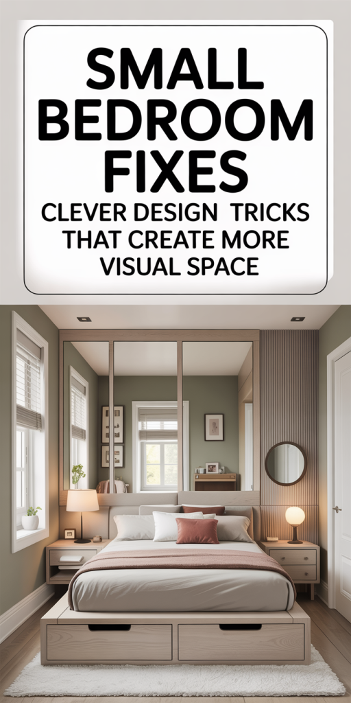
  • Small Bedroom Fixes: 15 Clever Design Tricks To Make Any Tiny Room Feel Bigger In 2026

    When a bedroom feels cramped, it affects sleep, mood, and how we use the rest of the home. We’ve learned that making a small bedroom feel larger isn’t about knocking down walls, it’s about how we design, edit, and light the space so our eyes perceive more room. This guide compiles 15 practical, contemporary tricks that work together: color, furniture choices, storage, lighting, mirrors, flooring, and daily habits. Each tactic is actionable, budget-aware, and suited to modern 2026 aesthetics, whether you’re renting, staging for resale, or finally tackling a long-postponed makeover. Read on and pick the three changes we can carry out this weekend to start seeing immediate visual gain.

    Why Visual Space Matters: Function, Comfort, And Resale Value

    Perceived space, what our eyes tell our brains, is arguably more important than square footage. When a bedroom looks open, it changes how we use the room: we sleep better, we can add a workspace or reading nook, and guests feel welcome. For homeowners, visual space impacts resale. Listings that photograph as airy and uncluttered consistently attract more views and higher offers. From an emotional standpoint, cramped bedrooms elevate stress and inhibit restful routines. Practically, small but smart design choices allow us to fit essentials without creating visual noise. That means prioritizing multifunctional furniture, streamlining patterns and colors, and preserving clear sightlines. We’ll cover solutions that increase perceived roominess without costly renovations, strategies that realtors, designers, and rental-minded owners can carry out quickly. The aim isn’t deception: it’s making the most of what we have so the room supports sleep, storage, and style. Throughout this piece we’ll balance aesthetics with function, offering tricks that look intentional rather than “small-space afterthoughts.”

    Use A Light, Cohesive Color Palette To Open The Room

    Color is the single most efficient visual trick to enlarge a room. Light, cohesive palettes reflect more light and blur boundaries between floor, walls, and ceiling, so walls seem to recede and ceilings feel higher. We recommend starting with a dominant neutral (soft white, warm cream, pale greige) and introducing one or two muted accent tones in linens or art. Keep contrast low to moderate: high-contrast stripes or dark feature walls close space: subtle tonal contrasts expand it. For a modern 2026 update, try warm off-whites paired with a single desaturated color, sage, dusty blue, or blush, used sparingly. Maintain consistent trim and door colors instead of painting them dark: uniformity lengthens sightlines. If you crave pattern, choose large-scale, low-contrast patterns rather than busy small prints. Finally, test paint colors in the room at different times of day: natural and artificial light change how a shade reads, and the wrong “light” color can appear dingy. With a cohesive palette, our furnishings read as part of one continuous environment rather than competing visual elements.

    Furniture Strategy: Create Flow Without Clutter

    Furniture dictates how our eyes travel through a room. In small bedrooms, the wrong pieces or placement kill flow and make the space feel congested. We should prioritize a calm arrangement that preserves walking paths and visual breathing room. Start by measuring the room and the bed: a queen in a very narrow room may feel overpowering, consider a full-size bed or a low-profile platform instead. Keep larger pieces against walls to open central floor space, and avoid floating too many items in the middle. Choose furniture with exposed legs or slender frames to increase the sense of openness: solid, blocky silhouettes sit visually heavy. Finally, create purposeful negative space: an intentionally empty corner or a clear pathway near the door gives the eye room to rest, which contributes disproportionately to perceived spaciousness.

    Multi-Functional Pieces That Save Space And Look Intentional

    We can dramatically reduce clutter by choosing furniture that earns its place. Think storage beds with drawers, headboards with built-in shelving, or nightstands that double as slim desks. Wall-mounted fold-down desks and Murphy beds are more refined than they used to be, many modern options are streamlined and look built-in rather than mechanical. Bench storage at the foot of the bed provides seating and hides bulky items. Look for ottomans with removable tops, nesting tables, and slender chests that can function as nightstands and dressers. When selecting multi-use pieces, favor consistent materials and finishes to avoid a mismatched, ad-hoc feel. The key is to design solutions that read like intentional furniture choices, not last-minute hacks.

    Scale And Placement: How To Choose And Position Furniture For Maximum Visual Space

    Scale matters. Oversized headboards, thick mattresses, and deep armchairs shrink visual space. We recommend a low-profile headboard and a shallower mattress depth (but not at the expense of comfort). Place the bed so the longer side faces into the room rather than the foot, this reduces the sensation of a barrier at the doorway. Keep nightstands small and avoid blocking windows with tall dressers. If we must include a dresser, place it opposite the bed to create balance and reflective sightlines. Floating shelves are preferable to bulky bookcases because they preserve wall continuity. As we reposition, we should walk the path ourselves to ensure movement feels natural: if our route requires sidestepping furniture, it’s a sign we need to scale down or relocate pieces.

    Smart Storage Solutions That Hide Stuff And Free Visual Real Estate

    Visible clutter is one of the fastest ways to make a room look small. Storage that hides belongings while staying accessible improves both function and perception. Under-bed storage is the most underused asset: shallow rolling bins hold out-of-season clothes, while deeper drawers store bulky bedding. Built-in wardrobes with flush doors create a monolithic wall that reads as architecture rather than furniture. For renters, sleek armoires or tall narrow dressers provide vertical storage with a small footprint. Use uniform baskets or bins inside open shelving to avoid visual chaos. Another trick: move the laundry basket out of view, placing it inside a closet or a storage bench maintains calm. We also recommend a dedicated drop zone, one slim tray or shallow wall hook near the door, so small items don’t accumulate on surfaces. When storage looks organized and consistent, the room breathes.

    Layered Lighting, Mirrors, And Reflective Surfaces To Expand Depth

    Lighting and reflection manipulate depth more convincingly than expensive renovations. Layered lighting, ambient, task, and accent, adds dimension. Overhead fixtures should be soft and diffuse: combine them with bedside sconces or pendant lights to free up nightstand surface area. Task lighting for reading or dressing keeps activity zones defined. Mirrors are essential: a full-length mirror placed opposite a window or behind a light source doubles perceived depth by bouncing light and sightlines. Consider mirrored closet doors for a large visual punch, or a strategically hung horizontal mirror above the headboard to widen the room. Reflective surfaces don’t have to be full mirrors: glossy lacquered furniture, a polished metal lamp, or even a subtle metallic wallpaper on one wall can increase brightness and perceived space. Use mirrors thoughtfully, avoid placing them where they simply reflect clutter. The goal is depth and light, not visual repetition of mess.

    Flooring, Rugs, And Visual Lines That Extend The Room

    The floor is an underappreciated tool for elongating a bedroom. Continuous flooring throughout the apartment or from the hallway into the bedroom creates flow and seamless transition, making the room feel like part of a larger whole. Choose long planks or narrow tiles laid lengthwise with the longest dimension of the room, the resultant lines guide the eye outward. Rugs should be large enough so at least the front two-thirds of the bed sit on them: a tiny rug isolates the bed and fragments the visual field. If using multiple rugs, keep textures and tones similar to avoid a patchwork effect. For renters, a single neutral rug and consistent flooring tones in visible adjoining spaces will yield the best optical expansion. We also recommend minimizing abrupt thresholds, raised door sills or mismatched flooring breaks create perceived boundaries that shrink space.

    Edit, Declutter, And Maintain Clear Sightlines Daily

    Design tricks work best when paired with simple daily habits. We advocate a five-minute nightly reset: clear surfaces, fold or hang clothes, stash anything left out in designated bins. A nightly ritual resets our visual field and prevents cumulative clutter. We should be ruthless about what stays on display, limit surfaces to a lamp, one framed photo, and perhaps a plant. Keep windows unobstructed: curtains that pool or heavy drapery block light and shrink the room. For artwork, one large, well-placed piece creates a stronger sense of scale than multiple small frames. Maintain sightlines by avoiding stacks of items in corners or on window sills: if we can see from one side of the room to the other without interruption, the space will feel larger. Finally, schedule quarterly purges: clothing that hasn’t been worn, accessories we don’t use, and décor that doesn’t contribute to function should go. Small, consistent housekeeping beats occasional deep cleans for preserving perceived space.

    Conclusion

    Small bedroom fixes compound. When we pair a light, cohesive palette with scaled furniture, smart hidden storage, layered lighting, and disciplined editing, the room reads larger even without structural changes. Start with two visible wins, a lighter paint and a large mirror, and layer in functional pieces like a storage bed or wall-mounted lights. These choices deliver immediate visual payoff and long-term comfort, increasing both daily satisfaction and market appeal. Remember: perceived space is as much about restraint as it is about design savvy. With a few intentional swaps and simple habits, any tiny bedroom can feel open, restful, and distinctly ours.

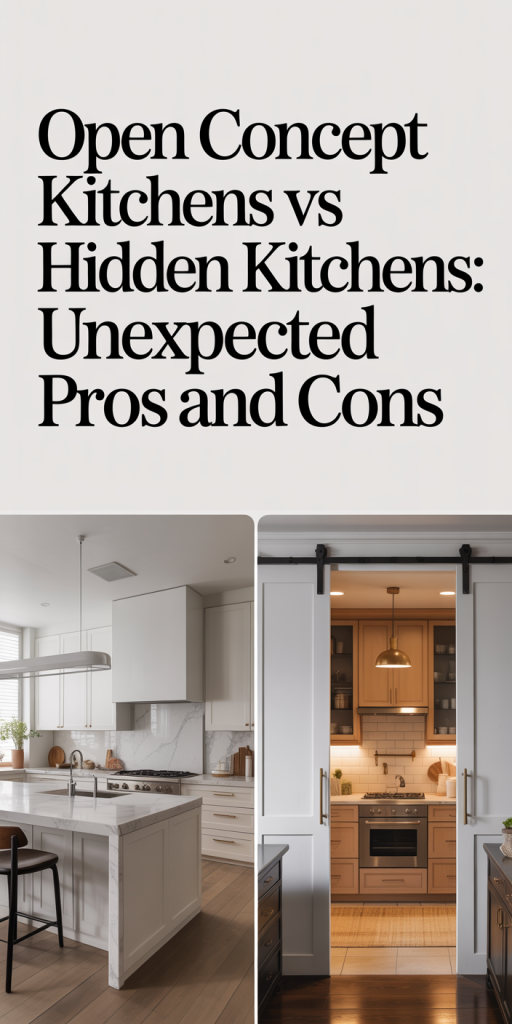
  • Open Concept Kitchens vs Hidden Kitchens: The Unexpected Pros and Cons (Which One Fits Your Life in 2026)

    Kitchen layout trends come and go, but the debate between open concept kitchens and hidden kitchens feels as alive now as ever. As we rethink how we live, work, and entertain at home in 2026, the choice between blowing walls open or keeping cooking out of sight is no longer purely stylistic, it’s about daily habits, family dynamics, resale strategy, and even mental energy. In this guide we’ll define both approaches, dig into practical design considerations, and uncover advantages and disadvantages you probably haven’t considered. Our goal is to give you a clear framework so you can decide which kitchen type fits your life, not a passing trend. Let’s walk through the trade-offs with real-world logic, targeted questions, and actionable takeaways.

    What Defines An Open Concept Kitchen? Key Features And Variations

    Open concept kitchens remove barriers between cooking, dining, and living areas to create a shared, continuous space. The hallmark is visual and spatial integration: islands that face living rooms, continuous flooring, and sightlines that allow conversation across zones. We typically see a few consistent variations:

    • The Great Room Kitchen: Fully integrated with the living area, often centered around a multifunctional island used for prep, dining, and assignments.
    • The Island-as-divider: A large island marks the kitchen boundary without walls, providing storage, seating, and a gentle visual separation.
    • The L-shaped Open Plan: Keeps one side of the kitchen dedicated to appliances and storage while opening the other side to the living area for flow.

    Key features that distinguish open concept kitchens are uninterrupted sightlines, multipurpose islands, consistent finishes across spaces, and flexible lighting schemes. Because the cooking area is exposed, venting, flooring durability, and noise control become more important. Open designs favor social cooking, entertaining, and homes where we want constant visibility, for supervising kids or staying connected while we cook. In 2026, open plans also commonly integrate hybrid work nooks, charging stations, and intentional tech placement so the kitchen isn’t just for food but for daily life.

    What Defines A Hidden Kitchen? From Galley To Scullery And Everything In Between

    Hidden kitchens range from enclosed traditional kitchens to modern takes like sculleries and butler’s pantries that conceal mess and systems. The defining trait is separation, walls, doors, or architectural buffers that keep cooking activity out of primary living sightlines. Popular variations include:

    • The Galley Kitchen: Efficient, narrow, and typically enclosed, great for focused cooks who want everything within reach.
    • The Enclosed U-Shaped Kitchen: Offers abundant counter and storage while keeping noise and smells contained.
    • Scullery or Butler’s Pantry: A secondary prep and cleanup zone that hides the dirty work while the main kitchen or serving area remains tidy.
    • The Pocket Kitchen: A compact, doorable cabinet-style kitchen that tucks away in a living space when not in use.

    Hidden kitchens prioritize function and containment. They make it easier to keep clutter and cooking smells out of sight, which appeals to people who entertain formally or want a calmer living room. In modern renovations we increasingly pair a modest show-kitchen, a curated area for serving and socializing, with a functional hidden kitchen behind it for heavy tasks. That hybrid approach gives us both presentation and practicality without exposing the full scope of kitchen activity.

    Design And Layout Considerations: Flow, Sightlines, And Zoning

    Choosing between open and hidden kitchens starts with three design fundamentals: flow, sightlines, and zoning. Each influences how we move through the house and how the kitchen interacts with daily life.

    Flow: We map circulation paths around work triangles, islands, and dining seating. Open plans favor free movement and social flow: hidden kitchens often restrict traffic to purposeful paths, which can improve efficiency for multi-cook households.

    Sightlines: Open layouts require intentional aesthetics because the kitchen is constantly visible. That means cohesive materials, concealed appliances, and thoughtful storage. Hidden kitchens allow more utilitarian finishes out of sight, often prioritizing durability and task lighting over visual harmony with adjacent rooms.

    Zoning: This is about defining activity areas. In open plans we rely on furniture, rugs, and lighting to create zones: islands become multifunctional anchors. In hidden kitchens we can zone vertically and horizontally, dedicate counters for baking, a scullery for prep and cleanup, and keep a pantry-station isolated to avoid cross-contamination.

    Other practical considerations include mechanical systems (venting and HVAC), acoustic buffering, and electrical placement for smart appliances. For example, an open kitchen needs stronger range hood ventilation to protect living room air quality: hidden kitchens let us contain odors more easily. Finally, consider adaptability: if we plan to age in place or want flexible multi-use rooms, layouts that allow future wall additions or removals give us long-term options.

    Unexpected Advantages Of Open Concept Kitchens

    We often celebrate open kitchens for sociability, but some advantages are less obvious until we live with them.

    1. Multitasking Made Real: With direct sightlines to living areas, we can supervise kids, keep an eye on virtual meetings, or watch TV while prepping dinner. That reduces task-switching friction and saves time.
    2. Perceived Space and Light: Removing walls lets natural light travel further and makes even modest homes feel larger. This perceived spaciousness often improves mood and lowers stress, a subtle but meaningful benefit.
    3. Flexible Entertaining: Open kitchens let gatherings flow organically: guests can chat while we cook, and buffet setups are simpler. That flexibility translates to fewer separate serving pieces and more relaxed hosting.
    4. Better Social Inclusion: Open plans support communal living arrangements and multigenerational homes. Whether we’re helping a teenager with assignments or hosting a potluck, the kitchen becomes a social hub rather than a workspace hidden away.
    5. Increased Visibility of Upgrades: High-end finishes, statement islands, and designer lighting are more impactful in open plans, potentially enhancing perceived value during viewings or open houses.

    These advantages make open kitchens compelling for families who prioritize connection, daylight, and flexible entertaining.

    Unseen Drawbacks Of Open Concept Kitchens

    Open kitchens aren’t without downsides. Beyond the obvious loss of privacy or noise, there are several less visible costs we should weigh.

    1. Acoustic Spillover: Cooking, dishwasher cycles, and conversations travel. Without walls, sound control requires better acoustic planning, soft furnishings, ceiling treatments, and appliance selection to reduce noise.
    2. Constant Visibility of Clutter: Because the kitchen is always on display, daily messes feel more stressful. That can pressure us into continual tidiness or attract cleaning service costs.
    3. Ventilation Load: Open plans demand more powerful range hoods and thoughtful HVAC zoning to prevent food odors and humidity from migrating into living spaces.
    4. Design Compromises: Making a kitchen visually consistent with a living room limits some practical choices, exposed storage, industrial finishes, or heavy-duty surfaces might clash with a relaxed living palette.
    5. Higher Renovation Complexity: Removing load-bearing walls or rerouting mechanicals to create openness often increases project complexity and cost. Even if we love the look, the structural or permitting hurdles can be significant.
    6. Resale Polarization: While many buyers prefer open plans, some segments, particularly in certain regions or older buyer demographics, still value enclosed kitchens. Going fully open risks narrowing appeal.

    Knowing these trade-offs helps us plan mitigations: invest in quiet appliances, create hidden storage strategies, and ensure ventilation capacity aligns with the openness of the design.

    Surprising Benefits Of Hidden Kitchens

    Hidden kitchens deliver predictability and control in ways that pleasantly surprise once we live with them.

    1. Stress Reduction: Out-of-sight cooking reduces visual clutter, which in turn lowers cognitive load. We notice this when hosting, dishes can be washed and stored out of view while guests remain in a calm living room.
    2. Better Scent and Air Management: Enclosed layouts naturally contain smells, making them a boon for homes that cook strongly flavored cuisines or frequently use deep-frying methods.
    3. Focused Culinary Workflows: For serious cooks, a hidden kitchen allows specialized zones (baking center, prep island, heavy-duty range) without worrying about aesthetics in the main living area. We can have industrial-style shelving, hanging pots, and heavy-duty counters that wouldn’t work visually in an open plan.
    4. Improved Safety and Containment: With doors or partitions, we can keep pets and small children out of dangerous areas more easily. That’s practical for households with curious toddlers.
    5. Easier Clean-up and Maintenance: Because the kitchen doesn’t need to always be presentation-ready, we can store frequently used tools and leave small projects in progress without social pressure to tidy immediately.
    6. Architectural Character: Enclosed kitchens often sit in older homes as intact rooms with defined scale, windows, and built-in features. Restoring or updating these spaces can preserve character that open plans might erase.

    Those benefits show why hidden kitchens remain a strong option for people who cook intensely, prefer formal entertaining, or want strict separation between life and workspaces at home.

    Challenges And Tradeoffs Of Hidden Kitchens

    Hidden kitchens come with their own compromises, mobility, social disconnection, and sometimes inefficient use of space.

    1. Social Isolation: When we shut the kitchen away, cooks can feel cut off from guests or family. That’s a real consideration if we enjoy social cooking or need to supervise activities while we work.
    2. Space Perception: Enclosed kitchens can make homes feel compartmentalized and smaller, especially if natural light is limited. That reduction in perceived space can affect mood and how we use adjacent rooms.
    3. Workflow Constraints: Traditional closed layouts like narrow galley kitchens may hinder multiple cooks. Tight corridors and lack of island space can create bottlenecks during busy meal prep.
    4. Underused Rooms: If the kitchen is too isolated, it risks becoming a back-of-house area that family members avoid, reducing interaction opportunities and amortized value of the footprint.
    5. Lighting and Ventilation Needs: Enclosed kitchens often require more artificial lighting and mechanical ventilation solutions, which can marginally increase operating costs and energy use.
    6. Resale Considerations: While many buyers appreciate a concealed kitchen, others, particularly younger buyers and those who value open living, may see it as dated. We need to balance current lifestyle benefits against potential buyer preferences in our market.

    We can address some trade-offs by designing openings, pass-throughs, or glazed doors that allow light and partial connectivity without full exposure, achieving compromise between privacy and inclusion.

    Cost, Renovation Complexity, And Resale Impact For Both Styles

    Budget and future resale value are pivotal when choosing a kitchen layout. The financial picture differs markedly between open and hidden designs.

    Costs and Complexity:

    • Open Concept: Creating an open plan often involves removing load-bearing walls, upgrading floor joists, and rerouting HVAC and electrical systems. These structural and mechanical changes raise renovation budgets significantly. Expect higher upfront costs for structural engineering, permits, and robust ventilation systems. That said, the visibility of premium finishes in an open plan can justify spending on high-end cabinetry and appliances.
    • Hidden Kitchens: Enclosed kitchens usually avoid structural work but may require investments in lighting, ventilation, and cabinetry optimized for storage. If we add sculleries or butler’s pantries, incremental cabinetry and plumbing costs rise, but complexity often stays moderate compared with wall removals.

    Resale Impact:

    • Market Preference: In many urban and suburban markets, open concept kitchens are still widely favored and can positively influence appraisal perceptions. But, market nuance matters: in areas with traditional homebuyers or where formal entertaining is common, a hidden kitchen or hybrid solution may attract a premium.
    • Flexibility Sells: Homes that offer adaptability, e.g., an open plan with the option to reintroduce doors or a hidden scullery paired with a show-kitchen, appeal to a broader buyer pool. That flexibility can protect resale value and reduce the risk of alienating buyers.

    Return on Investment:

    • We generally see better ROI by improving functionality and flow rather than chasing stylistic extremes. Investing in good ventilation, durable surfaces, and smart storage provides steady value regardless of the chosen layout.

    In sum, budget for structural work and mechanical upgrades if going open, and consider hybrid approaches to balance cost with market appeal.

    How To Choose Based On Lifestyle, Family, And Cooking Habits

    The right choice hinges on how we actually use our kitchen day-to-day. To decide, ask practical, personal questions and test assumptions.

    Questions to Guide Us:

    • How often do we entertain? Frequent hosts who favor casual entertaining lean toward open kitchens: formal hosts often prefer hidden or hybrid setups.
    • Do we need to supervise children or work from home while cooking? Open plans help visibility and multitasking.
    • How intense is our cooking? If we regularly cook complex meals or use heavy equipment, a hidden kitchen or scullery protects living spaces from mess and odor.
    • What’s our tolerance for clutter? If we prefer tidy living rooms and relax into mess behind closed doors, hidden kitchens align with that preference.
    • How important is natural light and perceived space? Open plans amplify both.

    Design Strategies Based on Answers:

    • For Families with Kids: Open plan with dedicated zones works well, but add ample concealed storage and noise damping.
    • For Serious Home Chefs: Enclosed prep areas or sculleries with heavy-duty appliances provide functional advantage.
    • For Entertainers: An open show-kitchen plus hidden prep scullery gives the best of both worlds: guests see a polished space while we pair it with a functional back kitchen.
    • For Tight Budgets: Retaining existing walls and upgrading inside the envelope is often more cost-effective: choose hidden or partial openness depending on natural light and circulation.

    We recommend prototyping with simple visualizations: mark the proposed island, furniture, and traffic paths on the floor with tape for a week. Living with a mockup surfaces issues you won’t see on paper, it’s the fastest way to validate whether an open or hidden layout truly fits your rhythm.

    Conclusion: Making The Right Call For Your Home And Future Needs

    There’s no universal winner between open concept kitchens and hidden kitchens, only the right fit for how we live now and how we expect to live in the years ahead. Open kitchens reward connection, light, and flexible entertaining but demand acoustic planning, stronger ventilation, and constant visual upkeep. Hidden kitchens offer containment, focused workflows, and lower social pressure at the cost of potential isolation and perceived smaller space.

    Practically, hybrid approaches often deliver the best balance: a curated show-kitchen for guests paired with a hidden scullery for prep and cleanup, or glazed doors that allow light and sightlines without full exposure. Our final recommendation is to prioritize everyday function over aesthetic trend, budget realistically for the mechanical work an open plan requires, and prototype layouts before committing. If we design around how we actually cook, host, and live, not just what looks trendy, we’ll make a choice that serves our home well into the future.

  • Big Windows vs Privacy: What Nobody Tells You About The Hidden Trade-Offs In 2026

    We love natural light. In 2026, architects, homeowners, and builders are still pushing ever-larger panes of glass into houses, apartments, and offices, and with good reason: daylight improves mood, reduces energy use, and makes spaces feel expansive. But when we talk about big windows vs privacy, there’s a quieter conversation we rarely hear. Oversized glazing changes how our homes behave at night, how neighbors and passersby relate to our lives, and how data flows around our property. In this text we’ll walk through why large windows appeal to us, the privacy downsides most people miss, real-world scenarios where those downsides become problems, and practical solutions, from design tweaks to tech, that let us enjoy daylight without giving away our lives.

    Why Big Windows Are So Appealing

    Big windows have dominated residential design for a reason: they deliver immediate, visceral benefits that small openings can’t match. First, there’s the psychological impact. A floor-to-ceiling window or a large clerestory floods a room with daylight, making spaces look larger and improving our mood and circadian regulation. Studies over the last decade continue to link daylight exposure to better sleep, higher productivity, and even faster recovery in healthcare settings, benefits we feel without thinking.

    Second, aesthetics and resale value. Contemporary buyers equate glass expanses with modernity and luxury. From an architectural perspective, glazing dissolves visual boundaries between interior and exterior, creating the coveted indoor-outdoor connection. That connection sells: homes with thoughtful daylighting often command higher prices and shorter market times.

    Third, energy considerations. When placed and shaded correctly, big windows can reduce daytime lighting loads and provide passive solar gains during cooler months. Advances in low-E coatings, triple glazing, and thermally broken frames make large windows more energy-efficient than they used to be, allowing us to justify larger apertures without paying the historical thermal penalty.

    Finally, lifestyle shifts drive demand. We’re spending more time at home and want spaces that feel open, connected to nature, and amenity-rich. Big windows are shorthand for that lifestyle. But these advantages come with trade-offs, especially around privacy and control, that we need to acknowledge before committing to a wall of glass.

    The Hidden Privacy Downsides Most Homeowners Miss

    When we choose large windows, we usually picture bright mornings and panoramic views. We often forget that glazing is also a two-way lens: it lets us see out, but it also lets others see in. That symmetrical transparency creates privacy risks that are subtle, cumulative, and rarely factored into design decisions.

    First, the day-to-night inversion. During daylight the brighter exterior tends to obscure interior details: at night, interior lighting makes the opposite true. This simple physics flips our privacy assumptions and can expose activities we assumed were private. Second, the proximity problem: large windows change the home’s relationship to the public realm. A dining room window that faces a sidewalk or a neighbor’s yard turns private conversations, routines, and even clothing choices into semi-public performances. Third, pattern recognition and surveillance: repeated, high-quality visual access makes it trivial for neighbors, delivery drivers, or opportunists to learn our habits, who’s home, when we leave, where we sit most often.

    We also ignore non-visual privacy risks associated with big windows. Exterior cameras or doorbell cams with wide fields of view may inadvertently record interior activity reflected in glass. Smart-home devices that rely on line-of-sight sensors can leak presence data. And aesthetic decisions that prioritize transparency may conflict with safety, consider a sleeping child visible from the street, or valuables displayed on an entryway table.

    Finally, social friction is underappreciated. We assume good neighbors will avert their gaze, but curiosity is human. What starts as casual observation can spiral into awkwardness or, worse, nuisance behavior. When we choose large glazing, we’re altering social boundaries, and we should do so consciously.

    Real-World Privacy Risks

    Big windows multiply realistic, traceable privacy risks in ways that planning pages and glossy brochures don’t show. Below we break down the most common and consequential scenarios we encounter in real homes and urban projects.

    Practical Design, Tech, And Behavioral Solutions

    The good news is we don’t have to choose between daylight and discretion. A layered approach combining design decisions, technology, and daily habits gives us control without sacrificing the benefits of big windows. Below are practical, tested strategies we can apply at different scales and budgets.

    Conclusion

    When we weigh big windows vs privacy, the right choice isn’t binary. Large glazing can transform a home, but it also alters boundaries, visual, social, and digital. The smart approach is intentionality: map sightlines, prioritize which spaces must remain private, and use layered defenses, landscaping, layout, treatments, and measured technology, to keep light without relinquishing control. If we plan for the night as deliberately as we do for the day, we can enjoy the airy, sunlit spaces we crave without inviting unwanted observation into our lives.

  • Open Floor Plans Vs Defined Rooms: Which Feels Better To Live In Daily — A Practical 2026 Guide

    We’ve all walked into a home and felt an immediate emotional reaction, light flooding a single, open space: or the calm of a series of smaller, purpose-built rooms. In 2026, with more people working from home, multi-generational households, and a renewed interest in wellness at home, the question of whether an open floor plan or defined rooms feel better to live in daily matters more than ever. In this guide we’ll cut through the design clichés and look at the psychology, everyday pros and cons, and practical strategies for choosing, or adapting, a layout that actually supports how we live. Expect research-backed observations, real-life trade-offs, and actionable suggestions you can use whether you’re buying, remodeling, or simply rearranging. Our aim is to help you decide which layout will make routine life easier, calmer, and more enjoyable for your household.

    The Psychology Of Space: How Layout Shapes Everyday Comfort

    Space isn’t just architecture: it’s an emotional regulator. When we talk about how a home feels, we’re describing cognitive and sensory reactions, perceived safety, social connectedness, control over stimuli, and the ability to focus. Neuroscience and environmental psychology show that spatial configuration influences stress, attention, and social behavior. For example, visual openness tends to increase feelings of freedom and social possibility, while defined rooms often create clear behavioral scripts: we eat in the dining room, sleep in the bedroom, work in an office. Those scripts reduce decision fatigue and can improve routines.

    Beyond scripts, our sensory thresholds vary. Some people need visual boundaries to feel secure: others feel confined by walls. Light, sightlines, and acoustics modify perception deeply. Natural light exposure correlates with better mood and sleep patterns, and open plans often maximize daylight penetration. But noise travels more in open layouts, elevating chronic stress for those sensitive to sound. Control is another psychological variable: the more control we have over our environment, closing a door, dimming a lamp, or carving out a quiet corner, the more restorative the space becomes. That’s why we should evaluate layouts not only by aesthetics, but by who we are, how we use time at home, and which daily stresses a layout must help manage.

    Finally, social dynamics matter. Open spaces encourage spontaneous interaction and supervision (vital for families with kids), while defined rooms support privacy and concentrated work. As we weigh open versus defined plans, we must map layout traits to our household’s rhythms, sensory tolerance, and social needs to predict which will feel better day-to-day.

    Open Floor Plans — Benefits That Make Daily Life Easier

    Open floor plans dominated new construction and remodels for years because they solve practical problems: they connect people, simplify flow, and maximize daylight. When we evaluate the benefits, three stand out, social flow, light and flexibility, entertaining and visual spaciousness, each of which directly affects daily living.

    Social Flow, Light, And Flexibility

    An open plan naturally merges cooking, dining, and living zones so we can cook while watching kids, socialize while prepping dinner, or keep an eye on a video call without feeling boxed into a separate room. This visibility reduces friction in multitasking and helps households run more smoothly. Open plans also improve daylight distribution: fewer partitions mean sunlight penetrates deeper into the footprint, reducing reliance on artificial lighting and enhancing circadian benefits. Flexibility is another practical upside: furniture arrangements can be swapped to suit changing needs, home gym one month, play area the next, without structural changes.

    Entertaining And Visual Spaciousness

    For anyone who entertains, an open plan simplifies hosting logistics. Guests flow from kitchen to seating areas without bottlenecks: cooks aren’t isolated: and the visual continuity creates a perceived increase in square footage that makes daily life feel less cramped. Even for smaller homes, a well-executed open plan can feel luxurious by eliminating narrow corridors and awkwardly sized rooms.

    These benefits translate directly into daily convenience: fewer closed doors to manage, more social connection during routine tasks, and a heightened sense of light and space. That said, the conveniences carry trade-offs we need to weigh next.

    Open Floor Plans — Everyday Drawbacks To Consider

    Open plans aren’t a universal solution. The very features that make them appealing, connectivity, light, and openness, create problems that affect daily comfort.

    First, acoustics. Sound carries in open spaces, so ordinary activities, cooking, conversations, television, can interfere with concentration or sleep when rooms aren’t isolated. For households with remote workers or students, that’s a real day-to-day annoyance. Second, scent and visual clutter. Cooking odors and messes are harder to contain: an unwashed sink or laundry basket is visible from multiple sightlines, adding to mental load. Third, temperature control. Larger contiguous volumes can be harder to heat or cool efficiently, especially in older homes without zoned HVAC. That raises energy costs and sometimes creates persistent hot or cold pockets.

    Privacy is another consideration. We may like seeing family members, but we also need spots to retreat. Open layouts reduce opportunities for private phone calls, quiet reading, or focused work unless we create intentional nooks. Also, storage can be a challenge, open spaces push storage needs into furniture solutions rather than built-in closets, which may not match how we organize daily life.

    Finally, aesthetics vs. function: open plans require discipline about tidiness and design cohesion. Without consistent finishes and clutter control, the openness amplifies mess instead of making a space feel larger. In short, open plans simplify some aspects of daily life but complicate others, especially in households with mixed needs for focus, privacy, and environmental control.

    Defined Rooms — Benefits For Privacy, Focus, And Routine

    Defined rooms, distinct spaces delineated by walls and doors, offer features that support focused, lower-stress daily living. The primary benefits we see are improved privacy, better conditions for concentration, and more intentional routines.

    Privacy matters for adults and kids alike. Bedrooms, studies, and dedicated workrooms allow us to close a door and create psychological separation between activities: work stays in the office, sleep happens in the bedroom. That separation helps us disengage mentally, improving sleep quality and work-life balance. For households with multiple adults or frequent remote work, defined rooms reduce interruptions and enable scheduled quiet times.

    Defined rooms also foster focus. Acoustically and visually isolated spaces minimize distractions, which boosts productivity and reduces cognitive load. If you’re on an important call or deep into a concentrated task, having a room to retreat into is invaluable. Purpose-built rooms let us design for specific needs: blackout shades in the bedroom, bookshelves and task lighting in the study, or soundproofing where necessary.

    Routine and habit formation benefit too. When activities consistently occur in specific rooms, meals in the dining room, reading in a den, our brains build habits faster and with less conscious effort. That predictability makes daily logistical decisions easier and reduces decision fatigue. For families, defined rooms can also support different schedules: a teenager’s music practice won’t carry into a sleeping adult’s space as easily.

    In short, if our daily life demands focused work, clear boundaries between functions, or lower sensory load, defined rooms typically feel better and more sustainable over time.

    Acoustics, Temperature Control, And Purposeful Storage

    When we pick defined rooms, we gain several technical advantages that influence everyday comfort: better acoustics, easier temperature zoning, and more effective storage solutions.

    Acoustics: Walls and doors are simple, effective noise barriers. They let us isolate sound-generating activities and maintain quieter zones for sleep or focused work. We can enhance this further with soft finishes, rugs, curtains, upholstered furniture, or add targeted soundproofing where needed. For families or people who need to record audio or participate in frequent video calls, this separation is often non-negotiable.

    Temperature control: Smaller, compartmentalized rooms are simpler to heat or cool individually. Zoned HVAC systems or even portable heaters/coolers work more efficiently in defined rooms because there’s less wasted air exchange. That translates to lower utility bills and more consistent thermal comfort in everyday life, especially in climates with large seasonal swings.

    Purposeful storage: Defined rooms encourage built-in storage, walk-in closets, pantry rooms, mudrooms, and dedicated laundry spaces, that keep daily clutter out of sight. When storage is integrated into the architecture, we spend less time moving items around or staging for guests. Purpose-built storage supports specific routines: a mudroom for shoes and coats, a pantry organized for weekly meal prep, or a craft room with labeled bins. Those habits reduce friction in day-to-day tasks.

    All of these practical technical benefits add up: when acoustics, thermal comfort, and storage are addressed, daily life feels more controlled, less noisy, and easier to manage.

    Common Limitations And Workarounds For Defined Rooms

    Defined rooms aren’t without limits. They can fragment social life, reduce perceived space, and sometimes make small homes feel compartmentalized. Fortunately, there are intelligent workarounds that preserve the advantages of defined rooms while mitigating downsides.

    First, fragmented social interaction. We can address this by creating intentional transition zones: a breakfast nook that opens to the kitchen through a wide doorway, or a half-wall that provides sightlines without removing all separation. Pocket doors and wide cased openings allow rooms to be opened for gatherings and closed for privacy. Second, lighting and daylight. Smaller rooms can feel dim: we offset this with strategic skylights, clerestory windows, or light wells that channel daylight into interior rooms. Mirrors and reflective finishes also help redistribute natural light.

    Third, perceived crampedness. Removing unnecessary corridors and using multifunctional furniture (daybeds, fold-down desks, integrated storage) increases usable square footage. Open shelving or glass doors on cabinets can visually expand a room without compromising function. We can also choreograph color and material palettes across rooms to maintain cohesion and avoid a choppy visual experience.

    Fourth, flexibility. If adaptability is a concern, we recommend modular solutions: movable partitions, sliding doors, or furniture that defines zones without permanent walls. These let us toggle between privacy and openness depending on the occasion.

    By thinking like both designers and psychologists, we can retain the control and focus benefits of defined rooms while keeping life sociable and bright, often achieving the best of both worlds with modest investments.